Alter Ego Assignment 1


Script/Plan

“When you were younger…”

Themes:

  • You cannot go back to the past, so live in the present.
  • Treasure the ones around you while you can.

Characters: Me (Current) + Grandmother

Reason to meet: Granddaughter visits grandmother.

Place for them to meet: Grandmother’s living room.

Incident to set up/respond to: Granddaughter reminisces about her past. She recalled her grandmother used to comb her hair as she sat on that couch when she was little.

Scene set –up: After taking a bath, Yiling walks to the living room to get her comb. Yiling sees Grandma sitting on the couch resting and this reminded her of the old times.

Dialogue:

(To be confirmed because not certain if grandmother can remember the script. If not will just improvise on the spot to get a more realistic and documentary type of an actual dialogue between me and my grandmother.)

Y – Yi Ling; G – Grandmother

(The dialogue will be in dialect)

Y : Ah ma, comb my hair for me?

G : aiyo so big already still want ah ma to comb hair for you ah?

Y : *while G was combing Y hair* Ah ma do you still remember how was I like as a child?

G : Aiyo last time when you were a little girl………(talks in detail about my naughty incidents as a child for maybe 40 seconds)……….and now you’re so big girl already. Wah time passes so fast…

Y: Ah ma, you do know that even though I was so naughty to you last time, I love you a lot right? Even now so.

G: Aiyo, I know hahahaha.


Explanation

The above is the dialogue I had initially wanted to carry out between my Grandmother and me. I had the idea to have an intimate conversation with my grandmother by talking about my past, which her expressions and her memories of me would bring her character out better. Be that as it may, much improvisation had to be carried out to head in the direction that I wanted instead of following the script I had planned out word for word.

Through this dialogue, there is a tight relation between both characters: My Grandmother and Myself.

I felt deeply that this dialogued recorded cannot be replicated or reproduced by anyone except for the both of us. Stories may vary when asking a different person who shares the same memory, but this story only makes sense when told by my grandmother and questions imposed by me.


In Depth Character Profiling (Updated)

ah-maajpg

My grandmother’s whole life is dedicated to taking care of the house and providing a home for her children, as well as practically taking me under her wing ever since I was born because my parents had to go to work. Her love language is more of ‘Acts of Service’ rather than ‘Words of Affirmation’. Hence, towards the end she replies my expression of love towards her with a mild chiding tone and shy chuckle.

me

My character in this dialogue is more of a reminiscing and a questioning one. Unlike my grandmother who is always at home and hardly steps out of her house, I am constantly on the move with time. My childhood is something I cannot revisit, and it will only be a fragmented piece of memory. Hence, this conversation with my grandmother about my past, adds another perspective on the same memory I had. In addition, it feels heart-warming to hear from my grandmother’s perspective of her memory of my childhood self.


Methodology

I added some clips between the dialogue footage not only to spice up the stagnant one-frame-middle shot, but to set the scene of where the dialogue was set up.

slide2

Such as my grandma’s HDB Flat scene, clock ticking (in my grandmother’s house), the swaying Bougainvillea flowers planted by my Granddad before he passed on (appears when Grandma and I were talking about him) and the ‘Block 321 Clementi Ave 5’, which is the neighborhood area of where my grandma stays at.

In addition, the clips are included to provide visual aid instead of having the viewers to just imagine something they might have never seen before.

slide1

Such as the process of her preparing food for me and the food that I loved to eat as a kid, exactly as the way how she prepares them.

For this part, I was inspired by a certain scene in The Virgin Suicide, where Trip and Lux were in the auditorium:

I liked the idea of how the narration in the lecture are in sync with the actions between Lux and Trip. For instance, at the 0:13 mark when the narration in the lecture says, “One high pressure and one low, coming into contact with another.”; and that is when Lux and Trip’s elbows touched. Hence, I was inspired by that scene and I added to the food scenes when the food my grandma listed out appears onscreen simultaneously.

Something that I have observed when I was adding subtitles to the video, is that how the subtitling was done really sets the atmosphere of the dialogue and film as well. While editing, I was pondering between translating the conversation for what it means in formal English, or should I translate it for what it is: Informal and light hearted conversation between a grandchild and a grandmother. As you can see, I went for the latter.

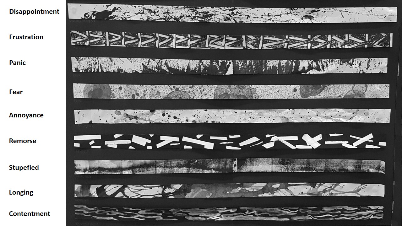
I included ‘Using Motifs to express Themes’ a couple of times in this project.

slide3

Clock Ticking footage and the Block Number 321 footage to express my theme:

  • You cannot go back to the past, so live in the present.
  • Treasure the ones around you while you can.

Both motif involves numbers. The clock showing that time is never stopping as much as we reminisce, and that ‘321’ is a form of counting down to the days we have left.


Difficulties faced

  1. Staging the dialogue according to the script was not easy at all because my grandmother character was MY ACTUAL GRANDMOTHER and directing her character to memorize the script was not plausible, so I tried to direct her in a way that our conversation is headed in that direction I wanted. Hence, the final product was more of a documentation of my daily conversation with her and I really liked it because: One, it was on a real account; Two, it was hardly staged because I just told my grandmother to talk to me as per normal and Three, I got to know some new things about how my grandmother sees me as a kid.
  2. I had a lot of extra footage, and cutting it down to grasp the main essence and the part about expressing my characters through the dialogue was not easy. Because I found that many parts were critical and I had to give up quite a handful of precious dialogue that would emphasize on my grandmother’s character. Thus, abrupt cuts were seen.
  3. I started to use Adobe Premier Pro for the first time to fully edit a video and it was quite stressful because I had a mental image of how I would want the video to look, but I was not able to achieve it because I wasn’t familiar with the software. But I believe with more practice and video tutorials online, I think I would be better than I was this time. 🙂


Theme

Theme = Emotion = Audience Connection

Theme is not a one-word explanation like ‘Happiness’, as it doesn’t tell much about the film.

For instance, the movie that captured our hearts and made me into a sobbing mess in the theaters: Inside Out

The overall theme for the movie is :

‘Sadness is required to make Joy better’

Having a good theme would not only make emotional connections with your audience better, but also the message stays rooted in the audience’s mind after the movie.

A Theme = The Controlling Idea = The Message

The controlling idea is that everything (Dialogue + Scene +Props tie down to 1 idea.)

It is also essential that the Theme of the movie/film CANNOT have Conflicting Themes! For instance, Riley in the movie Inside Out cannot talk about politics in the film because it has 0 relevance to the theme of the film and that it will confuse the viewers. Thus it is important that when setting the theme for a film, we ought to revise the circle above to ensure that our themes and subthemes in the film are not conflicting.


Another example is used to figure out the theme of the local film during lesson:

Singapore Dreaming (and yes… the entire film is available on YouTube YES~)

The themes the class has contributed for this film is :

  • Limbo of common folks to be the elites
  • The pursuit of wealth + success (Paper Chase)
  • Gender Roles in Asian context (specifically Singapore)
  • Negativity is transmittable
  • The need for upward social mobility
  • Ego is what breaks relationships.

What are other ways for us to present our themes for films?

  1. Through Characters, it embodies the theme.
  2. Motifs
  3. Dialogues
  4. Setting

Using Characters- Alfred Hitchcock’s Rear Windows

Using characters, this film illustrates the urban relationship behind closed doors. The main character sees the real bitterness of his neighbors through his own window.

Theme?

You will not know how person feels or think on the inside, and the exterior image they show you may be just a façade to hide their true feelings and emotions.

Choice of music in this film also shows the theme of this film, which evokes fragility & loneliness exhibited by characters in this film.

Using Motifs – Saving Private Ryan

In the film, there is a scene where the colonel was directing his troop towards his map as to where Ryan can be found. In the midst of explaining, the compass in his hand was shaking. The soldiers looked at the colonel’s hand and gave him a warm smile before the proceeded to look for Ryan.

The motif in this film is the Compass.

The colonel was nervous about the search or was suffering from physical injury from the war, but still insisted to search for Ryan with his entire troop. In the process, there was this conflicting moral ambiguity he was battling. The shaking compass was a motif to show the moral compass of the colonel along with the troops.

Theme?

Is it worth giving up the entire forest for a single tree?


Yit Ling, Clara and I (Group mates for Final project in Sem 1 <3) went to watch The Silence of the Lambs afterwards to try to apply what we have learnt during lesson, and sieve out the themes involves in this movie.

Themes?

>Repression from misogynist in a “male job”
>Women can handle male dominated jobs as well
>Hard work pays off
> Good things goes to those who fight for it 

Hence, a Theme is consistent throughout a movie and it sets the overarching story of the entire movie; the lesson learnt at the end of the movie.

Our group or as known as Ling Teh Kam-pany (Derived from our names), consists of Kam Yit Ling, Clara Teh Ke Wei and myself, Seng Yi Ling. And here, we present to you our very own movie trailer for our final 4D assignment of Year 1 Semester 1…

Movie Title: Yi(t) Ling
Genre: Fantasy + Psychological Horror

3 Act Structure

Beginning (Act 1)

Yi Ling is a shy and quiet person. Once focused on a task, she is far from being distracted. Sadly, she is ostracized by her classmates as she seemed rude and had a stuck up attitude. Her classmates disliked and gave her a hard time. Until one day, her new classmate Queenie decided to befriend her.

Rising action

To her dismay, Queenie sold Yi Ling out to fit in as she got ostracized by their classmates when she was seen hanging out with Yi Ling. She ganged up with her classmates and forced Yi ling into room rumored to be haunted for fun’s sake. When Yi Ling managed to open the door after much struggling, she was transported to another dimension where there were doors which led her to places as a ghost tailed her.

Middle (Act 2)

Encounters with the ghost tells Yi Ling that the ghost wants her to stay in this dimension and never go back. The spirit was motivated by loneliness which both characters shared and was enraged when Yi Ling refused to stay.

Ending (Act 3)

The ghost is in actual fact a manifestation as her alter ego. The other dimension filled with doors was a symbolism of change Yi Ling faced in her life. And the only way Yi Ling can get back to her world is by killing a part of her: Her Alter Ego.


References

We watched many horror movie trailers as a form of research and shared our experiences and views on past movies we’ve watched that could be of assistance to our movie trailer! 🙂

Crimson Peak (The Ghost was constantly present, but not shown blatantly.)

Black Swan (Killing of her Alter Ego)

The Babadook (Ghost was a manifestation of main character’s fears.)

The Boy ( Placement of background music.)

Placement of background music was very on point here – it had us 3 covering our ears and half shutting our eyes in fear to watch the trailer. The initial beginning of the trailer has a soft mellow piano tune when the female lead approaches the mansion, and the drastic change of music when they revealed The Boy to her sent shivers down our spine. The sudden change of music instantly let the viewers know what atmosphere the trailer aims to set: Simple life of the girl -> Horror of her lifetime.

Blair Witch Project (Handheld camera shots to show desperation and fear.)

https://www.youtube.com/watch?v=D51QgOHrCj0

Coraline (Travelling into another dimension, and use of different colour for different world)

In Coraline, the saturation of her world is low and colours are dull like the reality she lives in. In the other dimension, she enters a door where saturation is high and colours are vibrant and lively like the life she yearns to live in.


Editorial

Blackout shots – Blackout transition shots are a recurring motif. It is used as a representation of time lapse. When used in our trailer, the following scene will be of another place and another time. In addition, length of transition creates suspense and indicate a tonal shift in the scene.

Color  – Adjusting of color to establish different dimensions were used. In the real world, colors are more saturated and was brighter; whereas in the other dimension, saturation was kept to a minimum and brightness was decreased to emphasize on the stark differences in both worlds, so as to make it more spooky.

Background music and audio – Music were used to build up the anticipation and gives the audience the emotion they ought to be feeling a specific sections of the trailer. For instance, mellow piano music at the start to give a soothing feeling, and high pitched fast paced music at the climax when main character was being chased down.

Parallel Universe – At the scene (0:45) where the main character exit onto the parking lot, the composition has a mirror image reflection on the extreme left of the shot, to enhance the parallel universe feeling.
Staircase scene shows main character running up the stairs away from the Ghost, but she remains on the same level as the stairway in the other dimension is an infinite loop (0:58 – 1:09) .

Shots Established

Still Shot was used at the start of the trailer, where a serene feeling is given of the school environment. (0:09)

Fast Pan + POV at the scene where main character looks around perplexed at the new dimension she entered (0:49) .

Dolly In and Out scenes are present at the scene to show the ominous door (0:30) and the scene where zooming in on her expression to show that  she is perplexed after opening the door to another location (0:48).

Mid-shot was used at the scene where main character is pleading the classmates to let her out. (0:40)

Handheld shot when the main character is running up the stairs. (1:01)

Low Angle Shot at the scene where 3 Classmates (Dawin, Jon, JiaQi – Thanks guys!) were gossiping about the main character. (0:22)

Trucking Shot was used when classmates (Thanks Queenie and Debbie!)were pushing the main character inside the haunted room. (0:35)

Close-up Shot was used when main character was wrenching at the door handle when she is locked in (0:41). And the part where the main character’s phone is ringing (1:25).

Canted angle shot are present when phone is dropped amidst the struggle when pushing the main character inside the haunted room (0:37), and the scene where the ghost is wrenching the door to be opened (1:14). This is to create drama and suspense.

Slow Pan is used at the transition scene where the main character looks into the mirror and the reflection looks back at her (1:39-1:42).

Challenges Faced

  • We tend to forget that the trailer is 2 mins and thus, eventually worry that our trailer does not convey our plot properly; but at the same time we don’t want our trailer to be a 2 min summary of the movie (given that it is a MOVIE trailer).
  • Finding an appropriate location which conveyed the intended feeling was not easy. Our main character’s setting is in a school environment and hence the school was used. But for the horror aspect we had to find narrow and dark areas within campus and that was difficult. Given that we even trespassed ongoing construction sites in school.
  • Suitable. background. music. was. really. hard. to. find.
  • Miss Ruyi mentioned that our logo and lobby music was not very appropriate for our Horror trailer, but our group felt that the logo was a good representation of our efforts as a group and the elevator music gave it a merry feeling. This will create the drop of emotions when the horror aspects of our trailer is revealed. 🙂

Feedbacks and Critiques
  • Bar chart results obtained from Ms Ruyi’s Google survey for our group were more towards the positive end of the spectrum.  (thank you!)
  • Sound effect can be toned down to hear narration of the alter ego better in the end.
  • The starting music doesn’t match with the rest of the trailer , perhaps a non jazzy music that foreshadows the story?
  • Show that the alter ego and the main character are two compelling personalities/ people by including more interactive scenes between the 2. Perhaps by voice over of dialogue between 2 person or a struggle between the 2.
  • Yi Ling can act! (Yi Ling says thank you >~< )
  • There were different shots to show the mood of the character.
If u guys have any constructive criticism or comments that we’ve missed out, do leave a feedback down below! WE APPRECIATE IT ?

Initially I was pretty apprehensive to do group work for assignments as I am a rather ‘lone ranger’ kind of person, and having to do group work would mean that there is potential conflicts etc. But I was proven extremely wrong as I felt that our group worked really well together and even bonded closer as friends! 😀 I am very blessed to have worked with Clara and Yit Ling for this project, and I couldn’t have asked for better group mates~
Our first and hopefully not the last group photo as Ling Teh Kam-pany :D

Our first and hopefully not the last group photo as Ling Teh Kam-pany 😀

Thanks lovelies 😉

YAY So we have finally completed our FINAL assignment for 2D Foundation WOOHOO~
So lets get on with this extremely long and detailed post~

ME
Representation of Me: Tofu + Baby Elephant
slide1
Instead of using photographs of myself to represent myself, I decided to use my spirit animal as a representation of myself: A baby elephant.
Why a BABY elephant?
Because I often wish that I didn’t have to grow up so fast, and like a kid I am rather gullible & childish.
Why a baby ELEPHANT?
Because an elephant is a gentle giant ( I am rather big), they never forget(I bear grudges), they are playful and friendly but not to be trifled with ( my emotions are easily riled).
I was also intrigued to explore Anthropomorphism as well. Hence, I wanted to use Tofu as my subject as well. The texture of my elephant I have decided to go with is different types of Tofu as my friend once told me that I am like Tofu, soft and fragile and I ought to toughen up to be like Tau Pok.
slide2
Hence, in each row, the toughness of each elephant in each square will show the progression of how I , from a fragile watery Tau Huay transform into a tougher Tau Pok. Vice Versa. cool

Methodology
For the methodology for the representation of myself, I was very inspired by the cartoons I have watched in the past and recently.
Hence, I decided to carrying out my emotions and state into the form of hand-drawn elephant cartoon drawings, which then I scan my drawings into the computer, and then overlaying the texture of tofu over my drawings for the elephant’s skin on Photoshop.
This further emphasized on the meaning of my spirit animal is also soft and fragile like Tofu. Thus, giving a new definition to my spirit animal.
I decided to split the 4 rows into 2 where the first two will be on my concept of Dystopia and the other two will be my ideal concept of Utopia.
 scanwf
A constant method of carrying this project out is on Surrealism, as I was having lots of fun for project 2 and I would like to incorporate photo manipulation and montages again. 🙂

Compositions

1) Utopia 1:
 slide1
Me: Me when I am stressed.
Setting: Lured by Temptation
Black used in the background and doodled TV to show the dull and mundane life I am in. Juxtaposed by the burst of white light behind the TV, it acts as a metaphorical representation of the TV being a portal to send me to another dimension ( color wheel ) where there is colour, vibrance and excitement. Outstretched hand (Korean drama actor Song Joong Ki’s hand) from the center of the colour wheel invites and lures me into his world. *fangirl snigger*
Outcome: Living vicariously through fiction.
My concept for this composition is a themepark because I love thrilling rides and I lose track of time there. Similarly, in the land of fiction, I lose track of time and reality when I watch TV dramas.
I used Square complementary Harmony color wheel in this composition where I used : Violet, Orange, Blue and Green. Violet/ purple gives off a dream like atmosphere, Blue is calming, orange gives a youthful and warm feeling and Green is refreshing.

 For this row, I was rather inspired by an image I saw online once which I felt it was highly relatable.
 main-qimg-b98d152beefb60cbd0cc74ab21e30e0e-c
Everyone is a genius. But if you judge a fish by its ability to climb a tree, it will live its whole life believing that it is stupid.
– Albert Einstein
2) Dystopia 1
slide3
Me: Me when I am carefree
Setting:  Societal Expectations.
I used cool colors for this composition that has similar tones. Scene takes place in a classroom setting in my perspective. Blackboard serves as the center of focus to create line of perspective, further emphasized by grids on the floor, which says, “Flying Lesson 101”.
This is to show that sometimes in society and education, we are often taught things that we don’t need or does not apply to us individually, or it simply is not cut out for us. And no matter how hard we push ourselves to learn, we remember the theory but we cannot apply it.
Outcome: Inferiority complex.
Outcome is a representation of Exam day.
I used monochrome harmony ( Blue) and split complementary ( Blue with Orange ) in this composition. I used blue as the background as I wanted to express the coldness and cruel side of society (building in the background), as well as inferiority I experienced when my peers do extremely well but I don’t. It is as though, when I am not doing well in certain subjects as compared to others, I am deemed as incompetent, inadequate and less intelligent by society…
The bright orange juxtaposed against the dark blue background is to show how much my peers shine through their abilities, where I am blended into the background, questioning my abilities. I attempted to create a diagonal implied line from the bottom left corner to the top right hand corner, to convey the instability I felt.

3) Utopia 2

slide2

Me: Me when I have Anxiety
Setting: My Safe Haven
My Safe Haven is depicted in an outdoor scenario where ELEPHANTS SHOULD BE ROAMING AND NOT LOCKED IN CAGES NOR ENCLOSURES *ahem* where there is plenty of room to roam. I used rain, as Elephants love the rain; I represented the sun with a fried egg (Because I like too eat eggs) and the vegetation at the bottom to be a Soya Bean field as Tofu is made from Soya Beans, and metaphorically, I am where I am born. Hence, my safe haven is places where I find most joy and comfort as a child.
I used a Analogous Warm Colors for this composition where Green, Red, Orange and Yellow are present.
Outcome: Recuperation.
In this composition, the Elephant is seen in the ground with a Soya Bean and a rice grain on it’s side. This is a representation of me talking my problems out with my loved ones, and in this scenario, the Soya Bean is a representation of my family and friends (What made me ‘Me’.) and Rice is also the basic element which makes my comfort food: Carbohydrates. My elephant’s texture is Tau Huay again as I wanted to show that in front of my loved ones, I am allowed to breakdown and show my weak and fragile side 🙂 The Farmer Boots, Watering Can and Sunlight are what will help me grow up as a Soya Bean to be a stronger and happier person…I mean tofu.
I used Analogous Warm Colors and Earth tones for this composition.

4)Dystopia 2
slide4
Me: Me when I am Happy
Setting: Whirlpool of negativity
I depicted this composition by a hand grabbing the Elephant and attempting to throw her in the black hole made by the black and white whirlpool.
My highs and lows are rather unpredictable. I get triggered by comments and actions really easily as I am hypersensitive- *sighs* I am a Scorpio…excuses – and in an instant I get so caught up in chains of thoughts or reasons, I enter my abyss of fear and swirling thoughts, which eventually lead me to a state of melancholy.
Used Monochrome Harmony for this composition.
Outcome: Abyss of fear and melancholy
In my state of fear and melancholy, I am consumed by my own thoughts, things people say and self-loathe. I’ll think about past events and I get really scared of my consuming thoughts which swirls around me like vultures waiting to feed on my corpse.
Flying eyeballs with mouth-Conscious of things people say and the way they look at me.
Lizards with Math equations on them – Constant reminder of greatest fear in Math. I hate lizards.
Frankenstein Snowman – Things people compare parts of my body to.
Used Monochrome Harmony and Split Complementary ( Yellow rays from Window)
The texture of my elephant from a tough Tao Pok to Tau Gua to a watery fragile Tao Huay is evident here.

Artist References
A lot of my inspirations come from the cartoons I binged watched as a kid and the cartoons I watch now with my younger cousin on cable TV as a form of bonding session!
Best thing about being an Art student is that I can get away with watching cartoons for research purpose MUAHAHA.
I pay quite a lot of attention to the details in the animations which I drew my inspirations from:
Fairly Odd Parents
I really liked how they used color of the background has similar tones and roughly from the same hue. And the main characters are usually much more saturated and has brighter hues to draw our attention to them. The juxtaposition of the one-hue background to the more vibrant and colorful main characters really gives the main characters that POP of color.
The AMAZING WORLD OF GUMBALL
&
PICKLE AND PEANUT
cartoon-network-the-amazing-world-of-gumball
sectionname_xd_pickle_peanut_rich_nonretina_01c8eb16
My inspiration for Anthropomorphism comes from these 2 cartoons.
I liked how in The Amazing World of Gumball, the character’s personality are related for the medium they are made from. For instance, Teri (the paper bear beside Tina the T-rex) is made out of paper, she is very fragile, and physically weak. It is revealed that if Teri stands in the light, you can see “inside of her.”
And in Pickle and Peanut , I like how the main characters are the only ones made from ‘Real Objects’ whereas the rests are drawings.

Problems Faced
Use of colors
The colors aspect was bugging me quite a bit. The placement of colors on certain areas of my compositions and the saturation, tone and the Hex color code made it hard for me to decide as there were so many colors to choose from. But then again I was intrigued by the types of color harmony I can use to further illustrate and emphasize on my intention and emotion in each composition.
Ideas
I was rather concerned regarding using Color Harmony as the main key point as my head was really congested with ideas on how to pull off the photo montages, methodology, ideology and which elephant to use for which setting etc.
Images
Finding the right high resolution images for my photo montages and photo manipulation was rather difficult. For instance, it was not easy to find a high resolution image for tofu. 🙁

Comments and Feedback

Lovely Classmates’:
commensTHANK YOU GUYS FOR THE LOVELY COMMENTS <3
Miss Joy’s ( I can’t remember word for word but I got the gist):
– Can tell that I tried to apply my Principles of design such as implied lines and use of perspective.
– Joy suggested that for my ‘Societal Expectation’ composition, doing a sketch of a bunny hopping off a cliff to show the act of learning to fly would be better as compared to writing the text ‘Flying Lesson 101’ as the texts are rather jarring when seen as a whole during presentation of my 12 compositions, as it was the only composition with text on it. 🙂

Have pretty mixed feelings when lesson ended today 🙁 I had lots of fun working on the assignments, and odd to say but critique day is my favorite part of the assignment XD, but I cant help but feel a tinge of sadness when in sem 2 our class may split up and we may not get Joy as our instructor again even if we try to grab our timetable slots on STARwarS… sigh. But regardless I am very glad to get to know my classmates more as individuals through 2D projects ;’) It is my utmost pleasure guys~ Thank you for the memories <3

Today in class we learnt about what makes a good story!

Miss Ruyi showed us a video of filmmaker Andrew Stanton on TED TALK on what he thinks make up a good story, and I find that highly inspirational and I was blown away by how much thought was placed into story making in films and animations.

Link to watch the video is here: https://www.youtube.com/watch?v=KxDwieKpawg

I have learnt from the video that:

  • Story telling is knowing when to insert your punchlines.
  • Stories in films give us affirmation that our lives have meaning.
  • A good story is able to transcend through past, present and the future.
  • ‘Make Me Care’. By evoking emotions of audiences to care about the characters, it engages the audience’s heart and minds.
  • Make a promise to the audience that watching your film is worth their time. It acts as a pebble pulled on a slingshot, it propels one forward in the story.
  • Story form without dialogues are very innocent. Well absent information draws the viewers into the story and capture our hearts. An example of a film without dialogues is Wall-E !MV5BMTczOTA3MzY2N15BMl5BanBnXkFtZTcwOTYwNjE2MQ@@__V1_UX182_CR0,0,182,268_AL_
  • ‘Unify Theory as 2+2’ make audiences think and ponder instead of feeding direct information to them.
  • Character with a spine (story/goal) gives depth to the story.
  • When thing goes static, the story dies.
  • Global tension exists to help the story.

152a2877c5a24119a8422a4067f47b03

Like Dory’s bad memory in Finding Nemo and Finding Dory where her memory was a constant worry for the audience to reach a final resolution to the films.

  • Drawing a (tragic) backstory of a character also helps to build a good story. Like Woody in Toys Story where he is selfless, but his back story is of him being very selfish in the past.
  • Having little secrets in the story, the plot is driven forward as the audience would be curious of ‘the secret’ shared by the characters.
  • Use what you know. Express values of what you truly feel. It is the truth and it is genuine, which I believe audience can feel. After all, your story is unique and not replicable.

~~~~~~~~~~~~~~~~~~~~~~~~~~~~~~~~~~~~~~~~~~~~~~

Understanding types of genres also aids in story telling.

moodboard genre

A film can be exciting when mixing of genre is involved. (e.g. Action + Thriller) But eventally as a whole, the movie ought to have a primary genre.

he

Like ‘Her’ by Spike Jonze, it is a mixed genre of romance and sci-fi, but the primary genre of this movie is Romance~

The use of ‘The 3 Act Structure’ is very relevant and aids one to organize their story boarding in films.

3-actThe setup (Exposition) consists of the facts the audiences need to know, like the establishment of characters an motive

~~~~~~~~~~~~~~~~~~~~~~~~~~~~~~~~~~~~~~~~~~~~

Personal Input:

A movie I had watched recently that I felt was… bad and a total waste of my money and time was …

mechanicposterYES. I had really high expectations of this movie initially because the male lead was Jason Statham, the actor in one of my all time favorite action movie, ‘The Transporter’.

Using ‘The 3 Act Structure’ to breakdown the action-thriller movie,

(SPOILER ALERT)

The Introduction and Exposition was rather clear, he was a highly paid for assassin who faked his death so he could lead a ‘normal life’. And in the midst of enjoying civilian life, his identity was found and was given a job he didn’t want to continue anymore.

The Rising Action at the Conflict stage began when he escaped to Thailand to seek refuge from an old friend. Long story cut short, his plan was ruined when some damsel in distress seeks for his help, who turned out to be a spy who was held hostage by the employer who wanted the male lead to carry on his assassin job.

And this is when the plots starts dwindling… the following scenes were so fast paced and everything that came after seemed rush. He traveled to 3 different countries to execute missions in 36 hours… did he teleport through a portal or??? I felt that sexual tension was exploding between the characters even though there was no proper build up to their relationship. Now, I felt the build up was essential even though it was not a romance film as he took up the assassination job which he avoided for years to save her: someone he ONLY met for 2 days…

I got bored really quick as the only thing that kept me alive in the cinema was the gory fighting scenes and the constant flashing of the male and female lead’s hot bodies. WHAT HAPPENED TO THE STORY?!

The falling action in the resolution category was that the female lead was saved and they lived happily ever after. THE END. *roll eyes* SO PREDICTABLE… At that point I just wanted my 1 hr and 40 mins back.

Amazing casts were in this movie, like Jason Statham, Jessica Alba, Michelle Yeoh etc. But the plot and script just killed it all.

Even though there was The 3 Act Structure in the movie, I find that the process of buildups and transitions were very badly handled. But of course, this is purely based on my opinion while comparing it with other films I have watched. Sorry for the spoilers and unplanned movie review.foot-in-mouth

~~~~~~~~~~~~~~~~~~~~~~~~~~~~~~~~~~~~~~~~~~~~~~~~~~~~~~

Food for thought I had during today’s lesson was ‘ Does good looking actors/ characters help to drive a story?‘ I had dual perspective on this… Yes, because good looking characters help to keep the audience’s attention. And No, because attention is so drawn to the visual appearance of the actor, the plot of the story is casted aside and that defeats the purpose of the entire film because… if you want to look at good-looking actors, just go stalk them on social media right? Why bother paying so much to watch a movie?? Unless the whole use of good-looking casts is for publicity reasons. #SadTruth

Thanks for reading!!

Cheers,

Seng Yi Ling.

“Emotion. It starts out small, but it grows.”

I suddenly came up with this quote while I was brainstorming for this project on my 2D sketchbook, and I find this very relatable to my direction into mark making. Little or undeveloped emotions are categorized into primary emotions when we are young, and it has become more evolved and complicated as we grow.

Concept

To document the myriad of emotions categorized into Positive and Negative emotions experienced while growing up.

Approach (towards the whole project, materials used, things tried)

My Approach towards the whole project is just freely experiment with everything and anything! I didn’t want to hold myself back by constraints, so I totally let myself go and immerse myself in the world of mark making while channeling my inner Jackson Pollock to assist my spontaneity! 🙂

20160821_153537

Materials used are nail polish, nail polish remover, water color, eyeliner, salt, acrylic paint, Chinese ink, mono-printing ink etc.

Mark making tools that I have tried are a wide variety. For instance…Tools used in Kitchen like Clingwrap, rubberbands, foil, toothpick, chopsticks, spoons etc. Things in First Aid Kits like crushed pills, cotton buds, cotton pads etc.

(More information of tools and materials I’ve experimented with are heavily documented in my previous posts! :))

Highlights of the works

Sequence of lines arranged on board are in the sequence of my emotions as I grow up.

First Board

First Board

Second Board

Second Board


~~~The flowing emotions below are categorized into ‘Primary emotions’ and do not represent the order of the 18 strips in the above images~~~

(JOY)

Bliss – Inspired by rain droplets on the window shield during a heavy downpour, the white noise is soothing to me. The flow of the lines created by gravity is soft and flowing.

Relief – This piece is actually a flip side of the paper I used for the creation of the ‘Fear strip’. There is lesser black and coagulation of black bubble marks on the other side of the paper. Just like sometimes when fear is just all in our head, we just need to look on the ‘flip side’ to see that fear is actually all in our head.

Contentment- Inspired by the calm and tranquil reflection on the lake, I am at the state of satisfaction and happiness. Strokes are soft and fluid which exhibits comfort.

(LOVE)

Infatuation – Like an intense but short-lived passion for someone, there are short frequent ups and downs. Lines are curved to evoke fluidity. Whiteness fades off towards the end to show infatuation fading off.

Affection – Tools used to create marks are soft and as the purpose of healing. Tissue used to wipe tears, and cotton mesh pads used to stop bleeding injuries.

Longing- A yearning desire to be cherished. Tone of black, the representation of yearning desire, varies at different stages and spreads in different directions that is not within my control. Spreading and tonal value of lines fade off towards the end to represent the wearing off of the desire.

(FEAR)

Fear – Coagulation of different sized black spots that takes up a lot of space. Just like fear itself that takes up unnecessary space.

Anxiety – Layering of black on white on black again, anxiety is to me is full of ‘what ifs’. The cracking of black and swirling mixture of black and white reveals the under layer of white shows that it is breaking one apart, and how swirling thoughts consume me slowly.

Panic – A dark and heavy base with sharp pointy lines pointing upwards, like panic which grows because of a strong heavy reason that weighs one down.

(ANGER)

Frustration – I wanted to created a perfect systematic pattern of angular lines. But an accidental mistake such as over estimation, messed up my pattern, which further emphasizes my frustration that my attempt to achieve perfection is ruined.

Influenza Virus

Influenza Virus

Envy – Splotches resemble influenza viruses which spreads routinely amongst people. You would not identify Flu easily until you’ve experienced the symptoms. Similarly, one wouldn’t realize they are envious of someone until they’ve experienced doing things out of the ordinary.

Annoyance – Different tonal values of black was a result of different ratio mixture of mediums. Aggressive marks are created by whacking a damp paintbrush in mid-air to achieve splatter patterns. Different tonal values of black ink symbolizes the extent of the issues I was annoyed about. The darker it is, the more serious, and the size of splatter represents the amount of issues I was annoyed about.

(SURPRISE)

Neurons

Transmission of nerve impulses along neurons.

Shock – Vigorous expressive lines with narrow spreading lines , like transmission of nerve impulses travel along neurons when one goes in shock.

Stupefied – To be put overwhelmed to the state of being incapable of any responsiveness. Black lines across the strip represent the state of constant astonishment. Similar to the TV static, and very fine details surround the line like noise.

Bewilderment  Vigorous movement of the flowing lines create a sense of confusion. Like a maze or tangle of lines. Lines get thinner towards the end to show the increase in fragility as more darkness overwhelms the lines.

(SADNESS)

Remorse – Correction tape on written words shows a mark on the surface if you look closely enough. Attempting to remove errors but marks are permanent, as much as we try to conceal of fix it. Damage has already been done.

Neglect – Tried to create 3 Dimensionality on a 2D platform by introducing space. Placed a small circle on the extreme left and a close up view of a very large circle on the right to create depth. Intended to create a line of perspective to show the physical distance between 2 circles by adding a horizontal line at the back to act as the background.

Disappointment – Wanted to create happy marks with a tool that brings me happiness, but ended up getting something distressful. Hence, disappointed when my expectations are not met.

Challenges faced & how I’ve addressed them.

  1. Certain emotions I want to convey using a specific item did not turn out the way I want them to. Hence, solution to that was to reuse the strips that convey a another feeling I felt upon looking at the final mark.
  2. I find it frustrating that I couldn’t focus on conveying my emotions into my mark making techniques as I was very restrained by how aesthetically pleasing it should be. And my solution was to do mark making in a way that I would not be able to see the final product as soon as I begin, as I would worry how it looks before I even end. So I would suggest closing my eyes as I proceed, only revealing the final product to myself when I am done (Like blind contouring in Foundation Drawing class!).

Comments given by my classmates! 🙂 Thanks for the comments! I really like receiving them! 😀

20160909_225124

~~~~~~~~~~~~~~~~~~~~~~~~~~~~~~~~~~~~~~~~~~~~~~~~~~~~~~

This concludes my last and final post for ‘(2D) Project 1: My line is Emo’!

Thanks for sticking with me on my journey into mark making! embarassed

Any suggestions for my own improvement or comments, do feel free to comment below!! 😀

Cheers,

Yi Ling.

Object of Significance: Yu Yee Oil.

Significance:

Yu Yee Oil has been with us for as long as many of us can remember. I believe that every Singaporean is able to recognise this brand just base on the packaging design and colour. It is a go-to medicated oil for children who has stomach-ache and an essential item for parents to apply this on the belly and bottom of the feet for their kids every time after their bath.

Yu Yee Oil is a significant object that greatly reminds me of my childhood. It has been with me since I was a baby.

Even today, I still use it. Not only because for its function to cure stomach-aches, but because the smell itself is very comforting. I even bring it with me to places I am unfamiliar with. A familiar scent that has been with me since childhood. A scent that is highly distinguishable. A whiff of it instantly calms me down. It makes me feel grounded. The moment the minty scent hits the back of my throat; a surge of warmth spreads within me and I feel all soft, mushy and warm; like a baby wrapped in a bundle. And I like feeling like that. A baby wrapped in a bundle, safe and sound with not a thing to worry about. And I think this is a way I can take myself away from reality, even if it is only just for a while.

References and Objectives:

I used maternity, family and baby photoshoots as visual references.

I wanted to capture the essence of family love, tranquility and purity. So I studied how the position of subject matters in the photos can help achieve the mood I wanted to convey.

photo ref

Baby photo shoot ideas pictures with baby girl with her cute headband looking up to the camera


Hence, with that, I wanted to capture these bolded words above in my photographs.

~~~~~~~~~~~~~~~~~~~~~~~~~~~~~~~~~~~~~~~~~~~~~~~~~~~~~

My Story:

Close up of the object in a neutral background from various vantage points

Front view of object against white back drop.

Front view of object against white back drop.

Top View of object on soft towel

Top View of object on soft towel


Side view of object lying down on soft towel.

Side view of object lying down on soft towel.


Full Figure shot of myself with the object.

Normal Standing pose with the object.

Normal Standing pose with the object.


Full Figure shot of myself interacting with the object. Aim to capture my feeling about the object.

Cradling my object like a baby bump.

Cradling my object like a baby bump.


Mid-range shot of me interacting with the object. Aim to capture my feeling about the object.

Playing with my object as though it is like a newborn.

Playing with my object as though it is like a newborn.

My Story Photo 3 My Story Photo 2


Close- up shots of me interacting with the object

My Story Photo 1Close up shot 1


My final top 3 photographs that I felt conveyed the mood of my story:

I deliberately wore white to create a juxtaposition between the bright and vibrant colours of my object. So that more attention can be drawn to my object and my expressions which I wanted to use as the main elements to set the mood of my story.

My Story Photo 2

My object keeps me safe when I am scared.

I chose a specific timing in the afternoon to capture this image as the lighting from my window casts a shadow behind me. Shadow is casted towards the interior of the room which represented the internal darkness I have inside of me, and the bright light casted towards the exterior is a representation of my bright personality on the outside.

My Story Photo 3

My Object is soft and delicate to the skin like a baby.

My Story Photo 1

My object is small and close to me. Literally and metaphorically.


I attempted to create depth in this photograph as I brought my object much closer to the camera and pulled myself far behind. I wanted to show that a small and bright object like this, can also have a great impact in my plain white life.

~~~~~~~~~~~~~~~~~~~~~~~~~~~~~~~~~~~~~~~~~~~~~~~~~~~

THE HALL OF REJECTED WORKS

These are just some of the photographs that failed the cut to get selected as my top 3 images because I couldn’t capture the emotions I want to convey in the photographs.

photo ref


editted


I brought my hand around the object to draw the viewer’s attention by framing it, and tilting my head at that direction. I thought looking at it would provide an implied line in the direction of the object. I tousled and spread out my hair to give a more relaxed feeling. However, I felt that after the shot was taken the mood was more…sensuous than pure and tranquil. Hence this photograph did not make the cut.

~~~~~~~~~~~~~~~~~~~~~~~~~~~~~~~~~~~~~~~~~~~~~~~~~~~~~

Physical contact is a way to draw people closer because of intimacy and entering of one’s personal space. Hence, I plastered the object close to my face and cropped a mid-shot photograph to a close-up photograph obtain this. My objective for cropping is to allow the viewer to feel closer to us (me and my object). And placing the object against my face is a form of physical intimacy.

Close up shot 1

This photograph failed the cut because my object’s function is not to be used anywhere near the face (application on face may burn). In addition, this photograph looks like a cosmetic advertisement instead, which totally goes against the function of my object.


This was a fun project! 😀