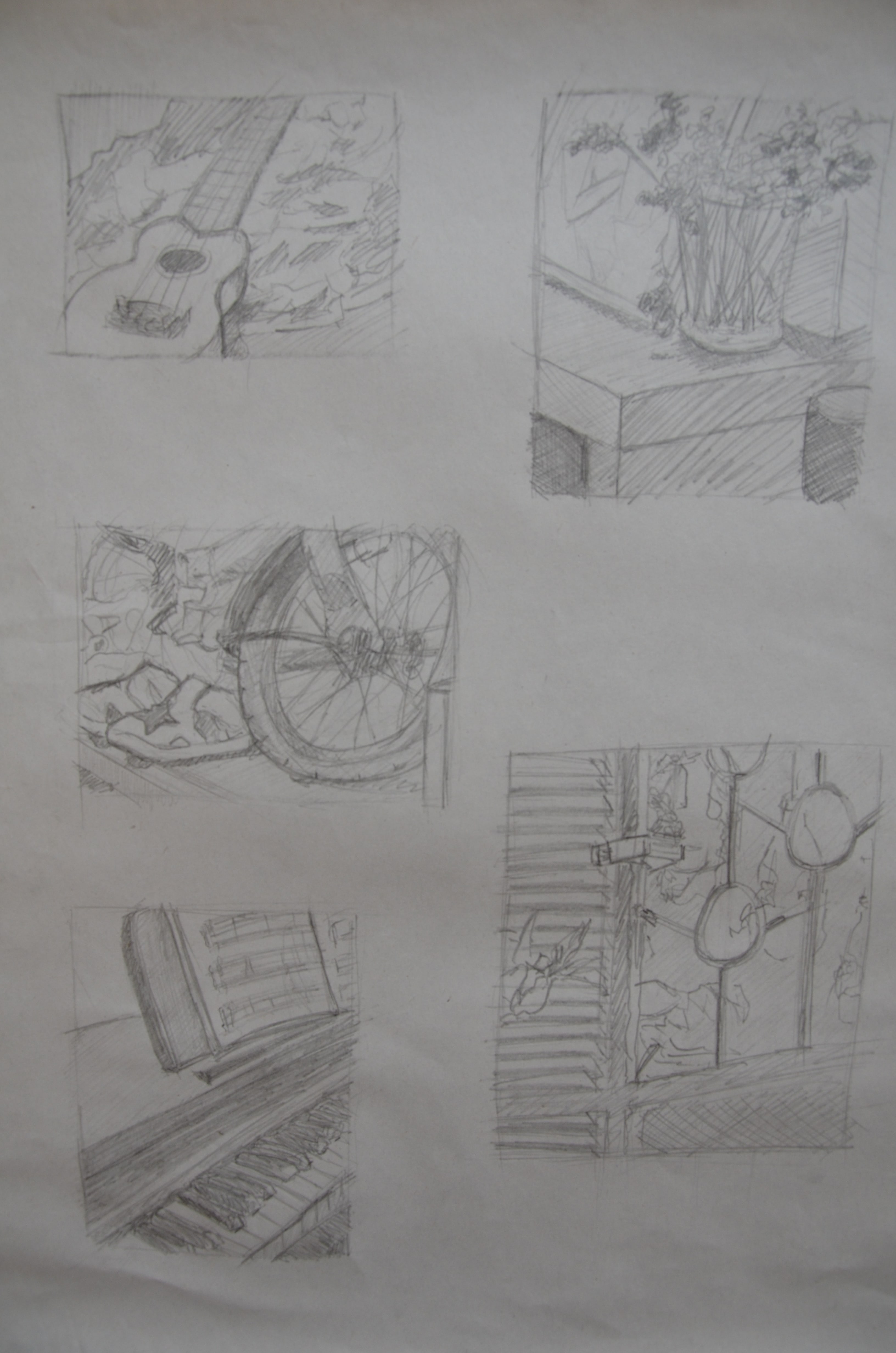
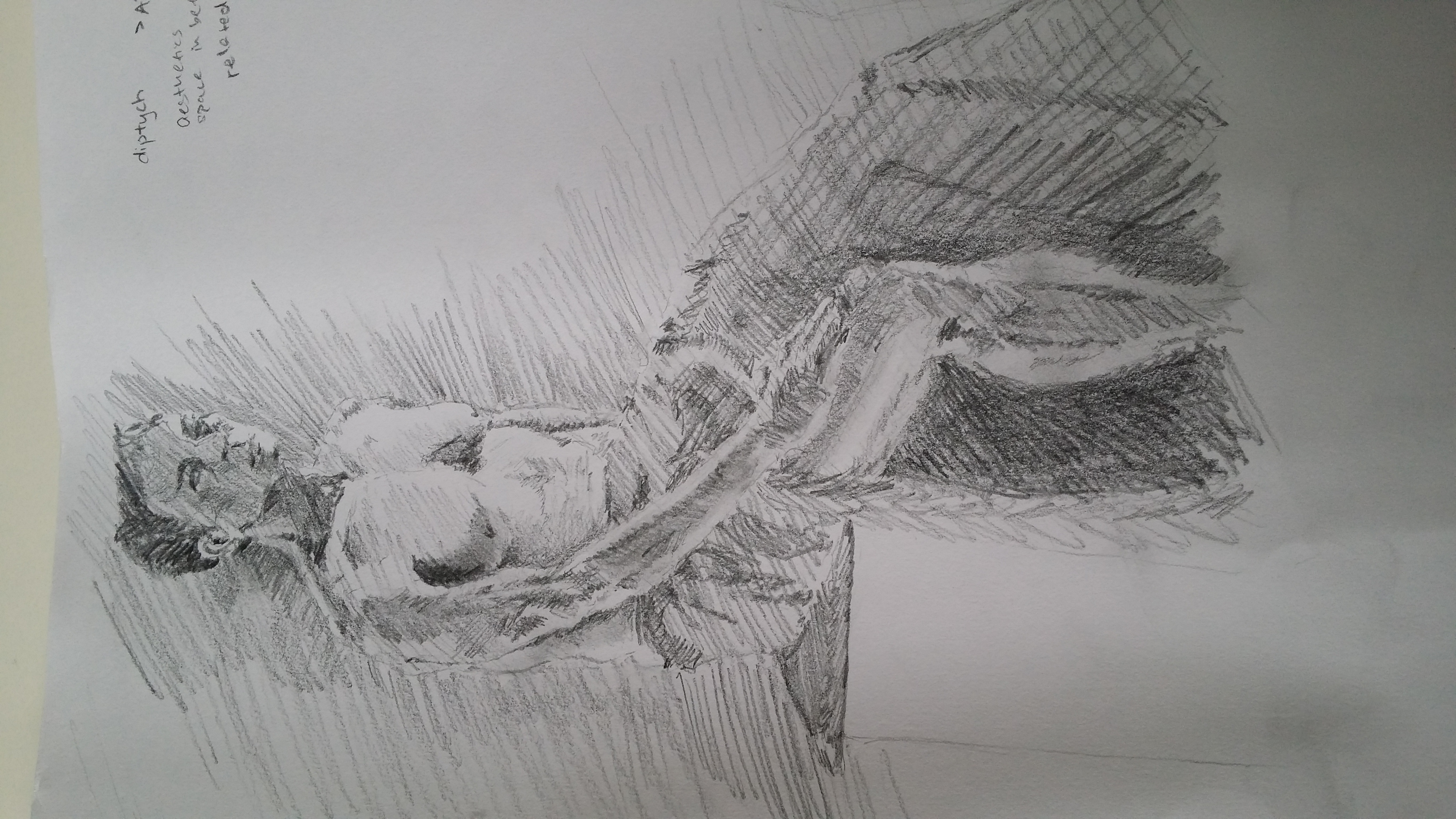
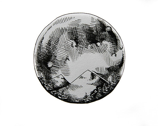
Collation of my decent works from drawing class! 😀
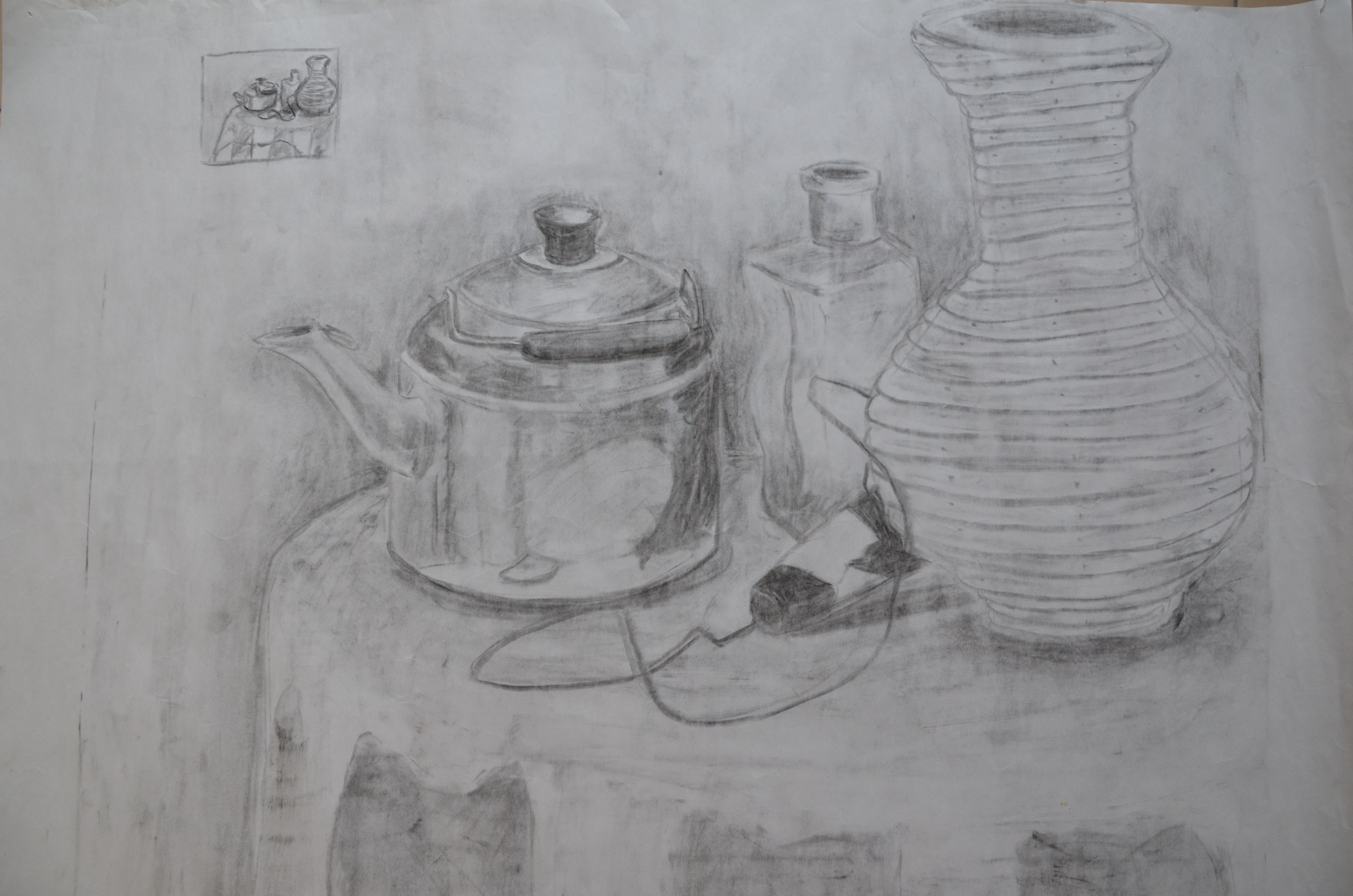
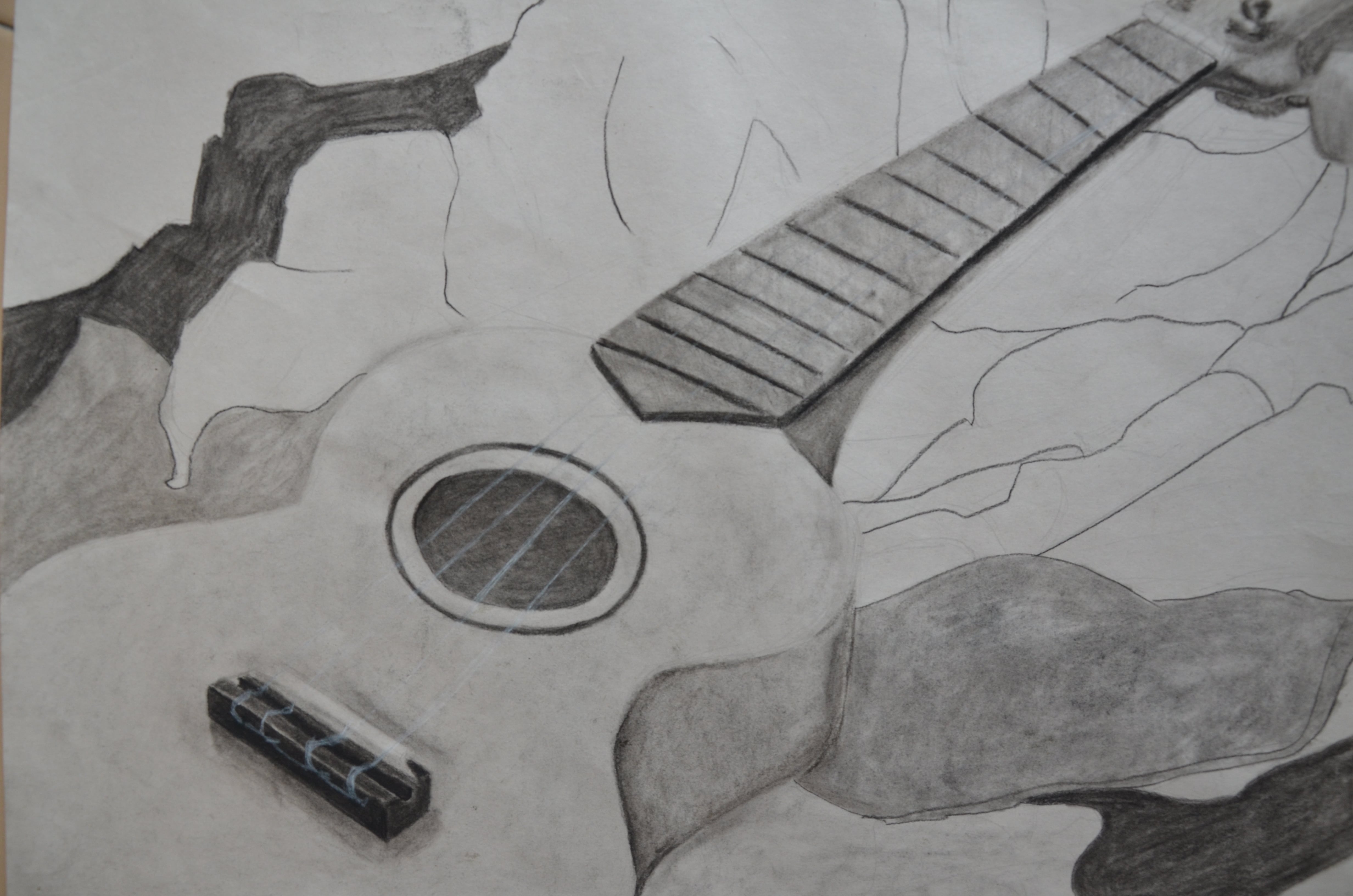


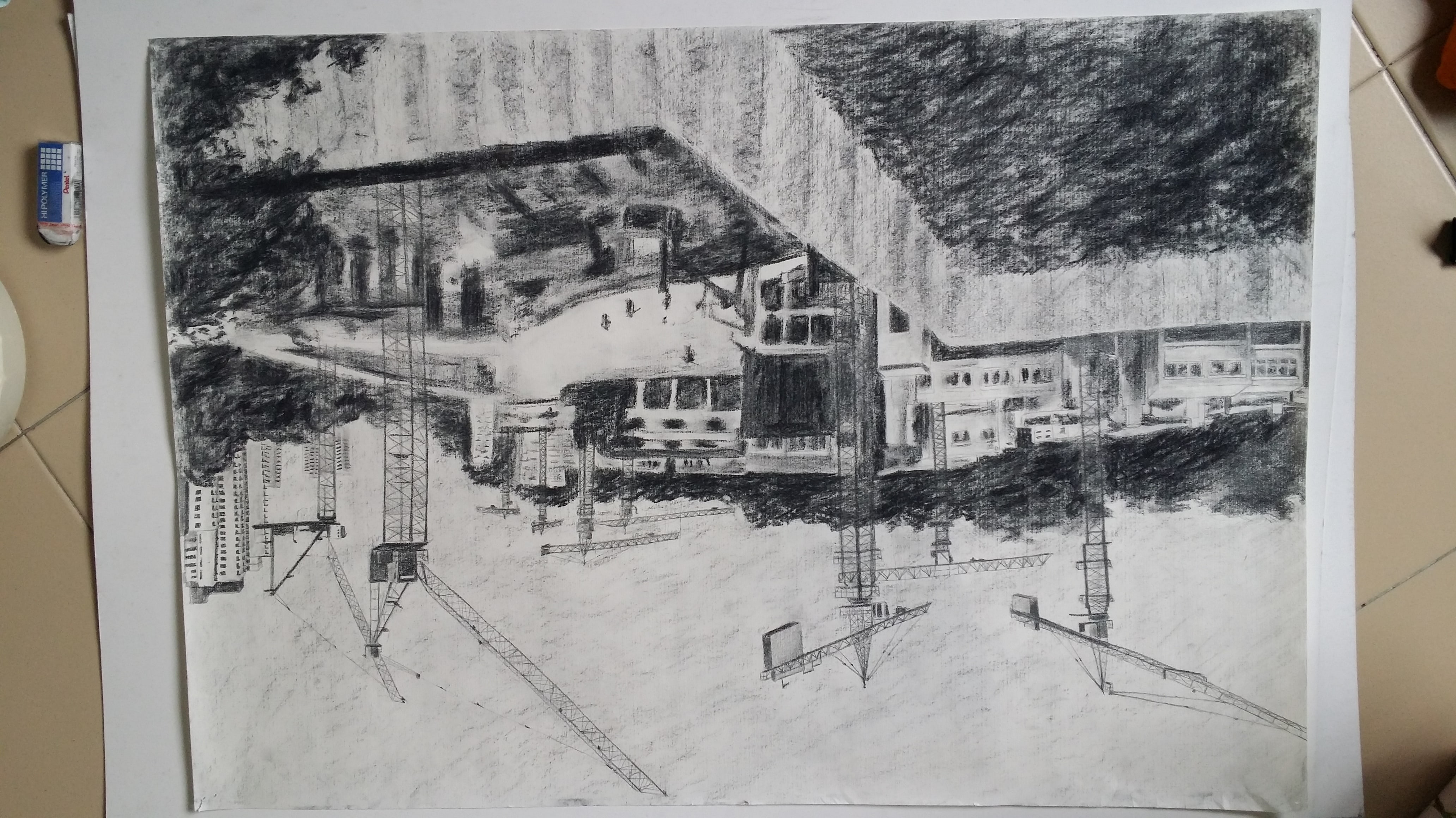
Tonal Study
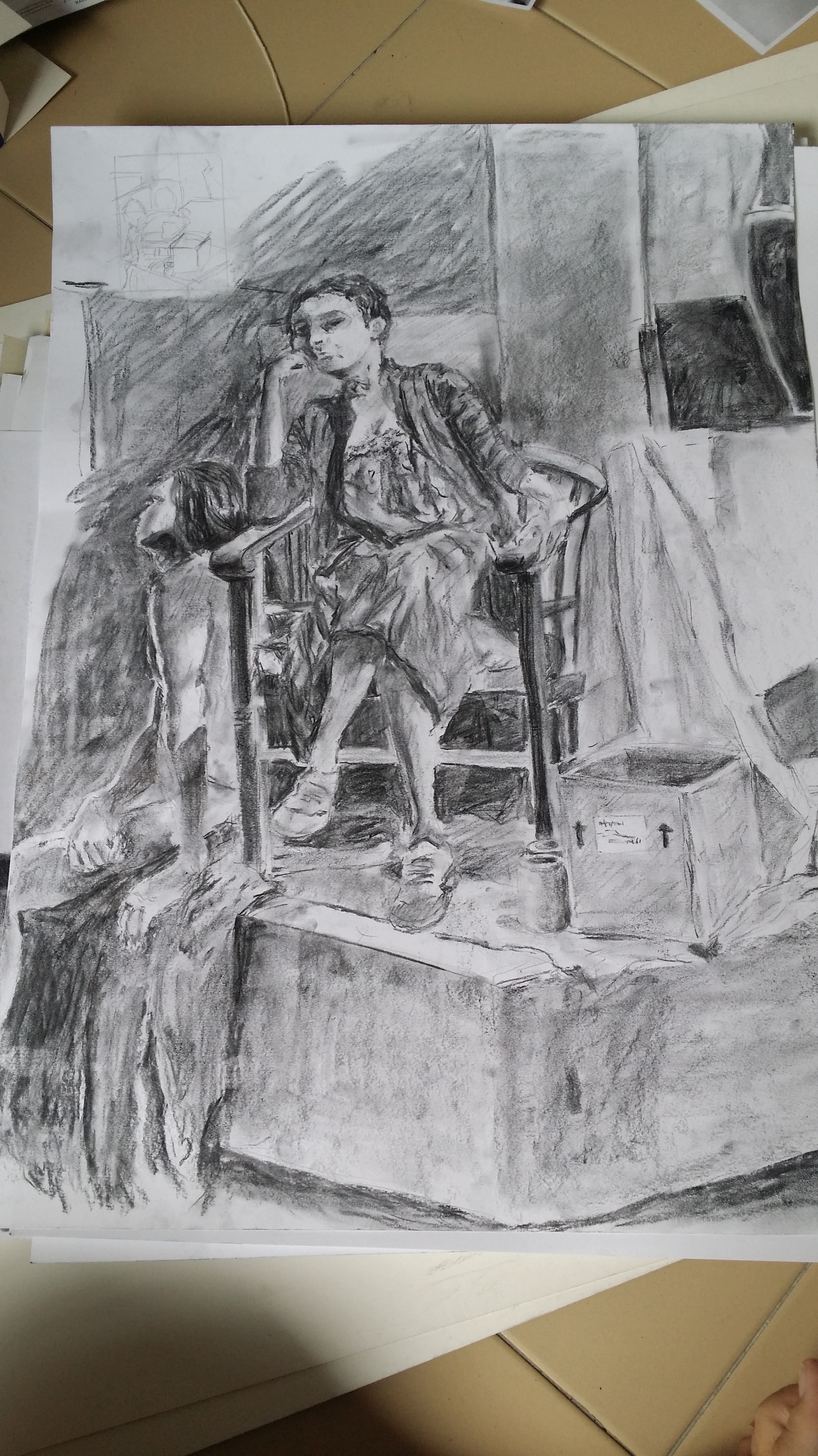

Collation of my decent works from drawing class! 😀
Shortly after making marks, I’m making prints!!
For Project 2: “Forrest Gump”, I have to pick movie quotes, translate them into abstract visual language like symbols, pictograms, dingbats, icons and engravings and apply techniques such as hyperbole, metaphor, caricature, parody, anthropomorphism etc. to express the narrative quality of the quote. I also have to make use of design principles from the various class presentations to create my final design. (dots, lines, shapes, planes, value, texture, balance, gradation, symmetry, repetition, pattern, rhythm, unity, harmony, size, proportion, dimension, contrast etc.)
Personally, I realise that I have not watched a lot of mainstream Hollywood movies, but my taste and preference for movies lies a lot more in Disney/Pixar animated films, as well as Japanese movies and animated films, which have pretty memorable and unique quotes as well.
Below are some of my favourite quotes that I have gathered:
| Movie | Quote |
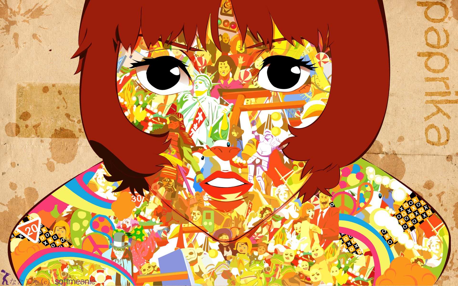
| *Paprika | “Don’t you think dreams and the Internet are similar? They are both areas where the repressed conscious mind vents. “ |
| Mulan | “The flower that blooms in adversity is the most rare and beautiful of all.” |
| Grave of the Fireflies | “Why do fireflies die so young?” |
| 1 Litre of Tears | “When I look up as I fall down, I see how limitless the azure sky above is as it smiles down upon me.” |
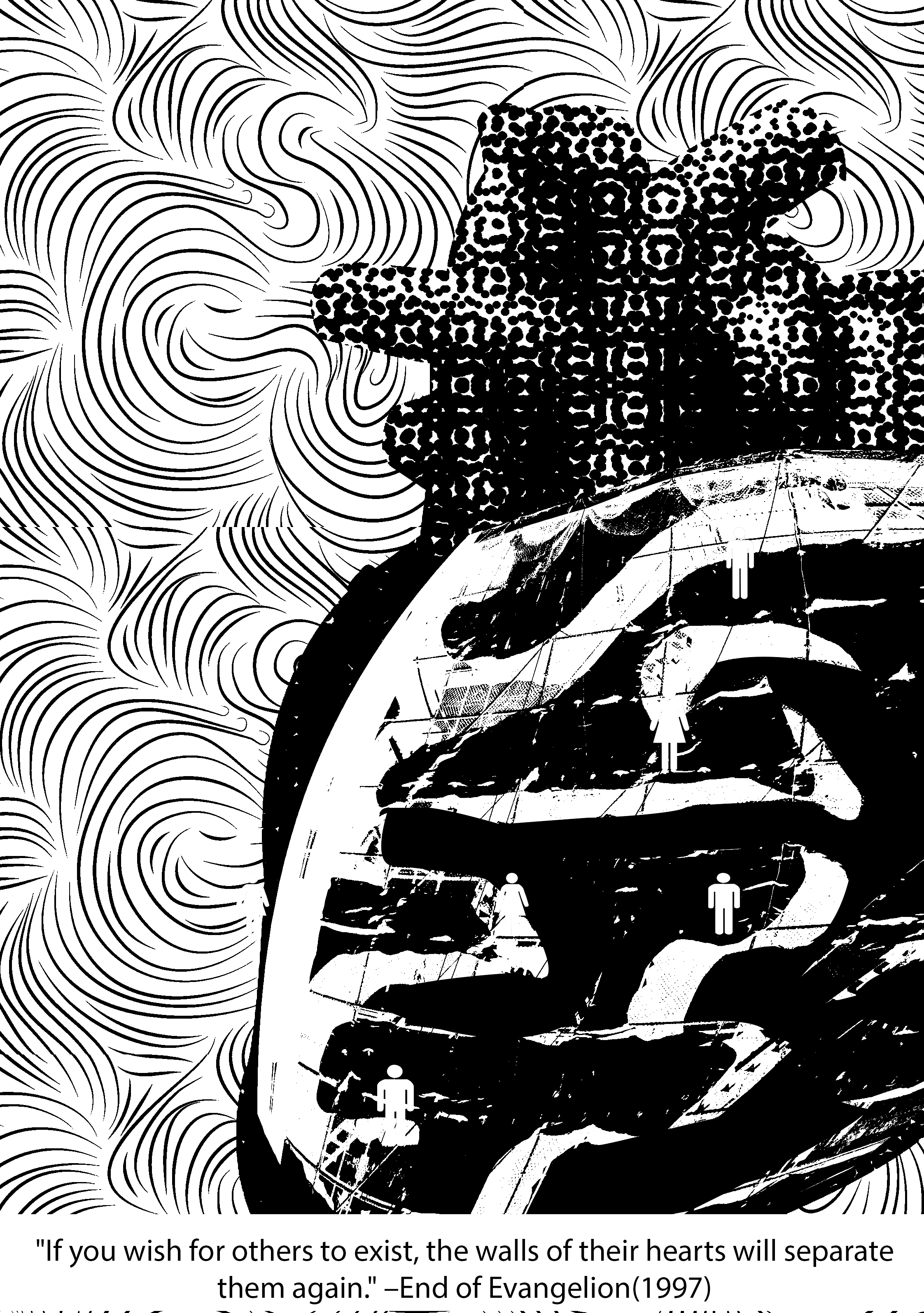
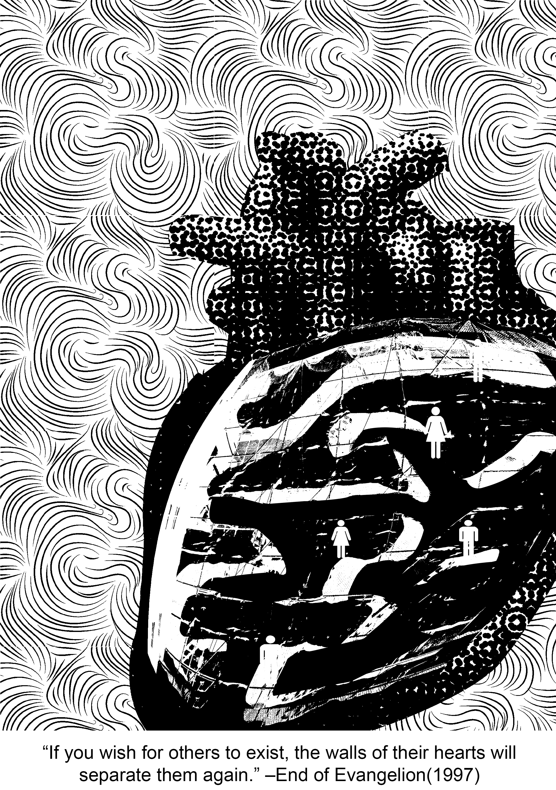
| * End of Evangelion | “If you wish for others to exist, the walls of their hearts will separate them again.” |
| *Sherlock (bam, the only mainstream series I watch) | “Anderson, don’t talk out loud. You lower the IQ of the whole street.” |
| *Peter Pan | “To live would be an awfully big adventure.” |
(* starred quotes are the four that I have chosen.)
Taking a pick out of this list was quite the feat, but I figured that was a wise decision not to pick quotes that were either too literal or too figurative because it leaves little room for imagination and abstraction.
Context in movie:
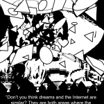
Paprika is a relatively contemporary, sci-fi Japanese animated movie that is in a futuristic, alternative universe and is about dreams and reality. To put it simply, an organisation creates a device that allows people to jump from reality into the dream world and that is used as a prototype for treatment at a hospital (later revealed to be malfunctional but I’m just going to stop here because this movie is a masterpiece and I don’t want to spoil it). Paprika is the name of the avatar of the main female protagonist. The quote is said by Paprika herself as she draws a comparison between the characteristics of dreams and the Internet.
Keywords: Dreams, Internet, similar, repressed conscious mind, vents
Imagery ideas:
-Surreal alternate space that we transiently experience when we sleep. Normally has a lot of crazy, bizarre things going on that will almost never happen in real life.
-Has a sense of lightness since we have a lot more freedom to imagine what we want to in our dreams.
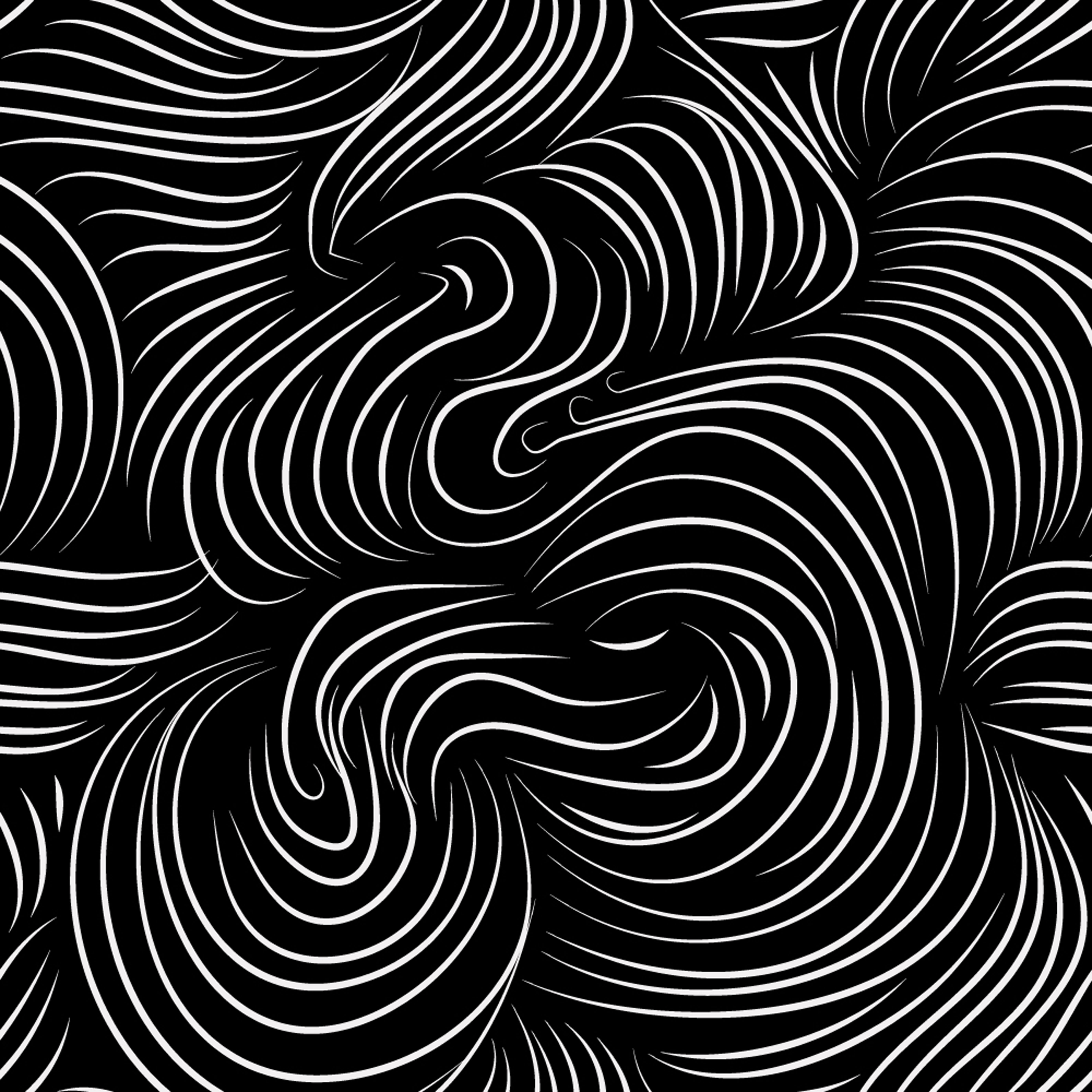
-A sense of movement can also be created as well since the scenes that we imagine are often overwhelming and hard to comprehend, leaving us in confusion (which, with reference to observations from the previous project, can be expressed with spirally lines radiating outwards)
Possible imagery: hot air balloon, water, anything to do with space or distorted reality
-a global computer network providing a variety of information and communication facilities, consisting of interconnected networks using standardized communication protocols.
– cloud, data, wifi signal, hotspot, can be sea as well
– show the contrast between dreams and the internet, yet feature the main similarity between them
– (form of restriction) treasure/Pandora’s box, lock, chain, handcuff, torn wing, cage
– burning flame, open eye (window to the soul)
– (outpour) waterfall, volcano, soil erosion, avalanche, tsunami, some sort of a crack and spill situation

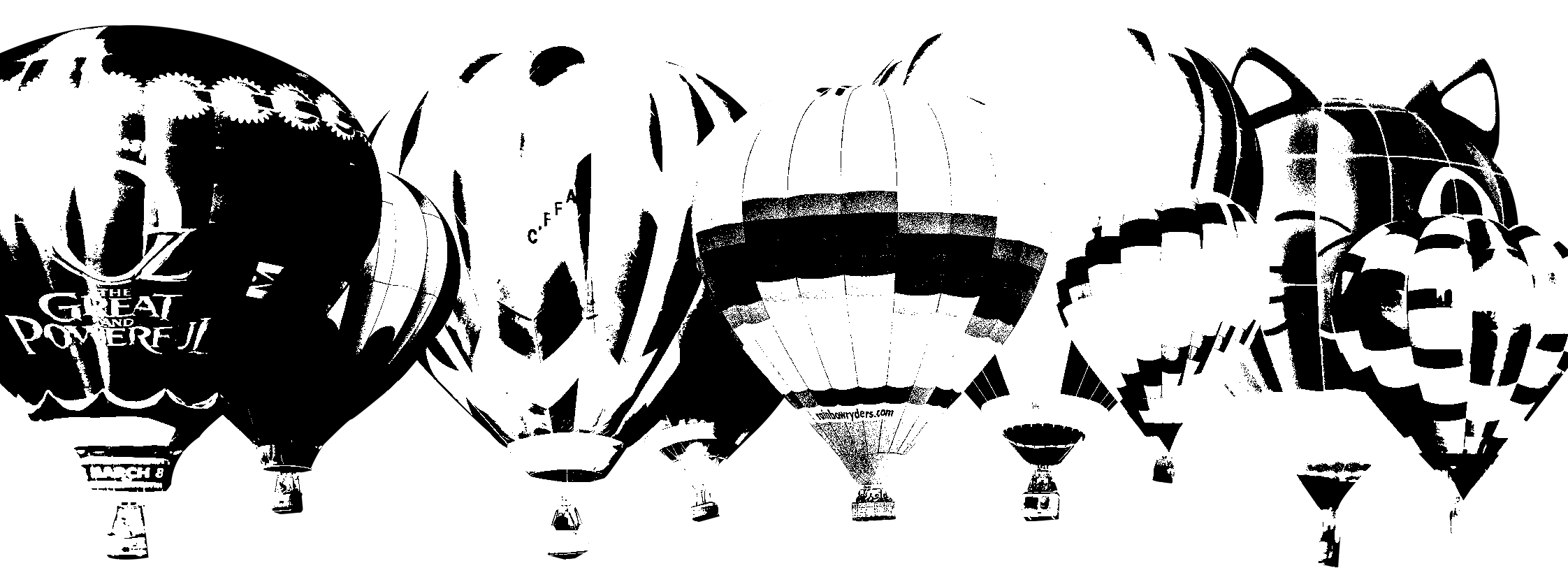
As for the ‘Internet’, I chose to use a relatively larger-scaled cloud icon. To me, the Internet is a vast space with many users, just like how the water droplets aggregate in the air to from one massive cloud.

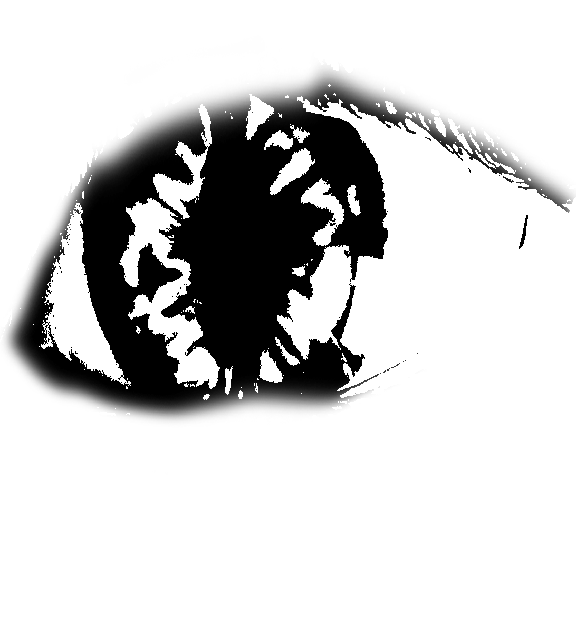
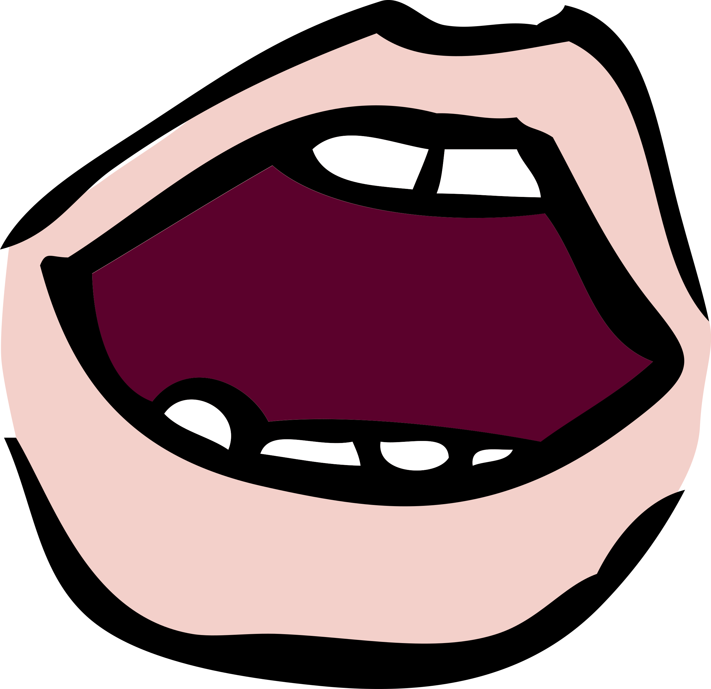
To represent the ‘conscious mind’, I’m using an open eye since it implies being awake and aware of your surroundings. After looking through icons and symbols, I decided that using a more realistic-looking eye was better since it gives a stronger sense of consciousness (“the eyes are the windows to your soul”). Using simple icons felt very dead.
1st Draft:

I separated the singular massive cloud and the layer of hot air balloons into distinctive layers. I wanted to place eyeballs on all of the hot air balloons and the cloud, then have something come out of them (expressing ‘vent’) but I felt like it did not do a good job of conveying the quote since it did not make much sense for dreams and the Internet to have conscious minds of their own. Plus, I was also intending to put a broken chain on the eyes to represent ‘repressed’ (but no longer). However, after attempting to put chains on each of the eyeballs on the hot air balloons, it proved to be an editing disaster.
2nd Draft:
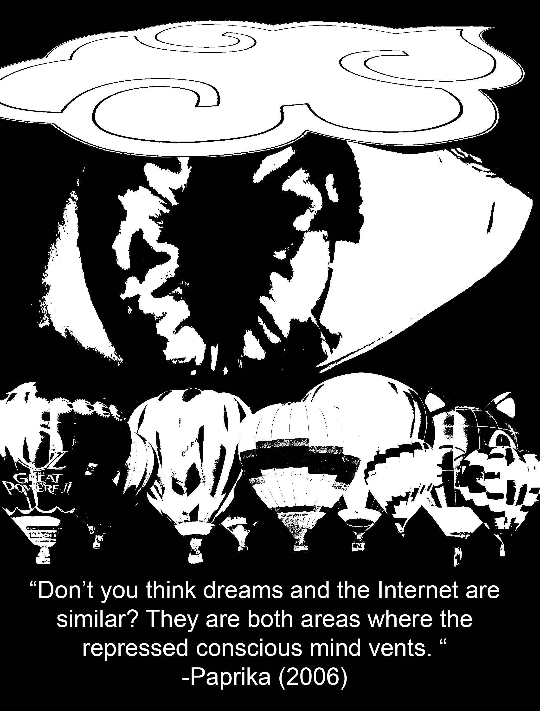
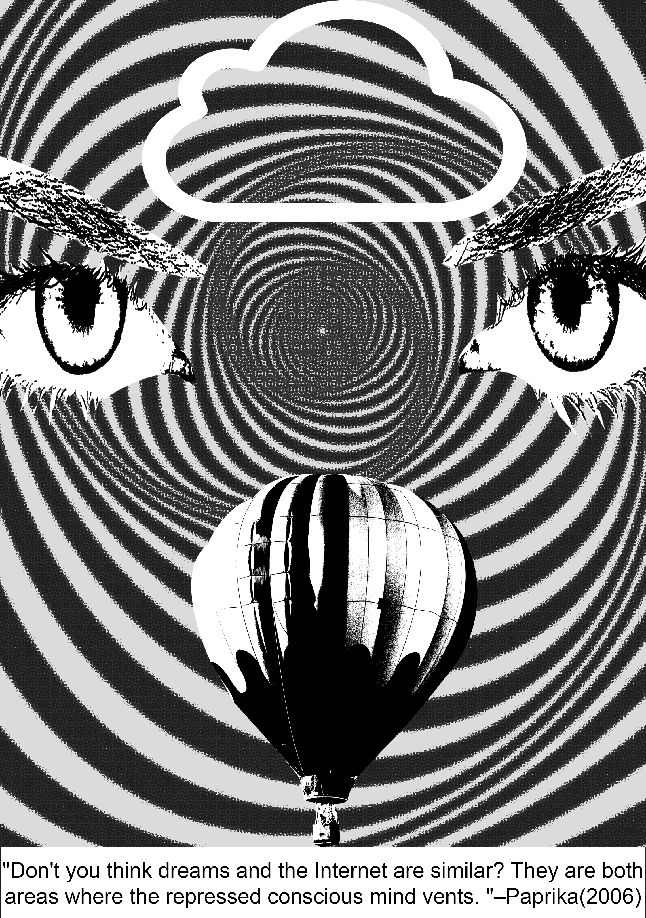
Now, instead of slapping eyeballs everywhere, I decided to put a picture of an eyeball that was relatively larger than the other elements to show that it was the dominant subject of the piece. However, it is still concealed behind the cloud to create a sense of depth (hiding behind the clouds, more subtle way of representing ‘repressed’), and the black background also enhances the feeling of a void which reminds me of the dark we see when sleeping; it is a strong contrast with the white parts of the eyeball which is supposed to symbolise consciousness and being awake.
To express the element of ‘venting’, I wanted to use rhythm to show an erupting action, sort of like lava from a volcano, or bubbles coming out from a underwater vent. The use of a variety of shapes was abstract enough to show the idea of “anything”, parallel to how we like to post anything on the Internet, and how we can literally dream up anything when we are asleep. Initially, I used a regular rhythm of shapes everywhere but it proved to be much too rigid. After some tweaking, I managed to come up with the design below:
In this version, I used progressive rhythm, where the shapes got bigger from the eyeball to the cloud and hot air balloons. The warp effect that I added also enhances the illusion of depth as we can sense that these shapes are in motion and travelling a distance from the eye to the cloud and hot air balloons. This is paralleled with how our thoughts are transferred from our minds to the Internet and our dreams.
3rd Draft:
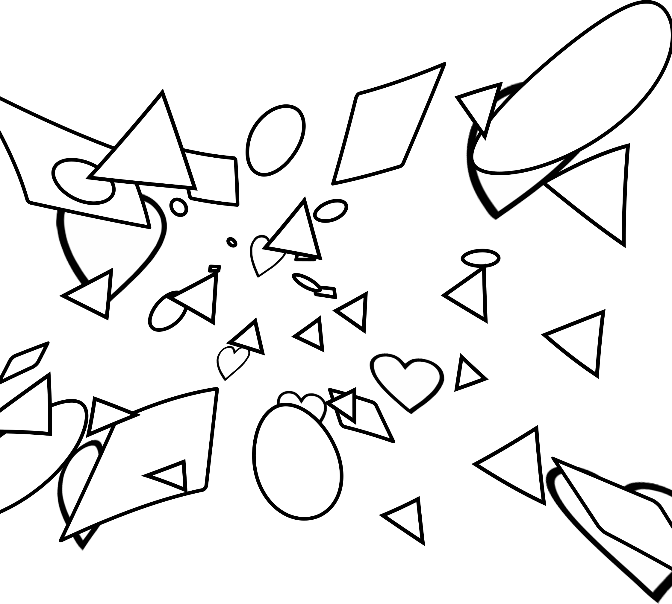
 For my final-ish concept, I further enlarged the scale of the eyeball so that it was hidden under both the hot air balloons and the cloud to express how the conscious mind is being repressed. I added more shapes near the centre of the iris as well to show that the shapes are originating from the eyeball and moving outwards and as a result, their distribution becomes more sparse as they go outwards towards the clouds and the hot air balloons.
4th Draft:
-With the cleaning up of my design, I realized that had unintentionally created some sort of a symmetry which was really effective since symmetry grabs people’s attention by instinct. It also makes my entire composition look like a face. (TvT)
This accompanied with the meaning of eyes as ‘windows to a soul’, plus the op-art background, this projects a hallucinatory effect on the viewer’s mind, which is a literal invasion of the consciousness, or inside of the mind, as I have interpreted for this quote.
Final Draft:

Context in movie:
Evangelion is one of the most well-known and oldest Japanese animated films that is ever so enigmatic and philosophical. There is so much hidden symbolism in this movie that might just reveal themselves to you… if you rewatch the movie like 1093420384032 times and consciously try to catch them. At first, the Evangelion series just seems to be a normal Gundam (they call them Evas) action show, but it gets so exponentially complex towards the end that it is almost impossible to fully comprehend what is going on. The main philosophy that the End of Evangelion is trying to express is that humanity essentially belongs to a common pool of ‘primordial soup’ where all our souls linger even after death. There, we can be reborn again, but when we turn back into human form, there will undoubtedly be conflict and unhappiness, as compared to staying in primordial form where everyone lives in unity and there will be guaranteed peace (it’s almost like the philosophy for Buddhism). The main protagonist, Shinji has to make a choice between this two options, and this quote comes from Rei (another Eva pilot), who instigates Shinji to make a choice at the end of the movie. (One of my absolute favourite series ever)
Keywords: Others, exist, walls of their hearts, separate
Imagery ideas:
Others– masses of people, masses of monsters/aliens, simple dots, faces (kaleidoscope effect)
(kaleidoscope tutorial – http://www.creativebloq.com/photoshop/kaleidoscopic-collage-effect-5132671/2)
walls – barricade, fence, brick wall, thorny bramble bush (inspired by Sleeping Beauty), clam shut tight
hearts– heart, differences (different colour), life, tree


1st draft:
Final Draft:
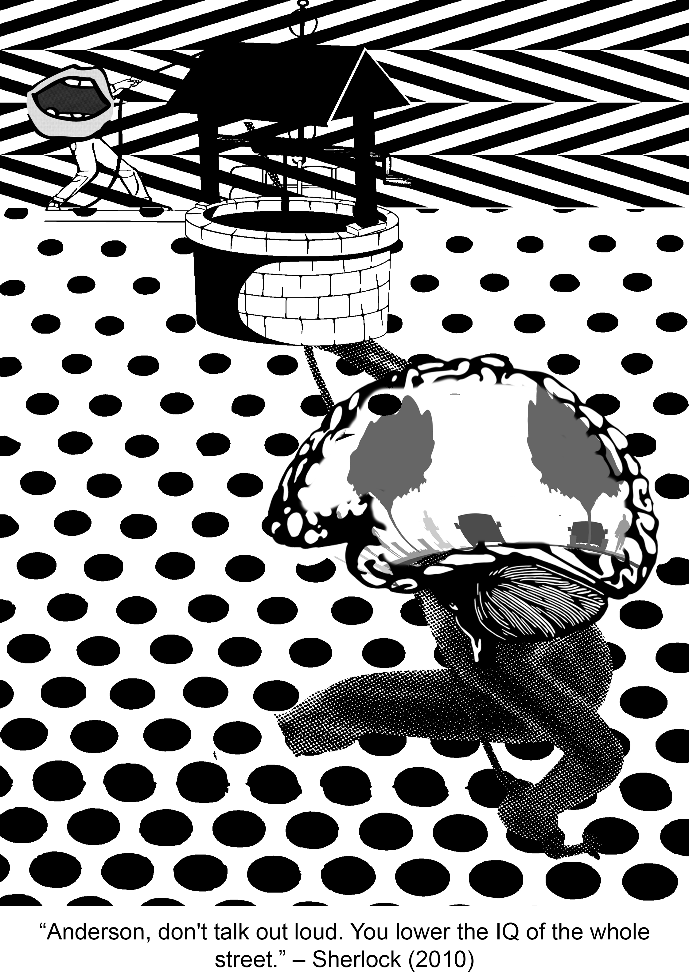
Context in movie:
I barely watch any mainstream film series but my friend insisted that I watched Sherlock and boyyy did I marathon this ENTIRE series (with no regrets). Sherlock is “not a psychopath, but a high-functioning sociopath” as he always reminds everyone and extremely intelligent. While on a case, Sherlock shows obvious disdain for the lowly intellectual likes of Inspector Lestrade who works for the official police team when he keeps trying to interrupt Sherlock’s inspection of the crime scene. Having the sharp tongue he does, Sherlock subtlely throws this insult (the quote) at Lestrade, essentially telling him to shut the hell up.
Keywords: don’t talk, loud, lower the IQ, whole street
Imagery ideas:
don’t talk – silence sign, mask covering up mouth, tape at mouth, zip at mouth
loud – megaphone, forte symbol
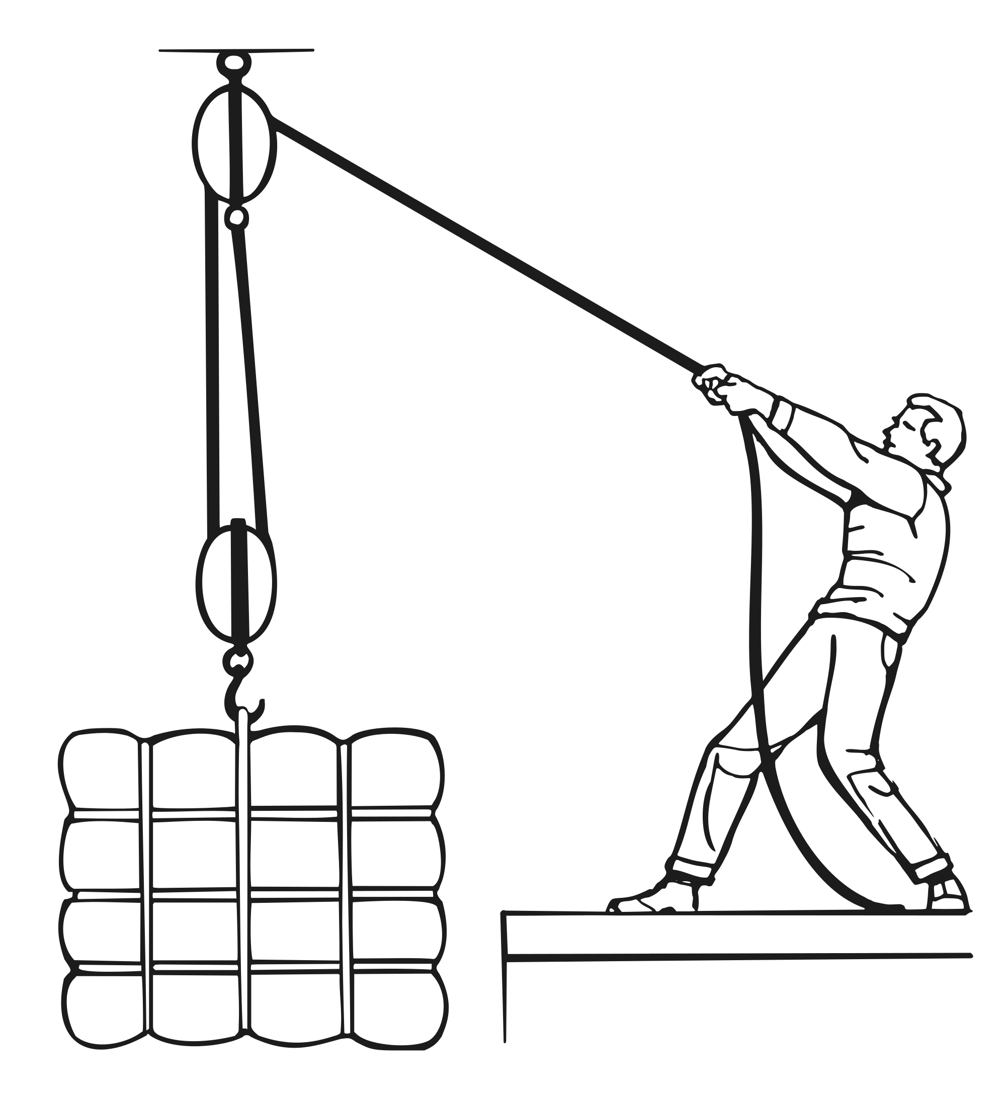
lower the IQ (kind of literal version) – lowering bucket into a well, pulley system (can use principles of design to express downward motion)
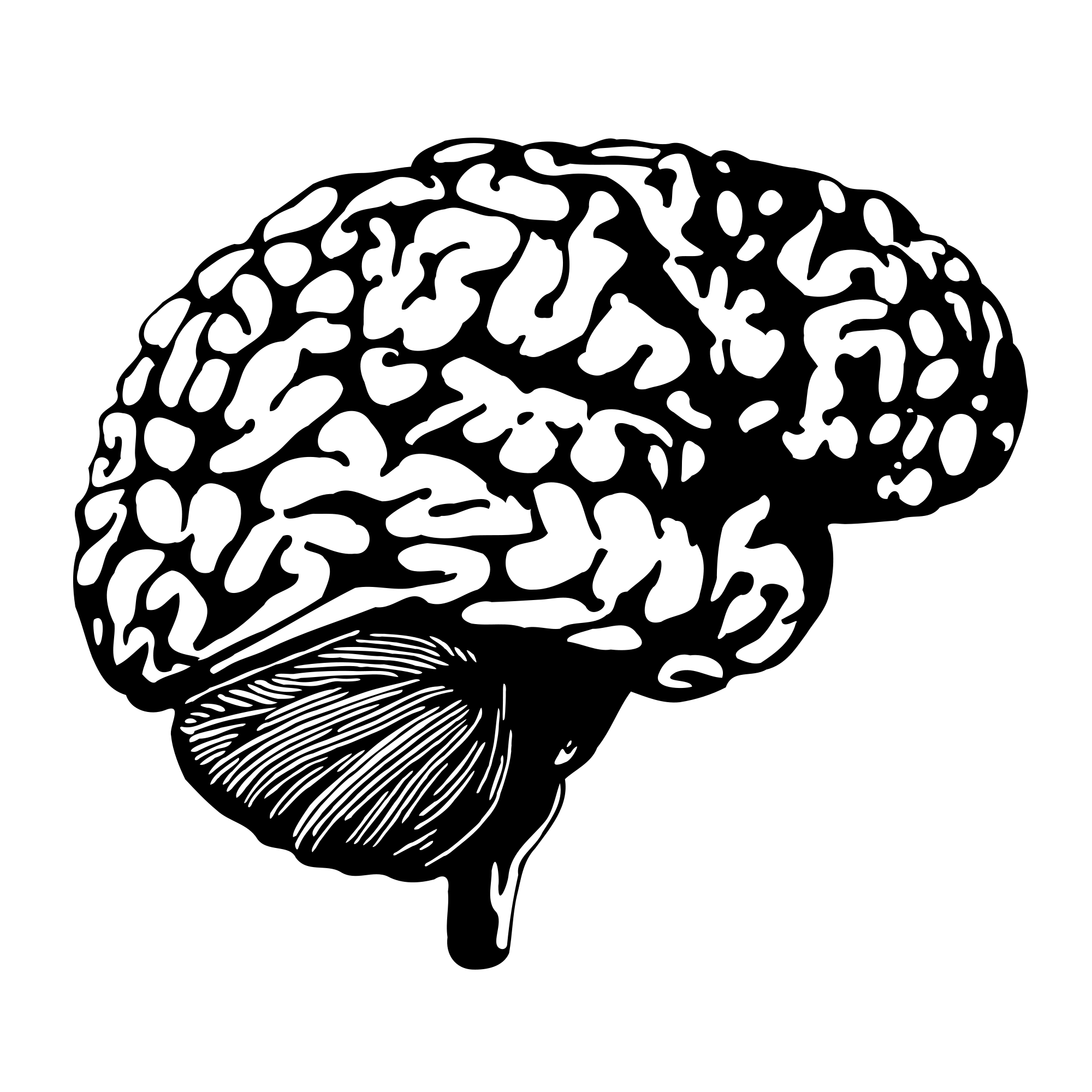
lower the IQ (essentially stupidity) – broken glasses, scarlet geranium, bag over head, skull (empty head)
whole street – streetlights, zebra crossing, junctions, crossroads, traffic lights, electricity poles, directions


1st Draft:

Final Draft:
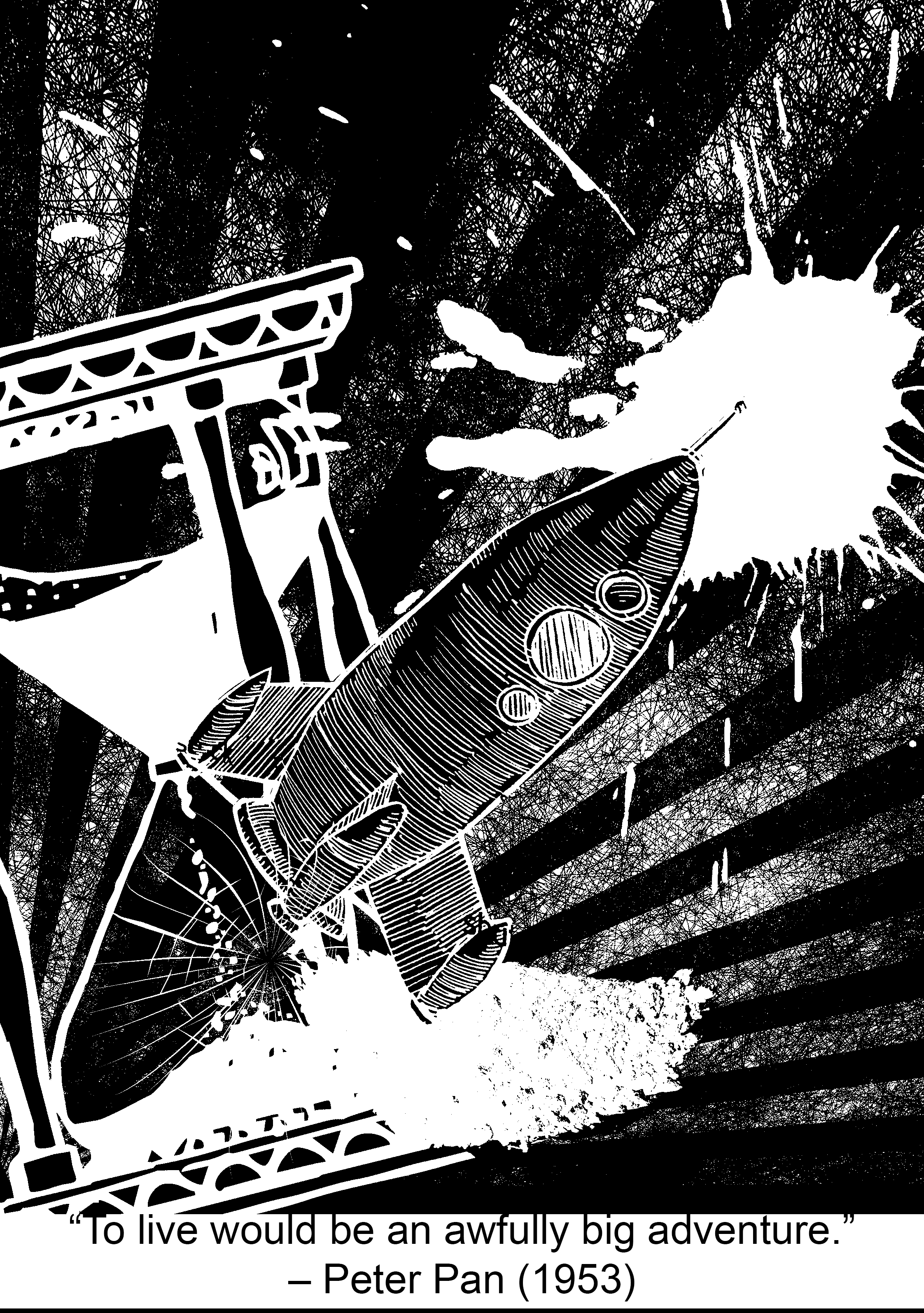
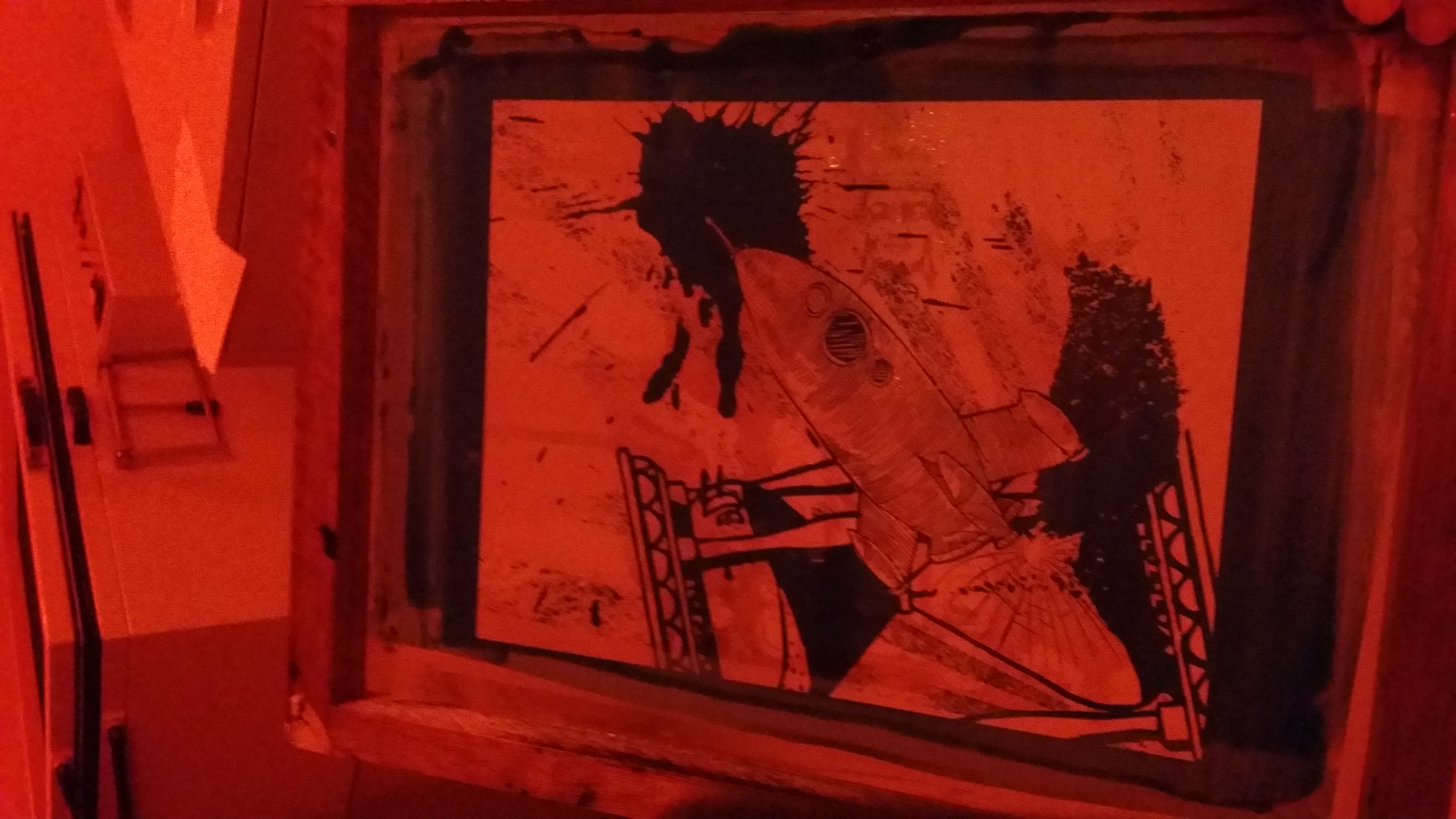
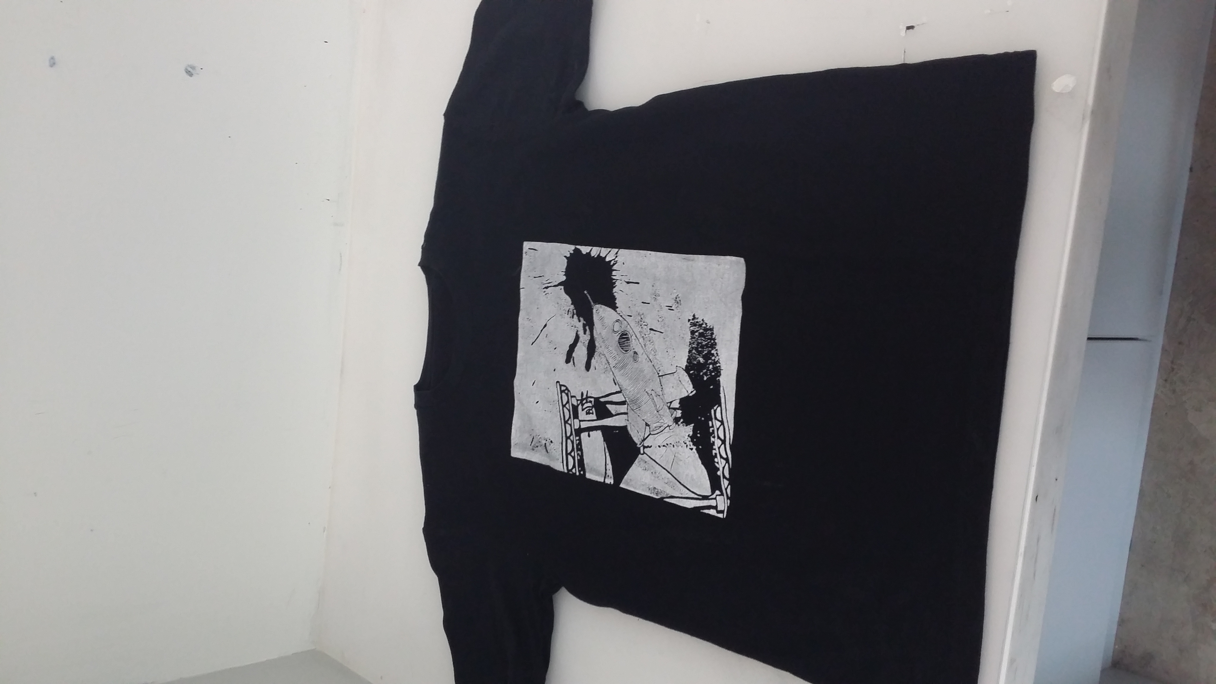
Context from movie:
Peter Pan has to be my favourite Disney movie (totally not because I was obsessed with Huggy Pan for a while (Billy Murray playing Peter Pan in Disneyland) (yes I will link you to a video because his sass needs to be shared). I love Peter Pan because of how relatable it is, with me being a teenager (YES I’M STILL 19) and the whole never-wanting-to-grow-up theme. This quote basically resounds this theme, with ‘to live’ being a metaphor for growing and maturing (in contrast to staying a child in Neverland), and ‘an awfully big adventure’ implying that growing up will be both a very foreign experience and a daunting feat for Peter Pan. (and you are RIGHT, Peter! Please take me to Neverland.)
Watch this from 0:21 8’DDD
P.S.: I <3 HUGGY PAN (he’s not working as Peter Pan anymore ;v;)
Keywords: Live, awfully big, adventure
Imagery ideas:
live (essentially growing up and maturing, not stuck in time) – clock, watch, hourglass
awfully big – blue whale, elephant, cosmos, magnifying lens (zoom in), infinite
adventure – (travel) bag pack, ship, aeroplane, map, mountain, compass, parachuting, biking, car
The fun part: SILK-SCREEN PRINTING
(didn’t document the printing part because I was busy working like a factory. Yes I sold shirts to my friends so I had to handprint around 10. If you want profits, think again! 8’D)
Reflections:
One difficulty that I faced with this project was when I was trying to edit the pictures (more on the technical side). When I added a colour invert filter to a layer, the ENTIRE composition inverted itself, and it was SUPERRR frustrating to work with, BUT!! I found out I could isolate the layer so that the filter only affects one layer :DDDD PS still does some wonky stuff once in a while but I have it under control now ;D
I think I’ve fulfilled the objectives of this project, which is to use symbolic images/subject matter to express a concept. I’ve learned how to expand my visual vocabulary; for example using hot-air balloon to represent dreams in my Paprika quote design.
The way the representative subject matter is orientated in relation to the other subject matter should also be carefully considered! Their relationship is very important in conveying certain ideas that cannot just be condensed into one object itself, especially for movement; for example having the rocket oriented diagonally away from the hourglass and the radiating lines really helped to give a sense of movement in my Peter Pan design!
AND I really enjoyed doing this project because
–Project 3 post incominggg den den dennnnn—
Composition techniques:
My attempt for class activity:

|| Strong diagonals, active space ||
If I suddenly disappeared while doing my everyday chores, what would the world look like without me in that instant?
What a peculiar (and slightly depressing) question to ponder about.
In this project, there were two main things to be taken care of:
I decided that it was a wiser choice to start thinking about content first.
Recalling what we learned about semiotics in the first lesson, I decided to first scope some life themes and then do some research on symbolism and allegory for them.
The life themes that I found included:
–Family, friends, community, knowledge, nature, growth, time. solitude, and recreation.
Below are some symbolism/allegories that I have found for these themes:
Family- Tree (life, origin, family, nature)
Workload, responsibilities- bag pack
Knowledge – books, glasses
Time – clock, calendar, road (passage of time)
Growth/Youth- Tree, playground
I decided to mix these symbolic subjects up with subject matter that was both important and personal to me and below is the list of ideas that I came up with:
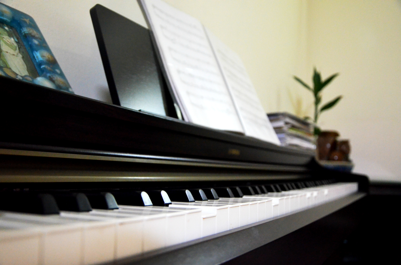
Music – piano, earpieces
My past (specifically band)
Every day things – lrt gantry
Knowledge – book at lib/ glasses
Love for nature – botanical gardens, community garden
Time – clock/calendar/road
My love for solitude/privacy/self-reflection – diary, room (yes, with the cluttered floor and everything), mirror
Creation – my 3D hw/tablet/sketchbook/bunch of drawings/art tools
Growth – Tree (family, origins),
Community, youth – playground
Losing my identity as I go through life (WTF SO DEEP b0SS)
No longer there physically
Clouds – transience
https://en.wikipedia.org/wiki/Allegory
http://examples.yourdictionary.com/allegory-examples.html
http://www.learnstrong.co/uploads/5/3/9/2/53925379/symbols.pdf
http://www.tarotteachings.com/symbol-meanings-of-tarot-s-z.html


Those were cool and all, but they didn’t tell a story.
Why my pictures didn’t make the cut:
It wasn’t until I consulted XM for help and after receiving my 2D Project 2 that I had an epiphany of what I could add into my photograph.
The advice I received about telling a story and juxtaposition. Focusing on the photo of me disappearing while making a cover, I could tell a more elaborate narrative about myself.
New narrative (this is really personal??):
(has to link back to the whole disappearing thing and what I left behind)
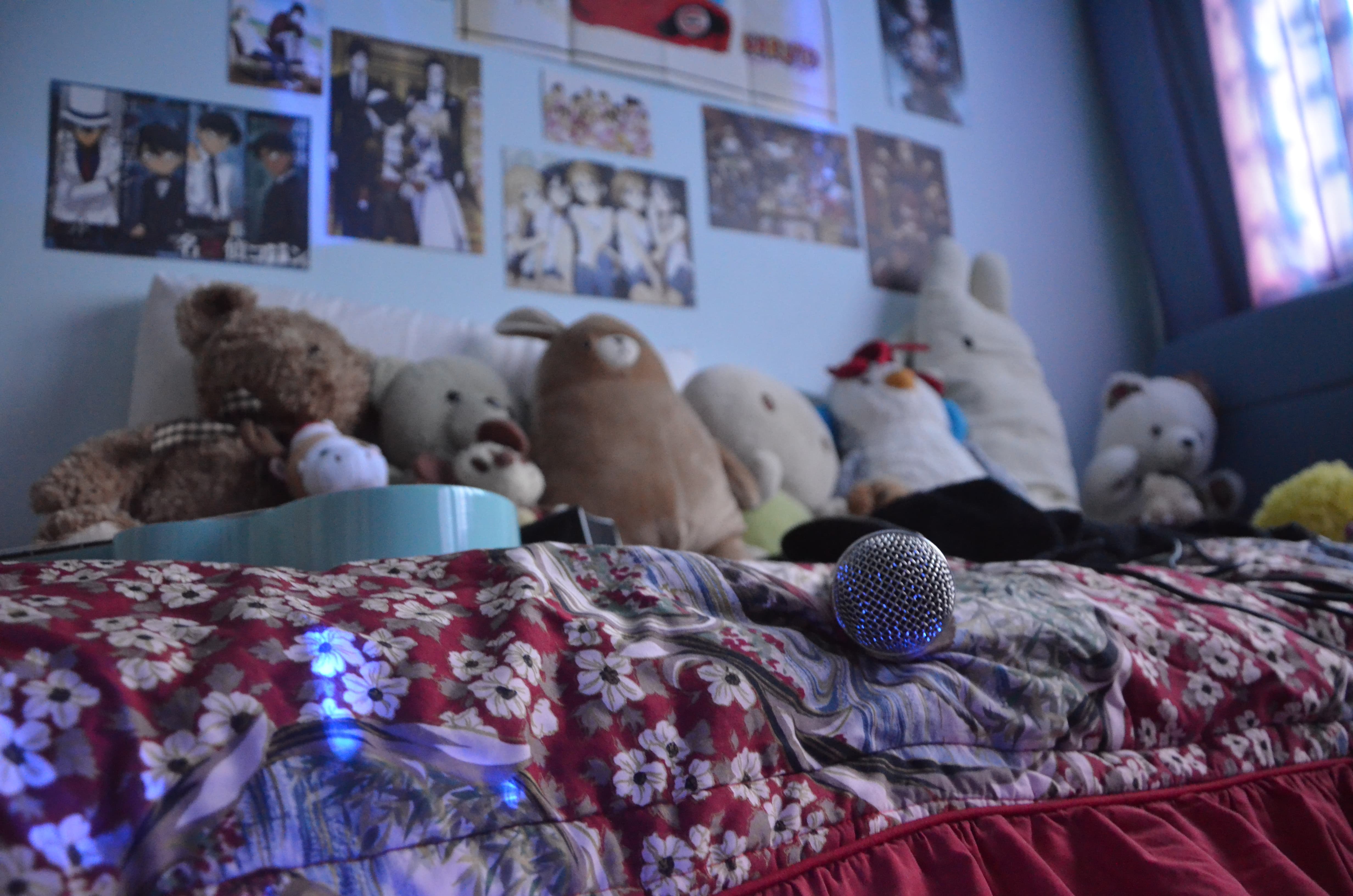
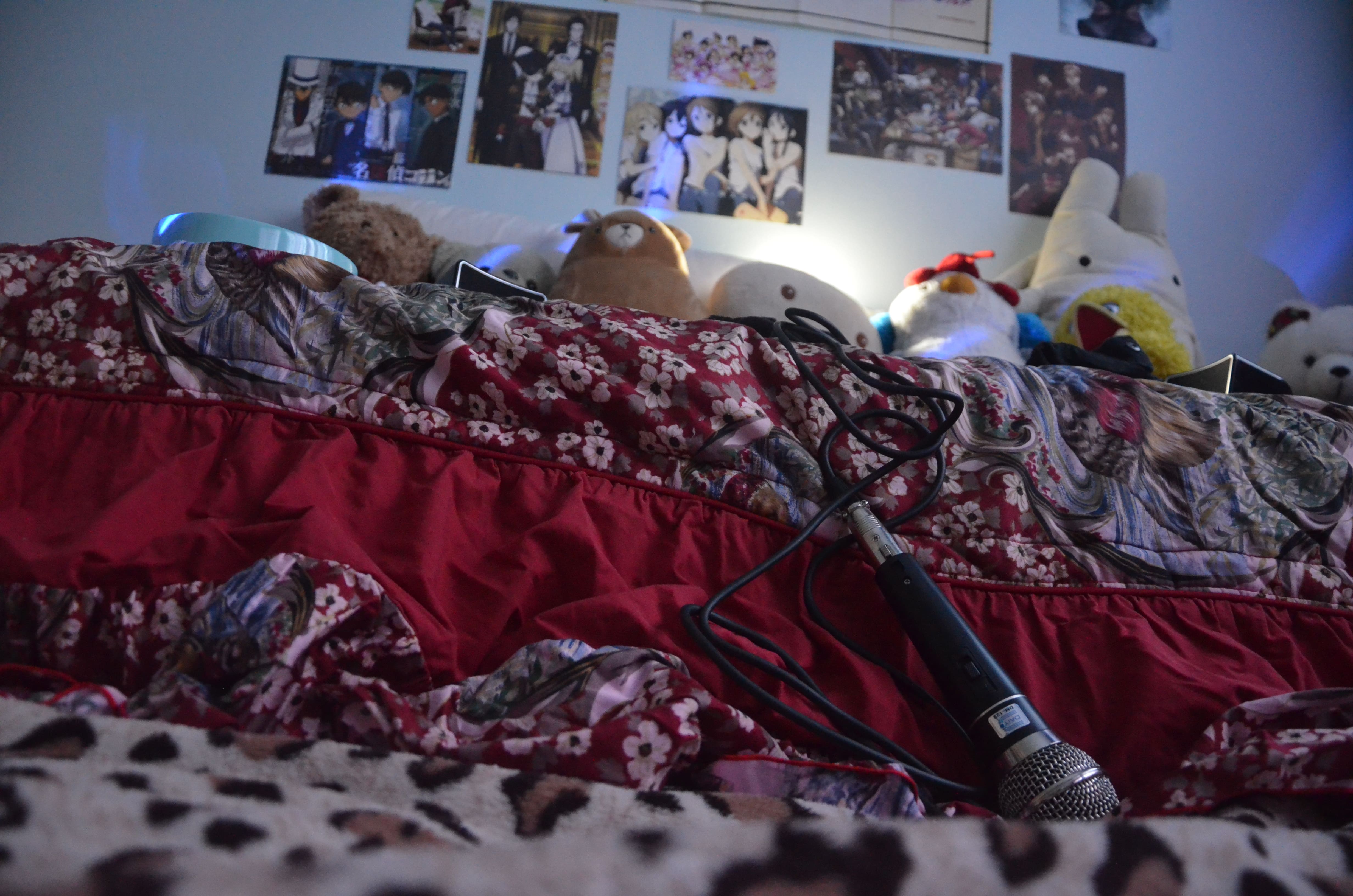
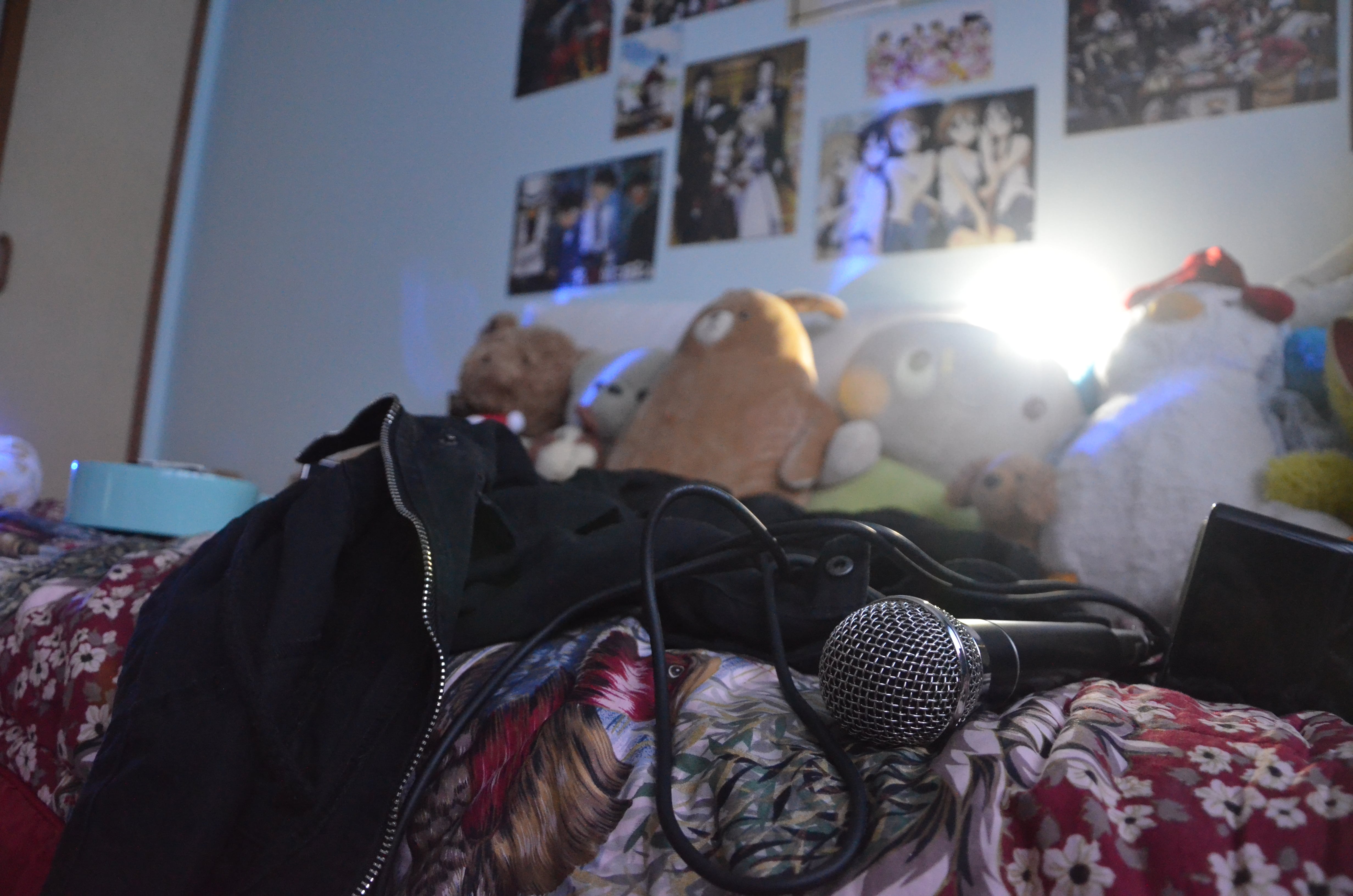
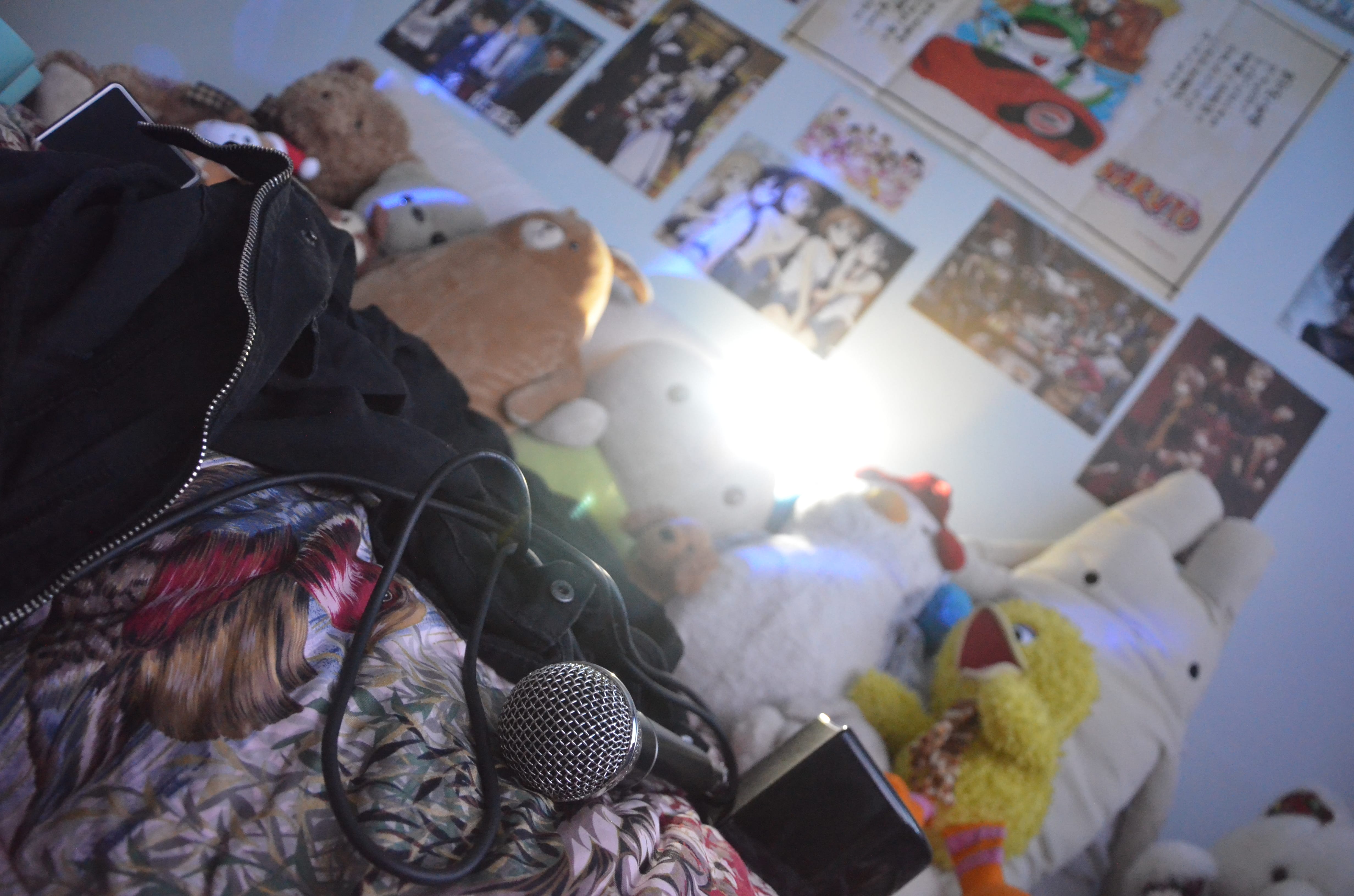
Ever since I was in primary school, I discovered anime (Japanese animated series) which really helped me to tide over a difficult period in my life (and has largely guided me on the path that I am on today). With each new series I watched, I enjoyed printing out the lyrics of the openings and endings of the new series and singing along to them. This hobby of mine developed even further when I discovered the vocaloid subculture in secondary school (yes, it’s all pretty complicated) whereby tons of creators from all around the globe could use these voice programmes to make their own songs, so you could imagine how massively huge my song collection got. I had begun learning how to make covers on my own of these songs using SUPER basic software and hardware such as Audacity and a simple Logitech microphone. I really enjoyed this hobby of mine but I never really had the audacity (oh no, unintended pun) to step out of my comfort zone and actually do singing (although I had band background). I’d watch my classmates go on school talent competitions in awe and admiration (even now).
SoOOOoO that was a pretty long but very personal story for me (even my parents don’t know 8’D). So I wanted to take a photo which conveyed a scene of me silently wanting to pursue this hobby further but always simply continuing to karaoke to myself, with myself in my bedroom, and never stepping outside of my comfort zone. When I disappear in the middle of my (almost daily) karaoke sessions, I leave behind all of these emotions behind as well.
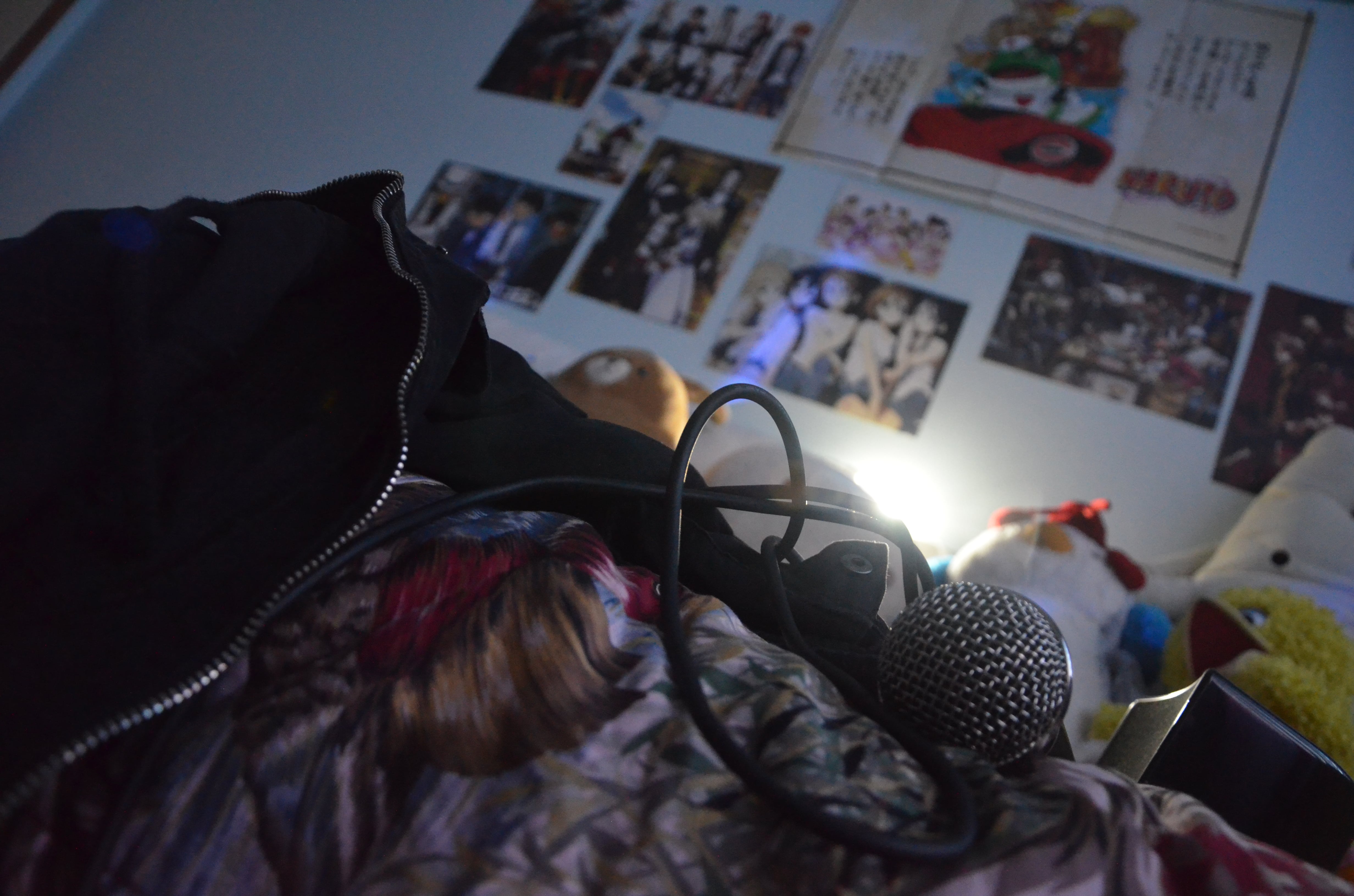
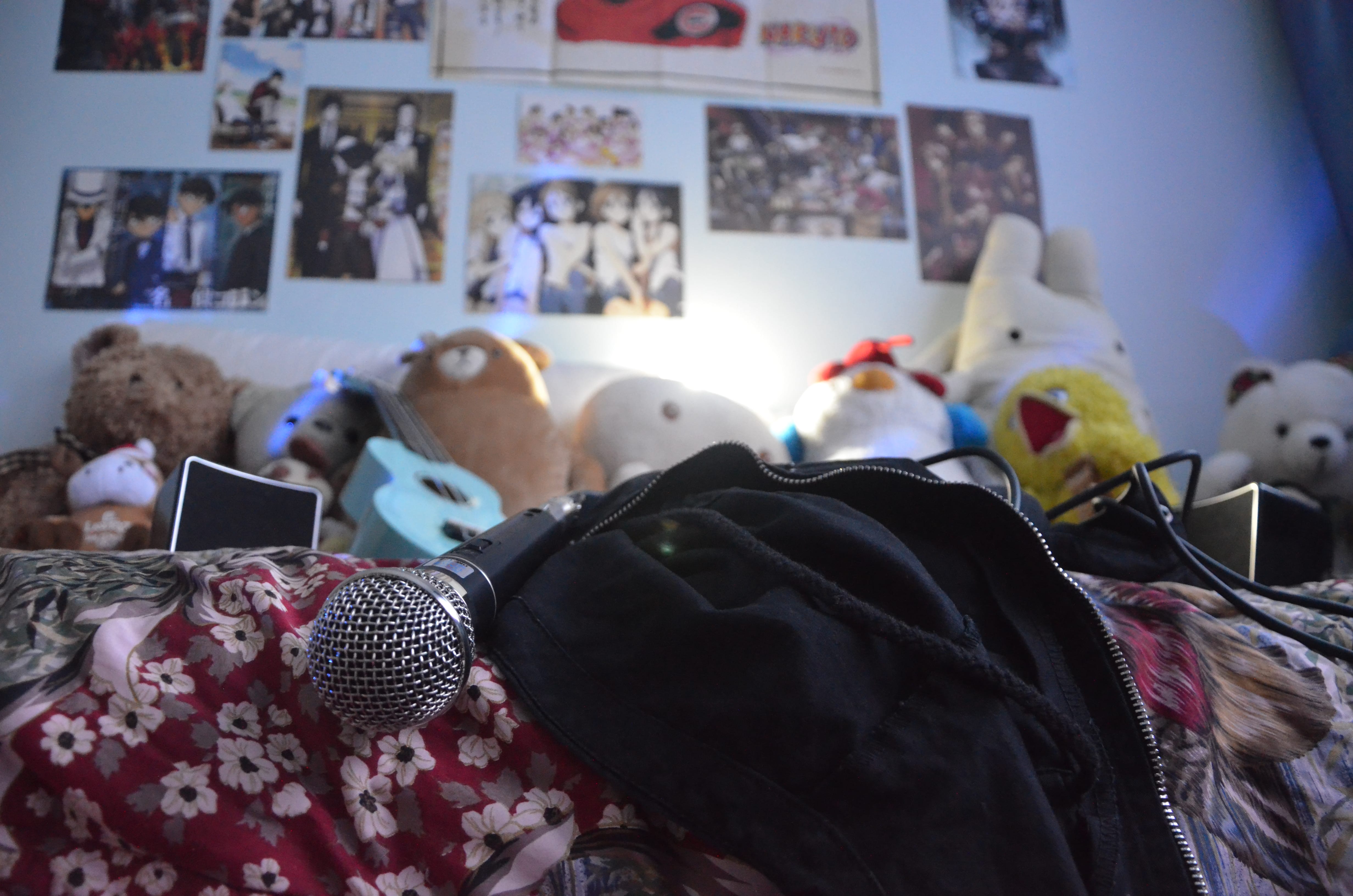
Subject matter:
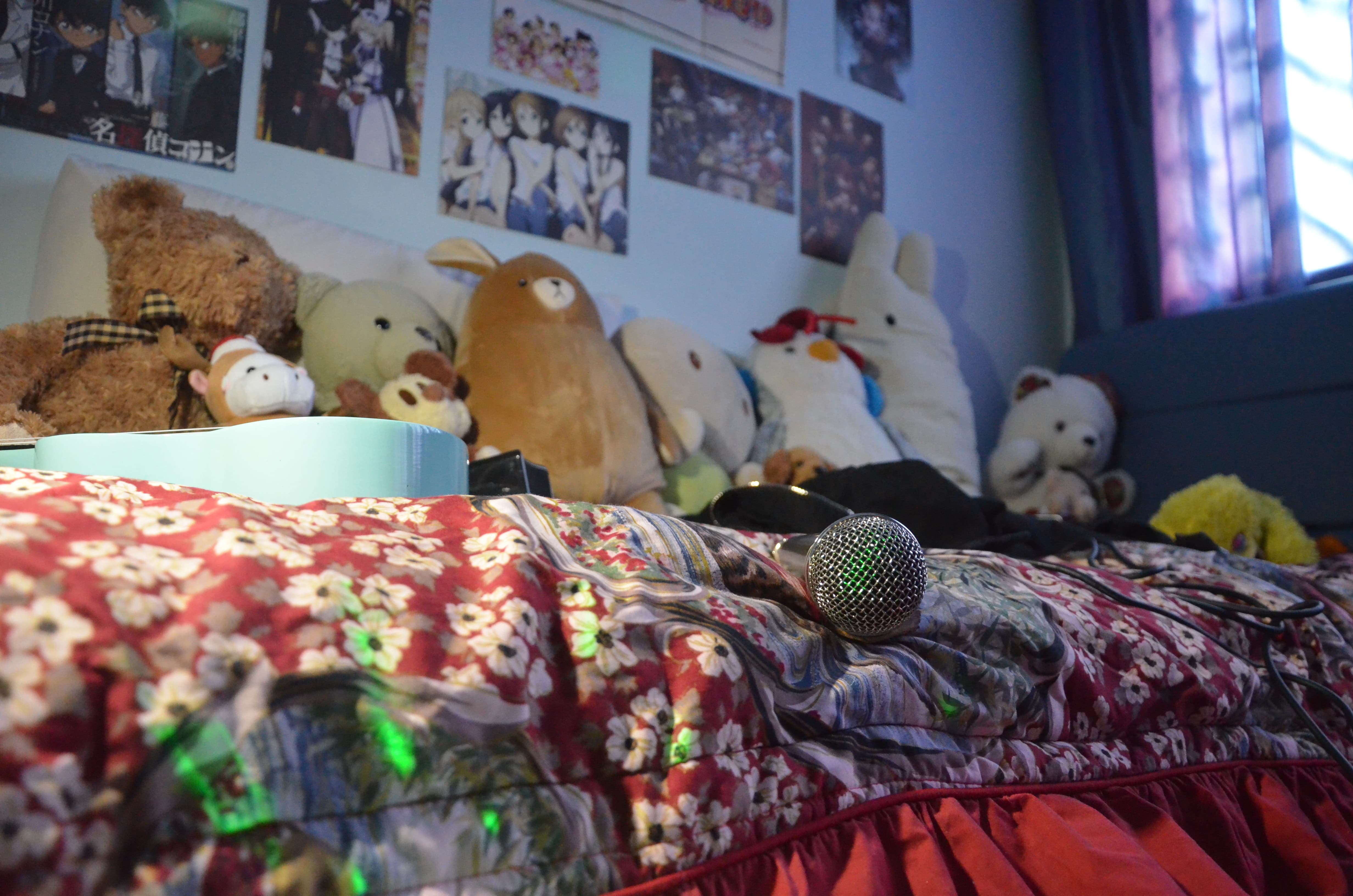
My aim is to juxtapose the razzle-dazzle of singing on stage and the contentment of singing in my bedroom.
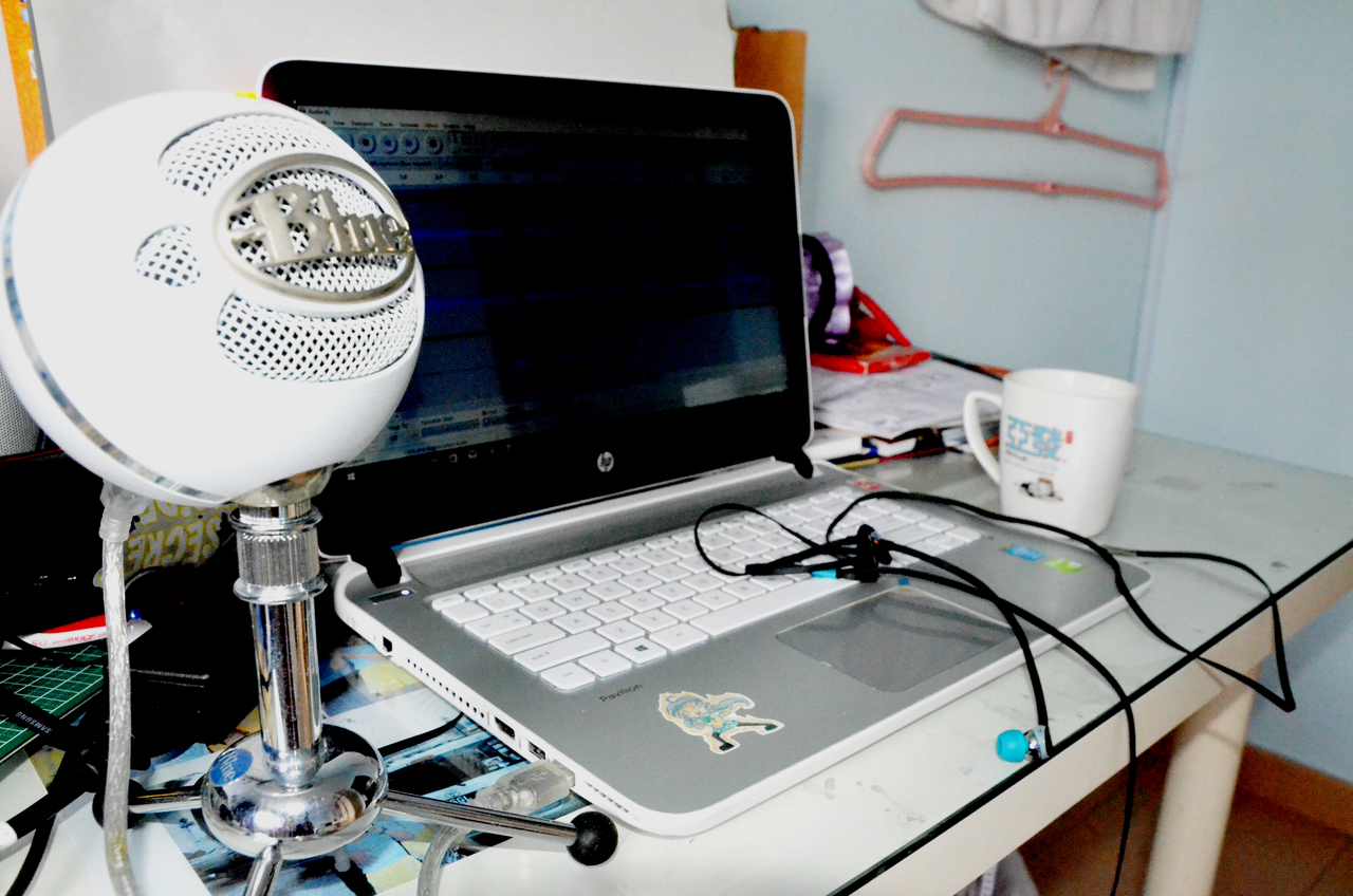
Instead of using the condenser mic in the previous photo I took, I decided to use a dynamic mic (that my family happens to have for some reason) because it is more commonly used by singers on stage, compared to condenser mics which are used in studios for recording, which implies a sense of isolation from everyone when singing. Also, it was a more easily identifiable symbol of the act of singing.
This is paired with red bed-sheets (to simulate the red curtains of a stage) and colourful lights so it could value-add to the whole flashy theatricality of singing on stage. I am also including a black jacket (which I presumably threw “on-stage” before I disappeared) because my favourite rock singer always wears a jacket/hoodie.
Pertaining to the contentment of singing with contentment in the comfort of my own bedroom, I am including my bed (of course), stuff toys as an imaginary audience, anime posters stuck on the wall to indicate my preferred music genre.
With these subject matter, I will be attempting to take shots using the various techniques of composition that I have learned.

--End of Post--
Some notable artists who utilise mark-making in their works are:
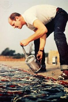
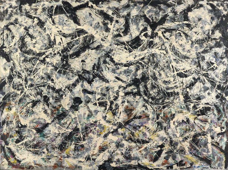
Paul Jackson Pollock was a major figure in the abstract expressionist movement (Post WWII, 1940s, New York) who had a volatile personality and was a “raging alcoholic” (as quoted by my Art History lecturer) and specialized in drip painting. He carried out his action paintings using hardened brushes, sticks and resin-based paints while rigorously and passionately working his way around the canvas, splashing paint in whatever manner catered to his mood that day.
Some of his most famous works include:
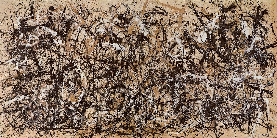
Artist: Jackson Pollock (American, Cody, Wyoming 1912–1956 East Hampton, New York)


Date: 1950

Medium: Enamel on canvas

Dimensions: 105 x 207 in. (266.7 x 525.8 cm)

Classification: Paintings

Credit Line: George A. Hearn Fund, 1957

Accession Number: 57.92

Rights and Reproduction: © 2017 Artists Rights Society (ARS), New York
Jackson Pollock American, 1912–1956 Greyed Rainbow1953 Oil on linen 182.9 x 244.2 cm (72 x 96 1/8 in.), unframed Signed and dated: recto: "Jackson Pollock 53" (bottom right in black paint); verso: "Jackson Pollock / 53" (upper left in black paint) Gift of Society for Contemporary American Art, 1955.494 © 2017 Pollock-Krasner Foundation / Artists Rights Society (ARS), New York
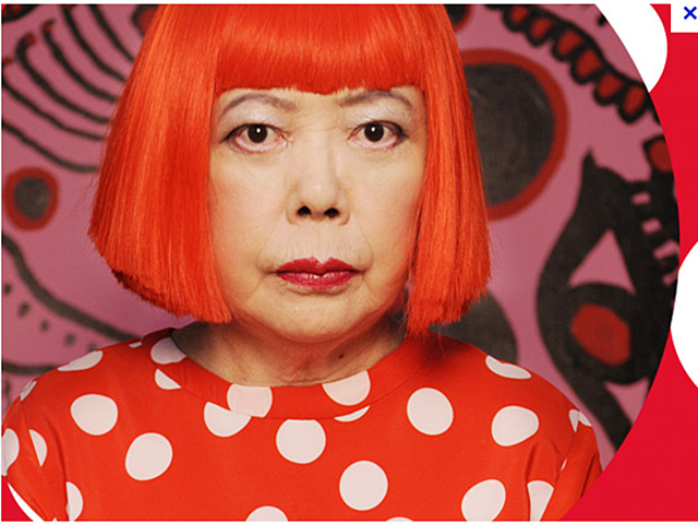
Yayoi Kusama was born in Nagano Prefecture, Japan where she would do many paintings on her own, but her love of art was rejected by her family, compelling her to further develop her works in the United States. She is heavily influenced by the abstract expressionist movement as well and her 2D works often utilize a wide variety of media such as gouache, watercolours, pastels and oils to print repetitive patterns such as polka dots and nets for the entire area of a canvas (even the sides of the canvas would be painted), which creates an overall psychedelic effect, especially under certain lighting.
Actually, a few months ago I had the opportunity to visit the Yayoi Kusama: Life is the Heart of a Rainbow exhibition.


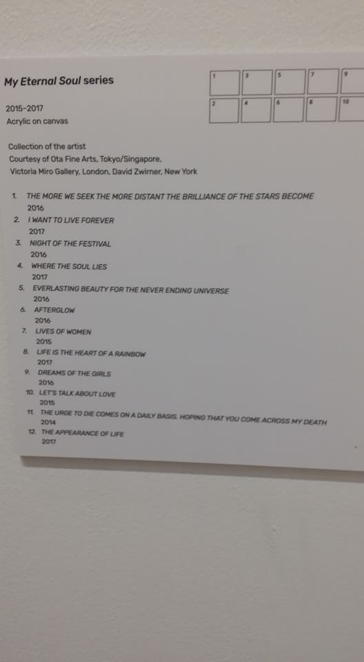
Asides from her astounding 3D works, her 2D works are equally intriguing. The colours she uses are very opaque, mostly vibrant which make a very strong statement. The variation in lines and shapes is also thus made very obvious. The fact that Kusama is able to persist with such repetitive patterns across an entire canvas never fails to impress me. Some of her paintings are littered with simple shapes like cirlces and stripes, but for some of them, you have to squint closer to really see it. For example, take a look at the 4th painting from the left in the top row (the brown and black one). Try squinting and having a guess at the title of the painting!
***drumroll intensifies***
.
.
.
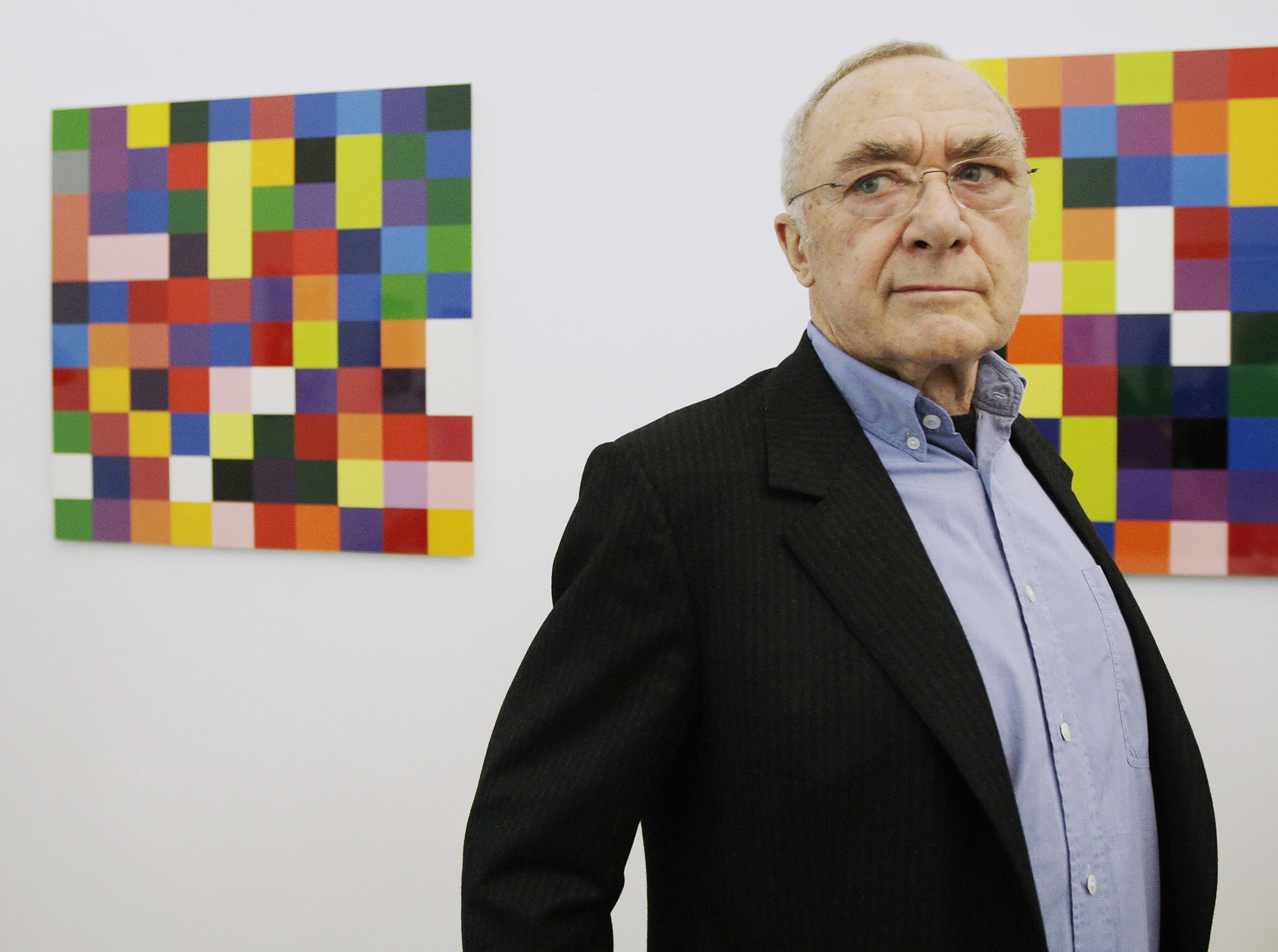
If you watch the video below, you can see how he uses this massive squeegee-like block to slide across the entire canvas, where there is already paint layered out and a single scratch can reveal the myriad of colours beneath:
https://www.youtube.com/watch?v=yF6EluMNR14
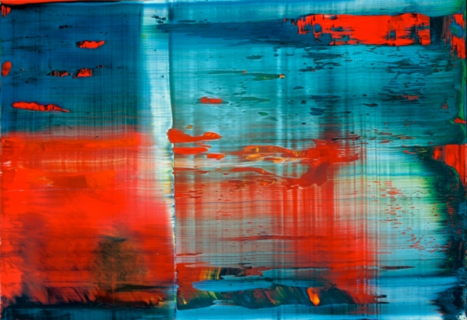
Abstraktes Bild
Abstract Painting

1999 50 cm x 72 cm Catalogue Raisonné: 858-3

Oil on Alu Dibond


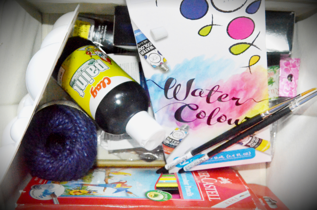
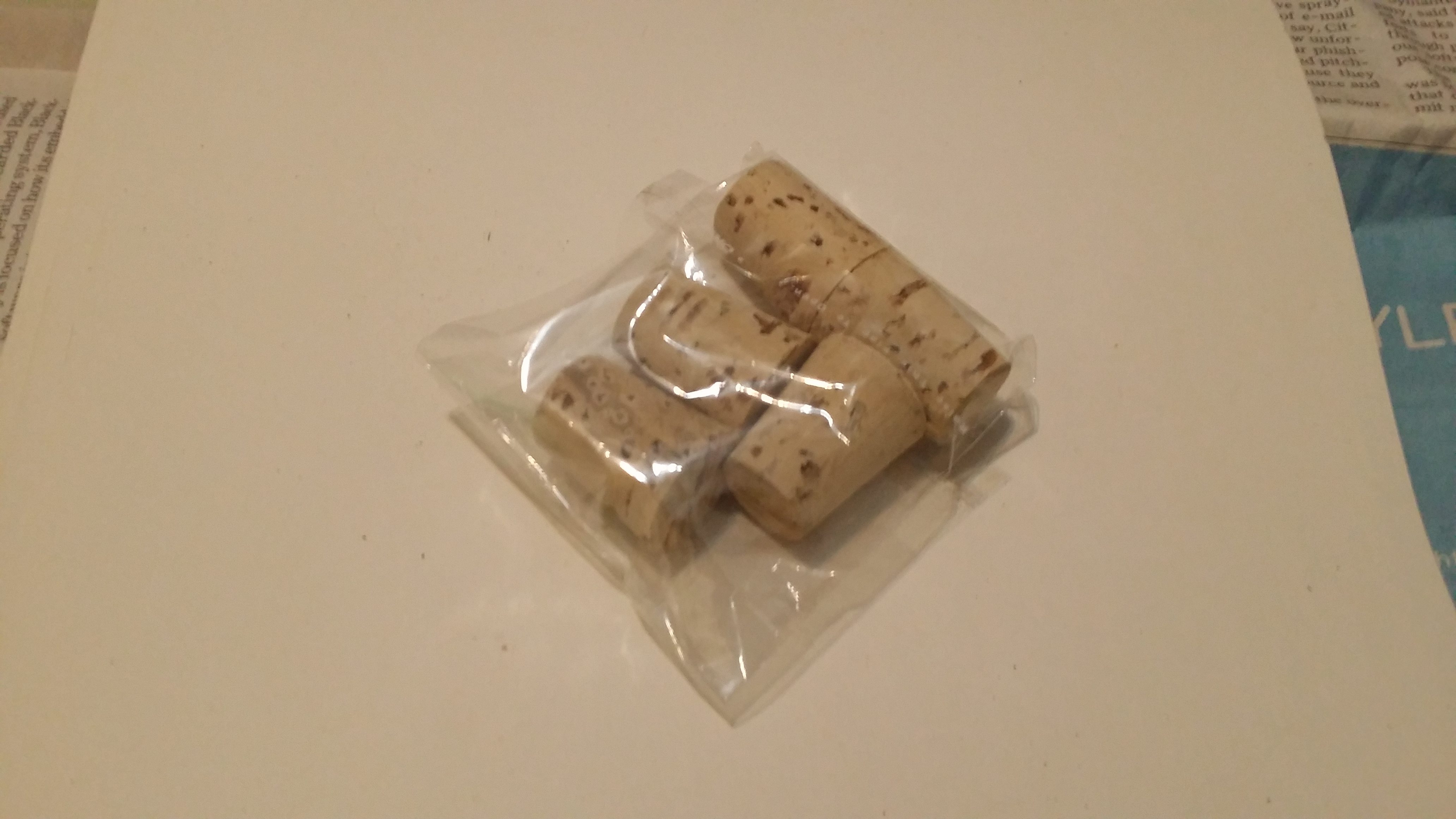
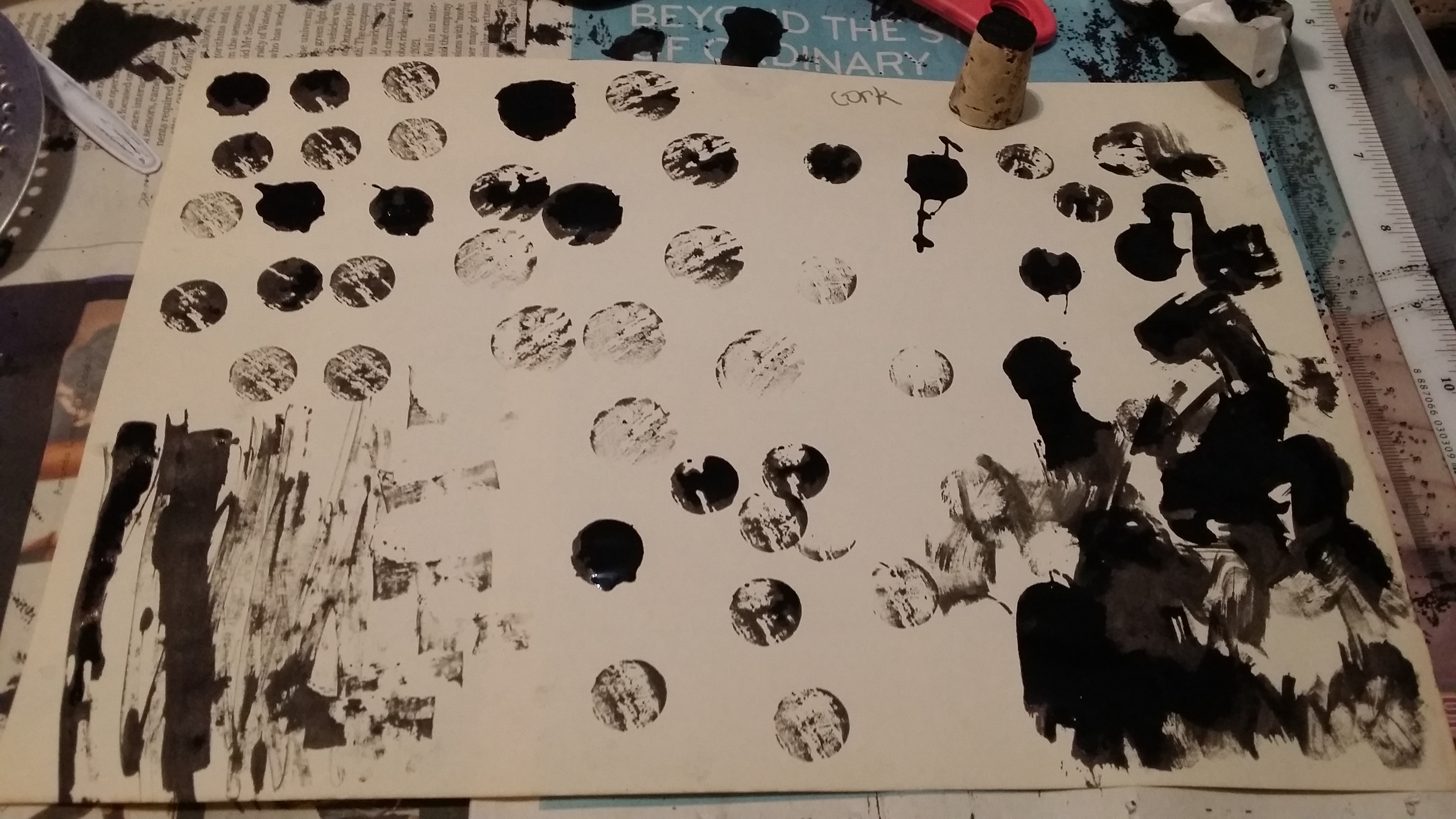
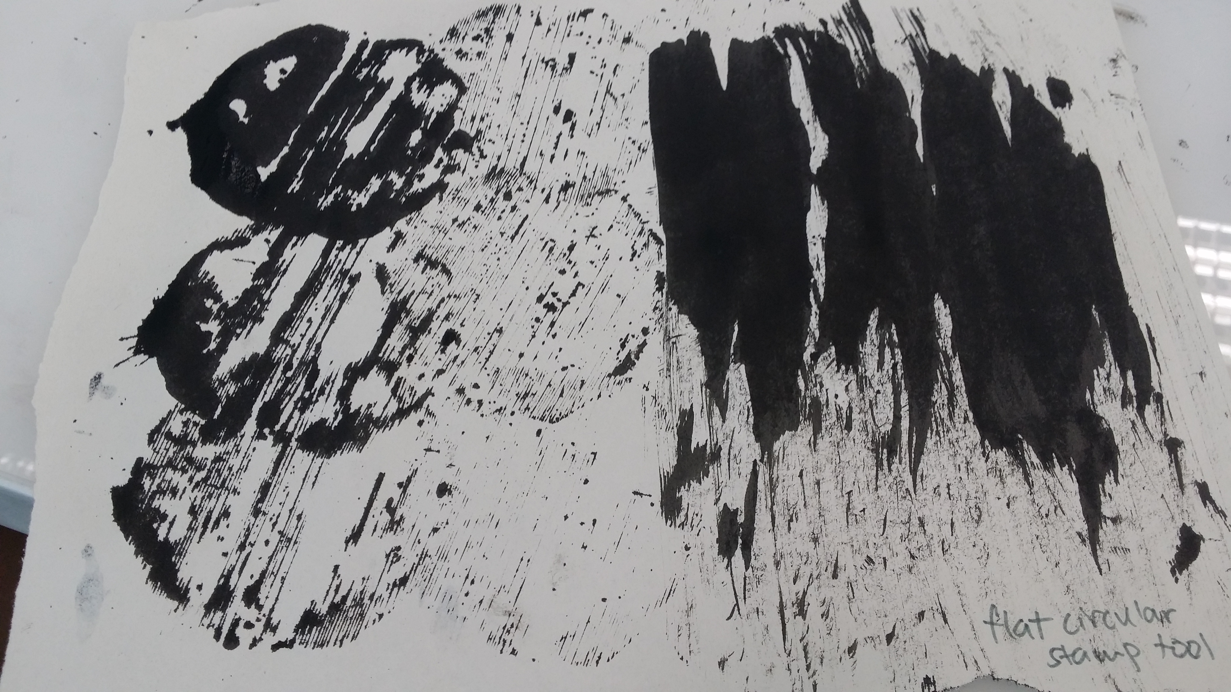
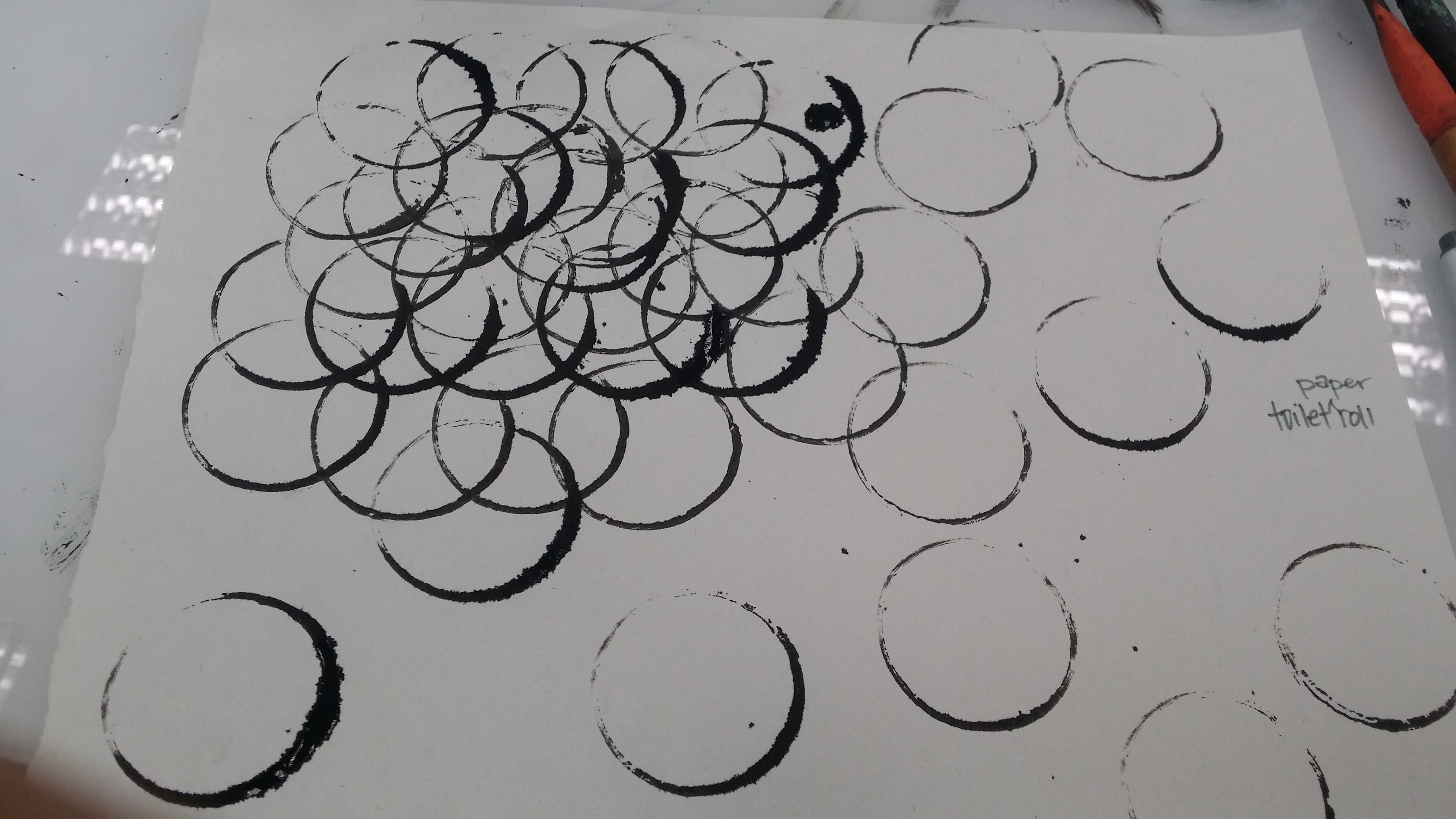
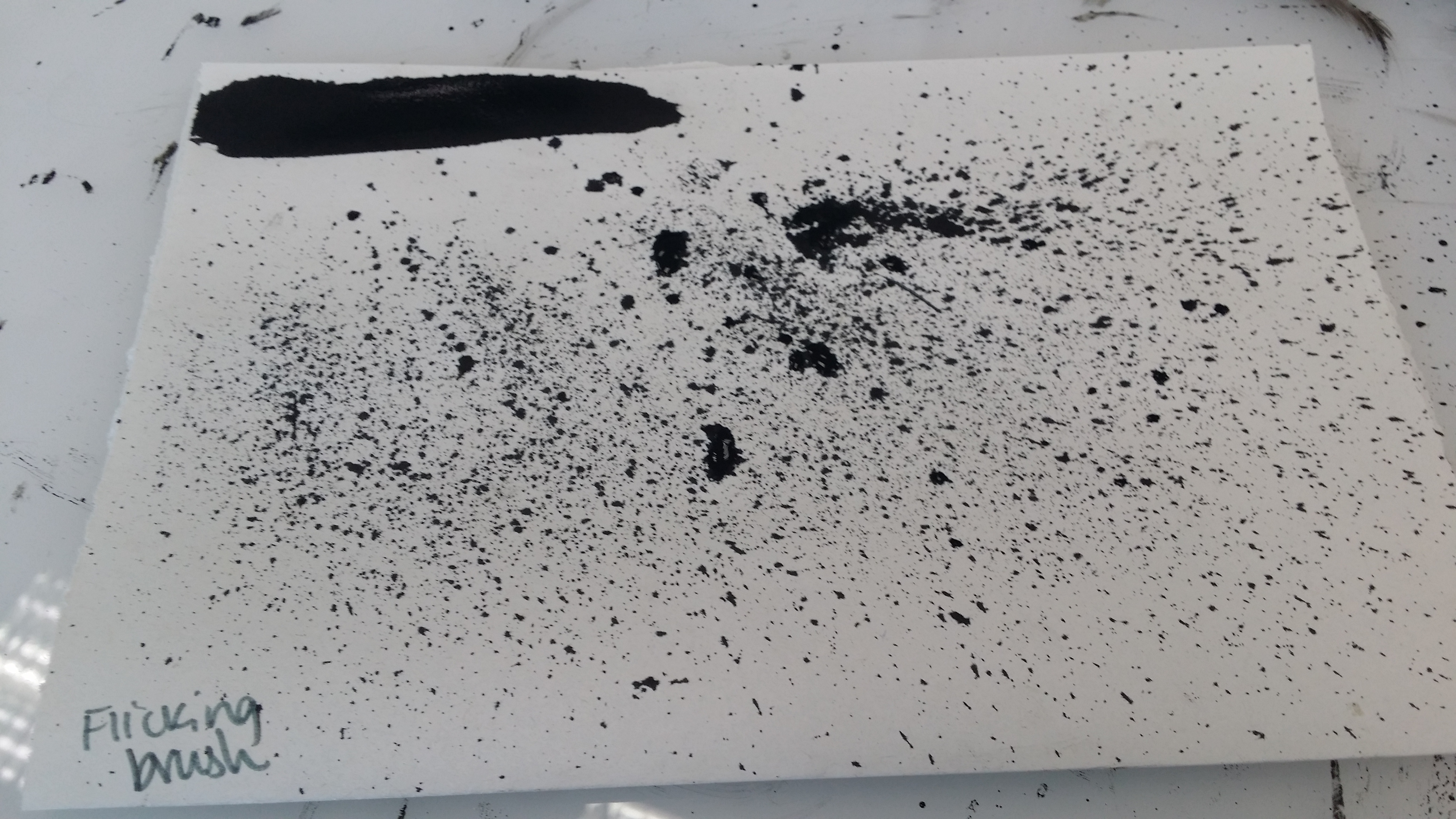
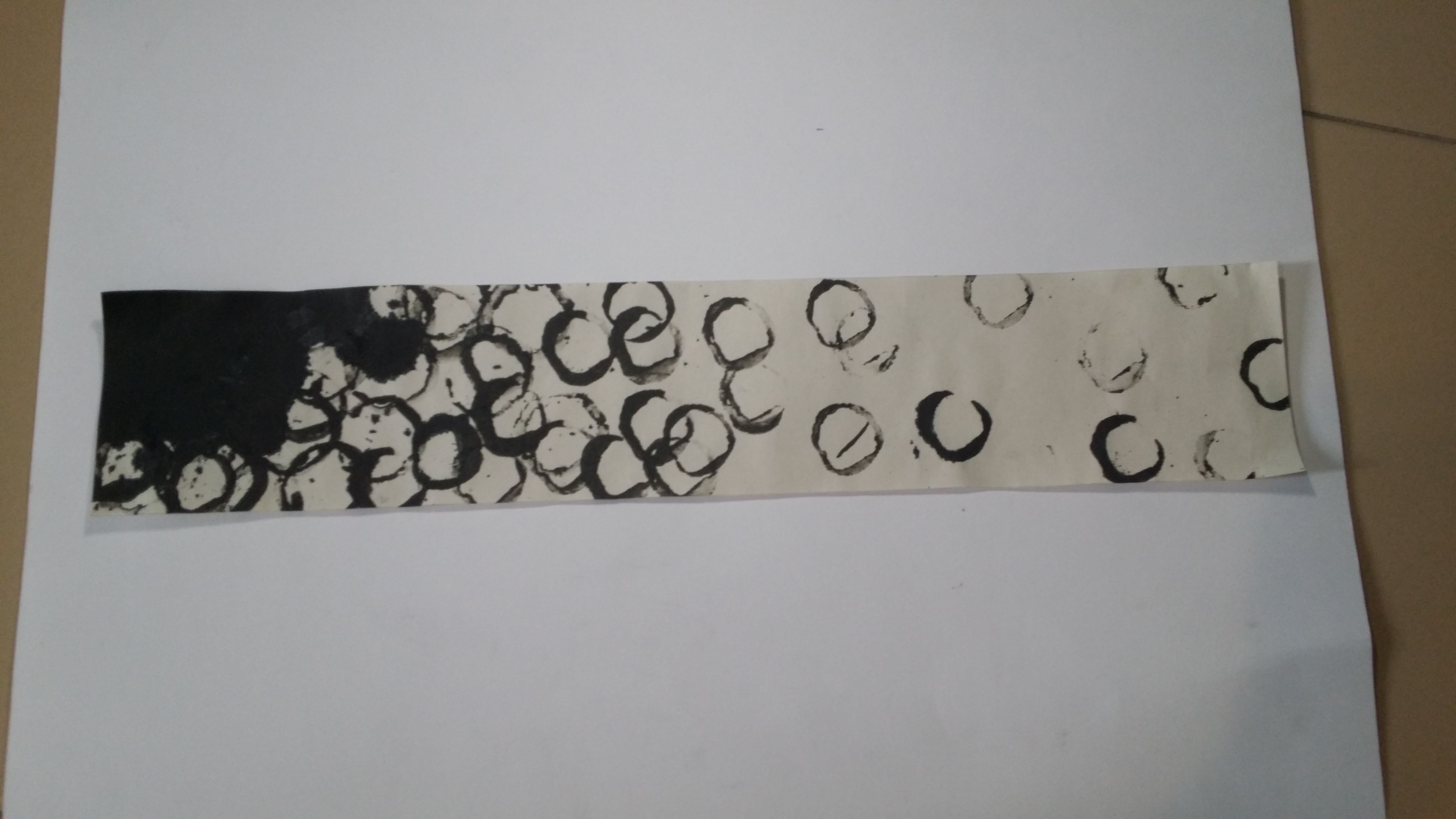
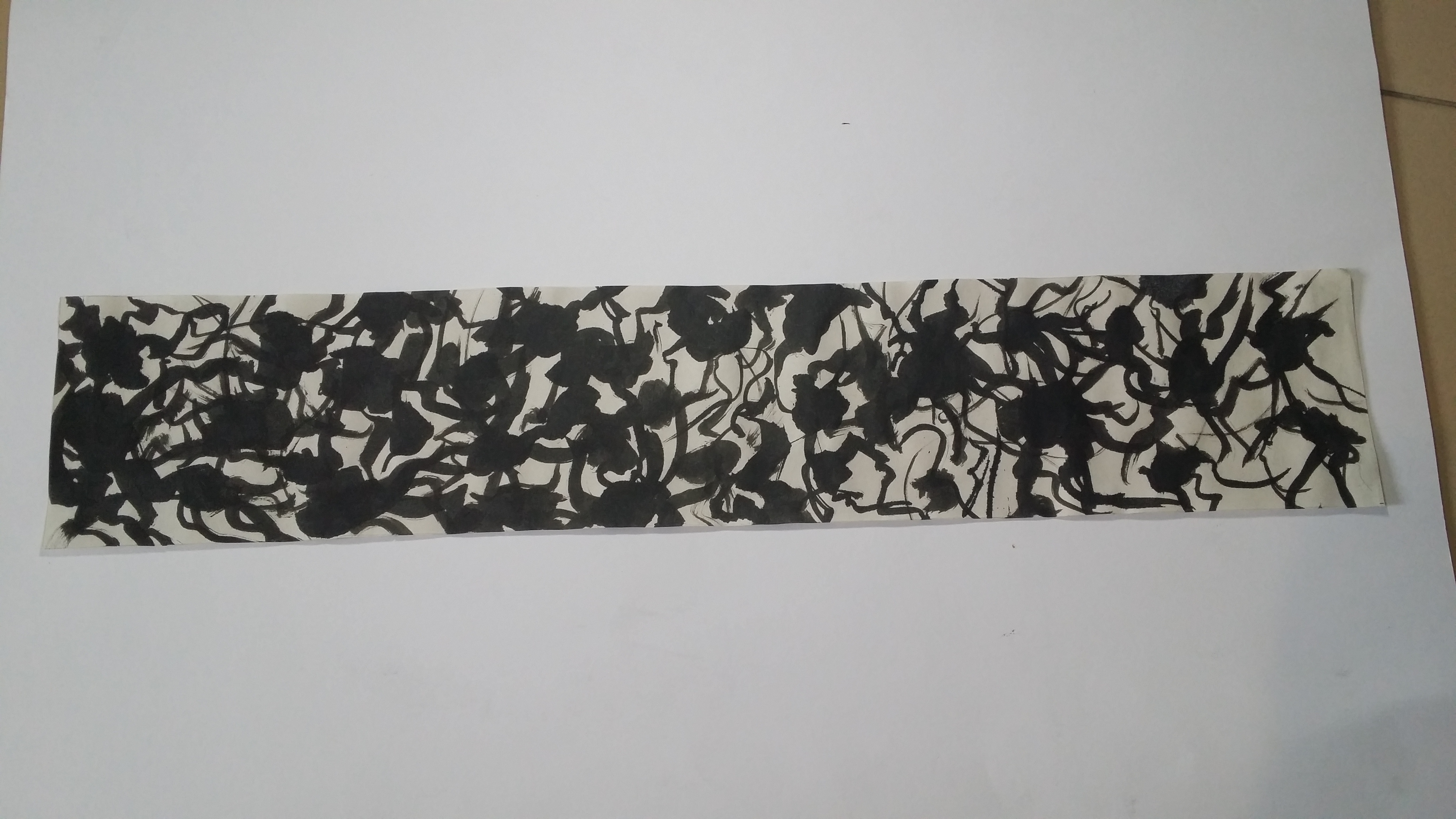
After over-purchasing and hoarding a bunch of random items I could get my hands on, I decided to test them all out to see what kind of tools would make interesting patterns that would be useful. (I might have went a little overboard with the shopping list but it was interesting seeing some of the patterns they produced!)

Aftermath:
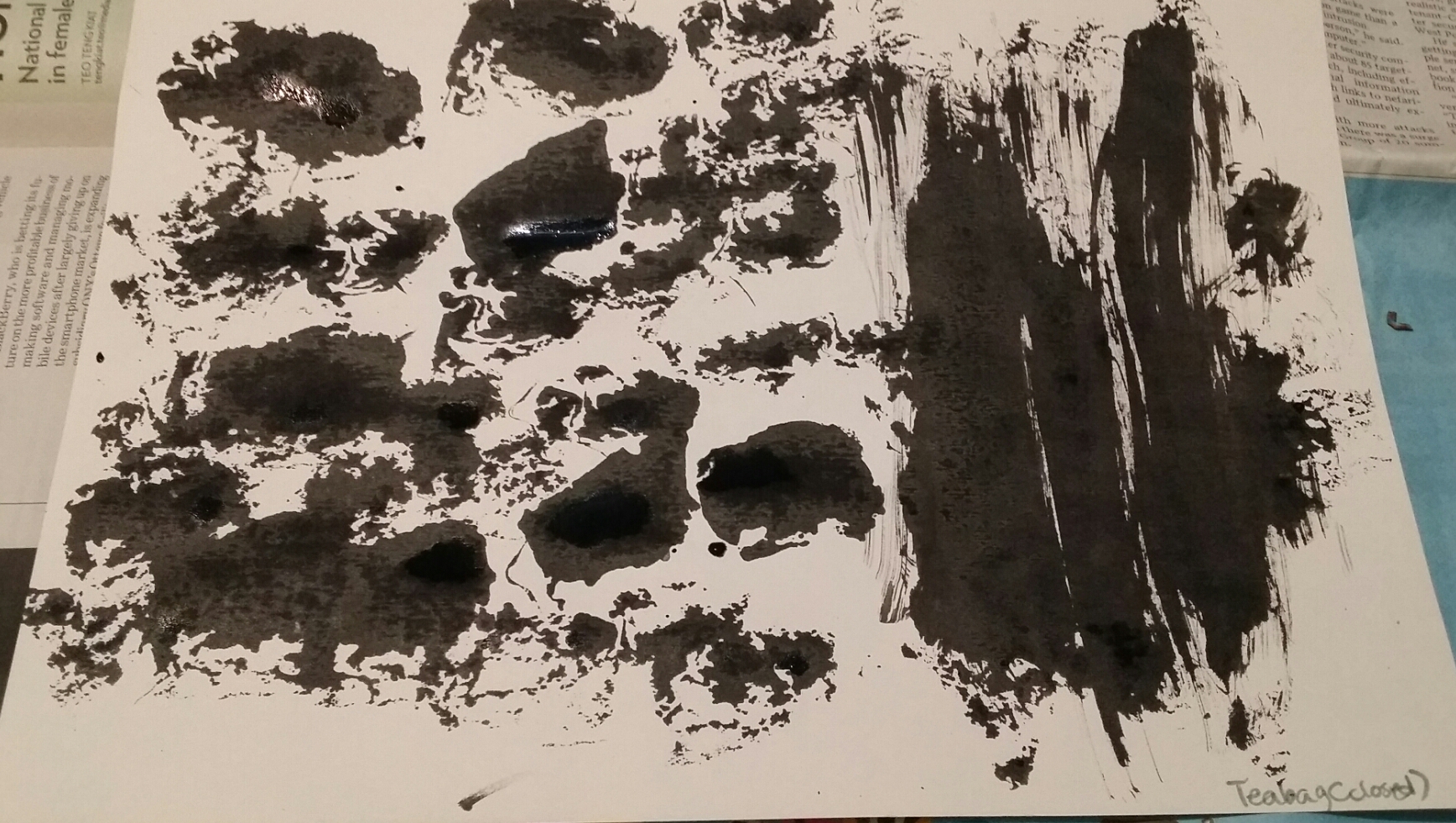
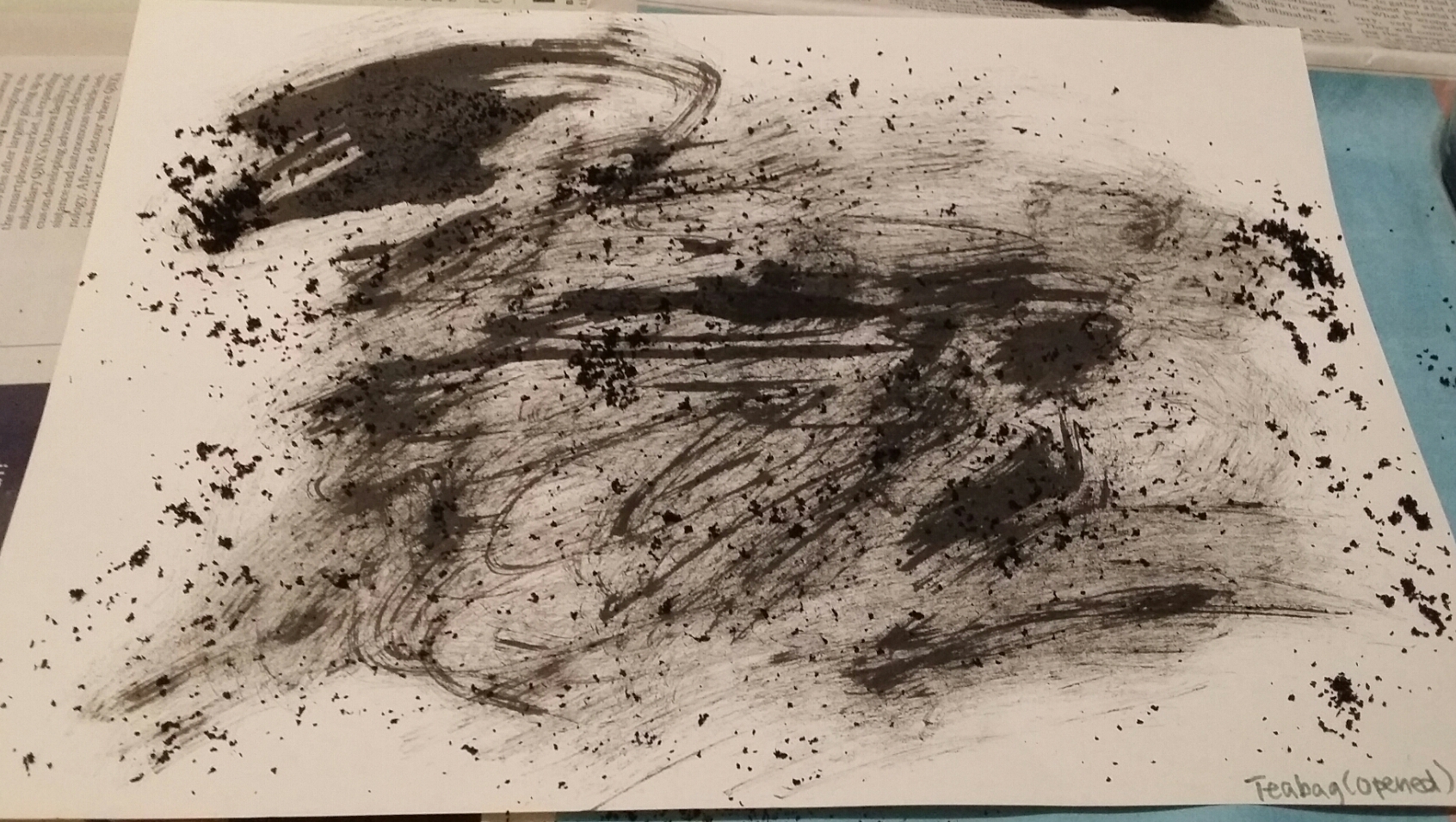
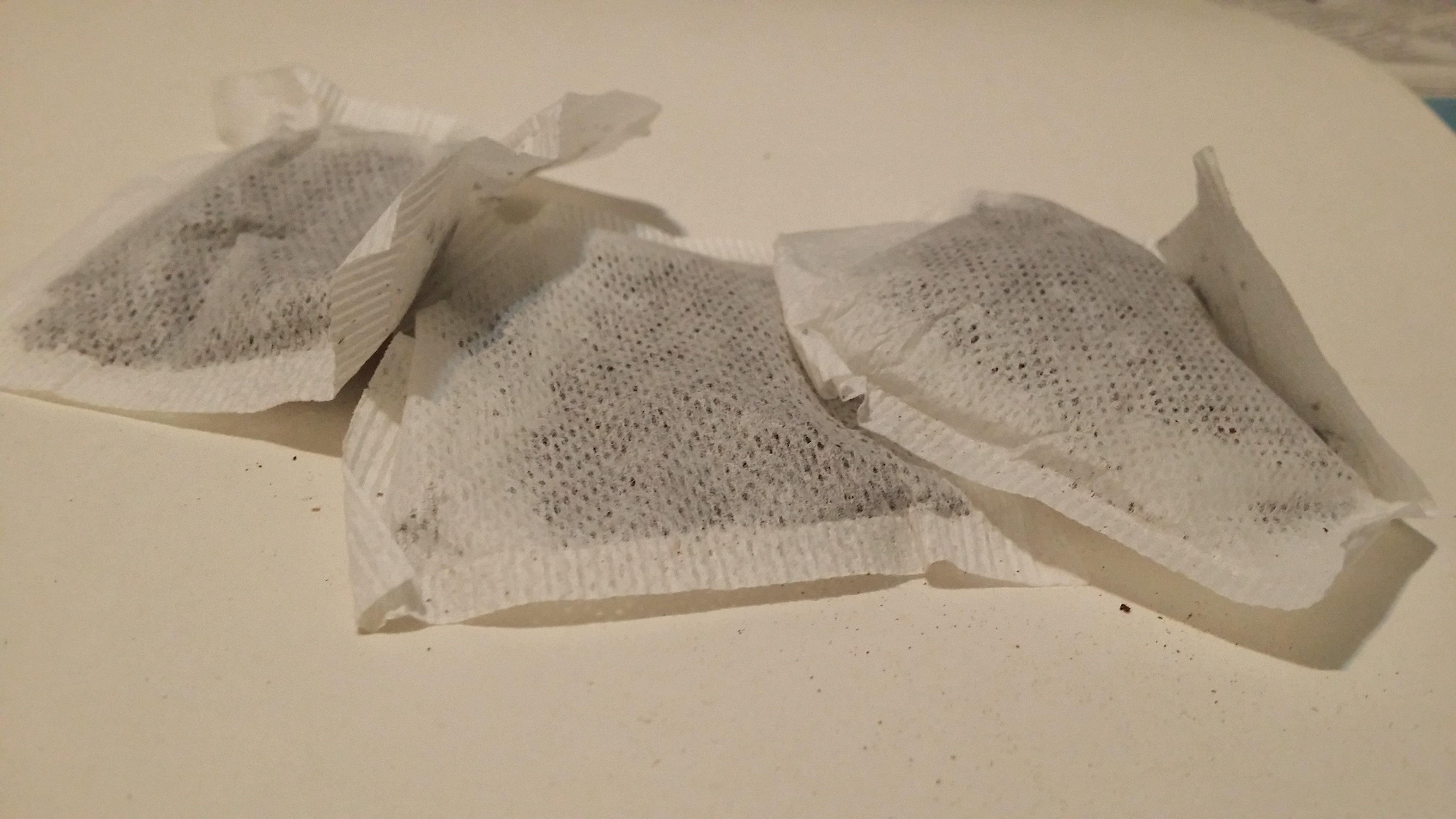
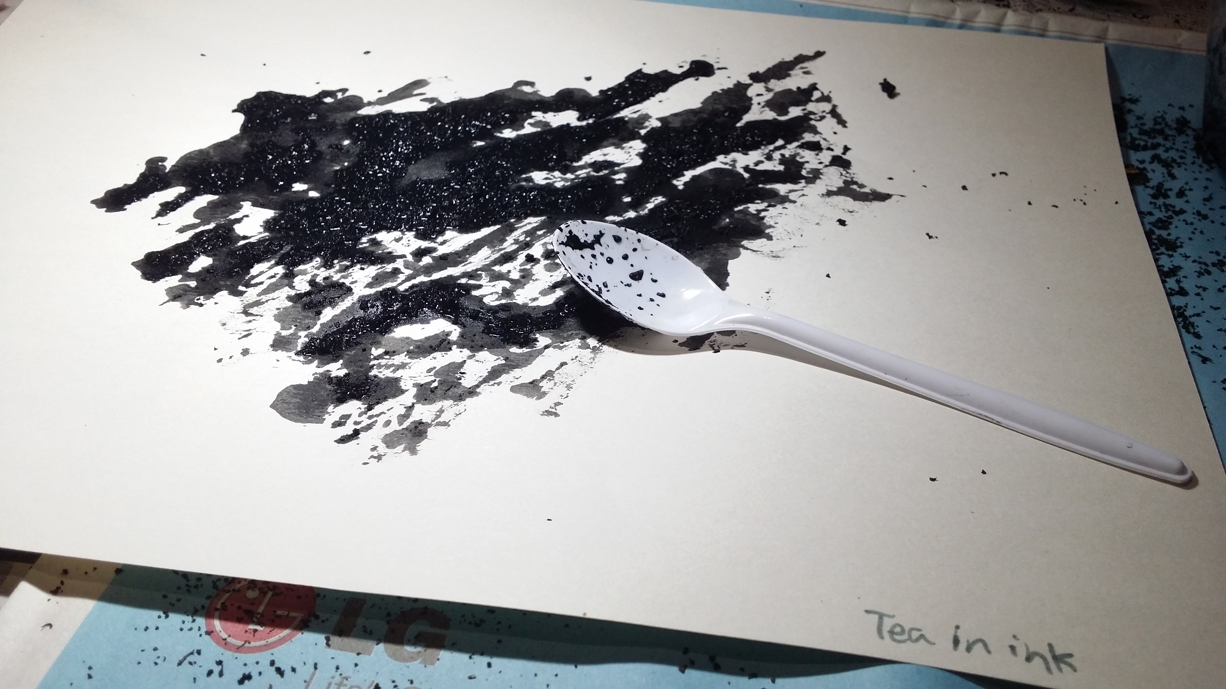
Tea effect 3 – Photo by me. Poured the tea leaves directly into the ink before using the spoon to spread it out onto the paper. Gave rise to a grainy texture with a somewhat splotchy background.
Aftermath:
Ruler effect – Photo by me.
I had to use a spoon to put some ink at the “starting line” first, before using the ruler to spread the paint over the paper. I think it turned out pretty neat! (though I would really use a smaller ruler instead)

Aftermath:


Aftermath:
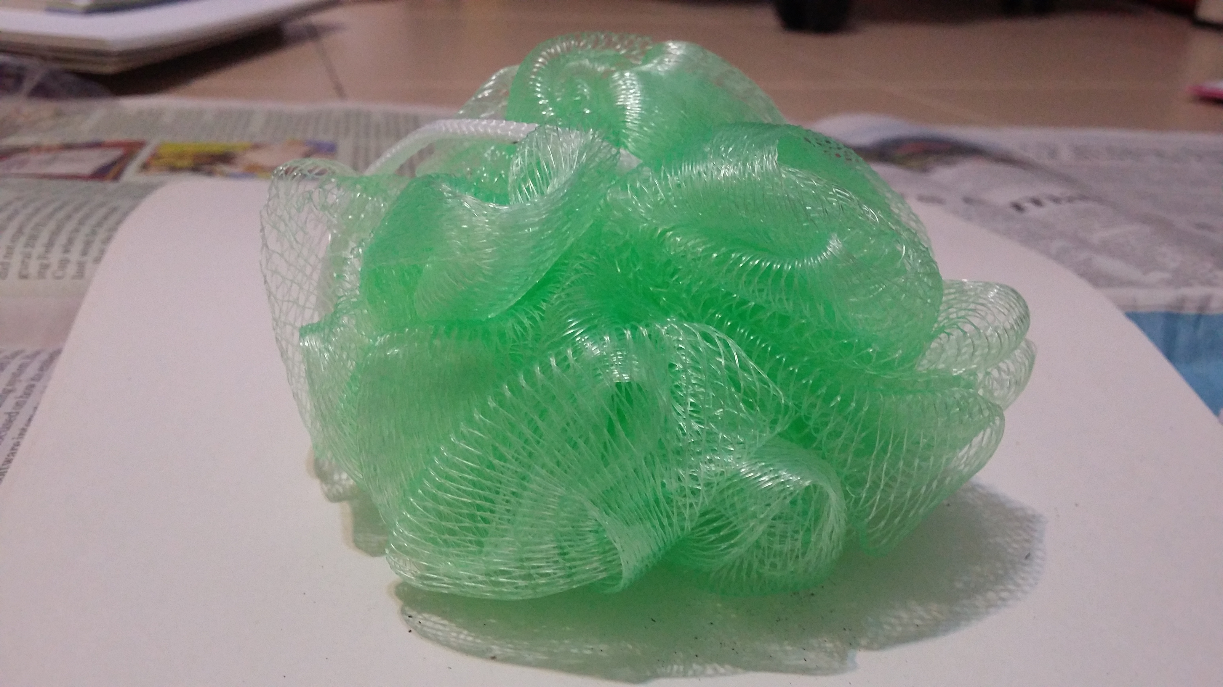
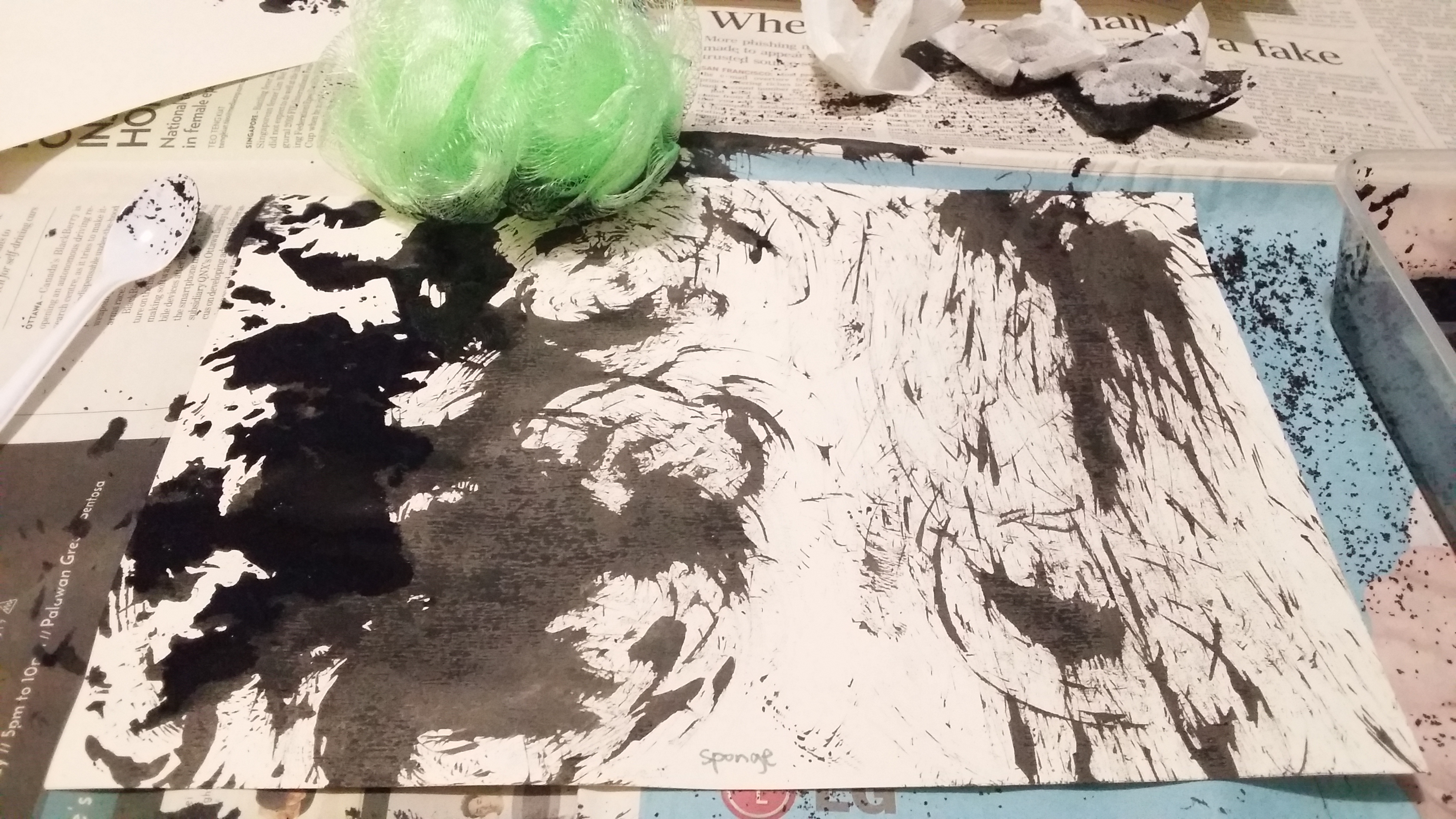
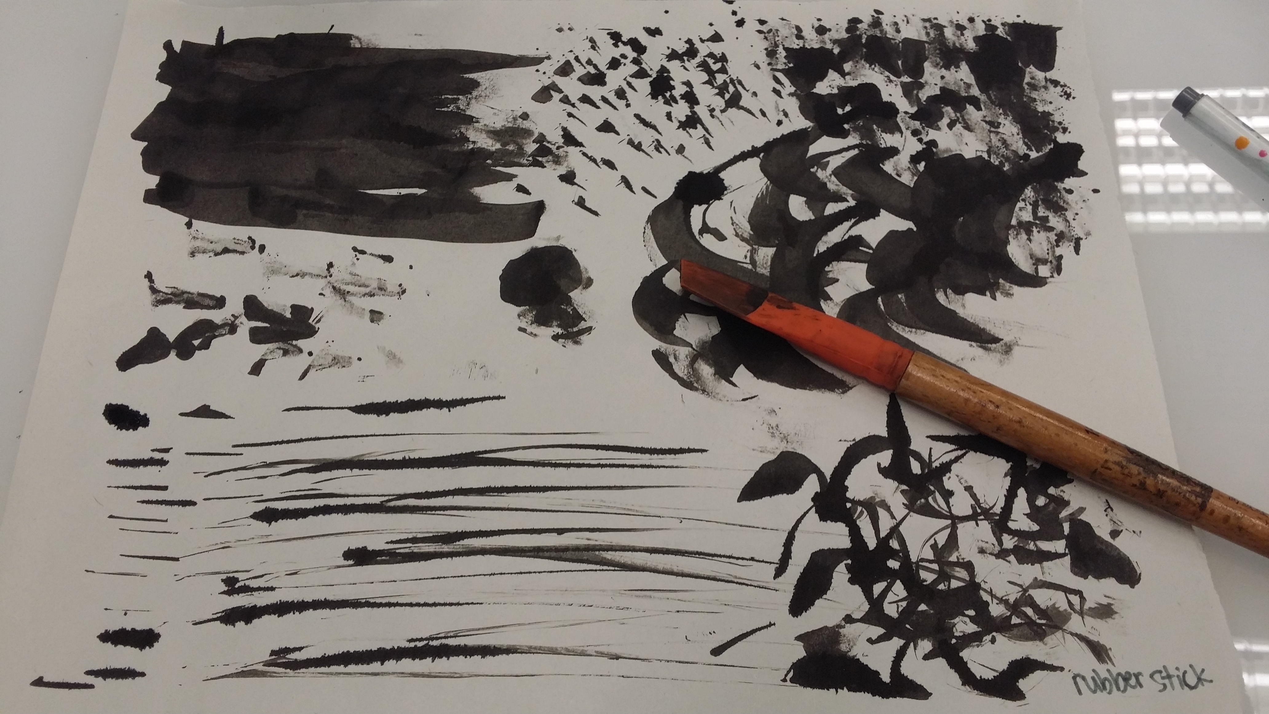
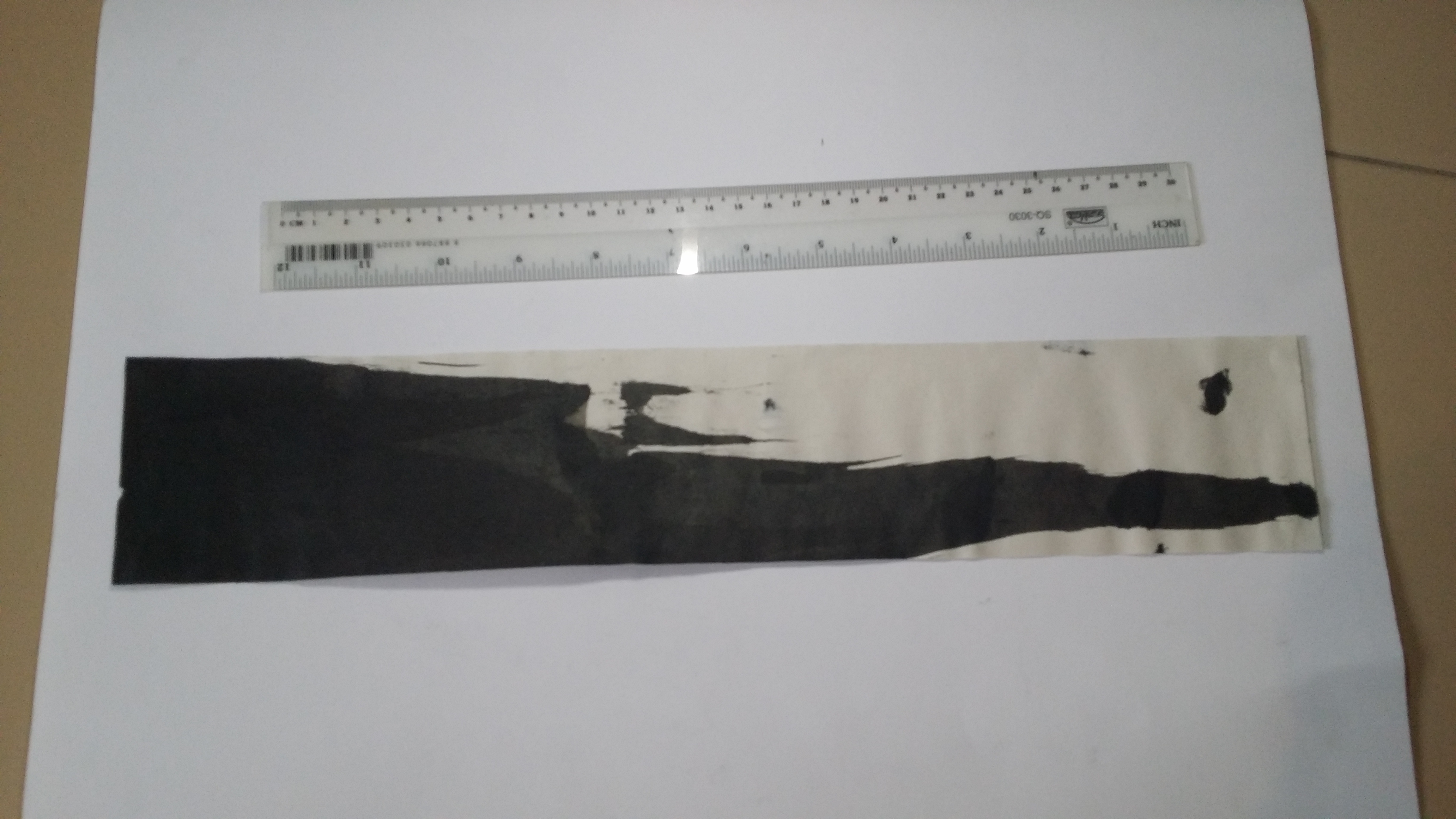
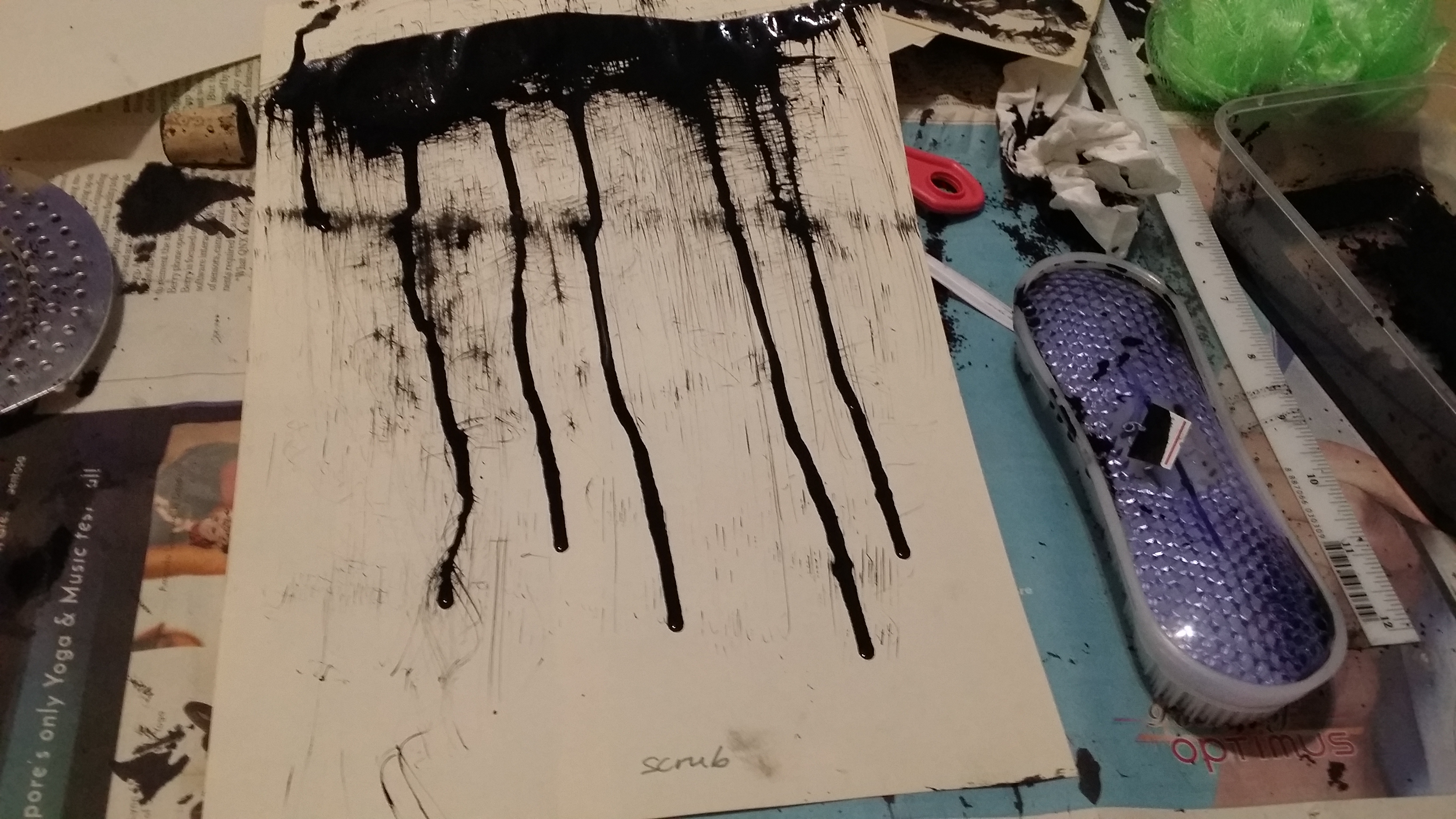
Scrubber effect – Photo by me. Again, I had to use a spoon to deposit some ink first before I could use the brush to scrape it outwards. It gave rise to sort of a wispy effect since the lines produced were so fine. I also purposely let the paint drip down and now it looks like a thunderstorm.
Aftermath:

Love is wholesome and warm feeling, one where you feel like you are being in a tight embrace and protected. This can be illustrated by curved lines that depict convexity and roundedness, and lines should be favourably thin and light to show the tenderness of love. Curves can also either be relatively sparse to suggest the sensuality of romance or more closely positioned to generate more passion and zeal.


Joy has a very vibrant, enthusiastic, ecstatic tone that can be showcased through more well-rounded curved lines as well, or zig-zagged lines radiating outwards to show pent-up energy being released. Joy can also be being pleased with status quo, such as enjoying a cup of tea in solitude in the early morning, and that can be expressed with more loose, wavy curves. For a prideful joy, tall vertical lines or steep diagonal lines can be used to indicate the celebration of superiority. For a sense of relief, there can be curves in the shape of a wave (The Great Wave of Kanagawa) to show something being held back before being calmly released, just like a sigh of relief.
Surprise has a positive connotation and is a rather transient feeling that is triggered by a sudden event, thus short lines, or small circles can be incuded. The spacing between these elements can also be considered, for example, having a cluster before gradually becoming sparse shows a sense of dispersement of shock. Curved lines with a point (also like multiple waves) and the use of diagonals to form peaks that grow out of a horizontal line also indicated something suddenly appearing out of the calmness.
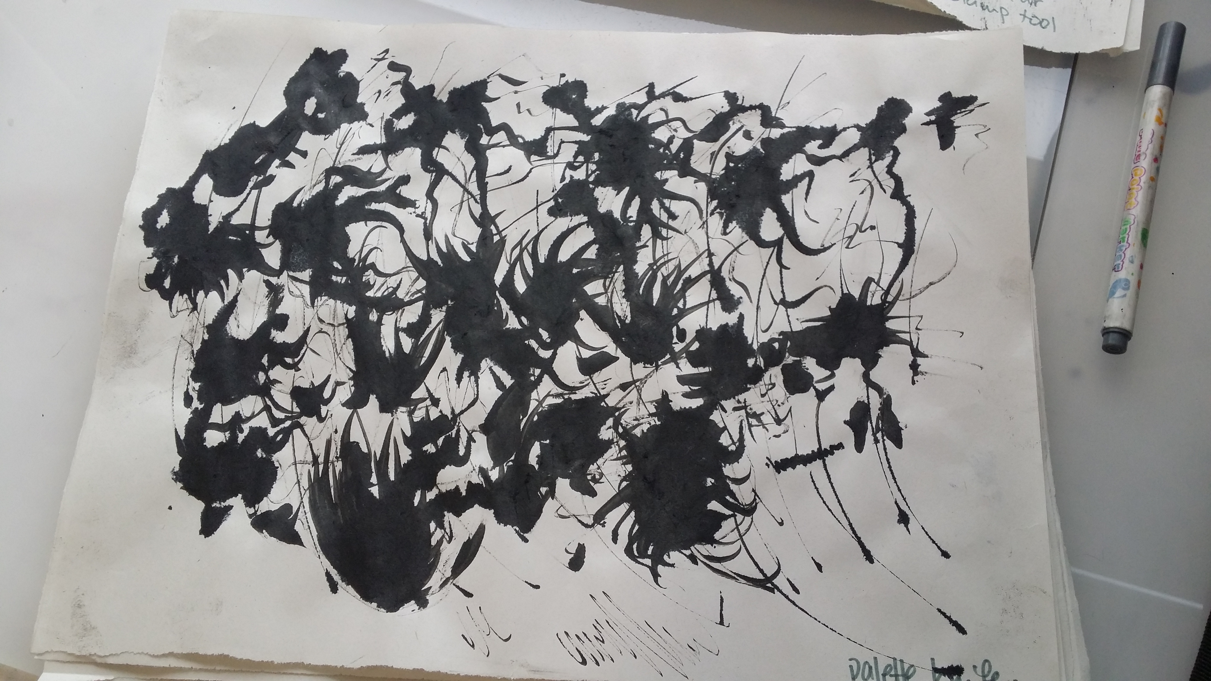
Anger is a very intense feeling which can last from small waves of irritation to a long-held grudge. Rage or fury can be shown using looser curves thickness with varying that reach outward (rather than tight curls), to aliken the feeling to hot flames of rage. For irritation, short, bold, jagged lines can be used to illustrate the constant but rather brief spans of feelings of annoyance. Disgust can be conveyed using wide, convex curves that disperse outwards to express revulsion (sort of like the feelings you get in your stomach before puking). Bold but connected splotches can be used to show envy or jealousy; a lasting, deep-rooted grudge that someone is reminded of every now and then when they are in contact with the person they just are unable to come to terms to with.
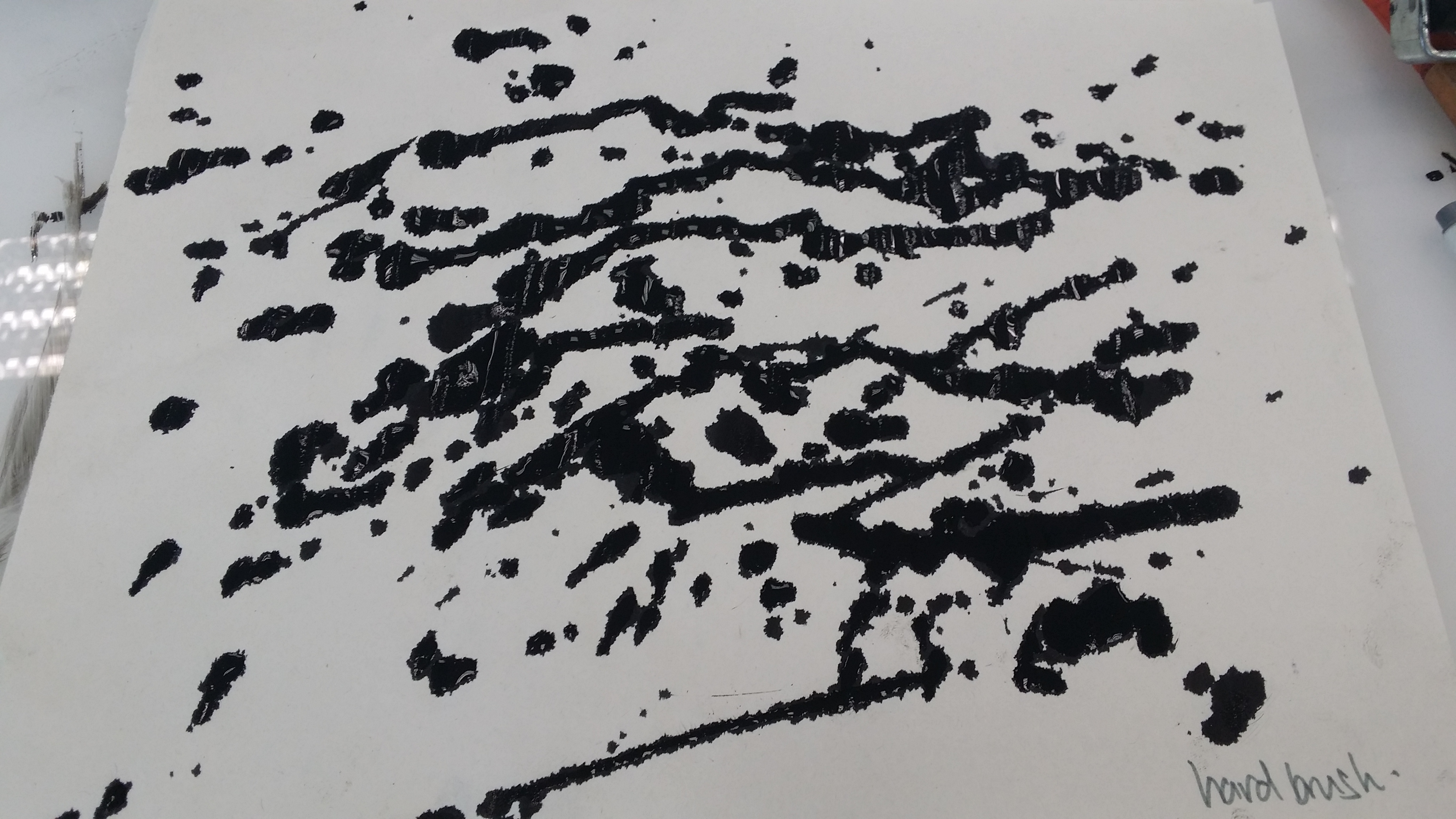
 Jealousy – Chinese ink, dripping using hard brush. Inspired by Jackson Pollock’s drip painting.
Sadness is a pretty personal feeling that not a lot of people express openly, so it would be appropriate to have a cluster of elements together rather than spread out widely or evenly throughout the entire paper/medium. Drip lines or really thin, wispy lines can be used to convey the silent wallowing in grief, and give sof a sombre, gloomy feeling. For a louder kind of sadness, like anguish, deep sorrow or regret, wider curves can be used, rather than straight lines or zigzag lines because straight lines are not as organic as curves and our ability to feel sad can be owed to our roots as human beings, therefore using curves would give it a very natural feeling (it’s only human to feel sad).
Fear is also a very intense emotion, it is created by mostly external experiences and guided by our very primal instincts of survival. It is also much more prolonged than shock and has a negative connotation, unlike surprise. There is suspense, anticipation, a sense of unknown or any threats that serve to trigger a griping fear from within us. Thus, there can be wide curves sprouting outwards, or exaggerated zigzag lines (like the ones on cardiograms) to indicated a racing heartbeat, or even short little jagged lines to show a less intense variation, nervousness.


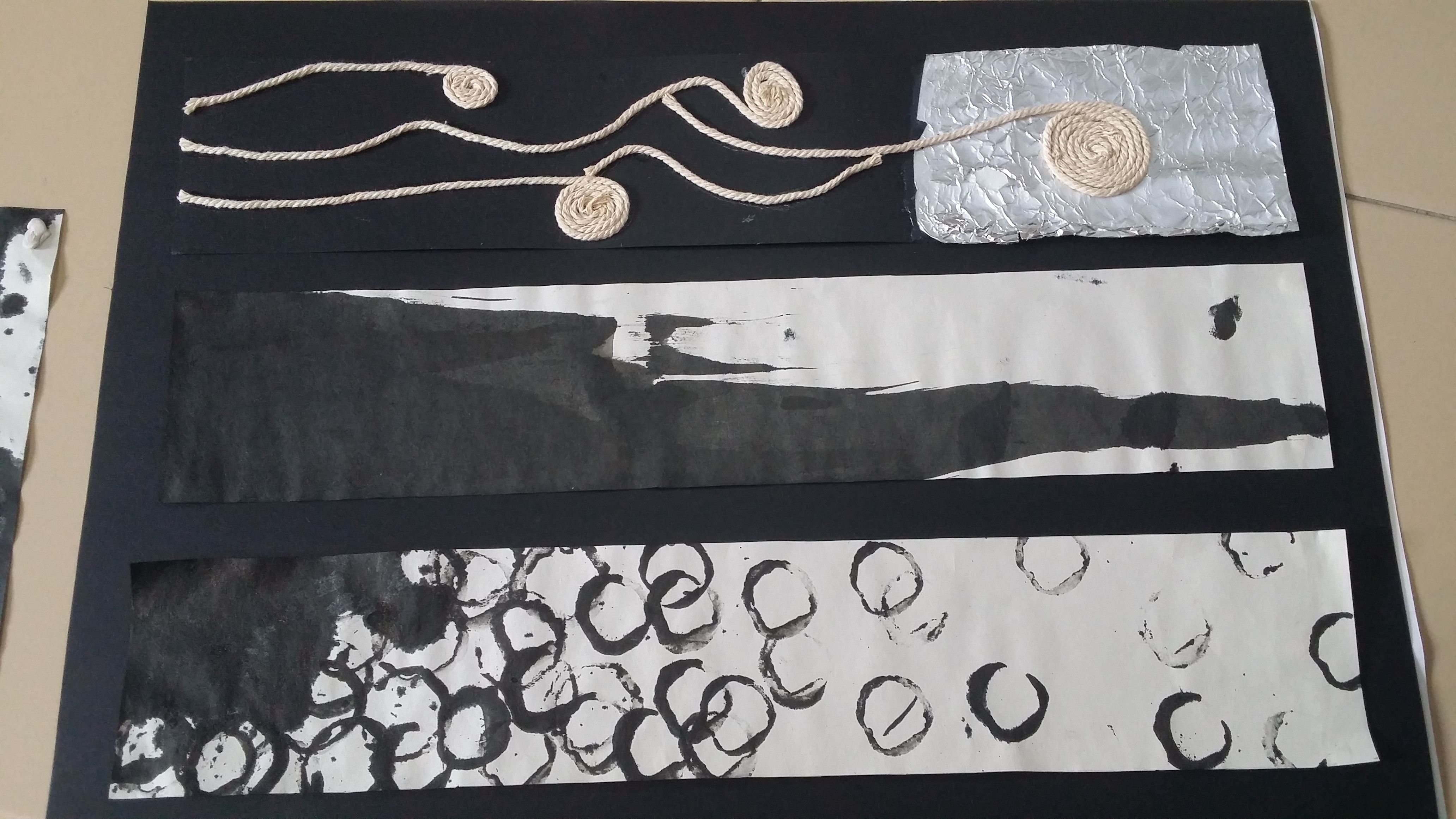
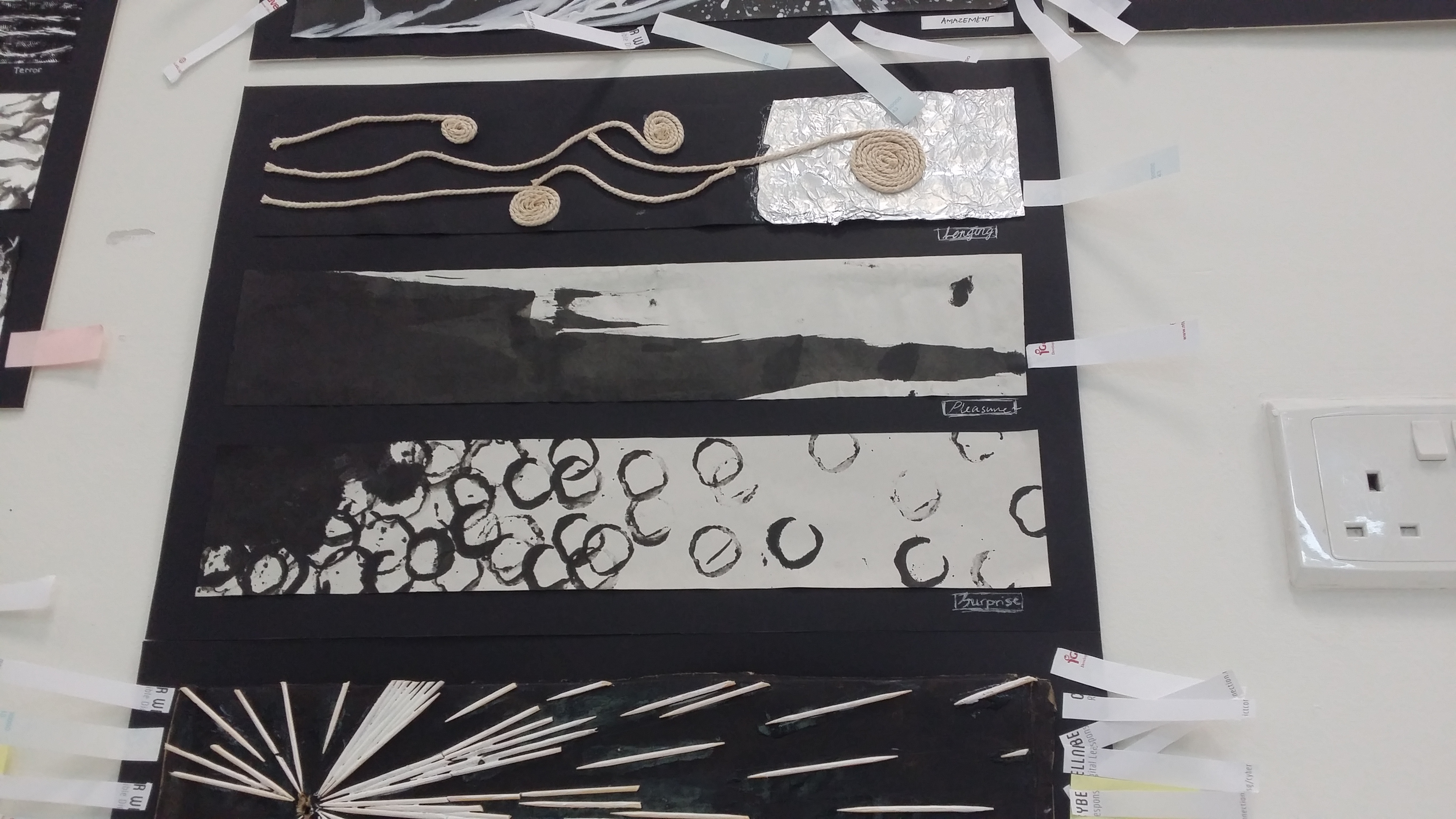
6 emotions (top to bottom):

Definition:A feeling of happy satisfaction and enjoyment.
Interpretation:
An uncontrollable feeling of bliss in a moment that seems like it would last forever.
Tools and exploration:
Previously tried using watercolour markers to create long flowing curves with gradient but looked too dull and static. Inspired by German artist, Gerhard Richter, who popularised the use of a squeegee for his abstract art works in a wiping/stamping motion, I decided to recreate a mini squeegee piece using my long ruler and some Chinese ink.
Rationale:
Pleasure is a rather uncontrollable emotion that comes in the heat of the moment. Can be fundamental (eating, exercising, social belonging) or higher order (experiencing altruism, viewing art). The feeling always comes in a sudden rush/wave and thus by using the ruler to quickly swipe across the strip gives it a sense of a quick motion, ink spills out of dimension as well to show that it is overwhelming.
3. Surprise – stamped with moulded clay, Chinese ink on newsprint
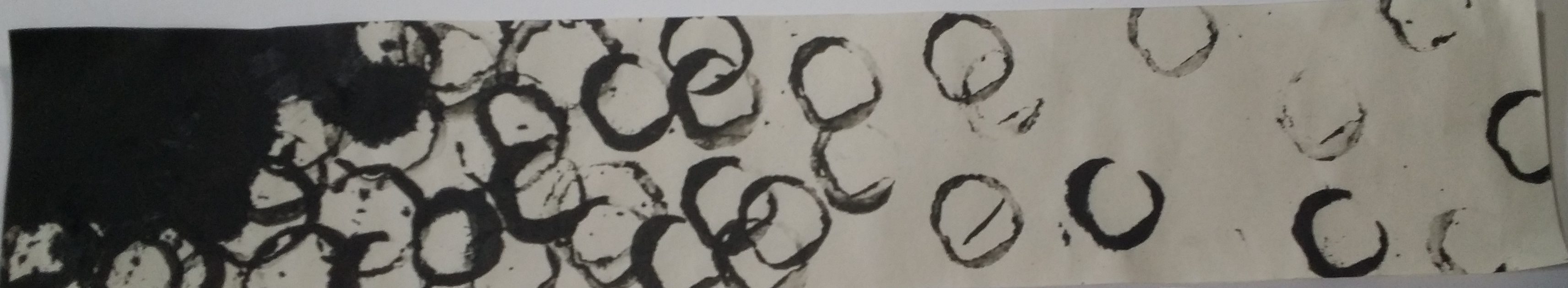
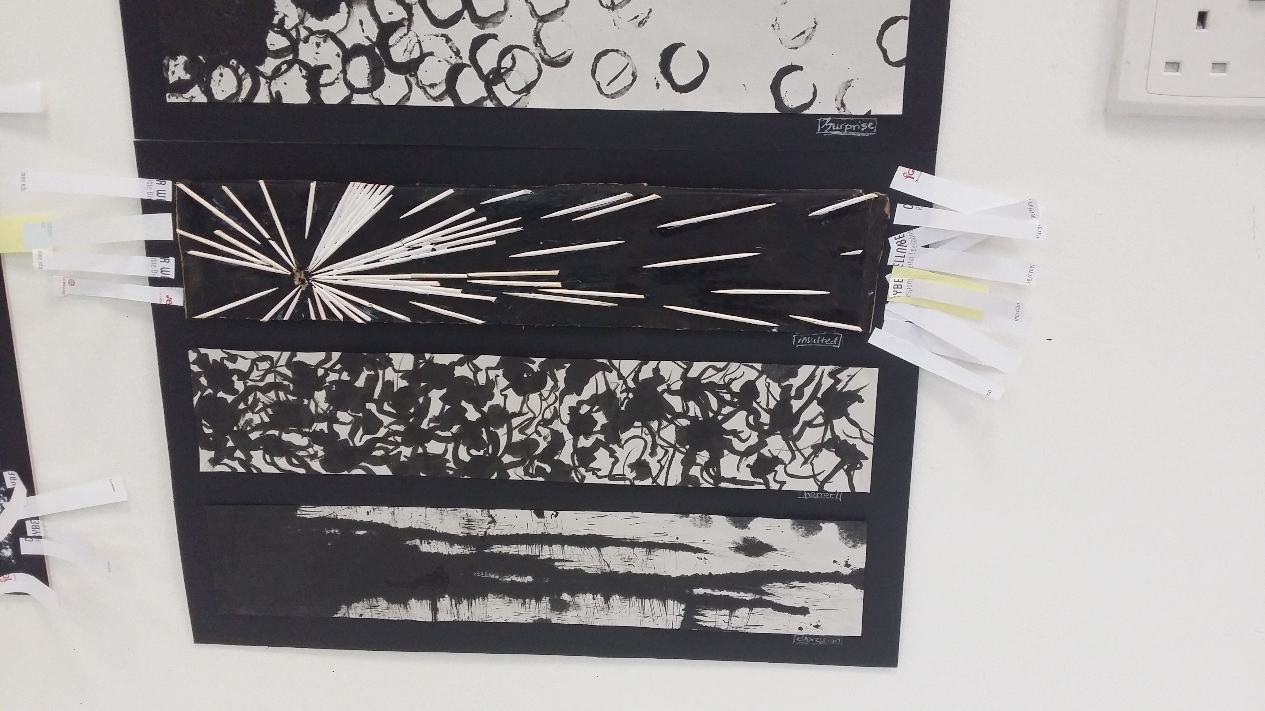
Surprise has a positive connotation and is a rather transient feeling that is triggered by a sudden event, thus short lines, or small circles can be included. The spacing between these elements can also be considered, For example, having a cluster before gradually becoming sparse shows a sense of dispersing of shock.
At first, concentration but gradually becomes more scattered. The rhythm slows down as the space between the circles increase towards the right.
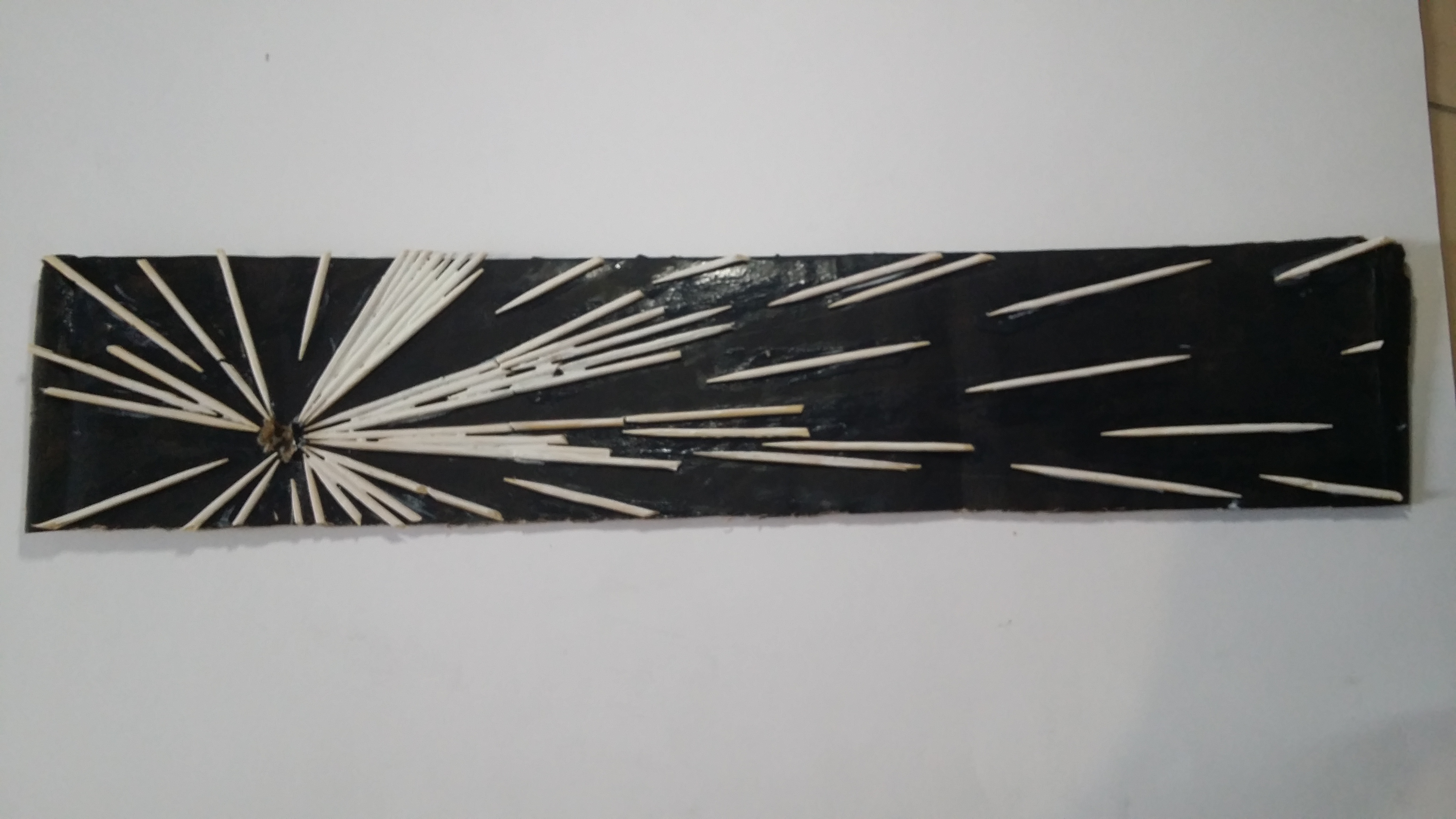
4. Insulted – toothpicks, white paint on black paper

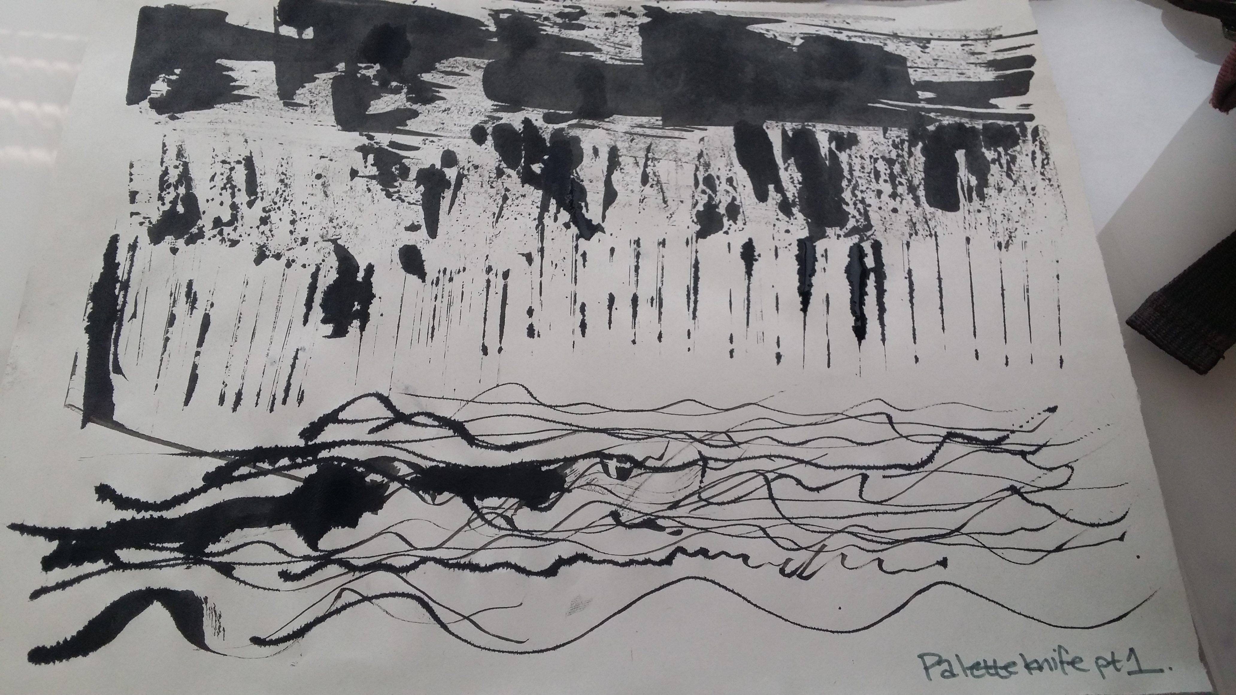
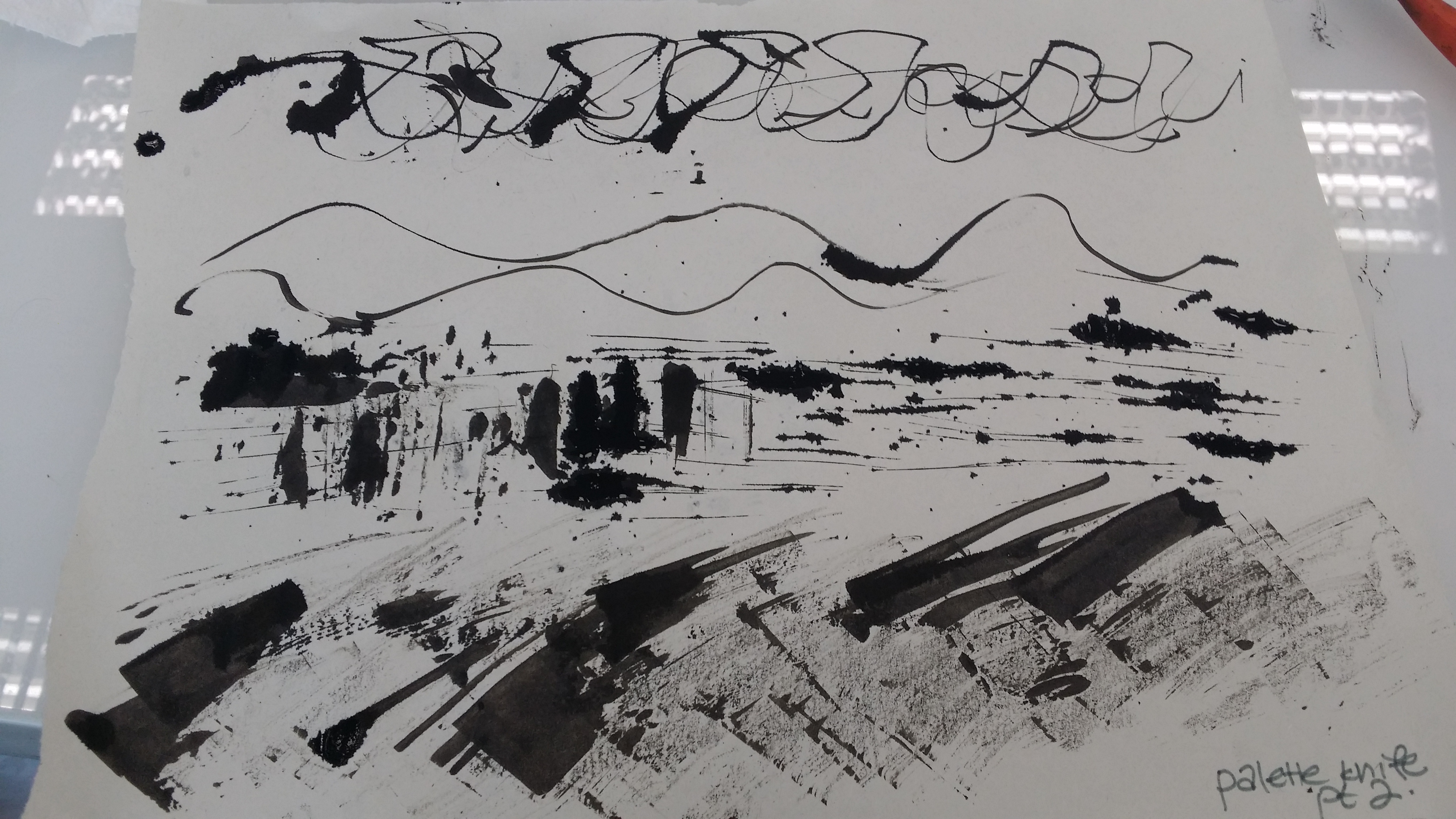
5. Horror – Chinese ink, Palette knife, newsprint
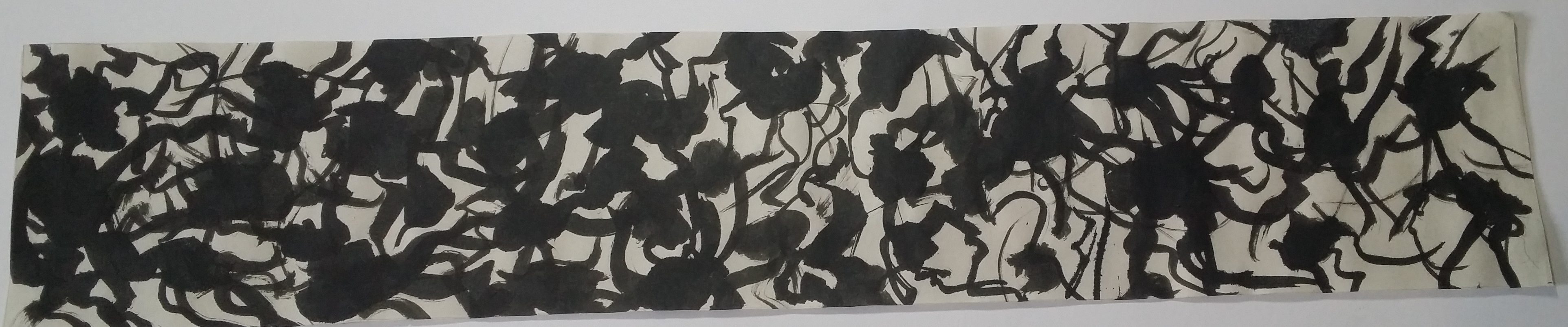
Primal, instinctive feeling of fear that comes from the gut when confronted with a threat/dangerous situation
Tools and exploration:
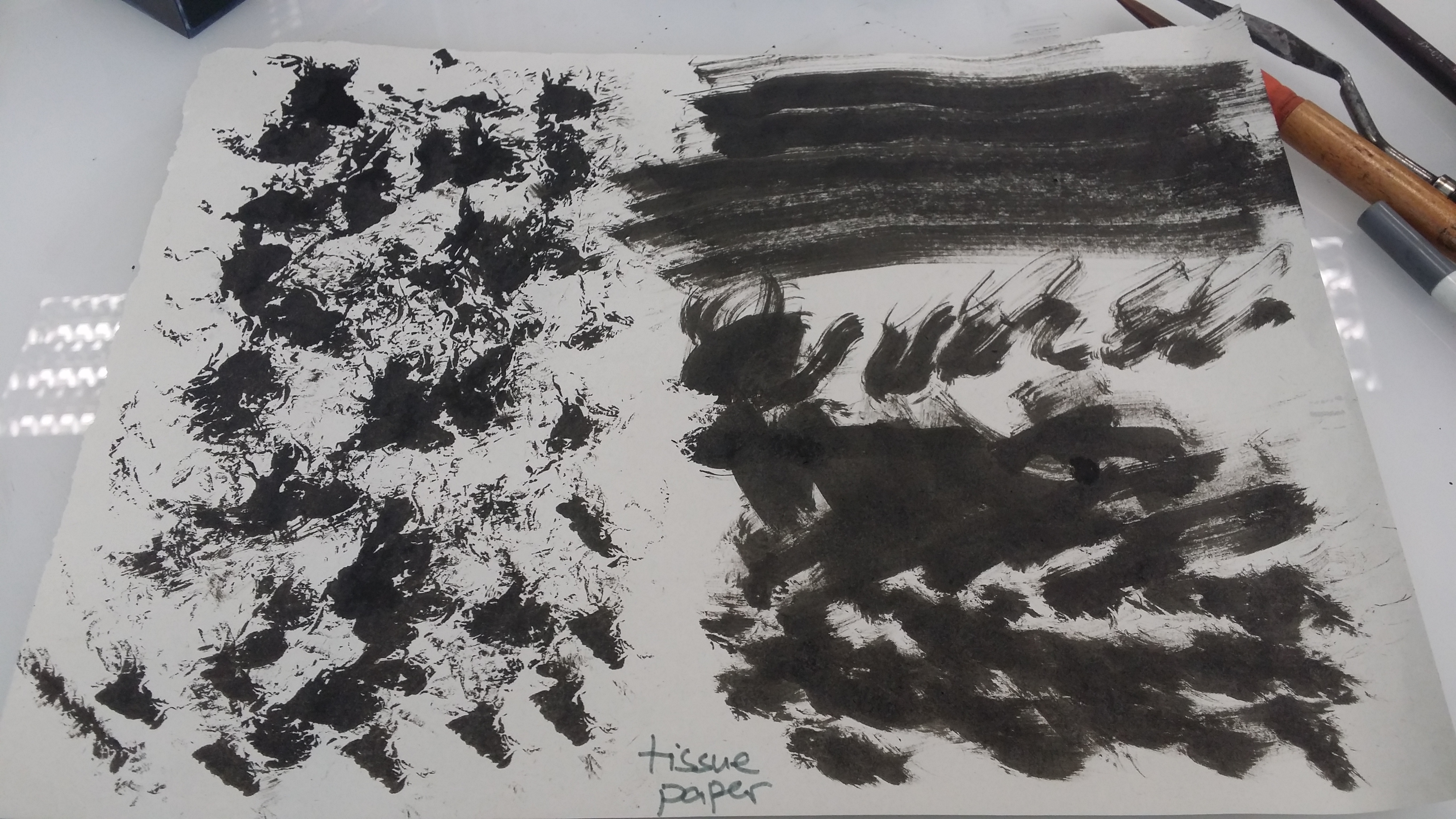
Chinese ink, palette knife. Previously tried other subdivisions such as anxiety, anger using tools like tissue paper, jealousy using drip painting with a hard brush
Rationale:
Feeling like something rises internally and feels intrusive, climbing manner upwards. Wavy patterns that radiate outwards from a dark source. Sort of like how any paranoia originates from insecurities, suspense that prolongs it. Tangled string-y feeling that is hard to get rid of.
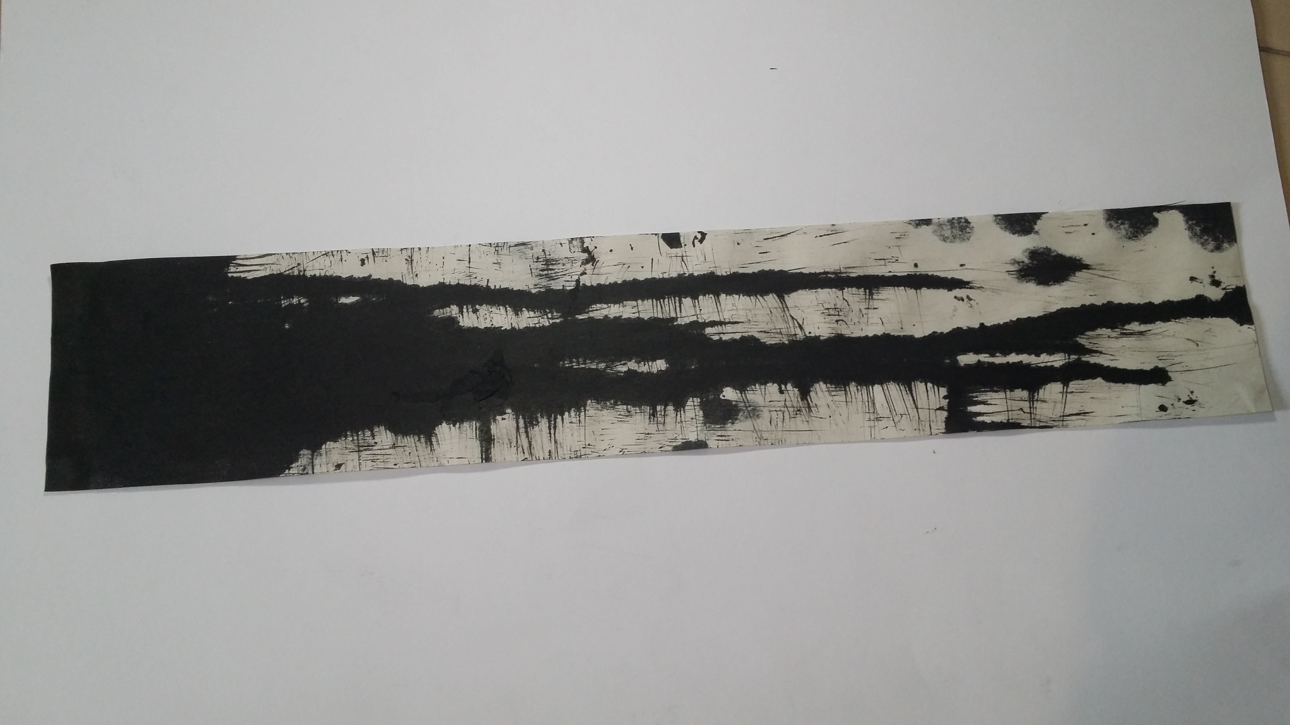
6. Depression – Chinese ink, newsprint, bath scrub

Rationale:
Sadness is a pretty personal feeling that not a lot of people express openly, so it would be appropriate to have a cluster of elements together rather than spread out widely or evenly throughout the entire paper/medium. Drip lines or really thin, wispy lines can be used to convey the silent wallowing in grief, and gives off a sombre, gloomy feeling.
Through this project, I have learned that the effects of designs on posters, websites, advertisements etc. may largely go unnoticed, they are extremely deliberate and directed in such a way that leaves a huge impact on our subconscious mind. Designers certainly do not add polka dots into a design just because they like polka dots. There are very specific reasons why they used a certain design in order to evoke a certain mood upon the viewer.
