In this project, not only did I play the role of Sarah in the video, I was also mostly in-charge of setting up the installation along with Azizah. We had two elements to our installation – the locker and the video.
Installation (Locker):
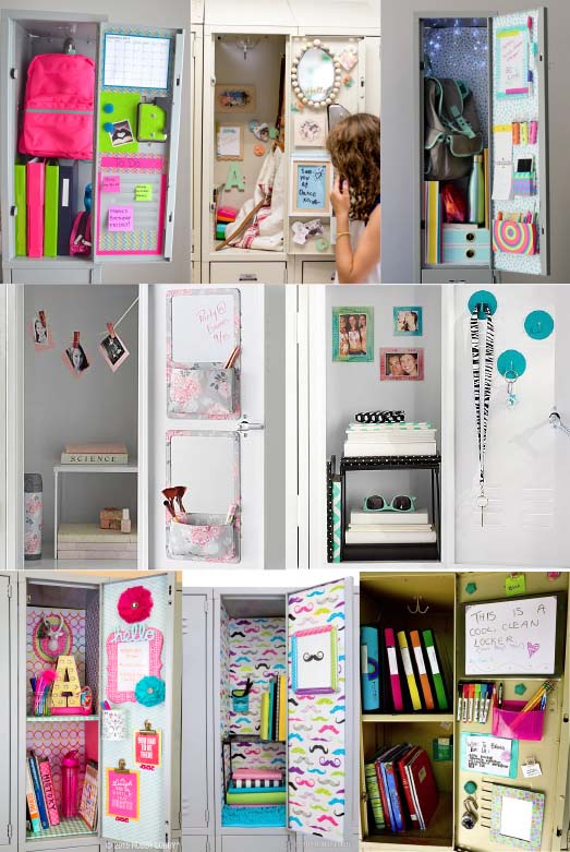
Locker References
She was hardworking, obedient and a very sentimental person. She would keep things significant to the events that happened to the relationship and we wanted to reflect that in the installation. For Sarah’s locker, we were looking for something plain, practical and organised. Since she led 2 different lives we divided the locker into 2 with a shelf/stand.
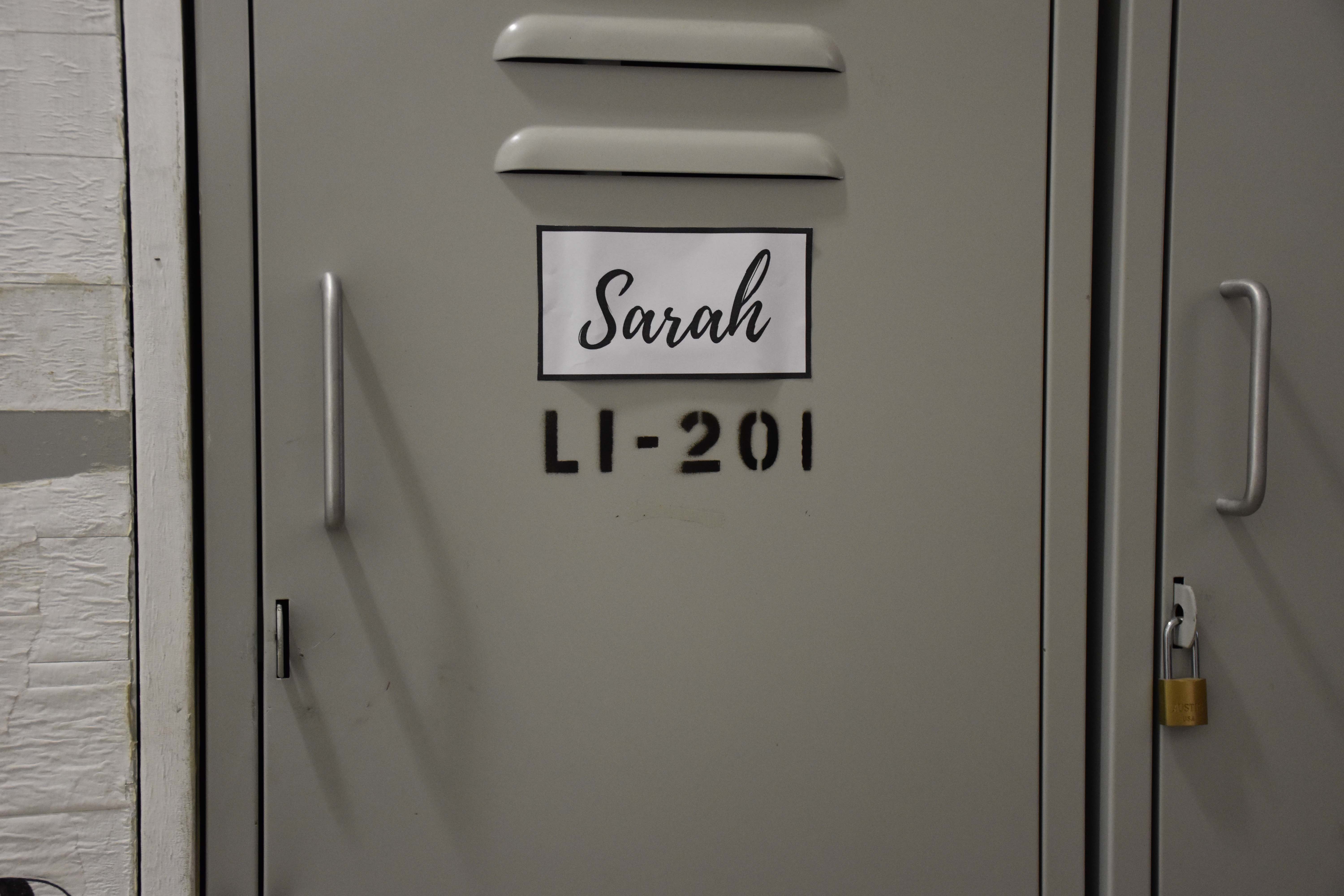
Locker is labeled for audience to find it easilyLocker Installation
The top shelf is where she kept her academic belongings such as textbooks and assessment books or her calculator. The bottom shelf is where she hid her secret relationship. The top shelf being on eye level meant that visitors will see that first before venturing to the other sections of the locker; just like how Sarah kept her relationship secret.
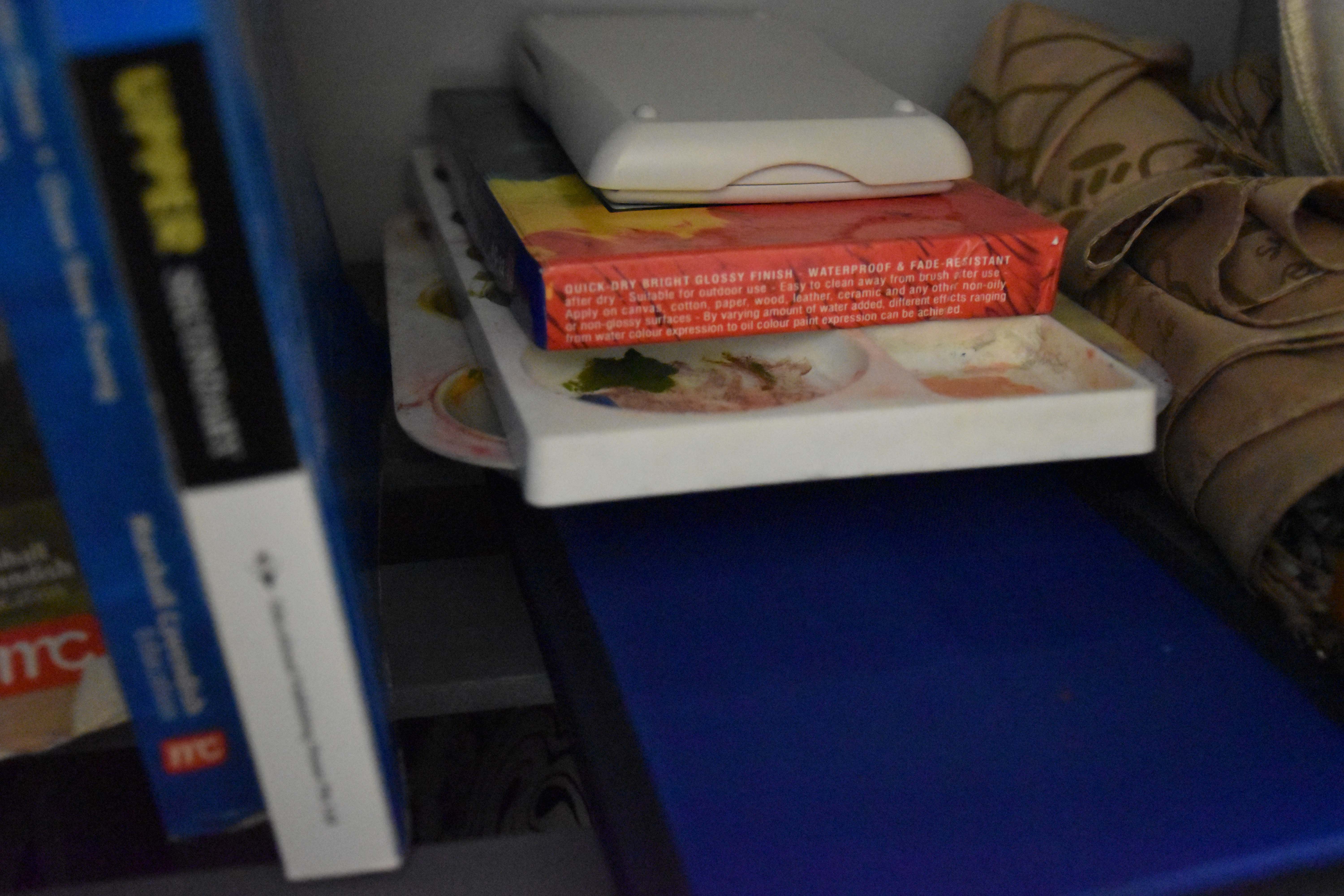
Top shelf includes textbooks, umbrella, calculator and some paint, palettes and paint brushes.
Secret #1
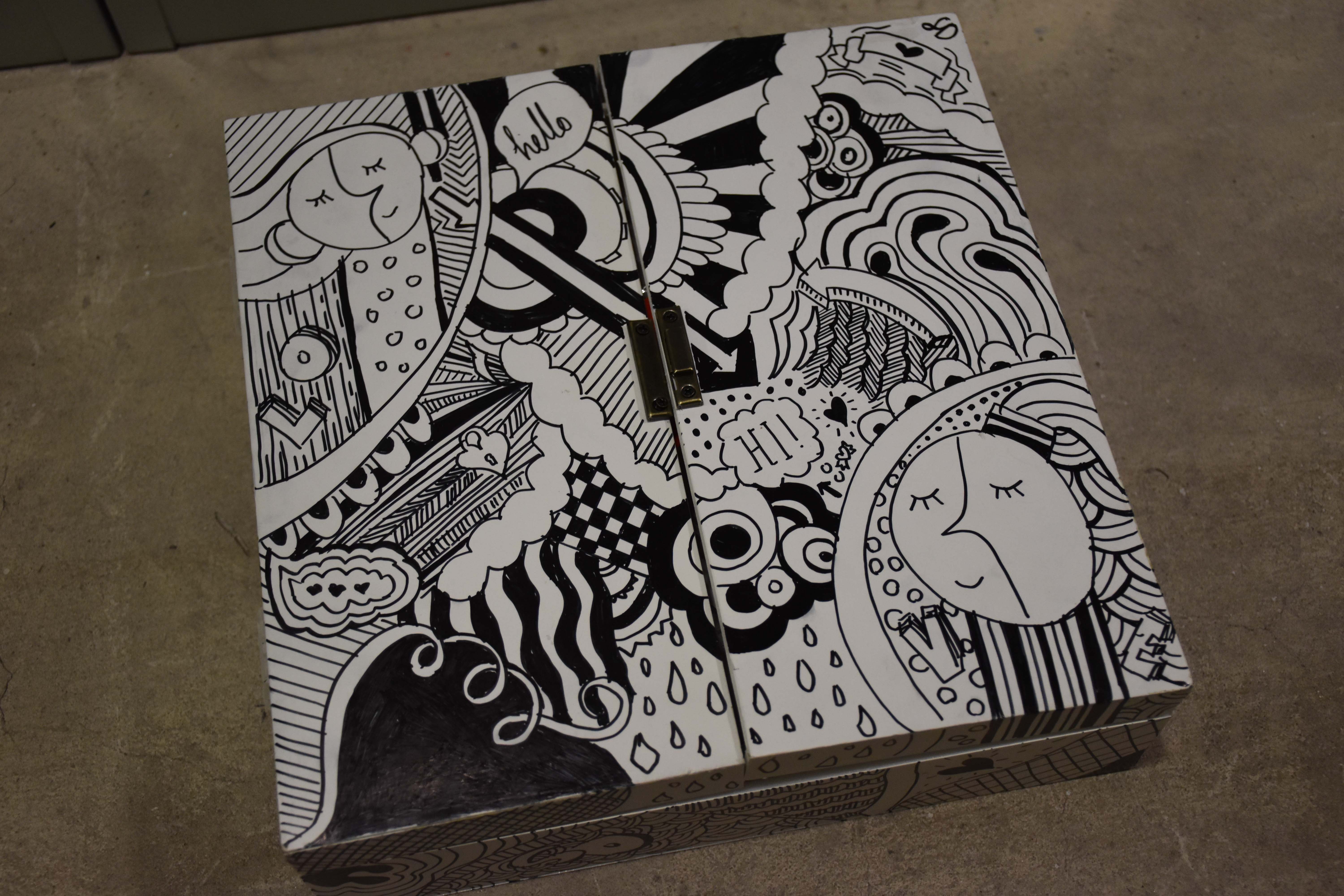
The box is doodled to show Sarah’s artistic talent and her love for Denise. There are also subtle hints of their relationship on the box e.g. you can see 2 girls at 2 corners of the box.
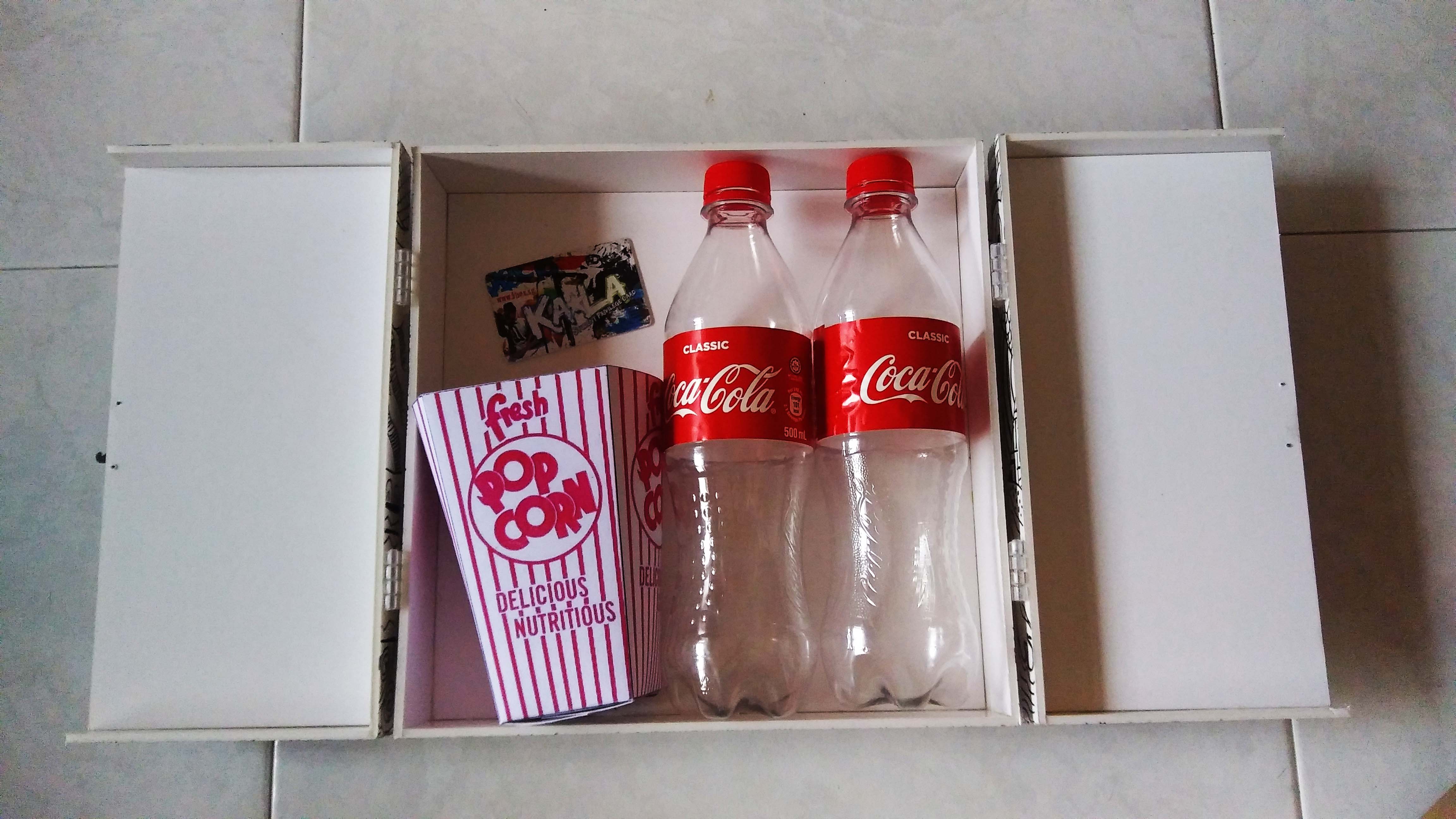
Inside the movie memory box includes 2 bottles of empty coke, an empty popcorn carton and a Karaoke student membership card.
Secret #2
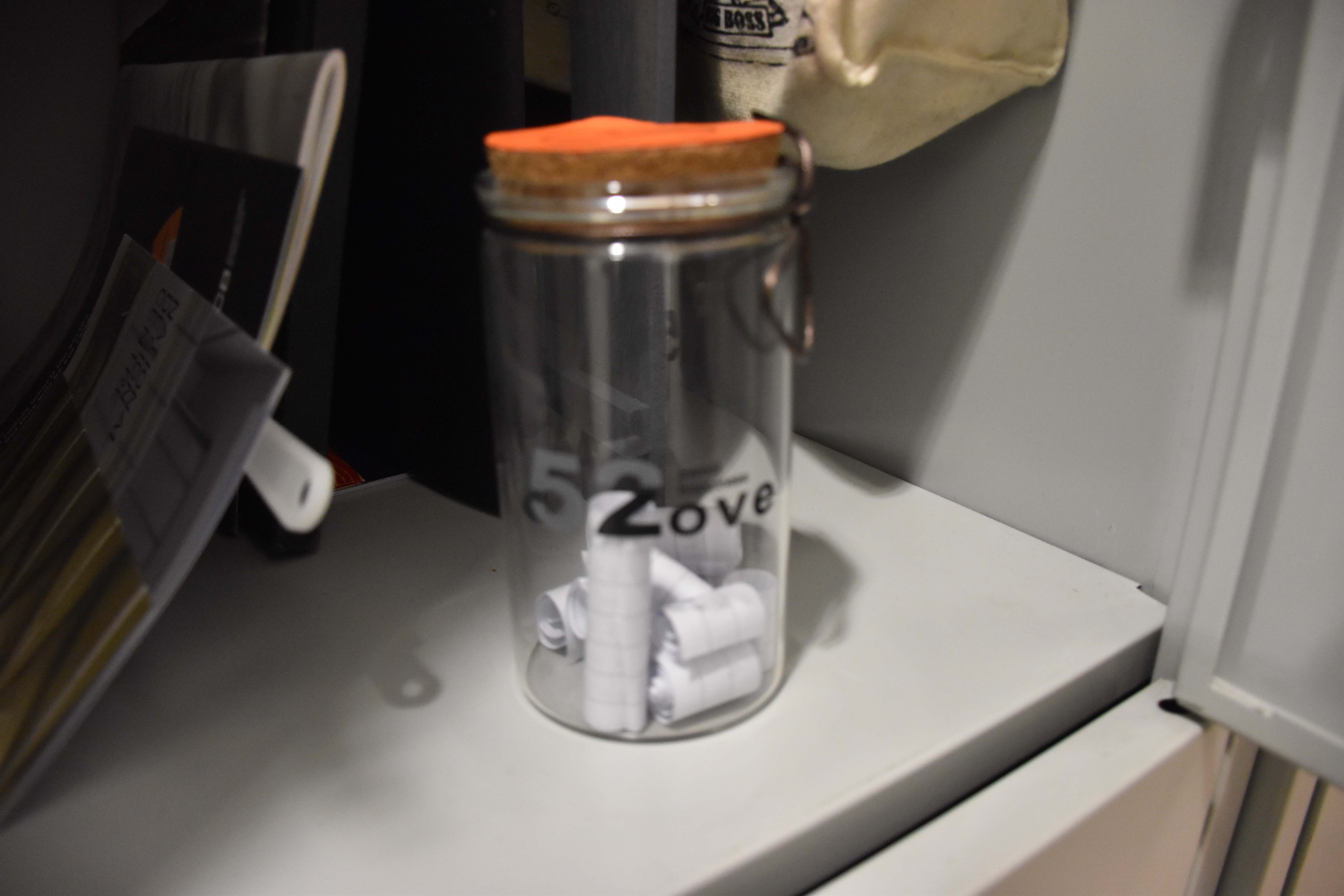
The jar of quotes dear to the couple that also links back to Sarah’s blog.
List of Quotes:
1) I don’t know how you are so familiar to me—or why it feels less like I am getting to know you and more as though I am remembering who you are.
2) Every smile, every whisper brings me closer to the impossible conclusion that I have known you before, I have loved you before—in another time, a different place—some other existence. ”
3) I love you more than love allows.
4) “Here in time,
you are mine;
my heart has not
sung louder.
5) I do not know
why I love you so—
the clock knows not
its hour.”
6) I can’t get close enough.
7) Your smile sort of looks like it makes flowers grow
8) You are so special – how did the universe come up with you?
9) I try to think of a word that is closest to love, and the only thing that comes to mind is your name.
Secret #3
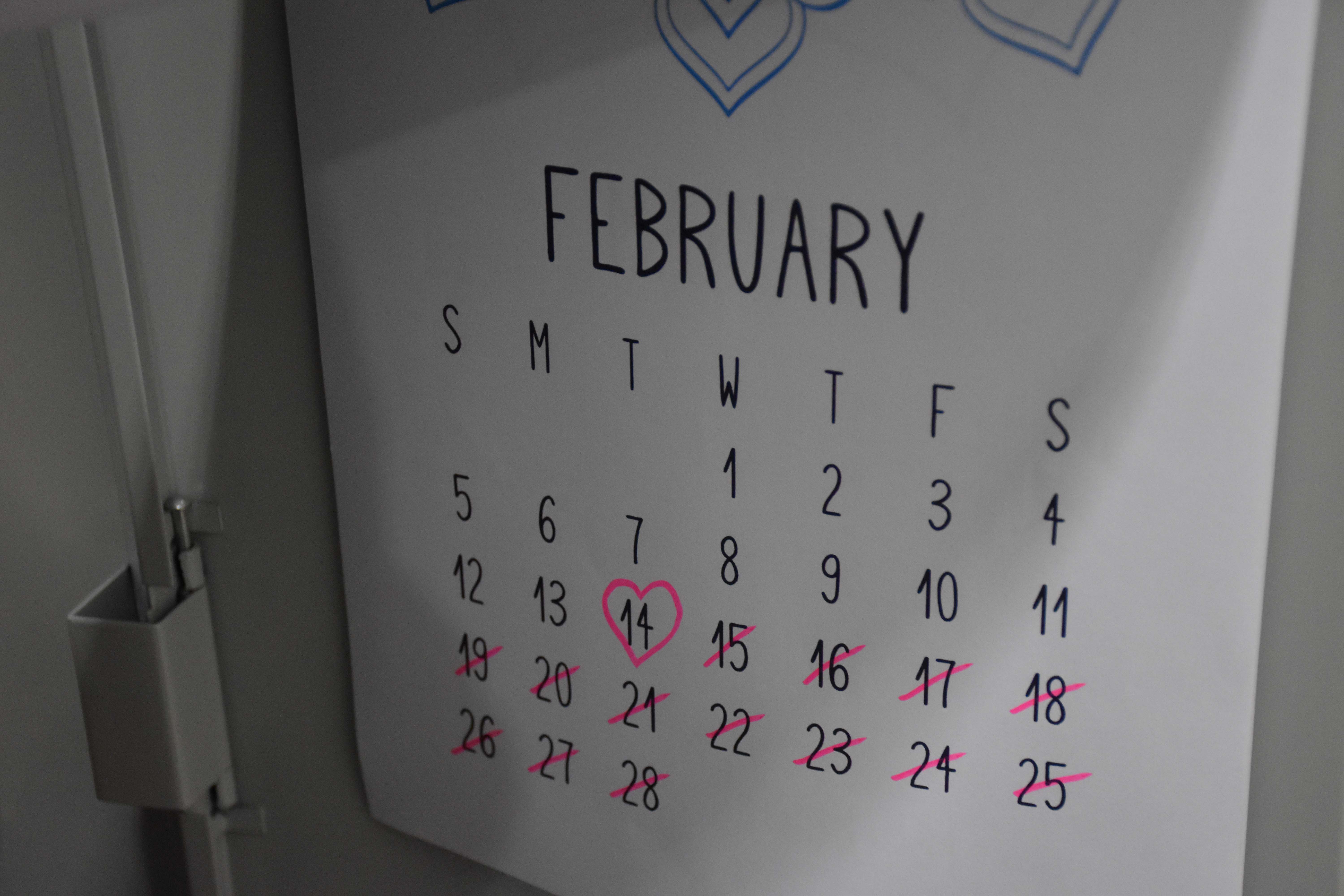
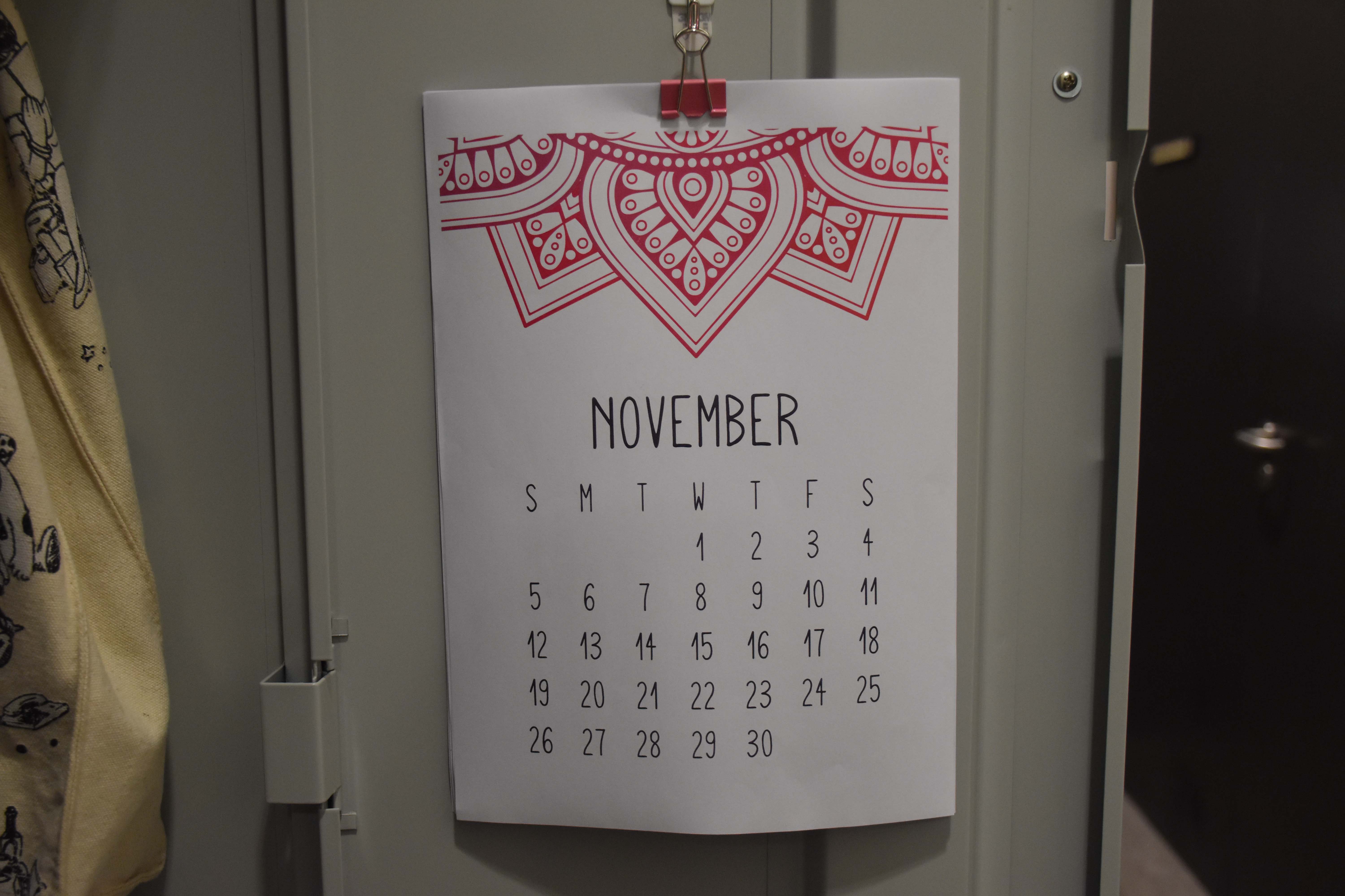
The calendar indicated the start, end and significant events in their relationship.
The Calendar starts with the current month – November because the locker the depiction of the present. The video in the past and the blog tells the full story.
Secret #4
Museum brochures. These are the outings that they’ve been on together. We made sure that brochures place within the duration of which they dated.
Secret #5
We also had a stalk of wilted red rose to show that their forlorn love is in the past. The flower was also carefully place beside the drawing of Denise in the sketchbook.
Installation (Video):
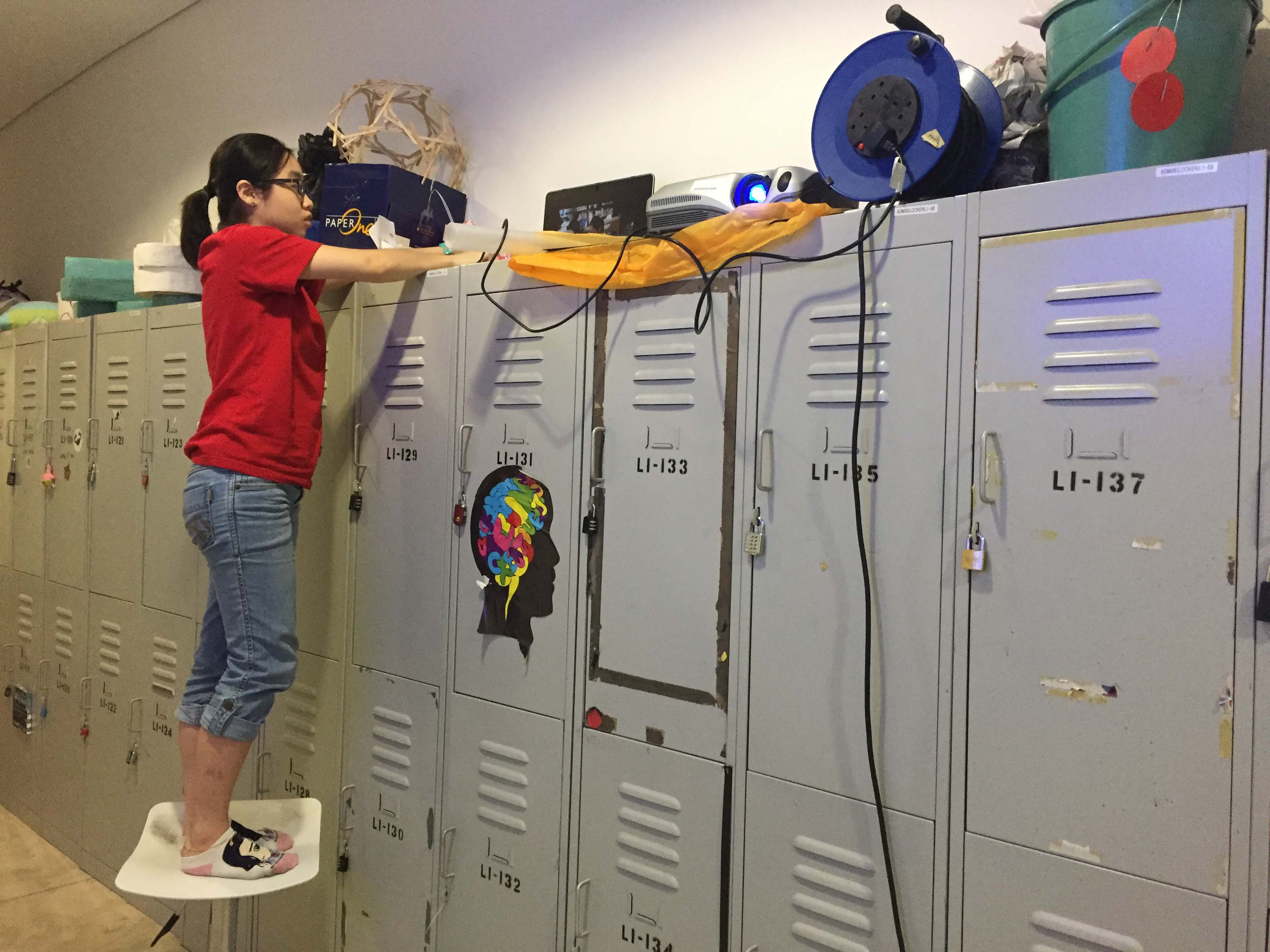
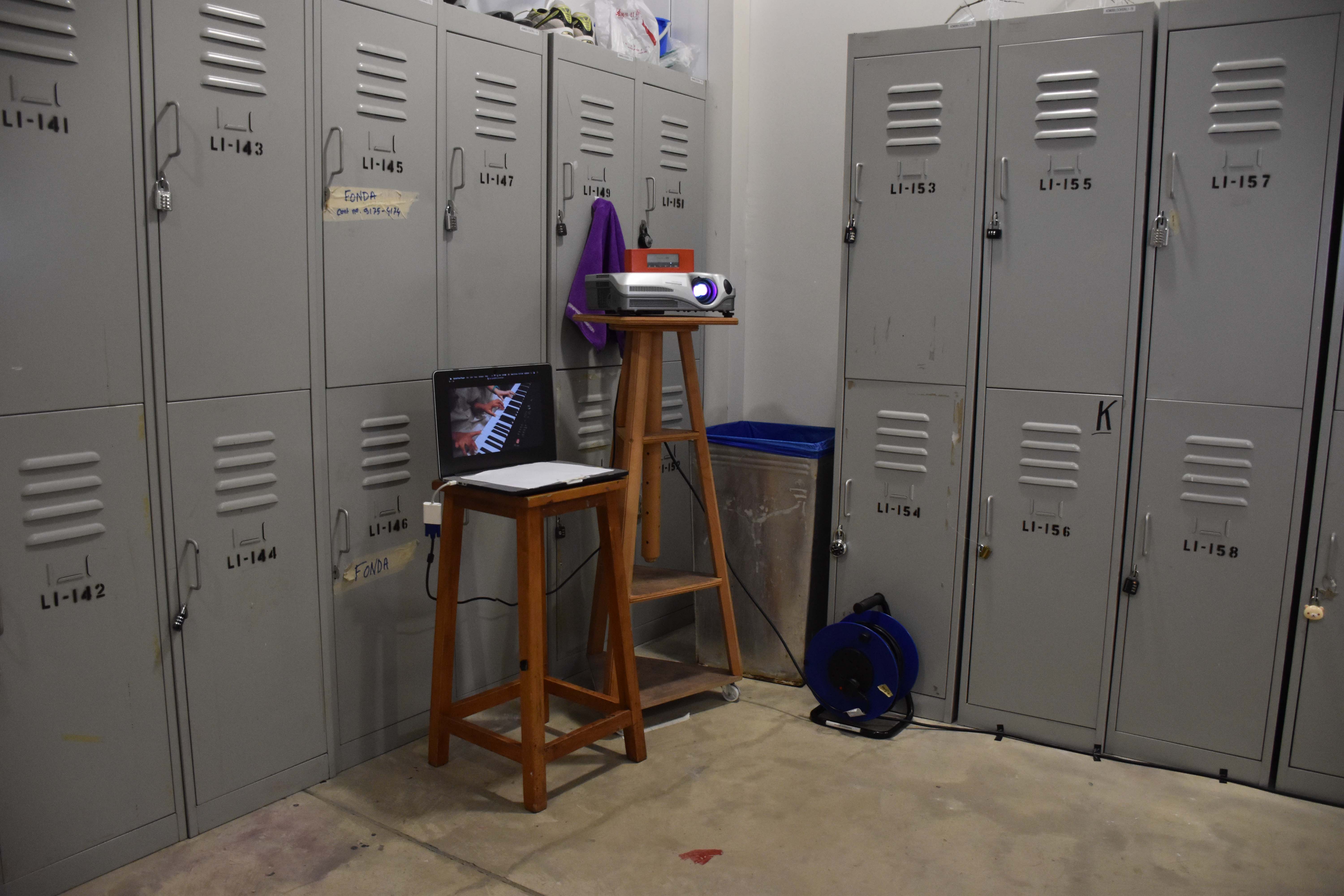
The siteSetting up projector on top of lockers
Originally we planned to display the video on the wall on the right. But the lockers were too high and because of the narrow space, the video was too small for the height.
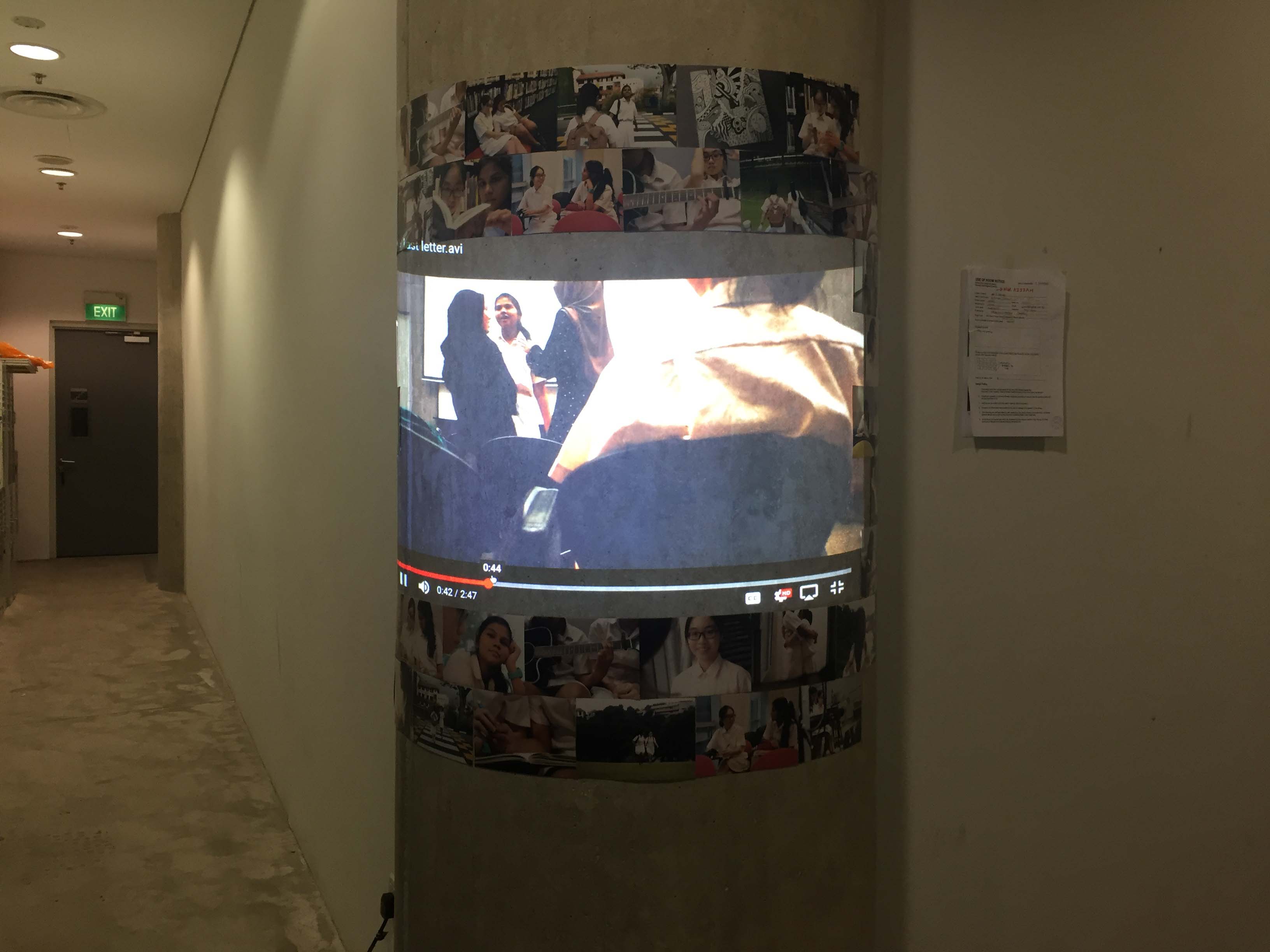
Upside down problemProjection is too smallProjection on curve pillar
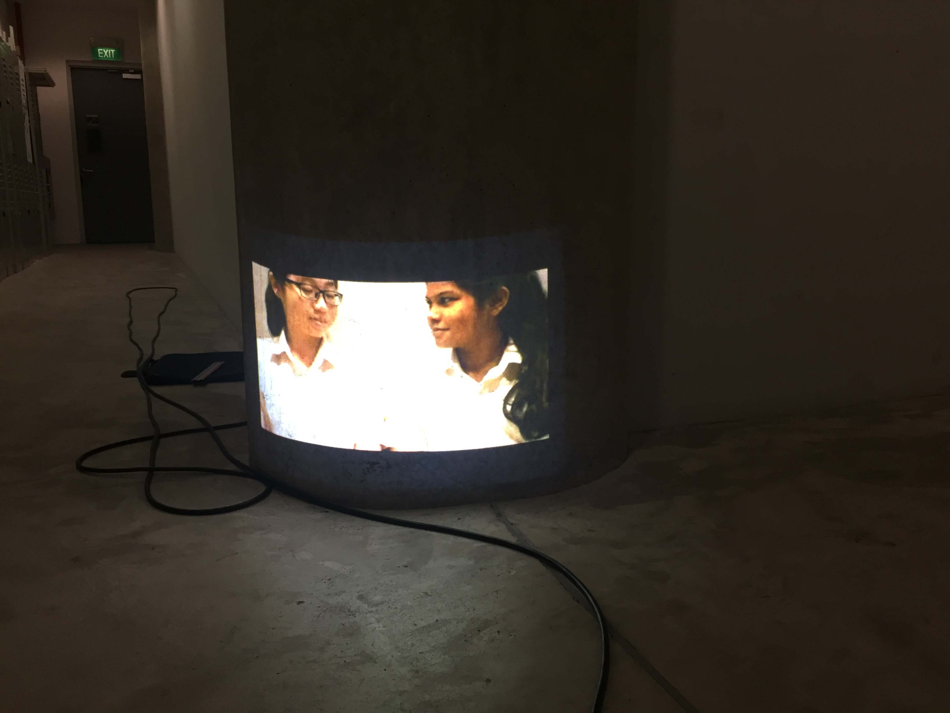
We then thought to put our projection on the pillar to guide our audience towards the designated locker. This also solves the small projection problem as having it on a smaller surface area makes its size look just right. There is just too much empty space on the flat wall.
Projection on curve pillar (eye level)
I really like having the projection at a low level because of its obscurity but we decided to have it on eye level for easy viewing.
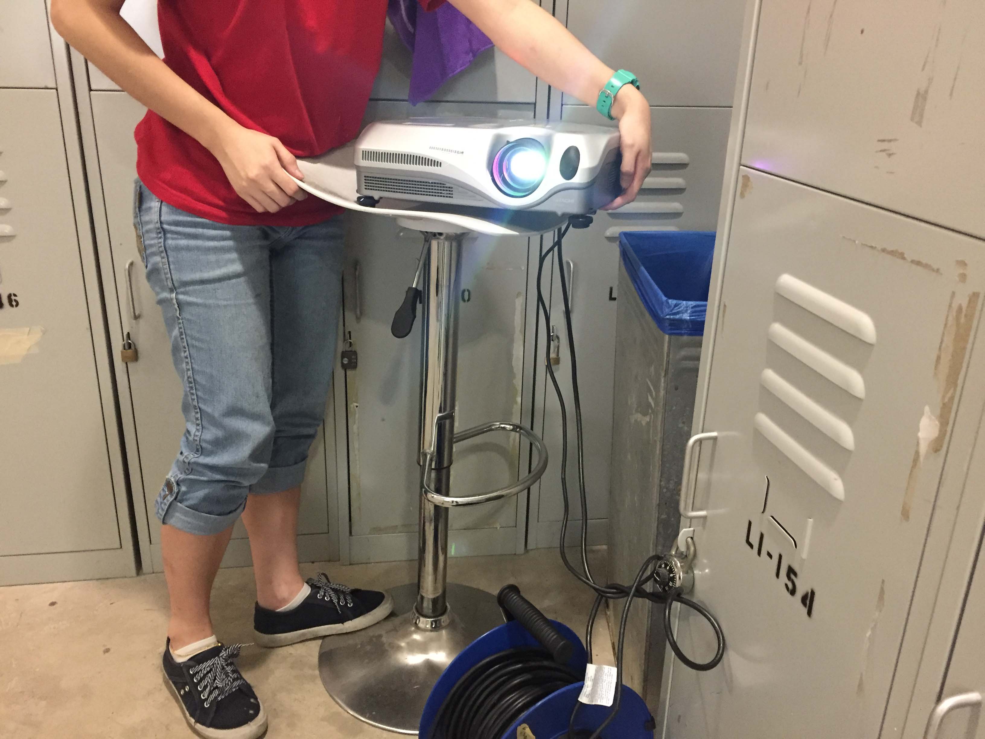
Unsteady chair for trial set up
We had trouble finding the right chairs for our set up. The first was too small and curvy to hold the projector upright. In the end we borrowed a chair and a stand from the drawing studio.
Final set upOriginal Idea for video projection
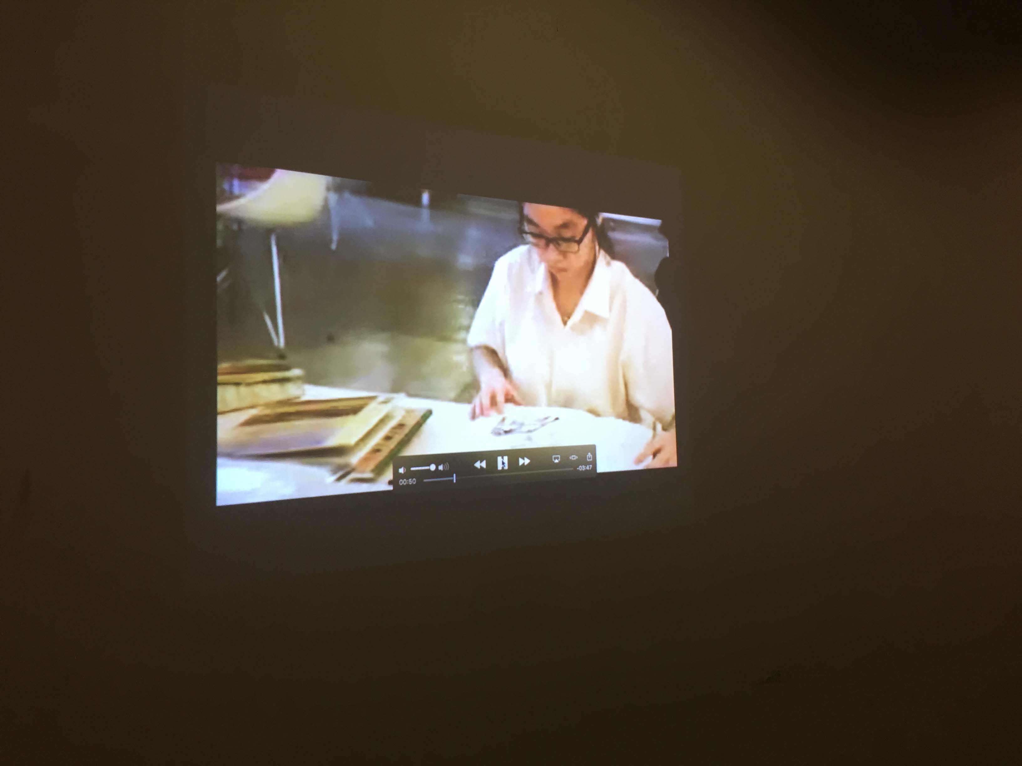
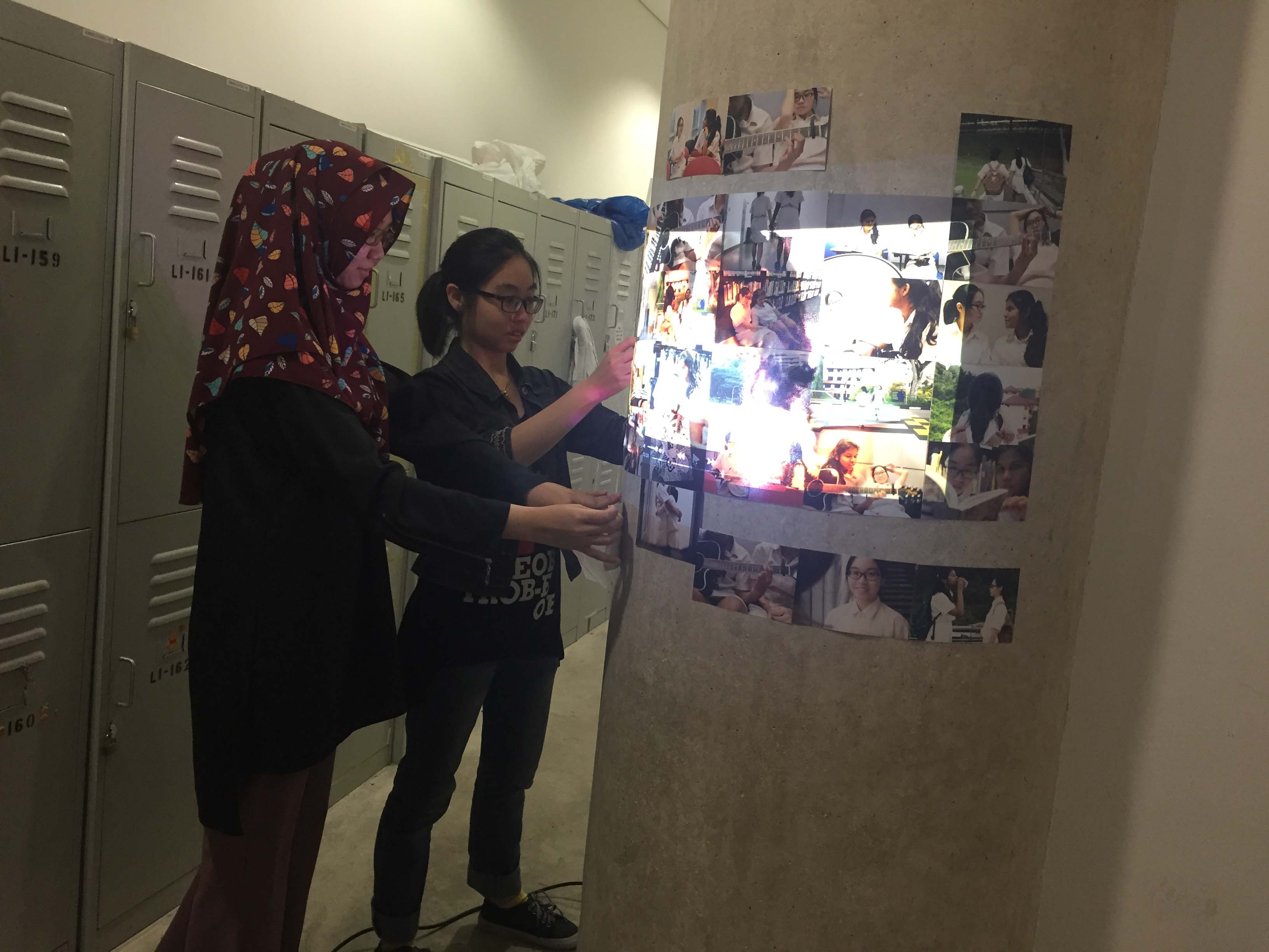
We really liked the idea of projecting the video on a collage of pictures as if it is a flashback of memories. The images used were screenshots from the video.
Fail projection
Sadly it didn’t work because the images that we printed were too colourful and it fought for attention.
Images around projection
We had the pictured around the projection instead.
Our first proposal was rejected because our character personalities were too vague and there were too many elements that we wanted to address. We had the conservative parents, the lesbian relationship and cancer for extra dramatization. It was too complicated. Thus we narrowed the story down. Focusing on just Sarah, a star student holding on to a forbidden forlorn relationship.
What draws them together?
– Common love of art: for Sarah, it is an escape from the rigid structures of her life. Denise isn’t very good at drawing but she appreciates art for its beauty (which she thinks is very important in life)
– Opposites attract: Sarah drawn to Denise for her extroverted, charismatic personality, which is what she cannot be. Denise drawn to Sarah for her meticulous, detailed drawings and gentle personality.
– Denise draws Sarah out of her shell, teaches her how to live life on the edge.
Why did they break up?
– Sarah’s timid nature starts to get on Denise’s nerves. Denise thinks she’s not adventurous and not living life enough, starts to get bored of her and thinks Sarah is weighing her down
– Denise finds the fact that they have to hide their relationship too annoying.
Sarah thinks Denise is too crazy and doesn’t think through her actions enough. Things that previously she found cool, like Denise skipping school, starts to bother her
– It gradually becomes increasingly apparent how little they have in common
Fight about each other’s lifestyles
– Denise gets a new girlfriend who is equally as crazy, but Sarah cannot move on and keeps their gifts in her locker
The story is told in a non-linear narrative through a blog, a video and the locker installation. The blog would tell the whole narrative in text posts. The video is a flashback of happy memories and the locker shows how Sarah is unable to move on from her broken relationship with Denise.
I played the role of Sarah for this project. The shooting went fine other than the bad weather and the awkwardness of acting. It was quite a struggle restraining our laughter and getting into character for the intimate scenes.
The hugging scene was okay. Awkward level was rather low. It was the easiest to shoot.The guitar was so long, we could not find a position that looked right for the scene. Leaning back was not right. Sitting up obstructed the guitar.
I was trying to seem infatuated but being a person who rarely show any expression it was difficult. Also because I cannot really control my face muscles for the desired effect I just look tired of Denise terrible guitar playing skills.
So we moved on to playing the piano together instead.The scene where Sarah teaches Denise was difficult too as we both felt uncomfortable acting it out.Then we also had to do a scene where we it hinted that we kissed. Referencing (), we cleverly did a pan away to suggest intimacy.But, we did accidentally made a somewhat believable kiss scene. This did not make into the final cut because it was shot for the first proposal that was rejected.
I also had to do recording for the narration of the video which took several tries because we had to match the length of the video. Also because I had to get into character and try to carry Sarah’s emotions across. I was going for a solemn tone. Something serious, sad and empty. Something melancholic. I try to start out happy and sweet as if I was talking about a dream and change my tone at the end as it turns into a nightmare.
The narration script:
I remember our highs in hues,
like the color of her eyes
as the sun was setting;
the pale of her hands in mine,
and the blue of her smile.
I remember our sorrows in shades,
like the gray of the shadows,
which loomed that day,
and the white in her lie
when she promised to stay.
Original pacing lasted only 30 seconds and our video was a little over a minute.
Final recording of one minute after Syadza helped guiding my tone and pacing. We counted about five seconds interval between each phrase.
Syadza was in charge of the video editing; you may head to her post for a more detailed explanation-> https://oss.adm.ntu.edu.sg/syadza001/documentation-of-the-last-letter/
Higgs, S. (2017). Finding Nemo in the Three-act Structure. Screen Education, (85), 90-97.
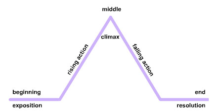
Linear Narrative
The 3 act structure is basically a linear narrative with more elements to it.
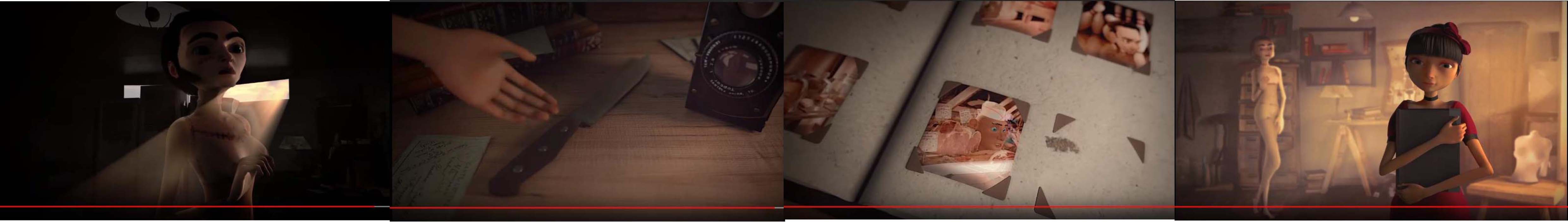
I did not have time to watch 2 hour long movies to study the story-lines and I know that we watched “I’m Here” in class. But I wanted to study something that we did not go through in class as an exercise. so I went to look back at some short animated films that caught my interest. One of them was Patchwork which really surprised me with its plot twist.
Act I
In Act I (Set up), they introduced the characters, background and aim of the story. We know that the characters is this man and this lady; presumably his wife or girlfriend. We also know that he is a sculptor and he is trying to create a realistic sculpture of the lady; who seems to have left him. (I think she is dead.) He is a perfectionist as he made many sculptures and still was not happy with any one of them although they all look beautiful to the audience. His frustration and anger also revealed that he is of violent nature.(probably why the lady left him, but that’s not the point) He sits down and looks at a flyer about speed dating which tells us that he might move one from the previous relationship which leads us to Act II. So basically, the man’s aim is to find a new significant other.
Act II part 1Act II part 2Act II part 3Act II part 4
Act II is the longest. It shows the man meeting women after women during his speed date, unable to find one the he likes. According to the three act structure, this would possibly be the ‘obstacles’ where he is unable to find the one. The rising action also starts here where we see him circle certain body parts of the many women he meets during the speed dating sessions in a montage. It raises curiosity within the audience as to what the man is up to.
Act II part 5
At first I thought this is in act III but after some thought about it being a turning point ( a tragedy is about to happen) of the narrative, I decided it was the midpoint instead of the previous scene where he and the woman fell in love in the bar. A new aim is also established here.
Act III part 2
The rising action continues as the man invites the woman into his home, they dance and had a great time. Until he kills her which meets his aim and is the climax of act II. The descending action starts from here.
Act III part 3
Next we jump right into the climax of act III where we find out the one killed was the man and not the woman. (conflict unravels) The resolution was that she too was a serial killer and murdered him before he could murder her.
E.g. Memento (2000)
Non-linear Narrative
From what I understand, a non-linear narrative is told by going back and forth the story line; meaning the use of flashbacks. It is usually used to in detective/investigative genres to slowly reveal the case and have the audience piece the pieces together themselves.
Plot VS Story
“The plot goes beyond the story world by presenting non-digetic images and sounds which may affect our understanding of the story.”
“the story; the exterior; sum total of all the events in the narrative and events that are not presented (inferred events or character’s interior world”
Because a non-linear narrative does not necessarily starts from the start and jumps around the timeline of events the plot and story needs to be established clearly to create a proper narrative in the minds of the audience.
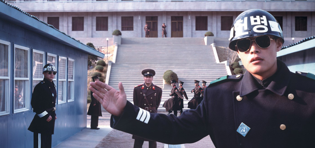
E.g. Joint Security Area (JSA)E.g. Citizen Kane
This short animation from Overwatch had a short flashback where the good robot now taps into the memory of a fallen comrade and learns his origins and purpose. Despite that short scene it actually feels like a linear narrative because the robot initiated the flashback??? Because usually, like memento, the flashbacks are skillfully cut and transited… This is non-linear.
“A multiple narrative describes a type of story that follows several protagonists rather than focusing on one main character. ” These multiple narratives came from traditional theater for example… (they happened to both be musicals)
Les MisérablesInto the Woods
This type of narrative is very interesting. Its quite similar to non-linear narrative as the audience has to piece multiple stories together on their own. However, there is a lot of planning involve in creating the characters for a more dynamic story with no stereotypes.
Story Ideation (Rejected)
There are many topics that I am interested in – Placebo effect, Butterfly effect, Schizophrenia etc. But they weren’t giving me any inspiration. I thought of dyslexia which was also one of the things that I had wondered about. My cousin has dyslexia and he is actually really smart and has a great memory yet he does so poorly in school. Why does it happen? What does he see when he reads? This topic is much closer to home, I could ask him some questions and the results would be more realistic.
However, after discussing with the group the idea was dismissed as we favored the lockers as our location. The story that I proposed was not revolving around the locker so it was rejected; sadly.
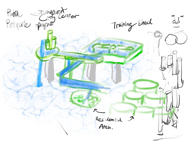
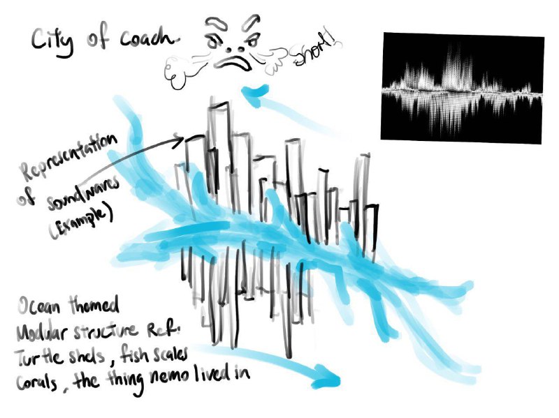
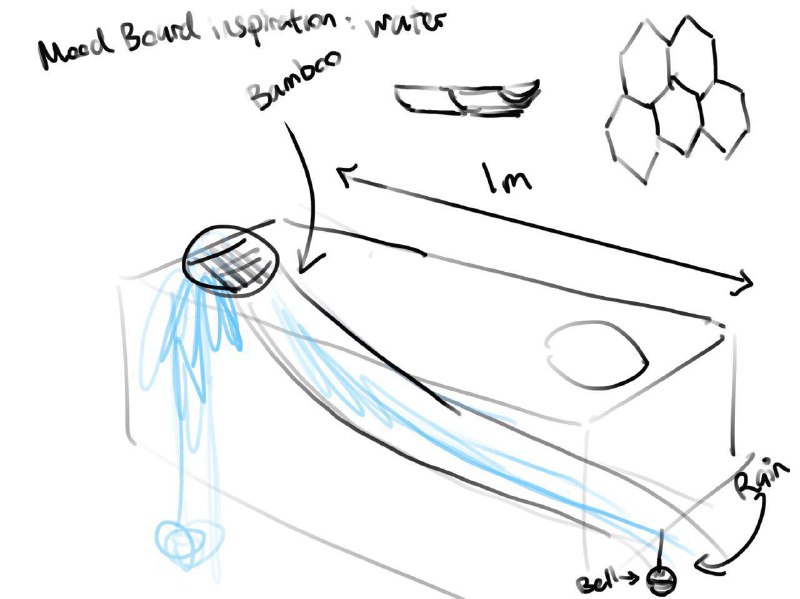
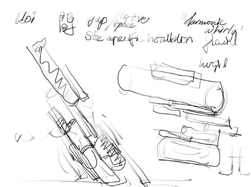
Originally we thought our music sounded quite Zen and the rhythm sticks reminded us of the bamboo falling in a bamboo fountain.
bamboo fountain
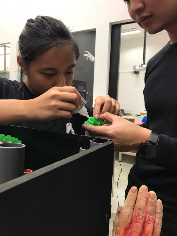
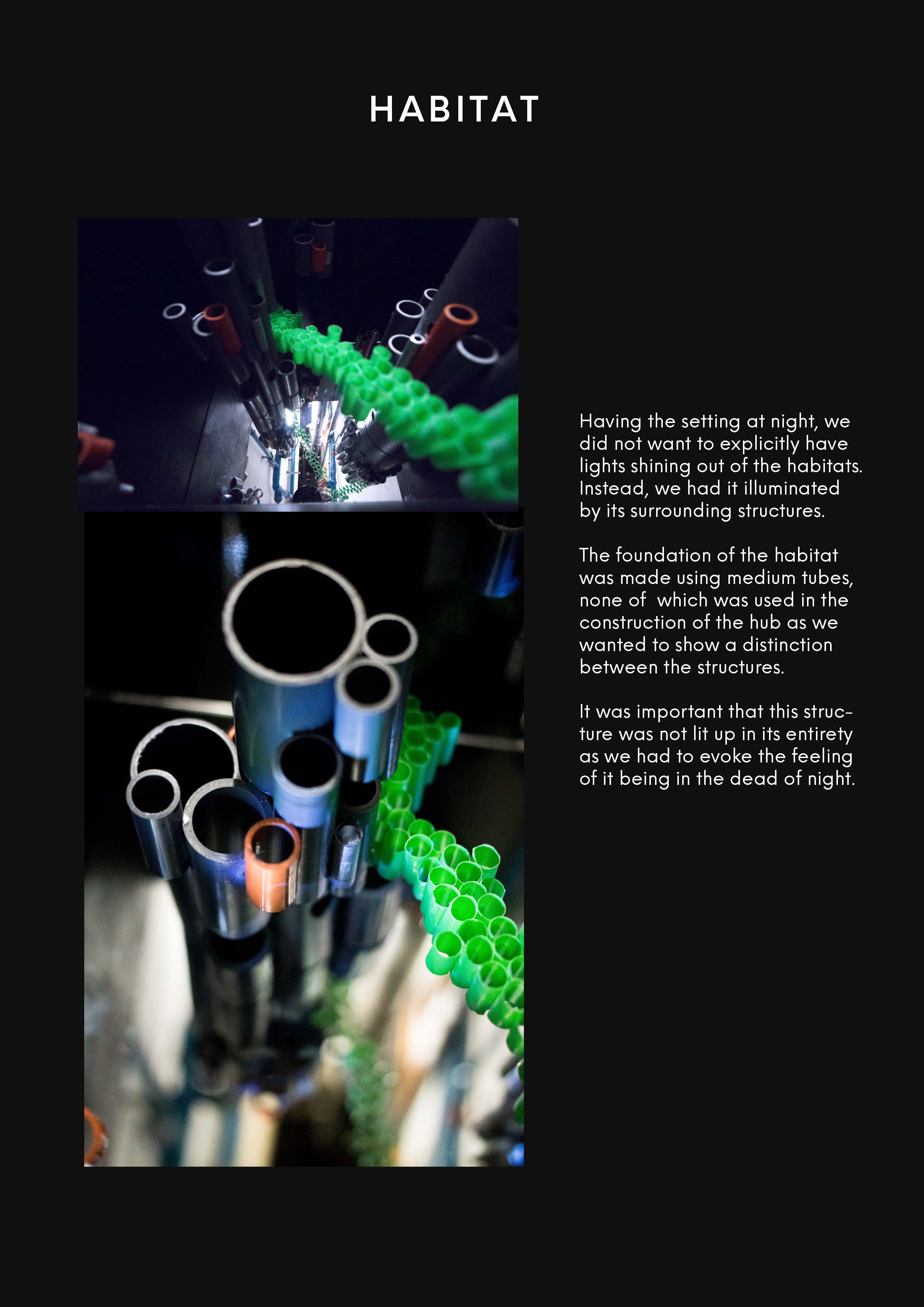
This is actually where the cylindrical modules came about. Bamboo.
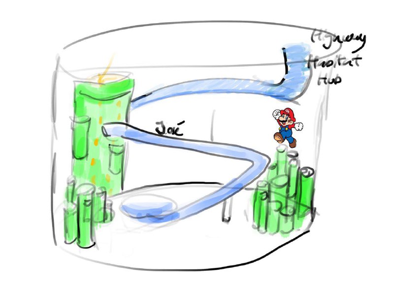
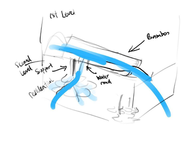
sketch of our own bamboo fountaincity of coachwater slide highwaysketch of how hubs and habitats would be link by water slide highwayideas of water engineeringafter consultation. Cheryl suggested pipes and emphasized use of modules and repetition.
Reflection:
Overall, this project 間 MA’s Obscure City of Voids was really fun. Love seeing how we translate sound into space and forms. We learned about interacting with all five senses to produce an impact-full design. I learned how to be more creative, resourceful and spontaneous with my group. I would never have thought of pushing my limits to create an infinity box or sourcing for a cheap reflective one way film online. Its all thanks to everyone in my group for working so hard and Cheryl for supporting me in explaining Modular structure. Cheers to Cheryl and BAMBOOzle. Happy holidays. 😀
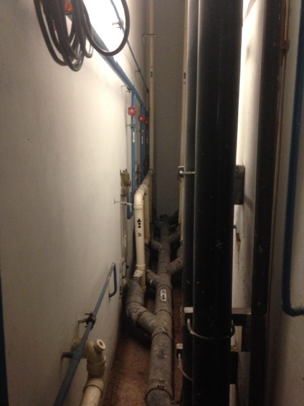
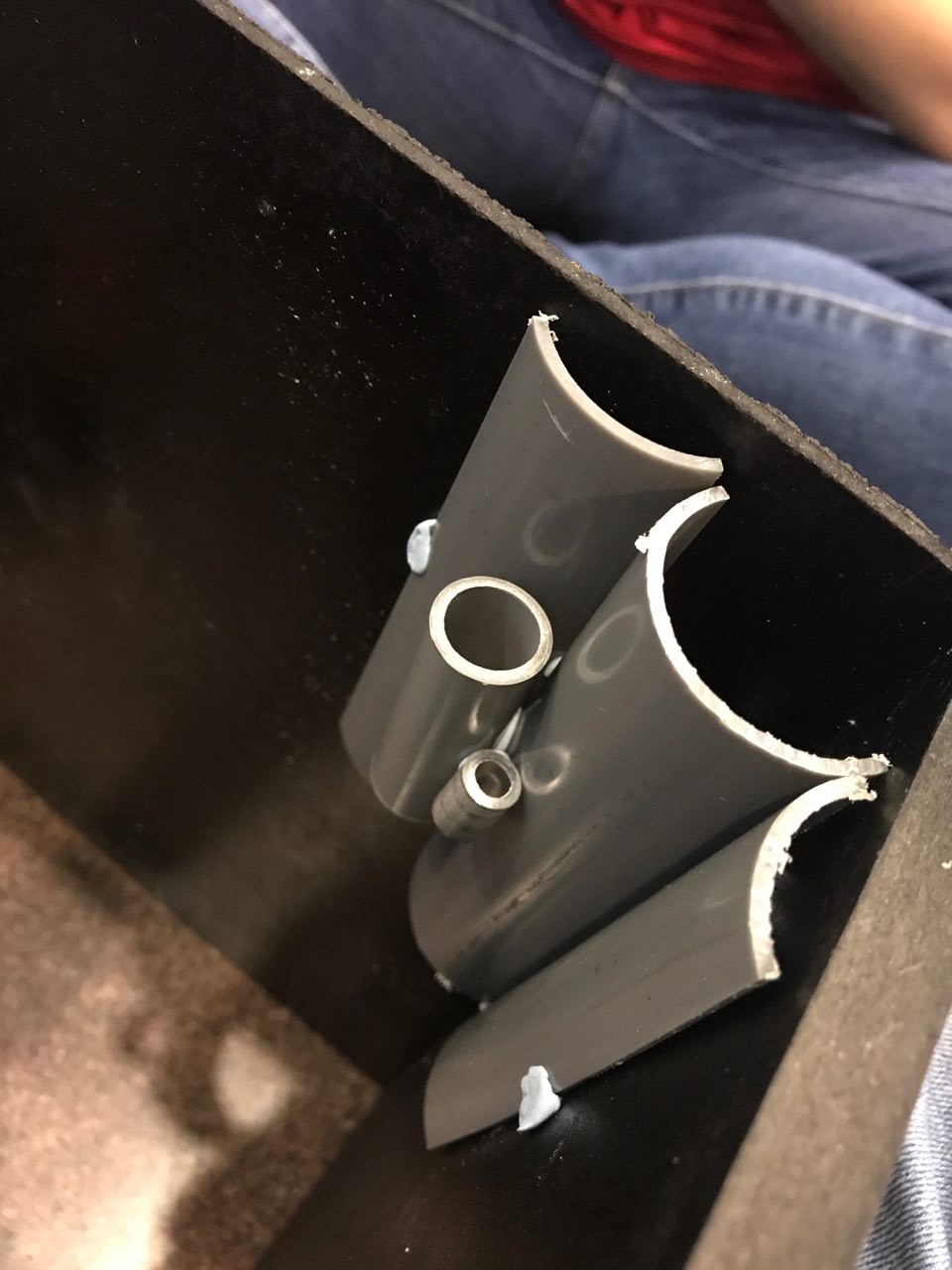
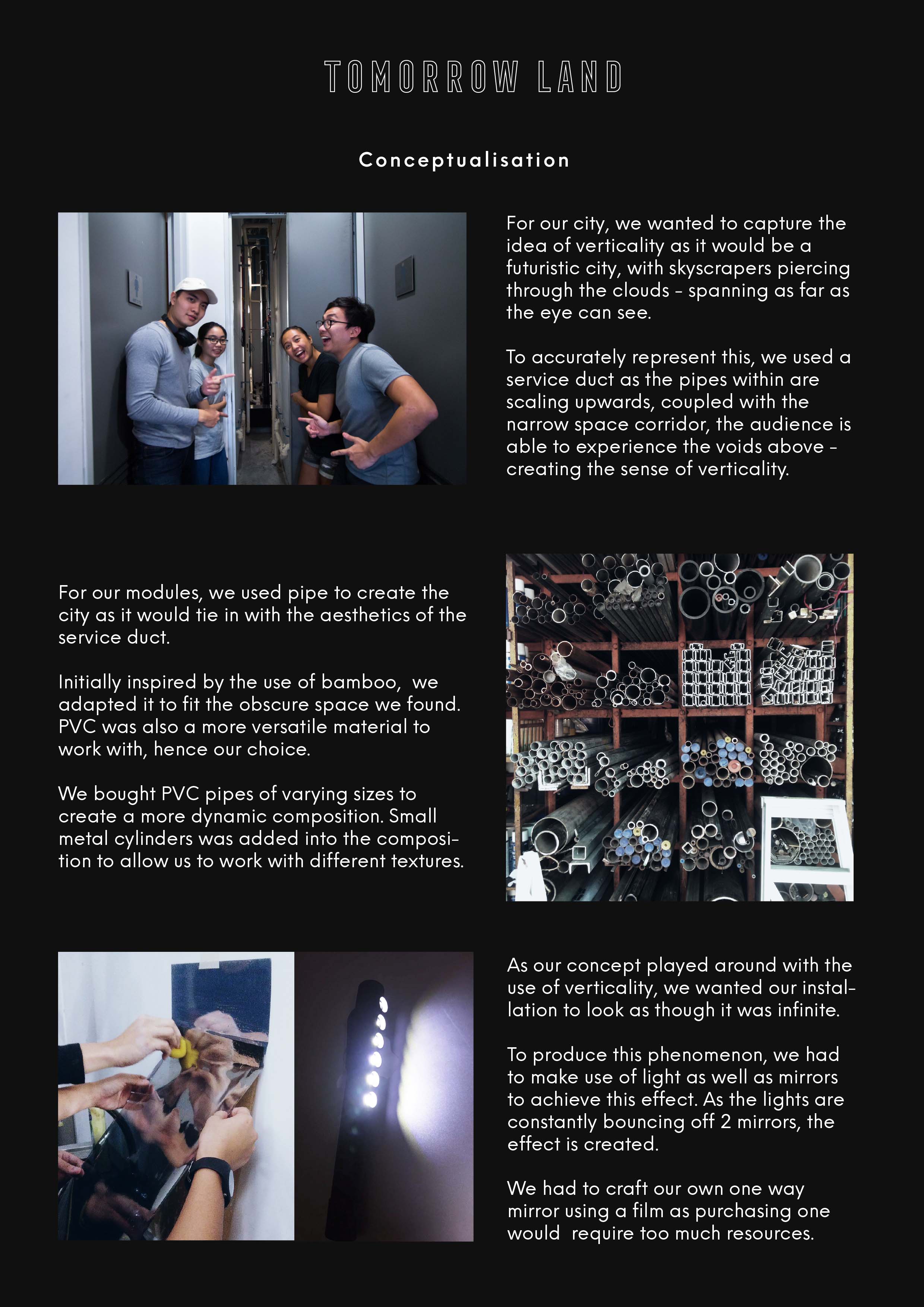
Our original idea of putting the model in the fountain could not work as it was not allowed and not really obscure. So we wondered around and found the service duct which was super obscure and we had the idea of pipes so it fits the theme well. Our city was designed within the constrains of the space.
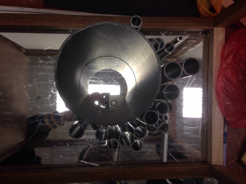
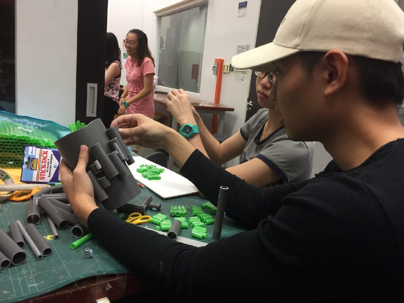
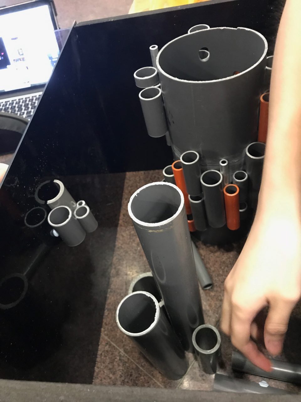
We bought different sizesOriginal arrangement all flat on the ground; not appealingMaking sure there is a good mix of different heights and widthprototype
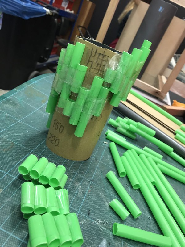
We made a small prototype using straws and a roll of sandpaper to see how the cylinders would look like together.
windows
The upward motion is so that we can achieve the infinity effect and link the reflections together.
piecing together the actual model
We also tried to apply some rhythm to the arrangement for more interesting look. And left holes for windows for light to come through.
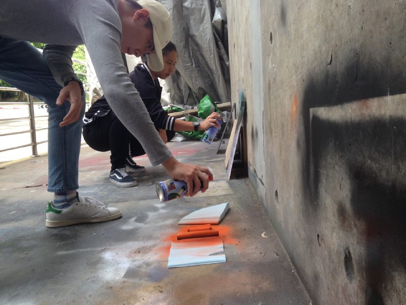
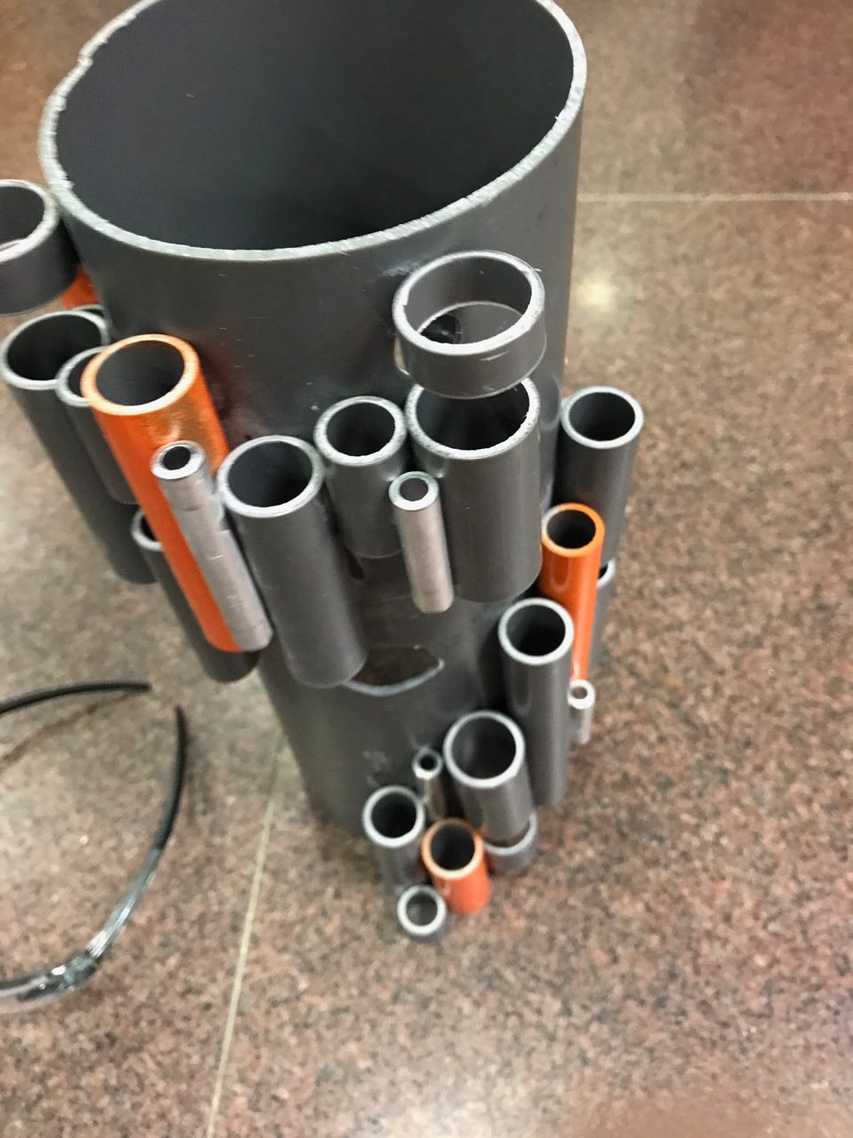
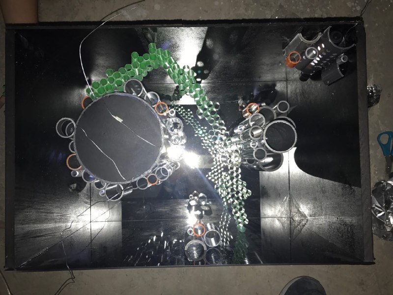
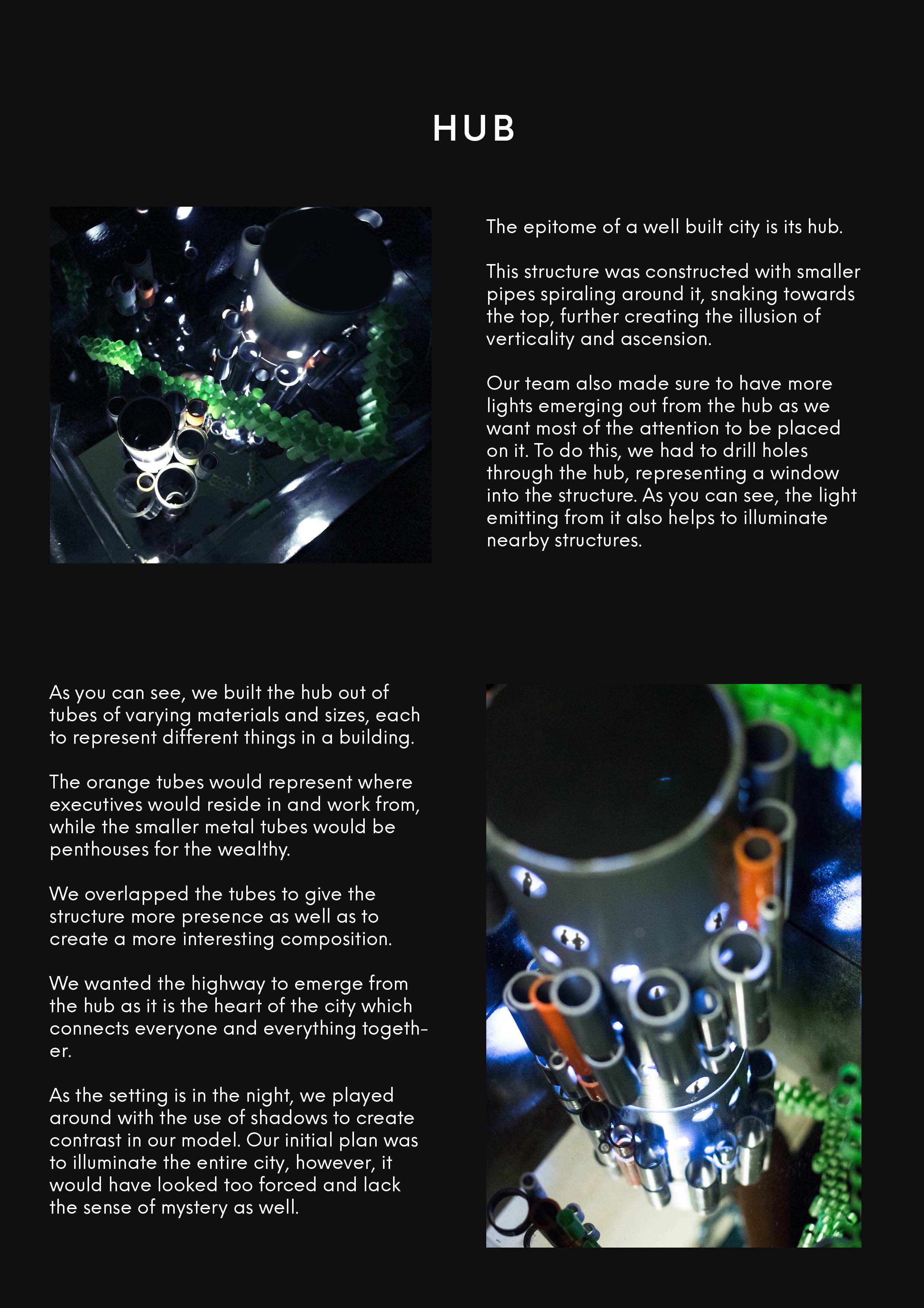
Spray painting the elements
We spray painted some of the pipes orange for a nice pop of colour and contrast to the original grey; which could also brought about a new class of residents! The walls of our box was spray painted black to prevent any distractions and focus your eyes on the infinity effect. The length we had it glossy black to reflect the light while the breath we had it matte.
Main hub with habitatsSmaller hub with habitats
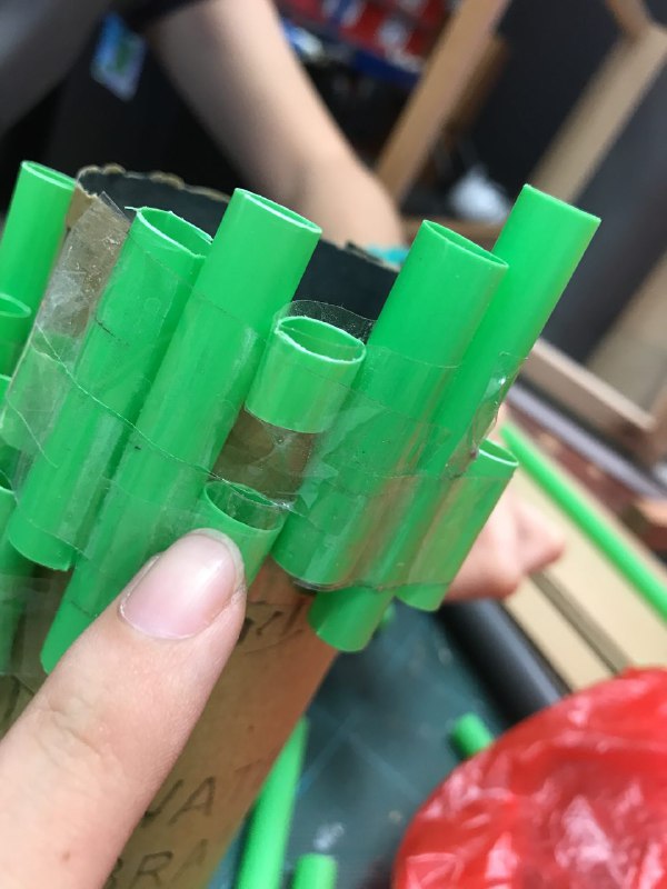
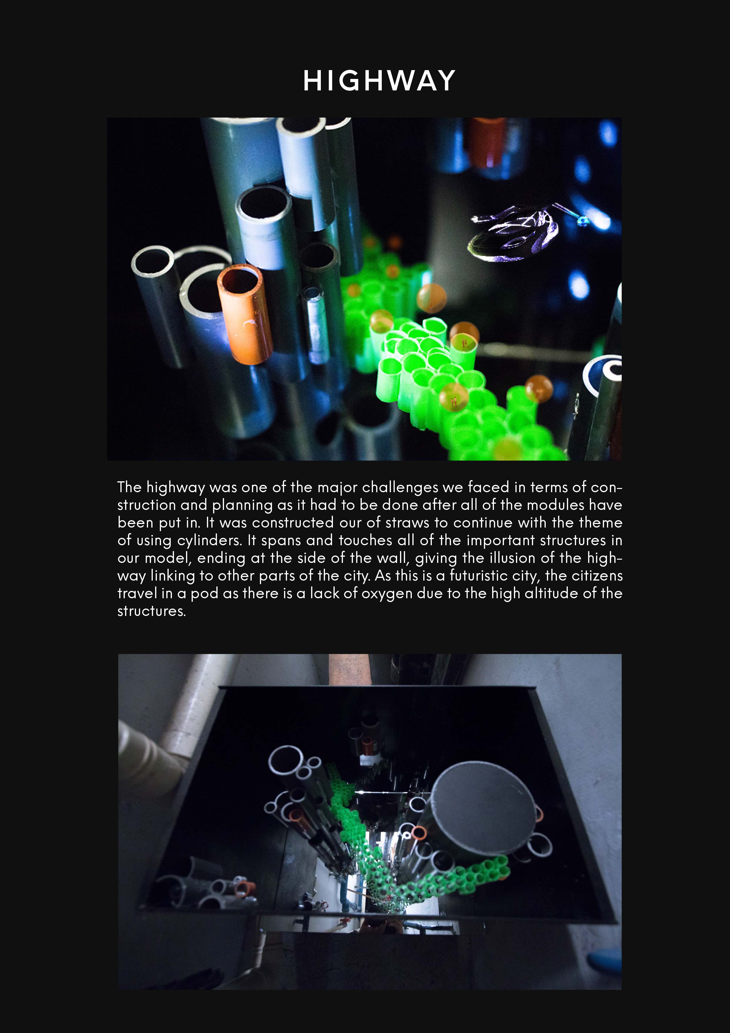
For the highway we used green straws. Green because it complements the orange quite well.
highway construction
First we glued them in pairs and then glue them downwards. We had difficulty assembling the highway as we could not do it outside the model.
Glueing it outside
We had to stick and break it a few times before getting it to move to the angle that we want. We wanted it to touch the significant parts of our model. (stated in the pdf)
Trying to decide where the highway should go
At first we wanted it to touch the top and bottom of the box for a similar effect to the main hub and habitats but it would have been too steep and there is not enough space for the length needed.
Cut off effect
Thus we decided it could just be a part of the city and the highway is leading to another part of the city. This portal that we made only brings you to one part of the city. To achieve this, we have some habitats cropped in the corners and sides. the reflections make them look whole and stepping a dimension portal or sort.
Cut off effectfinal arrangement
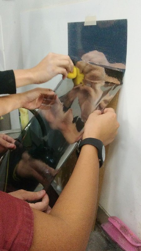
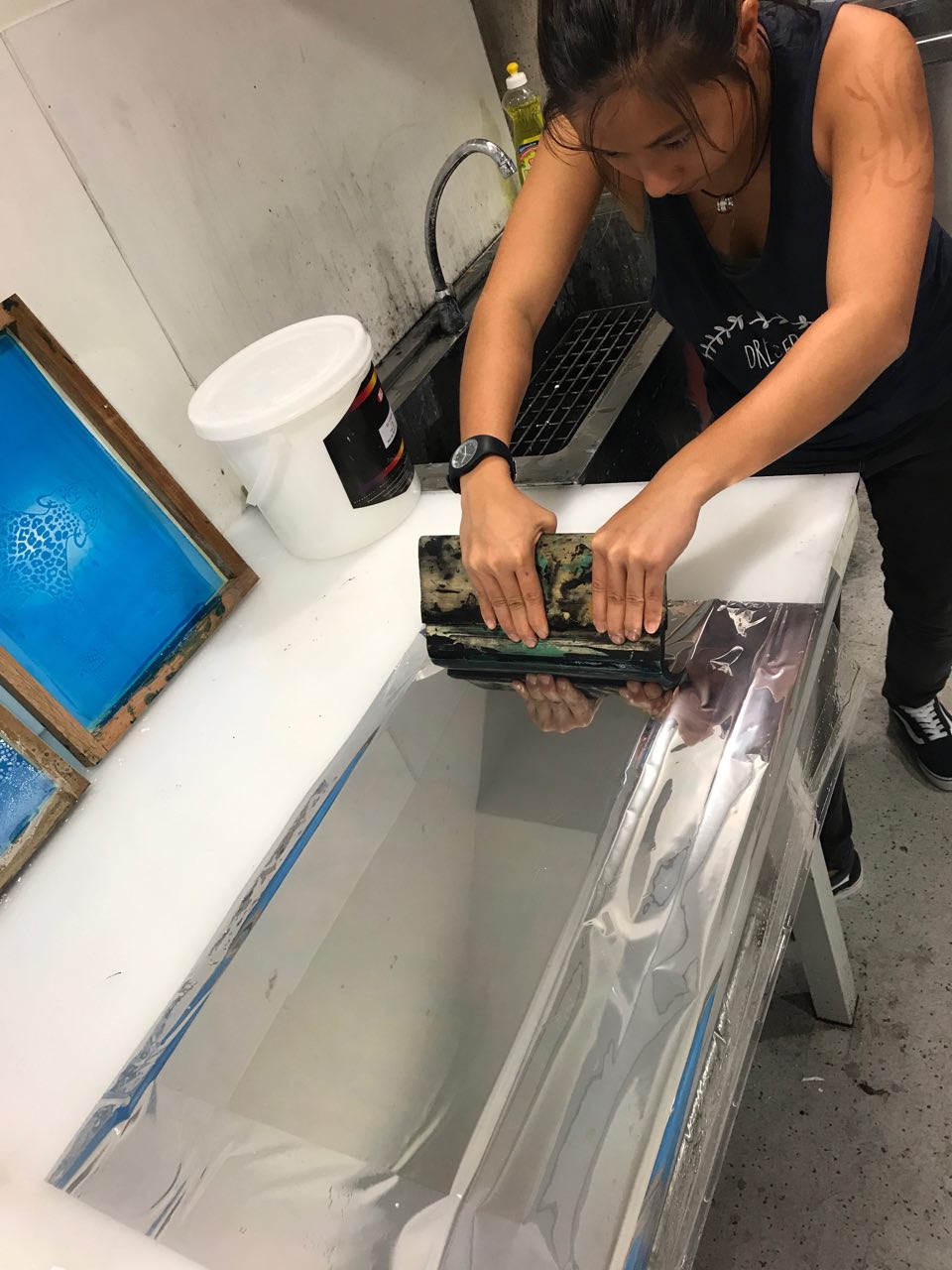
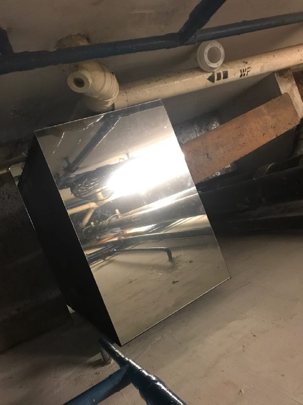
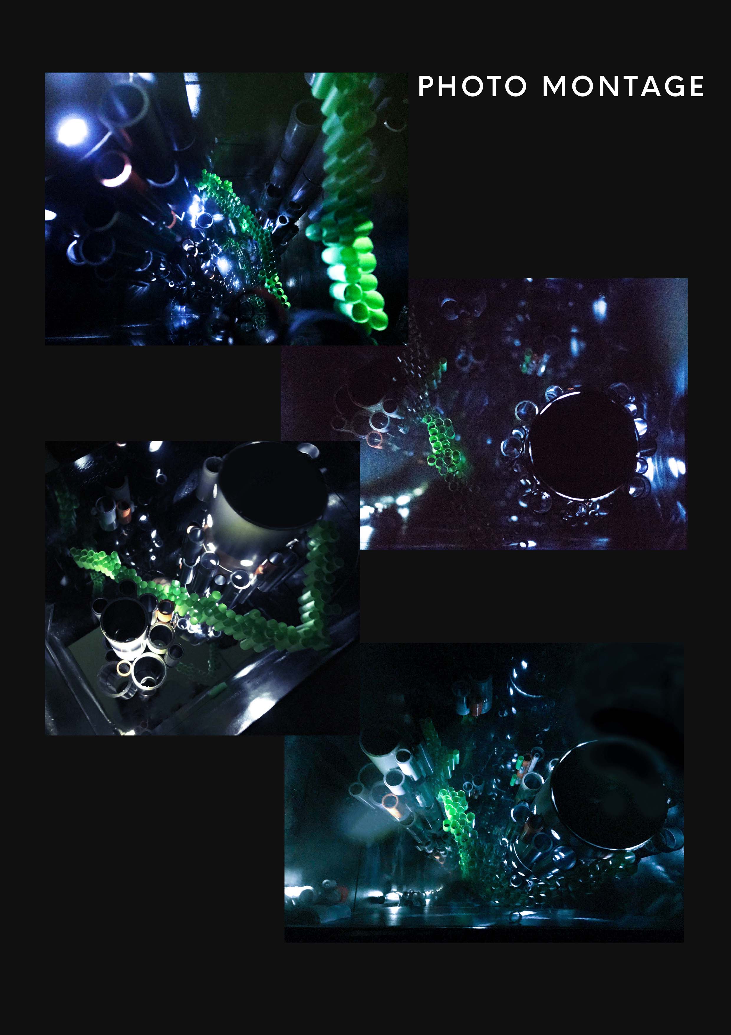
We needed a one way mirror for the infinity effect to work so…
We make our own one way mirror.Hannah squeegied it for better results because the first was full of bubbles.
We bought a reflective film and pasted it onto clear acrylic as an actual one way mirror would be too expensive for poor art students.
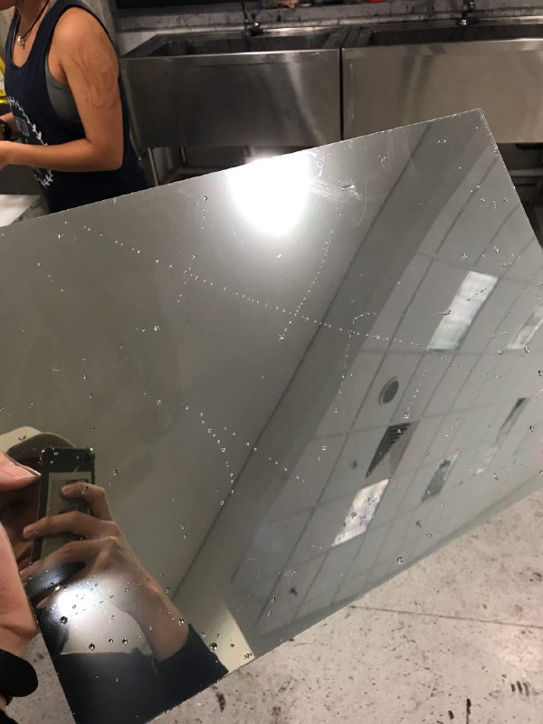
trimming the edgesOooo~ reflective!
then we tested it… the results were amazing! 😀
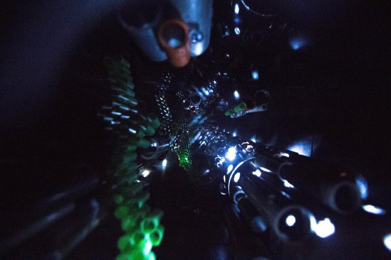
the infinity effectIt really works!In the actual site.
It doesn’t work with the lights on. It only works when the lights are on and the inside illuminated.
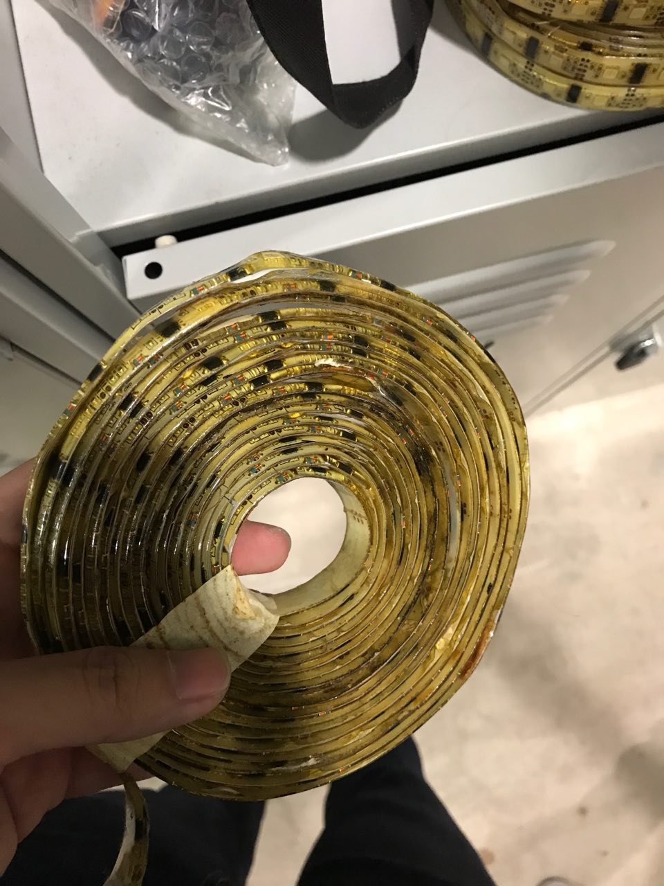
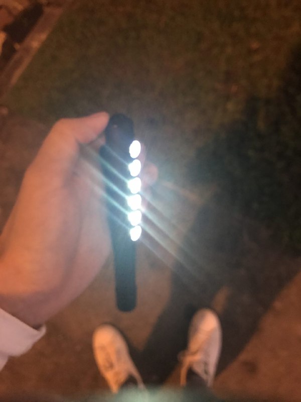
Led strip that didn’t work outone direction. cylindrical torch lightwe got 2 headlights for the hub
We also had difficulty finding the right lights. Originally we wanted to wire our own lights. But because we of the mirror that would definitely shatter under a drill we could not thread the wires through and decided to get electric battery powered lights.
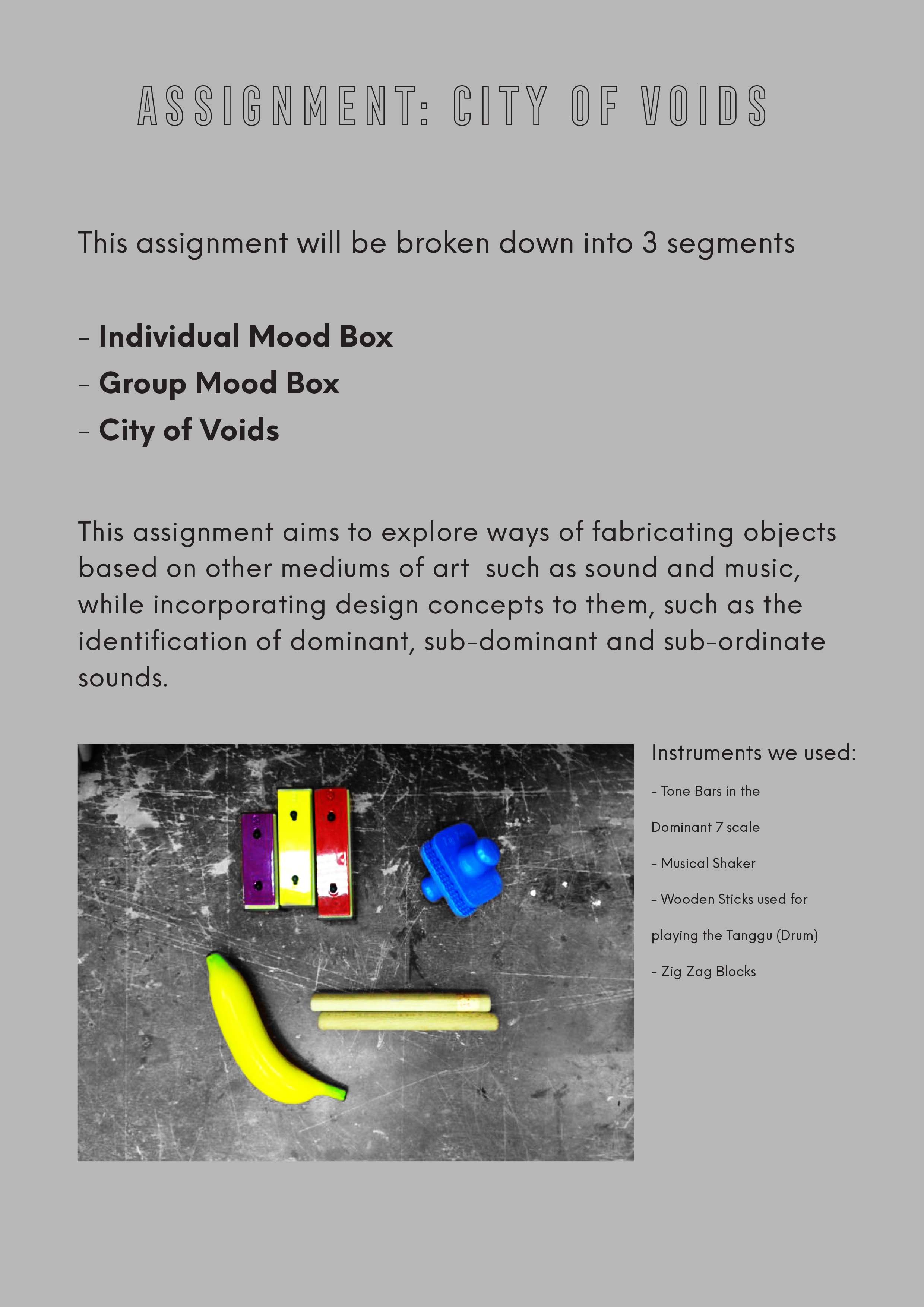
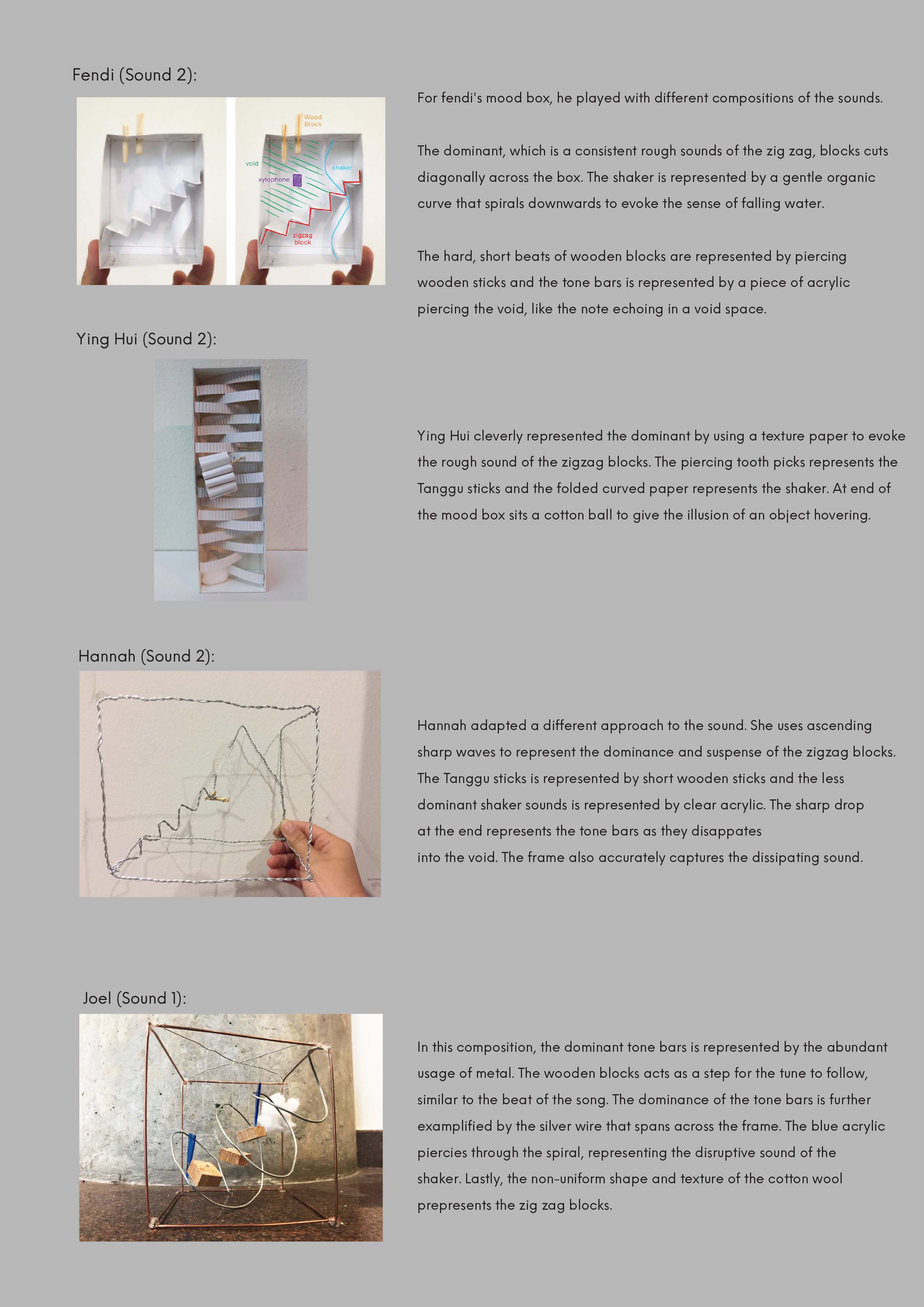
The majority of my group chose to do composition 2 for our individual mood boxes because we really liked the sound of the metallophone ringing into the ‘void’. It was a better choice than the first that was just continuous sounds which did not provide any voids/breathing space. It would have been too cluttered. Plus we can’t create a city of voids without a void to begin with.
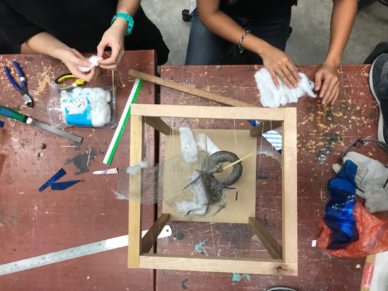
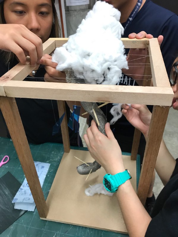
Final Model:
Labeled Moodbox
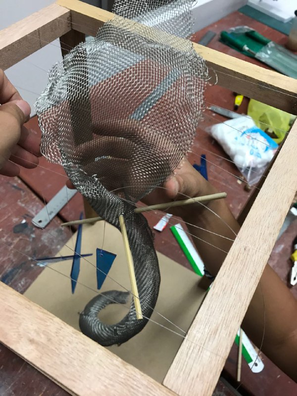
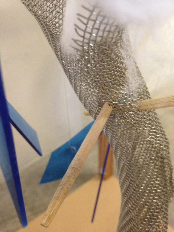
The zig-zaggie block is represented by a twisted wiremesh roll curling upwards because we felt that the sound was building up to the metallophone ‘ding’ at the end.
The metallophone is represented by a cotton ‘cloud’ as we favored my idea of metallophone as the sound of clouds. The cloud is peeking out of the box because we liked Fendi’s interpretation of the sound peeking out of the box as ringing into the void.
The rhythm sticks are directly translated with pairs of bamboo chopsticks intercepting the twisted wiremesh roll.
The banana shaker is represented by shards of blue acrylic because we felt that it sounds like rain. Thus, we hung them in a downward motion as if cutting through the void.
Production Process:
To save cost, we mainly used the materials found around the workshop.
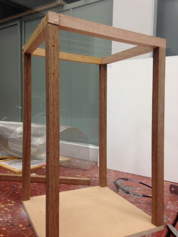
1. The frame
We made a frame out of some timber sticks to help suspend our model as sound is travels through space.
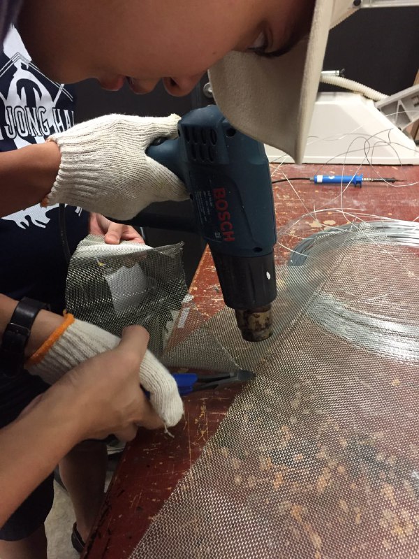
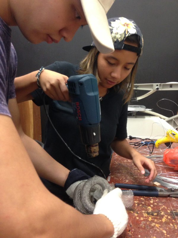
2. Cutting wiremesh with difficulty
We chose to use wiremesh because it has a criss-cross texture. When scratched it produces a similar sound to the zig-zaggie block; achieving the acoustic effect that we wanted. We had to soften the wire with the heat gun and cut slowly because there was a problem with the wire cutter.
3. Rolling wiremesh with great effort
The wiremesh was really hard and rolling it took great effort.
4. Twisting the wiremesh roll with the help of the heat gun
So, we used the heat gun to help soften it while we roll.
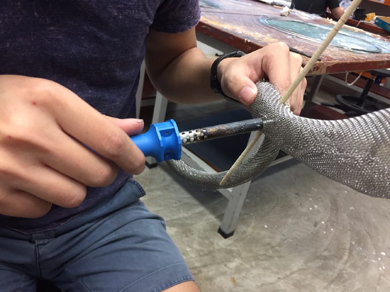
5. Widening wiremesh hole with soldering iron to make space for chopstick
Since the holes were too small, we had to widen them with the soldering iron to fit the chopsticks.
6. Poking holes into acrylic shards with soldering iron
We soldered holes into the acrylic shards to thread fishing line through them.
7. Putting it together
The top of the wiremesh opens up to look like its ‘fading’ into the void. The fishing line was nearly invisible and it gave the illusion that our model was floating. The wiremesh sat well in between the fishing lines. And we made sure that the acrylic shards were hung in a downwards motion; creating some rhythm at the same time for aesthetic purposes.
8. Rolling out the cotton balls
We used cotton balls as the cloud. Rolling them up, tearing them apart and putting them back together to get that fluffy effect. We also tried to make it fade in and out but somehow we could not get the desired results. The cotton couldn’t stand in place for a faded upward look.
9. fixing on the cloud
Making sure all parts are covered and everything is in place.
Other perspectives:
low angle view
Here you can see how the wire-mesh rises and builds up to the cloud. You can also see the acrylic shards falling downward as well as the chopstick interrupting the void.
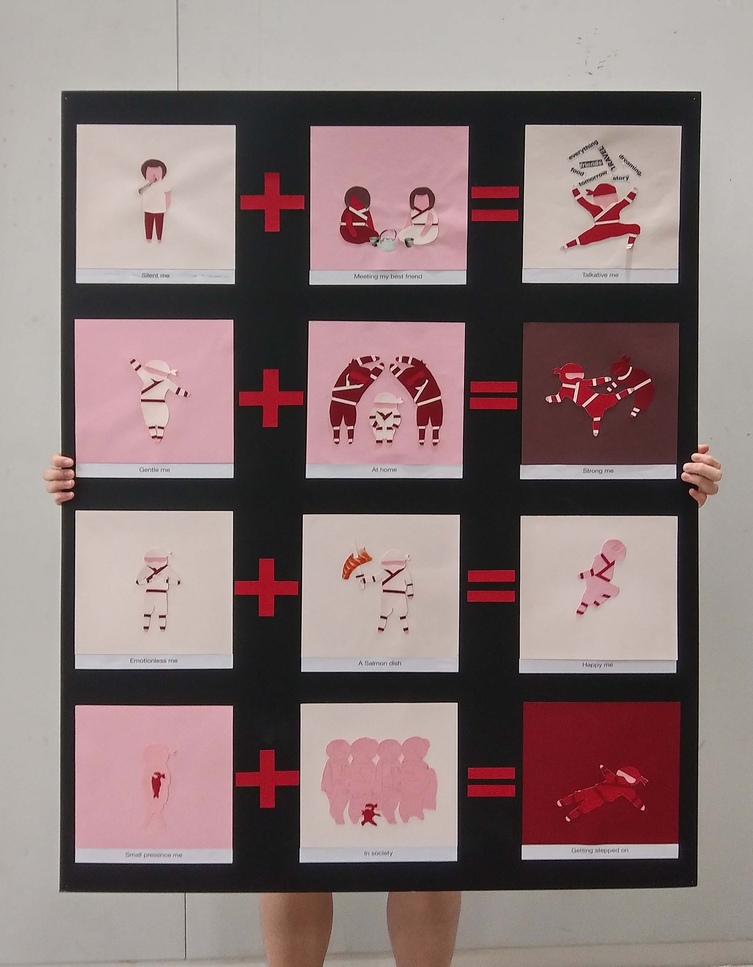
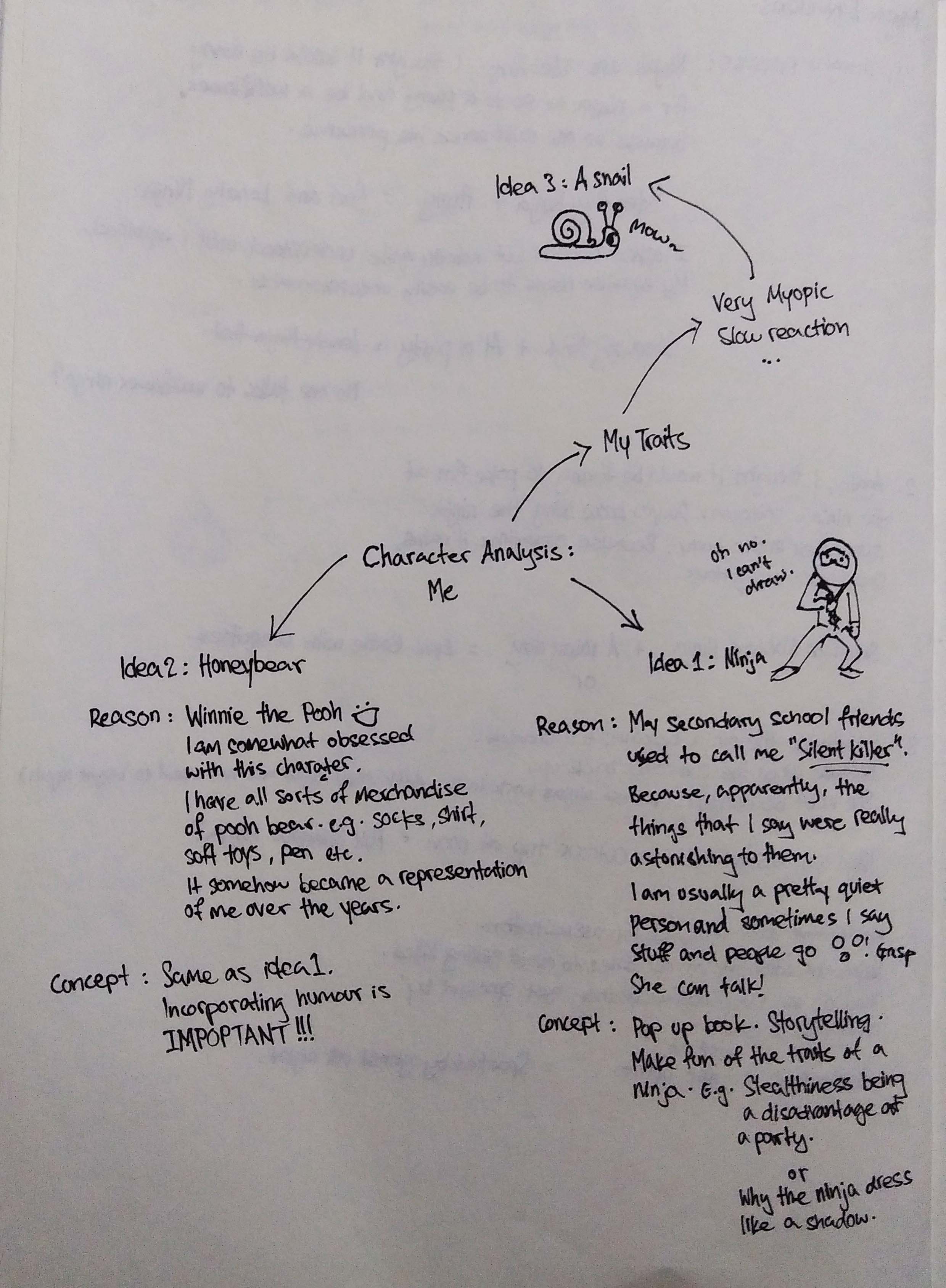
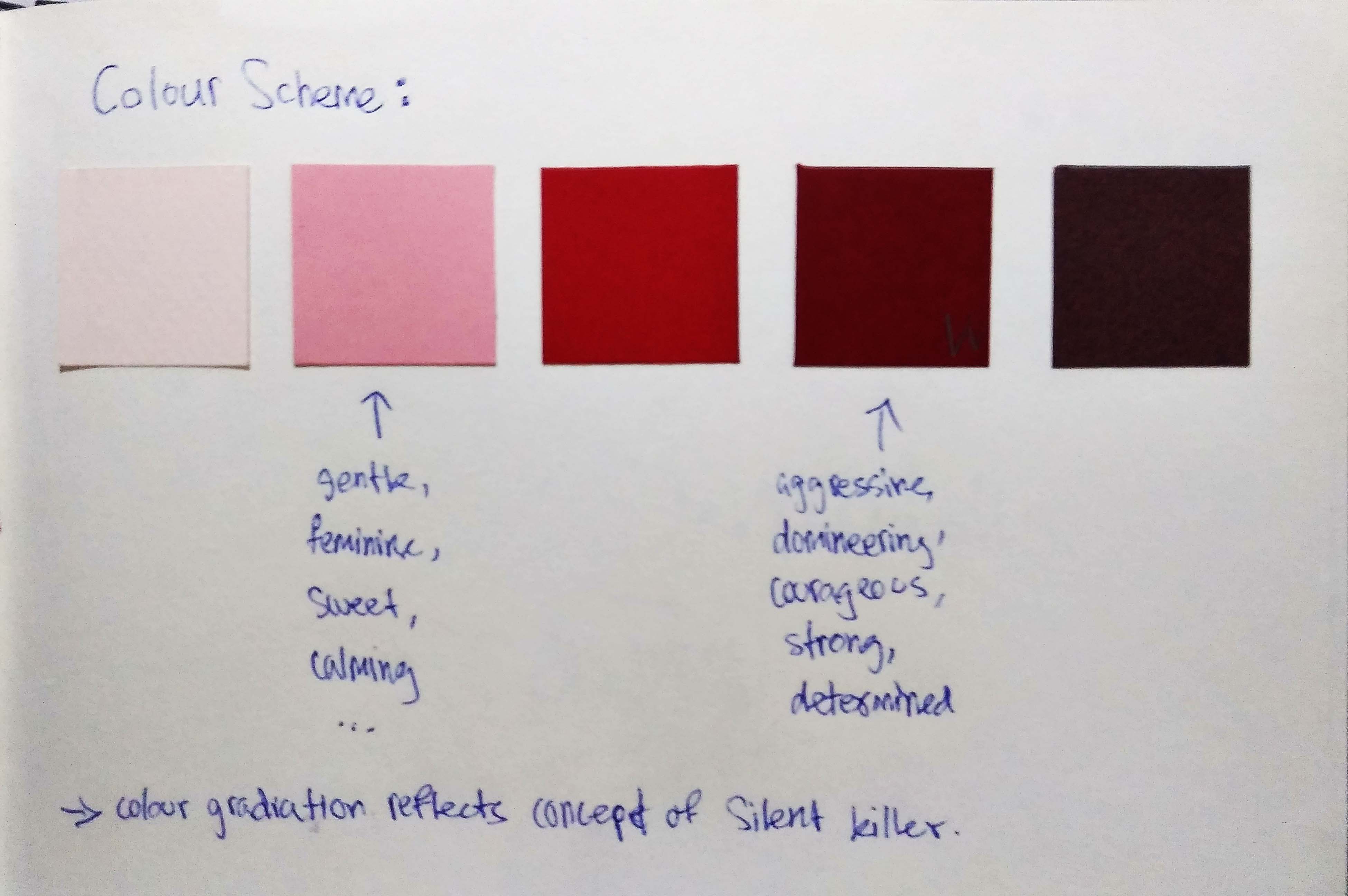
The background colour is determined by other’s impression/emotion about me. And the clothes that the ninjas wear reflect their personality.
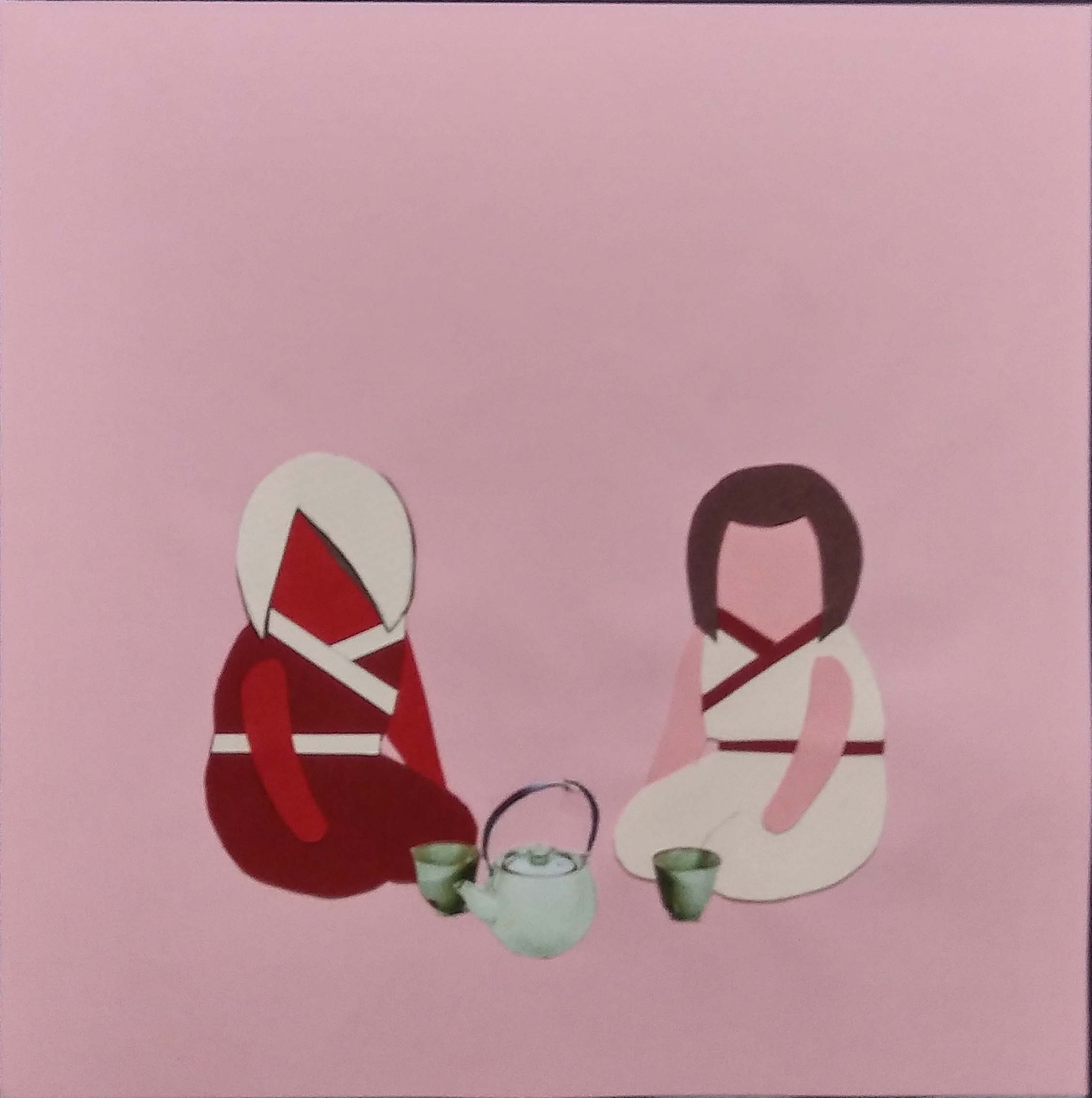
‘Silent Killer’ Reason no. 1: In Secondary School I met my best friend. There was once we went on a school trip to New Zealand, there was this really long bus ride from the countryside to the airport and we talked all the way. We talked about everything – food, dreams, myths, travel etc. Plus we both love drinking tea, thus the tea set.
Silent me is represented by the lightest and coolest colour of the monochromatic spectrum because there is not much energy in being silent. People around you do not really bother thus the background is of the same colour. This shows how being quiet blends you into the background literally even though you are there.
Meeting my BFF is a joyful thing thus the pink background to show the warmth and happiness. Clothes turn half ninja for transition. Colour scheme for the BFF is the darker side of the spectrum to show her energy and confidence. Much more powerful as compared to me in the cooler spectrum.
Talkative me is represented by me in red which shows that I have changed from quiet to loud. I made the background the same as the first panel to display clear contrast between the two. Viewers automatically force to compare due to simultaneous contrast.
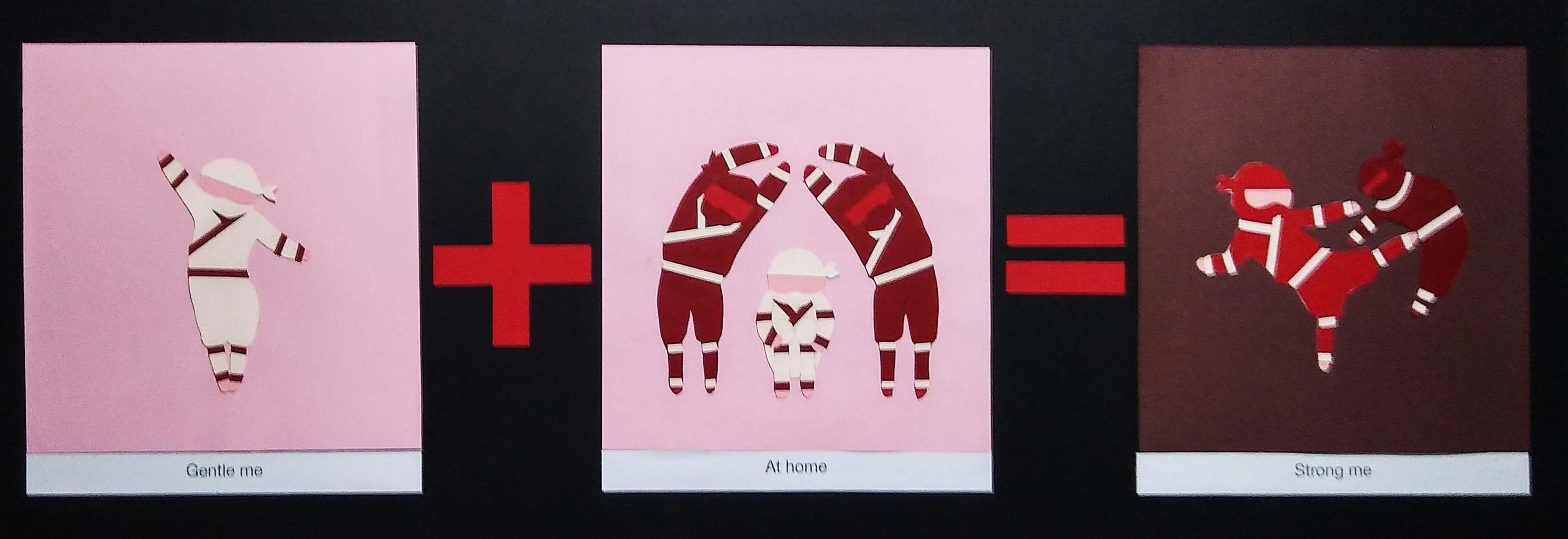
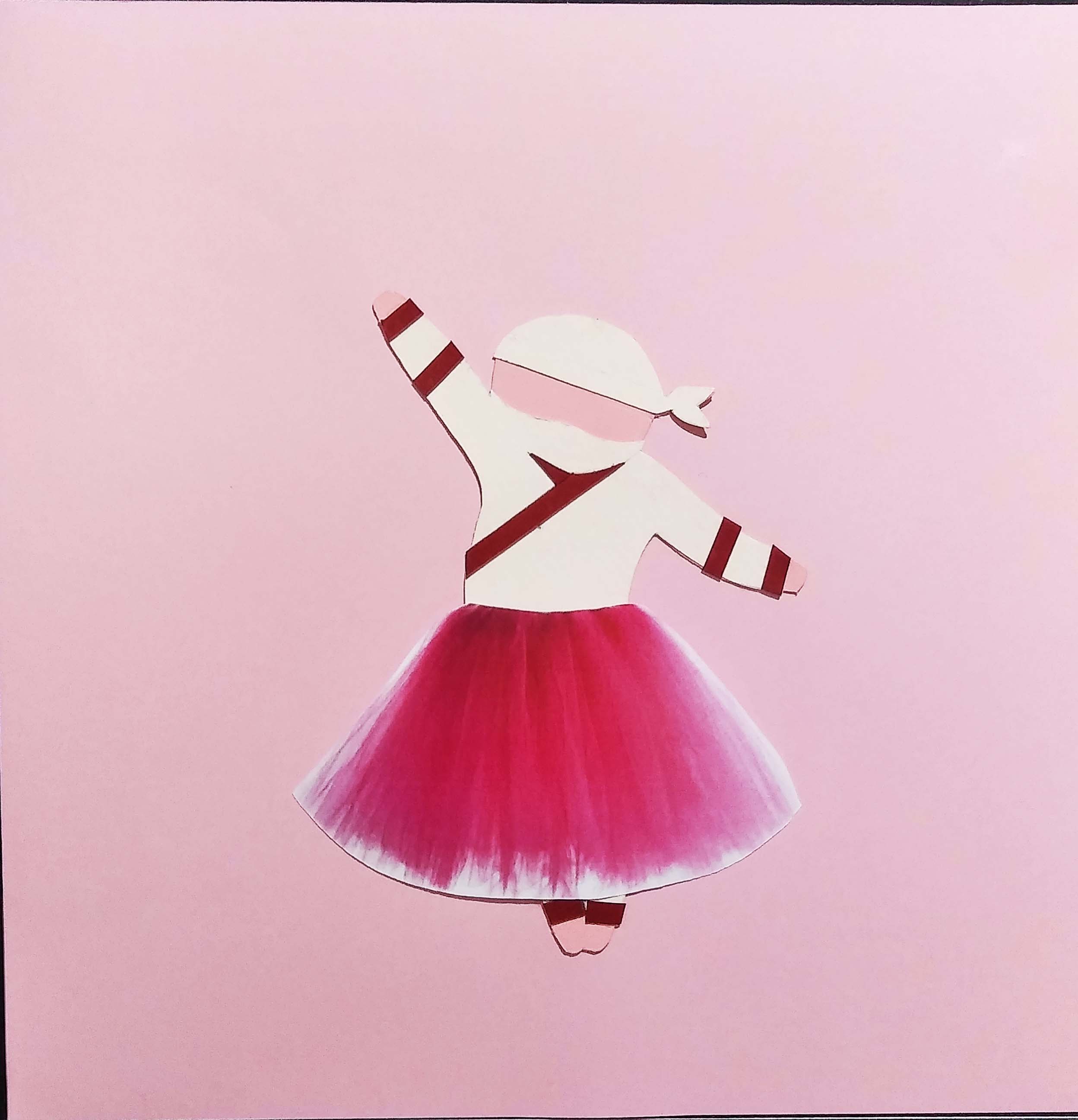
‘Silent Killer’ Reason no. 2: In School I am a rather gentle person and all my friends see as this meek fragile creature of which I represented with a graceful ballerina pose. But when I brought my friends home (represented by two parents forming a shelter with their bodies), their impression of me changed. They thought me violent after seeing my dominance over my siblings as I am the oldest child.
Gentle me is welcome by most people that I have met. They treat me well because of my good nature which was Pink. Again Gentle me is represented by the lightest and coolest colour of the monochromatic spectrum because there is not much energy. Its all very soft and pastel.
My parents are very loving and protective which is why they are represented in red representing their strength and power. I am crouching in between them in pink and cream. A weakling protected by the powerful. Background is pink because home is full of comfort and warmth.
Strong me is represented by me in red, it is the same interpretation as in the first equation. The tiny ninja in the colour of the parents because they are suppose to be my siblings; also part of the family. The background is dark because this part is where it tainted the impression my friends had of me.
‘Silent Killer’ Reason no. 3: I have very specific interest and one of which is Salmon; my favorite food. Only with subject of interest will trigger my genuine expression. Everything else looks force and emotionless.
Here, the background and the colour of the ninja is the same because there is not much emotions in myself and in others. I wanted to show the emptiness of being emotionless that is why the background and the ninja is both in cream.
Perhaps for the Salmon dish panel I should replace myself in pink because I am excited to eat it. The background is still cream because the feeling is only exclusive to myself. The third panel uses the same idea.
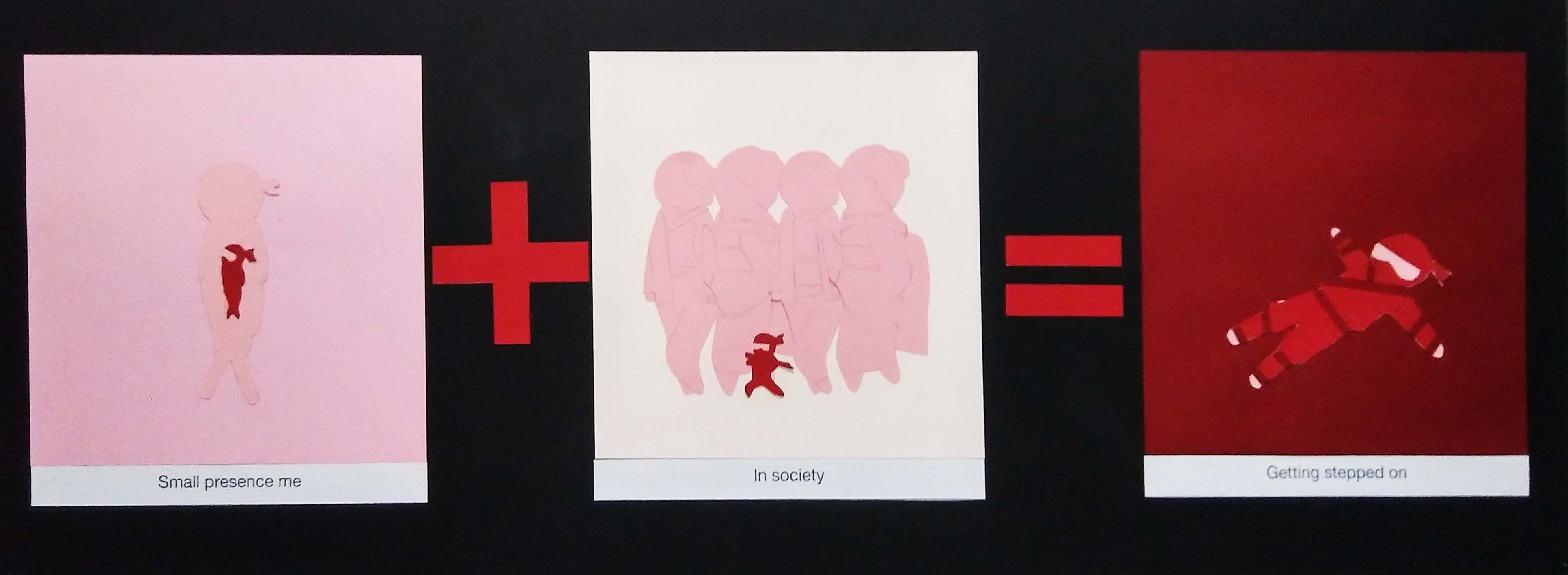
‘Silent Killer’ Reason no. 4: This one is more of a personal interpretation. Ninja’s have small presences like me. Ninjas are strong but in my case I am weak. When I am out in society, I get stepped on by people because of that.
Small presence me is represented in red. The shell of my person is in pink so that it blends into the background. This is to show that despite my gentle and soft nature on the surface. I do have some fight in my. Also this is to show how my ‘real’ self is hidden and people fail to notice me most of the time.
In society is represented by a cream background because nobody really cares about strangers in public, less for someone you do not ‘see’. Other people are in pink because the people around me are usually caring and kind, even though some might just be strangers. I am in red for easy visual interpretation.
The getting stepped on panel is in dark red background because red is like a warning sign there is also meanings of anger, danger and malice. Some people take advantage of my good nature and even though I am in red. The red here reflects more of anger than power. Together with the background it is meant to show how I have been discarded and forgotten.
Reflection:
I got some pretty good suggestions during the crit such as putting a footprint over the ‘getting step on’ panel, cutting out the clothes and hair for ‘in society’ and more contrast for the last two equations. Even though the last 2 equations were meant to look subtracted into the background, I think some contrast would be good too. All that cutting really took a lot of time, I should have planned my time better and be more determine about working through the night. (Stop slacking off Hui!)
Comments were pretty good! They really liked the colour scheme, the cute art style, the mix medium and the portrayal of the equation. SUCCESS! All has paid off.
When I look back, I really like the results. But the process was guelling.
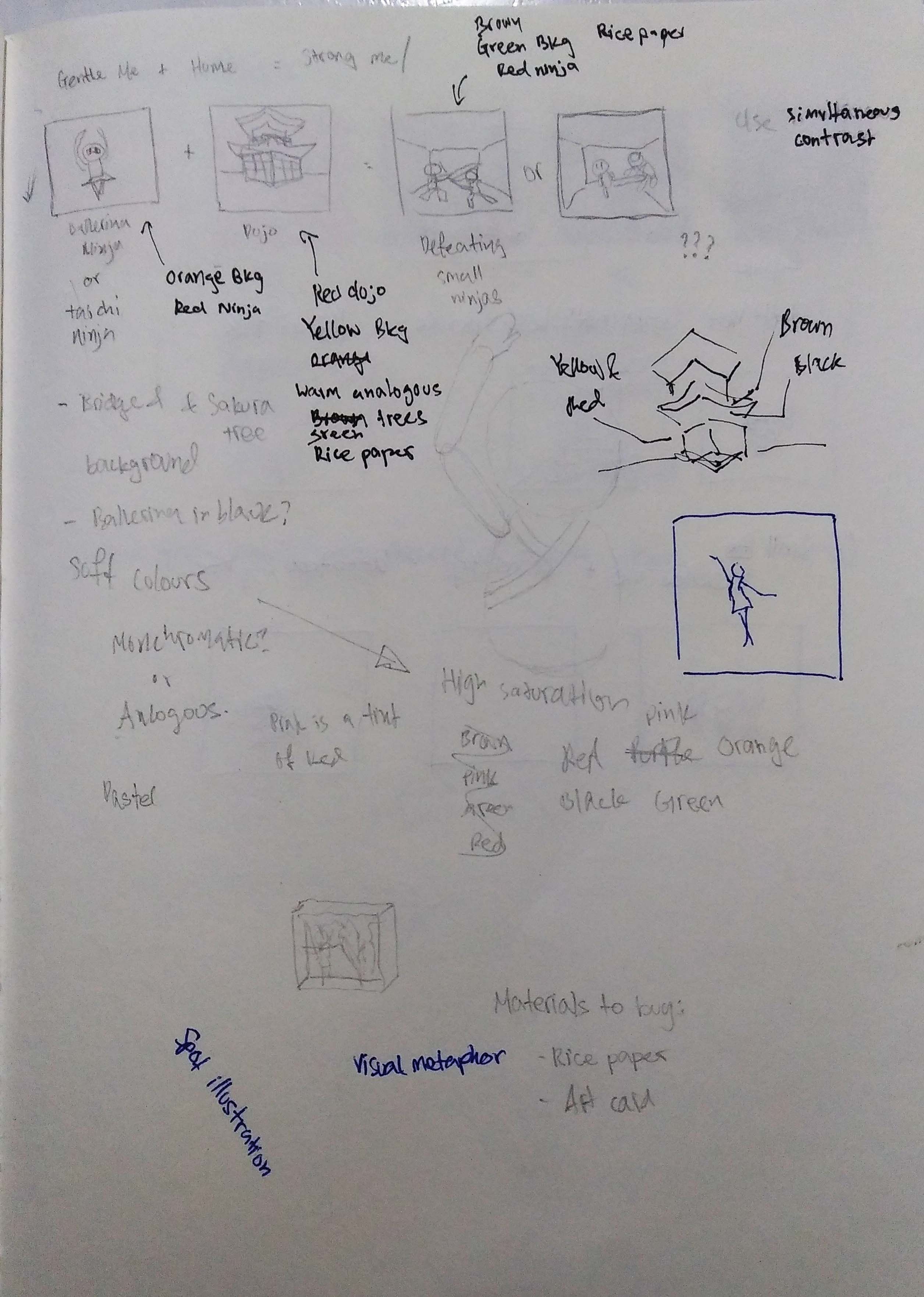
Silent me + Meeting Best friends = Word VomitGentle me + At home = Strong me
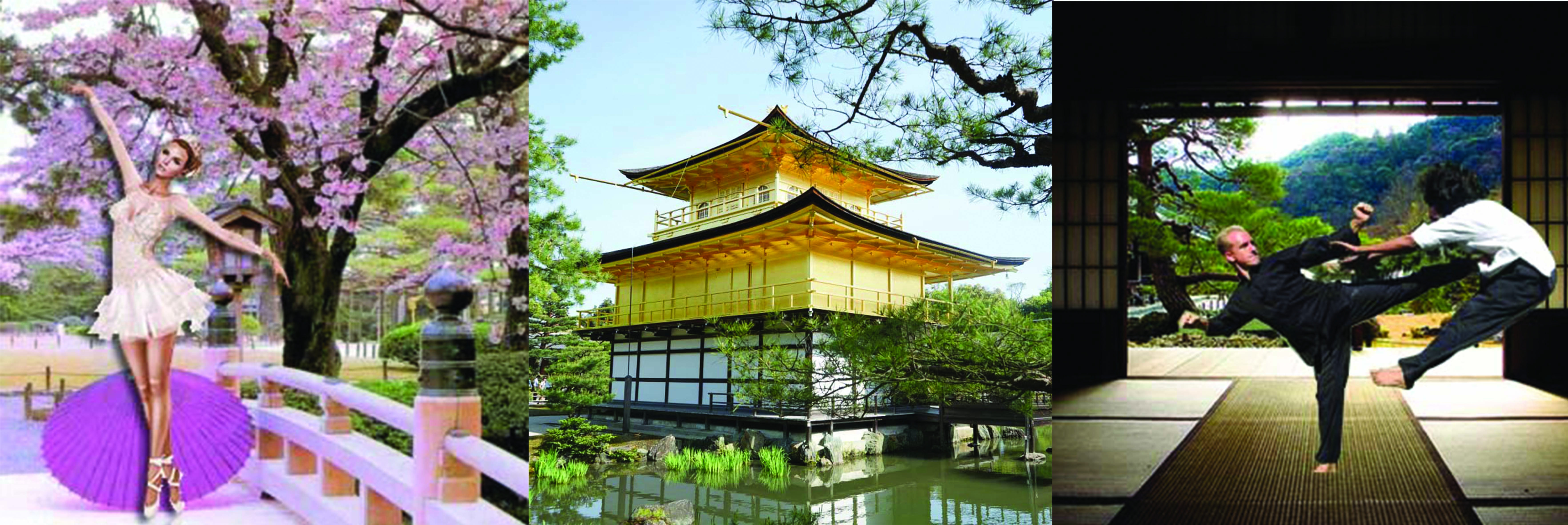
I tried to keep to the oriental Japanese theme of ninjas with a traditional Japanese building environment.
Emotionless me + Salmon = Happy Me
But here I couldn’t seem to find an appropriate background.
Small presence + In society = Getting stepped on
I realised I didn’t need to do a box collage as I originally planned because a 2D collage is good enough. There is no need to challenge the 2.5D aspect.
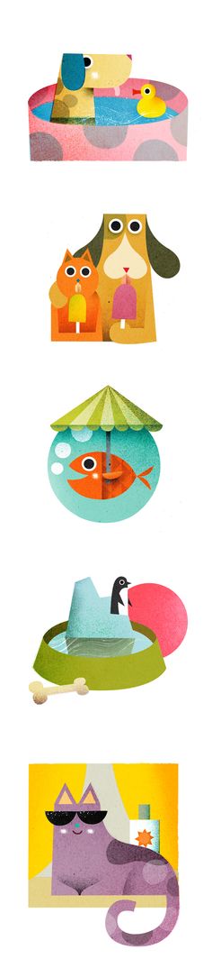
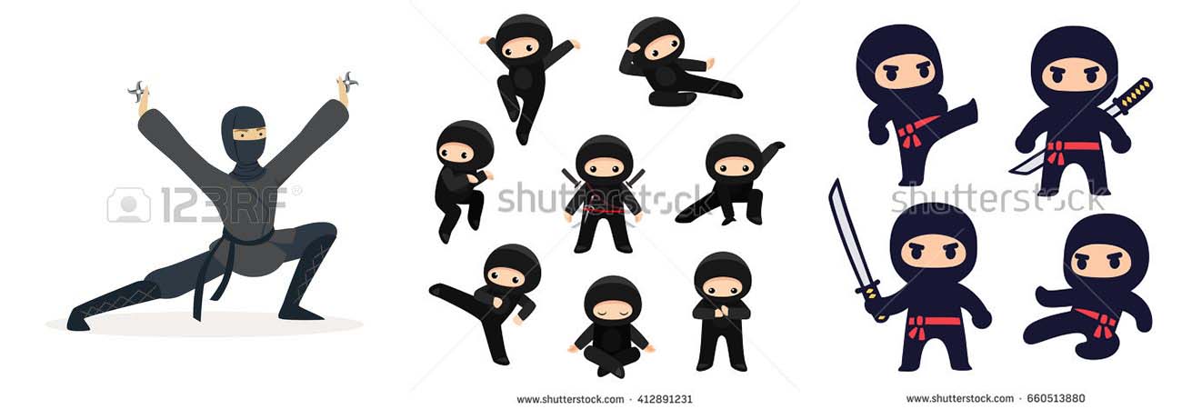
Spot Illustration (inspirations):
My draft was really cluttered and messy; there was too many elements and the design wasn’t consistent. So Mimi showed me some spot illustrations to help solve me problem and they were exactly what I had in mind. I just needed references!
I really like the use of solid colours as seen here.
Back to my own art:
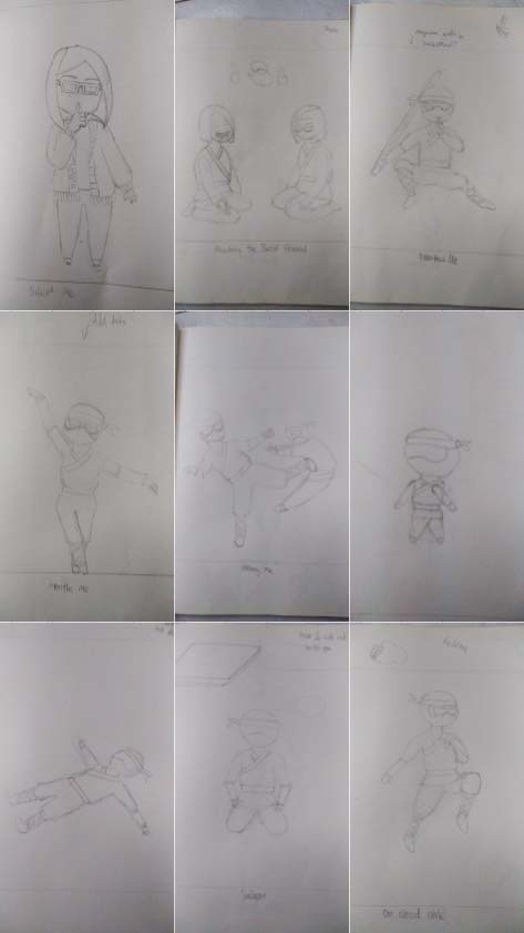
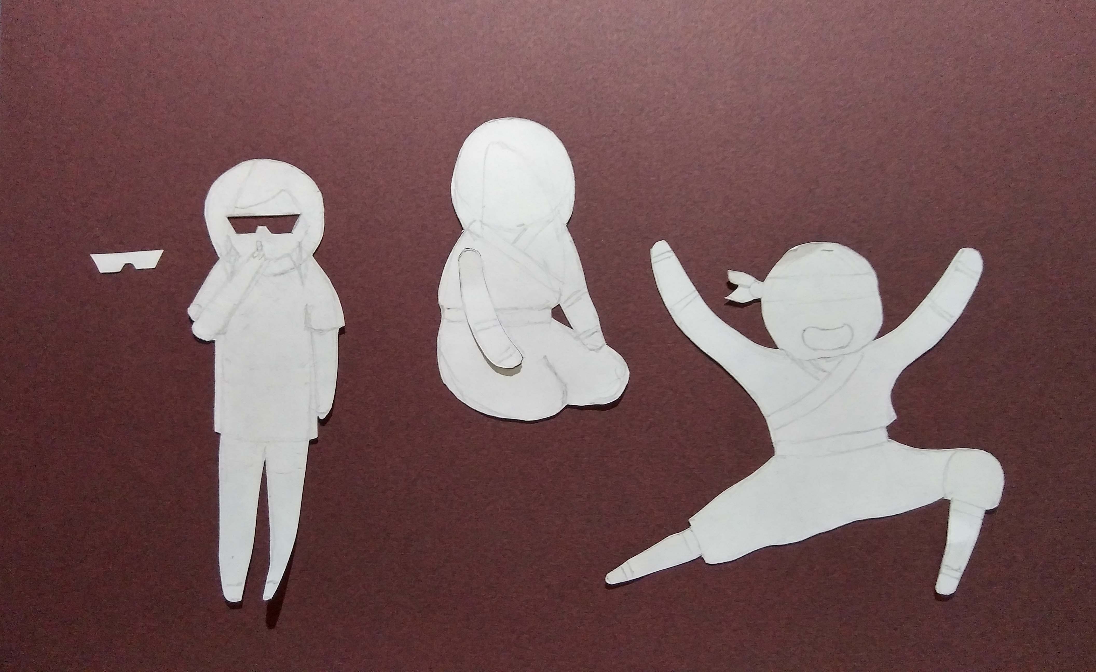
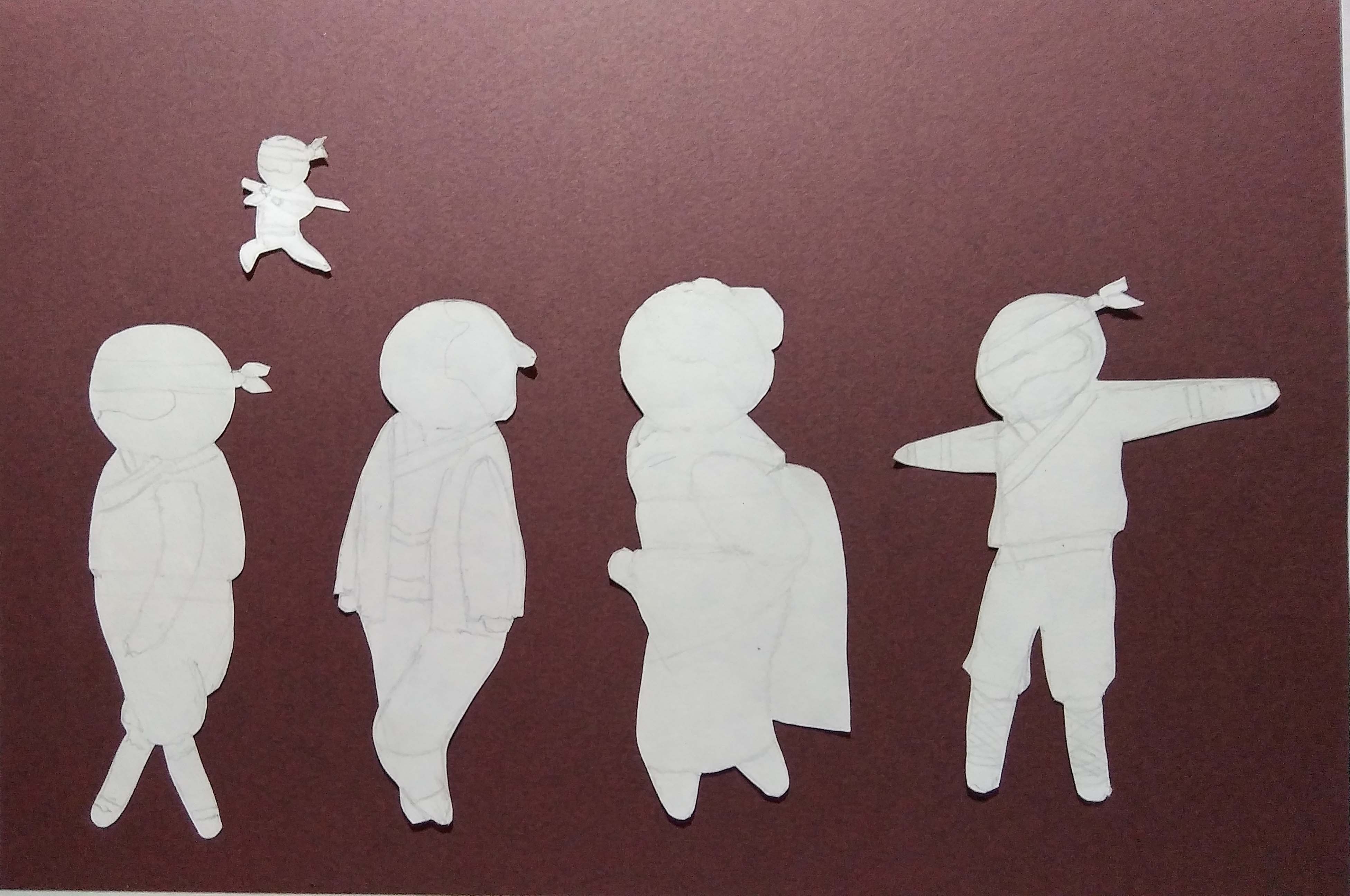
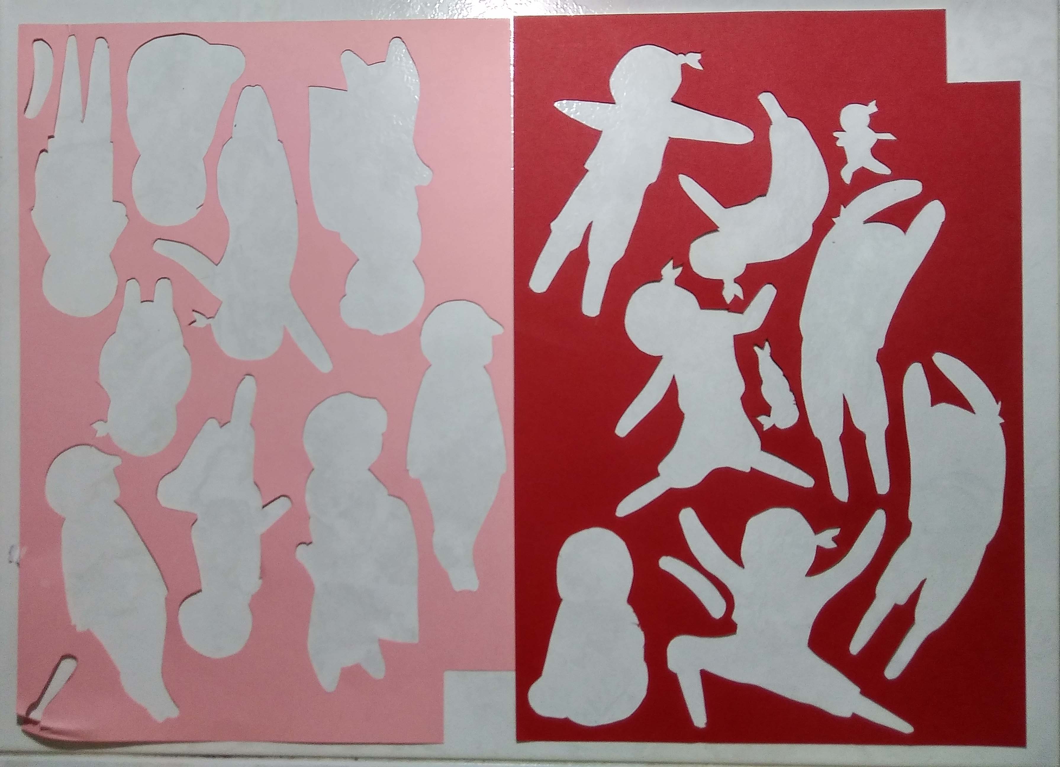
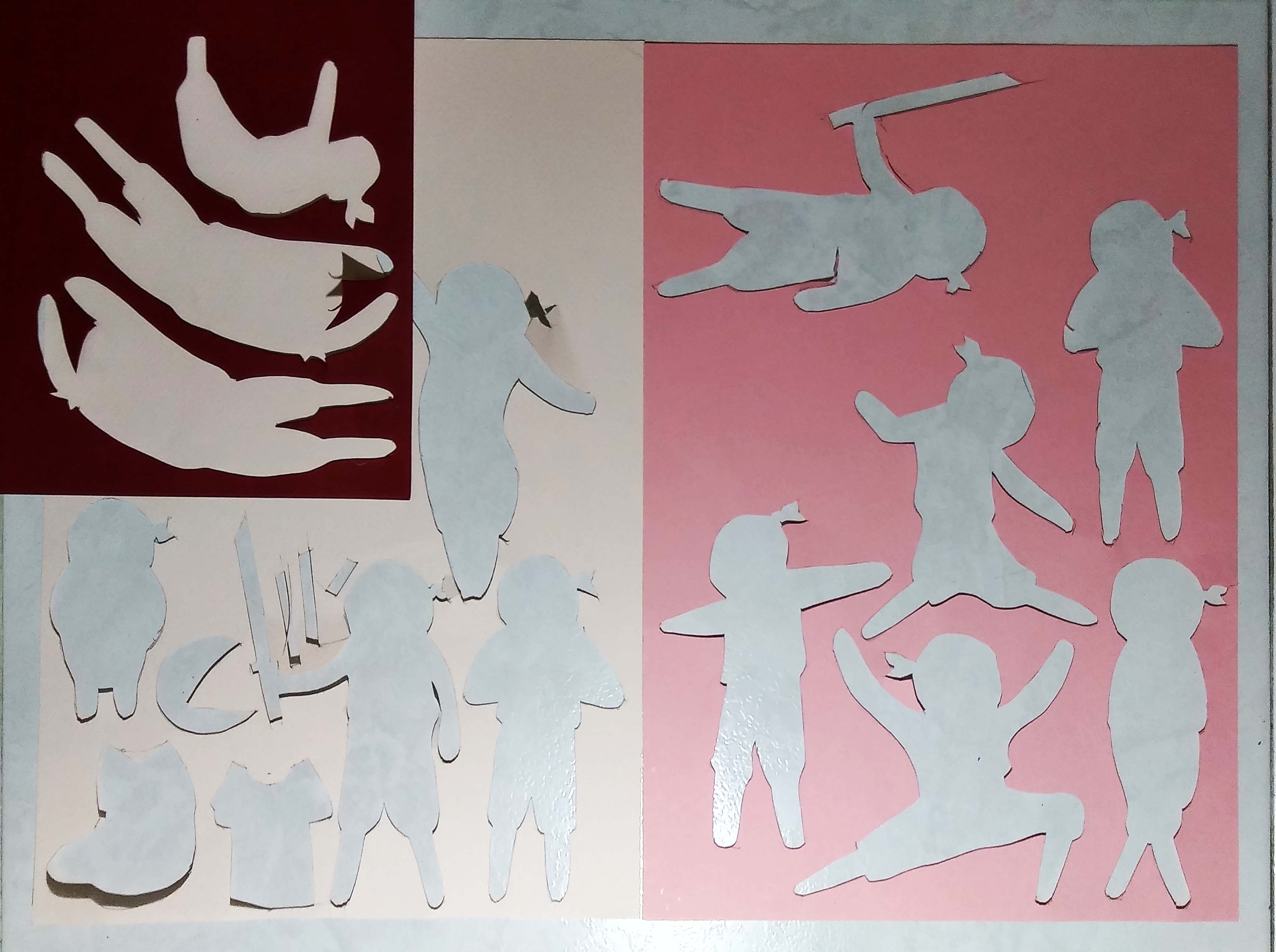
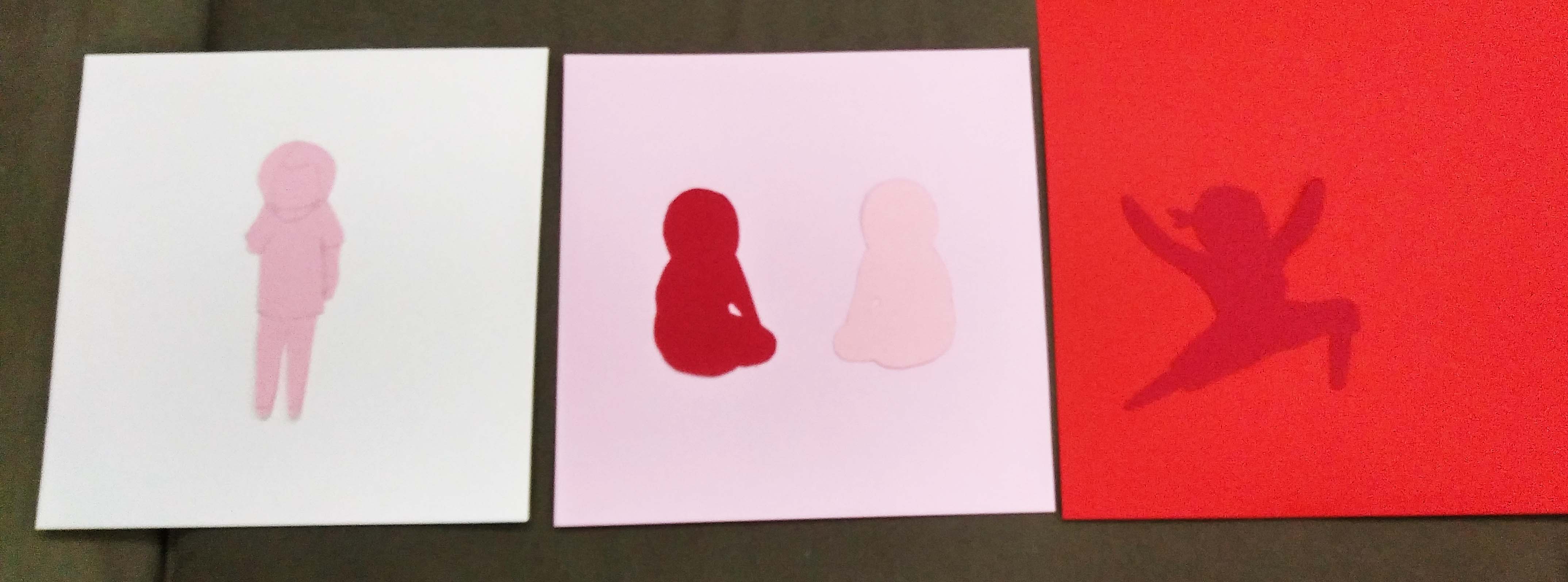
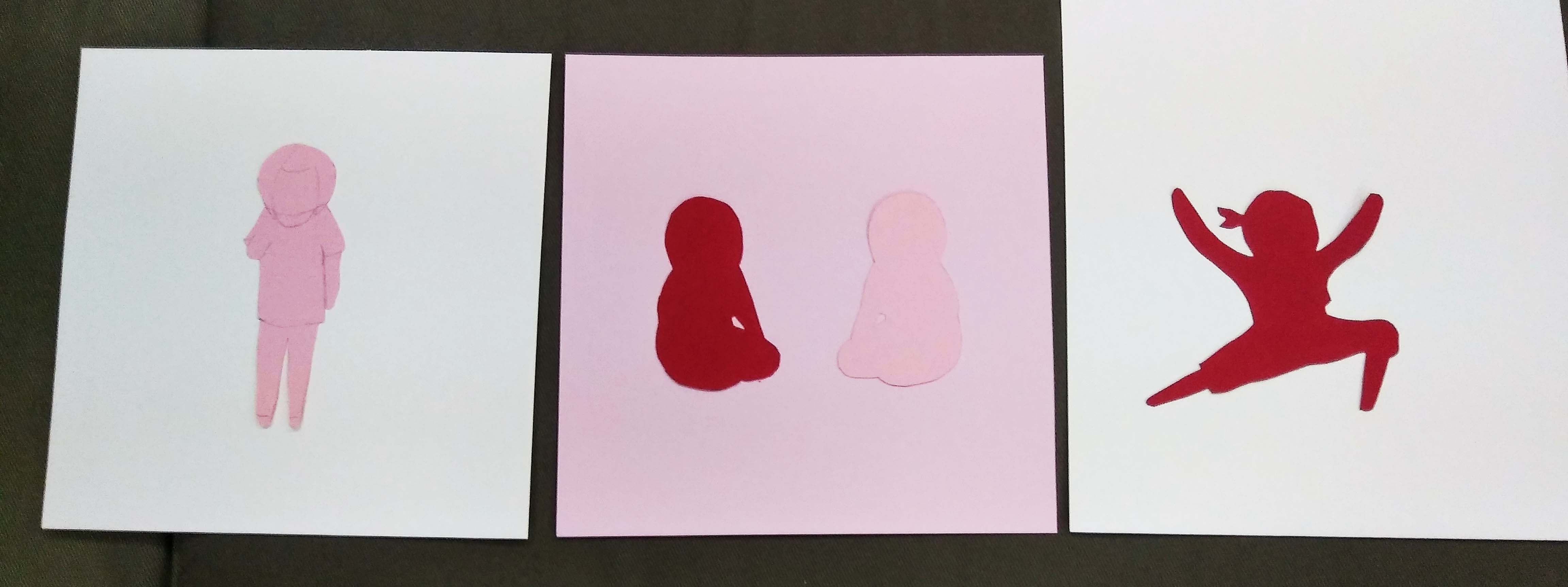
Sketches for cut out. But then I realise the style was inconsistent and I didn’t like that.Chosen style. I find it more adorable than the rest.Ninja referencesTalkative templateStrong TemplateSalmon TemplateSmall Presence TemplateColour paper cut outsMore cut outs for layering
Testing out different coloured backgroundThis looks better!I tried different hair colour to see which had better contrast and aesthetic.Left out the tutu because the one I printed was too big and lost the gentleness of the figure.Also left out the cloud because I thought it could be plagiarizing. I wanted to cut out my own cloud. 🙁 You can still tell the happiness from the posture though. I just couldn’t carry out the visual metaphor of happiness; referencing the idiom “on cloud nine”.Multiple print outs to find the right size