
by Ying Hui and May Thu ( https://oss.adm.ntu.edu.sg/may005 )
Month: February 2018
Ying Hui

Research: https://oss.adm.ntu.edu.sg/ytan149/project-1-image-making-through-type-research/
Process: https://oss.adm.ntu.edu.sg/ytan149/project-1-image-making-through-type-process/
Project 1: Image Making Through Type – Process
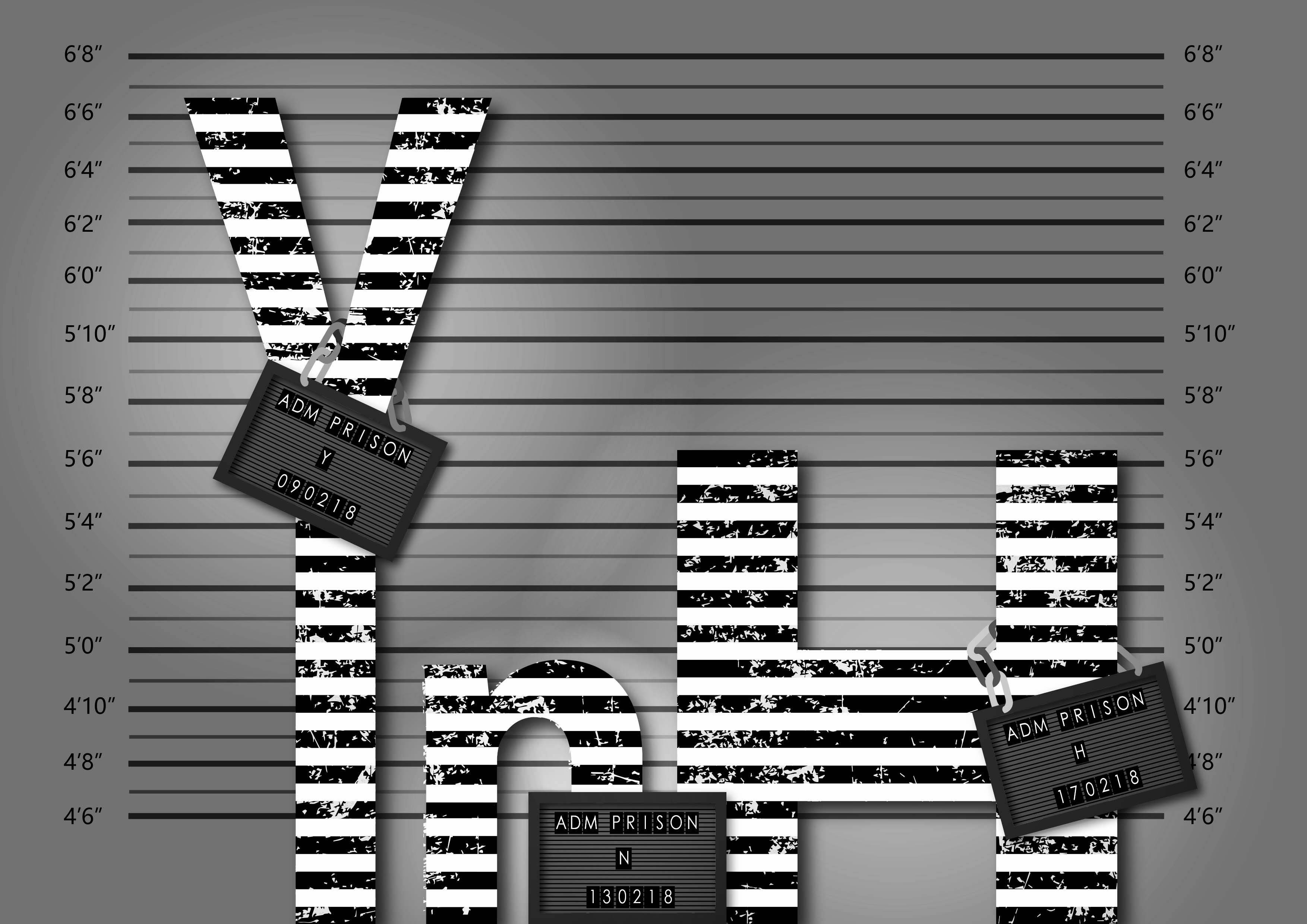
Criminal
This was the texture I found to use for my type. It is very much like the reference picture from my research; it looks like scratches and deterioration.
This was my first test with applying jpg. texture in Illustrator on my own after the tutorial class. It is the visual representation for the personalities of criminals – rugged, rotten, dirty etc. Here, I applied it to my entire name floating in the centre of the page which did not make sense.
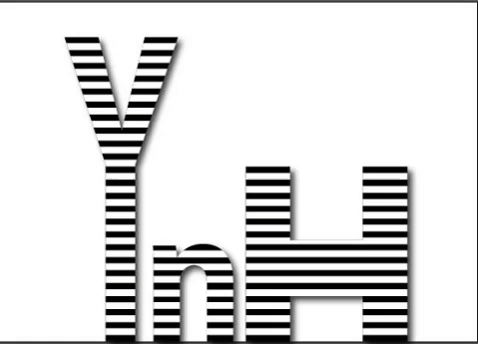
This time I had them ‘stand’ in a row. I also got feedback that the type should be in different sizes because people are of all shapes – thin, tall, fat, stout and so on. With that, I could only apply a number of letters and I settled for these three. To complete, I gave then each a panel to hold onto for identification. Then intensified the lighting to bring in more drama.
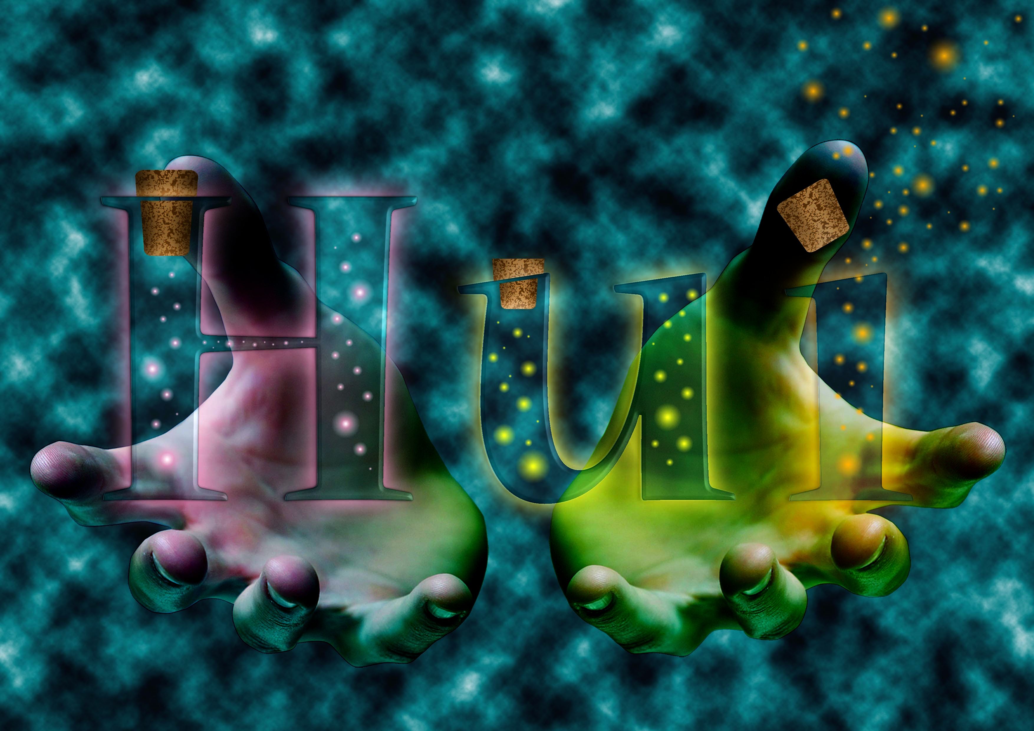
Dream Seller
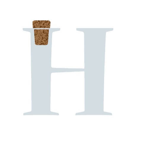
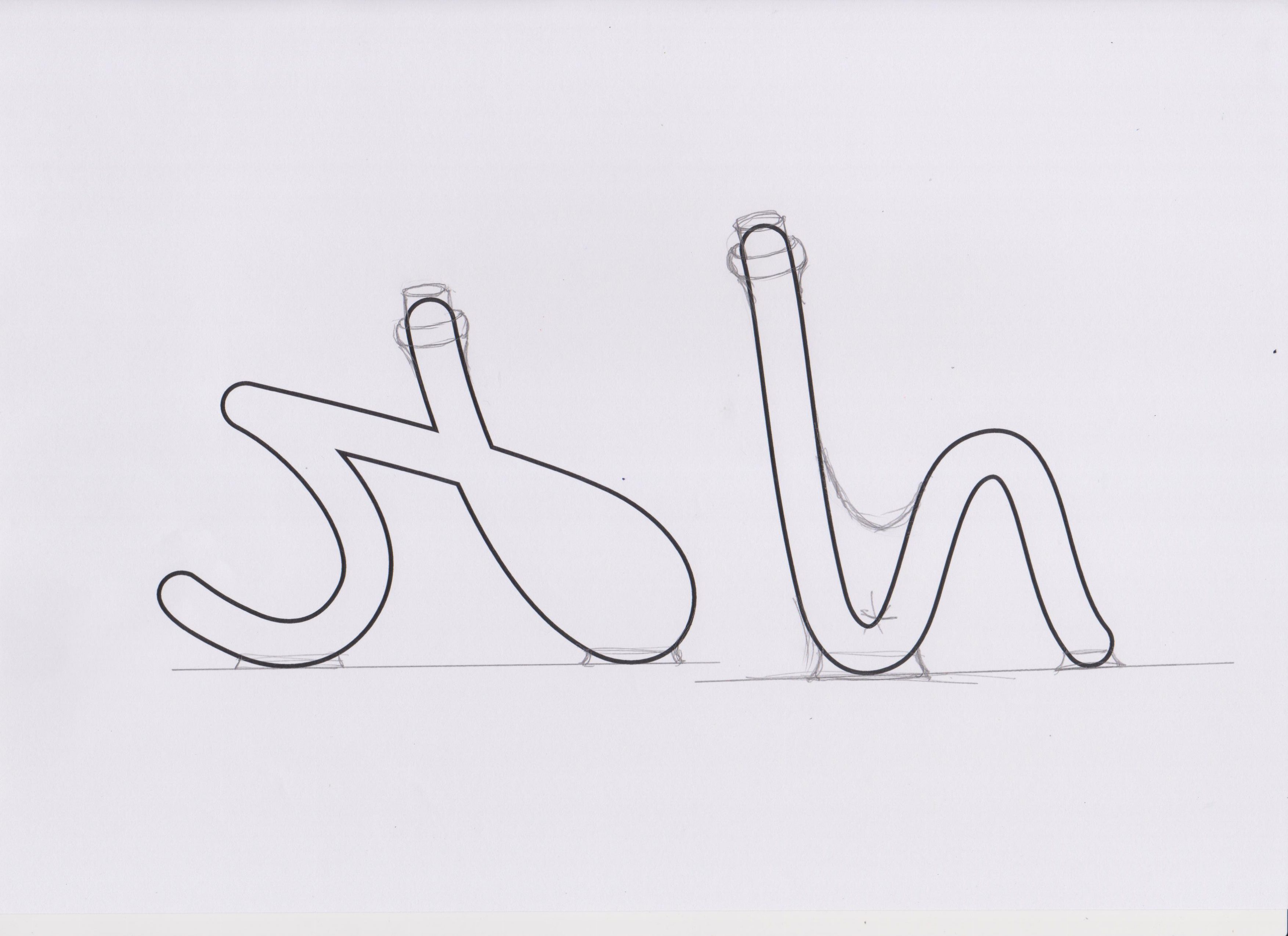 At first, I chose a script font and printed it on paper then sketched over it to change its original shape, to form letter bottles.

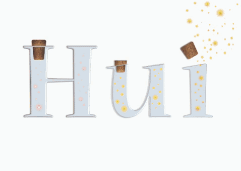
They look like this after I traced and coloured them.

I went to search for ways to help me create the ‘fairy lights’ in the bottle that were to represent dreams.
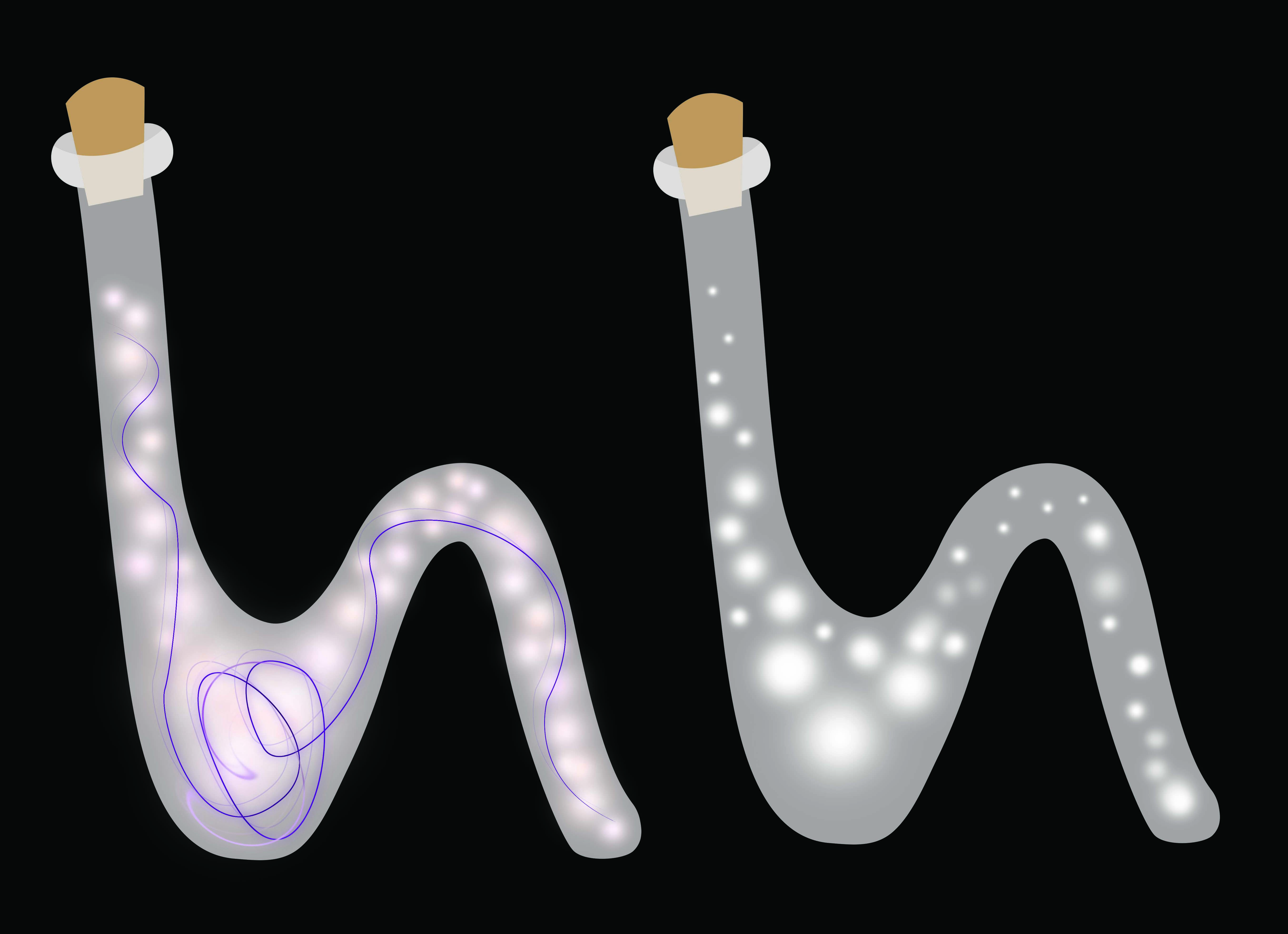
I tried it out on the bottles!

Things were looking flat and boring and I got many comments suggesting to make it 3D, create more depth and such. So I tried making the background darker to bring out the illumination of the bottles. I also got help from my cousin on drawing highlights and shadows. My drawing skills were lacking and I could not identify where the highlights and shadows should go. So this method did not work for me.
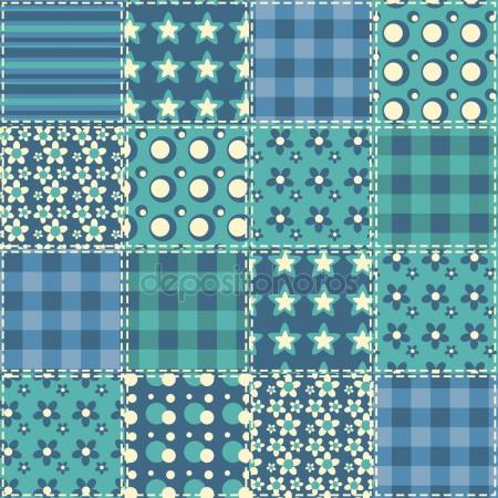
The background colour was picked from this quilt pattern found from google. It is sort of a bedtime blue which was perfect for the dream setting.
 After much searching I was able to find a tutorial on making glass type in photoshop.
Combining all the knowledge that I have acquired from the previous I put together the final piece. Rendering photoshop clouds for the background for a mystifying effect. The hand gestures to offer the products as if selling. Then I tweaked the blending filters to make it seem more natural.
Gardener

This one was a little tricky to get. Even using letters as a base, the results still came out ‘wrong’. Not the effect that we were looking for.

To fix that, I avoided changing the shape of the original type. Then I applied the elements that suggested the job of a gardener.

I move the vectors into photoshop to apply textures and materials.
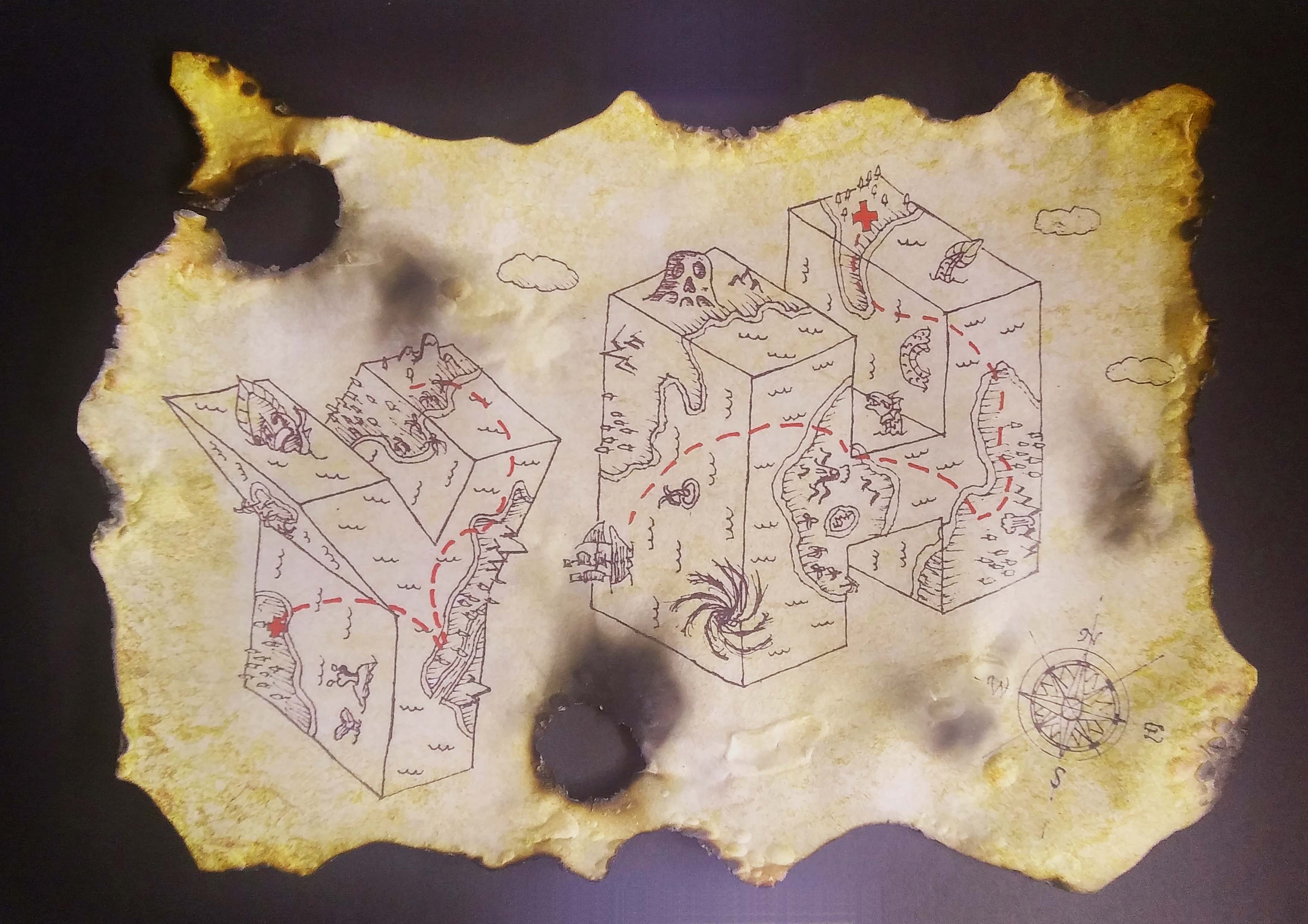
Treasure Hunter

The original sketch inked on paper, scanned. I followed the reference image to create the map look with the monsters.
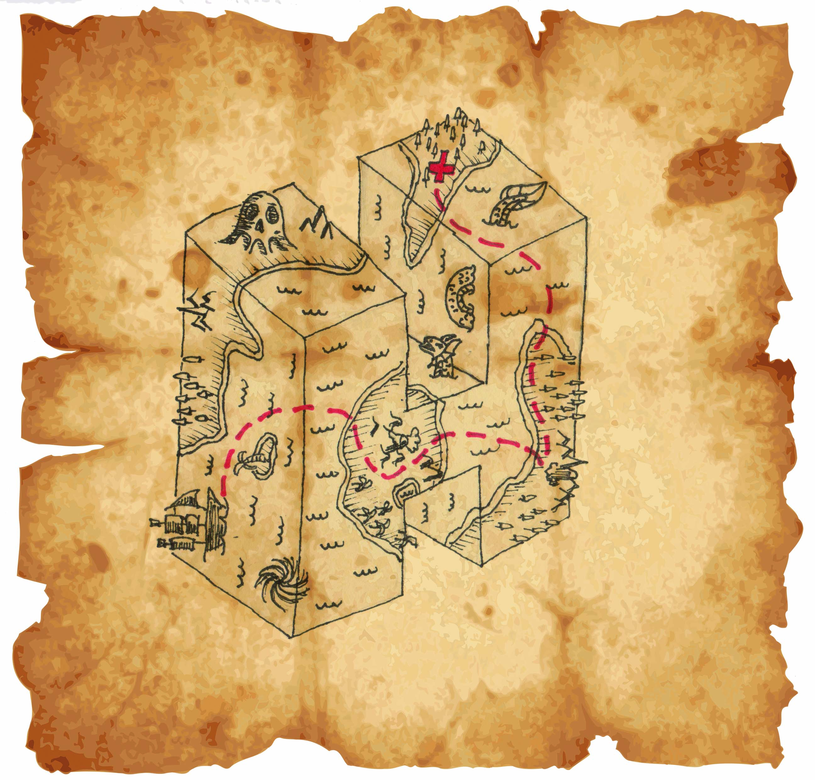
This was the first sample. It did not seem complete.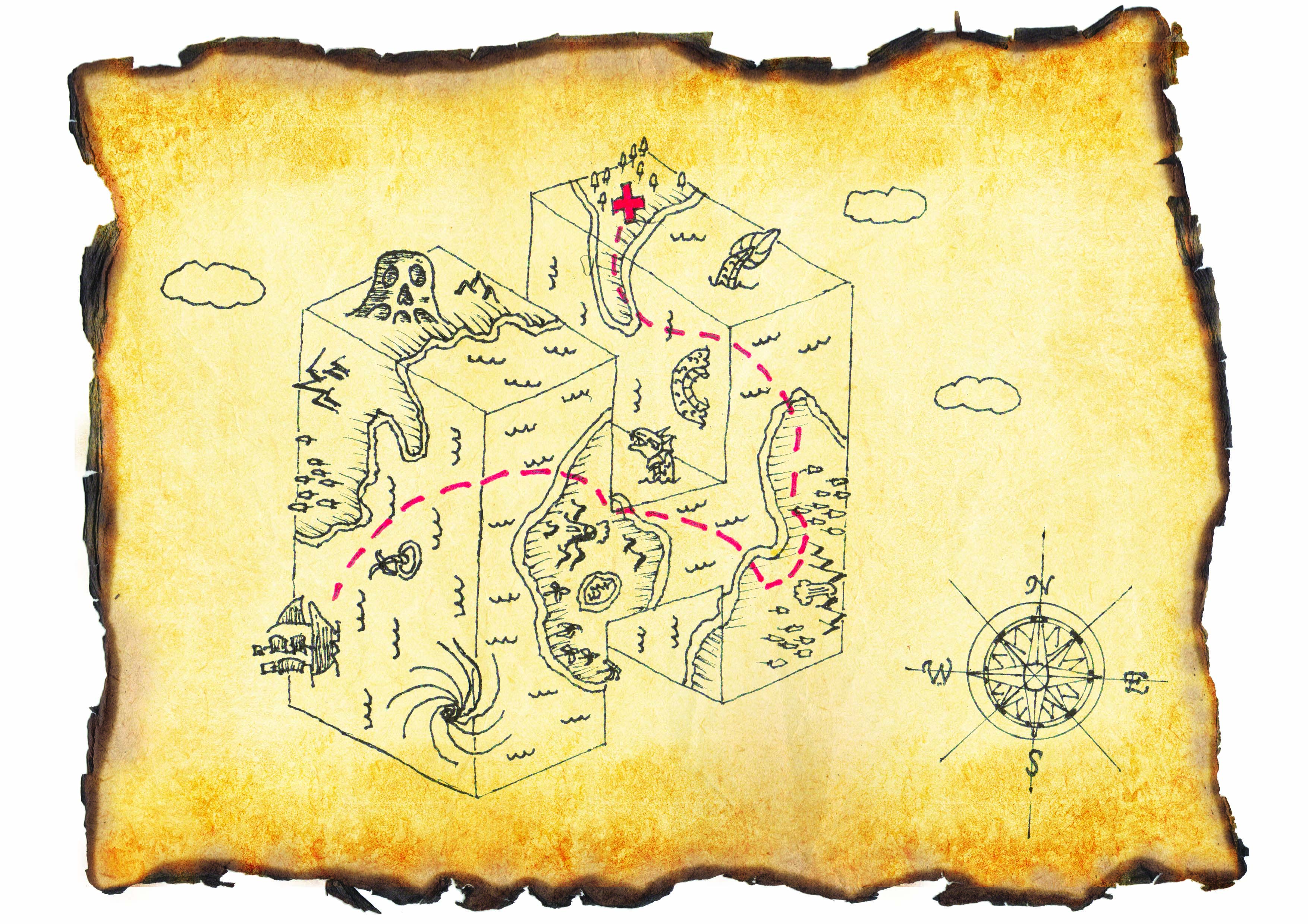
Then I added some clouds and the compass sign for direction and it seem more like a map. I wanted the map to look real so I changed the background to a texture that was more realistic together with burnt edge paper.
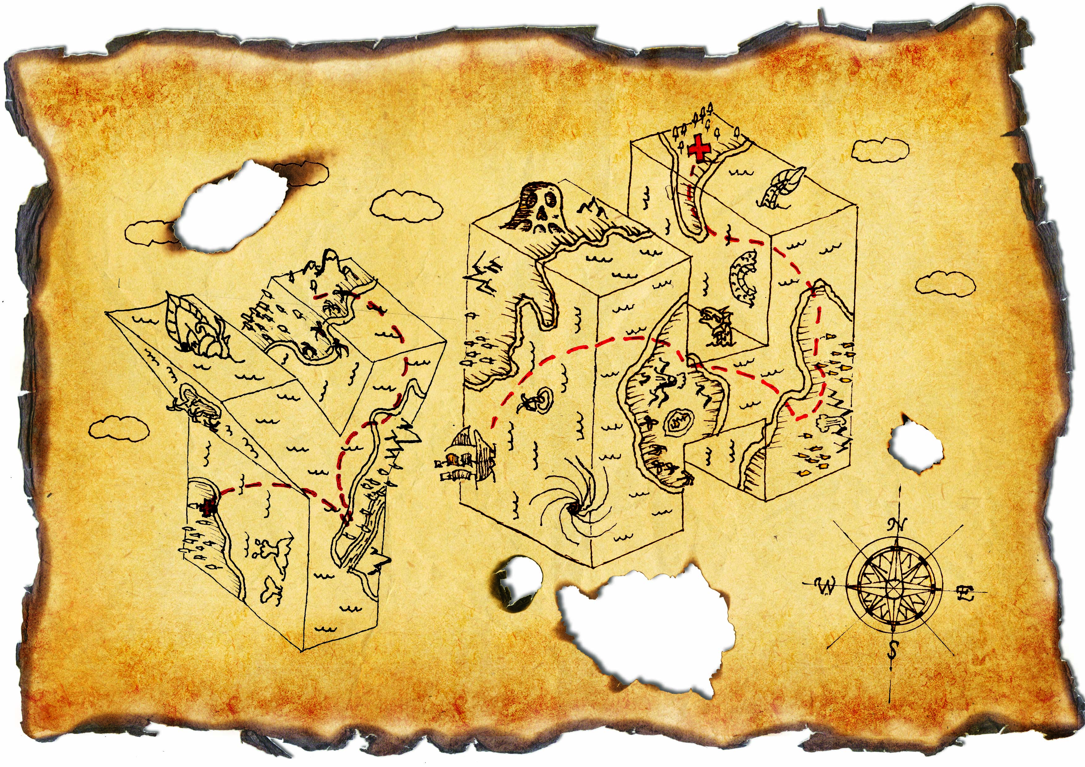
The lines were too faded before so I duplicated them many times to thicken it. Added another letter because I realised the brief said at least 2 and it actually completed the composition with implied lines and with ties in with the idea of traveling. Burnt marks were added to bring out the feeling of danger.

I tried burning the paper myself and the results were much more satisfying. You could not just see but actually feel what the paper had been through.
Prev: https://oss.adm.ntu.edu.sg/ytan149/project-1-image-making-through-type-research/
Next: https://oss.adm.ntu.edu.sg/ytan149/project-1-image-making-through-type/
Project 1: Image Making Through Type – Research
In this project, we were to create typography of our own name/initials that carries the essence of extraordinary jobs. I listed many jobs that I think are interesting, some fiction some non-fiction. The chosen four were my favourites:
- Criminal
- Dream Seller
- Gardener
- Treasure Hunter
Criminal

The essence of a criminal that I gathered are the black & white strip prison uniform, name plate, height measuring background and handcuffs. I went to look for google ‘criminal fonts’ to see what already exist, most of them were sans-serif and many had textures.
Dream Seller
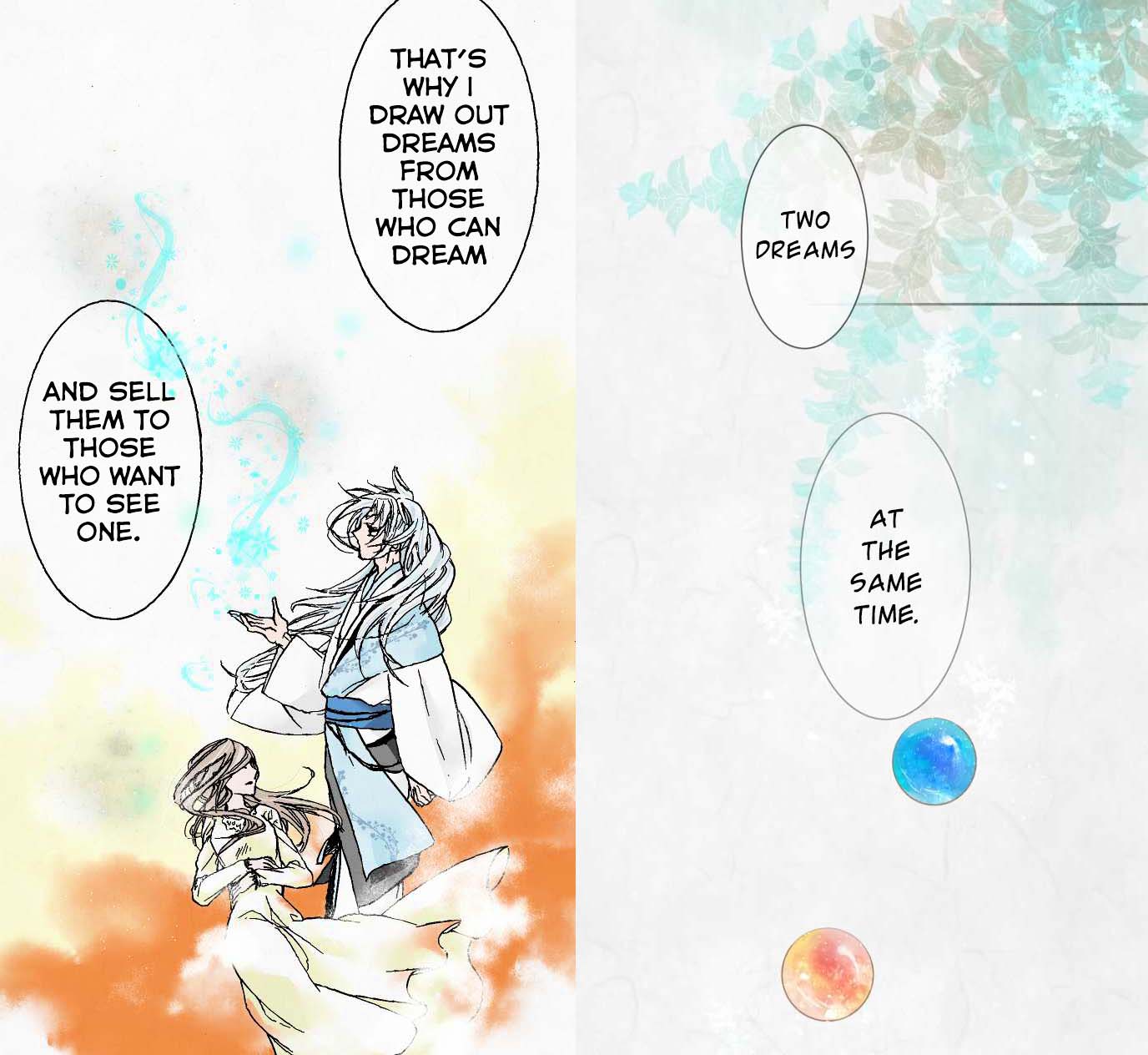
I read this webtoon recently about the after-life of a girl and there was a Youkai (Japanese for spirits, demons and other supernatural beings) that sells dreams. The dreams are depicted with fluid, wispy strokes that look like magical smoke. They are stored in colourful marbles.
The webtoon has very soft colours and textures similar to watercolour. The theme of dreams also reminds me of the Impressionism movement where the paintings and music were all very blurry, soft and muted.

When I discussed my idea with my classmates, many referred to the Big Friendly Giant (BGF) which also had the concept of capturing dreams. But instead of marbles, BGF puts them in jars which I think works better than a marble as a container.

Gardener
 I chose this job specifically because I wanted to play with the phrase “Green Fingers”. However after consultation, I realised this was not what I was supposed to do. Putting the garden into the letter was too easy and already exist. Thus I had to find something new.
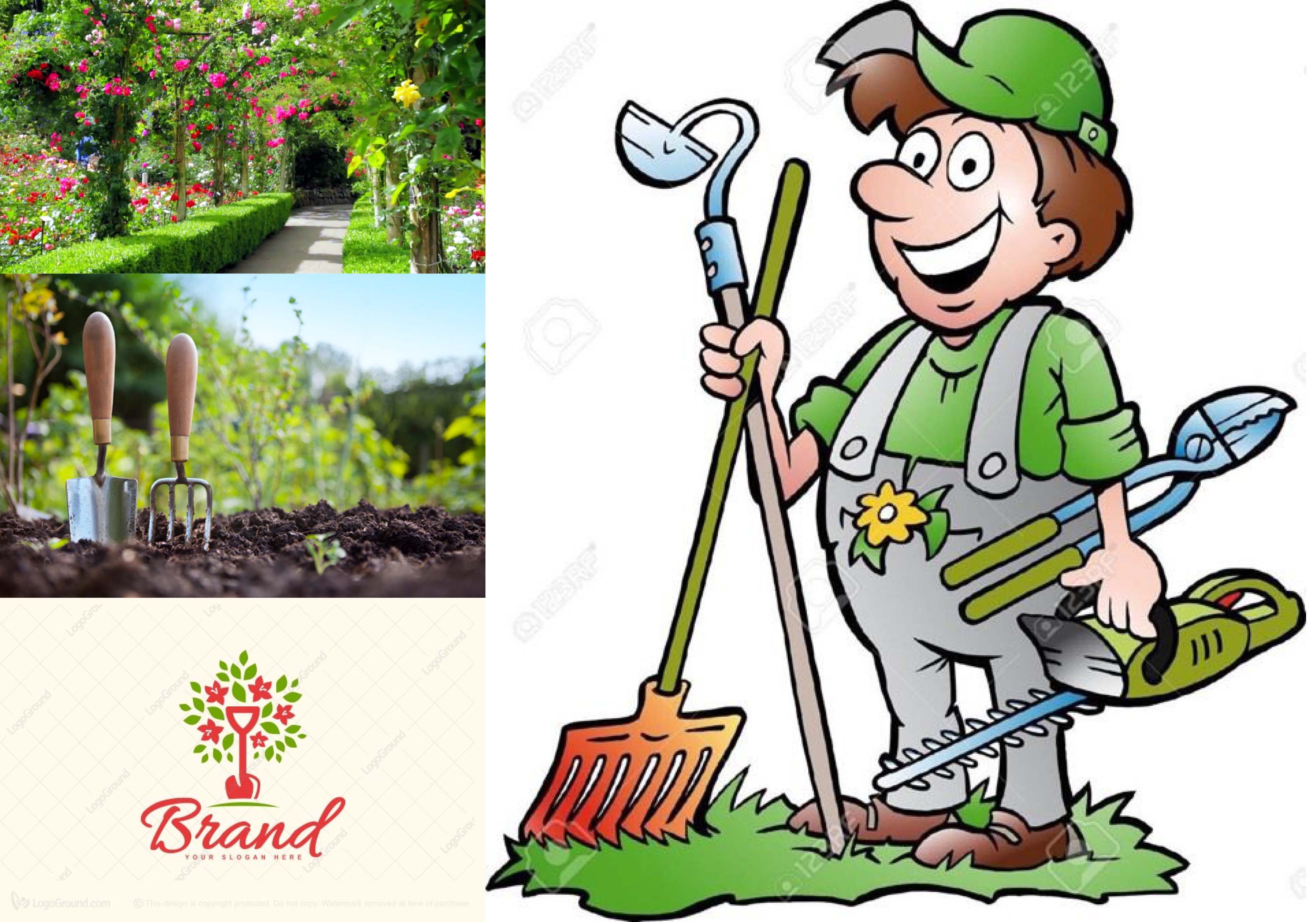
I went to look at pictures under ‘Gardening’ and I found gardening tools, soil, flowers, apron/overalls which gardeners always wear etc. Under ‘Gardening fonts’ I found that many related brand logos used handwritten script fonts.
Treasure Hunter
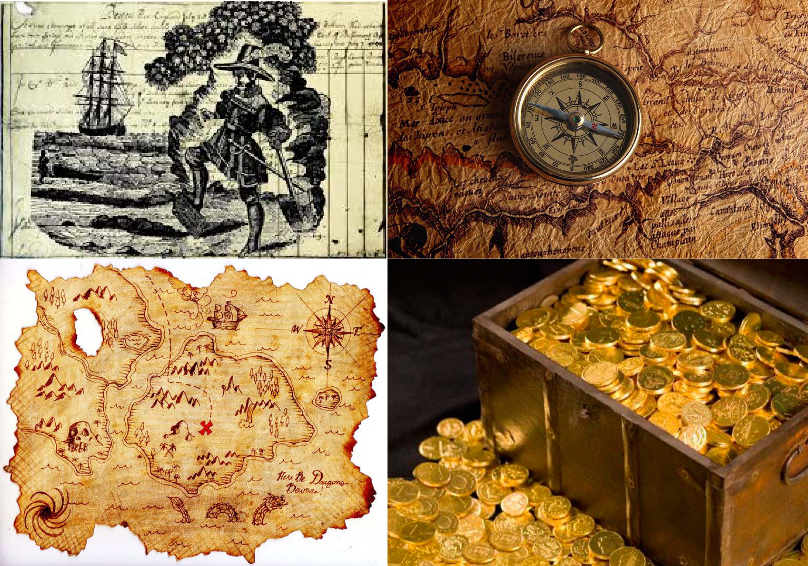
To find treasure, one needs to have a treasure map and under the search ‘Treasure hunter’ I found the maps, compass, gold. I also found this image of what seems to be a vintage print of a treasure hunter digging treasure over a page of writing presumably a journal. I thought it was an interesting idea to include a piece of writing in my work because a part of being a treasure hunter is to record your adventures.
Next: https://oss.adm.ntu.edu.sg/ytan149/project-1-image-making-through-type-process/
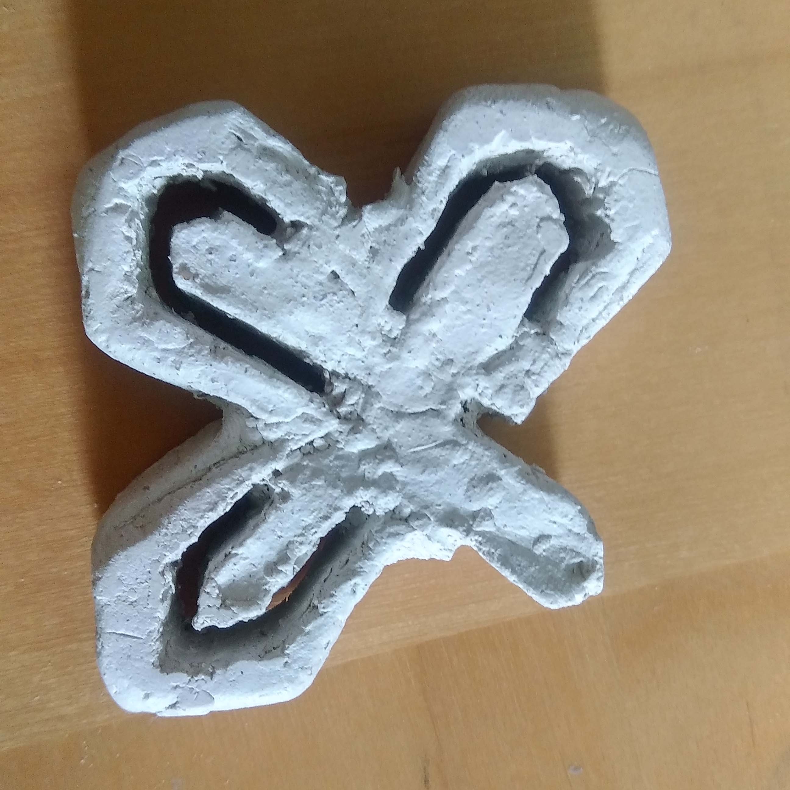
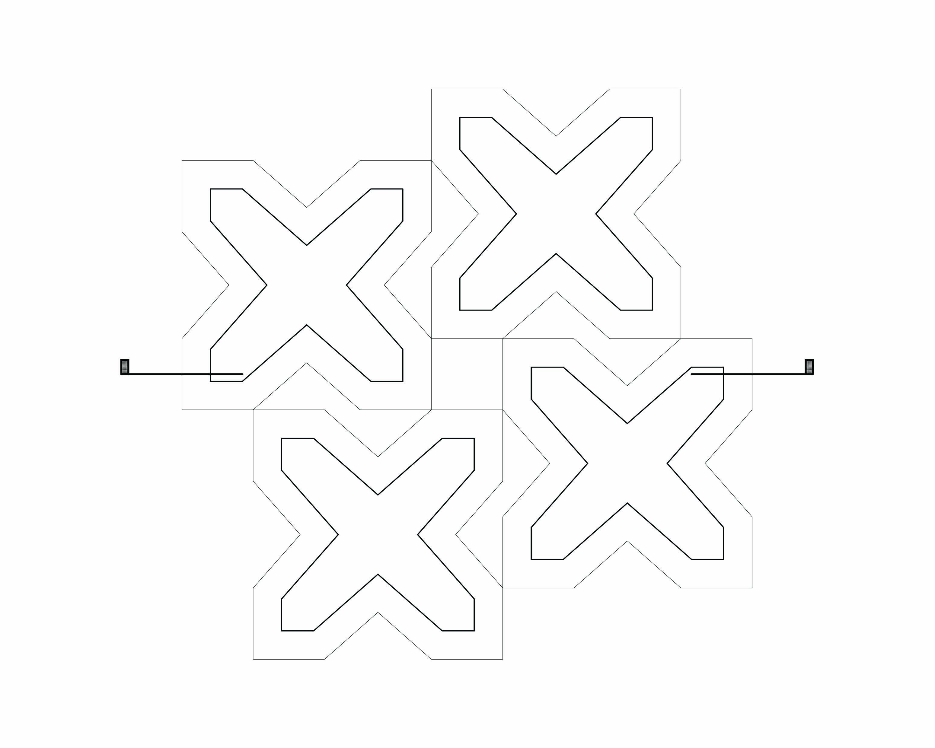
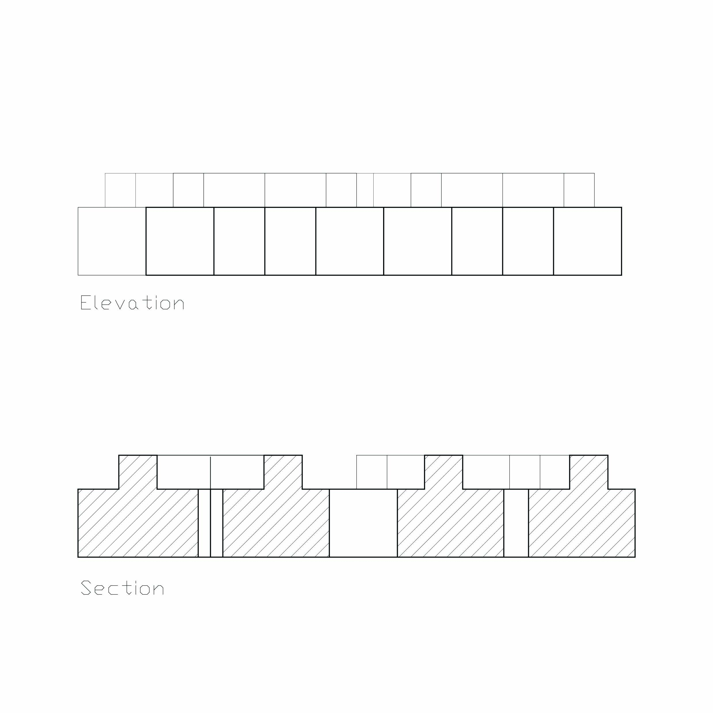
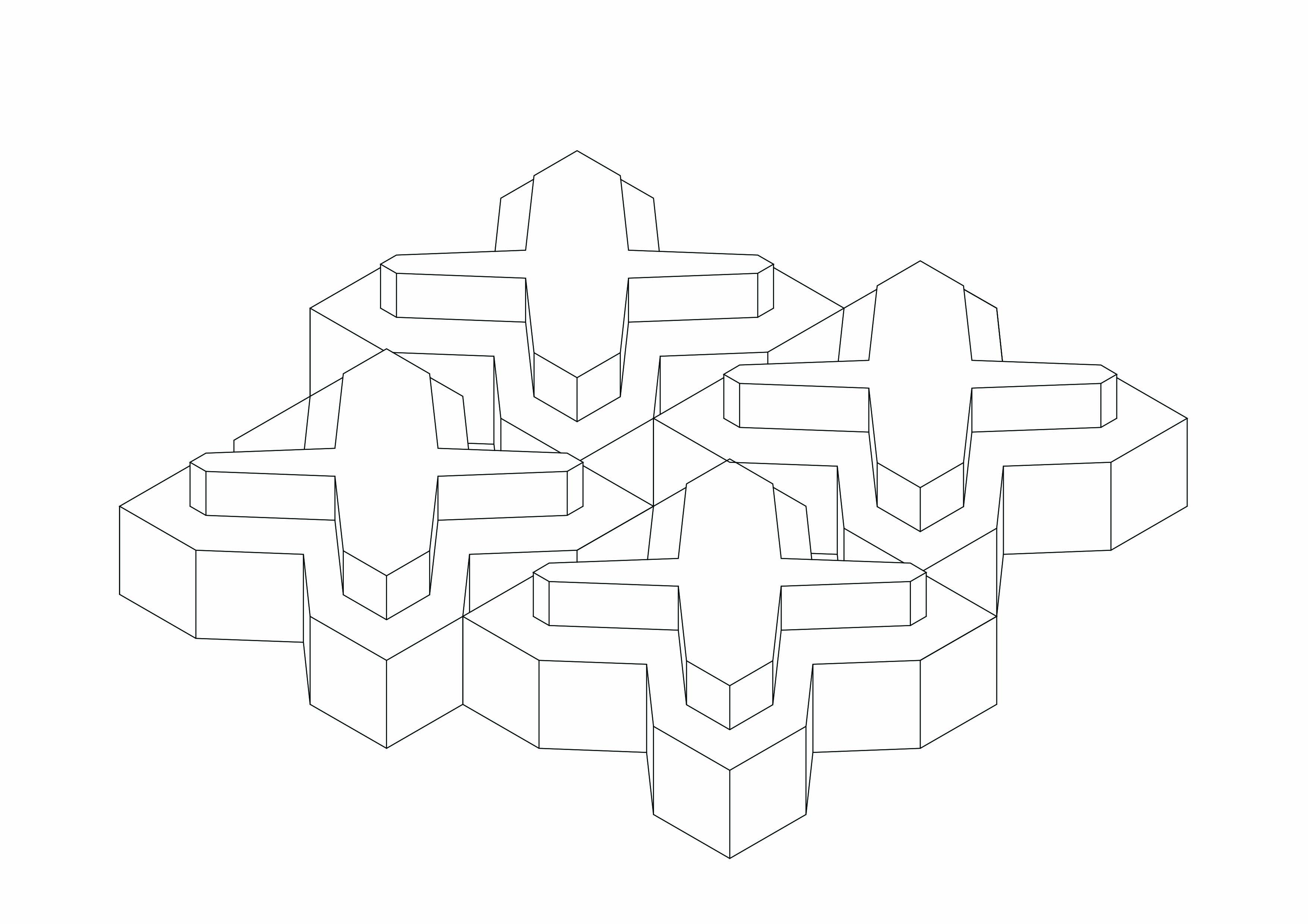
Pandora Revisited
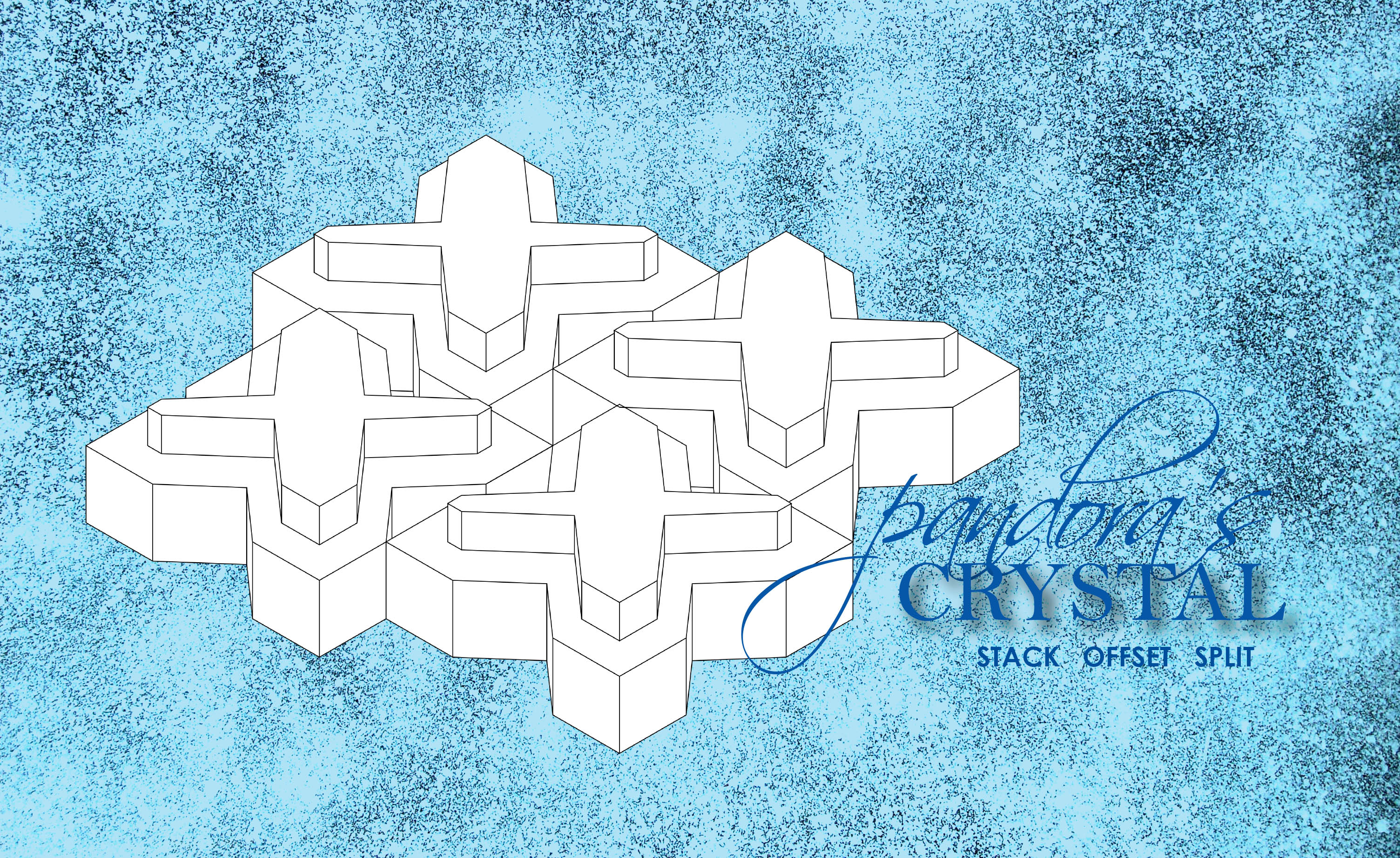
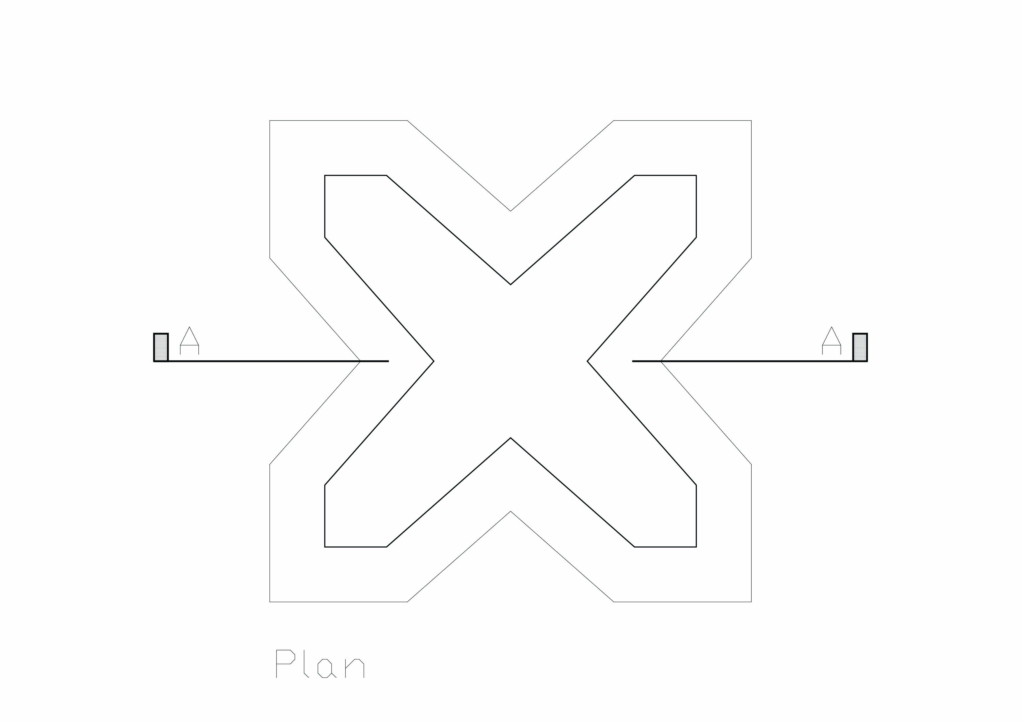
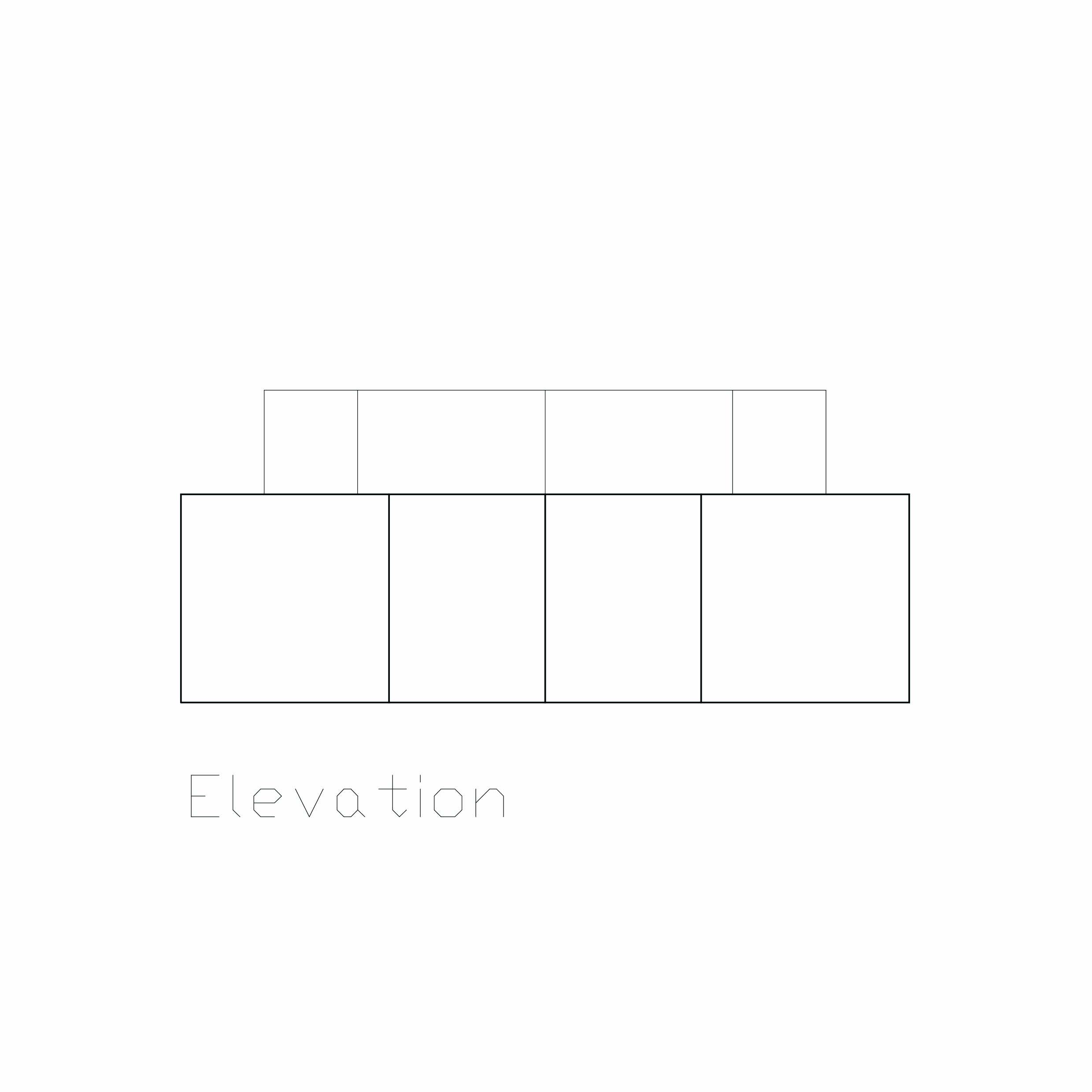
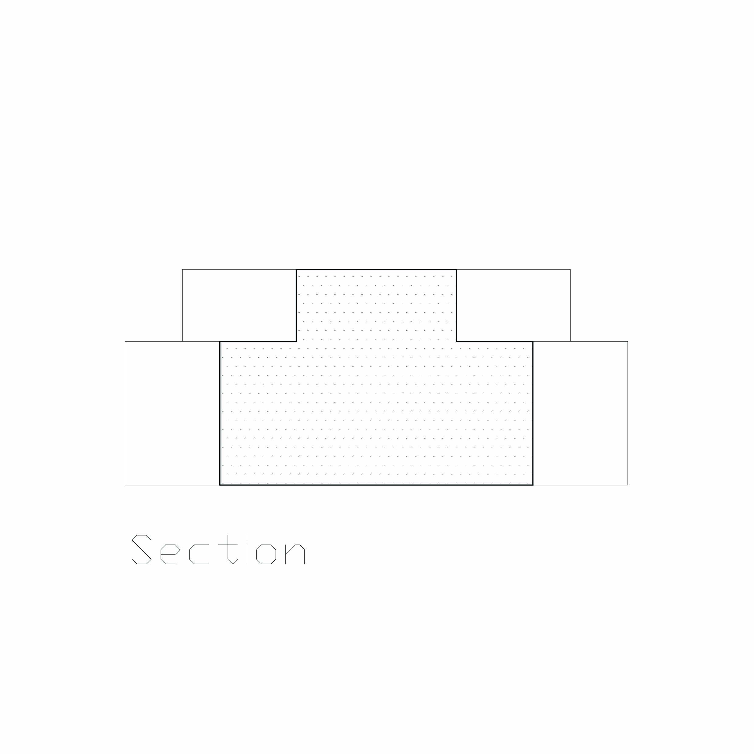
Stack Offset Split

Prototype 1:
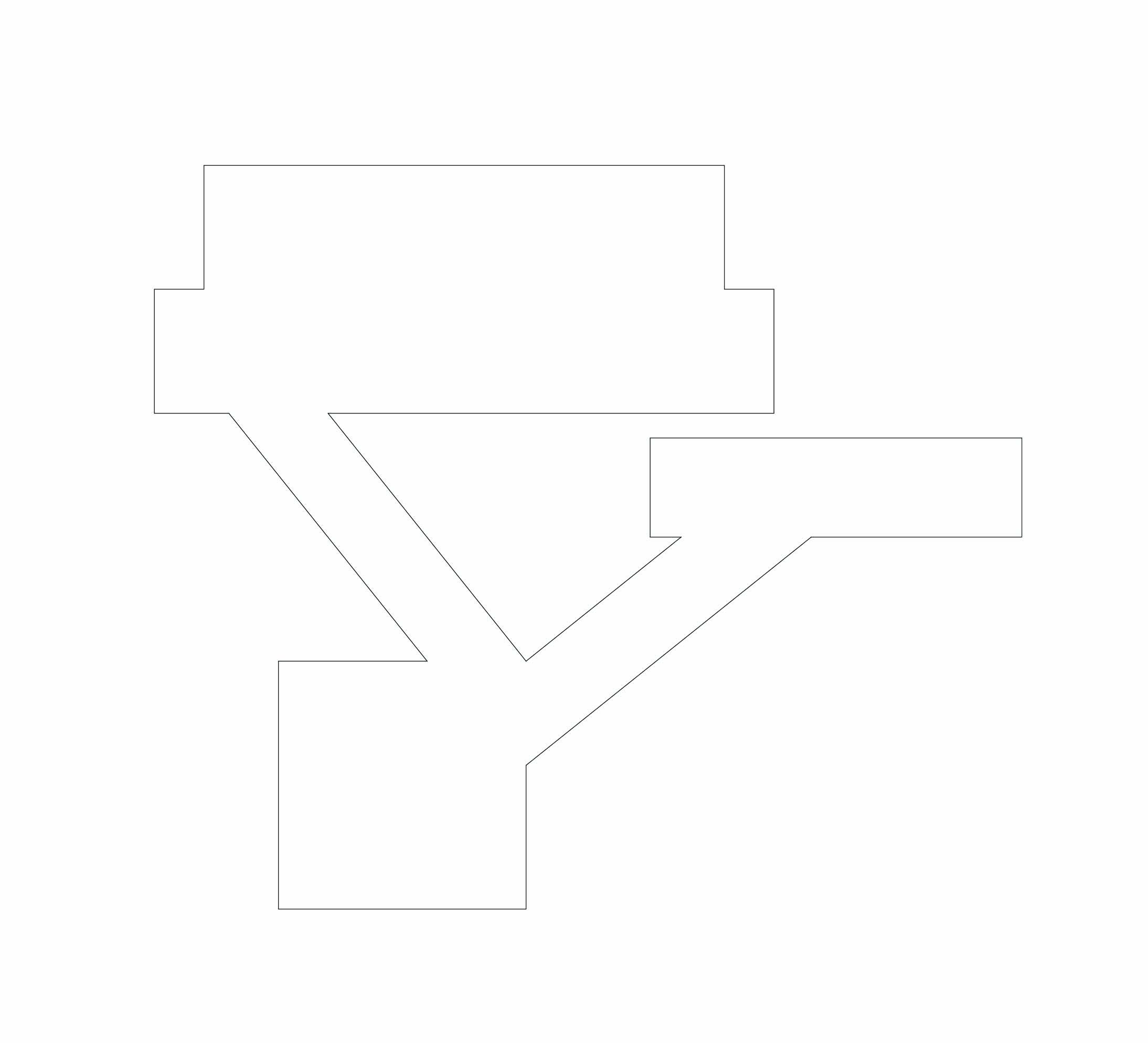
Prototype 2:

Prototype 3 (Final):


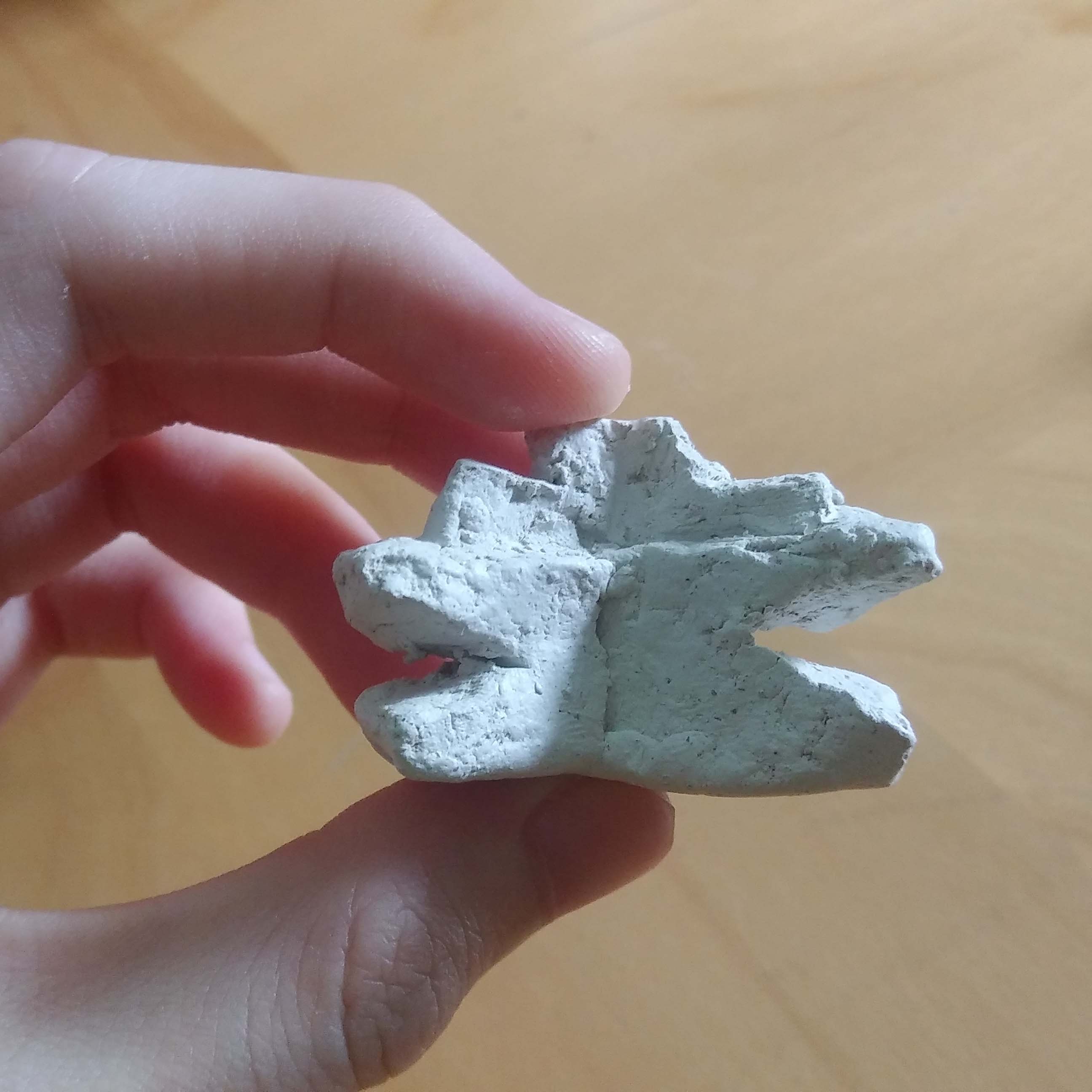
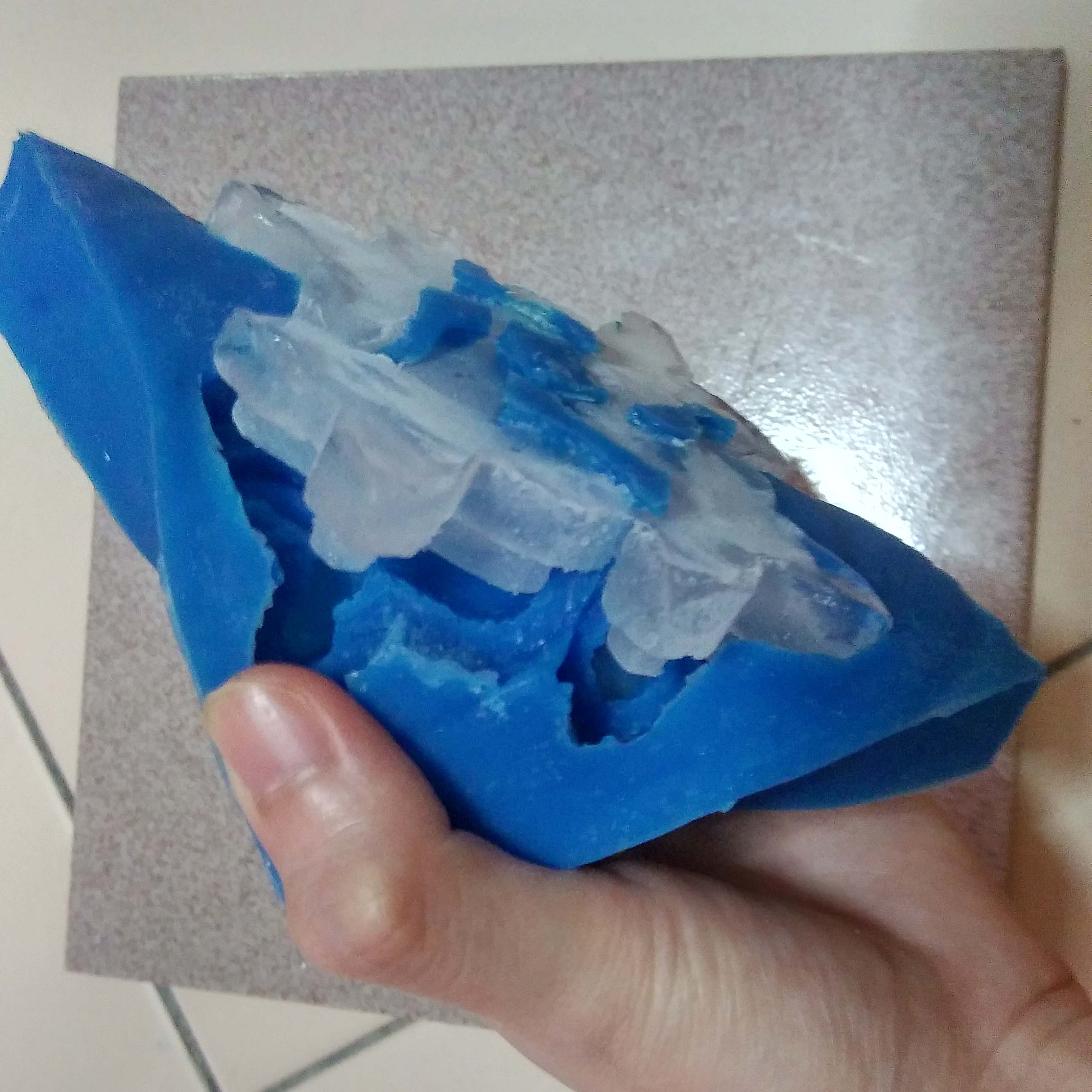
Silicon Cast:


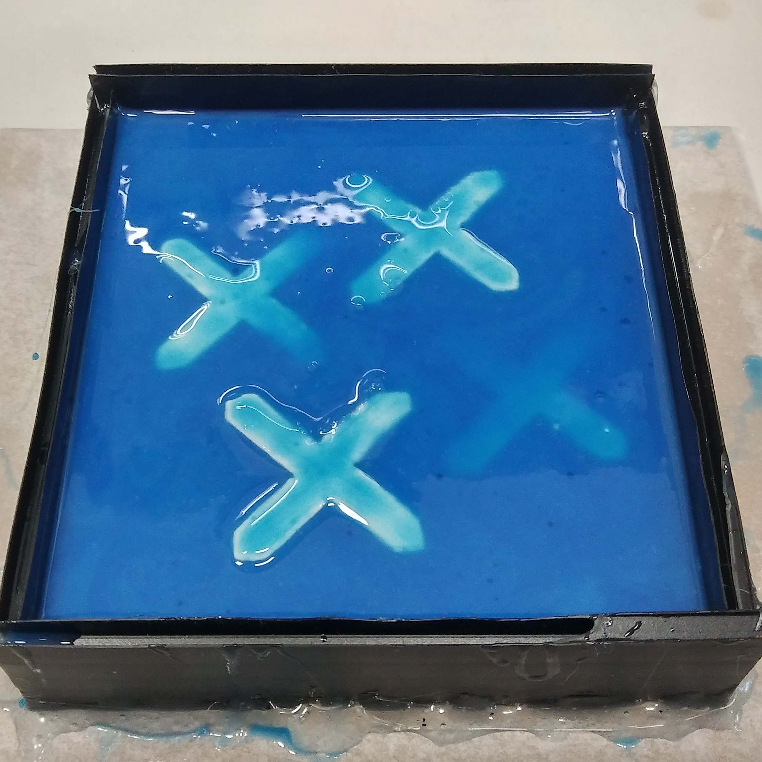
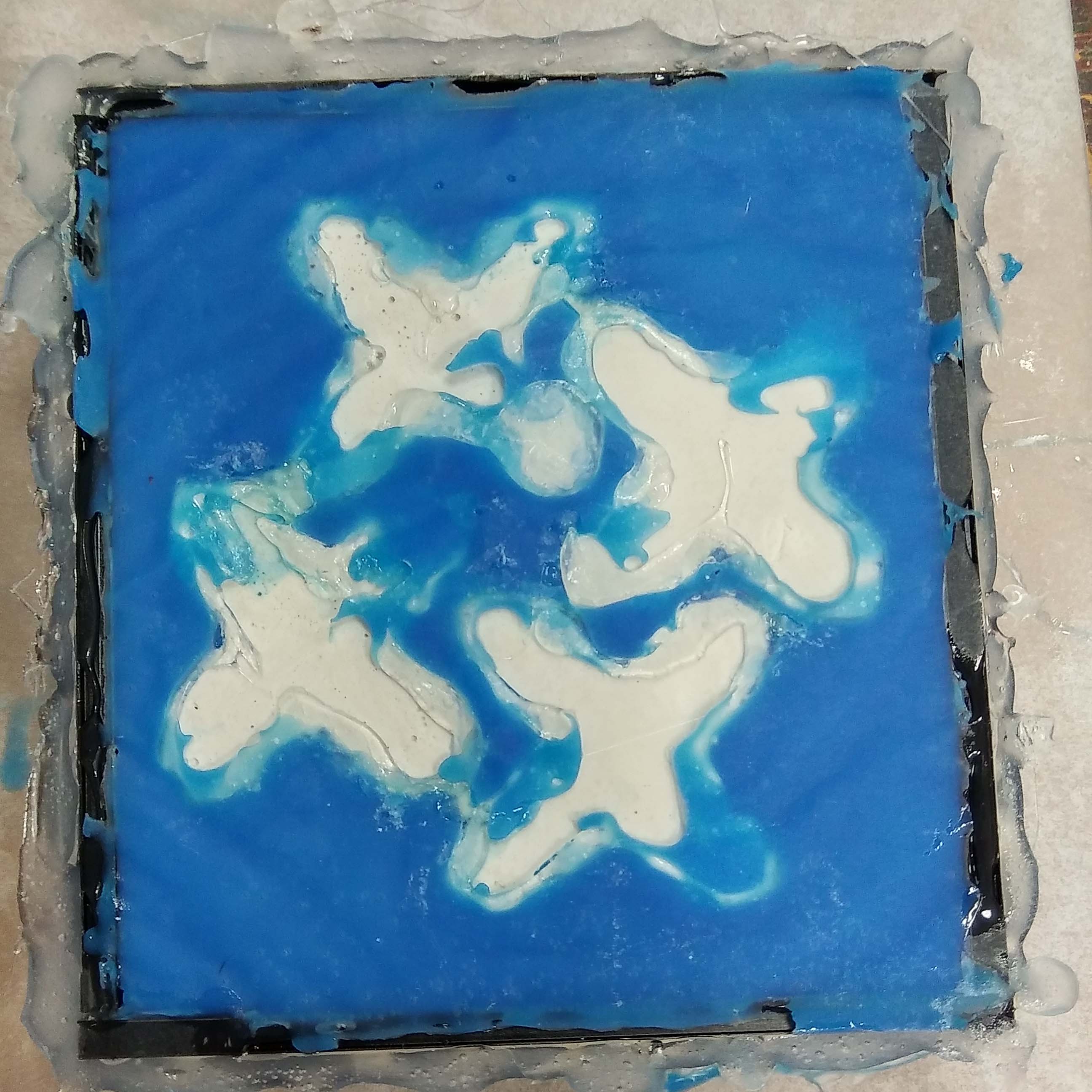
The silicon cast did not come out to well in my opinion. My clay modules had a convex surface thus the silicon leaked under. I did try to cover it up with the hot glue gun but it did not work. But that was an easy fix. I snipped away all the unwanted surface with a scissors.
Also due to limited amount of materials the top of my mold is too thin which poses some risk to freezing the ice.
Ice:

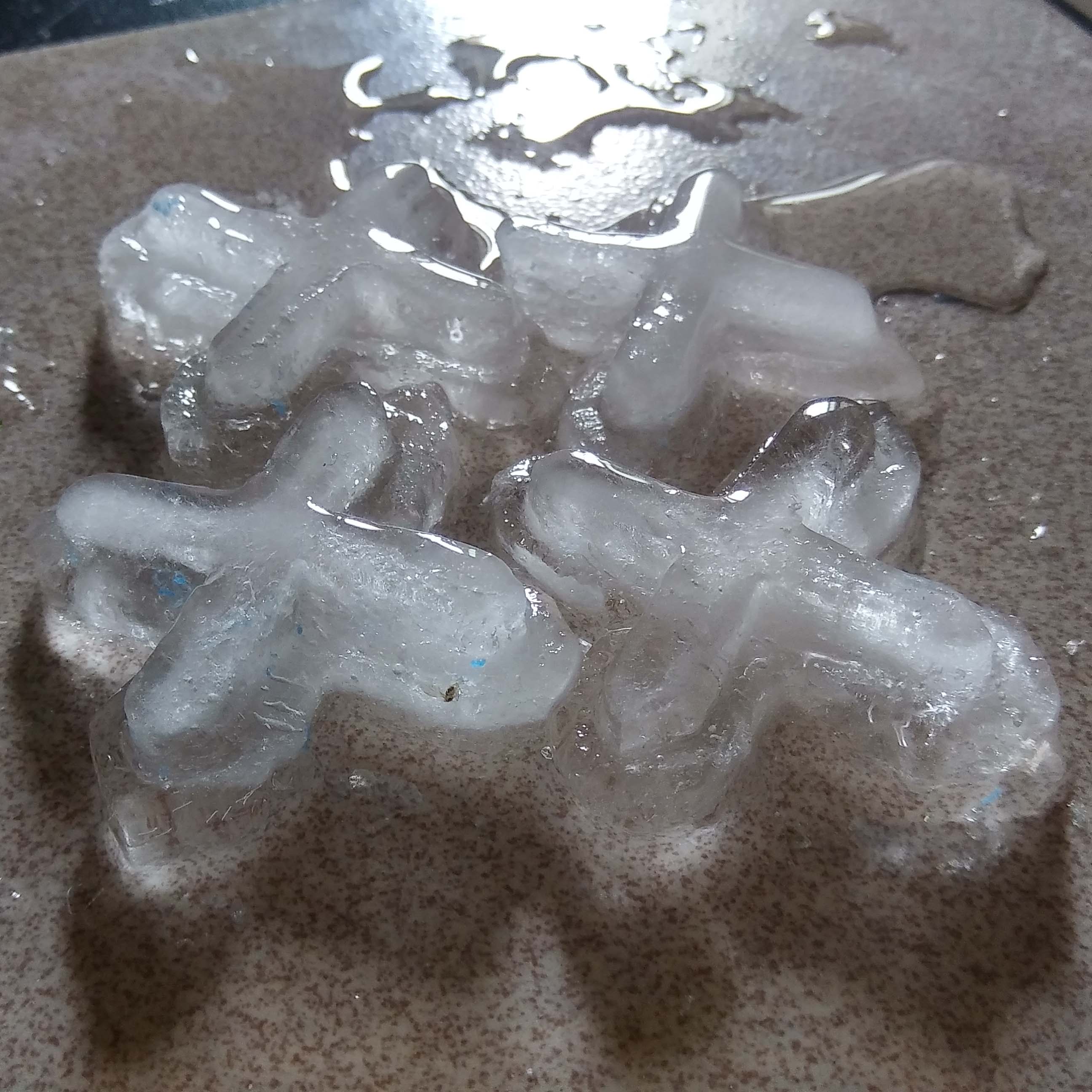
It was a failure! I should have trimmed the ends smaller so it would not trap the ice. So I had to take it apart one by one for the last photograph.
Micro Project IV- Glitch Practices

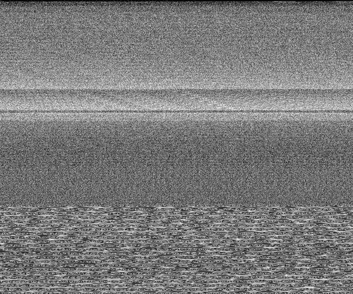
Combination of all audacity effects layered on top of one another creates this black an white static. All the colours and form are completely omitted after the first edit. It is now completely unrecognizable.

I mainly use sharpen and distort -> ripple in Photoshop. It created some ‘waves’.
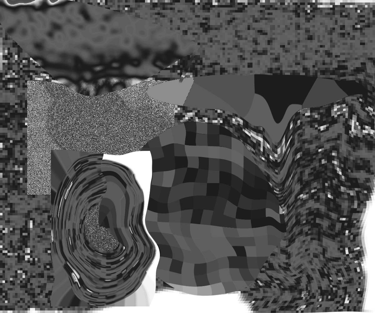
Distortion and liquify tool on Photoshop. Here it becomes wonky.

Added colours. Play with blend mode. Copy and pasted parts. Warp.
Micro-Project III – Tele Drift
Posted by Dion Chew on Wednesday, 31 January 2018
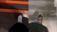
Dion and I decided to do a performance where the both of us coordinate to be a single person in the third space – lets call her Third. She did 3 things – walking, washing hands and writing.
- Walking
We thought it would be interesting to walk down some stairs. We went to different staircases and held the cameras to our hips, hers on the left and mine on the right. Together we tried to coordinated our foot steps one after another to make it seem as if Third is walking. It turned out really awkward because after every step there would be a short pause before the other leg moves; as if she was limping. I could not quite follow the left leg because of a lag in connection and it finished the stairs before me.
- Washing hands
After trying to synchronize our legs we decided to synchronize our hands. We went to the 2D workshop where there are a few taps by the window to stage Third washing her hands. Even though we gave cues and communicated the results were not perfect. It was difficult to position the camera so that the faucet lined up with Dion’s faucet. We timed to turn on the water at the same time but one of use was still a second behind. Syching our hands was fairly easy and believable but I was to quick to wash.
- Writing
We were afraid that our video did not make the 5 minutes cut and thus Third wrote a sentence on Microsoft Document. At first we tried to type on different places e.g. search tab match with Microsoft Document. It looked strange because the transition was so abrupt. Third was suppose to be a single person so we wrote on the same platform to achieve a more seamless split screen. Again, we did not know what the other was going to type which makes the end result funny.
Conclusion
The idea of a third space gave me +1 knowledge because I have never thought about it before- a place where the real and virtual world combine.
When we reviewed everyone’s work, the class was filled with laughter. Trying to communicate without speech through a screen apparently makes for good comedic skits. Despite all the difficulties in coordination I think this activity was really fun. We really had to see, hear and react accordingly to make Third come to life.
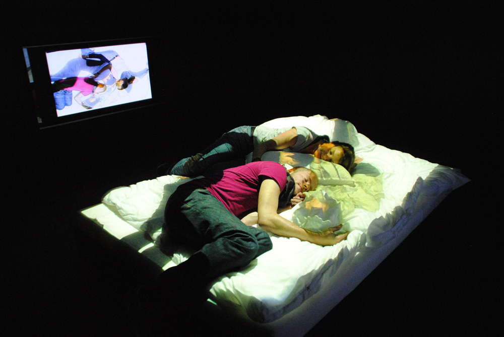
Micro-Project II – Open Source
Dion, Kai Ting and I came up with a crowdsourced artwork that reflects the emotions of the audience. The viewers are tasked to submit their current emotion represented by certain colours on an online poll.
The poll: https://www.surveylegend.com/s/kfk

The resulting artwork was the colour with the highest percentage projected onto a screen for all to see.

This is similar to that of Yoko Ono’s Cut Piece performance in which the viewers are co-creators of our artwork. They however do not have complete control. The artist holds the highest ‘power’ for the final outcome– deciding the amount and type of viewers, the location, duration and colours.
The natures of these results are also ever-changing. In another event such as a carnival, people would feel more lively and excited as compared to going to a boring lecture. A larger number of participants would change the results abundantly too, as feelings are fickle and completely unpredictable.
Marc Garrett mentioned in his essay,
that “Whoever controls our art – controls our connection, relationship and imaginative experience and our discourse around it.”
In this work, we also mediate the interaction within the crowd, viewers relate to the other participants without direct physical interaction. When they look at the final results, they form a connection with the percentage of people that feel the same way.
Both artworks represent the crowd collectively as a whole. Just like in D.I.W.O (Do-It-With-Others) the collaborating artists remains anonymous and produces a unexpected outcomes. Everyone is equal as the hierarchy for ‘good’ and ‘bad’ art is absent. D.I.W.O is all about being down to earth and pure interaction between people.
Add On:
Anonymity is important because there would be no external influence. Makes results more ‘pure’. Emotions are private not everyone wants to share. So being anonymous also protects the participant’s privacy.
Research Critique 2
The third space is described to be where the physical overlaps with the virtual. It exists when people interact with one another within a virtual environment.
“We essentially inhabit a swath of networked space, no longer constrained to the singularity of a single moment or place.” by Randall Packer, The Third Space
It allows for countless possibilities because the laws of physics does not apply there. One may exist outside of your own space and time as said in Maria Chatzichristodoulou’s Cyberformance essay, which I interpreted as transcending the concept of space and time. One can now be there and here, in present and future.
Being digital natives, the third space is as natural as air. Unaware we had entered a new ‘space’. This is because no physical traveling is needed to access the third space. It lives anywhere and everywhere as long as you are connected through the satellites.
Consciousness on the other side also makes it seem real and natural. This is done through the 5 sense and the display of emotions. However when you apply this to game characters causing a fourth wall break. It scares the player.

There was an exhibit at the Artscience museum last year by performance artist Stelarc. “For five days, six hours a day, wearing a video headset and sound cancelling earphones, the artist could only see with the “eyes” of someone in London, whilst only hearing with the “ears” of someone in New York. The body was also augmented by a 7 degree-of-freedom exoskeleton enabling anyone anywhere to program involuntary movement of his right arm, using an online interface. In the gallery space itself, the choreography could be generated via a large touch-screen.”
Visual and audio not only transports the user to these 2 cities creating a new reality. Quoting George Berkeley “If a tree falls in the forest and no one hears it, does it make a sound?” Essentially what is real to us is what we absorb through our senses.
The location and setting in which the performance is staged can also create closeness and intimacy.

Applying the idea of touch also bring the two in different places closer.

When we had our third space human wash her hand. We had to “connect” with each other by reading and predicting each other’s movement. We had to think as one and try to tap into each other’s thought. Touching mentally.