Month: March 2020
Sustainable Food Supply (Prototype)
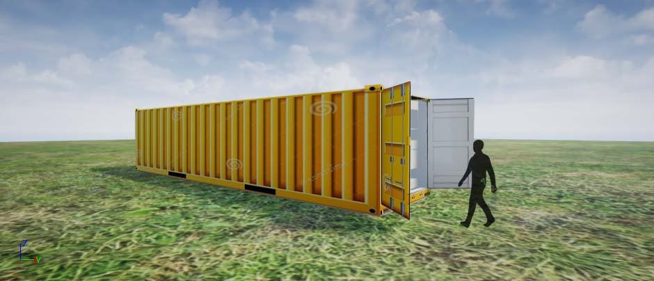
- global situation-international waters
- portable exhibit?
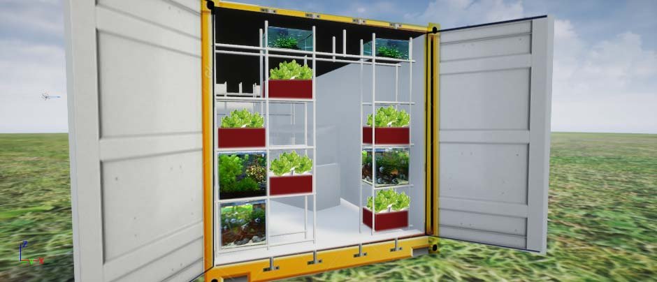
- small entrance to control single file traffic

- measure food to vege ratio before entering eating area
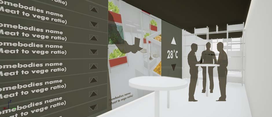
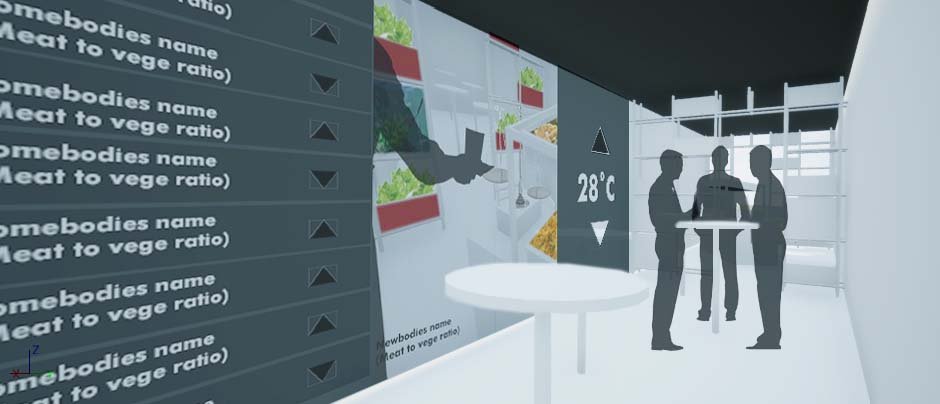
- Light shifts warm or cold depending on meat to vege ratio.
Project Management Reading
(So I only just saw the email and found out that this was an assignment was due on 28th Feb and am almost two weeks overdue…Oops)
Project management as I perceived, after the reading is requires an overwhelming lot of work and considerations. What a painstaking role! Almost every minute detail needs the attention of the PM, even things like the tone of authority or the feelings of the workers and their well being. That is not bad it is just impressive effort. The job entails more than completing the project but also establishes good work ethic which blows the assumption that being a designer is an exhausting-never-resting occupation.
The reading proposals some structures that help with planning such as the 6 goals and responsibilities. It is a simple list to keep track of the several tasks and check on whether the plan will be successful. I think this may be helpful when being a solo one-man show where the designer handles the entire project on their own. The reading made a point to remind us that, despite juggling multiple roles, the primary goals of the project management should not be dismissed. I was listening to a podcast interview of one of my favourite artist and she mentioned that being a freelancer is 50% art 50% business. Project managing is part of that latter percentage and plays a significant role in sustaining the business. As a creative, we must not get too caught up with the artwork but instead seek a balance for commercial work. If its your own personal work, it is fine to keep going back and refining every little thing. But if the work is for a client and money is involve, the artwork is only part of which they are paying you for.
The Six goals:
1. To reach the end of the project
2. To reach the end on budget
3. To reach the end on time
4. To reach the end safely
5. To reach the end error-free
6. To reach the end meeting everyone’s expectations
Alan Lakein’s quote “Failing to plan is planning to fail.” is pretty assertive but I agree. Throughout the years, I have found that I am a bad planner. My plans are more often than not messy and disorganized, or rather I planned them but am unable to produce as planned. The reading introduces iterative diagrams such as the fishbone which may help in more systematic approaches. The advise of being a generalist and understanding the work well enoguh to plan properly. Then again I am still at the experimenting everything stage and every new project is a new experience.
The financial side of project management is the most stressful, anything, as long as money is involve is stressful. I got into disagreement and trouble for it a couple of times and it was not fun. Lastly, I think the part about making sure the assignments are specific in terms of objective, duration and level of effort is really useful for self-motivation in not only commercial work but personal projects as well.
Story of the Forest (TeamLab)
So my favourite interactive installation seen from the visit to the National Museum is, predictably, Story of the forest by TeamLab. The immersive installation animates 69 antique drawings from William Farquhar Collection of Natural History Drawings, commissioned in the 19th Century documenting the flora and fauna within the local region. It starts off with a stunning petaled rain, captivating the audience from the start; an immediate overhaul over your sense of space with simply sound and visual. The black background, like a reversed abyss, made the dome interior larger than it seemed. It was beautiful, however the 3D effect does cause some dizziness. I, myself, stumbled a little crossing the bridge.
The second part of the installation was a the animated wildlife projection along a spiral walkway that wrapped around the Rotunda. I think the site really works for the idea of gradual time progression from day to night. It is unnoticeable that time has ‘passed’ until you enter the night. Regardless of the floating flowers, it was a smoother, more natural experience than the bridge.
The installation ends at the bottom of the dome, underneath the bridge that was part one. Back to the raining flowers but this time, perhaps due to the proximity, my footing felt more stable. The viewing was also more relaxed, one does not need to strained the neck to view the projection in all its glory. We were invited to lie down, a rather soothing therapeutic moment we had as a class.
The slight fantastical theme, though strays from the argument for authenticity and mission to educate, the matter is not of significance. The National Museum had a separate exhibit displaying the real drawings with full descriptions along with scent specimens for that purpose. The magical aesthetic, here, plays as an element to intrigue.
The only setback of the installation, for me, is that it is segmented by blackout curtains. Understandably necessary and disruptive at the same time, that is why I praise the fluidity of the second part. Like curator Ismail had said, the lack of hint in continuation led many visitors to end their visit prematurely. The projections are flawless in visual cohesion but the spatial planning could be better improved.
If i remember correctly, there was a point about Site specificity being taken into consideration. The forested nature was due to the fact the fort canning park was right next door and I do believe it helped to contextualize the exhibit. One may say it is not as effective because visitors rarely make the connection. But then again, the sentiment may be received unconsciously.
The brilliance of TeamLab and other similar companies is that the work is extremely passive on the interactive scale and yet people flock to see. Minus the factor of being insta-worthy, these works have successfully capitalized on the pure joy of viewing. As designers we are always searching for bombastic ways to wow the crowd and here is an artwork that proving high interactivity does not equate to quality of the work.
Such installations also has a double-edge relationship with crowds. It relied on the influence of other visitors, the bandwagon effect to direct traffic. For example, the option to view the falling flowers from the best vantage point which was to lie on the floor. Or that there are sensors that allow the audience to leave an imprint of themselves in the fictional woods. A supposedly casual and relaxing experience, is also disrupted in large crowds.
The focus on the most enjoyable consumption is what I had like to adapt from TeamLab’s Story of the Forest. I realised, the word “Environment” somehow naturally referred to a single large space which was limited my options. Separating the facts from aesthetics sounds like a good approach for serious topics such as mine-Sustainable Food Supply as works loaded with facts were never welcomed. Similarly, for my assignment, there must be a narrative link between the two; one cannot exist without the other because of the cyclical impact of the topic.