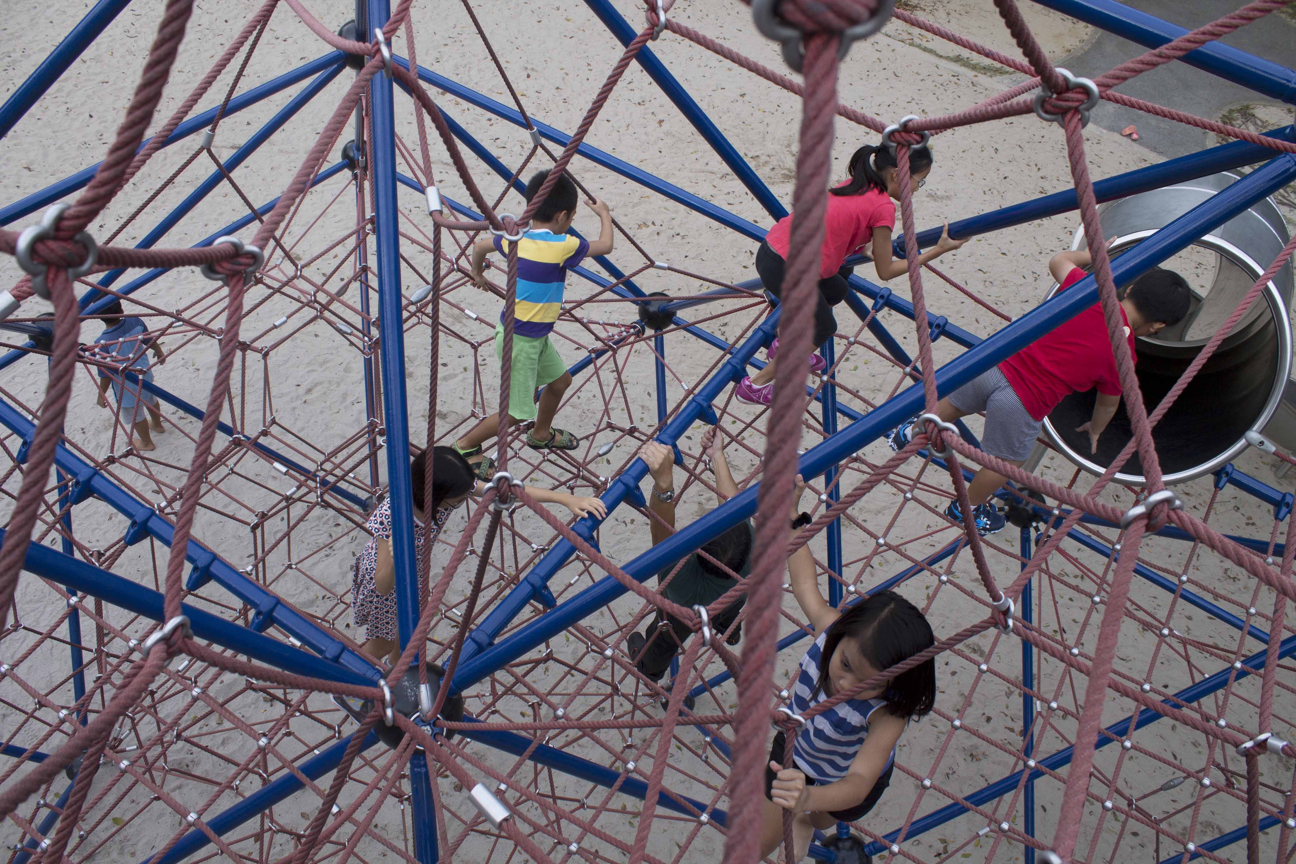
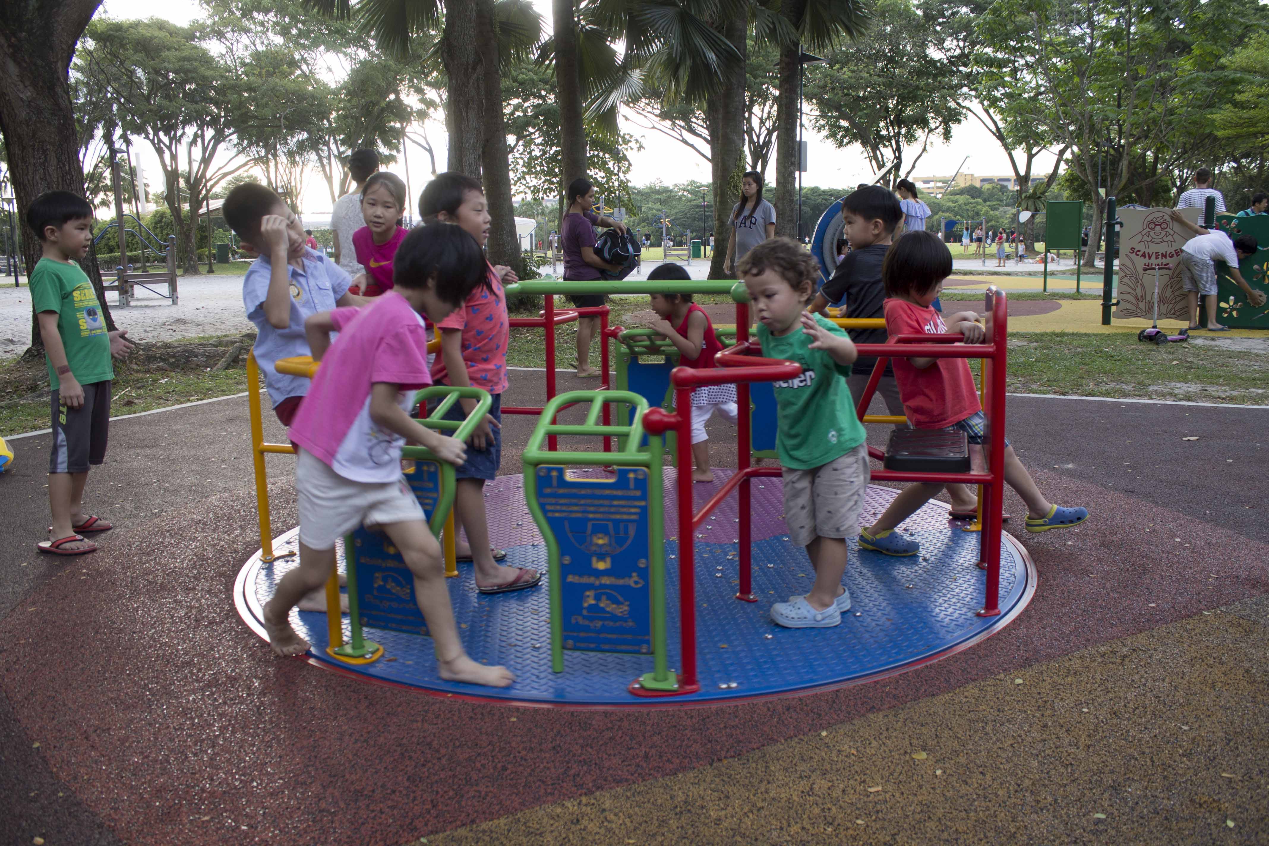
High Vantage Point:


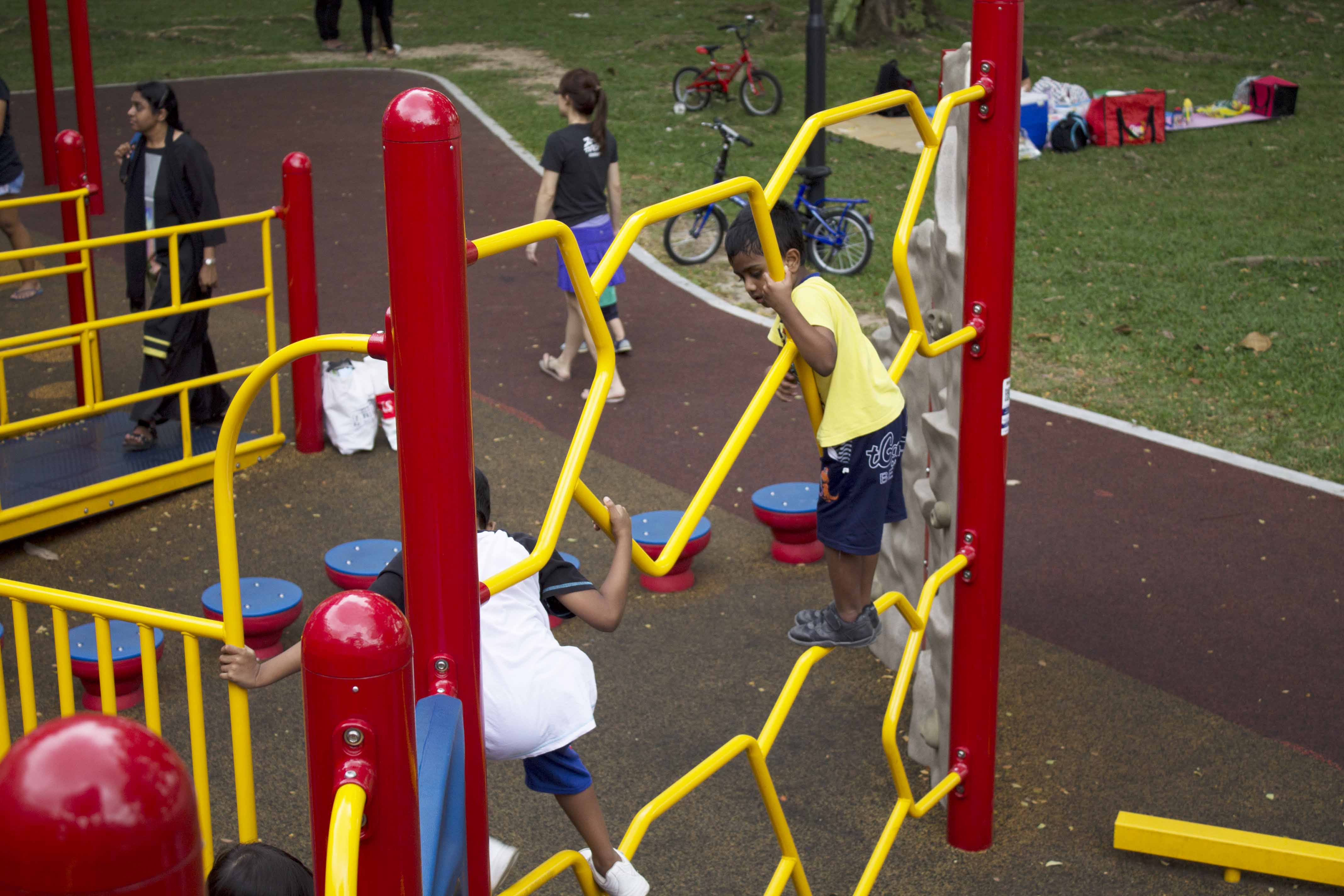
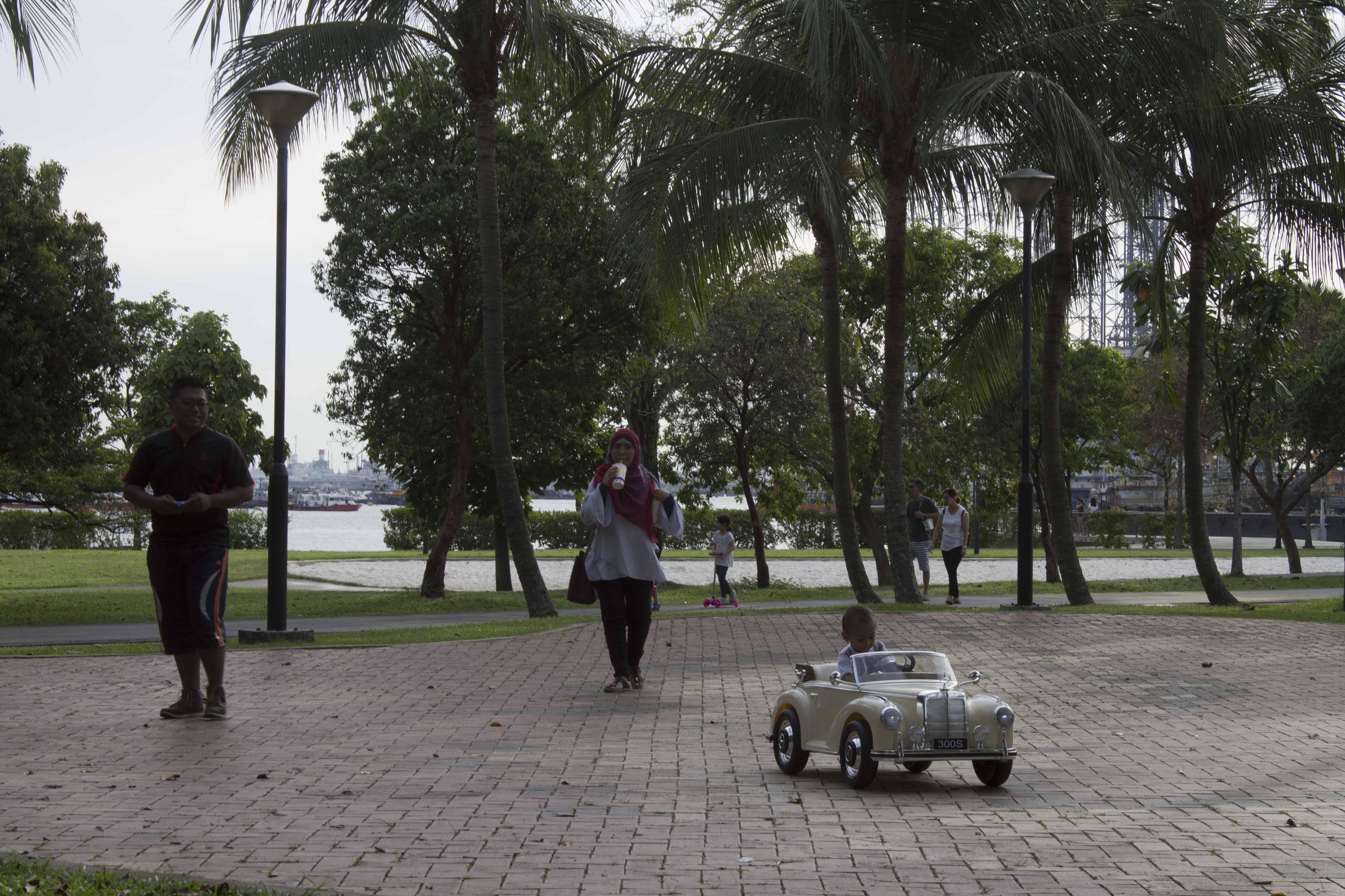
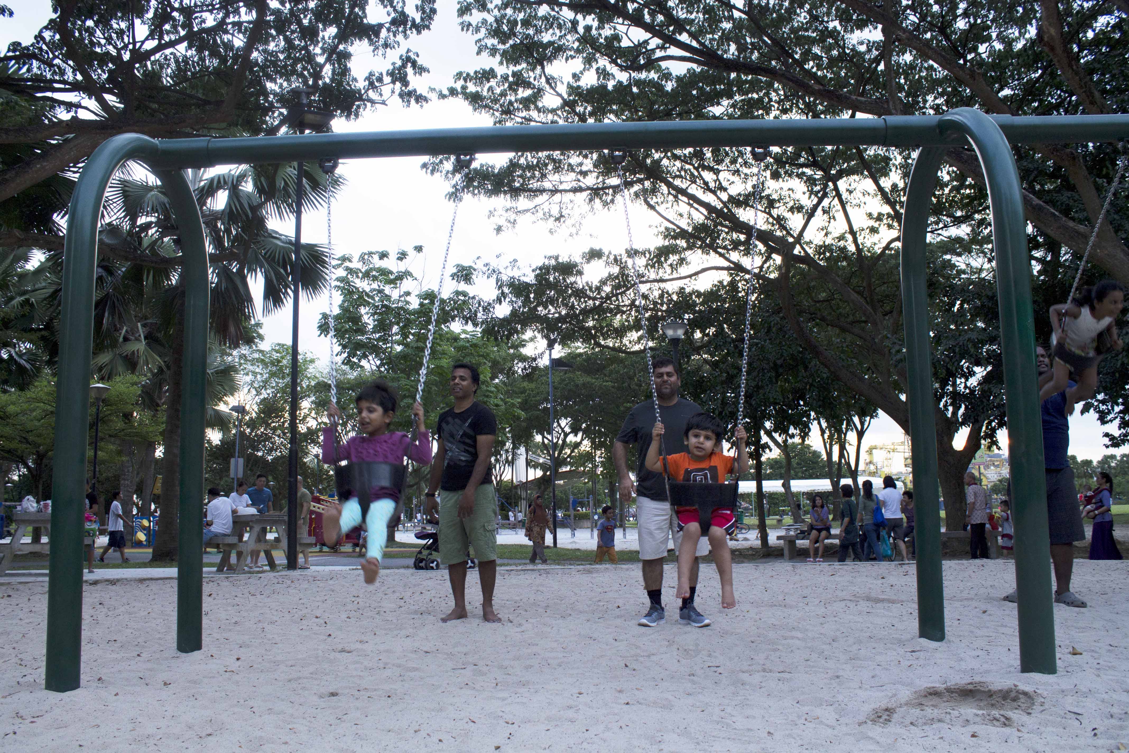
Medium Vantage Point:

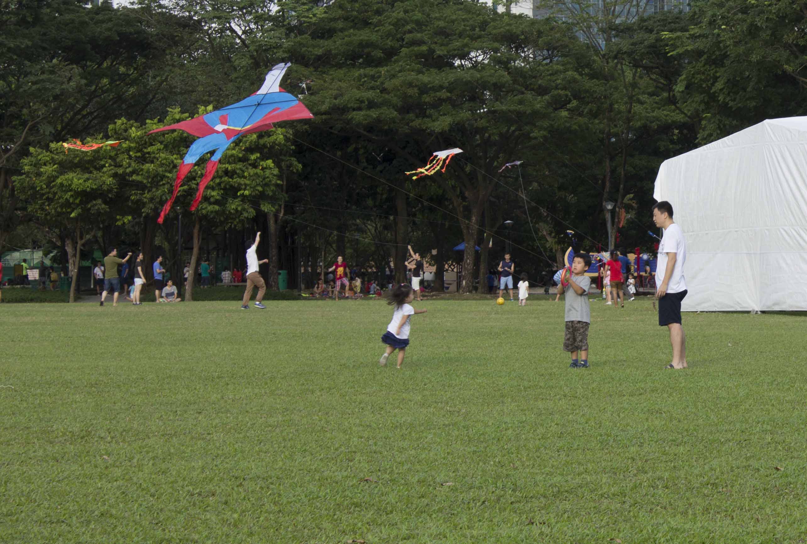


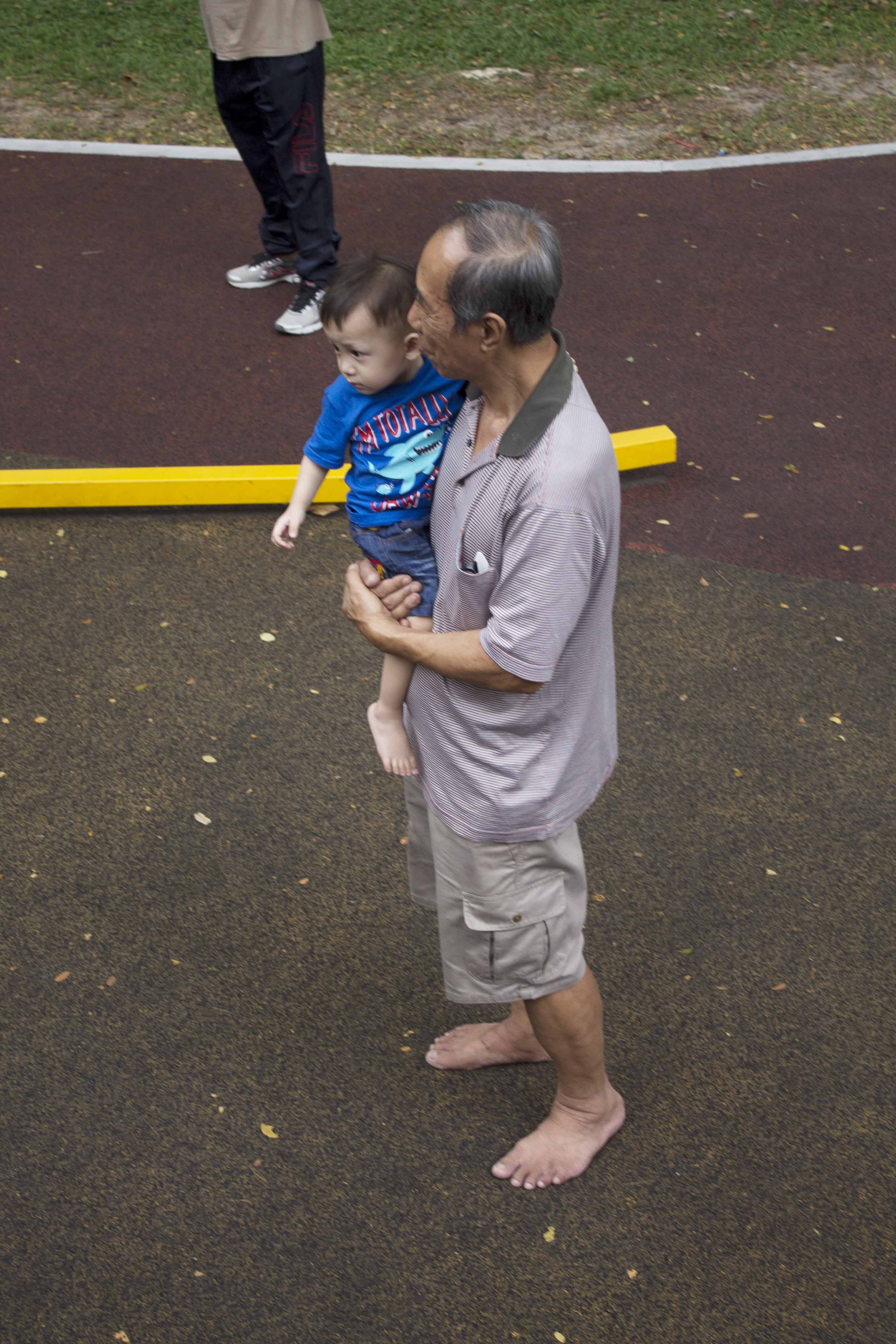
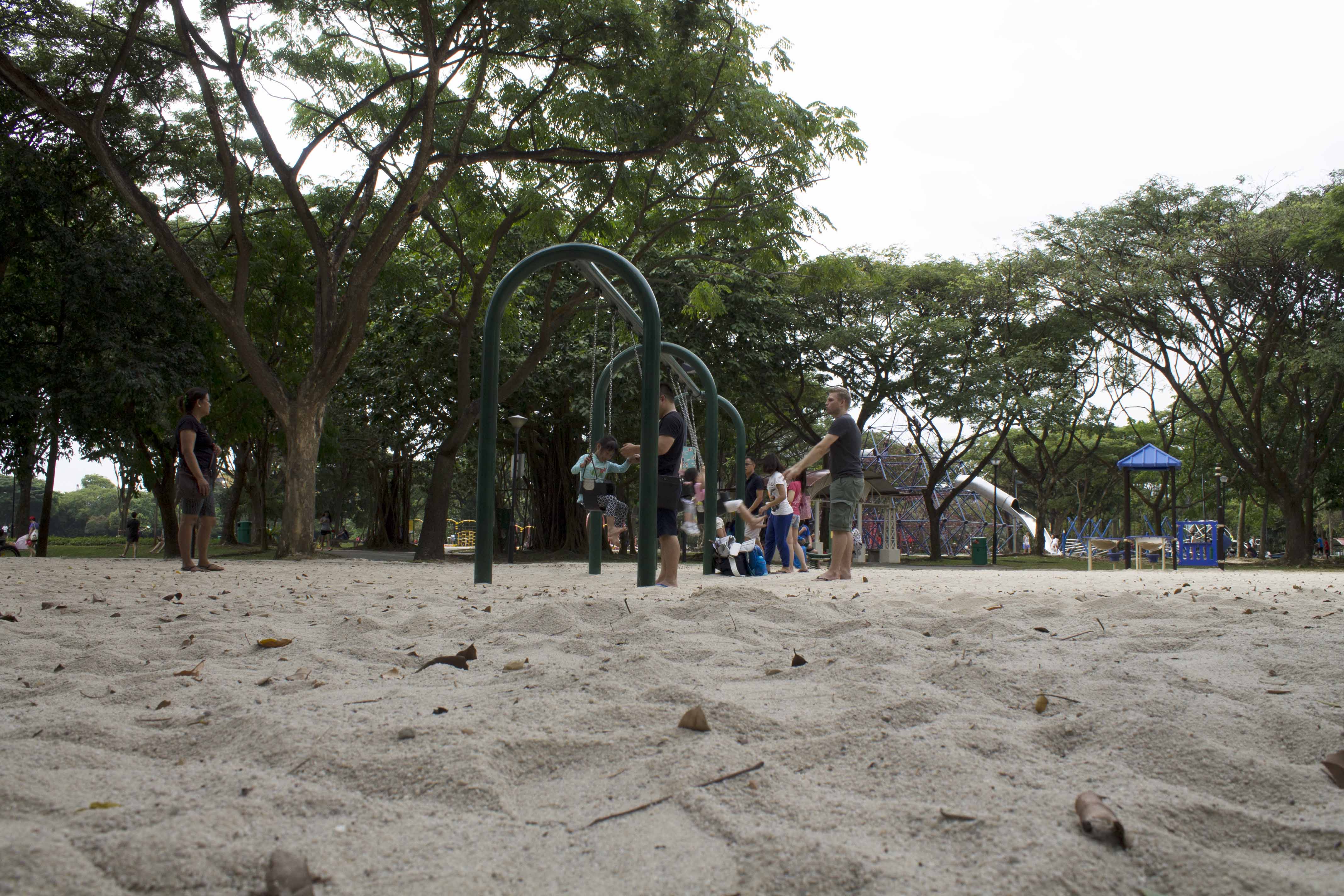
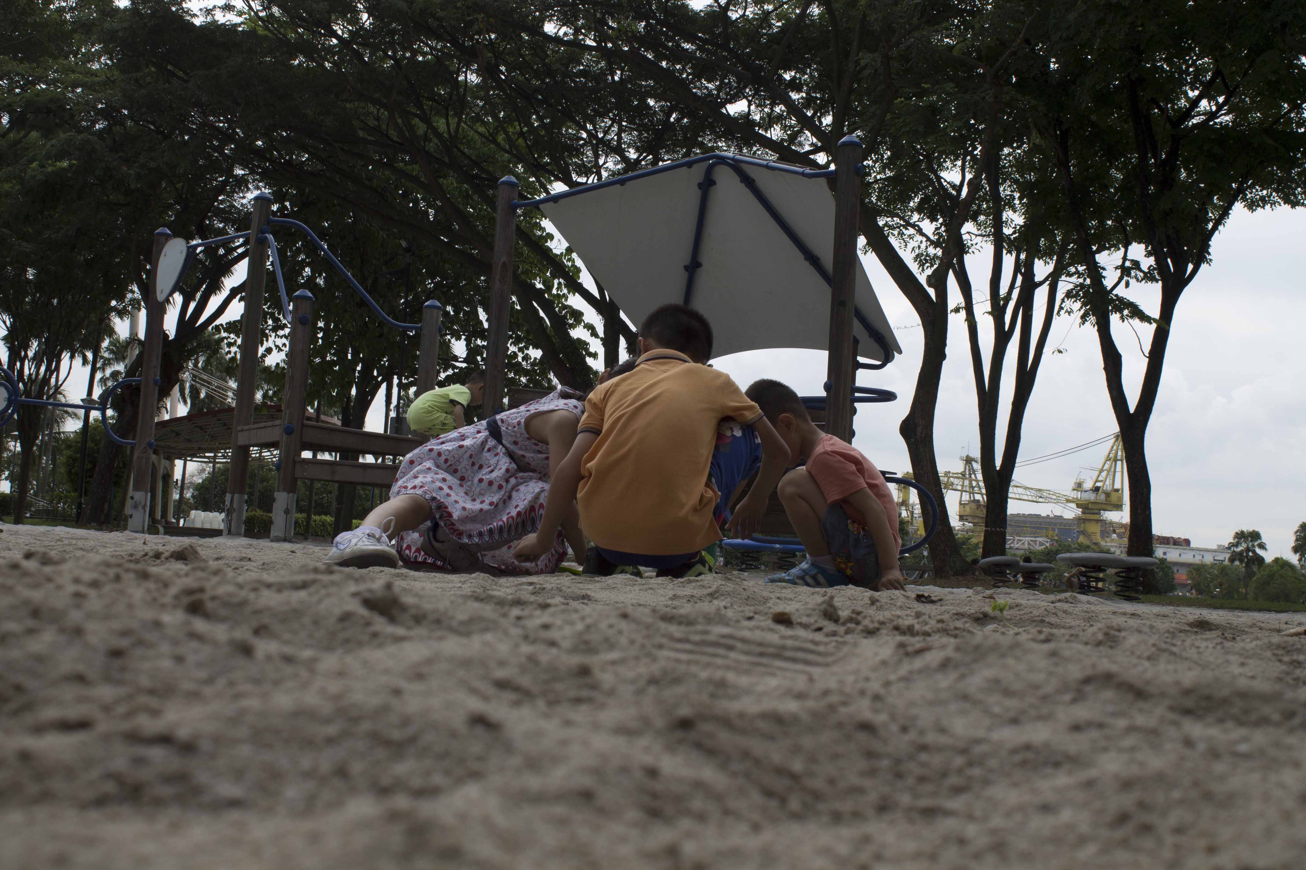
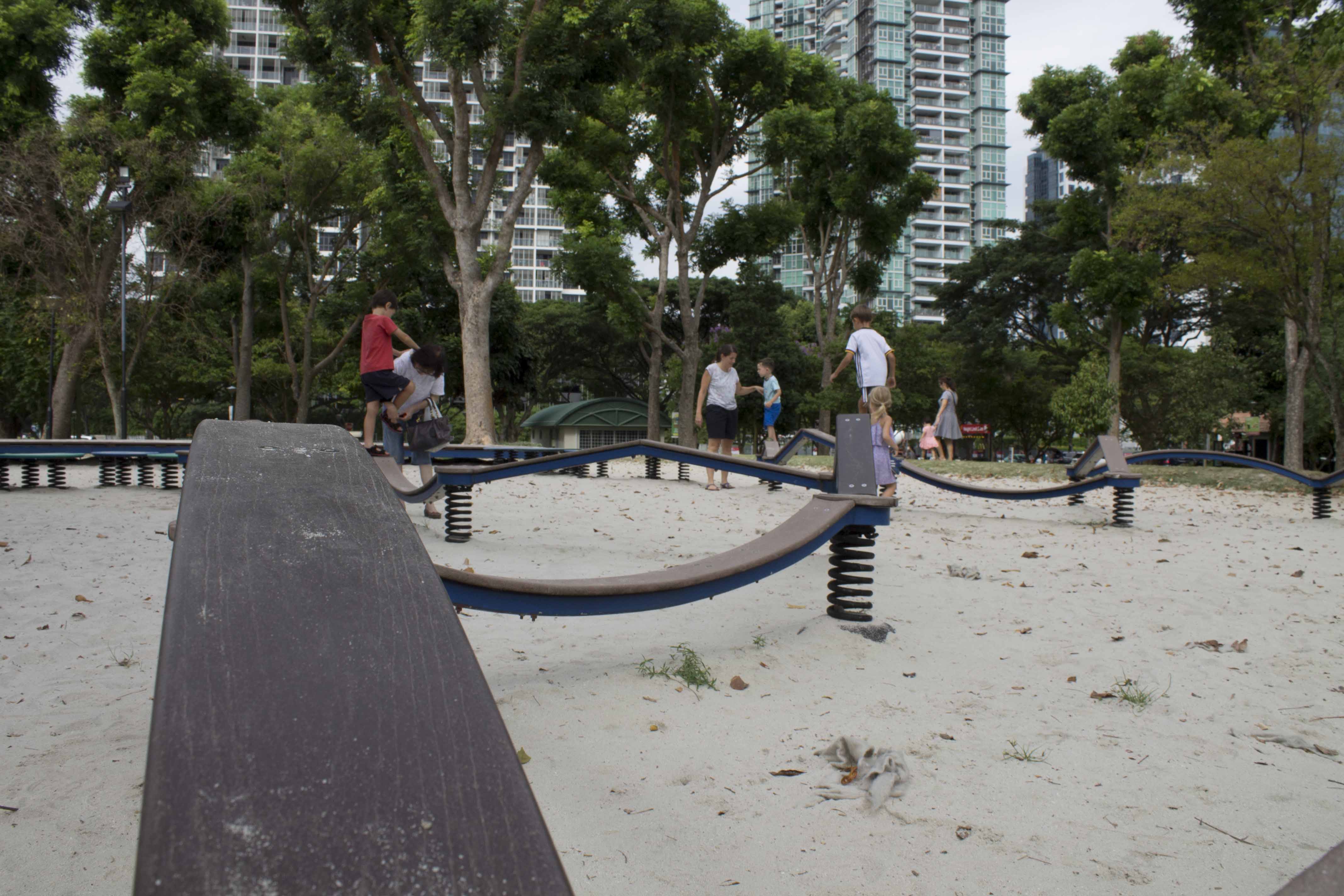
Low Vantage Point:


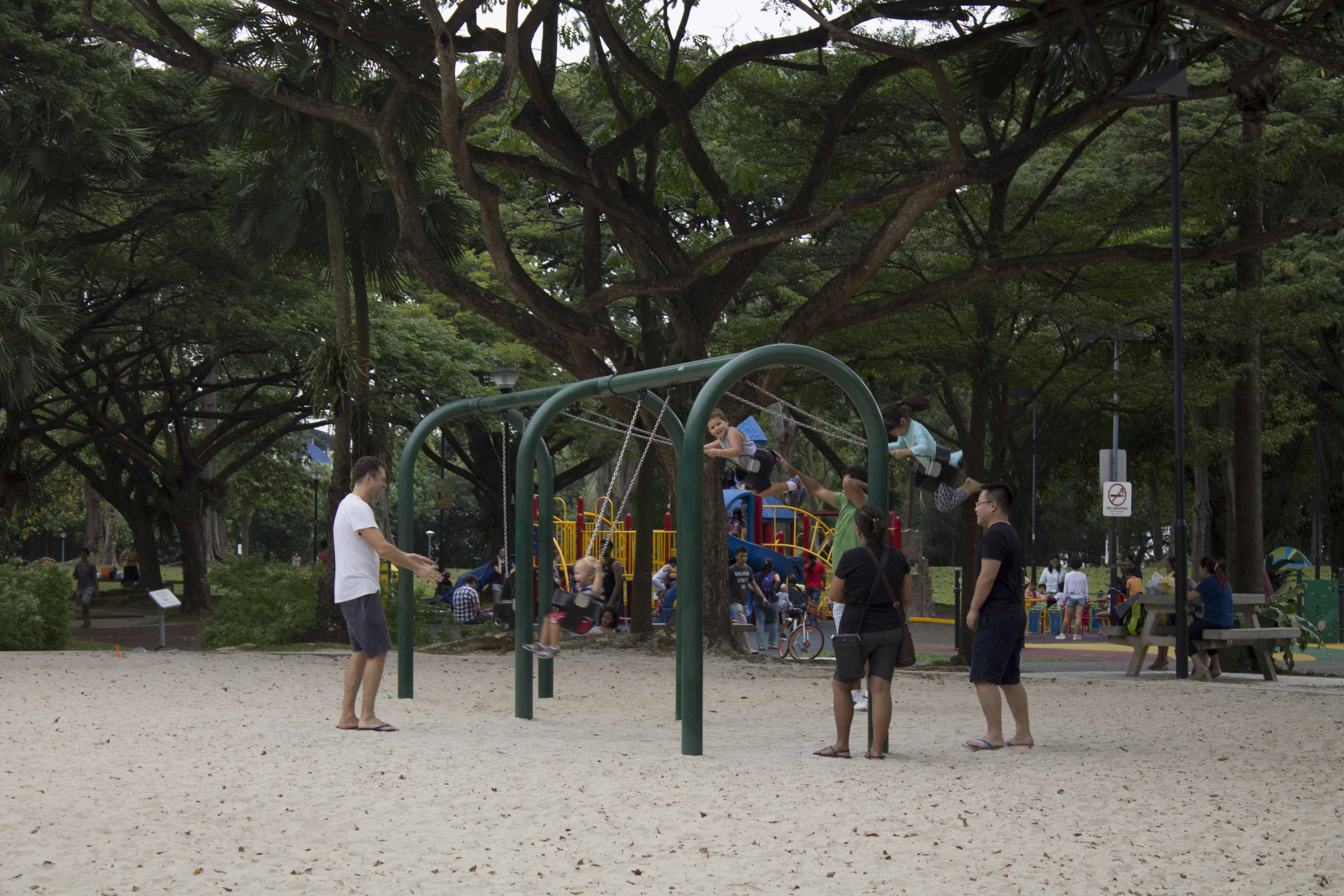
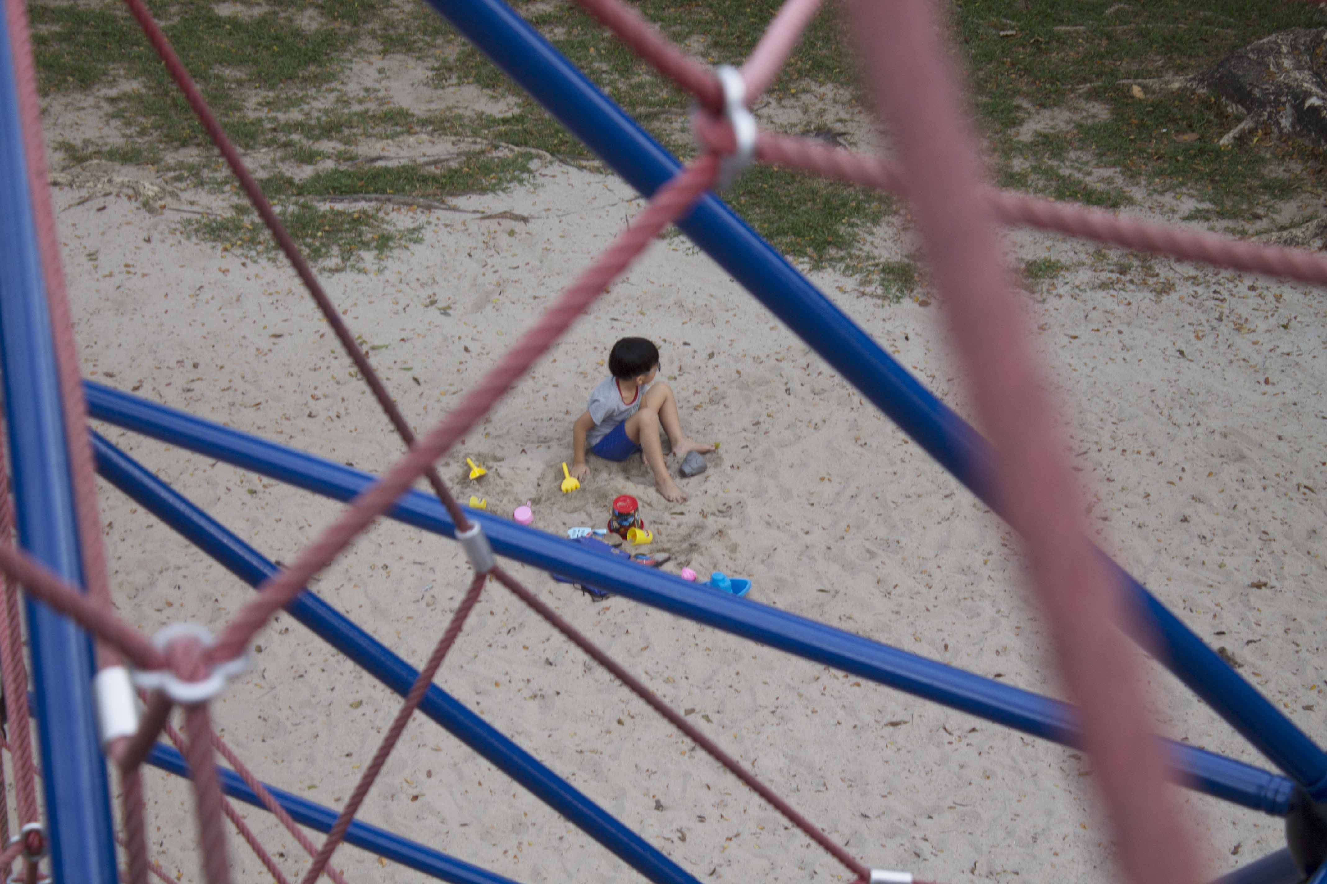
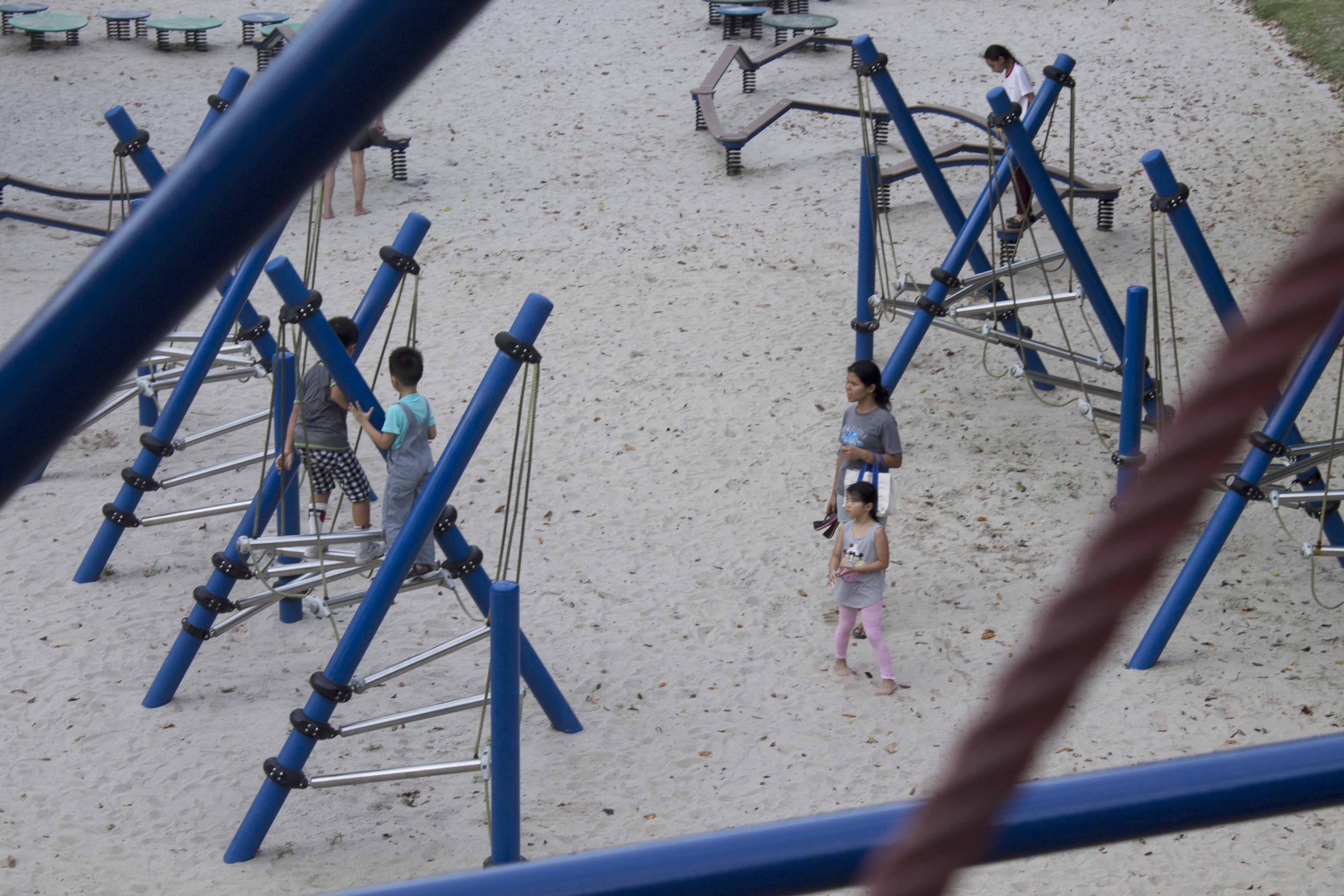
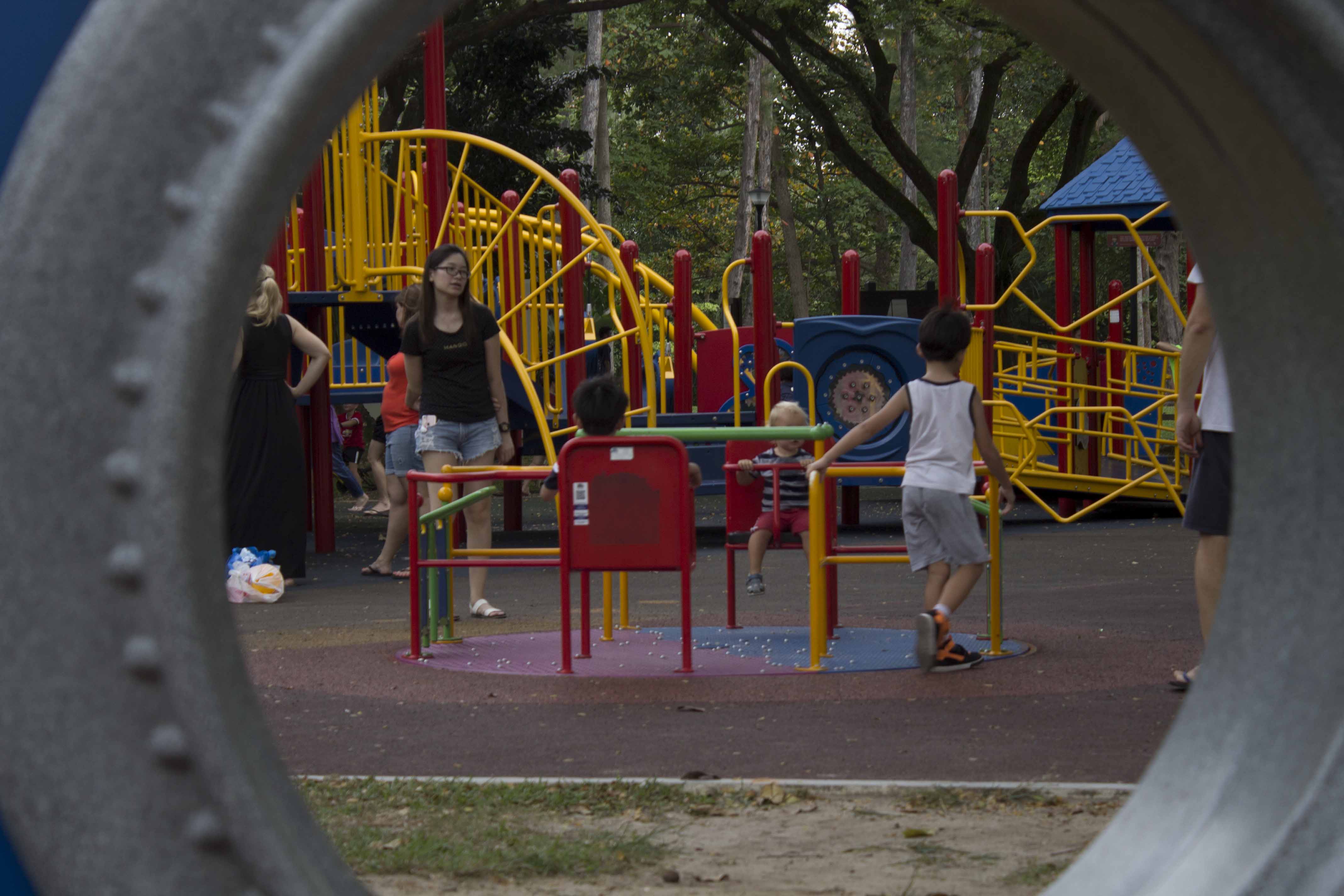
Framing:


Next Entry – https://oss.adm.ntu.edu.sg/ytan149/curating-self-final/
Welcome to my blog!
Next Entry – https://oss.adm.ntu.edu.sg/ytan149/curating-self-final/
When looking at a photo we ask these questions:
What techniques were used?
What visual elements make up the photo?
How do the elements work together?
How the image is composed?
Photo manipulation techniques – http://www.coursera.org/learn/exposure-photography/lecture/bGm8S/responding-to-photographs
In this project I try to experiment with the basic techniques of photo manipulation:
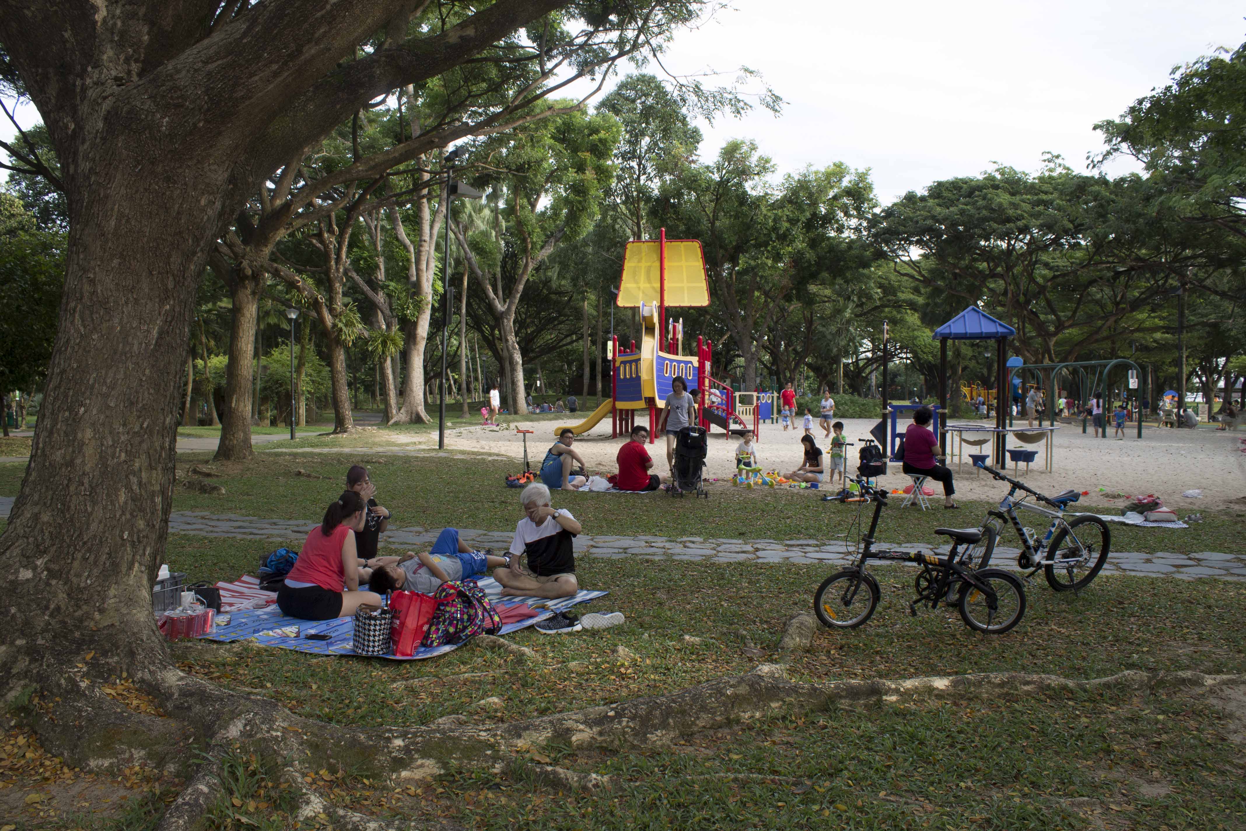
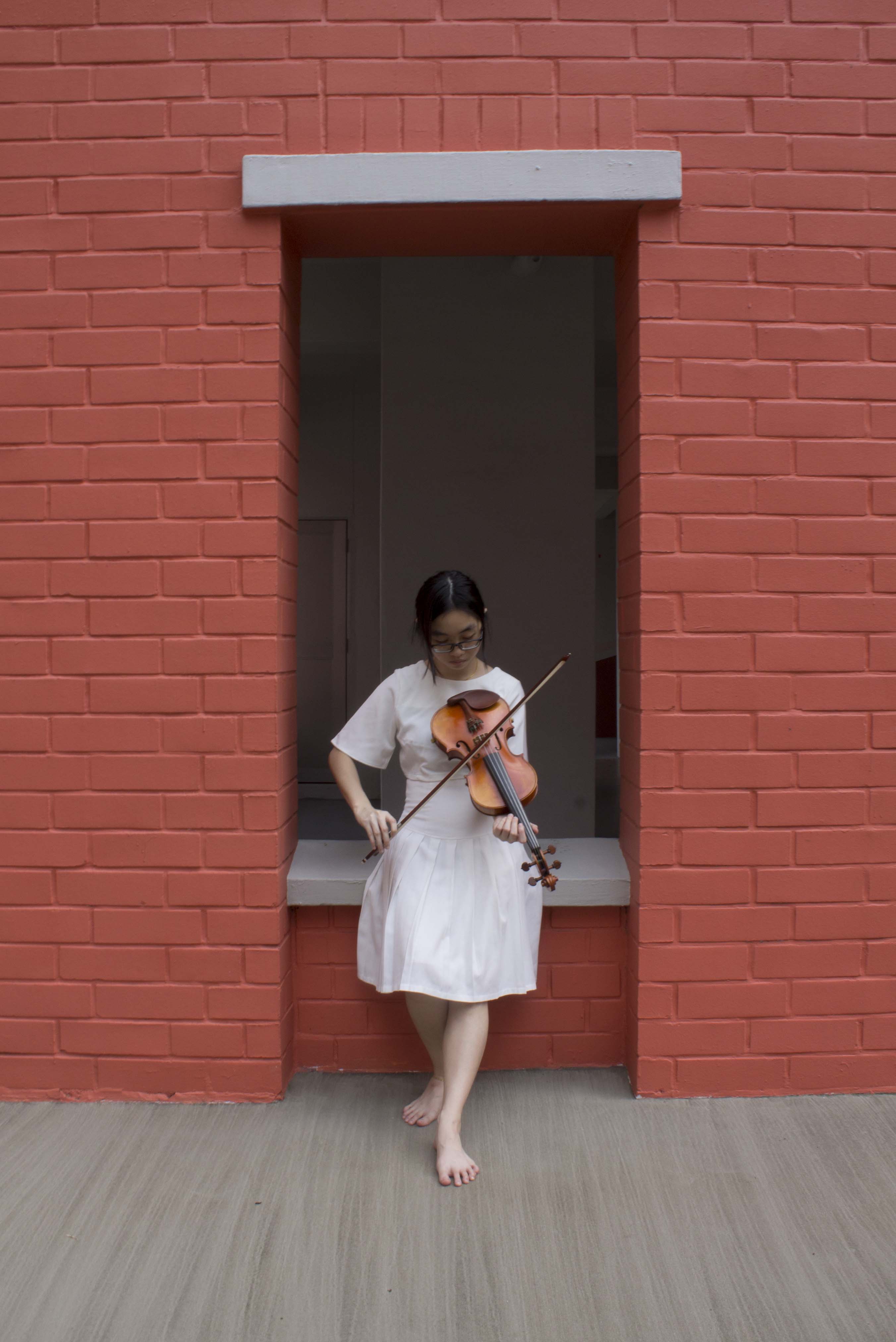
Framing and cropping is use to include or exclude details that may change the meaning of the photographs. By moving the frame of the camera or cropping an image, the creator controls and defines the content of what we see.
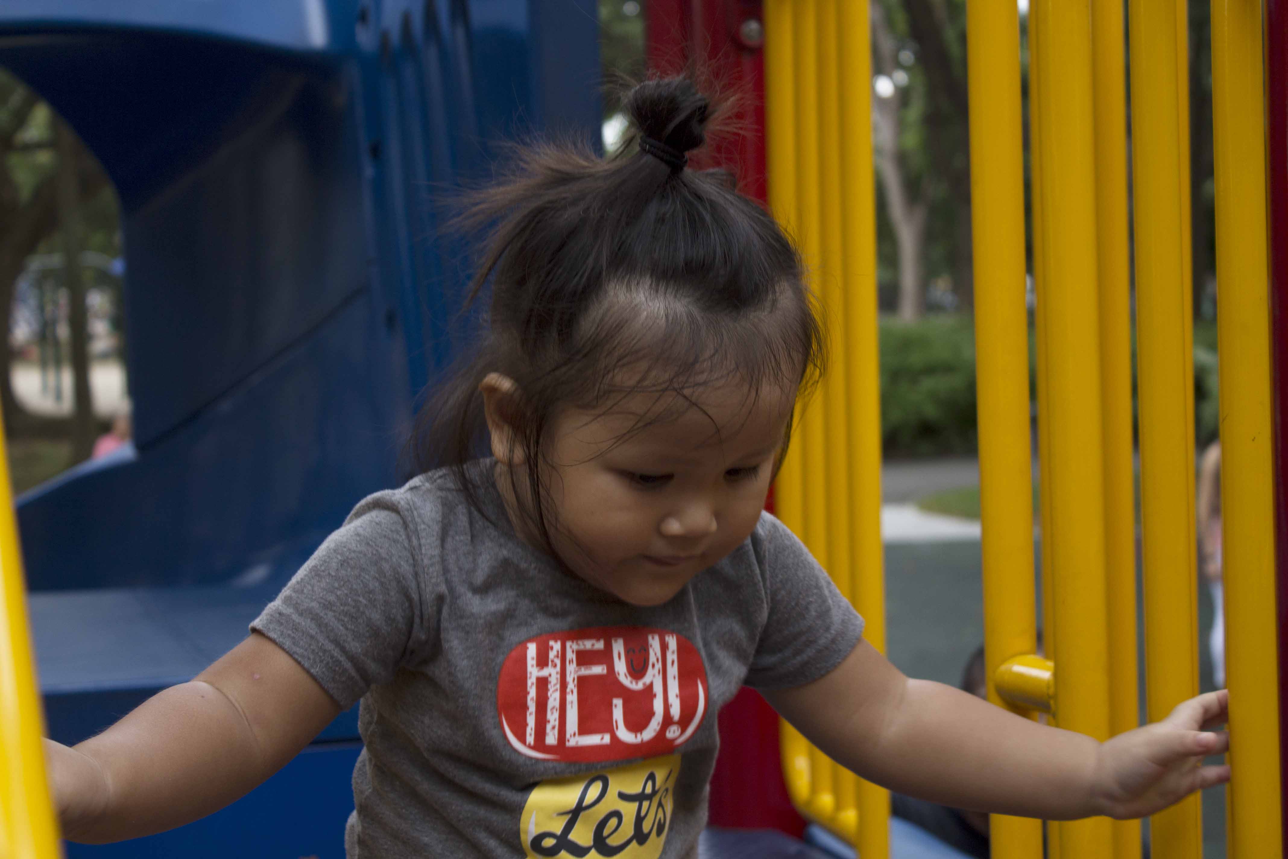
Subject Distance refers to the proximity of the camera lens to the subject. The closer the camera move in, the viewer becomes more involved with the details such as texture, expressions, while becoming less involved with the surrounding and environment of the subject.
Vantage Point or angle determines the position where the camera is place before a shot. By varying the angle of shot from above, below or at eye level can result in interesting images that could distort, manipulate or offer visual pleasure and surprise.


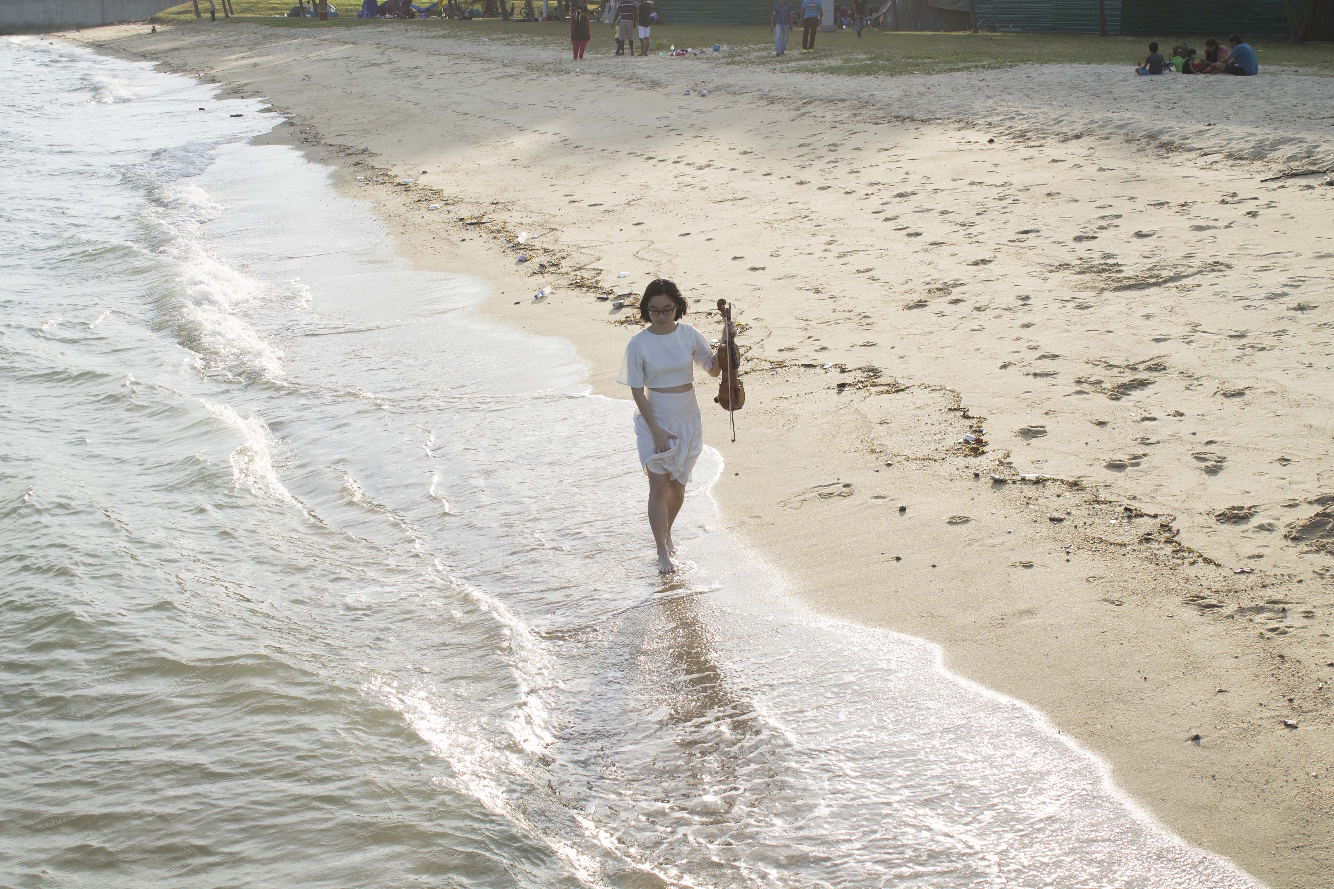
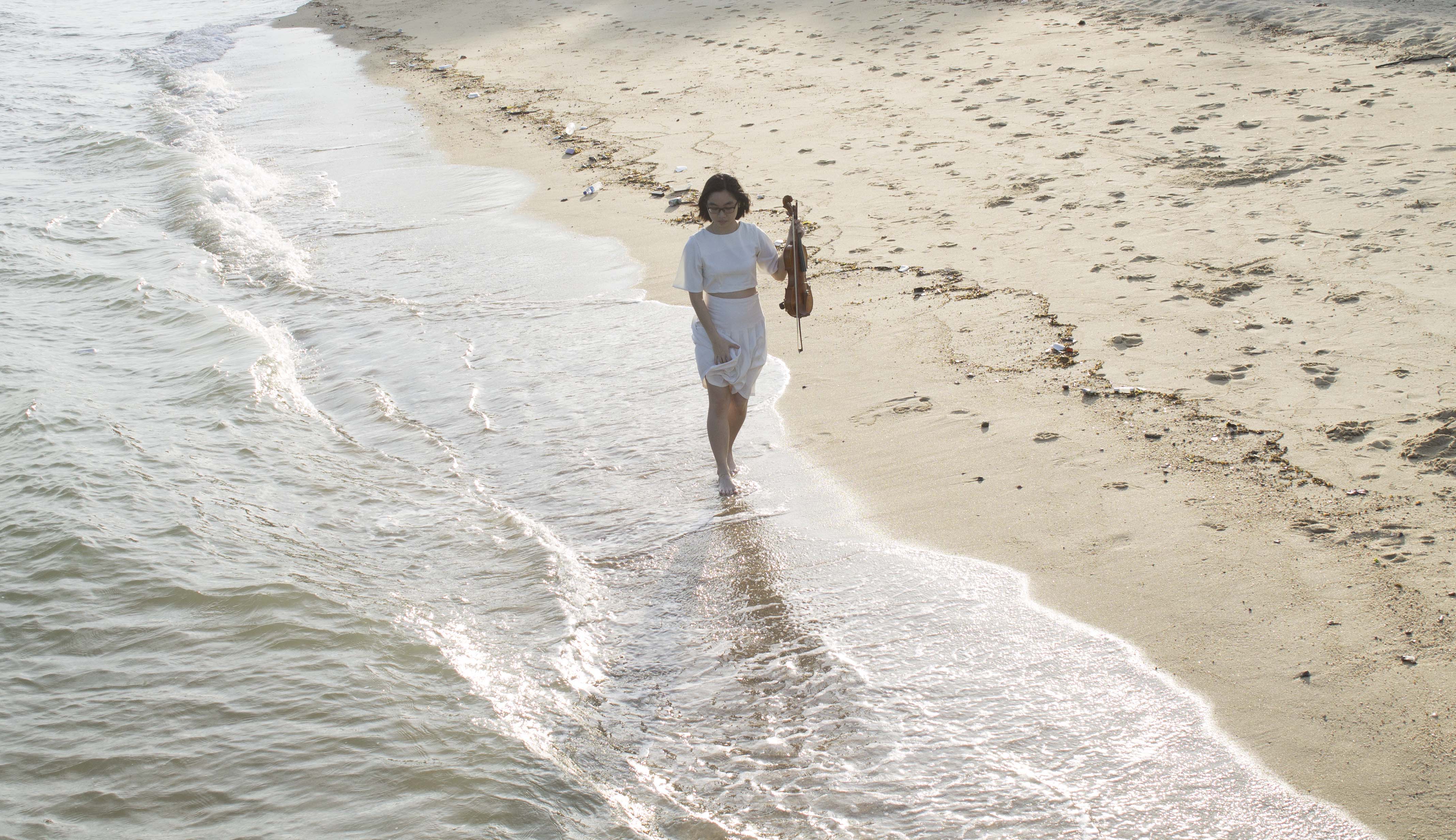
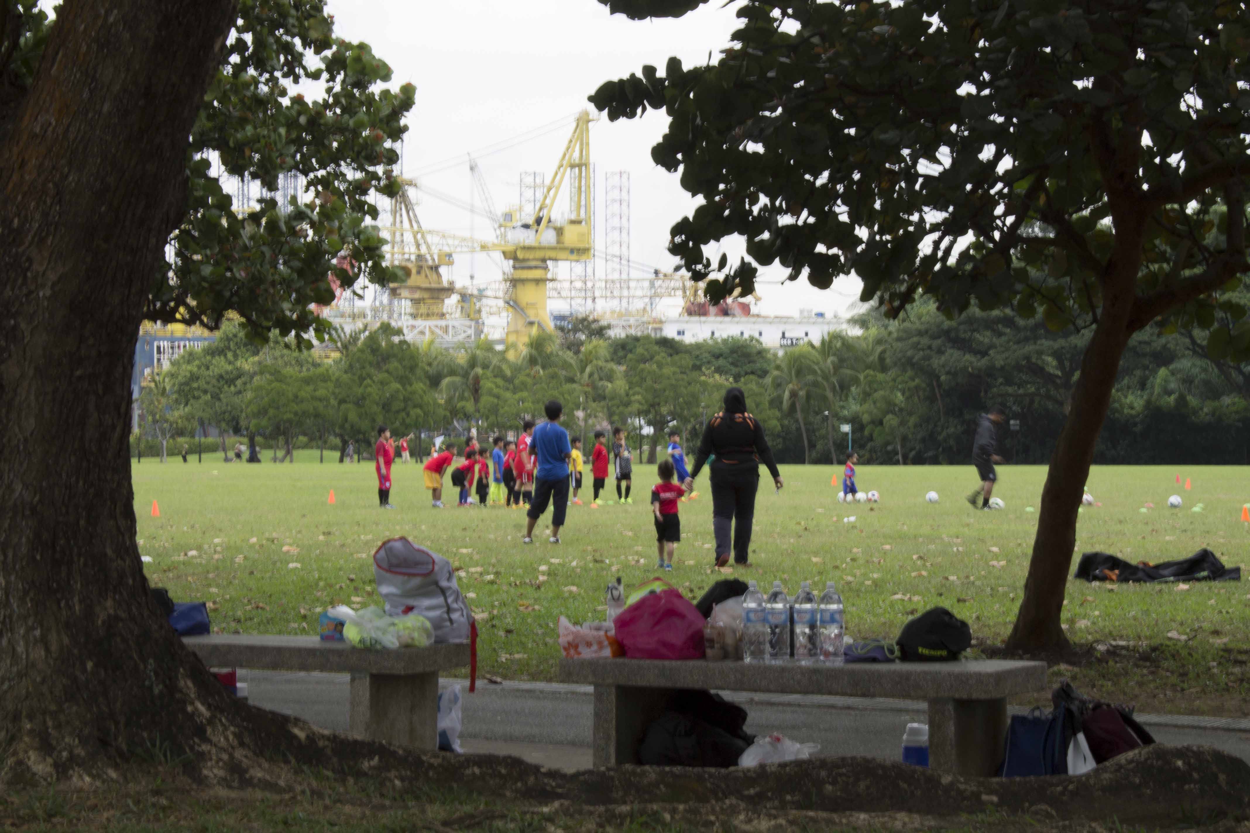
By cropping this image I eliminate the people in the background making the photo much cleaner and the tone of the photo becomes lighter. Leading the viewer to think that the photo was taken at an empty beach.

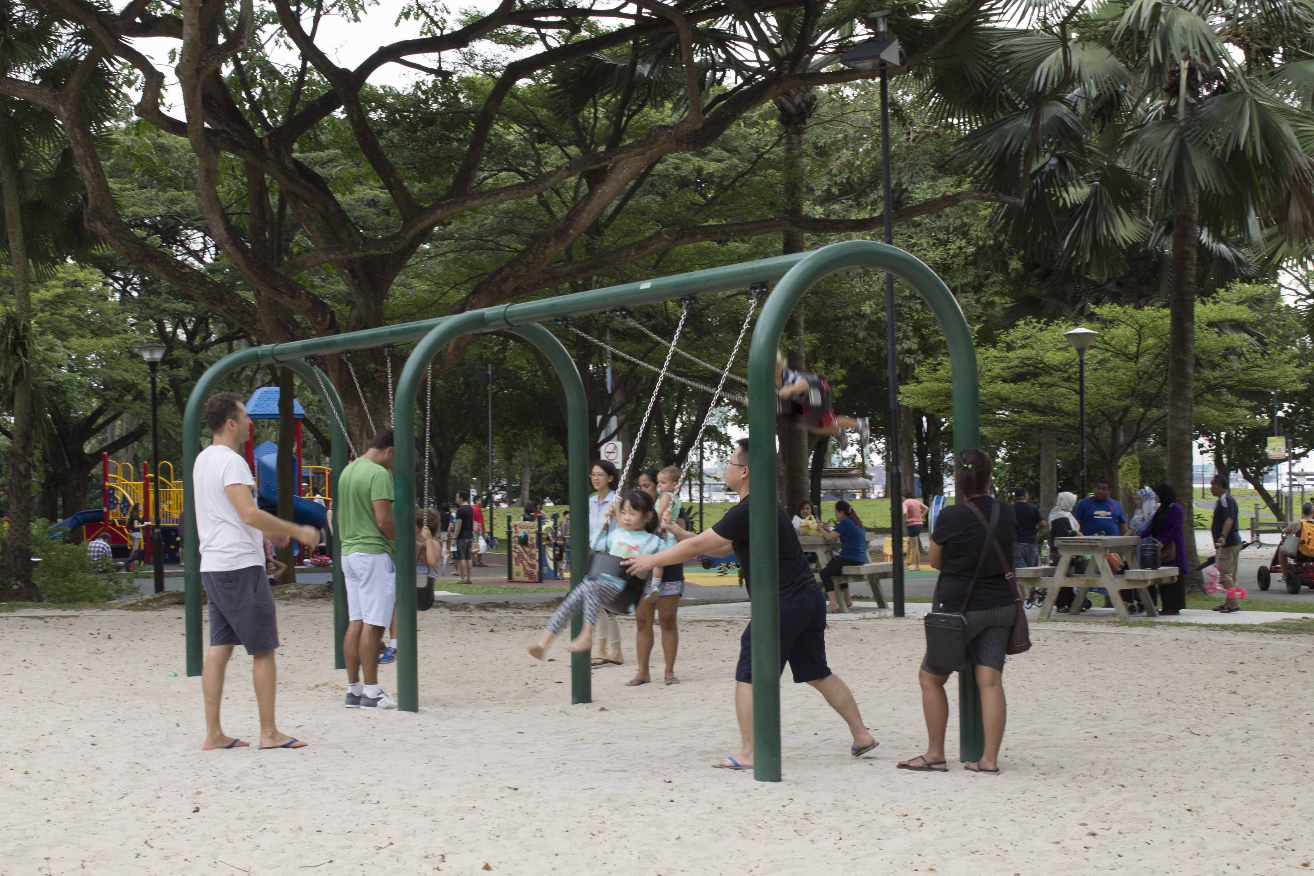
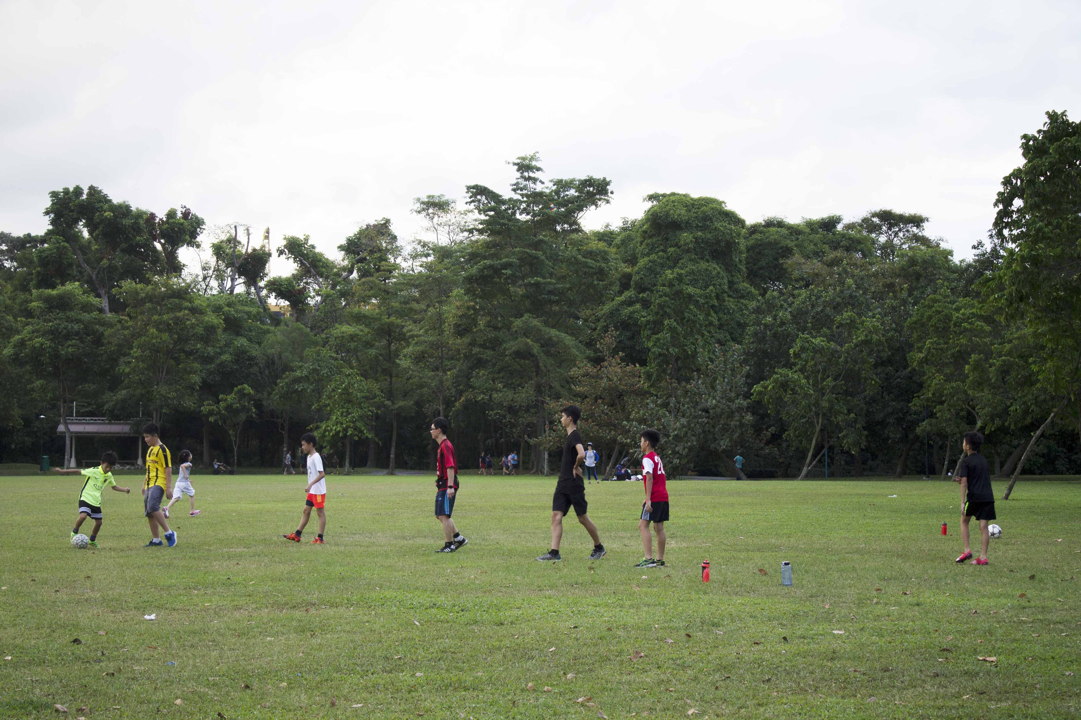
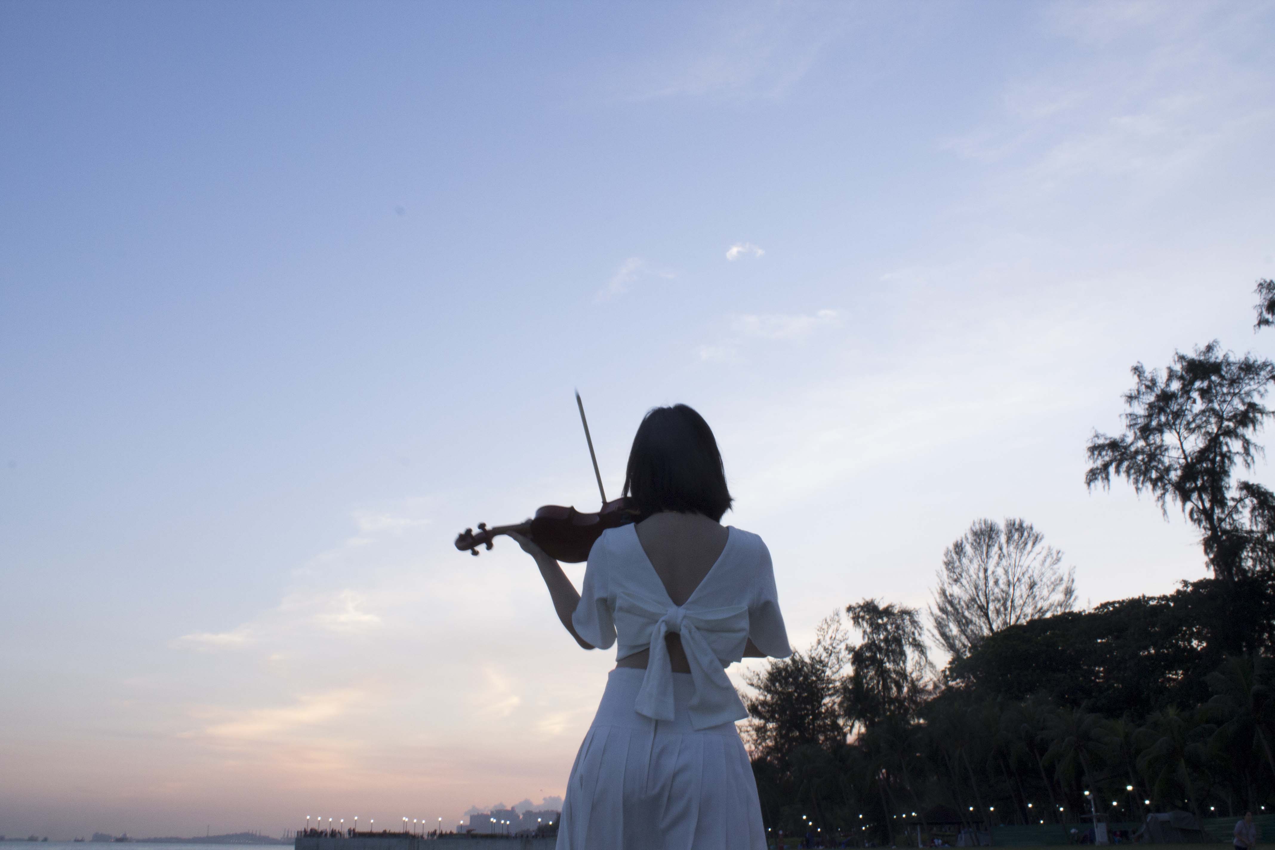
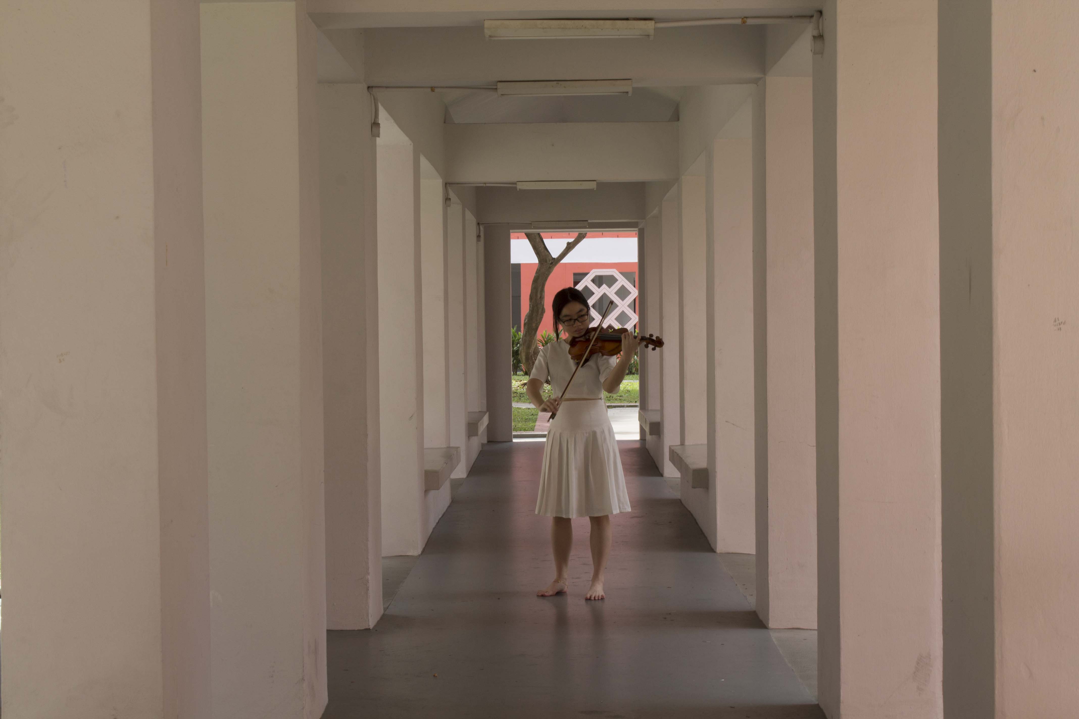
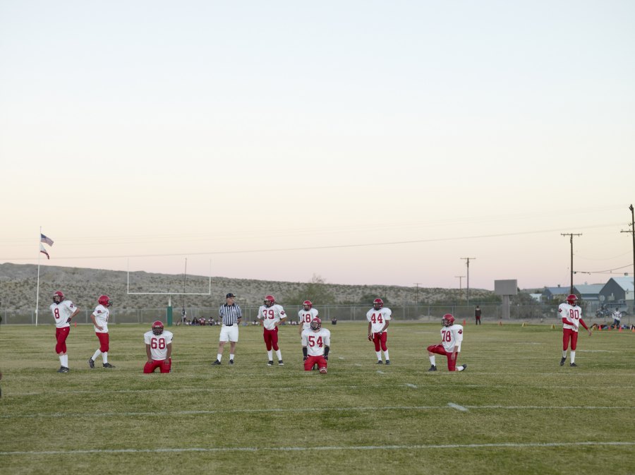
The long shot taken from a normal/medium vantage point depicts the subject playing out to the sea and sky. From this view it is as if the subject is envious of the freedom the ocean and the skies provide.
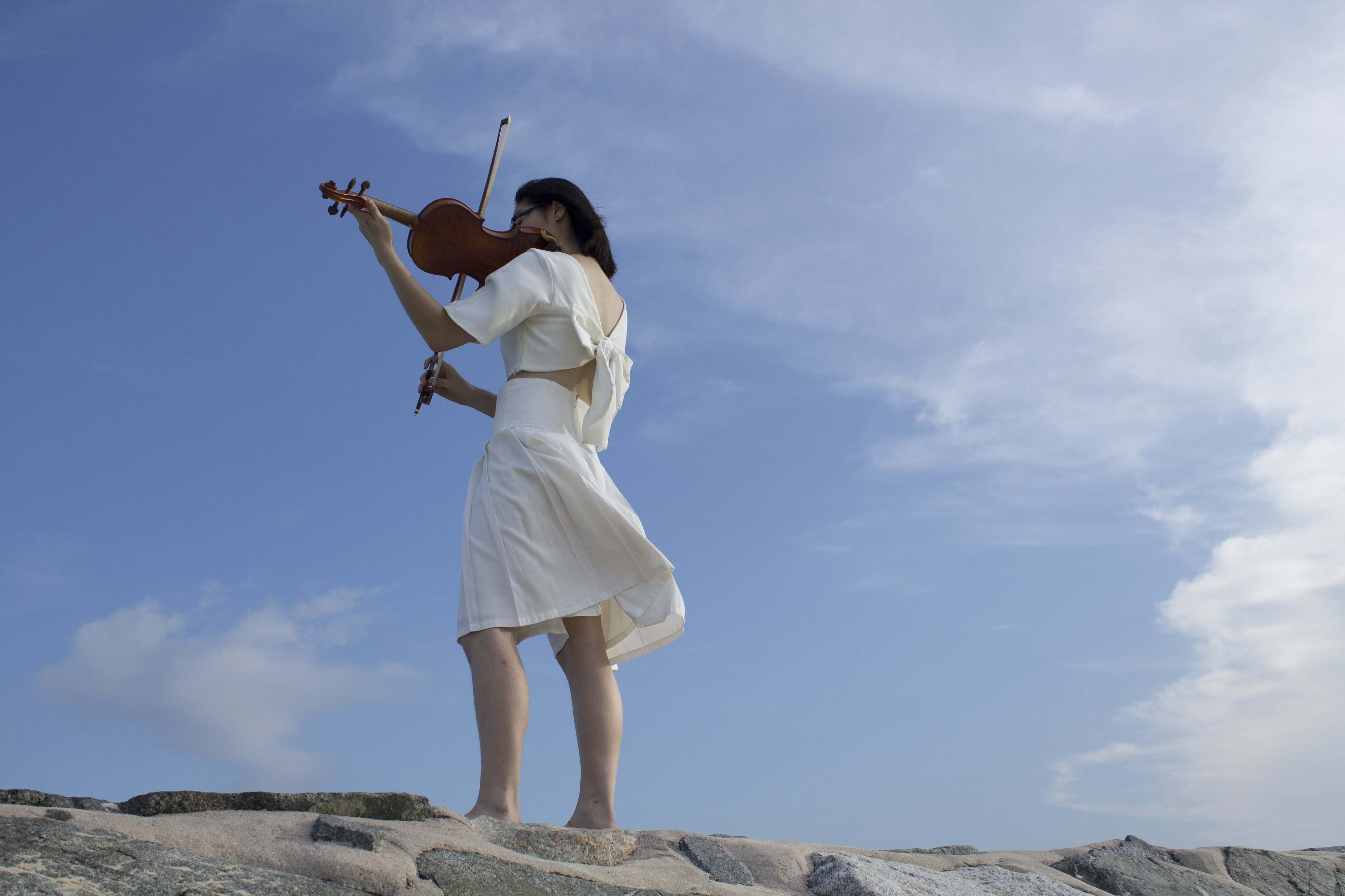
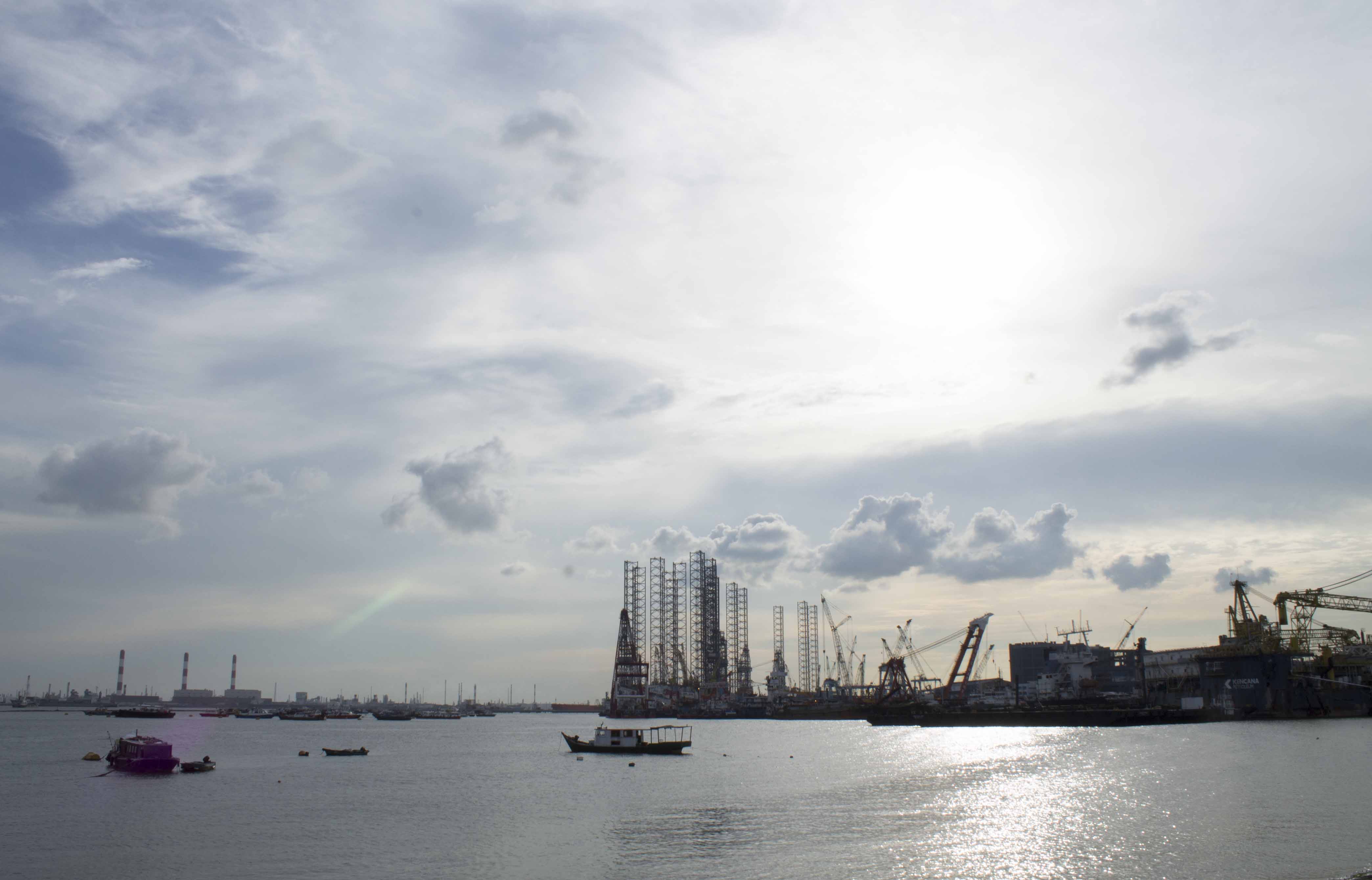
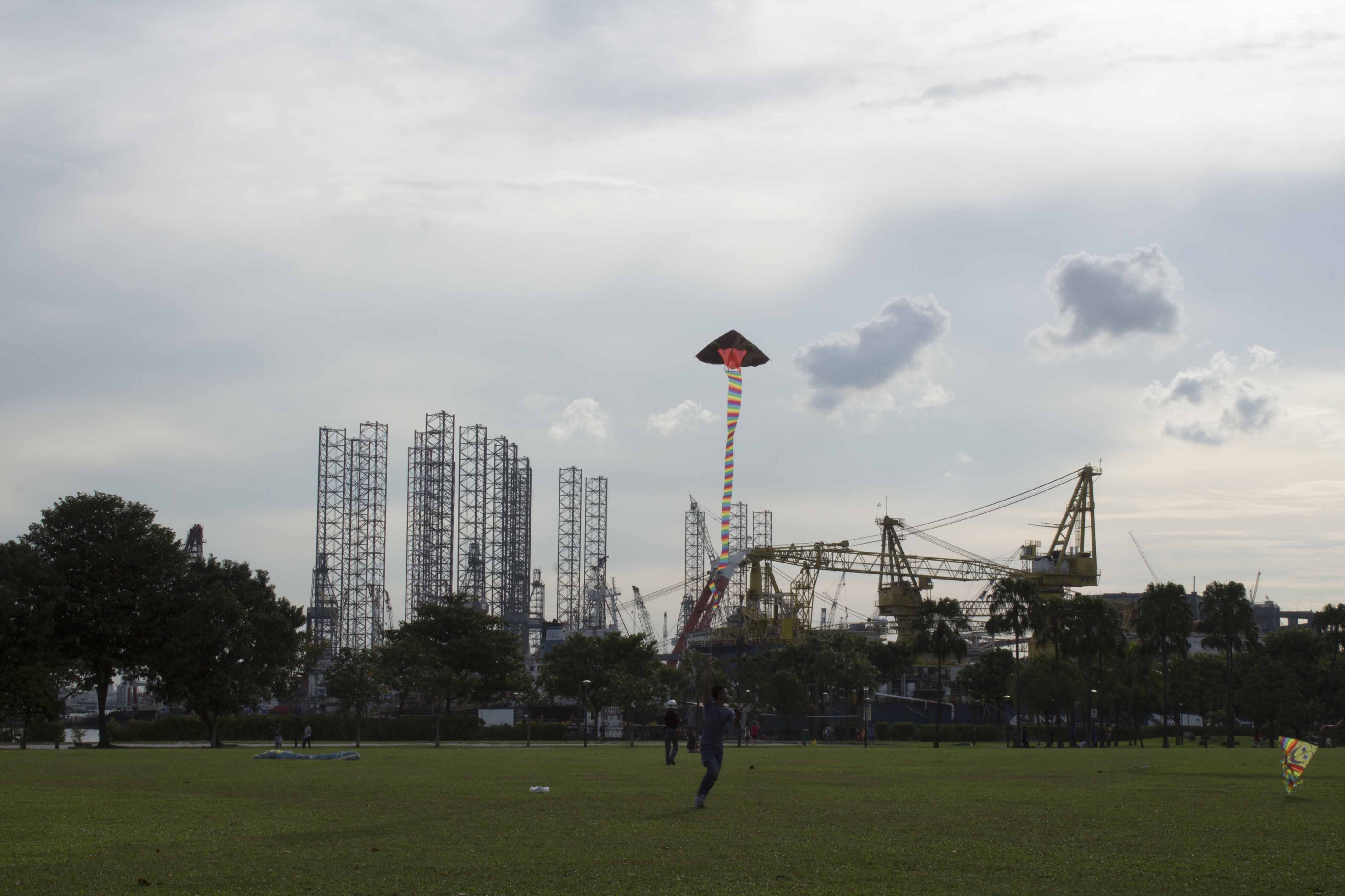
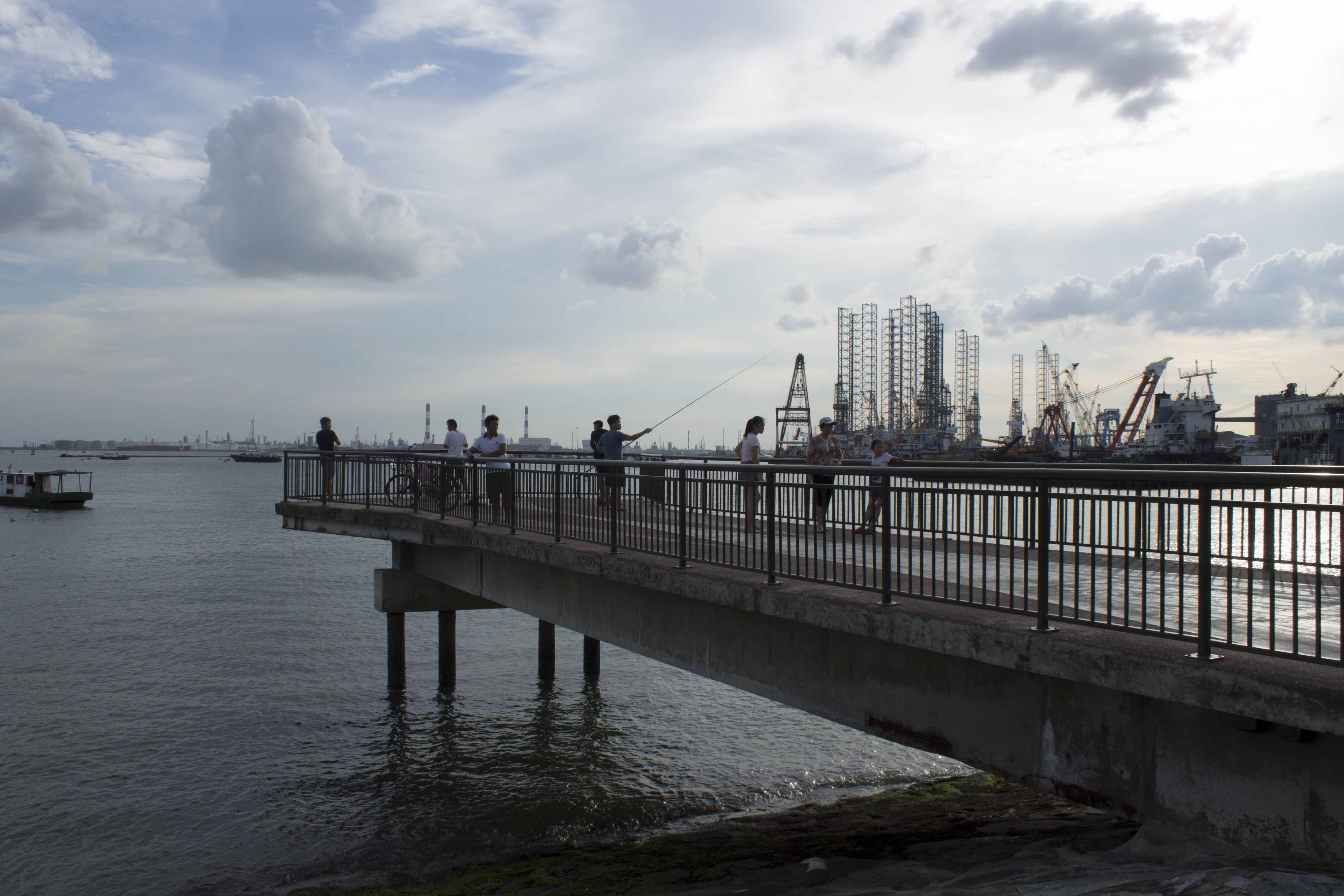
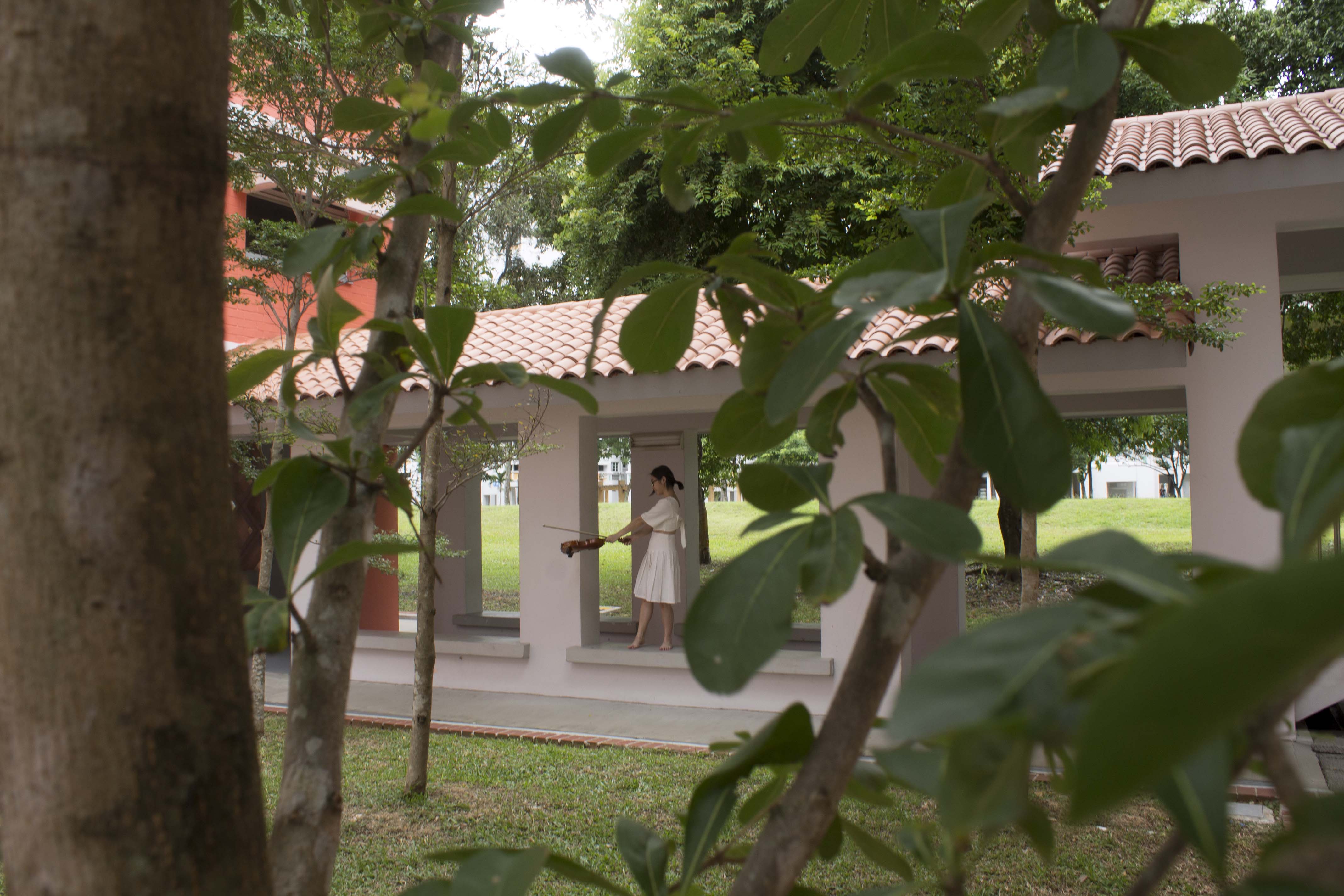
A long shot with a low vantage point here resulted in an empowering effect the subject. There is also some effect of framing from the clouds behind that helps to focus on the subject.

If i were to cropped the image and turn it into a medium shot, the original effect would be lost.

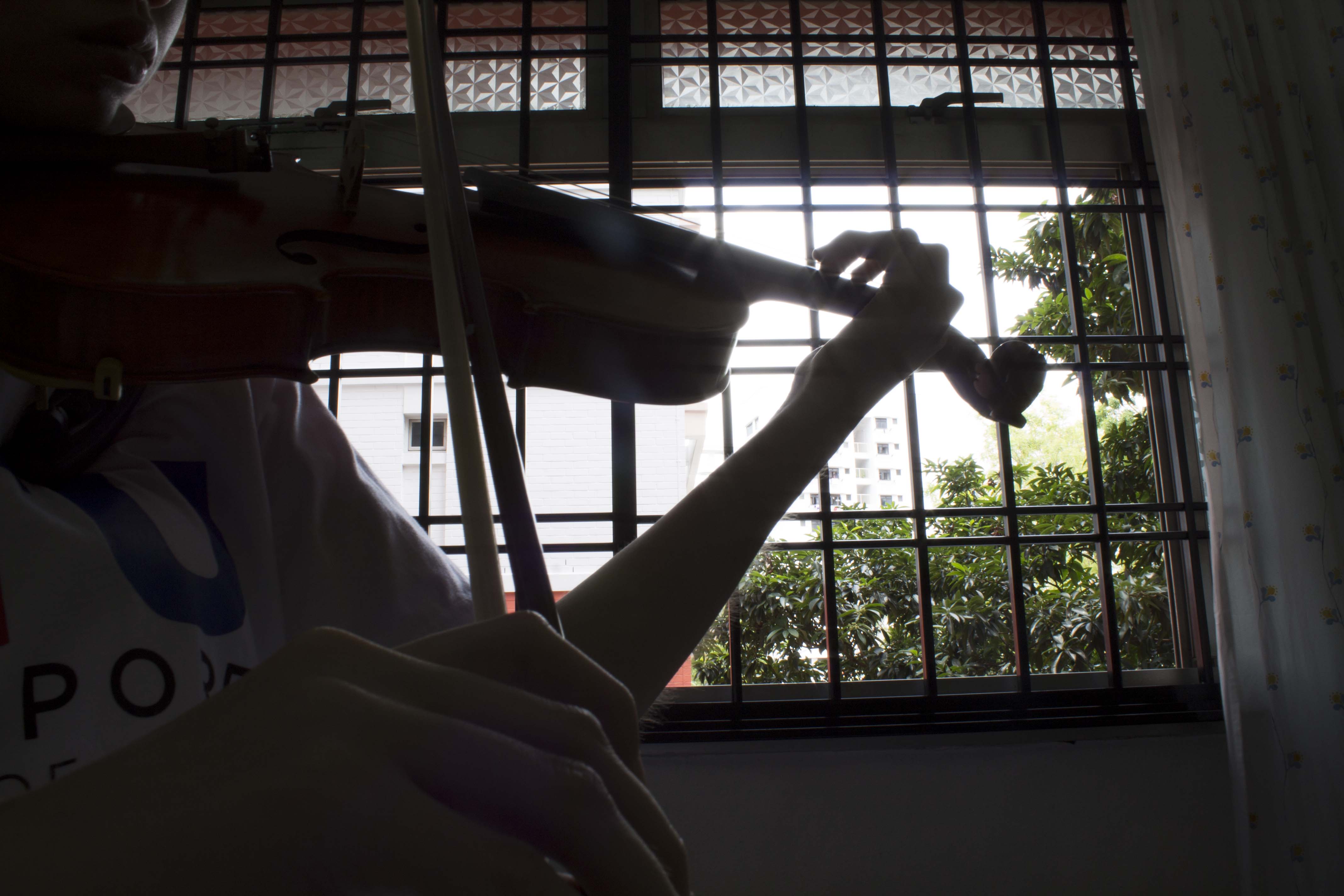
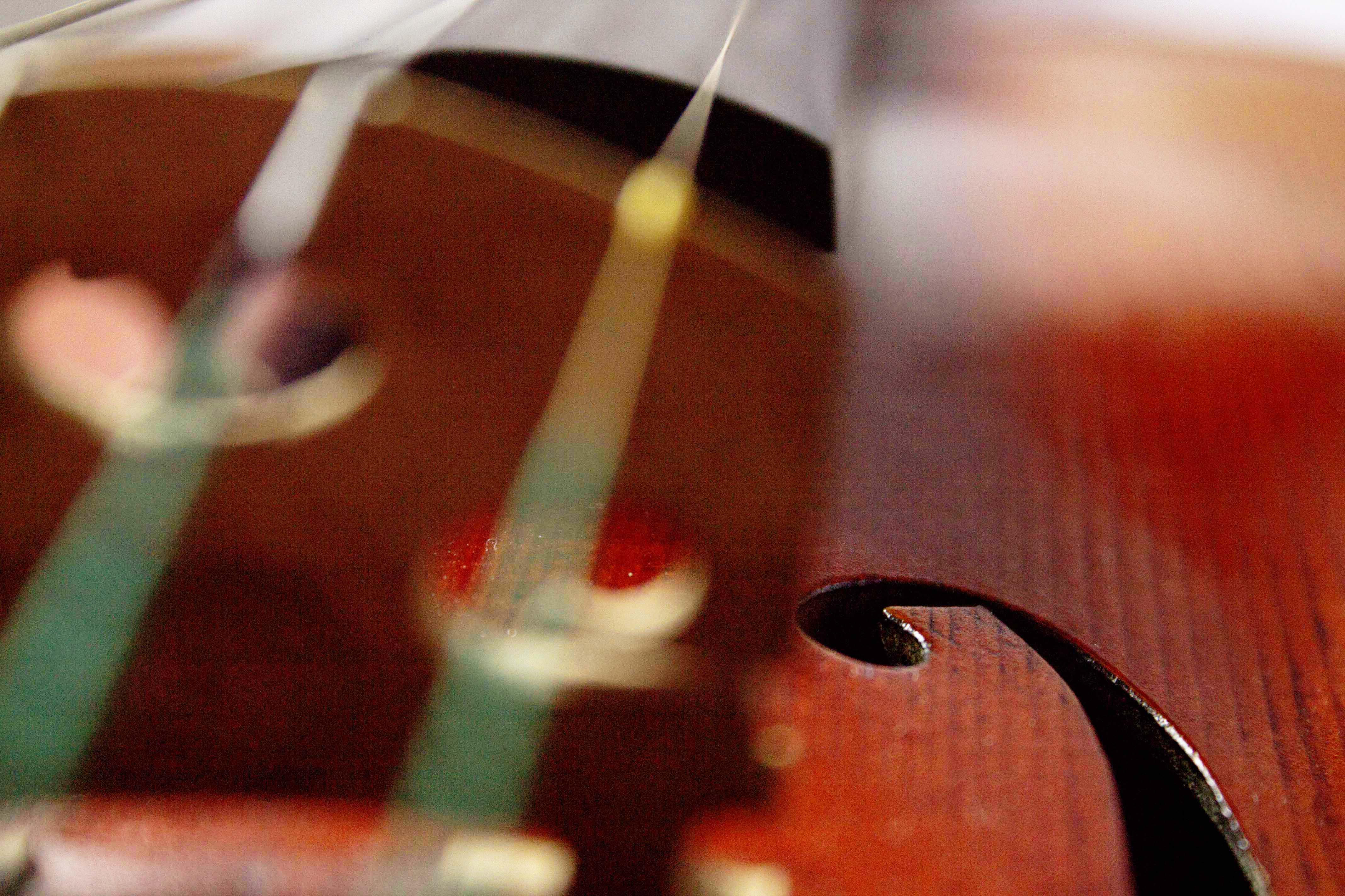
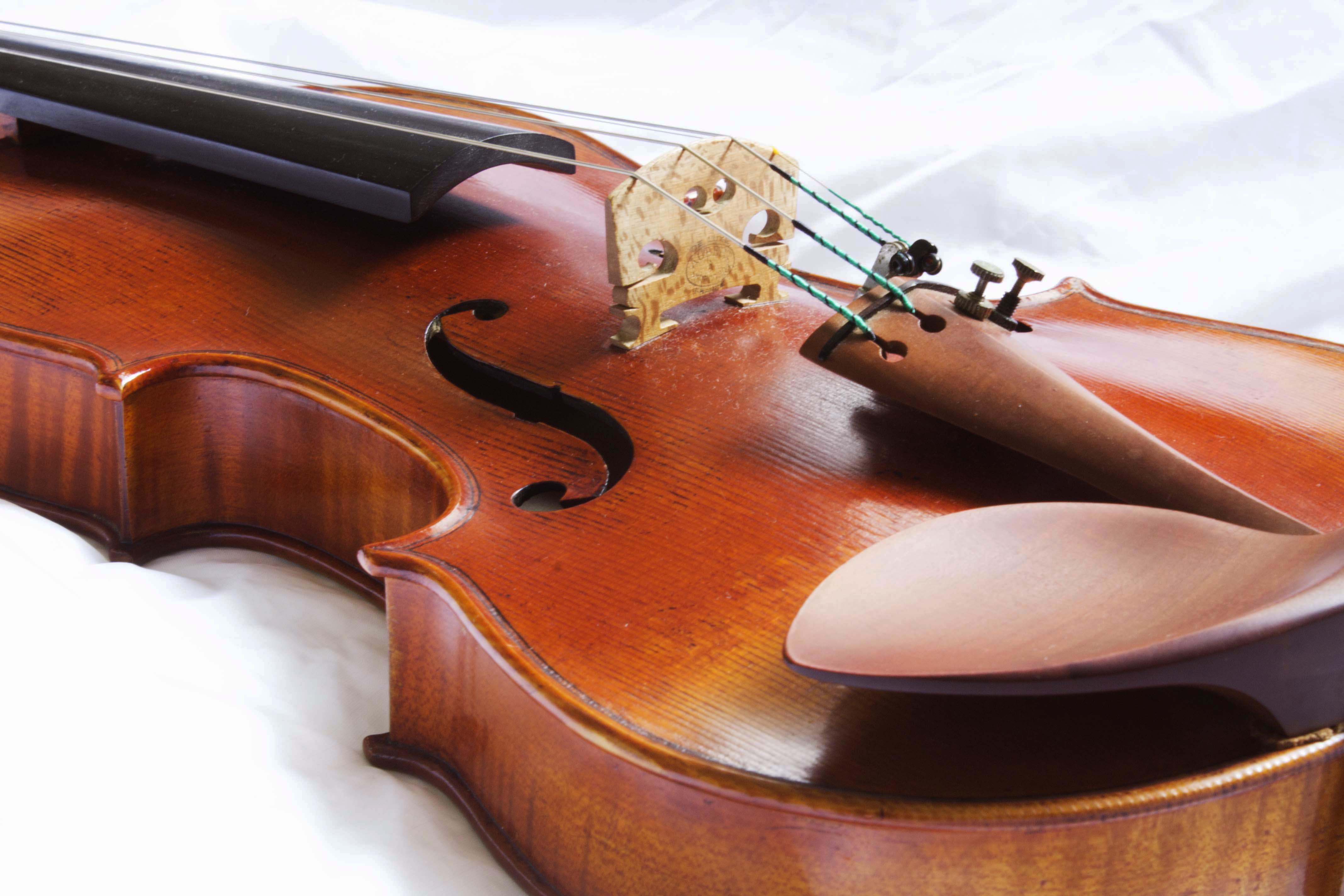
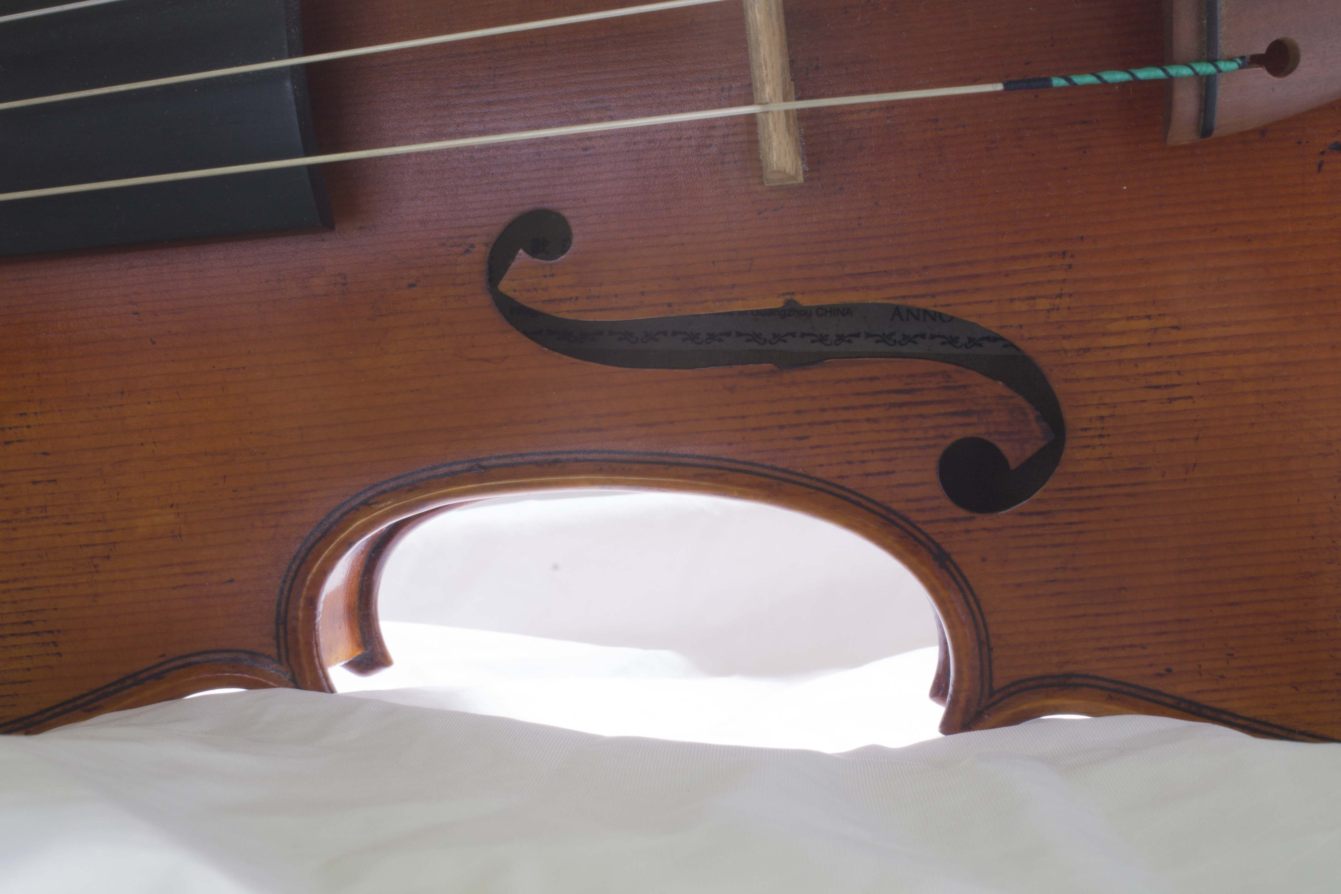
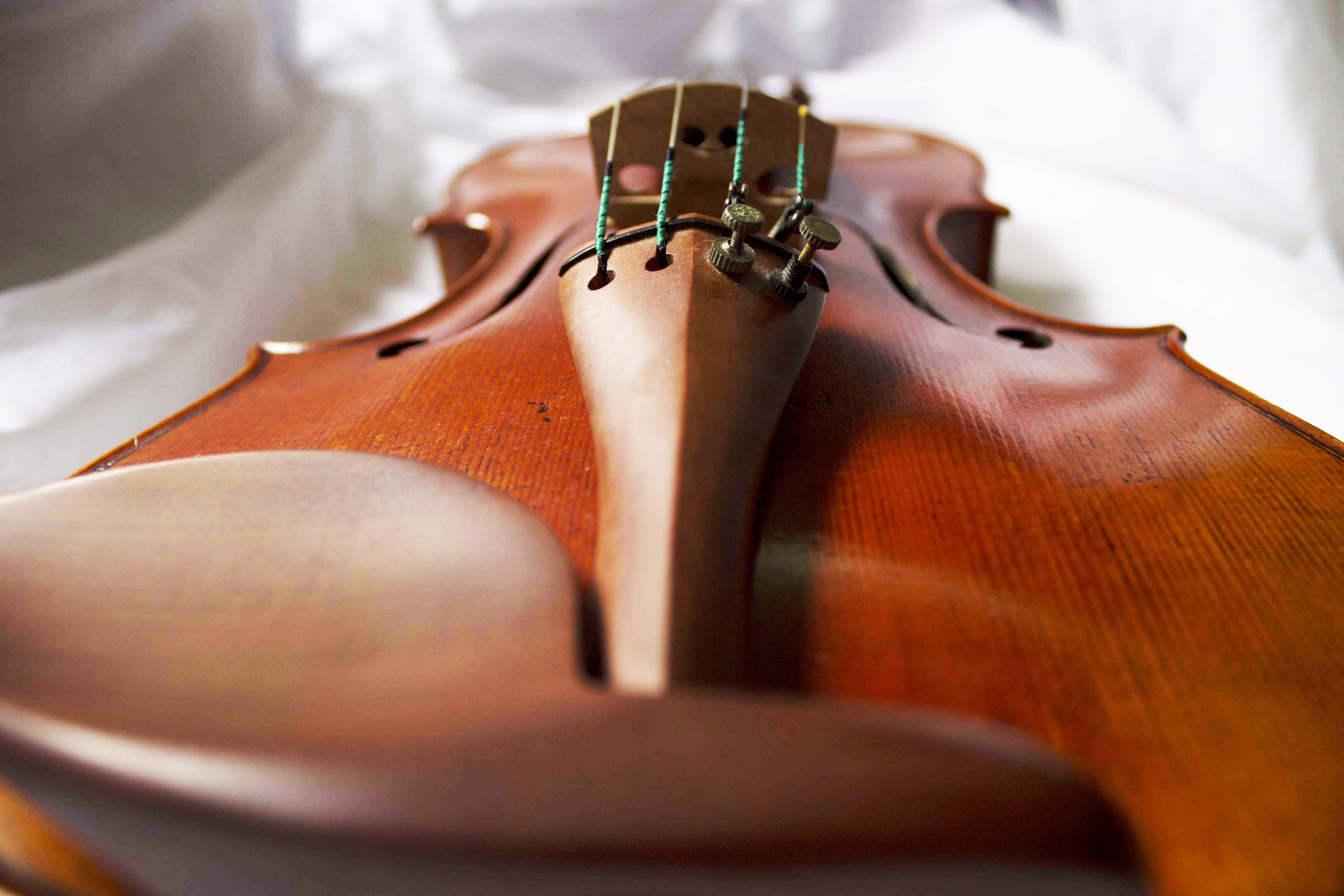
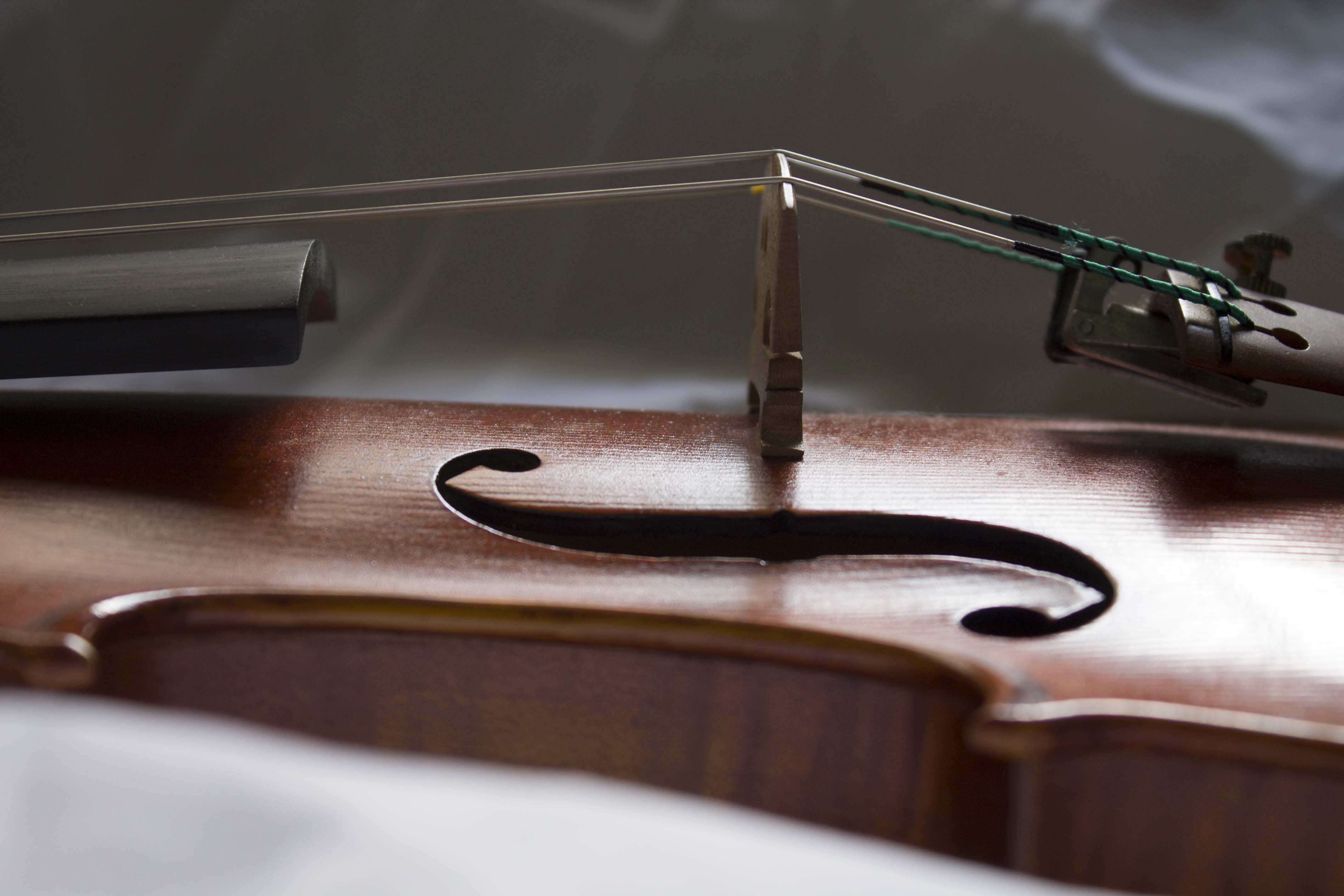
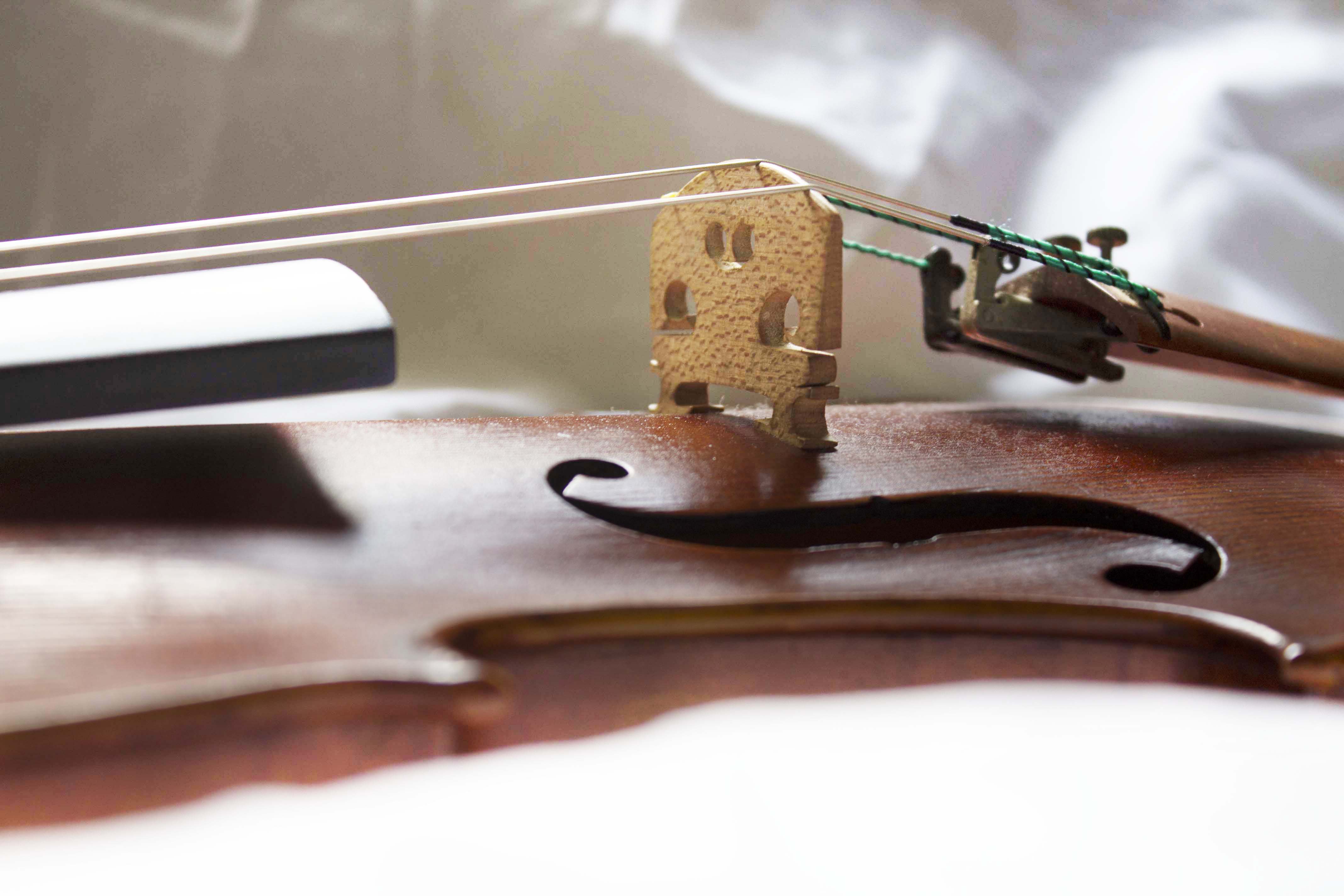
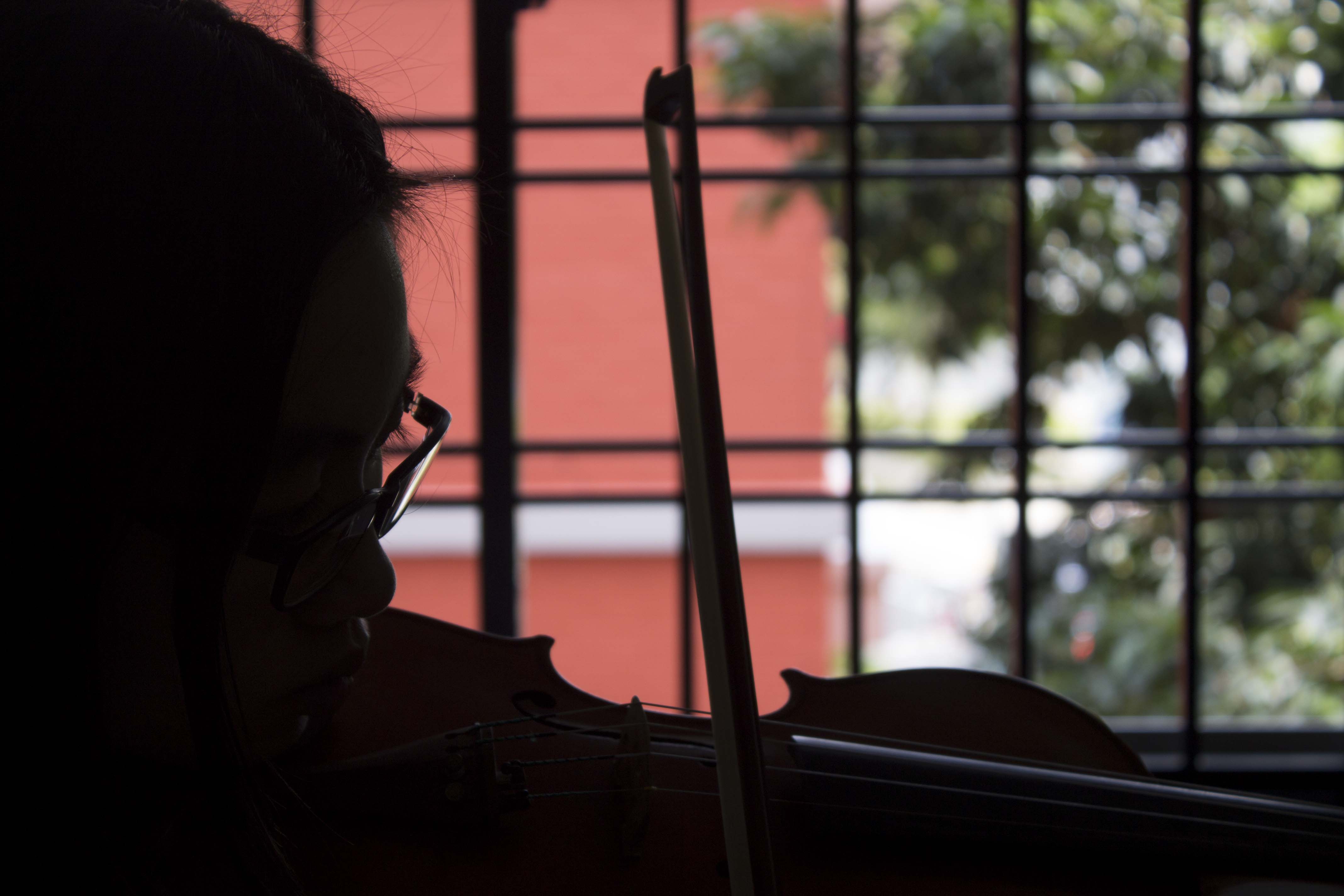
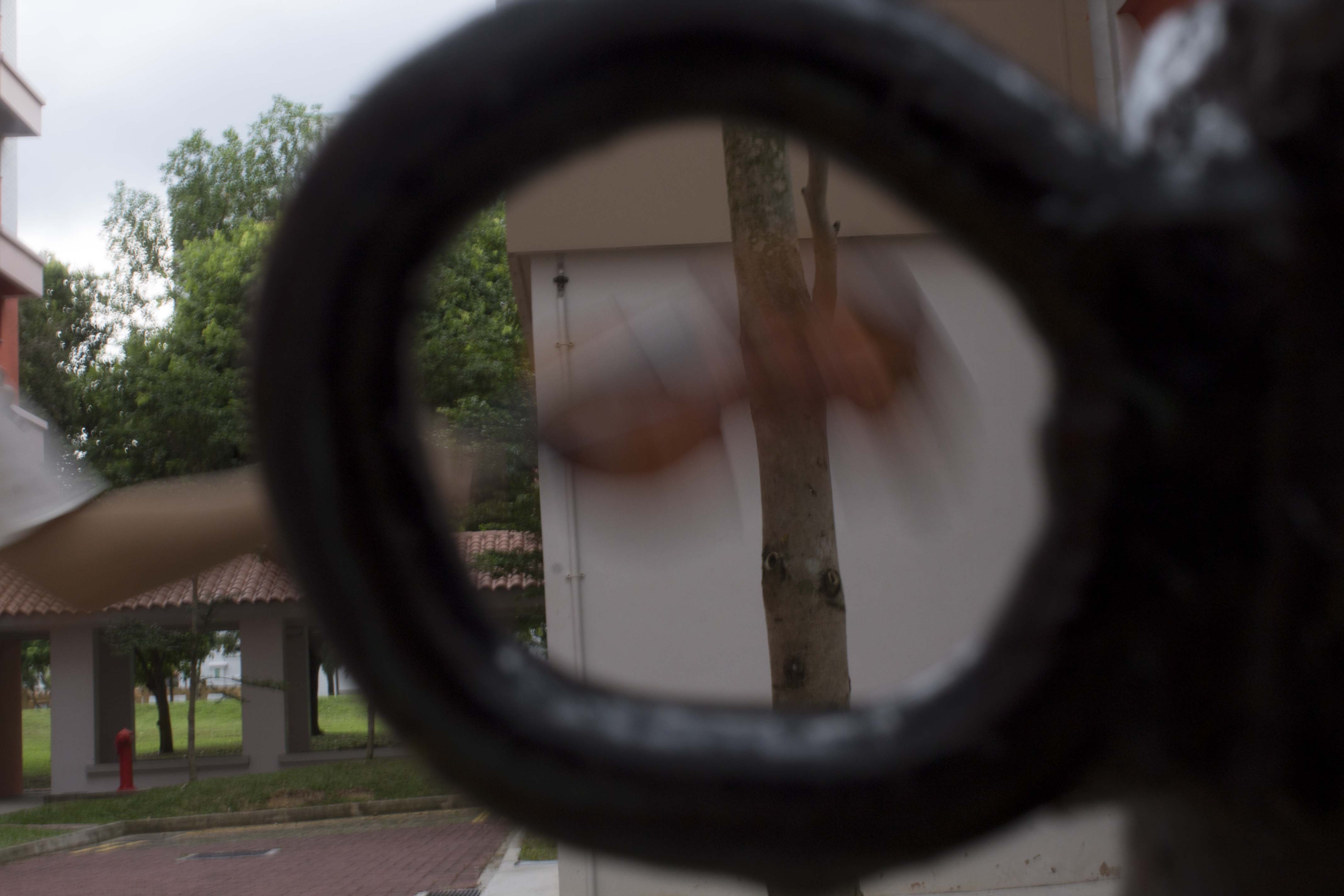
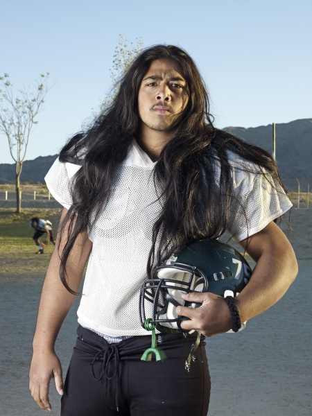
I attempted this as a close up shot only to realize it is actually a normal shot because my camera can only zoom so far.

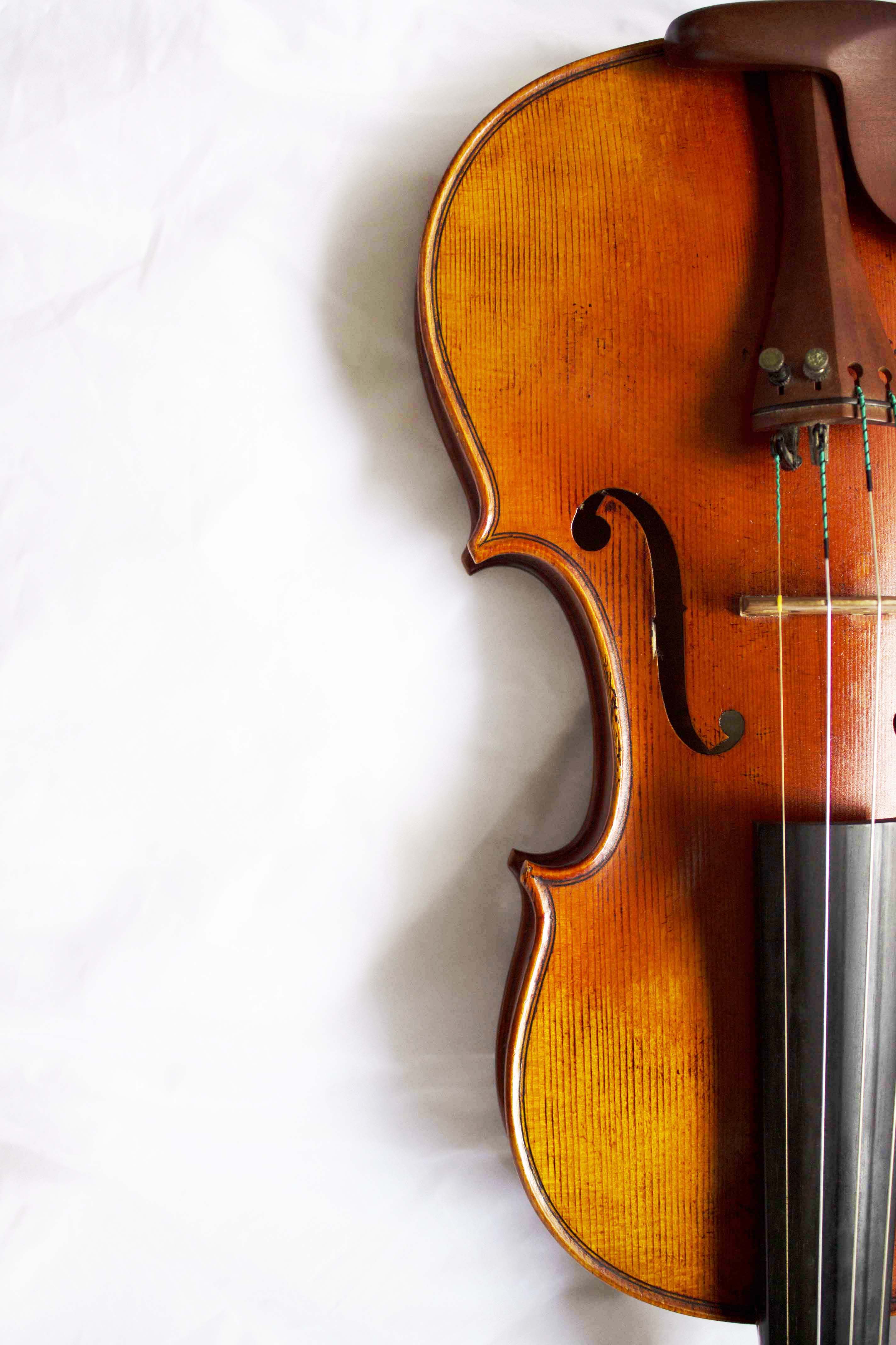
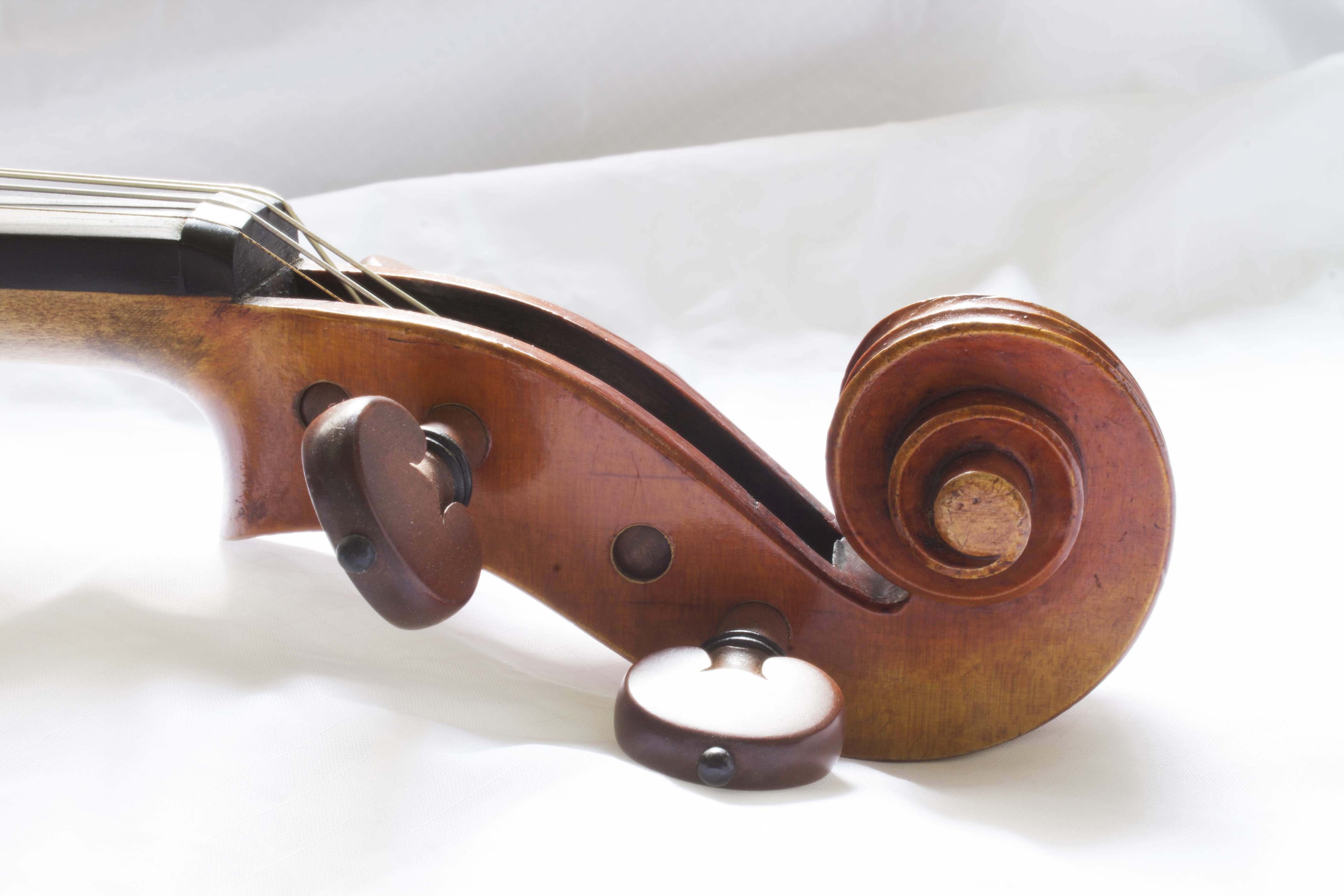
With this close up shot and angle, I was trying to capture the feeling of being trapped by my inferior skills of the instrument thus the darker tone. There is also a drastic contrast between the inside (dark and monotone) and the outside (bright and colorful).
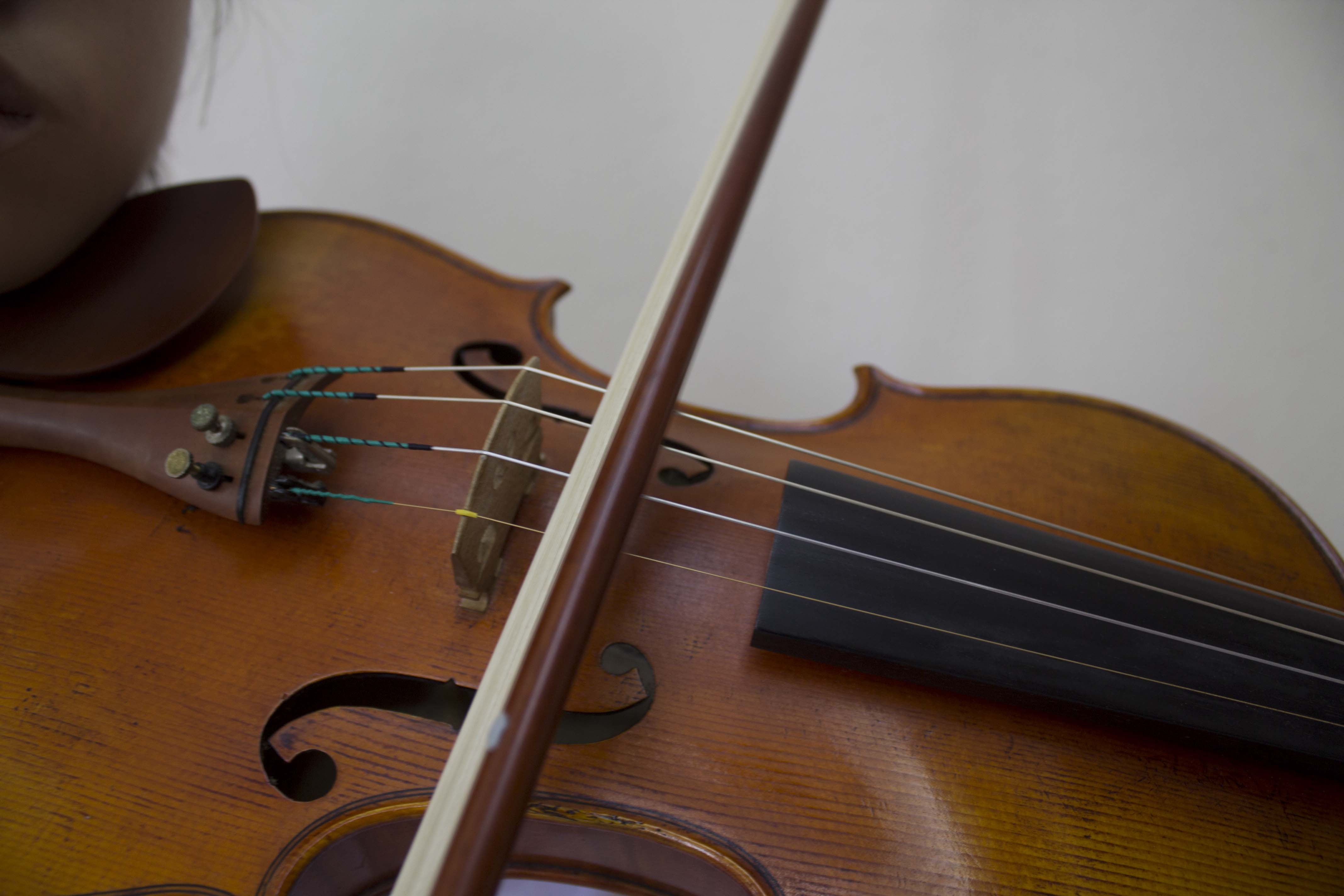
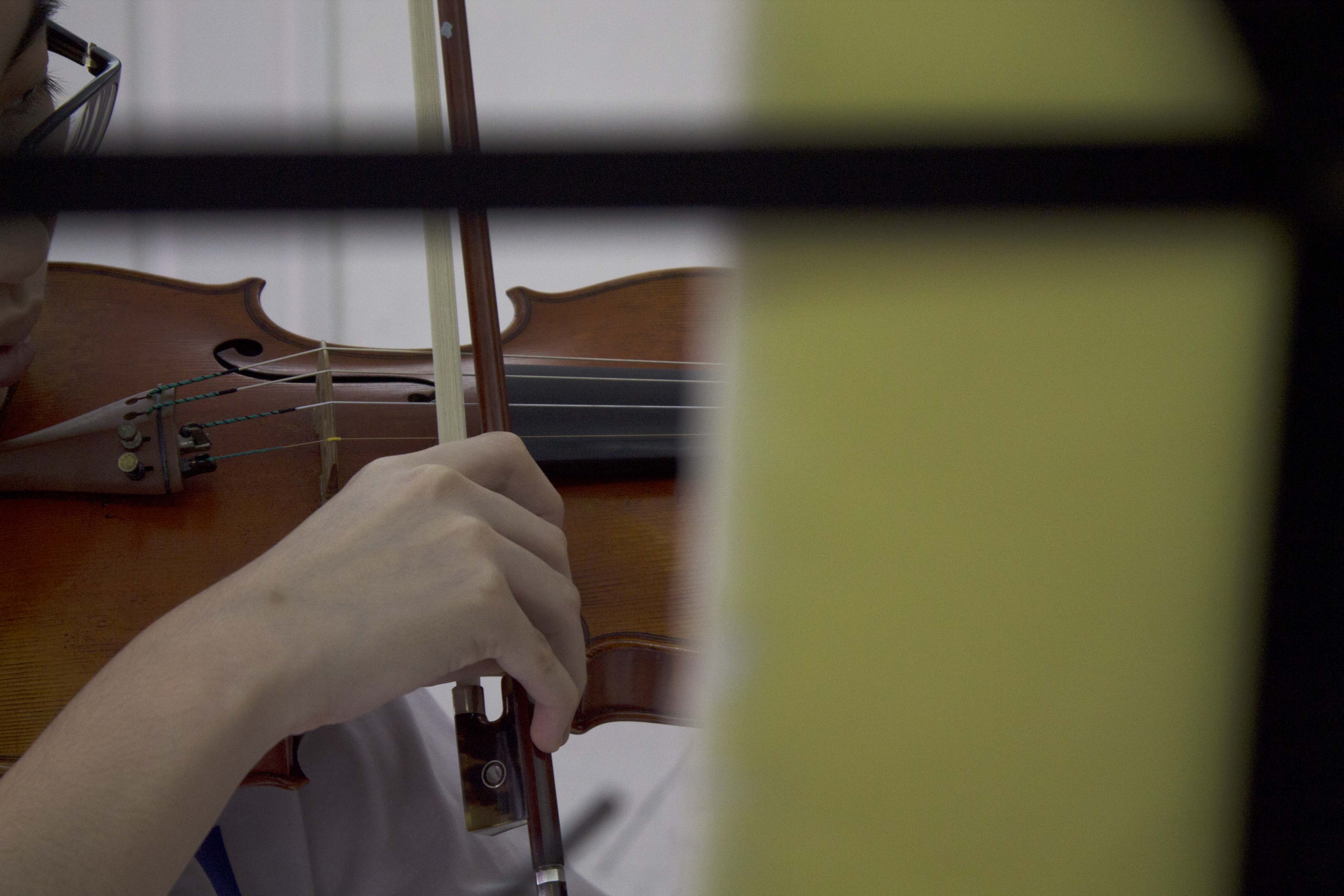
From the front much more emotion is revealed than the side. The instrument can be seen being held drooping downward much obviously than from the side.
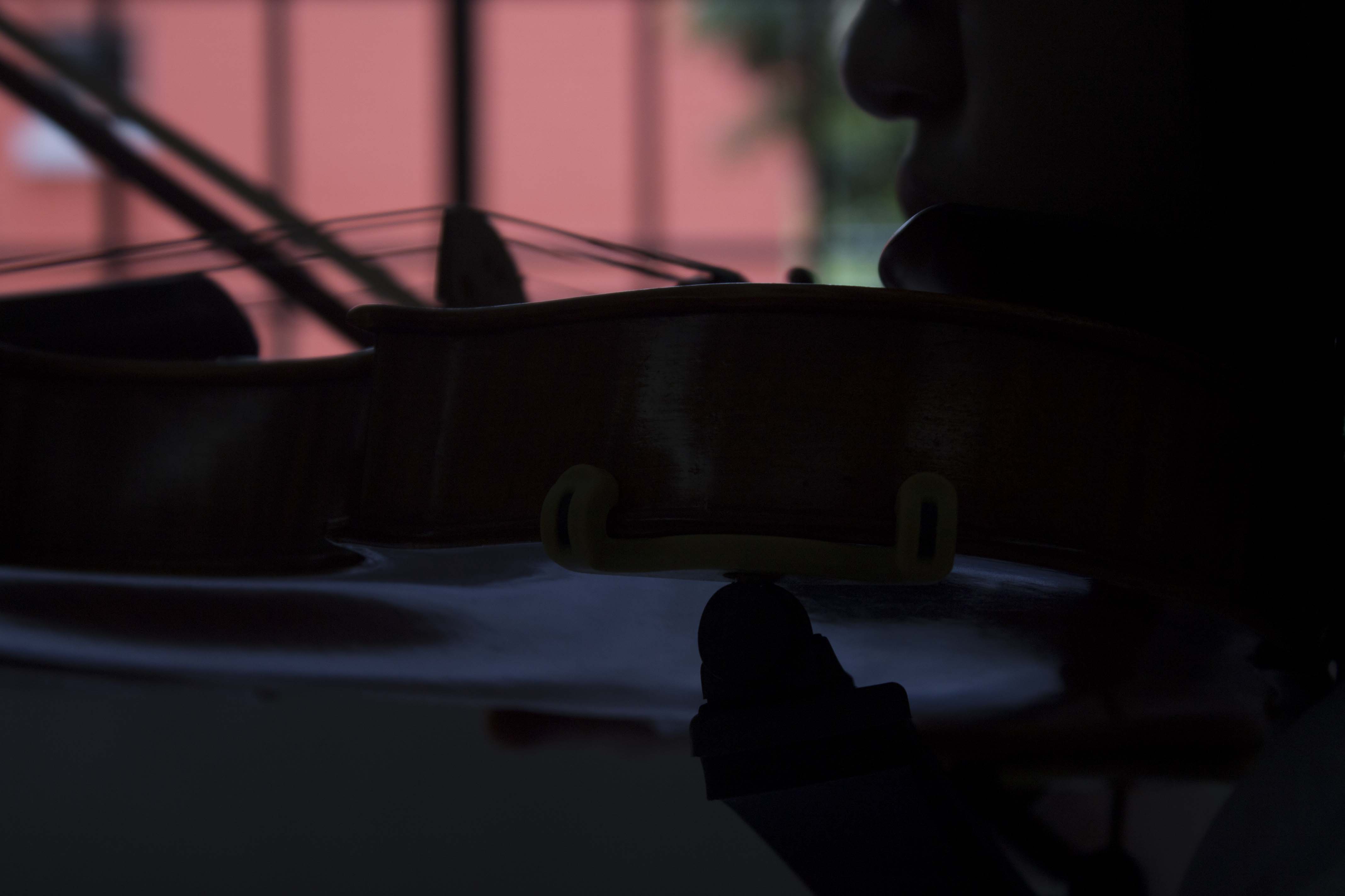
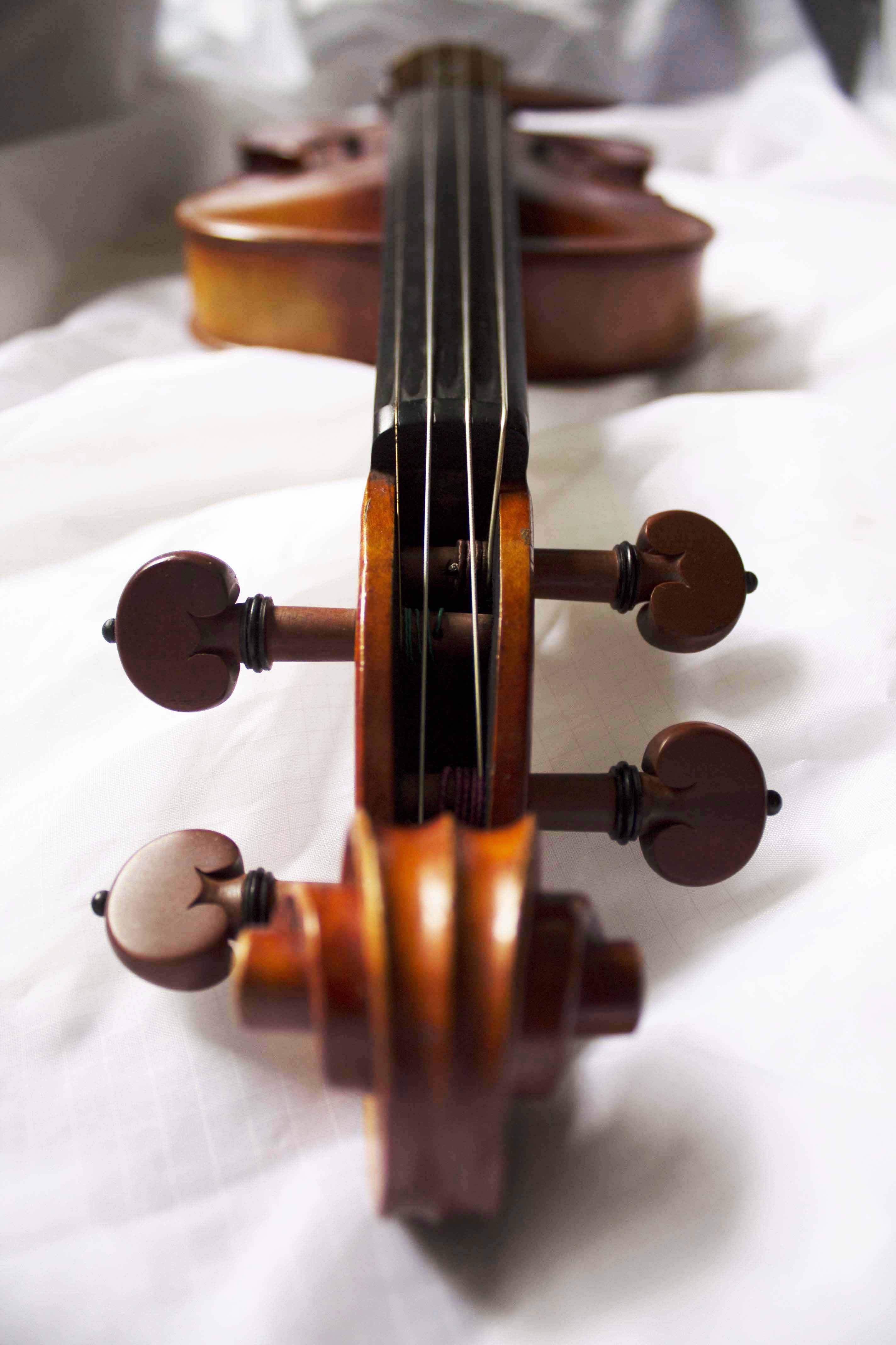
The back view shows the difficulty and tension that goes into gripping the instrument between one’s jaw and shoulders. Otherwise, there is not much to be seen from this view.
Next Entry – https://oss.adm.ntu.edu.sg/ytan149/curating-self-task-2-process/
*TRIGGER WARNING* MAY CONTAIN EXPLICIT CONTENT
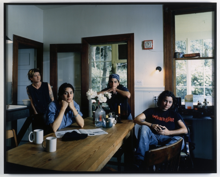
Catherine Opie is a social-documentary photographer. She was inspired to be one after encountering Lewis Hine’s images of child laborers from the early 20th century. Her interests lies in the relationship between the private and the public politics, the mainstream versus the infrequent. She was known for her works about the LGBT and BDSM community.
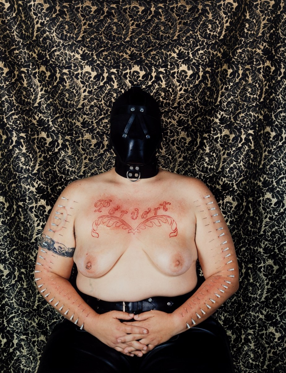
Catherine Opie decided to wear a hood in this piece because she wanted the focus to be her body and not the distortion on her face. It is about the existence of the word “Pervert” and what it meant. The politics lie in the fact that she dared inscribe it on her body, it does not lie in her eyes.
Why would she do this?
This piece were made in reaction to the gays and lesbians coming out of the closets during that time. All the sudden appearance of homosexuals segregated society and Catherine Opie wanted to push the viewer’s boundaries of normality; challenging our cultural code for relationships.
Catherine chose the background to reference seventeenth century paintings. The photo is took with intent of having a fruit bowl over her head, which queers the image with a little humor.
In her words “You’re looking at this juxtaposition of cutting of two stick figures, you know, women holding hands, with this comic fruit bowl over my head in the fabric.” https://transatlantica.revues.org/6430
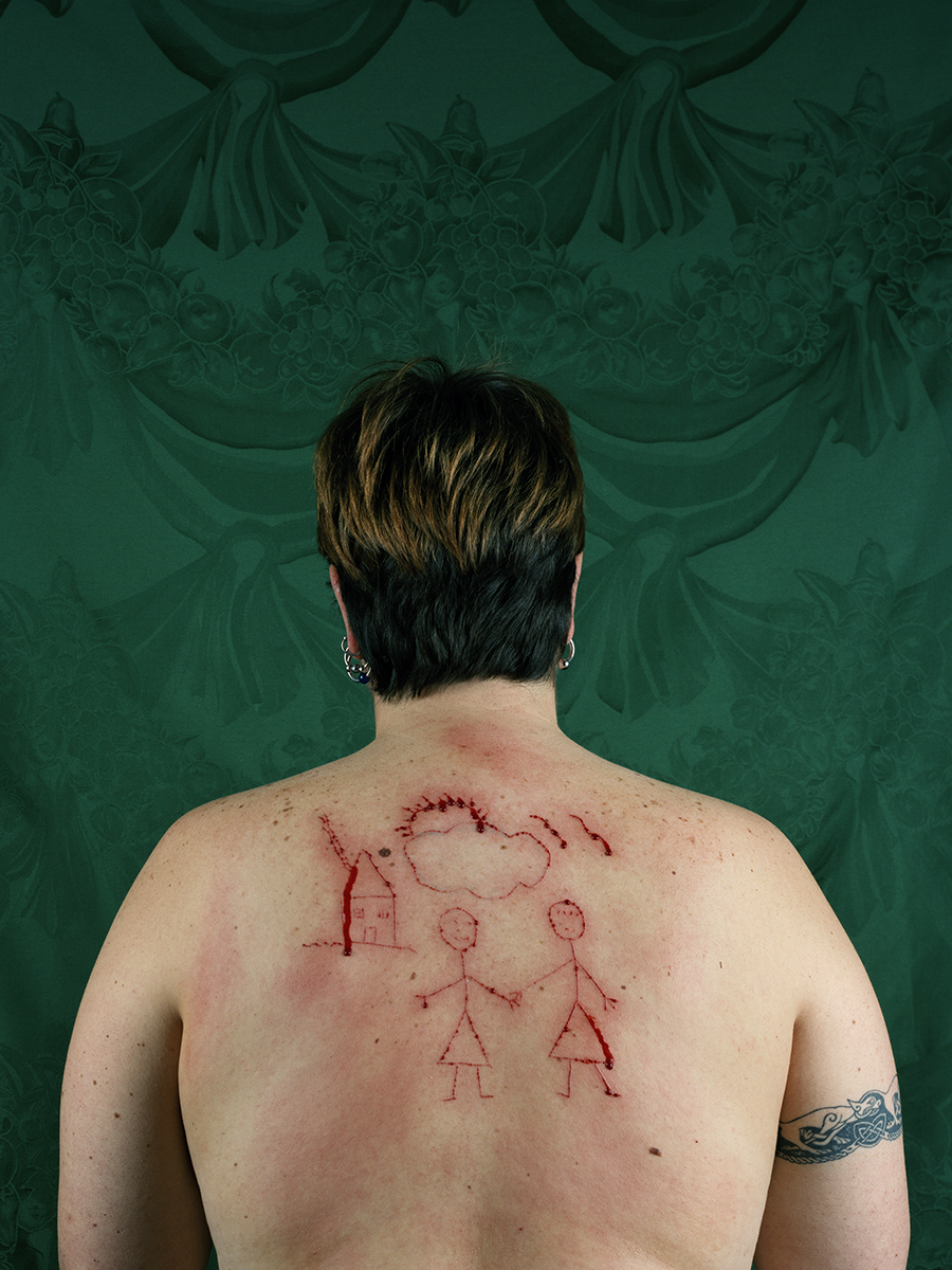
According to the creator this piece was made after the break-up of her first domestic relationship and she was working our her ideas of longing. It is also a representation of what a queer child might make at school.
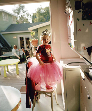
Not all her works that tackle homophobia are so intense. The above is a photo of her son in a tutu and tiara.
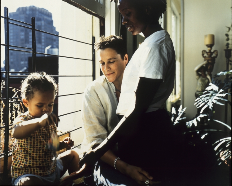
For the Domestic series, Catherine Opie rented an RV and spent three and a half months traveling the states. She wanted to complete the story of domesticity in a show that she attended.
“One of the things I always think about is who I want to have conversations with, what does it mean to create history related to a history that is already present, the need to add a conversation to a given situation, because something is not being represented, something is left out of the telling of the story. ” https://transatlantica.revues.org/6430
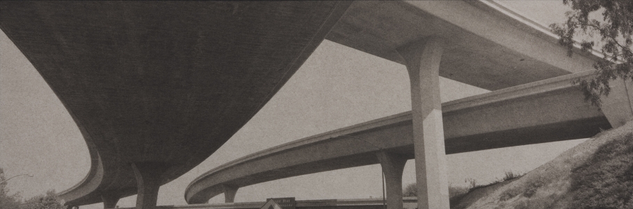
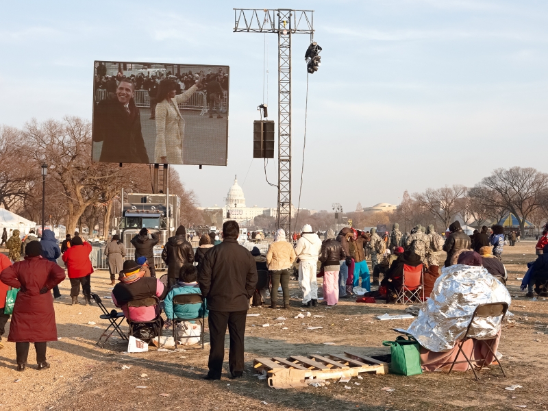
Catherine Opie also documents other events such as the Inauguration and High School Football.

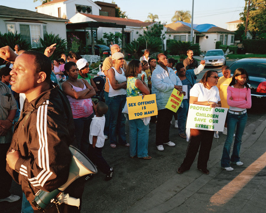

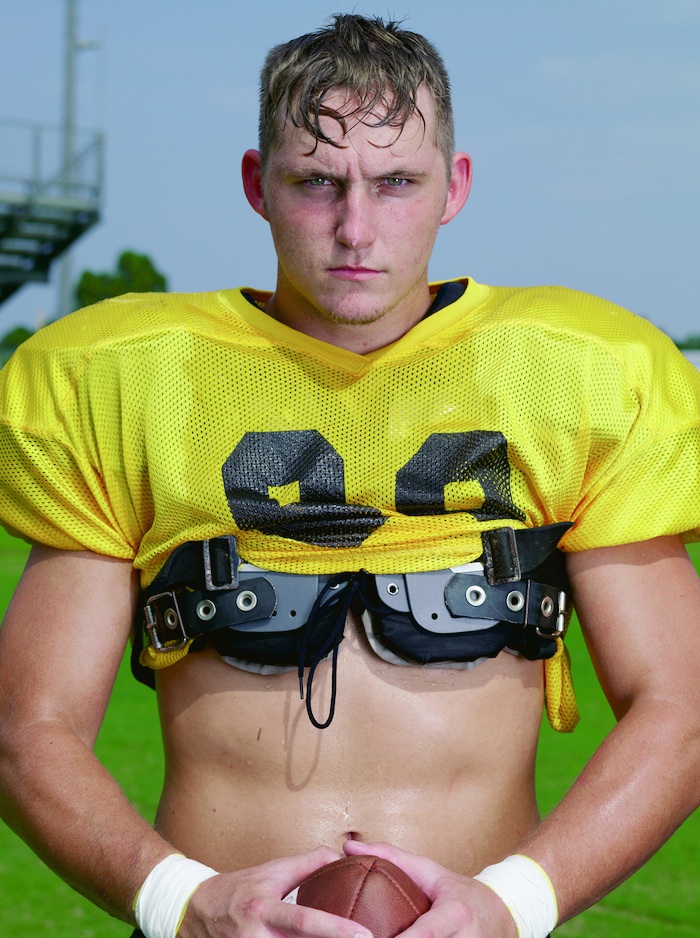


Catherine Opie’s photography style is nothing special it is not especially aesthetic but rather mundane. Just normal day to day lives that most people can relate to, which really ties in with her concept of interconnection.
Next Entry – https://oss.adm.ntu.edu.sg/ytan149/curating-self-process-part-1/
Definition – energy, enthusiasm, or liveliness.
Synonyms – sparkle, relish, eagerness.
My intepretation – A fancy word for magic. With a touch of wonder.
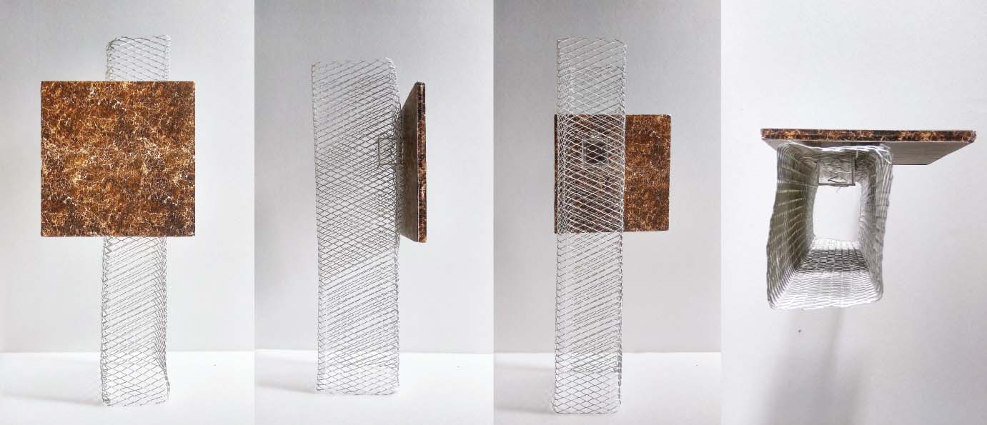
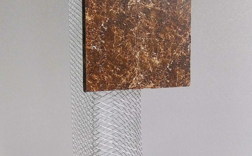
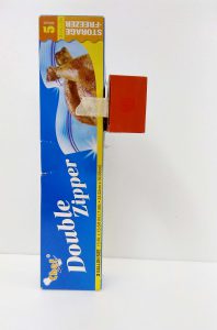
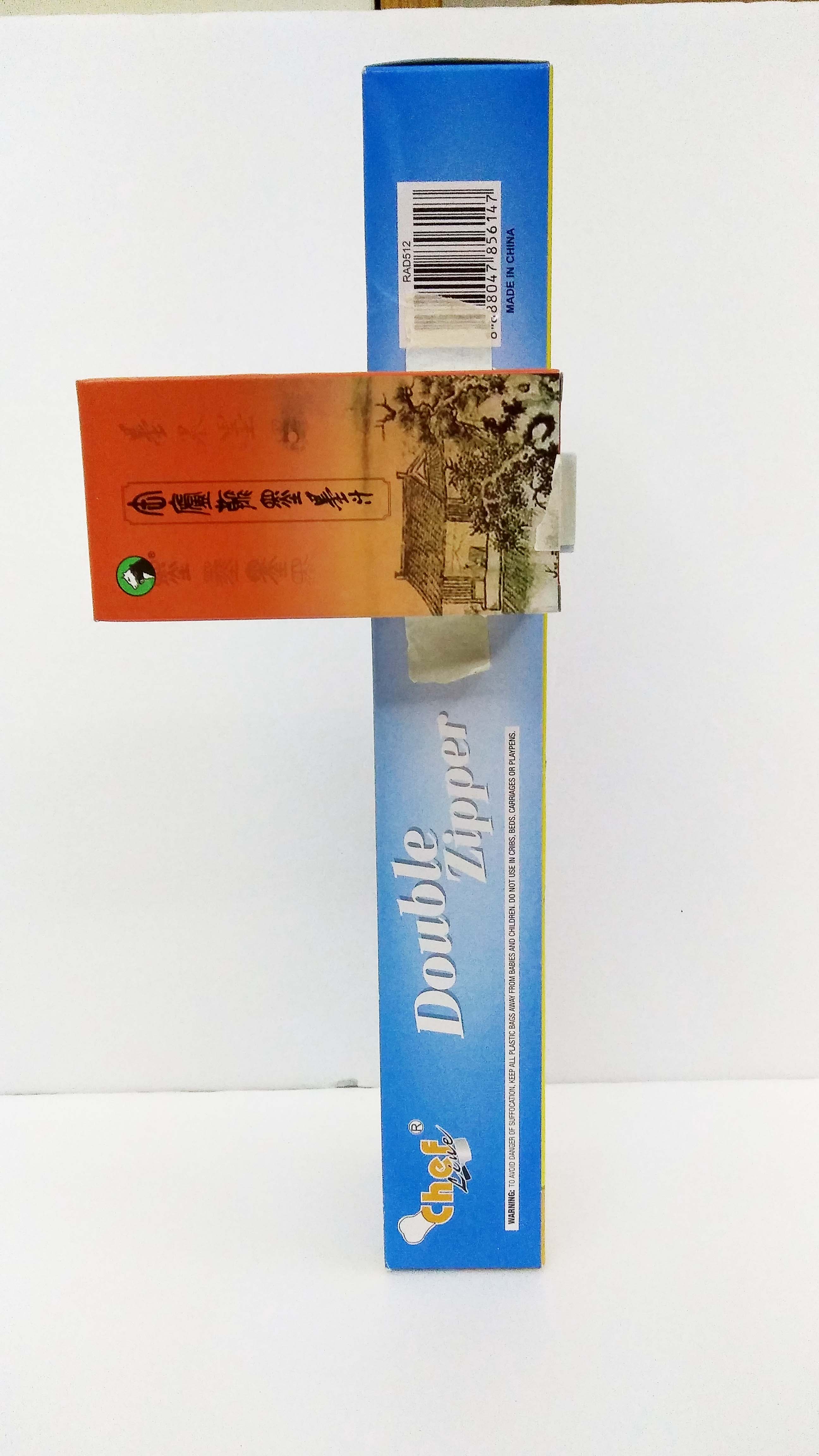
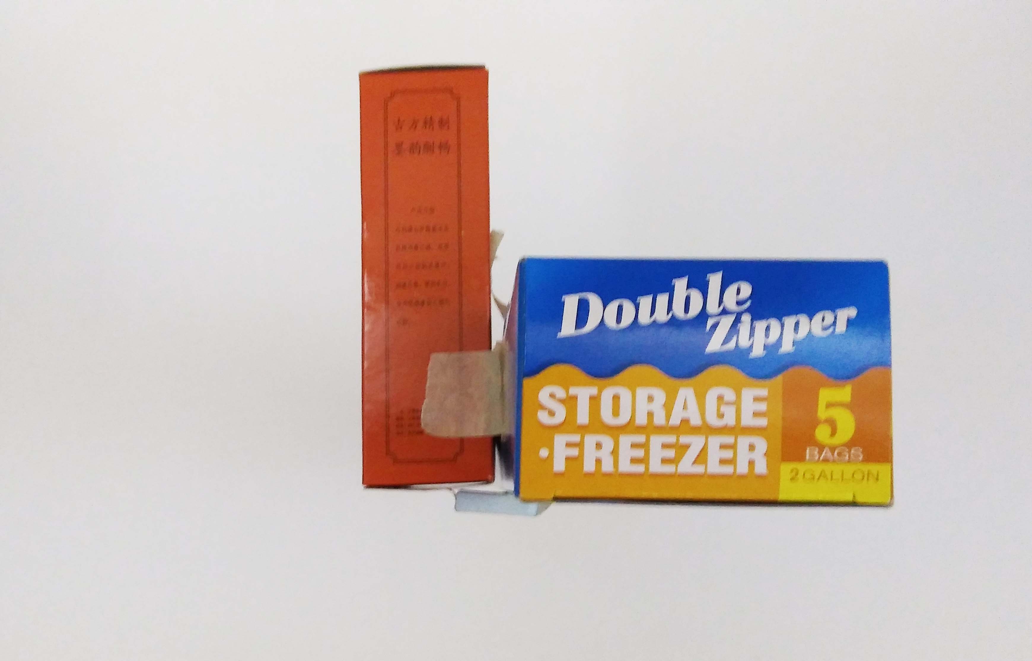
The idea was to raise curiosity and wonder in the viewer. Levitating the marble piece on a flimsy looking wire mesh seemed to be an impossible feat. I imagine the viewer to be amaze and curious to find out how the structure could stand on its own.
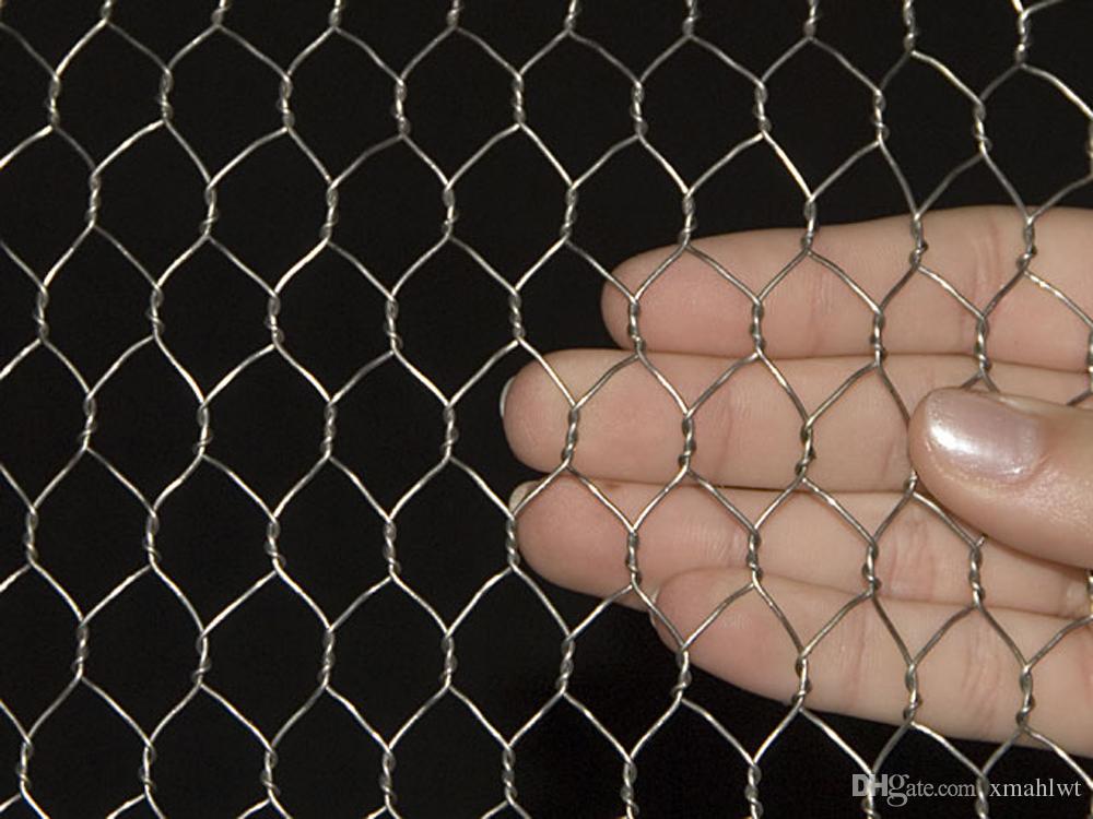
When viewed from the side the Zing happens as they will realize it is being held by a piece wedge between the wire mesh and the marble. Even with the magic unveiled it still is unbelievable because of the lightness of the dominant and sub-ordinate being porous and transparent respectively.
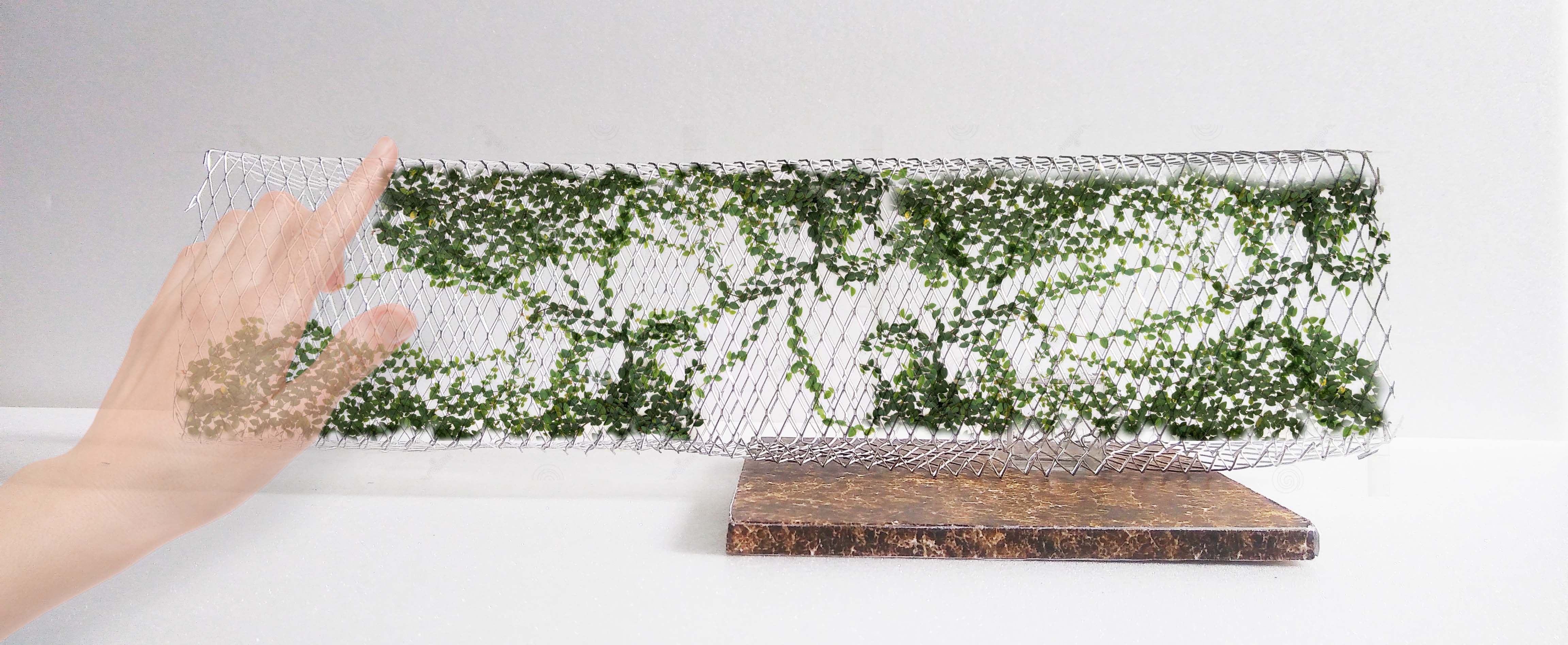
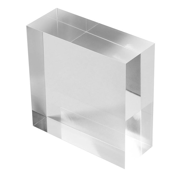
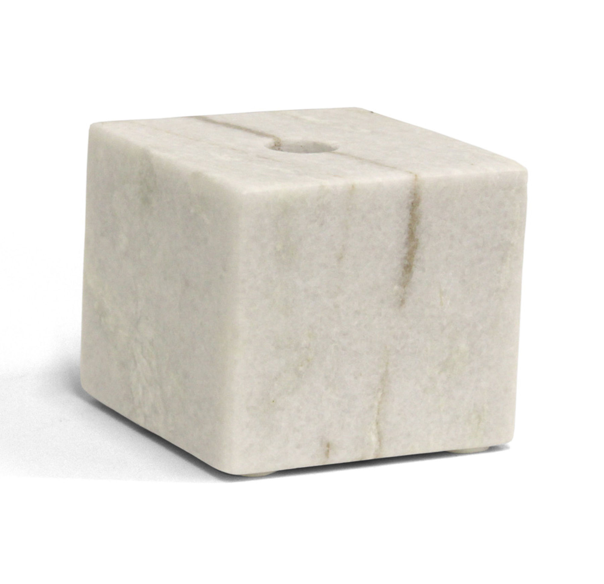
With the use of actual materials, the Zing becomes much more distinct.

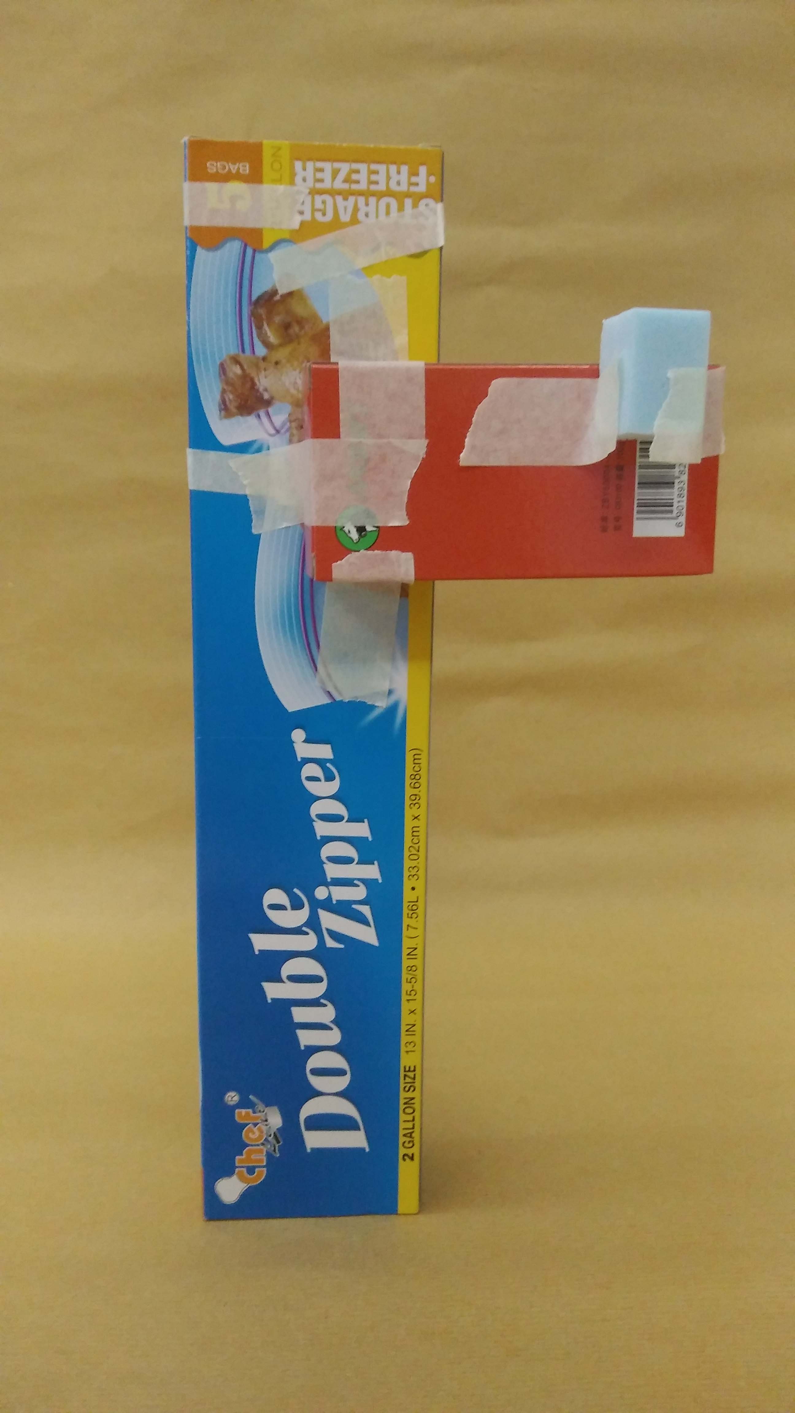
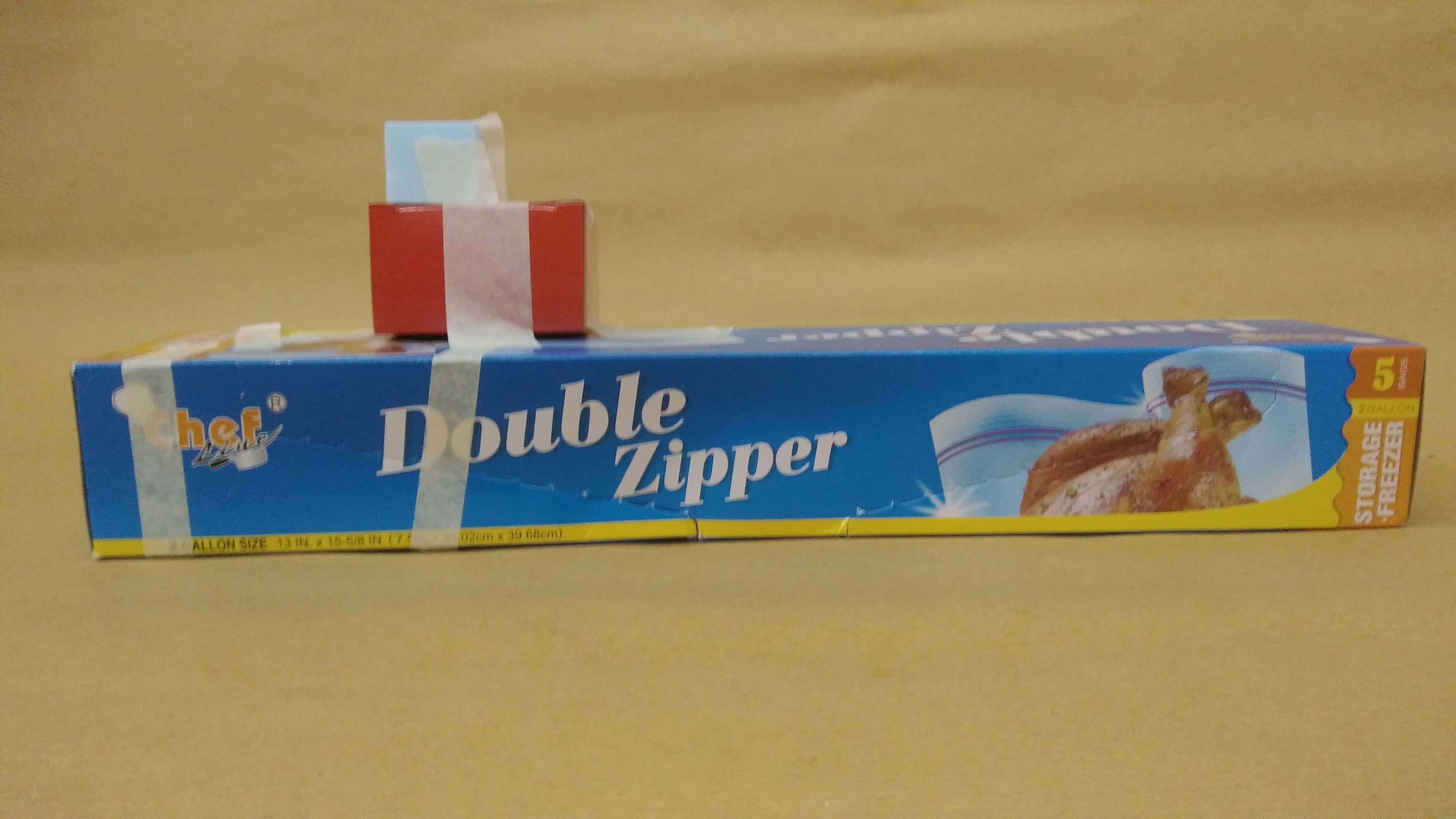
In the front view, the sub-ordinate is missing. Only the Dominant and sub-dominant could be seen so it seems that the sub-dominant is floating (at an angle). But how? Strange…

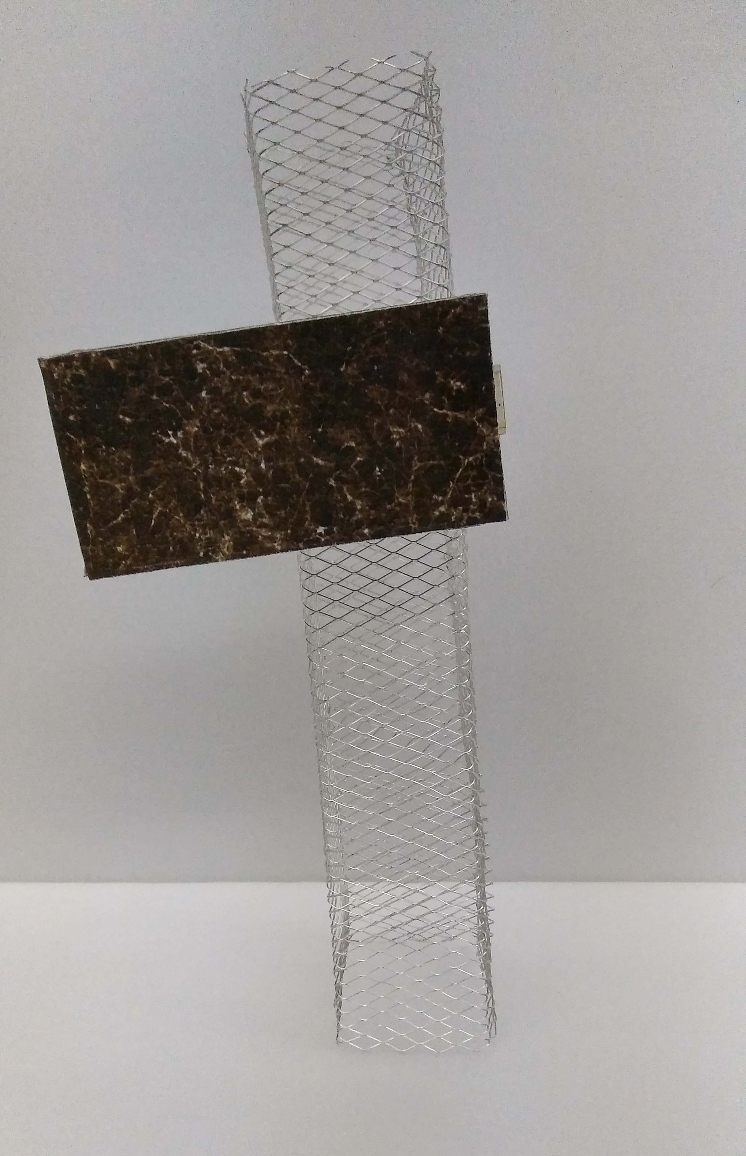
Even from the side view you can hardly tell what is actually going on. You see the sub-ordinate peeking out from the back but it does not answer your question of how the sub-dominant is floating.
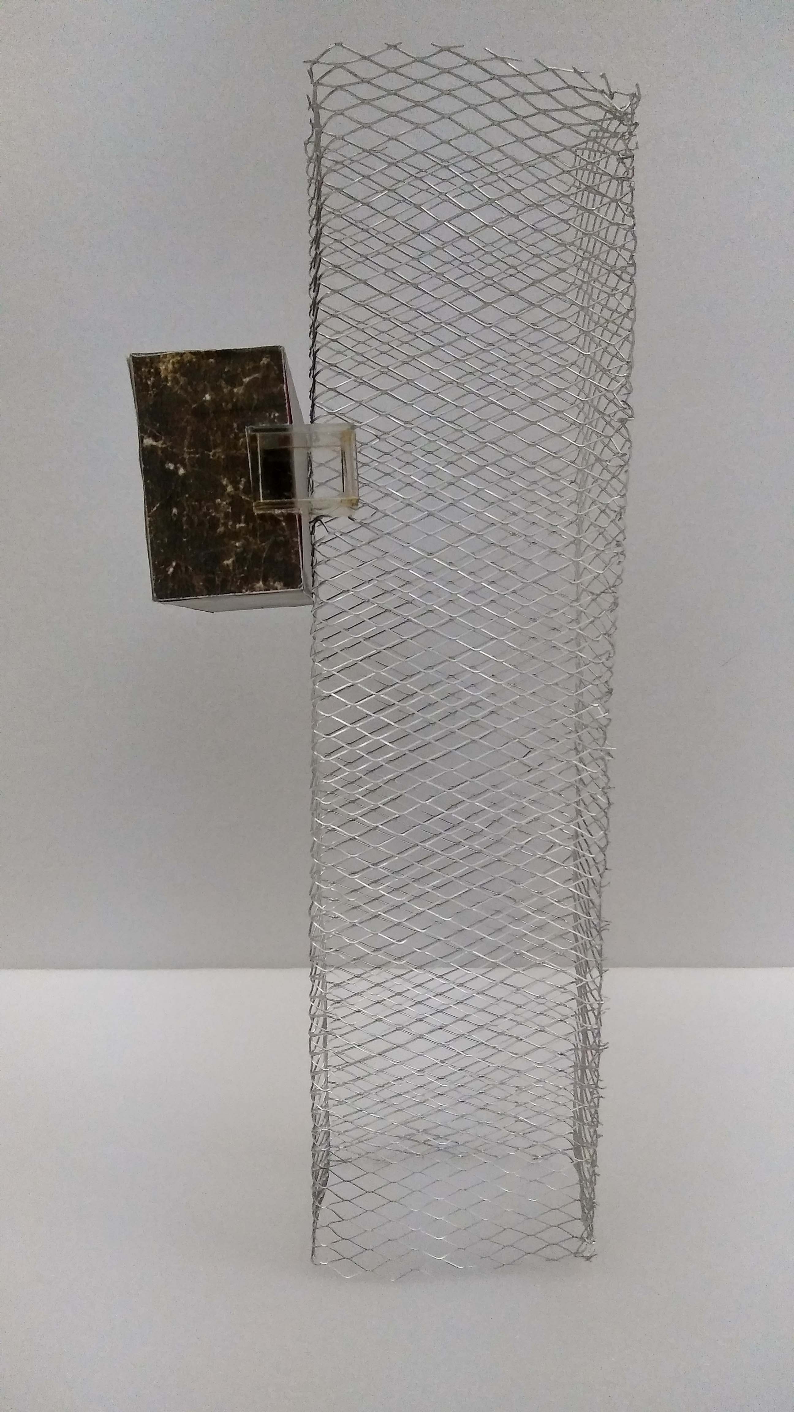
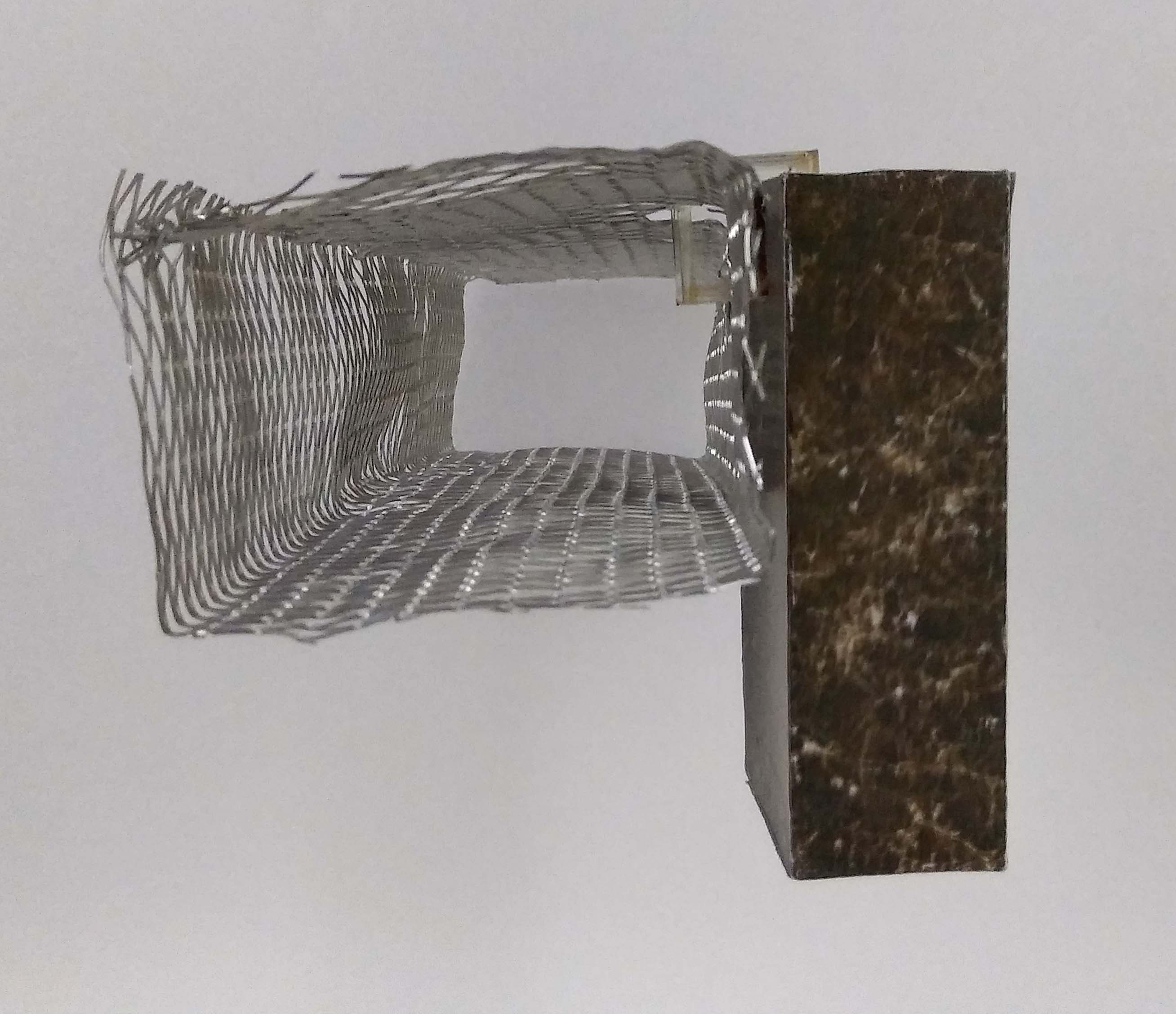
The sub-ordinate can only be seen clearly from the top and back view. This is the ZING part where you go “oooooohhh~” and be amaze that a mere wire-frame can support such a ‘heavy stone’.
(If I have time, I will try to fix the tilted ‘marble’ block. Because now the entire structure is very loosely attached. Looks like it will fall over any minute.)
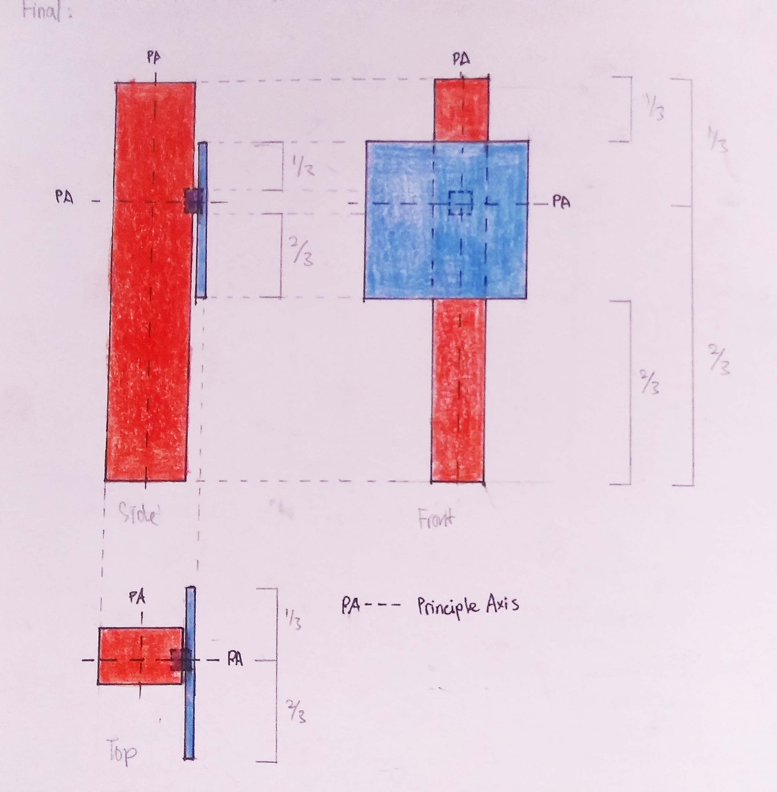
This is an improved version of process model 2. Following the comments from the previous session, I changed the dimensions of the Sub-dominant from a tall cuboid to a thin rectangle. I also tried to make it 1/3 the size of the Dominant; the ideal size. But turns out an exact 1/3 is not as aesthetic as I expected. A 1/3>x<1/2 would be more appealing.
Both the Sub-dominant and Sub-ordinate are placed at the 1/3 of the Dominant. The Sub-dominant being close the the bottom also creates some tension.
Having the Sub-dominant and Sub-ordinate jut out the side of the Dominant allows them to be visible from the back. A sneak peek of the Sub-dominant and Sub-ordinate raises curiosity and wonder. (the Zing factor)
Then when you view it from the side, you realize how the whole thing is being connected and how the Sub-dominant is being held up.

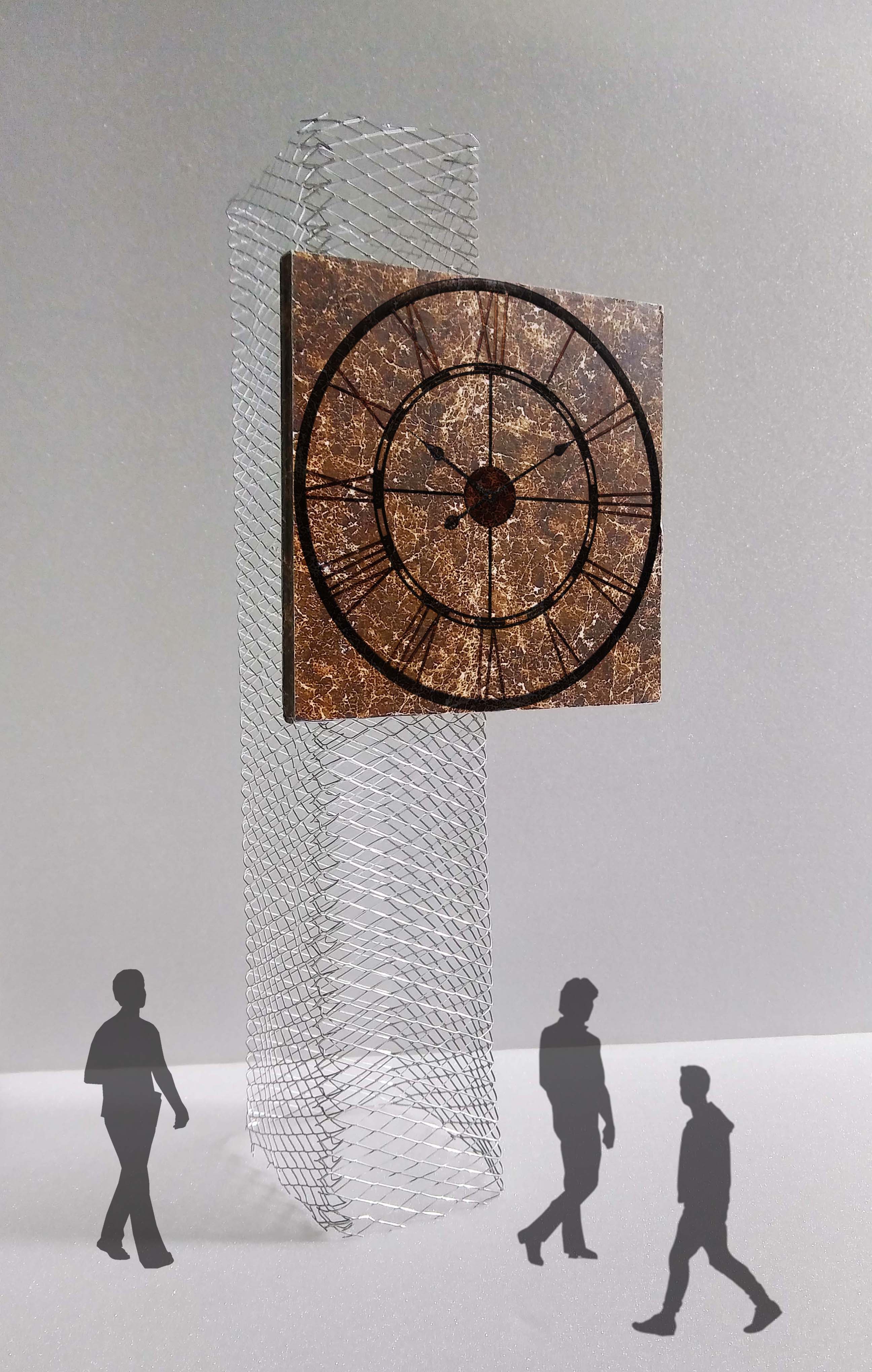
In this iteration, I was going for the same concept as the previous model (process model 3) – aiming to raise curiosity and wonder from a certain view. This time from the front.
A tiny gap between the Dominant and Sub-dominant is intended. The suspension of the Sub-dominant makes the viewer wonder “How?”.
Seeing the Sub-ordinate peeking out from the side; you think “Oh! What’s this?!”. It makes you want to find out more.
Then when you turn to another angle you get your answer. The Dominant and Sub-dominant is connected by the Sub-ordinate.

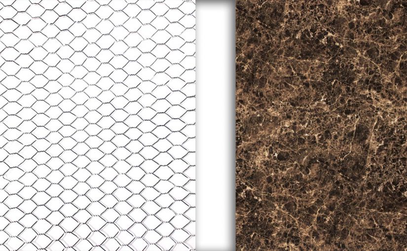
I decided to use materials of different weight to display the Zing effect.
The Dominant will be a volume made of frames versus the Sub-dominant made of solid opaque material; makes one question “How?”. Then the Sub-ordinate will be made transparent to make the Sub-dominant seem as if it is really floating.
My word: Zing
The google definition is energy, enthusiasm, or liveliness. But according to the answers of others that I asked on the meaning of Zing, it is a fancy word for magic and wonder.
In Model 1 and 2, I was still unsure as to how to translate the meaning of Zing into an arrangement of rectilinear volumes. Thus, only trying out arrangements that defined the dominant, sub-dominant and sub-ordinate.
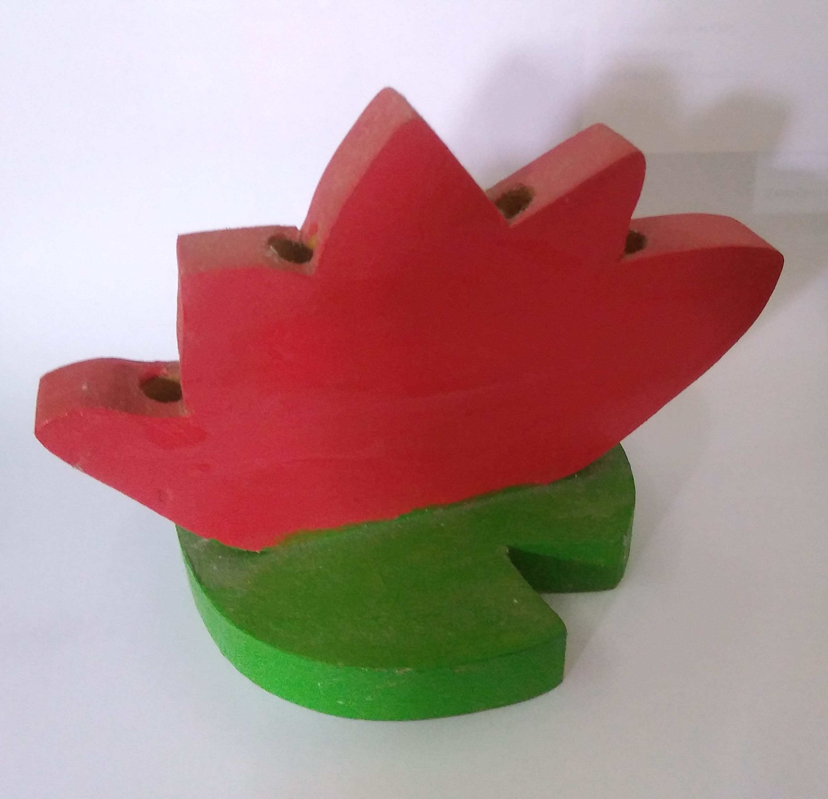
The red and green complementary colors play a role in the aesthetics of the object. The red part is the ‘flower’ and the green part is the ‘leaf’. The ‘flower’ is the Dominant (D). The ‘leaf’ is the Sub-dominant (SD) and the triangular cut out in the ‘leaf’ is the Sub-ordinate (SO).
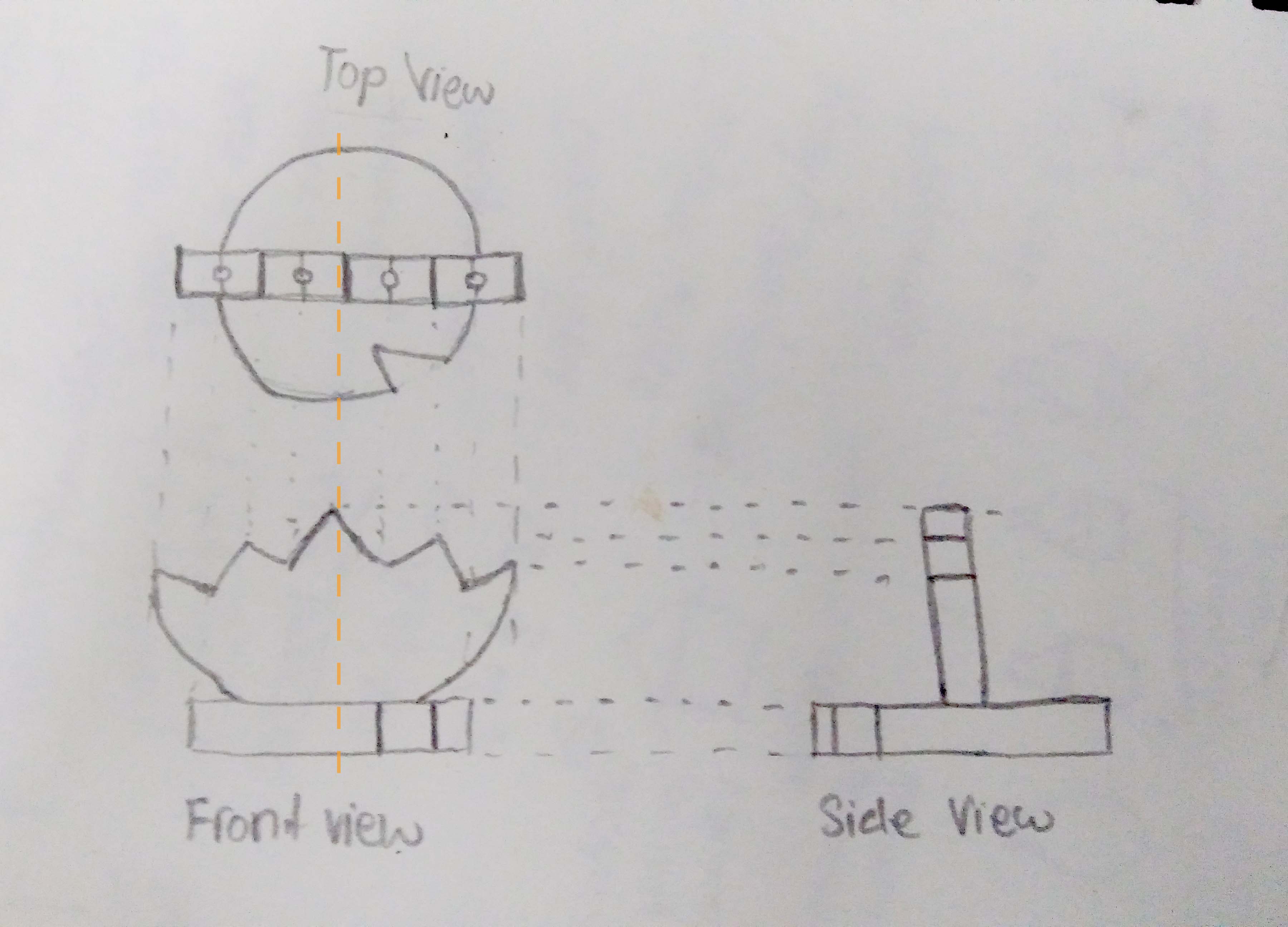
Four holes can be seen drilled into the ‘flower’ for inserting pencils. Due to their plurality, the four holes are considered to be another SD.
The ‘flower’ is obviously symmetrical. But because of the triangular cut out in the ‘leaf’, the object become asymmetrical.
There are many other details to an object that makes it interesting:
No Perspective: Everything in the image will be in focus. There will not be any depth in the image and it will appear to be flat.
1 Point Perspective: With only one viewpoint, it draws all the attention and focus to the point where the lines converge (viewpoint).

2 Points Perspective: It also attention and focus to the viewpoints. The addition of another plane adds more depth to the image than a 1 point perspective.
3 Points Perspective: Usually emphasizes on the scale of the subject and imposes its personality on the viewer. Again the addition of another plane adds more depth to the image than a 1 or 2 point perspective.

More than 3 point perspectives: As the number of viewpoints increase, the depth of the image also increases. However, it becomes more difficult to focus at a certain point in the image with multiple viewpoints. With no focus points, the viewer becomes disorientated and confused.
Welcome to Open Source Studio. This is your first post. Edit or delete it, then start blogging!