Criminal
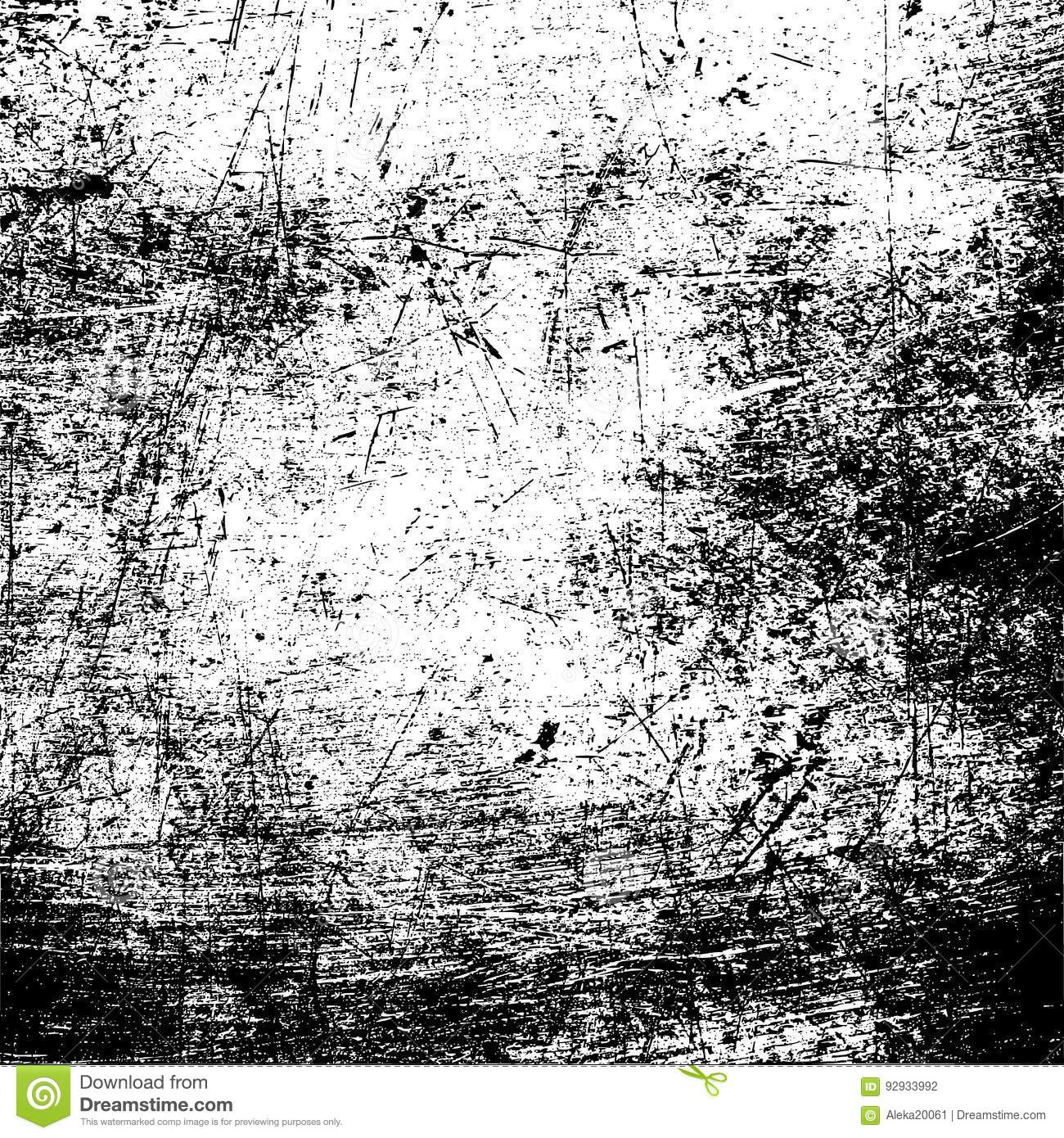
This was the texture I found to use for my type. It is very much like the reference picture from my research; it looks like scratches and deterioration.
This was my first test with applying jpg. texture in Illustrator on my own after the tutorial class. It is the visual representation for the personalities of criminals – rugged, rotten, dirty etc. Here, I applied it to my entire name floating in the centre of the page which did not make sense.
This time I had them ‘stand’ in a row. I also got feedback that the type should be in different sizes because people are of all shapes – thin, tall, fat, stout and so on. With that, I could only apply a number of letters and I settled for these three. To complete, I gave then each a panel to hold onto for identification. Then intensified the lighting to bring in more drama.
Dream Seller
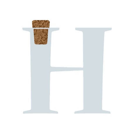
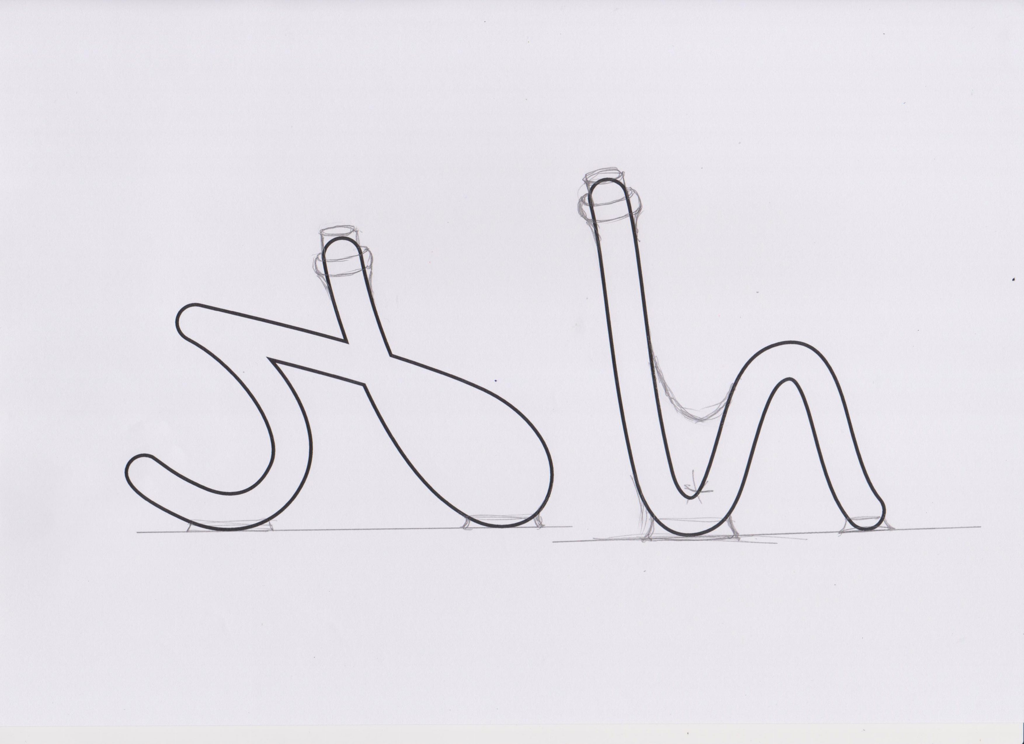 At first, I chose a script font and printed it on paper then sketched over it to change its original shape, to form letter bottles.

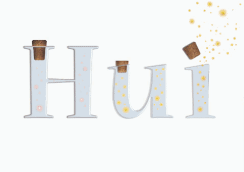
They look like this after I traced and coloured them.

I went to search for ways to help me create the ‘fairy lights’ in the bottle that were to represent dreams.
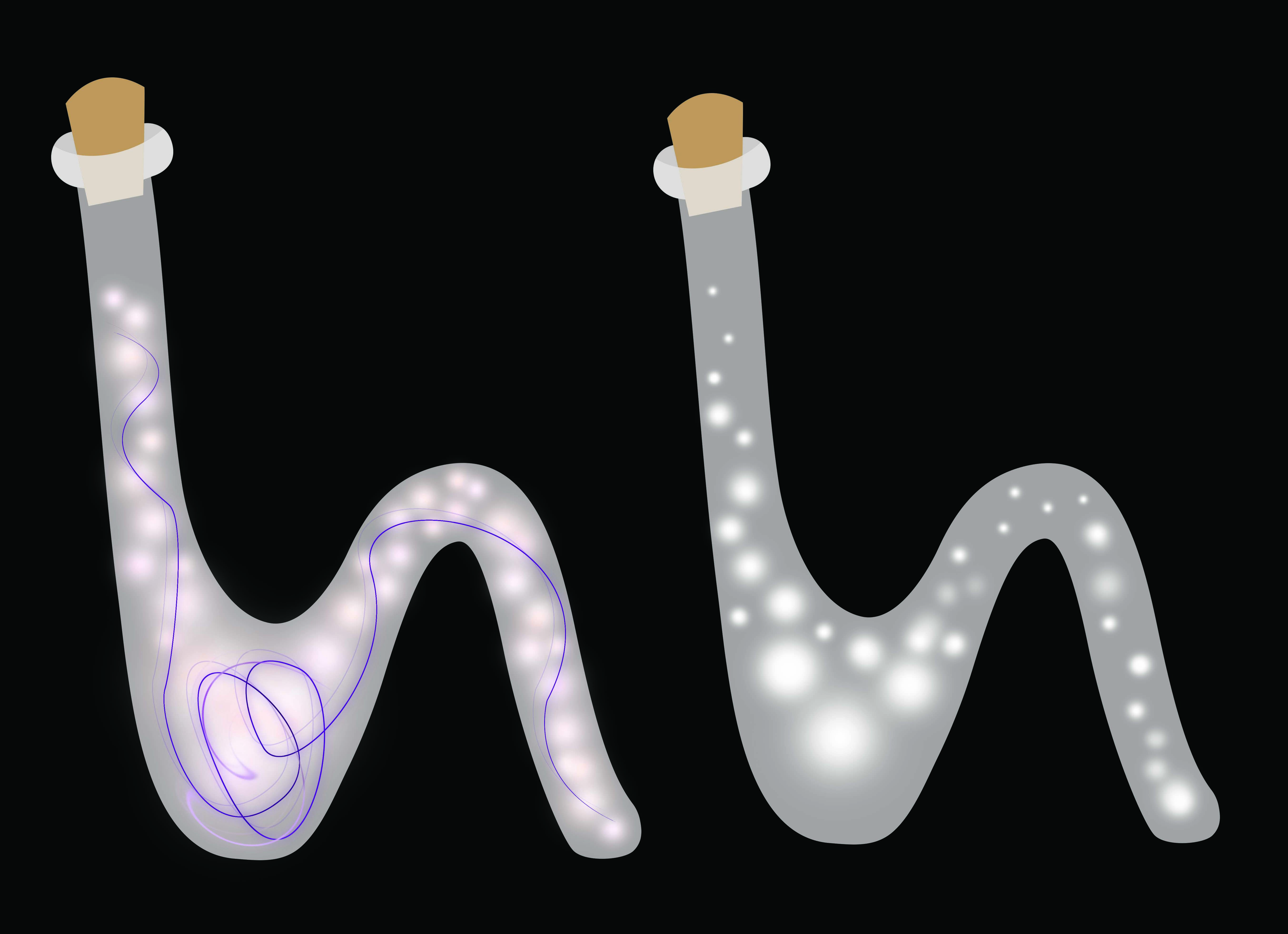
I tried it out on the bottles!

Things were looking flat and boring and I got many comments suggesting to make it 3D, create more depth and such. So I tried making the background darker to bring out the illumination of the bottles. I also got help from my cousin on drawing highlights and shadows. My drawing skills were lacking and I could not identify where the highlights and shadows should go. So this method did not work for me.
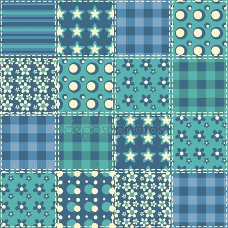
The background colour was picked from this quilt pattern found from google. It is sort of a bedtime blue which was perfect for the dream setting.
 After much searching I was able to find a tutorial on making glass type in photoshop.
Combining all the knowledge that I have acquired from the previous I put together the final piece. Rendering photoshop clouds for the background for a mystifying effect. The hand gestures to offer the products as if selling. Then I tweaked the blending filters to make it seem more natural.
Gardener

This one was a little tricky to get. Even using letters as a base, the results still came out ‘wrong’. Not the effect that we were looking for.

To fix that, I avoided changing the shape of the original type. Then I applied the elements that suggested the job of a gardener.

I move the vectors into photoshop to apply textures and materials.
Treasure Hunter

The original sketch inked on paper, scanned. I followed the reference image to create the map look with the monsters.
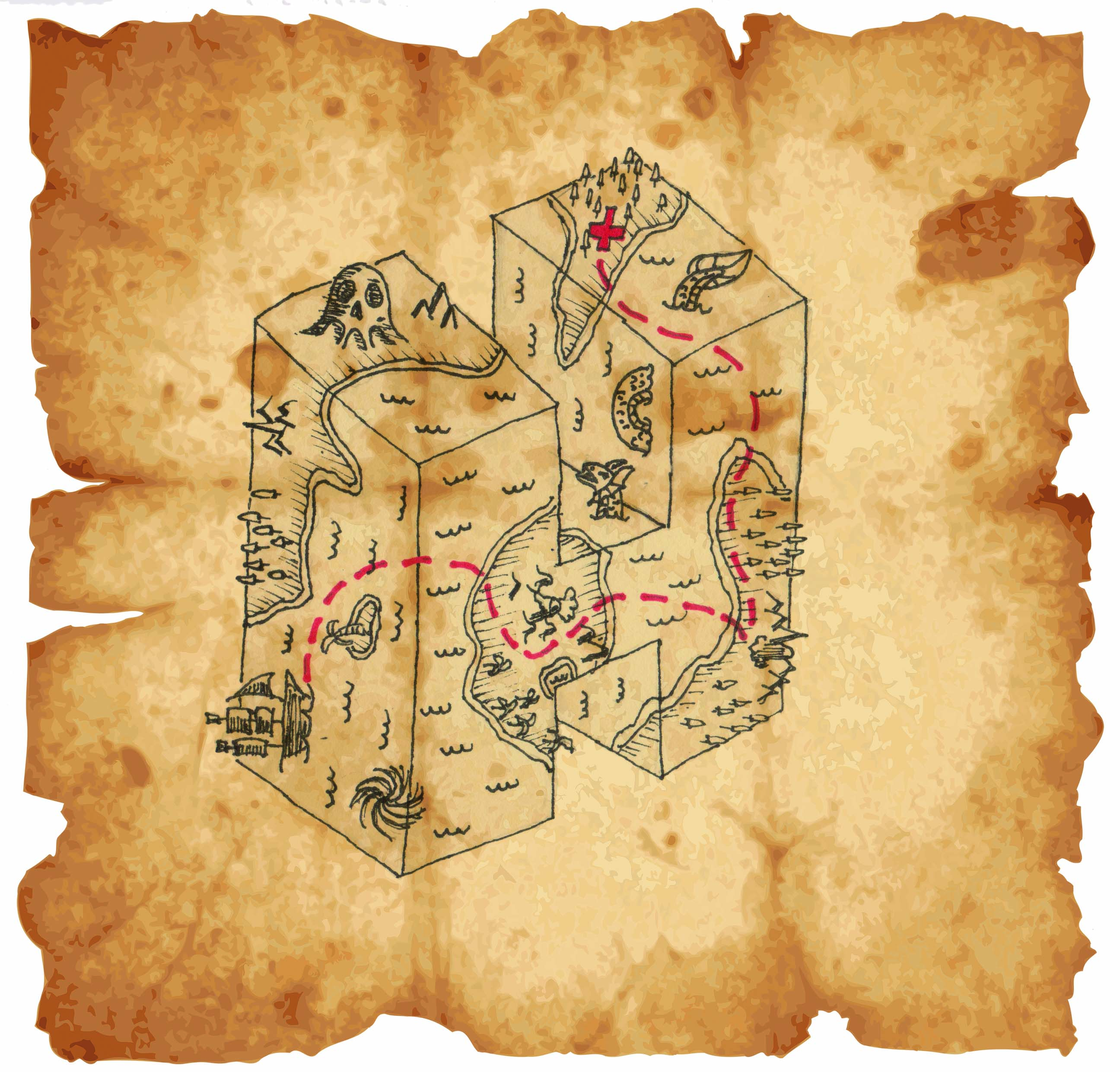
This was the first sample. It did not seem complete.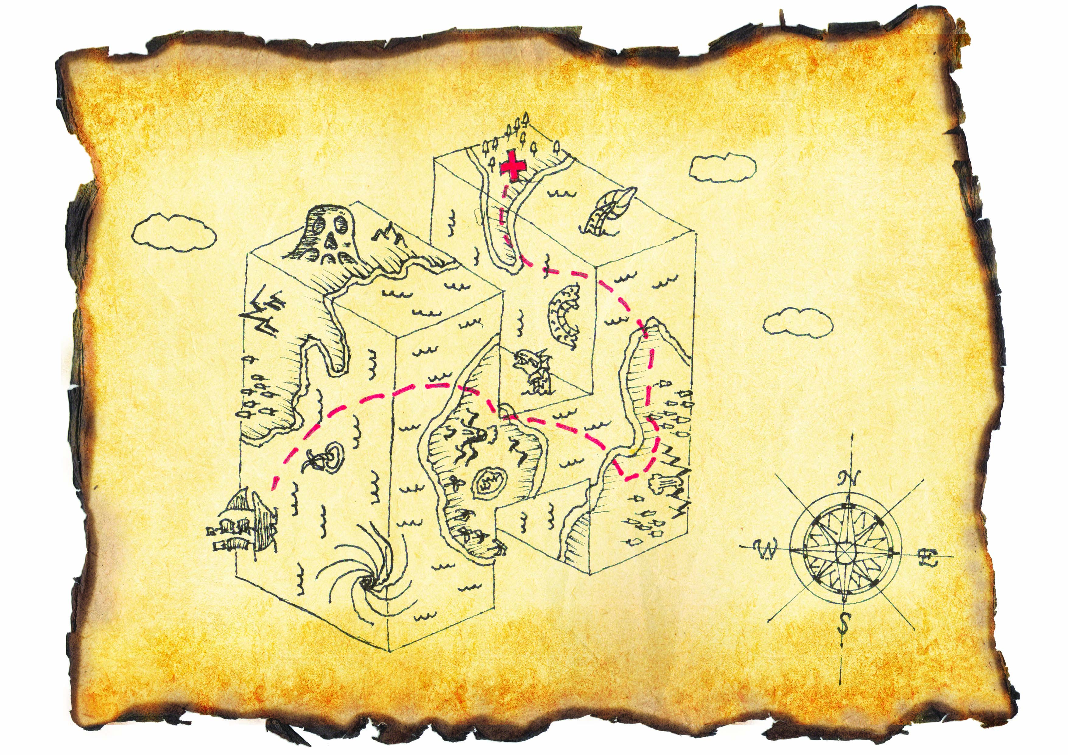
Then I added some clouds and the compass sign for direction and it seem more like a map. I wanted the map to look real so I changed the background to a texture that was more realistic together with burnt edge paper.
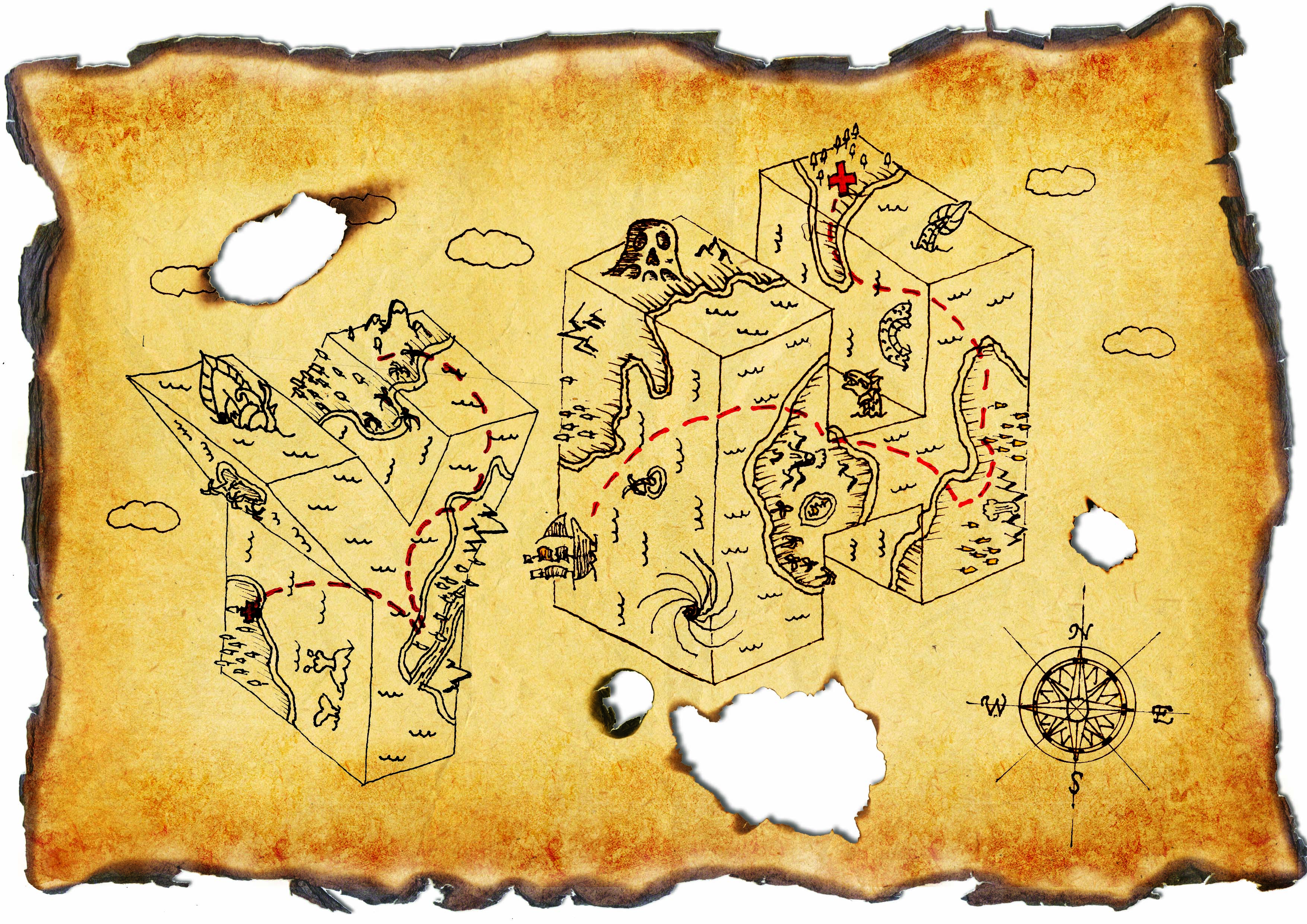
The lines were too faded before so I duplicated them many times to thicken it. Added another letter because I realised the brief said at least 2 and it actually completed the composition with implied lines and with ties in with the idea of traveling. Burnt marks were added to bring out the feeling of danger.
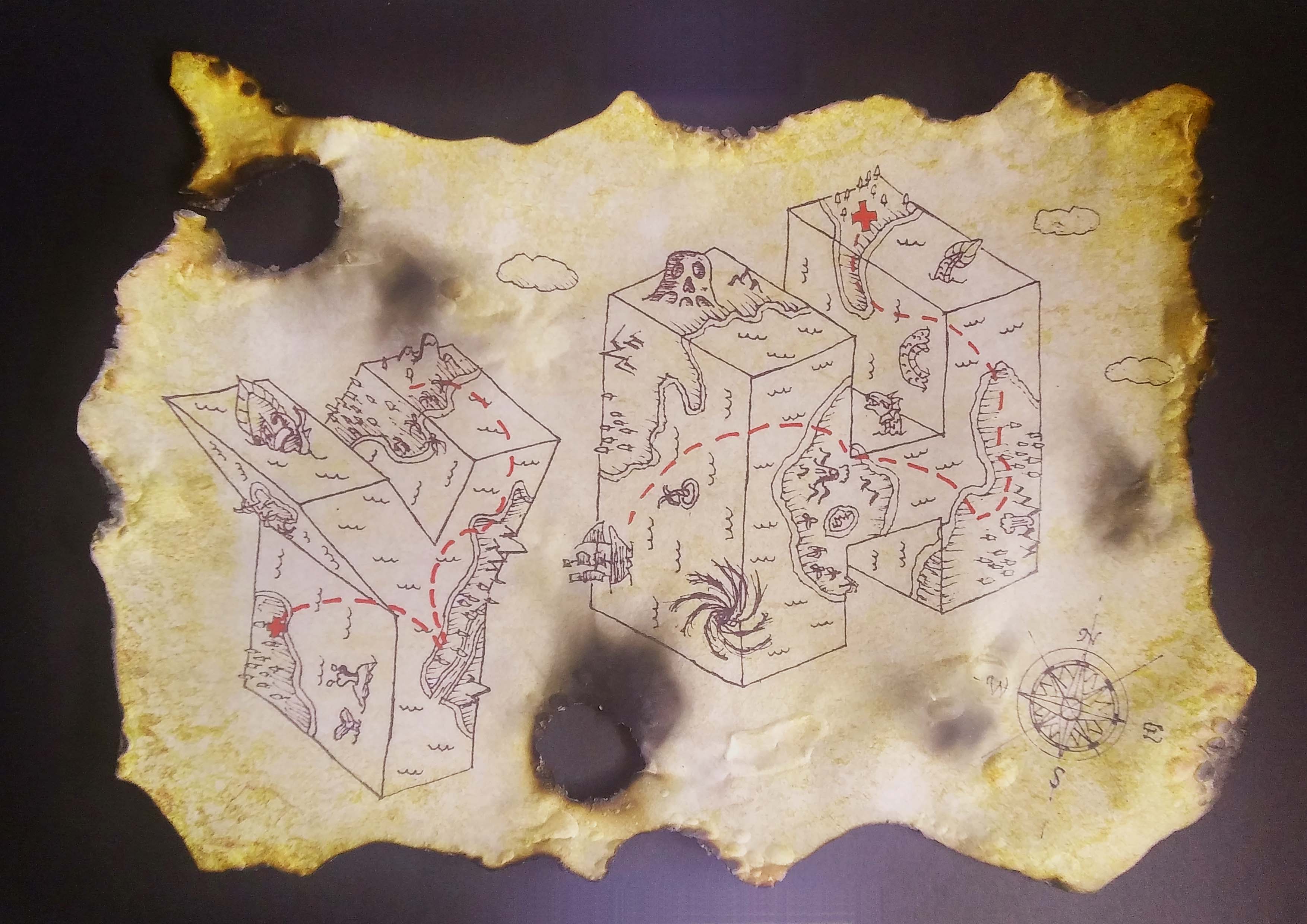
I tried burning the paper myself and the results were much more satisfying. You could not just see but actually feel what the paper had been through.
Prev: https://oss.adm.ntu.edu.sg/ytan149/project-1-image-making-through-type-research/
Next: https://oss.adm.ntu.edu.sg/ytan149/project-1-image-making-through-type/