
Paranorman
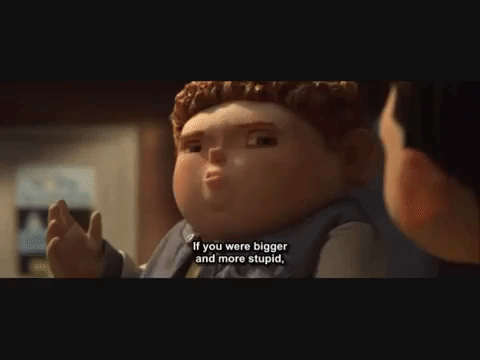
The quote was suppose to be :
“If you were bigger and more stupid, you’d probably be a bully too. Its called survival of the biggest.”
I am not sure why the subtitles are a little different – thickest instead of biggest. But the idea is about the same.
Norman has the ability to see and communicate with ghosts. And because of his ability he is being discriminated in his neighborhood. He is also being bullied in school, where the bully named Alvin (a boy much bigger in size than Norman) wrote ‘FREAK’ on his locker; there was also a scene before this where he was pushed down to the ground. Alvin being the tallest and biggest in size as compared to his other bullying companions is the leader of the group. Therefore “survival of the biggest.”

So basically, the quote is saying that bigger and stupid people pick on those that are much smaller and smarter. People with brains vs people without brains. (head made out of straws) The idea of the bigger bullying the smalland ‘keeping them in line’ reminds me of the novel 1984 by George Orwell, where the authorities would put up huge posters everywhere to intimidate and remind the party that they were being watch at all times. In conclusion, proportion will be significant in this design.
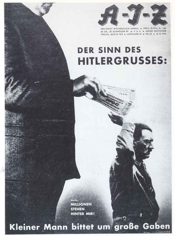
While looking through artist John Heartfield’s artworks, I found one that displayed proportion which I could use for reference. The image is taken from http://www.johnheartfield.com/John-Heartfield-Exhibition/about-john-heartfield-photomontages/dada-political-art-history/heartfield-context-7
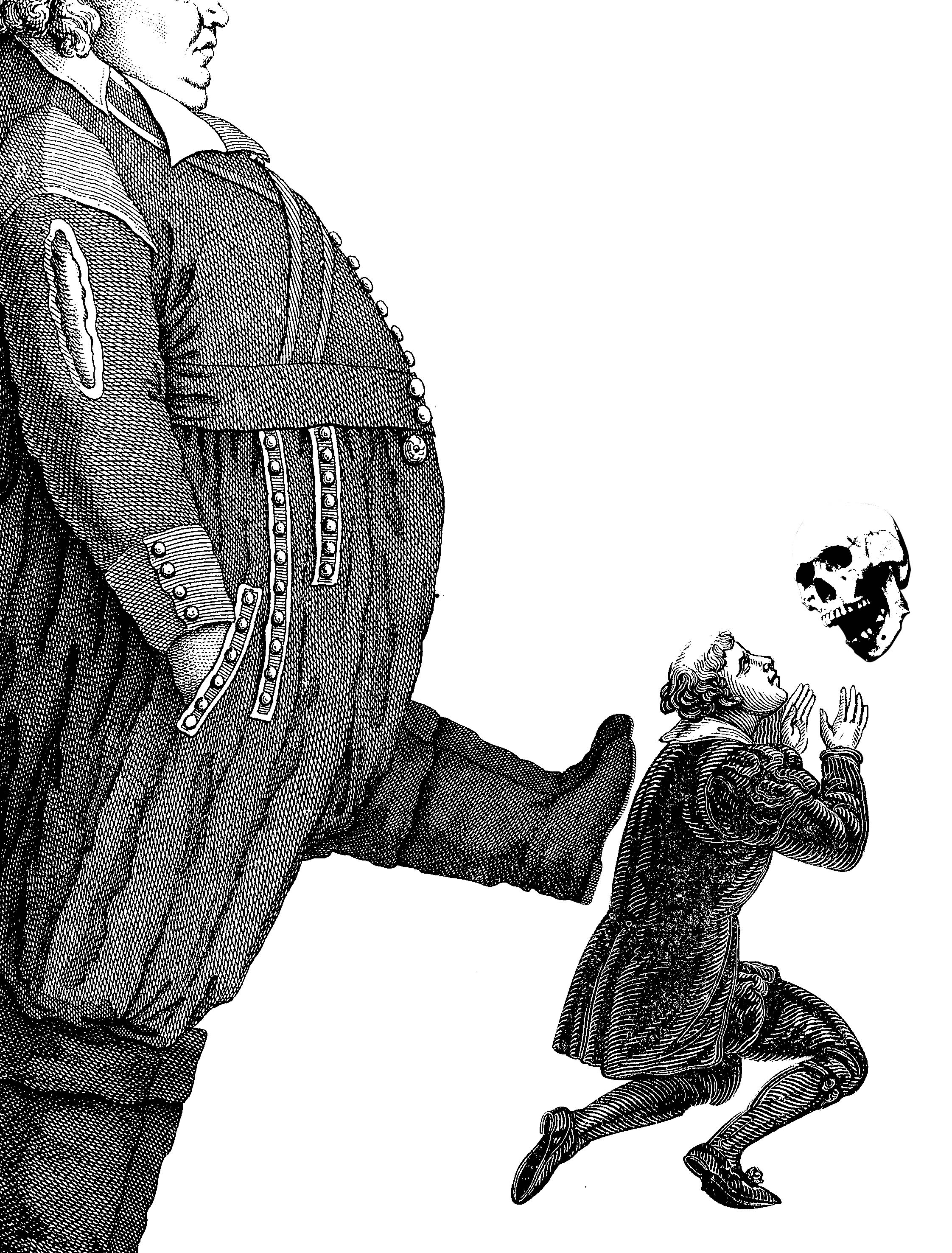
The first idea I had was to have a big, fat man and a skinny small man. The smaller man is holding a skull with its mouth open as if it is talking in reference to the movie where Norman communicates with ghosts. The big fat man is also kicking the smaller man to represent the ‘bullying’.
This idea lacks a part of the quote about being bullies being bigger and stupid. Being big is portrayed but not the stupidity. Also I think the communication with spirits is not obvious with just the skull floating out of no where. It would probably be better in the whole skeleton is there to also react to the smaller man. Another thing is that the smaller man might need to have a more dramatic reaction to being kick…
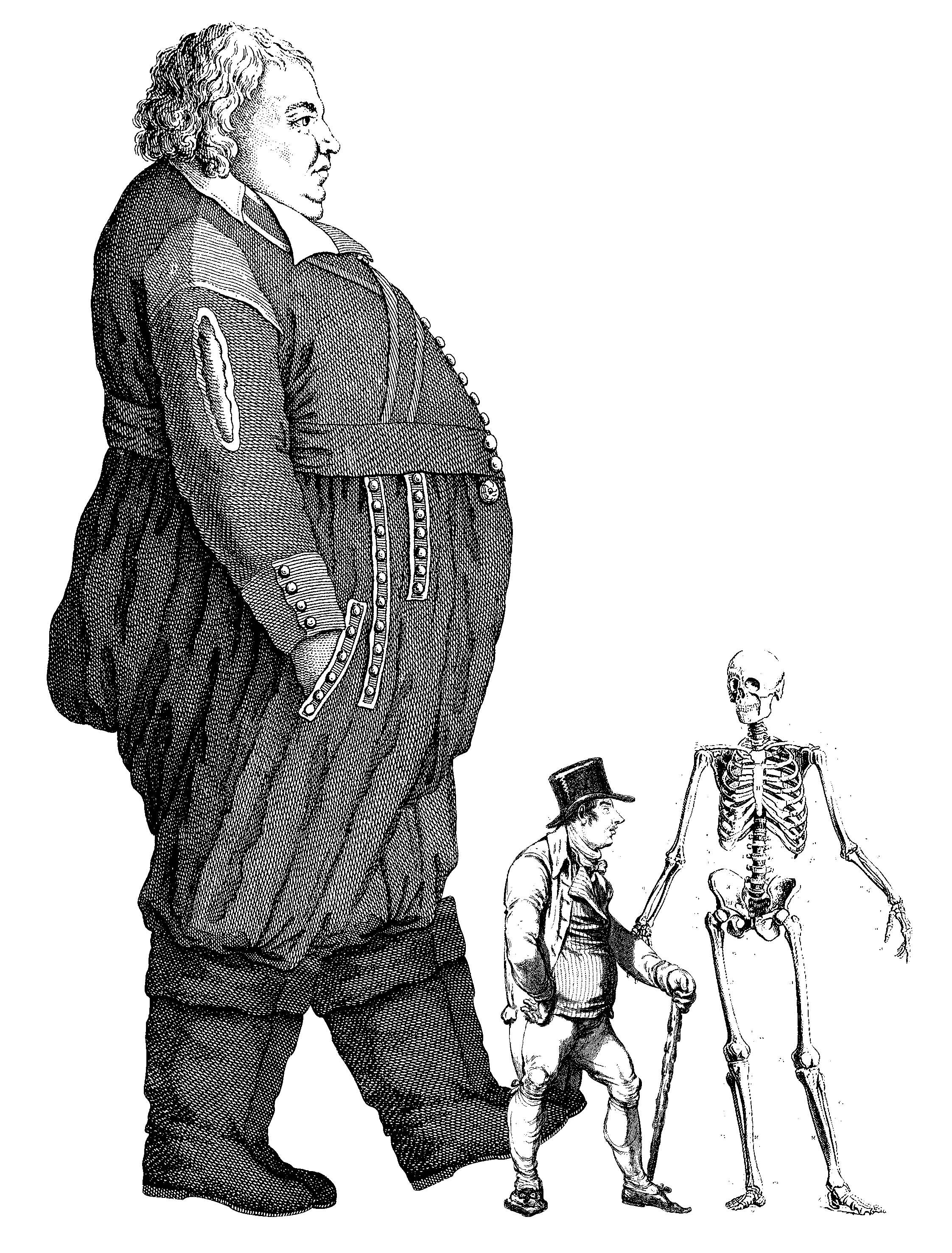
I changed the skull to a skeleton and switch the kneeling figure for a standing one. They are both looking at each other which shows more interaction. I had the leg of the bigger man about to kick the smaller man but it is not so obvious. He looks like he is peacefully walking pass in the back ground.
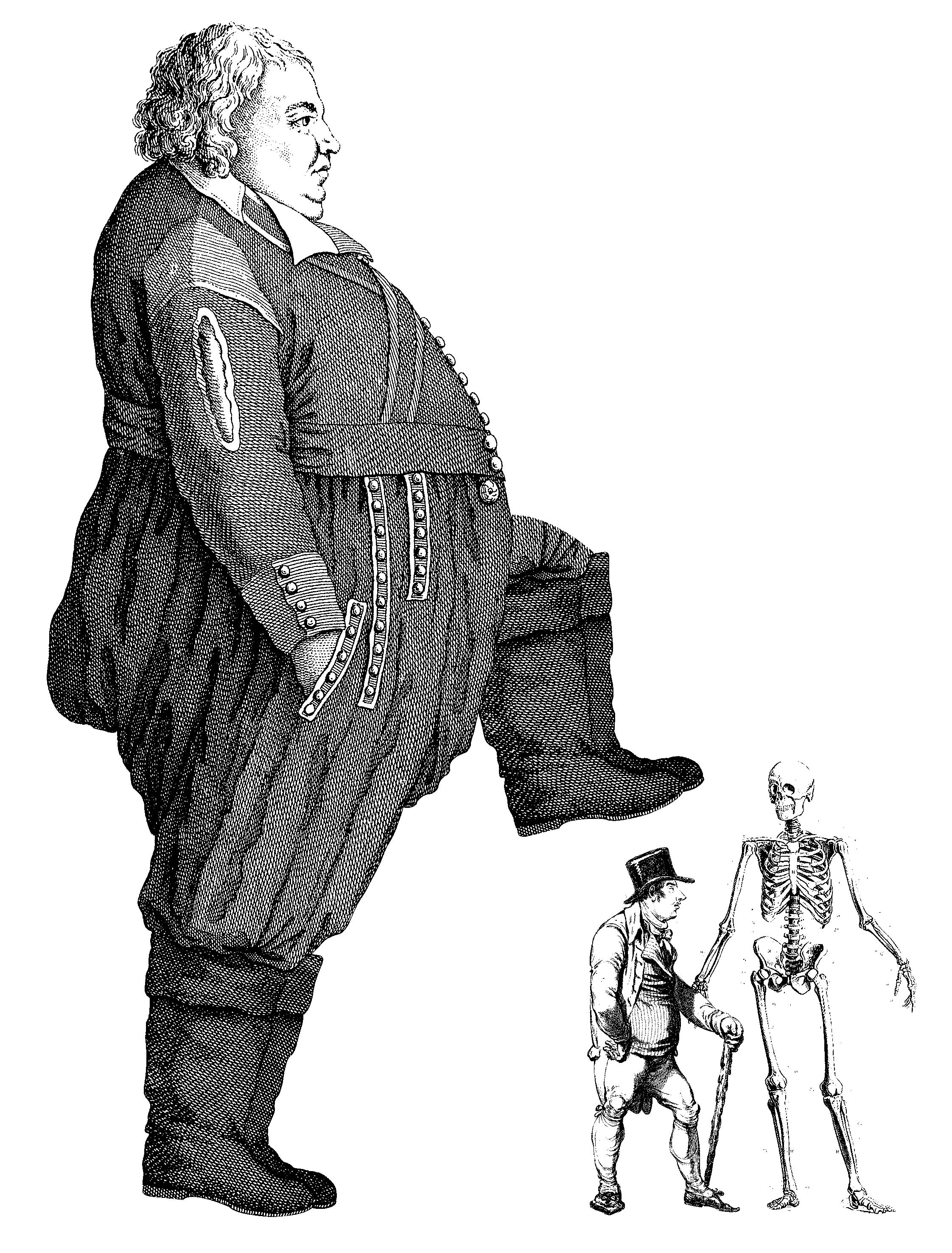
So I tried one that looks like he is about to trample on the small man.

Bringing up the idea of the human evolution from Idea 2; earlier homo-sapiens = less intelligent.
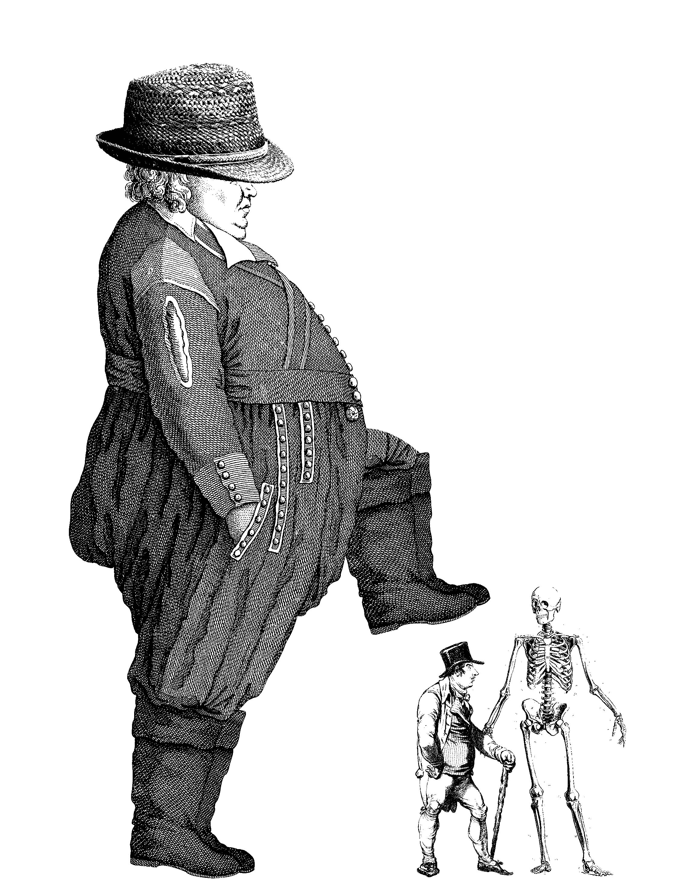
Big man is wearing a straw hat. A metaphor for someone without brains; stupid. This too was too cryptic. No one could understand.

I shrunk the size of his face in an attempt to stupefy him. I asked around and it was not approved.

I tried making the eyes bigger… nope.
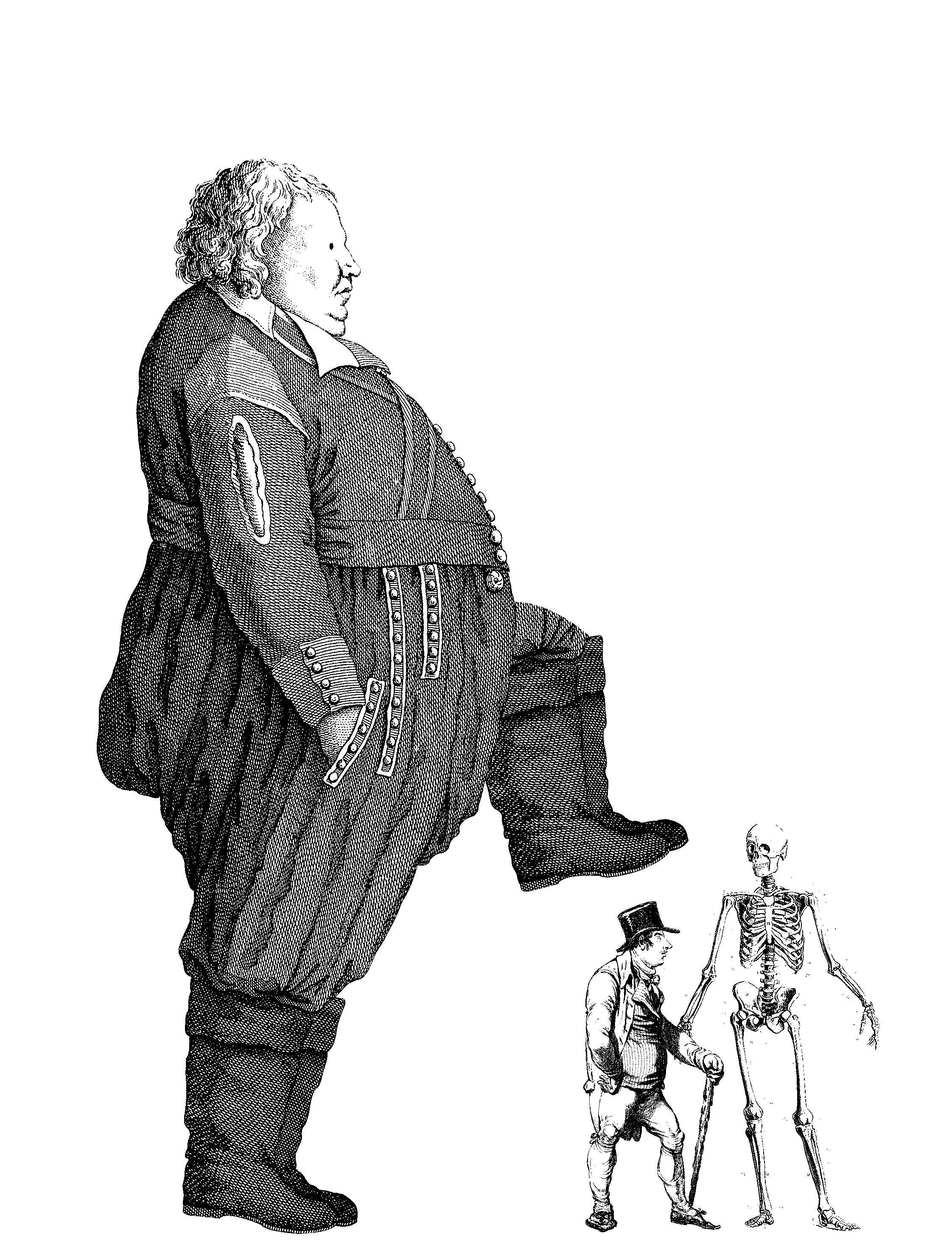
Finally I decided on making his eyes cartoon which shows that he has low IQ.
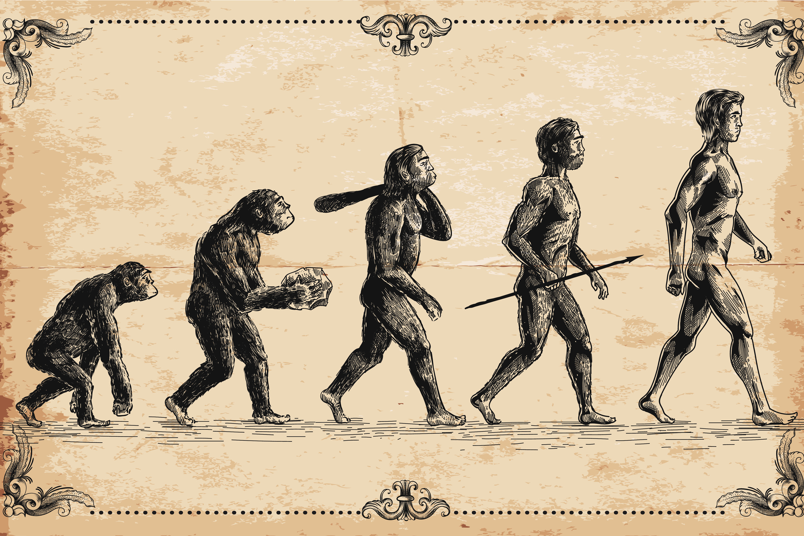

The second idea is to make a parody out of the human evolution because “survival of the biggest”. I continued using the principle of proportion to show that the more evolve they become the larger they get; both width and height. It is still incomplete as there is no sign of the “If you were bigger and more stupid”. Also the tote bag is vertical, a horizontal composition cannot work.

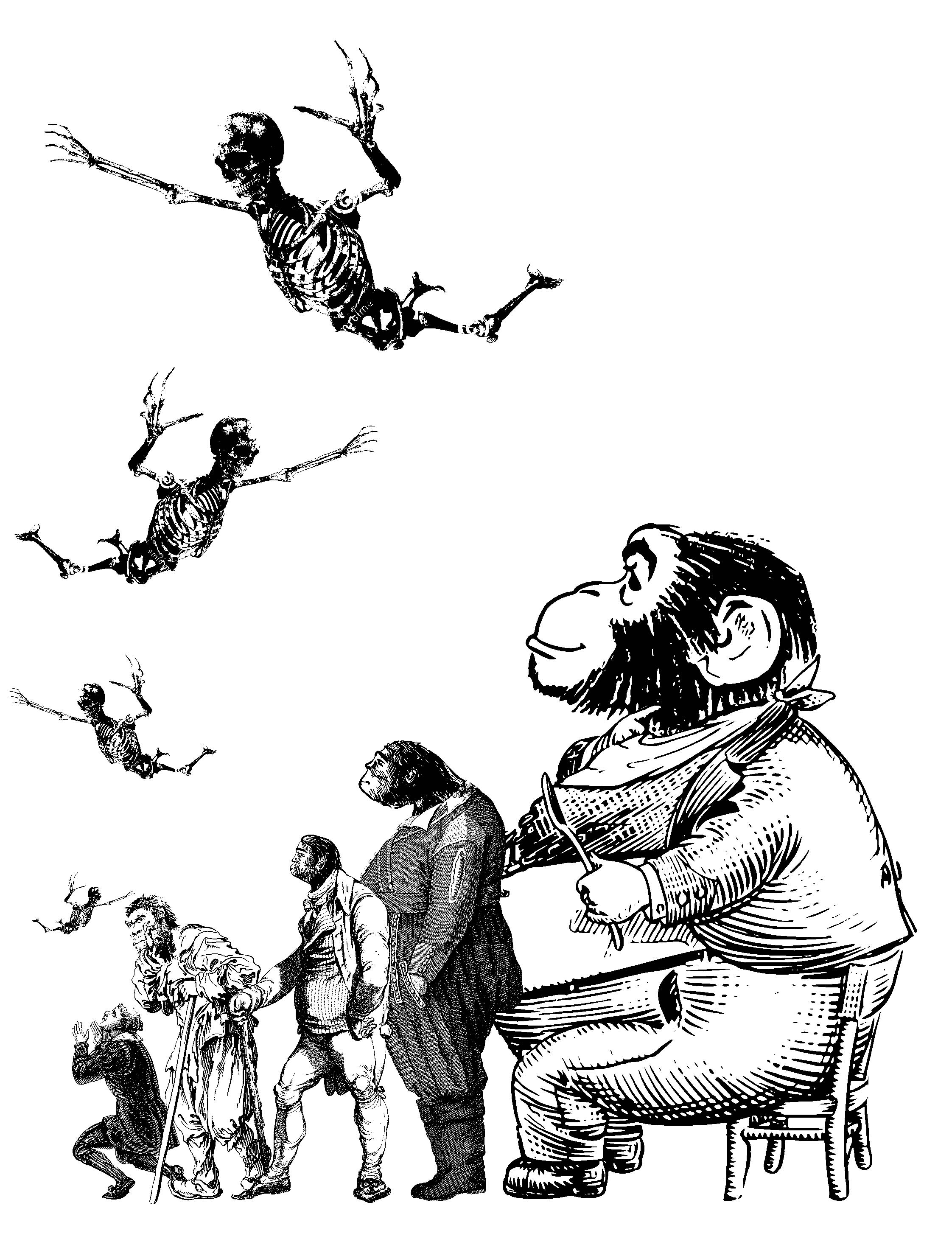
To apply the idea of bigger=dumber, I changed the heads of the bigger people to the heads of the earliest homonin. (since it is under the theme of human evolution. The supernatural part where Norman communicates with spirits must also be added to relate back to the movie.

So I added some skeletons sky driving down to the human which represents Norman. I like this design better than the first. But the skeletons might be have too little white spaces, everything might come out black when printed.
In the end…
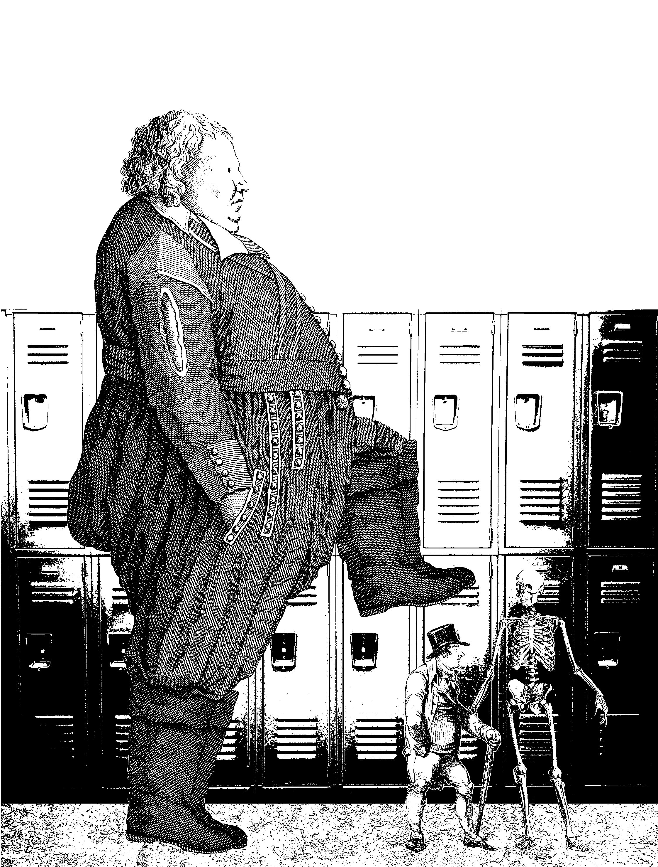
Idea 1 was more simple and easy to understand as compared to idea 2. To solidify the entire design, I added a setting to it just like the Beauty and the Beast design. The background brings in the scene from the movie where Norman was bullied in the school locker hallway.
Comments:


 The only problem here is that many could not understand the purpose of the skeleton and that is because they need to watch the movie to know. I guess the design can do without the skeleton but I need it to tie back to the context of the movie. Overall, this is design is extremely successful as this got the most comments, and positive ones too.
Prev: https://oss.adm.ntu.edu.sg/ytan149/forrest-gump-beauty-and-the-beast-2017/
Next: https://oss.adm.ntu.edu.sg/ytan149/forrest-gump-the-beautiful-mind/
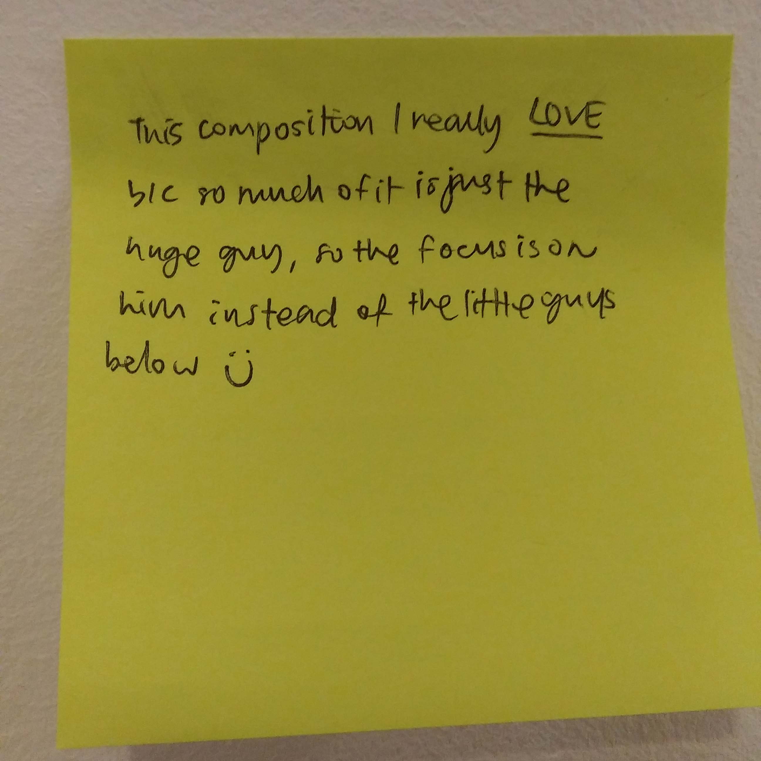
Thanks for the update on your design, Ying Hui. There’s a nice flow to the design. I was wondering if you could explore ways on which the big man isn’t cut off.