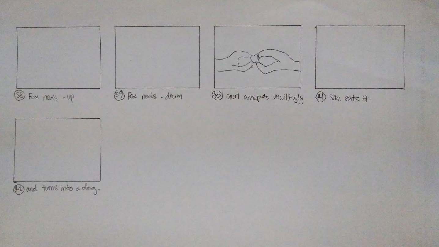
Photostory

She ate it.

Genre: Mystery, Horror

Process:

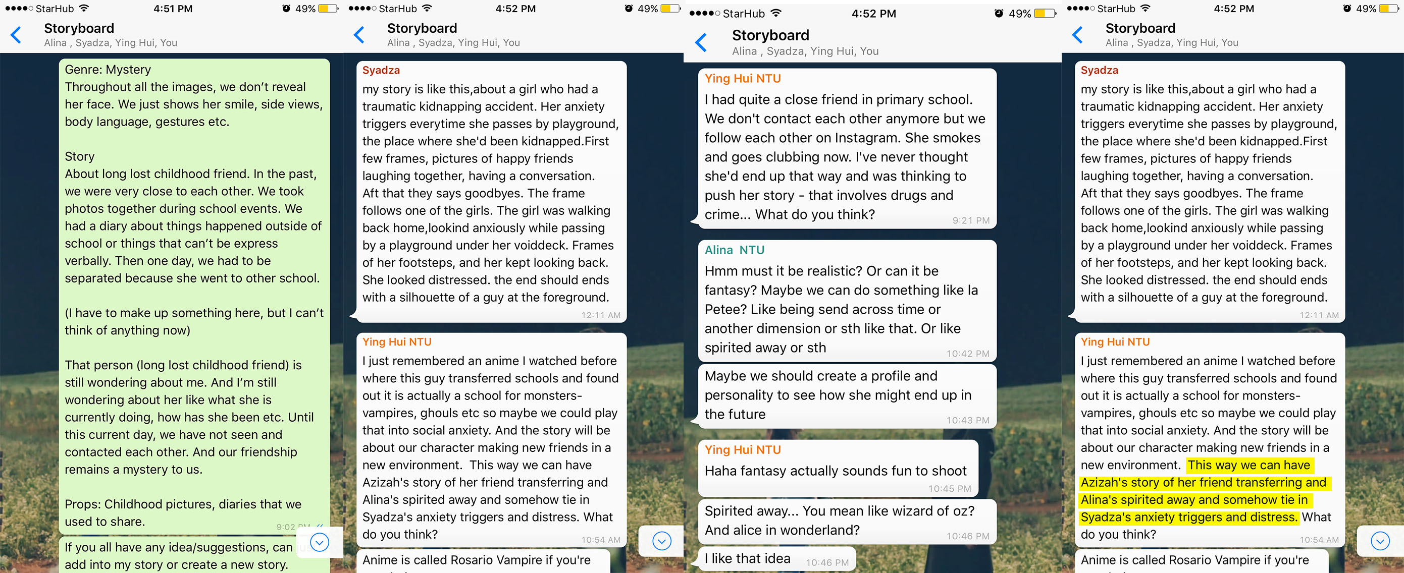
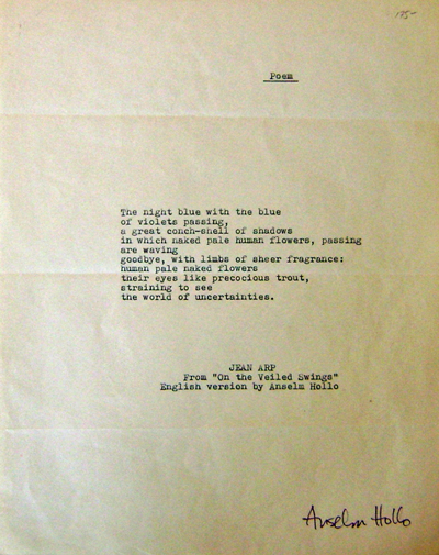
The story that we came up with, after combining all of our ideas, is of a shy introvert who who transferred into a new school. Little did she know it was quite a peculiar one.

In the story we were dealing with social anxiety – the fear of social situations that involve interaction with other people. Therefore there is a lot of literal running in my version.
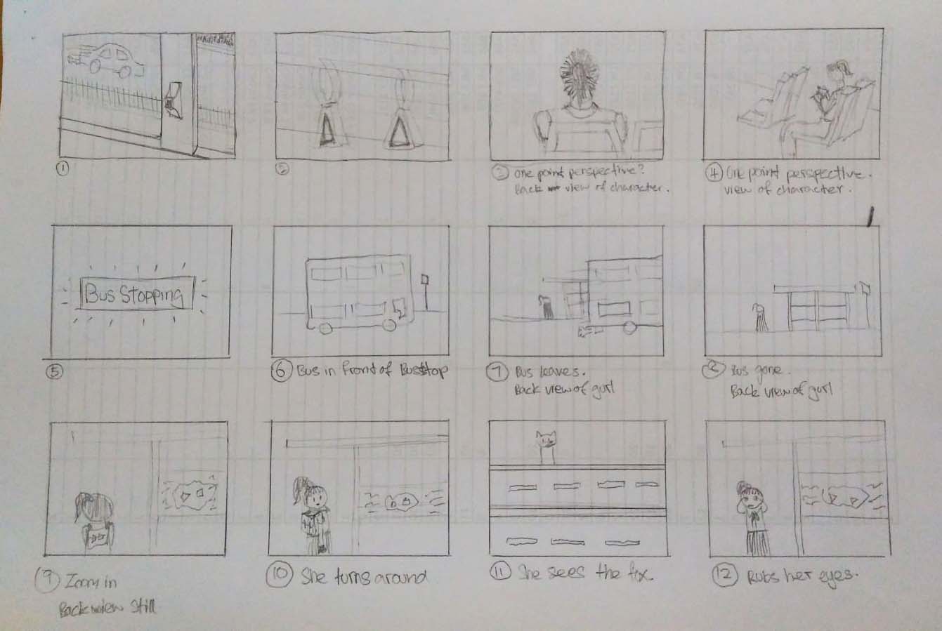
Storyboard part 1
Storyboard part 2
Storyboard part 3
Storyboard part 4


Scene I

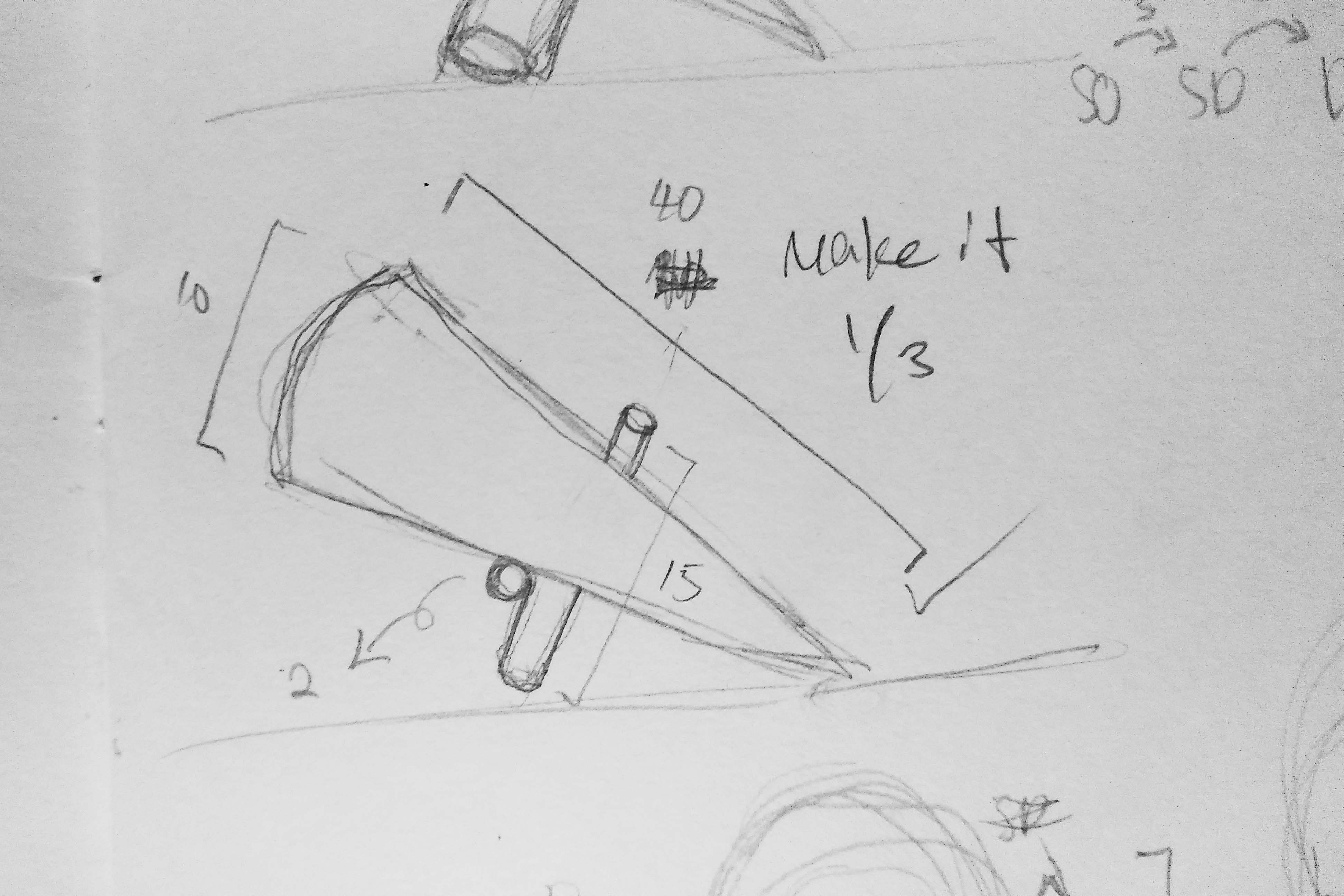
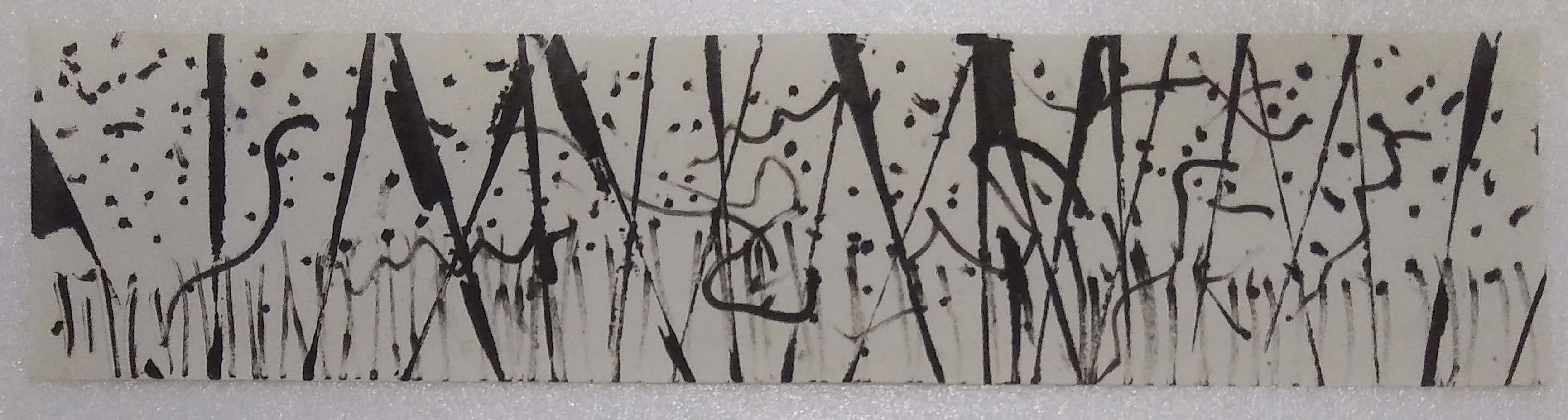
We planned the intro to introduce the topic of social anxiety as well as the 2 main characters – the girl and the fox. I suggested to make use of a cutaway shot that I saw from the stop motion movie Paranorman (as seen below).

Cutaway shot from Paranorman

Cutaway shots seems to be a very common in horror films. It can show that something is there and after it cuts away and cut back it is gone and that disappearing act makes people freak out. I thought this could be used in the intro to set the mood of fear and tension.

Scene I

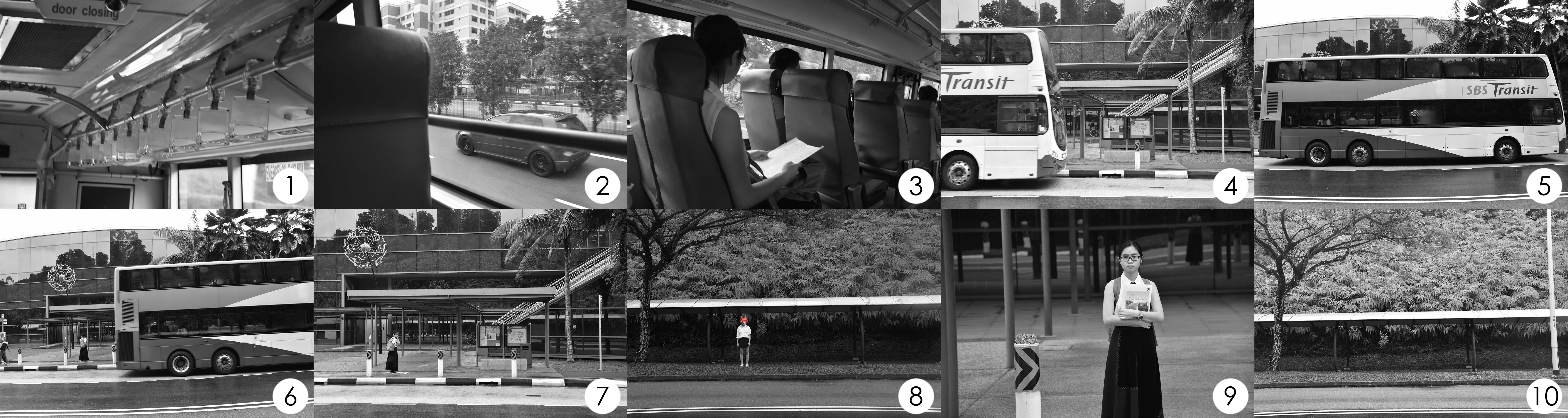
The intro starts off with the girl traveling to her new school by bus. When she alights the bus, she feels uneasy and hesitates to enter (social anxiety). Sensing something was watching her, she turns around to find nothing there.
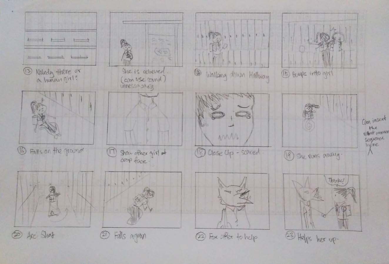
 

Scene II

Arc shot from Paranorman

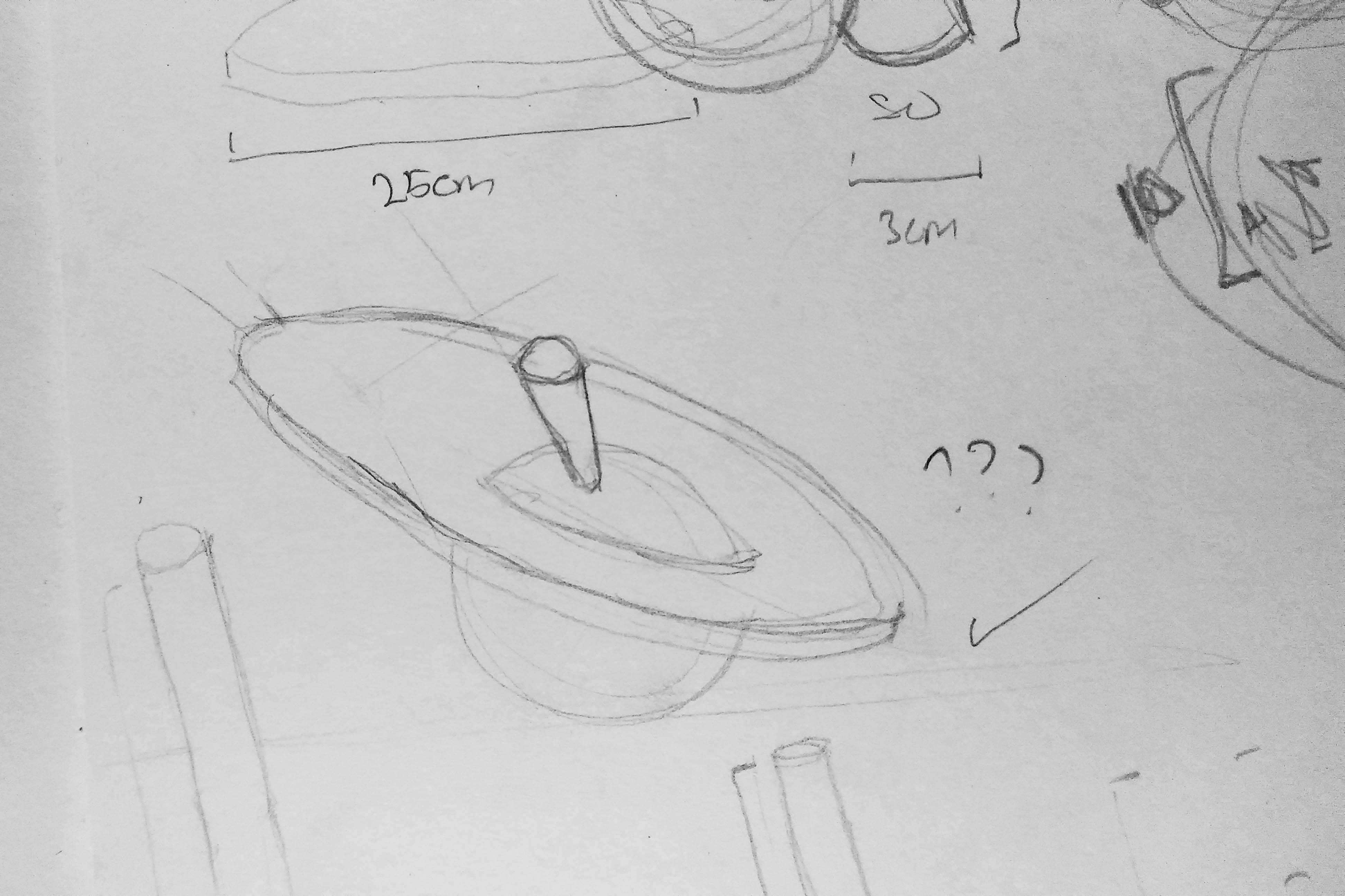
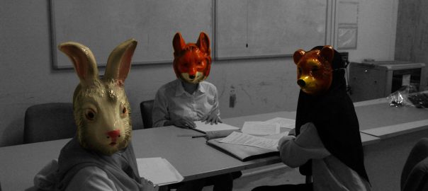
Paranorman also made use of the arc shot to reveal the ghosts that are invisible to everybody except for the main character. I thought that we could do the same and use it to reveal the ‘monster’ classmates.

Our arc shot

It was more suitable for the arc shot to be use in this way than to introduce our ‘monster’ classmates. This sequence of the rabbit staring in your direction while you walk pass it makes one queasy which is exactly that creepy/horror effect that we were looking for.

Sadly the arc shot does not fit my version of the story as I wanted a slow build up for an unsettling mood. I used the shot with the head cut off (scene II, shot 4) instead of the arc shot to raised questions as to what the girl had scene that she ran off scared. Then the fox is revealed and it answers the question to why the girl ran. They were ‘monsters’.

Scene II

The second scene takes place in the hallway of the school. It is where she avoids and runs from all social interactions.


Scene III

Scene III

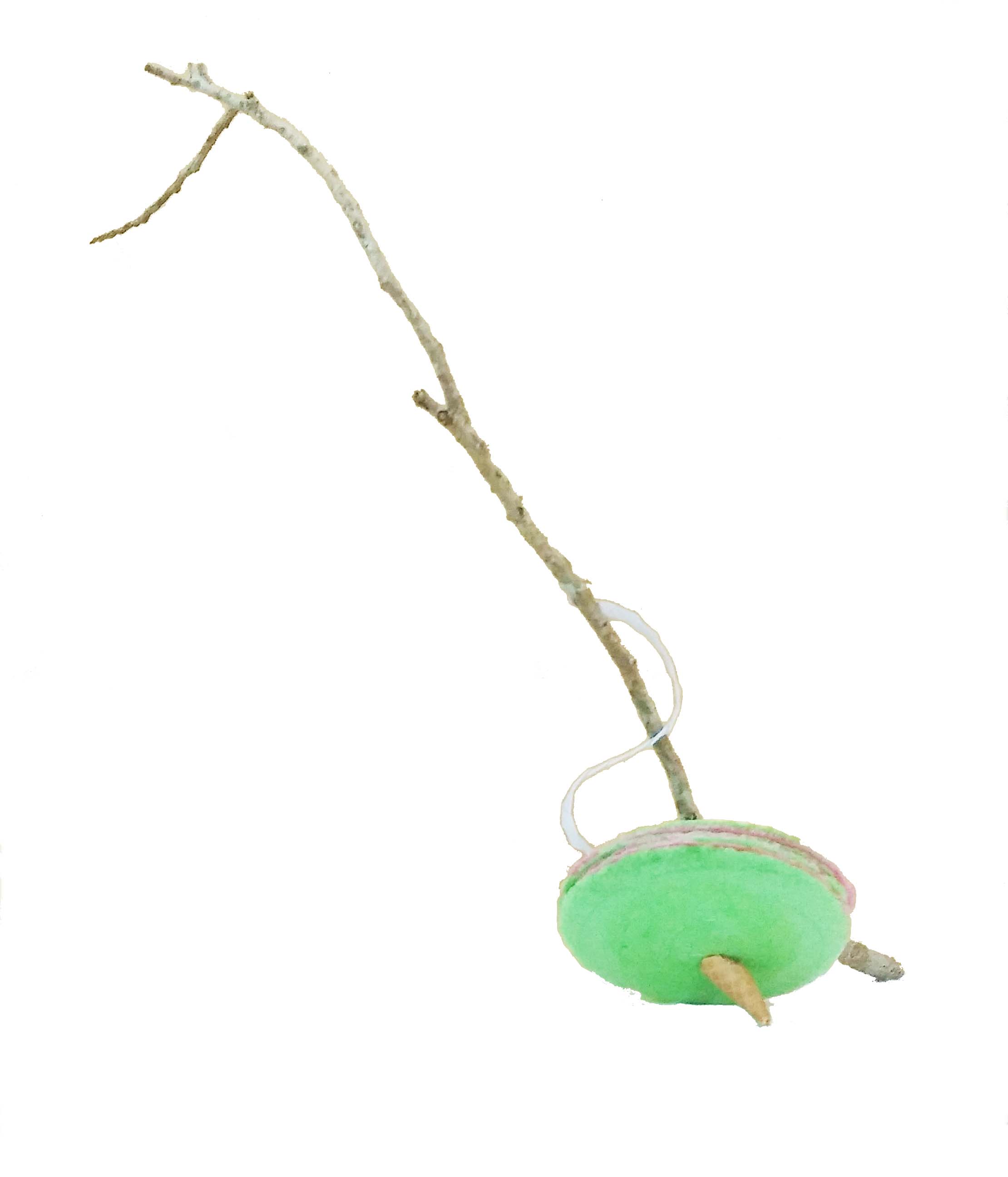
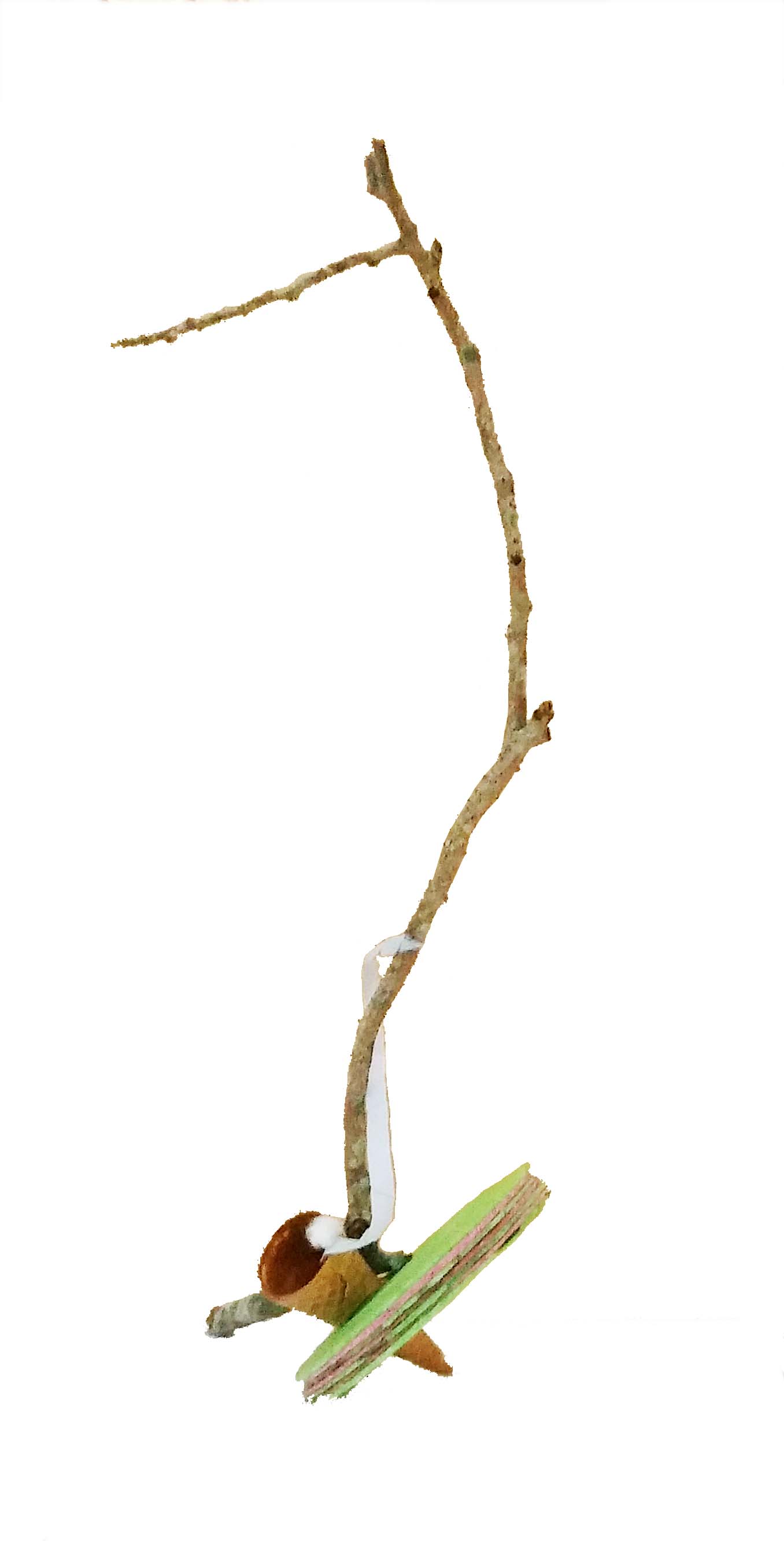
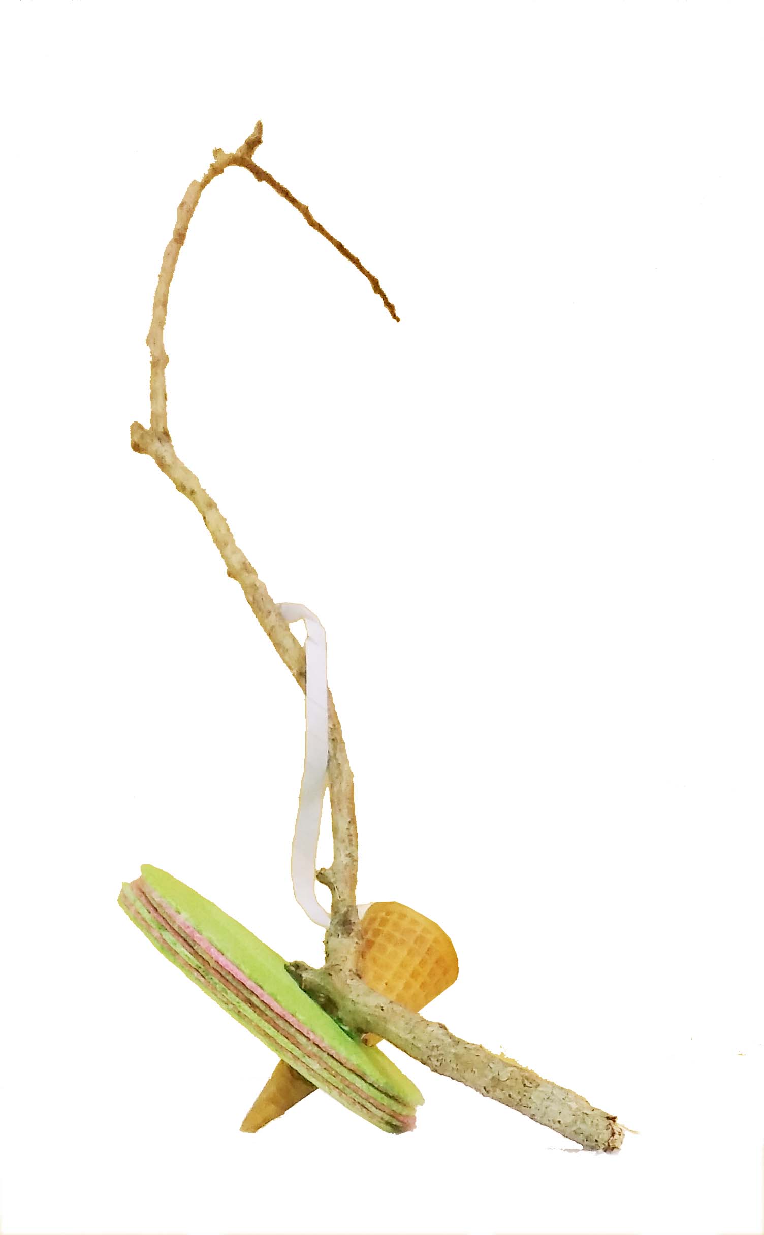
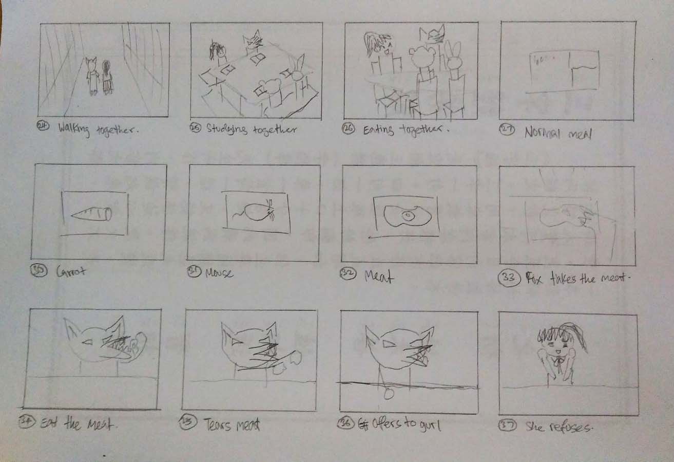
The last scene is in the classroom. Before she enters the room she takes a deep breath preparing herself to face her fears. The ‘monsters’ stare at her when she enters and takes her seat. When she got the courage to face them, she sees the horrifying sight of them feasting on unusual food. Then she gets peer pressured into eating their food. I wanted to keep the ending unknown, we do not know whether she turned into one of them or everything was just in her head. It is up to the viewer’s interpretation.

Masking

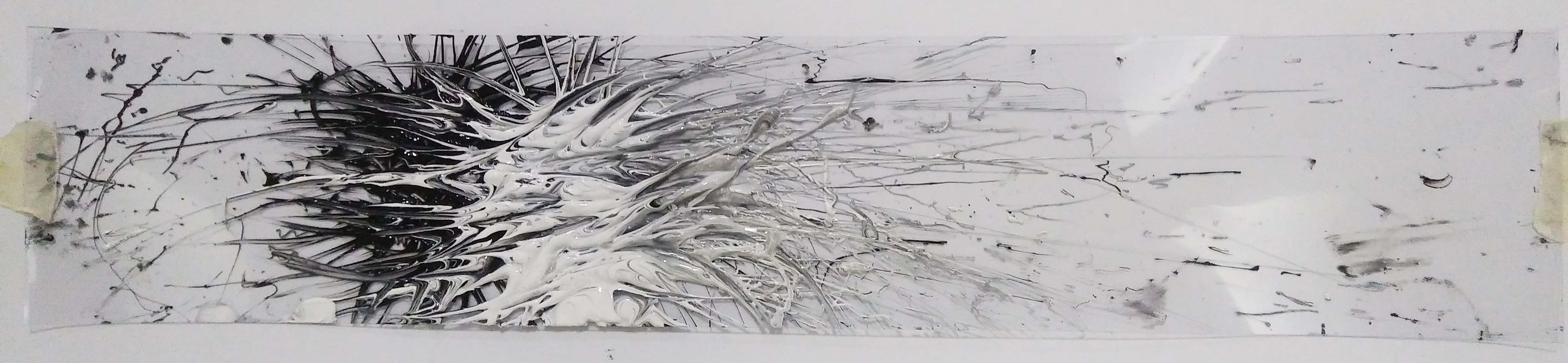
It is because of this scene that I made the entire film black and white; only leaving the masks and food coloured for the creepy effect. Masking the elements made the meat more grotesque and disgusting.

Originally I also wanted to include collage sequences just like the ones from La Jatee because the use of collage sequence can show the intimate and developed relationship between the two people. It would be helpful to show the progress of friendship and familiarity between characters. But i scrapped the idea in the end because I wanted it to be mysterious.


Sound edits inspirations

I was looking for sounds that create suspense and intensity and remembered this video that I came across a while ago. It mentions the use of ticking in many of Hans Zimmer (Film score composer) and also his use of the shepherd tone in the recent film Dunkirk to create intensity. After going through some ‘suspense music’, I decided that the ticking fits best.

The anthropomorphism also reminded me of Rabbits by David Lynch, one of the many films my Polytechnic lecturer introduced to me. It is set like a sit com with applause and laughter but it was edited into something less comical and more frightening. Inspired by this, I wanted to create something using that awkward silences and the sounds that are unexplained to build a unsettling atmosphere.

 Rejected:

The rejected is the one with the shepherd tone edit at the end.

Gaia’s Ikebana – Final

Top View
Front View
Back View


Shin is represented by the branch (dominant); reaching skywards.

Soe is represented by the blue paper strip (Sub-ordinate); man-made material. It brings the Shin and Tai together, literally men being between the heavens and the earth.

Tai is represented by the cone (sub-dominant); brown for the earth. Also the use of the ice cream cone relates to ice cream (because ice cream melt and I cannot use it for the ‘Ikebana’); is to refer to the cool weather during spring.

Also the park had an incredible playground that attracted a lot of children. So the use of ice cream and biscuits is for the juvenile impression.


Right View
Left View

The white cotton ball (sub-ordinate) has a soft appearance representing the Sakura flower buds during the Spring season. Because during my trip there the flowers were all barely opened and were mostly white and very few pink. 

The layered of pink and green piring wafer biscuit adds the colours of the park to the ‘Ikebana’. It also helps unify and bring harmony to the entire sculpture.

The overall arrangement was meant to emphasize on the line of the branch. Even if the elements are pointing in different directions, the blue strip helps direct your sight to the line of the branch by twirling around it.

Elements can be shifted more to the edge for viewing of all angles.


Gaia’s Ikebana – Research

Ikebana

ike, meaning ‘alive’ or ‘arrange’ and bana meaning ‘flower.’ (Fresh, FTD. 2017. )

A traditional arts from japan that is practiced for more than 600 years. It originated from the Buddhist ritual of offering flowers the spirits of the dead. By the middle of the fifteenth century, with the emergence of the first classical styles, ikebana achieved the status of an art form independent of its religious origins, though it continued to retain strong symbolic and philosophical overtones.” (“Ikebana International”. 2017)

As time passed, ikebana became a major part of traditional festivals, and ikebana exhibitions were held periodically. Rules were prescribed, and materials had to be combined in specific ways. In these early forms, a tall upright (indication of faith, to the heavens) central stem had to be accompanied by two shorter stems; the three stems represented heaven (shin), man (soe), and earth (tai). (“Ikebana International”. 2017)

Strives to create a harmony of linear construction, rhythm, and color. (“Flower Arranging | Godai Katsunaga”. 2017)

Minimalism, shape and line, form, humanity, aesthetics, and balance. (Fresh, FTD. 2017. )


Principles of Rikka arrangements

Example of Rikka arrangement

Rikka symbolized the mythical Mt.Meru of Buddhism and reflects the magnificence of nature in its display. (“Flower Arranging | Godai Katsunaga”. 2017)

  • mountain peak (ryō)
  • waterfall ()
  • hill (qaku)
  • valley behind the mountain (bi)
  • town (shi)
  • in (“shade”)
  •  (“sun”)

Moribana Style

I find that the dominant, sub-dominant and sub-ordinate is very obvious in this style.

Taken from Fresh, FTD. 2017.
Example of Moribana Upright Style
Example of Moribana Slanting Style Taken from https://imffa.org/wp-content/uploads/2016/08/ikebana.jpg

D – Branch

SD – flower stems and baby breath

SO – White Flowers

I like the Ikebana’s composition like the above ; with a branch hanging precariously to the side. It seems to defy gravity – standing with no support at all.The different direction in which they are pointing that creates a much more interesting arrangement. Also the curvy branch is in contrast to the stiffer and rigid flower stems to the left.


 Spring

March – May | 5 – 20 degrees Celsius | Cherry blossom blooming

The mood board is made of images that I took from my Japan trip in Spring of 2016. (How lucky I was to picked the Spring season.)  The tones during spring are very cool. The earthy pastel shades reflecting the soft and mild weather.

Sketch of final sculpture
  • Branch is brown obviously… (shin)
  • Flat cylinder to be blue (soe); a reflection of the sky (water body, although the pond wasn’t blue at all…) and to match the colour scheme. Planning to make it out of man made material e.g. my leftover metal netting from Project Pandora or some leftover paper from FYP two years ago. Probably the blue paper because of the scene (Park) I am trying to set. Paper is man made but still natural – also related to trees.
  • Green cone to represent the grass and bushes. (tai) Thinking of using a fruit or something related to the earth. But if I use a fruit (green apple) it will probably become a sphere? Then the sculpture will become more like the sketch on the right.
  • Pink for the SOs as the flowers. I am thinking of using mint for the cool temperature and weather. But are there any pink mints???
  • (I did the upright style in the end; the slanting style is quite difficult and I wanted to have the shin soe tai represented distinctly)

References

“Flower Arranging | Godai Katsunaga”. 2017. Godaikatsunaga.Com. http://www.godaikatsunaga.com/?page_id=195.

Fresh, FTD. 2017. “The Art Of Ikebana Flower Arranging”. FTD.Com. https://www.ftd.com/blog/design/ikebana.

“Ikebana International”. 2017. Ikebanahq.Org. http://www.ikebanahq.org/history.php.

Dominant, Sub-dominant & Sub-ordinate Part 2

Composition 1

Top
Front and right
Left and back


I planned out the dimensions to avoid making similar volumes. The circumference of the sphere is around 1/3 of the base of the cone. The height of the cone is 1/3 < x< 1/2 to the diameter of the cylinder.

Sketch Analysis


Composition 2

Front
Top, Left and right respectively


The diameter of the cylinder is 1/3 < x< 1/2 to the sphere. The diameter of the sphere is 1/3 < x< 1/2 to the cone and the heights are all also 1/3 < x< 1/2.

Although the proportions were approved, I can’t help feeling that the cylinder and cone are fighting for dominance. Perhaps I should lengthen the cylinder more.

Sketch analysis

Other sketches:

My Line is Emo: Final

My story for this project is my admission into NTU ADM.

Surprise

It started when I got the acceptance letter from NTU through email. I was expecting a rejection letter like most of my applications and could not believe what I was reading. “Congratulations” it wrote. I was in disbelief. Not sure whether it was real or I was just seeing things; I had to get confirmation from a friend that it was real. She said it was and there was this burst of emotion after she too congratulated me.

Tenseness

There was still a few weeks before the official opening of school. I got really stress and tense over the thought of going back to school. Firstly because I graduated from a design school, I knew vaguely what lies ahead – the late sleepless nights and the spending on overpriced materials. Secondly it was because it is University School of Art, Media and design, everyone here is definitely elite to be admitted into the school. Why out of all those people did they chose me? I am not talented at all. To stand on the same level as everyone there really pressurized me.

Translating this feeling onto the strip, it was like many needles poking at certain points to keep me in place and match myself to others.

Jolly

I participated in the orientation camp with much doubt. I did not think it was going to help me with making friends. It would be awkward was what I thought. However, turns out, it exceeded my expectations. ADM orientation camp was the most amazing camp I ever been in my entire life. The results that the seniors produced was outstanding. It blew my mind.

I used bubbles because it reminds people of the times they had fun. Bubbles are always fun. I have never met anyone that hate bubbles. Also it is such an adorable word that is impossible to say it in an angry tone. I also tried to create a rhythm to the arrangement of bubbles to look as if they are dancing – like what we did at the end of the orientation camp.

Bitterness

Sadly, I was late for my first presentation of my university life. I worked really hard to make sure I did everything on time and ended up being too sleep deprived I overslept. I felt bitter about the situation. It was unfair – the same feeling of being discipline as an innocent child. So to directly translate that feeling I dipped a cane in ink and whacked the crap out of crepe paper.

Regret

“I should’ve not slept.” “I should’ve slept more.” “I should’ve slept beside the alarm.” I thought of many things that I could have done that would have saved my 20% presentation grades. But time cannot rewind and no matter how much I want to fix my situation, it cannot become what it was before. Thus, the strip is patched all over with a torn print.

Care

I went home and cried to my family about what had happened. The black parts represent my troubled soul. If you look closer you can see the hairy texture as if it is reaching out for help. And the white paint smooths the texture down; representing the comfort and care my family provided me. 

My Line is Emo: Development

Love

Concept: I want to show the feeling of being loved by another. The love you feel in a hug; being embraced when you feel down. There is this ‘warmth’ that feels up inside you as if transferring from the hugger to the hugged. The phrase ‘Love brings light into your life’.

Idea: I am thinking of using the contrast in texture to represent the troubled soul and the ‘love flame’. Textured or crushed paper to represent the troubled soul. Smoothness of paint to represent the ‘love’ flame. In this case, I could try to make my own paper as suggested during consultation! The problem is that with the gloomy weather going on, I am not sure it is going to dry in time for submission… (i could also pressed the paper onto some coins or something to create creases?)

Results: 

Crepe and tissue

I pressed twisted black crepe paper into the damp paper before it dried. But the colour ran and turned blue.

Eggshells

I tried dyeing the eggshells black with Chinese ink but because it was water base the ink was washed away; barely even stained it.

Peanut Shells (black)
Peanut Shells (white)

I chose the peanut shells because out of the three, the peanut shells came out the most bumpy and rough. Also the texture is reflected on the back. So even though the peanut shells are not black/white, I can use the back of the paper.

Testing 1

At first I wanted to use a single colour ( white on white)  and focus on the texture difference. Since I only have one white handmade paper, I did a black only test.

Testing 2

Then I tried colour mixing.

Testing 3

Then i realised that when I rolled the acrylic paint over the paper I could lift the pulp – texturizing it even more.

Surprise

Concept: I rarely get surprised but when I do, I feel it in an instant and then its gone. It is an explosive feeling and you scream. After the moment of shock everything is back to normal. One BAM! and then nothing.

Idea: In translation it would be 1 big splatter on a smooth surface. Is this where I can use transparency??? I could use different objects to create the splatter. Water balloon? Plastic bag?

Results:

Black Splatter on white paper

Single colour spat looks quite boring.

Black and white splatter on white paper

Mixed of black and white because I felt perhaps surprise is not always ‘bad’ (black). It is more like a mixture of both positive and negative feelings.

Black and white splatter on transparency

To emphasize the “One BAM! and then nothing.” feeling. I decided to use transparency.

Joy

Concept: If surprise is one big explosion, Joy/ecstatic would be many tiny explosions. Or explosions of various degrees. Feeling ecstatic is when you feel so much joy and excitement you want to do a little victory dance.

Idea: This emotion is not violent – gentle explosions. I could make tiny burst of paint with the use of bubbles. It explains the emotion but is not special or anything because I have seen others done it already.

I could directly translate the victory dance though. That sounds interesting. With something that looks like feet??? Toy feet. Fingers. Toes. An object related to victory? A trophy or medal. Something I am ecstatic about? My figurine! But I rather not ink it though… Or you know I could do both! 🙂

Results:

In the end I did not try to create a ‘Victory Dance’ piece but I did try to incorporate rhythm to the arrangement of bubbles to make it look as if  its ‘dancing’.

Iteration 1
Iteration 2
Iteration 3

Regret

Concept: When I feel regret I desperately want to travel back in time and fix my mistake. But since time travel is impossible, I try to fix it the best I can but it does not work and it’ll never be the same. It is like taping torn paper together. The paper is still torn; the tear cannot be mended back to the way it was before.

Idea: Naturally the idea is to tear up a print and put it back together. Creating empty spaces on purpose to patch up later. So the question is -what kind of print? I could use fabric, it also cannot be mended even after you sew it back together. (too simple to just sew fabric back together? not interesting.) Maybe something structured, something regular. After it is destroyed and patched up it becomes irregular… Perhaps a grid will work? It would make it looks distinctly wrong than just a random paint smear. Possibly combine the two?

Results:

I thought maybe patching up a grid would make the message more apparent – mending a ‘perfect’ structure.

Grid patching with solid lines
Grid patching with lines of varying gradient

However, I did not feel the regret in the results. It looked more like confusion. The previous strip I did had much more impact than these two.

Fear

Concept: Fear when watching a horror movie. The moment the music indicate a jump-scare is coming up I get scared, my heart beat increases and I cover my eyes.  At the same time I want to know what the ghost or demon looks like. So in the end I cover my eyes and watch the movie at the same time; peeking through the holes between my fingers.

The other kind of fear that I want to portray is phobia, such as trypophobia – a proposed phobia (intense, irrational fear, or anxiety) of irregular patterns or clusters of small holes or bumps. When I see a trypophobia triggering image or object, shivers run down my spine, I get goosebumps and my hair stands.

(I am going to try both and see which is looks more interesting)

Idea:  irregular horizontal lines? But horizontal lines means peaceful, even. Jaggered horizontal lines? Fan out lines to represent peeking out through fingers? For the second interpretation I could include the basic shapes – cluster of circles, trembling lines and vertical lines.

Results:

I was trying to depict my fear of worms. Using strings dipped in ink to create the curve squiggles and satay stick to make the ‘handprints’. Iteration 1 looks quite interesting but it does not go along with my story.

Iteration 1
Iteration 2
Iteration 3
Iteration 4
Iteration 5

Anger

Concept: Natural reaction of anger is to lash out. The image of parents disciplining their child is what comes to mind. It is a form of ‘love’ but many would agree it is mostly out of anger and disappointment than love. It is a destructive and controlling emotion. When you are angry you are not in the right set of mind. You urge to shout, scream, punch etc to vent your rage.

Idea: My first thought to translate this feeling is to just directly do the same on paper. To cane the paper. Use hanger or belt? Feather duster. Ruler. Then the medium would have a hazy background representing the absence of common sense. The point would also result in a textured surface? Instead of using paper I could use tender fabric? Is there even such a thing? Tissue paper perhaps? Butter paper? No butter paper is not white/black. Tracing paper. I could use some crepe paper; they are easily torn.

Result:

Caning on crepe paper on the floor
Caning on crepe paper suspended
Caning on tracing paper suspended


Next Post: https://oss.adm.ntu.edu.sg/ytan149/?p=488&preview=true

My Line is Emo: Some Idealization and more Experimentation

At this stage I was still pretty confused with what I wanted to do. So I made multiple patterns with different objects that I found around my home. Thus almost all of them look like ‘fabric prints’, with no actual narrative and composition. 

Tenseness

During consultation everyone agreed that this depicts the feeling of Tenseness. To portray the emotion, I used satay sticks dipped in Chinese ink then carefully press it onto the paper at different angles. It looks like war zone with spears sticking out of the ground everywhere or a laser security system. We interpret the diagonal lines as twisted or warp state of mind; something is not right kind of feeling.

Surprise
Surprise (Rejected)

I see surprises as an explosive emotion. The shock you feel happens in an instant; then it fades away. The second piece was rejected as it does not fit the description as well as the first.

Regret

When I feel regret, I desperately want to turn back time and amend my mistakes. But since there is no such thing as time travelling, the only thing that I could do is patch things up the best I can. However no matter how well you try to fix it, it’ll never be the same again.

I tore a piece of print I made smearing Acrylic paint with a plastic bag. Then paste it onto the strip while purposely leaving empty spaces to be patch up with bigger pieces.

Love

I made this piece with the intention of positive emotions. Using a satay stick, I spread the paint in a wavy motion diagonally. Mixing the black and white, sometime more black and sometimes more white to show the happiness and disappointments in love.

Attraction (Not really)

I tried connecting two blotch of paint from different ends to depict attraction. Maybe it is too direct? Too simple? There is no narrative behind it thus it is somewhat boring.

Disgust (Rejected), Love (Suggested)

I thought these pieces described Disgust because of the veins and holes in the paint. But others do not agree because of the fluidity of the veins, how gentle it looks and the gradient from the mixed paint.

Disgust (Rejected), Joy (Suggested)
Joy (Not sure)

At first I thought this could show disgust because of the multiple ‘holes’; trypophobia triggering. But I guess the concept is not strong enough because normally we associate bubbles with joy and happy children trying to pop them. I also think the bubbles create a dreamy effect which could also show Tranquility.

Irritated (Rejected)
Annoyance (Rejected)

These are what I imagine my mind to look like when I feel irritated or annoyed. Being irritated is like hearing this continuous buzzing that would not stop and would keep building up in your head until you burst out in anger. Being annoy is also the same concept but much stronger than being irritated. Both were rejected because of the lack of dynamics, narrative and composition.

Next course of action: 

The next step I am going to take is to think about the narrative and composition of the emotions. What is the story behind my strip? How does it describe the emotion? What part of anger do I want to represent in my strip?

Also the use of materials/ medium in my concept. Maybe explore the different kinds of paper? Handmade paper was suggested in the consultation to achieve a very textured paper. For anger perhaps I could just texturize the paper by beating the crap out of it?

Other rejects:

Next Post: https://oss.adm.ntu.edu.sg/ytan149/my-line-is-emo-development/

My Line is Emo: Research and Experimentation

“The notion of origins, the promotion of inexpert forms of expression, as well as the “discovery” of the uncharted subconscious realm as unveiled by Sigmund Freud, unleashed a creative frenzy in the era of surrealism and resulted in the invention (or reinvention) of many drawings and drawing-based techniques: Automatic drawing, …” (Jones, 10)

English translation by Hollo from “On The Veiled Swings” by Jean Arp

The book ‘talks’ about chance drawings and collages with the example of Jeans (born Hans) Arp, a German-French poet, artist etc. He had a peculiar way of writing his poems where he would “close his eyes and randomly underline words and sentences in newspaper articles and advertisements that would become the foundations for his poems.” (Jones, 19)

Jeans (born Hans) Arp, Germany, 1886-1966, active France and Switzerland, Automatic Drawing, 1917-18, Ink and Graphite, 16 3/4 x 21 1/4 in. (42.6 x 54 cm), The Museum of Modern Art, New York, given anonymously

“For Arp, chance manifested the order (or disorder) of nature to which he aimed to connect, rather than his unconscious. His so-called automatic drawing beginning in 1917, for example, are derived from his wanderings in nature, not from the wanderings of his mind. Drawn after his habitual nature walks, the works capture Arp’s recollection of trees, branches, and other plant life.” (Jones, 19)

“Essential to the process was speed. “When one goes very quickly, the drawing is mediumistic. as if dictated by the unconscious.”” (Jones, 25) So the faster you draw, the less you think. Therefore the drawing is more from one’s sub-conscious.

The Birth of the World, Joan Miró, Spanish,1925. Oil on canvas, 8′ 2 3/4″ x 6′ 6 3/4″ (250.8 x 200 cm), https://www.moma.org/learn/moma_learning/joan-miro-the-birth-of-the-world

In the same page it also mentions Joan Miro. The “loosely drawn and schematic nature functions like multivalent pictograms or signs; that is a single form may connote several different meanings.” (Jones, 27)

After gaining some knowledge of automatic techniques, I became very eager to try them all out.

Strings: 

This is the first mono-printing I did. I just played around and see what effects it would create.


I tried putting crochet flowers in to see if the ink would penetrate the tiny openings. They did not; perhaps because the strings were knotted too tightly.

Here I tried with strings of different thickness.

… and strings of a single width…

Net: 

I thought mono-printing a net would result in a print of a net because the ink would have passed through the holes of the net. But that did not happened; with and without the printing-press.

 I was able to achieve the print of the net only by inking it and pressing it under the printing-press.

Brush:


Bubbles:

Bubbles bring about a dreamy effect. They are related to positive emotions; I could use them for Joy, Love or Surprise.

Fork:

I did not expect the stamping of a fork would look this terrifying and intense.

Seashells:

These are prints made from the stamping of seashells that I picked from a beach in New Zealand long ago.

Automatic Techniques:

Decalcomania

I made an attempt with pressing paint between papers that mixes the paint and creating interesting vein-like texture.

Fumage

I was very interested in the Fumage technique and wanted to try it for myself.

Miscellaneous:

Here I tried to make the impasto textured effect with acrylic paint and a fork. The attempt to keep the swirls of black and white was a failure; and it was not as textured as I liked it to be.

Next Post: https://oss.adm.ntu.edu.sg/ytan149/my-line-is-emo-some-idealization-and-more-experimentation/

Reference:

Jones, Leslie, 2012, Drawing Surrealism, Los Angeles, CA : Los Angeles County Museum of Art ; Munich : Prestel, [2012]

My Line is Emo: Ed Moses

I was going through all the artist reference listed in the project brief and Ed Moses’s drawings really stood out to me. The images that turned up when I googled “ed moses drawings” really drew me in and my mind sparked ideas for the project.

However I found that it was quite a challenge to search information online. Everything was so private since the museums did not give anything away. So I went to the ADM Library to borrow the Ed Moses book which was much easier since it had all that I was looking for. The book allows a more intimate connection between the reader and Ed Moses because of the interviews recorded in it.

From what I have gathered, Ed Moses does a lot of experimentation on materials and techniques in his work. He is constantly taking risks, trying out new materials and testing new forms; moving away from his comfort zone.

“Untitled (Hegeman Series)” , 1970| acrylic, resin & masking tape on canvas| 77″ x 95″| Collection of Cedd and Pamela Moses

https://vimeo.com/176224264

Ed Moses used resin for his Hegemann Series and I thought it was really interesting. In the book he stated that by putting the canvas face down on a big Mylar table, he could pour resin on the backside and it would bleed through the canvas out to the edge. He would then put fiberglass cloth around the edge to give it some structure. When it dried, he would peel the whole thing off and the result will be a surprise. The resin embedded in the canvas, as were the snap lines- they turned out shiny in some places and flat in others.

Why do you paint on both sides of the canvas?

That was what Frances Colpitt, a professor and Deedie Potter Rose chair of art history from Texas Christian University, asked Ed Moses. He mentioned of his discovery of ‘ghost’ painting when he reversed the canvas and the ghost images came through, which he liked a lot. So he wanted to put some kind of mark to it that indicated he made it, rather than being ‘found’. His idea of these ‘ghost’ paintings really intrigues me. It is like recycling an artwork when you don’t like it. Or creating a 2 in one.

Below are some of the works that I picked out from the book.

Rafe Bone, 1958| Oil on Canvas|72 7/8″ x 65 1/2″| Collection of Hanna Finkelstein, Los Angeles, CA
Rose #6, 1963| Graphite and acrylic on Strathmore board| 60″ x 40″| Collection of the artist
Cut Place #4, 1966|Graphite and paper foldout|13″ x 16 3/8″| Collection of Avilda Moses, Ojai, CA
Pulled Warp, 1972| Acrylic and masking tape on canvas| 66″ x 78″| Collection of Murray and Ruth Gribin Family Trust, Beverly Hills, CA
Broken Wedge A/1, 1973| Rhoplex and pigment on laminated tissue|84″ x 72″|Collection of the artist
NY Trac, 1974| Acrylic and tissue on nylon| 72″ x 84″| Collection of the artist
Red W-L, 1982| Acrylic on wood panels| 84″ x 122″| Collection of the artist
Bak, 1988-89| Acrylic and oil on canvas|96″ x 60″| Collection of the artist
Cocoteni, 1989| Acrylic and oil on canvas| 78″ x 132″| Collection of Fabian Carisson, New York, NY
Ranken #2, 1992| Acrylic and asphaltum on canvas| 60″ x 48″| The Molly and Walter Bariess Family Collection
Bozook, 2002| Acrylic on canvas| 96″ x 120″| Collection of the artist
So-Wh, 2004| Acrylic on canvas| 72″ x 60″|Collection of the artist
Cta-Hola, 2006|Acrylic on canvas|78″ x 66″| Collection of Jayne D. Murrell, Newport Beach, CA
Double, 2007| Acrylic on canvas| 72″ x 60″| Collection of the artist


Next Post: https://oss.adm.ntu.edu.sg/ytan149/foundation-2d-my-line-is-emo/


Curating Self: Final

Task 1: Object and representation of self

I had been playing the violin for as long as I could remember; from the age of three to be exact. Going for lessons every week for 17 years has made the instrument become a part of me.

Opportunites

It really opened many opportunities for me. During my learning years, I got to travel to many countries such as Australia and Korea. Also by completing all 8 Grades meant that I could teach the skill to others in the future.

With a medium shot I was able to show the enjoyment I had from the oversea trips through facial expression. I also chose to take the horizon of the sky and ocean to represent the countless possibilities that I could do with my musical skills.

Lonely

I started taking solo classes instead of group classes because everyone in my group class was advancing at lightning speed. I ended up lagging behind. Being not talented at all and I felt left out.

Taking a long shot from a high vantage point gives a sense of isolation. Translating the feeling of loneliness from being left in the dust by child prodigies. The waves and the beach creates a contrast in texture. Those kids were already sailing the seas while I still tread on oncoming waves.

Trapped

Playing music was really fun but learning the Violin was not easy. It hurt my jaw, my hands cramp up, the Rosin made me sneeze, most likely the noise I made was unsatisfactory. I felt trapped by my extremely slow improvement.

I decided to make use of tonal difference with lighting to depict this emotion. A contrast is created between the background and the foreground. The background being bright and colorful while the foreground is much more dark and dull.

Task 2: My World

During my childhood my family often came to West Coast Park for picnics on weekends, sometimes with friends or relatives. Having not been there in a long time and thought to take the chance to visit the park. I wanted to capture the  fun and energy of the place.

Volleyball

As the shot captures the players in the middle of motion, we tend to anticipate their movement.

The foreground, middle ground and background in this photo are very clear-cut. The people playing volleyball in the foreground. The trees in the middle ground and the sky in the background. These create some depth to the photo.

The Pyramid

I took this as a framing shot through the hexagonal shape made by the ropes. Then I thought it was a perfect example of multiple viewpoints with the lines criss-crossing one another. It made the photo quite messy but the boy in blue attracts attention and guides your sight from right to left.

Cycling Family

This is a one point perspective from taken from eye level. It also communicates movement with the swaying bicycles. There is also some depth to the image due to the converging lines.

Scattered Belongings

This image does not communicate much energy but I thought it was interesting that people would leave their belongings scattered around the field. As if to say they were carefree and had so much fun that they dumped their things wherever they like. Also that the place is friendly and safe enough to do so.