Welcome to my blog!
References:
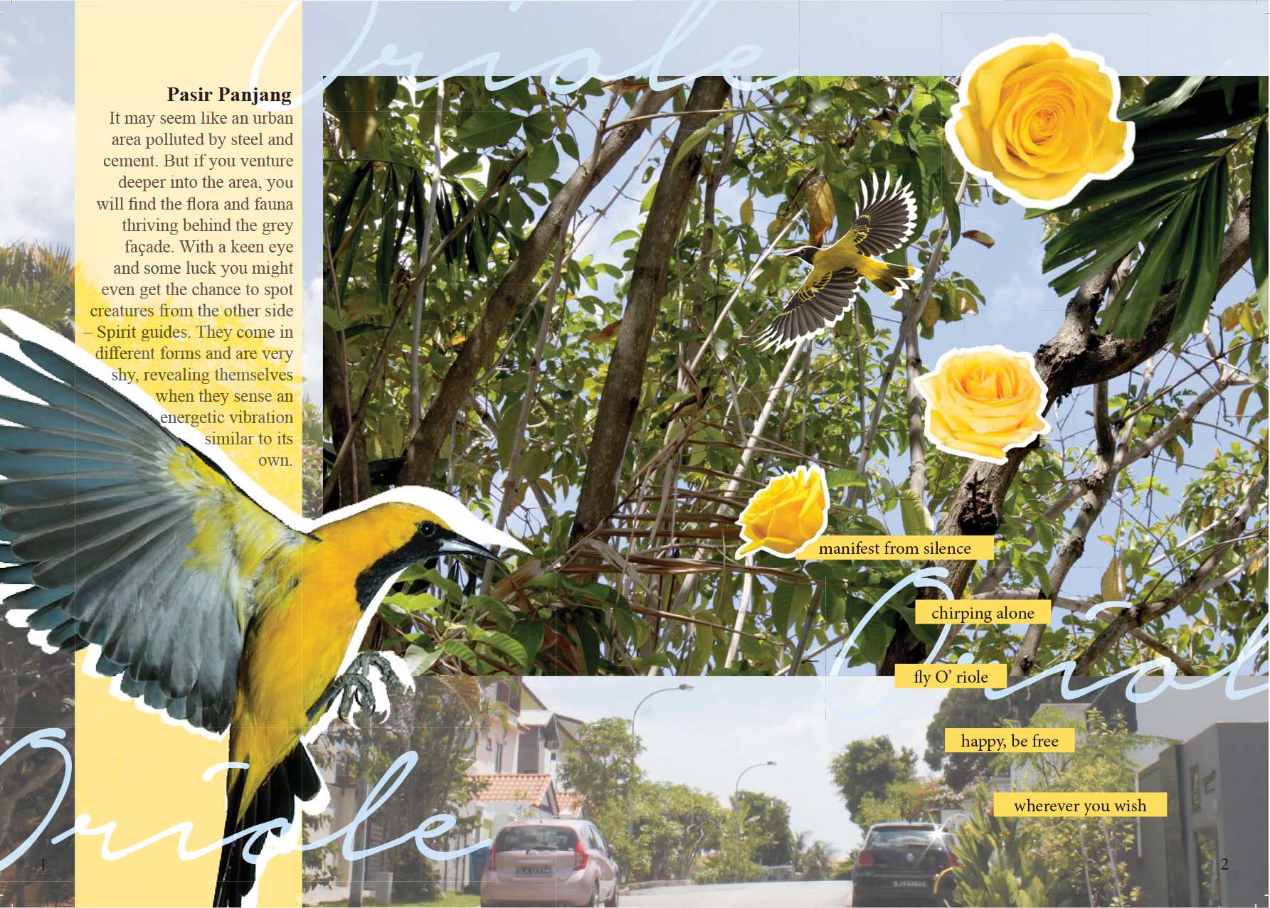
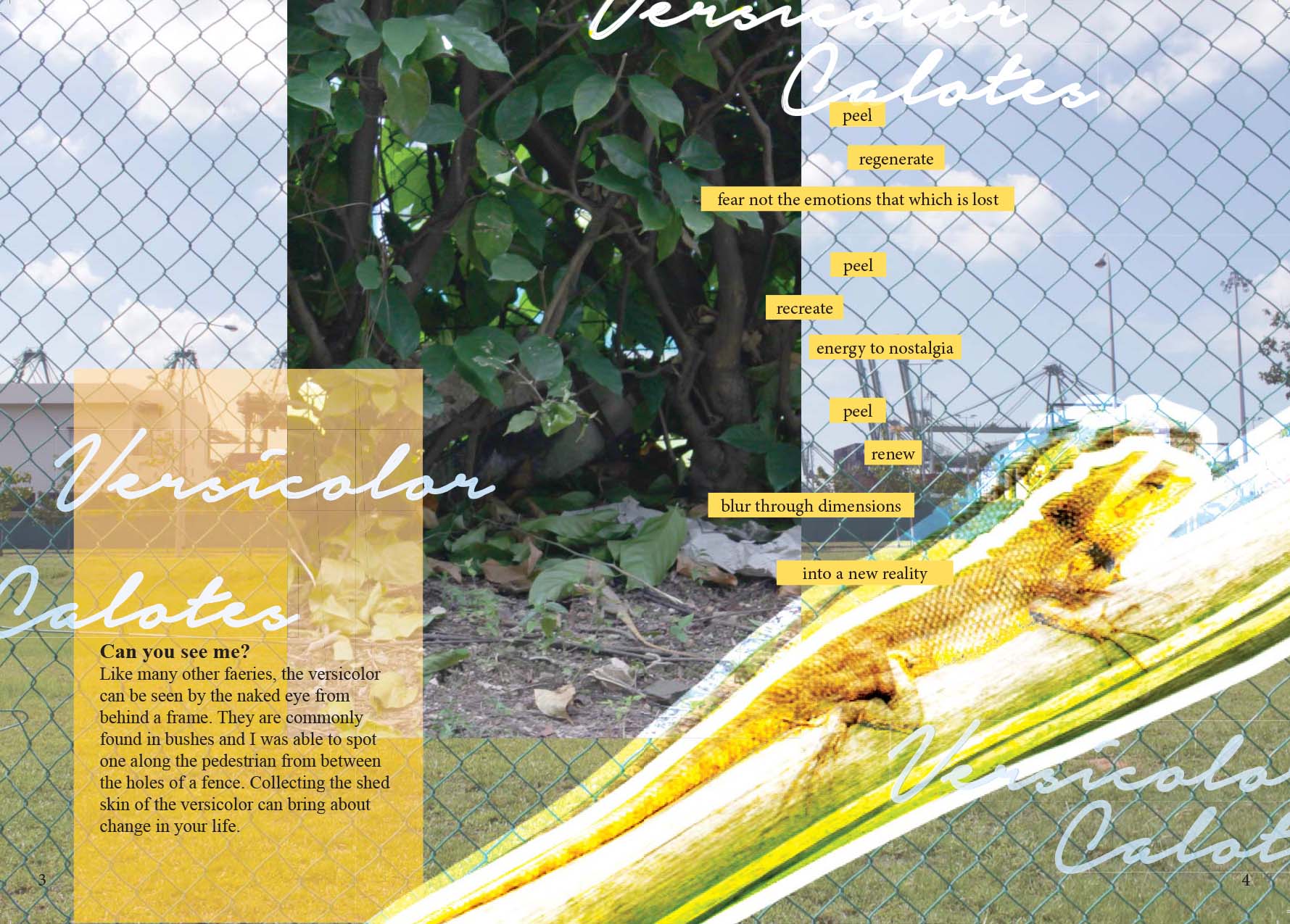
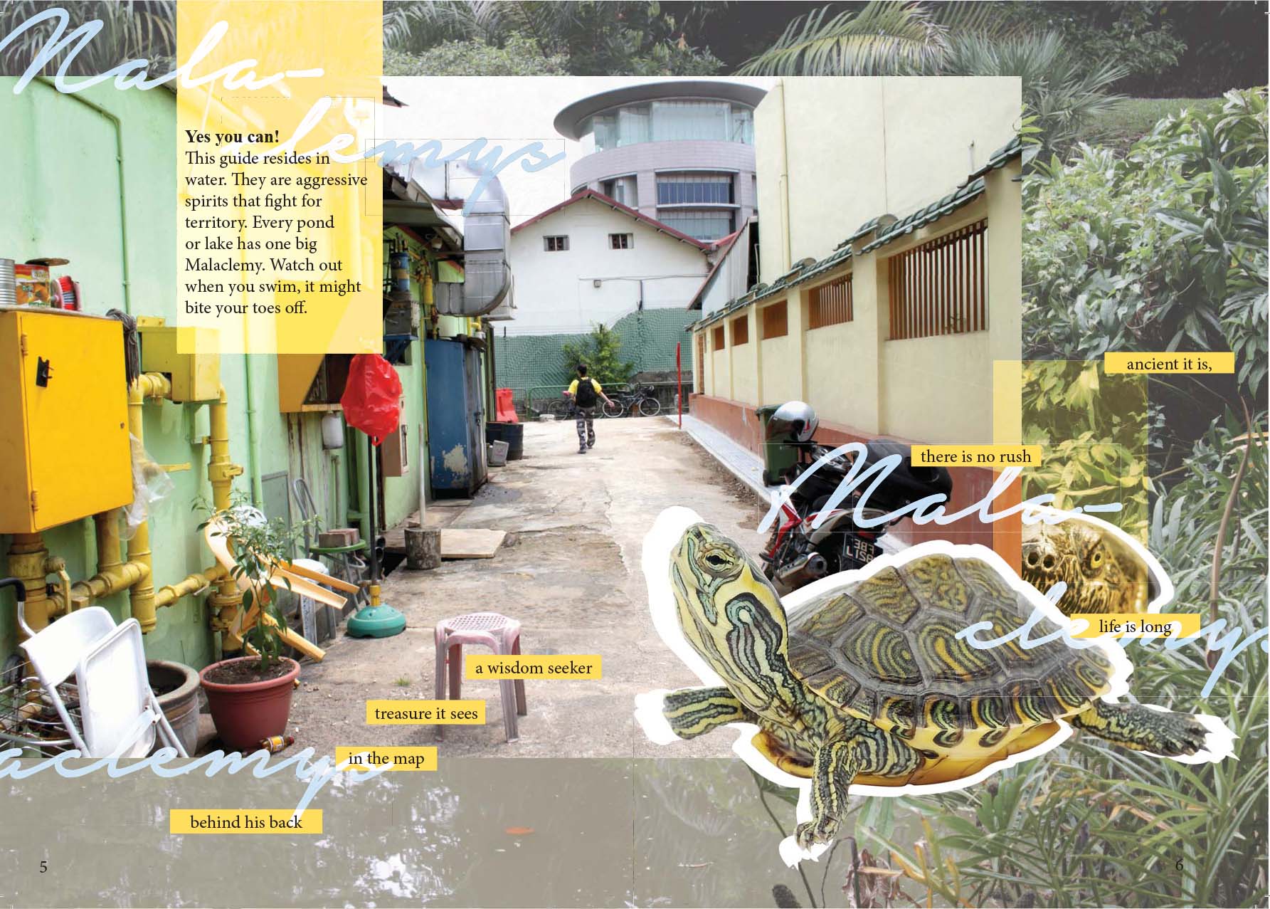
I chose to focus on the animals that I came across during my site visit. To make the subject of animals more interesting; I wanted to re-write my encounters as meeting mystical creatures – spirit guides. The references I found had elements of layering as the world of faeries are overlapped on our reality.

I found that I could play with the opacity alongside the layering concept.

The words cropping and staggering arrangement makes fits well into the theme; like a glitch in space.
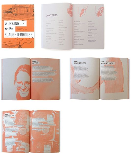
Tying into the subject of mythology, Oracles and faeries are known to speak in riddles. So I thought it would be fitting to describe the spirit guides through poems. Then highlighting the words for emphasis.
First Draft:

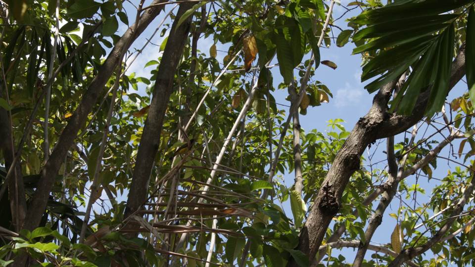
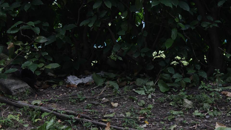
Originally my idea was to have the animals hidden in this bush as my cover page. However, I do not have the skills for illustrating the image I had in mind and dropped the idea.
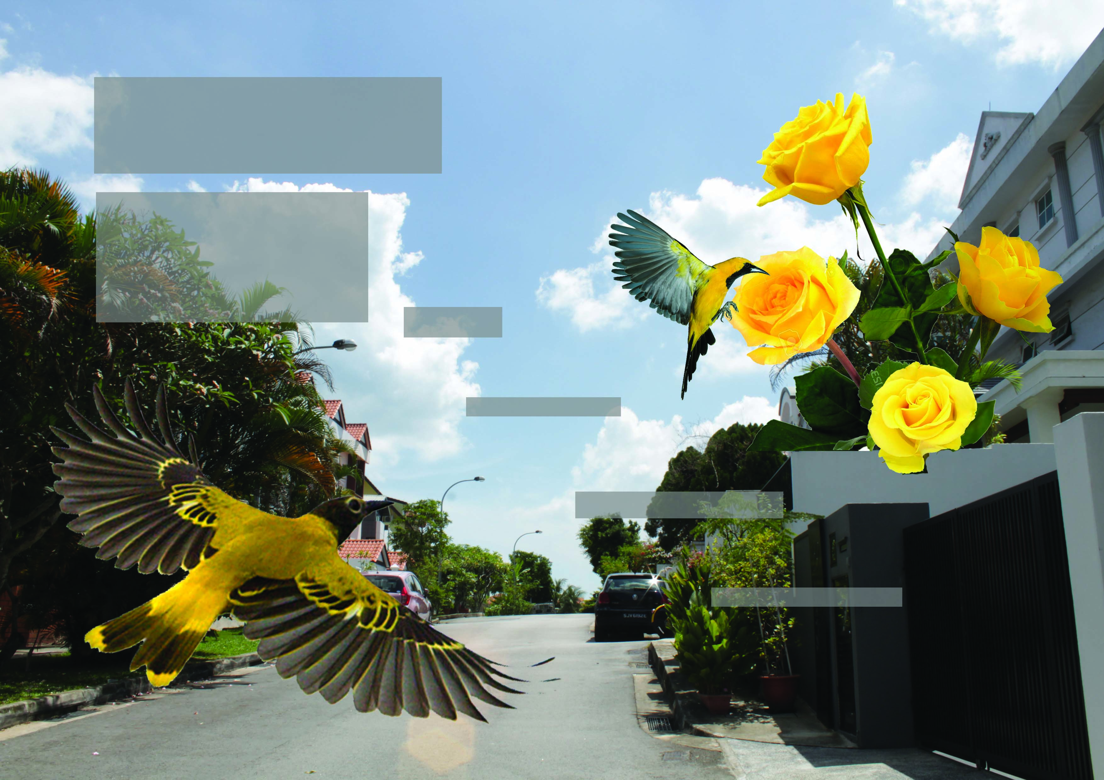
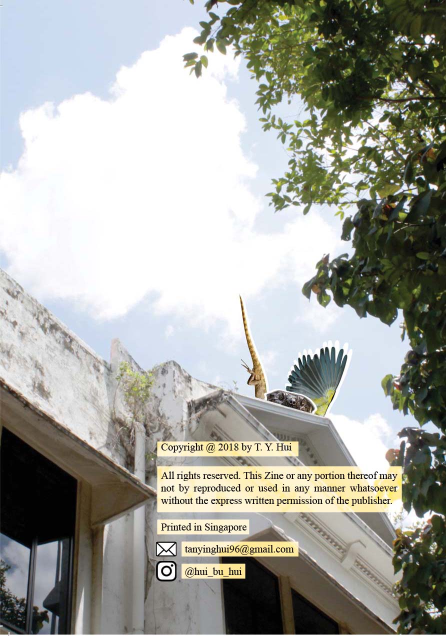
Consultation mentioned the lack of hierarchy and photo treatment. So I went back to edit images with the levels and contrast to bring out more details and light from them. Then applied the idea to the other spreads.
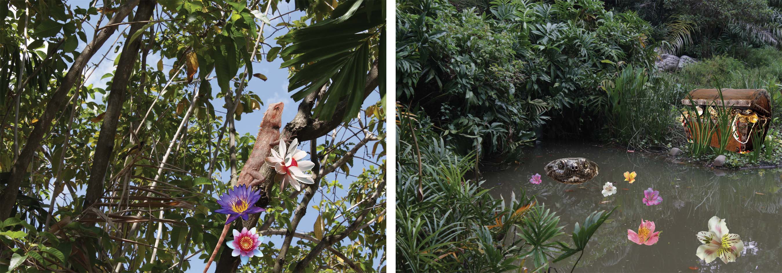
Other two initial spreads. I wanted to use flowers as symbolism to the meaning of the guides. But the aesthetics are not compatible at all; only the yellow rose compliments the bird.
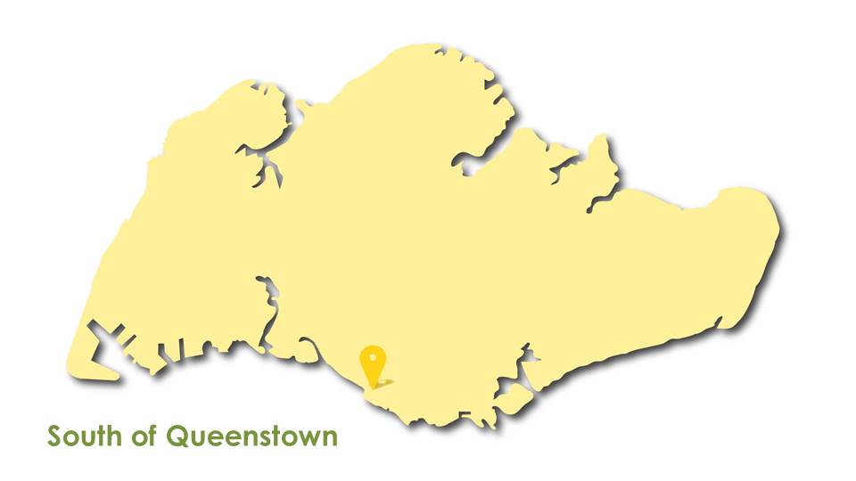
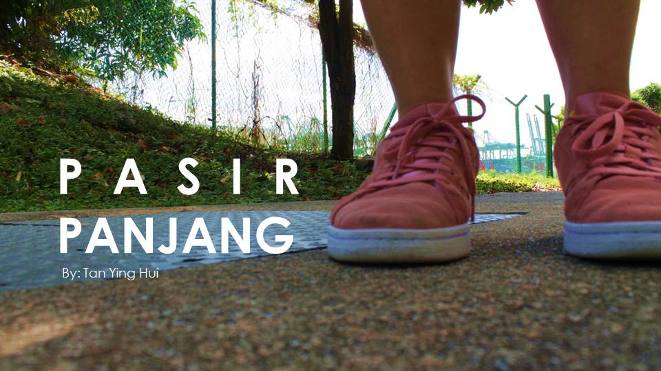
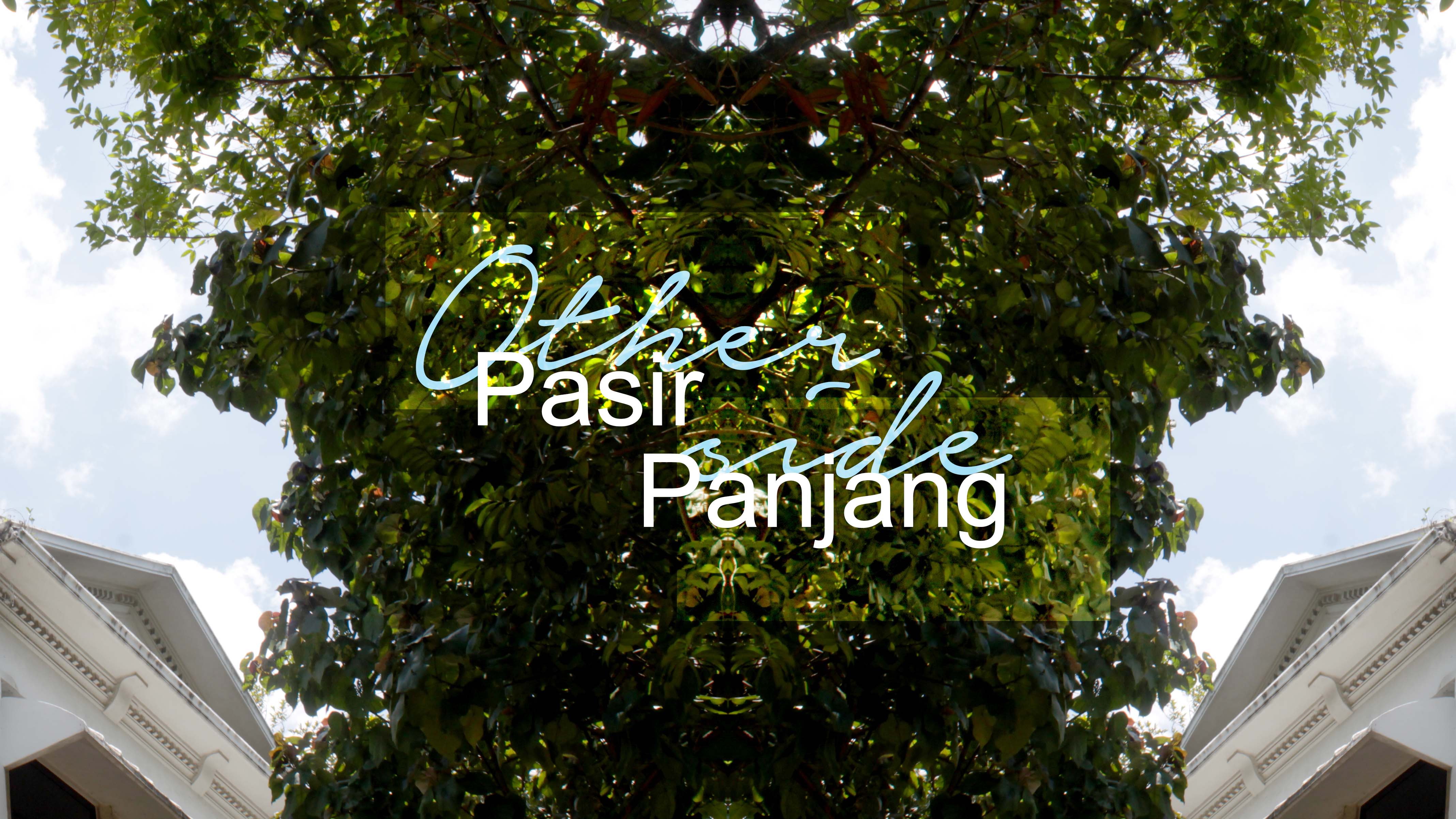
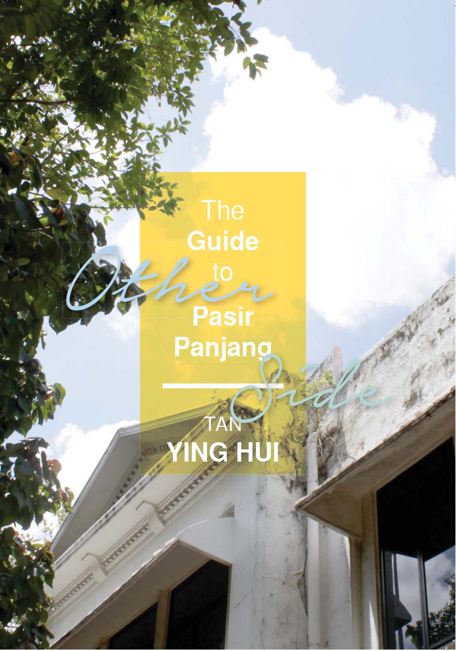
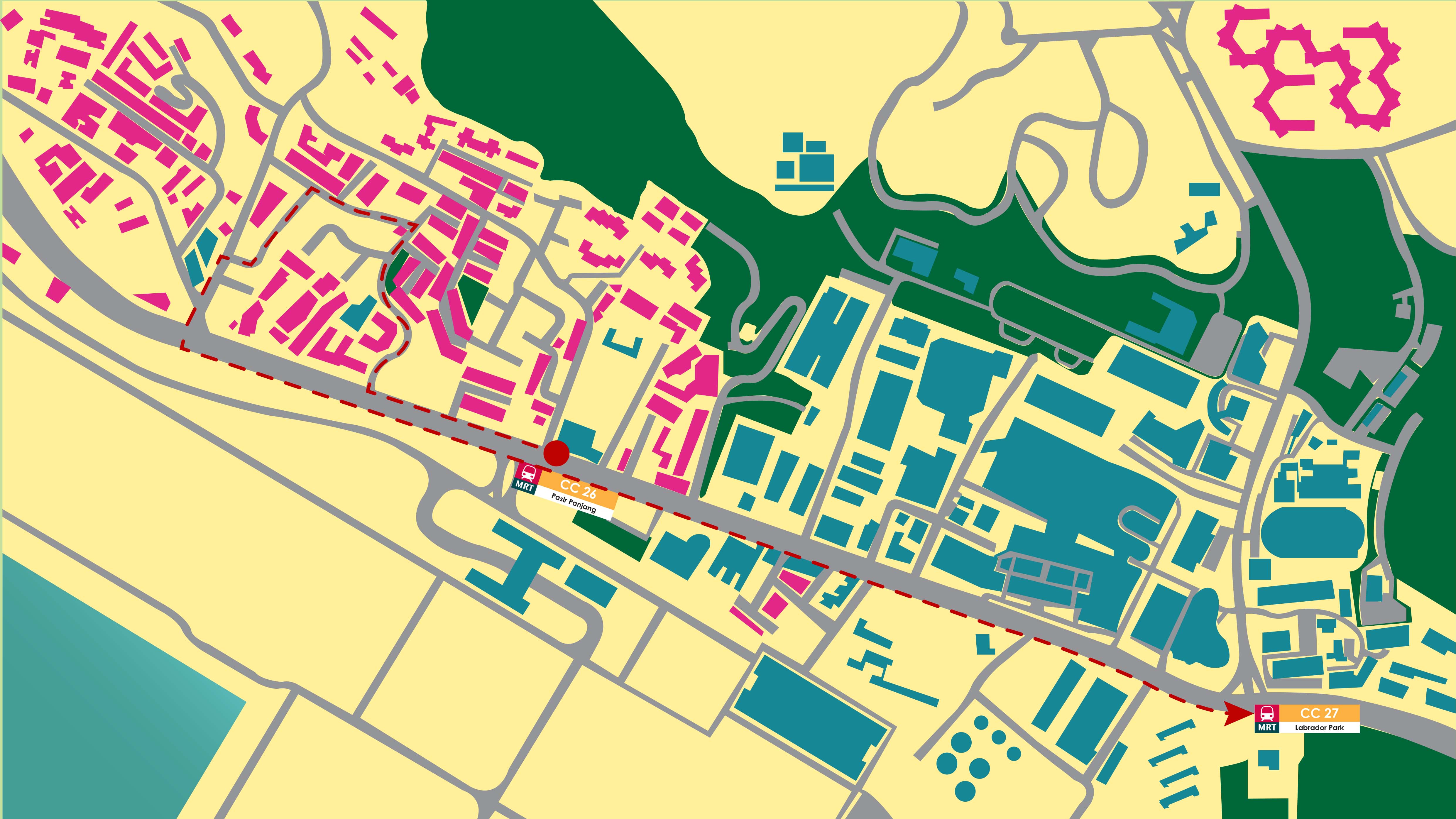
Chosen Site: Pasir Panjang
I went into this project without any prior knowledge to my chosen location. I did not know where it was, what was there, how to get there, nothing. I did not even research about the location before visiting the site so the experience was literally base on first impressions.
First thing I realised at Pasir Panjang was that it was really hot, more so compared to other parts of mainland Singapore; or more specifically the area where I live. I agree with Shirley that Singapore is hot island-wide but while I exploring Pasir Panjang, my camera was heating up so much so that it was unable to focus.
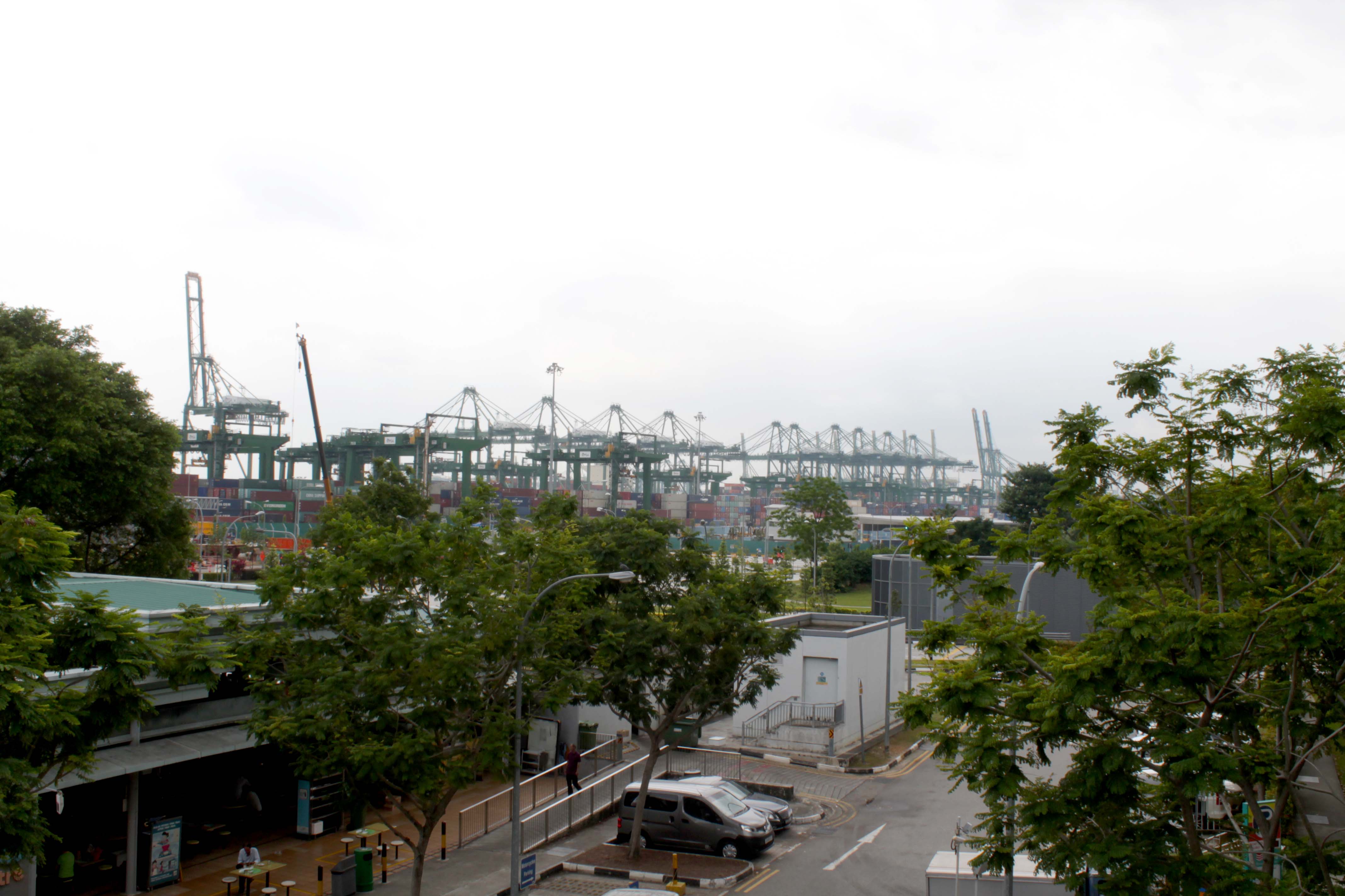
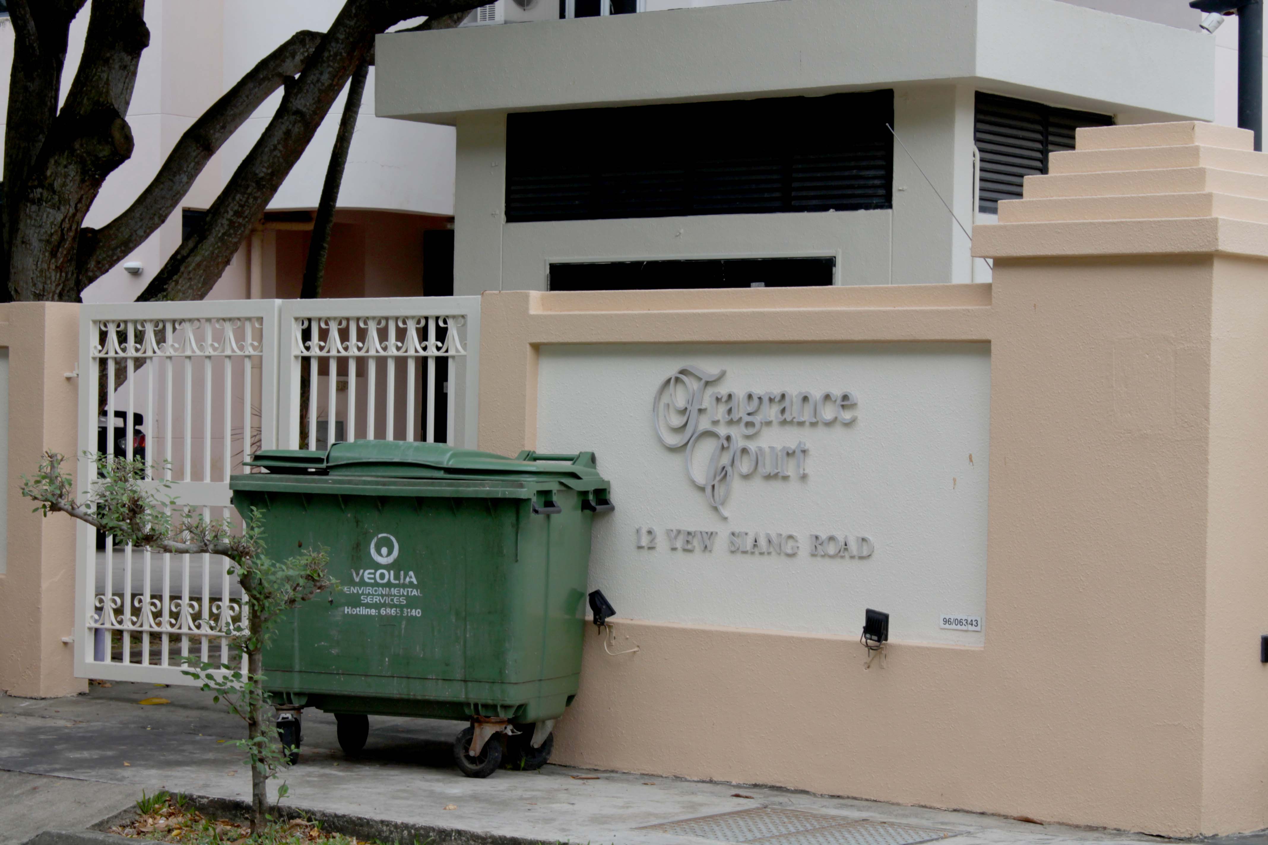
After alighting Pasir Panjang MRT, you will very quickly notice The Port of Singapore Authority (PSA); Pasir Panjang was along the coast, close to the sea.

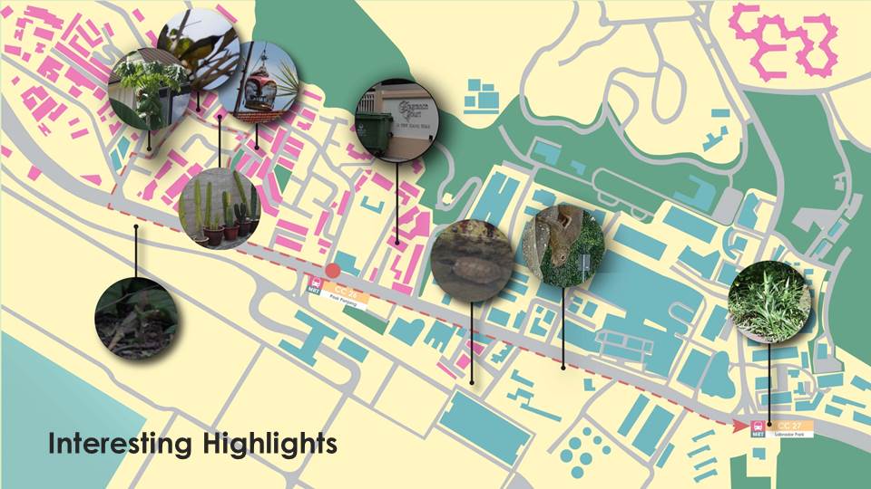
This striking red building stood out from the grey industrial factories. There are some art hanging on the windows. The shop sells many antiques and the outside is full of strange unwanted trash. Also an interestingly shaped branch on its fence.
At this canal, we found a tortoise swimming in it.
I found this pun amusing and thought I could build my Zine around a narrative of a runaway garbage bin. But had second thoughts and changed my idea.
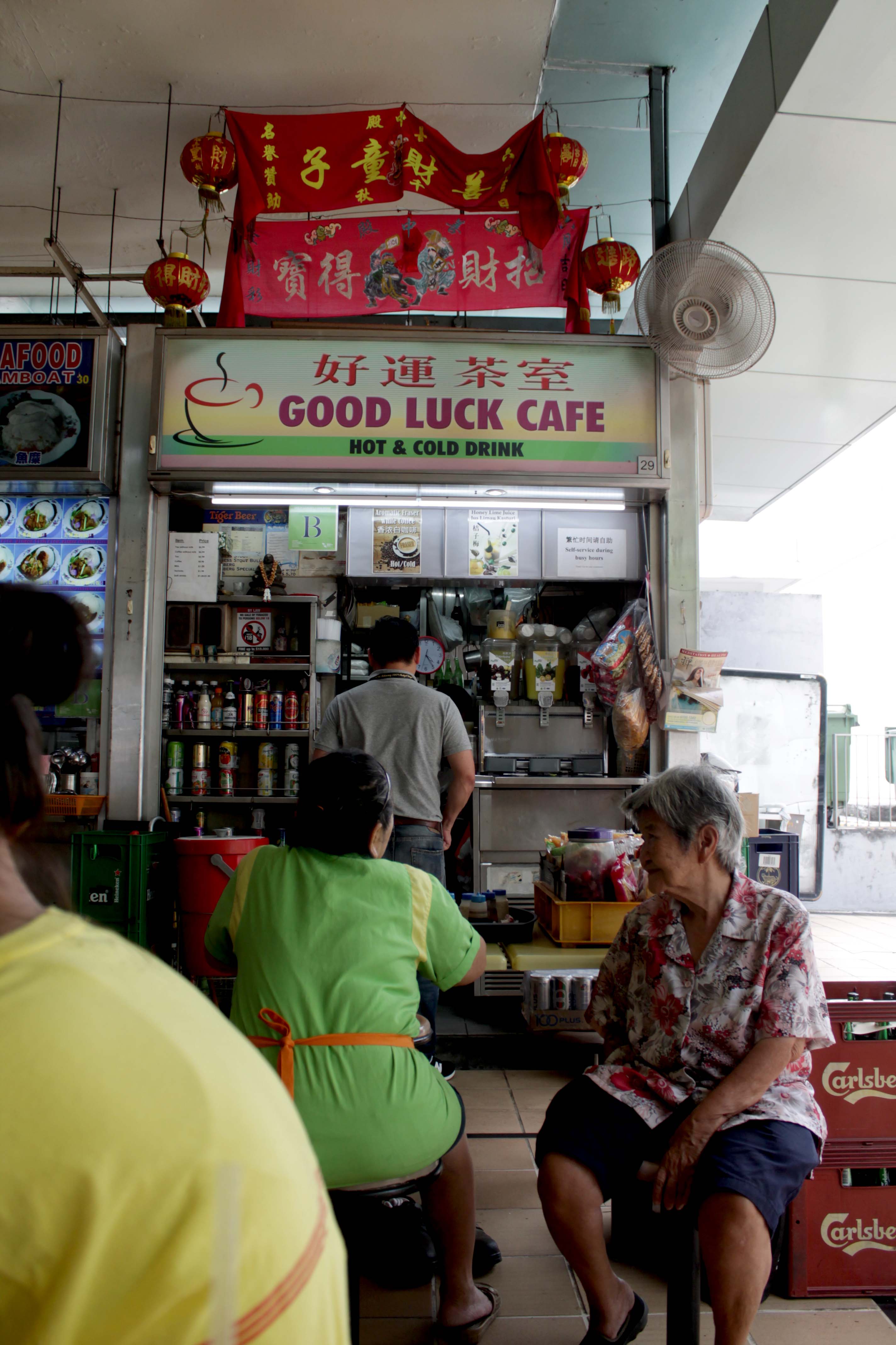 We had a drink after visiting the area. The owners were very nice and even chat with us after seeing us hang around taking photos.
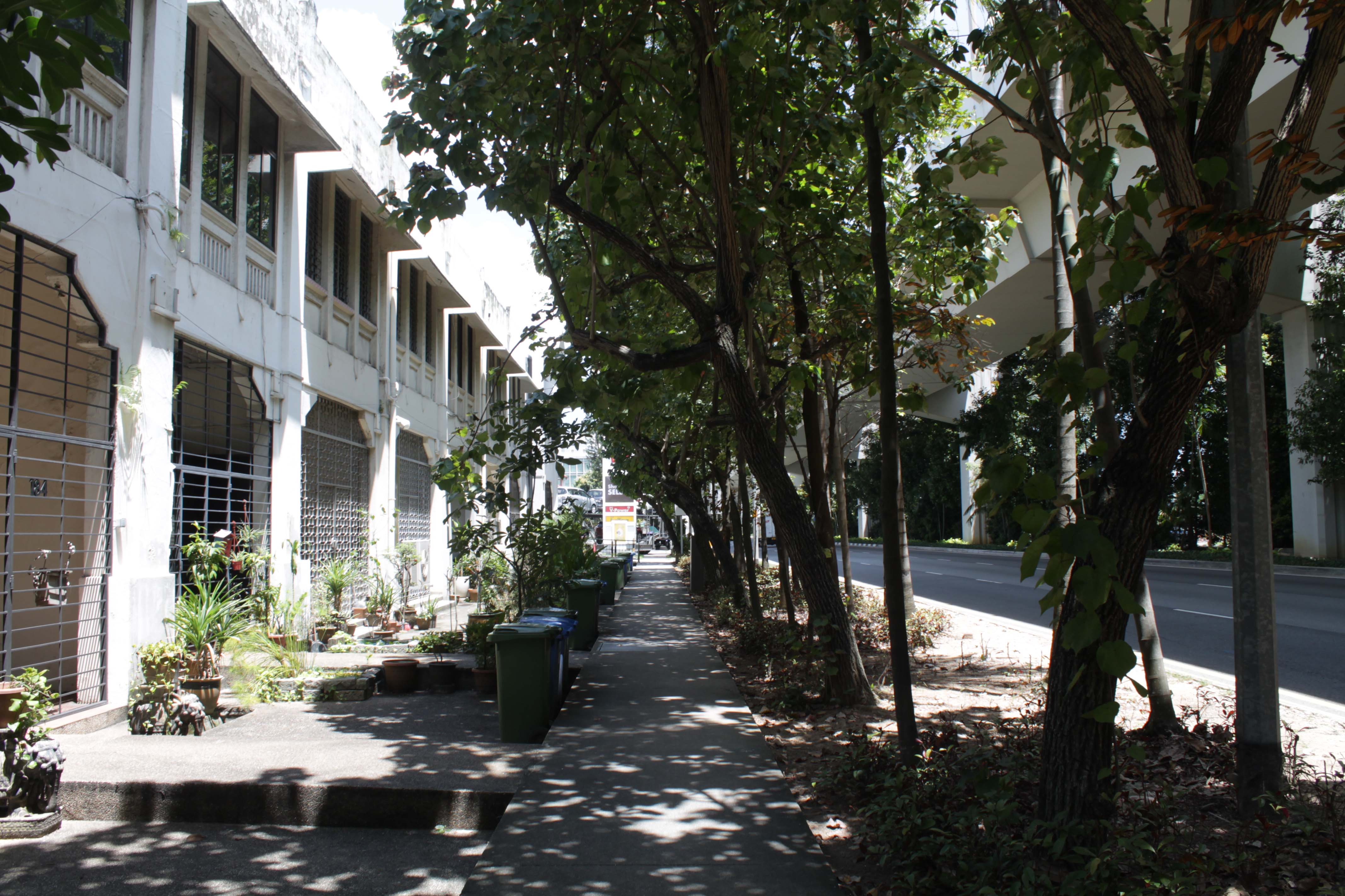
There are lots of private houses along the main road.
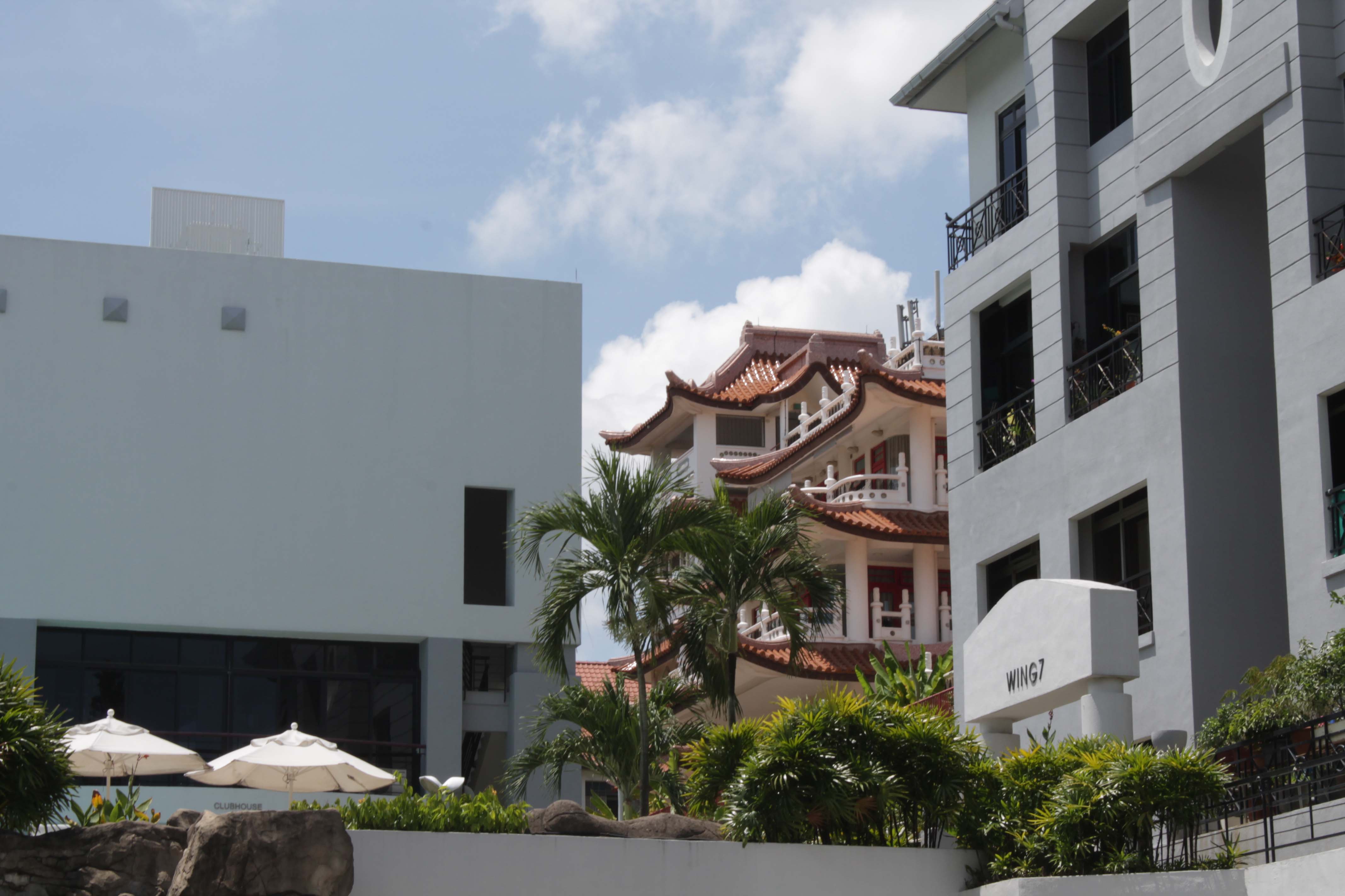
Deeper into the maze of private housing there is a temple.
A bird call that I have never heard before. I suspected it was the bird in the cage because the sound could only be heard at this spot.
Can you see the bird?
This is the chirp that it makes.
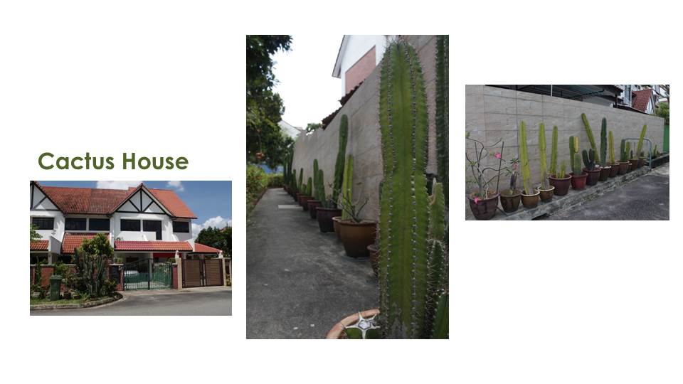 Peculiar house surrounded by the same cactus.
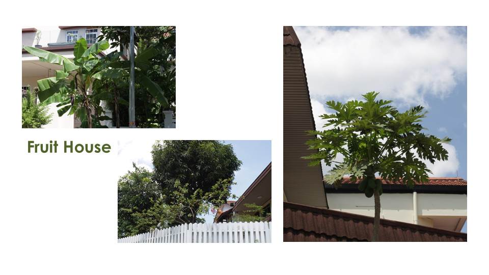 A house with many fruit trees.
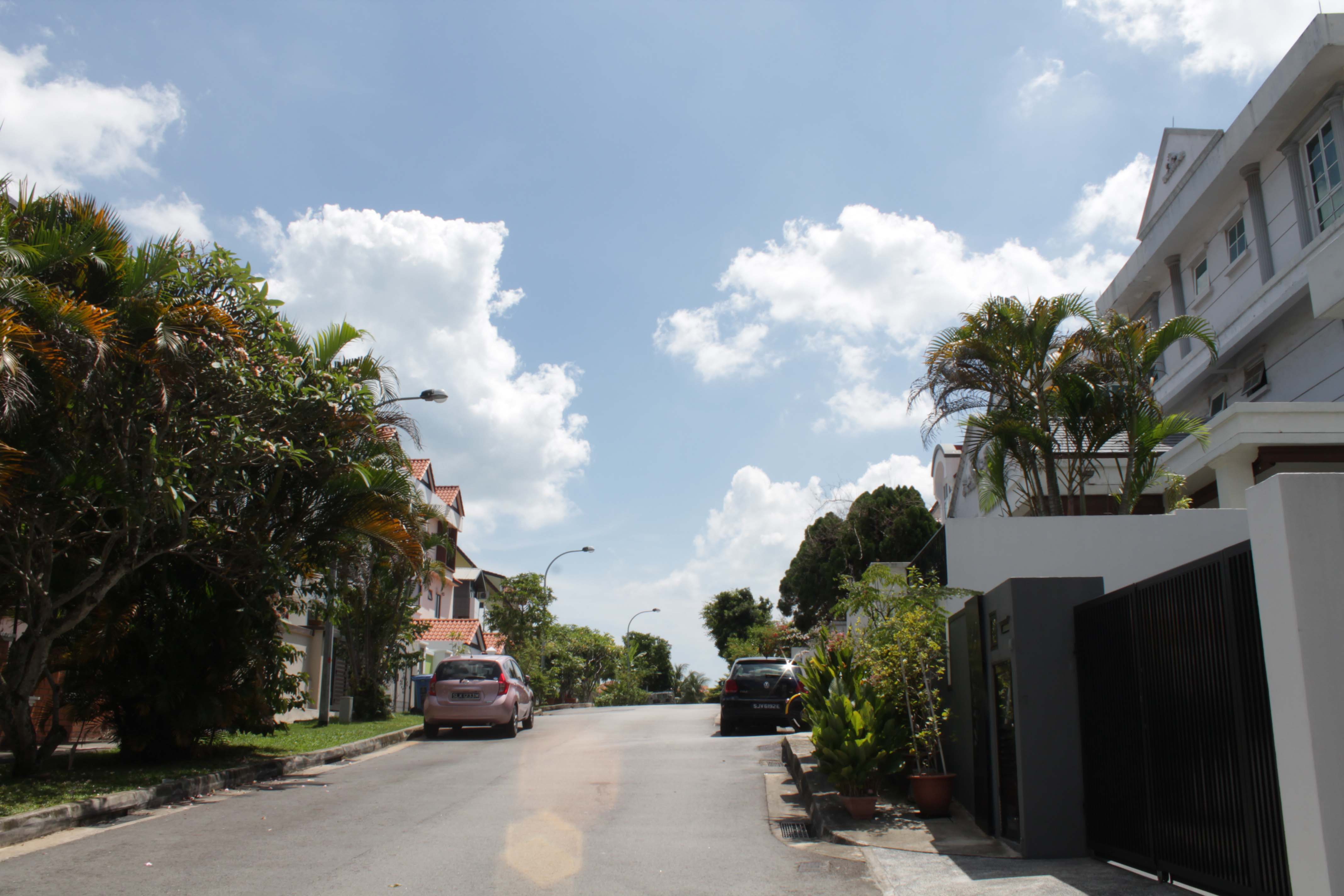
Wind Chime Houses which brought some magic into the area.
Again. Can you find it? The lizard is in there somewhere.
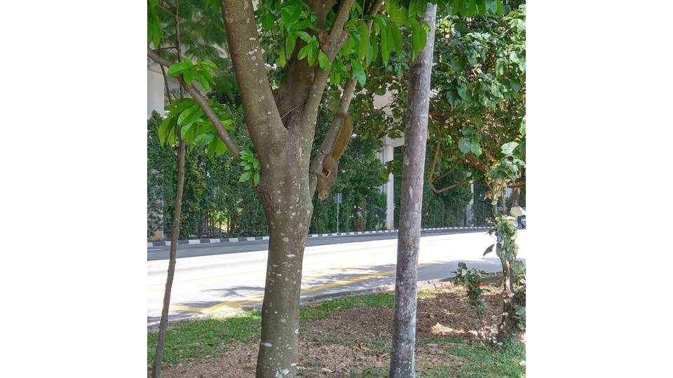
Also saw a squirrel on the way back.
Pandan smell on the way back. Labrador Park MRT stration is covered in Pandan leaves.
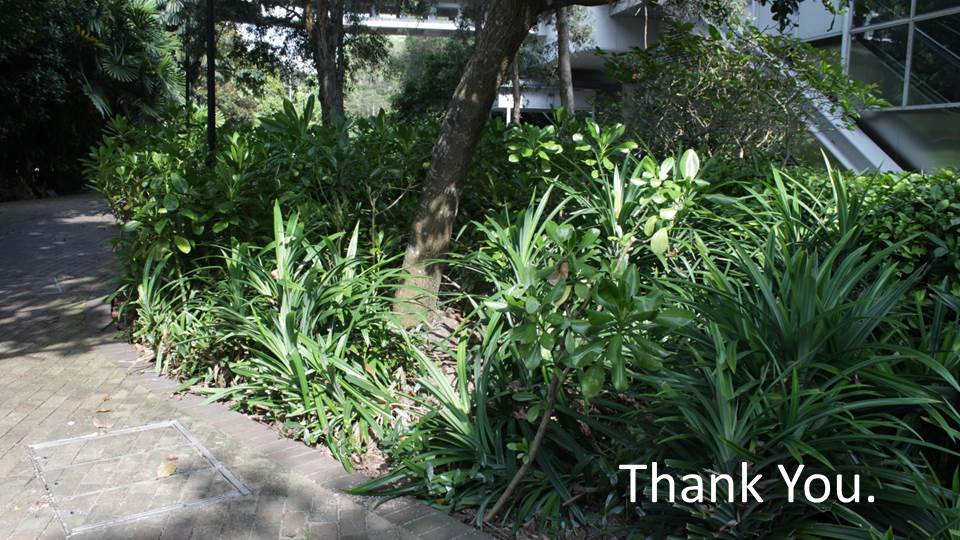
by Ying Hui and May Thu ( https://oss.adm.ntu.edu.sg/may005 )

Research: https://oss.adm.ntu.edu.sg/ytan149/project-1-image-making-through-type-research/
Process: https://oss.adm.ntu.edu.sg/ytan149/project-1-image-making-through-type-process/
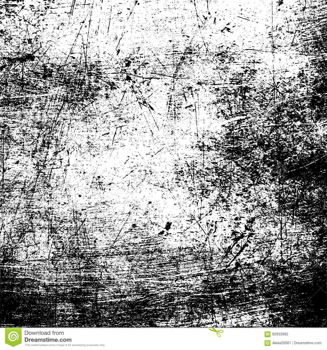
This was the texture I found to use for my type. It is very much like the reference picture from my research; it looks like scratches and deterioration.
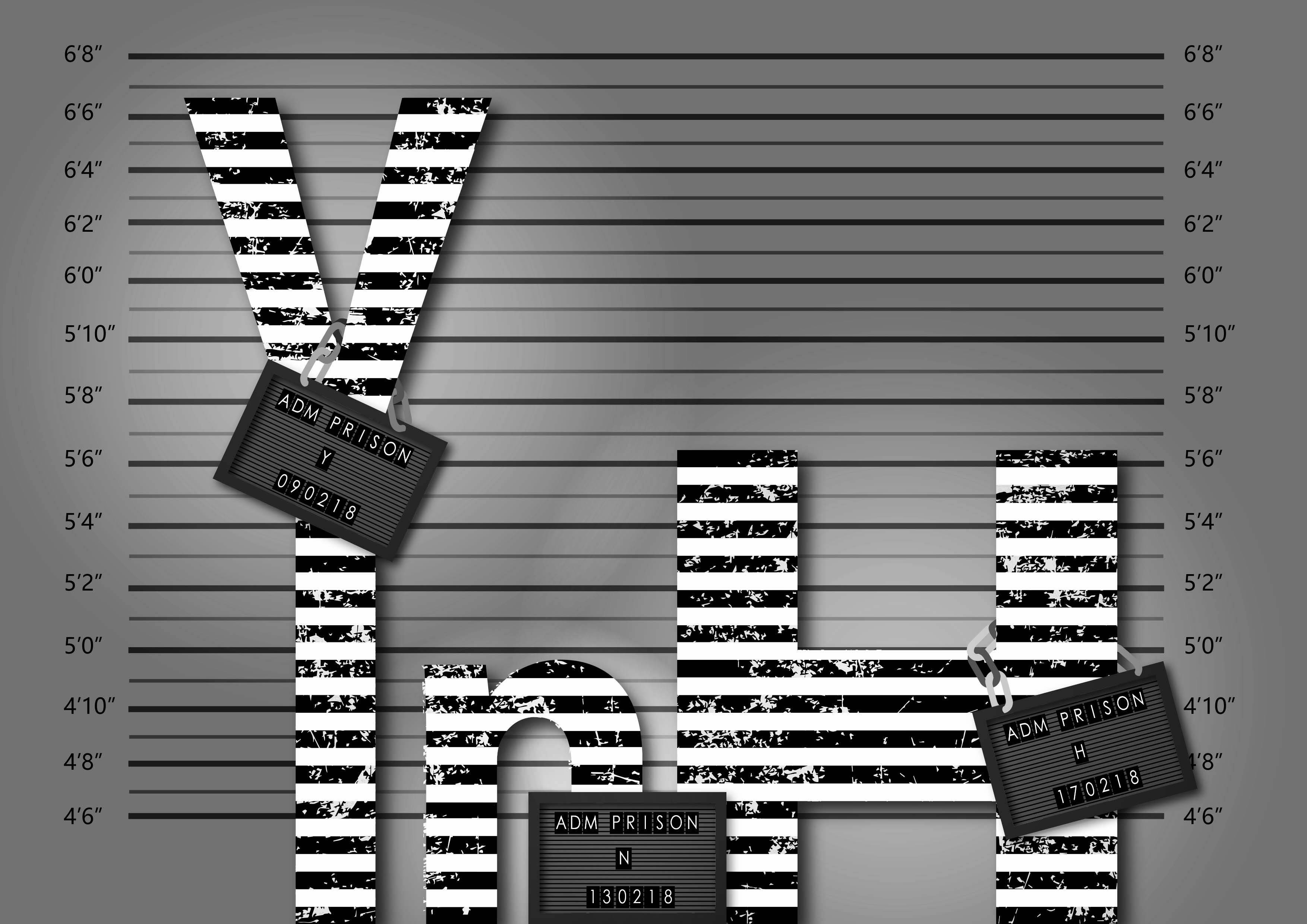
This was my first test with applying jpg. texture in Illustrator on my own after the tutorial class. It is the visual representation for the personalities of criminals – rugged, rotten, dirty etc. Here, I applied it to my entire name floating in the centre of the page which did not make sense.
This time I had them ‘stand’ in a row. I also got feedback that the type should be in different sizes because people are of all shapes – thin, tall, fat, stout and so on. With that, I could only apply a number of letters and I settled for these three. To complete, I gave then each a panel to hold onto for identification. Then intensified the lighting to bring in more drama.
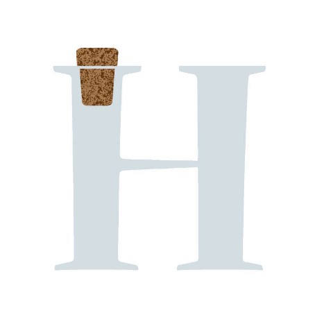
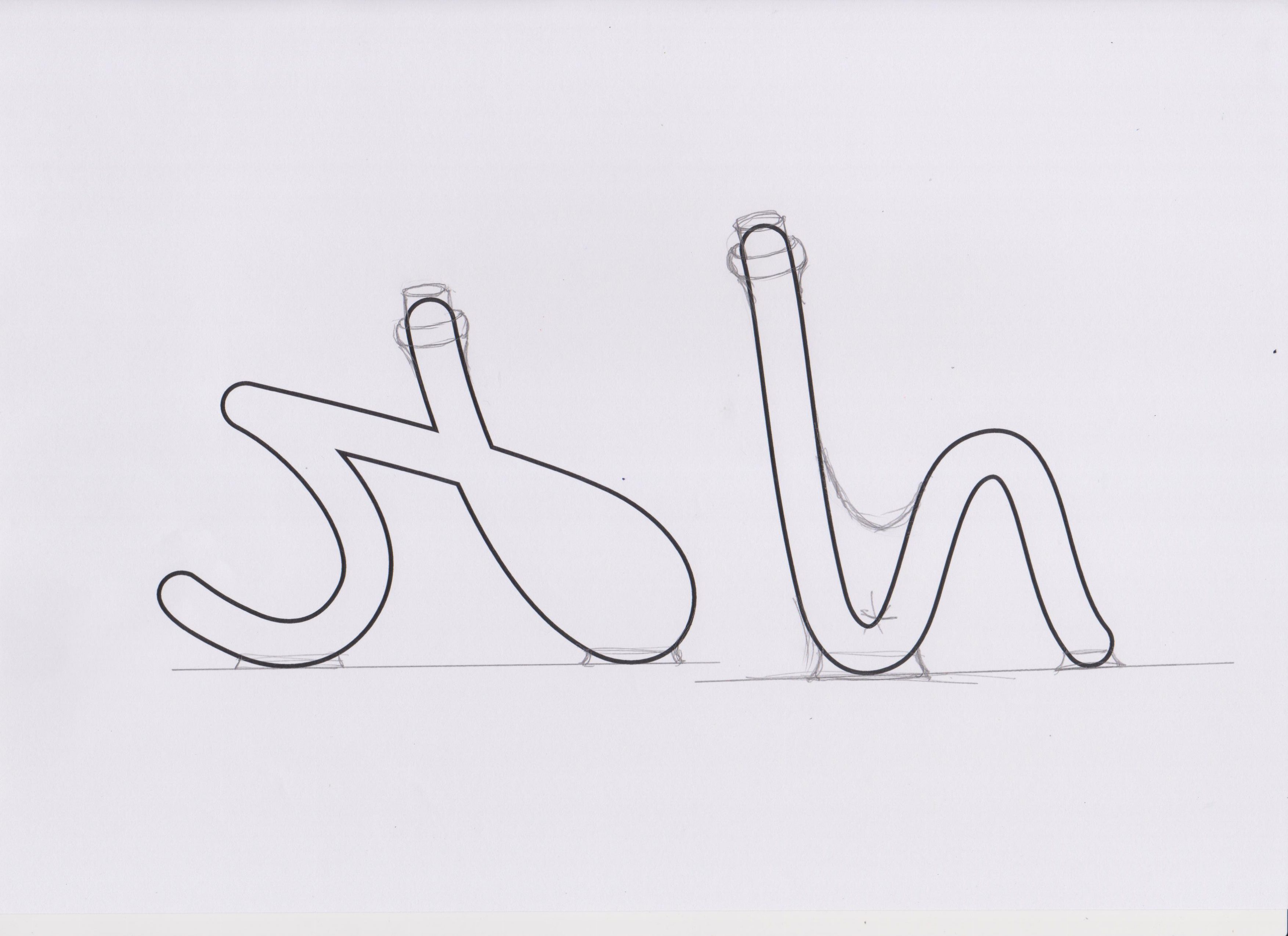 At first, I chose a script font and printed it on paper then sketched over it to change its original shape, to form letter bottles.

They look like this after I traced and coloured them.

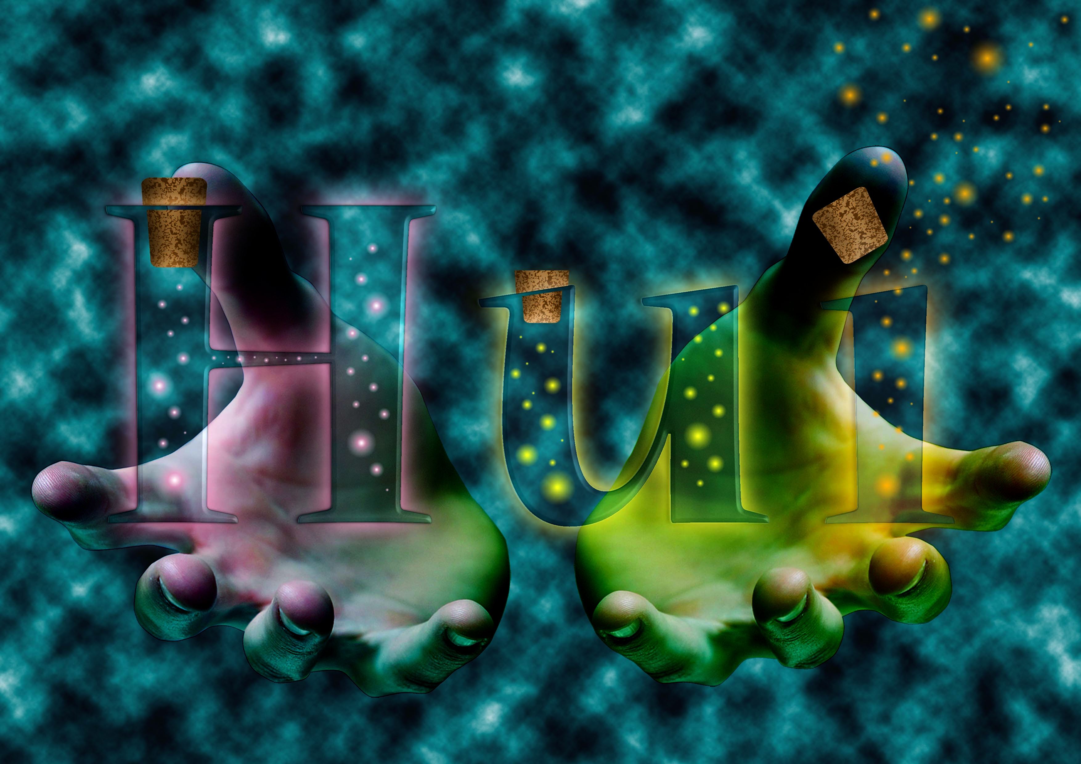
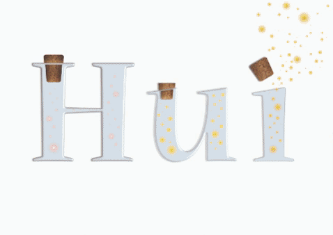
I went to search for ways to help me create the ‘fairy lights’ in the bottle that were to represent dreams.
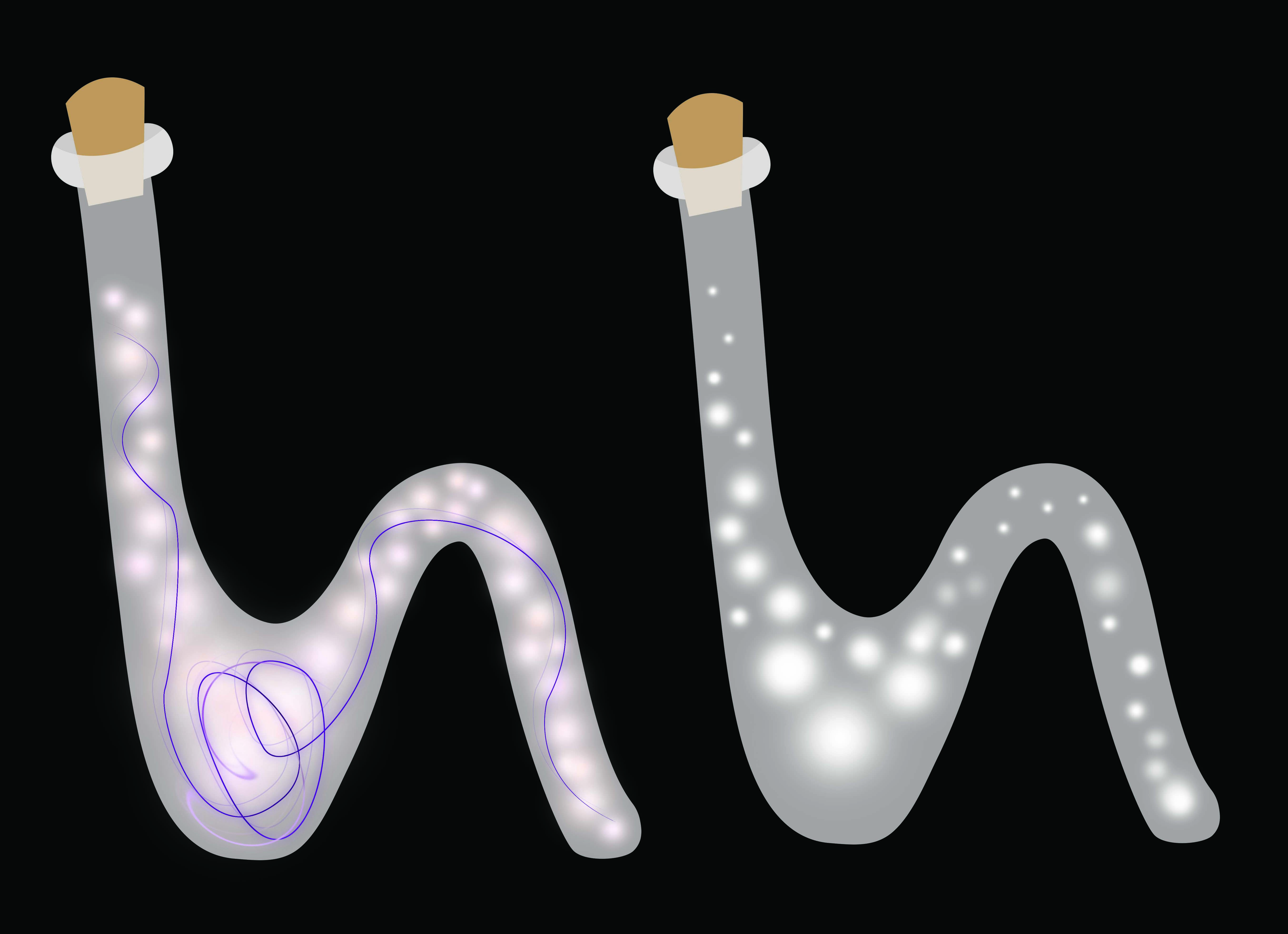
I tried it out on the bottles!

Things were looking flat and boring and I got many comments suggesting to make it 3D, create more depth and such. So I tried making the background darker to bring out the illumination of the bottles. I also got help from my cousin on drawing highlights and shadows. My drawing skills were lacking and I could not identify where the highlights and shadows should go. So this method did not work for me.
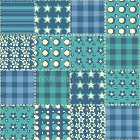
The background colour was picked from this quilt pattern found from google. It is sort of a bedtime blue which was perfect for the dream setting.
 After much searching I was able to find a tutorial on making glass type in photoshop.
Combining all the knowledge that I have acquired from the previous I put together the final piece. Rendering photoshop clouds for the background for a mystifying effect. The hand gestures to offer the products as if selling. Then I tweaked the blending filters to make it seem more natural.

This one was a little tricky to get. Even using letters as a base, the results still came out ‘wrong’. Not the effect that we were looking for.

To fix that, I avoided changing the shape of the original type. Then I applied the elements that suggested the job of a gardener.

I move the vectors into photoshop to apply textures and materials.

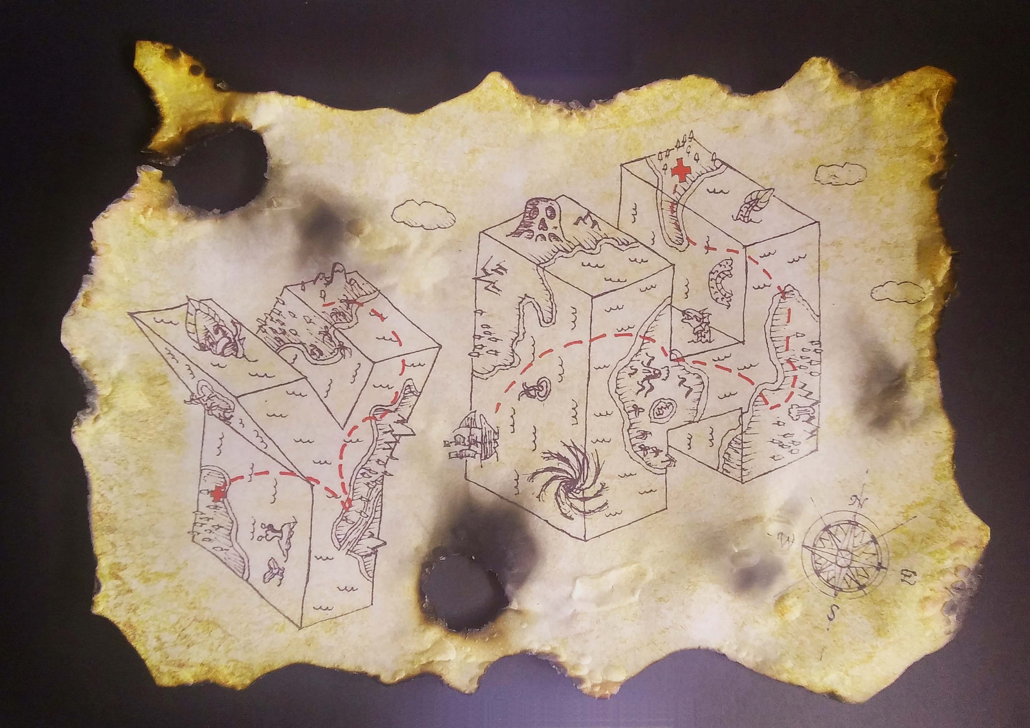
The original sketch inked on paper, scanned. I followed the reference image to create the map look with the monsters.
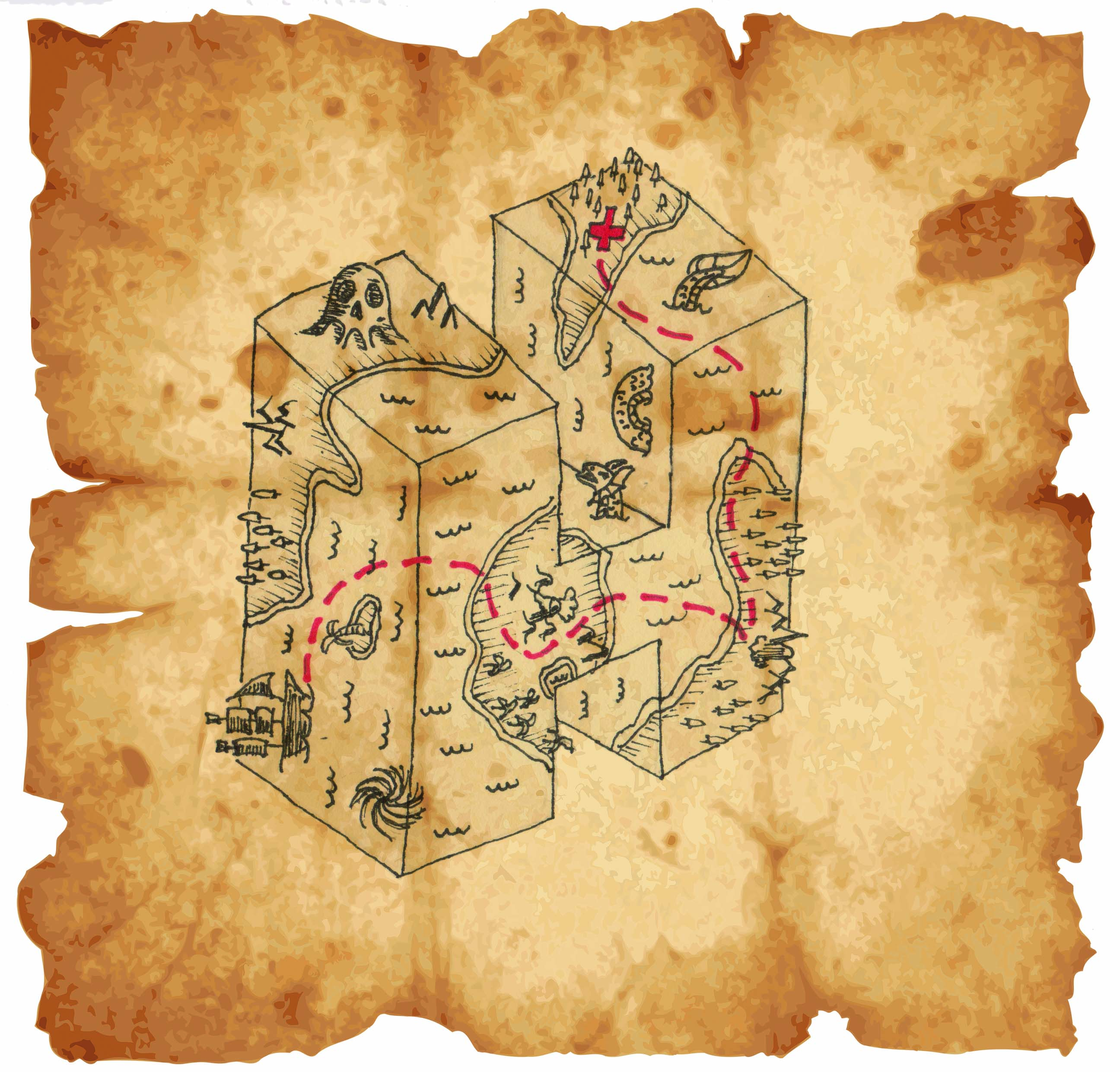
This was the first sample. It did not seem complete.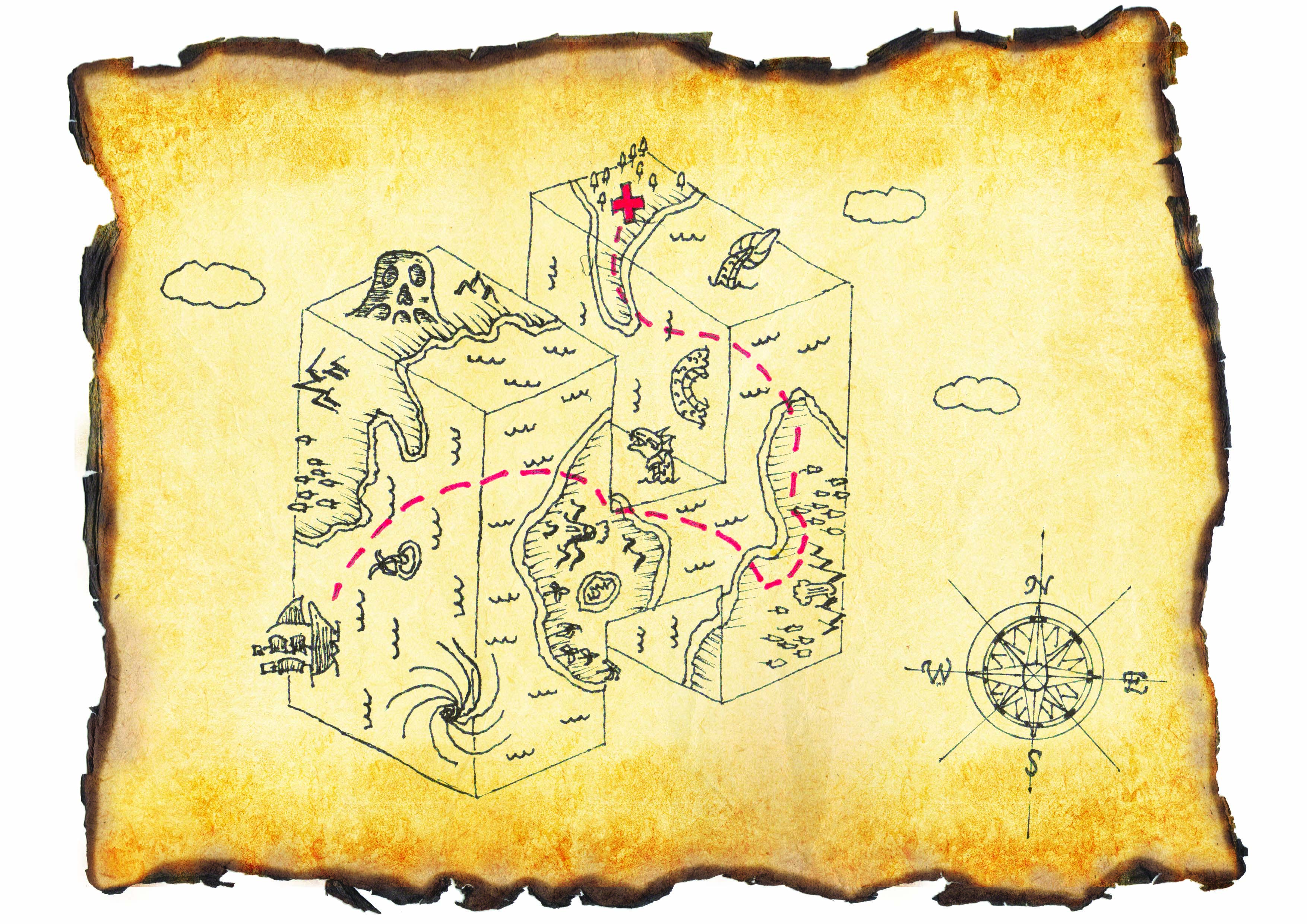
Then I added some clouds and the compass sign for direction and it seem more like a map. I wanted the map to look real so I changed the background to a texture that was more realistic together with burnt edge paper.
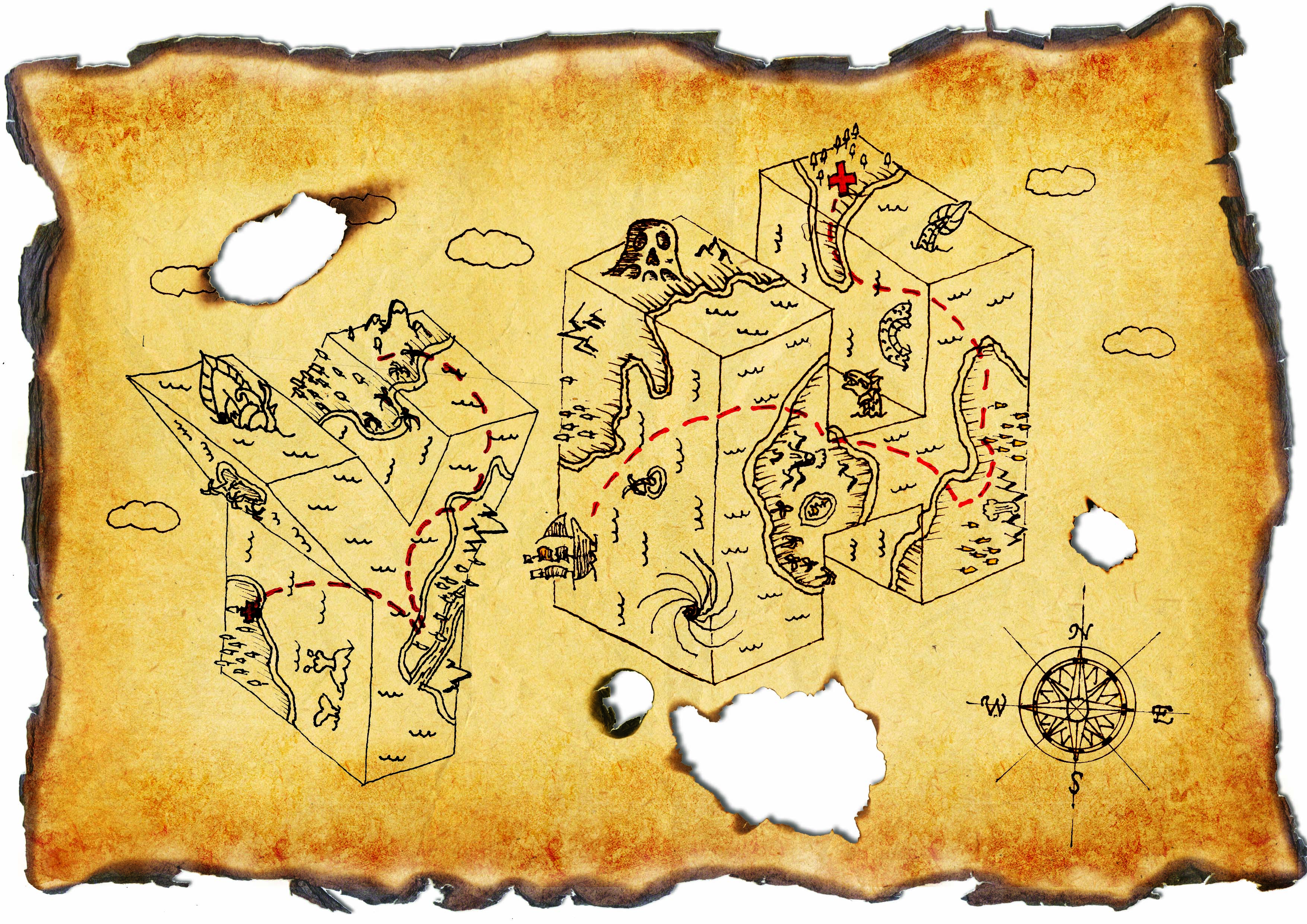
The lines were too faded before so I duplicated them many times to thicken it. Added another letter because I realised the brief said at least 2 and it actually completed the composition with implied lines and with ties in with the idea of traveling. Burnt marks were added to bring out the feeling of danger.

I tried burning the paper myself and the results were much more satisfying. You could not just see but actually feel what the paper had been through.
Prev: https://oss.adm.ntu.edu.sg/ytan149/project-1-image-making-through-type-research/
Next: https://oss.adm.ntu.edu.sg/ytan149/project-1-image-making-through-type/
In this project, we were to create typography of our own name/initials that carries the essence of extraordinary jobs. I listed many jobs that I think are interesting, some fiction some non-fiction. The chosen four were my favourites:

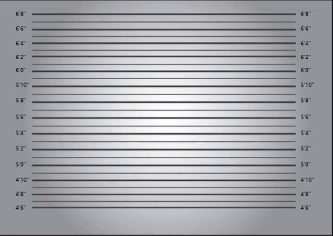
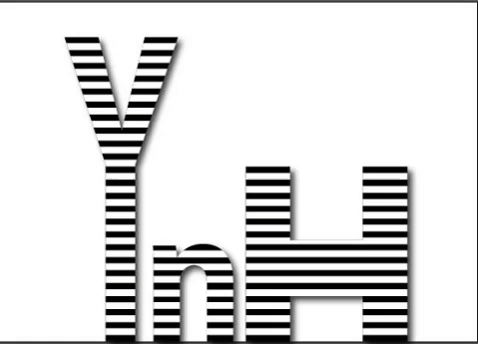
The essence of a criminal that I gathered are the black & white strip prison uniform, name plate, height measuring background and handcuffs. I went to look for google ‘criminal fonts’ to see what already exist, most of them were sans-serif and many had textures.
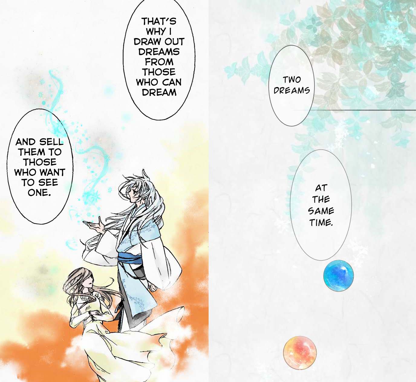
I read this webtoon recently about the after-life of a girl and there was a Youkai (Japanese for spirits, demons and other supernatural beings) that sells dreams. The dreams are depicted with fluid, wispy strokes that look like magical smoke. They are stored in colourful marbles.
The webtoon has very soft colours and textures similar to watercolour. The theme of dreams also reminds me of the Impressionism movement where the paintings and music were all very blurry, soft and muted.

When I discussed my idea with my classmates, many referred to the Big Friendly Giant (BGF) which also had the concept of capturing dreams. But instead of marbles, BGF puts them in jars which I think works better than a marble as a container.

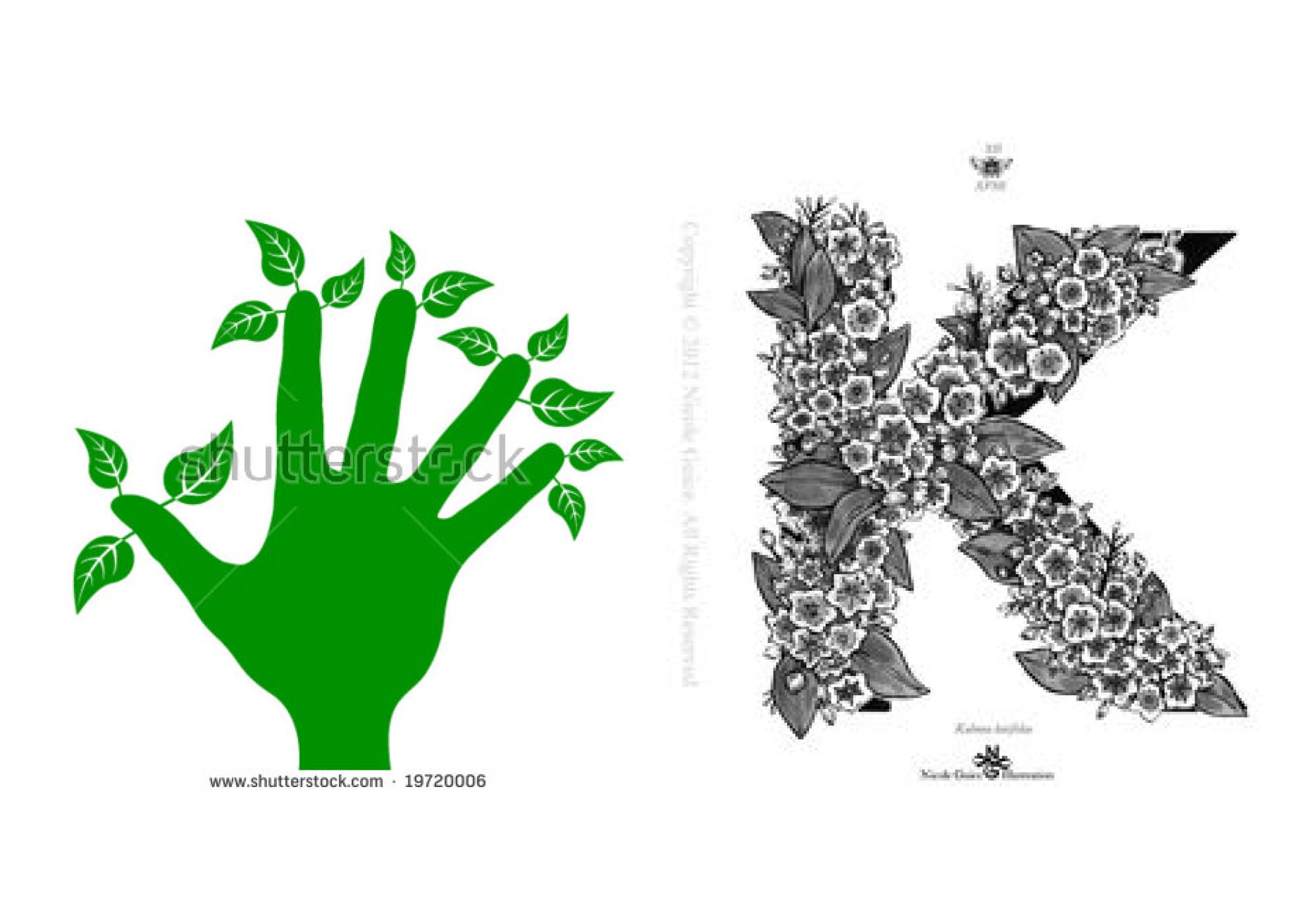 I chose this job specifically because I wanted to play with the phrase “Green Fingers”. However after consultation, I realised this was not what I was supposed to do. Putting the garden into the letter was too easy and already exist. Thus I had to find something new.
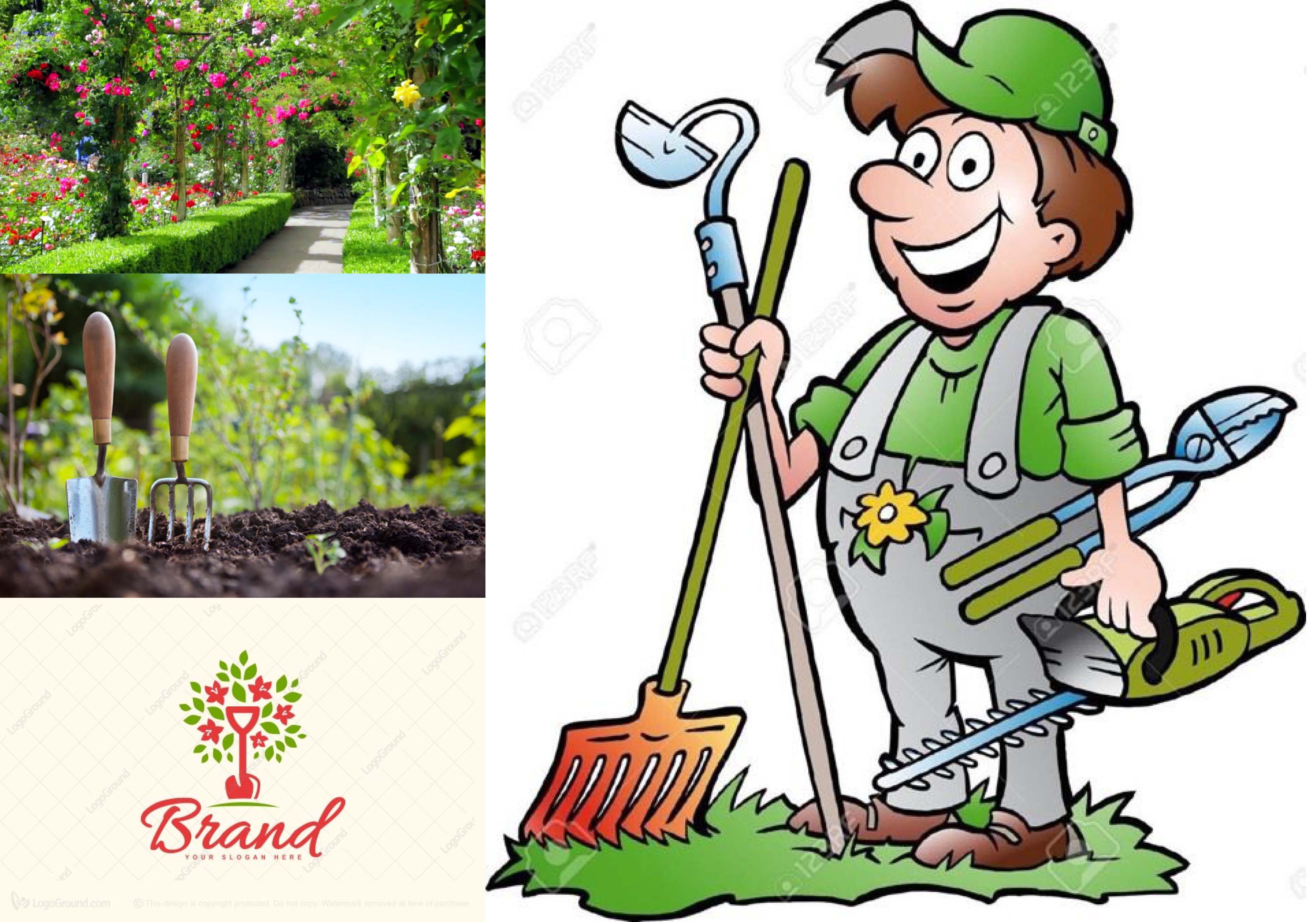
I went to look at pictures under ‘Gardening’ and I found gardening tools, soil, flowers, apron/overalls which gardeners always wear etc. Under ‘Gardening fonts’ I found that many related brand logos used handwritten script fonts.
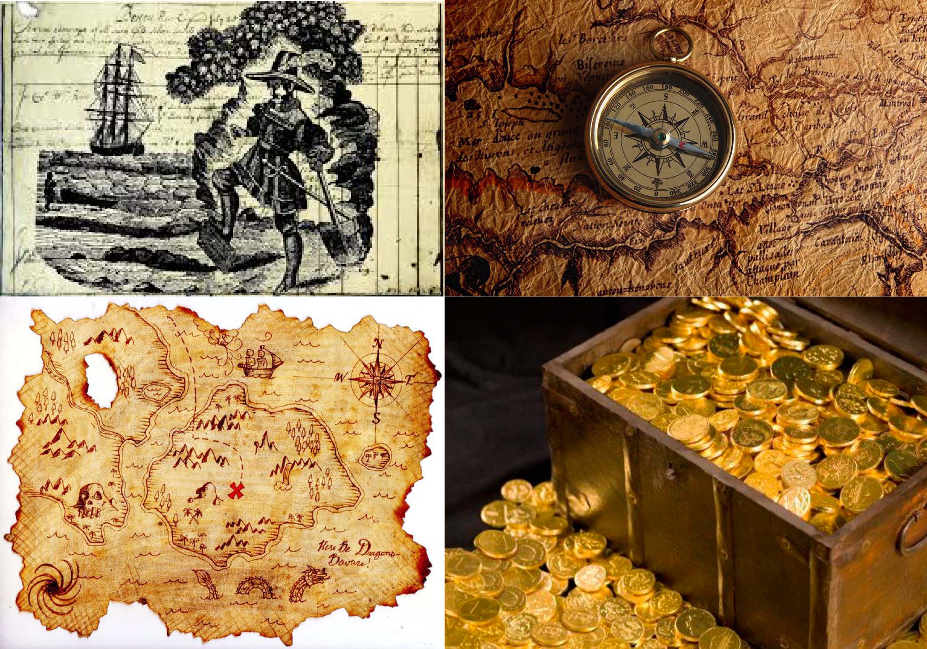
To find treasure, one needs to have a treasure map and under the search ‘Treasure hunter’ I found the maps, compass, gold. I also found this image of what seems to be a vintage print of a treasure hunter digging treasure over a page of writing presumably a journal. I thought it was an interesting idea to include a piece of writing in my work because a part of being a treasure hunter is to record your adventures.
Next: https://oss.adm.ntu.edu.sg/ytan149/project-1-image-making-through-type-process/