
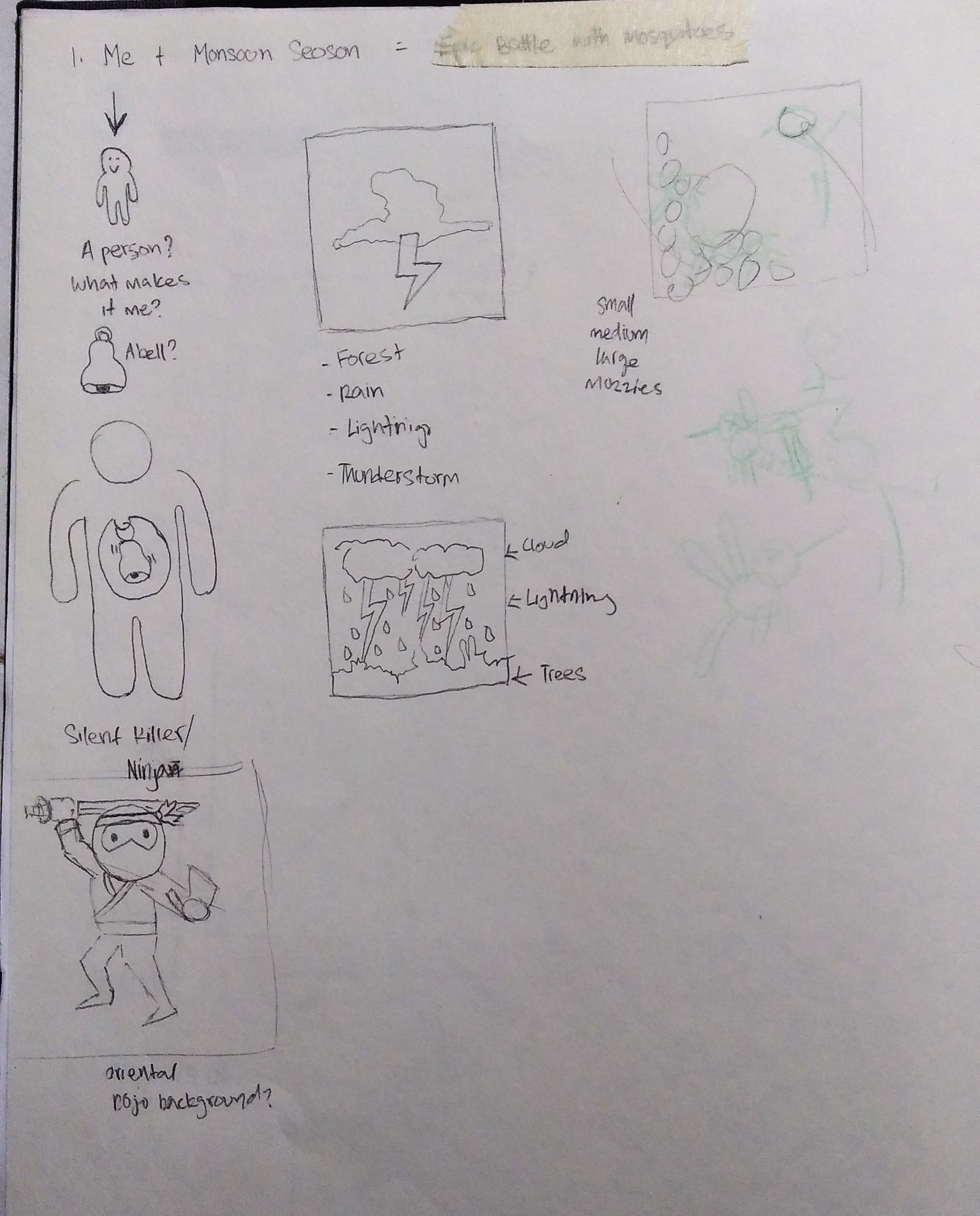

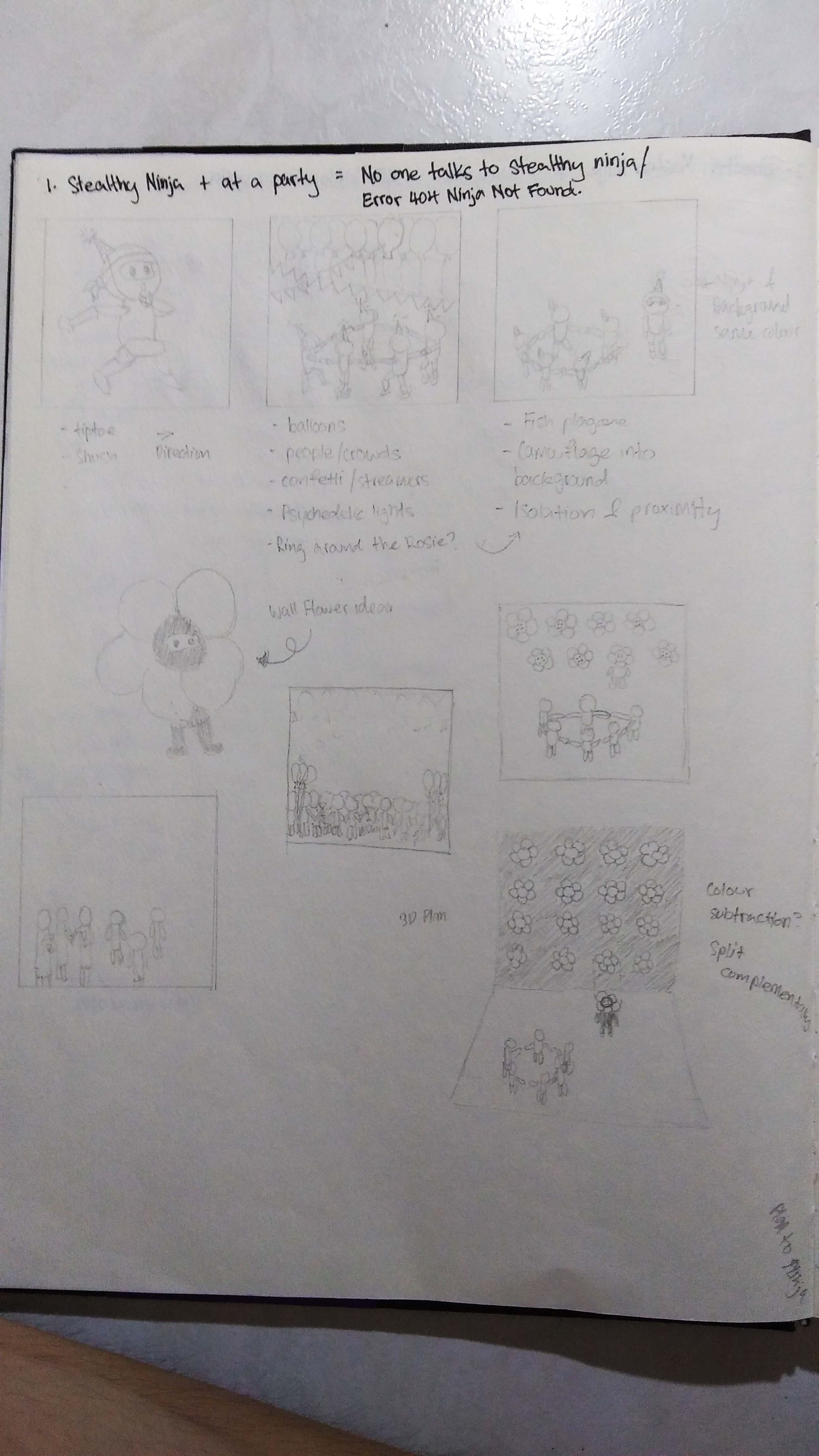

 This was rejected because the concept was not strong enough. The interpretations of a silent killer was not translated in the strips.
Tag: Process
Mnemosyne’s Scent (Group)

Charrisa’s Scent: Sea (Good) Ladyfinger (Bad)
Me: Clean Clothes (Good) Mopiko (Bad)
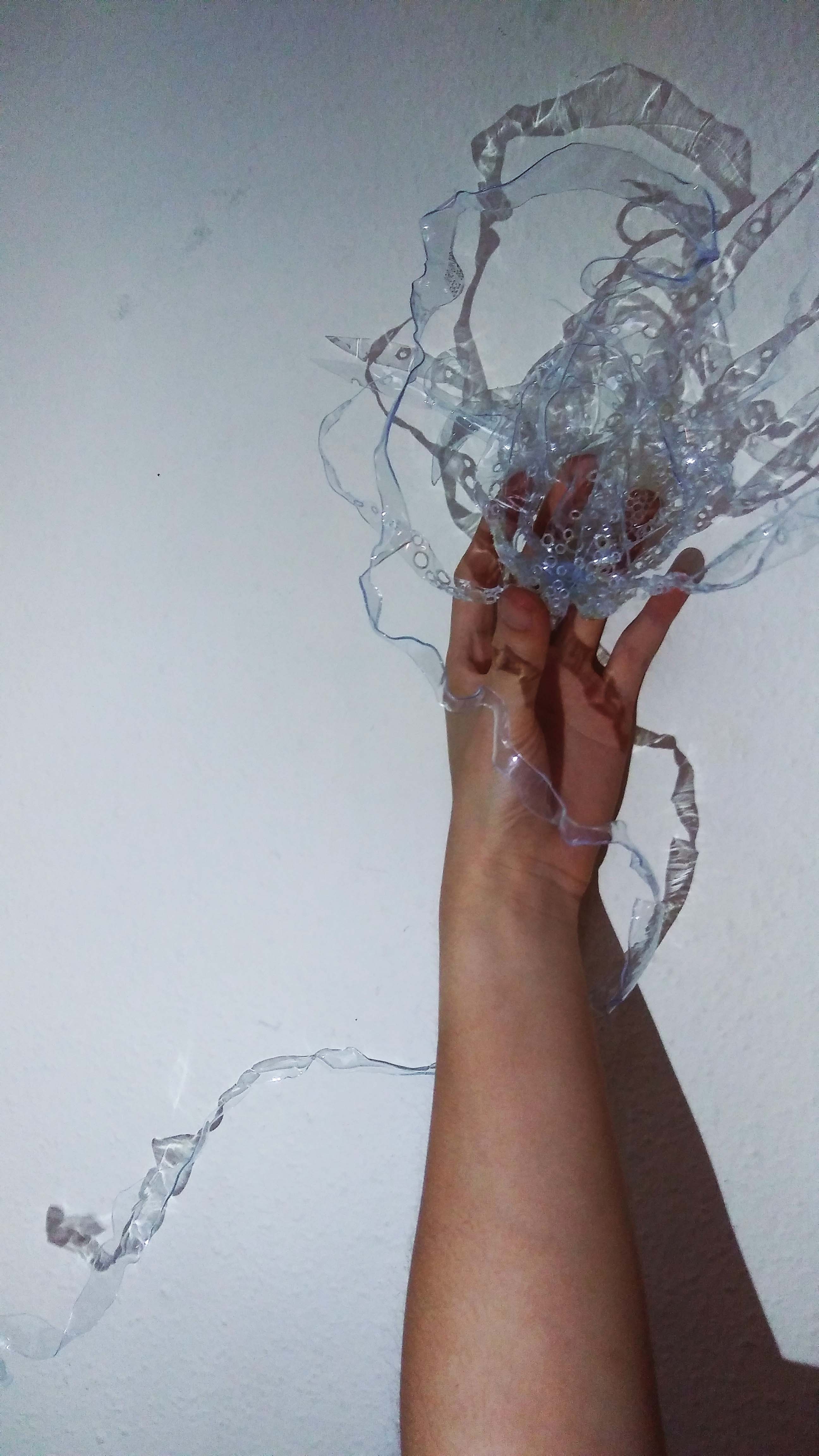
Both our models include a flower like piece and holes. Charrisa’s flower like piece is her good scent while her hole-dotted piece is the bad scent. My flower like piece is my bad scent combined with the hole-dots. We decided to do a fusion of good and bad scent and the concept will be of weaving.
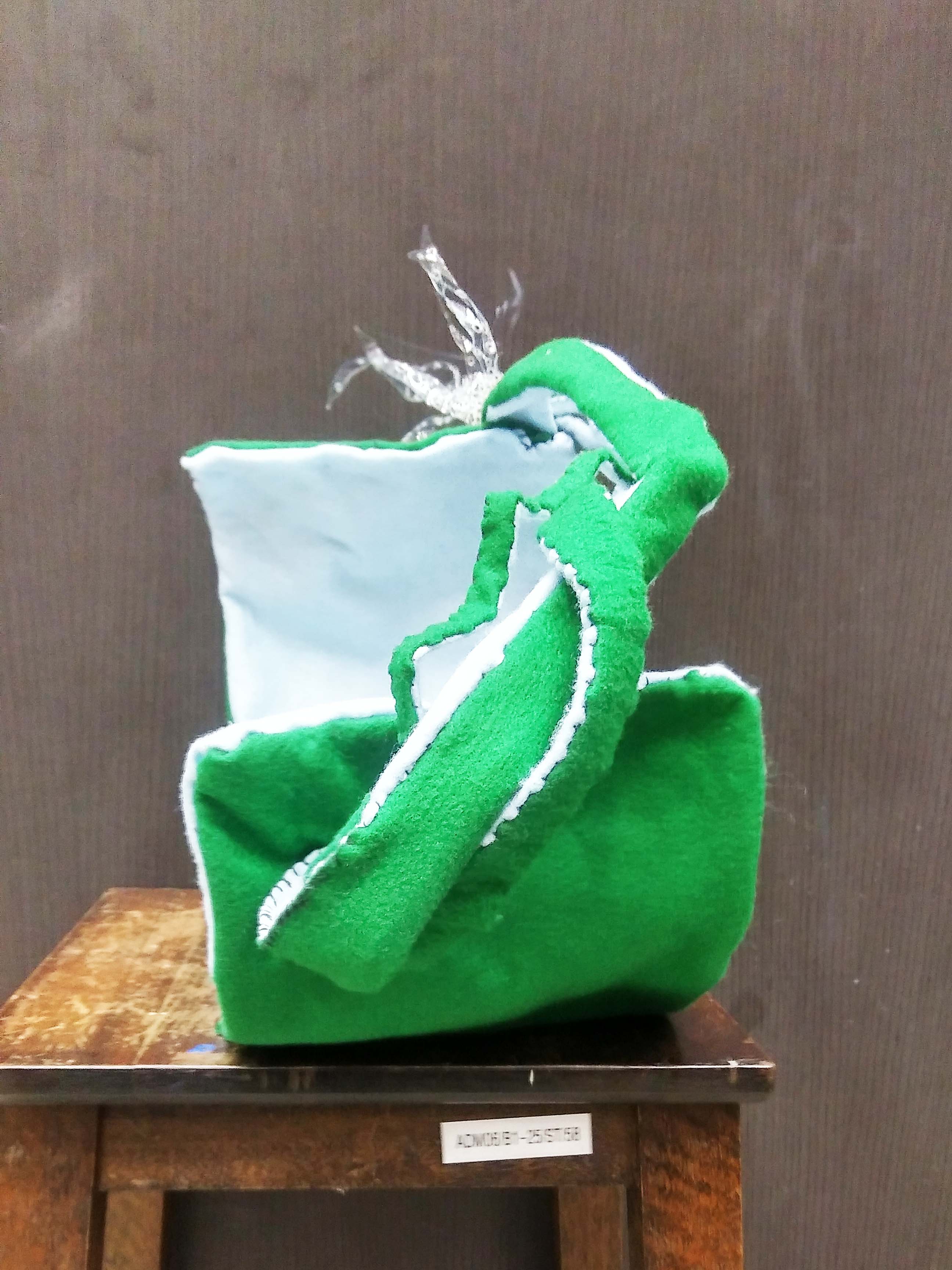
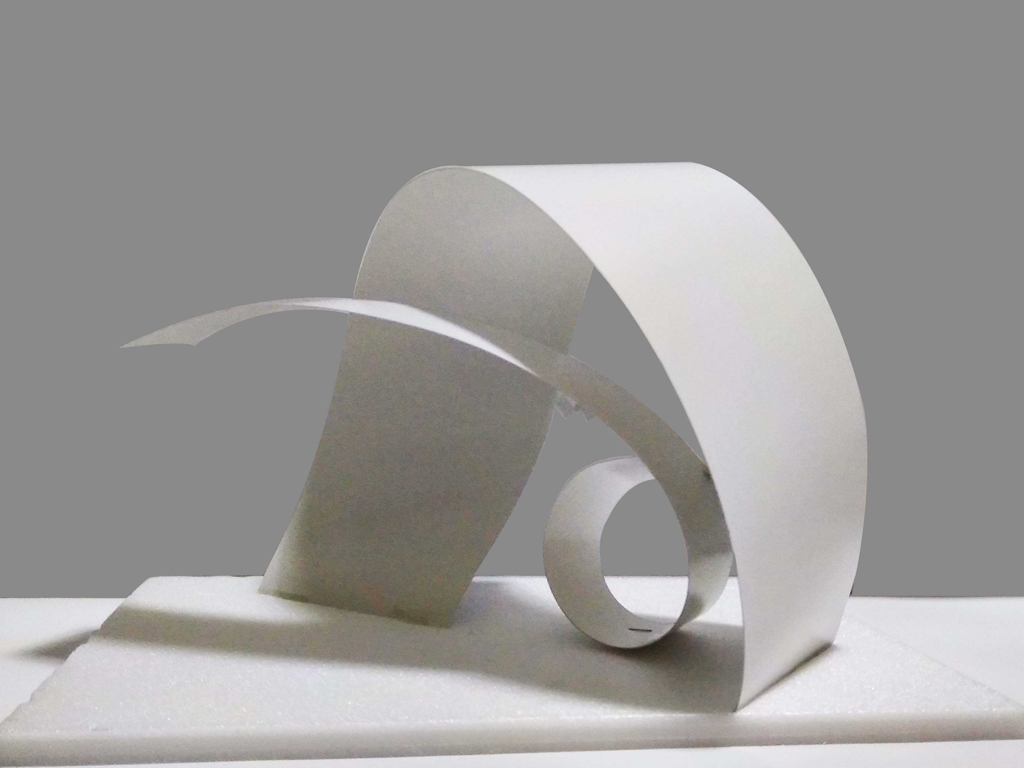
Weaving Prototype: 


We made the planes out of the individual strips from the flowery plastic piece. Mostly curve, twisted planes and one broken plane.
We intended to make the prototype as a hood.
However, due to our choice of materials, we were limited by length and were unable to achieve the expected results. This led to some modifications and the results is our final product.
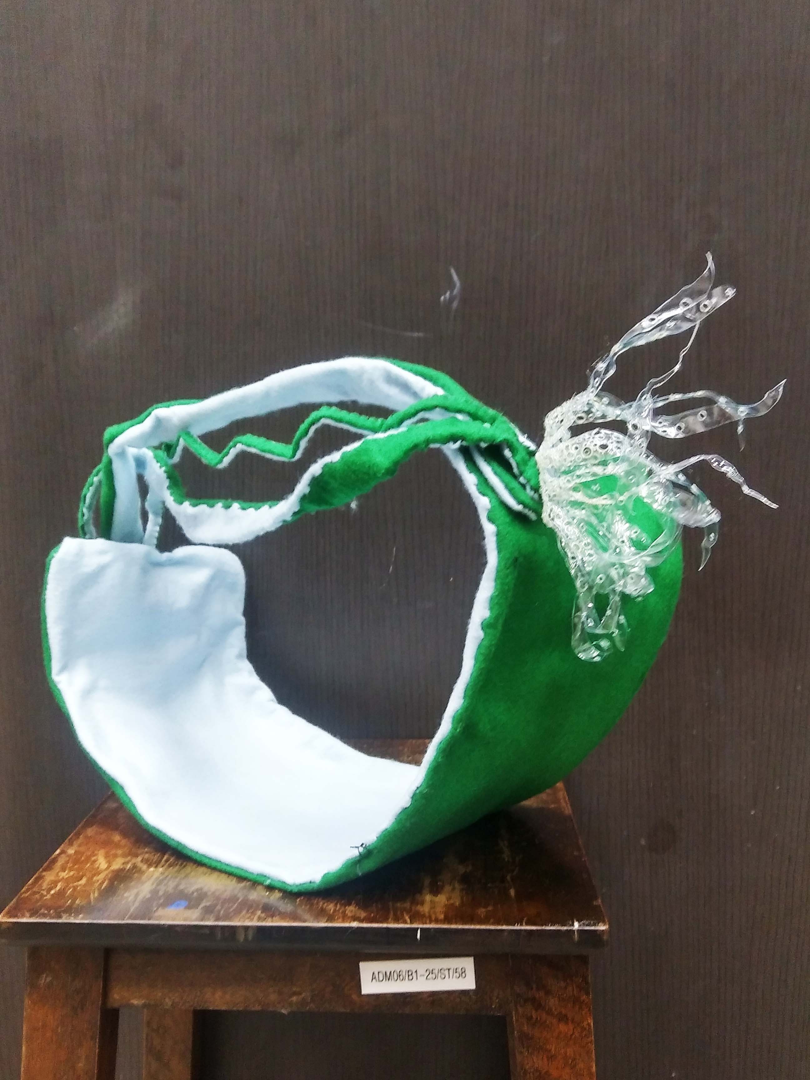
Materials: Felt and Thread
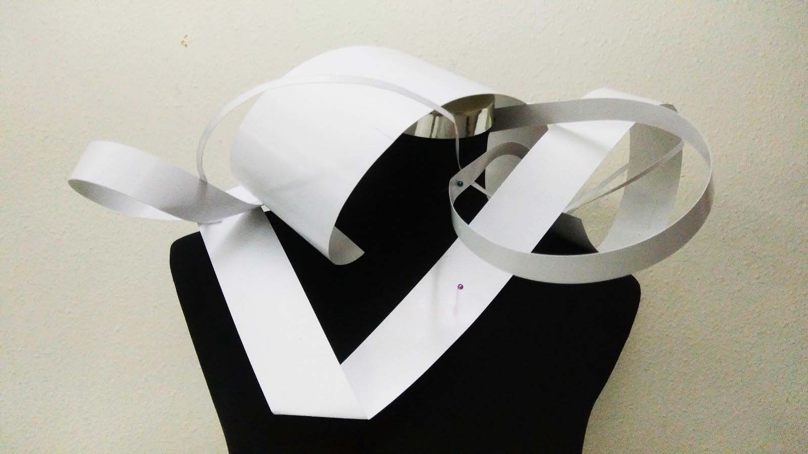
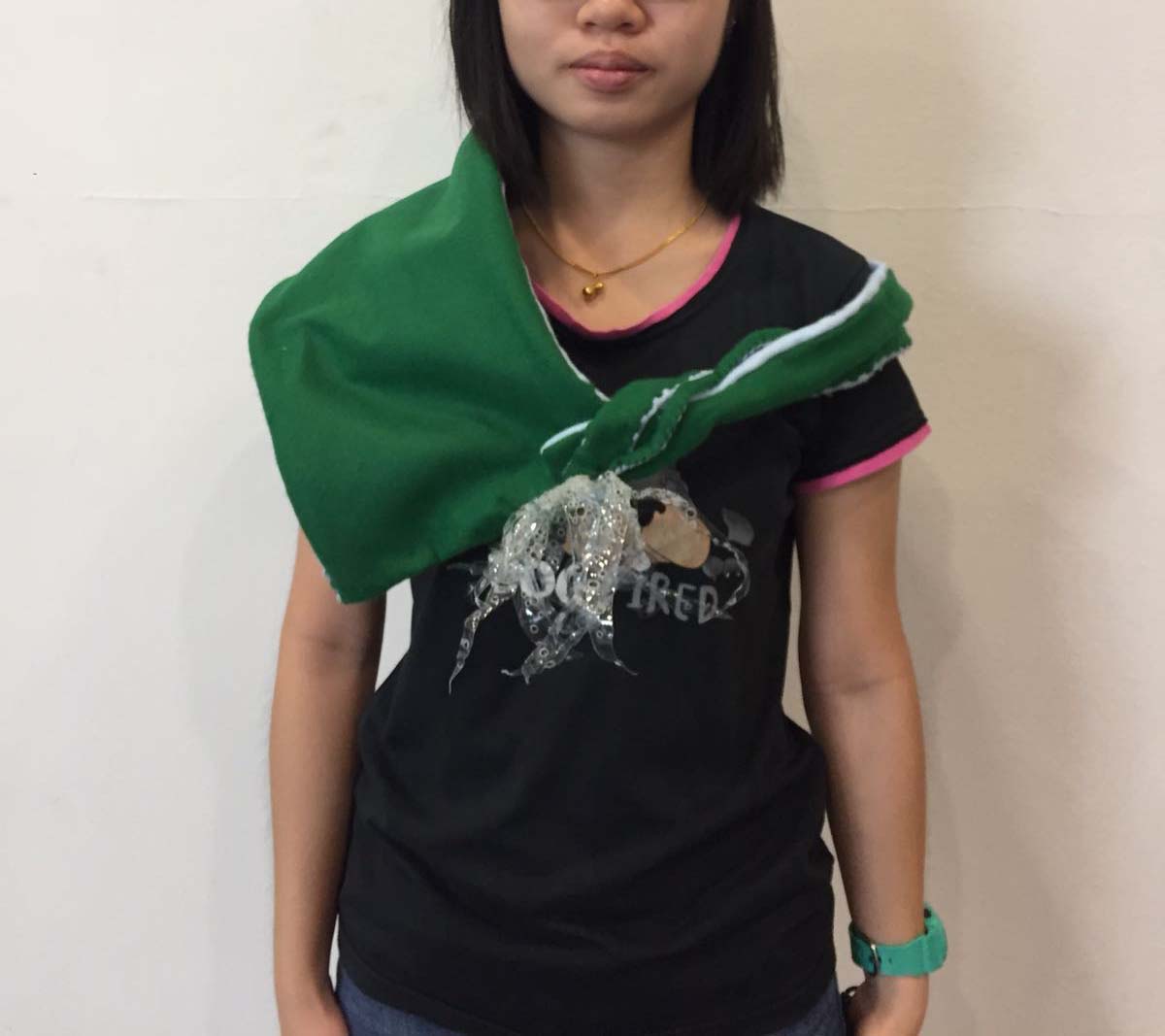
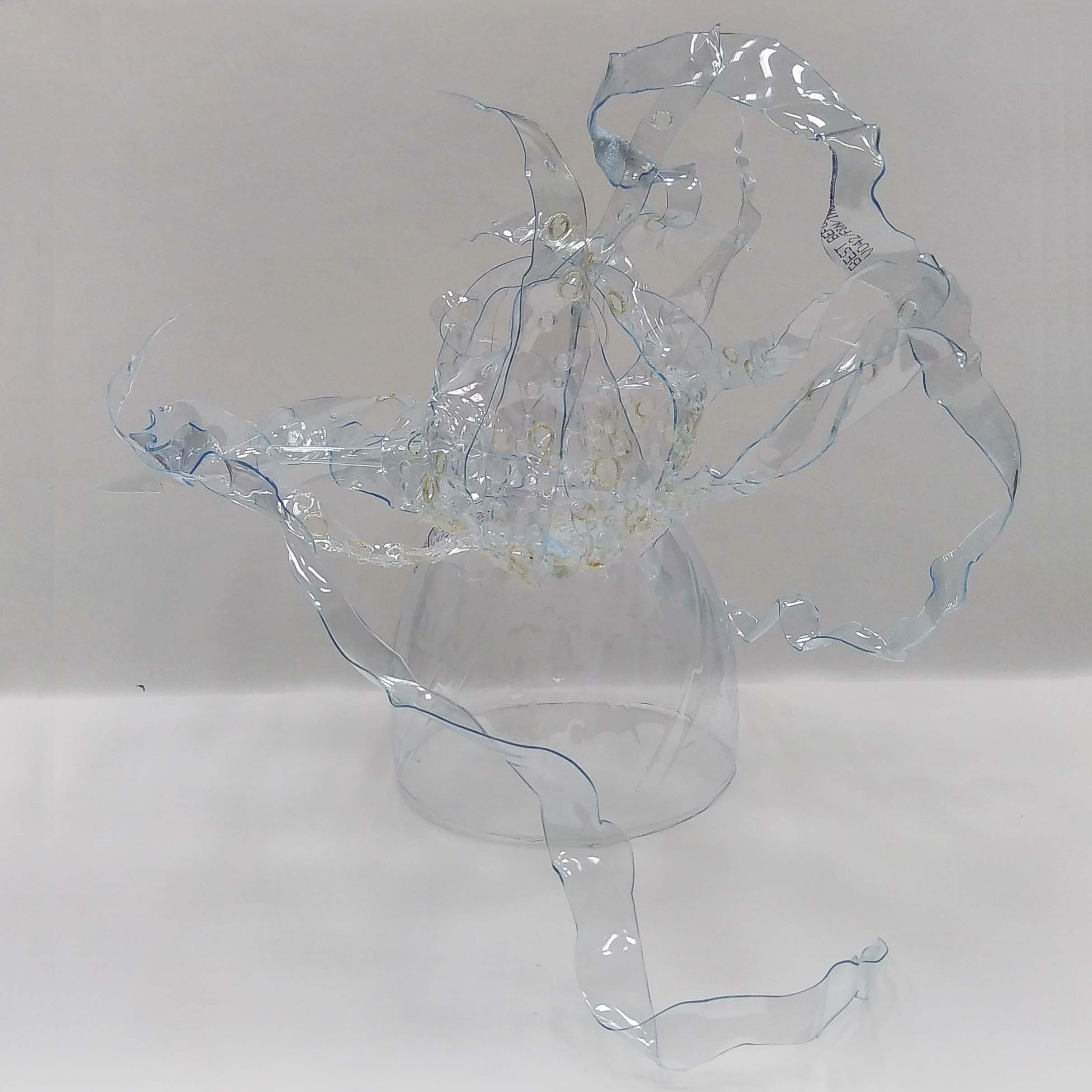
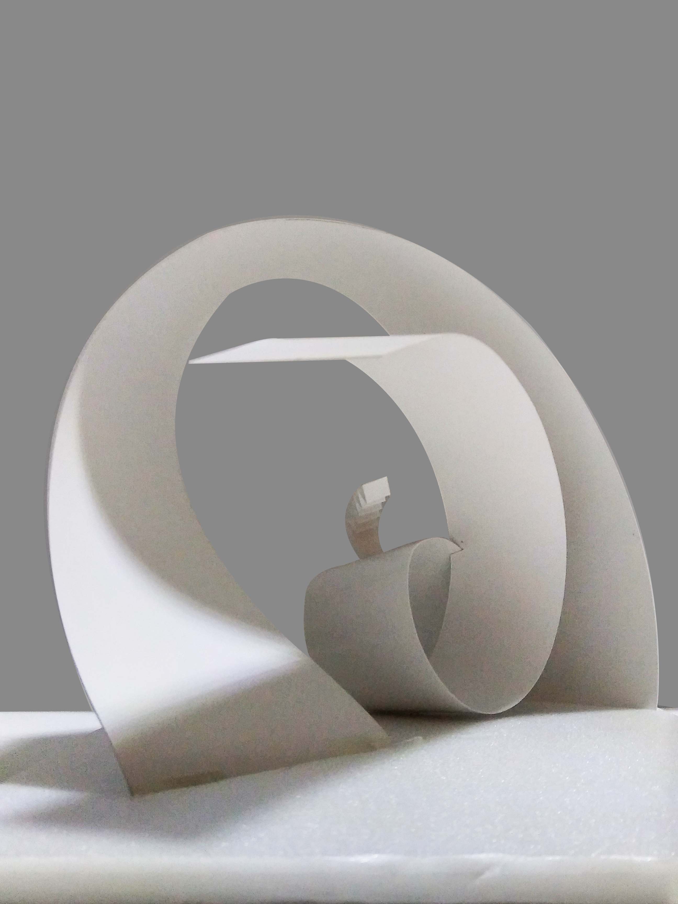
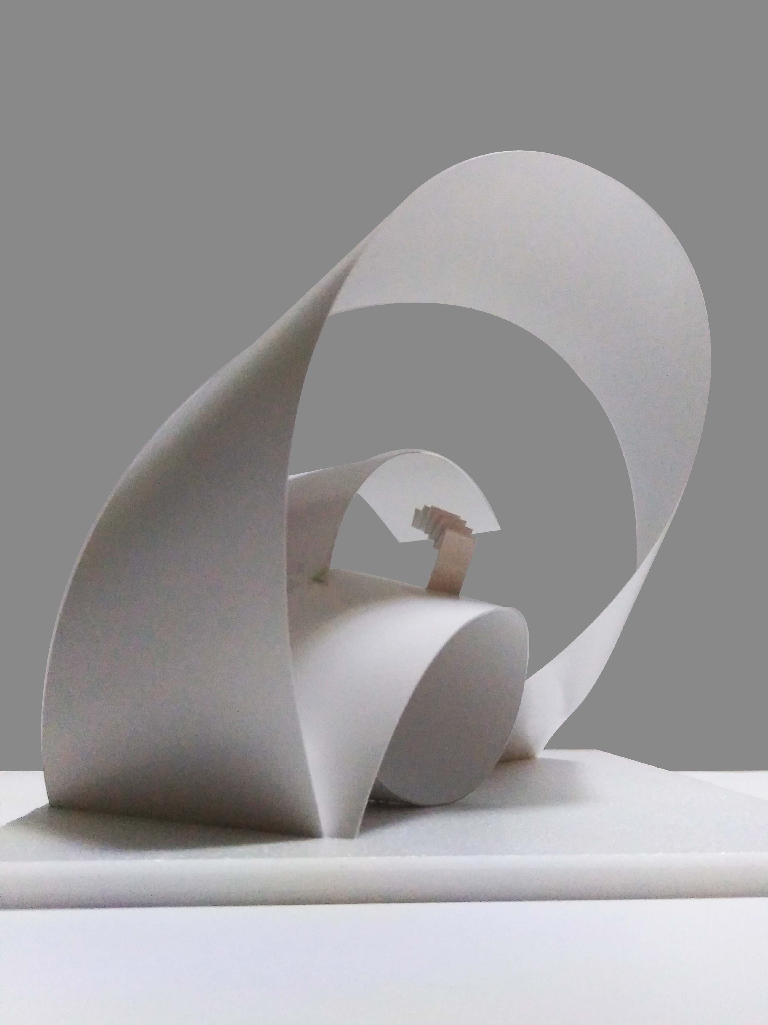
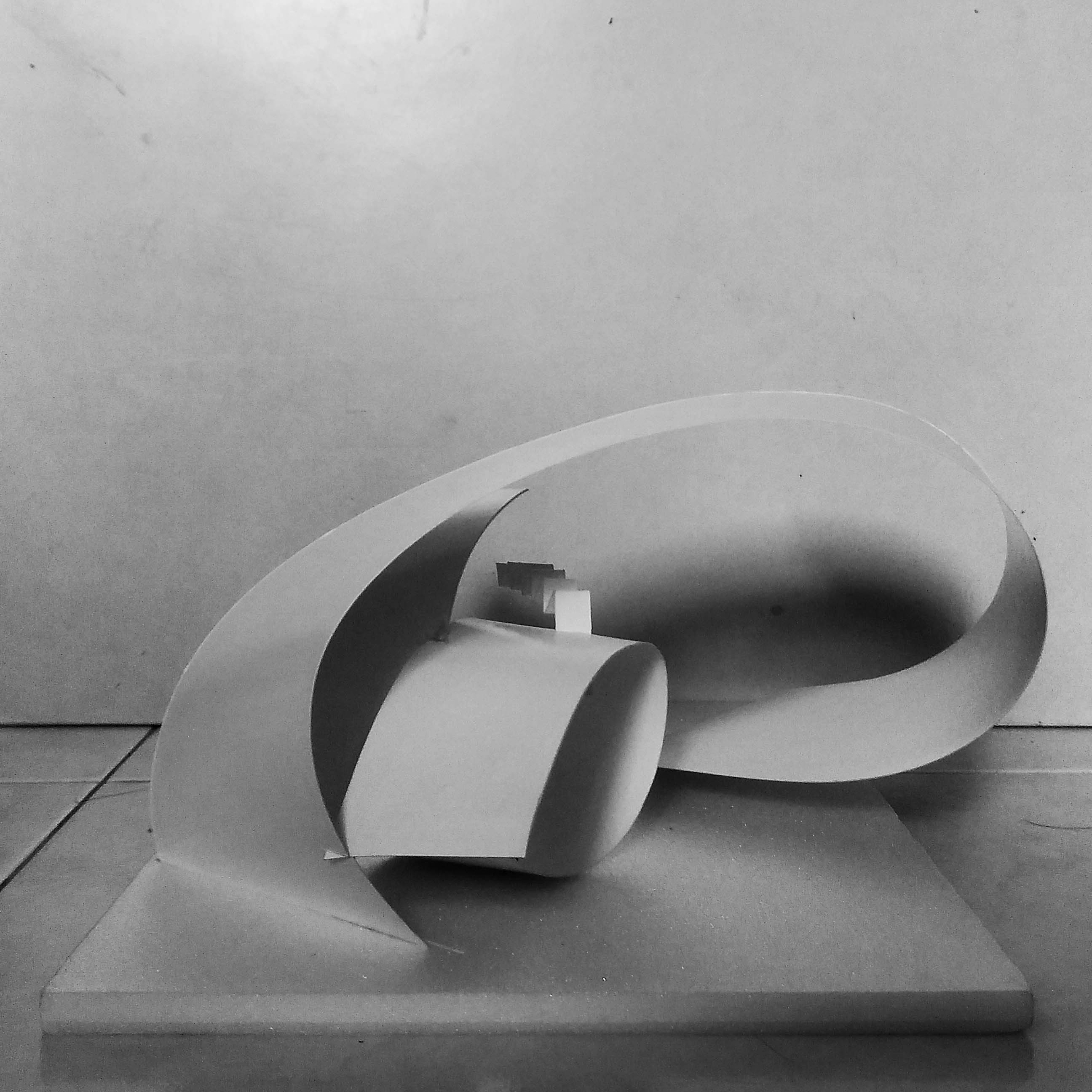
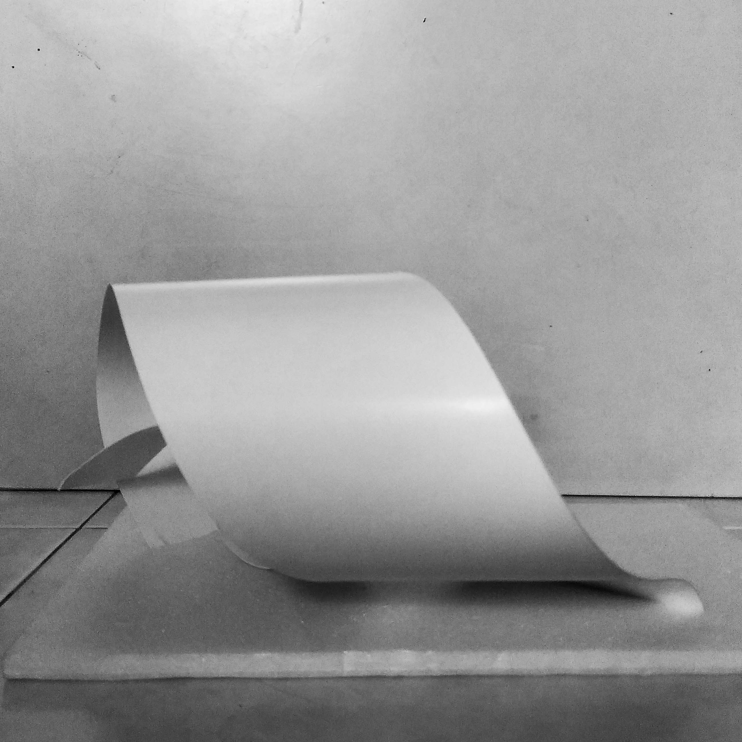
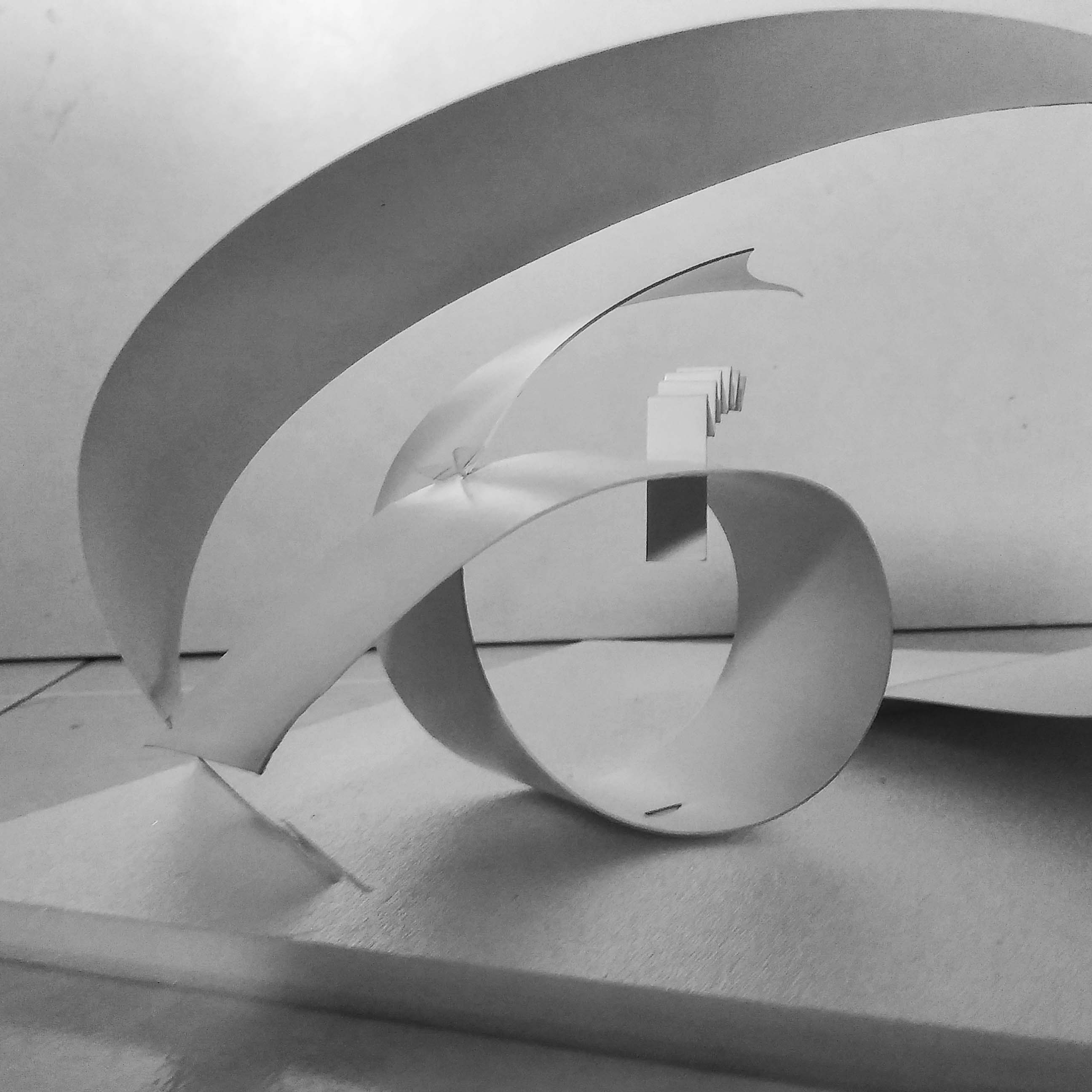
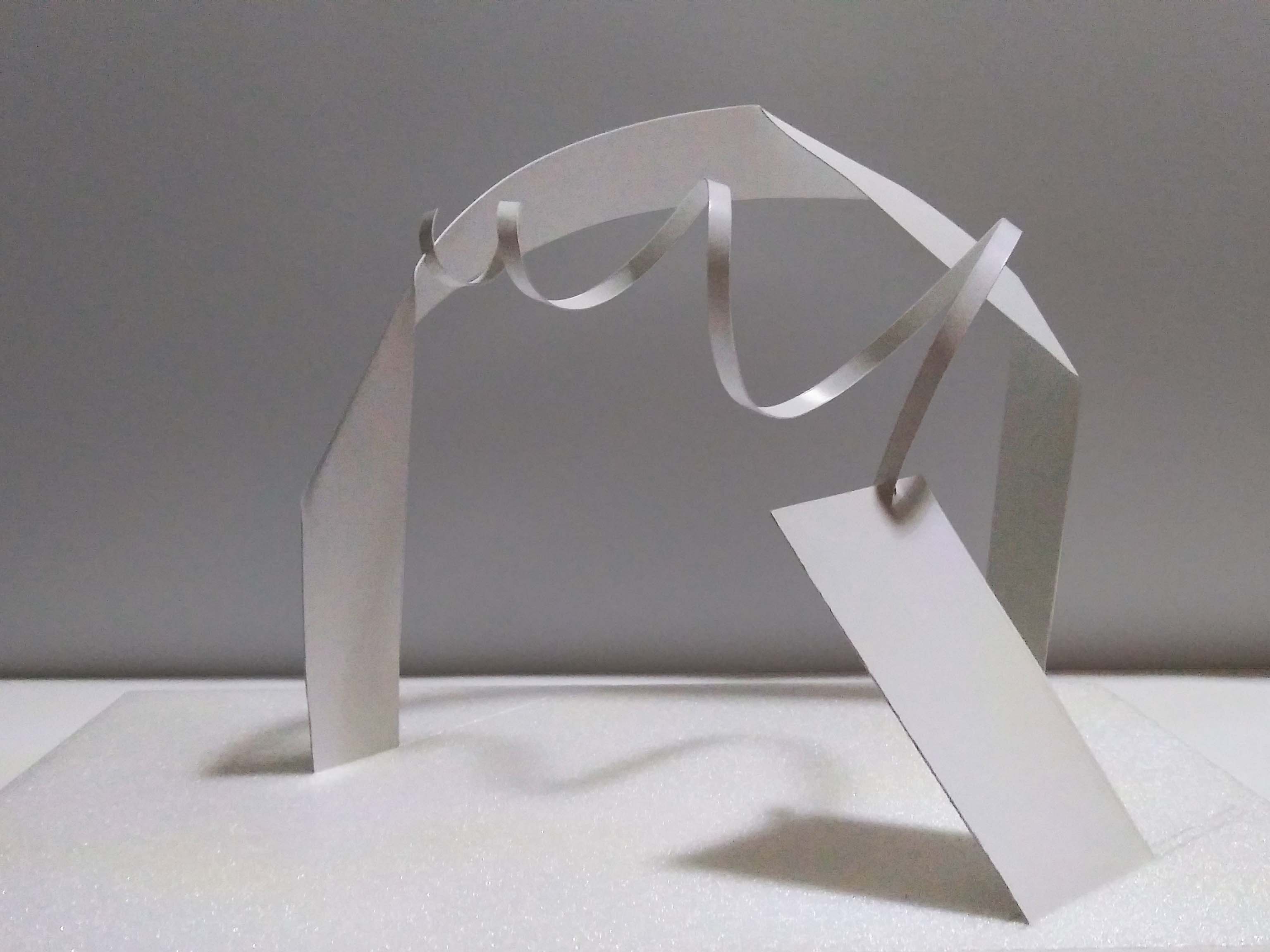
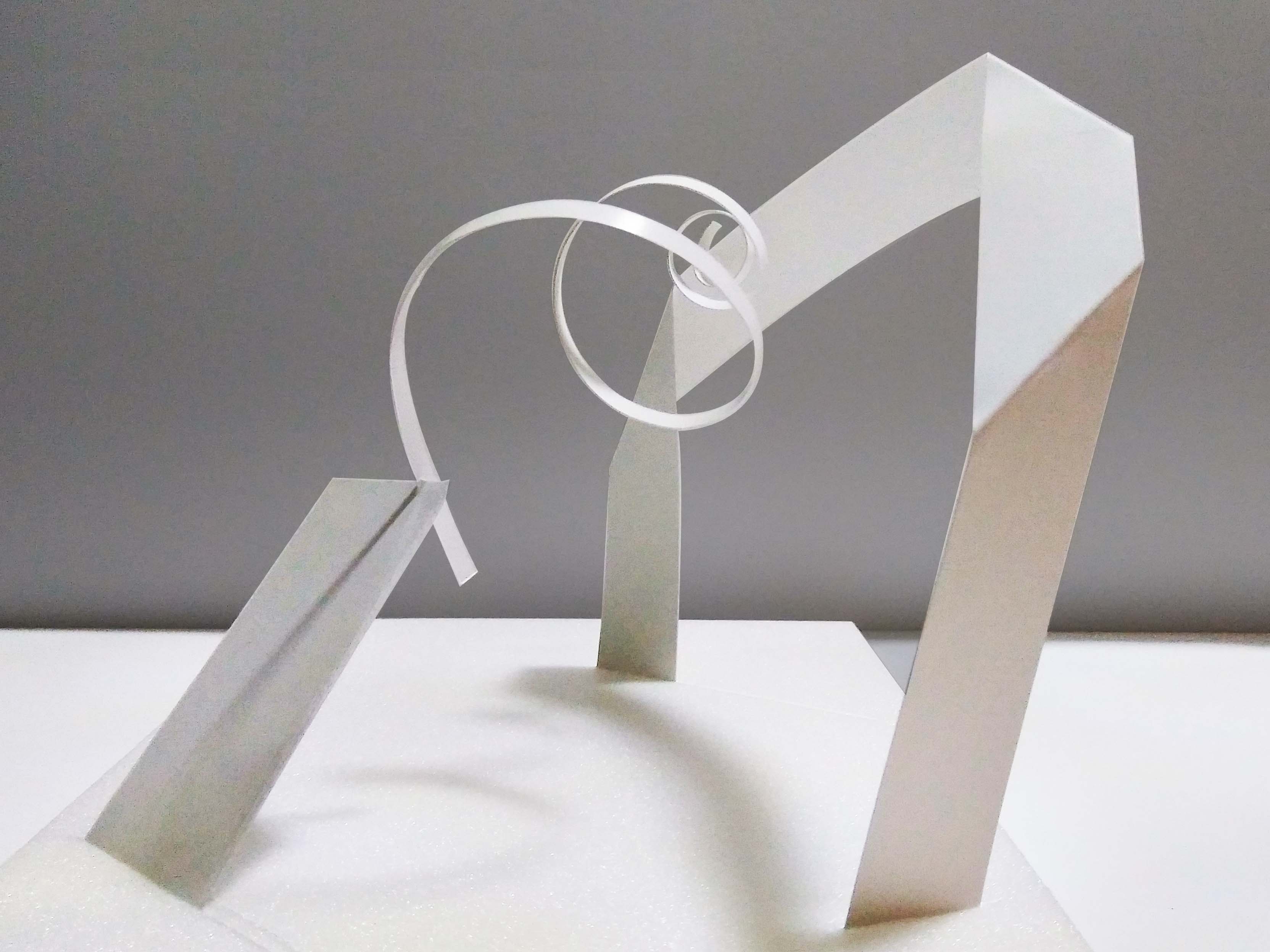
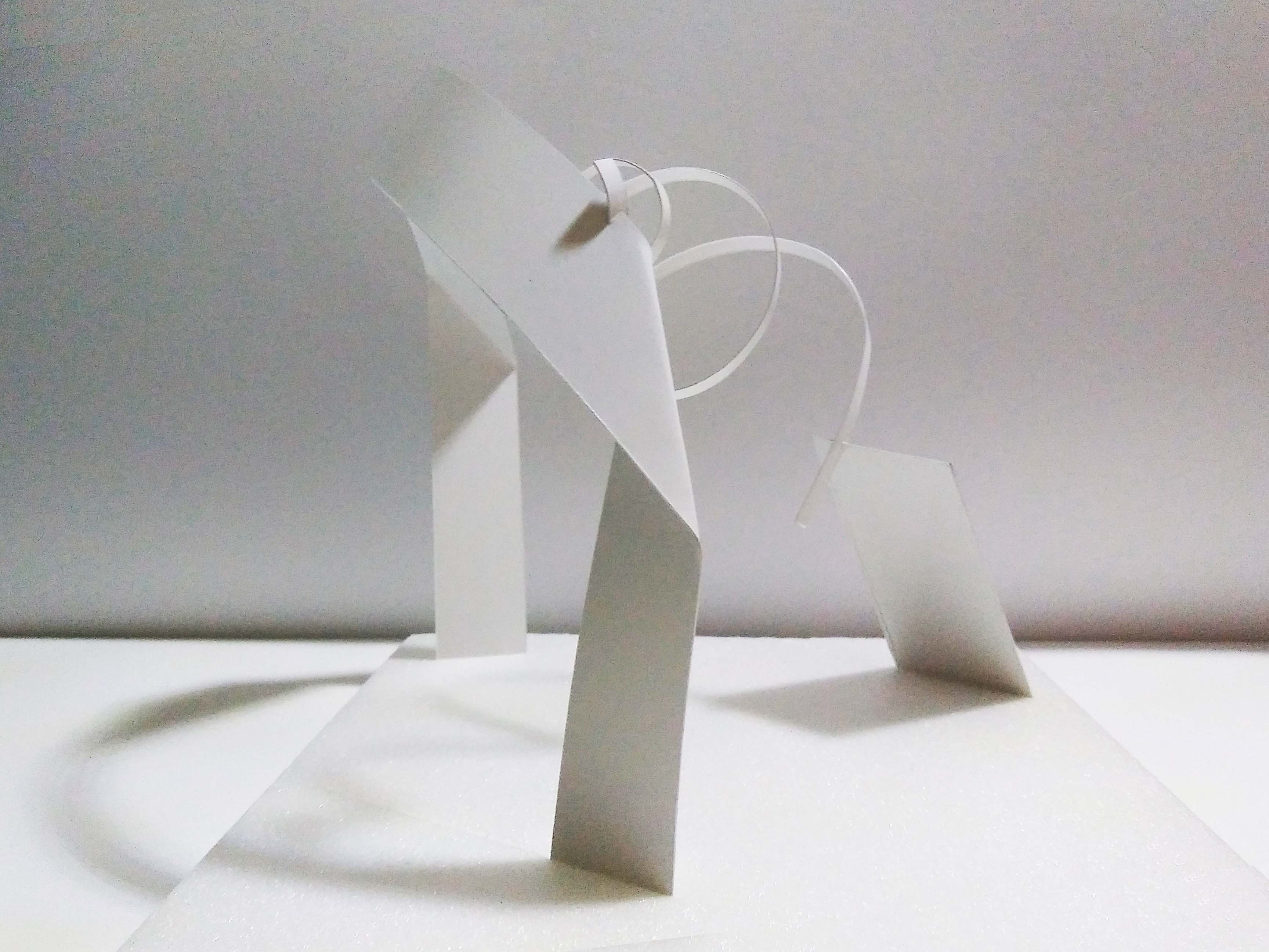
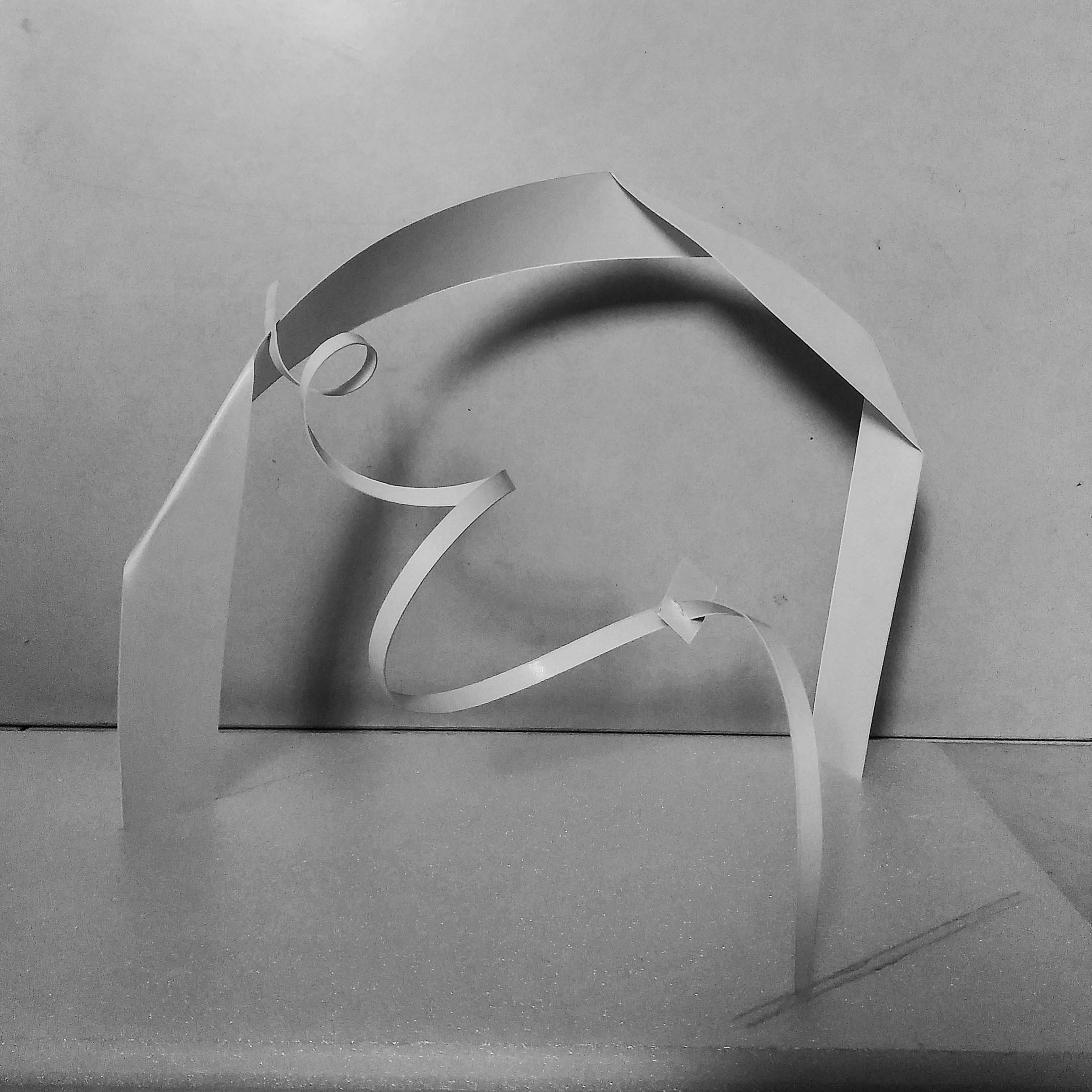
Final product:

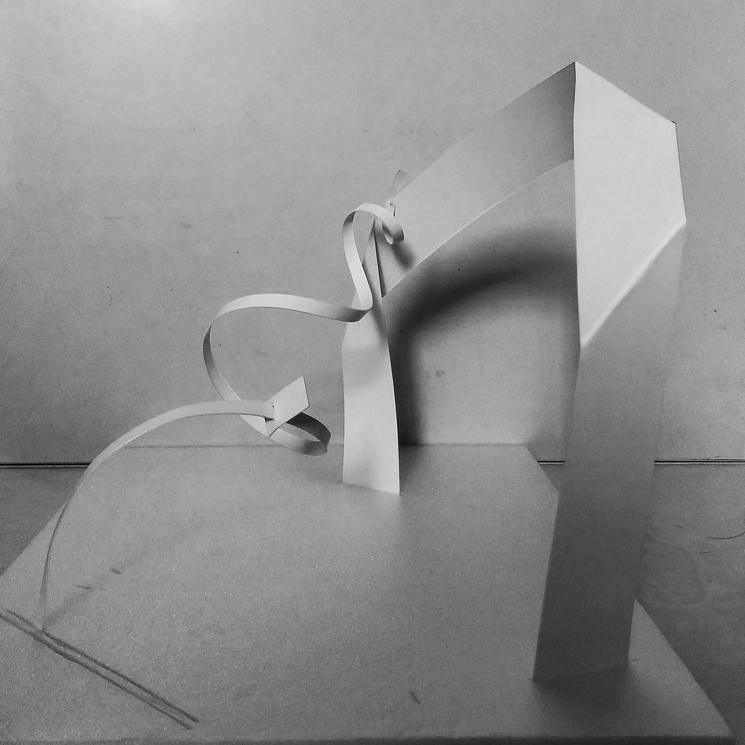
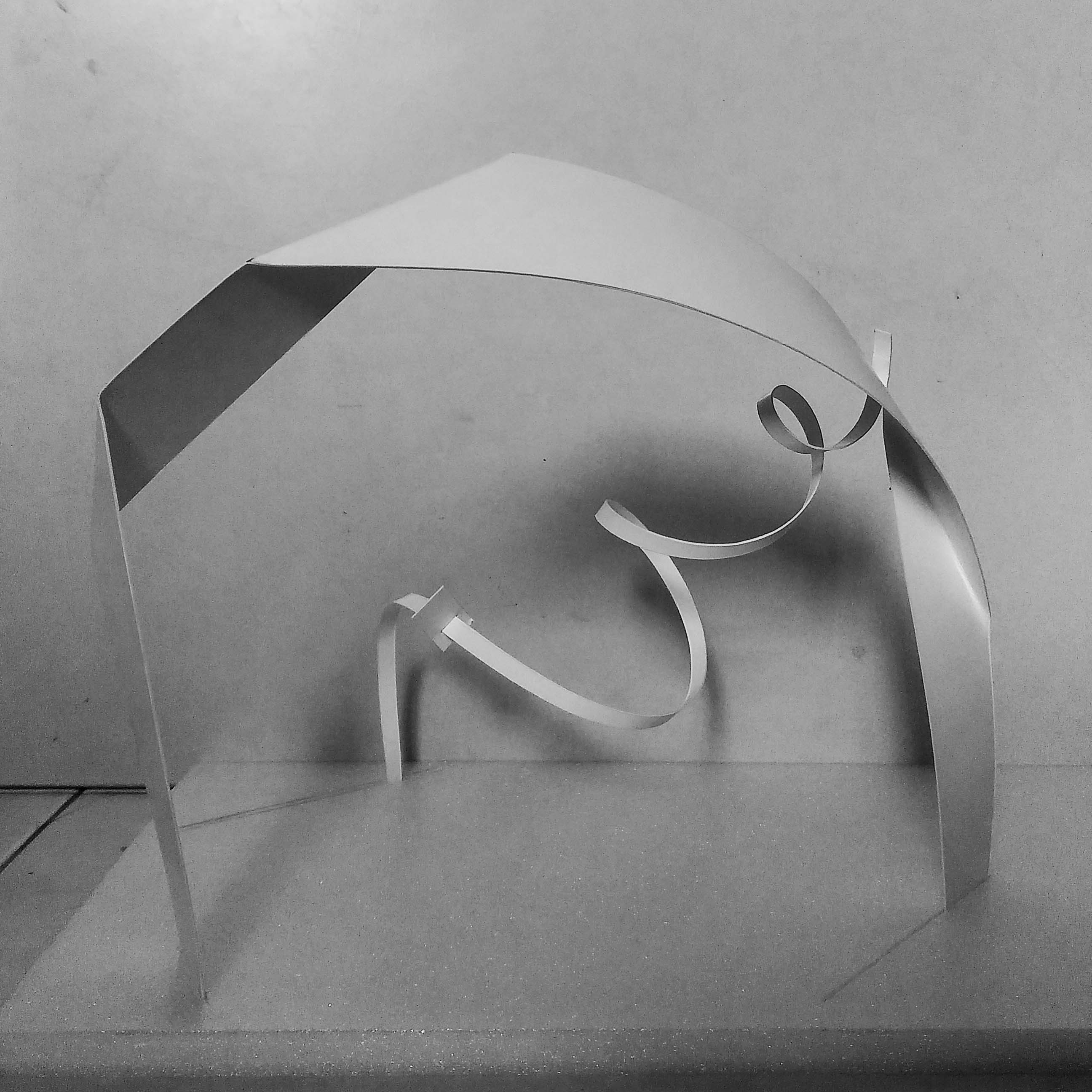
D= large curve plane
The dominant was kept and enlarged from the prototype as it was a little too small in the prototype.
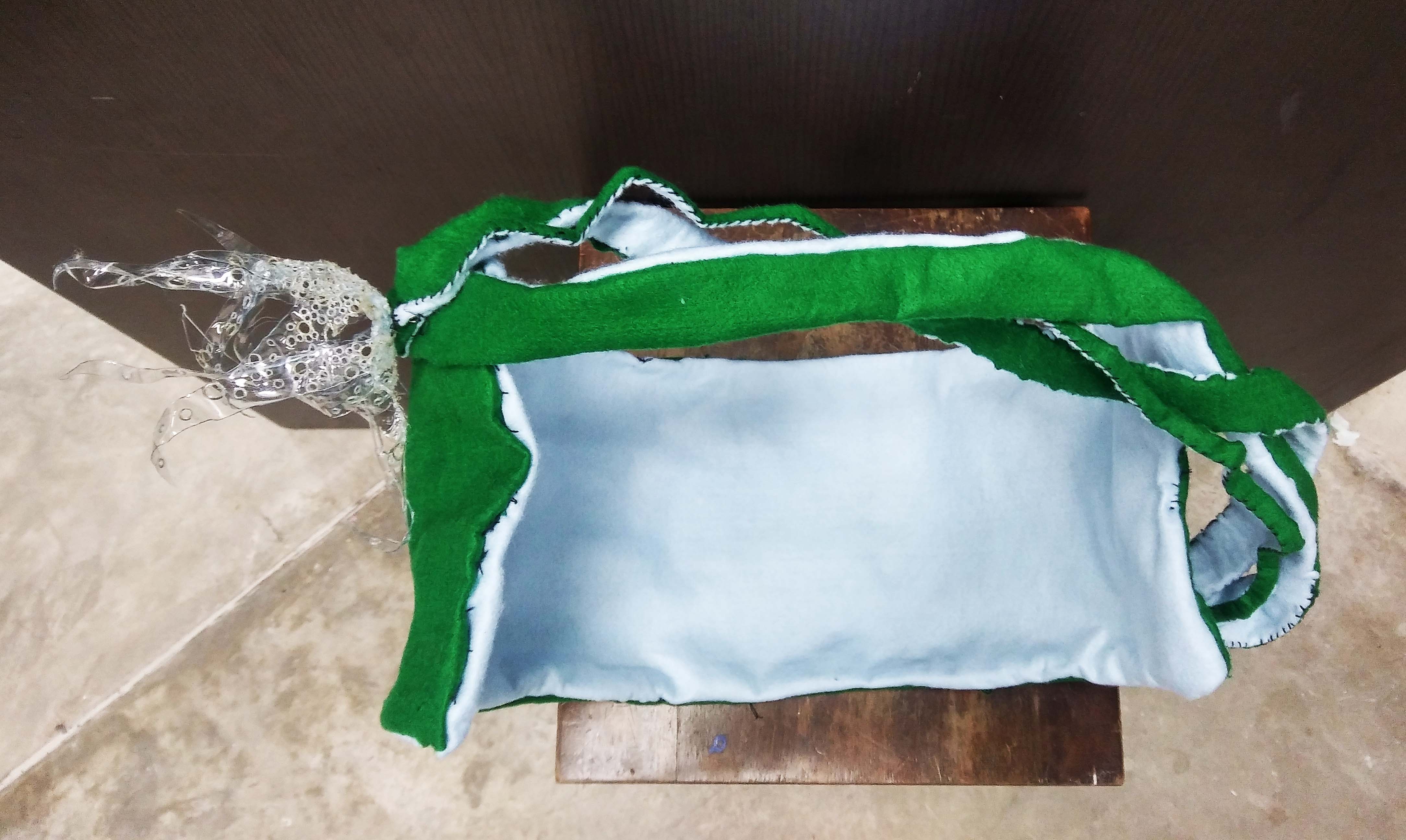
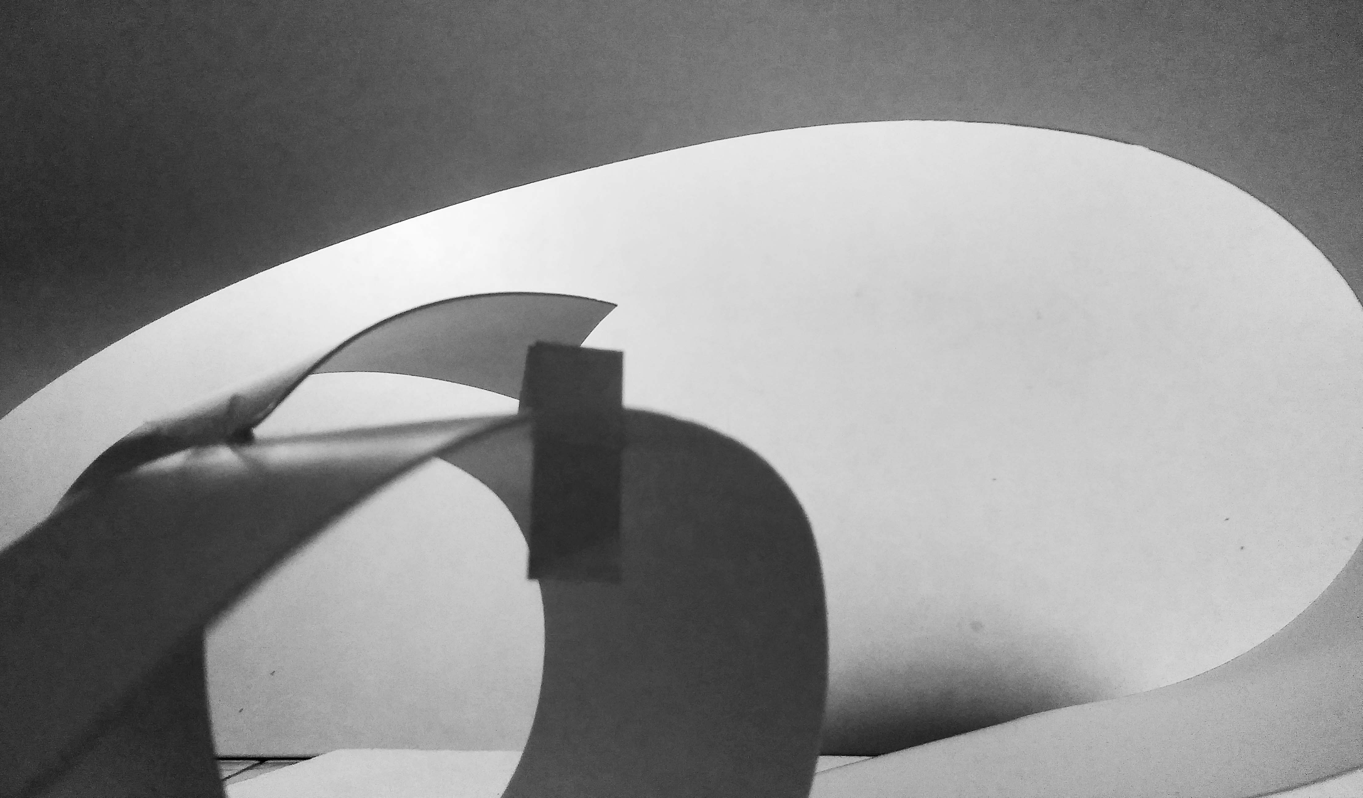
SD: twisted, bent and broken plane
The SDs are intertwine together for the mixture of good and bad scent.
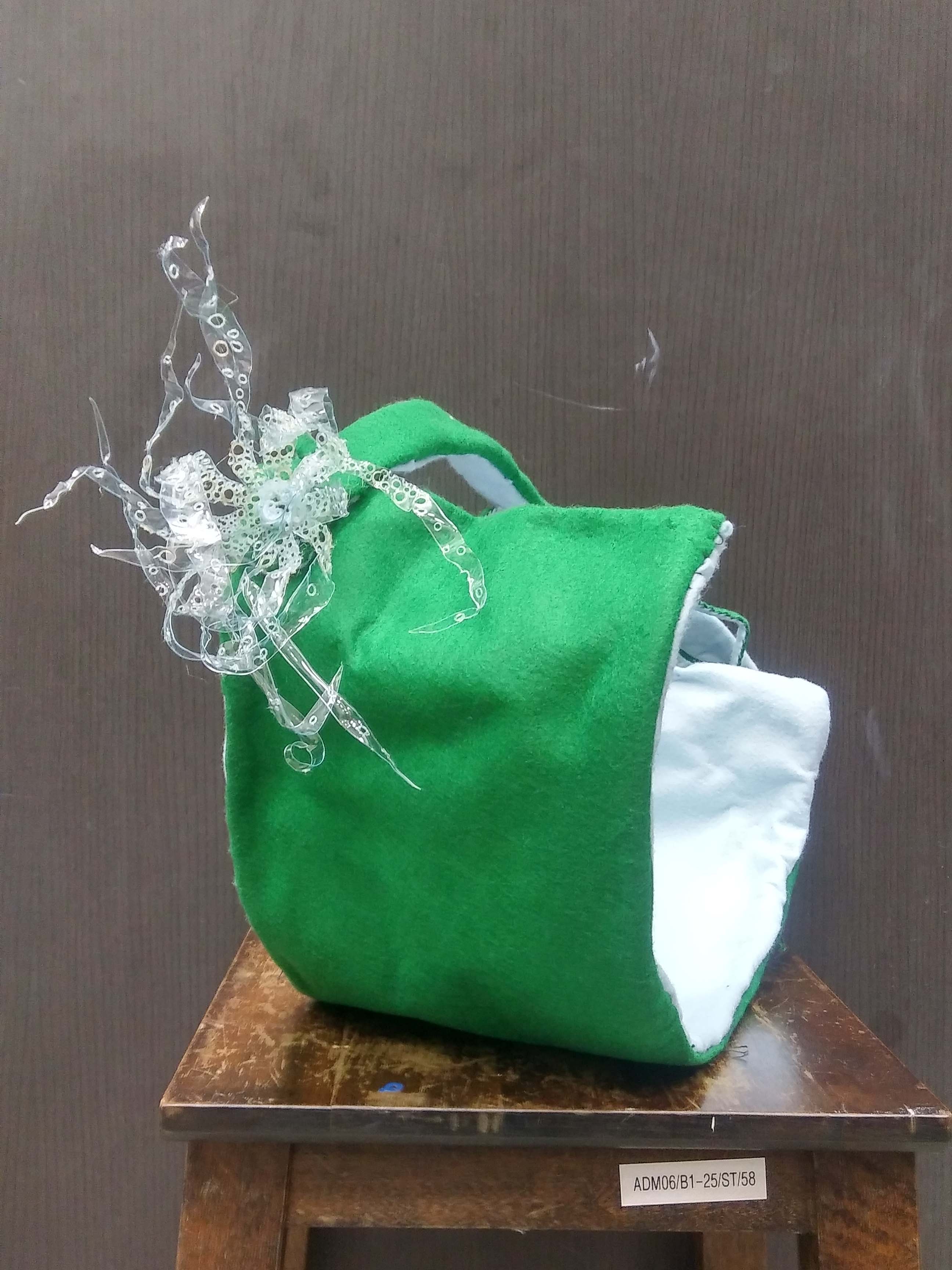
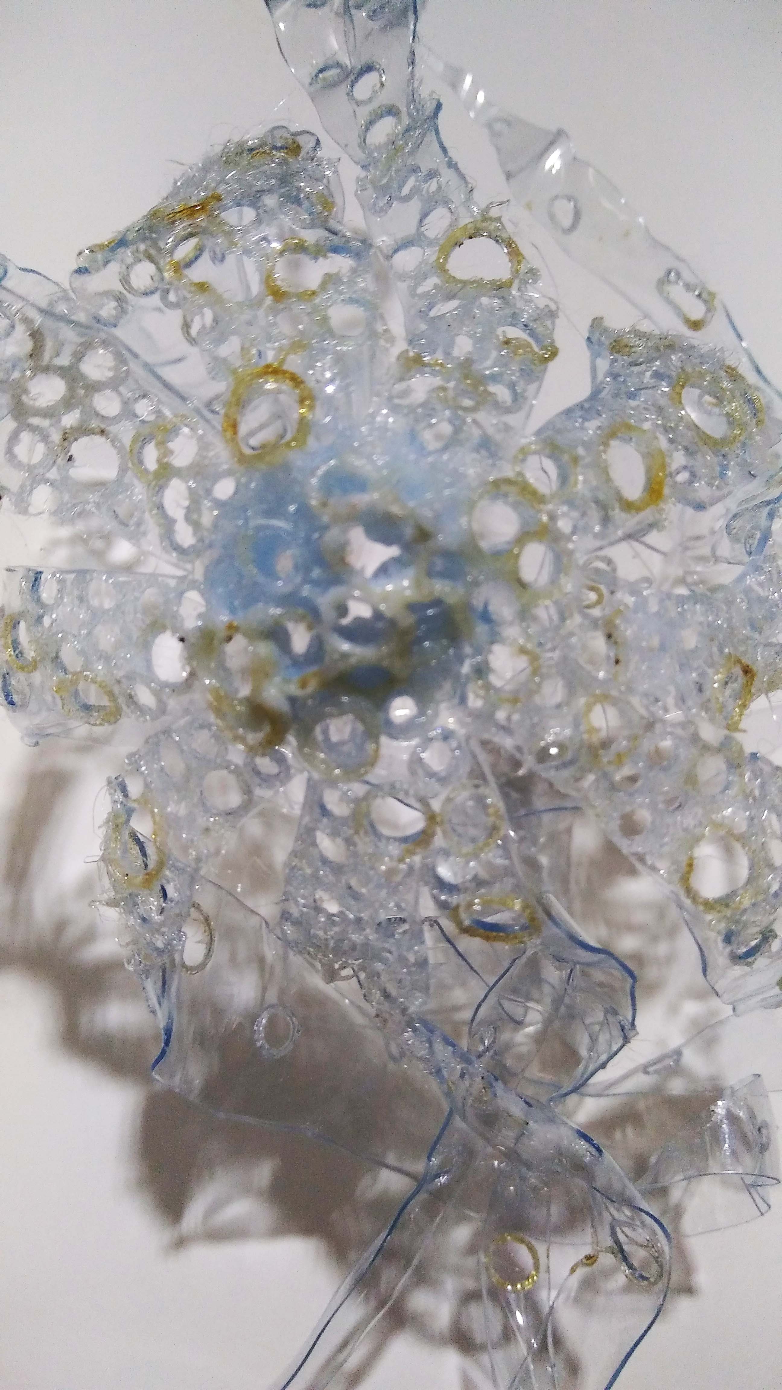
SO: complex plane
We used the piece that has both the flower form and hole-dots to link back to the origin and inspiration for the final product. Also the holes in the flowery piece makes it more of a sub-ordinate as compared to our idea of putting holes all over the product.
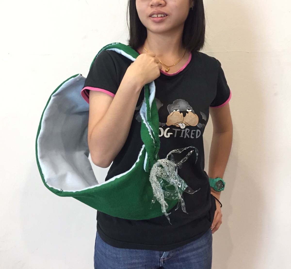
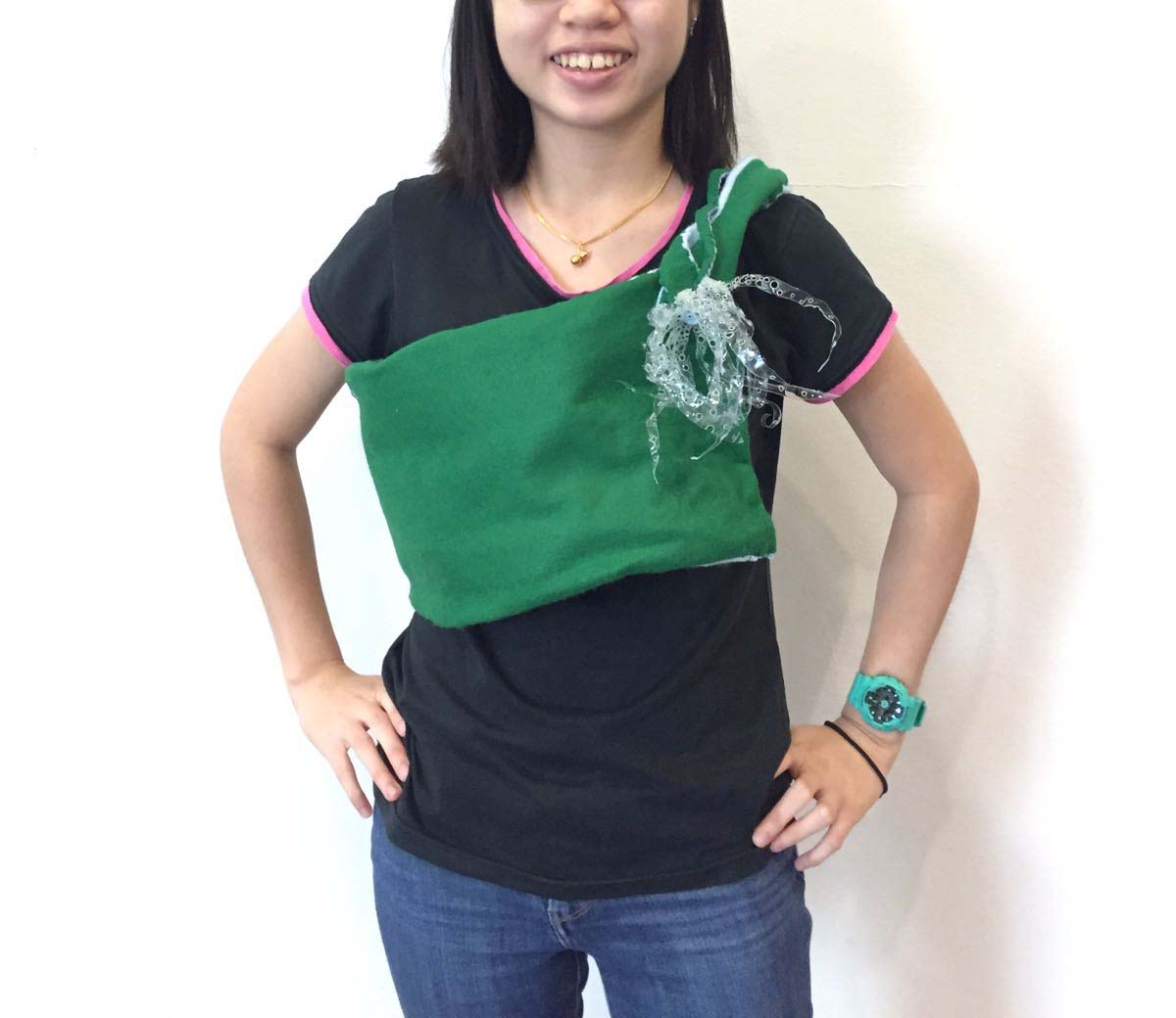
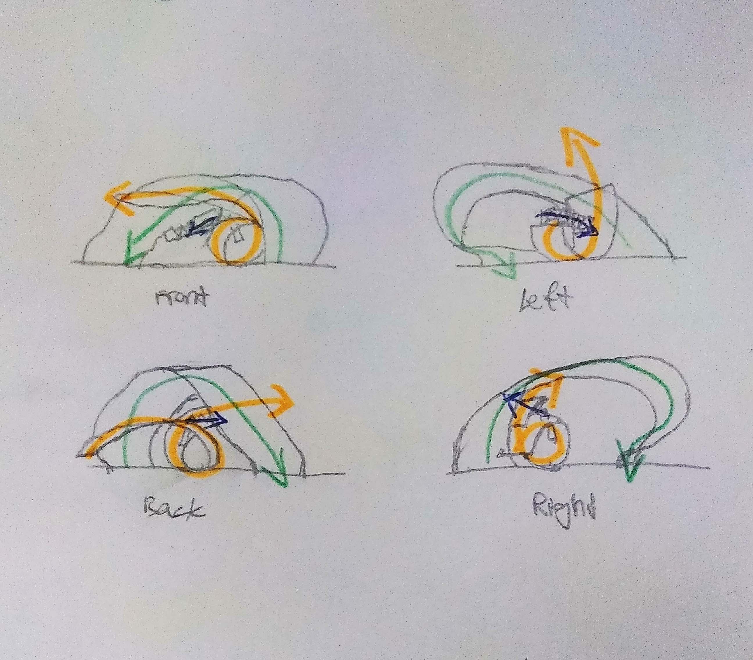
Versatile Uses:
Prev: https://oss.adm.ntu.edu.sg/ytan149/mnemosynes-scent-part-1-2/
Groupmate’s OSS: https://oss.adm.ntu.edu.sg/chew0360/
Mnemonic Device
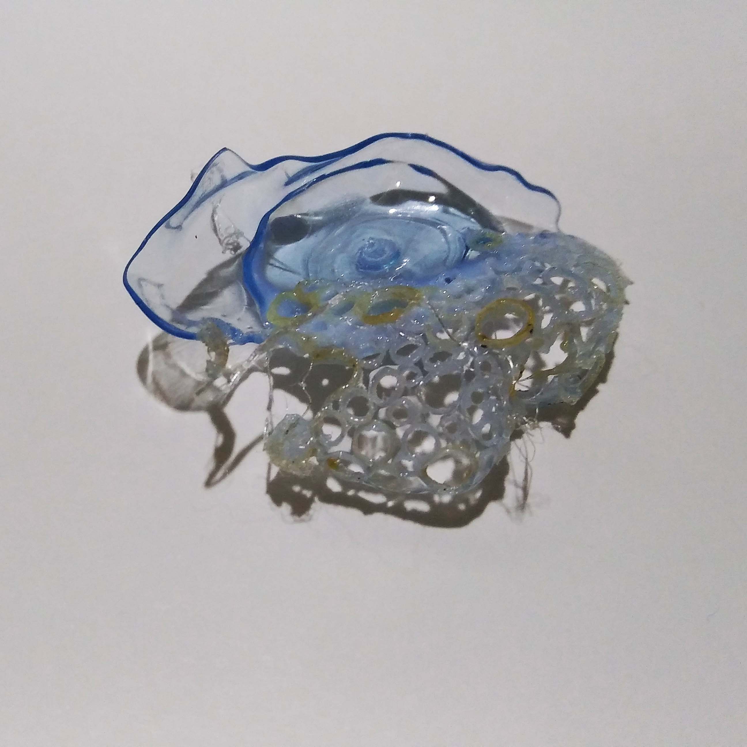
Mopiko scent shaped like a flame to represent the burning/stinging sensation when applied. Texture for itch. Long curling piece represents scent of home and the comfort feeling as if being embraced.
So I poked the plastic full of holes. The texture of the plastic after being poked full of holes makes it quite addictive to touch which reflects the ‘itchy’.
Good Scent
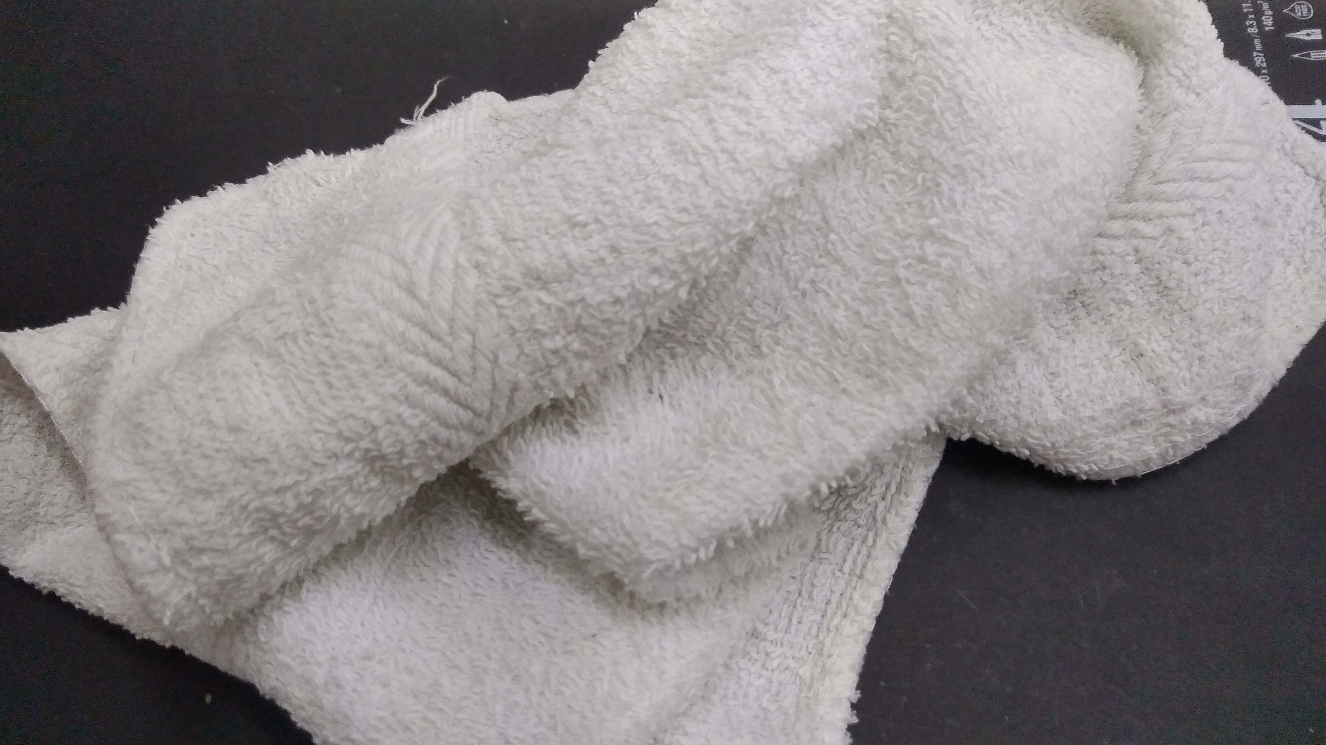
You know how different household has different smell? I think the smell comes from our choice of detergent. I picked out a fresh clean handkerchief to represent the smells of my home. It is a comforting scent.
Comfortable = no sharp edges = hugging
Bad Scent

Mosquito bites are extremely itchy. O_O My skin swells around the bite and I can’t stop scratching to relief myself. And when I get bitten it is not one, but many bites. I hate it so much. Mopiko is suppose to help mosquito bites but to me it doesn’t do its job. There is also a slight burning sensation when applied that is incorporated into the design.
Warm = stabbing = sharp edges
Test Pieces

Research
How to create a Scent Memory?
Step 1: Follow your nose
Find an unfamiliar scent; one you’ve never smelled before. “Novelty is important because we know from memory research that certain entities can hold [only] so much association power,”
Step 2: Have a moment
Choose the event that you want to relive —just make sure it’s an evocative one. “The strength of the conditioning does seem to rest on how emotional the experience is and the intensity of those emotions,”
Step 3: Distribute the scent
Organize your ancillaries and place the scent all around the space of your chosen event. Tuck the scent away if your chosen moment is an upcoming trip. You don’t want to wear or smell the notes so much in advance of the experience you’re trying to capture that you actually start adapting to them.
Step 4: Layer it on
When the time comes, start exposing yourself to the scent. “forming an odor association to a pleasant event takes a few more pairings than it would with a negative event,”
Step 5: Get some distance
Put away the scent after the occasion is over. Keep away from it for a few months before taking it out again to trigger the memory. But, you cannot visit the scent frequently or it will lose its ‘precious power’.
“HOW TO CREATE A SCENT MEMORY.” Instyle 23, no. 9 (September 2016): 327. MAS Ultra – School Edition, EBSCOhost (accessed October 15, 2017).
Mnemonic Device
Techniques a person can use to help them improve their ability to remember something.
In this project we need to link scent to form. Visual imagery of form and colours can help us memorize items. Such as green grass, yellow sun, blue water etc.
Example: The Method of Loci
“First, imagine a place with which you are familiar. For instance, if you use your house, the rooms in your house become the objects of information you need to memorize. Another example is to use the route to your work or school, with landmarks along the way becoming the information you need to memorize.
You go through a list of words or concepts needing memorization, and associate each word with one of your locations. You should go in order so that you will be able to retrieve all of the information in the future.”
“By recalling specific imagery, it can help us recall information we associated with that imagery.”
“Memory And Mnemonic Devices | Psych Central”. 2017. Psych Central. Accessed October 16. https://psychcentral.com/lib/memory-and-mnemonic-devices/.
Next: https://oss.adm.ntu.edu.sg/ytan149/mnemosynes-scent-group-work/
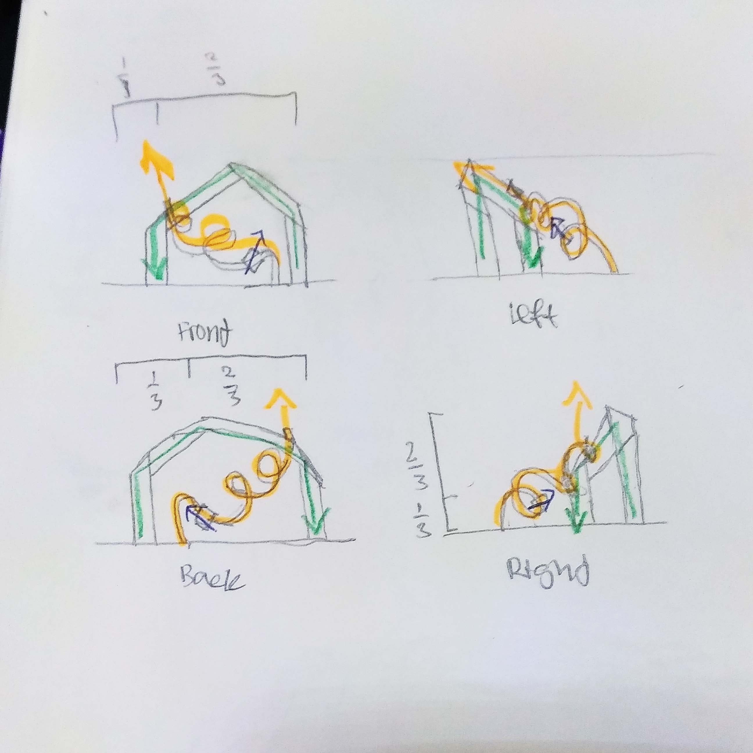
Planes
I made some 2D planes to visualize what the different 2D planes look like.
1. Straight Axis
2. Bent Axis
3. Curve Axis
4. Complex Axis
I also tried out the different types of 3D planes.
1. Curve
2. Broken
3. Twisted
4. Grouped
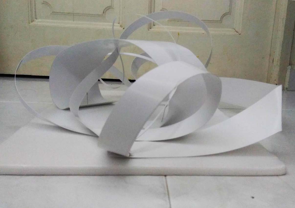
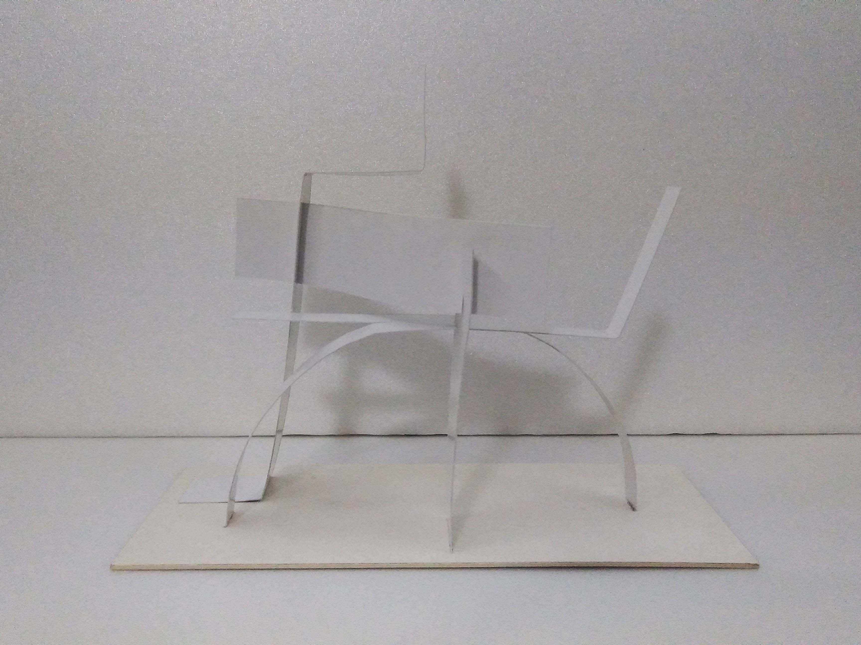
Prototype 1 & 2:
Using strips of different widths I tried to make an interesting composition. I end up cutting the strip which I was not suppose to. Thus the creation of prototype 3 and 4.

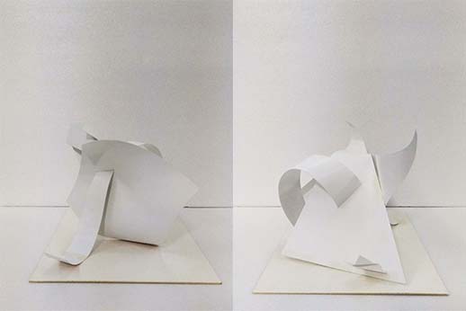
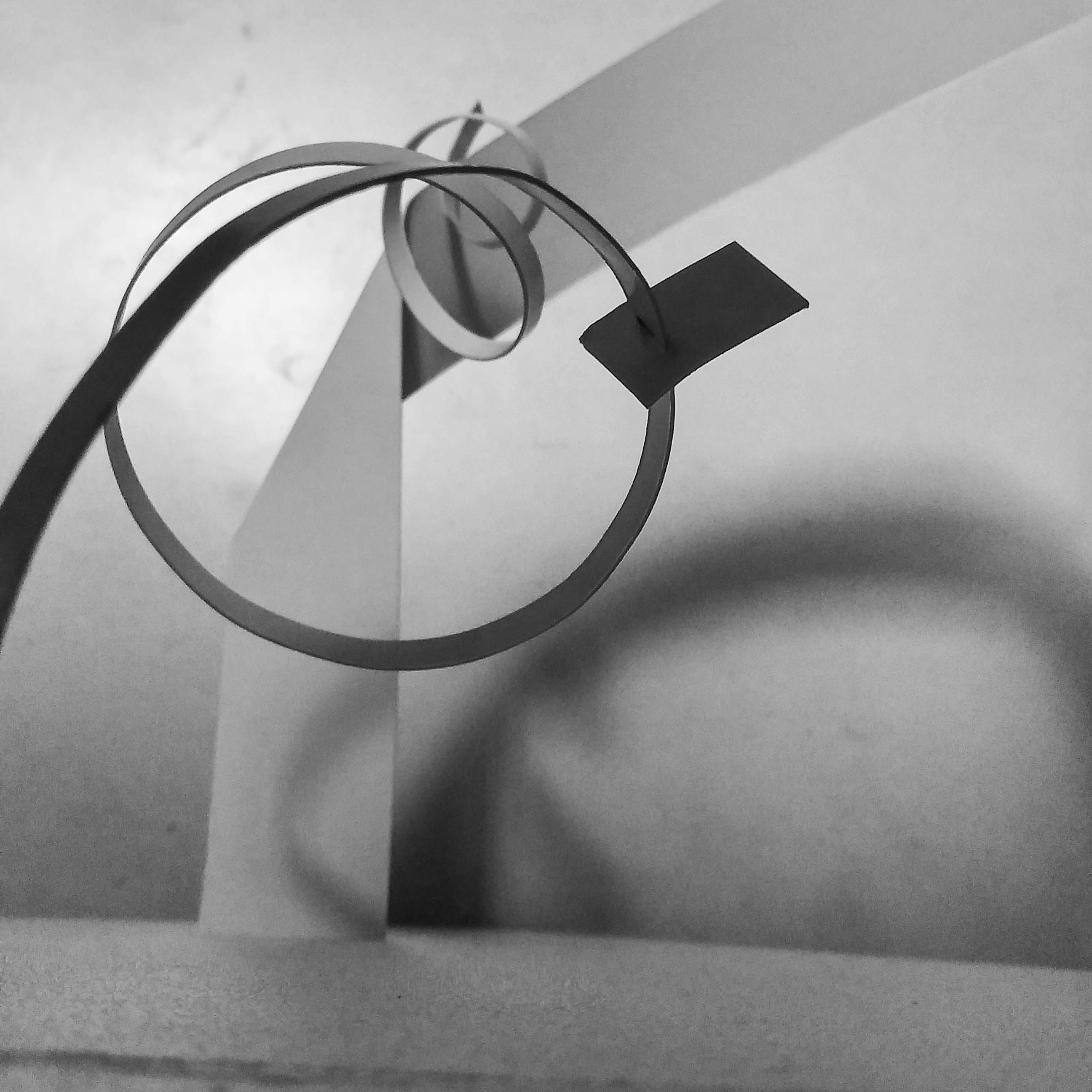
Prototype 3:

Dominant: twisted plane Sub-dominant: curve/twisted plane Sub-ordinate: Bent axis
Problem: Sub-dominant is too long.
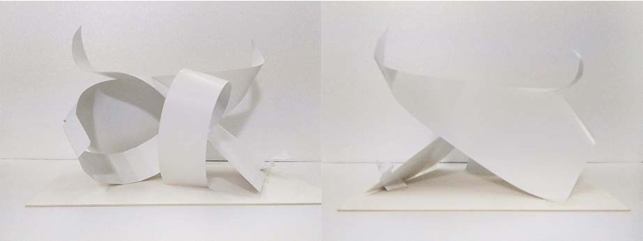
Prototype 3 (Edited):

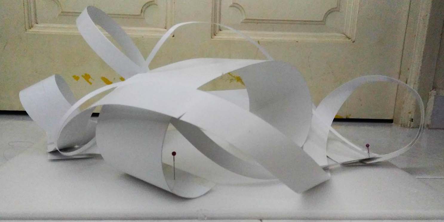
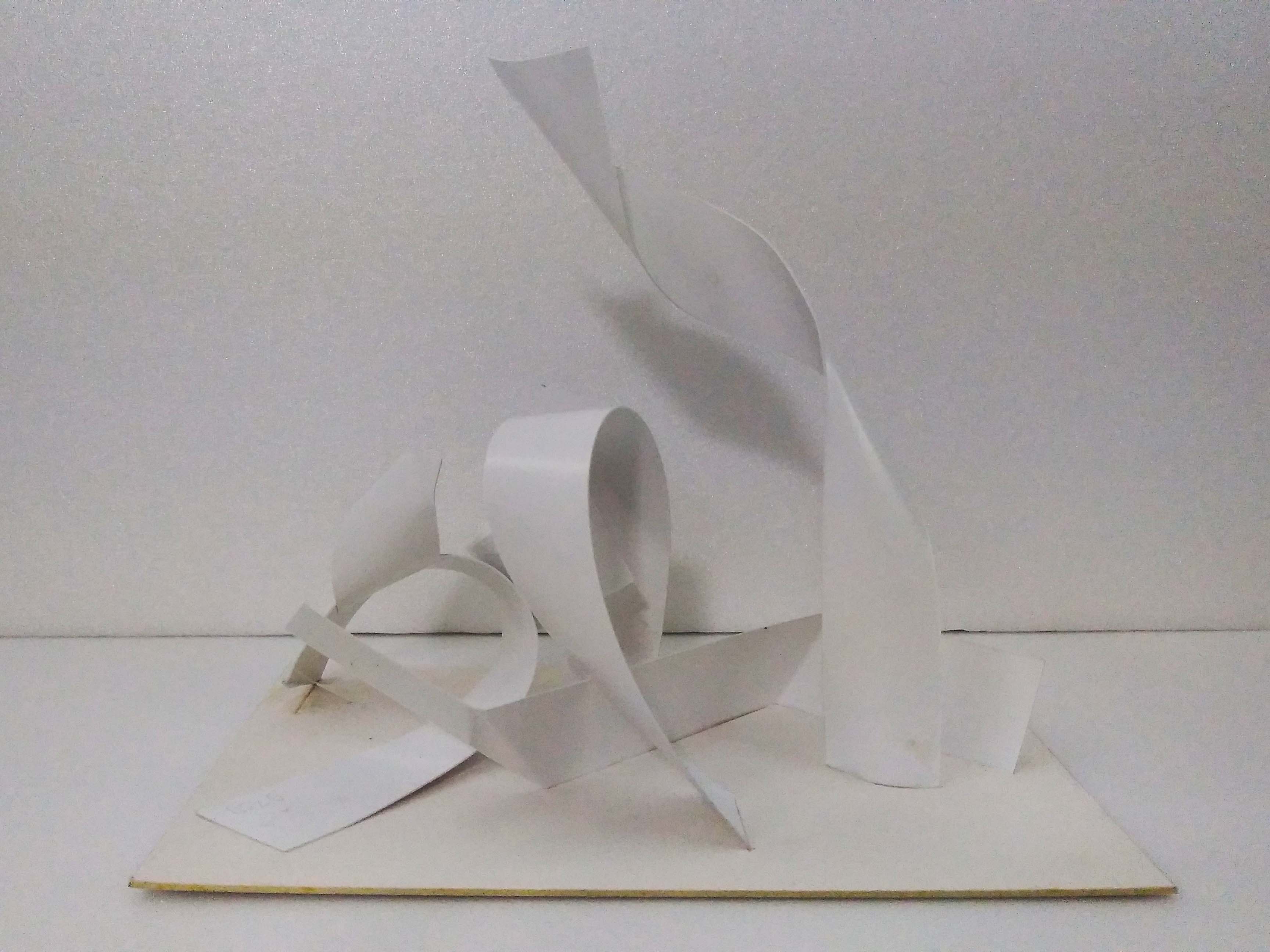
Prototype 4:

Dominant: Broken plane Sub-dominant: twisted plane Sub-ordinate: Straight axis
Problem: Sub-ordinate is too big. Looks like there are two sub-dominants.
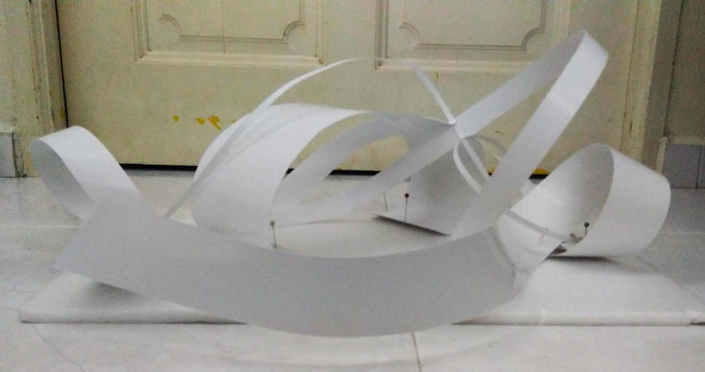
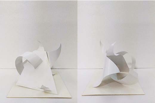
Prototype 4 (Edited):

Forrest Gump – The Beautiful Mind

The Beautiful Mind
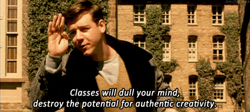 In the movie, John Nash enrolled into Princeton University and did not attend any of his classes. Instead he went around looking to prove different situations with mathematics. This was what he said to reason his absence in class.
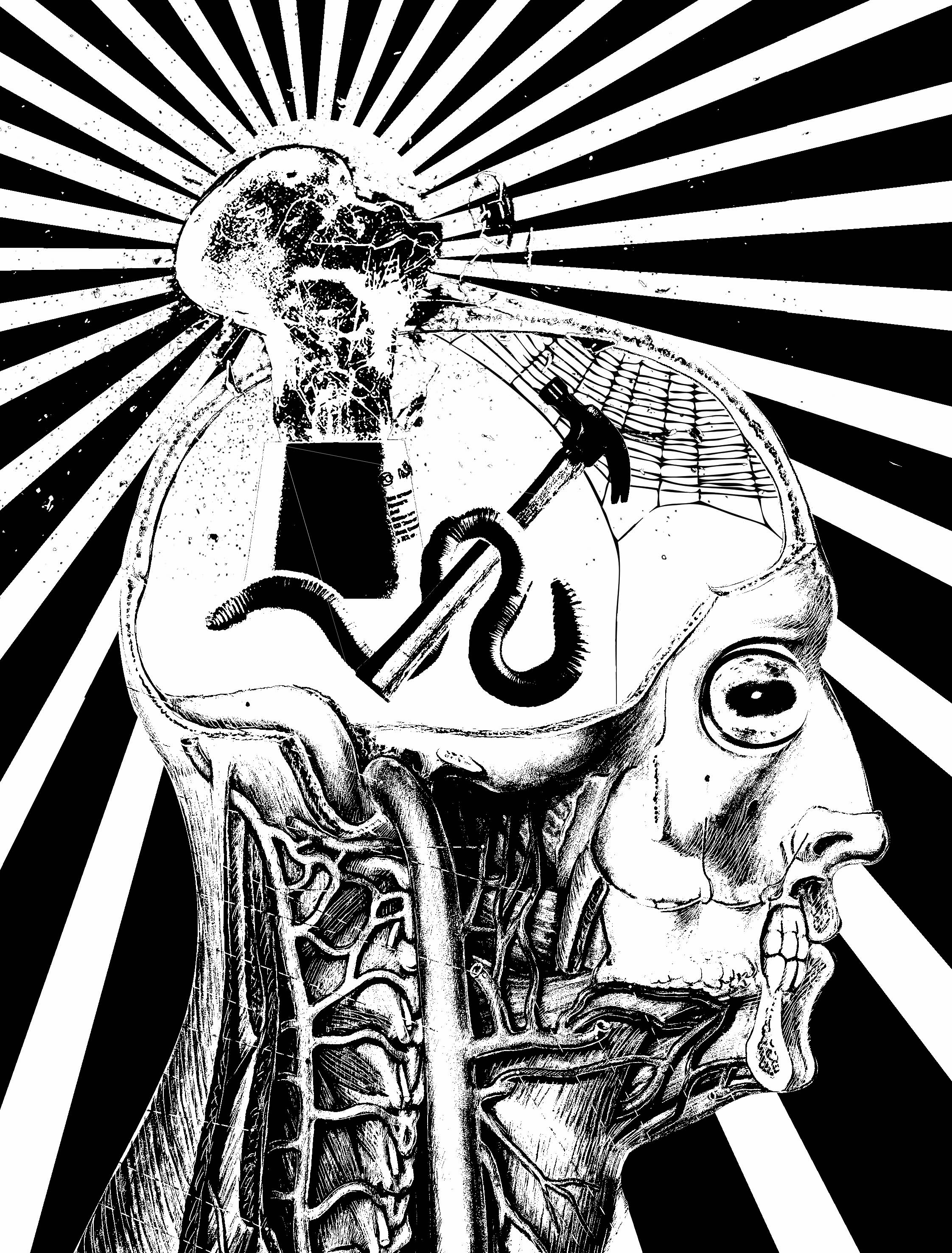
Key words:
- The spiderweb representing the dull mind because in places that are abandoned and untouched for a long time there tend to have many spiderwebs.
- A broken light-bulb with an explosion in the background to represent the destroyed creativity.
- The class is represented by the worm; refering to the bookworm. And the hammer to break the light bulb – destroyed creativity
- the sheep’s eye because sheeps are followers representing the lack of originality.
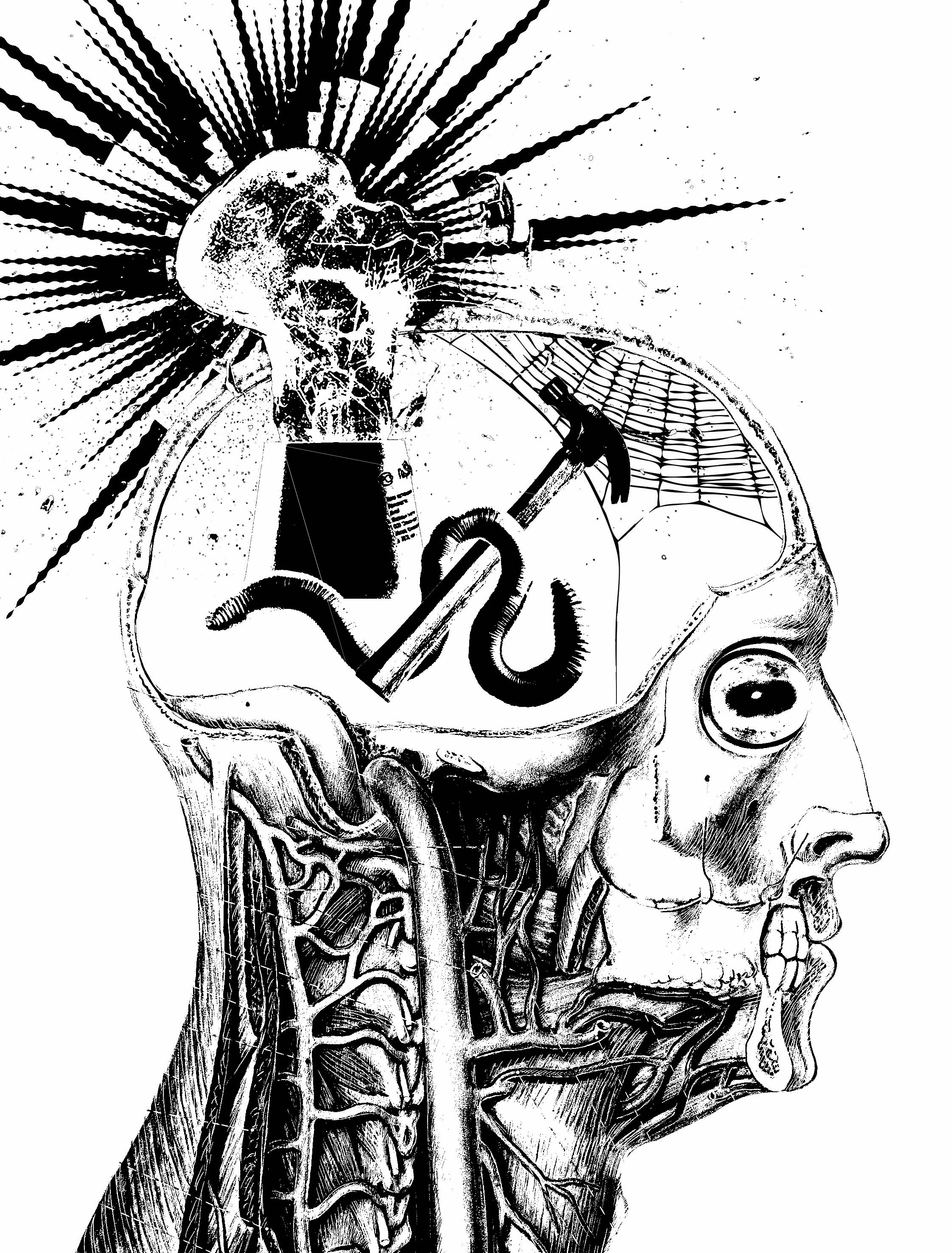
This design is also too hard to read so it was rejected.
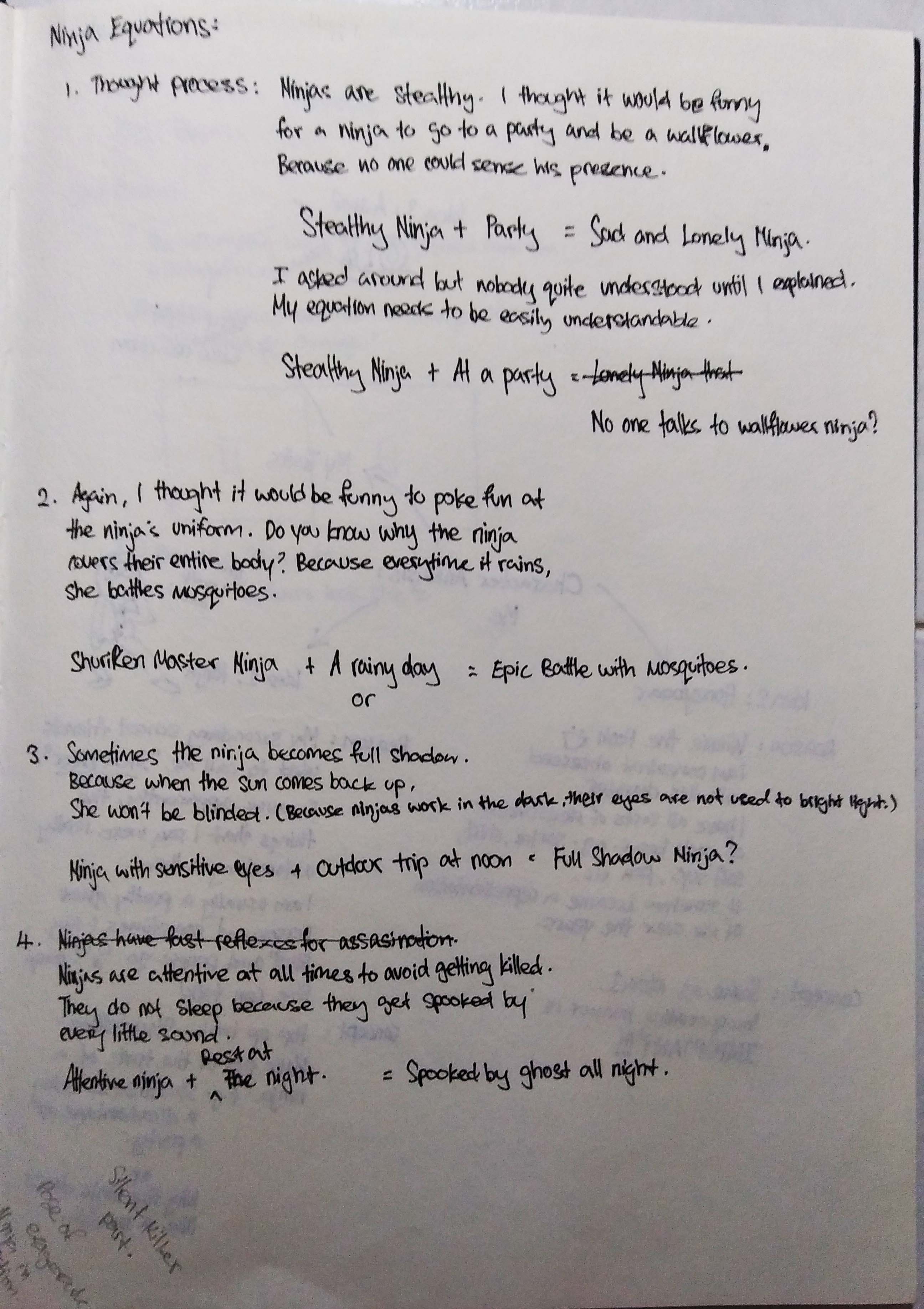
Okay. So let’s restart the thought process…
Creativity is often represented by a light-bulb or colors of the rainbow. (because when I googled ‘creativity’ that is all that pops up) The idea of a light-bulb does not really work because you cannot tell whether it is switched on or off. Also from Idea 1, the use of a broken light bulb did not work out too well.
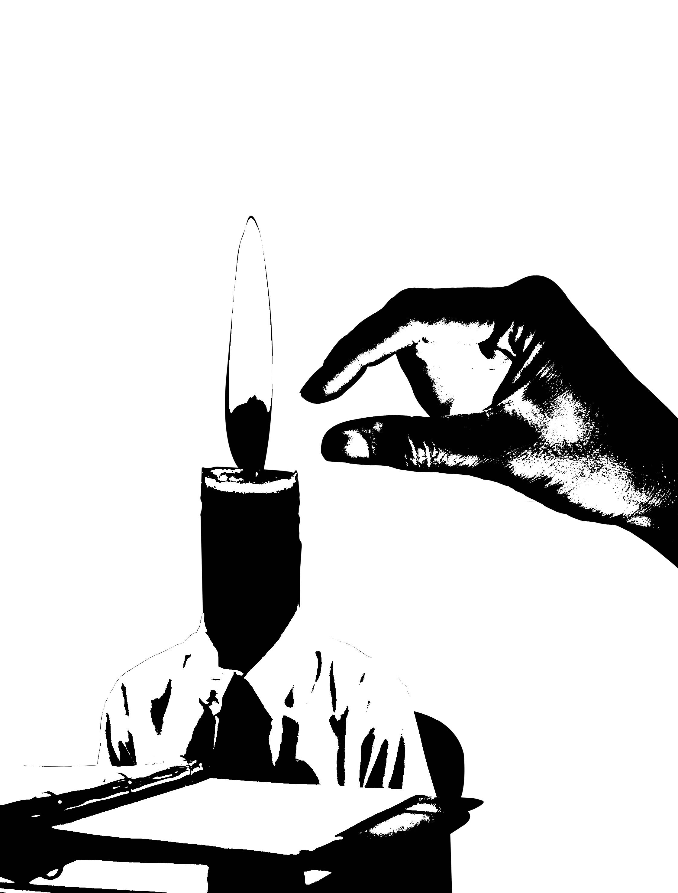
So I settled for another source of light – a flame.
Classes… When I think of classes i think of teachers, books, whiteboard, blackboard, projectors, students, school uniforms, stacks of notes etc. I could have a classroom setting which would be much easier to distinguish. In idea 2, I used a student sitting at his desk to refer to being in class.
And for the ‘dulling of the mind’, I place a hand in a pinching action about to extinguish the flame.

Idea 2 has all the elements needed however, I feel that the “Classes will dull your mind” part is still not quite right. I tried an already extinguished candle to show the dulled mind. Also removing the hand and adding a whiteboard with maths equations all over in reference to the film.
(At this point I realise I have been replacing the heads all throughout my first few other quotes. But this is the only way I know how to translate the quote.)

I also thought the “destroy the potential for authentic creativity” part was lacking. So I changed it up a little bit. There is another student in the back with his candle lit, meaning his creativity is still alive in contrast to the student seated at the table whose light is blown out.
The trees in the back ground is to contrast the outside and inside of the classroom. Then I thought the background is a little too much as there is not much ‘breathing space’. I am not sure…
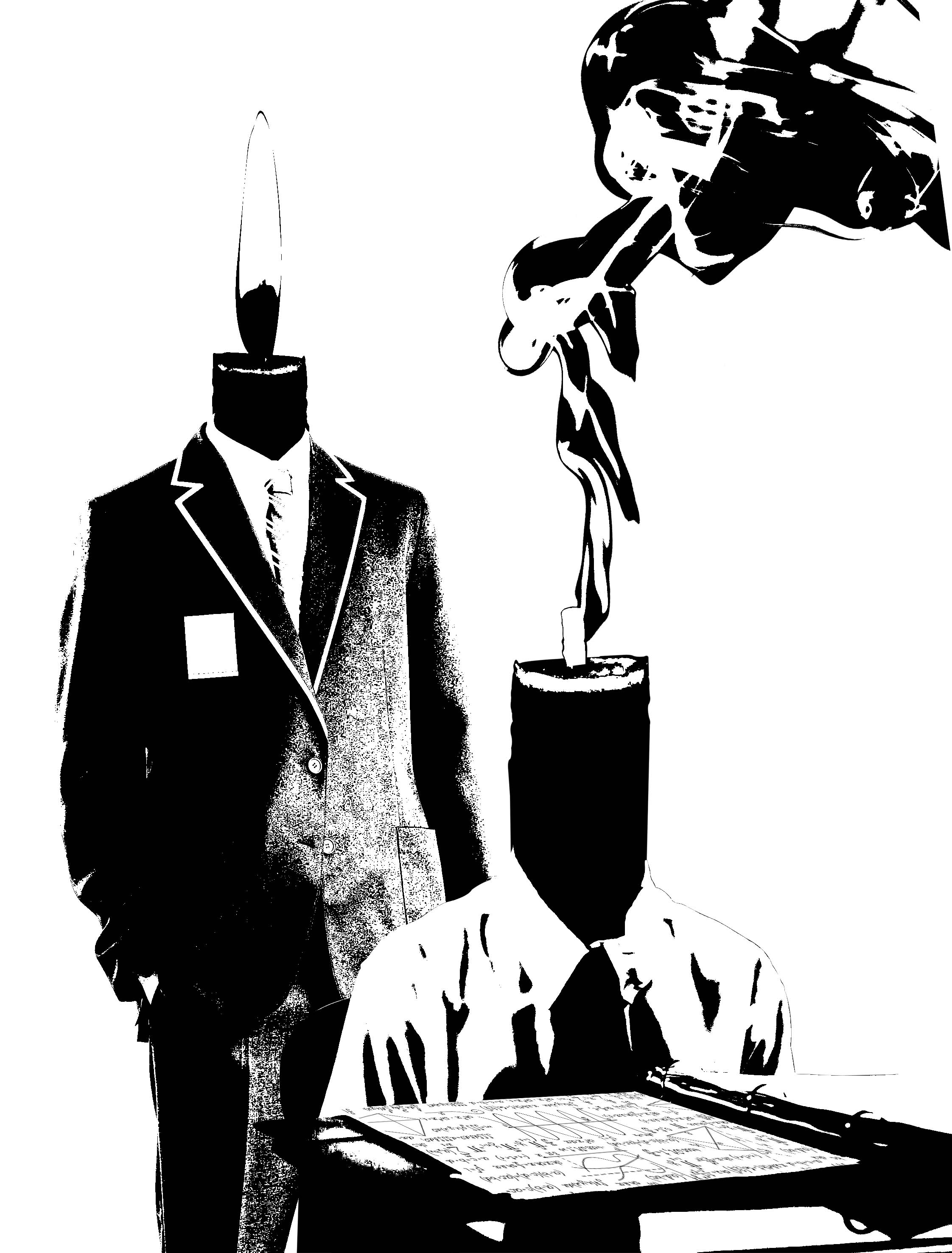

I switched the direction of the student behind because they are suppose to be from different spaces. And maybe their clothes should be different because wearing a uniform is associated to being in class.
I don’t need to plant the candle on the person. just someone extinguishing the candle flame.
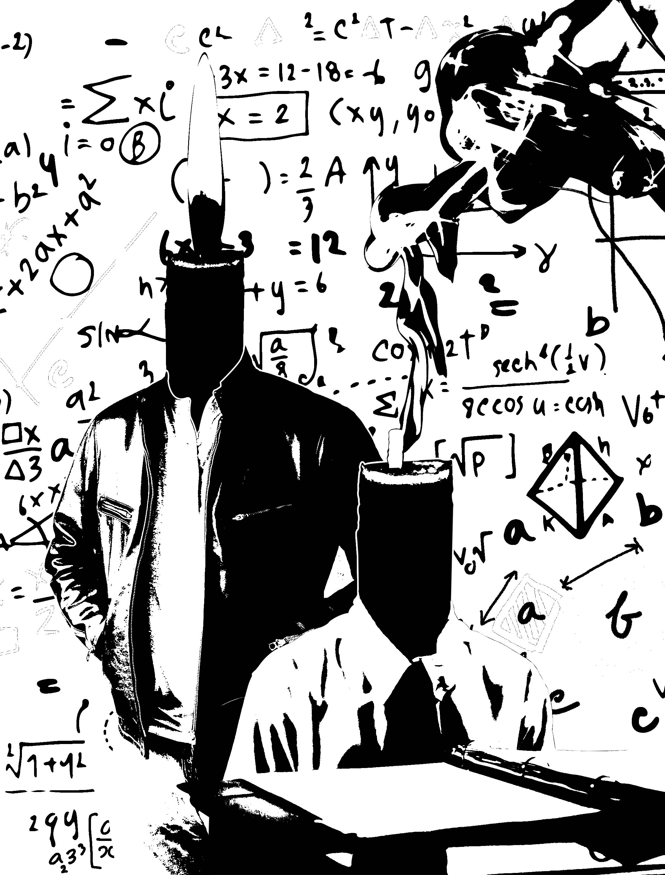
I had been replacing a lot of heads and thought I should move away from that idea. Simplifying my idea 2 to just the significant elements – candle, hand, math. Does this say “Classes will dull your mind, destroy the potential for authentic creativity. “?
More like math kills creativity.
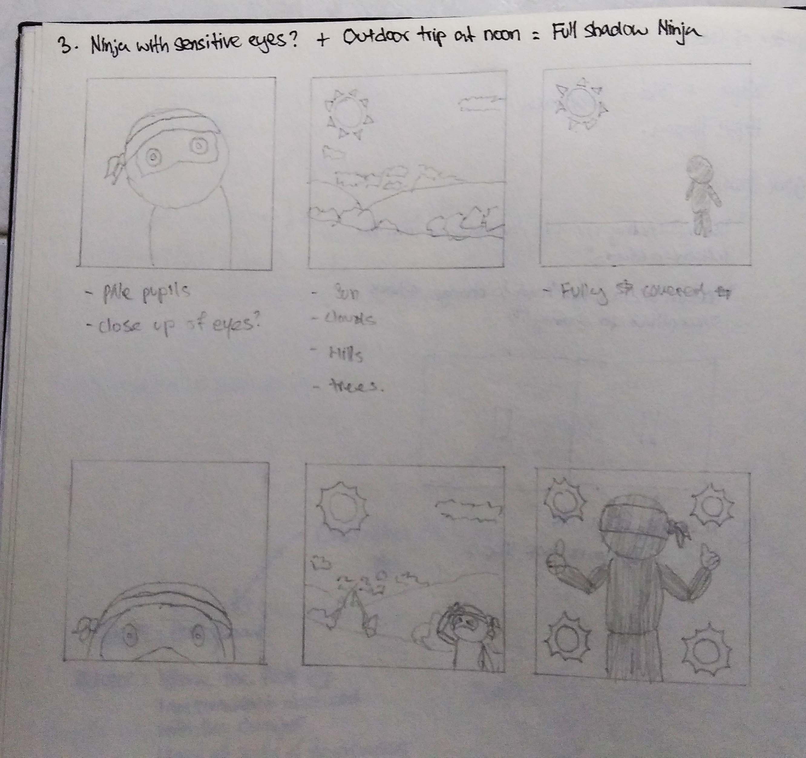
I re-interpreted the quote- John Nash was trying to think out of the box/ classroom and be original which led to idea 4.
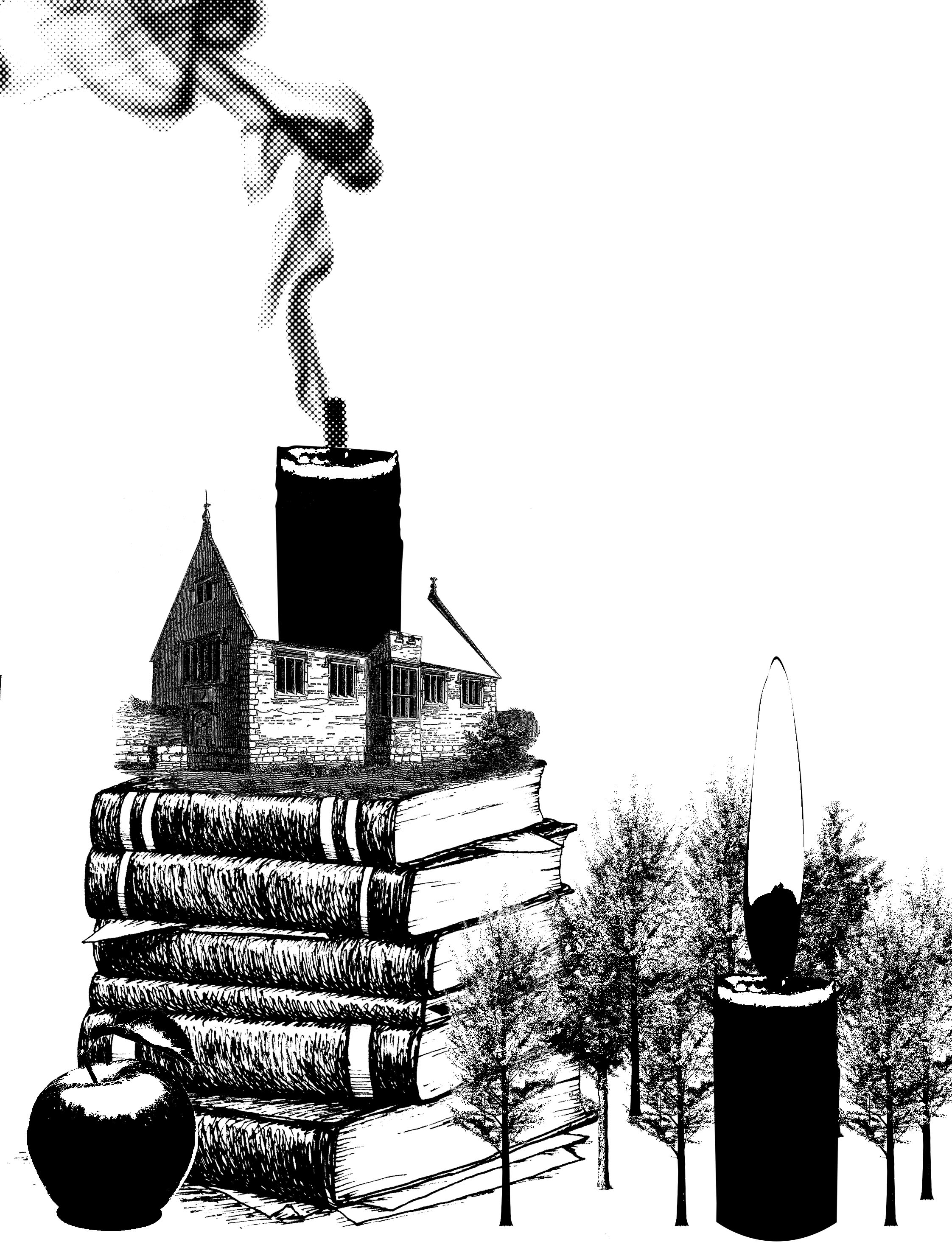
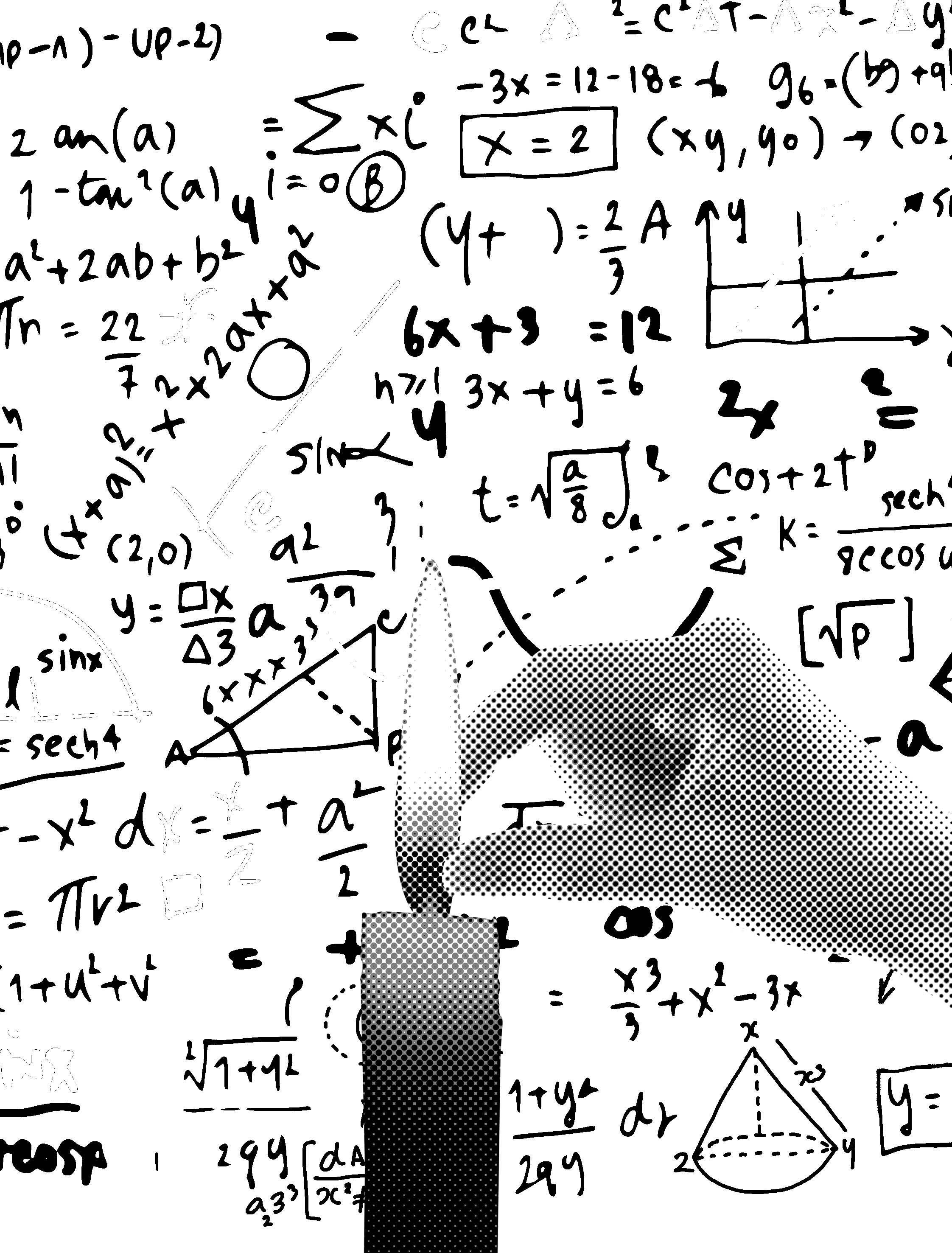
Then I tried making a juxtaposed between inside and outside the classroom. The design became too cluttered with too many objects. It is too messy.
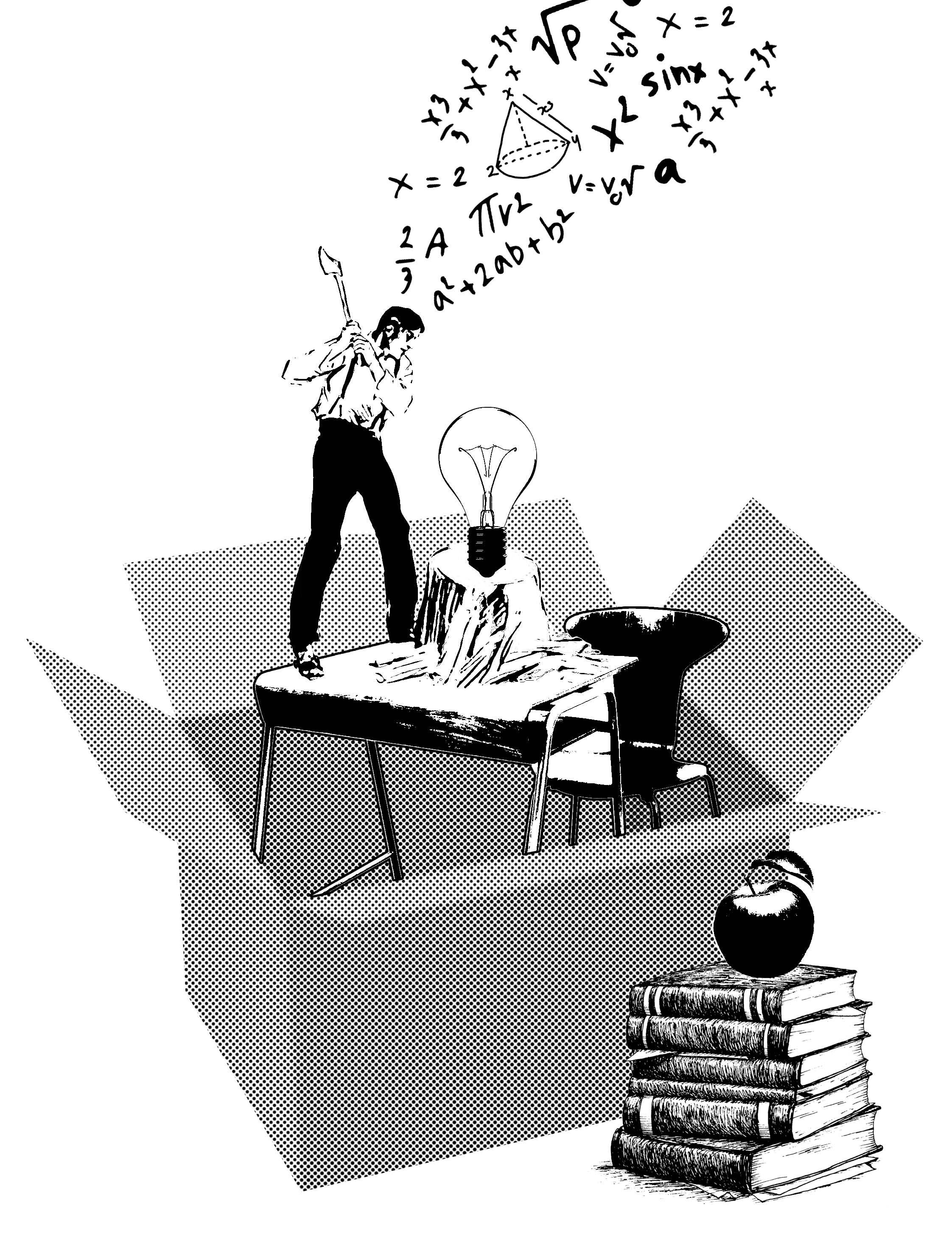
So then I did only the inside. I wanted to show a woodcutter cutting down a light bulb to reflect the destruction of idea. The use of the woodcutter is to tie into the human figure element that I wanted to carry on throughout the series. Idea 5 is still too complicated and due to time constraint I was force to submit this.
Comment:

Basically the idea is there, the design is just not resolved. Therefore it does not tie in with the other 3 designs. Joel did a good job interpreting the quote. He used books to represent classes. But personally I feel that books represented education more than classes. As the class that John Nash mentioned referred to being enclosed in the classroom listening to the lecturer. He wanted to go out and look for his own original idea therefore a single educational element could not display the meaning of class for me. Thus the usage of a box because thinking out of the box. If I have more time, I would give it more thought and hopefully create something better.
Prev: https://oss.adm.ntu.edu.sg/ytan149/forrest-gump-paranorman/
Forrest Gump – Paranorman

Paranorman
The quote was suppose to be :
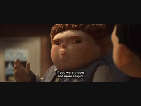
“If you were bigger and more stupid, you’d probably be a bully too. Its called survival of the biggest.”
I am not sure why the subtitles are a little different – thickest instead of biggest. But the idea is about the same.
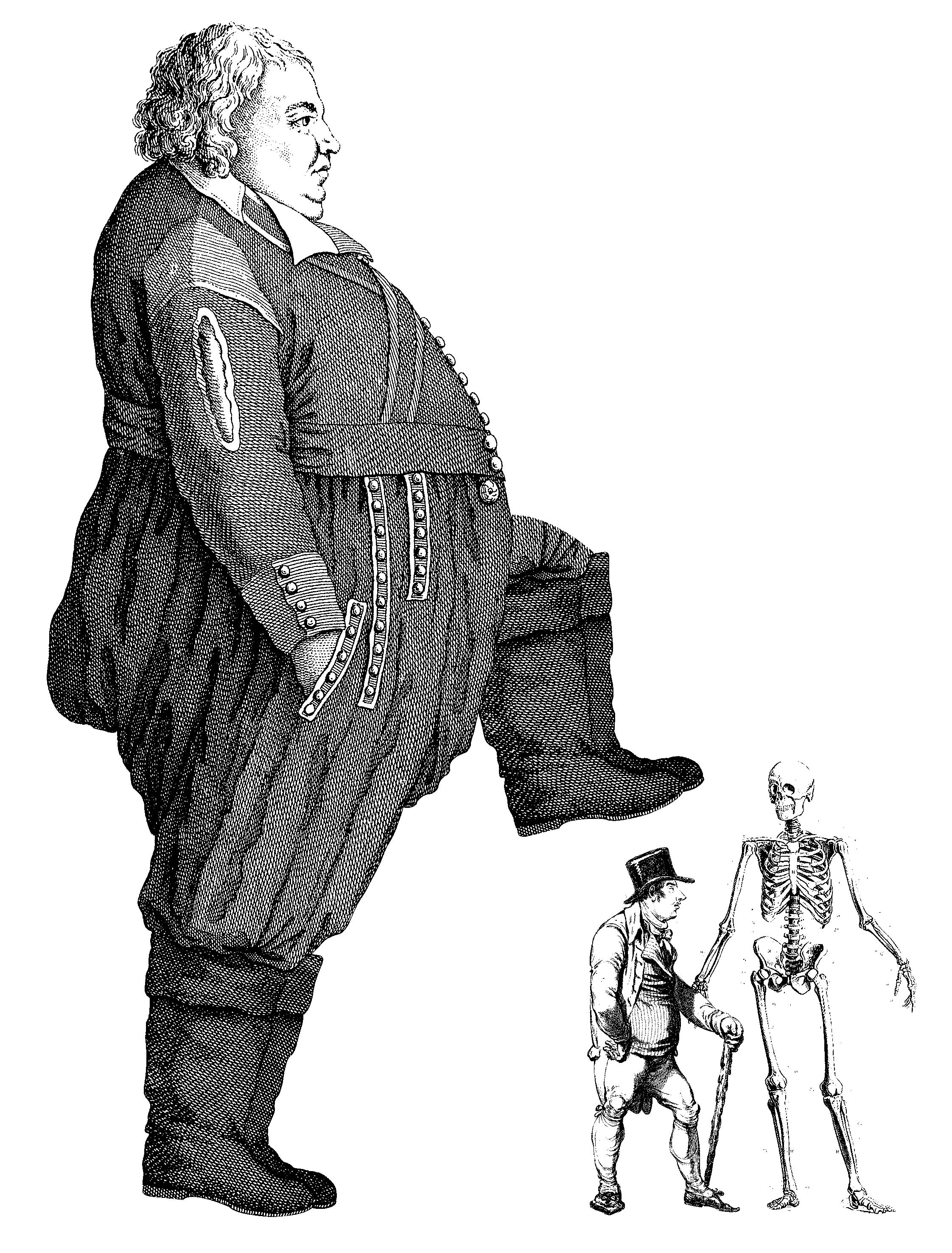
Norman has the ability to see and communicate with ghosts. And because of his ability he is being discriminated in his neighborhood. He is also being bullied in school, where the bully named Alvin (a boy much bigger in size than Norman) wrote ‘FREAK’ on his locker; there was also a scene before this where he was pushed down to the ground. Alvin being the tallest and biggest in size as compared to his other bullying companions is the leader of the group. Therefore “survival of the biggest.”

So basically, the quote is saying that bigger and stupid people pick on those that are much smaller and smarter. People with brains vs people without brains. (head made out of straws) The idea of the bigger bullying the smalland ‘keeping them in line’ reminds me of the novel 1984 by George Orwell, where the authorities would put up huge posters everywhere to intimidate and remind the party that they were being watch at all times. In conclusion, proportion will be significant in this design.
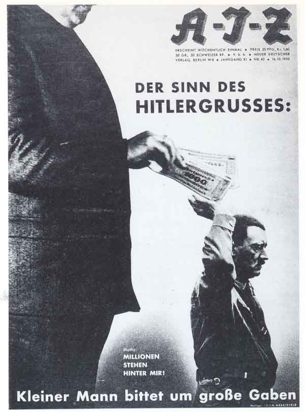
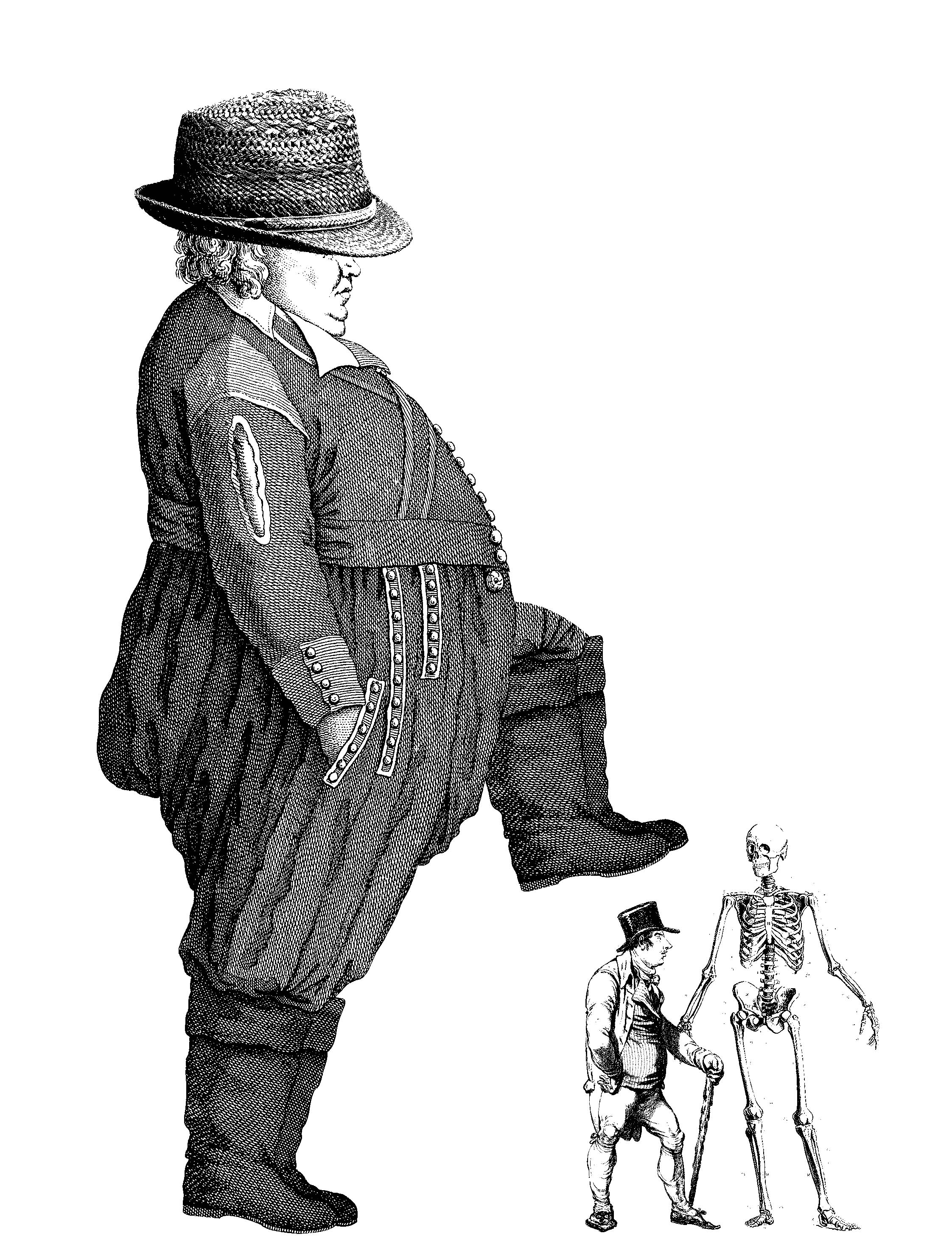
While looking through artist John Heartfield’s artworks, I found one that displayed proportion which I could use for reference. The image is taken from http://www.johnheartfield.com/John-Heartfield-Exhibition/about-john-heartfield-photomontages/dada-political-art-history/heartfield-context-7
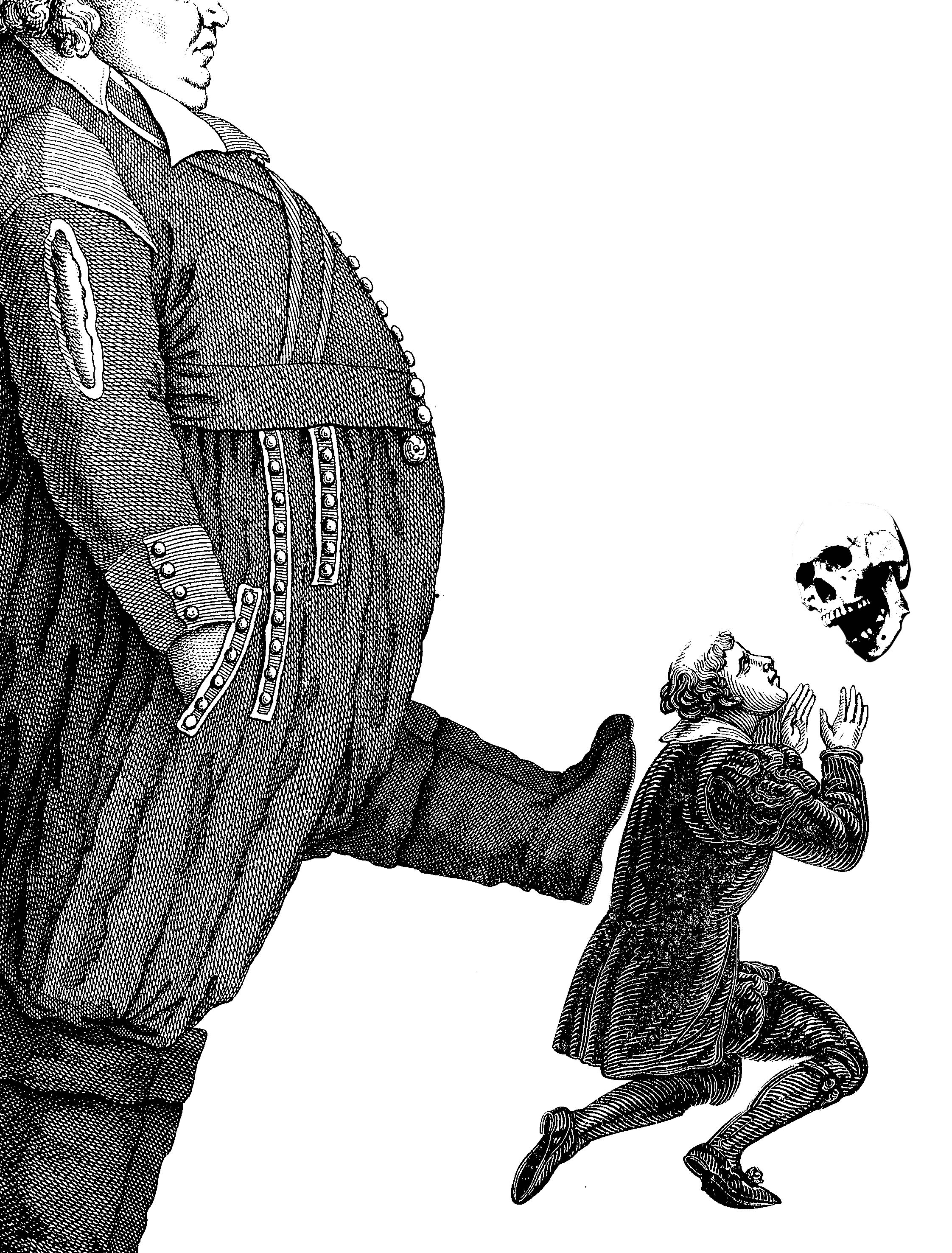
The first idea I had was to have a big, fat man and a skinny small man. The smaller man is holding a skull with its mouth open as if it is talking in reference to the movie where Norman communicates with ghosts. The big fat man is also kicking the smaller man to represent the ‘bullying’.
This idea lacks a part of the quote about being bullies being bigger and stupid. Being big is portrayed but not the stupidity. Also I think the communication with spirits is not obvious with just the skull floating out of no where. It would probably be better in the whole skeleton is there to also react to the smaller man. Another thing is that the smaller man might need to have a more dramatic reaction to being kick…
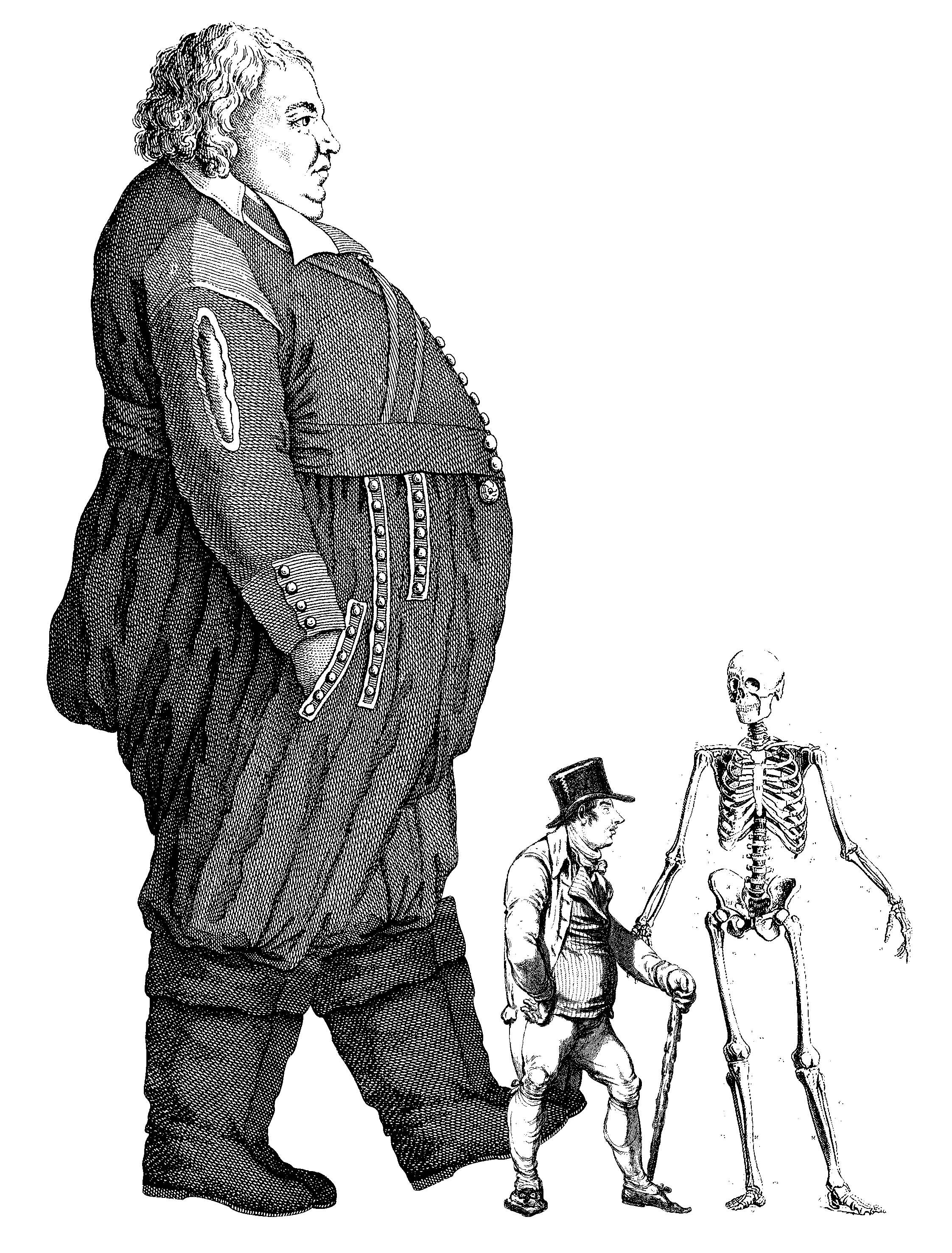
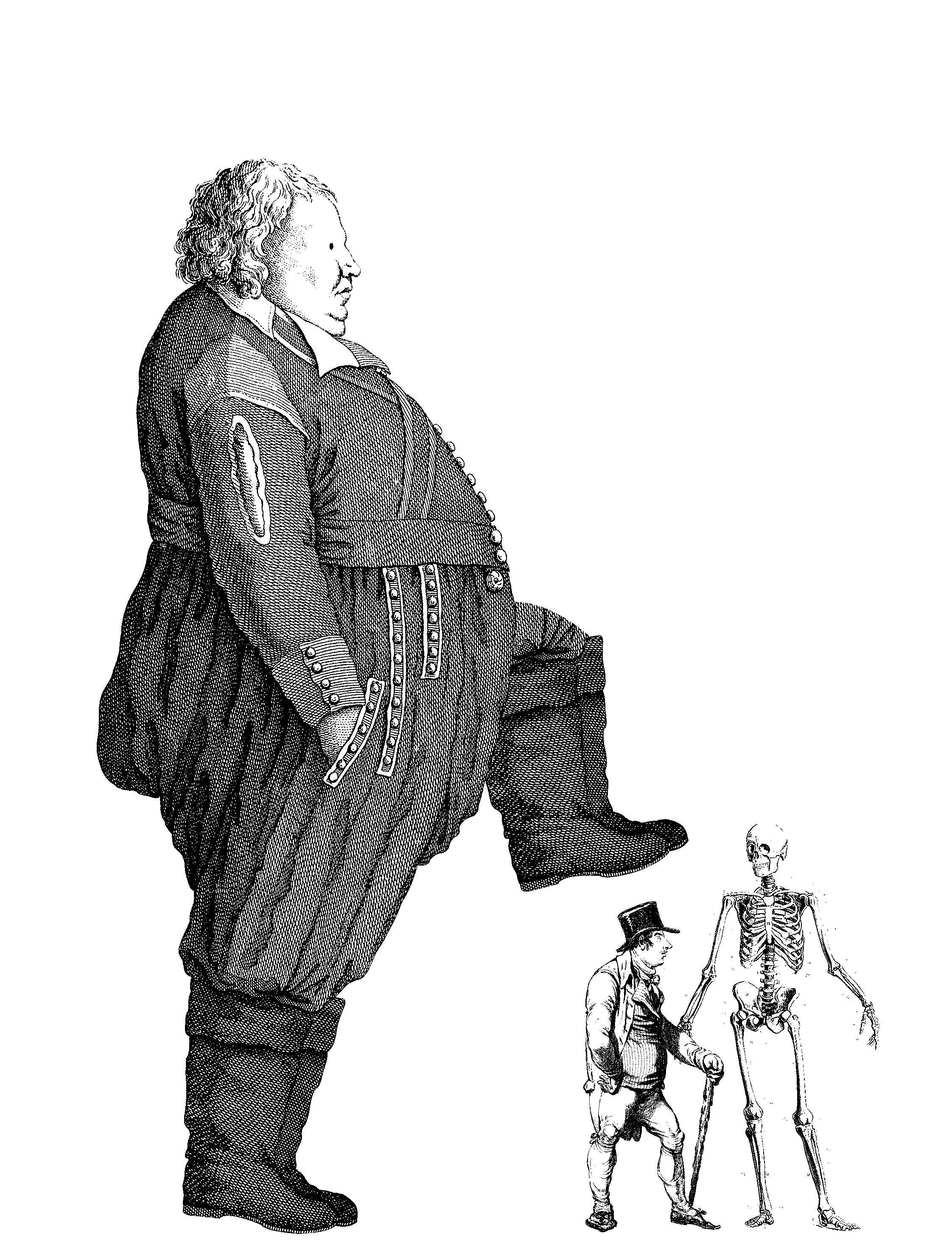
I changed the skull to a skeleton and switch the kneeling figure for a standing one. They are both looking at each other which shows more interaction. I had the leg of the bigger man about to kick the smaller man but it is not so obvious. He looks like he is peacefully walking pass in the back ground.
So I tried one that looks like he is about to trample on the small man.

Bringing up the idea of the human evolution from Idea 2; earlier homo-sapiens = less intelligent.
Big man is wearing a straw hat. A metaphor for someone without brains; stupid. This too was too cryptic. No one could understand.

I shrunk the size of his face in an attempt to stupefy him. I asked around and it was not approved.

I tried making the eyes bigger… nope.
Finally I decided on making his eyes cartoon which shows that he has low IQ.
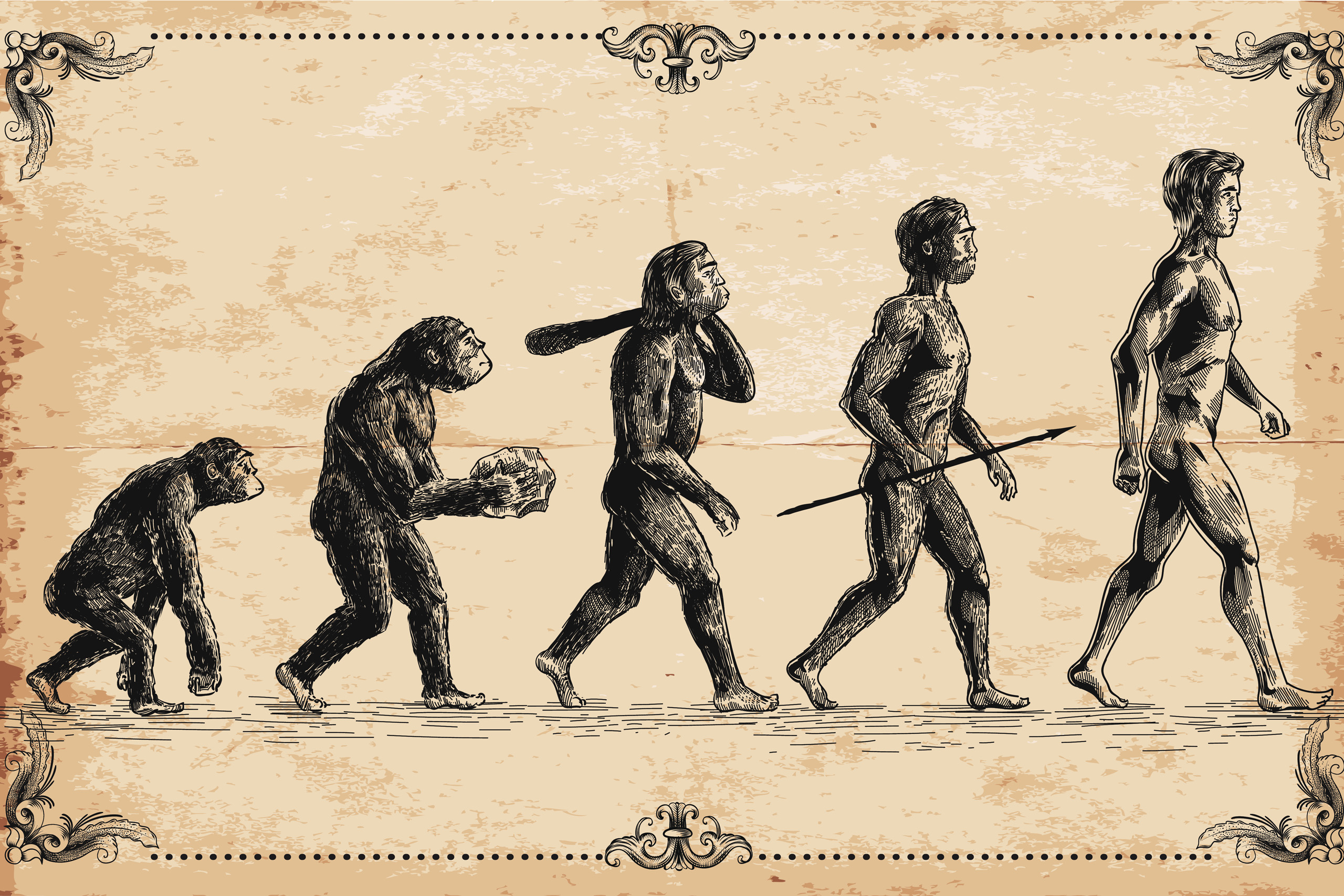

The second idea is to make a parody out of the human evolution because “survival of the biggest”. I continued using the principle of proportion to show that the more evolve they become the larger they get; both width and height. It is still incomplete as there is no sign of the “If you were bigger and more stupid”. Also the tote bag is vertical, a horizontal composition cannot work.

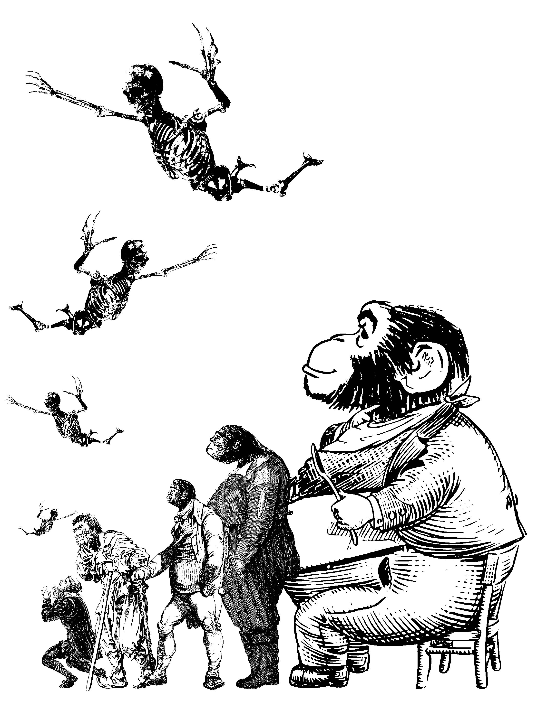
To apply the idea of bigger=dumber, I changed the heads of the bigger people to the heads of the earliest homonin. (since it is under the theme of human evolution. The supernatural part where Norman communicates with spirits must also be added to relate back to the movie.

So I added some skeletons sky driving down to the human which represents Norman. I like this design better than the first. But the skeletons might be have too little white spaces, everything might come out black when printed.
In the end…
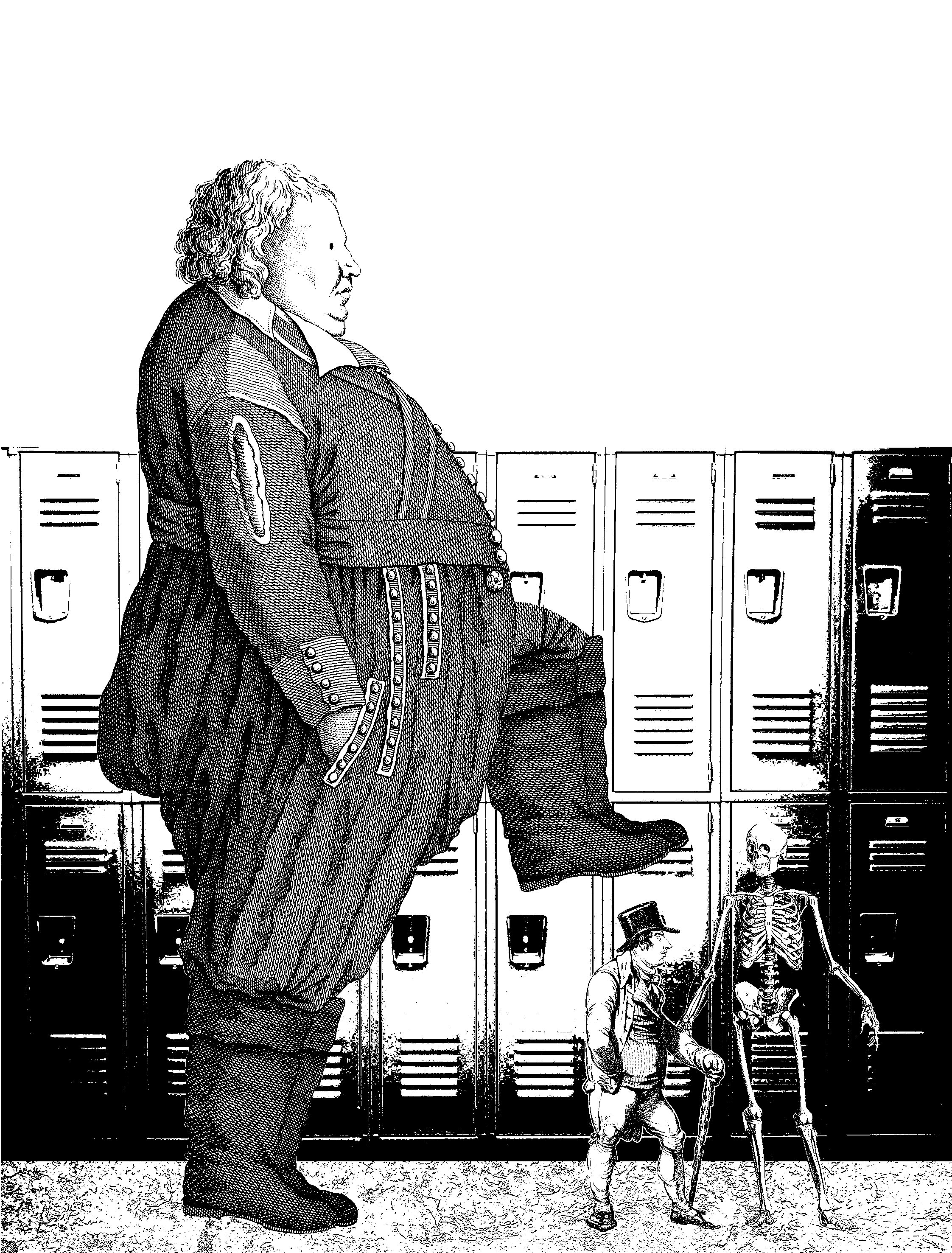
Idea 1 was more simple and easy to understand as compared to idea 2. To solidify the entire design, I added a setting to it just like the Beauty and the Beast design. The background brings in the scene from the movie where Norman was bullied in the school locker hallway.
Comments:


 The only problem here is that many could not understand the purpose of the skeleton and that is because they need to watch the movie to know. I guess the design can do without the skeleton but I need it to tie back to the context of the movie. Overall, this is design is extremely successful as this got the most comments, and positive ones too.
Prev: https://oss.adm.ntu.edu.sg/ytan149/forrest-gump-beauty-and-the-beast-2017/
Next: https://oss.adm.ntu.edu.sg/ytan149/forrest-gump-the-beautiful-mind/
Forrest Gump – Beauty and the Beast (2017)

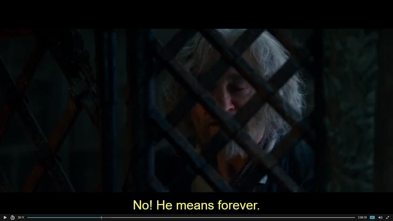

“No! He means forever. Apparently, that’s what happens around here when you pick a flower.”
In the scene that the quote was used, Maurice (Belle’s father) was imprisoned by the beast after being caught red handed, stealing a single Rose from the Castle garden. Everything in the Castle’s boundary is cursed upon by the sorceress that the Prince insulted. The people, the weather even the rose that he picked ‘froze’ in time until the day the beast finds the true love.
I chose this quote because I found it humorous. it is actually the entire movie in one sentence. “Forever” because the castle is cursed until the Prince falls in love or they’ll be curse forever. “Apparently, that’s what happens around here when you pick a flower.” It is referring to the moment the Prince turned the sorceress away because he thought her ugly. He was picky.

The first idea is Maurice’s skeleton holding the rose behind bars. This is very direct. The imprisoned skeleton means he has been in there for a long time that might as well be forever; it was forever for the man anyway because he is already dead. The flower is there but I don’t think it tells you that he is in there because he picked the flower. So maybe I should make it so that he triggers a trap and got imprisoned? Also you cannot see the skeleton holding the flower.
In the context of the scene, Belle was offering to take Maurice place behind bars for the rest of her life. Maurice being a loving father refused and tried scare her away from giving up her freedom. He is trying to say that she will be trap forever if she admits to picking the flower because that is what happens in that castle. It is meant to be a threat or a warning.
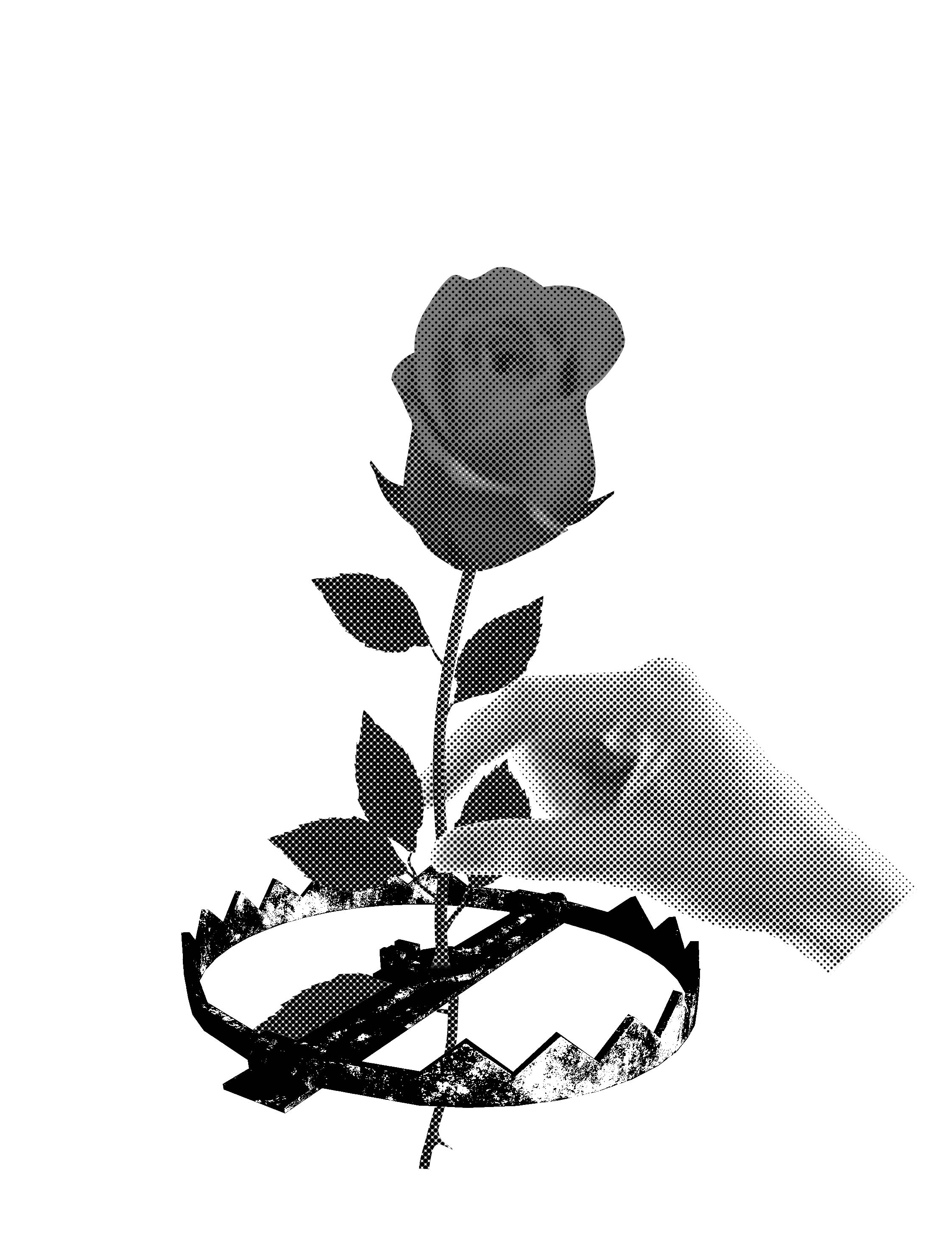
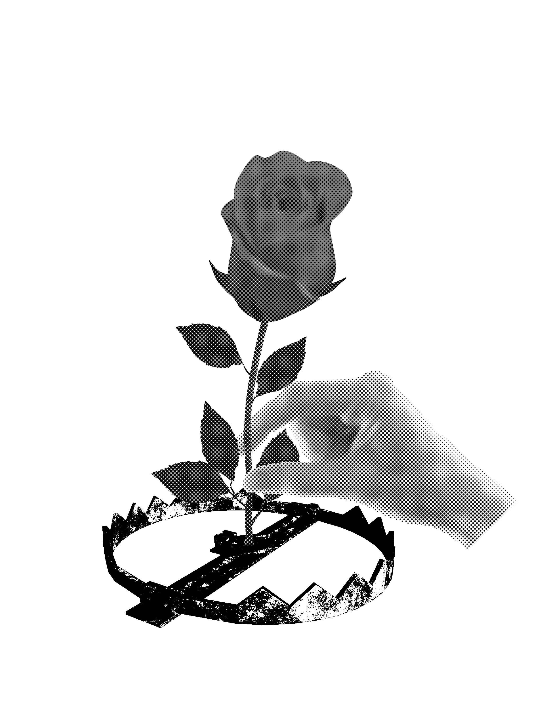
It depicts a literal action of picking a flower. The flower being caught on the bear trap will catch the thief between its teeth, trapping him.
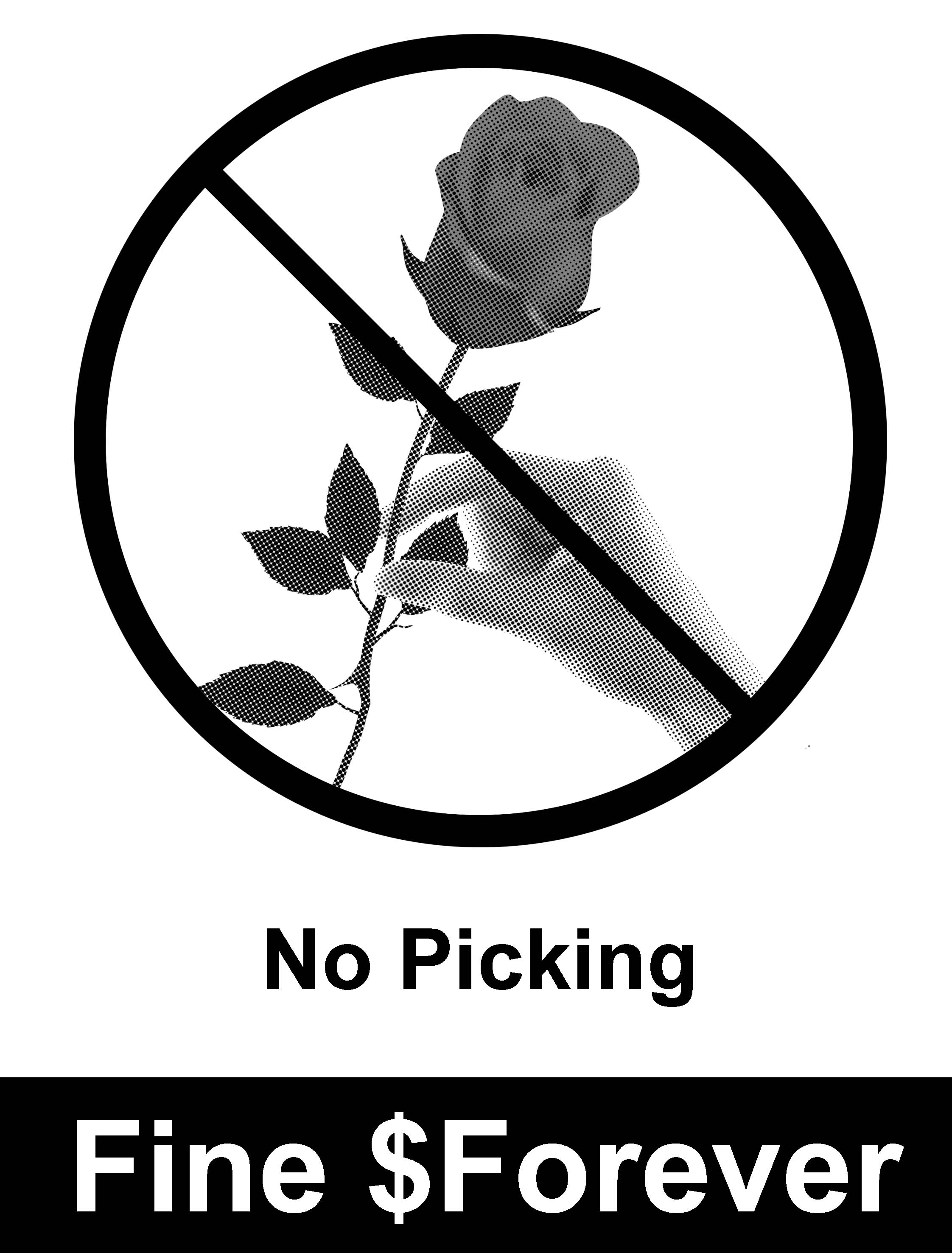
Idea 3 is of the same concept as Idea 2 but in the form of a sign. I used our local MRT warning signs as a reference, so this is a parody of the official signs. The fine being $Forever because the beasts wants to keep belle forever, the cost of picking the flower is forever. As we are trying to achieve full visual without text, this idea was disqualified.
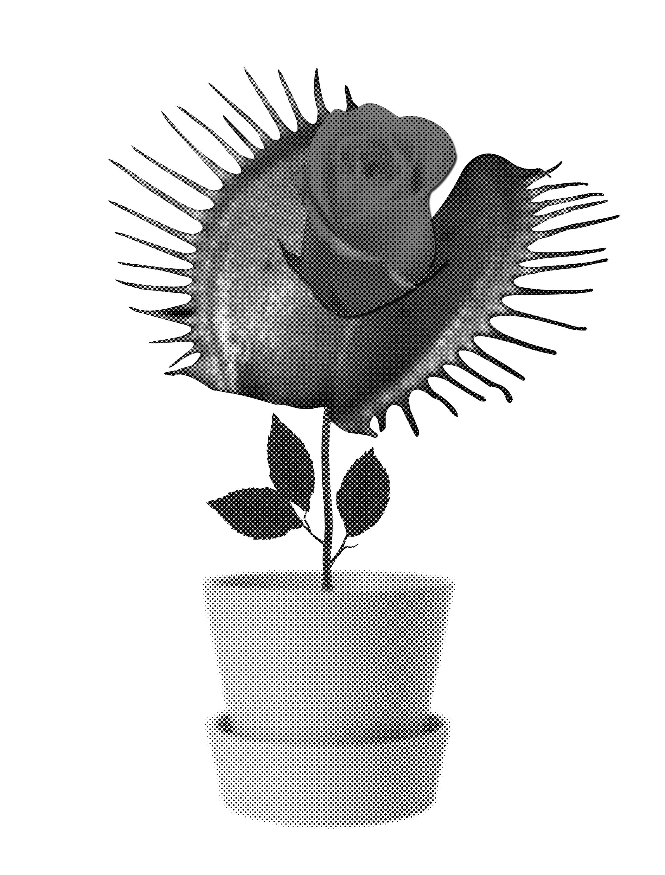
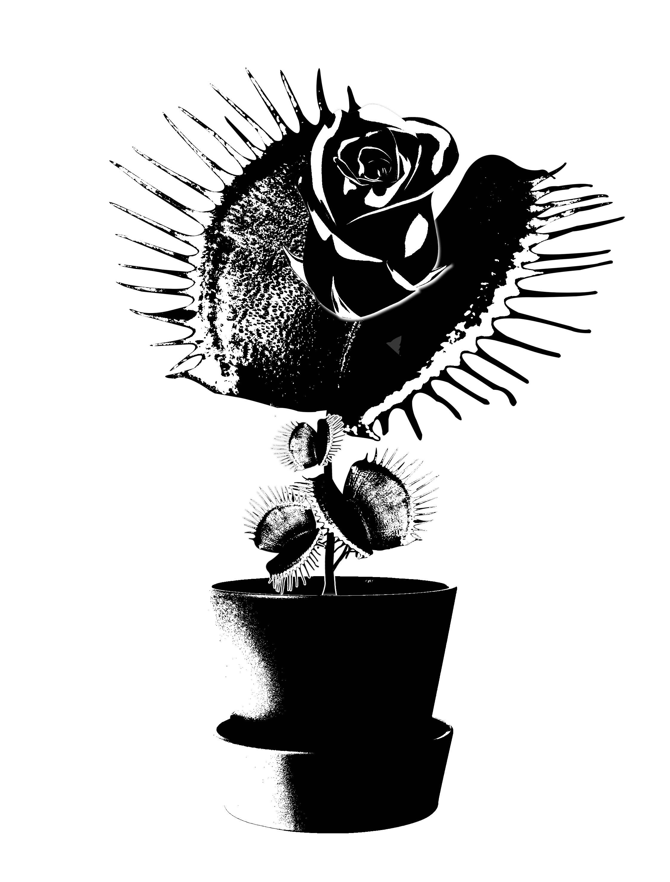
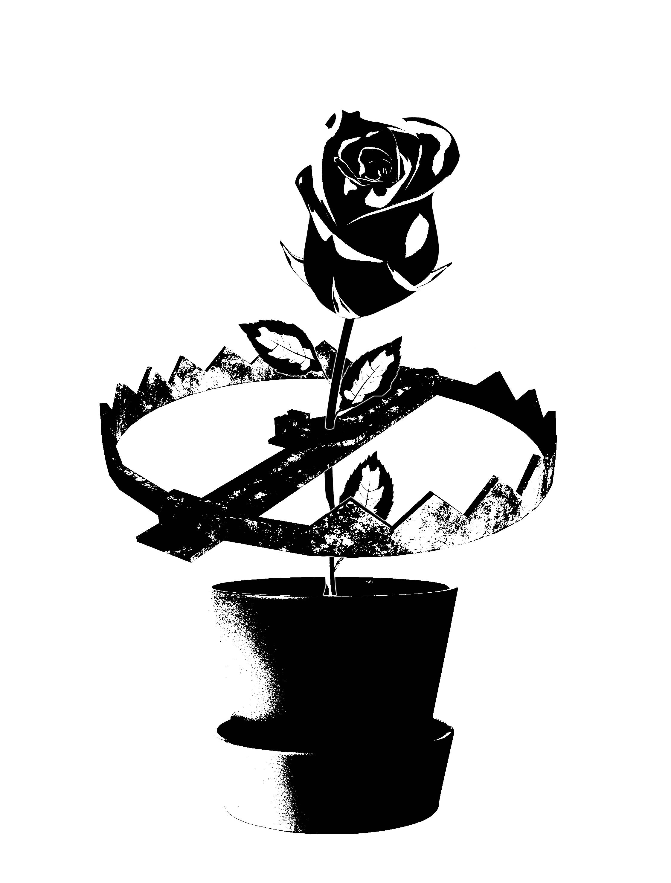
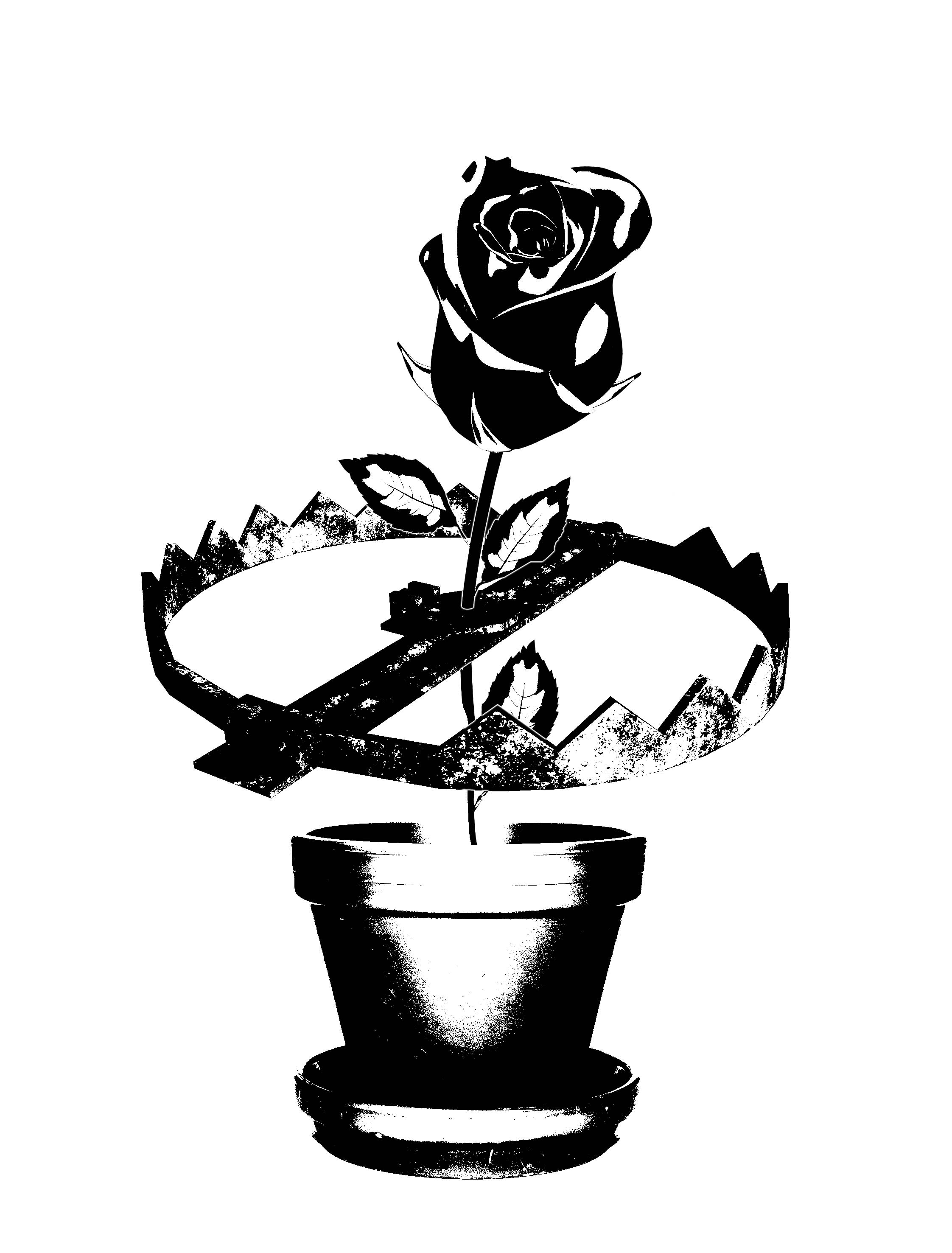

I was very interested in the idea of a surrealistic object and wanted to try it out; resulting in Idea 4 – a Venus rose trap. If you were to pick such a flower, the claw would catch you between its teeth just like the bear trap would. But then i realized that because the flower is in a pot it can be handled and moved anywhere which then leads to idea 5.

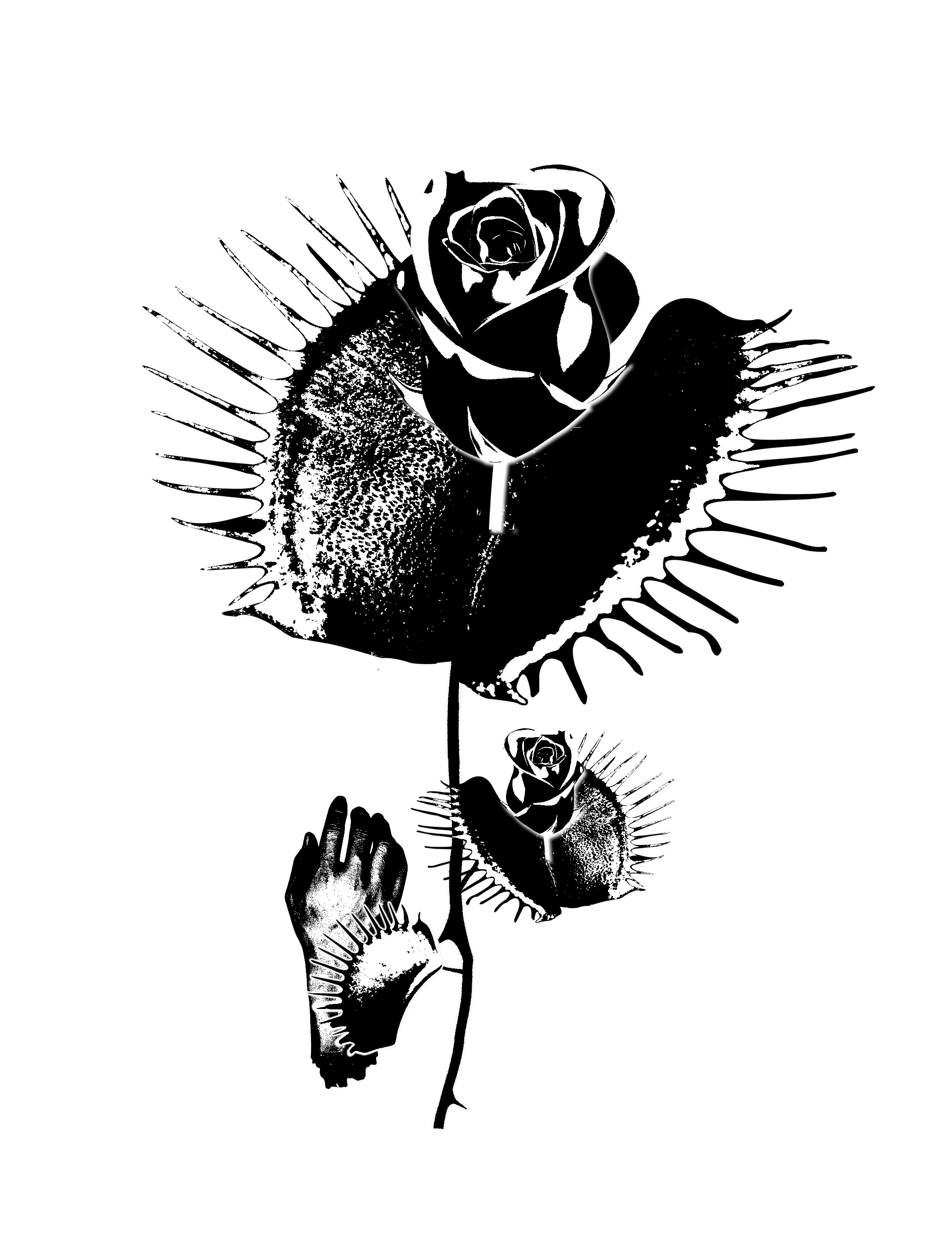
The idea is there but something is off. Design is still not resolved as the object is just floating in space. There is no contrast and the rose seems to blend into the Venus fly trap. Venus flytrap is ugly.
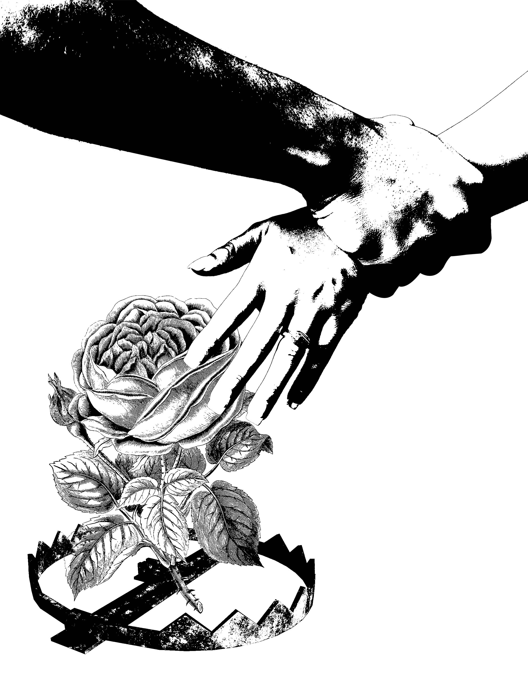
Going back idea 2, I changed the hand to hands to reflect the quotes intention that is to prevent the daughter from taking his punishment. So in idea 6, the father stops the daughter from taking the flower on the bear trap that will harm her.
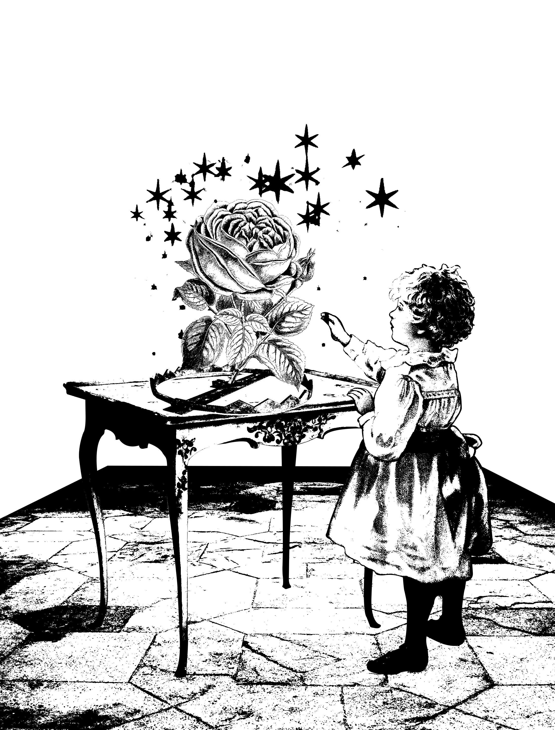
I wanted to unify all my designs by including an element constant throughout all 4 of them – human figure. Therefore the idea of surrealistic object is rejected. On the night before submission, I was hit with a woosh of inspiration and created Idea 7. (Selected idea final)
I brought the hand from Idea 2 with the rest of the body. A table and the floor to set a scene so that the girl is rooted down to the ground and not just floating in space. The idea goes the same for the table – to root down the bear trap. I added an extra element that is the sparkles, to represent the enchantment in the castle.
Comments:
Design is resolved! A success!
(Same comment as Clockwork Orange design)
Prev: https://oss.adm.ntu.edu.sg/ytan149/clockwork-orange/
Next: http://: https://oss.adm.ntu.edu.sg/ytan149/forrest-gump-paranorman/
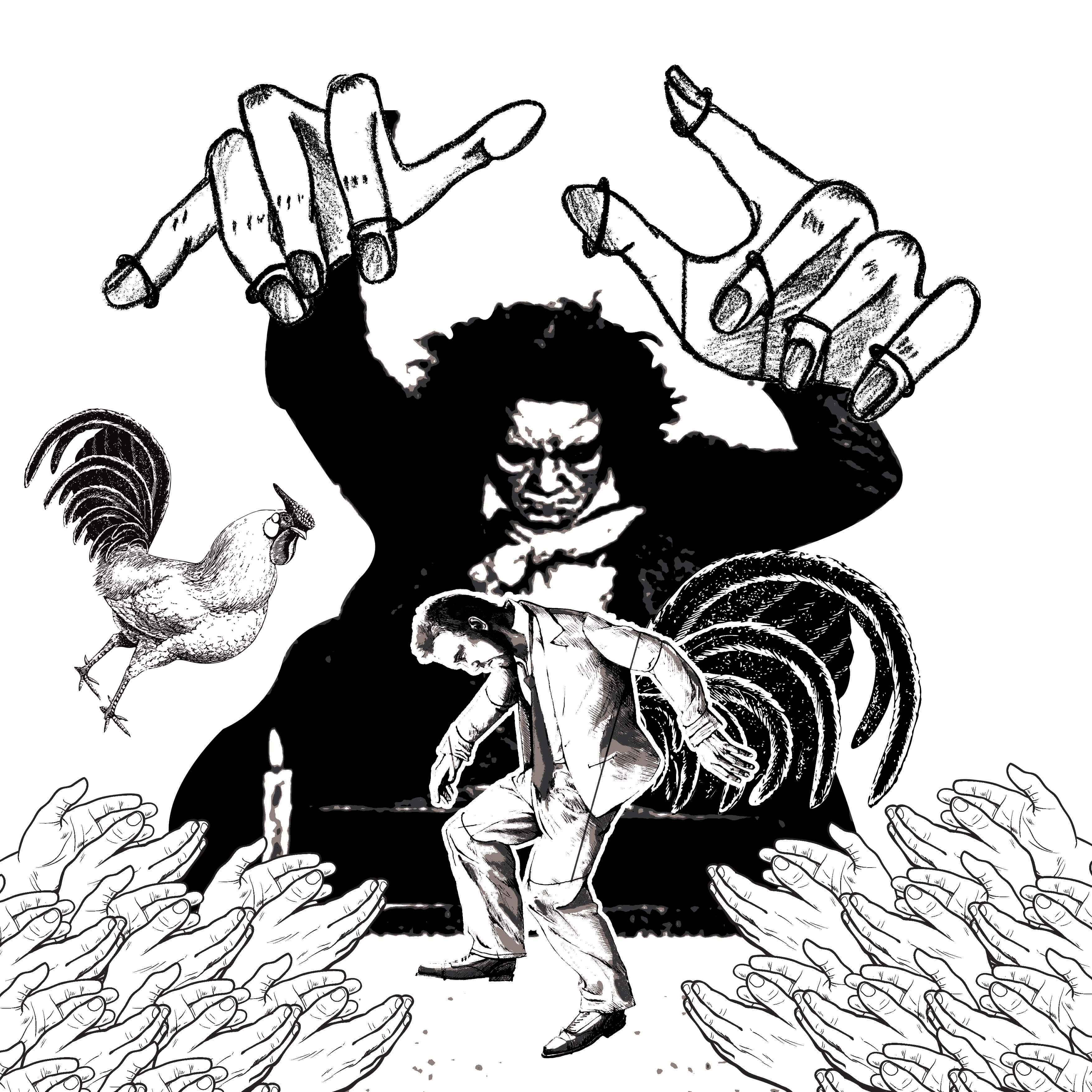
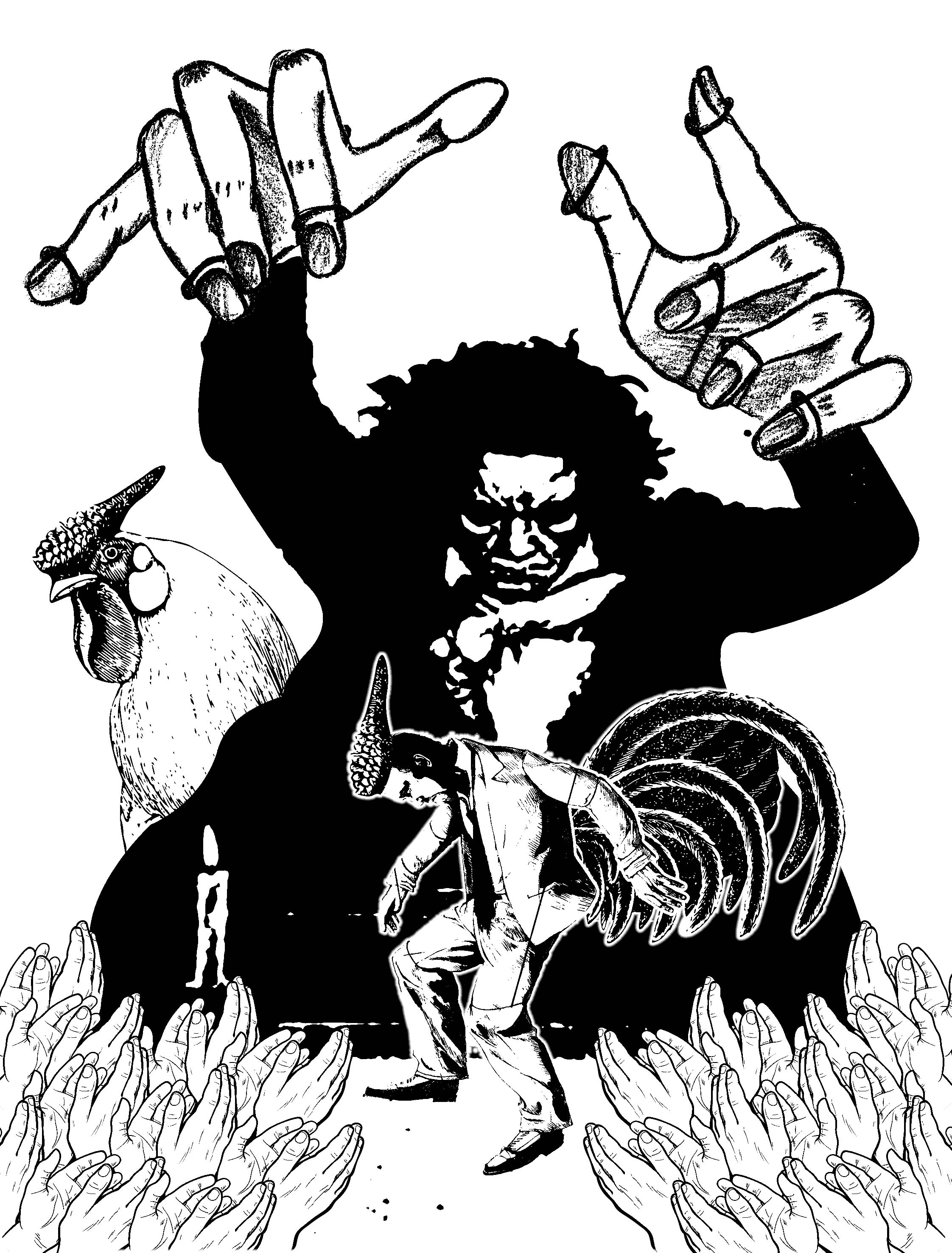
Forrest Gump – Clockwork Orange

Clockwork Orange

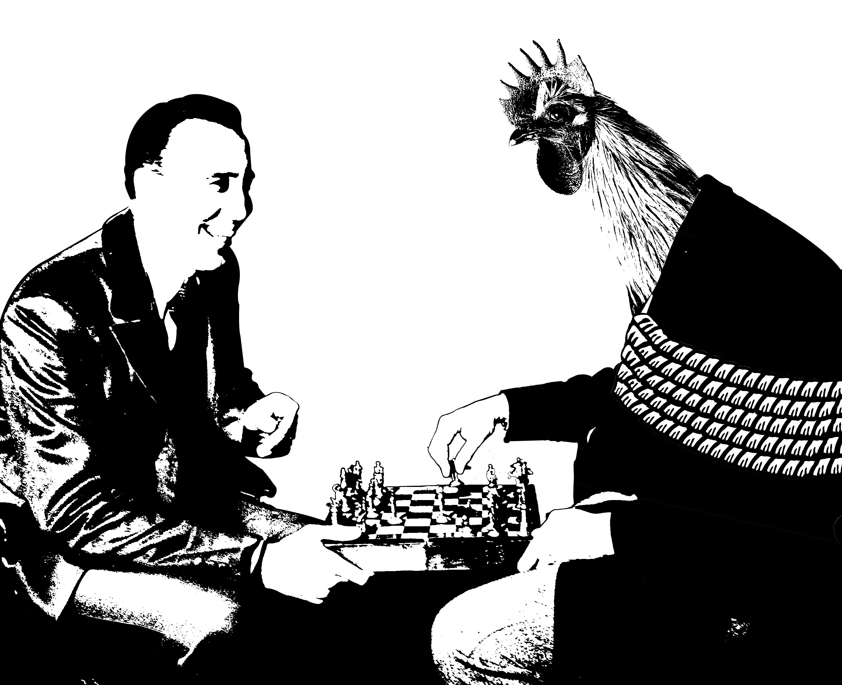
The quote i picked out was actually “When a man cannot choose, he ceases to be a man.” But the screenshot I took from the movie came with the previous sentence so… please just ignore that part 🙂
When a man is not recognized and respected as one, his existent is similar of that of a chicken. We commonly know chicken as a ‘brainless’ animal and uses it as an insult to call others stupid. A waiter’s job is so serve the customer. In this case the waiter is serving chicken meat, meat of his own kind, What i am trying to communicate is that he might as well be a chicken, a livestock. Doing whatever he is told and not a thought of his own.
Here, I broke down the quote in to its key words.
1. Choose
The first definition that appears when I google the word ‘Choose’ is – to pick out (someone or something) as being the best or most appropriate of two or more alternatives. I immediately thought of chess and games where you make appropriate choices for your survival and victory.
2. Ceases
It means to come or bring to an end. So I used ropes to bind the player to prevent him from playing.
3. Man
The man in this quote refers to mankind and not the male gender specifically. When one ceases to be a man, then what is he? An animal? Livestock? Monster? I made used of the chicken from the previous idea.
This idea end up being too complicated and cryptic. Also it would be better if the imagery is related to the movie.
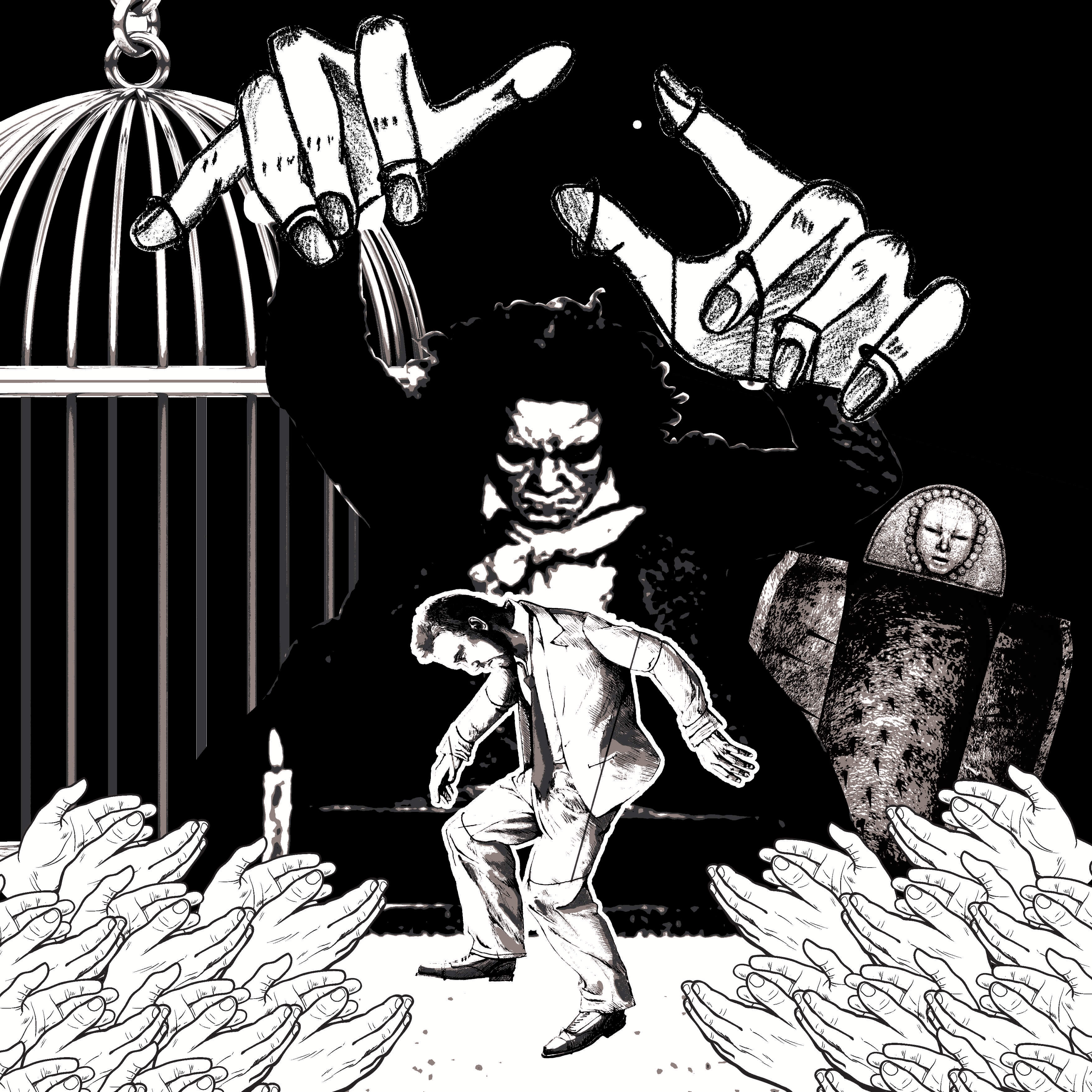
Idea no. 3 is base on the context of the movie. The protagonist went through a torturous experiment to fix his notorious behavior and after that, whenever he had a thought or will to harm anyone ever so slightly he would get a terrible nauseous headache.
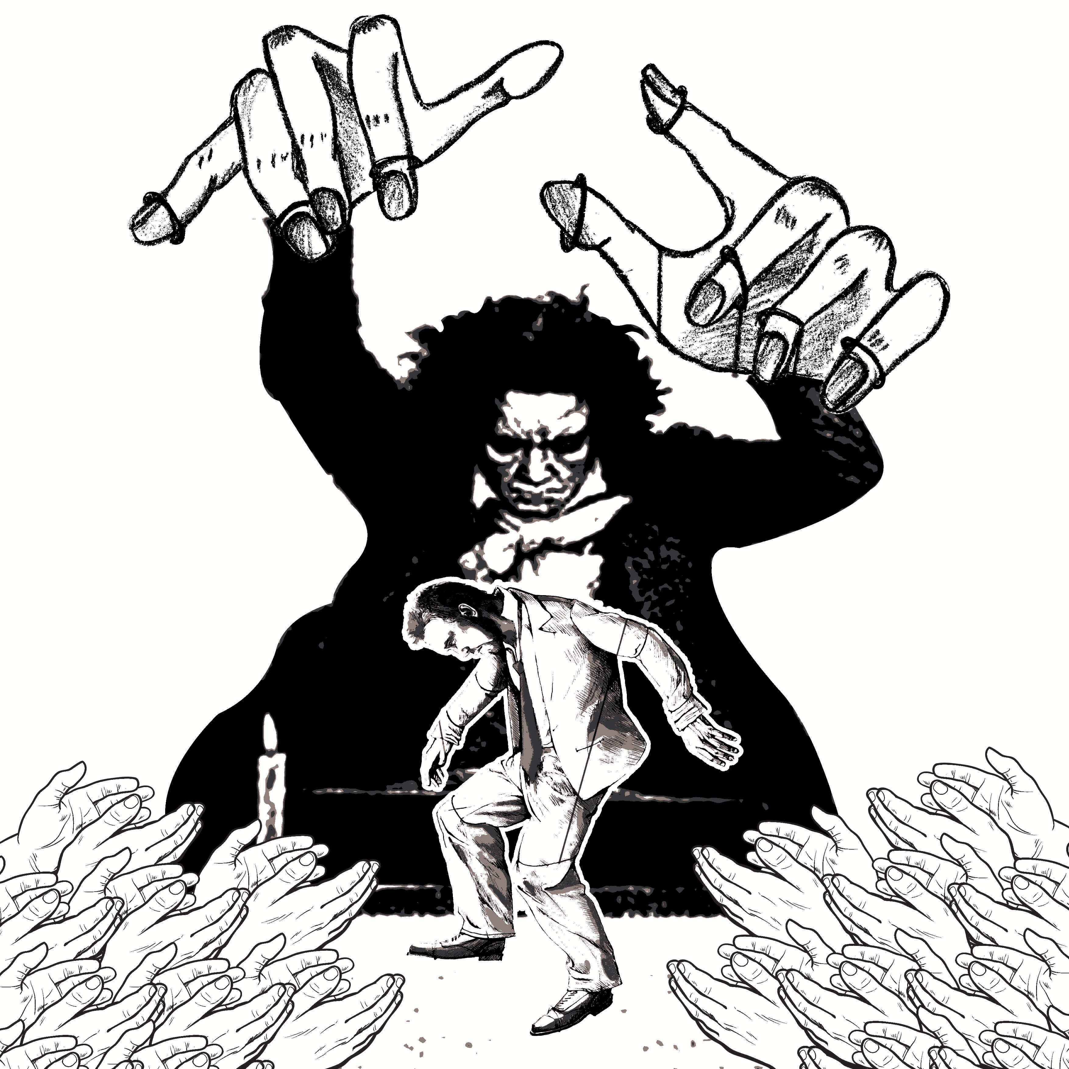
The elements in the background – the cage and the iron maiden are signifies the torture and restriction. There are hands applauding the “puppet show” because the experiment in the movie was approved by the society as a cure to bad behavior. The person controlling the “puppet”‘s movement is Beethoven because his 9th symphony the second movement was used to control his emotions. So it is like Beethoven is conducting his movements.
The cage and iron maiden in the background were a little excessive because the puppeteer concept already implies control and restriction.
Here is a titbit – Beethoven’s Symphony no. 9. Perhaps listen to it while looking at my design. Hahaha. 🙂
Continuing…
This is the selected idea but I have to finish the story; it only tells the part where the man cannot choose. The part where he ceases to be a man is still missing. So I thought to combine the anthropomorphism idea to degrade the status of a man.
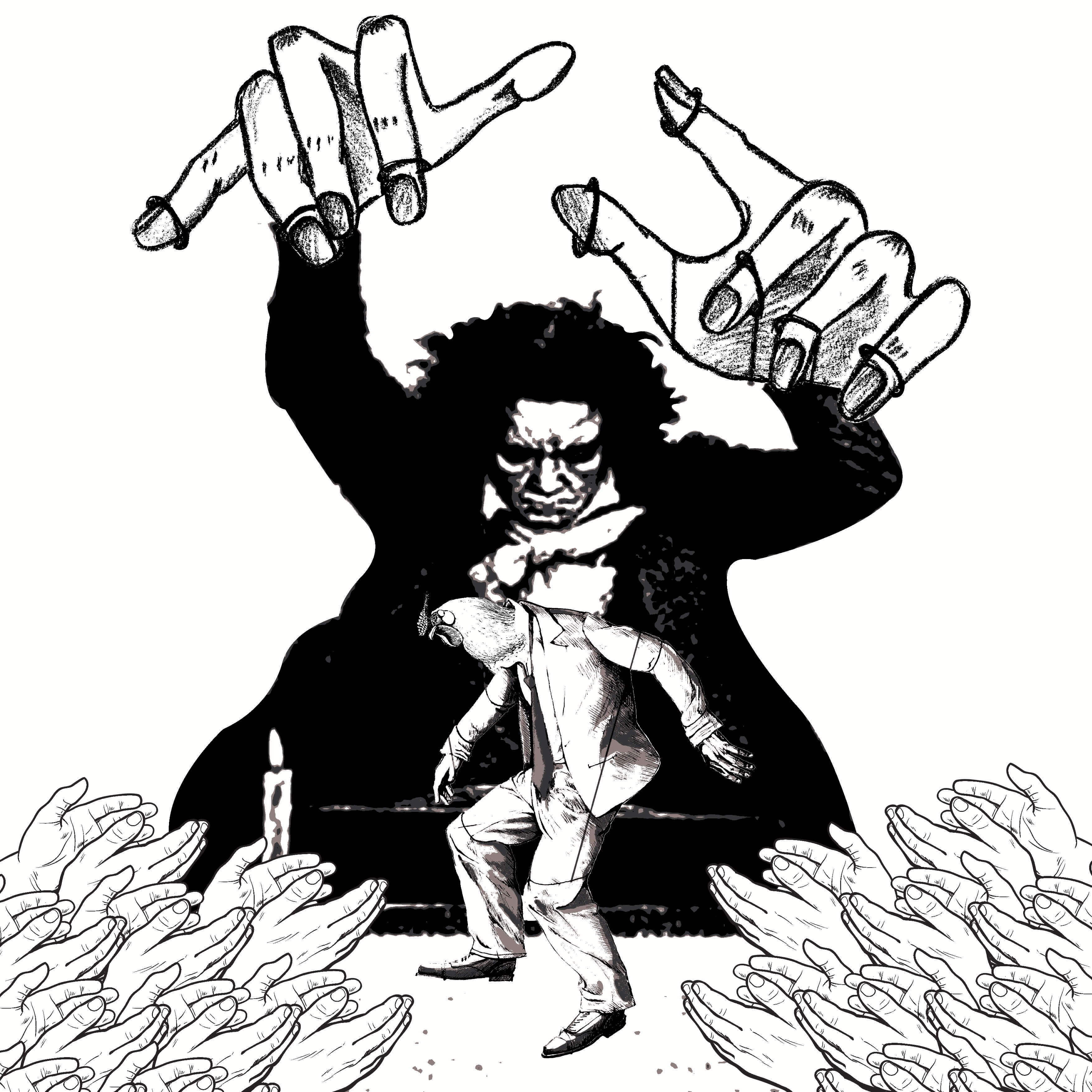
The half-chicken half-man is not very obvious. The chicken’s head is too small.
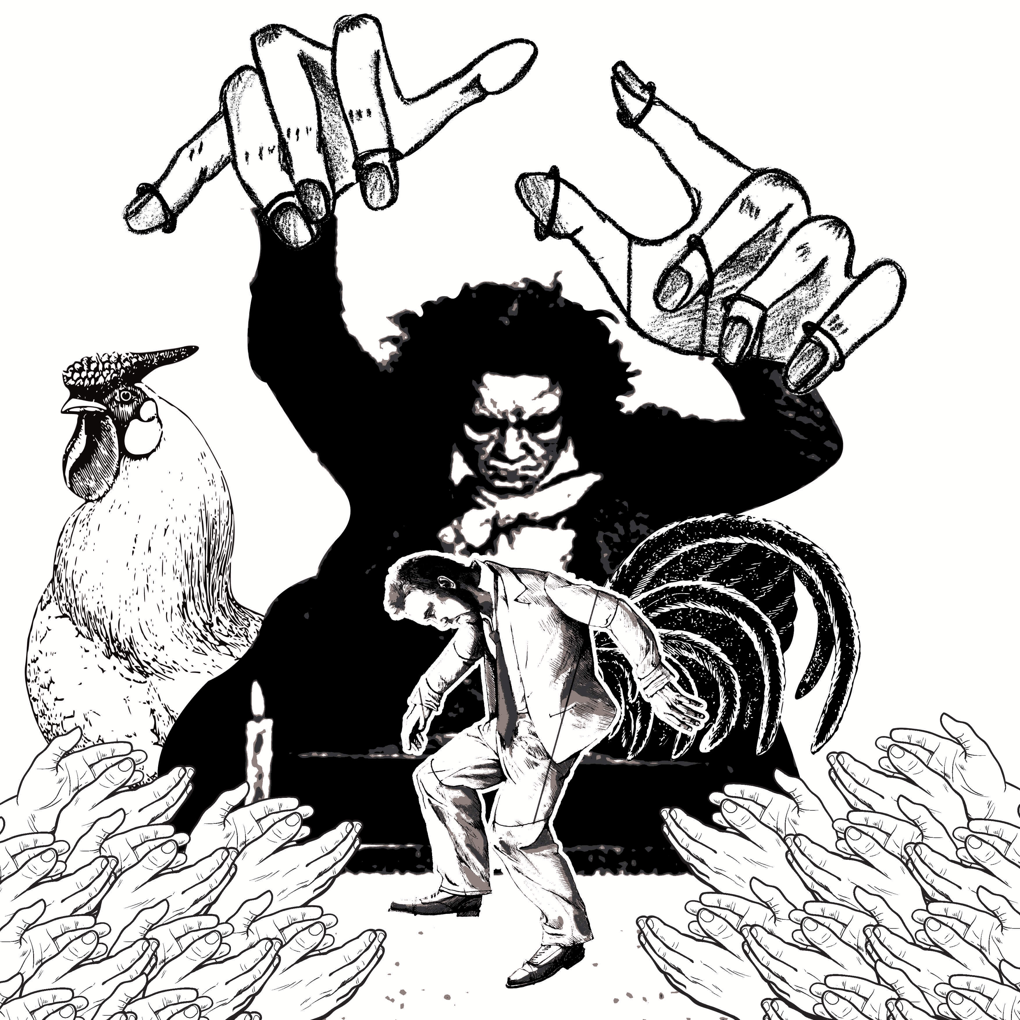
Since I cannot replace the head of the man with the head of the chicken as it would be too small to be identified, I placed a chicken in the background and link it to the “puppet” with the rooster’s tail attached to him. In this way, viewers can tell that he is becoming a chicken.
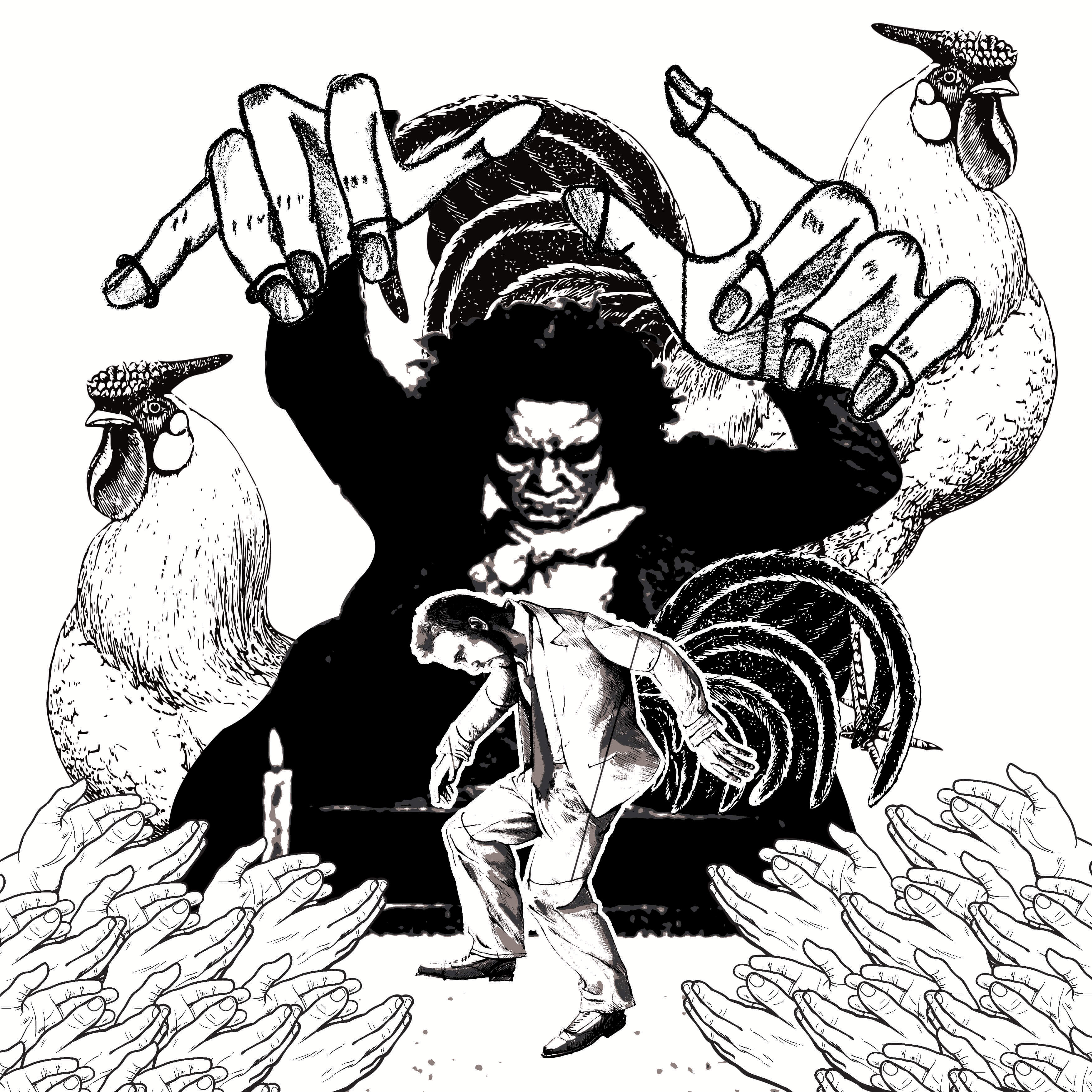
I thought maybe it is quite hard to relate to the rooster because in the previous iteration; the tail cannot be seen. So I added one more rooster in the background, this time showing parts of the tail.
Then I thought I should show the entirety of the chicken. But it looks out of place and odd.
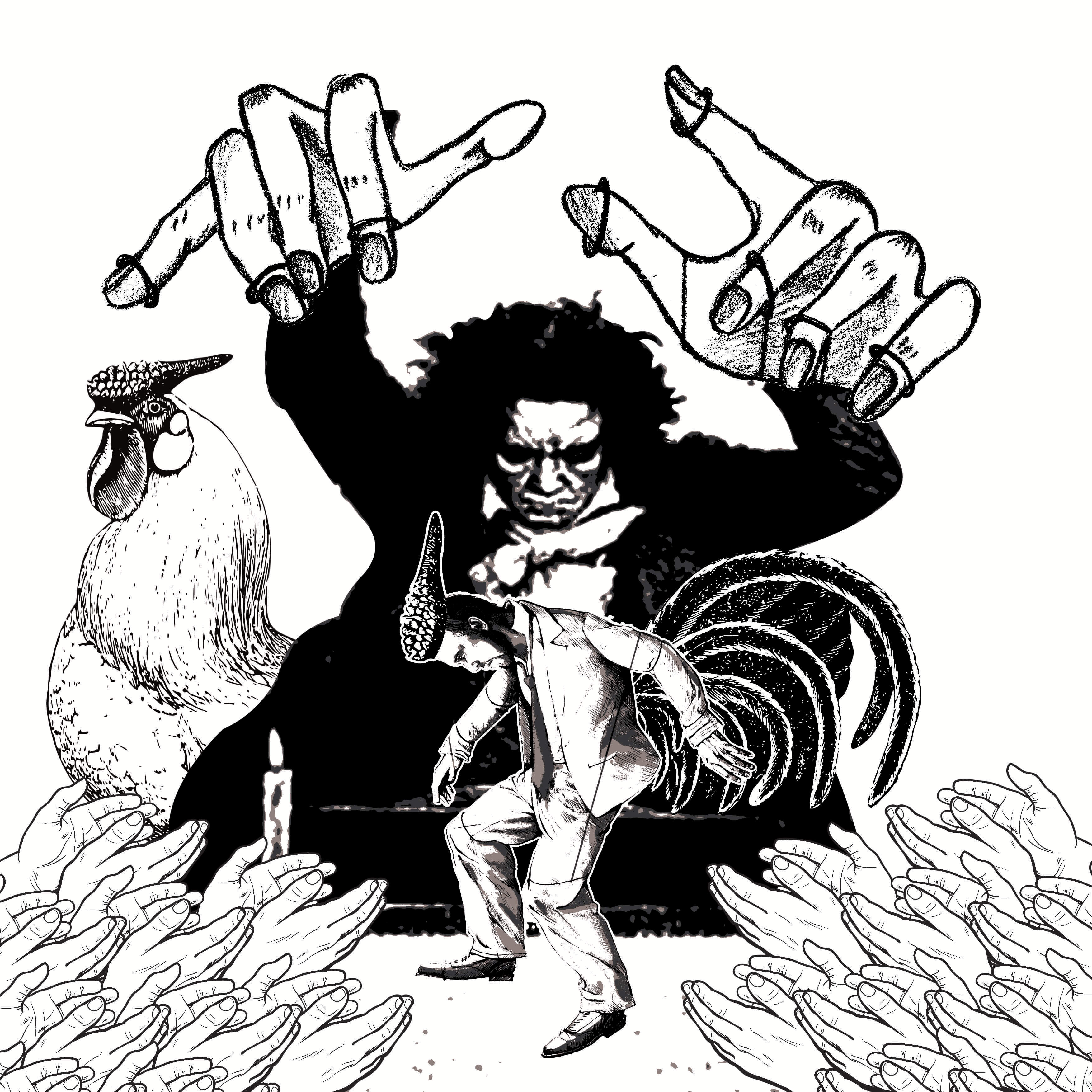
I went back to iteration 2 because I thought seeing the head and tail of the rooster at the same time on 2 separate bodies would tie them together more distinctly than the others. To emphasize the degrading status of being a man, I added the rooster’s crown onto the “puppet”.
(I had another Idea to “demote” the man into a woman because there was the topic of rape in the field. But thought it might be too offensive.)
Comments:
See the thing is if you can tell that he is a puppet, there is no need for strings! 😀Design is resolved! A success!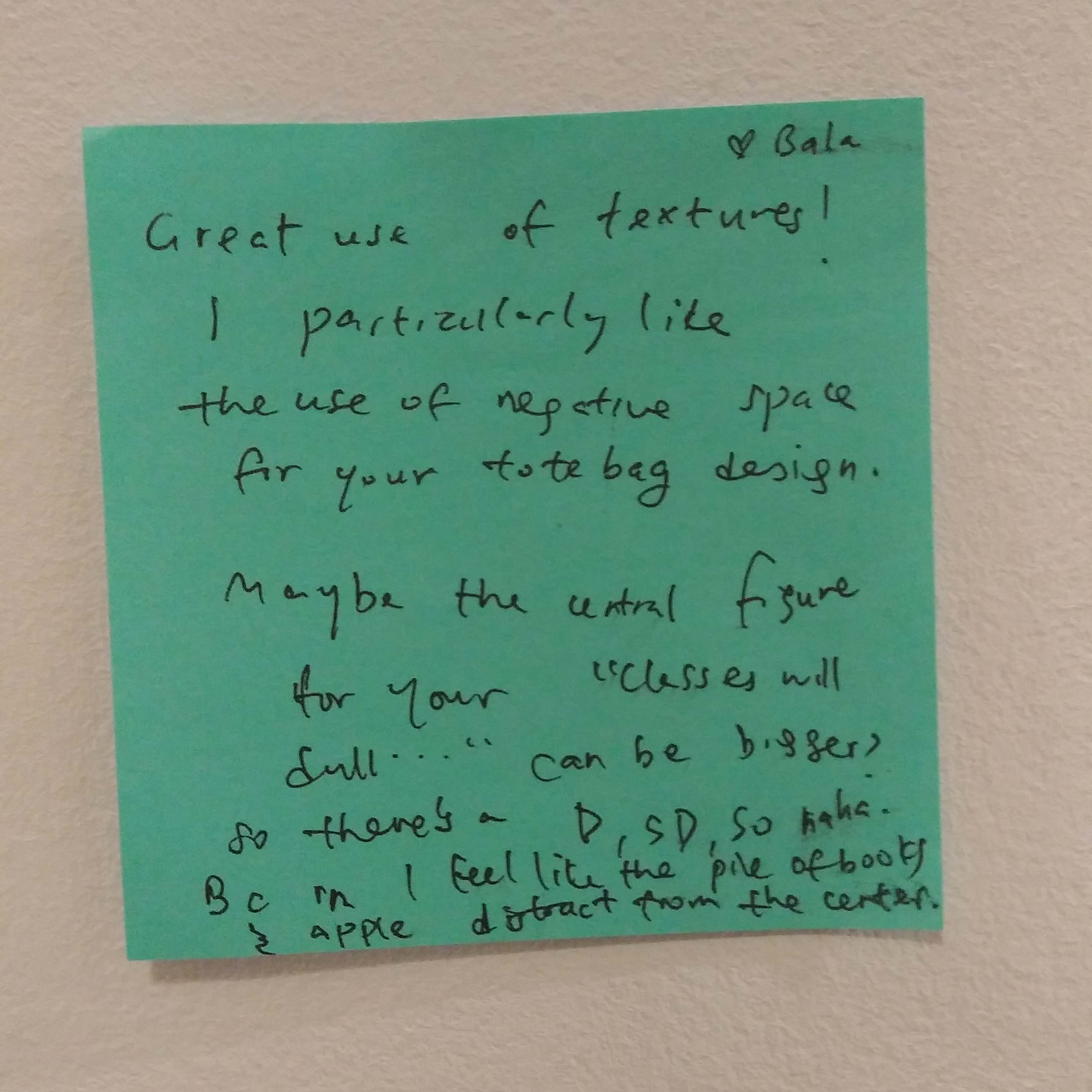 Good use of negative space?
Next: https://oss.adm.ntu.edu.sg/ytan149/forrest-gump-beauty-and-the-beast-2017/
Photostory
She ate it.
Genre: Mystery, Horror
Process:
The story that we came up with, after combining all of our ideas, is of a shy introvert who who transferred into a new school. Little did she know it was quite a peculiar one.
In the story we were dealing with social anxiety – the fear of social situations that involve interaction with other people. Therefore there is a lot of literal running in my version.
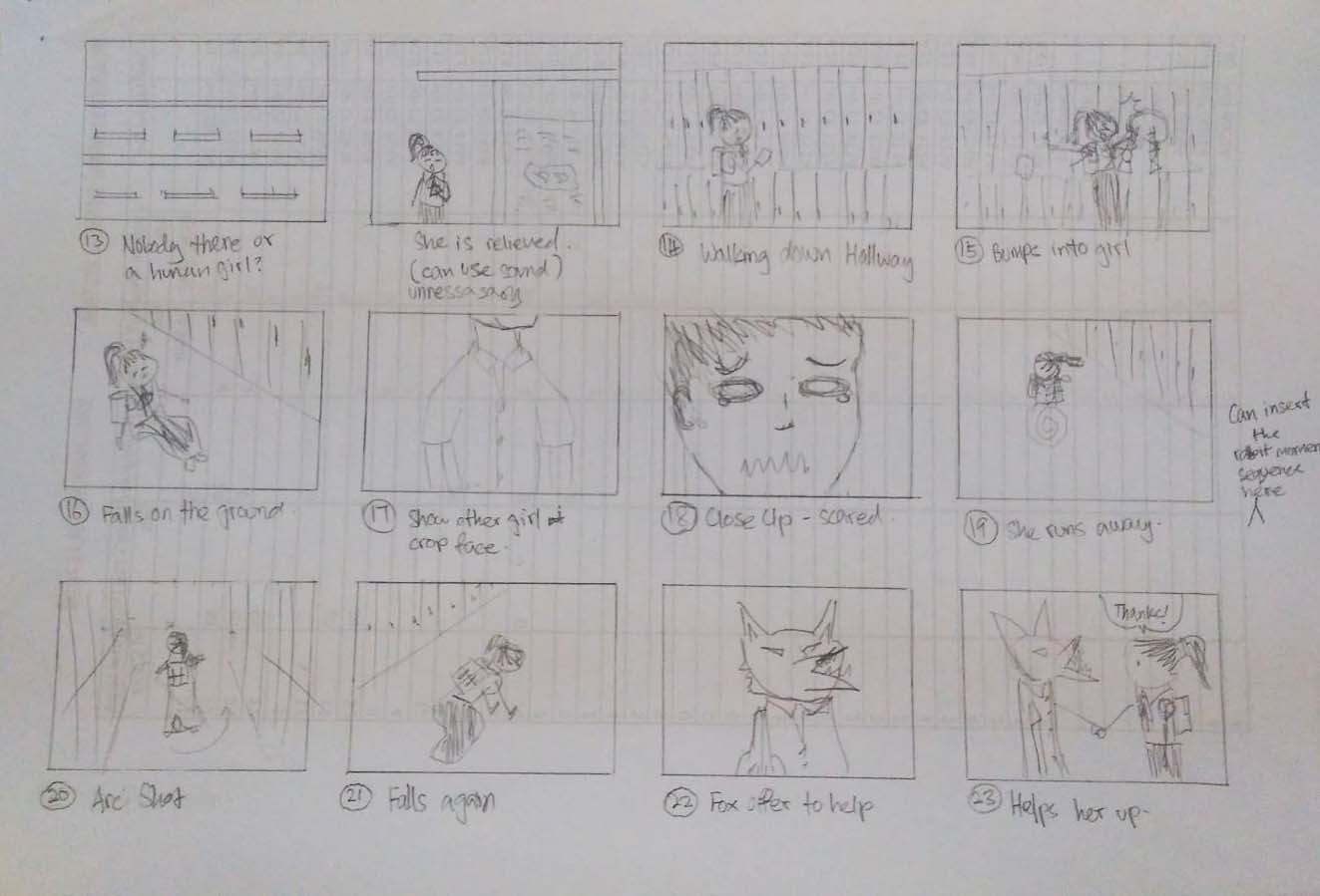
Scene I
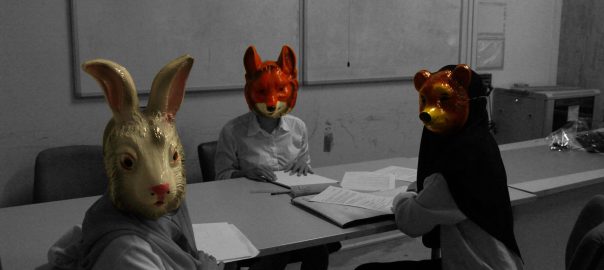
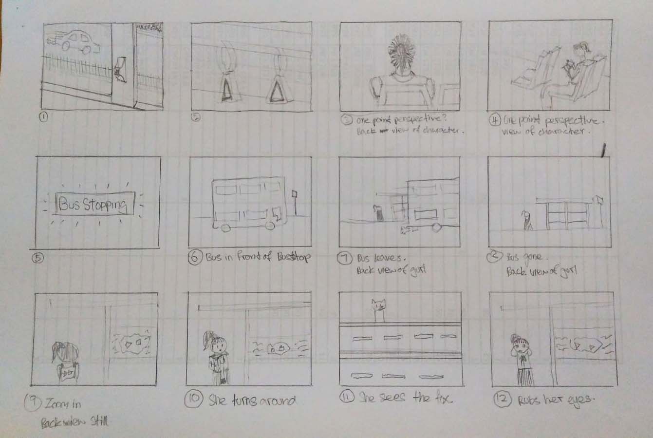
We planned the intro to introduce the topic of social anxiety as well as the 2 main characters – the girl and the fox. I suggested to make use of a cutaway shot that I saw from the stop motion movie Paranorman (as seen below).

Cutaway shots seems to be a very common in horror films. It can show that something is there and after it cuts away and cut back it is gone and that disappearing act makes people freak out. I thought this could be used in the intro to set the mood of fear and tension.
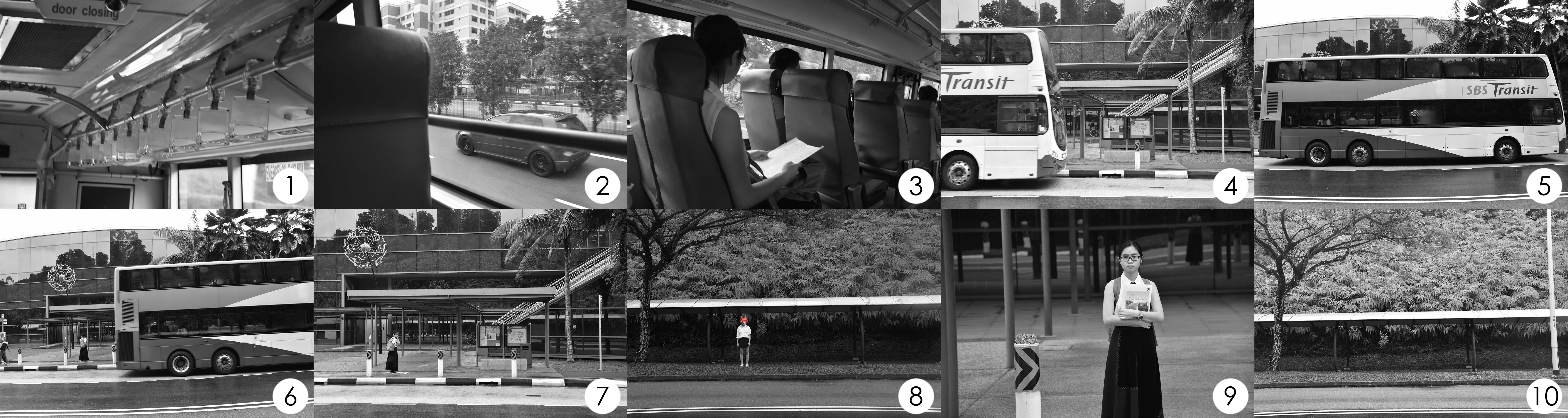
The intro starts off with the girl traveling to her new school by bus. When she alights the bus, she feels uneasy and hesitates to enter (social anxiety). Sensing something was watching her, she turns around to find nothing there.
Scene II

Paranorman also made use of the arc shot to reveal the ghosts that are invisible to everybody except for the main character. I thought that we could do the same and use it to reveal the ‘monster’ classmates.

It was more suitable for the arc shot to be use in this way than to introduce our ‘monster’ classmates. This sequence of the rabbit staring in your direction while you walk pass it makes one queasy which is exactly that creepy/horror effect that we were looking for.
Sadly the arc shot does not fit my version of the story as I wanted a slow build up for an unsettling mood. I used the shot with the head cut off (scene II, shot 4) instead of the arc shot to raised questions as to what the girl had scene that she ran off scared. Then the fox is revealed and it answers the question to why the girl ran. They were ‘monsters’.

The second scene takes place in the hallway of the school. It is where she avoids and runs from all social interactions.
Scene III

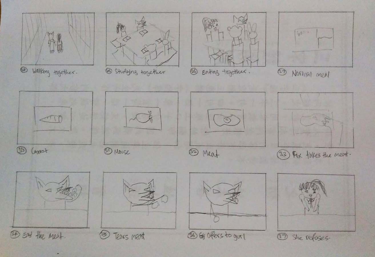
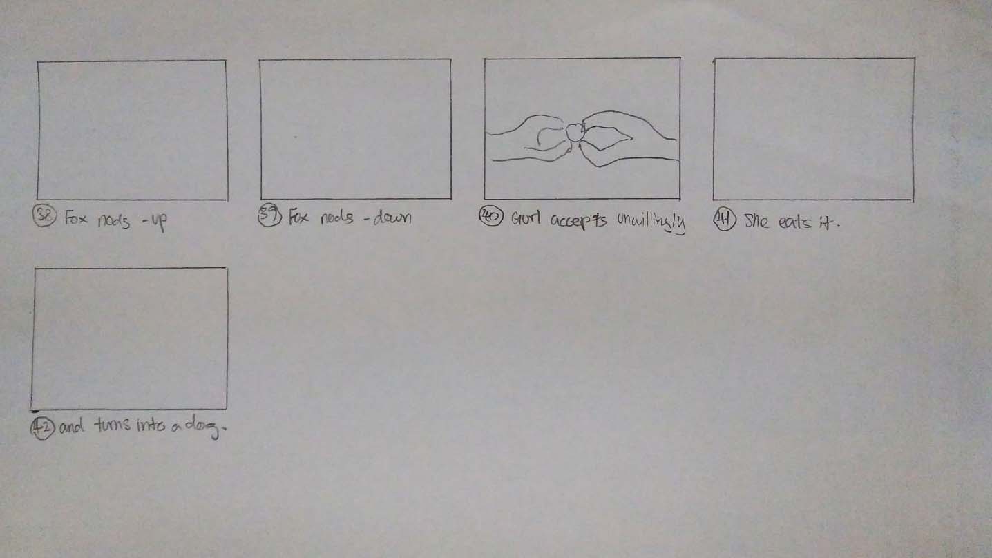
The last scene is in the classroom. Before she enters the room she takes a deep breath preparing herself to face her fears. The ‘monsters’ stare at her when she enters and takes her seat. When she got the courage to face them, she sees the horrifying sight of them feasting on unusual food. Then she gets peer pressured into eating their food. I wanted to keep the ending unknown, we do not know whether she turned into one of them or everything was just in her head. It is up to the viewer’s interpretation.

It is because of this scene that I made the entire film black and white; only leaving the masks and food coloured for the creepy effect. Masking the elements made the meat more grotesque and disgusting.
Originally I also wanted to include collage sequences just like the ones from La Jatee because the use of collage sequence can show the intimate and developed relationship between the two people. It would be helpful to show the progress of friendship and familiarity between characters. But i scrapped the idea in the end because I wanted it to be mysterious.
Sound edits inspirations
I was looking for sounds that create suspense and intensity and remembered this video that I came across a while ago. It mentions the use of ticking in many of Hans Zimmer (Film score composer) and also his use of the shepherd tone in the recent film Dunkirk to create intensity. After going through some ‘suspense music’, I decided that the ticking fits best.
The anthropomorphism also reminded me of Rabbits by David Lynch, one of the many films my Polytechnic lecturer introduced to me. It is set like a sit com with applause and laughter but it was edited into something less comical and more frightening. Inspired by this, I wanted to create something using that awkward silences and the sounds that are unexplained to build a unsettling atmosphere.
Rejected:
The rejected is the one with the shepherd tone edit at the end.
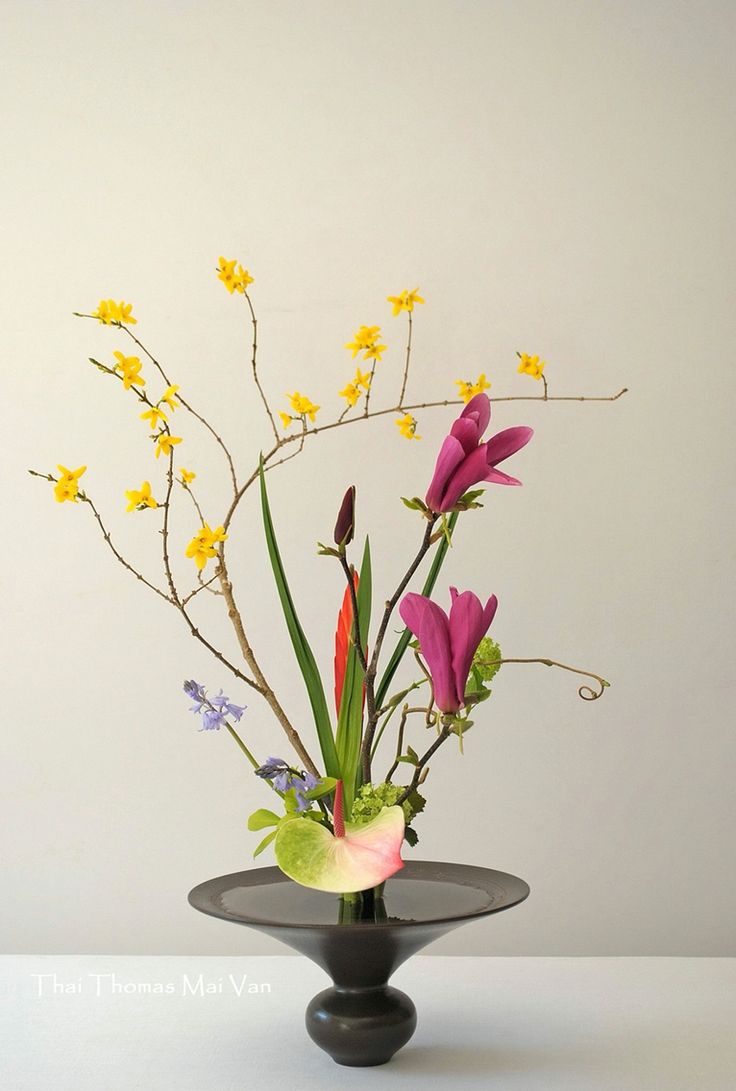
Gaia’s Ikebana – Research
Ikebana
ike, meaning ‘alive’ or ‘arrange’ and bana meaning ‘flower.’ (Fresh, FTD. 2017. )
A traditional arts from japan that is practiced for more than 600 years. It originated from the Buddhist ritual of offering flowers the spirits of the dead. By the middle of the fifteenth century, with the emergence of the first classical styles, ikebana achieved the status of an art form independent of its religious origins, though it continued to retain strong symbolic and philosophical overtones.” (“Ikebana International”. 2017)
As time passed, ikebana became a major part of traditional festivals, and ikebana exhibitions were held periodically. Rules were prescribed, and materials had to be combined in specific ways. In these early forms, a tall upright (indication of faith, to the heavens) central stem had to be accompanied by two shorter stems; the three stems represented heaven (shin), man (soe), and earth (tai). (“Ikebana International”. 2017)
Strives to create a harmony of linear construction, rhythm, and color. (“Flower Arranging | Godai Katsunaga”. 2017)
Minimalism, shape and line, form, humanity, aesthetics, and balance. (Fresh, FTD. 2017. )
Principles of Rikka arrangements
Rikka symbolized the mythical Mt.Meru of Buddhism and reflects the magnificence of nature in its display. (“Flower Arranging | Godai Katsunaga”. 2017)
- mountain peak (ryō)
- waterfall (rō)
- hill (qaku)
- valley behind the mountain (bi)
- town (shi)
- in (“shade”)
- yō (“sun”)
Moribana Style
I find that the dominant, sub-dominant and sub-ordinate is very obvious in this style.
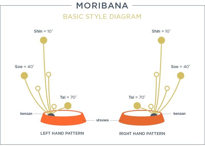

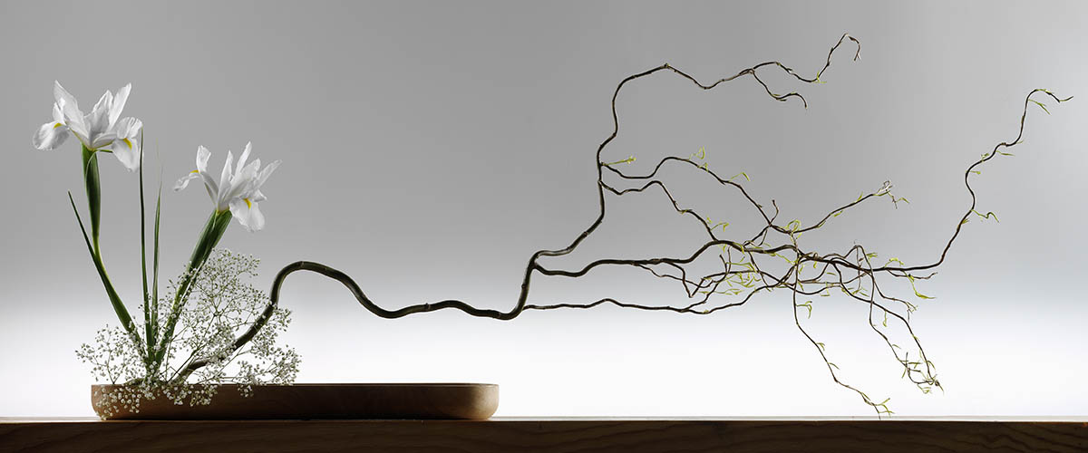
D – Branch
SD – flower stems and baby breath
SO – White Flowers
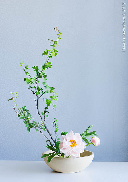
I like the Ikebana’s composition like the above ; with a branch hanging precariously to the side. It seems to defy gravity – standing with no support at all.The different direction in which they are pointing that creates a much more interesting arrangement. Also the curvy branch is in contrast to the stiffer and rigid flower stems to the left.
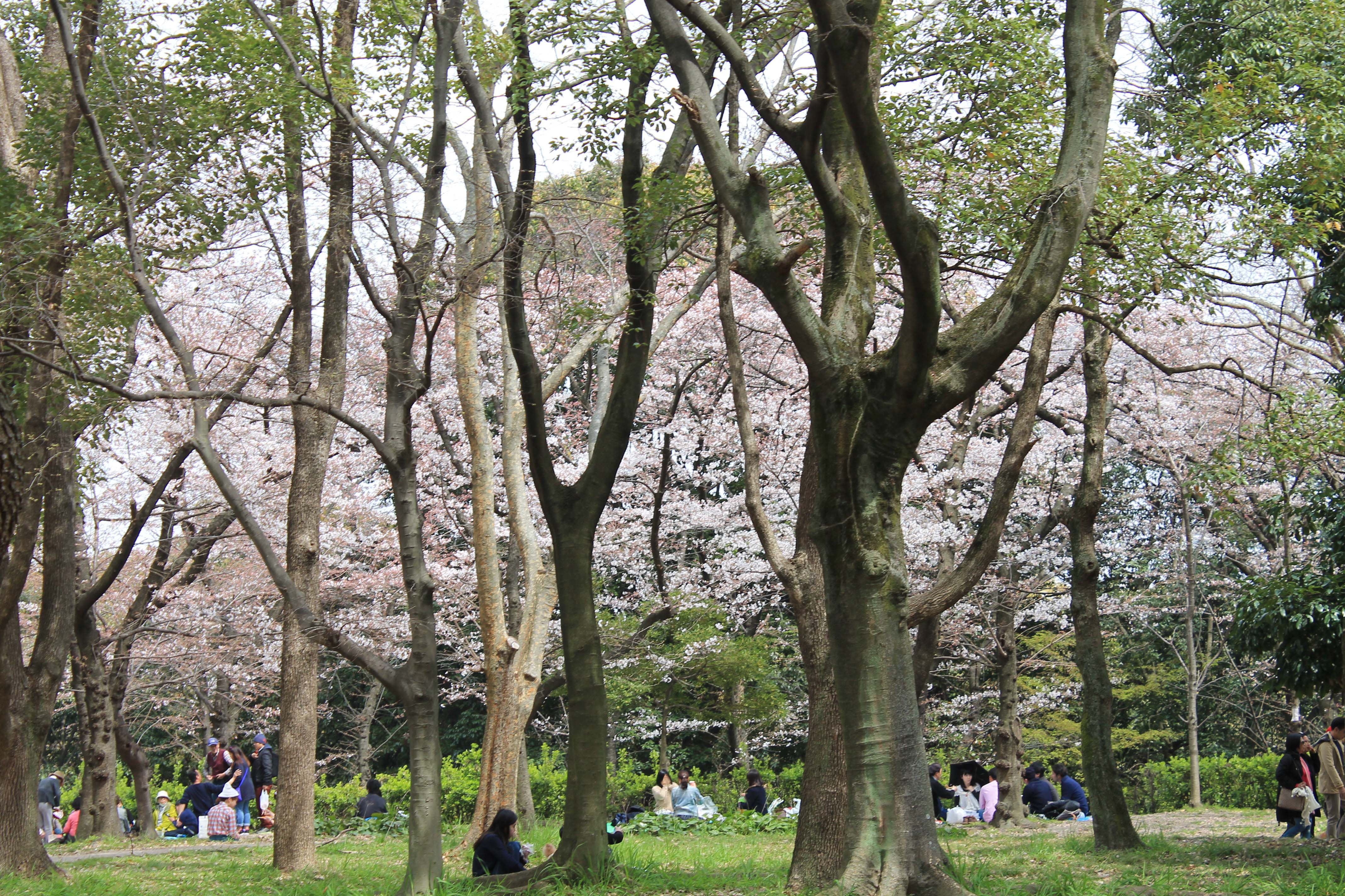
Spring
March – May | 5 – 20 degrees Celsius | Cherry blossom blooming
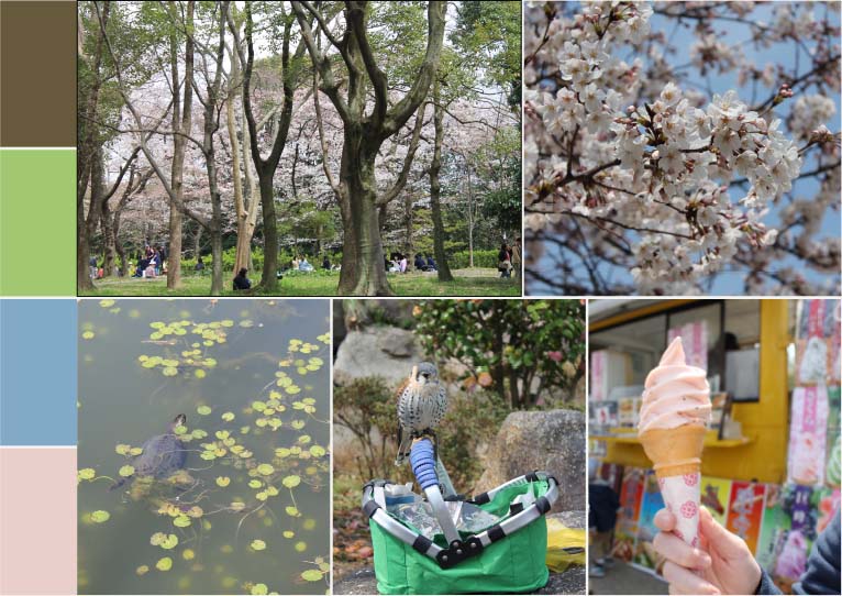
The mood board is made of images that I took from my Japan trip in Spring of 2016. (How lucky I was to picked the Spring season.) The tones during spring are very cool. The earthy pastel shades reflecting the soft and mild weather.
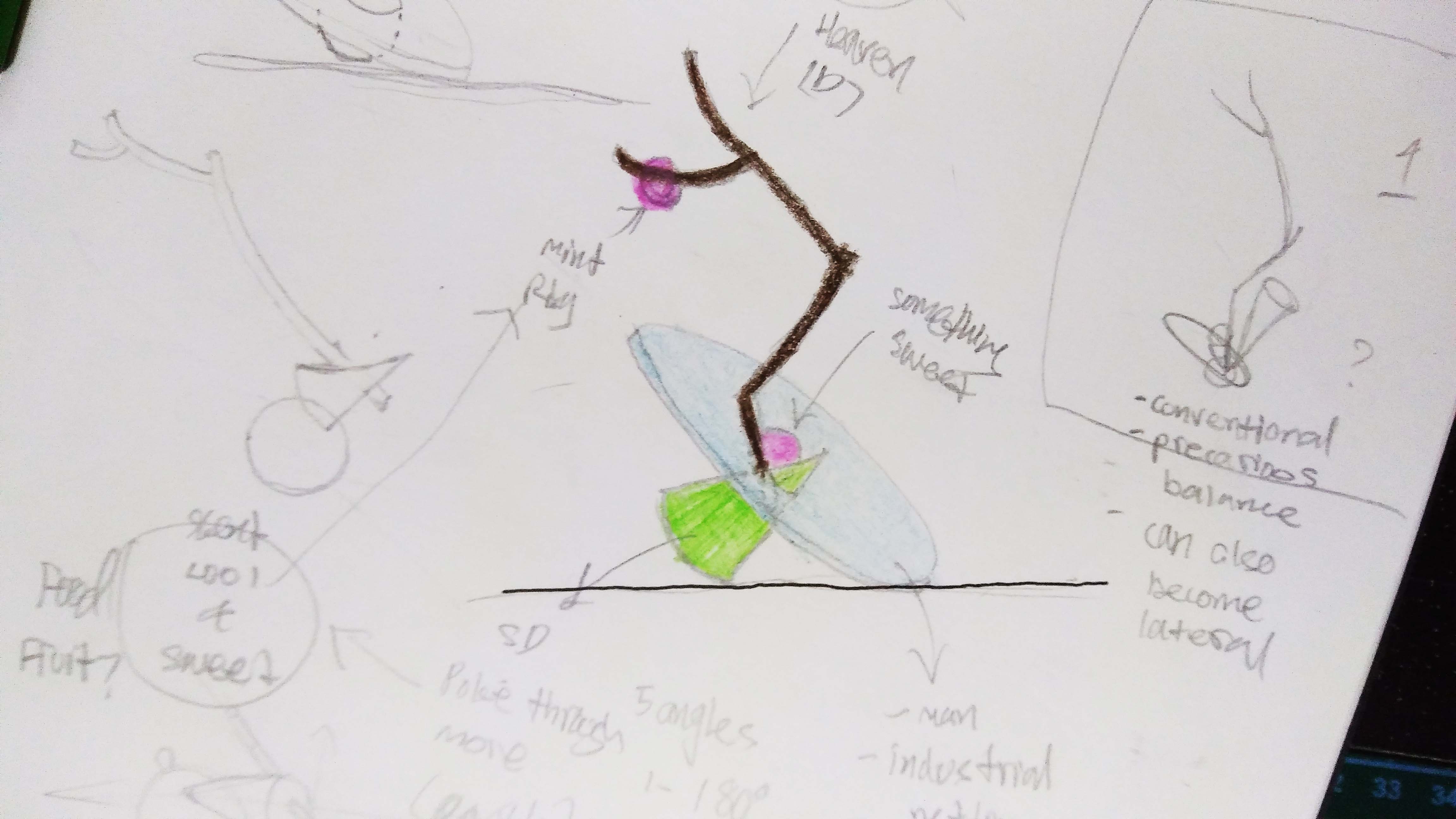
- Branch is brown obviously… (shin)
- Flat cylinder to be blue (soe); a reflection of the sky (water body, although the pond wasn’t blue at all…) and to match the colour scheme. Planning to make it out of man made material e.g. my leftover metal netting from Project Pandora or some leftover paper from FYP two years ago. Probably the blue paper because of the scene (Park) I am trying to set. Paper is man made but still natural – also related to trees.
- Green cone to represent the grass and bushes. (tai) Thinking of using a fruit or something related to the earth. But if I use a fruit (green apple) it will probably become a sphere? Then the sculpture will become more like the sketch on the right.
- Pink for the SOs as the flowers. I am thinking of using mint for the cool temperature and weather. But are there any pink mints???
- (I did the upright style in the end; the slanting style is quite difficult and I wanted to have the shin soe tai represented distinctly)
References
“Flower Arranging | Godai Katsunaga”. 2017. Godaikatsunaga.Com. http://www.godaikatsunaga.com/?page_id=195.
Fresh, FTD. 2017. “The Art Of Ikebana Flower Arranging”. FTD.Com. https://www.ftd.com/blog/design/ikebana.
“Ikebana International”. 2017. Ikebanahq.Org. http://www.ikebanahq.org/history.php.