Tag: Research
Kokopelli Research

Who is Kokopelli?
(PG ver.)
A mythical character often portrayed as a hunchback flute player. The legend originates from ancient beliefs of American south-west natives. He is thought to be a symbol of fertility, joy, feast and long life. He is also a musician, storyteller, rainmaker, healer, teacher, joker-magician and seducer.
“This merry traveler has a lesson fro everyone. the most important seems to show us that we shouldn’t take life too seriously.”
(Whimsical figure)
In certain myths, Kokopelli carries seeds or medicinal artefacts in his hump which some say is a sack. He would sow the seeds, and blow life into them by playing his flute. He is most welcome during planting season. Others say that Kokopelli talks through the wind and his flute can be heard in the breeze of spring, bringing warmth. In this version, he brings fortune and prosperity to those who listen to his songs.
https://www.harpo-paris.com/en/legends-and-stories/8-kokopelli.html
http://www.indigenouspeople.net/kokopelli.htm
How do we hear?
(Vibrations and Hair!)

Sound waves travel into the ear canal to the eardrum. The eardrum passes the vibrations through the middle ear bones (ossicles) into the inner ear. In the inner ear is the cochlea that has thousands of tiny hair cells that change the vibrations into electrical signals that are sent to the brain through the hearing nerve. The brain then interprets the sound you are hearing a sound.

Frogs also have the Tympanic membrane that stretches across a ring of cartilage similar to that of humans. There is rod that is connected to the ear drum (Columella Auris), which vibrates by sounds that come at the frog. That sound passes through as pressure waves and the rod sloshes around in the inner ear fluid, which causes microscopic hairs to move (similar to human!), which send signals to the frog’s brain to be interpreted.
http://www.dangerousdecibels.org/virtualexhibit/2howdowehear.html
http://frogsaregreen.org/tag/frog-hearing/
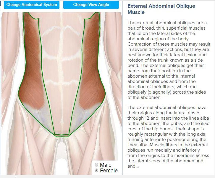
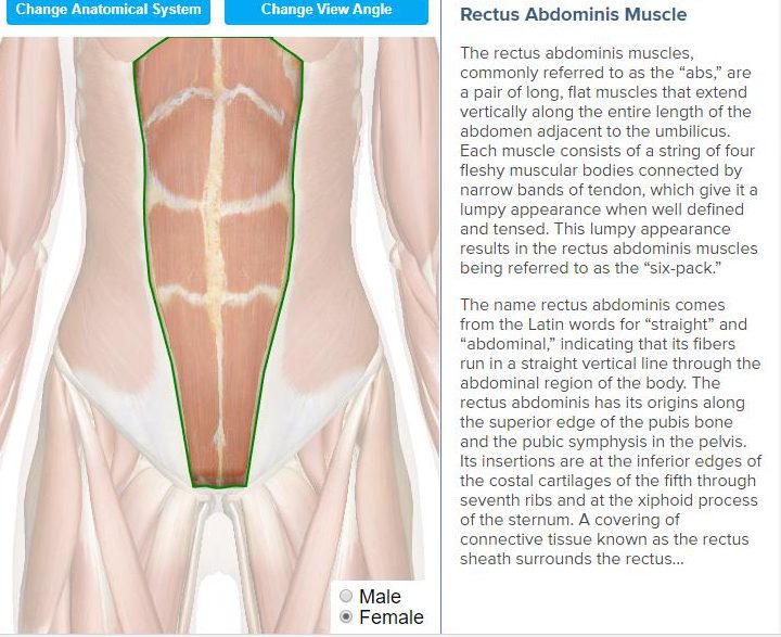
Body Part 1: Belly

There are 3 layers of muscle in the abdomen. The first is the external abdominal oblique followed by the Rectus abdominis and the Internal abdominal oblique and lastly we have the transverse abdominis.
http://www.innerbody.com/anatomy/muscular/lower-torso
Out of the Ordinary
Inspiration
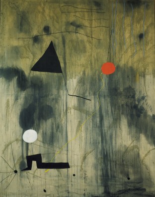
KEY WORDS: fold, ripple, resonance, inflate, pinch
Body Part 2: Face

(So many muscle!)
Facial muscles can be divided into 3 groups – Orbital, Nasal & Oral.
The orbital group of facial muscles contains two muscles associated with the eye socket – Orbicularis Oculi (performs closure of the eyelid) and Corrugator Supercilii (draw brows together, creates vertical wrinkles on the bridge of the nose).

The nasal group of facial muscles are associated with movements of the nose and the skin around it. (serve little importance to us humans) The nasalis is the largest of the nasal muscles – split into 2 parts; transverse and alar. The two parts compresses and opens the nares. The next nasal muscle is the Procerus. The contraction of the procerus pulls the eyebrow downward to produce transverse wrinkles over the nose. The last nasal muscle is the Depressor septi nasi which pulls the nose inferiorly to open the nares.

The oral muscles include Orbicularis Oris (used to purse the lips), Buccinator (pulls the cheeks inwards against the teeth, preventing accumulation of food in that area) and others that can be further classified into the lower and upper group.
http://teachmeanatomy.info/head/muscles/facial-expression/
https://www.youtube.com/watch?v=HIImGwTVXuQ
https://www.youtube.com/watch?v=5aDCrYUKIMo
https://www.youtube.com/watch?v=agmm3P2tUTs
KEY WORDS: Elastic
Project 1: Image Making Through Type – Research
In this project, we were to create typography of our own name/initials that carries the essence of extraordinary jobs. I listed many jobs that I think are interesting, some fiction some non-fiction. The chosen four were my favourites:
- Criminal
- Dream Seller
- Gardener
- Treasure Hunter
Criminal

The essence of a criminal that I gathered are the black & white strip prison uniform, name plate, height measuring background and handcuffs. I went to look for google ‘criminal fonts’ to see what already exist, most of them were sans-serif and many had textures.
Dream Seller
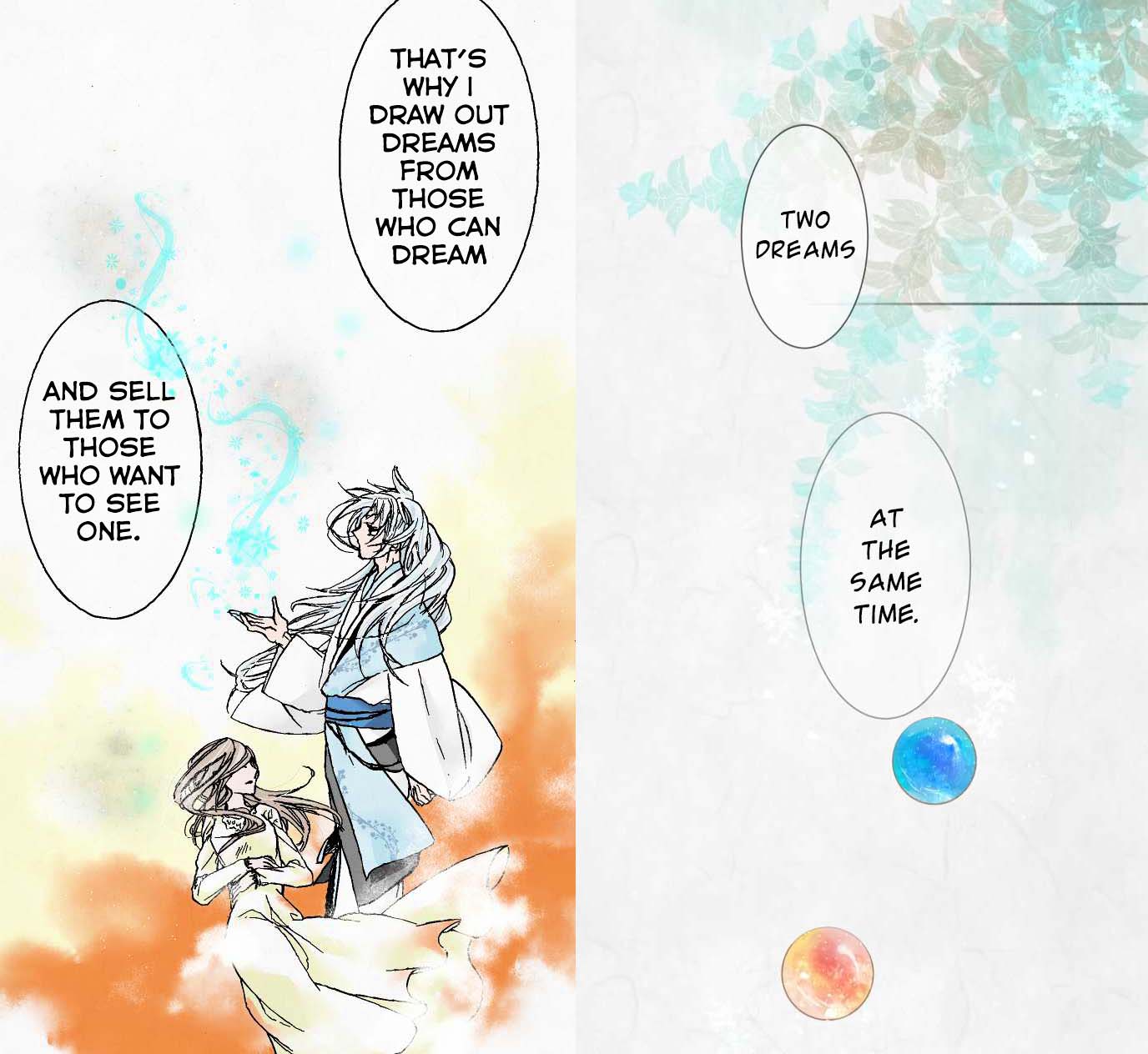
I read this webtoon recently about the after-life of a girl and there was a Youkai (Japanese for spirits, demons and other supernatural beings) that sells dreams. The dreams are depicted with fluid, wispy strokes that look like magical smoke. They are stored in colourful marbles.
The webtoon has very soft colours and textures similar to watercolour. The theme of dreams also reminds me of the Impressionism movement where the paintings and music were all very blurry, soft and muted.

When I discussed my idea with my classmates, many referred to the Big Friendly Giant (BGF) which also had the concept of capturing dreams. But instead of marbles, BGF puts them in jars which I think works better than a marble as a container.

Gardener
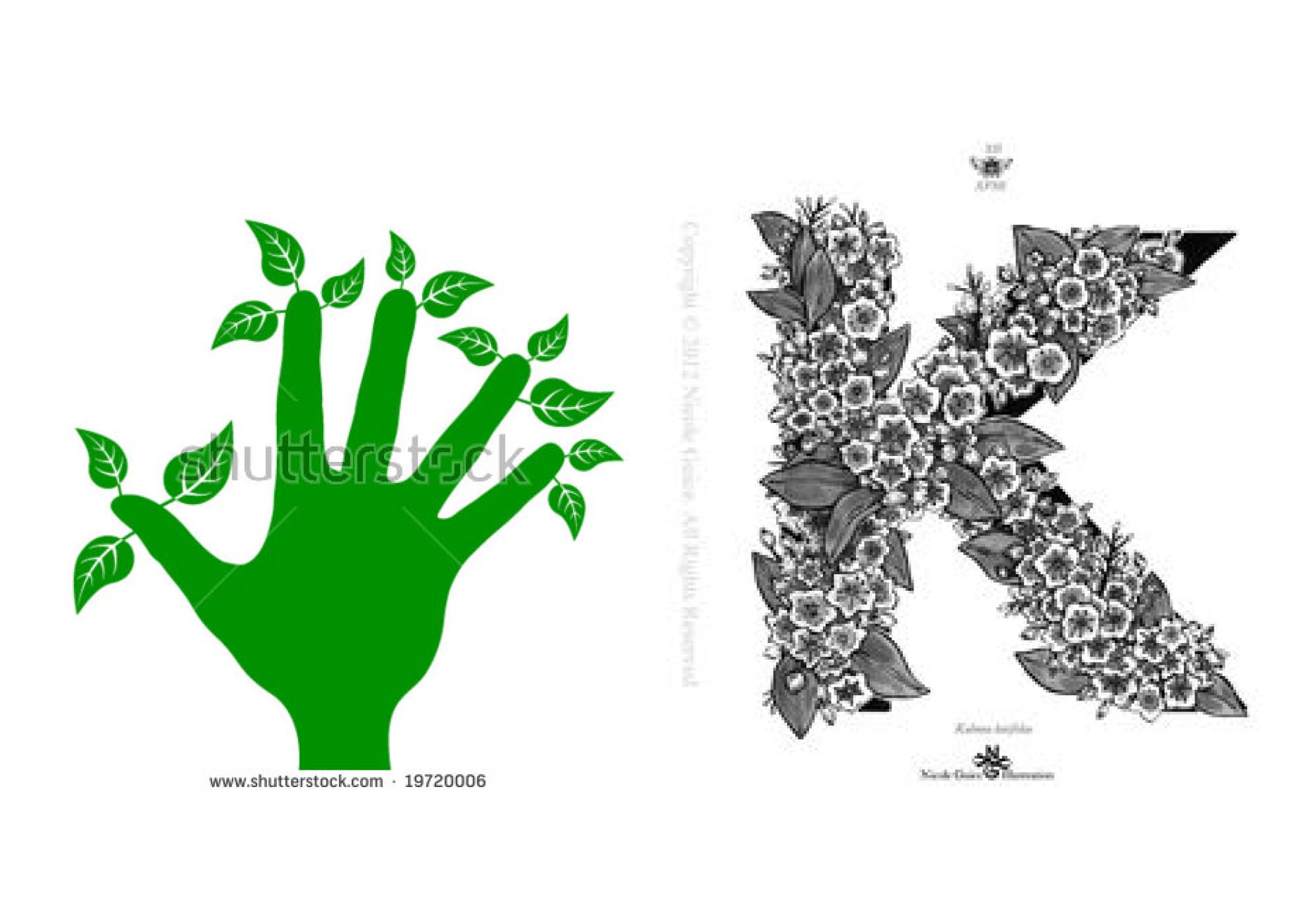 I chose this job specifically because I wanted to play with the phrase “Green Fingers”. However after consultation, I realised this was not what I was supposed to do. Putting the garden into the letter was too easy and already exist. Thus I had to find something new.

I went to look at pictures under ‘Gardening’ and I found gardening tools, soil, flowers, apron/overalls which gardeners always wear etc. Under ‘Gardening fonts’ I found that many related brand logos used handwritten script fonts.
Treasure Hunter
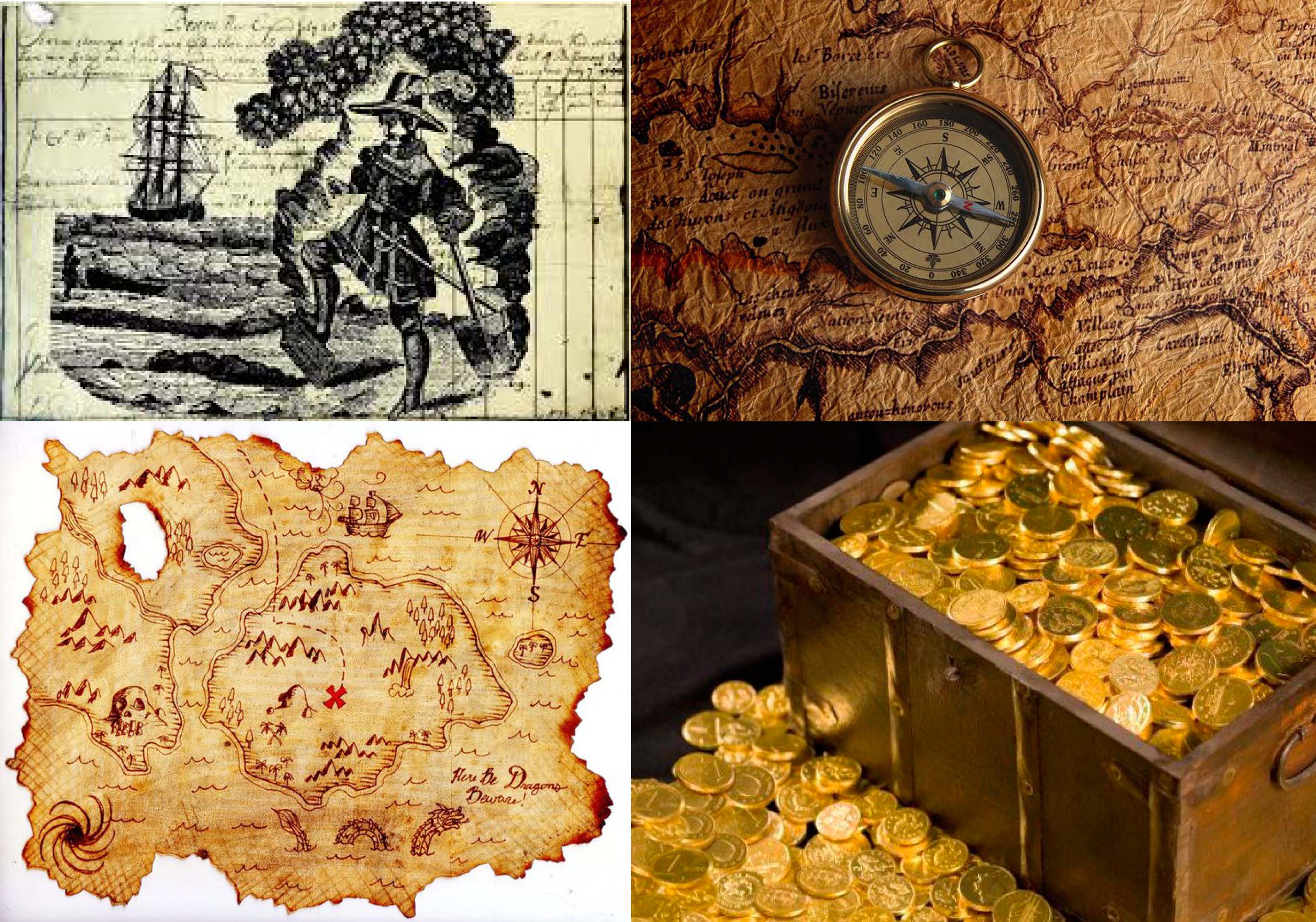
To find treasure, one needs to have a treasure map and under the search ‘Treasure hunter’ I found the maps, compass, gold. I also found this image of what seems to be a vintage print of a treasure hunter digging treasure over a page of writing presumably a journal. I thought it was an interesting idea to include a piece of writing in my work because a part of being a treasure hunter is to record your adventures.
Next: https://oss.adm.ntu.edu.sg/ytan149/project-1-image-making-through-type-process/
Micro-Project II – Open Source
Dion, Kai Ting and I came up with a crowdsourced artwork that reflects the emotions of the audience. The viewers are tasked to submit their current emotion represented by certain colours on an online poll.
The poll: https://www.surveylegend.com/s/kfk

The resulting artwork was the colour with the highest percentage projected onto a screen for all to see.

This is similar to that of Yoko Ono’s Cut Piece performance in which the viewers are co-creators of our artwork. They however do not have complete control. The artist holds the highest ‘power’ for the final outcome– deciding the amount and type of viewers, the location, duration and colours.
The natures of these results are also ever-changing. In another event such as a carnival, people would feel more lively and excited as compared to going to a boring lecture. A larger number of participants would change the results abundantly too, as feelings are fickle and completely unpredictable.
Marc Garrett mentioned in his essay,
that “Whoever controls our art – controls our connection, relationship and imaginative experience and our discourse around it.”
In this work, we also mediate the interaction within the crowd, viewers relate to the other participants without direct physical interaction. When they look at the final results, they form a connection with the percentage of people that feel the same way.
Both artworks represent the crowd collectively as a whole. Just like in D.I.W.O (Do-It-With-Others) the collaborating artists remains anonymous and produces a unexpected outcomes. Everyone is equal as the hierarchy for ‘good’ and ‘bad’ art is absent. D.I.W.O is all about being down to earth and pure interaction between people.
Add On:
Anonymity is important because there would be no external influence. Makes results more ‘pure’. Emotions are private not everyone wants to share. So being anonymous also protects the participant’s privacy.
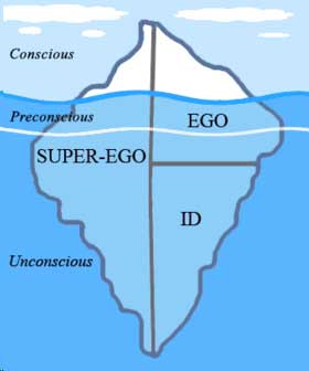
Ego – Research
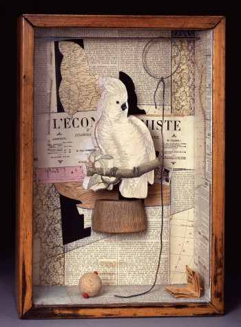
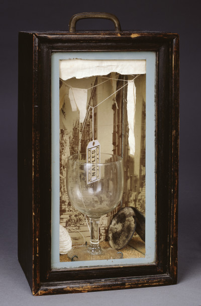
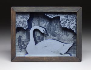
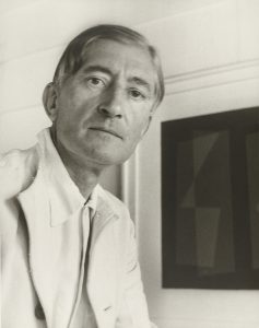
 Joseph Cornell
American artist & film maker
https://www.royalacademy.org.uk/exhibition/joseph-cornell
After Ms Mimi shared those paper-cut examples from senior’s work, I thought it looked pretty similar to Joseph Cornell’s box collages.

 Josef Alber
German-born American artist
https://www.moma.org/artists/97
http://www.g-e-s-t-a-l-t.org/MEDIA/PDF/Interaction-of-Color.pdf
Colour Theory
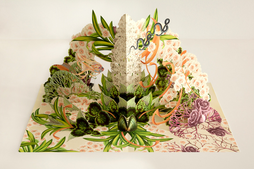
Pop-up Books
Bożka Rydlewska
Poland Artist/Illustrator


Extra: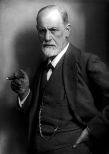

Sigmund Freud
Austrian neurologist; founder of psychoanalysis
https://www.sigmundfreud.net/the-ego-and-the-id-pdf-ebook.jsp
Hedgespeth, J. (2016). Ego, superego, and id. Salem Press Encyclopedia Of Health
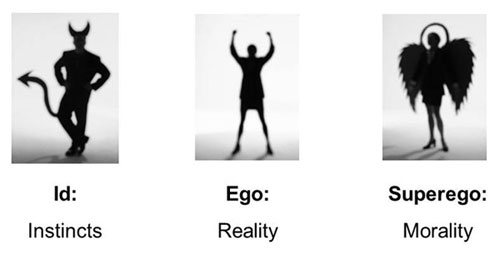
All the talk about Ego made me think of Sigmund Freud’s Psychoanalytic theory of personality. I thought it would of some help in this project. So here it is…
My Line is Emo: Research and Experimentation
“The notion of origins, the promotion of inexpert forms of expression, as well as the “discovery” of the uncharted subconscious realm as unveiled by Sigmund Freud, unleashed a creative frenzy in the era of surrealism and resulted in the invention (or reinvention) of many drawings and drawing-based techniques: Automatic drawing, …” (Jones, 10)
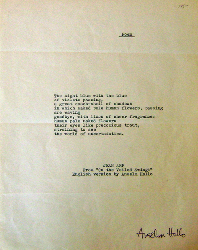
The book ‘talks’ about chance drawings and collages with the example of Jeans (born Hans) Arp, a German-French poet, artist etc. He had a peculiar way of writing his poems where he would “close his eyes and randomly underline words and sentences in newspaper articles and advertisements that would become the foundations for his poems.” (Jones, 19)
“For Arp, chance manifested the order (or disorder) of nature to which he aimed to connect, rather than his unconscious. His so-called automatic drawing beginning in 1917, for example, are derived from his wanderings in nature, not from the wanderings of his mind. Drawn after his habitual nature walks, the works capture Arp’s recollection of trees, branches, and other plant life.” (Jones, 19)
“Essential to the process was speed. “When one goes very quickly, the drawing is mediumistic. as if dictated by the unconscious.”” (Jones, 25) So the faster you draw, the less you think. Therefore the drawing is more from one’s sub-conscious.
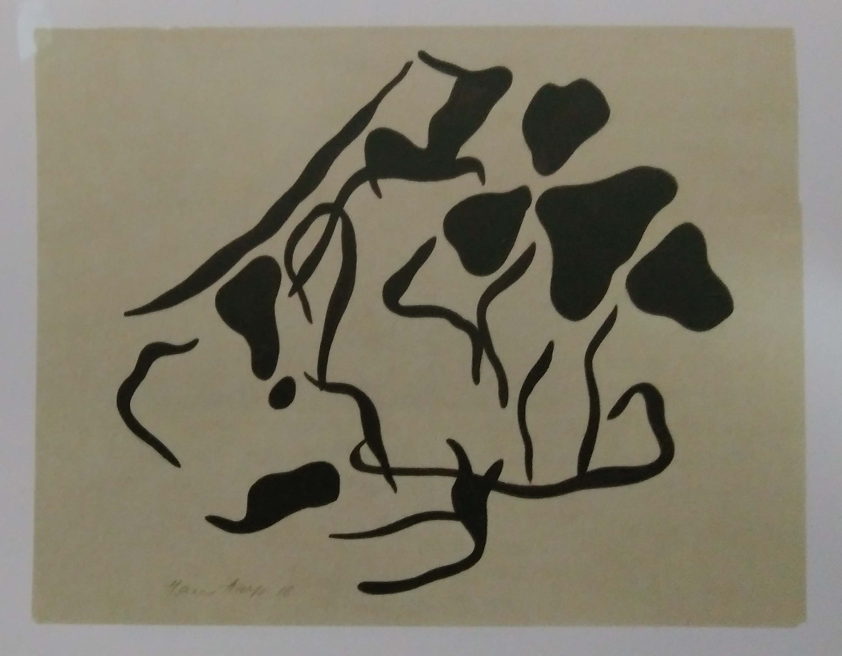
In the same page it also mentions Joan Miro. The “loosely drawn and schematic nature functions like multivalent pictograms or signs; that is a single form may connote several different meanings.” (Jones, 27)
After gaining some knowledge of automatic techniques, I became very eager to try them all out.
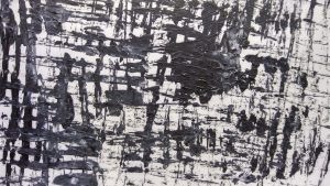
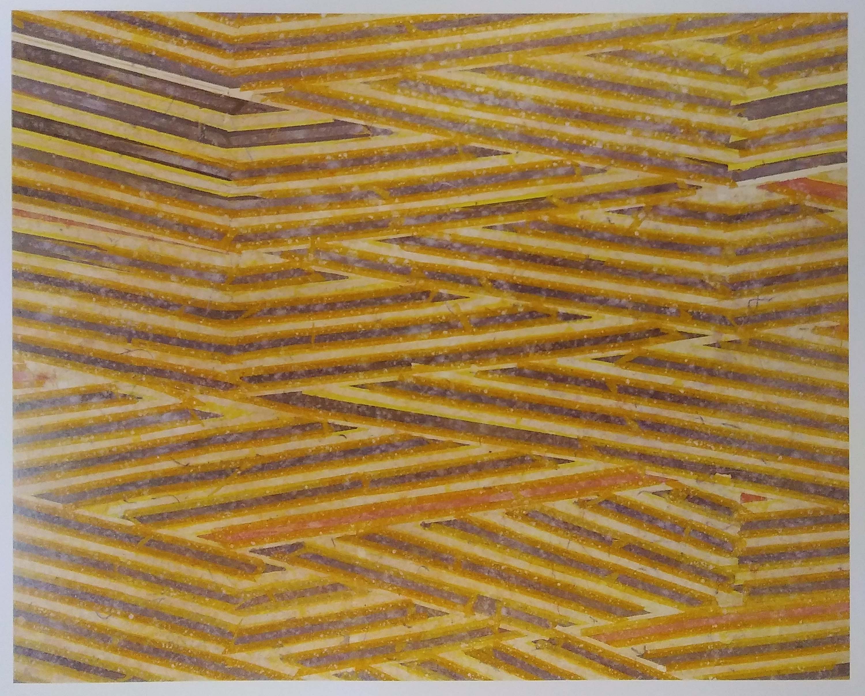
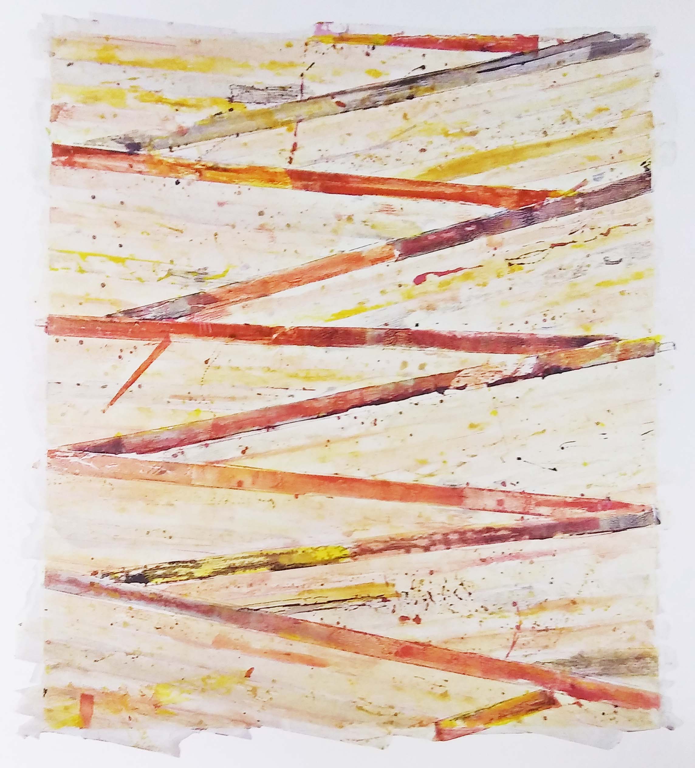
Strings: 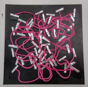
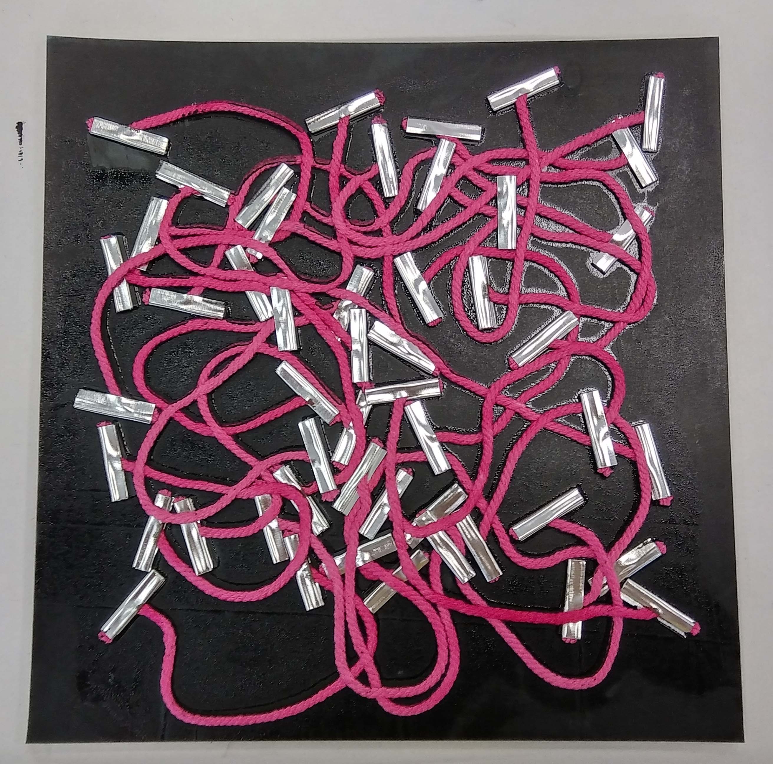
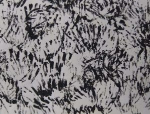
This is the first mono-printing I did. I just played around and see what effects it would create.

 I tried putting crochet flowers in to see if the ink would penetrate the tiny openings. They did not; perhaps because the strings were knotted too tightly.
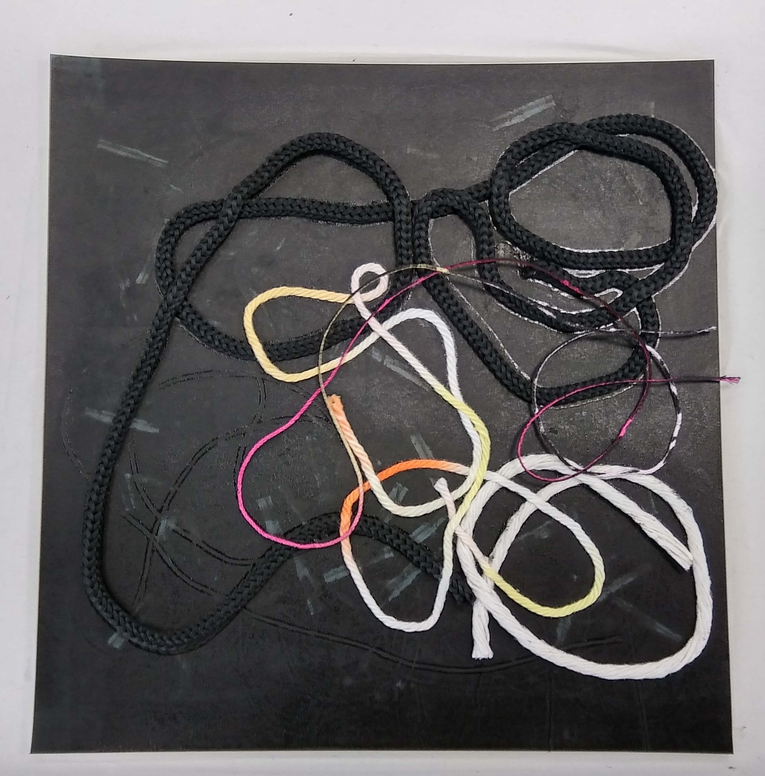
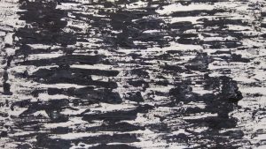
 Here I tried with strings of different thickness.
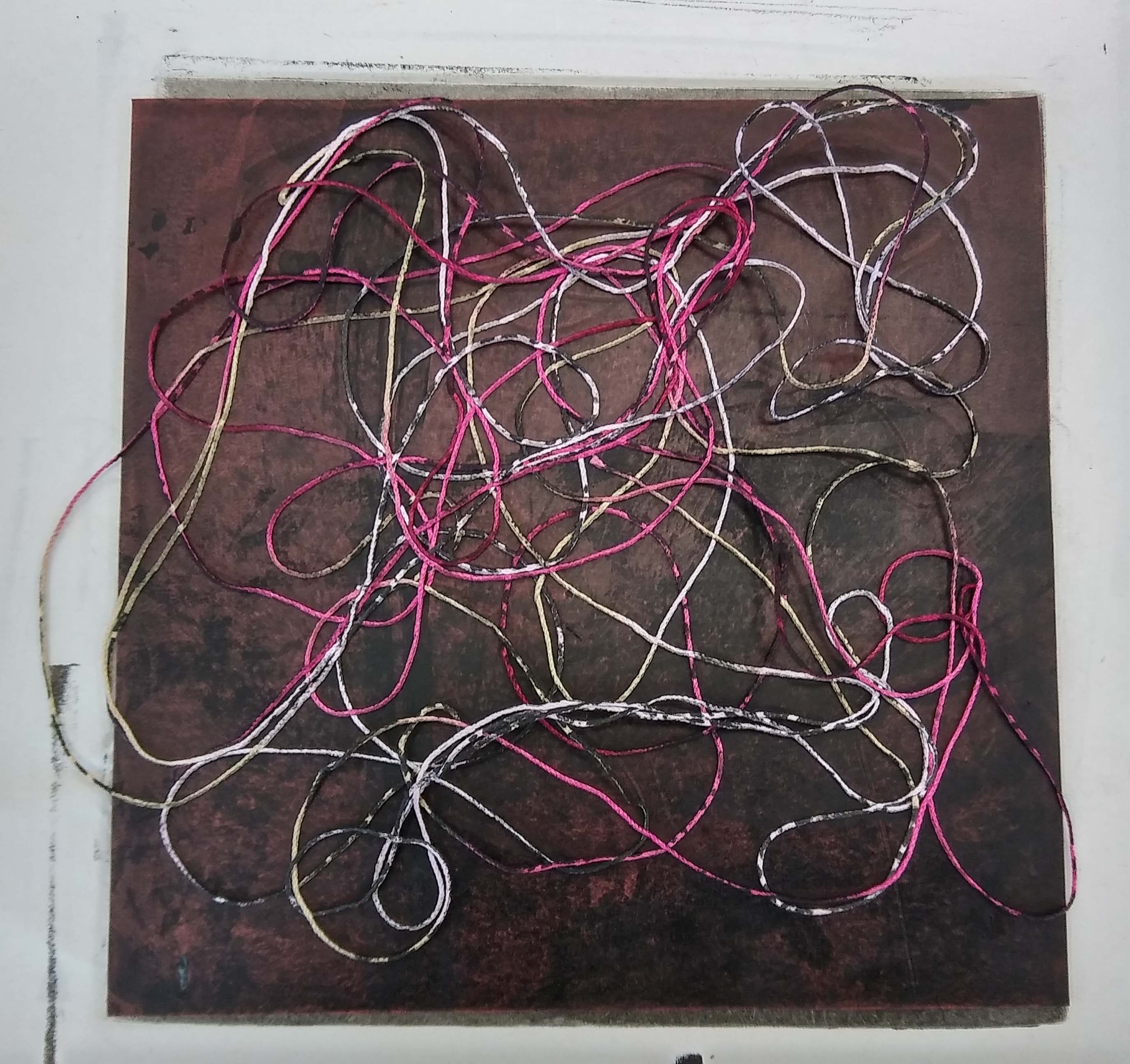

… and strings of a single width…
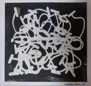
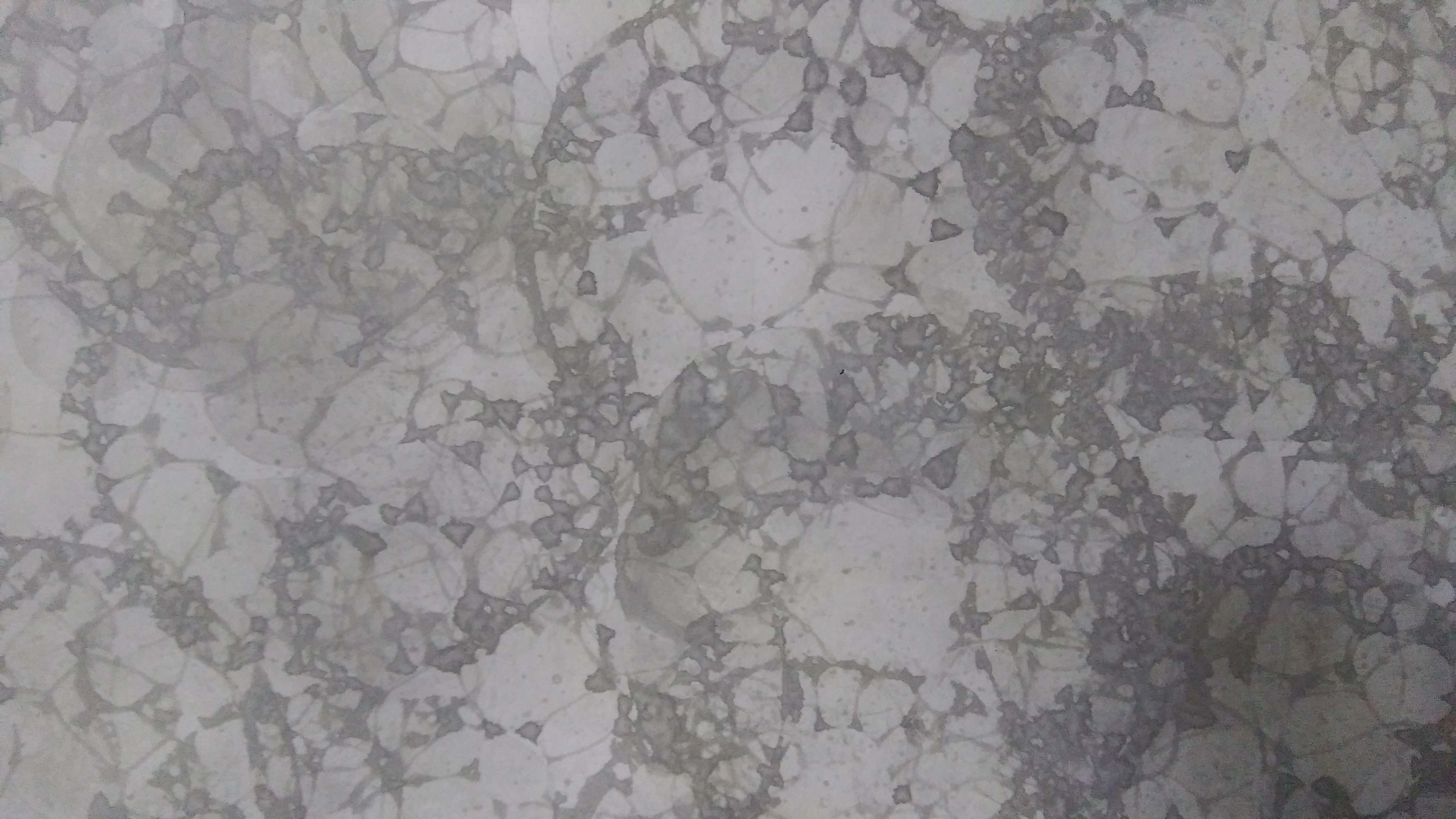
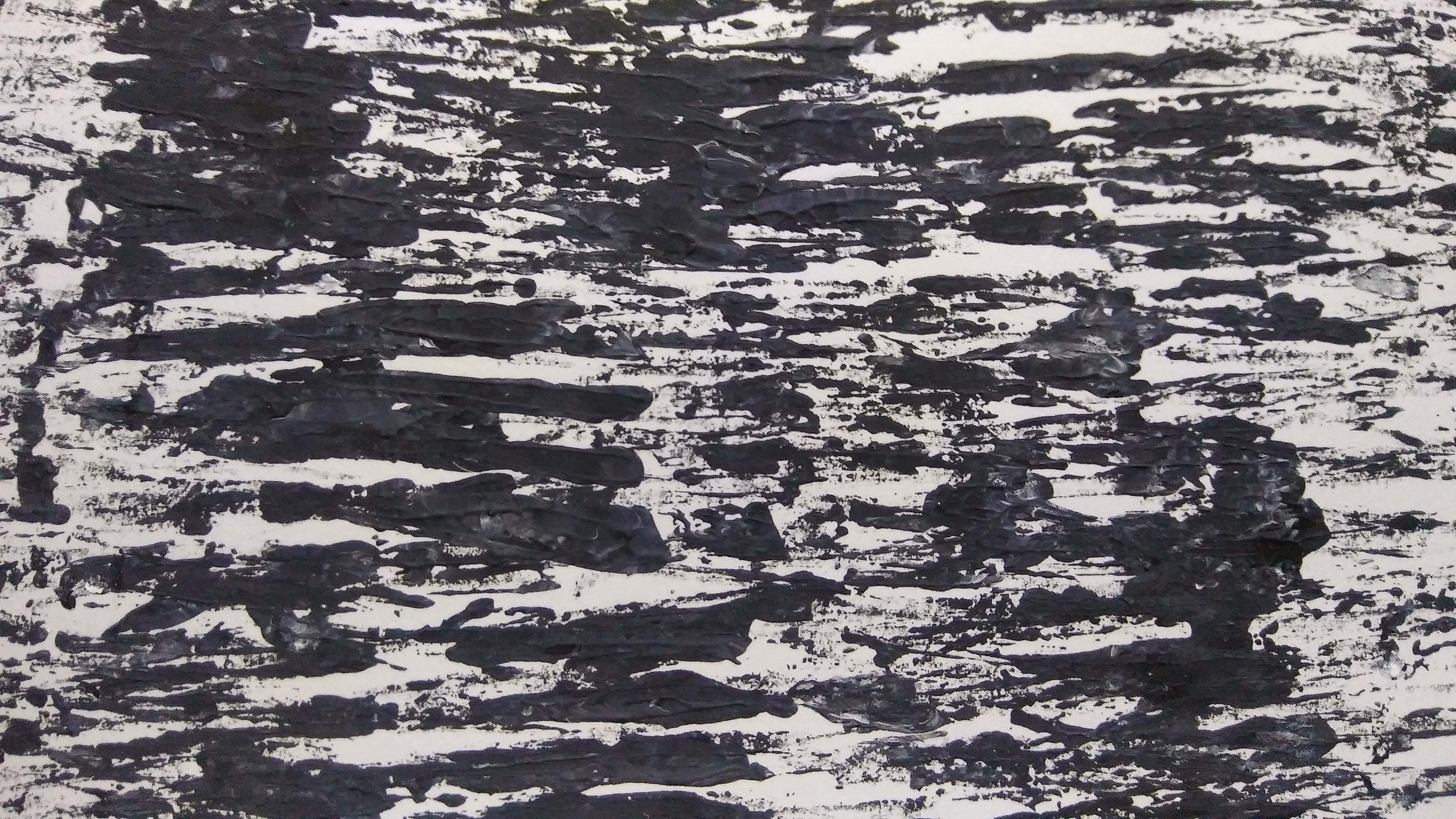
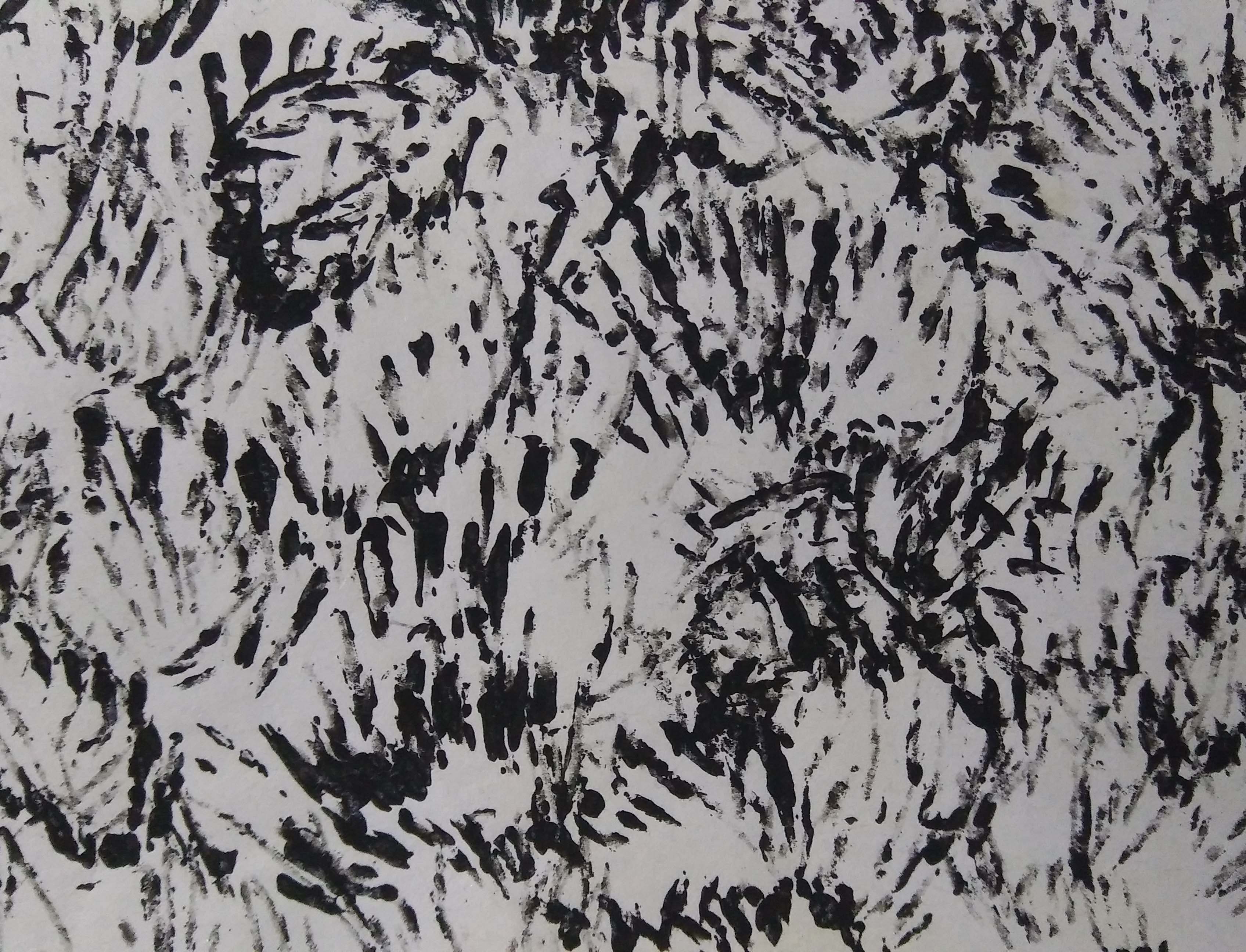
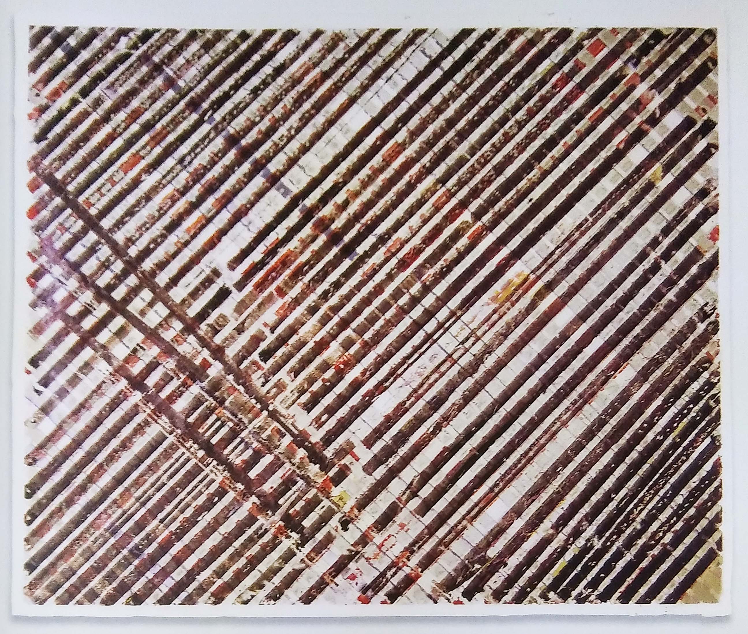
Net: 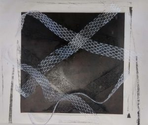


I thought mono-printing a net would result in a print of a net because the ink would have passed through the holes of the net. But that did not happened; with and without the printing-press.
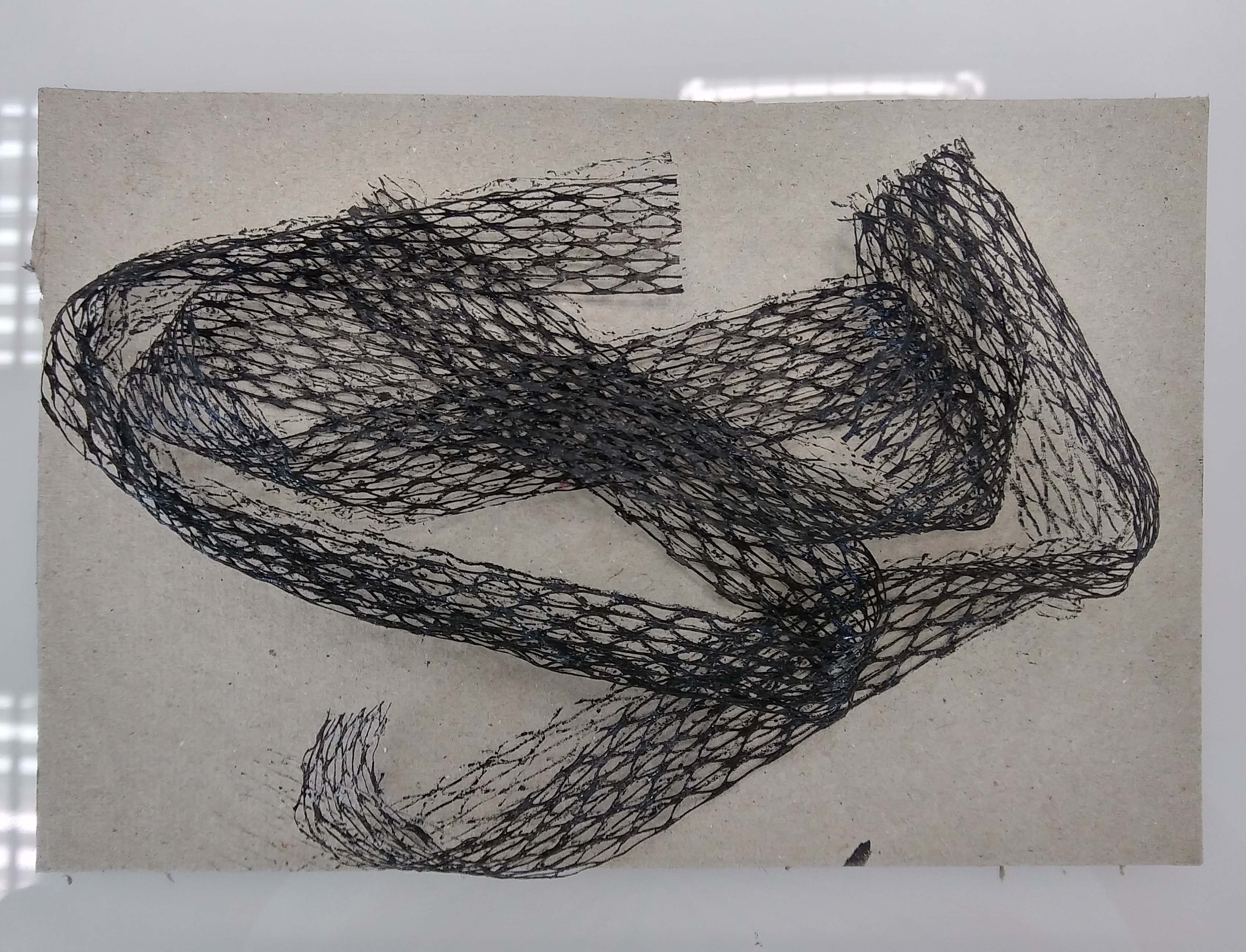
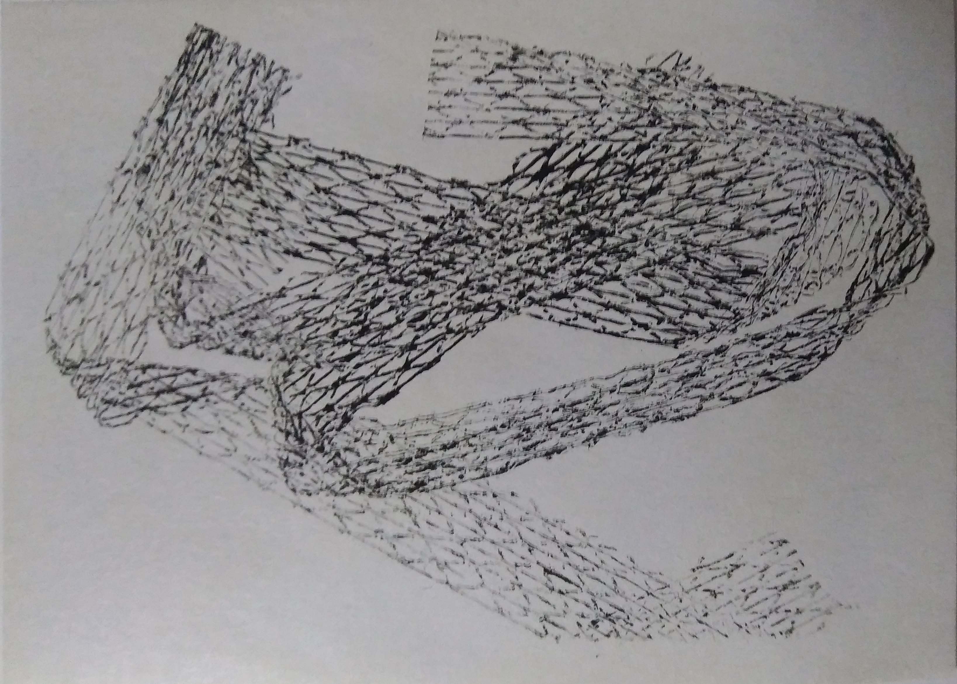 I was able to achieve the print of the net only by inking it and pressing it under the printing-press.
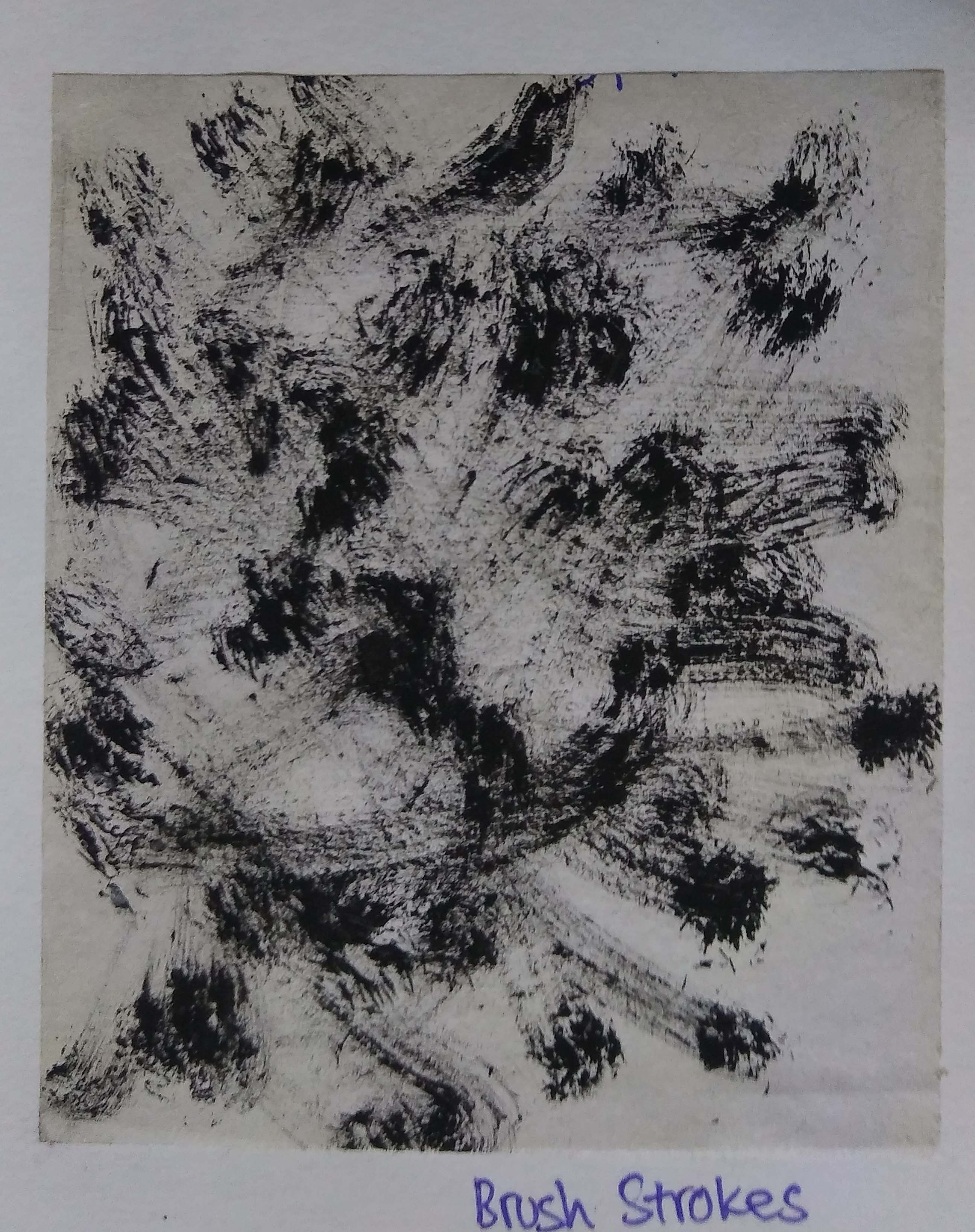
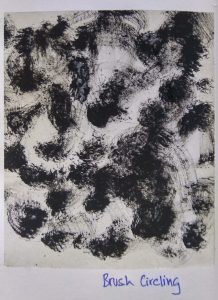
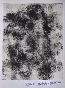
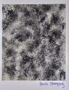
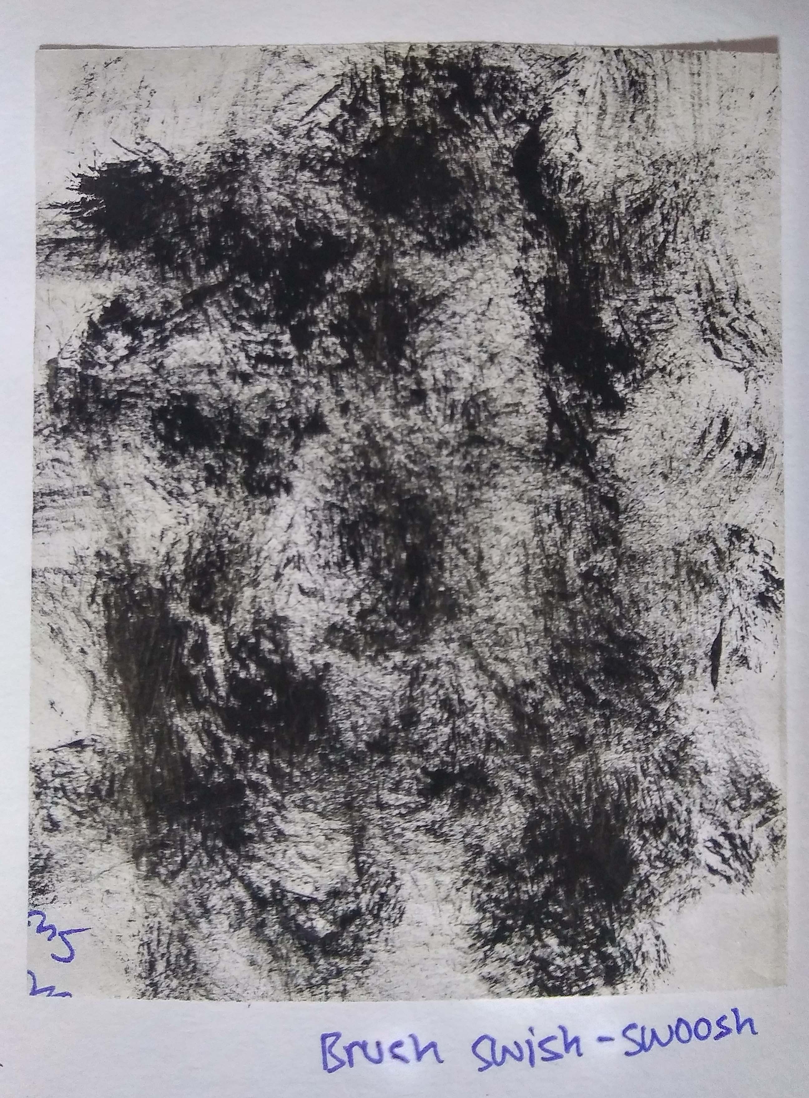
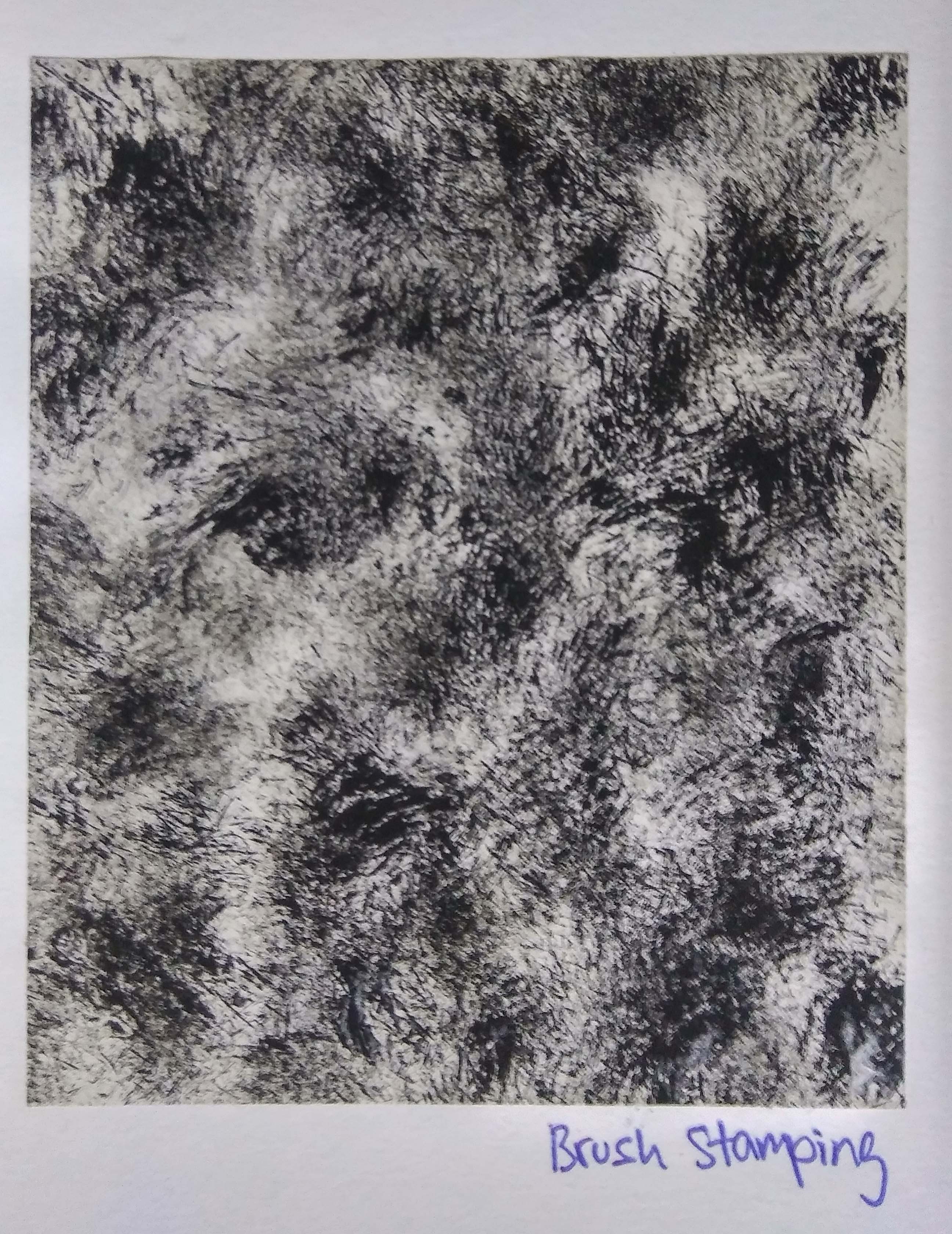
Brush: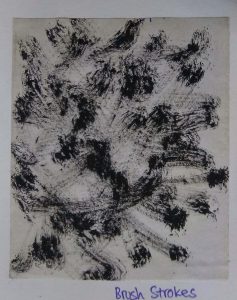
Bubbles:

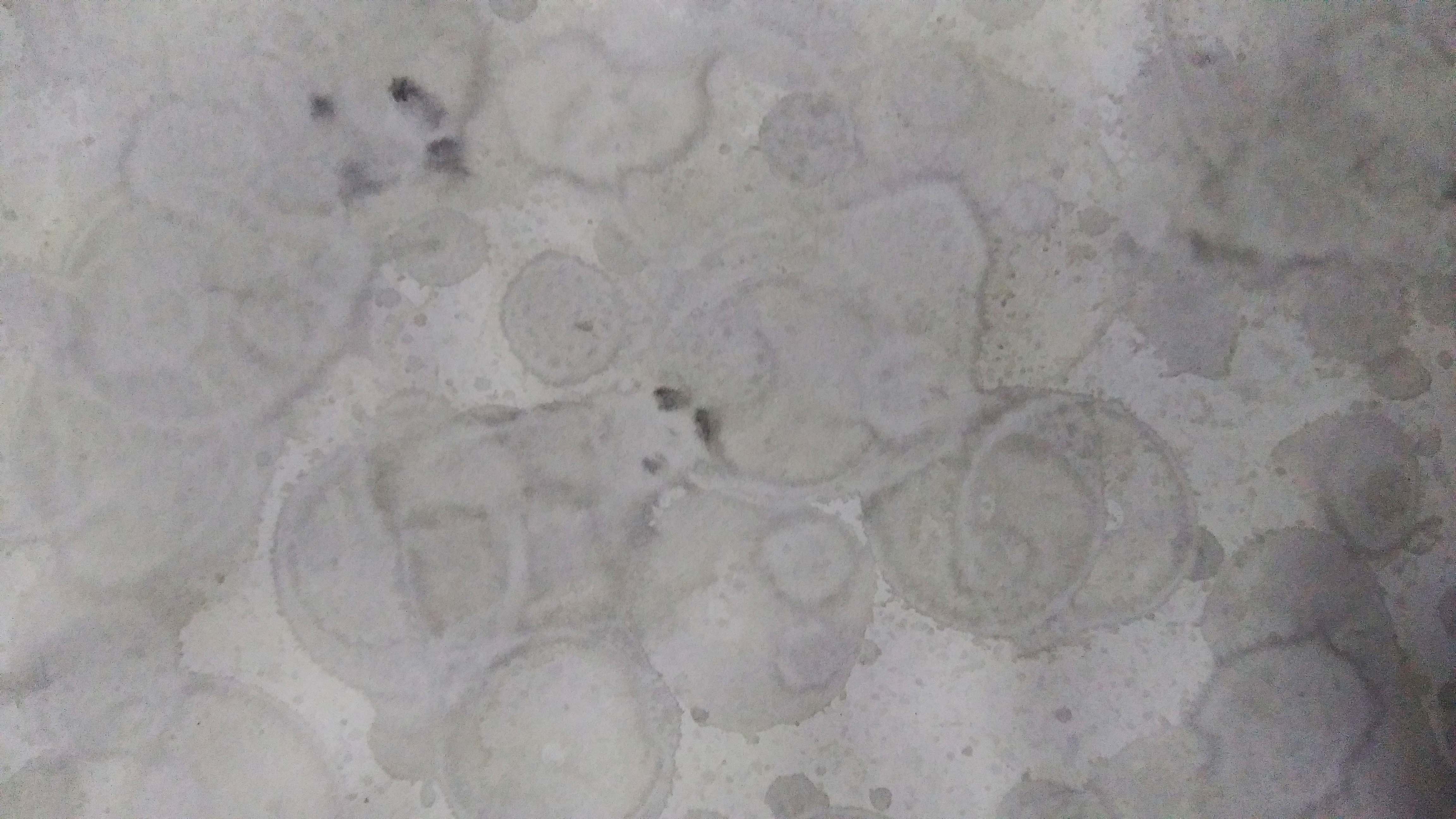
Bubbles bring about a dreamy effect. They are related to positive emotions; I could use them for Joy, Love or Surprise.
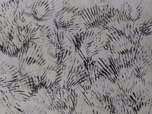
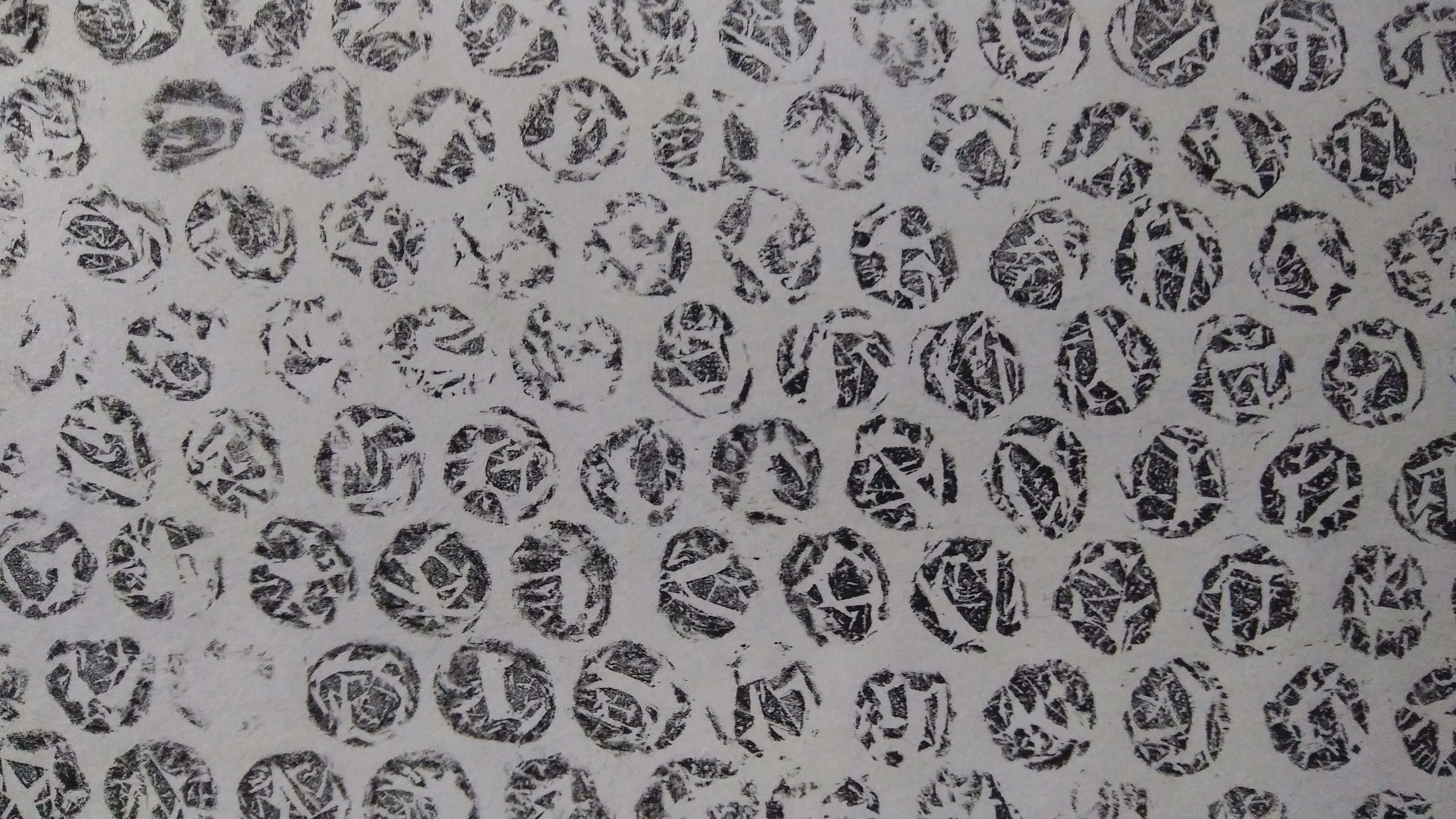
Fork: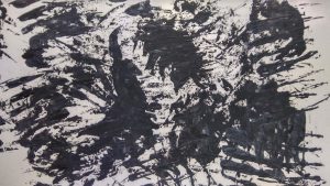


I did not expect the stamping of a fork would look this terrifying and intense.
Seashells:

These are prints made from the stamping of seashells that I picked from a beach in New Zealand long ago.
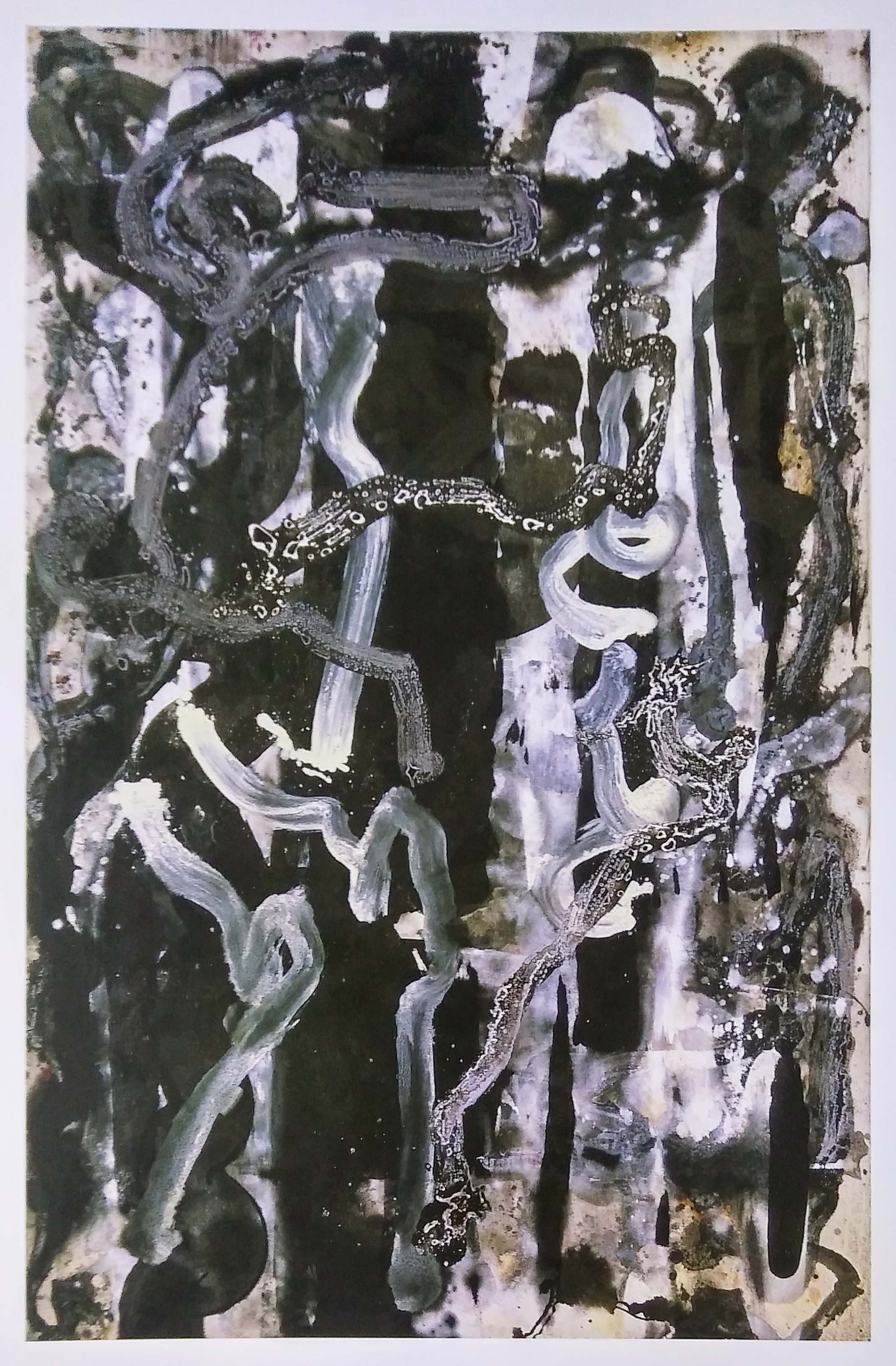
Automatic Techniques:
I made an attempt with pressing paint between papers that mixes the paint and creating interesting vein-like texture.

I was very interested in the Fumage technique and wanted to try it for myself.
Miscellaneous:

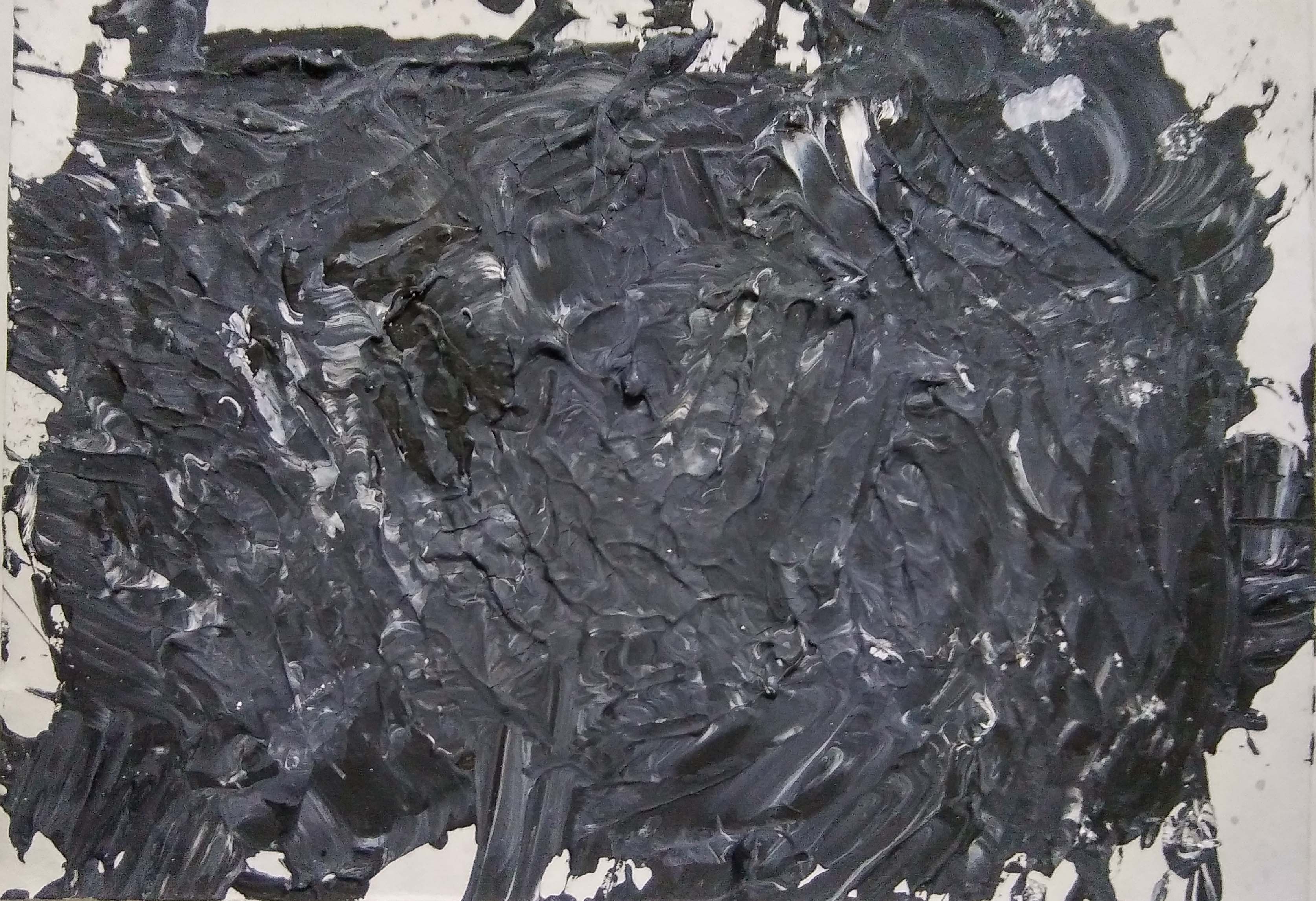
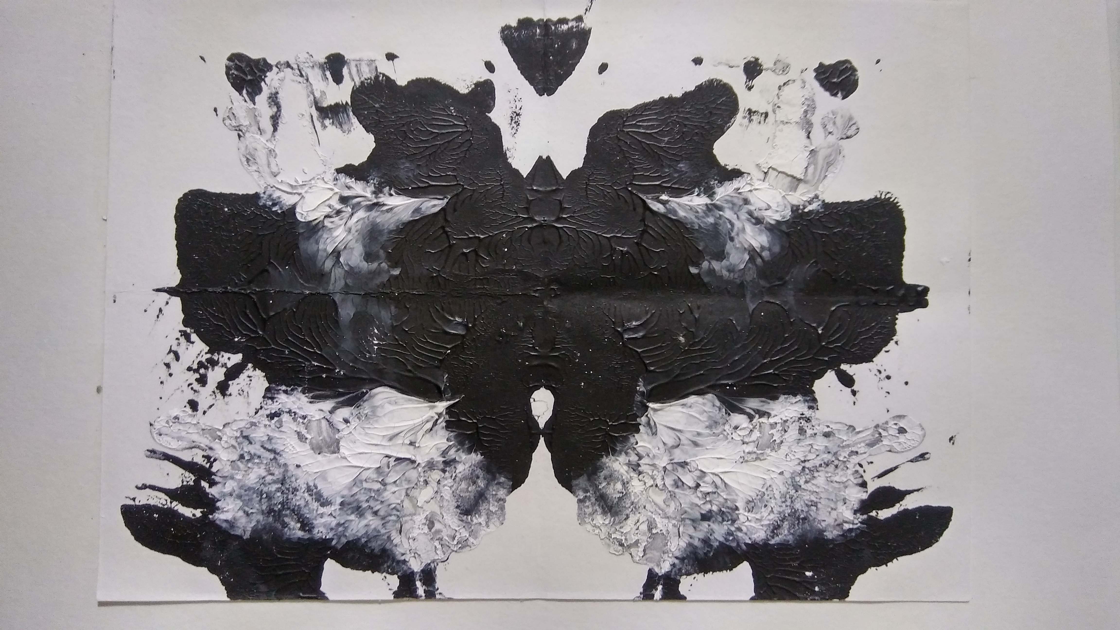
Here I tried to make the impasto textured effect with acrylic paint and a fork. The attempt to keep the swirls of black and white was a failure; and it was not as textured as I liked it to be.
Next Post: https://oss.adm.ntu.edu.sg/ytan149/my-line-is-emo-some-idealization-and-more-experimentation/
Reference:
Jones, Leslie, 2012, Drawing Surrealism, Los Angeles, CA : Los Angeles County Museum of Art ; Munich : Prestel, [2012]
My Line is Emo: Ed Moses
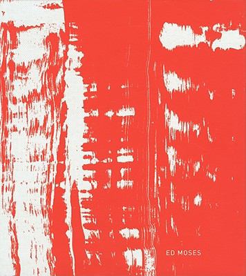
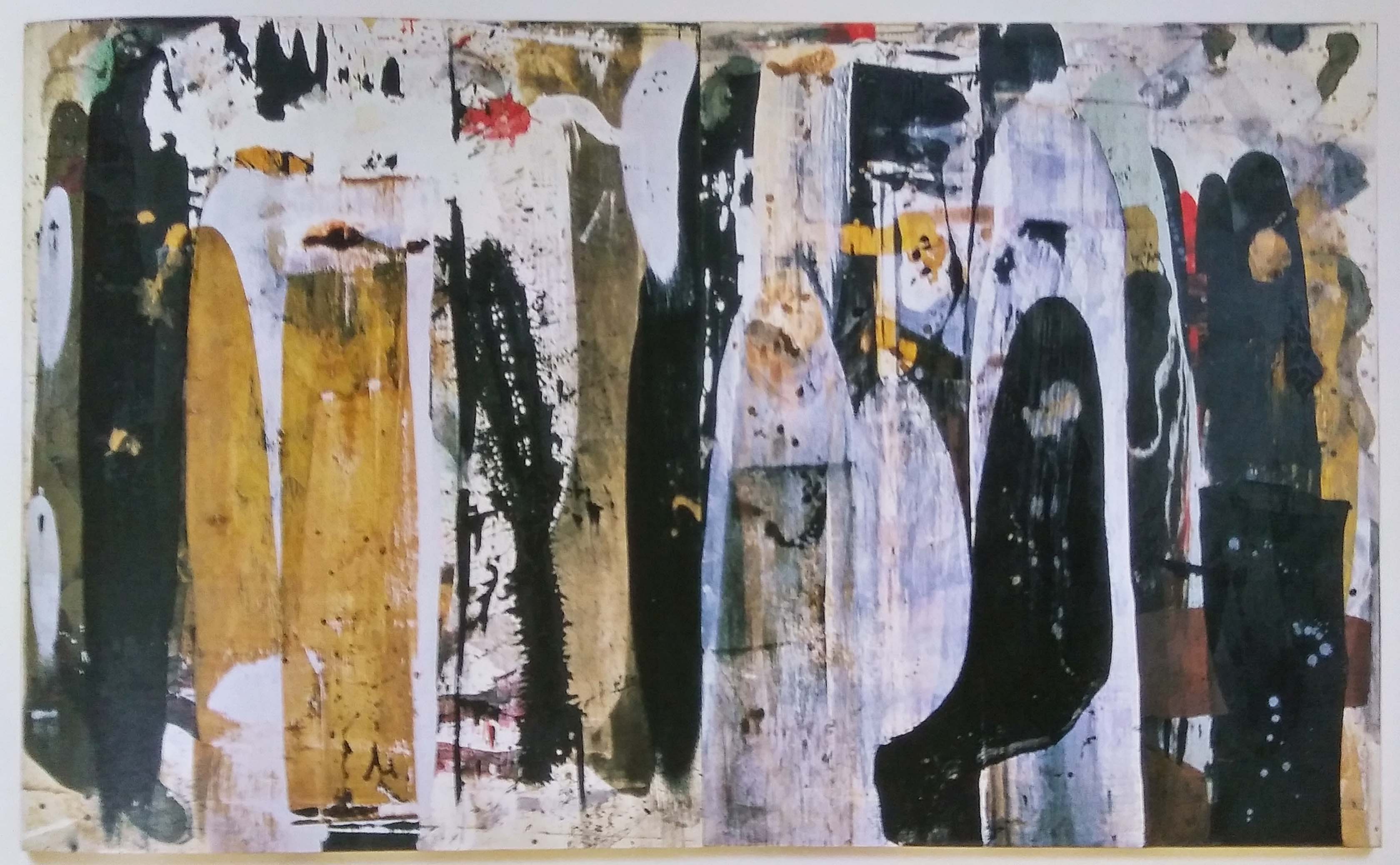
I was going through all the artist reference listed in the project brief and Ed Moses’s drawings really stood out to me. The images that turned up when I googled “ed moses drawings” really drew me in and my mind sparked ideas for the project.
However I found that it was quite a challenge to search information online. Everything was so private since the museums did not give anything away. So I went to the ADM Library to borrow the Ed Moses book which was much easier since it had all that I was looking for. The book allows a more intimate connection between the reader and Ed Moses because of the interviews recorded in it.
From what I have gathered, Ed Moses does a lot of experimentation on materials and techniques in his work. He is constantly taking risks, trying out new materials and testing new forms; moving away from his comfort zone.
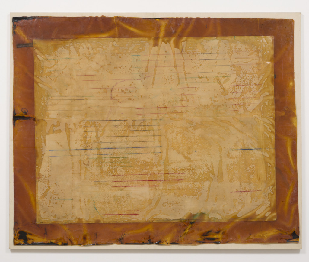
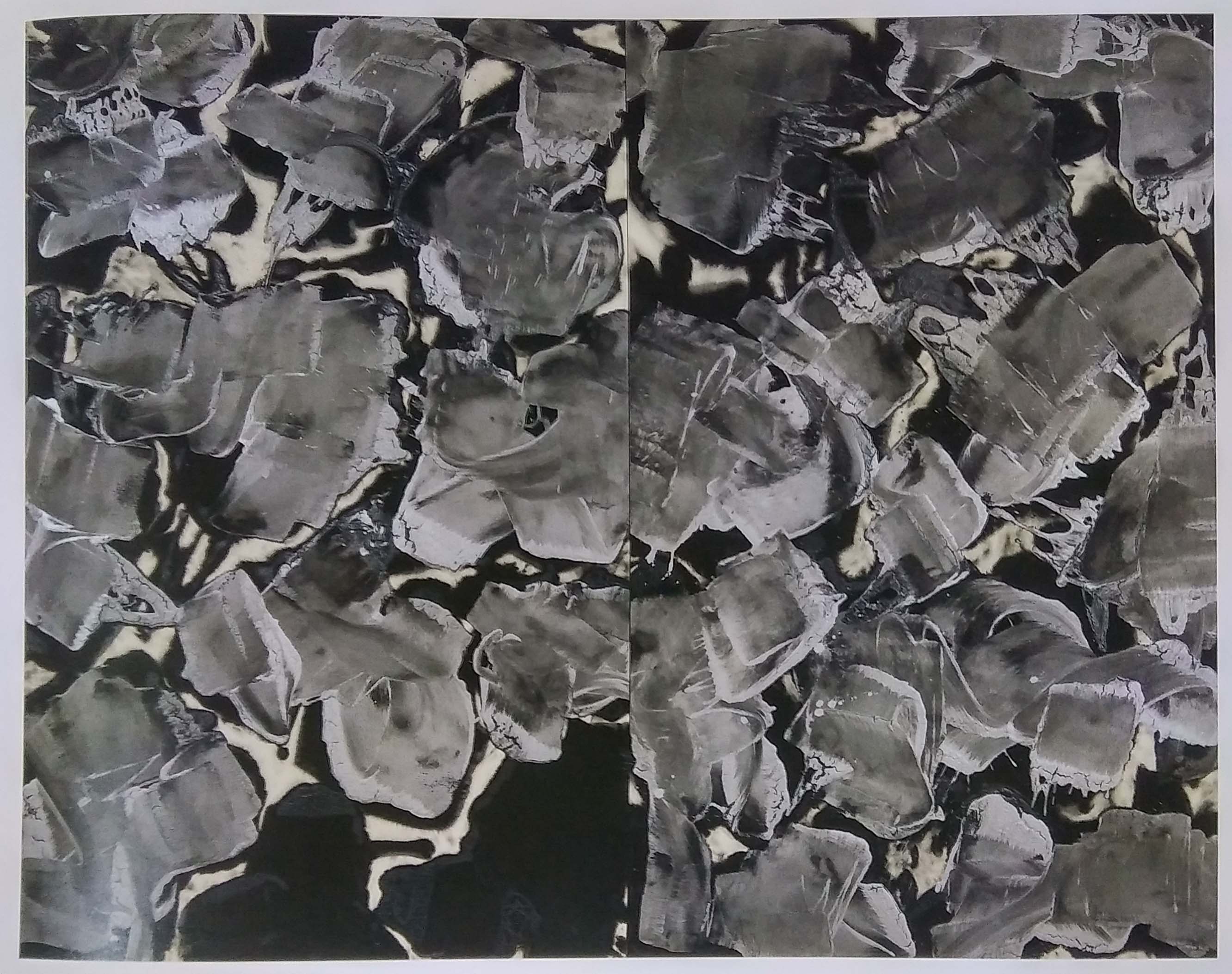
Ed Moses used resin for his Hegemann Series and I thought it was really interesting. In the book he stated that by putting the canvas face down on a big Mylar table, he could pour resin on the backside and it would bleed through the canvas out to the edge. He would then put fiberglass cloth around the edge to give it some structure. When it dried, he would peel the whole thing off and the result will be a surprise. The resin embedded in the canvas, as were the snap lines- they turned out shiny in some places and flat in others.
Why do you paint on both sides of the canvas?
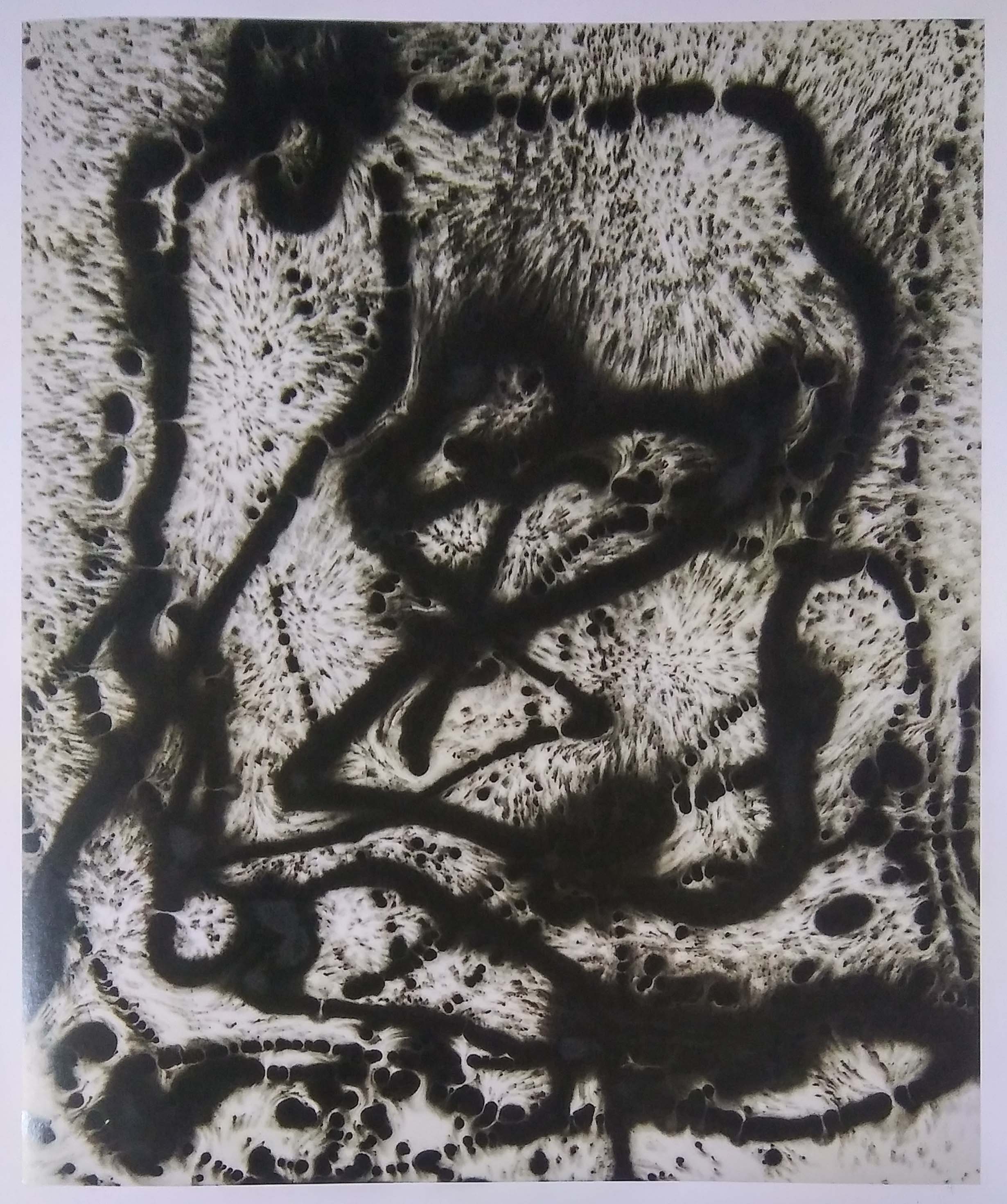
That was what Frances Colpitt, a professor and Deedie Potter Rose chair of art history from Texas Christian University, asked Ed Moses. He mentioned of his discovery of ‘ghost’ painting when he reversed the canvas and the ghost images came through, which he liked a lot. So he wanted to put some kind of mark to it that indicated he made it, rather than being ‘found’. His idea of these ‘ghost’ paintings really intrigues me. It is like recycling an artwork when you don’t like it. Or creating a 2 in one.
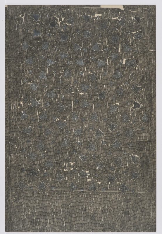
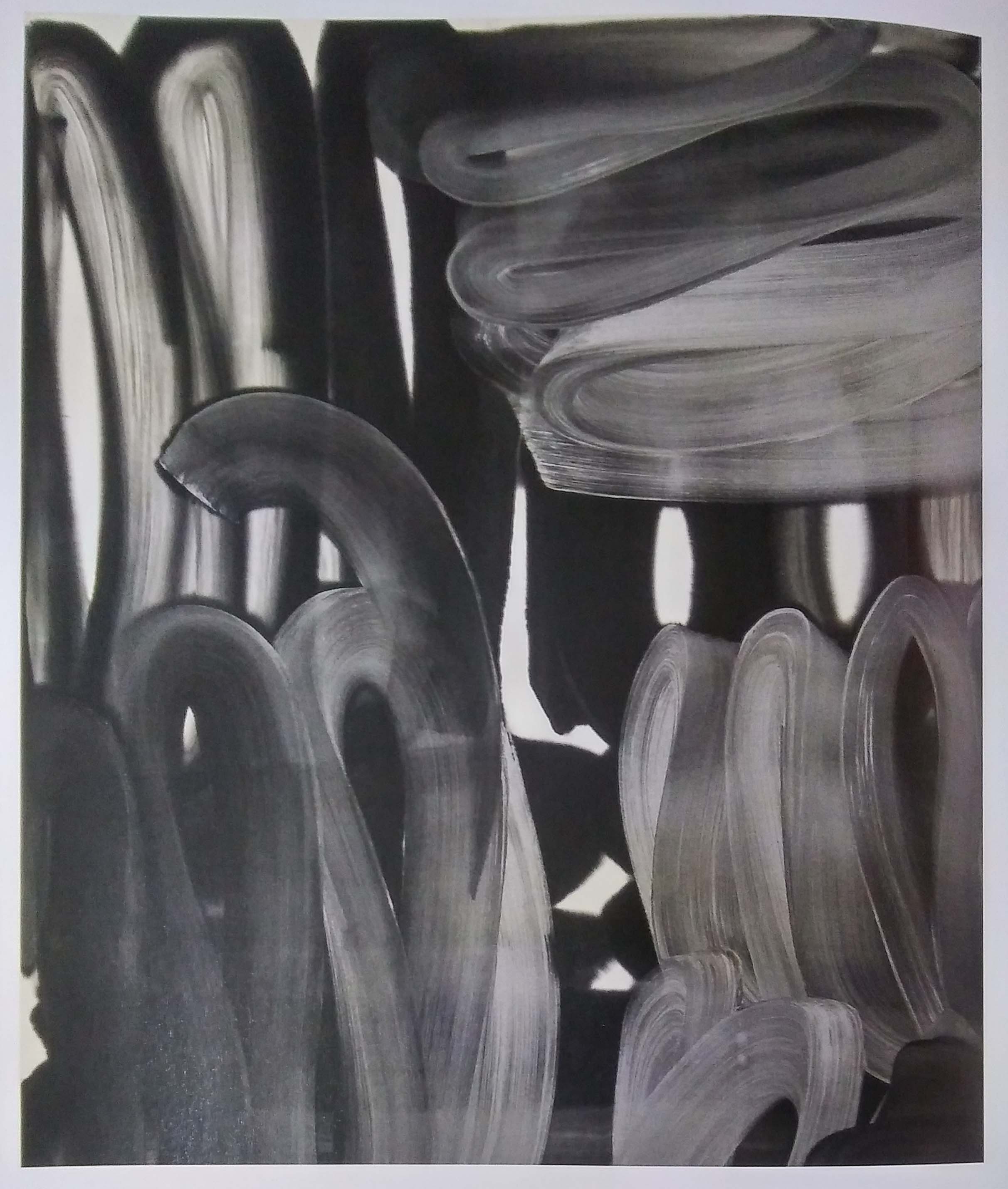
Below are some of the works that I picked out from the book.


Next Post: https://oss.adm.ntu.edu.sg/ytan149/foundation-2d-my-line-is-emo/
Curating Self: Catherine Opie
*TRIGGER WARNING* MAY CONTAIN EXPLICIT CONTENT
Catherine Opie is a social-documentary photographer. She was inspired to be one after encountering Lewis Hine’s images of child laborers from the early 20th century. Her interests lies in the relationship between the private and the public politics, the mainstream versus the infrequent. She was known for her works about the LGBT and BDSM community.
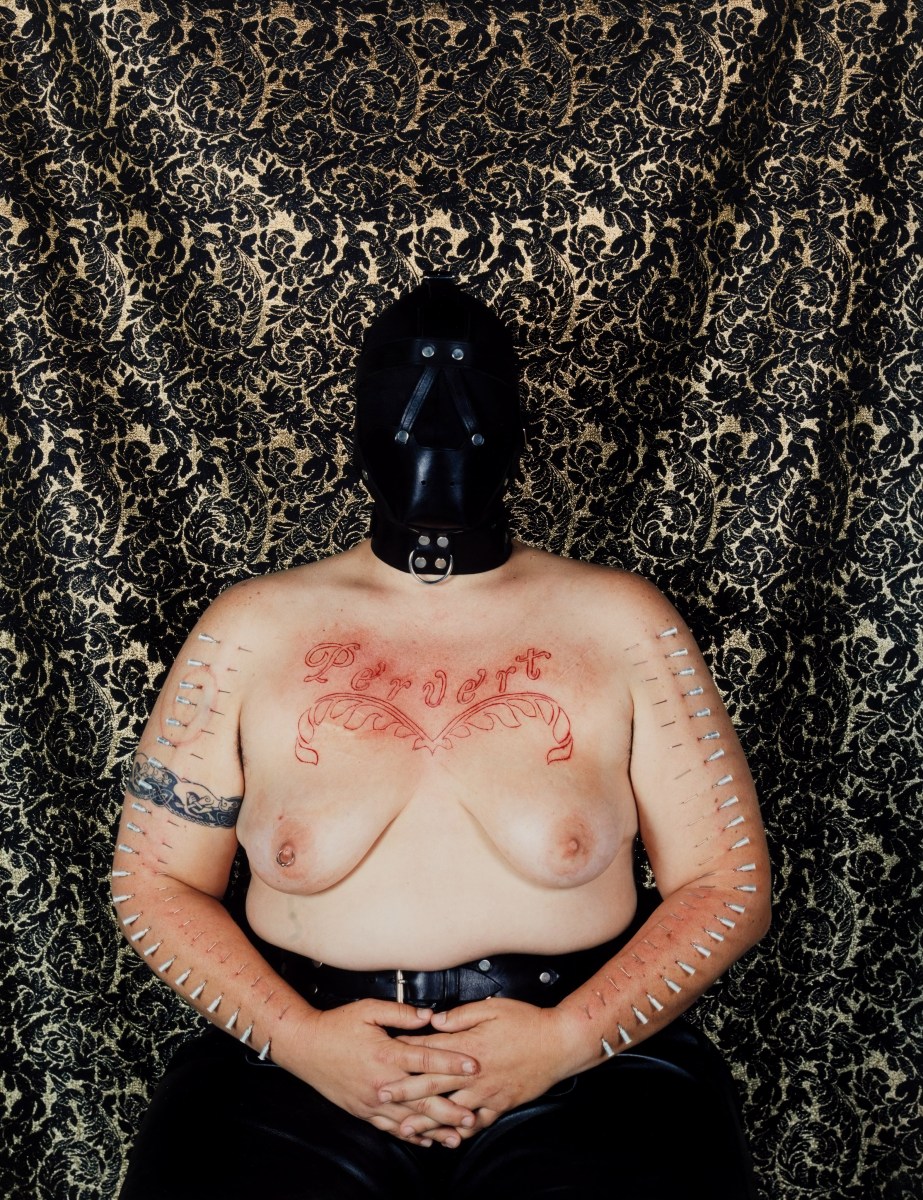
Catherine Opie decided to wear a hood in this piece because she wanted the focus to be her body and not the distortion on her face. It is about the existence of the word “Pervert” and what it meant. The politics lie in the fact that she dared inscribe it on her body, it does not lie in her eyes.
Why would she do this?
This piece were made in reaction to the gays and lesbians coming out of the closets during that time. All the sudden appearance of homosexuals segregated society and Catherine Opie wanted to push the viewer’s boundaries of normality; challenging our cultural code for relationships.
Catherine chose the background to reference seventeenth century paintings. The photo is took with intent of having a fruit bowl over her head, which queers the image with a little humor.
In her words “You’re looking at this juxtaposition of cutting of two stick figures, you know, women holding hands, with this comic fruit bowl over my head in the fabric.” https://transatlantica.revues.org/6430
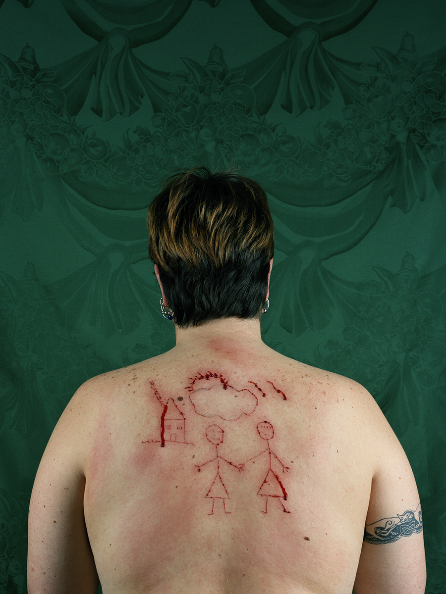
According to the creator this piece was made after the break-up of her first domestic relationship and she was working our her ideas of longing. It is also a representation of what a queer child might make at school.
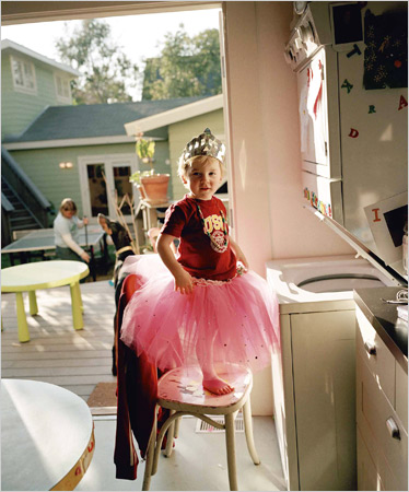
Not all her works that tackle homophobia are so intense. The above is a photo of her son in a tutu and tiara.

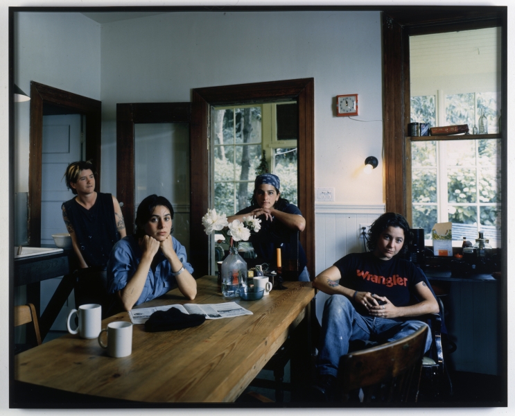
For the Domestic series, Catherine Opie rented an RV and spent three and a half months traveling the states. She wanted to complete the story of domesticity in a show that she attended.
“One of the things I always think about is who I want to have conversations with, what does it mean to create history related to a history that is already present, the need to add a conversation to a given situation, because something is not being represented, something is left out of the telling of the story. ” https://transatlantica.revues.org/6430
Catherine Opie also documents other events such as the Inauguration and High School Football.

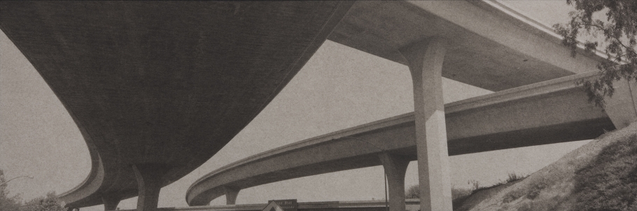
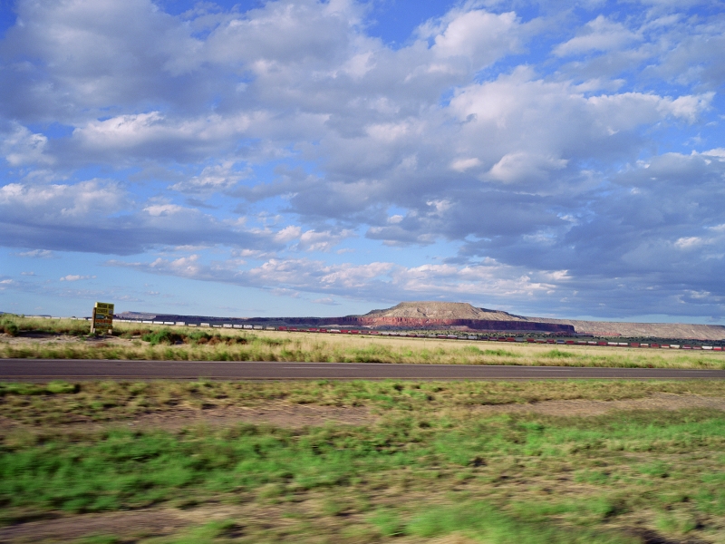
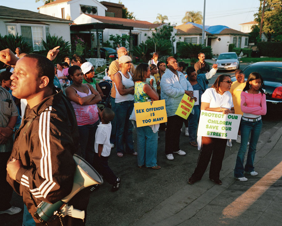

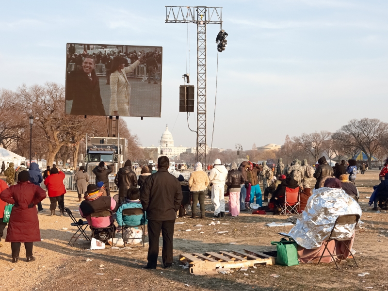
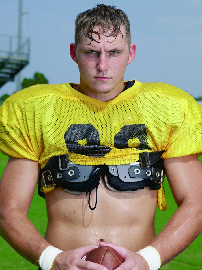
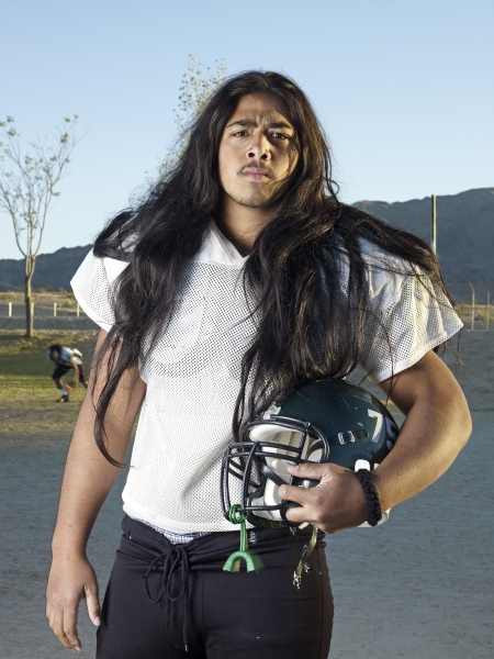


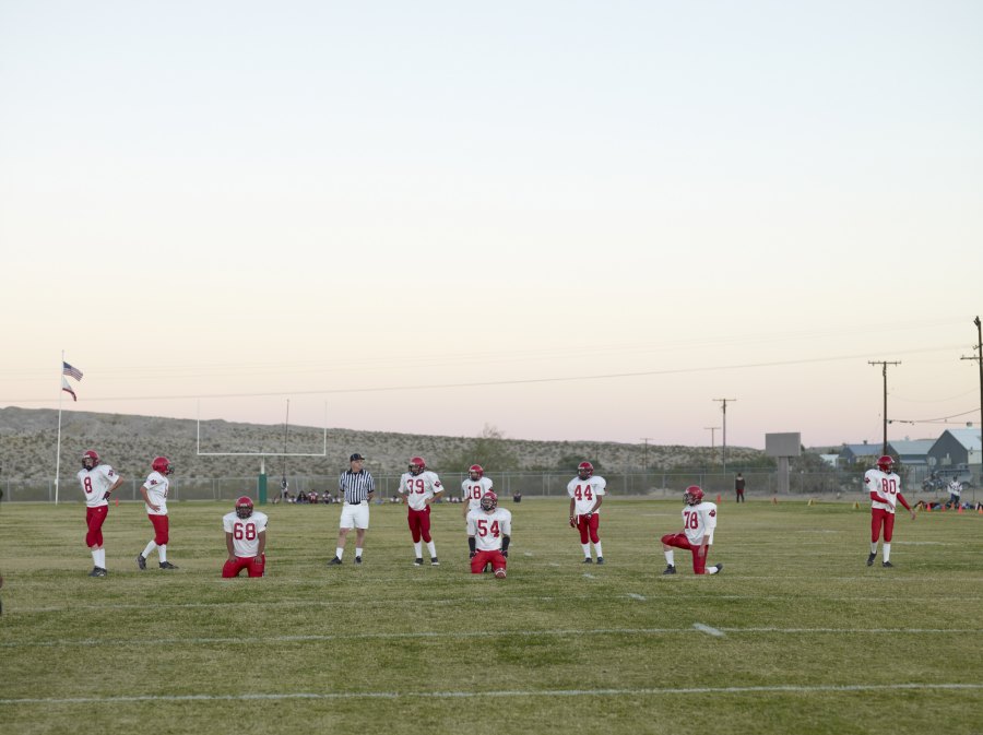

Catherine Opie’s photography style is nothing special it is not especially aesthetic but rather mundane. Just normal day to day lives that most people can relate to, which really ties in with her concept of interconnection.
Next Entry – https://oss.adm.ntu.edu.sg/ytan149/curating-self-process-part-1/