
by Ying Hui and May Thu ( https://oss.adm.ntu.edu.sg/may005 )
Tag: Year 1
Ying Hui

Research: https://oss.adm.ntu.edu.sg/ytan149/project-1-image-making-through-type-research/
Process: https://oss.adm.ntu.edu.sg/ytan149/project-1-image-making-through-type-process/
Project 1: Image Making Through Type – Process
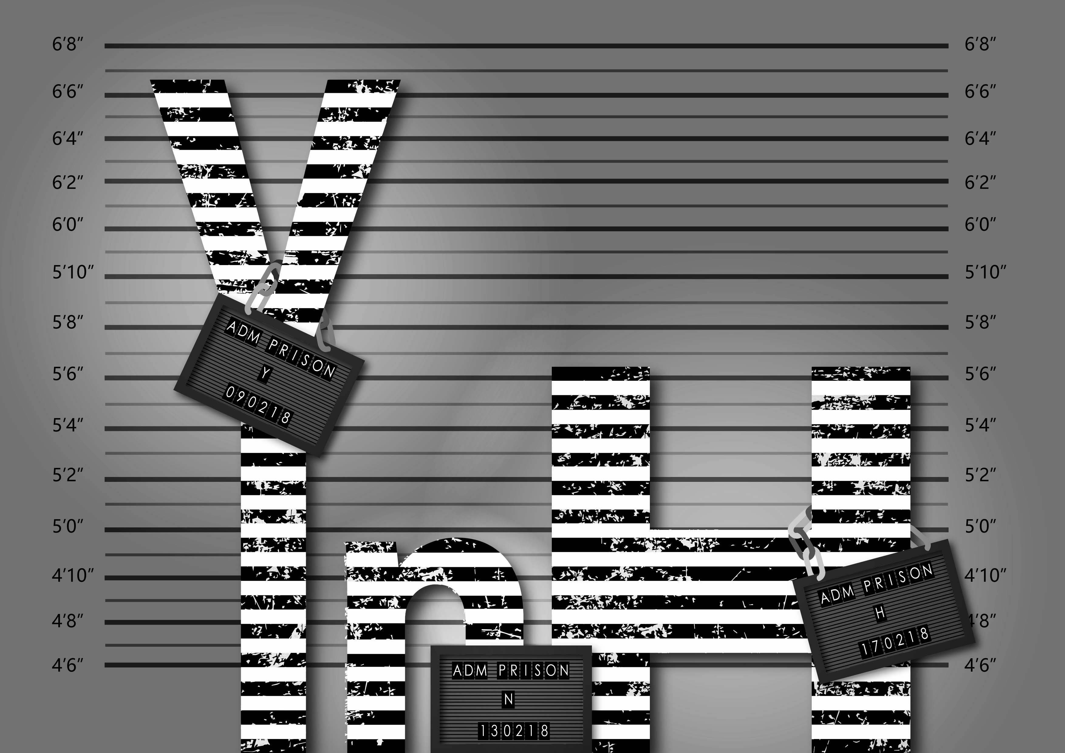
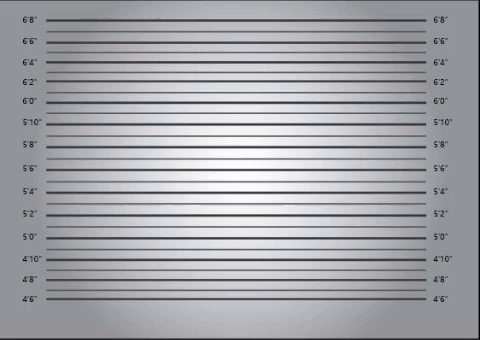
Criminal
This was the texture I found to use for my type. It is very much like the reference picture from my research; it looks like scratches and deterioration.
This was my first test with applying jpg. texture in Illustrator on my own after the tutorial class. It is the visual representation for the personalities of criminals – rugged, rotten, dirty etc. Here, I applied it to my entire name floating in the centre of the page which did not make sense.

This time I had them ‘stand’ in a row. I also got feedback that the type should be in different sizes because people are of all shapes – thin, tall, fat, stout and so on. With that, I could only apply a number of letters and I settled for these three. To complete, I gave then each a panel to hold onto for identification. Then intensified the lighting to bring in more drama.
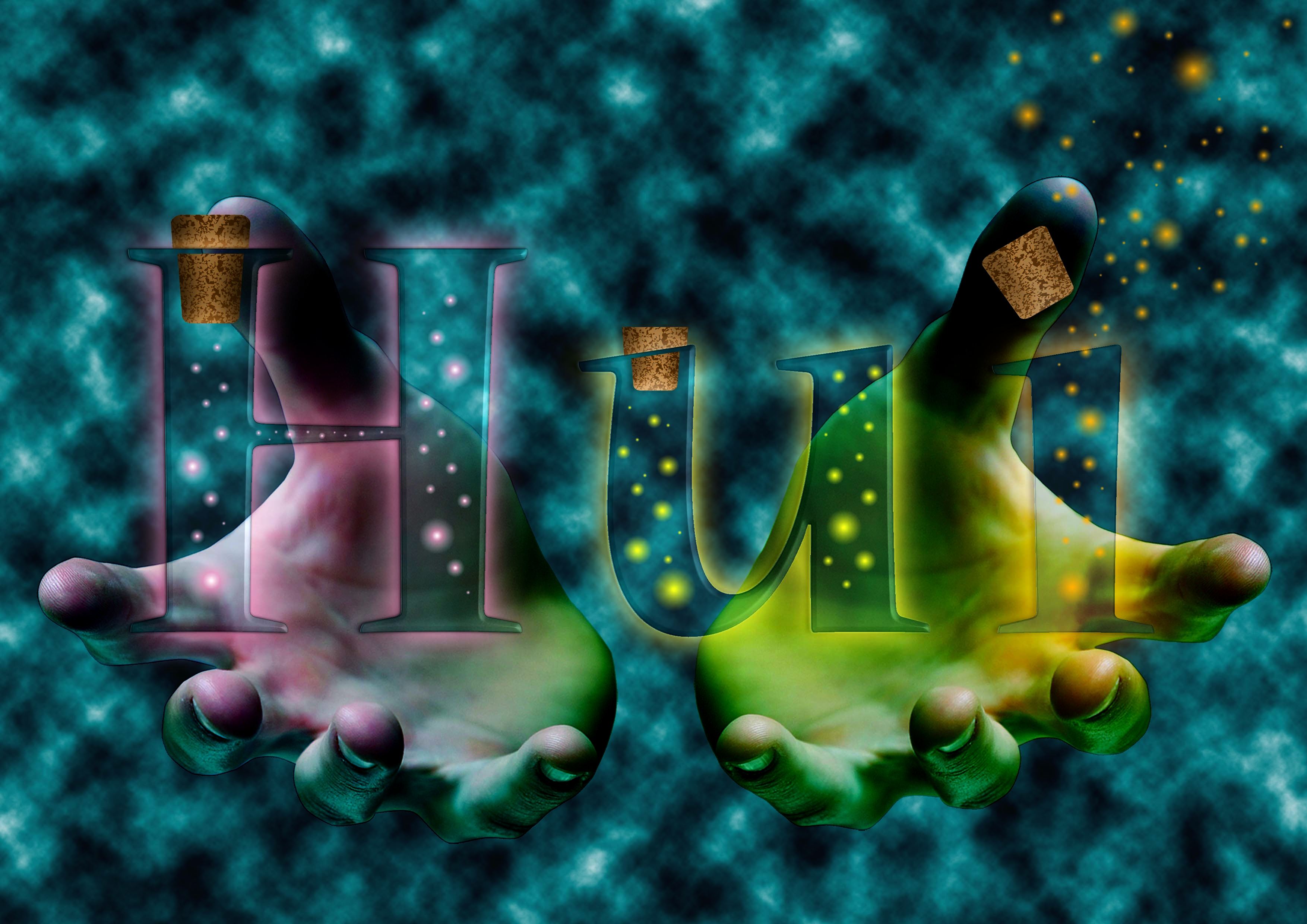
Dream Seller
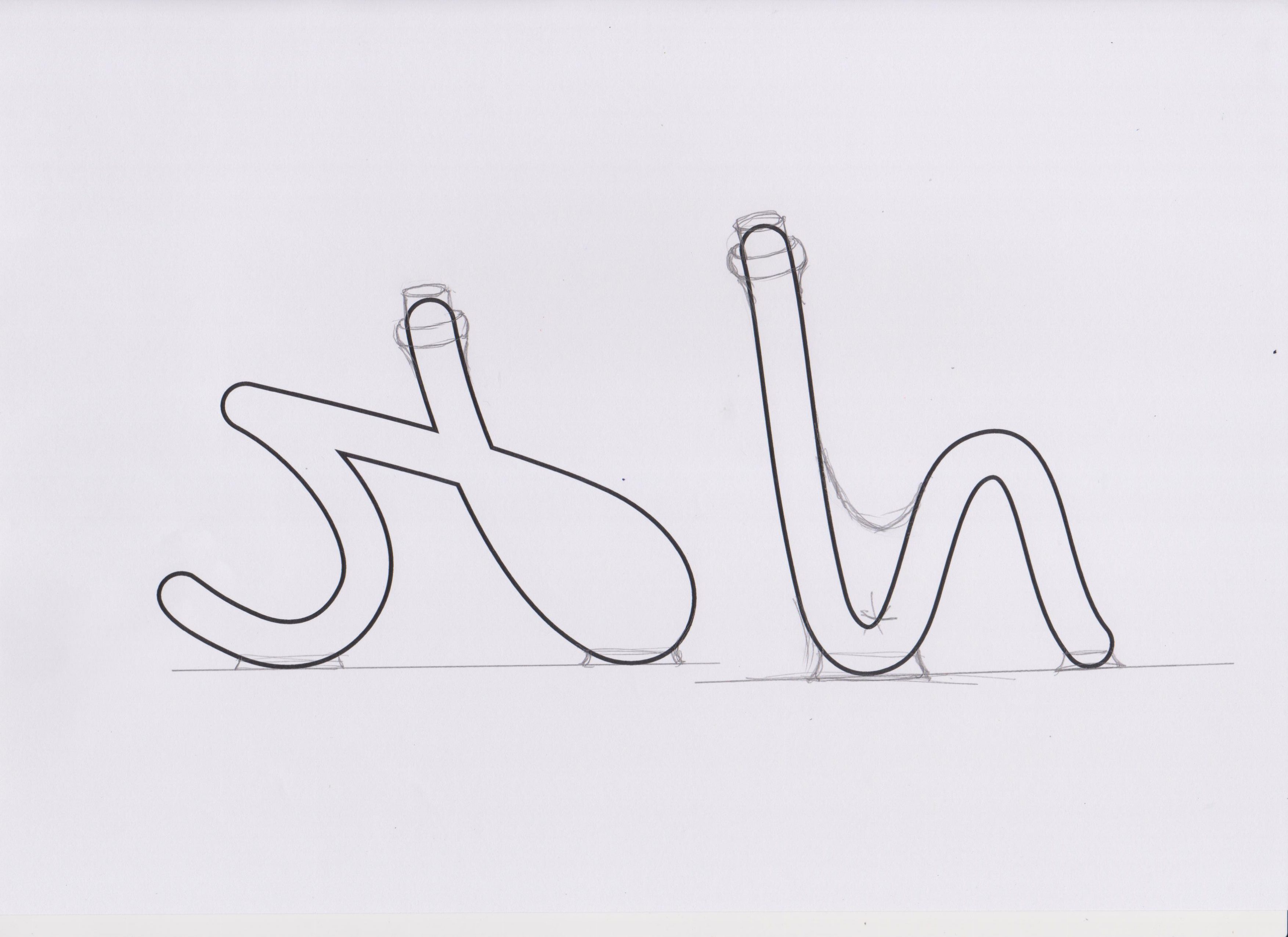 At first, I chose a script font and printed it on paper then sketched over it to change its original shape, to form letter bottles.

They look like this after I traced and coloured them.

I went to search for ways to help me create the ‘fairy lights’ in the bottle that were to represent dreams.
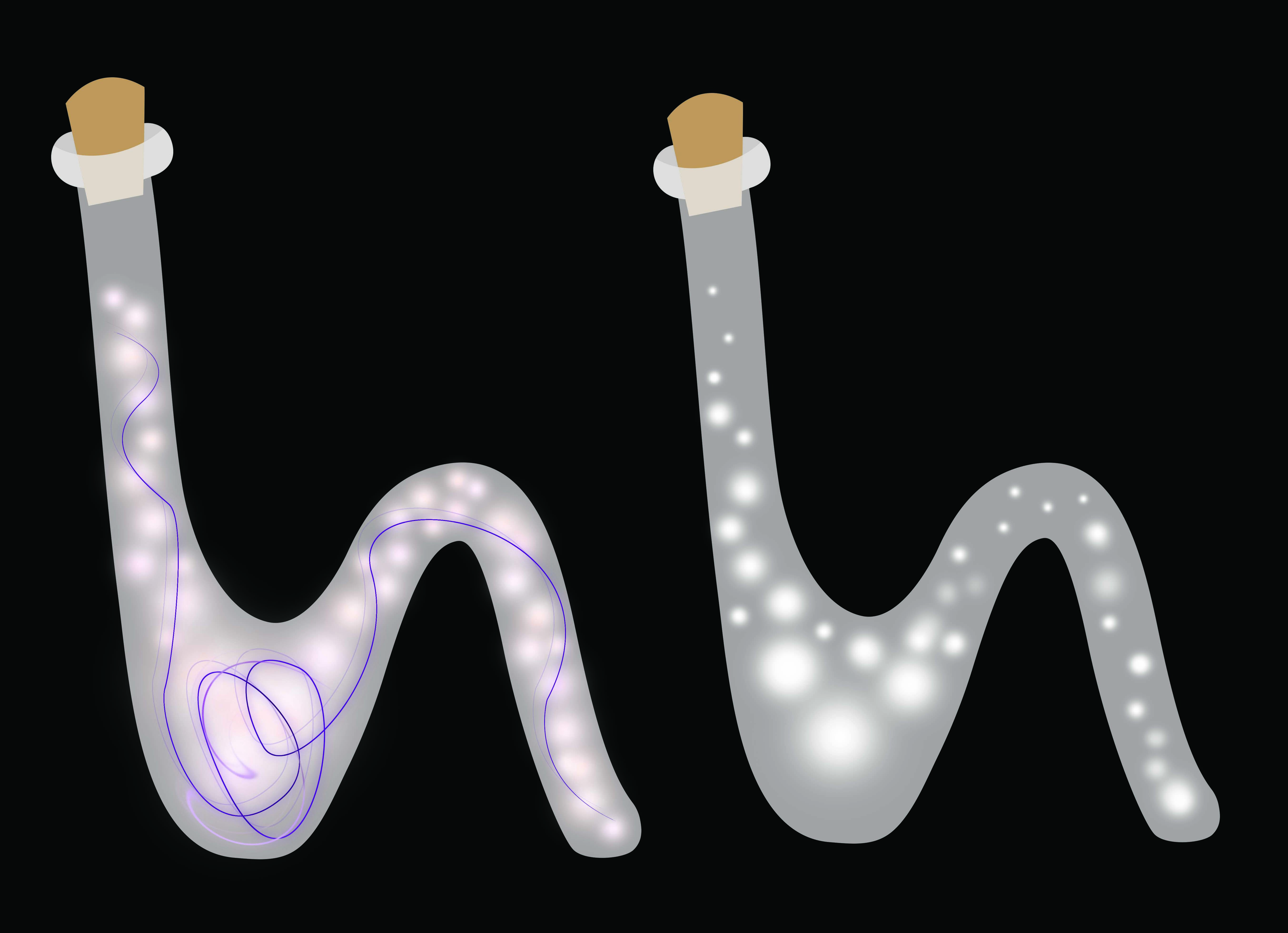
I tried it out on the bottles!

Things were looking flat and boring and I got many comments suggesting to make it 3D, create more depth and such. So I tried making the background darker to bring out the illumination of the bottles. I also got help from my cousin on drawing highlights and shadows. My drawing skills were lacking and I could not identify where the highlights and shadows should go. So this method did not work for me.
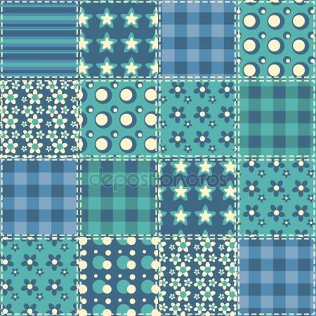
The background colour was picked from this quilt pattern found from google. It is sort of a bedtime blue which was perfect for the dream setting.
 After much searching I was able to find a tutorial on making glass type in photoshop.

Combining all the knowledge that I have acquired from the previous I put together the final piece. Rendering photoshop clouds for the background for a mystifying effect. The hand gestures to offer the products as if selling. Then I tweaked the blending filters to make it seem more natural.
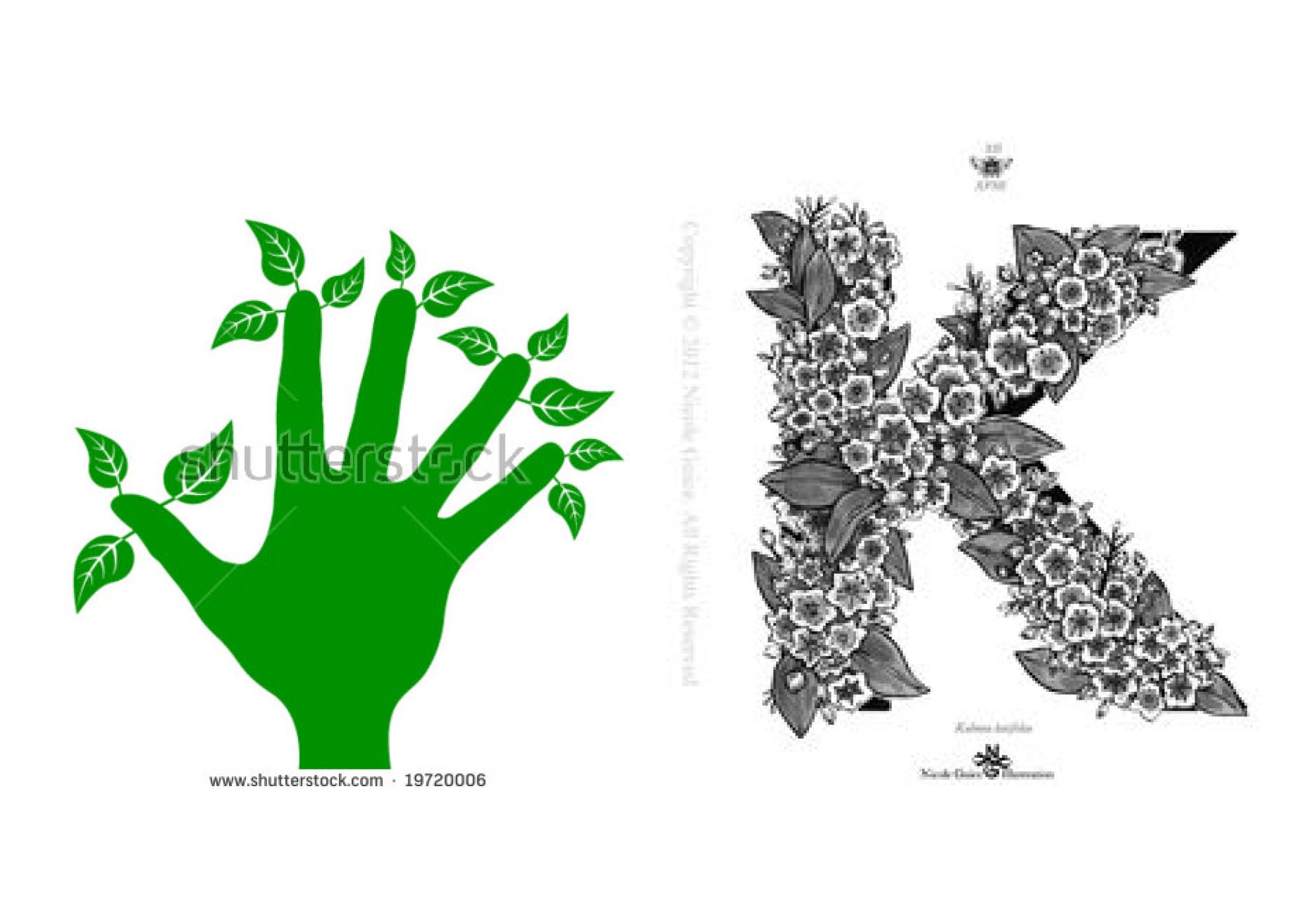
Gardener

This one was a little tricky to get. Even using letters as a base, the results still came out ‘wrong’. Not the effect that we were looking for.

To fix that, I avoided changing the shape of the original type. Then I applied the elements that suggested the job of a gardener.

I move the vectors into photoshop to apply textures and materials.
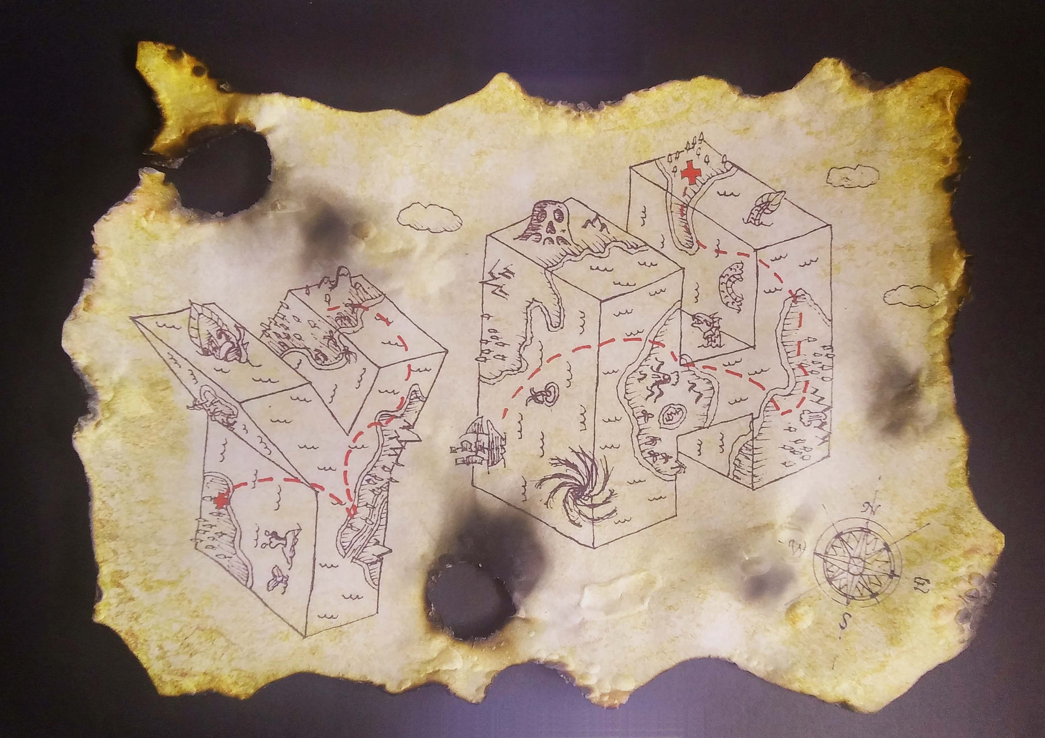
Treasure Hunter

The original sketch inked on paper, scanned. I followed the reference image to create the map look with the monsters.
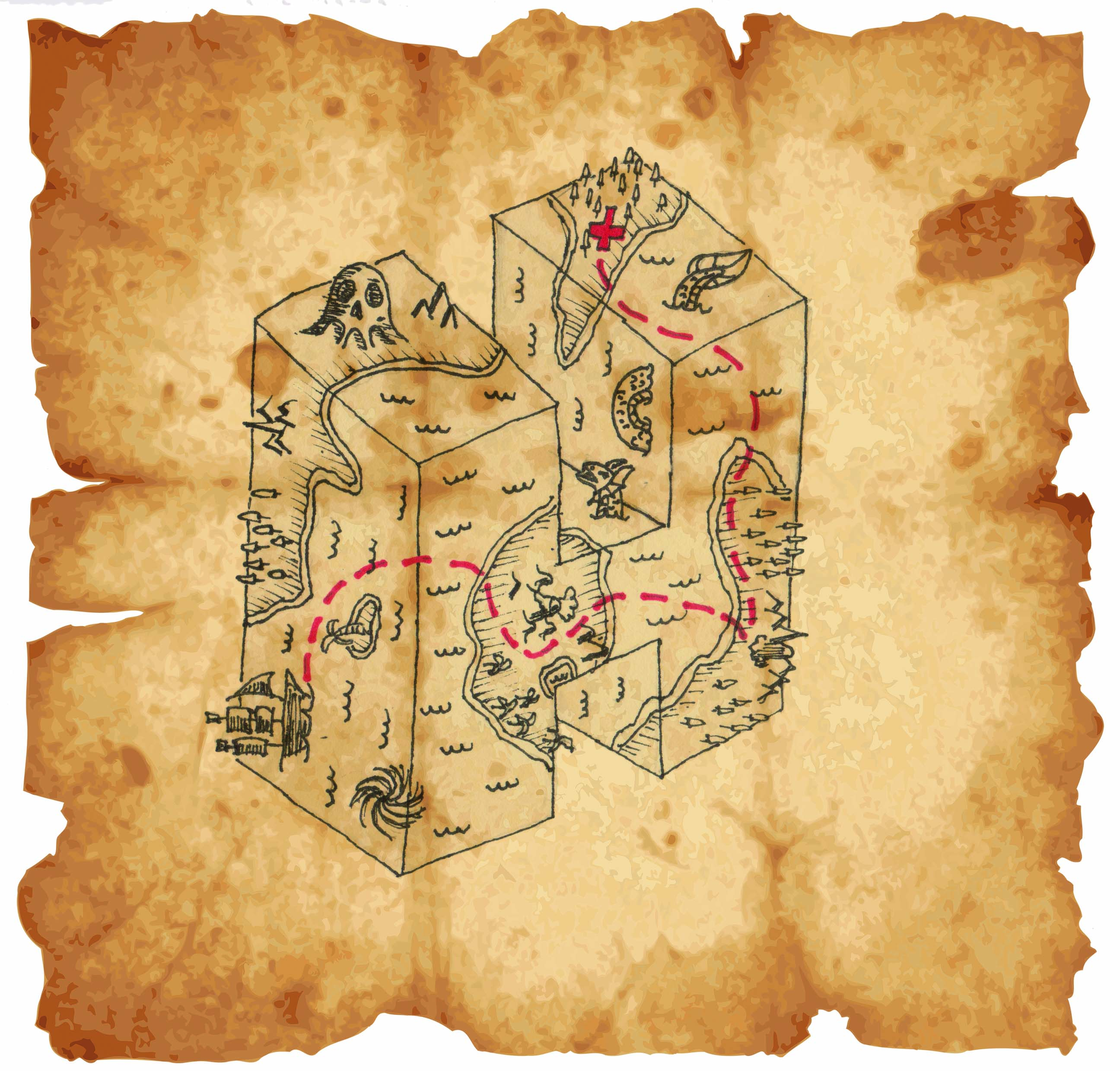
This was the first sample. It did not seem complete.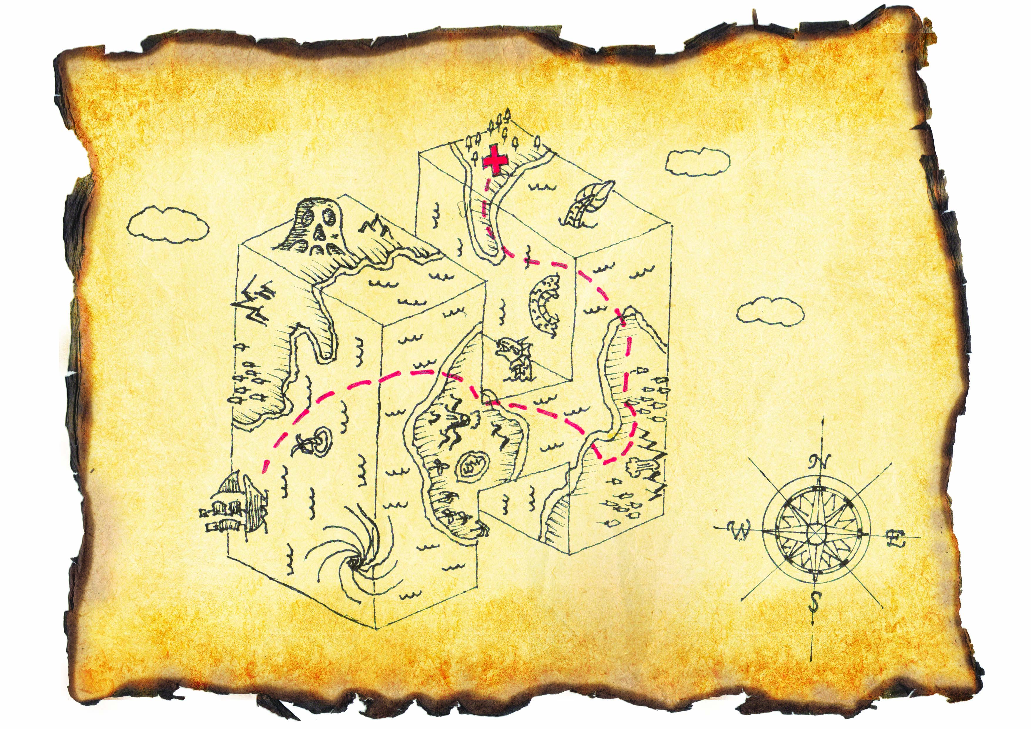
Then I added some clouds and the compass sign for direction and it seem more like a map. I wanted the map to look real so I changed the background to a texture that was more realistic together with burnt edge paper.
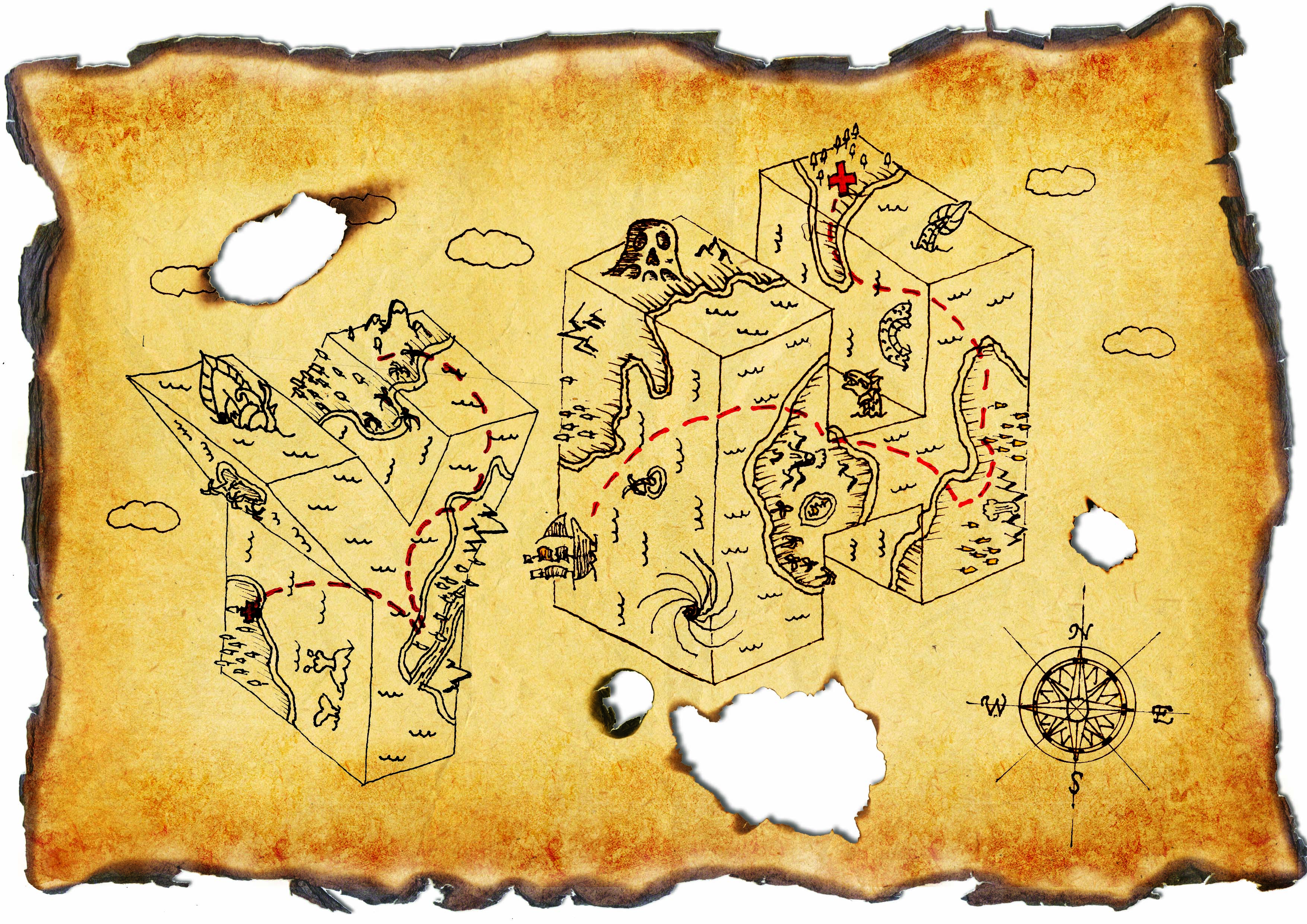
The lines were too faded before so I duplicated them many times to thicken it. Added another letter because I realised the brief said at least 2 and it actually completed the composition with implied lines and with ties in with the idea of traveling. Burnt marks were added to bring out the feeling of danger.

I tried burning the paper myself and the results were much more satisfying. You could not just see but actually feel what the paper had been through.
Prev: https://oss.adm.ntu.edu.sg/ytan149/project-1-image-making-through-type-research/
Next: https://oss.adm.ntu.edu.sg/ytan149/project-1-image-making-through-type/
Project 1: Image Making Through Type – Research
In this project, we were to create typography of our own name/initials that carries the essence of extraordinary jobs. I listed many jobs that I think are interesting, some fiction some non-fiction. The chosen four were my favourites:
- Criminal
- Dream Seller
- Gardener
- Treasure Hunter
Criminal

The essence of a criminal that I gathered are the black & white strip prison uniform, name plate, height measuring background and handcuffs. I went to look for google ‘criminal fonts’ to see what already exist, most of them were sans-serif and many had textures.
Dream Seller
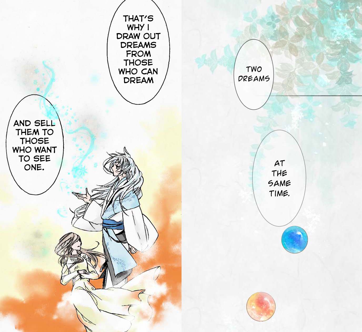
I read this webtoon recently about the after-life of a girl and there was a Youkai (Japanese for spirits, demons and other supernatural beings) that sells dreams. The dreams are depicted with fluid, wispy strokes that look like magical smoke. They are stored in colourful marbles.
The webtoon has very soft colours and textures similar to watercolour. The theme of dreams also reminds me of the Impressionism movement where the paintings and music were all very blurry, soft and muted.

When I discussed my idea with my classmates, many referred to the Big Friendly Giant (BGF) which also had the concept of capturing dreams. But instead of marbles, BGF puts them in jars which I think works better than a marble as a container.

Gardener
 I chose this job specifically because I wanted to play with the phrase “Green Fingers”. However after consultation, I realised this was not what I was supposed to do. Putting the garden into the letter was too easy and already exist. Thus I had to find something new.
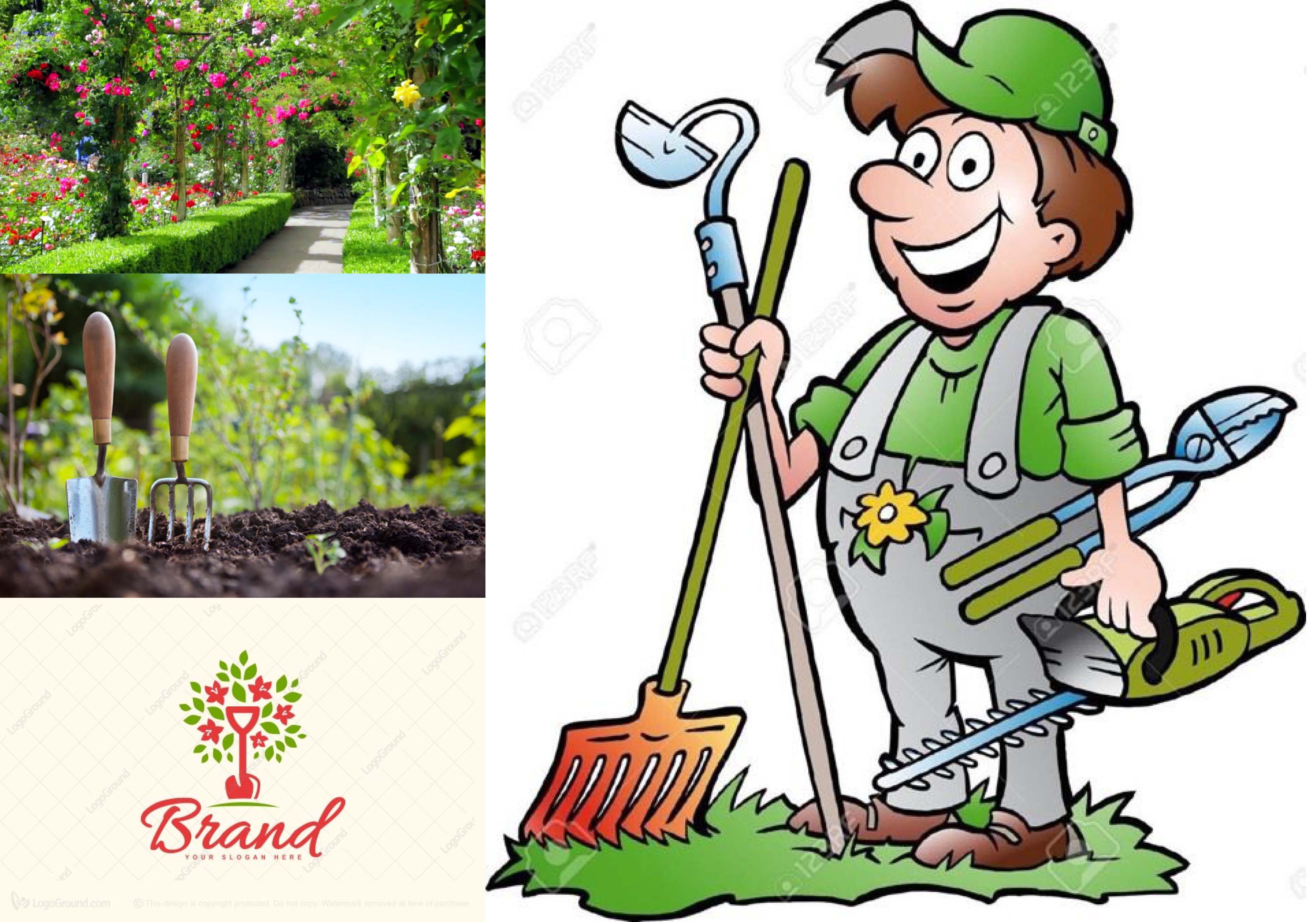
I went to look at pictures under ‘Gardening’ and I found gardening tools, soil, flowers, apron/overalls which gardeners always wear etc. Under ‘Gardening fonts’ I found that many related brand logos used handwritten script fonts.
Treasure Hunter
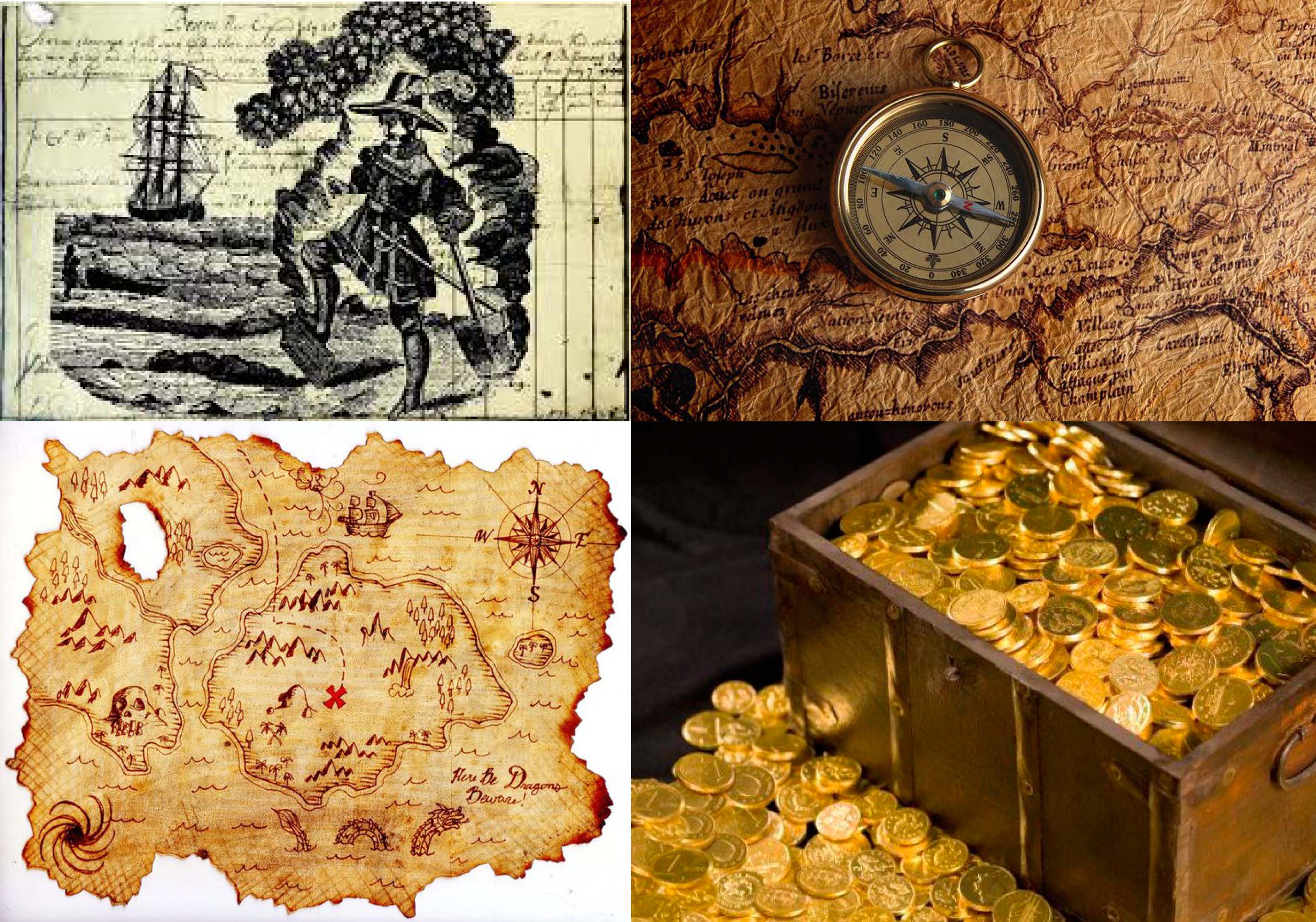
To find treasure, one needs to have a treasure map and under the search ‘Treasure hunter’ I found the maps, compass, gold. I also found this image of what seems to be a vintage print of a treasure hunter digging treasure over a page of writing presumably a journal. I thought it was an interesting idea to include a piece of writing in my work because a part of being a treasure hunter is to record your adventures.
Next: https://oss.adm.ntu.edu.sg/ytan149/project-1-image-making-through-type-process/
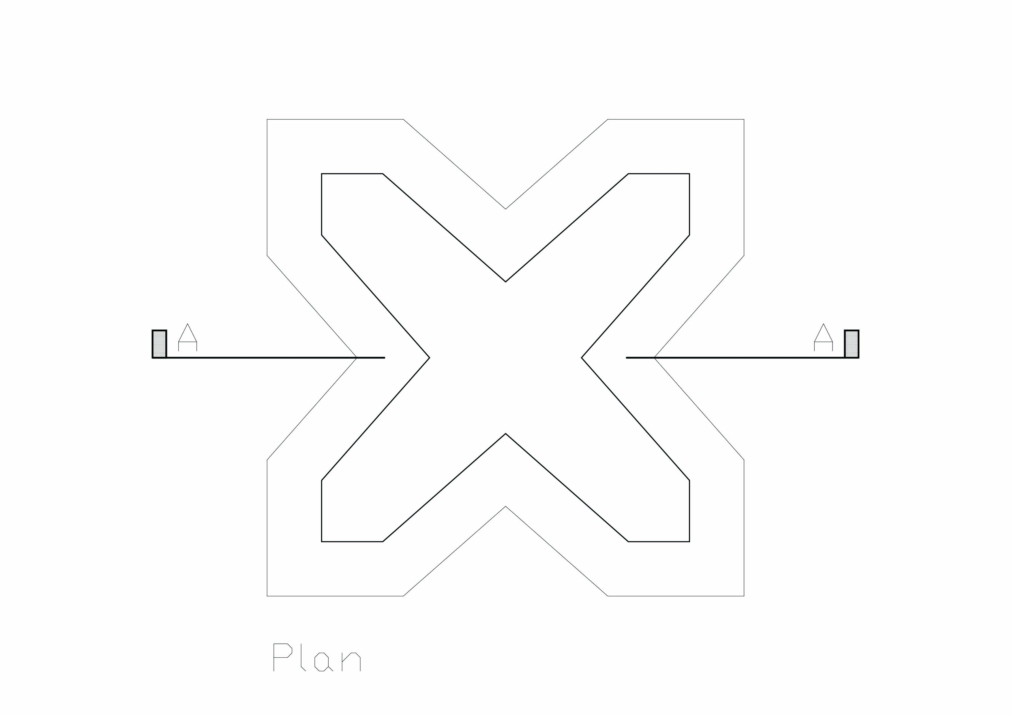
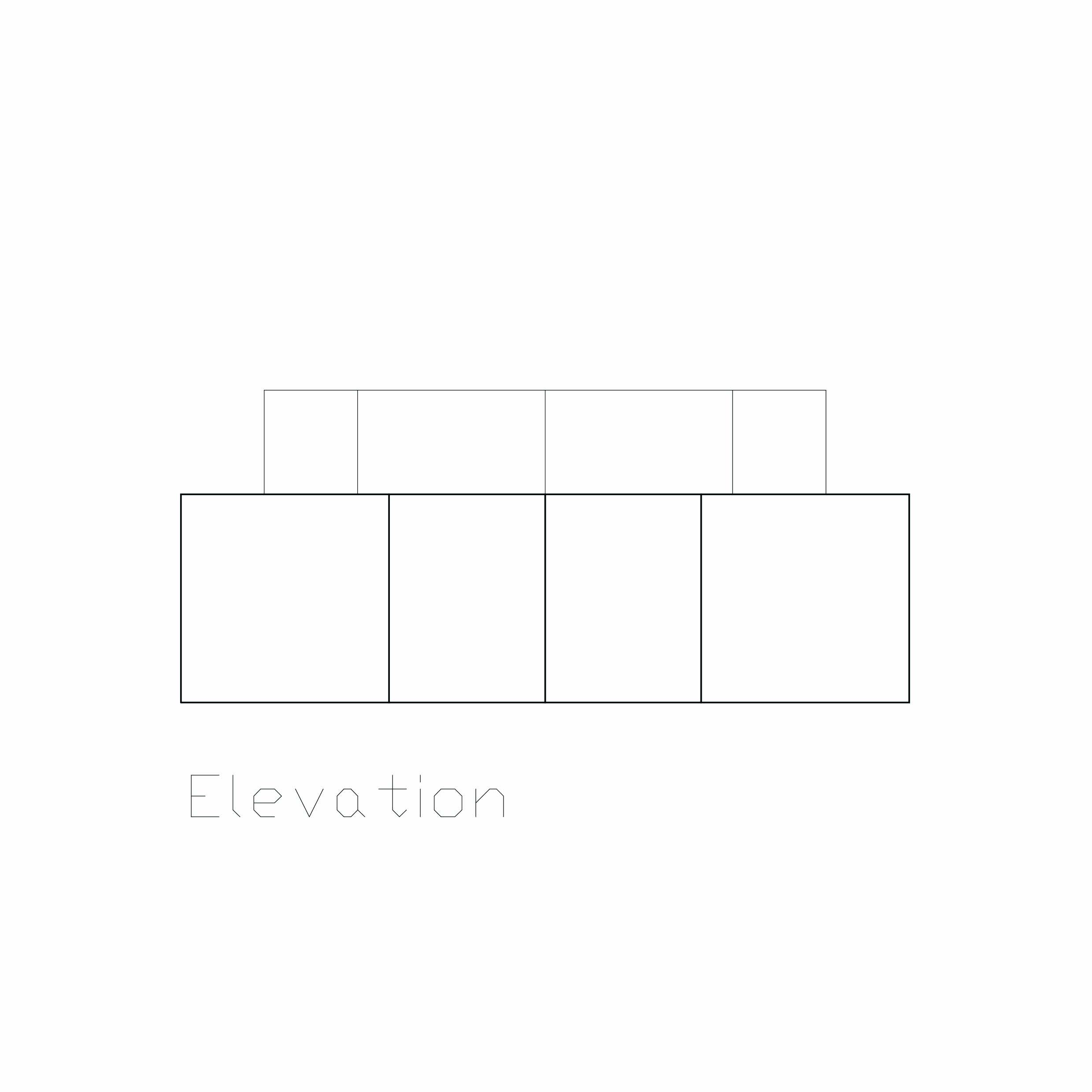
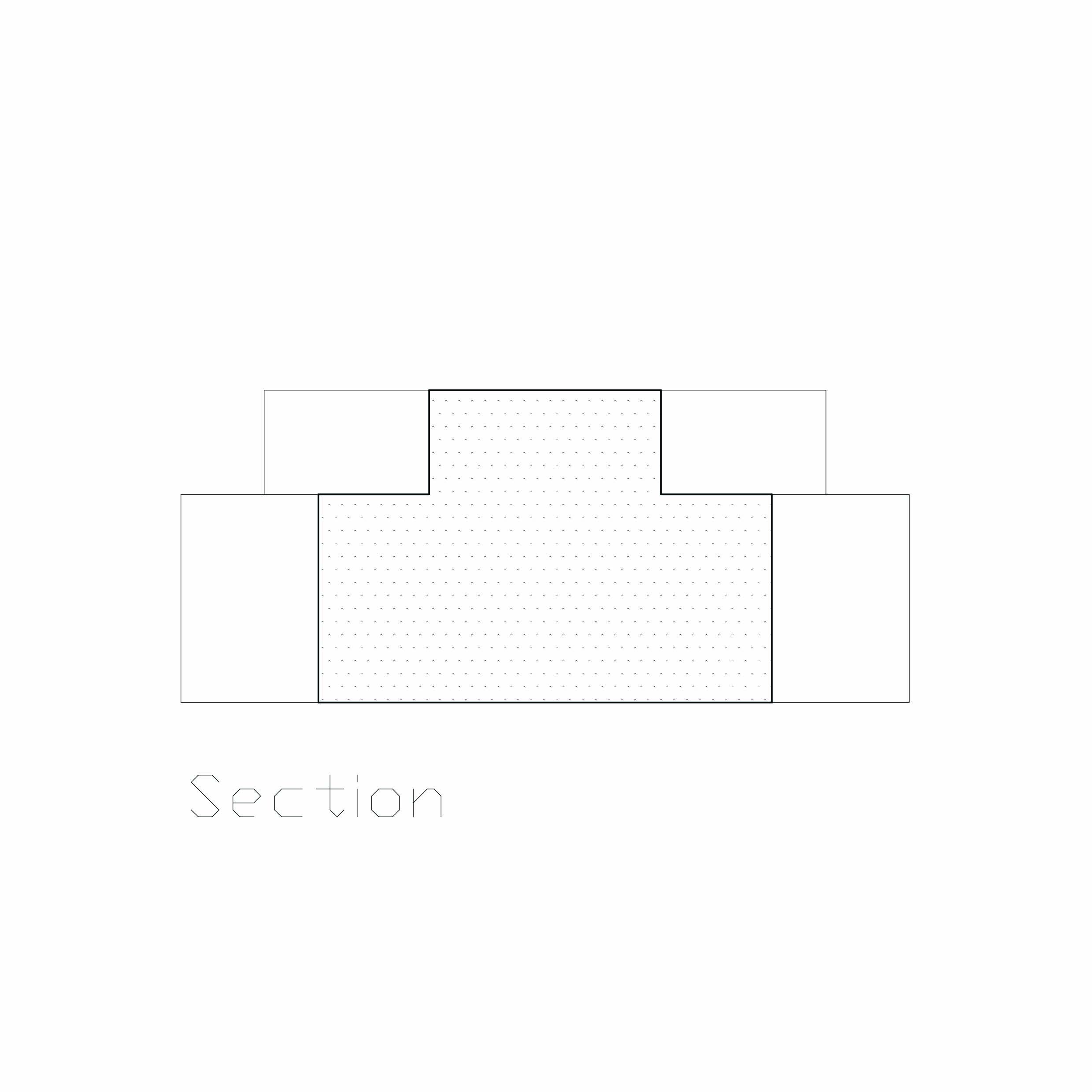
Pandora Revisited – Presentation Board
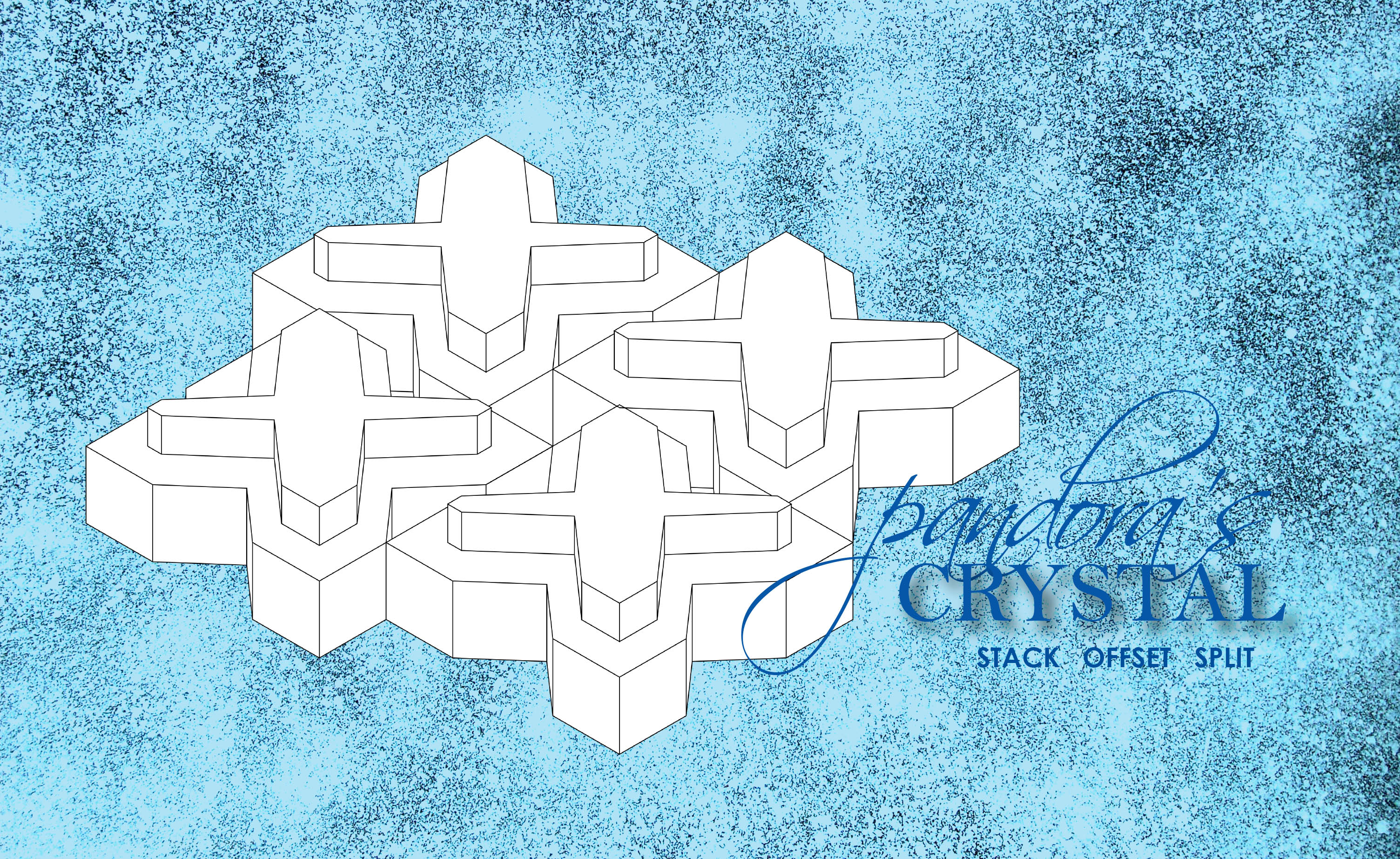

Pandora Revisited
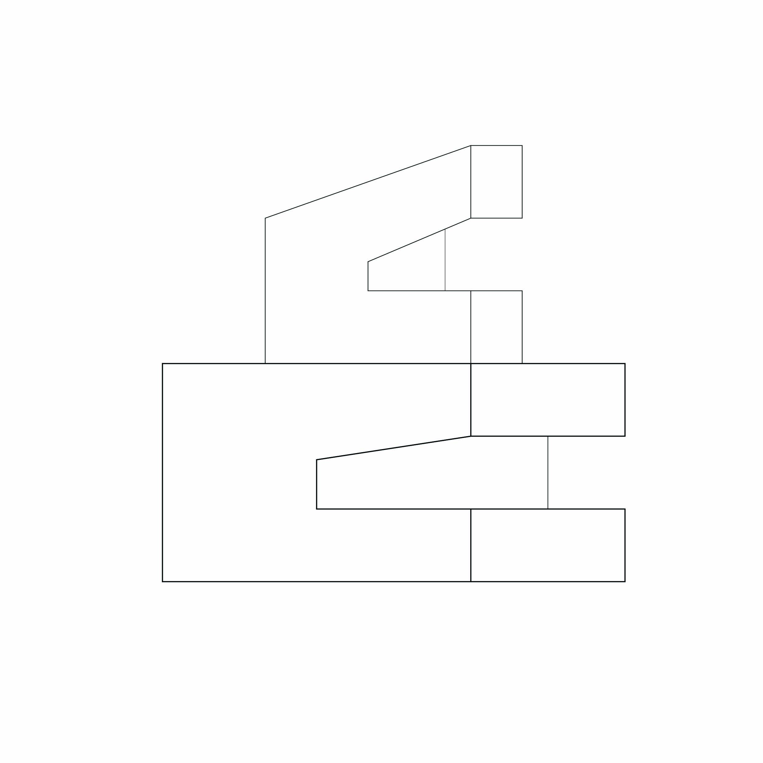
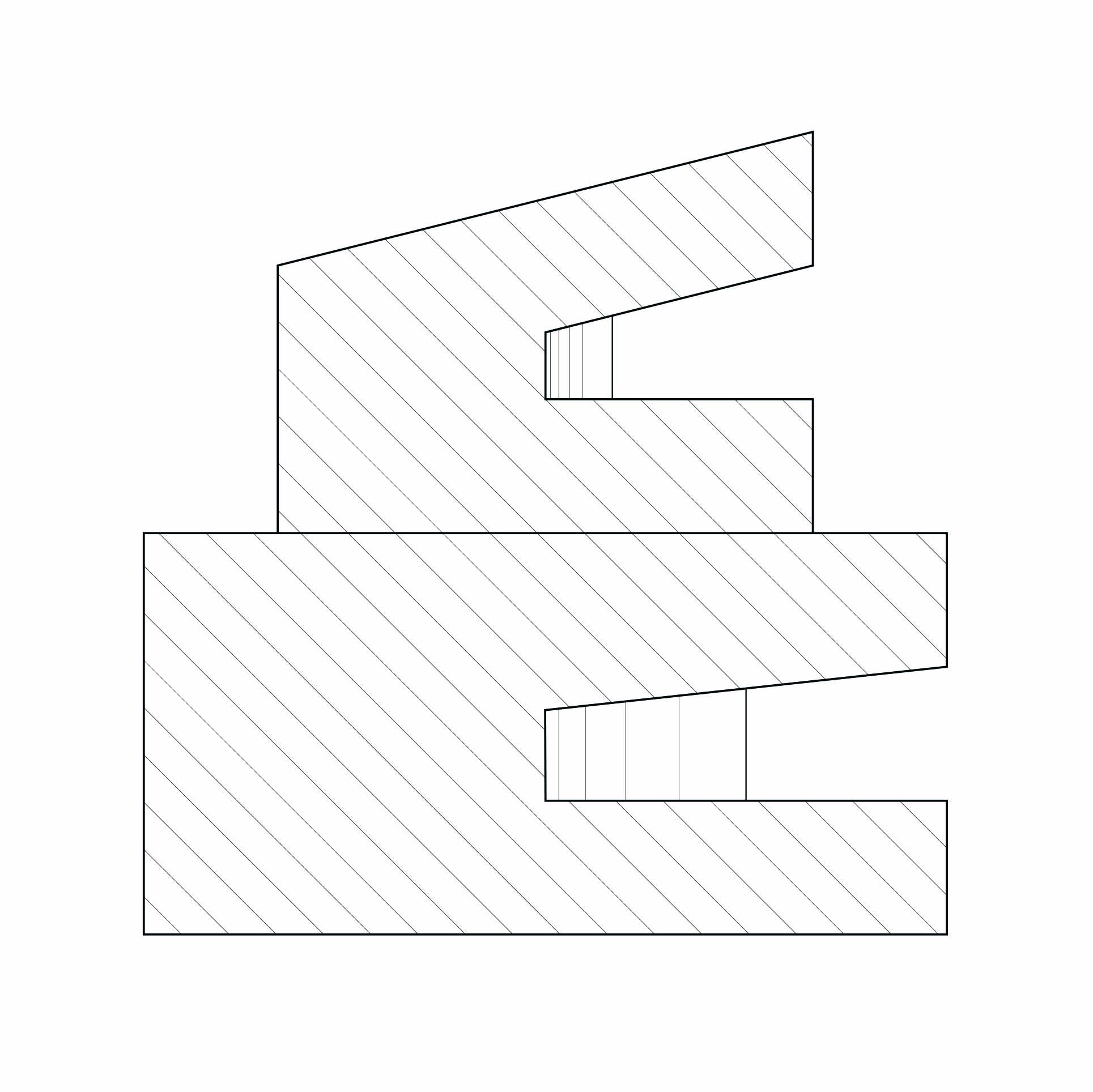
Stack Offset Split

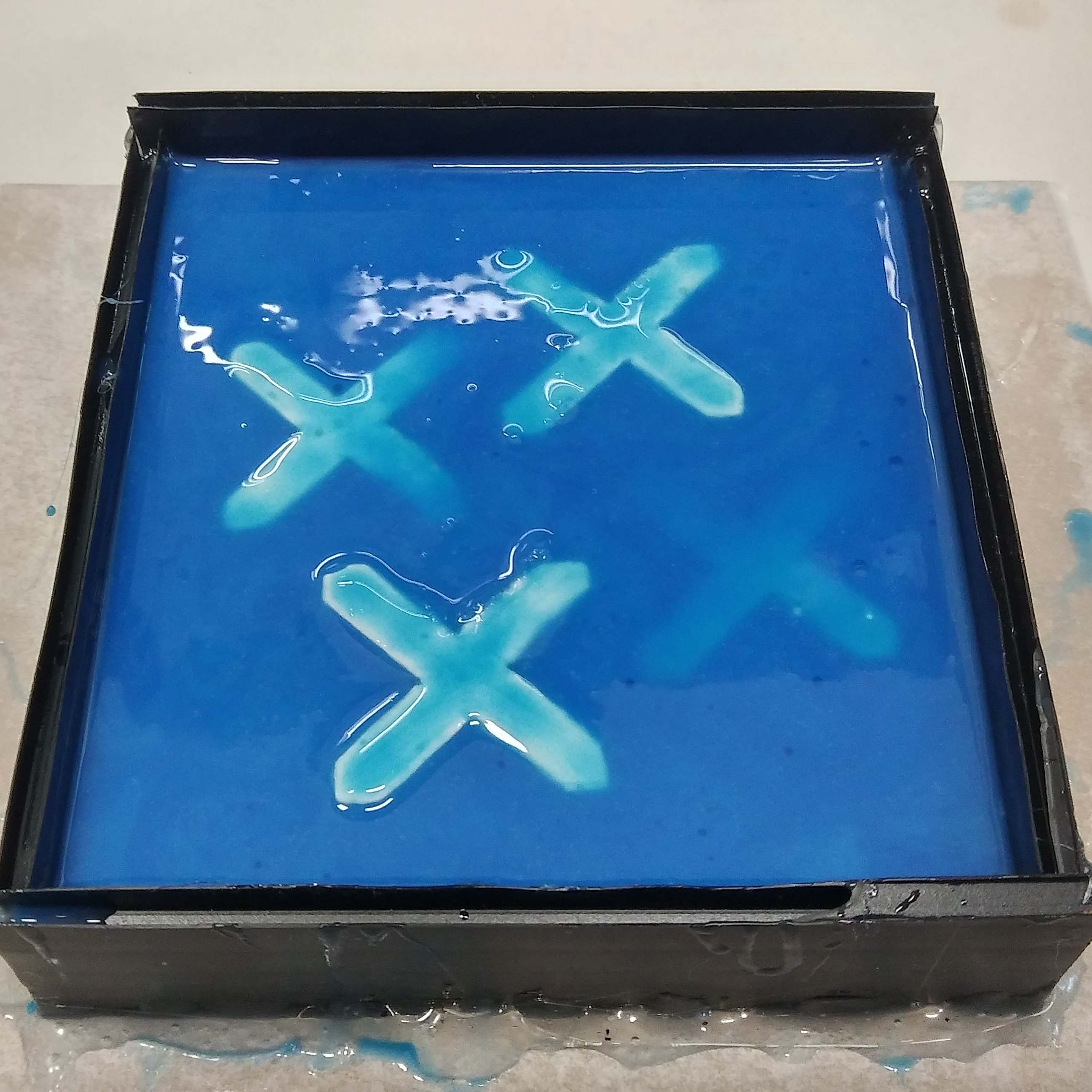
Prototype 1:

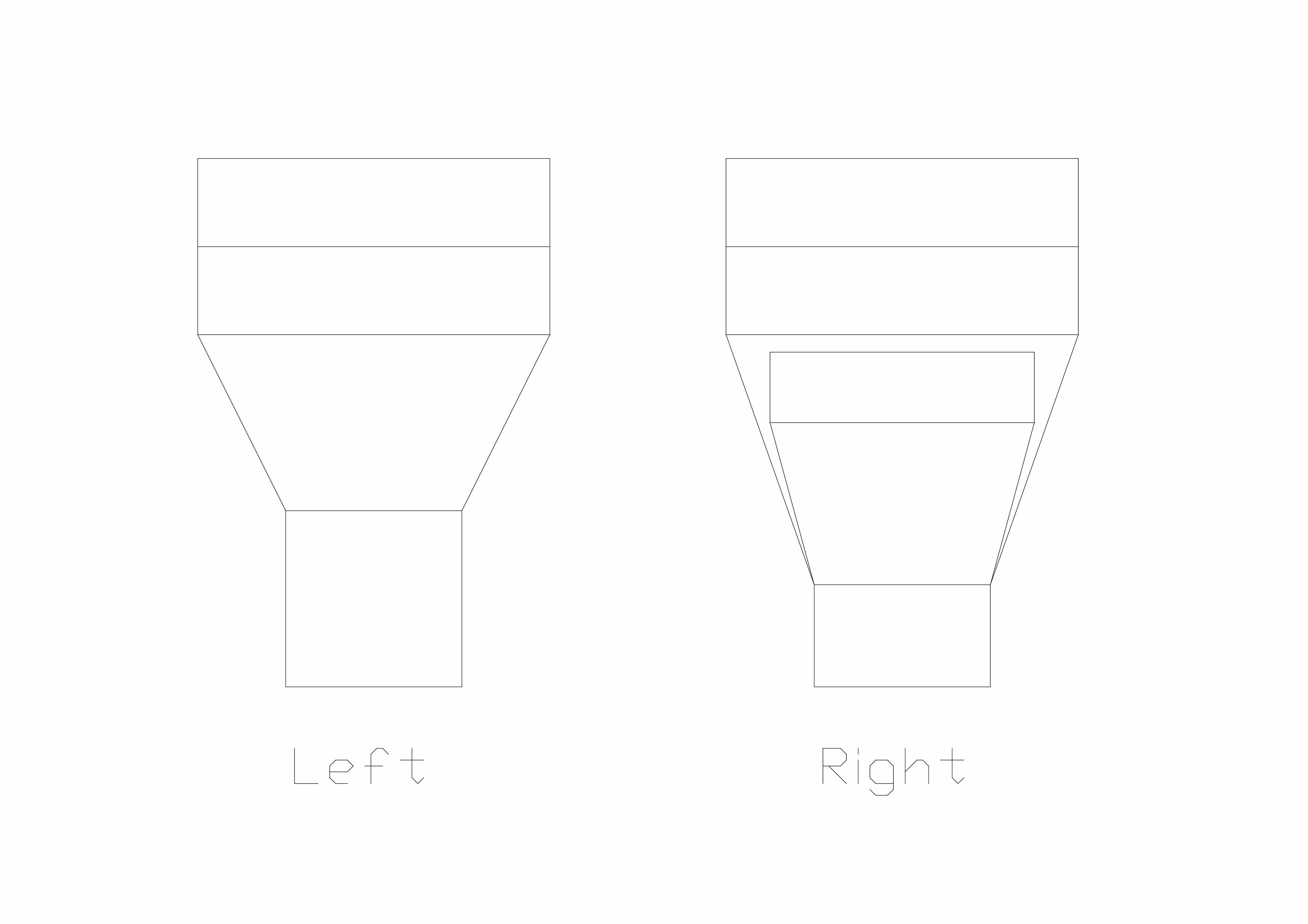
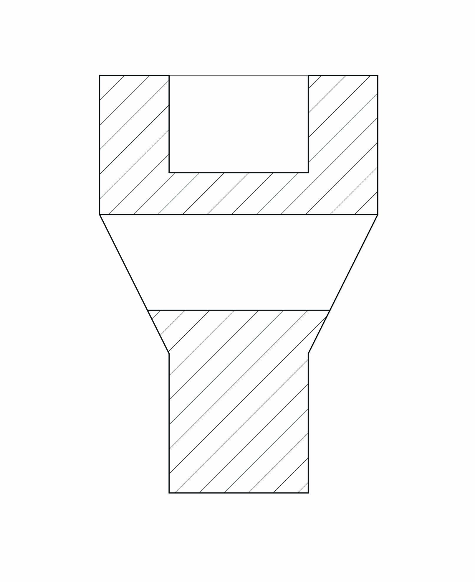
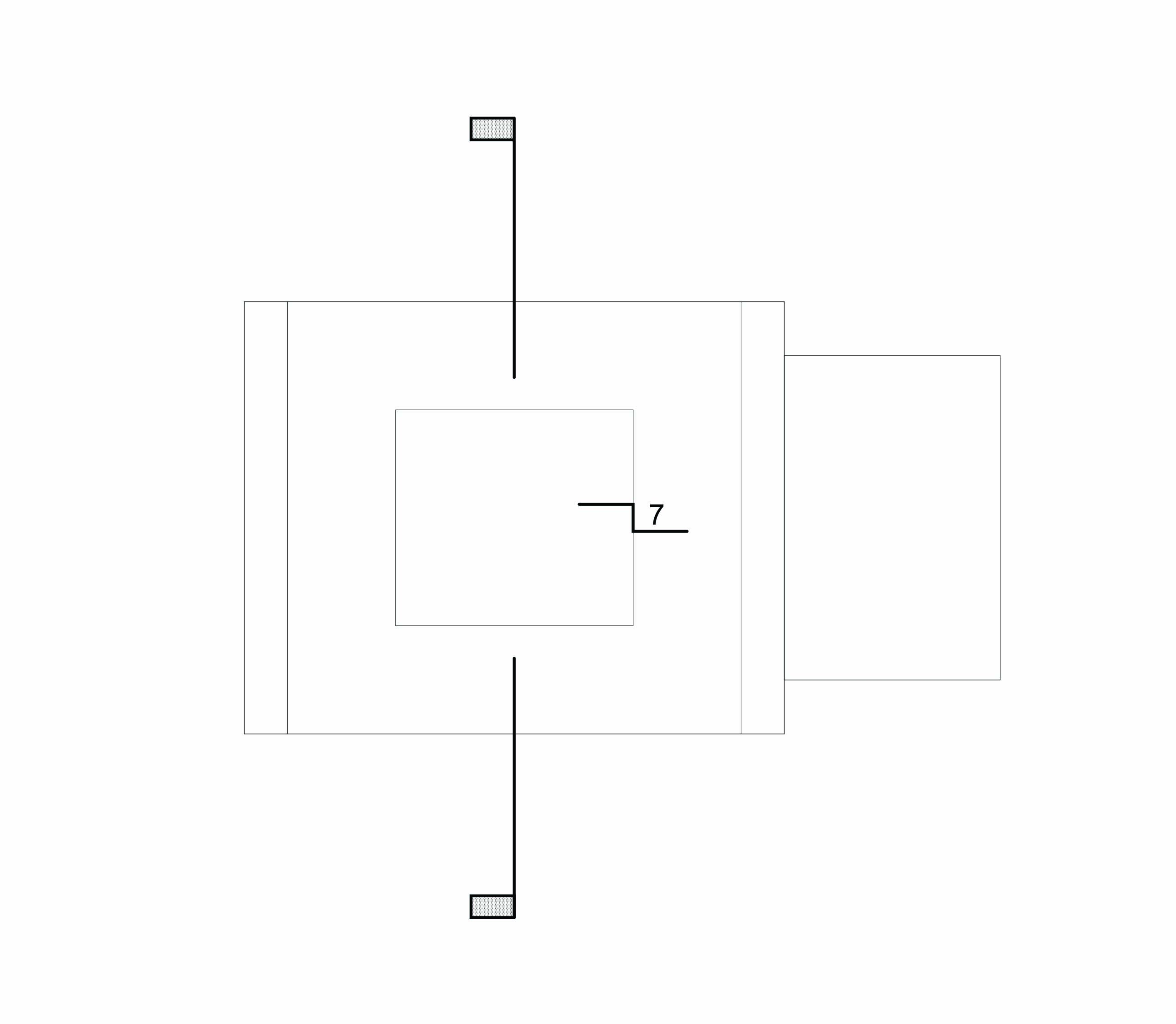
Prototype 2:

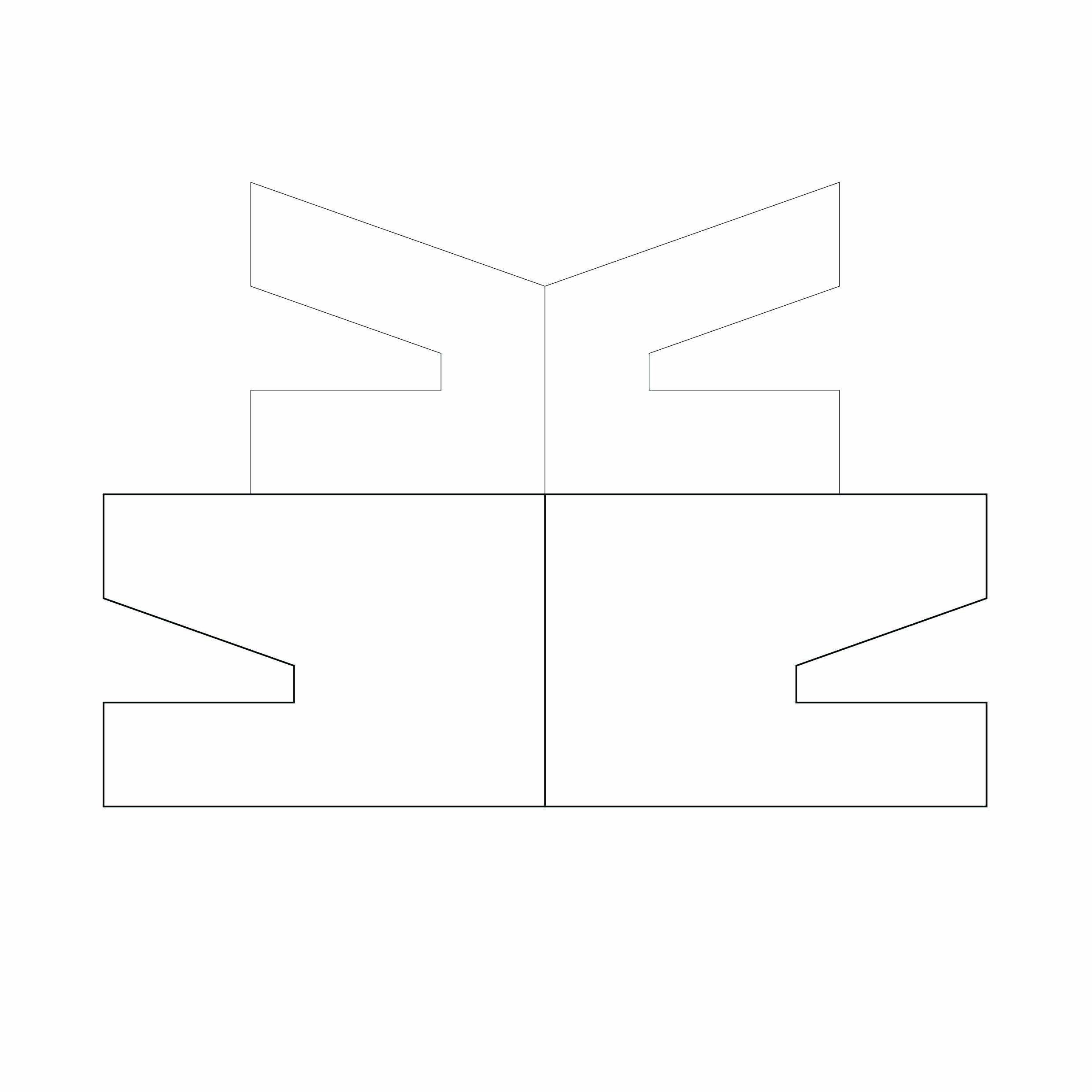
Prototype 3 (Final):


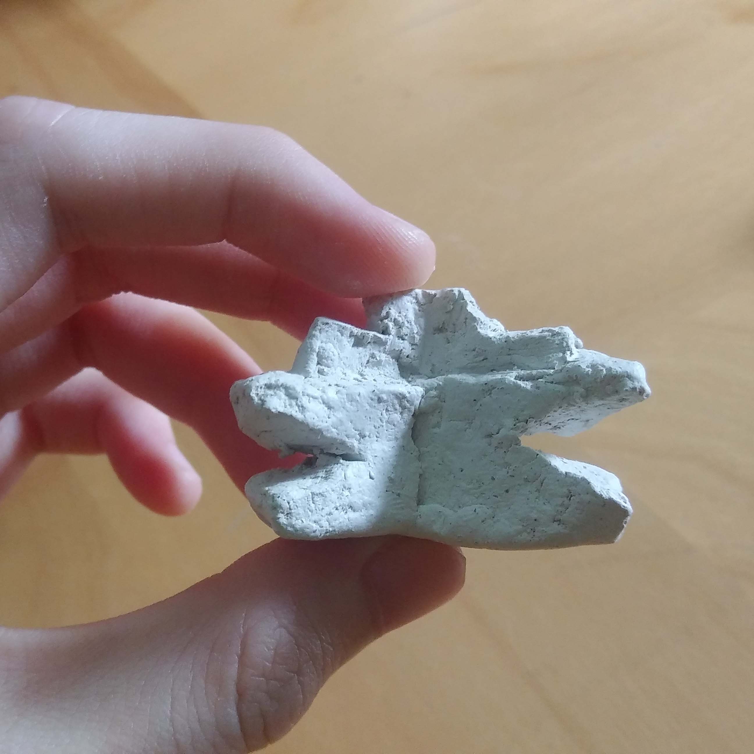
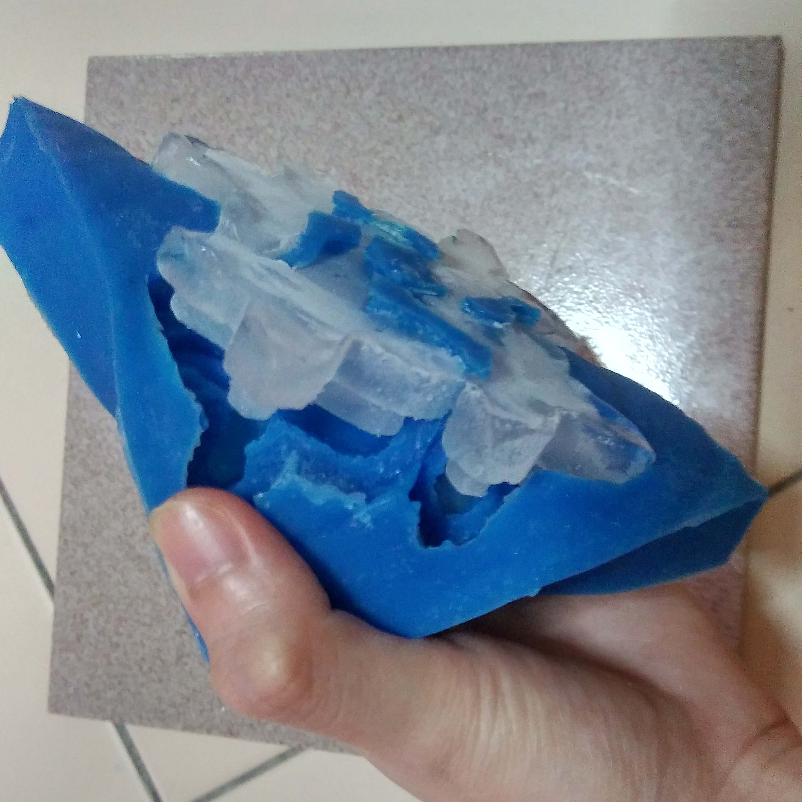
Silicon Cast:


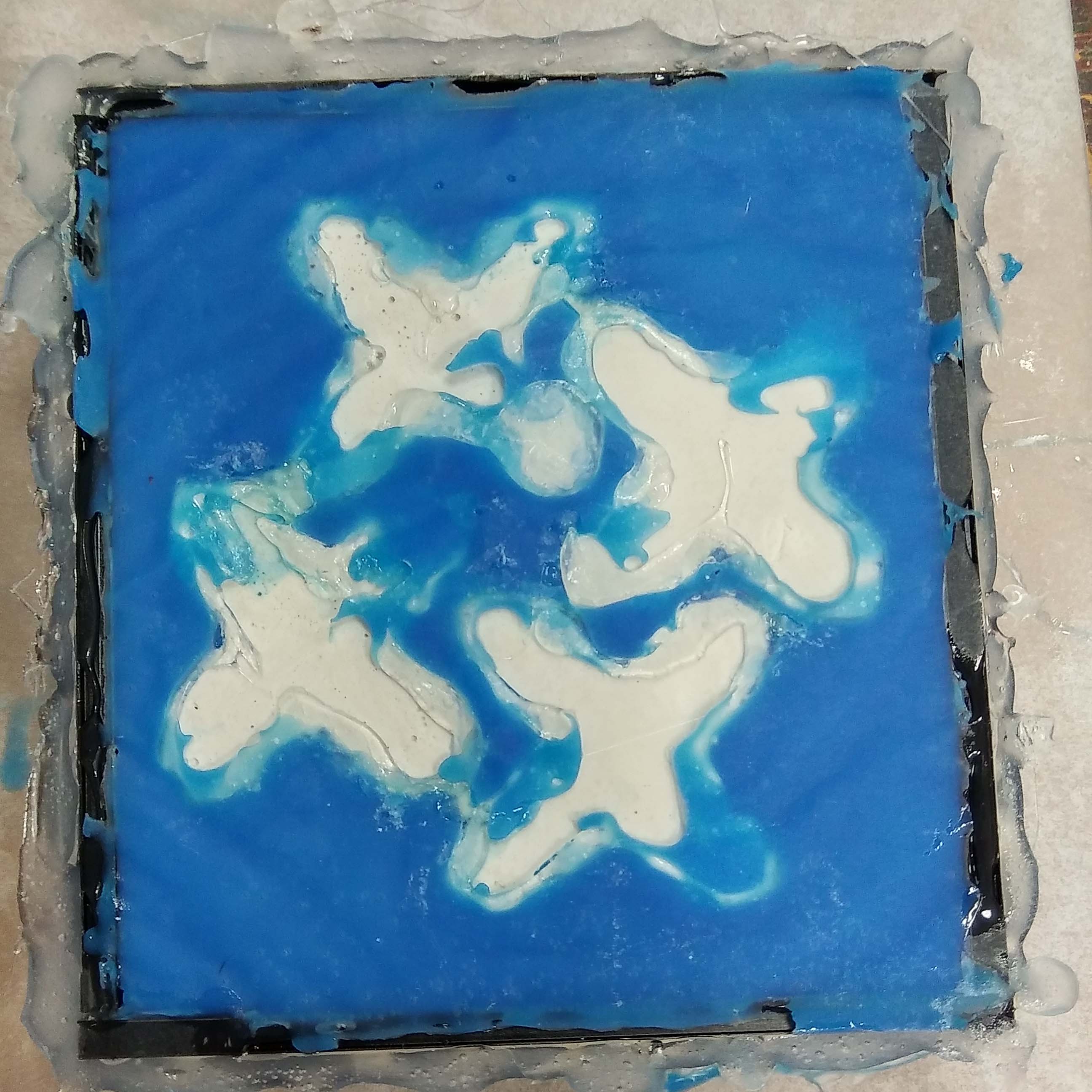
The silicon cast did not come out to well in my opinion. My clay modules had a convex surface thus the silicon leaked under. I did try to cover it up with the hot glue gun but it did not work. But that was an easy fix. I snipped away all the unwanted surface with a scissors.
Also due to limited amount of materials the top of my mold is too thin which poses some risk to freezing the ice.
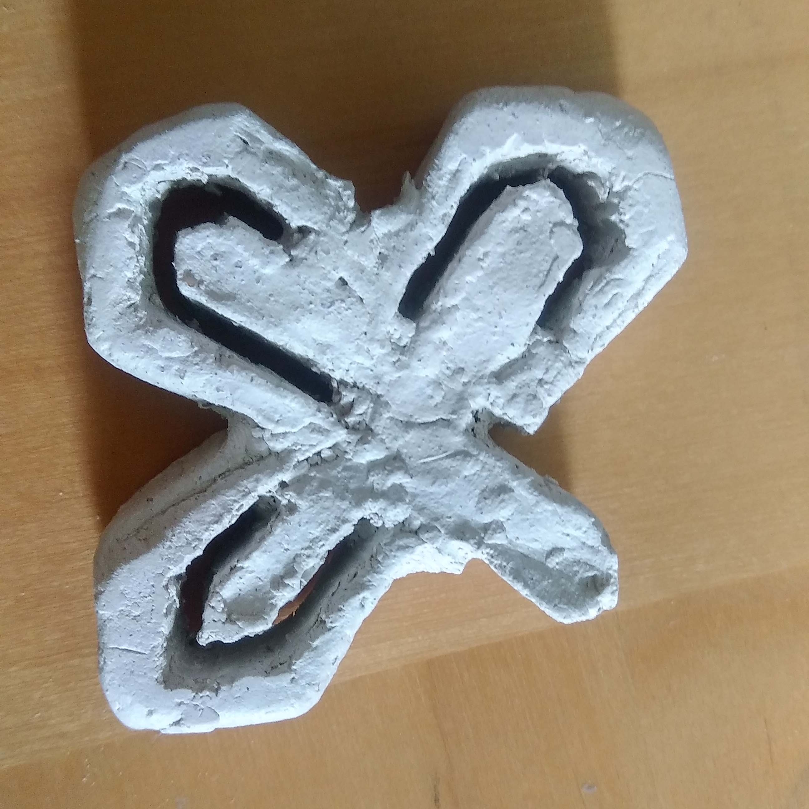
Ice:

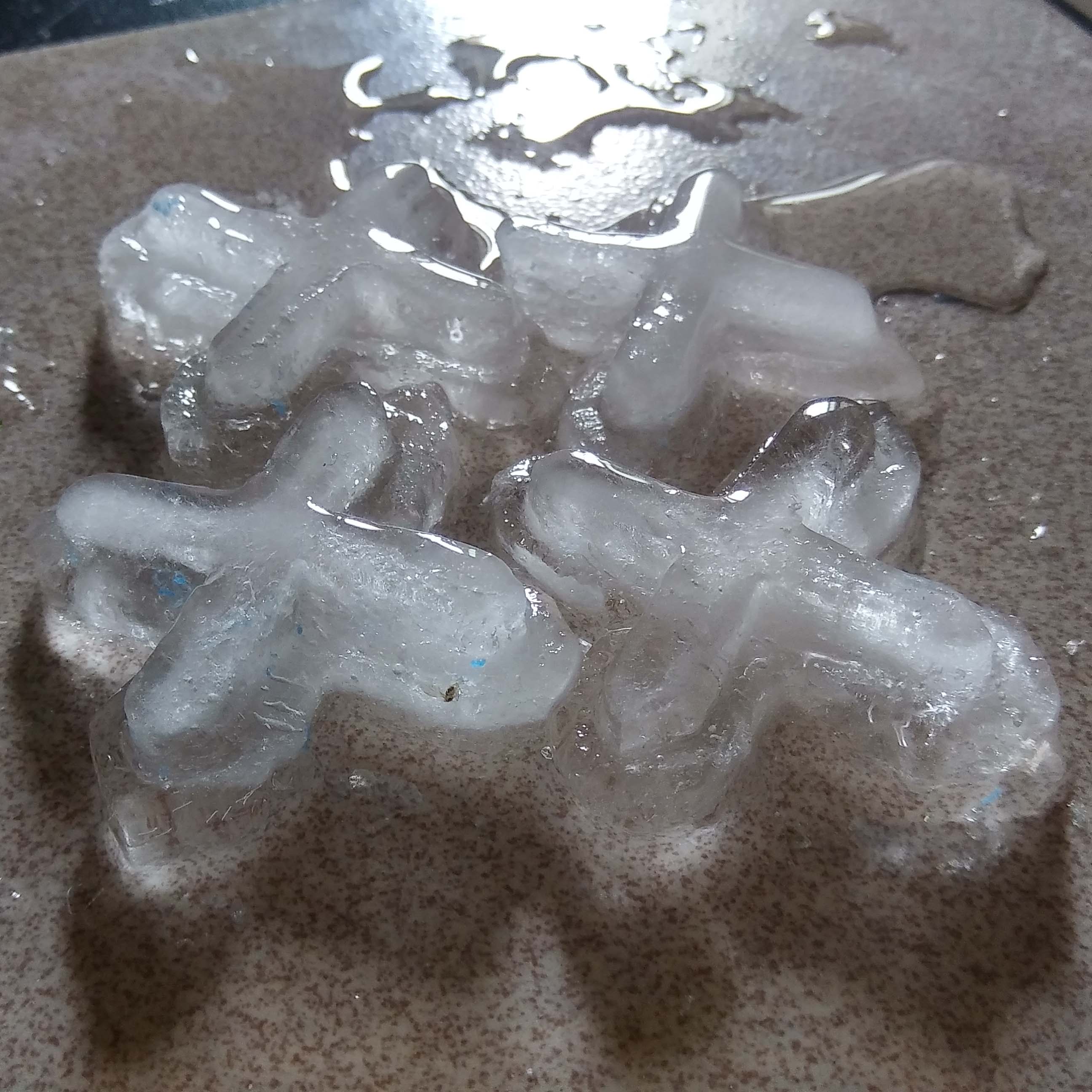
It was a failure! I should have trimmed the ends smaller so it would not trap the ice. So I had to take it apart one by one for the last photograph.
Micro Project VII: Video Selfie

https://youtu.be/yMsqa_8BM6w
The alter ego I have chosen is a musician; inspired by the duet Twosetviolin. They are down to earth violinist who put out a relatable image. Therefore the home setting and clothes.
Their content allows fans to come together and feel for musician struggles. So I decided to make my video selfie an imagination of what their practice session might be – a little comical/sarcastic, serious and finally their efforts being applauded by their audience.
This side of performance is rarely seen, the outcome overshadows the process which is commonly seen as weakness. But everyone has to practice even professionals and that is why people love Twoset.
Recess week Arduino
With May Thu
https://oss.adm.ntu.edu.sg/may005
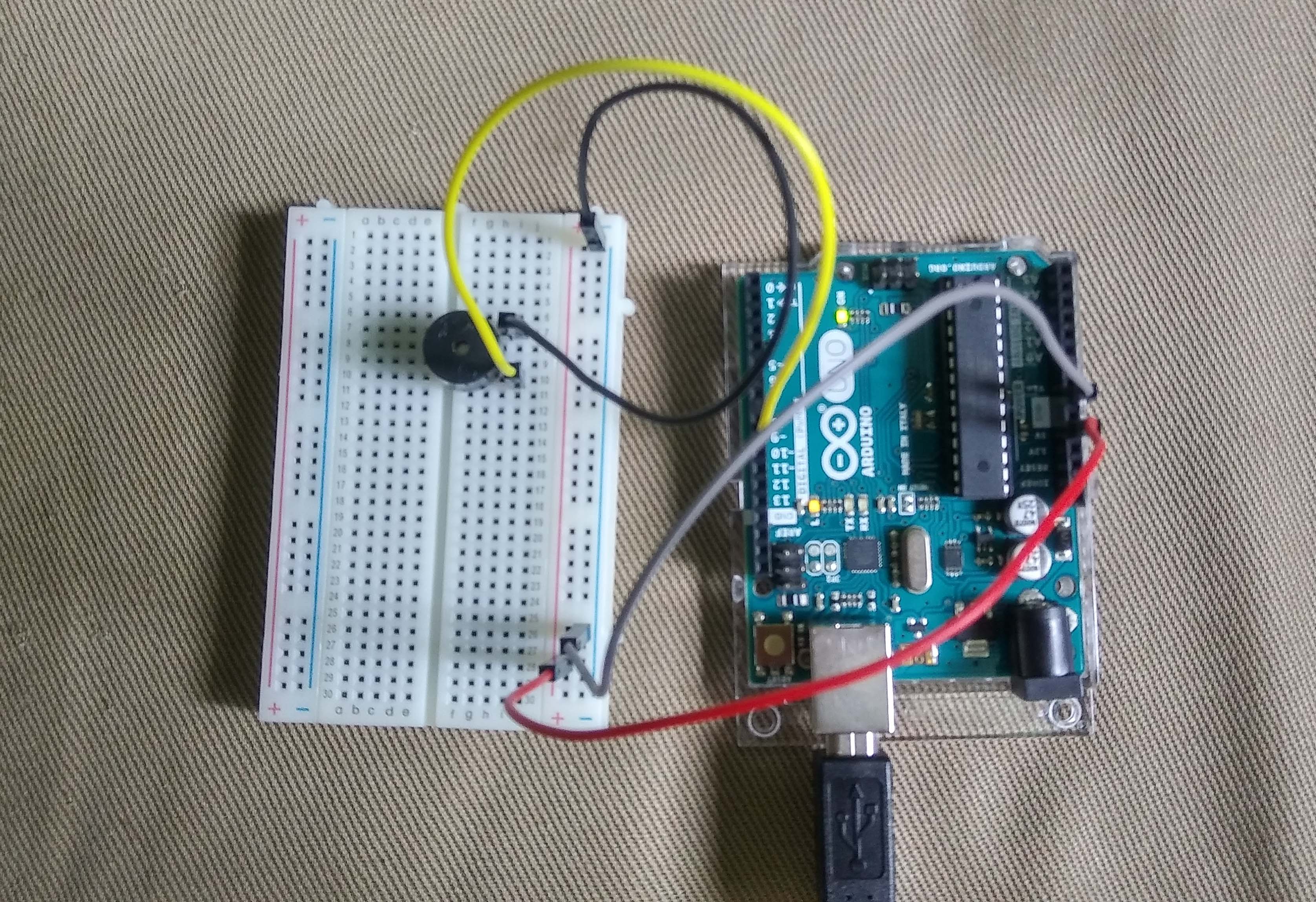
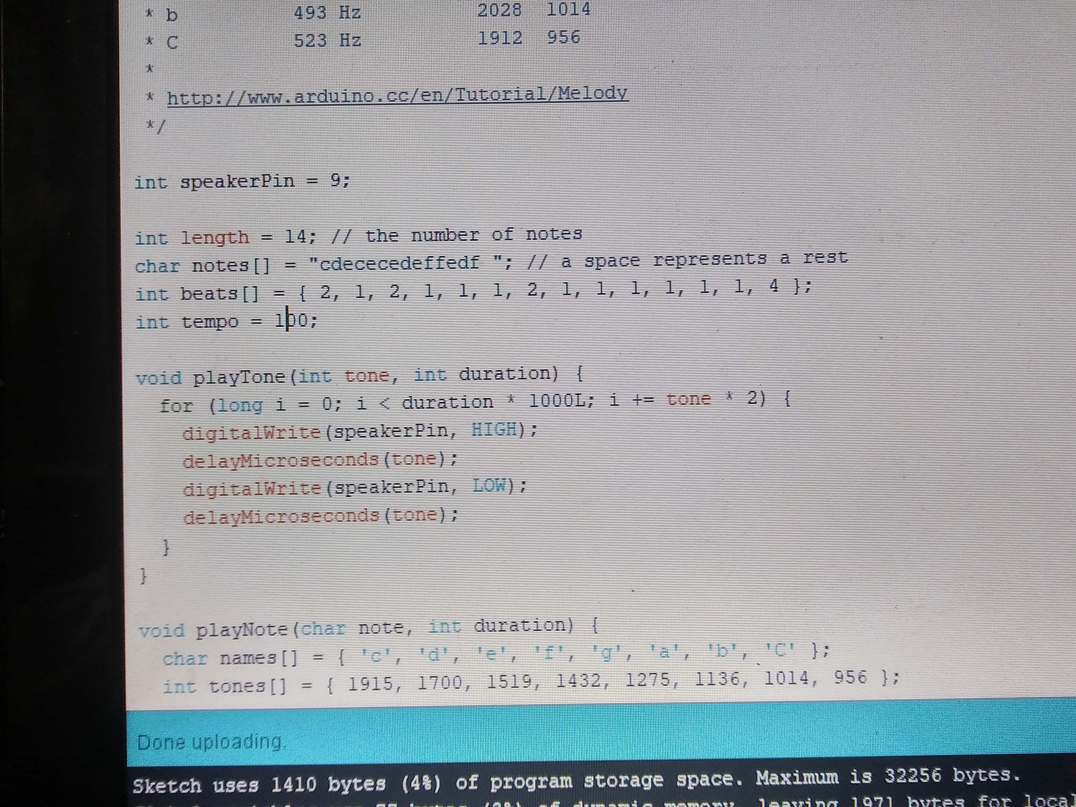


We tried making the Ibiza Box again because ours did not work the last time. Except here we only use the Piezo. We tried editing the code given and it did not work. The original code works fine even though we did not have all the parts.
Micro-Project VI – A Day in the Life of Super-Participation

https://www.facebook.com/groups/981877025312775/
Groupmates: Desmond, May Thu, Joseph & Teri
Time: 11am 9/3/18 to 11am 10/3/18
For this activity we voted this day as our most interesting day of recess week. However, I think we did not share as actively as we should have. We mostly shared things that we were doing; all pretty trivial things such as going to class, going home, eating etc.
Joseph and I shared quite a lot, followed by May Thu and Teri. Desmond only started sharing after half a day had gone by. We also tried to comment on each others post as much as possible, most of which is reaction to the post. Sometimes we would ask about the shared information like where we were and what it was for.
I think the motivation behind this super-participation is to gain company for being alone, sharing joy and letting others know about your current status. Its always nice to let people know where you were in case you drop into a canyon and had to amputate your own arm. (127 Hours traumatized me)
Because we are all in different locations, we use the facebook page as an extension of our senses. It allow us to communicate and express ourselves in many different ways – text, stickers, videos, images etc. Through sharing we want to try and gain a reaction from others. It could be shock, empathy, sync emotions or amusement.
In my group I do not think anyone of us were trying to a certain persona by force but the things that we choose to share does reflect our personality and character.
Research Critique 3

Micro-Project V:
https://oss.adm.ntu.edu.sg/ytan149/micro-project-5-art-of-destruction/
In our Micro-Project V: The art of destruction, we printed the Mona Lisa in actual size and burnt it. The act of burning this iconic painting is against the tradition where the painting needs to be hung and framed on a wall to be viewed and enjoyed. As such there is aberrance in the aesthetic culture.
Jon Cates said that there was “poetic embrace of noise and error” in which is the balancing of nonsense and knowledge. There cannot be beauty without ugliness and ugliness without beauty. The aberrance created is rationalised; with purposed to reveal an important message – art does not have to be proper.
This can be further supported by the Glitched Studies Manifesto, “Here noise exists within the void opposite of what (already) has a meaning. Whichever way noise is defined, the negative definition also has a positive consequence: it helps by (re)defining its opposite (world of meaning, the norm, regulation, goodness, beauty and so on).”
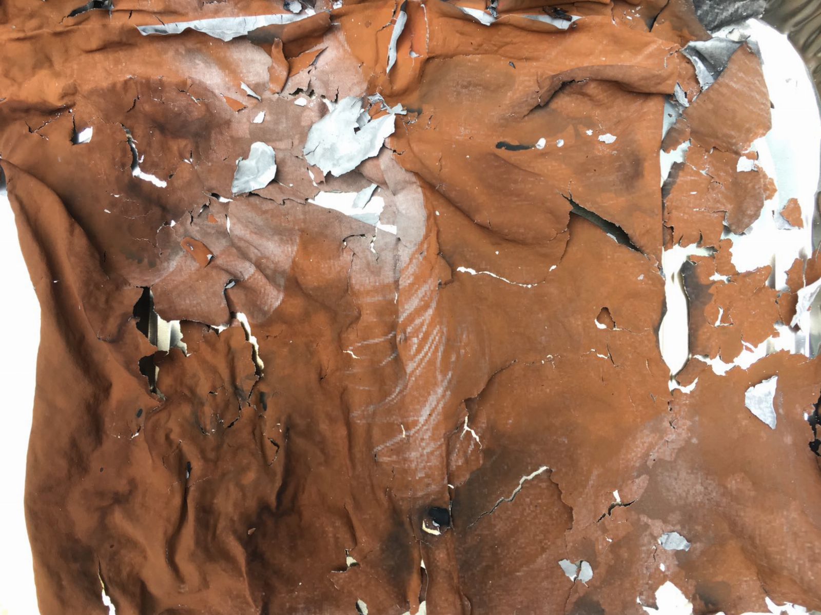
If you watch the performance you may see that the Mona Lisa starts off as a proper image. As it burns, it crumbles and falls apart. Some leftover ashes of laser pigment stayed intact, with a vague imprint of the printed image. The act of destruction lifts the art from its physical form to an idea. The rules of painting – perspectives, proportions, chiaroscuro etc are quite literally erased and replaced by a new concept that we the artist introduced.
Again as mentioned in Glitched Studies Manifesto “These works stretch boundaries and generate novel modes; they break open previously sealed politics and force a catharsis of conventions, norms and believe.”
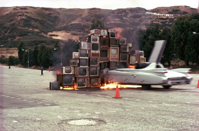
Glitch art is often associated with the Utopian view and freedom. In our performance, Mona Lisa’s ashes were prone to being blown away by the wind which represented art to be ephemeral and free. Chip Lord was constantly talked about creating an image and putting out there as a form of information throughout the Ant Farm’s projects. He also made a brief mention of Ethos. Ethics are mostly in question in performance art. For example Ant farm’s Media Burn performance in 1975 was used to create an image to critique and attack media.
As mentioned in Glitched Studies Manifesto “Once the glitch is understood as an alternative way of representation or a new language, its tipping point has passed and the essence of its glitch-being is vanished. The glitch is no longer an art of rejection, but a shape or appearance that is recognized as a novel form (of art).” A glitch is an adnormality but after it is popularize it slowly becomes a norm and ceases to be a glitch.