The topic we touched on was low self esteem. People nowadays in our generation put criticism against themselves at the front. They are worried about how they are perceived by the society regarding on their looks, body or even their personality.
We had Karen stayed still on a chair holding a sign saying “I have low self-esteem. What do you want to comment on my body image? Please write a comment on the corresponding body part.”
Karen is acting as the supposedly low self esteem girl. She is depressed at her body image and is very concerned about how the society perceived her. Her body acts as a blank canvas and our group had our classmates to put down their thoughts about Karen’s body image directly onto her. We briefly gave them a simple instruction, to read the sign and told them that they could write wherever they want with the provided markers. The audiences would have full freedom/control of the artwork.
The ‘source’ materials are open to all; to remix, re-edit and redistribute, either within a particular DIWO event or project, or elsewhere. The process is as important as the outcome, forming relationally aware peer enactments. – Marc Garrett
The only down point is that people would naturally take a peek on what other audiences wrote. Therefore their thoughts might also change due to after looking at what the previous person had gotten down on Karen.
Our idea is mainly to have audiences to make contributions towards our ‘canvas’ and the process of them putting down their thoughts. Unlike the traditional art making by a single artist whereby the end result is only thing they are looking for. Similarly to Yoko Ono’s Cut Piece whereby we can’t take control of the outcome. The audiences are the ones that will determine the outcome at the end. If there’s isn’t any participants, the blank canvas would remain blank.
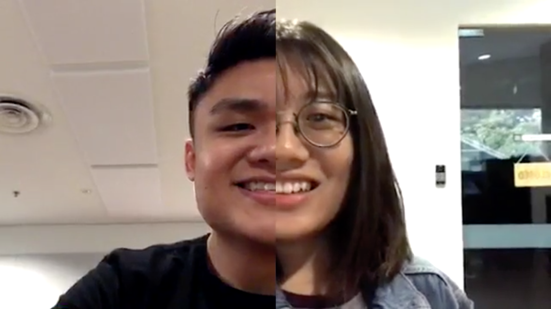
After a long day of school, two friends decided to quench their thirst by refilling their bottles at the ‘same’ water cooler for one another.
LOCATION
Naomi was at the water cooler right outside the 4D room.
I was at the water cooler near the lounge at level 1.
OBJECTIVES
The objective was to make the whole interaction seems like the both of us are at the same location.
OUTCOME
The end result was slightly better than we expected. But if we were to be given more time and a better network connection, the experience would run smoother.
DIFFICULTIES
At first we didn’t figure out how the Facebook live’s split screen would work.
Internet connection. In order to sync seamlessly, both of our internet connection has to be fast.
Naomi’s phone wasn’t compatible to the newest Facebook live function and she wasn’t able to join in the split screen mode.
The alignment of water cooler was difficult to coordinate on our own side especially since we only had one hand free. The other hand was holding the bottle, the other had to hold the phone.
We were disrupted in the middle of our live, where someone wanted to use the water cooler. Therefore we had to pause for awhile during our live.
OVERALL EXPERIENCE
It was a fun and interesting experience.
Expect the unexpected.
We will be interested to explore more different interactive concepts using the Facebook live
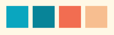
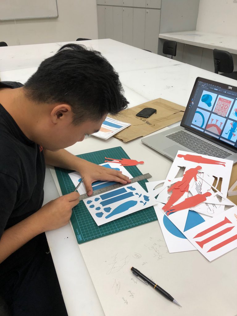
After a few consultations, my ideas were confirmed down. I was going for the paper cut medium for all my panels. I chose one complementary palette for all my panels as well to tie them all together as one category.
It’s kind of tricky for paper cut and layering, as I would have to plan ahead. I drafted out all my designs out on illustrator first in order to know which layer comes first and which comes after.
Rough sketches of some of my elements
I sorted out all my elements and lay them flat on the artboards. The only cons for paper cutting is that there is no room for error. Once you cut it wrongly means you’ll have to reprint again. Unlike doing digitally when you can undo as and when.
Final –
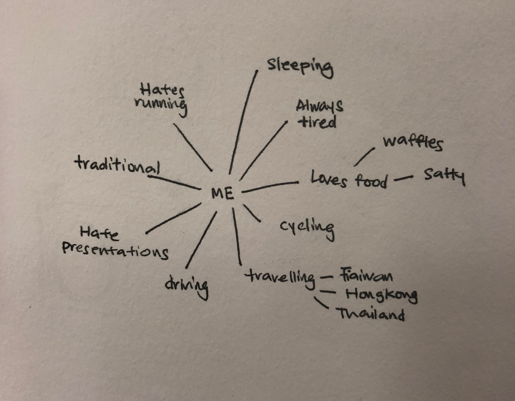
Basically me as a snail, slow and always procrastinating. Deadlines and submissions all piled up on the calendar, hence being a snail transformed into a fast moving shell rushing for all the deadlines and submission.
Basically me as a bicycle wheel, everything’s smooth sailing. Whenever at interviews or presentations, I would get super nervous, butterflies in my stomach. I’ll see the interviewers as sharp nails and puncturing my tyre at the end.
Basically me as a pufferfish, exhausted on my couch. Whenever I get into a super crowded place/situation I will get tensed up, suffocating hence puffed up around the crowd.
Basically me as a pig, loves foods. Buffets are like heaven, anything but mushrooms. Hence if I get to a mushroom buffet, I would slimmed down drastically.
Difficulties –
Tiny details are super tedious to manually cut it down, it may also tend to break easily. Positioning the each layers down right also takes up a lot time as it may get it right the first time.
Takeaways –
I have learnt to always organise my artboards as and when in order not to have any missing elements when handling with intricate details. Correct colour combination also plays a very important role, once you get the colours wrong, the design will not stand out.
For this assignment, we will have to create 12 different compositions where it represent ourselves in different situations. We will also have to apply colour theory to the compositions.
Me + Situation = Outcome
We have to come up with a representative of ourselves instead of using a human form.
I really like how the artist uses complementary colour to bring contrast to the two different elements. I also like how he plays with shadows and depth to show the dynamics in the paper cuttings.
The animal paper cut is super clean and seamless. The clever usage of layerings to create the depth on a flat surface. The expressions on the animal looks very peaceful as well.
The Shaker Tube being the dominant is because it stretches out the longest and the loudest among the 3 different instruments. The Metallophone being the sub-dominant is because it came out only right after the shaker tube and it does not travel as far as the shaker tube. The Egg Shaker is being the sub-ordinate is because it stretches out the least. It may have shaken 3 times but it is still not as loud as the other two instrument.
So Jia Ying and me got paired up to create a set of accessories based on our pleasant/unpleasant scents. Both of our scents are really far apart and after much consideration, we came up with a common scent where we both have common interest in, which is Mala. To tie back to the theme, we got design inspirations from the ancient china accessories.
Some of the challenges we faced is shaping, twisting the wood into the curvy shape. Initially we wanted to swirl the wood as much as we can but the wood is extremely thin therefore it is prone to breaking very easily. But overall it was a fun experience working as a team.
This exercise is to create interesting compositions by mixing 2D and 3D planes.
001
For Model 001, I played with the large void to make the D look like its levitating with the SD wedged in the middle. Both the D and the SD is pointing upwards but in two different directions to show the dynamics in this composition.
002
Smell & Memory –
“Smell goes into the emotional parts of the brain and the memory parts, whereas words go into thinking parts of the brain.”
After a smell enters the nose, it travels through the cranial nerve through the olfactory bulb, which helps the brain process smells. The olfactory bulb is part of the limbic system, the emotional center of the brain. As a member of the limbic system, the olfactory bulb can easily access the amygdala, which plays a role in emotional memories. Sights, sounds and smells can all evoke emotionally charged memories.
Olfactory Bulb
Emotional memories
The researchers further showed that the auditory, visual and olfactory cortices each store memories related to the specific sense they process. Lesions in the olfactory cortex did not prevent trained rats from remembering to associate a sound with the fear memory.
Plastic bottle model –
Based on 2 of our scent – pleasant and unpleasant scent to create a sculpture.
Pleasant
Unpleasant
Brand new electronic gadgets
All sort of mushrooms
I feel nauseous whenever I thought of mushrooms. I can never stand the smell and also the texture!
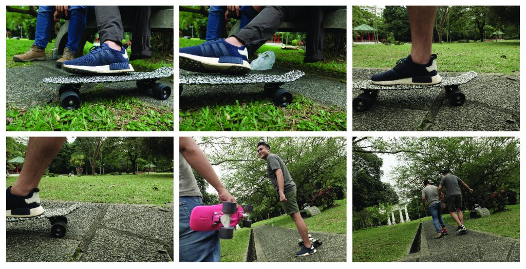
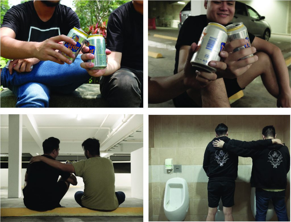
For assignment 2, we were tasked to come up with a set of still images and also the use of sound to shape the whole storyline. We will have to create a fiction story for the long lost friend whom we lost contact with.
SYNOPSIS
J and Nik were the best skating buddies. Never have they left each other’s sight since then. No one would have expect something bad will happen to them or others because people are always being taken for granted.
PLOT
J later found out that he had to have one of his legs to be amputated due to diabetes. He did not want to disappoint his skating buddy as he could not skate with him anymore. He held the results on hand, given up on life walking across the road and got to an accident. After long recovery they met up and talk about their happy memories which really helps to pull J back up from where he had fallen.
REFERENCES/INSPIRATIONS
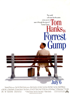
The storyline is closely influenced by Forrest Gump, whereby the characters sat on a bench and talks about their past. I also took inspirations from the Oldboy’s flashback scene for my flashback scenes. To make the transition from the present to the past as smooth as possible.
VISUALS
Present – Past – Present
In order to separate the present and the past, I desaturated slightly for all the flashbacks but still keeping the vibrance-ness as the flashbacks are more of a happy moments rather than sad moments. The flashbacks were happy moments the both of them spent together during the past.
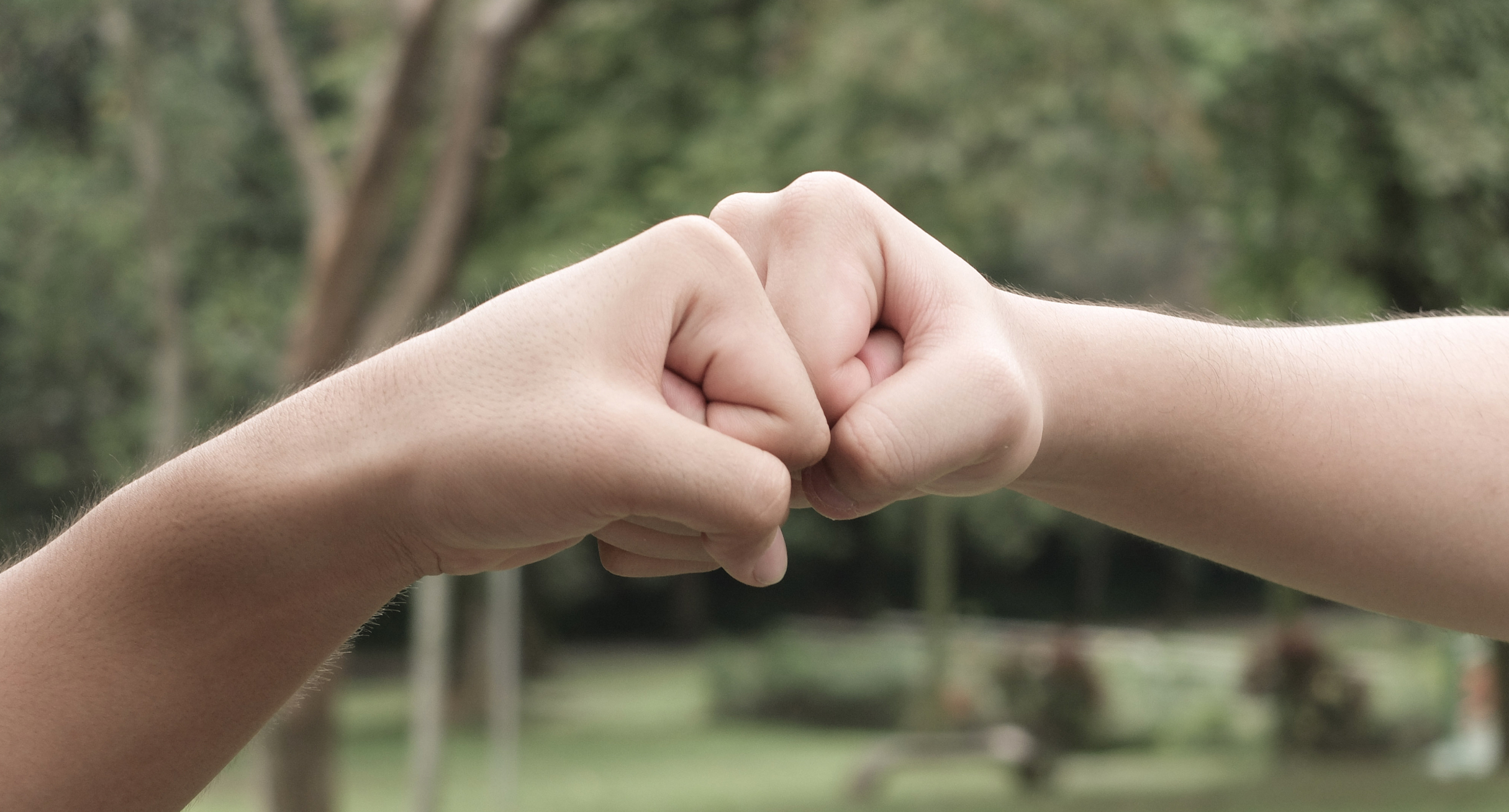
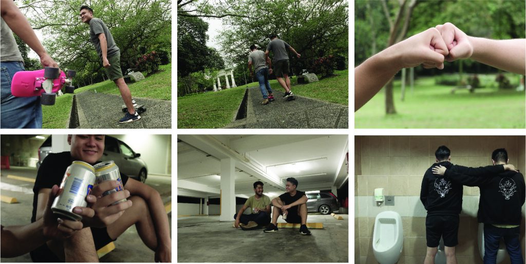
To show how close the relationship between the both them, we had shots like them happily skating together, bro-fist, late night talks in the carpark with drinks and breaking the bro-code in the toilet.
The transition from the present to the past
I matched the similar shots from present to past to have a smoother transition between the two timelines.
I have decided to show the accident scene in the front to captivate the audiences’ attention. To make them think about what really happened before and after.
Reflection
This is rather my first time touching on video editing software even though it’s just iMovie. At the start, I was struggling at finding the suitable music for the right settings. I was trying not to be so literal and direct. It really helped me to visualise deeper and knowing the importance of a good composition as well.
We designers are treated unfairly nowadays whereas our skillsets/ideas. So I kinda tie this idea back to the real design industry out there. The idea of using money birds is to portray that our creative ideas/ concepts are really valuable to us.
My 1st draft for this composition. I did not want to smack the person right in the middle. I placed the pliers coming in diagonally to create the leading eye towards the cage. I also played with the proportion of the pliers to create the surreal effect. During the consultation, was told the background was a bit too plain and to create more textures at the background to create more depth.
Final composition. I added the whimsical clouds at the back to add more depth also to increase the surrealism effect.
Madness, as you know is like gravity. All it takes is a little push.
You will never know what will happen until you push that person to their limits. Some of the keywords I extracted out from this quote would be madness, gravity and push. Pushing someone down into the deep ocean is like pushing someone to the very corner. I tie madness with the inner demons inside all of us , its only time that they would come out and play.
When people first think of gravity, they would image this kind of situation. So I kinda make the composition more interesting by inverting it instead.
It makes the whole composition more interesting and would make the viewers think of why the gravity looks like that instead of looking like the normal.
I’m not a monster, I’m just ahead of the curve.
Roller coaster came to my mind when I think of the curve. I perceive monster as the obstacles in life and therefore the curve would be something even massive to overcome it. When drafting on my first composition, I really had a hard time thinking of what creature that is as curvy as the roller coaster.
Second draft, I finally thought of octopus being the obstacles. I fuse the octopus into the roller coaster tracks, turning them into the tracks rather than them standing alone without connecting with the roller coaster. The background now seems to plain and making the the elements out of focus. So I have added a starry night background to make roller coaster and the octopus pop out.
Final composition.
I believe, whatever doesn’t kill you, simply makes you stranger.
Being the strongest, powerful man in the empire, many would want you dead. Or even Arrows piercing through one of the king’s face is not something that will happen in a normal situation. To make the whole composition more interesting and weirder, birds and butterflies protruding halfway out of the arrows, this suggests the different strange encounters/events happening around. All the arrows coming out from the back at an angle kind of portrays the backstabbers in life.
Silkscreen Experiment!
This might be the most tedious part but also all the fun comes out from here! I previously did silkscreen during my poly days but that’s like years back. So I’m kinda excited for how my design would turn out.
After coating our screens with emulsion, its time for exposing our design on the screen. I was being skeptical as my design has many tiny details which I’m afraid it won’t be able to expose nicely.
18 seconds of truth. It’s either death or happiness.
It’s always good to have happy friends waiting along
It’s time to see if my design turns out well enough! Fingers crossed!
First and second tries on paper. Too much ink went into the screen, resulting in just black. Third time’s the charm right?
And indeed it came out as a charm, I was quite happy for my third try!! Now’s the time to know my real destiny… silkscreening on the tote bag. 2 sides 2 tries.
Its always good to have a pair of hands pressing down the screen tight making sure no excess ink will slip through.
On paper, my design came out perfectly fine due to the finer pores on the paper. But on a tote bag, the pores are larger therefore its harder to capture the finest details from my design and resulting almost a pitch black design on the tote bag. The take away from this assignment is that, I have learnt to expect the unexpected. Nothing will always go the way we want things to be. What looks good on screen doesn’t mean it will turn out exactly on screen. Photoshop skills indeed freshen up.
Money birds – portrayed as our creative ideas, concepts
Pliers – portrayed as hell clients
Design principles:
Hierarchy, Contrast
For this composition, I’ve tied down the link between the life of a designer now. Having ridiculous clients trying to squeeze us designers dry they anything or everything. The cage being our minds, caging our precious creative ideas, concepts. Creative ideas, concepts are usually perceived as money therefore I interpreted them as money birds. The pliers coming down towards the cage, trying to pry open the cage and set free the money birds suggest the hell clients trying to get our ideas, concepts at a very low price or even free. They often call that exposure/experience. Therefore if you’re good at something never do it for free.
Elements:
Deep ocean creatures – portrayed as the demon inside us
Humans – portrayed as one person’s feelings/limits
Dark ocean background – portrayed as the level of a person’s limits can go
Design principles:
Hierarchy, Contrast
You will never know what is your limit until someone pushed you to very corner. For this composition I played around with the definition of gravity by inverting the composition as most of the people would not think of defying gravity when gravity first comes into their mind. The human floating towards the ocean creatures portraying the effects of pushing someone to their limits, releasing the inner demons within them.
Elements:
King of Arthur – portrayed as strongest man in the empire
Arrows – portrayed as killer weapon
Birds and butterflies – portrayed as strange encounters
Design principles:
Contrast, Rhythm, Emphasis
Being the strongest, powerful man in the empire, many would want you dead. Or even Arrows piercing through one of the king’s face is not something that will happen in a normal situation. To make the whole composition more interesting and weirder, birds and butterflies protruding halfway out of the arrows, this suggests the different strange encounters/events happening around. All the arrows coming out from the back at an angle kind of portrays the backstabbers in life.
Elements:
Roller coaster – portrayed as the curve
Octopus – portrayed as the monster/obstacles in life/inner demon
Starry night & island – portrayed as the support/distraction
Design principles:
Proportion, Movement
The first thing came into my mind when I first thought of curve was the roller coaster tracks. I fused the octopus into the tracks making them the tracks instead of a normal roller coaster ones is to portray them as the obstacles in life. Also to show the battle against our inner demons. Therefore the roller coaster train is running directly over the octopus is to show the success of fighting against the obstacles. The two islands in front portray either as the support or distraction in life.


 Basically me as a snail, slow and always procrastinating. Deadlines and submissions all piled up on the calendar, hence being a snail transformed into a fast moving shell rushing for all the deadlines and submission.