Author: Yuolmae
Eat-Art-Sleep-Repeat
YUDORI – Post-colonial feminist artist
Yudori is an illustrator and comic artist whose uniqueness comes in her strong narrative voice and her post-modern perspective.

She is flippantly contradictory; rude for conservative taste and rebelling against feminist progressive narratives. Her works redefines the female identity, subjugating, dissecting and reincarnating it. In the age of political correctness, her transgressive tone makes her a controversial independent artist. Her resilience to stick loudly by her values and not sell out is a great source of inspiration.
Post modern feminist discourse
Her works are post-modern, criticizing and subverting existing trends within regressive leftism. She uses humor to retaliate against the leftist wave of feminist empowerment, breaking the dichotomous structure of the modern discourse of womanhood. Her art jokes at regressive empowerment standards and thoroughly embraces the multifaceted expression of womanhood and femininity.

I want to be a Princess, Instagram @yudori, 2020
Post Colonial Rebellion
Her works free the Asian body from western gender discourse, free from western feminism and free from the western gaze.

You Melt Me, Web series, 2019
Her works bear resemblance to Marji Satrapi’s Persepolis, where both artists engage a critical perspective in evaluating and unfolding the cultural differences between east and west in perspectives and in relationships. Yudori’s works convey a world many Westerners have only experienced from a Western perceptive. She sensitively and truthfully illustrates her Asian perspective and development, breaking down established gender and cultural roles in her stories, redesigning the Asian identity in the western sphere of understanding.
As an independent artist, Yudori has shared experiences of repeated failures and countless rejections due to her strong voice. Yet her fiery perseverance to not “sell out” is the reason for her large following and global success. From requesting for Ko-fi donations for webtoons to success in Europe’s , her journey of staying true to artistic ideals is something which deeply inspires me.
Assignment 1b

Final project- Antsy: Concept and reflection
When I started this concept, my main gripe was with the lack of diversity and openness in menswear fashion.
Women have inclusive fashion. But portrayals of men have not changed much. Why can’t men be free to explore and be themselves?
Men use clothes to fit into their societal stereotype and perform heteronormativity. In the society of performative gender, clothes are of dual purpose, to build up our outer shell of appearing to be masculine, and to possess the traits of coolness and strength, and to hide our true selves, masking whatever detracts from our performance, erasing whatever society deems as “inadequate”. This creates a lot of stress as e continue building up our shell but become more resignedly hollow within, as we do not nuture and let our true selves out.
Can’t we embrace ourselves?
Thus for this project, I want to design a menswear fashion show. The unique twist is that instead of men, they are human-noids with insect heads and other insect parts. But all in all they’re standing upright like humans. The insect i have chosen is the ant, to represent feeling of “antsy-ness”, of being anxious and ill at ease with oneself. Reflecting how we feel unease with our true selves when we all try to use clothing to cover our true disfigurement and using clothes to create status, in this societal and gendered performance.
Such concepts are not easy to bring up through packaging alone, thus Lisa suggested that I create a zine. The constant motif is lines in the zebra crossing. These lines dictate the societal order and structure that we conform to. In the sea of black and whit monotonous conformity, the persona walking through wonders if they can truly embrace their own self and fit in.
Because i cannot actually choreograph a fashion show, I intend to create a few collaterals for marketing purposes; a zine to introduce the concept of the show, cards, posters, billboard advertisements, digital wallpapers and mail-in calendars.
Antsy: zine gallery


Antsy Zine process
During the journey of creating the zine, I gained inspiration from the aesthetic qualities of a handmade zine. The color and quality of risograph printing and screen tones seemed to be a striking aesthetic distinctly juxtaposed against the glossy images pushed out by the fashion magazine- perfect for my anti-conforming message.
I chose the screen-tone style and used “color halftone” in photoshop to create the pixelated texture. It was very suitable in creating texture and depth to my insect humanoids. Furthermore, the dotted pattern was directly contrasting with my linear motifs, creating visual interest.

Here are some drafts i created to show my persona interacting with clothes. At first I wanted to create a very anthromorphic character, taking reference from animated films like “antz” and “bugs life”. However, I could not manage to get the expressiveness which i wanted. Thus i settled on creating a humanoid with feelers, glasses and insect limbs.  I tried to create words through shadows but it proved to be too distracting and not as concise

Thus i decided to simplify it and just have people walking on the zebra crossing. Each person has a different identity and performs a different but accepted form of masculinity. Our main persona looks on and is caught like a deer in the headlights, unsure of what he should be
Break out – Mockups

 Besides a zine, I decided to create an array of products as collateral for publicizing my fashion show. I created cards and calendar pads, a poster and digital wallpaper. I also created an a1 poster to publicize the main event.
Rejects:

I created this but i do feel its not as good. It overall looks very confusing as the colours clash and fight for attention
Varoom cover


Self portrait Process to final
In this project, we were encouraged to break down parts and characteristics of ourselves and compose them in a self portrait.
After discussing with Lisa, we settled on a concept which focuses on nature and “breaking out”. One of the core concepts is using plants to break out of the existing surface, like how weeds grow through pavements, cracking the tarmac. It is used to symbolize growth, to break through boundaries and restrictions of the physical shell and transcend, growing far and free. I wanted my self portrait to reflect my struggles, and also reflect my will to move on and continue to flourish and thrive despite all that.
I also wanted to include hands, not just because they are a subject that is immensely interesting to study for me, but because their imagery also brings across meanings of flourishing, growth and creation.


So, originally, I proceeded with a terracotta and skin tone palette, rendering the hands with realism and the rest of the body in abstract 2d graphic style. I hoped that through the delicate realism of the hands, I can bring out my meaning of wanting to grow as a person and “break through” flat the wall of the 2d, and create depth and dimension. The graphic styles of plants were also meant to add another layer of “growth” and dimension.

However, after feedback, i was told that the green plants were very jarring and did not fuse well with the rest of the painting. It was narrowed down to two reasons: 1- the color was too contrasting and bright, 2, the flat style of the plant did not fuse well with the dimensional realism of the hand. Also, if creating dimensional realism of the hand is used to evoke “growth” out of the 2d boundary, then placing a 2d plant above the hands seems like a contradiction of my desire to bring out growth through dimensionality.

Halfway through the painting, I decided that I also wanted to include another element, a dog. Look_its_Leia is a dog who was rescued from a birthing center and is now an advocate for animal rights and just treatment. Just last year, she was involved in a local charity event “Tux for Tails” to raise awareness and funds for animal welfare. I wanted to add the dog in, as i felt that the charitable community cause is something i strongly for, and also because the dog’s tale is a story of great tenacity.
However, After creating the dog, I realised that it couldn’t fuse with anywhere in the painting, so i gave up.
I also felt that the color palette didn’t really suit the current state I was in with my life, and the self-portrait did not accurately depict how I felt in this stage. I came across this image online and found that it really resonated with me through the use of chiaroscuro and muted colours. The vast blackness also corresponds to how dim my external situation is right now. 
Therefore, i decided to overhaul my existing painting and re-work on it, re-colouring it till it reaches the suitable mood and tone reflective of myself.

In place of the warm terracotta, there is now an array of cool blue tones, interspersed with purple, like bruised skin. The cracks in the face represent cracks of pain and frustration, and parts of me just seem to lose direction and melt away. There are ominous blues and dark reds in the background, creating a sense of unease, depicting how uncertain the path ahead is.
However, in spite of all that, there is new life and plants growing through, intertwining with the shell that is flawed and broken, depicting how I want to embrace the shell of life which is cruel and challenging, and find the strength to grow and carry on.
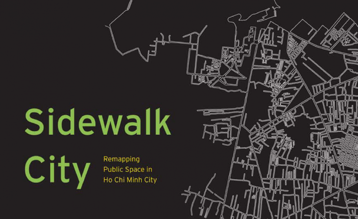
Reading Response: Sidewalk City
Is how space designed, layout and construed simply a work on paper or is it more?
We delve into the article exploring how legislation and human activities affect how a city system is structure.
The author interestingly brings in her postmodern perspective, deconstructing the original intent of city planning as just a mere means of creating an efficient overall structure, and introduces the concept that “urban design has responsibility to ethnography”.
And from there we learn how to marge these two diverging paradigms into a harmonious design system, where human nature and instinct coincide and live abiding the rules.
An interesting dilemma brought up is how design, being mainly placed in the hands of the elite, is couched in deep-seated political inequality, due to ignorance or indifference, further marginalizing the poor, lower income groups who make a living on the public space, by taking that space away from them. The opposing idea is one of designing with social justice in mind, to create alternative space typologies that cater to every person.
However, designers have argued that advocacy planning; keeping in mind of social concerns, have often resulted in uninspiring designs and this causes designers to lose their core focus.
The reading also presents how “lab-based”, idealistic designs wouldn’t work well in the real world, for the real world is fraught with social issues and needs that need to be addressed in design.
“Intelligent design solutions require a deeper understanding of the design problem.” The writer makes a salient point by introducing how city states are an immigration hub, and design should transform itself from being native and local, to being international and cosmopolitan, to be able to suit a “heterogeneous public”.
But then so, how do we combine spatial analysis of serving the “heterogeneous public” and preserving “ethnography” and the essence of what makes the country’s sidewalks what it is?
The explanation of the solution is definitely easier than its execution. To build a spatial ethnography of the sidewalk, and integrate social relations and physical space, we need to use visual research methods, and also reconsider and restructure sidewalk paradigms.
This gets me thinking:
In Singapore, much of our history is erased or poorly taught and documented. This has allowed our infrastructure and sidewalks to be built representing an era post-historical baggage. This system, while efficient, does nothing to preserve whatever distinct cultural roots or local flavor that our nation has sorely lacked, and continues to come up empty with.
To preserve our waning culture, and to promote the growth of new ones, should we forgo Singapore’s deep-rooted virtues of efficacy and do some restructuring of the public space? Or should we continue on progressing towards greater modernity and not attempt to construct some space of belonging for our historical past?