We laugh, we cry, we live, we die.
What we exhibit are only performances of our internal existence.
With the tilt of the chin, the tensing of muscles, the arrangement of ligaments, we etch out a performance to leave an emotional mark on the world. Our exhibited emotions are ingenuine and fickle; controlled mainly by imbalances in hormones. They are essentially performances of chemicals, revealing only a side of themselves to the public, masking most and experienced only by the individual.
Even as we sonder, we cannot truly understand others’ emotions. Internal focalisation only causes our perceptions to eclipse and pass by. Even as we attempt to understand their emotions by stepping into their shoes, we undoubtedly fail, for our perceptions are shrouded and moulded by our personal experiences of performing that emotion.
Just as onlookers cannot fully understand the innate quality of emotions from the surface, viewers would not be able to comprehend the meaning of emotional lines on aesthetic face value alone.
This became the main challenge for me, and thus I devised a scientific method to portray the growing and weaning journey of emotions. Each chemical and step in creation relates back to the main emotion. I aim to let viewers feel the process of emotions, allowing them to be able to relate and understand the artwork at a deeper level.

Relief is essentially a transient moment of happiness, joy and bursts of euphoria. The hormone Serotonin increases, dispelling dark cloud in our moods, enveloping our minds and giving us a more refreshed state. It is happiness in a moment of time, separated from the turnings of the world.
This piece was inspired by my meditative musings in the shower. Personally I love to stand under a warm shower head, feeling the pressure crash on me like the waterfall on a stone, pounding, molding, melting me. In the water I am cleansed and revived. Looking down only seeing grey tones floors and hearing the sound of water reverb back in the closed space, the shower is my quiet piece of solace and sanctuary in my busy life. As I shed the dirt, grime and tiredness off my body, I look down and see concentric circles on the bathroom tiles. white reflections on grey— outer circles for when the water hits off my body, small center dot for water splashing onto the floor.

Chemical used:“masking fluid”
First applied to the paper, a wash of colour is painted over, just like a literal wash in the shower. Peeling away the fluid was alike peel away the dirt and grime, and peeling away the outer skin to reveal a new self. I also used tissue to create the lighter layer of texture above, creating a clean new self. The method of “removing the bad elements” channels how the effect of serotonin is to reduce and eliminate negativity like depression, making way for rejuvenation and happiness.


The gradient from left to right signifies the cleansing process. Using multiple layering techniques to increase the intensity of black areas on the left, I’ve created a dark and cramped atmosphere. Viewers may feel slightly unclean or uneasy in the void of darkness.
Following the instinctual way of reading left to right, viewers will be presented with an increasing amount of negative space. This creates a sense of clean airiness, balancing the cramped and messy black gradient in the left side of the line. This creates a more comfortable space to look at, providing relief to the eyes.
The circles envelop in a very full and wholesome way, creating a calming soothing rhythm, capturing the rhythmic pattern of cleansing and rejuvenation. They also harmonise both elements of light and dark, making a seamless transition of colours in the line.

Obsession in love, is the relentless clinging on to someone. Obsessors are often misunderstood and judged, labelled to be mindless, psychopathic and selfish, wanting to claim ownership regardless of other’s wishes. However, obsessors actually have multi-layered thought processes, and do face ethical and moral dilemmas in their choice. To label them as only having a one-track mind, mindlessly chasing after one goal is simplistic and reductionist, as it wholly ignores the emotional conflicts they undergo. Such is the dual nature of love. In the happiness that the obsessors wish to attain, they are also bombarded with a vast array of pain, internally and externally.
The first seed of attraction sprouts, following the natural progression of life. Some are hooked on the kick of dopamine in the initial stages of attraction, latching on to the sensation, wanting to continually feed on it. Like a drug, the sweetness of love that courses and saturates their veins disillusions and poisons them, making them prone to sugar-high hallucinations of obsessive fantasy.
The lover falls deeper and deeper into clamorous obsession, persisting despite resistance. Reflecting on the pain of rejection, they start to question their self worth and motives, falling in a frenzy where they try their best to justify their actions. They believe that they are rejected due to their personal faults, and seeks to work harder and attain the other’s affections in an attempt to prove their own worthiness of love. However, they also realise that there is an innate issue with themselves, and seek to get out of the cyclical hole they have dug for themselves. The pain and confliction of beliefs shrouds them in clouds of confusion.

Chemicals used: C12H22O11- “processed sugar”, “oxygen absorber”

I concocted the paint using oxygen absorber, sugar and Chinese ink. The granules saturated the ink, giving it a shiny reflective glimmer that may still be visible. It also gives off a sweet smell. This evokes how obsessive relationships look enticing and wholesome on the surface, but are actually incredibly unhealthy.
Processed sugar increases endorphins and dopamine that can boost mood and provide a temporary chemical “high”, reflecting how the sweet initial stages of love provides bliss to the obsessor. Oxygen absorber, used to keep baked goods fresh, reflects an attempt to keep the relationship fresh. However, this chokes the life out of the relationship slowly.

Paint was applied at certain points on the paper and allowed to drip down, following the flow of gravity going deeper and deeper and deeper. This shows the natural progression of love. However, the paint starts to branch out and does not stay in a neat line. The branches look like an unnatural progression of growth, like angiogenesis, which are blood vessels reaching out to growing tumors.

Like blood vessels they keep reaching further down, continually yearning for deeper levels of attraction, fuelling the growth of an unhealthy union.
This yearning increases exponentially from left right, depicting the obsessor’s growing affection. Thus, at certain points, the relationship stops becoming wholesome and becomes shrouded and ominous. From the perspective of the obsessed, their continual effort to reach out is painful. They seek to heal the pain of not being able to let go.


I used a syringe containing a concoction of traditional healing oil and ink and splashed it from the opposite direction, in an attempt to stop the growth. The choice of traditional healing oil evokes how the obsessed is blinded and disillusioned from the truth. The concoction of paint and oil is immiscible, creating unique patterns on the paper.

The inability to mix paint, which represents love, and oil, which represents treatment, forces the viewer to look deeper into the ethical dilemmas of obsessions, and try to empathise with the obsessors.

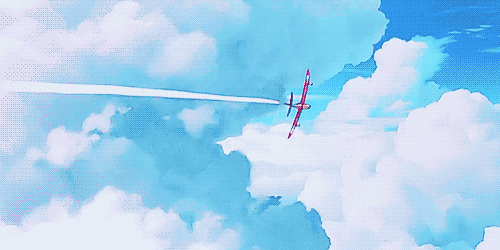
Surprise is a great wave surging, crashing over you unexpectedly and drenching you with inexplicable emotions. The strongest surprise comes from an unexpected moment of relief. Like how fighter planes emerge from the turbulent winds or like how the moon rises and glows, we are faced with the sudden reassurance that hope is ever present, bringing us out of our darkest periods. In that moment, so many smaller fragmented emotions rip through our body, while we stand fixed in the moment, taking time to slowly comprehend.
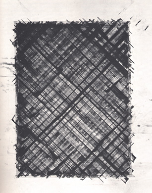
To exhibit the unpredictability of emotion, I attempted creating spontaneous artwork using methods of impasto and splatter painting. This creates an effect which is unplanned, deconstructed and abstract.
Looking at my peers who seem to be approaching their work methodically with a clear mind, I felt very insecure and self conscious. Feelings of anxiety, frustration and anger directed at the self caused me to try the impasto method for these two pieces, creating a rhythmic piece reflecting my mental state.
Using a paint knife, i splattered black ink all over the paper, also squeezing white paint from the bottle directly on a piece of newsprint. I then placed another piece of newsprint over the original, and sent it over the roller. This method did not allow me to have any handle or control on the final effect. As the globs of paint are pressed under the roller, I cannot see what is happening between the papers, leaving me in a state of confusion and being lost.

Peeling apart the two papers, this created two pieces, one a multilayered black piece, showcasing my tumultuous emotions welling up in me, taking on threatening forms of various sizes. However, the first piece was messy and did not convey surprise cleanly. However, the transfer paper, which was not intended as the final work accurately captures the wave-like surge of emotion that was coursing through me unexpectedly.
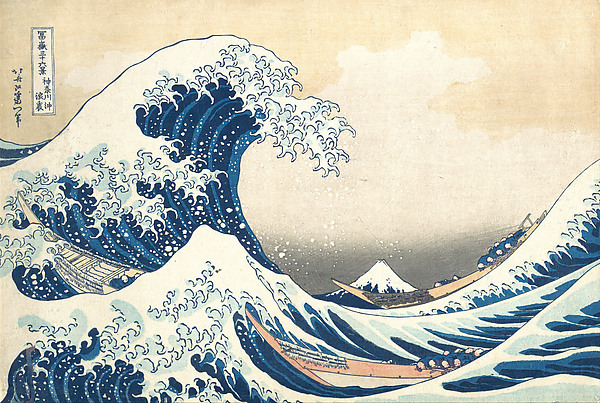
The transferred piece was evocative of the “Great Wave off Kanagawa”, and I sought to mimic it through my attempt of doing a golden ratio presentation in my final framing.
Just as how Hokusai juxtaposes the huge surge of waves against how tiny man is in comparison to the forces of nature, I wanted to show how puny my own control was compared to the forces of nature, which created a better artwork than I could ever do.
The awe in seeing the forces of nature puts viewers at ease, as it gives them a better sense of perspective. Placing their personal problems against the backdrop of the universe and its mysterious, incomprehensible workings, our personal troubles seem to fade away.

Anger Furore is the epitome of anger, built up by increasing stress, tension and frustration till the point of explosion. When stress builds up, blood pressure increases.

Chemicals used: NaCl- “Saline solution”, C4H10- “Lighter fluid”, C7H4O- “Charcoal”

First, I splashed NaCl, saline solution violently on the paper. Saline solution is equivalent to what our tears are made out of, creating the first bottommost layer of anger, which is sadness. It also brings up the allegory of rubbing salt on one’s wounds, depicting how one is slowly inflamed to rage in fury.

I used fumage smoking in the left corner and fading out at the right where most of the tears will congregate
On top of the wet areas, I also sprinkled salt, increasing testosterone, increasing aggressiveness. Salt also increases blood pressure, stimulating the contracting and relaxing muscles, evoking how we tense up in anger and clench our muscles.

I aggressively punched black splatters onto the paper. Each step works in tandem to show the exponential increase of anger to the burning point.
I peppered more salt over the wet areas. In our bodies, salt detoxes and flushes out toxins, like catharsis. We relieve ourselves of negative emotions by bursting out. Besides how salt detoxes and disinfects us internally, it’ll inflame the surrounding area, when flushing out. This draws parallels to just how angry outbursts hurt those around us.
Finally I used charcoal to shade and give the line a charred look. It is angled to portray forest fires, all consuming and self immolating.
The left is more concentrated in darkness, while the right is faded and sparse. This demonstrates how our anger consumes us from within, tiring us out. This is a great transition leading into Sadness.

Sadness After the outburst, I am awash left only with the feelings of tiredness, guilt, regret and all submerging sadness. It washes me over and consumes my entirety, but in a different way. I pretend not to be too affected by it, becoming tired after my outburst. To the world, I dilute it, keeping it hidden behind a veil. I bottle up the sadness but, but it drips, it drips down and threatens to overflow the bottle, submerging me. The guilt kills me and I explode once again.

Chemicals used: NaClO- “bleach”, NaCl- “Saline solution”, “Table salt”
Using the method of multiple exposures, I aim to create a piece which looks subtle and filtered, but slowly growing in intensity. I first painted a large amount of bleach and paint on a lino block. I allowed it to soak into the newsprint and sent it under the roller. I placed another piece of paper above the initial printing paper. As newsprint paper is not extremely absorbent, unlike watercolour paper, the inks bleed easily into the second piece above it. I re-did these steps a few times. The first piece was too dark, only showing black and white patches, without any detail. Subsequent pieces are more watered down and the colours seemed to be filtered.
I stuck all the pieces of paper together. The globs of paint melded together into a layered pancake, forming ridges in the paper which i made into creases, evocative of tissues we use to wipe away our sad tears. I inverted the final piece and framed it, to enhance the effect of looking at sadness trough a veil.
Finally, I splatted some black ink on the displayed side. This is the only application of colour that we see directly, without being filtered. This stands out starkly from the filtered colours and creates the point of interest at the right of the line. This creates an entire atmosphere of sadness increasing incrementally till the point of overflowing.

Fear is one of the most visceral existential emotions that cements our existence. In this wild and ever-changing world, we constantly look for answers and a way to belong in the world, to allay fears of the vast unknown. Social structures like community and sense of belonging are human constructs that help us to deal with our existence. It helps us understand ourselves and our role in the world. Once we loose our sense of belonging, the existential fears start to creep in, inundating us and paralysing us, as we fail to search for our personal purpose and meanings.
“I’ve been to ten high schools, they start to get blurry. No point planting roots’ cause you’re gone in a hurry”. From the perspective of a teen who has always been on the road, travelling internationally, a sense of belonging is not afforded. Our personal experiences make up our personal identity. Fractured and disjointed experiences will cause a fragmented sense of self identity, unable to find a community to belong in. Personal fears about never being able to fit in with the populace are heightened, becoming the ever present existential worry of being not a part of the entire society or the world.

Chemicals used: “India ink”. NaClO “bleach”. “Chinese ink”. “Acrylic ink”
Each ink belongs from a originated part of the world, evoking how the individual’s memories and sense of identity is made up of wholly different experiences. Fragmented international inks poured on a large surface are melded together with bleach, causing the colours to bend together, washing out memories scattered about.
Using the roller, i created patterns and imprints on the reverse side of the paper in broad, frantic strokes, as if running and hurriedly seeking for something- the sense of personal belonging, This created patterns like an inferno, like a chasm of fire. Certain curvatures created the side of the volcano, evoking how the fear is imminent within us, waiting to fully implode. Meanwhile, the fear is still rumbling, all encompassing and surrounding our core.


Reflection
Abstract art is a style that I’ve honestly never encountered or experienced. As someone who roots her beliefs firmly in Egalitarian Art, my belief that art should convey a message and be understood, created my innate sense of bias against the realm of Abstractionism. I had the notion that even children could do abstract art, and abstract art just exists as garish, lazy pieces over-celebrated due to the proficient “bullshit” writeup.
I mean, with overhyped examples like this, I do have a valid point.
“A blackboard covered in white scribbles by the American abstract artist Cy Twombly has fetched a record $70.5 million (£47 million) at auction at Sotheby’s last night”
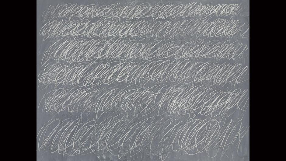
Cy Twombly- “Blackboard covered with White Scribbles”
I was so quite very wrong. Distinctly wrong about my prejudices that Abstractionism was just a lazy, easy way out unfettered by planning or the elements of design. This sudden deep dive into the murky depths made me fear, frustration and much insecurity.
Growing and learning from my attempts in experimenting, I’ve learnt to use experiment in specific mediums directly in relations to y main theme. Ive grown out of my shell of using only easily accessible materials.
Instead of having not much idea and control over the construction of abstract pieces, I am now more conceptually aware and able to approach my projects with a clear methodology and aim in mind.