You can check out part 1 here: https://oss.adm.ntu.edu.sg/yuol0001/toa-payoh-site-research/
Part 1.2 Ideation: https://oss.adm.ntu.edu.sg/yuol0001/toa-payoh-ideation/
Part 2 Process: https://oss.adm.ntu.edu.sg/yuol0001/398-2/
Big mistake…
I realized a little too late that zine were not to be a sensory experience. Mimi and classmates noted that the purposeful touches made it look unkempt, shabby and unprofessional, altogether ruining the effect of the zine.
I have learnt the important lesson that zine are supposed to be only a visual experience and that intentional marks shouldn’t be physical, but should be incorporated into the 2d design.
i guess my bold experimentation wasn’t satisfactory…but it was worth a shot!
Throughout this journey I’ve been struggling quite a bit to balance graphic illustration style and my personal illustrative style. As usually I’ve been looking to experimenting and making the gamble was quite a risk!
I am really grateful for all the comments I’ve received and i am looking forward to improving my work!
Positive comments!
Constant flow
Good colour choices- people love the consistent theme and colour scheme
Interesting play on text( linking 1st and second page)
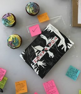
Nice to put map to visualise location- good travel journal idea- creates good storylike feel- cool timeline format
Love the pop up texture of cover and graphics
Easy to read font which fits zine design
Whimsical, nice print
Warm tone of paper fits well
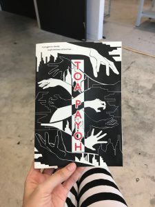
Narrative suits visuals, nice to follow- conveys working of tpy against test of time-balance between modern and 80s can be shown clearly
Consistent style- nice illustrative and graphic style
meh…?
can see flow of graphics (sort of)
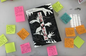
Stuff to improve on
- UGLY WASHING MACHINE (WHO AR I TOTALLY FEEL THE SAME LAH HELP ME CHANGE THANKS)
2. Work on craftsmanship- improve on binding- aligning a little off. Improve gluing- uneven page- destroy feel of zine
3. There were also a lot of comments on paper
-Creating the paper texture made it seem excessively messy.
Can see through second page- distracting
4. Text and graphics
-Should change zine to highlight important parts, because bolding text was not so obvious
-Text and graphics too cramped – too many words- shouldmake graphics speak more
-better spacing or less texts- distracts attention from graphics
Personal feedback…
I felt that i did not fully agree with how my friends commented that there were too much text.
Upon asking my friends from other schools, they felt that the inclusion of the text and story really helped them to understand the zine and intent better, as compared to a version i showed them which consisted of minimal text.
I felt as my zine was attempting to communicate some dense ideas, removing the texts and letting the graphics speak for themselves really removes the edge behind my message and leaves it open to misinterpretation.
However, I do agree that there should be better spacing, because it does look a little cramped, especially for the last spread.
If i had a choice, I would keep the text as it is but print on a large paper such that the pages will not be as cramped.
Interesting add on:
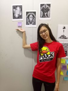
Hohoho I made the effort to dress like my zine and blended in with the rest of adm with my ashy 50 shades of grey face. But effort to me whoop!
pls gimme more presentation point XP
(pls this is a great improvement from last sem’s 2 d presentation where I dressed in the obnoxious B-duck shirt and almost fainted during presentation.)