When I started this concept, my main gripe was with the lack of diversity and openness in menswear fashion.
Women have inclusive fashion. But portrayals of men have not changed much. Why can’t men be free to explore and be themselves?
Men use clothes to fit into their societal stereotype and perform heteronormativity. In the society of performative gender, clothes are of dual purpose, to build up our outer shell of appearing to be masculine, and to possess the traits of coolness and strength, and to hide our true selves, masking whatever detracts from our performance, erasing whatever society deems as “inadequate”. This creates a lot of stress as e continue building up our shell but become more resignedly hollow within, as we do not nuture and let our true selves out.
Can’t we embrace ourselves?
Thus for this project, I want to design a menswear fashion show. The unique twist is that instead of men, they are human-noids with insect heads and other insect parts. But all in all they’re standing upright like humans. The insect i have chosen is the ant, to represent feeling of “antsy-ness”, of being anxious and ill at ease with oneself. Reflecting how we feel unease with our true selves when we all try to use clothing to cover our true disfigurement and using clothes to create status, in this societal and gendered performance.
Such concepts are not easy to bring up through packaging alone, thus Lisa suggested that I create a zine. The constant motif is lines in the zebra crossing. These lines dictate the societal order and structure that we conform to. In the sea of black and whit monotonous conformity, the persona walking through wonders if they can truly embrace their own self and fit in.
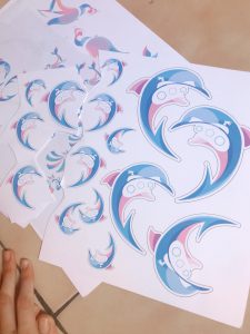
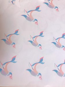
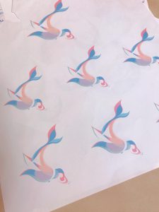
Because i cannot actually choreograph a fashion show, I intend to create a few collaterals for marketing purposes; a zine to introduce the concept of the show, cards, posters, billboard advertisements, digital wallpapers and mail-in calendars.
I think OSS may have accidentally deleted my trump snake writeup so I’m redoing this.
My plan was to create the conventional snake game, but this time replacing the snake with a walking animation of trump. When trump eats “food”- money, he will grow longer as his tail will extend.
i used a sprite sheet that i found via google to create the basic trump walking animation. This sprite sheet worked well because it was multi-directional instead of only being able to move left and right, allowing for four different directions for our trump snake to move in.
At first i used array list to make the snake game. With every snake head movement- ie it moves one step in one direction, i tried top code the erasure of one unit of the tail.
However, this resulted in an uneven erasure of the tail, where there were some afterimages of the snake left even after erasure.
Thus i decided to use the class method of creating the snake game
using this method, the game run a lot smoothly and the issue of adding tail was rectified.
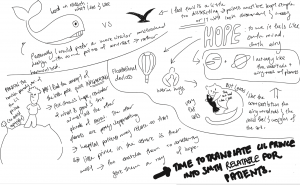
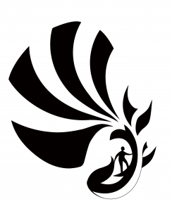
Because this project requires the use of gestalt to fuse two images together, with clear distinction of figure and ground, i started to research into easily recognizable images with clearly defined shapes.
At the same time i started to make mind maps connecting different concepts in which i thought would best represent hope. Below you can see that there are many different concepts, focusing in flight, water, and space.
Originally, i started off with the idea of little prince, using space motifs like planets to represent hopes and aspirations of the patients. However, that design idea was scrapped because the circular shapes of the planets were too circular, lacking in contrast and an interesting silhouette.
I began to do more research, developing a design that made use of curves and at the same time retained contrasting angles. The concept of contrast, both in the design sense, and the conceptual sense, intrigued me. I felt that through utilizing contrast, I could create a design that truly resonates with the patients– for the patients live a life of constant juxtaposition of illness and health.
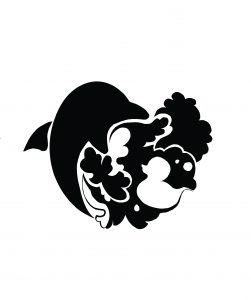
In the end, I ended up choosing the concept of Water, expounding on it and creating a contrasting dichotomy between two opposing forces- Man and Nature. I used the water motif to represent the harsh forces of nature, how insurmountable and challenging it seems. This reflects the reality of patients, constantly struggling over their illness. Even faced with such challenges, the patients bravely fight on, like humans who try to tame the waves.
The surfers, the submarine- navigators, and the yacht-sailors are just mere, weak humans, trying so hard to go against the currents of nature, pushing forward with their weak human bodies, against the cruel and uncaring brutal strength of nature. Even before the humans existed, and after the humans die, the waves have and will still exist, laughing at the face if the small, insignificant splashes made by human effort. But these people don’t back down, and neither do they give up, knowing the futility.
With this understanding and this layer of meaning, these imageries have close parallels to the patients’ journey and almost act as metaphors. Thus i chose these images to create my graphic form.
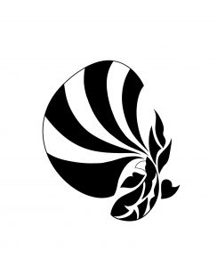
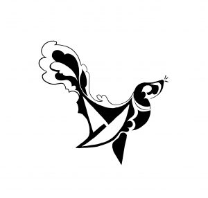
Initially, i had a very hard time coming up with graphic designs. My shapes tended to very towards the illustrative, as they were too detail oriented. After consulting with Michael, and comments from friends, I realized that the details, although adding flourish to the design, create too many focal points around the design, and confuse the viewer’s gaze.
after many trials, i finally was able to simplify my designs into clean graphical strokes. I attempted to design according to the Fibonacci spiral and golden ratio circles, creating designs with leading lines that highlight the blending of figure and ground.
The nature motif, represented by aquatic animals, makes up the positive space, and the human is the negative space, almost like the human effort is trying to chip and erode away some of nature’s power from within.
when adding color, I initially attempted to use gradiented pastels to create the soft and airy look. I wanted my colors to blend together harmoniously, to provide feelings of peace, serenity and encouragement. However, this idea was rejected became Michael explained to me the nature of logo design would be to have simple and crisp colors to save on printing cost.
Thus i looked into forming crisp sharp lines, aligning with the golden ratio, to block out colors in the positive space of my graphic form.
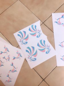
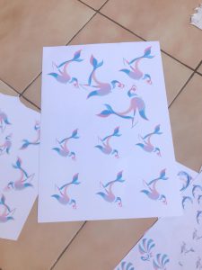
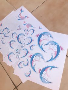
final images and a video of my mobile can be found here:
You can check out part 1 here: https://oss.adm.ntu.edu.sg/yuol0001/toa-payoh-site-research/
Part 1.2 Ideation: https://oss.adm.ntu.edu.sg/yuol0001/toa-payoh-ideation/
Part 2 Process: https://oss.adm.ntu.edu.sg/yuol0001/398-2/
Big mistake…
I realized a little too late that zine were not to be a sensory experience. Mimi and classmates noted that the purposeful touches made it look unkempt, shabby and unprofessional, altogether ruining the effect of the zine.
I have learnt the important lesson that zine are supposed to be only a visual experience and that intentional marks shouldn’t be physical, but should be incorporated into the 2d design.
i guess my bold experimentation wasn’t satisfactory…but it was worth a shot!
Throughout this journey I’ve been struggling quite a bit to balance graphic illustration style and my personal illustrative style. As usually I’ve been looking to experimenting and making the gamble was quite a risk!
I am really grateful for all the comments I’ve received and i am looking forward to improving my work!
Positive comments!
Constant flow
Good colour choices- people love the consistent theme and colour scheme
Interesting play on text( linking 1st and second page)
Nice to put map to visualise location- good travel journal idea- creates good storylike feel- cool timeline format
Love the pop up texture of cover and graphics
Easy to read font which fits zine design
Whimsical, nice print
Warm tone of paper fits well
Narrative suits visuals, nice to follow- conveys working of tpy against test of time-balance between modern and 80s can be shown clearly
Consistent style- nice illustrative and graphic style
meh…?
can see flow of graphics (sort of)
Stuff to improve on
UGLY WASHING MACHINE (WHO AR I TOTALLY FEEL THE SAME LAH HELP ME CHANGE THANKS)
2. Work on craftsmanship- improve on binding- aligning a little off. Improve gluing- uneven page- destroy feel of zine
3. There were also a lot of comments on paper
-Creating the paper texture made it seem excessively messy.
Can see through second page- distracting
4. Text and graphics
-Should change zine to highlight important parts, because bolding text was not so obvious
-Text and graphics too cramped – too many words- shouldmake graphics speak more
-better spacing or less texts- distracts attention from graphics
Personal feedback…
I felt that i did not fully agree with how my friends commented that there were too much text.
Upon asking my friends from other schools, they felt that the inclusion of the text and story really helped them to understand the zine and intent better, as compared to a version i showed them which consisted of minimal text.
I felt as my zine was attempting to communicate some dense ideas, removing the texts and letting the graphics speak for themselves really removes the edge behind my message and leaves it open to misinterpretation.
However, I do agree that there should be better spacing, because it does look a little cramped, especially for the last spread.
If i had a choice, I would keep the text as it is but print on a large paper such that the pages will not be as cramped.
Interesting add on:
Hohoho I made the effort to dress like my zine and blended in with the rest of adm with my ashy 50 shades of grey face. But effort to me whoop!
pls gimme more presentation point XP
(pls this is a great improvement from last sem’s 2 d presentation where I dressed in the obnoxious B-duck shirt and almost fainted during presentation.)
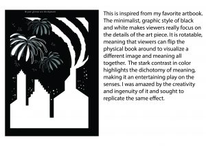
This is a continuation of part 1 of my zine journey.
You can check out part 1 here: https://oss.adm.ntu.edu.sg/yuol0001/toa-payoh-site-research/
Part 2 process: https://oss.adm.ntu.edu.sg/yuol0001/398-2/
Part 3 Final: https://oss.adm.ntu.edu.sg/yuol0001/a-journey-in-toa-payoh-final/
one unique comment i received was:
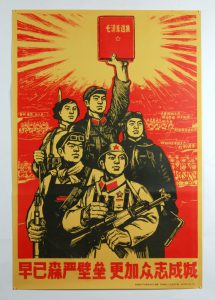
my work and style resembled chinese propaganda
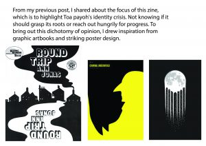
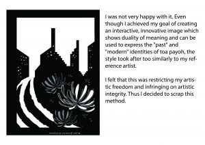
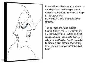
This got me thinking. Since Toa payoh was a mostly Chinese kampung, its roots were very ethnic Chinese. Many of the cultural heritages are also ethnic Chinese, most prominently the medical association, which specializes in Traditional Chinese Medicine. Thus, I came to the conclusion that the brushstroke, Chinese propaganda style is a good fit for this project.
This led me to think more about toa payoh’s personal relationship with the past. I visited Toa Payoh again and also went to heritage rich areas like Joo Chiat and Emerald hill.
All of these places have heritage signboards and avertise heritage tours.However, in comparison, Toa payoh did not have proper maintenance on the heritage sites. They just looked dreary and dead, seemingly without a link to the modern interest.
I felt that there was a lack of effort to relate and catch up to the modern world. This change in perspective compared to my last experience when i went there made me think
It seemed as if Toa payoh had become complacent in its search for regional identity, choosing to rest its laurels on its past glory and not choosing to make a big improvement about itself. As it is evidently unable to catch up yo progress, it seemed to have grumpily consoled itself wth its own heritage, creating a sleep atmosphere of a suburb stuck in the days of the “glorious past”.
Instead of creating a golden place of heritage and remembrance of the past like Joo Chiat, Toa Payoh is essentially creating a gilded state of antiquity. Inauthentic but out of necessity as it is unable to catch up to progress, and can only work with what it has– which is its heritage.
This is not wisdom, it is the feeble attempt to stroke one’s pride to cover up for current real inadequacies. It is an attempt to create some sort of heritage identity to stay relevant. It has taken out pages from the cultural preservation of joo chiat, but altogether lacks integrity or innovation.
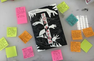
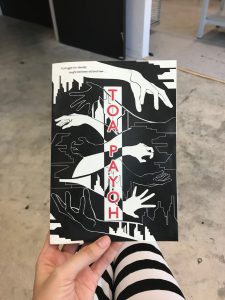
Narrowing downfrom the original concept of a struggle for identity; unable to choose between the new and the old, I decide that i will introduce the background of struggle. I choose to create a zine resembling a cultural heritage tour, looking at the old parts of Toa Payoh from a modern perspective. It will be like a personal lament and sighing of Toa Payoh’s current state
*Due to the truly unfortunate circumstance of the trusty macbook pro dying on her, Yuolmae has very regrettably lost many of her process files. However, she has managed to recover a few from backup data.
There was a very big hindrance for me when i started to do my drafting. Mimi said thats we could design either our full name or parts of our name; such as nicknames, initials or even half of our names.
The letters of my name YUOLMAE had a strange percentage of being straight or curved. The letters YL in YUOL are undoubtedly straight, while UO are curved. MAE can present itself as a straight text when in capitals, and curved when in its smaller case. It made no sense to have an uneven intersplicing of irregular blocks and curvatures in my name, thus I decided to split my full name into YUOL and MAE.
I was always interested in in jobs in the food sector. Because my name YUOLMAE in korean means “small fruit” (No joke.), I decided to become a fruit seller. I chose to use MAE because of their curvy nature when in lower case. After doing a vector shape for “mae” on illustrator, I felt that the san-serif “mae” was very reminiscent of the roundness of fruits. I halved the fruits to allude to the natural shape of fruits while also showing the letters concisely. The “e” is depictd as a vine attached to a fruits to give some sense of mystery.
At first, I there was no flag on the fruits, thus making the situation awkward as viewers were left to guess for themselves whether I meant to represent a fruit seller or a farmer. I felt that I needed additional tools and background images to convey my occupation as a fruit seller, like a signboard staked behind the fruits denoting the prices. However, Mimi said it was too distracting and image-reliant. Thus, i changed my idea into a more subtle one, placing a price tag on one of the fruits. This did not create a huge distraction from the painting, and also illustrated my idea well.
F00D idea 2
I wanted to bring out the very nature, sentiment and attitude of the job. Thus I chose a job as a fast food server, where the fast paced lifestyle creates a stressful, underappreciated environment to work in. I chose a more zoomed in crop of the composition originally, to show the narrow-minded nose dive into the job, where servers can only focus their attention on such a small area at a time so as to not screw up.
However, following Mimi’s feedback, I created a more zoomed out composition, for greater clarity. The textures and splotches mean to represent the frustration and errors of the demanding job. Due to previous feedback that the “e” is not very defined, i closed the gap and uncertainty by placing a ketchup splotch at the corner of the e.
“Doctor, Lawyer or Surgeon“
The surgeon is always a profession I had been deeply inclined towards. I have always been intrigued by the cold, calculative profession which provided so much knowledge and insight to the mysteries of the human anatomy.
My initial draft was a mixture of a realistic sketch and a render, which was immediately rejected by Mimi due to the lack of cohesiveness. In addition, the lack of harmony is further exemplified due to the contrasting natures of the straight YL and the curvy UO. Thus, I changed my concept to be a fully vectorised render, working with curves to link the entire design together.
My first sketch attempt played with gestalt in the shape of the stetoscope, linking the Y, U, and O together.
I later changed the color scheme as it became too stark and contrasting. I chose a warm flesh-toned palette and created contrast using the cool grays of the surgical knife, showing the nature of the profession, where hard mechanics and solid skills work on moving, soft human flesh. I added the vignetting to simulate how the surgeon’s job is to go into the body, just like how vignettes pull viewer’s eyes into the painting.
When there’s trouble, you know who to call~
Civil defense is an important part of keeping Singapore safe, and one of the professions I truly respect and admire are Firefighters. They rush into the situation fully prepared to face the worst, with the danger of self-sacrifice looming ever behind their heads. But they don’t look back.
I realized that my surname, ANG, represented a triangle, a rectangle and a circle, much like the symbols of harmony in art. The differences in the geometric shape made it an interesting challenge to tackle. I made the rectangular N into a burning building, connecting the two blocks with a fireman’s ladder. Out of the negative space of A, I fashioned a firefighter. The roundness of the G made it perfect to be a fireman’s hose.
However, my greatest issues were with how the color scheme did not match at all. Even though i decided to use a tetradic color scheme, the colors did not work well at all. I suspect that it was because purple was used, and purple was one of the most difficult colors to be paired with. Below shows different attempts in creating a harmonious color scheme
At last, I settled for a black and neon color scheme. Against the black background, the vibrancy of the purple and oranges used sprung to life but did not threaten to drown out one another. The sense of peril in the job is also heightened with this contrasting color scheme.
Final
For my final presentation, I created 3d versions of the fruit, and propped them up on a yellow board. Viewers thus saw the clearer image of fruits sold on a display, highlighting and emphasizing the job of being a fruit seller.
Feedback:
Feedback from peers was mostly positive, with people liking the 3d effect of the fruits and the textures apparent in the fast food server piece.There was also one comment liking how the name was placed off center for the fast food server piece and the fruit seller piece.
There was a negative comment saying that the fast food seller piece would’ve been better if its background was on a fast food tray.
For this project, we had to learn to use translate colours to evoke sentiments in the viewer, conveying our true meanings.
Each layer of images become a deeper, more in-depth view of myself as a person, taking the viewer on a coloured trip down my personal psyche.
Inspirations and Research:
I’ve always wanted to explore the many detailed delicacies of using an analogous or monochromatic colour scheme. The lack of fancy colours require intricate detailing to bring the picture together to harmonious completion, and the story is in the details. Watercolour is a very good medium for these sort of portrayals. The very tinted colours of watercolour portrait create colour compositions which flow seamlessly together.
The Art of KiDChan- children +coloured+
Watercolour and acrylics can also be used to create more dramatic colour compositions. The high tint, low tone hues resulting in fresh and bright colour compositions with a clear contrast.
Salmonella_fish’s Instagram
I also wanted to play around with complex hues like tertiary colours. An example would be purple, which creates really intensely popping colours when paired around with green, orange or black. Due to the very different makeup of the colours, when placed in a triadic composition, they vie for dominance and often confuses the viewer’s eyes if the quantities of each colour are not aptly measured and portioned.
This may be used stylistically to create a piece which bedazzles the viewer’s eyes but at the same time leaves them confused without a clear place to focus on. Below is a personal attempt that I have done in the past
Ang. 2015- A cacophonous symphony in man-made natural beauty
I learnt that if i wanted to have a clear sense of direction when using this colour scheme, I may use the 70/20/10 rule to weigh out percentages of colour usage.
S t u p I d.ly
My process consisted of me trying to replicate the watercolour effect on digital mediums. This caused many of my paintings to have shadings, which veered my squares away from clean-cut colours. This caused some confusion during my presentation as some shadings had caused the original pure colour to be mistaken for something else, ruining the composition’s colour scheme.
I had not slept well for a week up to the presentation, sleeping on an average of two hours a day and I didn’t sleep for the presentation. This caused me to jumble up many presentation points, even wrongly labelling the colour scheme. 1000% screwed up the presentation, I bid bye to my dear 20%
Poor time management was an issue. I painted all my pieces and spent an extraordinary amount of time on them, almost neglecting other subjects. I should have been like my peers and used flat vectors to make simpler designs- effective as they not only save time but get the message across clearer. Also, colour schemes are more easily perceived if flat colours are used.
For the first row, I investigate the cool feeling of familiarity increasingly being encroached by conflict.
Me: Closed Off
The first piece uses complementary colours opposite the colour wheel to give a sense of unease. Supposed to be jarring and highly conrasting, the strong greys wash out the pure bright reds and greens, creating tones that seem to blend together seamlessly. This creates a colour which had lost its unique hue and integrity as a colour. It is now neither clearly belonging in the realm of complementary colours nor can it identify itself as analogour colours, as they seem similar due to the heavy usage of greys. This stylistic choice depicts my feelings of apprehension to this project, as I did not have a clear sense of direction, my integrity wavering between revealing an unadultered, pure side or presenting a manufactured self.
Unravel
This piece uses triadic colours red blue and yellow hues which have been been added with whites, becoming soft tints. These tints create very child-like, dreamy atmospheres to evoke a childish sense of safety, as a bed to lull me into self discovery. The yellows start to travel from the top left corner, creating a leading line into the focus of the painting, which is the coat. The highly detailed colouring on the coat also attracts attention, presenting to the audience the metaphor of having layers of self-insulation from realising the truth.
Vulnerability
The final piece of this is done in complementary colours red and blue in higher contrast, so as to depict the strong sense of disjunct opposition in colours. In comparision to the first square, which uses similar colours, this piece has a different approach and contrast is further emphasised through the use of the dark hues of black. This conveys the sense of conflict.
These pieces use a black as a majority colour, creating a strong sense of framing and contrast, directing our eyes specifically to the points of intended interest.
Isolation speaks the tale of how I feel secluded and isolated from the world because of my weirdness. My realm of existence seems to be multicoloured in my eyes, whereas the world of others was droll and dull. It aims to illustrate the conflict of fitting in or staying out.
This piece uses triangular (tetradic) colour scheme, using yellow-orange, yellow-green, red-violet and blue to create an intensely hyper-coloured piece that is very much in contrast to my other equations. This gives a strong sense of activity and invites intrigue. However, as all the colours are cold-toned, it creates a sense that the hyperpigmentation of colours does not symbolise a happy mood. This aims to disorientate the viewer as they realise the intent behind the usage of colour is not what they had expected. This evokes the sense of disorientation in my piece, allowing the viewer to feel like a deer in a confused realm of multicoloured headlights.
Stranger
This piece uses split complementary colours of orange, blue-green and blue-violets to depict the resistance to join the crowd despite repeated drags and coaxes. The strong opposition of majority cool colours against one warm colour further highlights the tension and opposition.
Implosion
This piece uses tetradic colours of orange, yellow-green, red-violet and blue, depicting the internal implosion of personal weirdness.
Using triadic hues of Orange, Green and Violet, I create a playful, imaginative colour scheme which opens itself to exploration as it plays well into the colours of the colour wheel.
This evokes the sense of openness to discover and delve deeper into myself.
A wide variety of styles are also used; from graphic design flatlay, to pop-art, to advertising or fashion-esque. These further emphasise the willingness to explore beyond set boundaries.
Experiemental
The motif of the octopus is constantly used to reinforce my attempt to climb out of the bottle, which is an image of how I bottle up my emotions.
Discovery
Even as I delve inside, looking into the bottle in an attempt to squeeze myself in it, I try to change and become free of the bottle. Looking through the bottle allows me to see the other side, becoming a way to gain clear insight, discovery and introspection.
Expression
The tentacles grow to occupy largely most of the surface of the square, presenting my hopes that one day, I will be as free and comfortable to roam and be myself.
This depicts my self hatred. It is a journey of intense emotions. Each individual section is made of a different colour scheme.
(Left) Angst, Contortion:
The first on the left is split complementary, consisting of yellow-green, blue-green and red. This creates a sense of “split” tenseness, illustrating the building up of discomfort and unease.
(Middle) Inferno:
The middle is an analogous colour scheme ranging from yellow-orange to red. These colours are all tinted with a reddish-orange hue, creating a feeling of monochrome. This creates an intense colour scheme where all colours converge on being extremely warm, illustrating the burning suffocating intensity of the emotion
(Right) Catharsis, Loathing:
The right piece uses a triadic colour scheme of red-orange, yellow-green and blue-violet in high contrast. This is further emphasised by the use of the black and white negative space. As purple is a tertiary colour, it is more complex and thusly, in addition to the above listed reasons, the colours of the right section look most unnaturally popping. This is stylistically intended to show a warped sense of catharsis, which is a strong release of emotion, which usually garners attention.
All in all, the three compositions are stitched together into one piece which depicts an analogous colour scheme. This illustrates the entire transformative process of my inner pain and anguish. The detailed shading further draws the viewer in due to the intensity of the colouration
Due to Technical issues in my hall’s wifi, I was only able to complete updating some parts by 12 28. The information had been typed, but the final publishing was lacking in material. WordPress lagged and earlier versions consisting only of the final presentation was uploaded. Other parts of research and process were buffering while uploading, and I faced the spinning wheel of uploading for 20+ minutes. Very unfortunately this means a late submission. The wifi server was overcrowded and fell down, unable to be connected, even if i moved to the common study lounge in my hall where wifi would be guaranteed to be assured. I hope my lateness can be understood and I won’t be further penalised.
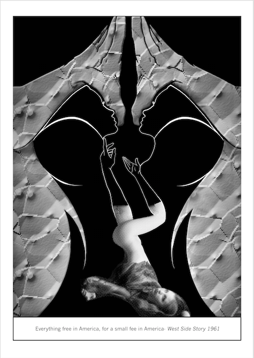
Today I explore and rebuke the sexual propaganda of capitalist ideology.
In our society where capitalism is fundamentally entrenched, I’ve noticed a vicious weaponization of sexuality to sell insidious messages, feeding the masses propaganda like consumerism to keep us obedient and unaware of the trappings of the capitalist system. This is particularly evident in advertisements.
Dolce and Gabbana- Spring/Summer 2007
Instead of marketing the product by emphasising on its inherent value, advertisements have grotesquely twisted the natural human sexuality into an object of desire, pandering to the basest human desire to sell their products. By association with the seductiveness of the sexual images, the idea which the sexualised image is trying to sell becomes alluring too. Through seemingly innocuous and cheeky enjoyment of naughty images, we are shoved the love for materialism and hyper-consumerism, where consumers are encouraged to buy more than they really need just to show it off, trapping us in the capitalist mechanics of society by our own obfuscation. By pandering and exploiting our ideals of class-consciousness, they fuel conspicuous consumerism.
Good advertisement does not just circulate information.
It penetrates the public mind with desires and belief.
-William Bernbach
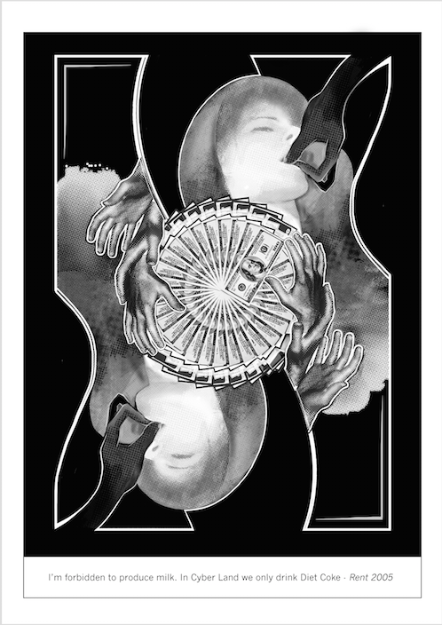
The image of the woman is used as a symbol of capitalist ideology, precisely apt because she is the image of constant obsession and fixation in advertising media. She is objectified, oppressed, liberated and empowered by the capitalist media. She is the subject, the object and the moving force in forming desire, existing in the liminality between muse and masterpiece. Media’s utmost constant fixation on the female causes her to become a reflection of what capitalist ideology strives towards.
The woman is depicted in various salacious and provocative poses, but never in a helpless tone. It reinforces that the woman is a unique identify with personal liberties and power, viciously weaponising her sexuality as a means to power. Sensual factors are played up and ever constant, reflecting on the jarring, intent to catch attention via the shock factor. Women’s natural sexuality is been perverted by the capitalist lens into a way of advertisement, appealing to the lowest common denominator to further the capitalist regime.
Dadaism is more of an intellectual style rather than an artistic one, thusly there aren’t many distinct stylistic preferences which define it. Dadaism came as a rebellious rejection of the authority of previous schools and mainstream styles of aesthetiscm. It was also a rejection and response to bourgeoise capitalism. I took stylistic inspiration for my artworks from the distinctive Art Nouveau and advertisments, which were used to create alluring images suggestive of meaning to us, tempting us. By using the style of art nouveau, characterised by flowing lines, to depict a meaning that is inherently anti-capitalism, I subvert the meaning of the bourgeoise style n favour of dadaist ideals.
Stylistically, I was inspired by my research on Theo van Doesberg. His style of constructivism which presents itself in clean lines and curves direct the viewer’s eye, creating a sense of elegant movement and direction. Sexualising the natural body creates an almost sinful, hypnotic images. The leading lines and play in symmetry create lines of movement for our eyes to follow.
In my works, I’ve consistently implemented symmetry and gestalt to create a sense of unification in my artworks, bring up a sensuous quality in the linework. Sensual factors are played up and ever constant, reflecting on the jarring, intent to catch attention via the shock factor.
The curving lines create leading lines for the eye to follow, giving the piece a hypnotic feel. The woman and cash are both prominent symbols of rewards in the capitalist system, representing the hedonistic view of happiness of the capitalist ideology. Our eyes travel through the seductive image and cyclical image of money in a smooth progression, reflecting how we are easy to accept what we see as natural and part of the status quo. The images of hands reaching towards the scintillating beauty and the money reinforce the idea that both are incredibly desirable, drawing us in with their desirability. These objects of desirability appeal largely to our sense of class consciousness and entrance us, obfuscating us from the actual state of our illusionment. This obfuscation is represented by the puzzle like framing. The curvilinear framing of the entire piece reflects the shape of a puzzle, evoking how we are only viewing one element of the puzzle, and blinded from the entire picture and unaware of how we are manipulated.
Joy states that the shape of the puzzle is not evident, should emphasize the shape of the puzzle to make it more recognizable for clearer symbolism.
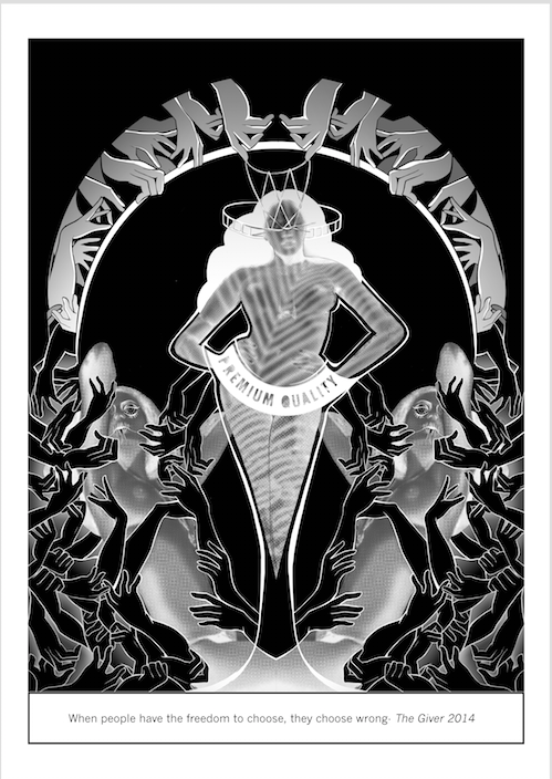
This piece is strongly evocative of advertisements which aimed to evoke the authority and prestige of high art. The arch, for instance, aims to reflect the ancient Roman arches, attempting to give the piece an air of superior antiquity. Yet, the most of the piece evidently subverts the artistic style choice and it works to reveal the true nature and meaning of the artwork.
Our hands all grapple with the images of scintillating beauties, as if grasping hard for the trophies of capitalist merits, and in turn lusting hardly after the capitalist ideology. However, the woman, representing the capitalist idea, is presented in a strong manner, highly poised. Her personal liberties and power are emphasised as she is shown to be higher in stature than the people grasping after her. Even her damsel-like pose is subverted by the presence of the deceptive eye and tongue. The string above the center lady’s face is a cats cradle, a game where string is manipulated into a maze of shapes. This forms a mask above her face, emphasising the meaning of deception and manipulation. The lady in the centre is also an abstract representation of the Heineken bottle, as shown from the abstract label of “Superior Quality” on her body, proving how the capitalist society uses images of sexuality as a weapon to suggest consumerism to us. Thoroughly, this piece subverts conventional, respected aesthetic prevalent in the capitalist market, revealing the sinister workings of how capitalism weaponizes sexuality as a means to promote its ideology.
The third piece comes as more of a reflection on the insidiousness and reveals the negativity of the insidious capitalist society. Through the more disjunct use of textures and lines, this piece looks inherently more dada-istic and critiques the constant over-sexposure in capitalist propaganda. The woman in the picture lies downfallen and helpless admit the mass of seductive imagery. This is displaying how we, like the woman have sold our personal integrity and choices in exchange for the suggestive benefits the capitalist system promises us, reflecting our state of disempowerment as our personal freedoms of choice are constrained heavily by the capitalist system of disenfranchisement. Yet we are too blind or helpless to extricate ourselves from our (un)knowing complicity, and step towards our personal freedom. The hands grasping at empty negative space further the consensus of our personal helplessness and further illustrate that the promises that the capitalist ideology promise are illusionary.
Joy reflects that the texture of the nipples was too garish and distracting
The gestalt technique used for the heads were not looking to anything in particular, thusly a waste of potential. I originally thought of making them look towards the female genitalia in the negative space in between the palms, increasing the entire aspect of the weaponization and perversion of sexuality. Joy reflects that its good to go all the way and make it clearer.
We, consumers, are also not removed from the blame. Our constant fixation with instant gratification, and demand for advertising media that entertains us, crippling the integrity of the industry. However, as we choose to whine about the current state of affairs, we are an integral part of the equation as advertising panders to prevailing societal attitudes and tastes.
These pieces reflect how advertisements are always portrayed as very seductive and alluring, thusly pandering to our basal wants and convincing us to purchase that product. Through the artworks, I hope to encourage organic thought that will liberate us being needlessly fooled by capitalist advertisings.
Completed at 1145, 23/10/2017, but only finished updating and uploading by 0010, 24/10/2018, due to internet connectivity issues. Please forgive me and give me some allowance


 Inspiration