FYP Topics of Exploration:
- Waste Management
- Culture in the Modern World
Author’s Reflection: The topic of Waste Management is inspired by the author’s last trip to Pulau Semakau, pre-Covid days and upon research, there are a lot of people who are unaware of how limited lifespan our only landfill has left. In 2035, Singapore’s only landfill will be fully filled to the brim, unless we practice the 3Rs – Reduce, Reuse & Recycle. Before Covid-19, the author had the opportunity to begin my #trashtag journey where she would travel to Singapore’s beach, East Coast Park, to pick up trash. The purpose? It was as simple as wanting to give back and partake in the challenge of clearing trash. Along the way, it made her realise the huge impact the community has towards how fast the landfill would be filled. The purpose of embarking on this journey was to highlight and emphasise on the impact we leave towards our own community, no matter how small we are in this universe.
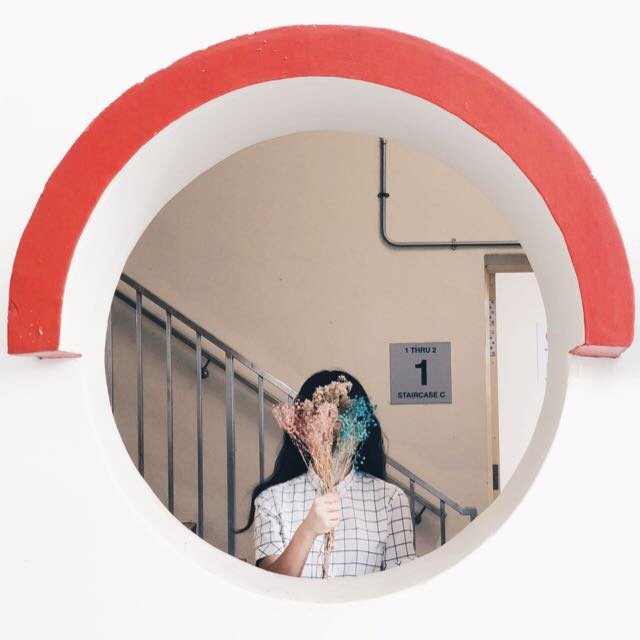
The topic of culture has always been a part and parcel of the author’s life. She is a Malay-Filipino, and she has always held close to her own culture to stay rooted with her self-identity. In this fast-paced modernised world, there are certain aspects of culture and tradition that has been lost fighting against the battle of time. The author would like to explore culture in this modernised world and hopefully shine light onto the traditions and its purpose.
The final topic that has been chosen is MALAY CULTURE.
Malay Culture consists of a variety of areas to touch from arts, music, wedding, language, food, motifs & colours, attire, superstitions and plenty of others. Over time, there has been plenty of researches done in DR-NTU, of Malays seeking identity of their Malay Culture through language and linguistics. The idea of Malay individuals losing their identity over time because of their inability to be fluent in their Mother Tongue language.
“Tak akan Melayu hilang di dunia.” – Hang Tuah
This quote is widely known in the Malay community through the legend of Hang Tuah in 1908. The quote loosely translates to the fact that Malay(s) will never disappear in this world.
Food for thought: Will Malays live with their culture, customs, traditions, heritage, history and names in pride in the next 40 years?
Author’s Perspective: Malay individuals will definitely not cease to exist therefore the quote may be somewhat right. However, what may disappear would perhaps be the sincerity and pride of being a Malay. Surely, there are plenty of factors as to why individuals are slowly losing sight of their own culture, and one of the major factor is globalisation.
Globalisation is an inevitable process that has struck the world and has given birth to the conciliation and hybridity of the modern world with the traditional aspects. The question is whether it is a negative change, or a positive change? Is there a balance to this? How far can we go along with globalisation and what do we change or retain? Even in Malay Music & Arts like Malay Dance, there has been drastic changes over the past 20 years.

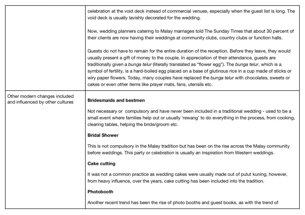
Malay weddings are the embodiment of the Malay Culture – it embraces modernisation whilst retaining culture, all seen in a-day-or-two event.
Changes seen in a Malay wedding over the years
[ will edit & replace with visual chart for presentation]


Points to note in future research:
- Final research framework: about/into/through design?
- Explore either directions according to frameworks:
- Modernised artefacts
- Malay culture through wedding
- Malay-Muslim aspect
- How to be inclusive of the other races in Singapore?
Keywords:
- Modernisation
- Embodiment
- Integration
- Symbols
- Representation
- Metaphor
- Amalgamation
- Disintegration
- Preservation
- Adaptation
Final Direction: The role of bringing up the topic of the Malay Culture as a designer is to highlight an appreciation for Malay aesthetics in Malay weddings, alongside its cultural richness, significance and relevance. Hopefully through the project, the artist will be able to bring forth a new perspective that uniquely presents itself to our Malay community itself and others in Singapore.
Research Framework: Research through Design – through studies of the Malay weddings and its product, tradition and cultural context, the author aims investigate and understand the dying tradition of certain elements in a Malay wedding and bring it back in this modernised world.
A preliminary survey was sent out to the Malay community of ages 16 and above, to understand the general consensus of what they may be feeling towards Malay Weddings & Culture.

The majority of participants 62.4% are aged between 21-25, whilst the second biggest group are 41 years old and above.


The majority of participants are not married, while the second highest participants are married. Having married participants for this preliminary survey is beneficial to the findings of this project.

1: No idea at all
5: Know everything about it
34 out of 85 individuals (40%) are aware of Malay weddings, with 11 (12.9%) who are extremely knowledgeable of it. Whilst 35 out of 85 individuals are somewhat knowledgeable of Malay weddings.

1: Unimportant
5: Very Important
35 out of 85 individuals (41.2%) believe that it is indeed important to infuse traditions at their wedding.

The question asked is in relation to how traditions and cultures are affected by the people who are planning the wedding itself.
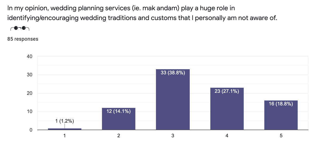
1: Strongly Disagree
5: Strongly Agree
72 out of 85 individuals agree that these services mentioned above affect wedding traditions and customs practiced.

1: Strongly Disagree
5: Strongly Agree
72 out of 85 individuals also agree that relatives influence the wedding customs / traditions.

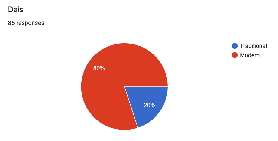
1: Tradition
5: Modern
47 out of 85 individuals (55.3%) would love to hold a wedding that is a mix between traditional and modern.
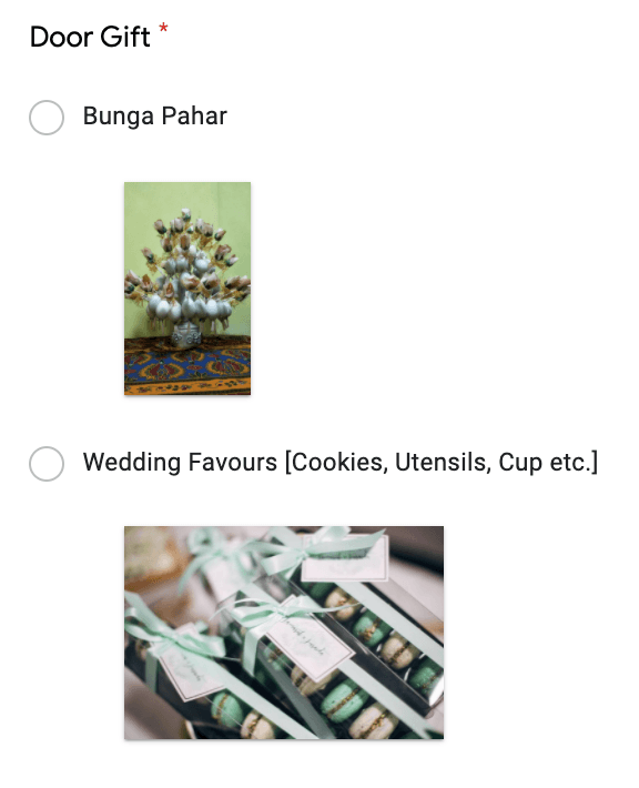
The next segment in this survey aims to discover the individual’s preference in their ideal wedding. Images shown are of traditional representations versus modern objects that are practiced now.


Conclusion: Via this preliminary survey, it has been inferred that majority of the participants believe that traditional aspects ought to be infused with the modern customs in this day and age, aligning with the idea of moving forward with the time, instead of against it.
Amongst this 85 participants of whom made up majority of millennials and elders above 45 in the second most participants, it is not a biased standpoint from a group of generation thus proven the general consensus in achieving a traditionally modern wedding.
Through this research, the attention would be directed towards the losing tradition in Malay Culture, one of which is the element of pulut kuning, bunga mangga as well as hantaran, whereby the modern overpowers the traditional by a huge difference.
Moving forward, researches will be conducted to further understand why the results are as such and the reason majority of the people lean vastly towards the modern areas, especially in the aesthetics of food-related items, with the exception of the outfit.
Hence, the next step would be to continue researching on available product packaging in the market that has taken a forward leap in terms of contemporary designs while being inspired by traditional motifs, and possibly redesign branding and packaging for the various items mentioned above.
Visual Analysis / References:
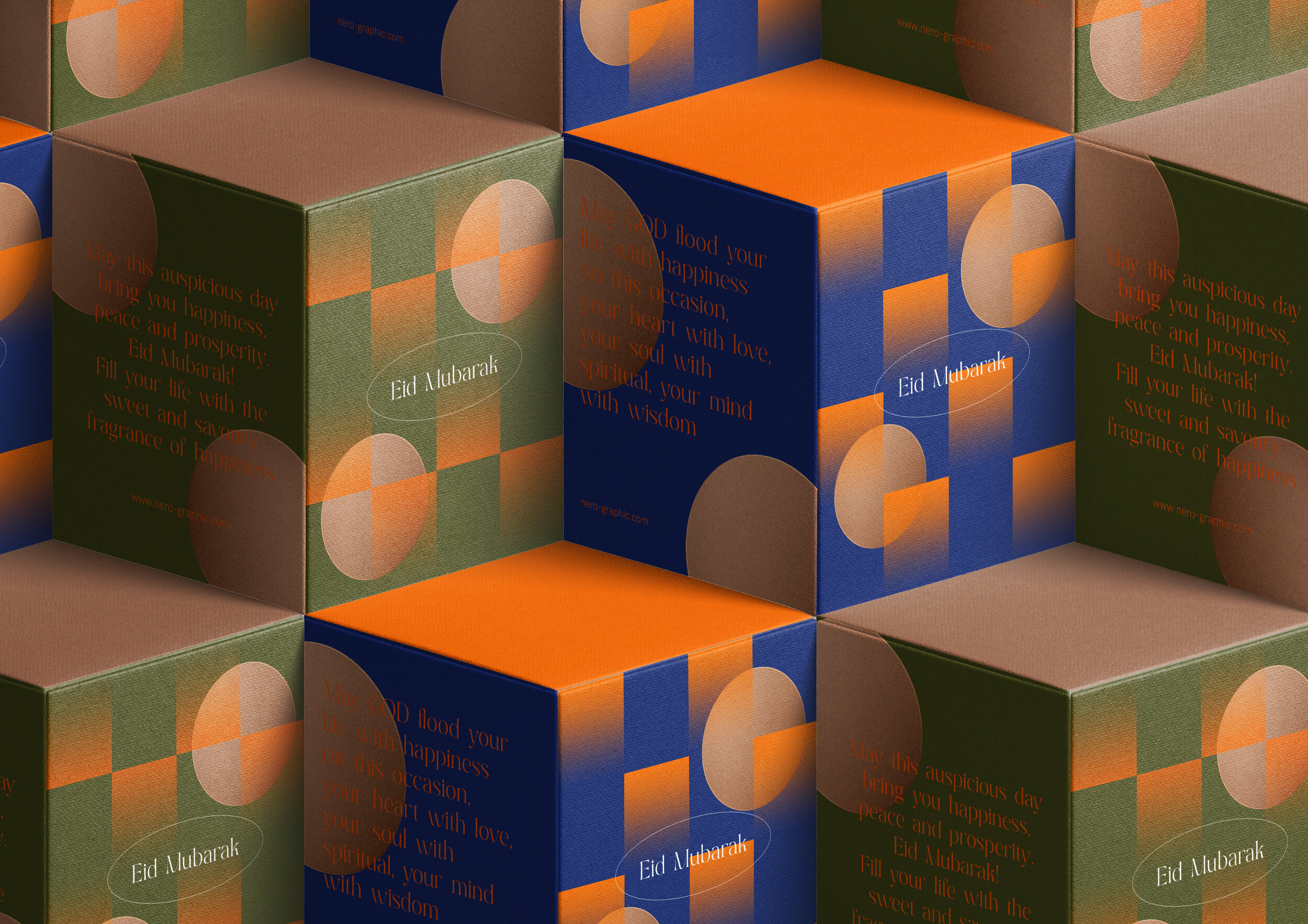
Nero Atelier’s modern design for Hari Raya’s packaging – a yearly celebration for the Malay-Muslim community in Singapore. The packaging is inspired by the formation of ketupat’s (a dish made from rice, wrapped in coconut leaves) texture and patterns.
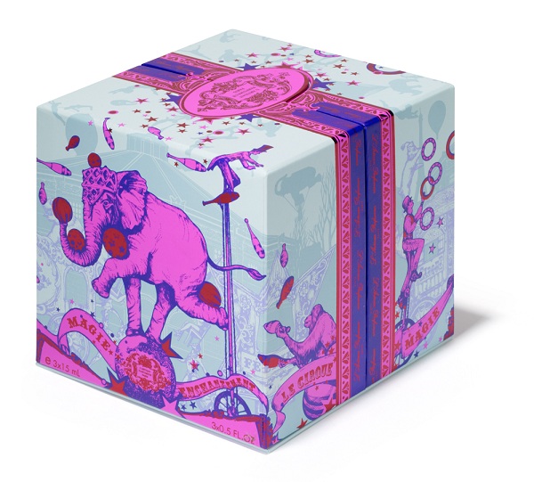

A Christmas packaging for L’Artisan Parfumeur that was inspired by The Winter Circus.
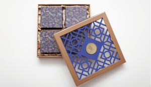
Singapore Airlines Mooncake packaging.
Sugar Pavillion x Andaz Xiamen product packaging
Works Cited:
https://www.behance.net/gallery/84018641/Mooncake-gift-box-2019
https://www.superadrianme.com/food-and-beverage/singapore-airlines-mooncakes/
https://www.behance.net/gallery/119404361/Eid-Mubarak-Festival
https://eresources.nlb.gov.sg/newspapers/Digitised/Article/straitstimes19830502-1.2.139.8.1
http://csmt.uchicago.edu/glossary2004/metaphormetonym.htm
https://www.tatlerasia.com/the-scene/weddings/nazrul-nazaruddin-nas-great-idea-malay-wedding-tradition
https://www.mariefranceasia.com/wedding-special/guests-and-bridesmaids/malay-weddings-key-traditions-meanings-112794.html
Tunku Aminah’s Wedding, A Timely Reminder To Preserve Malay Traditions
https://eresources.nlb.gov.sg/infopedia/articles/SIP_73_2005-01-25.html
https://www.researchgate.net/publication/341919418_The_Evolution_of_Malay_Bride’s_Traditional_Wedding_Attire_in_Peninsular_Malaysia


/cdn.vox-cdn.com/uploads/chorus_image/image/63379920/100YearsBauhausLead.0.jpg)