Project 02 – Research, Process, Final

From the previous Project One’s idea of pancakes layering over each other, I decided to bring it over to Project 2 to explore more for my poster and utilise the same concept of Quantum’s Expanding Universe, General Relativity. I have already decided over the top of my head that I wanted to keep the simplicity and style of the previous mark created. The quantum theory was still kept the same with the idea of analogy, and figure-of-speech used as a representation for my project instead of going the abstract way. The analogy was that the pancakes would represent the universe and the elements on the pancakes would represent the galaxies. When the pancakes expand, the galaxies ie. blueberries do not expand but the distance between each blueberries do. Another element I knew I wanted to add back in this poster was the pan. The pan would represent the space. A general misconception that people have with this quantum theory is that the universe expands in a pre-existing space, which would mean that one day we will explode. However, that is not the case. The space is also expanding outwards together with the galaxies and universe. With this quantum in mind, I went back to the previous mind-map where I have already decided on some nouns and verbs to incorporate into my poster.

Previous Mind-map:

I derived some key terms from my previous mind map and further explored nouns and verbs that could be useful through the Ellen Lupton’s method. With this technique, I quickly realised that I wanted the elements represented on the pancakes to be doing the verbs through the poster. For instance, if my noun was a person, and verb was sticky, I wanted these terms to work through the direction of where my audience can read the poster. I wanted the noun chosen to do the verb and guide the eyes of the audience through wherever it should be. 


I really wanted to explore with verbs that could be used by the elements in the poster so ie. bouncing, there is an element bouncing it in. I made use with a bunch of verbs that were rather essential in my poster ie. dripping, jumping, climbing. Each actions used should be purposeful, instead of just being there for the sake of being there. With that said, I explored further into my moodboard.

Moodboard:

I quickly looked at variations of pancakes to get inspirations on how I wanted the pancakes to look like ie. thick, stacked, dripping, broken, full, perfect, lopsided, coloured etc. Moving forward, I looked for other inspirations and references to get my ideation started and through Skillshare, I saw some elements that really intrigued me and I wanted to explore that in my work – use of gradient, simplicity and the stretched texts effect.

Most of the inspirations I got were illustration-based and very quirky and simplistic in style. As per my last inspiration, Francesco Ciccollela, I really wanted to use his style for my poster. Hence, most of the style and references made are quite similar. The final moodboard above was going to be some of my colour style for the posters. Below, there is a back-up style, for the print to be more abstract and not so representational. In case, my direction was not going well.

Ina approved of the quirky style and simplistic, representational style, so I went ahead with that. I relied heavily on the sketches beforehand to see which layout I should go for because I knew once I started digitising, that would most possibly be my final one. I showed a bunch of sketches to infuse the different techniques taught in the skillshare, mainly; a) activating diagonals, b) simplicity c) overlapping d) cutting image.

According to the sequence, the first one on the top left is of three pans stacking up against each other with maple syrup leaking down to the next pans. The second sketch had a huge jug pouring maple syrup and the humans onto a stacked pancake with people below it. The third sketch were three pancakes overlapped against each other to create a bigger negative space above it. As for the fourth sketch, I cut it down to two pancakes with a ladder for the human to climb up or down with ingredients to make pancakes floating around in the background.

Sketches:

The next sketch had a rather static and calmer feeling with the three pancakes being diagonal and parallel to each other. The 6th sketch would show a bouncing person on a souffle pancake and keep to the minimalistic style. The 7th sketch was more different than the rest as it is a top-down shot of three pancakes. And the final sketch consisted of three pancakes with two pancakes broken to create a sense of action throughout the pancakes.

I ended up choosing the first sketch to develop further.

For the first draft, I began by digitising them and choosing colours for the backdrop first because it’ll be easier for me to work when I have my colour palette down. As for the pans, I wanted to have it in pink so that the colour would not run too far off from the pancakes and I would have to use only a few colours to keep to its simplistic style.

Although I really liked the look of the simplistic solid backdrop, I decided to add gradients to incorporate some texture into the overall poster. It instantly created more dynamic and a sense of depth especially with the different sized pans from top to bottom. 

I then infused in the various elements into the poster to see if it would work or if it might get too cluttered.


From then, I chose a gradient background and darken it to bring out the pancakes more. Adding in the elements and exploring more with the various layout to see which variation or layout would work better in the overall poster.

Finally, I decided that overlapping the pancakes would work the best as it would create more negative space and allowed for the type to be incorporated without cluttering the poster. I added in all the elements fully and moved onto adding the type onto the poster.

From there, I went ahead and try out the different type that could be incorporated into the poster but nothing seemed to work as it would make the poster look too messy considering the elements are already rather spaced out. I also added in the style shared on Skillshare of the stretch being pulled to see if it would work, however it looked too stretched out and would steal the spotlight from the pancakes.

The text was tricky because I wanted to keep its simplicity but also infuse in the stretched-text effect somewhere. Ultimately, I chose the one with the text smacked right in the center and Ina suggested to remove the red and blue shadows to keep it simple so I did. 
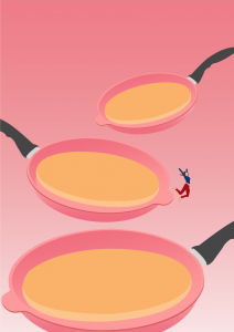
Final Poster:

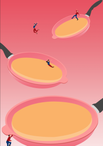
From the get-go, I already knew I wanted to keep it very simple like the references I have shown ie. Francesco Cicollela. With the initial pans quite spread apart but I overlapped them so that there is depth created within the 2D space. By tilting each pan and making it expand, as the eyes go lower, it subconsciously created a sense of balance as well as activate the diagonals. The eyes are led from the smallest pan to the biggest pan at the bottom. Together with the actions of the elements, the eyes will flow in its direction.

For instance, the man is slipping down the honey or maple syrup towards the next pan where the lady jumps down, people skateboards or slide down and are digging a hole to go to the next pancake, the bigger “universe”. And finally at the third pancake, we see people resting and jogging around, staying at their position. We also see a person climbing up possibly from another smaller universe to join the expansion. I felt that incorporating the sense of actions through the literal actions of the elements of the poster brought out the quirkiness of the poster even more. 

The overall colours that were use were mostly triadic; red, blue and yellow and the complementary outfit colours of red & blue for the people make them stand out against the backdrop. 

Digitisations of other sketches:


Final Poster:

Mockups:

Layout by Graphic Burger, Behance, Freepik – Antoniooli

Invention of Grid Systems

There are many types of grid systems used in organising various layout for print and screen such as book, magazine, poster, webpage, applications and interface. The type of grids are baseline, column, modular, manuscript, pixel, hierarchical grids. First few introduction of the grid system include ancient manuscripts which helped scribes in writing texts evenly spaced and straight. Such examples can be found in the Dead Sea Scrolls.

About 1500 years later, the same principle was transferred to western presses and the machines required movable type to be manually inked and pressed onto paper. Examples include the Guternberg Bible which uses a two-column grid.

Gutenberg Bible

Newspapers extended usage of grids because it could include a higher number of information onto a sheet of newsprint. Without the use of columns, the lines may be seen as too long and may tire the eyes of the reader.

In the early 20th century, grids became highly used after the Bauhaus and De Stijl movement. Designers like Jan Tschischold and Josef muller Brockmann created grid systems for typographic layouts and poster designs. Josef Mueller-Brockmann

Josef Mueller-Brockmann

Josef Mueller-Brockmann

Grids were created as a system for organizing text, and so they remain today.

Josef Mueller-Brockmann

An example of poster designs that demonstrates modular, rotation and radial grids would be Joseph Muller Brockmann’s poster in 1950s of Beethoven. 

Image result for beethoven radial poster

His influence of modular systems can be seen in many graphic and web designs today. He went further to explore the grid systems in three-dimensional spaces like exhibitions spaces as well as corporate interior design. 

The Guardian modular grid

In late 20th century, designers became more involved in the use of grid systems and have continued to be used throughout. 


Wim Crouwel

References: https://trydesignlab.com/blog/grids-ui-ux-graphic-design-quick-history-5-amazing-tips/

Reflection:

In general, the past four weeks were pretty intense in terms of the information given and taken. The handout of key names and words were really essential and important, though it was a bit difficult to refer to whilst concentrating on the slides, considering how small the font size were. It could perhaps have been implemented into the first page of the slide as well. With regard to the lesson, it was content heavy but ended up being interesting and the break after 30-minutes helped us regain our concentration again. It was particularly exciting to learn the history of visual communication as I can implement the different movements and its style into my future works. Personally, the reflections at the end of the lesson were also quite beneficial as it allowed me to explore more about the topics that were rather interesting to me, that might not be deemed as interesting to others, and also allowed me to delve deeper into topics that were not taught in-depth as there is only so much history that can be passed on in 4 lessons.

With that, my suggestion for improvement would arise from the entirety of History of Design. As product design, visual communication and interactive media are taught by three different lecturers specialising in these specific modules, the history taught will, no doubt, overlap and may be too repetitive for us. Though it may be difficult, perhaps the amalgamation of the history of all three areas combined into one and spread out across the 14 weeks could help us better visualise the timeline and movements better (or not, heh).  My next suggestion would be in terms of the test. Having an overall test at the end of the four weeks would be better to test us for our comprehension of the topic, instead of having it immediately after the lesson. Possibly a short kahoot game could replace the first quiz,  just to check how we have faired and understood thus far, from the first two lessons? 

4 weeks is too short to learn the history that have taken place throughout the years but I appreciate and enjoyed the effort by the other lecturers and Desmond to condense it down to the bare necessities and important informations.


Walter Gropius & his army

Bauhaus, as many of us are familiar with the name, derived from the literal German word “construction house”. It defines the German school of arts in the early 20th century and was founded by Walter Gropius. What makes the school so interesting is the idea of their movement and approach to techniques which makes their students our definition of the “T” person. The school have morphed into an art school infused of aesthetics from architecture as well as design, whilst maintaining its influence on modern and contemporary art.

Image result for bauhaus

In 1919, Walter Gropius, regarded as one of the pioneer master of modernist architect, opened up Bauhaus school and brought together a hub for well-known artists like Wassily Kandinsky, Paul Klee, lyonel Feininger, Johannes Iten, Georg Muche, Oskar Schlemmer as well as Josef Albers. As Bauhaus aimed to unify art, handwork and the industry, they provided apprenticeship programmes in applied arts of carpentry, pottery, metalworking, glasswork, stage design, photography and commercial art. 

The foundation course or Vorkurs, directed by Swiss born artist/educator Johannes Itten, was to stimulate students’ in materials, drawing techniques and forms, progressing into their specialization in the Bauhaus workshops (ceramics, glass, painting, mural painting, furniture, metalwork, textiles). Itten had also attempted to draw connections between artistic activity and discovery of unconscious reality, which connected with Kandinsky’s own “Concerning the Spiritual in Art” published in 1911. 

For Itten’s mysticism, he was later in 1923 replaced by Hungarian Constructivist Lazlo Moholy-Nagy. In1923, Josef Albers & Laszlo Moholy-Nagy were appointed to succeed Johannes Itten. Moholy-Nagy introduced industrially functionalist designs in the metal workshops, discouraging traditional materials and handicrafts in favour of technologically produced modern materials: steel tubing, glass, plywood. He began informing Bauhaus of its more industrial focus, committing the school to new material technology and mass production, reducing the importance of craft specialization and traditional workshop training; on the artist-constructor, than the artist-craftsman.

In 1925, as they were pressured by the conservative government, Bauhaus moved to Dessau. The building was designed by Walter Gropius, architectonic sensation with glass-faced workshop reflecting the Bauhaus’ style.

Image result for glass styled bauhaus building

The changes of venue and leadership resulted in a constant shifting of focus, technique, instructors, and politics. For example, the pottery shop was discontinued when the school moved from Weimar to Dessau, even though it had been an important revenue source; Bauhaus commits to Functionalism, with convictions for a better society,

“A thing is defined by its essence. In order to design it so that it functions well – a receptacle, a chair, a house – its essence must first be explored; it should serve its purpose perfectly, that is, fulfil its function practically and be durable, inexpensive and ‘beautiful’.” (Walter Gropius, 1925)

Bauhaus continued in the expression “form follows function’. Aesthetic assessments were made in terms of function, and beauty was defined in terms of utility. This approach was very attractive because it gave designers a strong framework from which they could analyse the built environment. Industrial production and machine aesthetic was then consciously adopted. It was at the Bauhaus that the idea of a designer being both an artist and a craftsman came into being as they embraced industry and its creative possibilities for mass-production. The development of industry presented designers with exciting new opportunities and the relationship between art and industry was re-assessed. 

In 1925, Bauhaus GmbH established, Catalog produced with illustrated Bauhaus products. The next two years, the Architectural Building department established under leadership of Hannes Meyer, who introduced psychology, sociology and economics. In 1930, Ludwig Mies van der Rohe appointed, Bauhaus principles and structure altered. Under political and financial pressures, Bauhaus temporarily moved to Berlin.

1933, closed under unstoppable Nazi regime, having been painted as a centre of communist intellectualism. Although the school was closed, the staff continued to spread its idealistic precepts as they left Germany and emigrated all over the world. However, Bauhaus ideologies continued to spread outside of Germany as Moholy-Nagy founded New Bauhaus in Chicago in 1937.

100 years of roundel

We ended lecture 02 with the introduction of the rise in usage of the sans serif typefaces, presently evident in the famous London Underground logo. There was always a craze or adoration for the logo which I could not bring myself to comprehend. When my friends went to London, they would bring me souvenirs that had the train’s symbol and it felt weird imagining if my foreign friends were to present souvenirs of the SMRT logo when they return. I went deeper into researching why the London Underground logo was so famous and started off with its history.

These underground roundels were first introduced in 1908 where it was presented as the station’s nameboards much like what we see on our local train stations.  As it was to be differed and identified differently from the rest of the advertisements, they made it circular. 

London Underground logo

Courtesy of London Transport Museum.

London Underground logo

The invention of the winged wheel was an early precursor of the current iconic Transport logo and was a badge issued to bus crews from 1910 which featured the London General Omnibus company’s text on it. 

Winged Wheel

Courtesy of David Lawrence

In 1913, Frank Pick who was the publicity manager working for  Underground commissioned a typographer, Edward Johnston to design a typeface that can be used for the company’s branding logo. The roundels or sometimes known as “bull-eye” and its surrounding forms were all adjusted to fit the typeface produced,

With the creation of the typeface, the logo has became a cultural icon on its own not only because of its legibility to read but also because of its amalgamation of abstract art, typography as well as the form itself that represented nothing specifically.  Due to its form and legibility as a train station marker, the logo itself has survived through various eras and retained its identity with minute detail changes, such as the solid red disc to a red circle.

The stripped down version of the logo shows how abstract the form and simple it is.

W H Hilton

Courtesy of David Lawrence

London Underground logo

Johnston

Courtesy of Justin Howes / Capital Transport Publishing

The symbols were further altered along time to have bolder weights, increased size of bar, expansion of the white space. These edits were done by Edward Johnston who fully curated the Underground symbol  in 1919. This London Passenger Transport Board (LPTB) symbol is from 1933.

Johnston

Courtesy of David Lawrence

The logo was also used for its company’s counterparts.

Finally, in 1950, the logo was stripped down to its simplest form.

Underground Map

Courtesy of David Lawrence

Over the next 100 years, the logo has became a symbol for London.

As quoted by Frank Pick himself — “Design is not a mode that enters in here and there and may be omitted elsewhere. Design must enter everywhere.”

Greenwich

To some, the simplicity, clarity and abstraction are details that made it such a memorable and nostalgic symbol – something of which could be used for 100 years without getting bored of. The logo could be placed on any medium or materials and yet has proven to be of widespread usage. The symbol has become so famous in London itself that we see it in all sorts of arts – fashion, photography or even commercially, in restaurants logos. Whilst it may not be a highly ornamented logo, it is definitely a successful logo that has withstand time and maintained its integrity over the 100 years.

References:

  1. https://slate.com/human-interest/2013/09/london-underground-logo-a-brief-history-of-the-iconic-design.html
  2. https://www.logodesignlove.com/london-underground-logo 
  3. https://www.citylab.com/design/2013/10/what-makes-londons-underground-logo-so-special/7109/