Which came first?
As we would all know, Baskerville typefaces are very apparent by their high contrast between their thick and thin strokes when compared to their Old Style type category.
Apparently, the first ever Modern typeface that appeared was from the Frenchman Firmin Didot who is the son of Francois Ambroise Didot, also known as the one who altered the contrast between the thick and thin letters. Firmin Didot designed the Didot typeface when he assumed responsibility of his father’s typefoundry.
Soon after, Didone’s typefaces were followed by Bodoni. Giambattista Bodoni was an Italian type designer, punch cutter as well as printer and he was influenced by the typefaces Romains du Roi, especially with its flat as well as non-bracketed serifs as well as Baskerville for its high contrasts in strokes.
The modern typefaces usually have a horizontal stress and vertical axis with a pretty small aperture whilst holding an abrupt and high contrast between its thick and thin.


As everyone also mention how similar Bodoni and Didot are, we can see some differences through this.
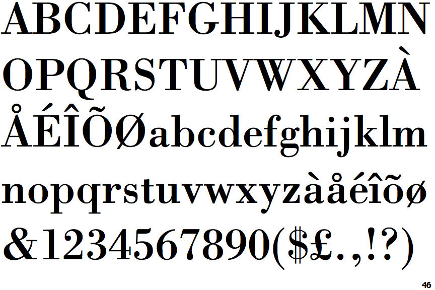
Bodoni
Didot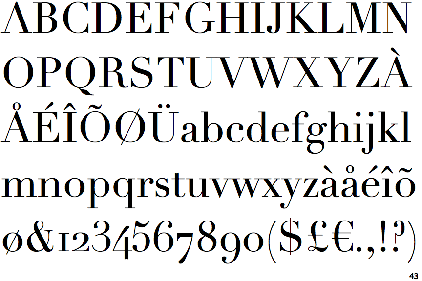
Differences identified:
- Bodoni Number 4 is closed and has a double-serif bar, while Didot is open and has no serifs or spur
- Bodoni Number 3 are terminated with balls while Didot only has one at the top
- Bodoni Number 8 is symmetrical in a vertical axis while Didot is assymmetrical
- Bodoni $ sign has a double line crossing the ‘S’ while Didot has a single line
- Bodoni upper-case ‘J’ is lower than the baseline, while Didot sits on the baseline
- Bodoni upper-case ‘G’ has no serif feet, while Didot has a downward spur
- Bodoni upper-case ‘W’ has 4 upper terminals, while Didot has 3
- Bodoni upper-case ‘K’ has a visible gap between vertical but not Didot
Whilst we are unsure of which typefaces appear face, it is clear that both typefaces arrived in the 18th century and were very apparent and consistent with its high contrast in weights. Hence, it was the birth of Didone Typefaces, where both Didot and Bodoni were melded together to form the most characteristic typeface designs of its era.
Credits: ilovetypography.com; http://www.identifont.com/differences?first=Bodoni&second=Didot; https://www.fonts.com/content/learning/fontology/level-1/type-families/didone
You must be logged in to post a comment.