—
We ended lecture 02 with the introduction of the rise in usage of the sans serif typefaces, presently evident in the famous London Underground logo. There was always a craze or adoration for the logo which I could not bring myself to comprehend. When my friends went to London, they would bring me souvenirs that had the train’s symbol and it felt weird imagining if my foreign friends were to present souvenirs of the SMRT logo when they return. I went deeper into researching why the London Underground logo was so famous and started off with its history.
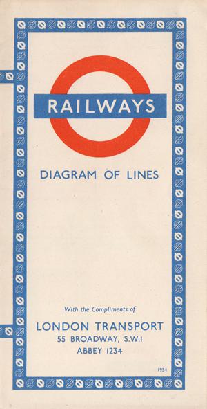
These underground roundels were first introduced in 1908 where it was presented as the station’s nameboards much like what we see on our local train stations. As it was to be differed and identified differently from the rest of the advertisements, they made it circular.
![]()
Courtesy of London Transport Museum.
![]()
The invention of the winged wheel was an early precursor of the current iconic Transport logo and was a badge issued to bus crews from 1910 which featured the London General Omnibus company’s text on it.
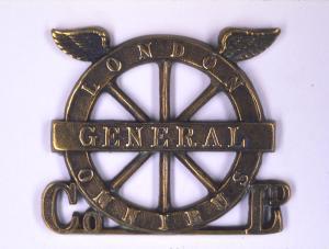
Courtesy of David Lawrence
In 1913, Frank Pick who was the publicity manager working for Underground commissioned a typographer, Edward Johnston to design a typeface that can be used for the company’s branding logo. The roundels or sometimes known as “bull-eye” and its surrounding forms were all adjusted to fit the typeface produced,
With the creation of the typeface, the logo has became a cultural icon on its own not only because of its legibility to read but also because of its amalgamation of abstract art, typography as well as the form itself that represented nothing specifically. Due to its form and legibility as a train station marker, the logo itself has survived through various eras and retained its identity with minute detail changes, such as the solid red disc to a red circle.
The stripped down version of the logo shows how abstract the form and simple it is.
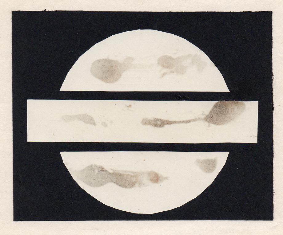
Courtesy of David Lawrence
![]()
Courtesy of Justin Howes / Capital Transport Publishing
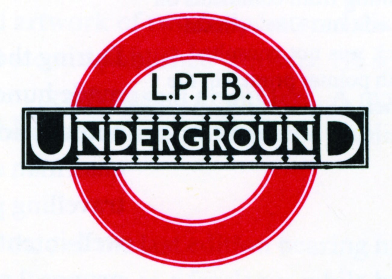
The symbols were further altered along time to have bolder weights, increased size of bar, expansion of the white space. These edits were done by Edward Johnston who fully curated the Underground symbol in 1919. This London Passenger Transport Board (LPTB) symbol is from 1933.
Courtesy of David Lawrence
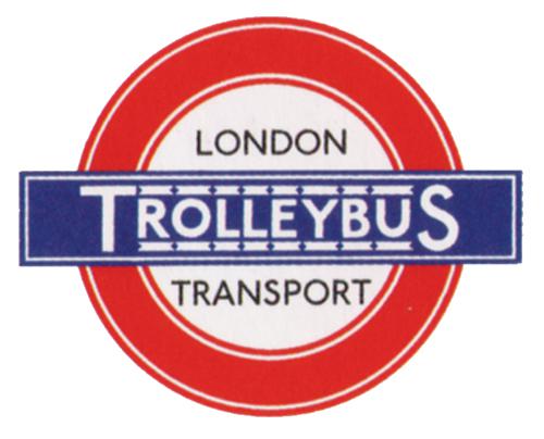
The logo was also used for its company’s counterparts.
Finally, in 1950, the logo was stripped down to its simplest form.
Courtesy of David Lawrence
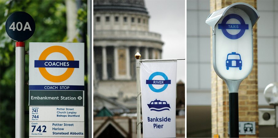
Over the next 100 years, the logo has became a symbol for London.
As quoted by Frank Pick himself — “Design is not a mode that enters in here and there and may be omitted elsewhere. Design must enter everywhere.”
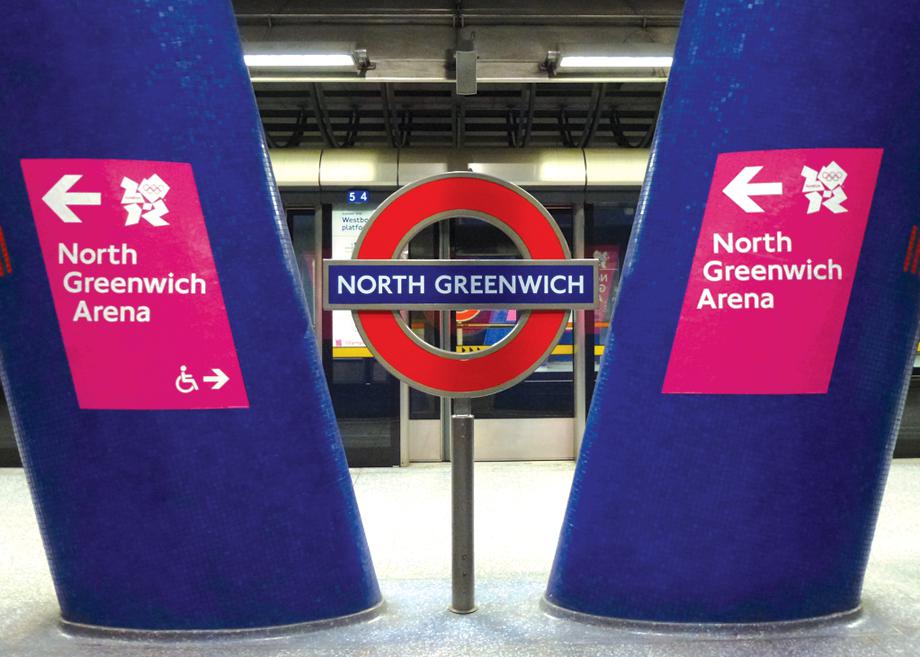
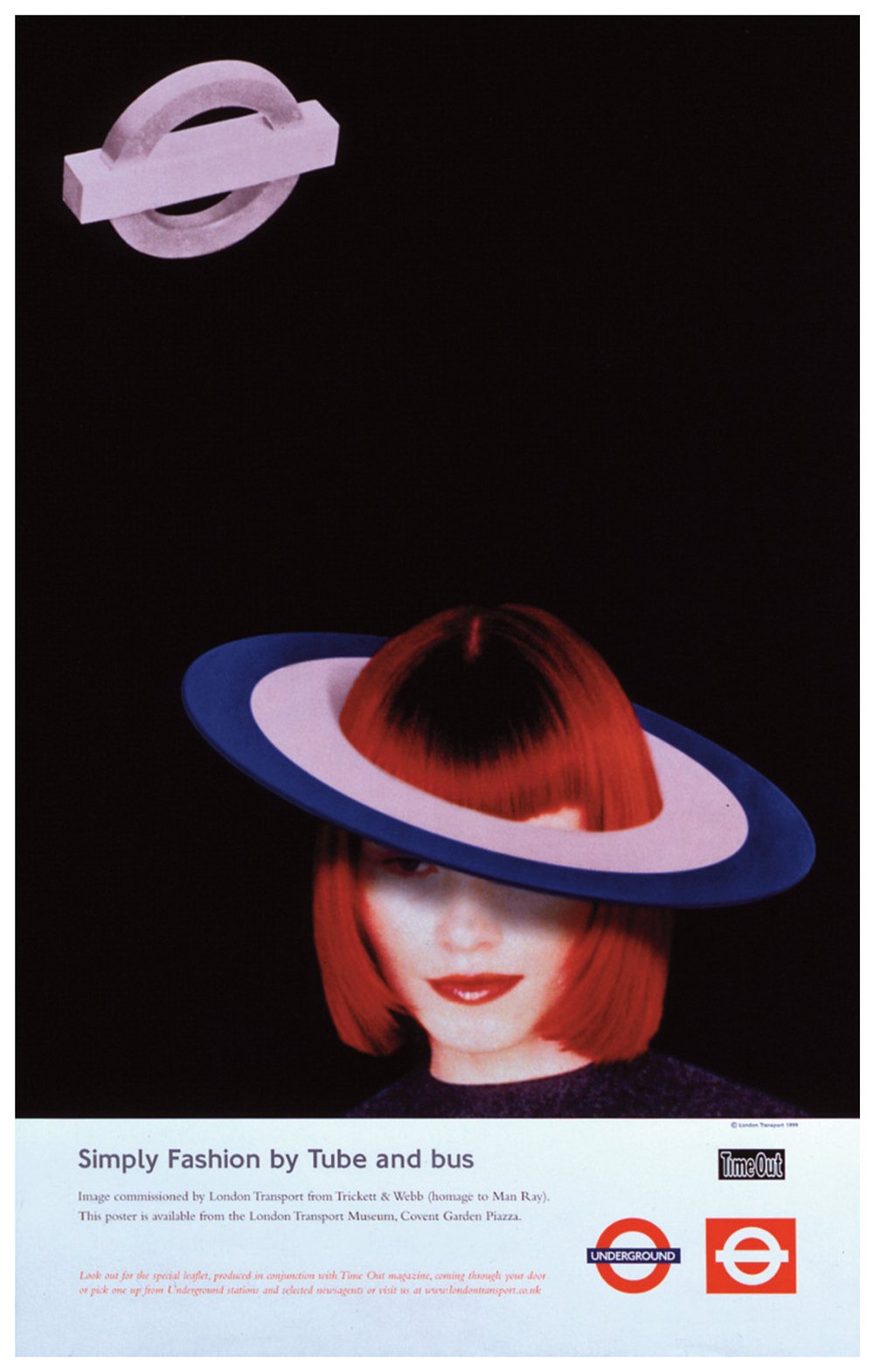
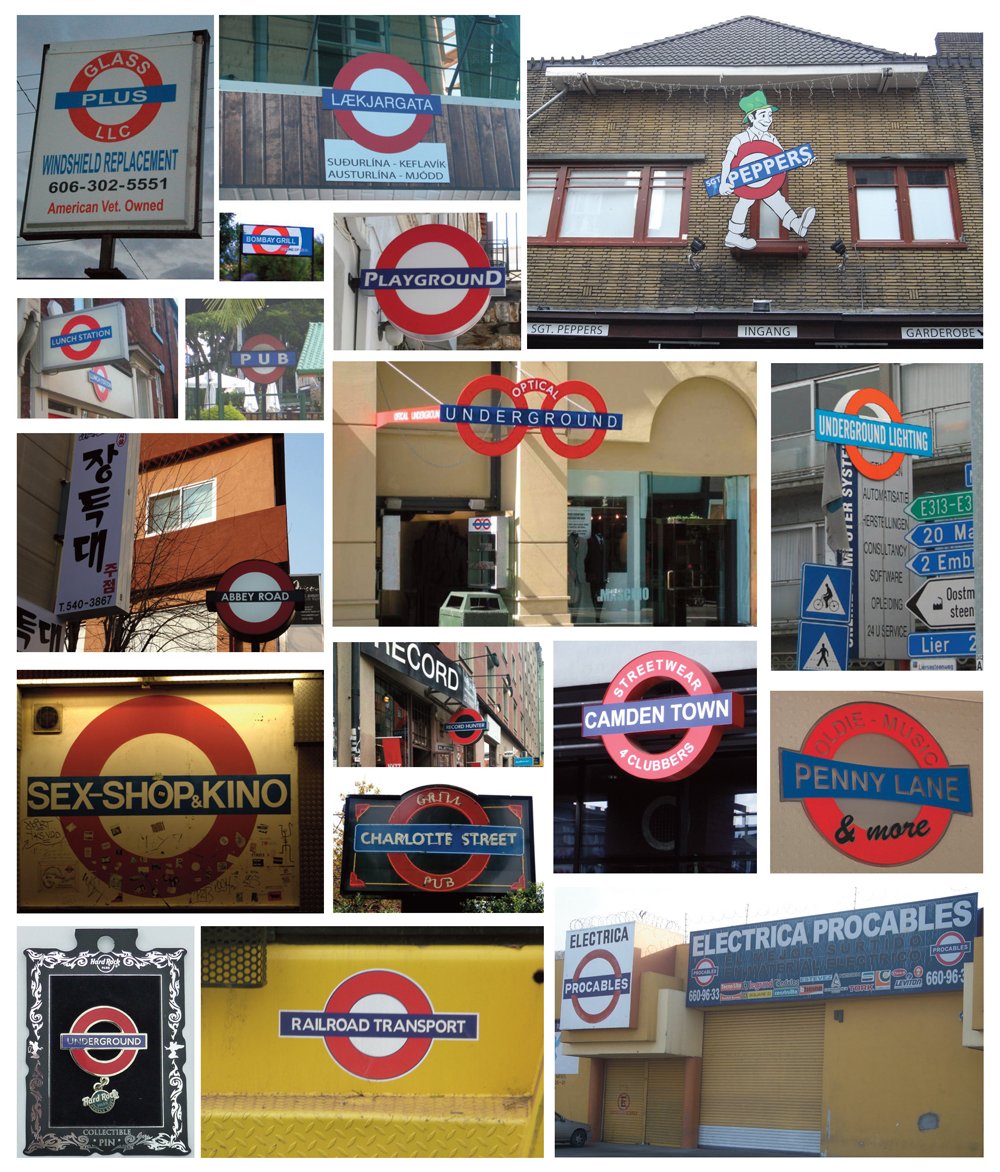
To some, the simplicity, clarity and abstraction are details that made it such a memorable and nostalgic symbol – something of which could be used for 100 years without getting bored of. The logo could be placed on any medium or materials and yet has proven to be of widespread usage. The symbol has become so famous in London itself that we see it in all sorts of arts – fashion, photography or even commercially, in restaurants logos. Whilst it may not be a highly ornamented logo, it is definitely a successful logo that has withstand time and maintained its integrity over the 100 years.
References:
- https://slate.com/human-interest/2013/09/london-underground-logo-a-brief-history-of-the-iconic-design.html
- https://www.logodesignlove.com/london-underground-logo
- https://www.citylab.com/design/2013/10/what-makes-londons-underground-logo-so-special/7109/
You must be logged in to post a comment.