The start of this assignment introduced us to the colour theory.
First of all, based on the class activities and some brainstorming, this would be the initial concept of the project I would be going with.
magic + Humour/Storytelling = ME
Entertainer/Performer – Stage fright/public speaking fears = Ideal me
Self confidence x Personal management skills – A better me
Patience + Sociable/Heart to reach out to people = Me in 5 Years
Because for this project, colours will be used and thus it is important to understand certain colour harmonies that could aid me in my concept and upcoming experimentation along the way.
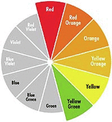
First of all what is a colour wheel? The colour wheel is a circle which contains colours arranged in certain style to show the relationship between primary, secondary and tertiary colours. It is also a useful tool that serves as an aid to visual arts and design students. I find it particularly useful and following the theory of various harmonies, we can create the style we want with the correct colours without comprising the entire look or feel of the image you are trying to portray.
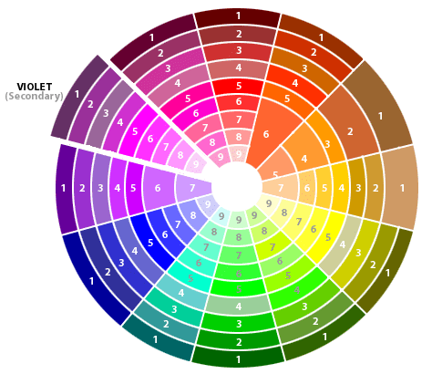
This is a tertiary colour wheels. The colours here are formed by mixing of the primary colours to get the secondary colour, then the mixing of the primary and secondary colours again to get a tertiary colour.
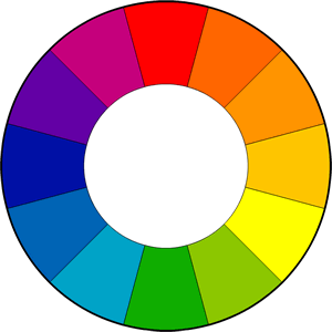
So what is Colour harmony? Colour harmony is the theory of combining colour in a way that makes it harmonious to the eye. There are various styles of harmony theory which could suit to different needs of a creator or designer depending on the concept or theme of the design.
Analogous Harmony
Analogous colors are groups 3 colors that are adjacent to each other on the color wheel, with one being the dominant color, which tends to be a primary or secondary color, and two on either side complementing, which tend to be tertiary. These colours usually match well to create comfortable design that blends together with one another and are extremely pleasing to the eye. Adjusting the background to give a constrast to the colour schemes also brings out the effect.

Complementary Harmony
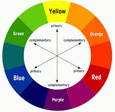
Complementary colours are colours that are directly opposite from each other on the colour wheel. When two colours are opposite each other on the wheel, they are known as complementary colours. Complementary colour usually creates high contrast especially when set to full saturation.
It might be tricky at first but requires careful adjusting in other not to make it too jarring to the eyes. Complementary colour can be use to make something stand out or prominent to the audience’s eye.
Split Complementary
Split complementary scheme are like complementary harmony with slight alterations. Instead of using its direct complementary colour from the opposite side of the colour wheel, it uses the two colours adjacent to it. This style provides strong visual contrast too, but with lesser tension compared to the complementary style.

Monochrome Harmony
Monochromatic schemes uses varying lightness, saturation and adjustments of a single primary colour. Using different lightness and settings for the same colour, it creates a soothing and comfortable mood for the viewer. The monochromatic colours, because similar visually, often go well together. While this style can be very easy with the eye, because of the stark level of contrast and high level of similarity, it could be difficult to emphasize the most important elements in the piece.
Analogous Harmony warm and cool
Analogous colours can be subdivided into two parts, the warmer group and cooler group. Well the warmer colours in the colour well are mostly red, yellow and orange in shades. They usually represent warmth and give a very comfortable feeling such as the sun, fire, or sunset. In fact, such colours make people comfortable as it increases blood circulation and rises our body temperature! Colours like that are used and meant to get people excited into a mood! Some examples are using them in Posters or advertisements for sports event, marathons, or activities that make people’s heart pump!
The other group are the cooler colours. These are colours with purple, blue and greenish tints. They are coolour because they represents cooler scenes such as cool jungle, the icy lakes or the sky. Cool colours chills people down and tend to have a psychological effect of calming a person’s mind and soul.People feel at ease and calm. Such examples can be used to promote products such as beds or beer. Cooling colours can also be used for darker themes such as posters for horror movies or advertisements for Halloween or night based events to enhance the mood and feel for the event.

The class activity was a very good stepping stone. Not only does it allow us to look into our flaws and strengths, it also give us a chance for others to discover our personalities for us. We are given the chance to see ourselves from another person’s perspective. Not only was the points taken was useful for the brainstorming of the final assignment, the activity that allowed us to see into what we will be doing in 5 years time was also a good gauge of how we want to be and what OTHERS think and expect you to be.
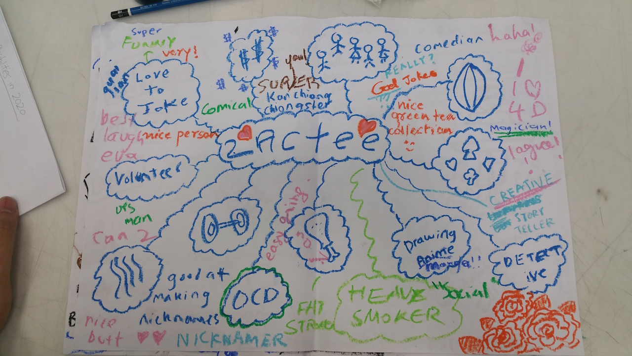
These activity allowed us to see ourselves another light and definitely useful. On the less academic side, this activity allow us to know our classmates better on a deeper level and served as a fun and meaningful bonding session for me and my peers.
Reflection
It is interesting but for a first timer like me, I find it rather convoluted to truly understand the theory initially. However after looking through some videos and researching on some articles online, I managed to get a fundamental grasp in the theory. I think it’s a rather useful knowledge and with the help of the colour wheel, both of them will serve as powerful tools me in the future projects in my upcoming semesters. I look forward to the project!