YOZXZXCZXC Whatsup my new handsome and pretty classmates!
Hopefully it has been a great week for everyone!
So here I am just doing a short and simple explanation
For the typography:
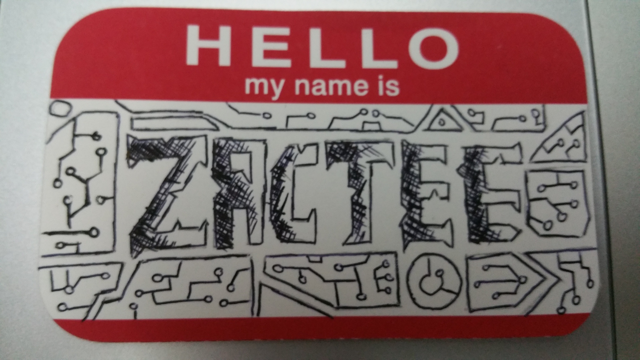
For this card it is more like a motherboard/computer ram. It is sort of like a piece of electronic card design and my name is kind of embedded into it. This is because I have been a computer promoter/salesperson for the past 8 years and is very interested in digital and IT gadgets. So this idea came to my mind one day as I was reading up on some IT forums!
For the conceptual one :
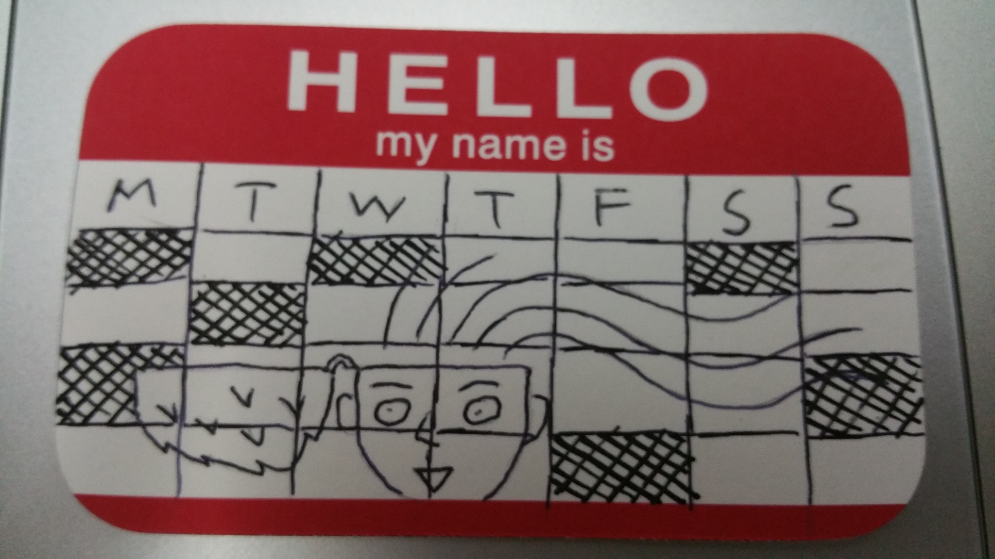
For this one it actually looked like a class timetable, or rather, a weekly scehdule. This is because as a person, I have mild OCD and wants my activities and events of the week to be well planned. I always need to make up a to-do-list so that I can follow it well. However, the irony is that I tend to procrastinate, making my planning obsolete. Oh well!
In the center of the picture I drew myself with my mind opened up, trying to tell the viewer that I am an open minded person who isn’t afraid to talk about anything or try new things!
This is the abstract card:
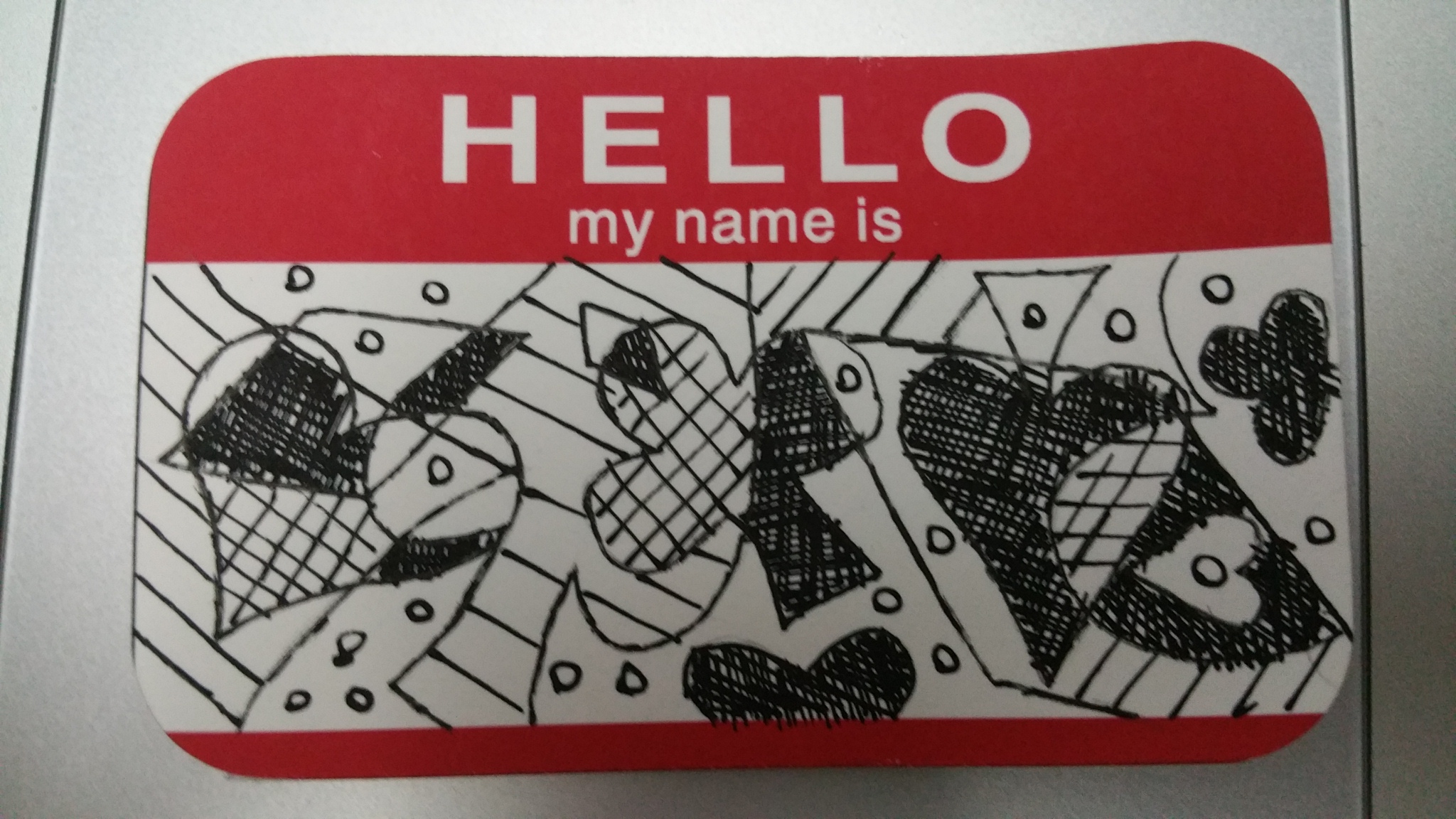
Abstract stuff has always been my weakness as I am not a very artsy person in this sense. In this design u can see four main shapes, mainly the four suits of the playing card. Clubs, hearts, spades and diamonds, overlapping one another. This is also just to show my love for the playing cards. Not that I am a compulsive gambler but that I am more of a magician, and one of my favourite magic categories is card magic.
Overall I had fun brainstorming and creating these 3 cards. It was a great activity to kickstart myself for the start of the term and an activity that not only allowed me to know myself even better but allowed me to get to know my new awesome classmates better!
Typography research:
As a base for the upcoming project one in which we are to create postcards using typography (mainly our name or initials), according to our attributes, I have done several brainstorming and research on typography type! so here are some of the findings on the internet. There are almost no limit or boundaries to creation of typography so here are just some categories and type of typography that I took interest in!
Food typography:
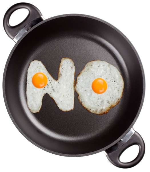


Not only can food be made into text to enhance the meaning the artist want to bring across, text can also be made into shapes or designs of food! Very versatile and creative indeed !
Elemental Typography


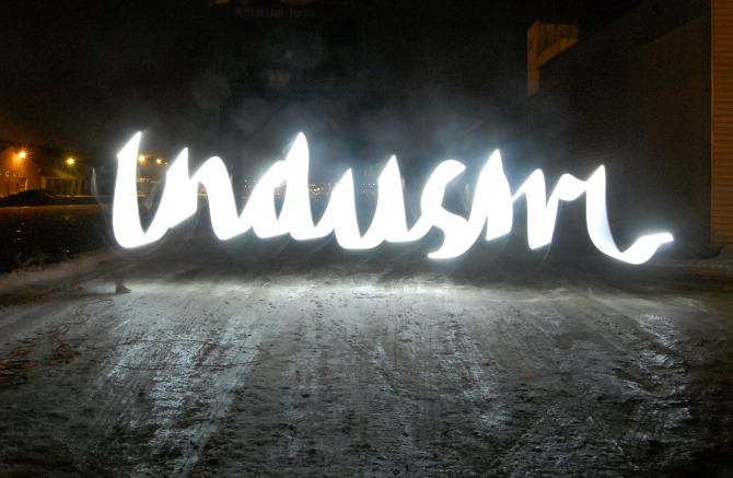
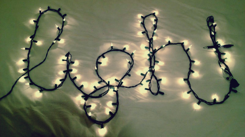
Similarly, elements like water, fire and light are very creative and innovative ways of creating texts! Similar to food typography, not only can you use the element to create the text, you can actually use text to create the elements as well. One example is the one thereby text actually was designed to look like water droplets!
Environmental Typography


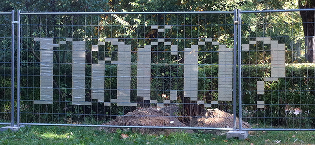
As stated, this typography uses the natural elements and the items found in the environment. Some of the techniques include using ice (during winter in colder countries), or even insects and spiderwebs to form text!
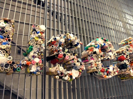
Interactive/human typography
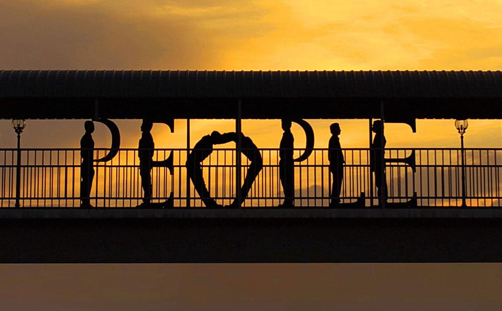


using people and parts of the human body to create stunning typography are also an amazing way in which people are able to express themselves! One of my favourite is the one where the artist uses her hand to create alphabets, which are able to interchange themselves between the capital and small casings. Very interactive and creative indeed! One way I thought of using this technique would be to educate children!
Dual/hidden meaning logos/icons:

last but not least, this is one of my favourite type! It is not really typography per se, but the it is kind of unique and creative to me when you can inject hidden meanings into the icons and logos, giving it a dual meaning. I would like to try to explore something like that for at least one of my attributes in the upcoming projects but I might not execute it as well! but I will try!
In conclusion I was never a typography person but this project, exercise, brainstorming and research opened me up and I think i am ready to take up the challenge of project one in creating awesome (I hope) typography for my 6 attributes!
See you all in class again! 😀