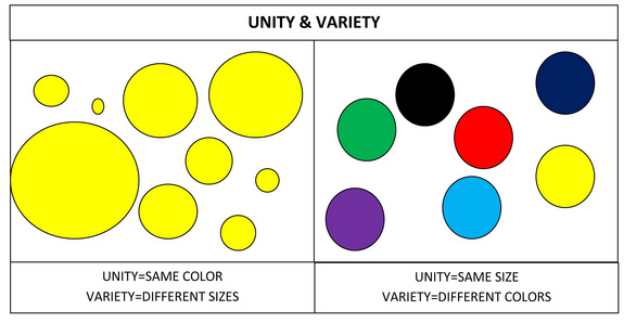
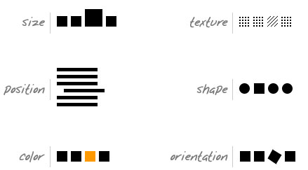
Unity/Harmony
When all elements are in agreement, a design is considered unified. No individual part is viewed as more important than the whole design.
- Perspective: sense of distance between elements.
- Similarity: ability to seem repeatable with other elements.
- Continuation: the sense of having a line or pattern extend.
- Repetition: elements being copied or mimicked numerous times.
- Rhythm: is achieved when recurring position, size, color, and use of a graphic element has a focal point interruption.
- Altering the basic theme achieves unity and helps keep interest.

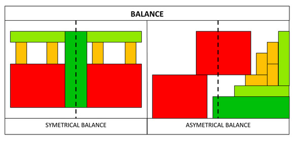
Balance
It is a state of equalized tension and equilibrium, which may not always be calm.
- Symmetry
- Asymmetrical balance produces an informal balance that is attention attracting and dynamic.
- Radial balance is arranged around a central element. The elements placed in a radial balance seem to ‘radiate’ out from a central point in a circular fashion.
- Overall is a mosaic form of balance which normally arises from too many elements being put on a page. Due to the lack of hierarchy and contrast, this form of balance can look noisy but sometimes quiet.
 Symmetrical example in real life:
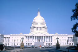
The left and right of the architecture is mirrored with the central plane which made the building symmetrical.
- Asymmetrical example in art:

Hierarchy
contains elements that lead the reader through each element in order of its significance.
Images should be expressed starting from most important to the least important.
Example of hierarchy in art:

The Proportion and placing enthroned Madonna and Child make it the most important subject, followed by those wearing red, and lastly to those in the background.
Example of hierarchy in typography: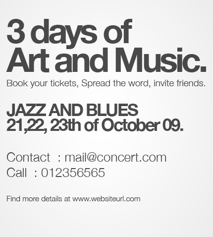
The most importation information to be read first with the biggest font, and at the top,
Secondly most in sequence information second and medium font and lastly the information that should be read last having the smallest font and placing at the bottom.
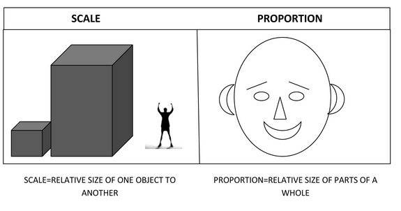
Scale/proportion
relative size of elements against each other can attract attention to a focal point.
When elements are designed larger than life, scale is being used to show drama.
Example of scale in photography:

The scale of the finger is way larger than the figurine, its is automatically processed by the brain that it is a small figurine instead of it is a giant hand.
Examples of Proportion in Sculpture:

The proportion of the arm is way larger than it should be for that small head, it attract attention due to the abnormality of the disproportion.
Dominance/emphasis
created by contrasting size, positioning, color, style, or shape.
The focal point should dominate the design with scale and contrast without sacrificing the unity of the whole.
Examples of dominance/emphasis in Photography:
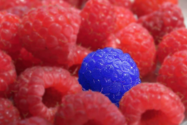
A single bright blue raspberry stands out from a crowd of red raspberry, it draws attention to the blue raspberry making the other red raspberry to become the background.
Similarity and contrast
Planning a consistent and similar design is an important aspect of a designer’s work to make their focal point visible
Too much similarity is boring but without similarity important elements will not exist and an image without contrast is uneventful so the key is to find the balance between similarity and contrast.
Example of Similarity in graphic design:
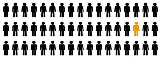
The pattern is repeated, however the colour of a single stickman is different with other to show contrast.
Example of Contrast in Painting:
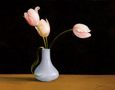
The flower is being emphasis by having a contrast with the black background which makes it stand out.