I Am The President
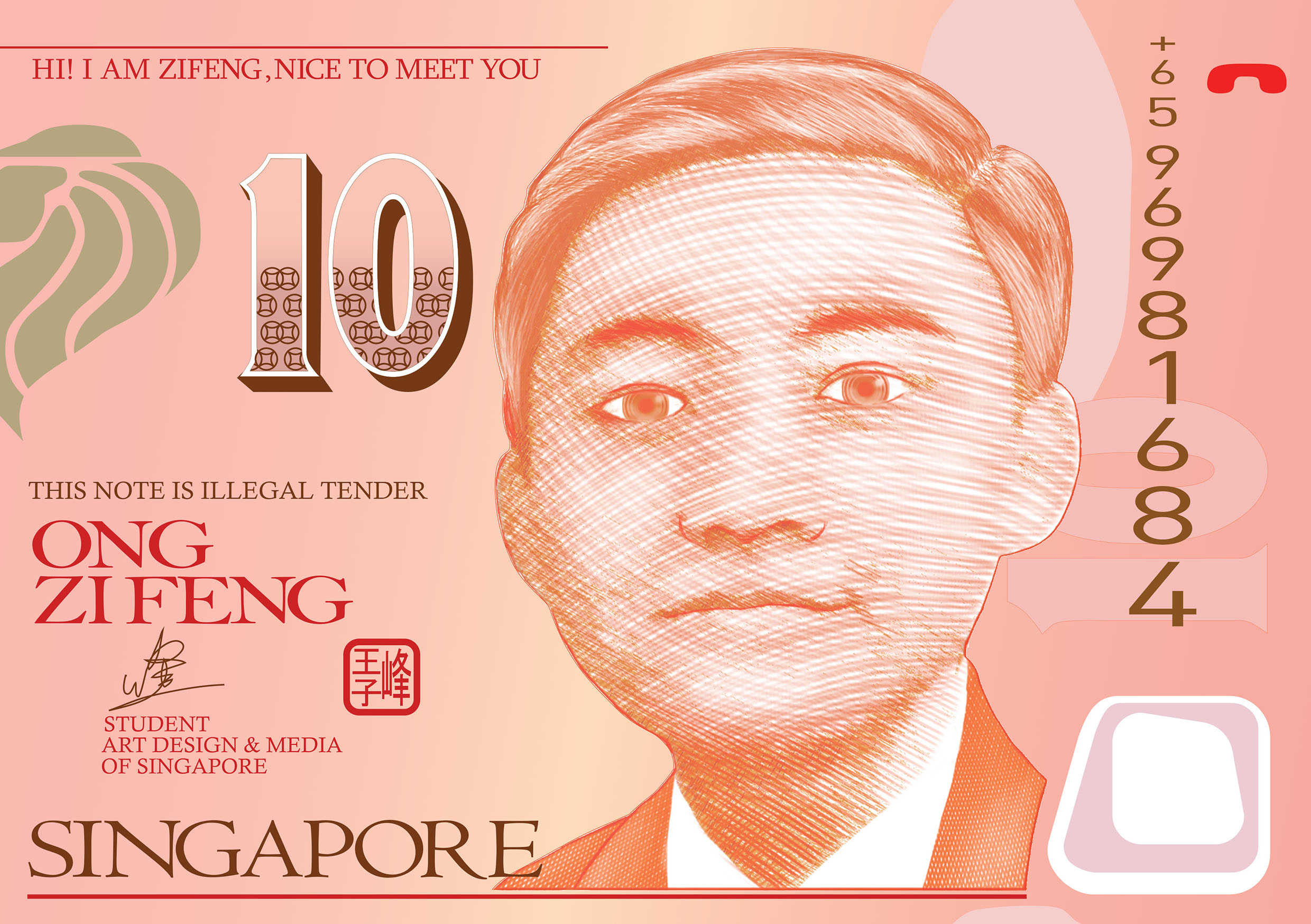
I REALLLLYYYY like this one, but I think I am not going to use this as one of my final as the typo of this work isnt really showint that i am the president, whats doing the work is the overall image which is a ripoff of $10 Singapore note, which made this really funny!
I Am a Ninja

My initial idea was to use it as black on black, because the small letter ‘e’ and the capital letter ‘N’ forms a human shape, and the shape of ‘e’remind me of a ninja which fits into my black on black idea, after some exploration in the font and such, this is the result of experimentation, the background image is one of the best i could find, however the resolution kind of destroy it, maybe gonna find some other background for it or discard this totally.
I Am a Vandaliser

Another potential piece as a final, graffiti is the first thing that came to my mind when talking about typography, because i used to like the style of graffiti painting, the “illegal” part of it makes it VERY EXCITING!! *i had not done it btw* another reason i liked graffiti is the vibrancy in most of the street graffiti, it is loud, expressive and sometime aggressive, which i think its great as a form of expression as well as a great art.
I Am a 3D Artist
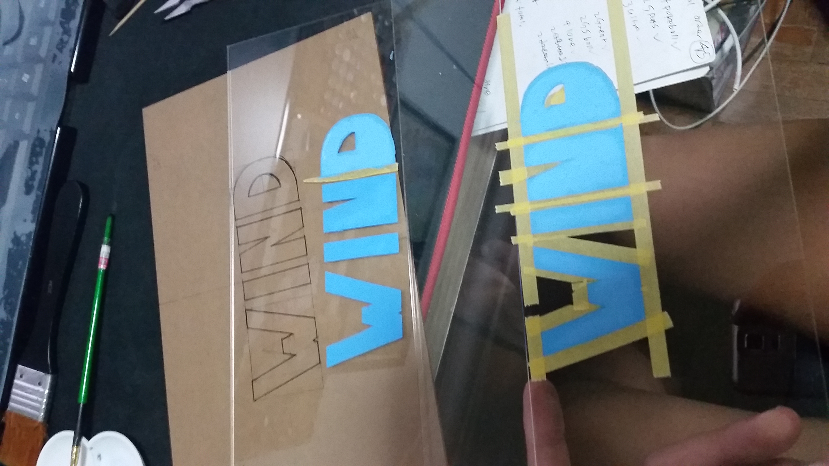
Wind is my English name! I used it when I was backpacking as the Ang Mor cant really pronounce Zi Feng, so the Feng = Wind.
At first i draw the type by hand, afterward I gave up and use masking instead, its more accurate this way! carefully measure up the centralization and traced it using acrylic paint, why blue? because its the wind. wind feels bluish for me if i have to give it a colour.
 Why dandelion? because Wind cant really be seen and something need to be used to show it, something classy and elegant like dandelion is used to give the feeling of a cool breeze (not tornado or hurricane!)
Spent alot of time just to do this, total of 10 layers of acrylic, painted each layer by layer, one of the easier part is the alignment of every layer and paint (easy as in skill, totally not easy as in time wise.), the harder part is to get the dust off between every layer..( difficult in skill & time wise, 2 surface each piece, after I cleaned the bottom of the top layer, I have to re-clean the top of the bottom layer again, removing all fingerprint and dust isnt easy, imagine sticking 20 piece of screen protector on your phone without any dust in between, its crazy!!)
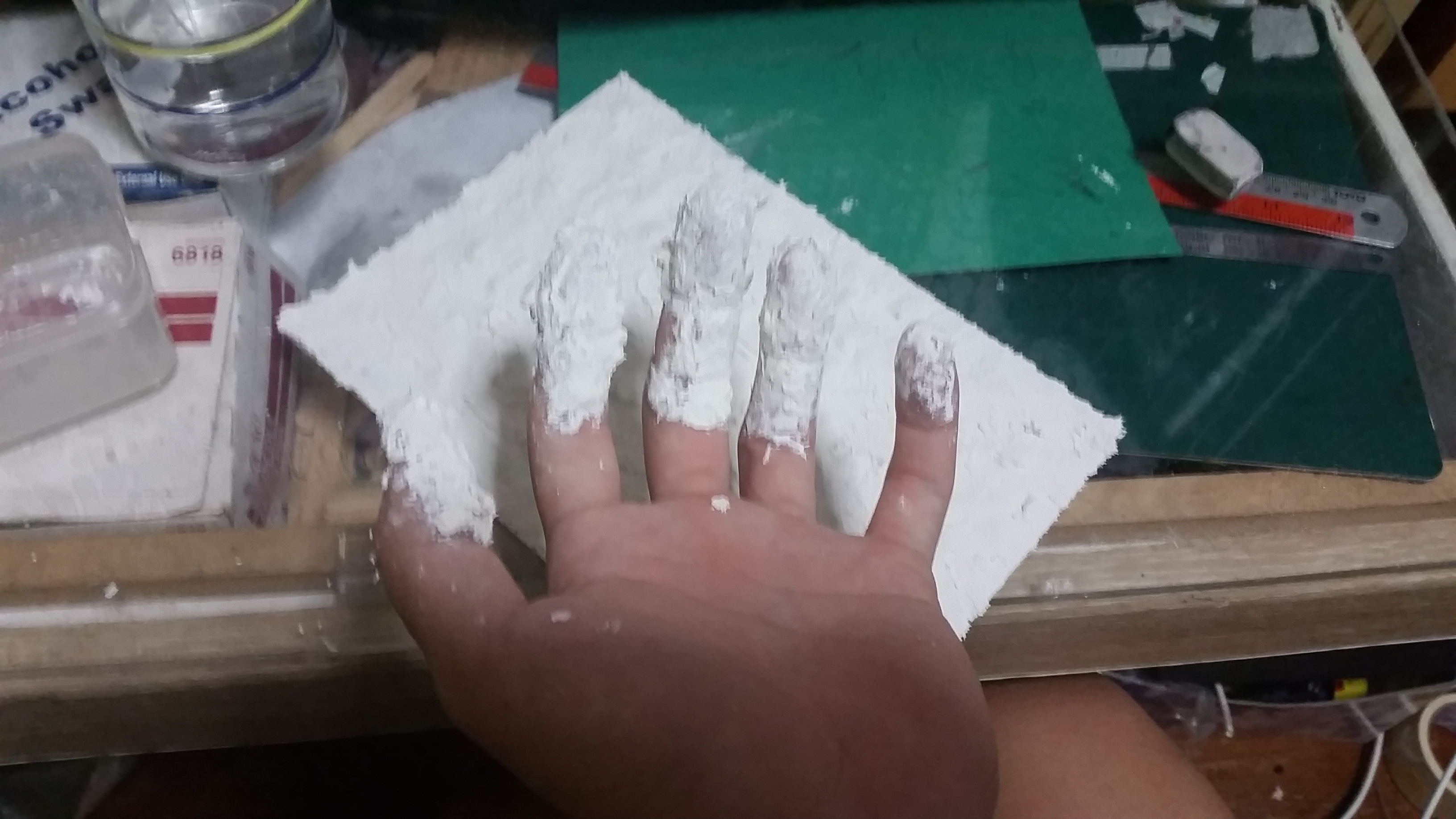
I Am There
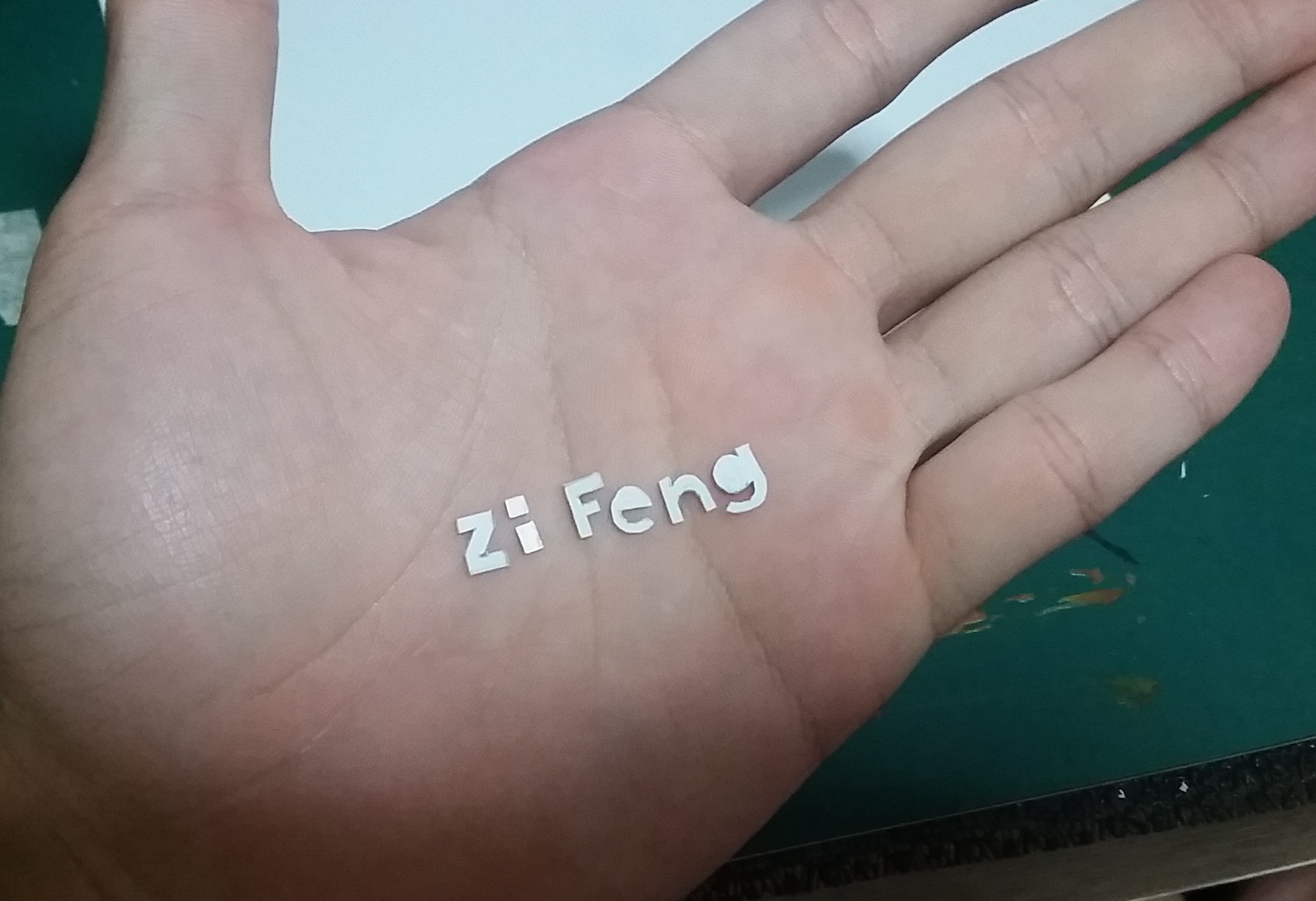
Started on the idea of White on White, tiny little font in the middle of huge blank background (not really, its just a A5, so tiny font will do) carefully cut out 1mm styrene sheet of my name.. e n g is extra difficult to cut due to the curve and the inside angle. lots of trimming must be done.
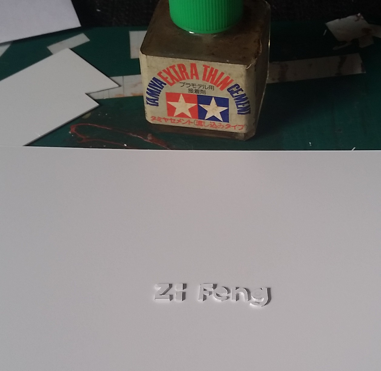
As I need the shadow to drop at certain angle, I need to carefully place the typo so it do not sit in the dead center of the A5, I have to take in the consideration of where the shadow will fall and my centralized position of the typo will be “popout text + shadow” it seems like a minute difference, but it is these minute difference differentiate a perfect piece from a regular ones. So in conclusion, the position of the typo will be slightly to the top left of the “supposed center” to counter the distance of the drop shadow created.
 sticking cutted out styrene name on A5 styrene sheet by using the thin cement which is used to build plastic model, it simply melts the styrene and fused together when it dries.
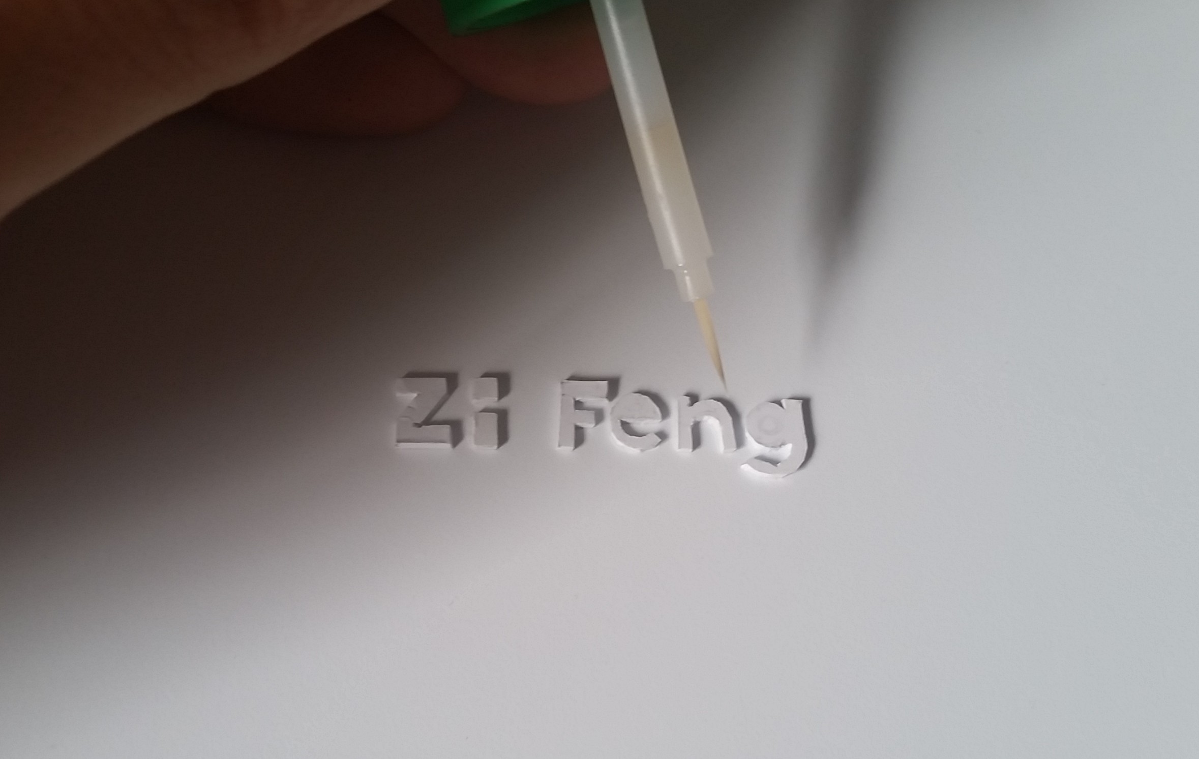
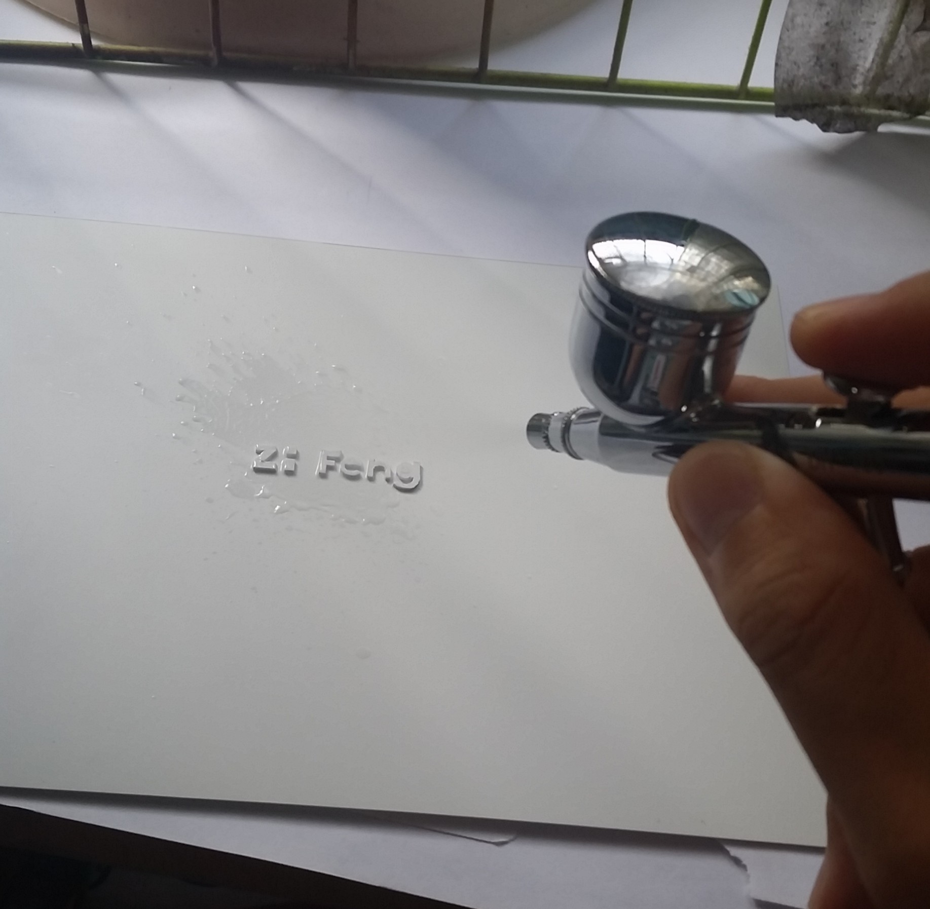 Airbrushing white on white on white just to remove any difference in texture, imperfection during cutting and make sure it look like its popping out from the paper. BUT SOMETIMES ACCIDENT HAPPENS!!!
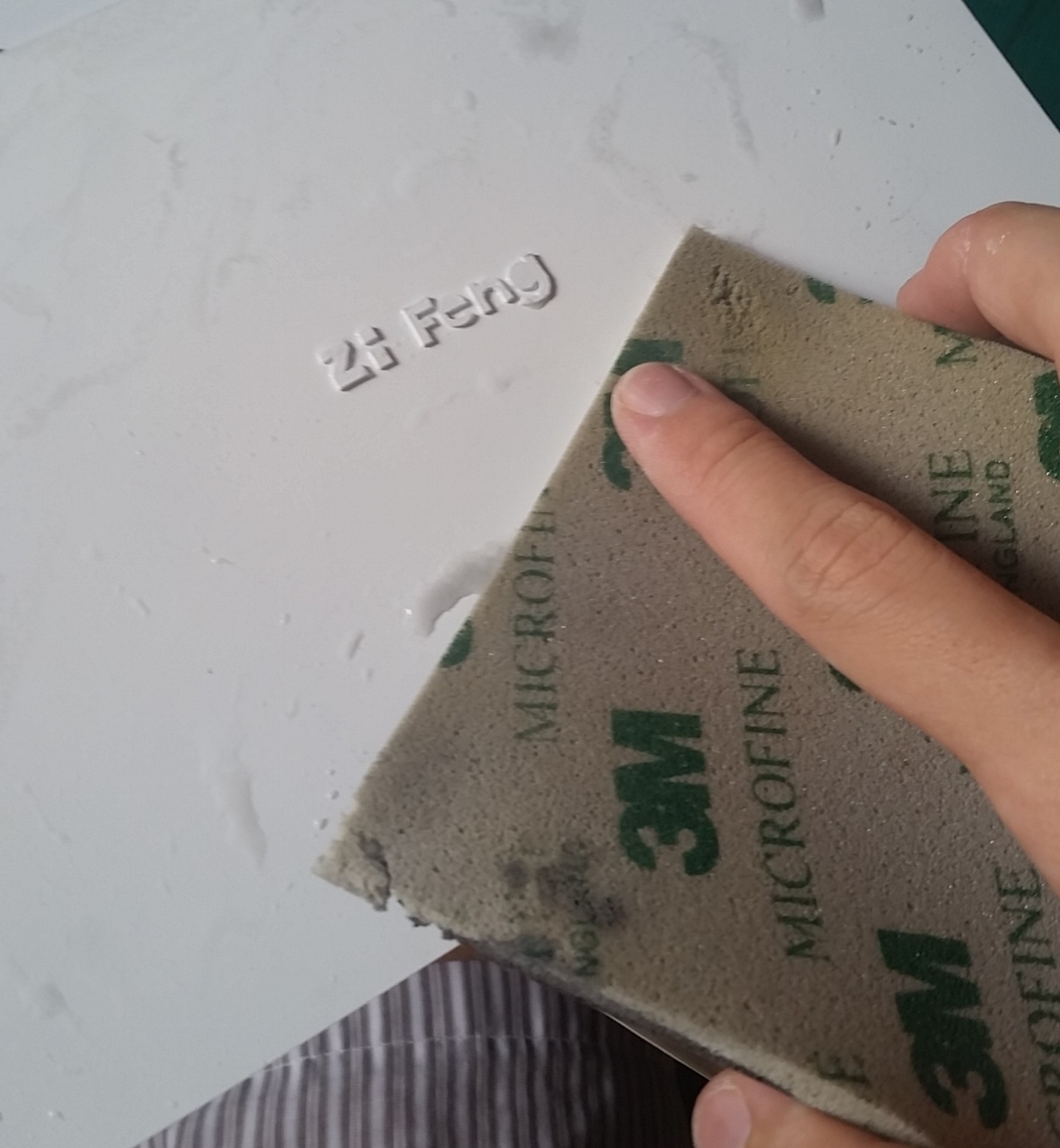 After the accident happens, i have to sand the thing down and rework it.
 resume airbrushing after sanding.
I Am Old
 this is an illustrator file which i am going to transfer it by lino printing

and this is what i am going to carve on the lino. still thinking about the way to transfer the print accurately. hmmm i’ll see what i can do..
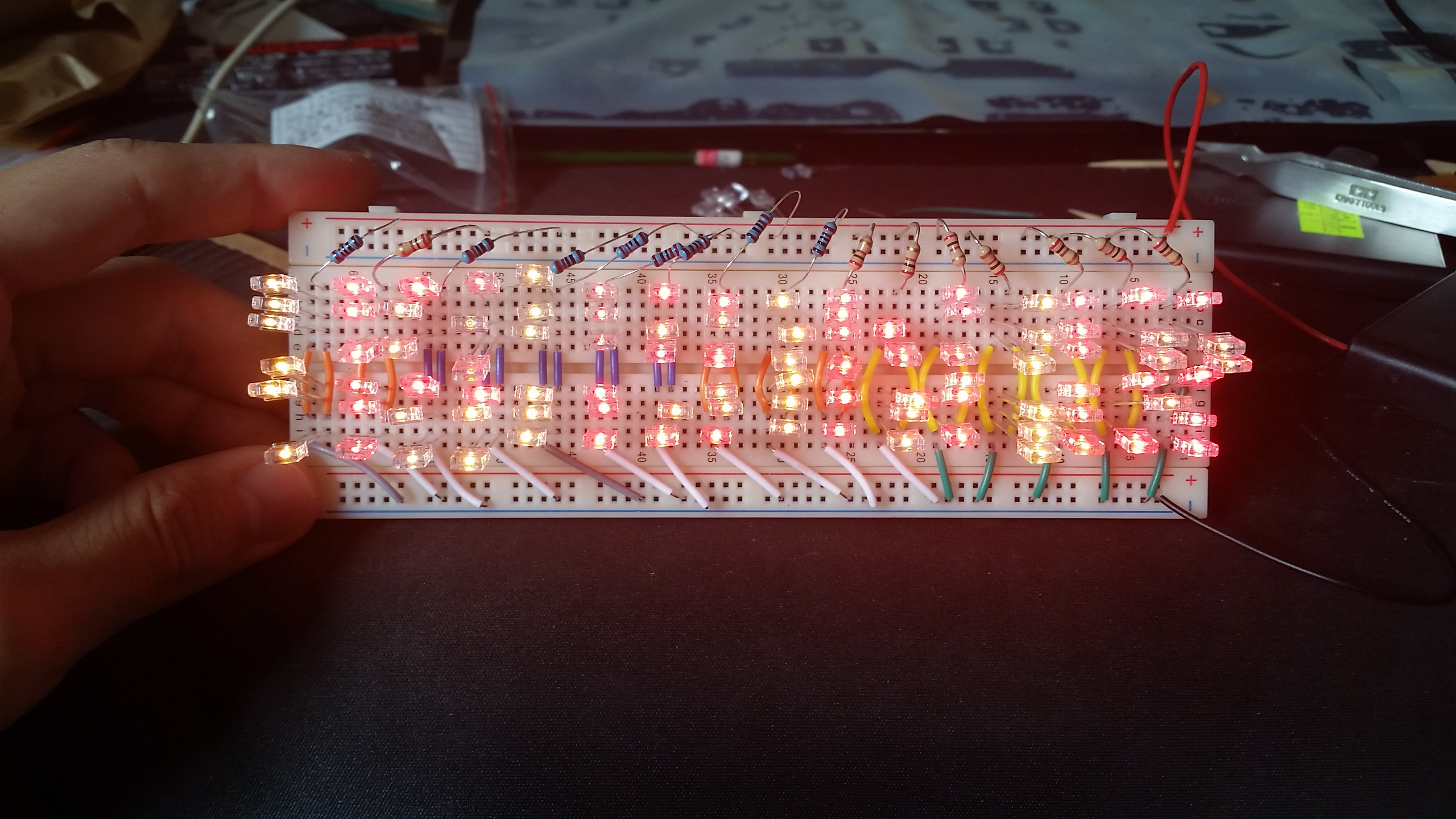
I Am an Electrician
Electrician always start to learn circuit using the most basic exercise, to learn how to light up LED lights. seems easy but theres some calculation to be done so as not to burn your LEDs, which i burnt a few due to my inexperience.
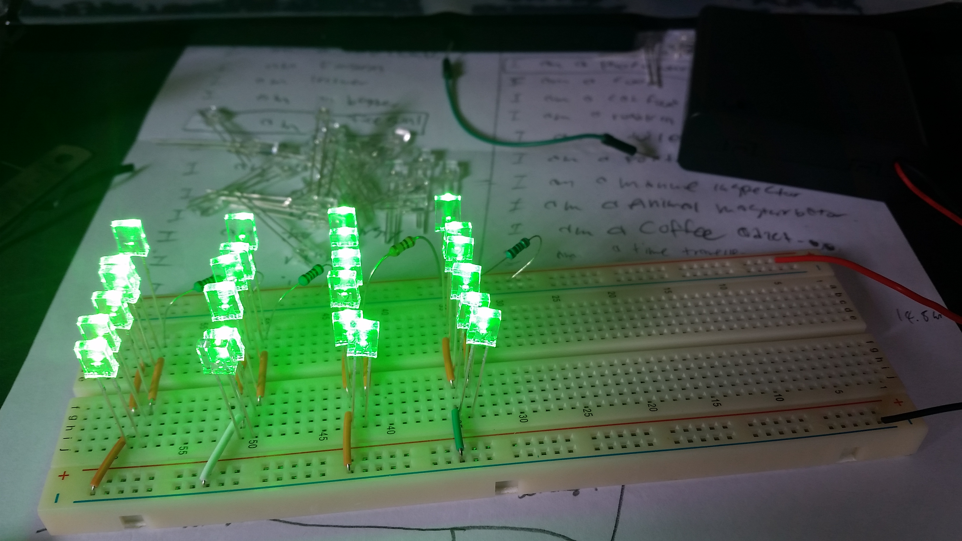
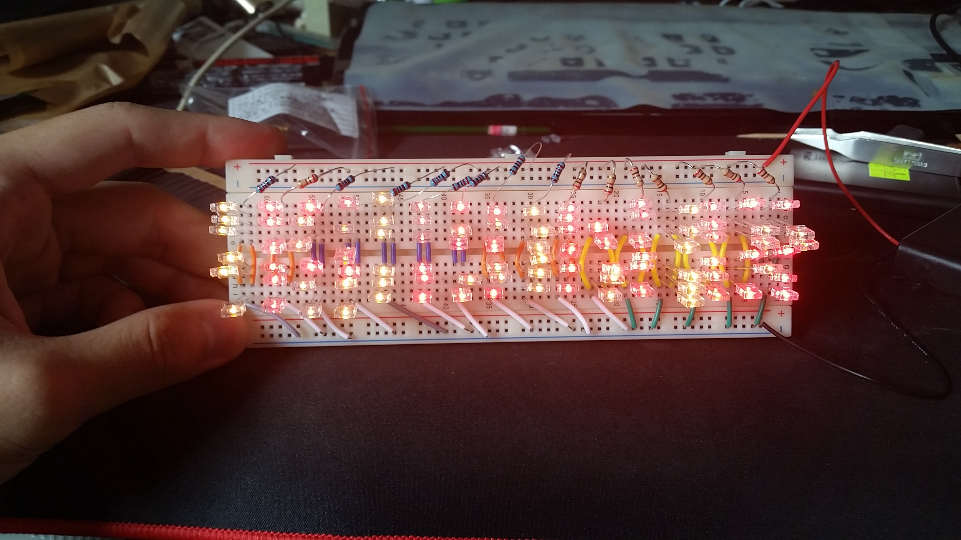
I tried to form the word FENG on the bread board but its not sufficient to do so so i guess i need more LEDs (round instead of rectangular) a bigger board, which after some research online, there is no breadboard(the white plate which i stick my LEDS onto it) thats so big, i need to buy circuit board and solder one by one. THIS WILL BE HARD! i’ll see what i can do.
I Am a Gardener
 The most time consuming process, the carving out of the leaves.
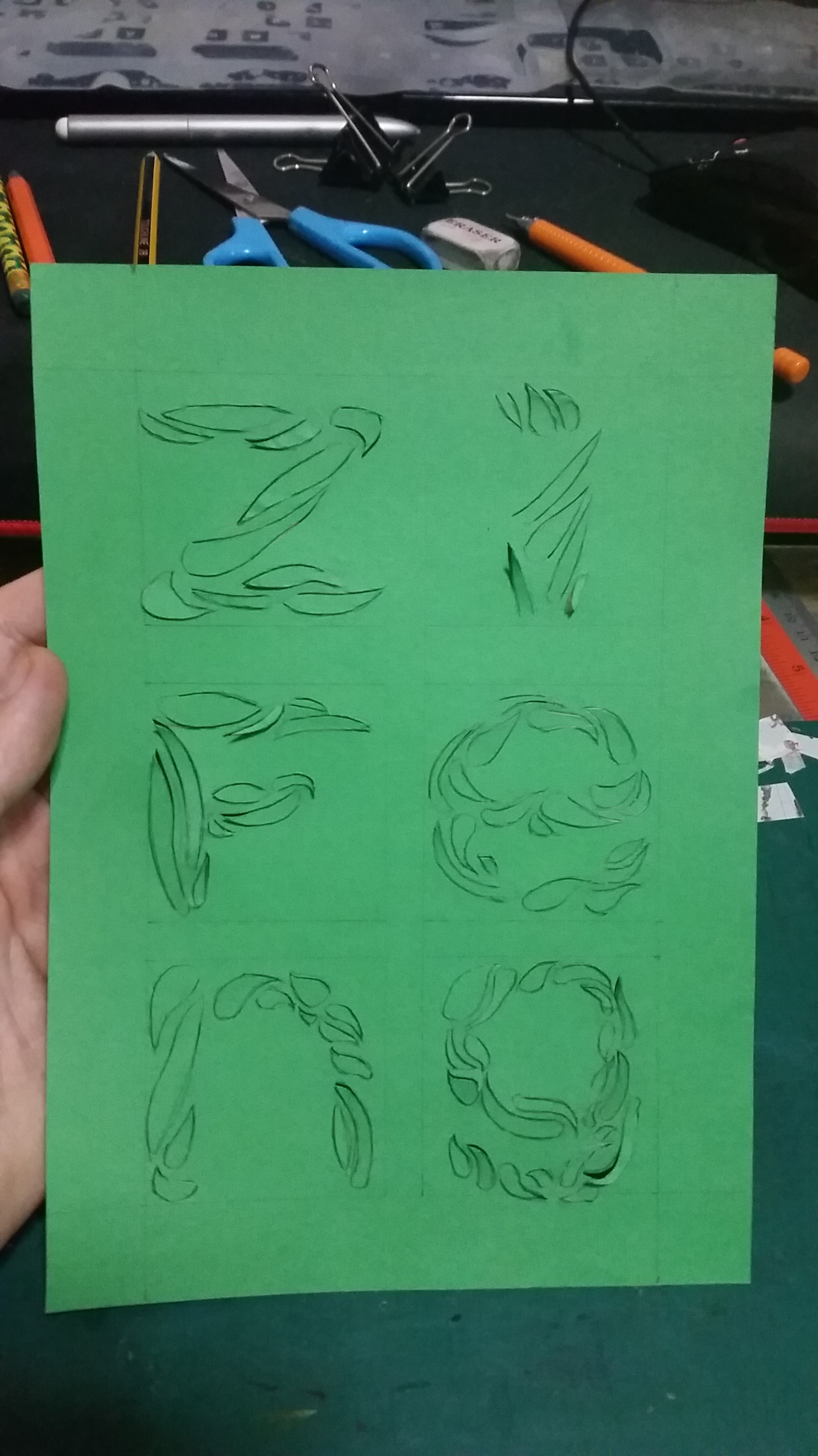 this is how it looks right after cutting out
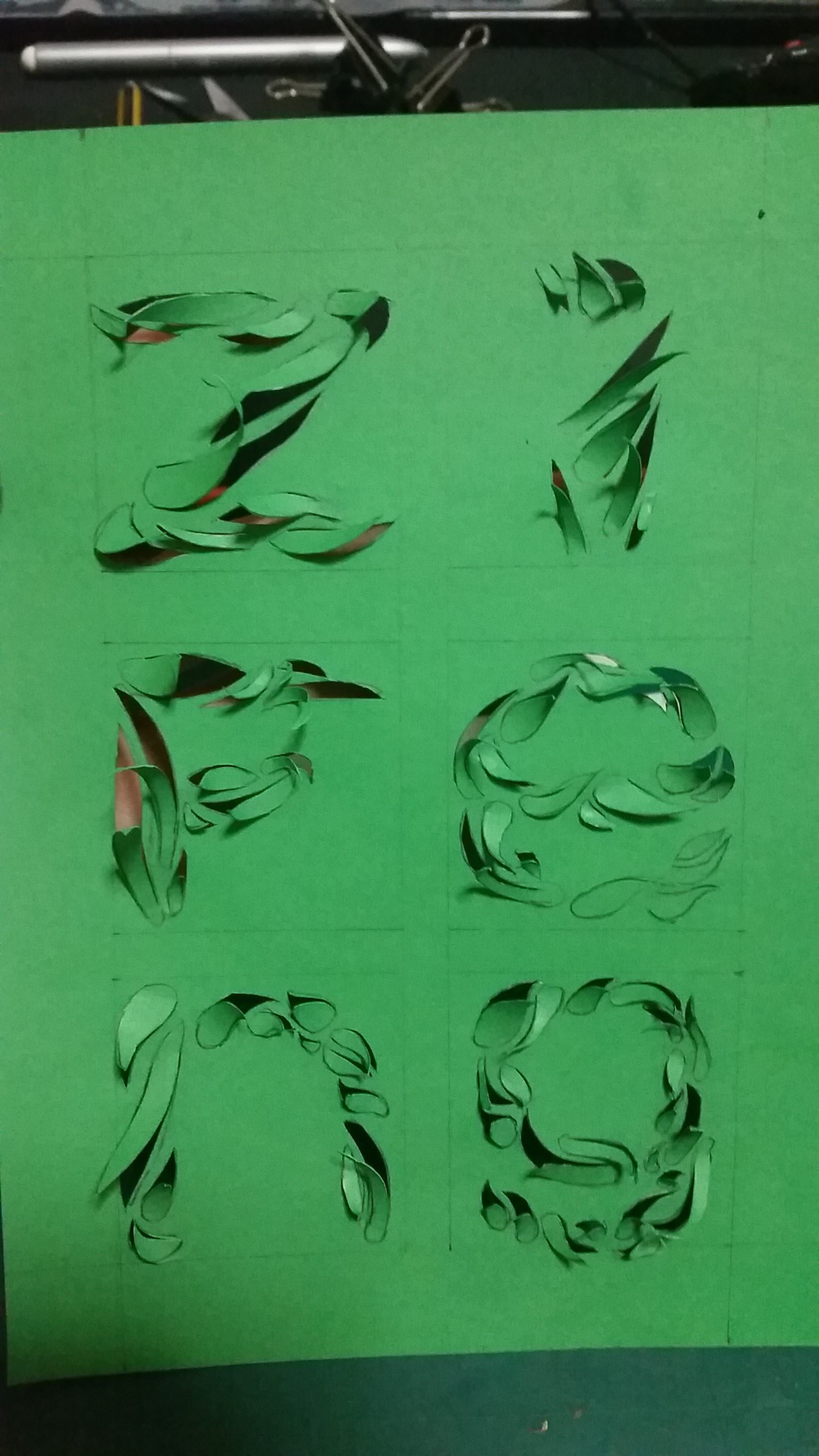 and this is how it looks after the “rolling” of the leaves
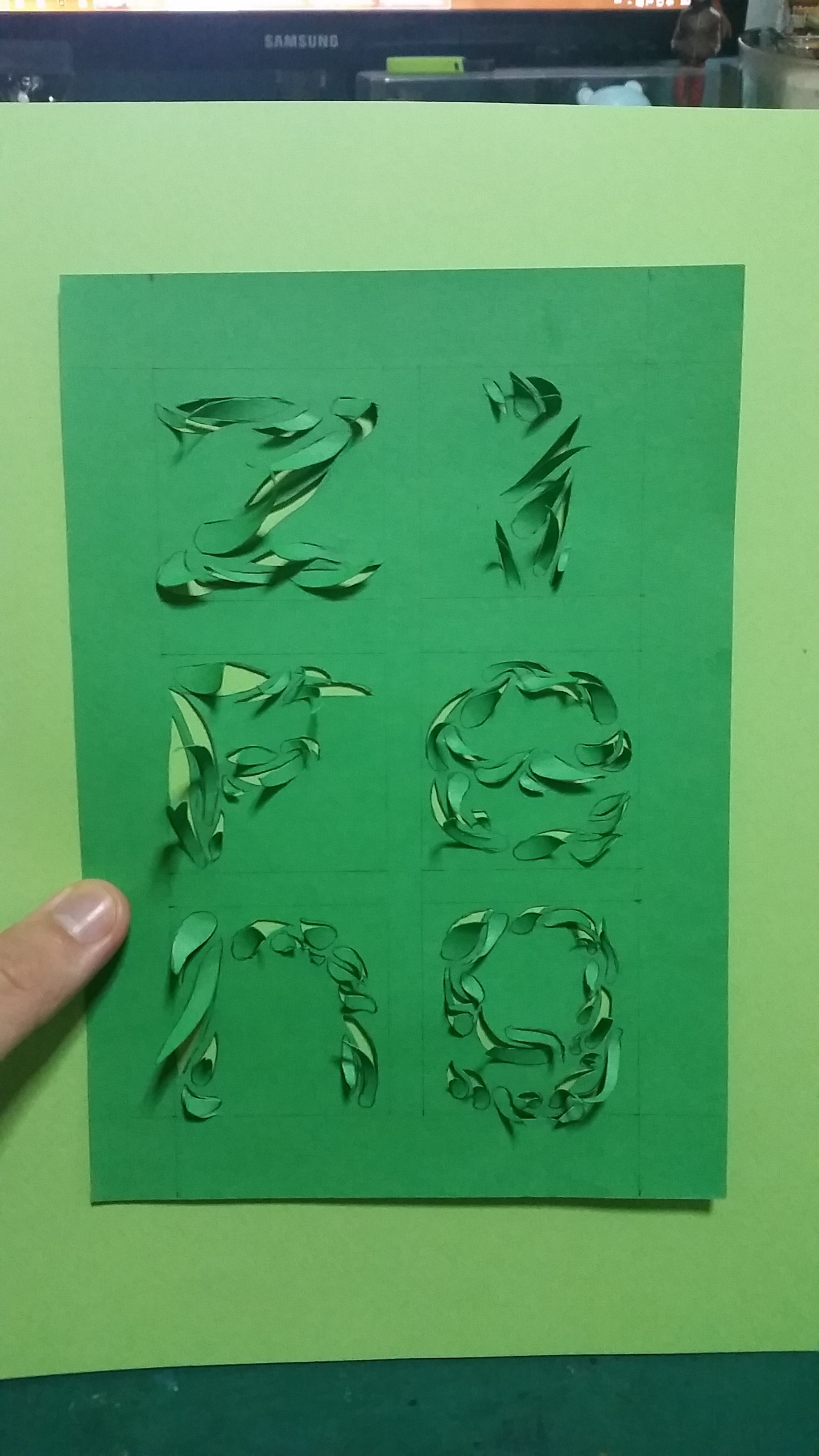 and against a lighter shade of green as backing, i kind of liked this and looking at the “g” it gave me another idea of I Am.. which is…..
I Am a Trypophobic
Seriously, i am really Trypophobic, it is the fear of clustered holes, in my case its fear of clusters of holes in skin. TOOOO DISGUSTINGGG! MY HAIR STANDS JUST BY THINKING OF IT! THE RESEARCH FOR PICTURE IS KILLING MEEEEEEE!! MY HEAD IS ALL ITCHY, NOW MY BACK IS ITCHYYYYYY!! ARRRGGGGG!!!
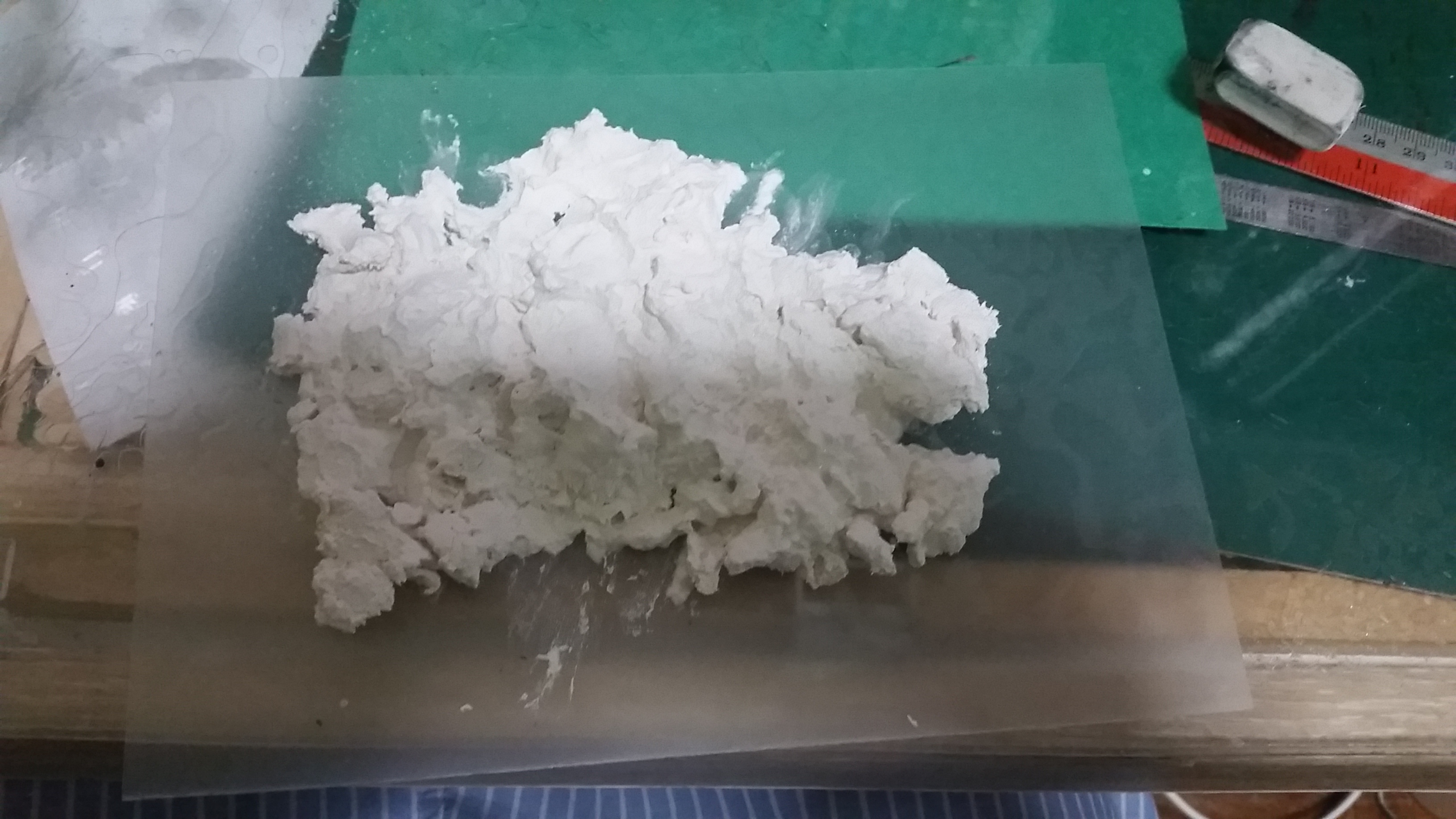 The only thing i could find at my house to work with it is the left over clay. so i added some water and knead it to make it softer.
 I feel that i am doing 3d projects.. well.. 2d, 3d, all the same. its all design and design is a language across all culture.
 the outline of my name, I used the back of the brush to poke holes, wipe the brush and repeat the process, this is slightly disgusting, my hair stand again just by looking at this!! ARRGGGG!
 I reduced the picture size because I dont want to keep staring at it while typing, click it for full size and get the itch which I am having all over my back right now.. *IMAGINE THIS DISGUSTING THING GROWS ON YOUR BACK AND YOU SLEEP… ARRRGGGGGGGG!! WELCOME TO THE TRYPO CLUB!*
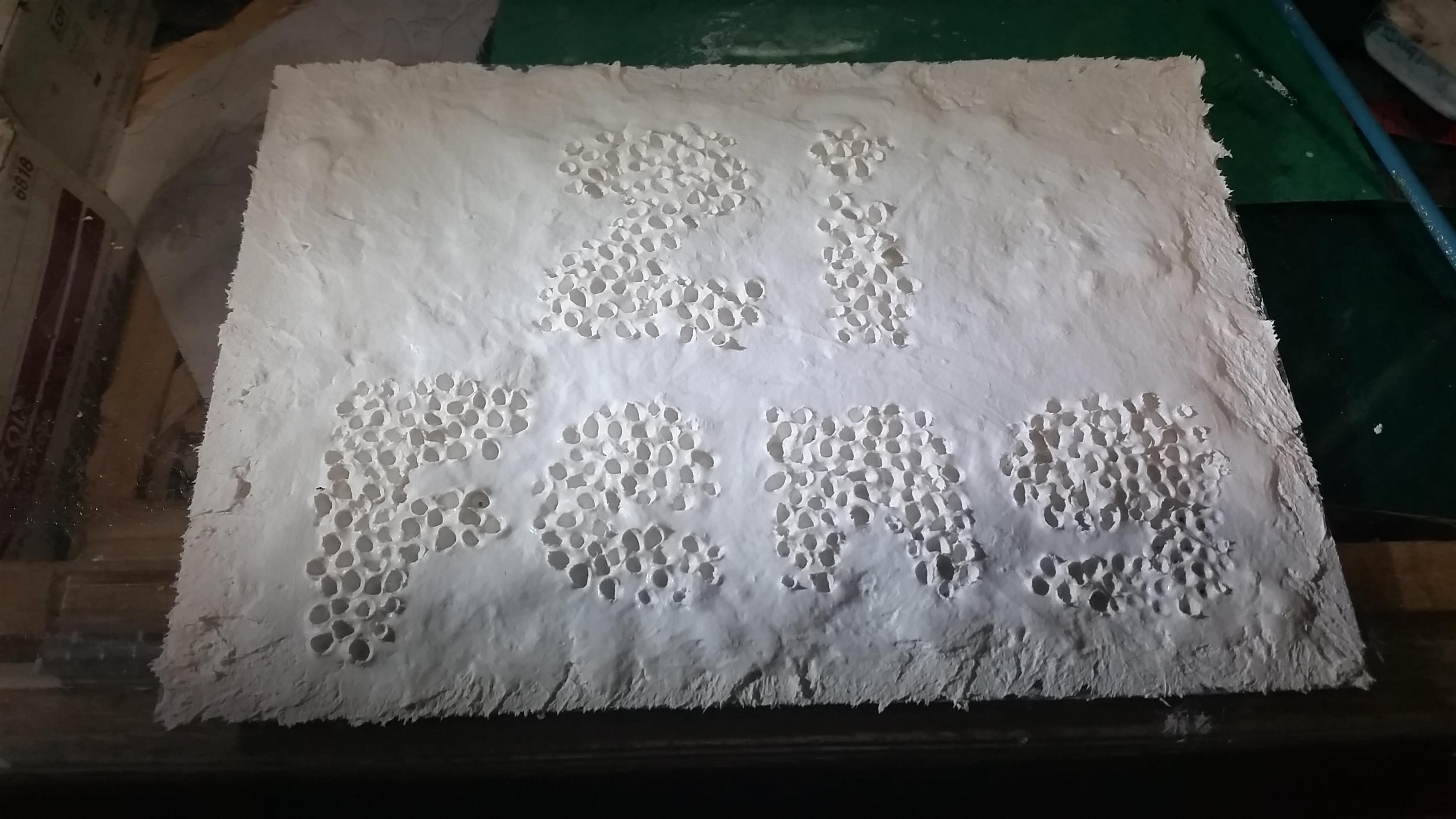
this is the finished overall, I might paint it to give it a more disgusting feel.. (as if its not disgusting enough!!)
TO CLEAR OUR MIND, HERE’S A PICTURE TO CALM US DOWN.
HELLO PRESIDENT.