2D sem 2 Project 3 – Zine – Final-Final1-Final2-FinalEdited-ReallyFinal-ReallyReallyFinal…..

Finalzine

Finalzine2

Finalzine3

Finalzine4


Finally final, throughout this project, I’ve learnt many things, how to use InDesign, the very basic of laying out and making of a Zine(which i am really bad in and still feel so after the project), if unsure – ask, if still unsure after asking – copy other peoples work in your own style. I also learn that how a block of text should be like in a page and such.

Also~

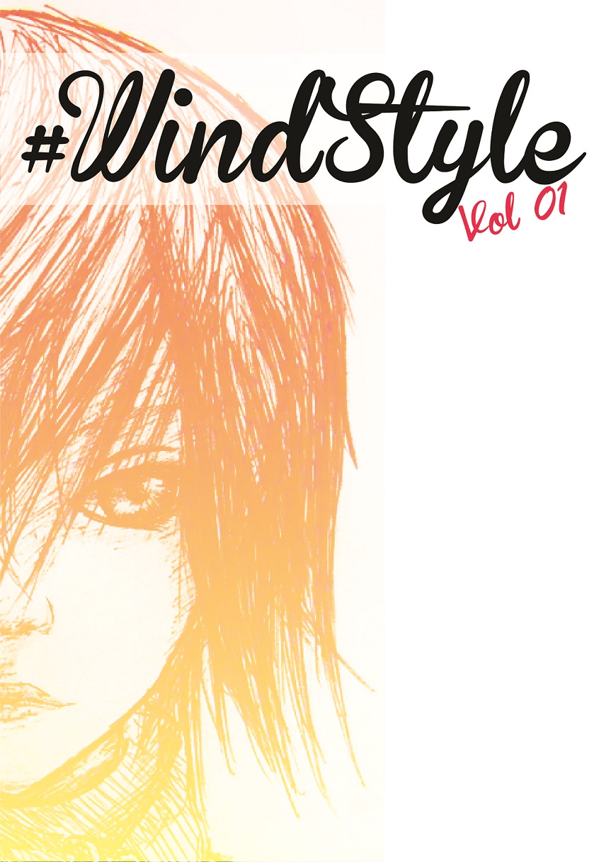
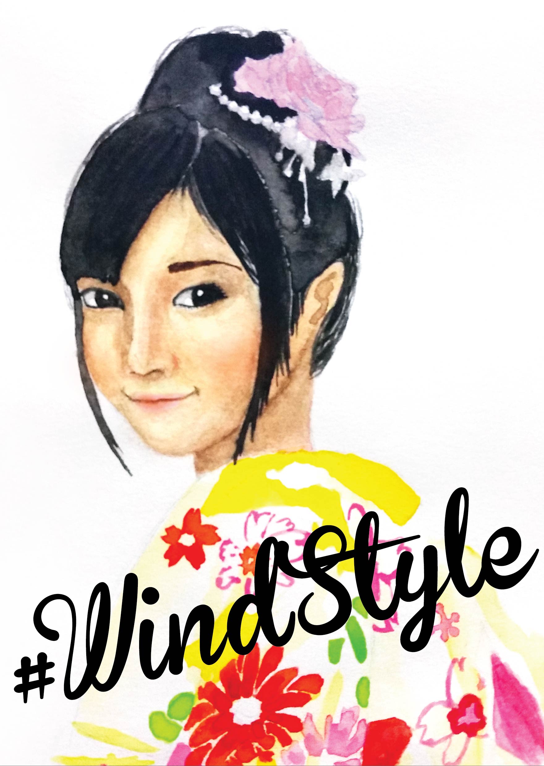
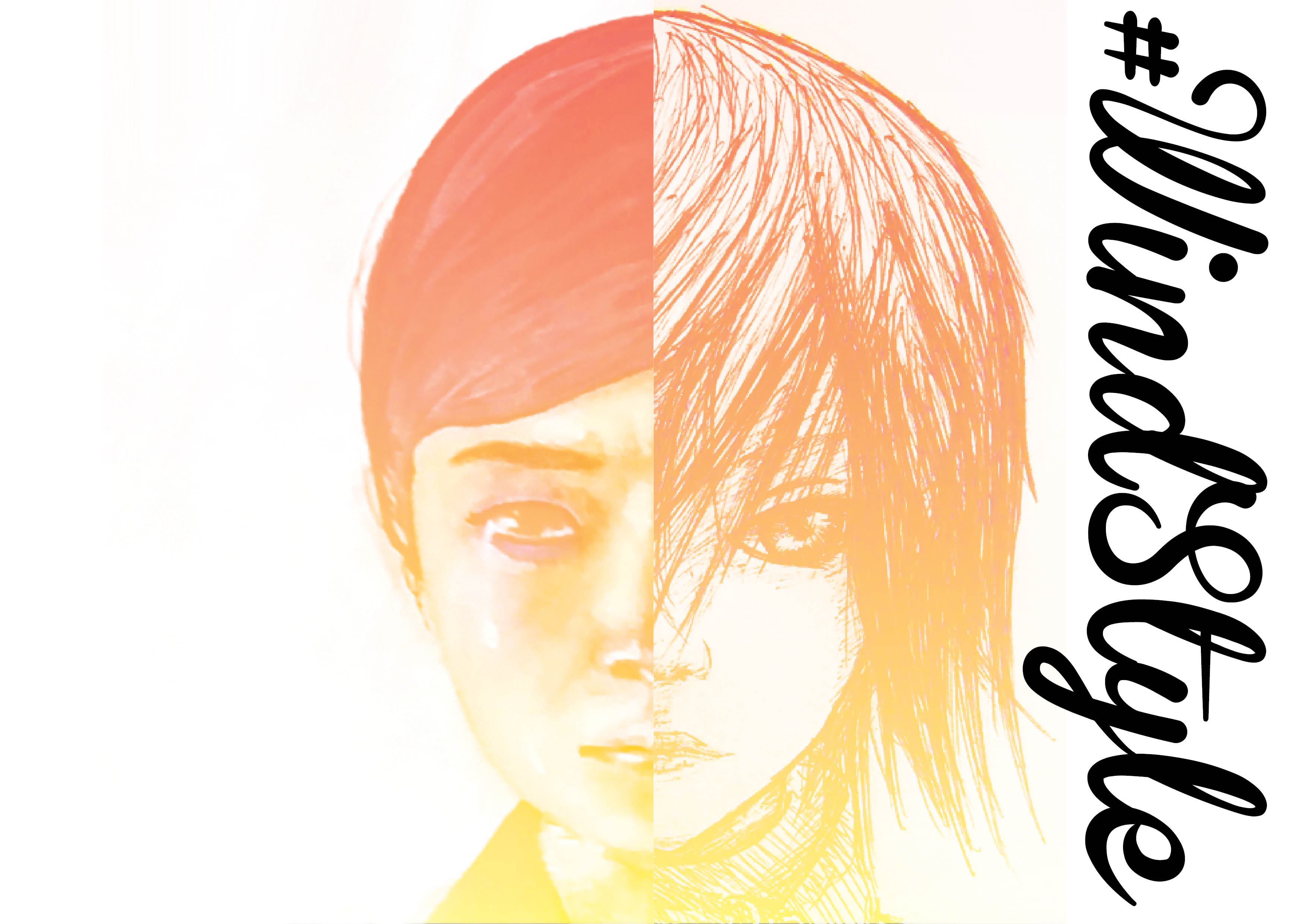
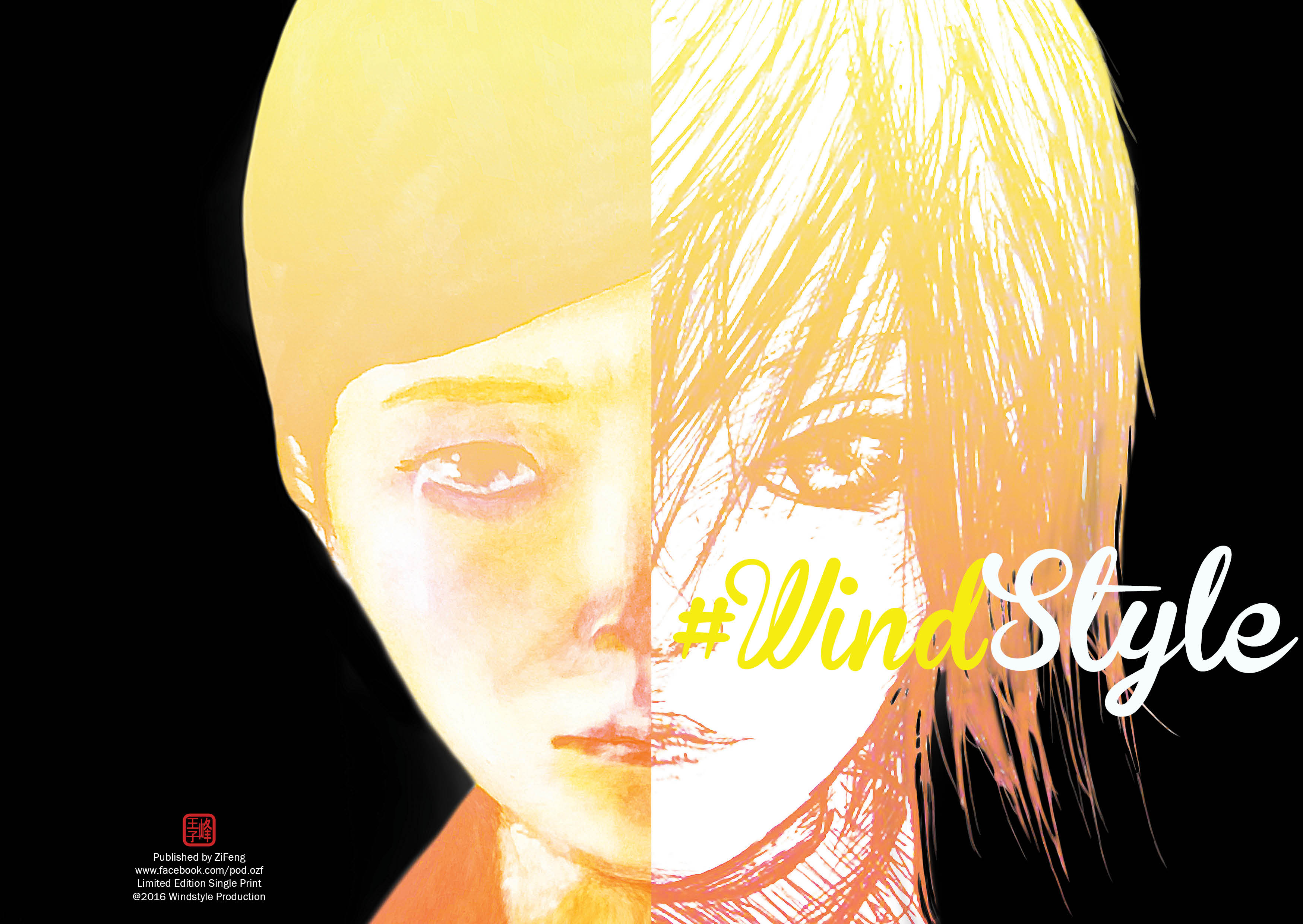
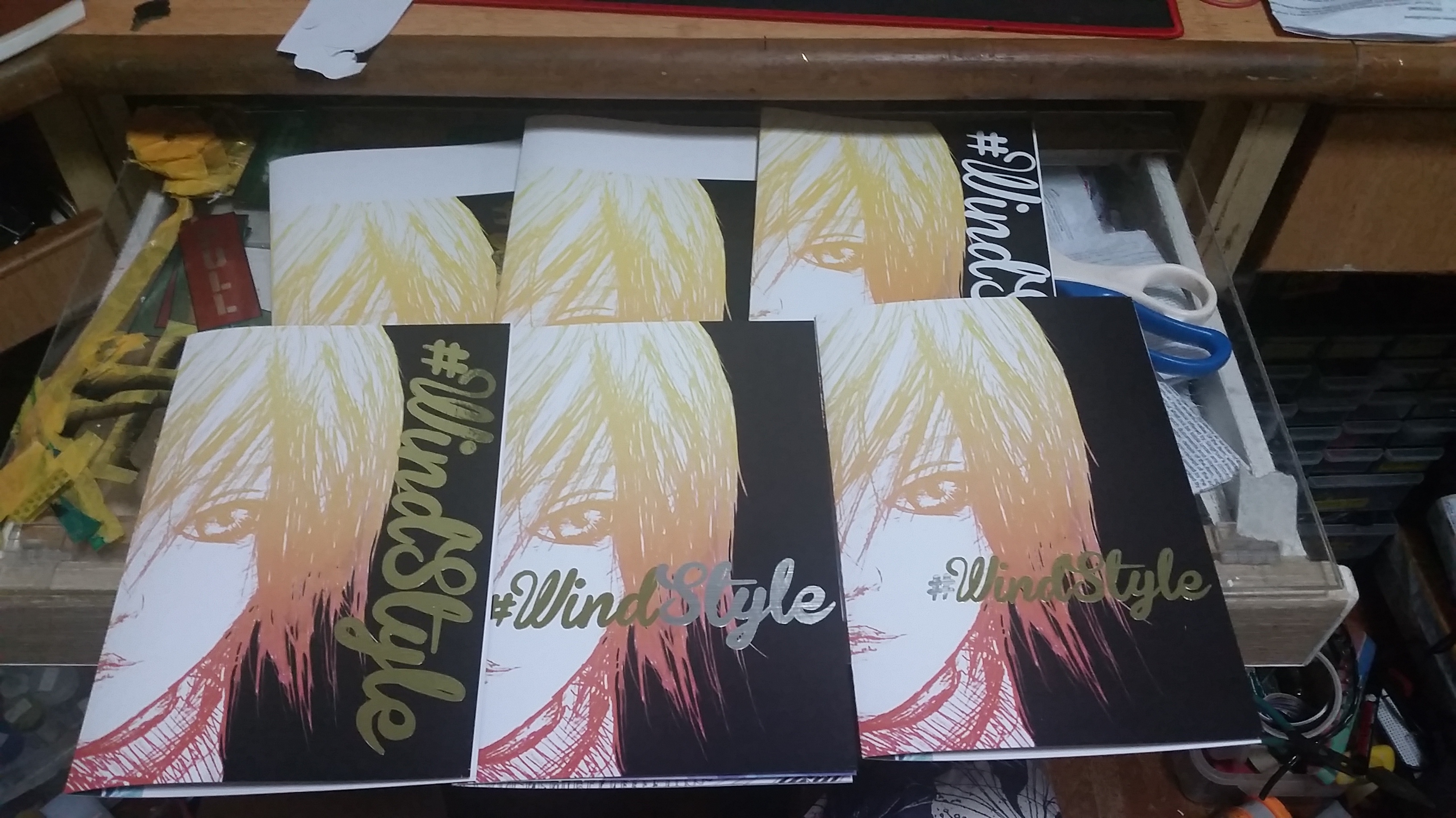
DO NOT LEAVE THE PRINTING SHOP BEFORE CHECKING ON THE PRINT QUALITY AND ALIGNMENT OR ELSE YOU WILL WASTE TON OF MONNNIIIEESSSSS!!! and also to prove that i cant decide which coverpage to use till last minute, i printed all potential coverpage out and cut the gold and silver one by one and very carefully to make sure every one of them is submission worthy. chose the bottom row middle one in the end as it is more WindStyle- MY STYLE.

2016-04-11 22.26.57


lastly, I realise page layout is totally different from a piece of painting/artwork as a good page layout is totally unnoticeable, unlike a painting when it is good, it will grab attention. so in conclusion, I survived this project and tried my best to stay afloat and not to die in my own failure of self doubting, became very doubtful of my judgement of beauty, know i cant handle this project myself and go around asking people about opinion and “This 1 nice or not?” to try to produce something consultation worthy and finally, receive advice given by Shirley and made huge improvements to my work and tried to do the best i can within my capabilities and tadaaaa! im done.

2D sem 2 Project 3 – Zine – Research and executions – PART 2!

like I said, I will keep trying, i cant judge weather my work looks ok or not (again, im really bad in laying out and choosing font)

so I just keep doing different versions of the same thing, by doing this, I hope I can learn which style suits me other than #WindStyle. and how to develop a sense of laying out, by asking around

“WHICH 1 NICER ARH???”

Windstyle3-01-01
Windstyle3-01-01-01-01-01
Windstyle4-01
try2
try24
Windstyle3-01-01-01

Yes simple thing like placing one TITLE I ALSO PLAY SO LONG, just this simple thing spent a few hours of my life. SERIOUS.

place here looks weird, place there looks ok, go do other stuffs and come back, my ok become weird so i heed to re position things.

thats for coverpage, and after that.. the other 6pp……


This is the only spread i confirmed after consultation and Shirley advice me to shift the circle from the middle of the spread to cropped at around 2/3 of the spread for it to be more visual appeal and i think it also concentrate all breathing space to one side and it will look much better this way.

page 2-3e2


Page 4&5, the black and white. at first there was no breathing space so i took Shirley advice to page 4-5e3final 13


For page 6 & 7, i hange from 6 small tumbnail to 2 to give it more breathing space

page 4-52e2

page62

After adjusting all of this again and again. i realise this is totally not my thing, luckily i diden go into Visual Communication.. wheww~~


2D sem 2 Project 3 – Zine – Research and executions.

I’ll start off with different ideas for my book title. as the content will revolve around book  title, its the most important thing!!!

  • The Little Book of Rejected Ideas.
  • Best of 2D
  • The Rejected
  • Behind the Submits
  • #WindStyle

Test of ideas(coverpage) and trying out the coverpage, although theres a saying “Don’t judge a book by its cover.” but this is a 8 PAGE ZINE. COVER is half(or 1/8 in mathematical judgement) as important as the content!!!behind the submits-01windstyle1-02-01

Untitled-2

After thinking for a long time of what i want to put into the book, and got totally no idea!!!!!!!

browsed all of my past works and below are the possible pages I think I will be using, but this doesnt seems right, first time laying out a book and I realise i am really bad in layout after a long time playing with it, then i settled with just 1 picture per page so i dont have to worry about layout, this is a fail example, dont learn from me…. I shall retry again.

Try14 Try13 Try12


After a day of failure, I started a new day.try23page 2-3e page 4-5e2page 4-52

After consulting with Shirley, I notice that i have totally no breathing space in my spread, font choice wasnt good, lack of hierarchy in my spread, and I always know that i am really bad in laying out, choosing font, if you ask me to draw/compose a picture, i could do it without much thinking, then give me text, I DIED.


I WILL JUST KEEP TRYINGGGG KEEP KEEP TRYING~~~