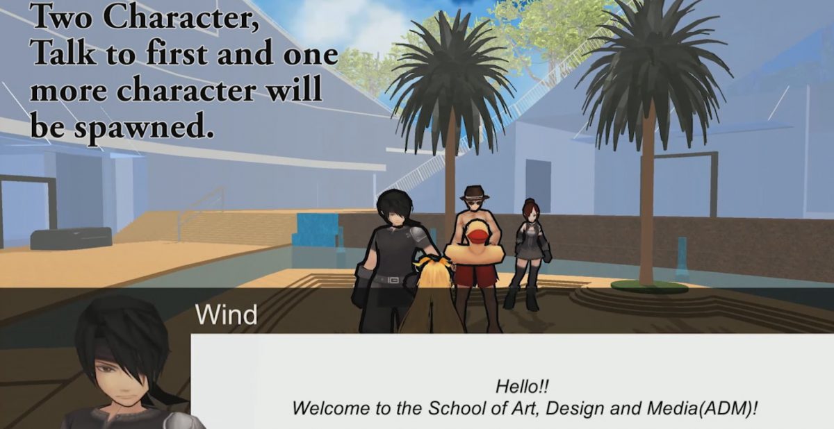
During this week, I tried out NPC chat by colliding with them, the Render Texture Camera of Unity is applied to the NPC chat so that their “Display Picture” is rendered in real time which is showed in the dialogue, through this, Vladimir suggested that I should make it mouse controlled camera as most of the games in the market is mouse controlled, so it will be more user friendly to so to. I’ll try to figure this out soon.
In this, this will be the basic system needed to complete the game, By talking to one NPC, another will be spawned or despawned, if i place the character on places where the spawning of new character cant be seen it will create a sense of exploration as the user will see different things in the same place even though they past by the same area, the things there will be different. i think It would be interesting and user might just want to see different stories in the game. By having this system of character spawn and despawn, i could make a game that is linear and there could be path for different story depending on which npc the user talked to and spawn the path for them while closing all other path by despawning the npc for the other path. I think this will be fun as many user could come to different story line within one game.
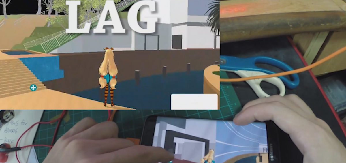
Exporting to phone is not an easy process as I need to download many different softwares like JDK (Java Development Kit) to make it work, I am not sure how does it even work when it failed countless of times, I also switched my phone into developer mode and somehow the app appeared in my phone when I’ve export it to my computer. Most of the thing I’ve followed this video, and i just try again after it fail.
This is what I have after the export, It is basically too lag to be played properly and the experience of the game if it lag is not worth the time playing it and It will be rage inducing if it is at this level of lagness.
After this, i decided to scrape the idea of making a phone game and focus on computer platform as computer have much higher processing and rendering power.
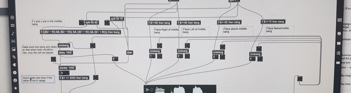
This was the hardest Max patch we wrote up till now as it is logic base and after LPD taught us about the function of different commands –
Clocker(used in the patch to count down the 3,2,1,)
Timer
Speedlim (use in this patch to prevent sound from looping endlessly)
Pipe
Select
Split (used in this patch to split zeros with all other number hence when there is no value = 0 = do nothing)
Route
Trigger
Gate (I tried to use this, but diden fully understand this so i used IF statement)
Onebang(my favourite) (make sure there is only one bang until it is reset)
Counter
Line
LoadBang
Loadmess
Scale
Expr (to put mathemathical expression (x1 + x2)/2 )
Pack and Pak
all of these are basic tools and if one can use them to their fullest by chaining up different object, alot of cool stuffs could be done in just these objects.
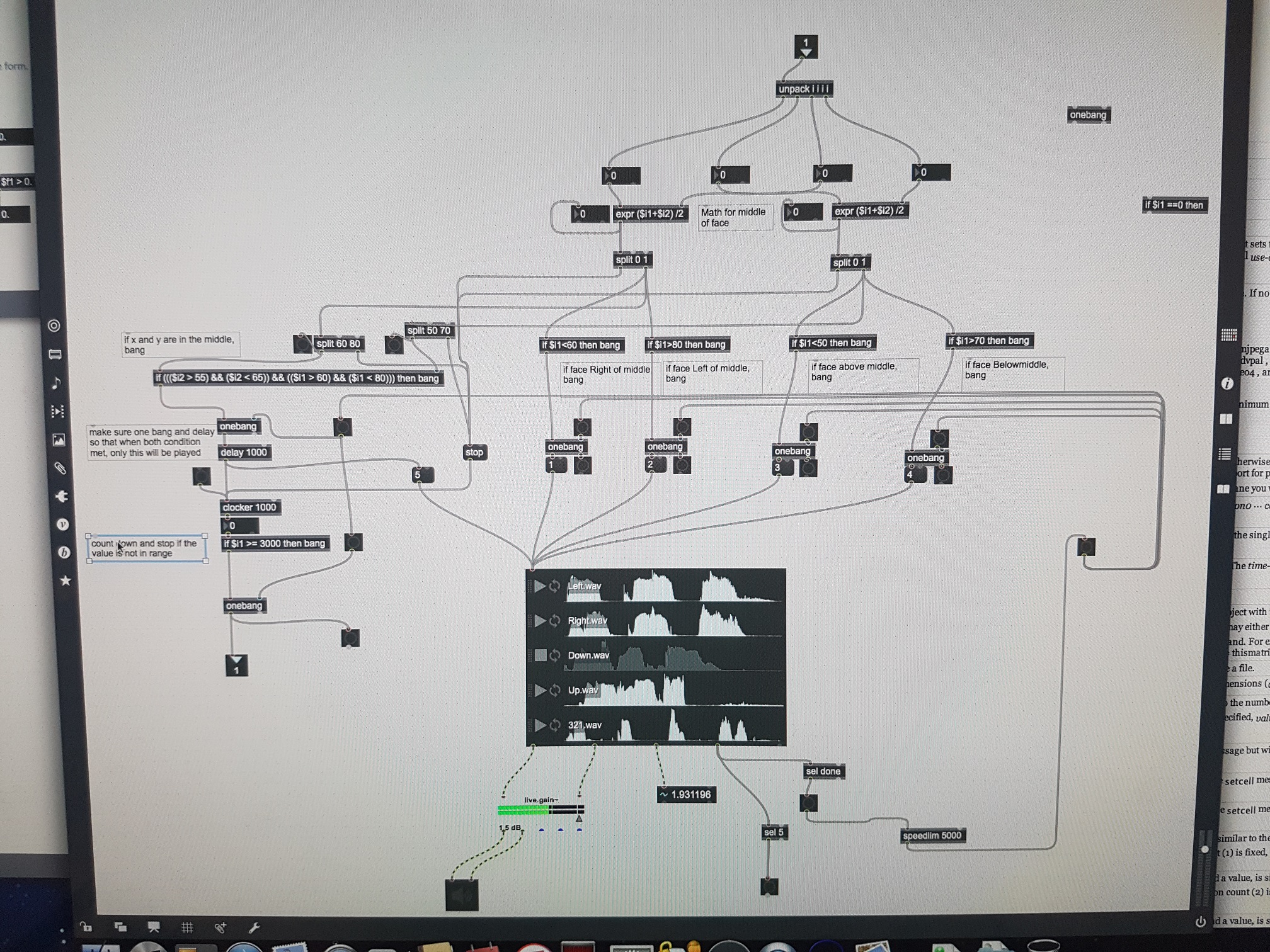
This is the main piece of patcher in my patch, the rest of the patch are very similar to the previous exercise, so in summary, the flow of this patcher
get the square value from face & unpack it
find the middle of the square in terms of X value and Y value
split into 5 zone
1) Middle Zone (MZ) (the zone where X and y value are around the center, for my patch it is 60 < X < 80 and 50 < Y < 70),
2) X higher than MZ
3) X Lower than MZ
4) Y Higher than MZ
5) Y Lower than MZ
For 2 to 5, send the number straight to the audio player
And for 1,send the number to audio player while if the value stays in the zone without X or Y going out of the zone for 3 seconds(using counter and if $i1 >= 3000), then take a photo, else stop the timer(and when the timer resumed, it will auto start from 0
lastly, I used a single playlist of audio player just because i dont want the patch to play more than one sound clip at any given moment, the only way for different soundclip to play is either
1) when one clip finish playing and the condition is still the same, it will playback the same soundclip after 2000ms or
2) when condition changed when a soundclip is playing, it will then stop the current playing soundclip and play another sound clip instantly.
I hope this is relative clear of the flow, through this exercise, I learnt mainly about logic flow, which i think is the most important in every kind of coding.
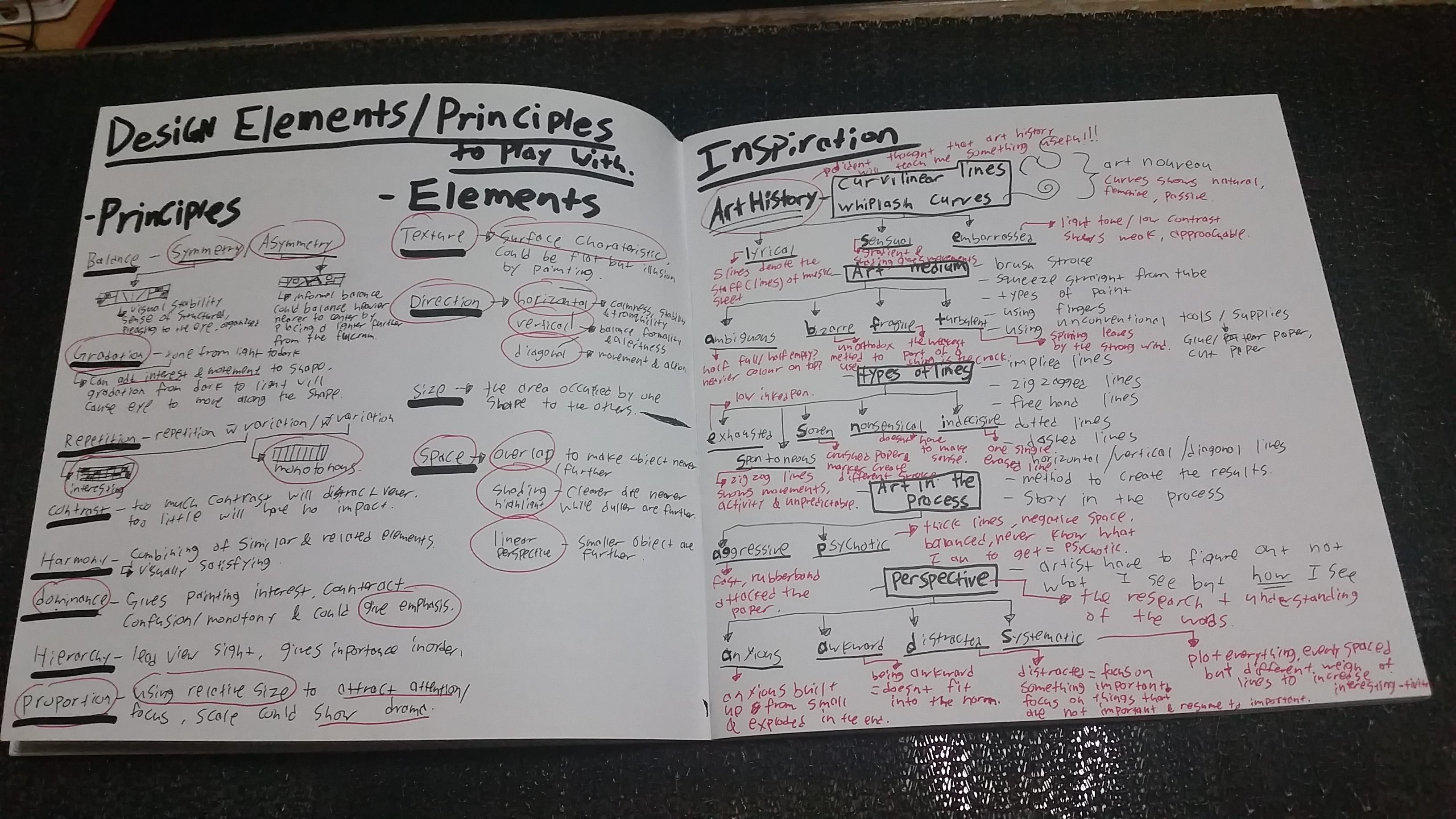
After my exploration, I realized that my idea is not strong enough as most of the work lacks the foundation of art and seems like the work of someone who just want to complete the work, therefore I re-did my research from the basis of design – The Design Element and The Principles of Design. I think that the foundation of design is important, so rather than just doing a project, I hope I could learn to apply the Design Elements and Principles not by chance but by consciously applying it. ( Those works in the previous pictures in which I circled and wrote with red text are those which was done after the further research )
Researches, Inspirations
This is also the reasons of final choice, I think all my finals I do should have a reason and basic design element/principle to execute it. The following is my 4 steps which leads to my final work.
Study and understand the design element and principles again and choose what could be applied in this project. ( I found a few principles and elements which are not taught in class, it made sense so I am using it too)
Principles of Design Balance – Symmetry – brings visual stability , sense of structured, pleasing to the eye and more organised. Asymmetry – could be an informal visual balance, could balance the visual weight by putting the heavier weighted ( bigger or darker ) nearer to the fulcrum (center) and balanced by a lighter (smaller or lighter) further away from the fulcrum(center)
Gradation –
The tone from light to dark, can add interest and movement, cause eye to move along the shape from dark to light.
Repetition –
Repetition with variation is interesting while without is monotonous.
Contrast–
The relative difference between 2 tone, too much contrast will distract viewer yet too little will have no impact.
Harmony –
Combining of similar and related elements, create a visually satisfying result
Dominance –
Gives painting interest, Counteract confusion/monotony and could gives emphasis
Hierarchy –
lead viewer sight, gives importance in order.
Proportion –
Using Relative size to attract attention/focus. Scale could show drama
Elements of Design Texture –
Surface characteristic, could also be flat and bring texture by using illusion of painting
Direction –
Horizontal – Calmness, Stability, Tranquility
Vertical – Balance, Formality, Alertness.
Diagonal – Movement, Action, active
Size –
The area occupied by one shape relative to the other
Space –
Overlap – To make object nearer/further
Shading/Highlight – Clearer lines are nearer, Duller are further
Linear Perspective – Smaller object are smaller
2 . Research the ways that people express themselves through art, (Mainly – what is said by the lecturer in art history lesson)
Art Nouveau –
Curves are natural, feminine, passive
Art Medium –
Brush stroke
Squeeze straight from tubes
Type of paints
Using Finger
Using of unconventional tools/mediums like glue, cutting of paper, punching holes
Methods to execute the art.
The Story in making the art is an art itself.
3. Research the 18 words given again, understand how it is being carried out and how do I want to execute my idea/meaning of that word on paper Perspective of words Aggressive – Fast, Impact, High contrast Anxious – Anxiousness is built up overtime Awkward – Does not fit in, sudden corners in curve lines Distracted – Shift of focus on mundane/monotonous work to fun and interesting, then back to the mundane/monotonous work long after it should Embarrassed – Curve lines, low contrast and indefine lines to show a shy personalities Exhausted – getting lesser, leads to giving up, using of a pen that is low in ink Indecisive – hesitate, incompleted. Psychotic – Unstable, using of negative space, using of ways which final result could not be predicted. Sloven – Fast scribble, crushed paper, marks of ink leaked from the paper above, untidy. Ambiguous – half full, heavier on top, question about the execution Bizarre – the Unexplained, unorthodox Fragile – i want it to be straight forward, the weakest/most fragile part of a paper is the torn part. Lyrical – passive, curves, high and lows, 5 lines to represent staffs(lines) on music sheets, instrument which plays music Nonsensical – Does not have a meaning, like a hotdog, a SUPPPPEEERRRRRR LONNNNGGGGG HOTDOG! Sensual – Curvy, Ribbons, using space by light and dark tone, contrast, whiplash Spontaneous – random stroke, unplanned, do what i want to do when i am doing the final. Systematic – Plotted, measure everything, this needs to be perfect, no stroke overshot, every thing intended. Turbulent – messy, wind could not be seen nomatter how strong it is, leaves could easily represent wind strength, negative spaces could form tornado like lines.
4. Choose what I want to use on step 1, 2 and 3 for every word and use it to build my final idea for every words.
*Word – Element, Principles , How it is being expressed*
Aggressive – Texture, Dominance, The method in executing the art. Anxious – Size, Gradation, Perspective of words. Awkward – Space, Asymmetry, Perspective of words. Distracted – Size, Proportion and Asymmetry and Repetition, Perspective of words. Embarrassed – Space, Contrast and Gradation, Whiplash Curves. Exhausted – Size, Gradation, Type of lines – freehand lines. Indecisive – Direction, Contrast, Type of lines – Freehand lines. Psychotic – Texture and size, Contrast and Balance, Method in Executing the art. Sloven – Texture, Contrast and Dominance, Type of lines – Freehand lines. Ambiguous – Texture, Contrast and Repetition and Balance, Type of paint and squeezing straight from tube. Bizarre – Texture, – , unconventional medium – Silicon glue. Fragile – Direction, Contrast and Dominance, Using unconventional medium – tearing of paper. Lyrical – Space, Contrast and Asymmetry, Whiplash curves. Nonsensical – Direction, Gradation and Contrast and Dominance, Type of lines – Implied lines. Sensual – Space- Shading & highlight, Gradation and Harmony and Asymmetry, Whiplash Curves. Spontaneous – Texture and Space, Harmony and Proportion, Type of lines – Zigzagged lines. Systematic – Direction – Diagonal, Repetition and Gradation and symmetry, Perspective of words. Turbulent – Texture, Contrast and Proportion, unconventional medium – using of glue with marker
Anxious – Anxious people are easily agitated, they are unstable, Anxiousness are built up over time, and anxious people get more anxious because they are anxious. chain reaction. I watched this OCD and Anxiety Psychology Crash course to understand more about anxiety.
Awkward – does not fit in, the errrrrrrrrrrmmmmmmmmm, awkward silence
Distracted – Being focus on things that are unimportant, usually like scrolling facebook, instagram, and tends to overshot the “rest time” we set for ourself.
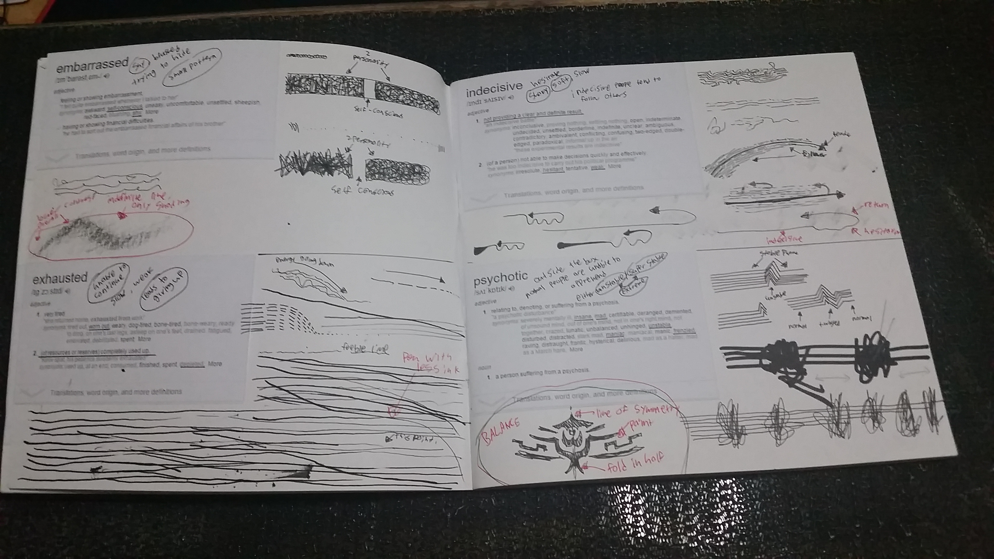
Embarrassed, Exhausted, Indecisive and Psychotic exploration
Embarrassed – Shy, Blushed, trying to hide, Small pattern, low contrast, Soft, Curvy Indefine line – only shading
Exhausted – unable to continue, slow, weak, leads to giving up, pen with little ink left. energy going down, feeble line
Indecisive – Hesitant, Shaky, Soft, slow, indecisive people tend to follow other people,
Psychotic – normal people are unable to apprehend, either extreme unstable/ extreme stable. Bipolar,
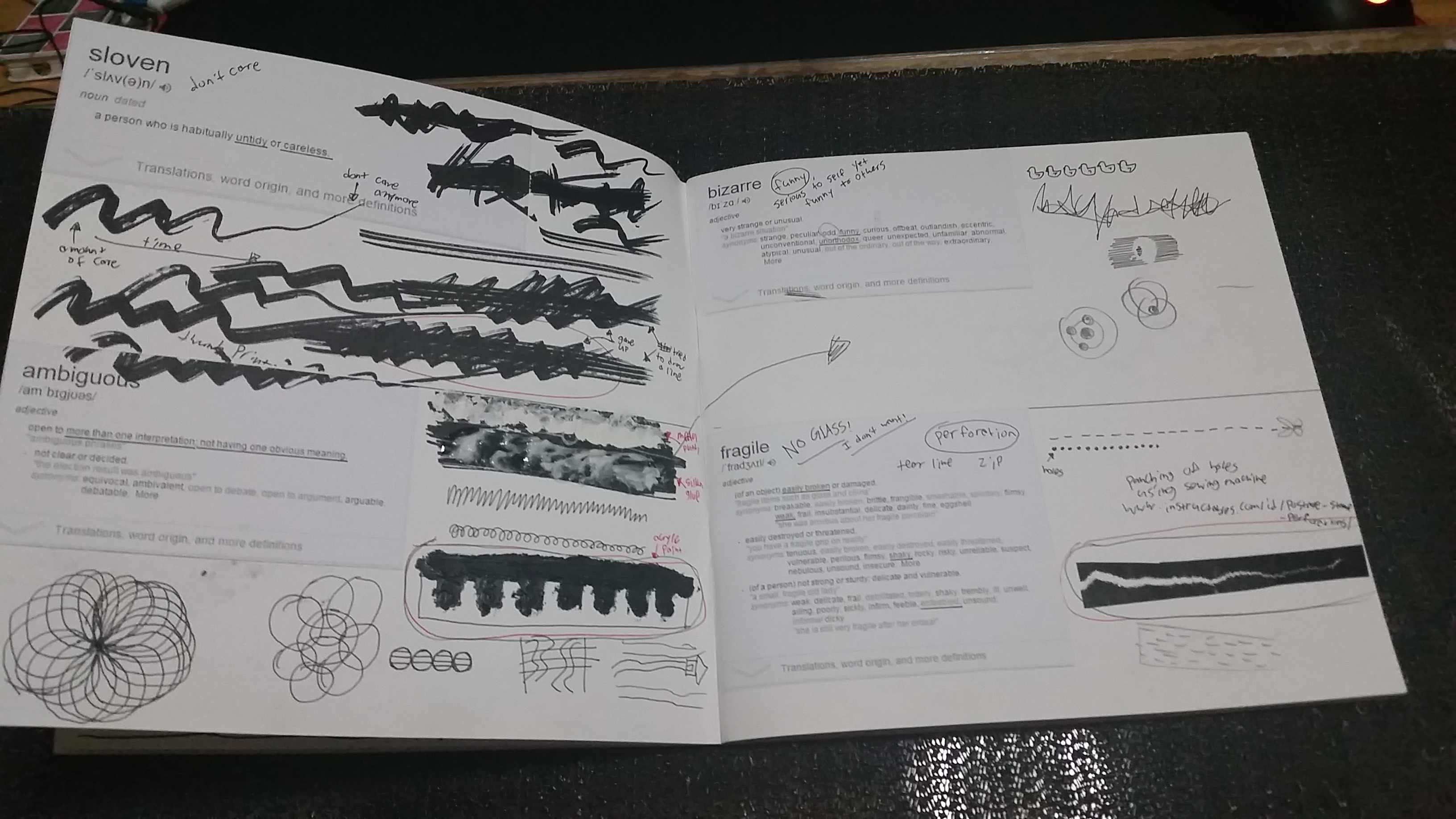
Sloven, Ambiguous, Bizarre and Fragile Exploration
Sloven – Dont care, Thick marker mark, fast rough sketch , crushed paper.
Ambiguous – have more than one meaning, open to interpretation,
Bizarre – Funny, Serious to self, Unorthodox, weird, odd – using of other weird/odd mediums
Fragile – No glass crack alike, perforation, Tear line of paper, zipline
Lyrical, Nonsensical, Sensual and Spontaneous Exploration
Lyrical – at first i got totally no idea, but i got inspired by art noveau from art history class and the whiplash curls. so 5 lines to represent the staff on music sheet and curvy lines.
Nonsensical – yeah, no meaning, illogical, meaningless,