BOLD3RRR Reflection: GLIXCH#^D

Bold3RRR by Jon Cates was a magnificent piece that explored the eccentric way of glitches and recursivities, I found this piece really amazing due to the fact that it was a live streaming and the effect were rendered in real time.

Bold3RRR seemed to me like Jon Cates had planned to give the viewers a sense of cognitive dissonance by establishing it in a non-linear way whereas the message was cut up into parts and overlapped in the later part of the live stream. Jon Cates used our sense against ourselves to trigger a perception of chaos by employing our two main senses – auditory and visually to oppose each other by having them interjecting in a juxtapositional manner which produces a discord in our perception of Bold3RRR.

Auditory, Jon Cates uses noises which we usually associated with glitches (static noise, clicking sound, distortion of speech etc.) and having parts of the dialogue being cut and looped on top of the speech along with the bombardment of sound recordings, phone ringing, QQ messenger notification and “glitch sound” in the later part of the video to intercept the clear dialogue and make it harder for us to understand what Jon Cates were saying.

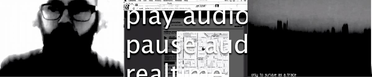
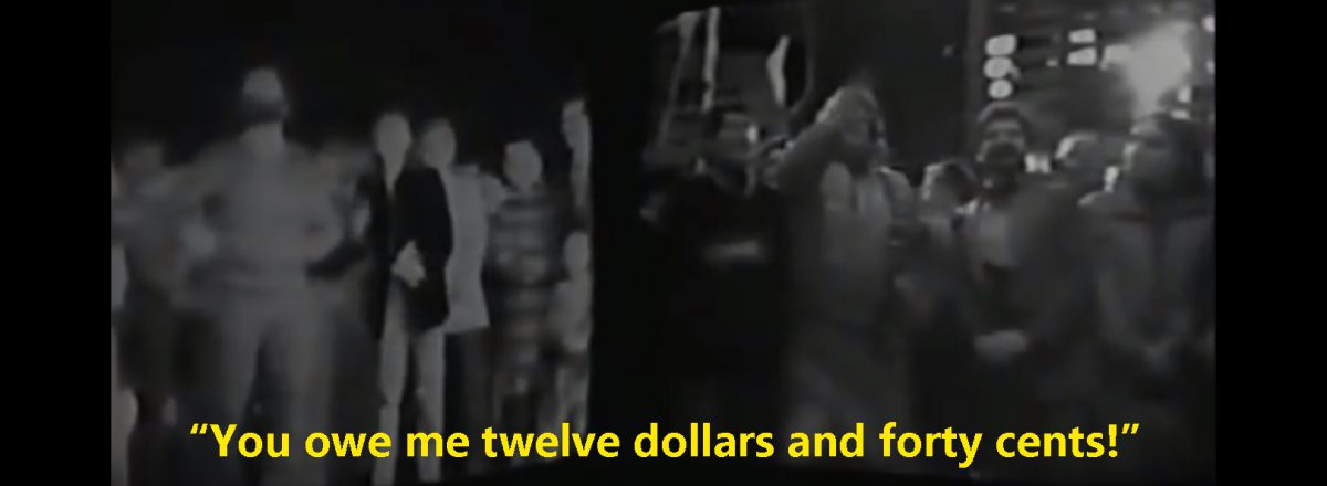
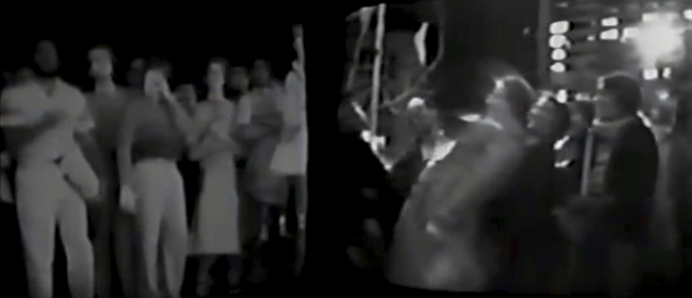
Visually, there are 3 variety of scene in Bold3RRR,
1) A clean frontal video of Jon Cates in full screen,
2) Typographical rendering of the script and project title of the programs being superimposed to the screen capture of the program/google maps
3) A Glitch scape

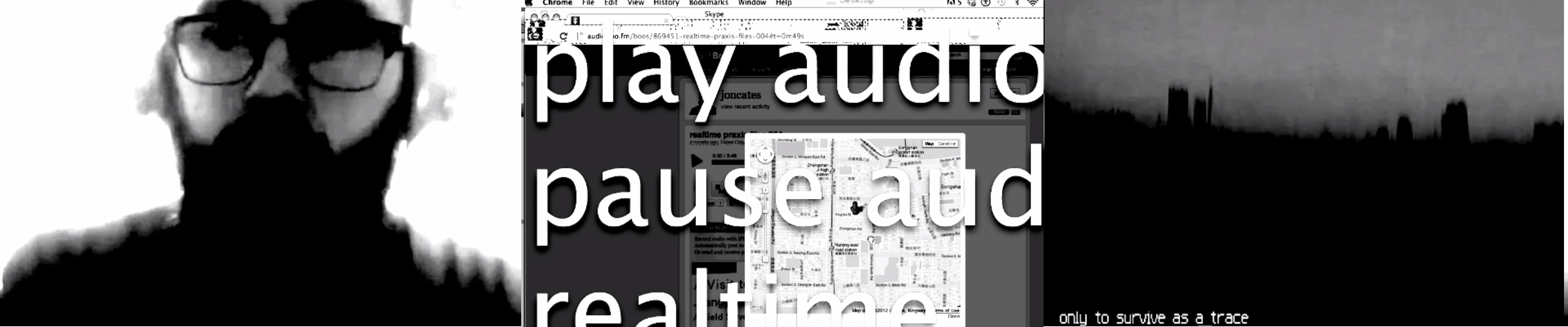
Audio and visual coordinated really well but only synchronized on rare occasion where the speech matches the frontal video like at the start of the video and only happened a few times throughout. Other than that, we could hardly acknowledge any connection between our senses when we were bombarded with multiple dialogue of the same tone, “glitch sound”, phone ringing, messenger notification, images and text flashing on the display. Jon Crates knew that he was going to work very much on the recursivities and glitch effect right at the start of the video where he said

“I want to reflect, on real time… I want to reflect on real time renderings. I want to reflect on real time renderings”

This got me thinking after watching Bold3RRR more than twenty times, why did he said that three time? It was not a replay of the same audio clip three time, it was him, saying it three time. Then I got the conclusion that this was the motivation as well as the goals which Jon Cates have for Bold3RRR, Jon Cates was playful towards the technology and saw the human quality in real time glitch and wanted to reflect it into Bold3RRR by the means of using, overlaps, recursivities, distortion of speech and sensory overload which impart a sense of wonder and surprise in a form of “Dirty new media” which is now known as glitch art.

Glitch happened when we have imperfections in the program and it produced results that were unexpected by the programmer. While there are many people who would prevent glitch as much as possible, artist like Jon Cates embraced the parts where these imperfections occurs and explored into these glitches which generated unpredictable artwork by inputting digital information like audio or visual sample into it which seemed to be the underlying “biological” character of our digital world otherwise seem to be the least organic commodity around us. By putting the inputs into a glitchy system, it seemed like the glitch had gave birth to a whole new entity which the offspring is disparate than the parent (the input and the glitchy system). Glitch is also like a crack in a system that will generate unforeseen outcome which represents the imperfections in the system and unpredictability in human nature and Bold3RRR reflected on the idea that there is a human quality and organic character in our digital new media through real time rendering show how human always lived their life- that there is no turning back in time, once it was on live stream, one mistake and the whole audience will see it and there will be no retrieving of the mistake.

Overall, I was inspired to use pre-recordings in the production of live video to produce result more than just what a live video could ever do, Jon Cates had multiple of source file readied before the live skype stream and pumped them into a glitchy system which mashed them up together in the live performance to form Bold3RRR the way it is – eccentric yet captivating.

Research Critique: Hole in Space

Image result for ms-dos
The best computer I could ever buy in 1980 look like: MS-DOS. GIF from https://archive.org/details/msdos_shareware_fb_MDCD10.ARC

If I imagined that I am living in 1980 where the best computer I could ever purchase(if I am even rich enough) are only running on MS-DOS operating system, a period which the first computer that runs graphical user interface only appeared 3 years later(Apple Lisa), and I heard that I could talk to someone else 4800km away- face to face, real-time, I will not believe it until I went down and have the random someone from 4800km away replied to what I said.

This is how insanely amazing I think that the work Hole-In-Space was, this work by artists Kit Galloway and Sherrie Rabinowitz was so forward in the time where the audience(also became participant) were not prepared for it and since during the 3 evening of the work, there was no signs or sponsor, no explanation was given to the work, it definitely struck curiosity within the passerby thinking :”Wait, What is this? is this a screen? *stares at someone and he stares back* Hmmm.. *Wave and the person wave back* HOLLLLLYYYYY SH*TTTTTT ITS MAGIC!!!!”

This made me wanted to see how the work was back then and I found a Youtube video of the work which was really interesting in how people communicate through the work.

“Its just, umm, television like telephone, right?  …. What a revolution it’s gonna be eh?”

– Random guy from the video A Hole in Space LA-NY, 1980 — the mother of all video chats (8:40)

People were singing, playing charades, finding their family or friends.– Playing charades through the work. From the video A Hole in Space LA-NY, 1980 — the mother of all video chats (13:20)

I think that the fact that the work was placed there for only 3 days with no explanation was just right because on the second day, there was news reporting and on the third day, people were calling their family or friends and asked to “meet-up” over the Hole-in-space this escalated to a big crowd holding signs shouting and screaming, and the whole situation started to get chaotic. The Hole-in-space has the power to bring people closer psychologically(definitely not physically), family and friends saw long lost friend, strangers interacted with each other they normally wouldn’t and this was evident in the reading Welcome to the “Electronic Cafe International”  

“Los Angeles’s Korean community and black community traditionally are at odds with each others. As they met and got to know each other through the network, they wanted to visit each other!”

Welcome to the “Electronic Cafe International (Page 349)


That people could gain understanding through meeting in the third space where people could react to each other. Seeing each other face in real time was essential in people opening up due to the fact that they know they are protected from harm however in the reading,

“Still, a person is offended when the virtual-space hand “touches” body part that wouldn’t be touched normally “in the flesh.” In virtual space, we learn the extent to which we “own” our body image”

Welcome to the “Electronic Cafe International (Page 347)

This made me goes to deep thought that since our virtual image are just a group of pixels that formed on the screen, therefore “our” virtual image does not exactly belongs to us, but to the owner of the screen, but is that ethically correct? Just because that these pixels grouped together to look like me and I will go”This is me” while pointing on the screen, but are they really me? Human’s way of possession are too weird.


Back to the topic, I think that Hole-in-space was an amazing work which turns all the viewer into a participant and through it, the interaction between the first space and the third space became a part of the art as people not only talked to people 4800km away, they also talk to those who were beside them and formed a connection due to Hole in space. These participants enable Hole-in-space to transform into a platform for collaborative performance art where all viewer became the art work, without their participation, the Hole-in-space would just be a piece of work that film people walking past the street in a window.

Lastly, I think that Hole-in-space enable people to see the potential in technology which shrinks the distance between people when used appropriately. It filled people with hopes in the future’s technology.– Contented Participant. From the video A Hole in Space LA-NY, 1980 — the mother of all video chats (26:46)


Research Critique – Here Come the Videofreex

I started watching the video with intention of finding out what made them revolutionary in the field of broadcasting, then I notice the common theme that they had since the start of the video throughout – They were persistently breaking the laws and social rules while being driven by their passion to finish what they started.

like how they stole the tapes from CBS 29:34 to 30:50 –

I think its the spirit in them that they film everything regardless of being good or bad, they will document everything and they felt like they had the responsibility to do all of those for the people and the future generation like how they mentioned here –

“There was a Political Obligation that we had to these people, not to let CBS have them.”

and during 48:26

“It was Necessary for us to go to these place where history was being made and to say : Lets have that alternative record.”

The Videofreex were going out of their way to get the record for the people  (even committing mutiny against CBS and hijacking the show) and this sense of being a part of something bigger was an important factor for them to go on for such a long time even with measly wages. Because of these, they were doing things that weren’t done by others during that time especially during a period when America was relatively in chaos which many demonstration were happening and Videofreex were not shy in covering the events from within the demonstration and even getting beaten by the police. Plus, Videofreex were covering on topics like Abortion and Death, which none of the mainstream TV would do during that time.

All of these set them apart from the mainstream TV and I am sure that many individuals were inspired by them for the actions they’ve done. With the portability of the Sony Portapak, paired with the guerrilla way of filming which gave the insight of an event happening, anyone could potentially be someone important that document the history, this slowly grew into the need of having a smaller video recorder to make it more potable. Videofreex had revolutionized the way news were being reported from being an “third party observer” to “First party participant” which could be seen in the news where the news reporter traveled down to the place where the event were taking place (e.g. chinese new year, tsunami aftermath) and report straight from the place.

Lastly, keep playing and experimenting with these things like Videofreex and you will get somewhere. For me, I think that anyone could be a social broadcaster, but those who are willing to take the risk for the things that they have passion in will become a legend.

Principles of design

Unity/Harmony

When all elements are in agreement, a design is considered unified. No individual part is viewed as more important than the whole design.

  • Perspective: sense of distance between elements.
  • Similarity: ability to seem repeatable with other elements.
  • Continuation: the sense of having a line or pattern extend.
  • Repetition: elements being copied or mimicked numerous times.
  • Rhythm: is achieved when recurring position, size, color, and use of a graphic element has a focal point interruption.
  • Altering the basic theme achieves unity and helps keep interest.unityd99797ed2b52c3cee5e891d6cc17e2ce


Balance

It is a state of equalized tension and equilibrium, which may not always be calm.

  • Symmetry
  • Asymmetrical balance produces an informal balance that is attention attracting and dynamic.
  • Radial balance is arranged around a central element. The elements placed in a radial balance seem to ‘radiate’ out from a central point in a circular fashion.
  • Overall is a mosaic form of balance which normally arises from too many elements being put on a page. Due to the lack of hierarchy and contrast, this form of balance can look noisy but sometimes quiet.BALANCESymmetrical example in real life:
  • cap1

The left and right of the architecture is mirrored with the central plane which made the building symmetrical.

  • Asymmetrical example in art:
  • g hockney acrylic


Hierarchy

contains elements that lead the reader through each element in order of its significance.

Images should be expressed starting from most important to the least important.

Example of hierarchy in art:

Duccio_maesta1021

The Proportion and placing enthroned Madonna and Child make it the most important subject, followed by those wearing red, and lastly to those in the background.

Example of hierarchy in typography:vh_3

The most importation information to be read first with the biggest font, and at the top,

Secondly most in sequence information second and medium font and lastly the information that should be read last having the smallest font and placing at the bottom.


Scale/proportion

relative size of elements against each other can attract attention to a focal point.

When elements are designed larger than life, scale is being used to show drama.

SCALE PRO

Example of scale in photography:

h_scale-0-1280-0-1024

The scale of the finger is way larger than the figurine, its is automatically processed by the brain that it is a small figurine instead of it is a giant hand.

Examples of Proportion in Sculpture:

_63152331_06-quenum-en-jouant-le-gros

The proportion of the arm is way larger than it should be for that small head, it attract attention due to the abnormality of the disproportion.


Dominance/emphasis

created by contrasting size, positioning, color, style, or shape.

The focal point should dominate the design with scale and contrast without sacrificing the unity of the whole.

Examples of dominance/emphasis in Photography:

dominance

A single bright blue raspberry stands out from a crowd of red raspberry, it draws attention to the blue raspberry making the other red raspberry to become the background.


Similarity and contrast

Planning a consistent and similar design is an important aspect of a designer’s work to make their focal point visible

Too much similarity is boring but without similarity important elements will not exist and an image without contrast is uneventful so the key is to find the balance between similarity and contrast.

contrast

Example of Similarity in graphic design:

gestalt-pattern-image

The pattern is repeated, however the colour of a single stickman is different with other to show contrast.

Example of Contrast in Painting:

contrast1

The flower is being emphasis by having a contrast with the black background which makes it stand out.


2D Project 1, Lines (2)

After my exploration, I realized that my idea is not strong enough as most of the work lacks the foundation of art and seems like the work of someone who just want to complete the work, therefore I re-did my research from the basis of design – The Design Element and The Principles of Design. I think that the foundation of design is important, so rather than just doing a project, I hope I could learn to apply the Design Elements and Principles not by chance but by consciously applying it. ( Those works in the previous pictures in which I circled and wrote with red text are those which was done after the further research )

Researches, Inspirations

This is also the reasons of final choice, I think all my finals I do should have a reason and basic design element/principle to execute it. The following is my 4 steps which leads to my final work.


  1. Study and understand the design element and principles again and choose what could be applied in this project. ( I found a few principles and elements which are not taught in class, it made sense so I am using it too)

Principles of Design
Balance
Symmetry – brings visual stability , sense of structured, pleasing to the eye and more organised.
Asymmetry – could be an informal visual balance, could balance the visual weight by putting the heavier weighted ( bigger or darker ) nearer to the fulcrum (center) and balanced by a lighter (smaller or lighter) further away from the fulcrum(center)

Gradation
The tone from light to dark, can add interest and movement, cause eye to move along the shape from dark to light.

Repetition
Repetition with variation is interesting while without is monotonous.

Contrast
The relative difference between 2 tone, too much contrast will distract viewer yet too little will have no impact.

Harmony
Combining of similar and related elements, create a visually satisfying result

Dominance
Gives painting interest, Counteract confusion/monotony and could gives emphasis

Hierarchy
lead viewer sight, gives importance in order.

Proportion
Using Relative size to attract attention/focus. Scale could show drama

Elements of Design
Texture
Surface characteristic, could also be flat and bring texture by using illusion of painting

Direction
Horizontal – Calmness, Stability, Tranquility
Vertical – Balance, Formality, Alertness.
Diagonal – Movement, Action, active

Size
The area occupied by one shape relative to the other

Space
Overlap – To make object nearer/further
Shading/Highlight – Clearer lines are nearer, Duller are further
Linear Perspective – Smaller object are smaller


2 . Research the ways that people express themselves through art, (Mainly – what is said by the lecturer in art history lesson)

Art Nouveau
Curves are natural, feminine, passive

Art Medium
Brush stroke
Squeeze straight from tubes
Type of paints
Using Finger
Using of unconventional tools/mediums like glue, cutting of paper, punching holes

Types of Lines
Implied lines
Zigzagged lines
Freehand lines
Dotted lines
Horizontal/Vertical/Diagonal lines

Art in Process

Methods to execute the art.
The Story in making the art is an art itself.


3. Research the 18 words given again, understand how it is being carried out and how do I want to execute my idea/meaning of that word on paper
Perspective of words
Aggressive – Fast, Impact, High contrast
Anxious – Anxiousness is built up overtime
Awkward – Does not fit in, sudden corners in curve lines
Distracted – Shift of focus on mundane/monotonous work to fun and interesting, then back to the mundane/monotonous work long after it should
Embarrassed – Curve lines, low contrast and indefine lines to show a shy personalities
Exhausted – getting lesser, leads to giving up, using of a pen that is low in ink
Indecisive – hesitate, incompleted.
Psychotic – Unstable, using of negative space, using of ways which final result could not be predicted.
Sloven – Fast scribble, crushed paper, marks of ink leaked from the paper above, untidy.
Ambiguous – half full, heavier on top, question about the execution
Bizarre – the Unexplained, unorthodox
Fragile – i want it to be straight forward, the weakest/most fragile part of a paper is the torn part.
Lyrical – passive, curves, high and lows, 5 lines to represent staffs(lines) on music sheets, instrument which plays music
Nonsensical – Does not have a meaning, like a hotdog, a SUPPPPEEERRRRRR LONNNNGGGGG HOTDOG!
Sensual – Curvy, Ribbons, using space by light and dark tone, contrast, whiplash
Spontaneous – random stroke, unplanned, do what i want to do when i am doing the final.
Systematic – Plotted, measure everything, this needs to be perfect, no stroke overshot, every thing intended.
Turbulent – messy, wind could not be seen nomatter how strong it is, leaves could easily represent wind strength, negative spaces could form tornado like lines.


4. Choose what I want to use on step 1, 2 and 3 for every word and use it to build my final idea for every words.

*Word –  Element, Principles , How it is being expressed*

Aggressive – Texture, Dominance, The method in executing the art.
Anxious – Size, Gradation, Perspective of words.
Awkward – Space, Asymmetry, Perspective of words.
Distracted – Size, Proportion and Asymmetry and Repetition, Perspective of words.
Embarrassed – Space, Contrast and Gradation, Whiplash Curves.
Exhausted – Size, Gradation, Type of lines – freehand lines.
Indecisive – Direction, Contrast, Type of lines – Freehand lines.
Psychotic – Texture and size, Contrast and Balance, Method in Executing the art.
Sloven – Texture, Contrast and Dominance, Type of lines – Freehand lines.
Ambiguous – Texture, Contrast and Repetition and Balance, Type of paint and squeezing straight from tube.
Bizarre – Texture, – , unconventional medium – Silicon glue.
Fragile – Direction, Contrast and Dominance, Using unconventional medium – tearing of paper.
Lyrical – Space, Contrast and Asymmetry, Whiplash curves.
Nonsensical – Direction, Gradation and Contrast and Dominance, Type of lines – Implied lines.
Sensual – Space- Shading & highlight, Gradation and Harmony and Asymmetry, Whiplash Curves.
Spontaneous – Texture and Space, Harmony and Proportion, Type of lines – Zigzagged lines.
Systematic – Direction – Diagonal, Repetition and Gradation and symmetry, Perspective of words.
Turbulent – Texture, Contrast and Proportion, unconventional medium – using of glue with marker