Coloured self portrait:
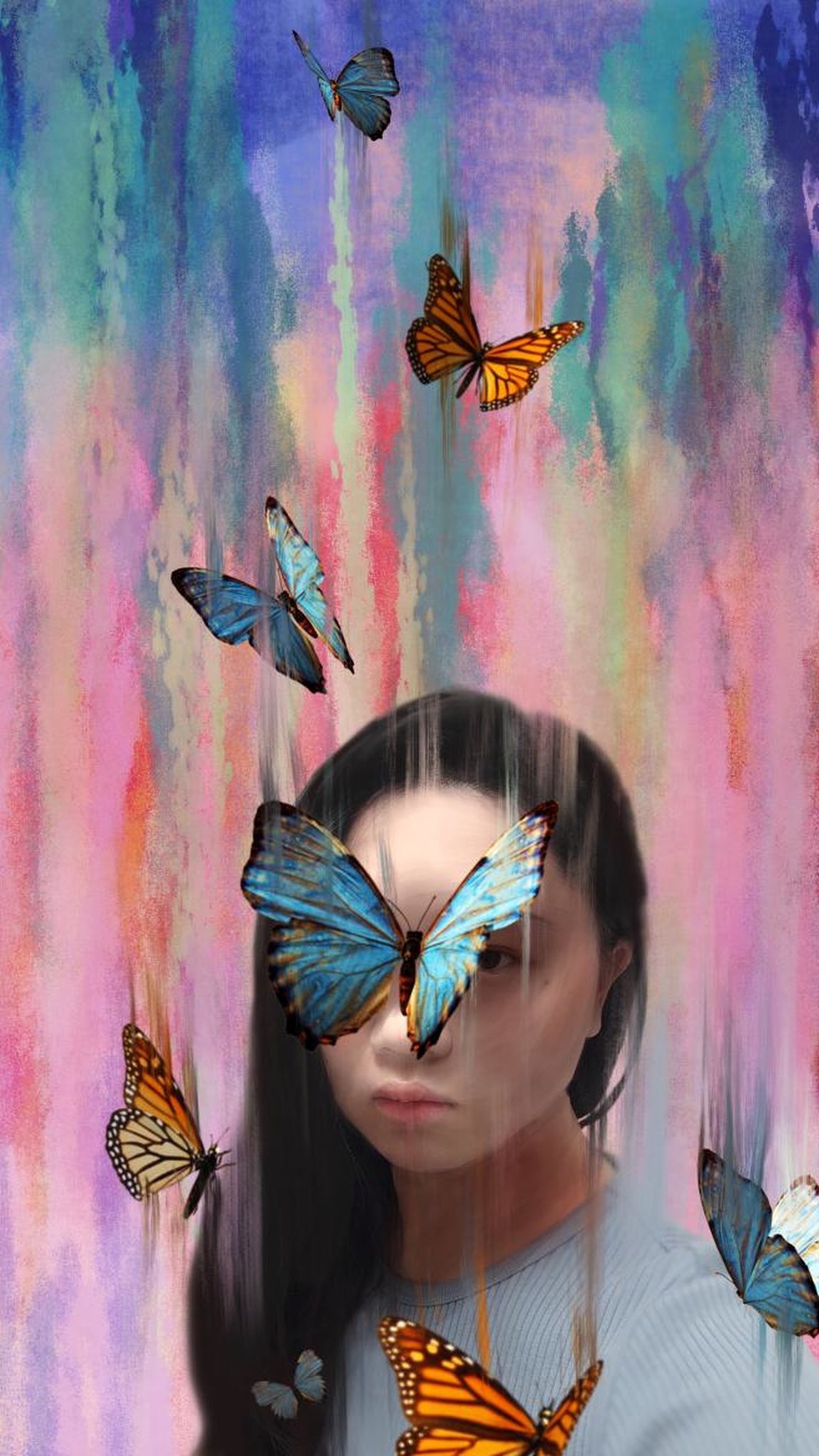
Awakening
Artist statement:
With this piece, Awakening, I hope to present the part of myself that daydreams, and visualizes worlds, characters and creatures so vivid that I lose myself in them.
In the empty moments of my day, when I am in transit, when inspiration strikes me, my mind wanders. When I drag myself out from between the lines of books, out of the scenes of a movie, from the depths of a game–and it takes me a moment to regain my sense of self and reality–that dazed, swirling sensation, contained entirely within my mind, is what I wished to portray.
Those out-of-body experiences are an incredible pleasure to me, and generally the indicator that whatever media I had just consumed, or whichever daydream I had plucked up, had been a particularly riveting one. This is why I named this piece ‘Awakening’, for to me, the moments between rousing from a waking dream and reality is one of the most surreal and enjoyable moments I’ve experienced.
The aesthetics of this was influenced by Zhuang Zi, a Chinese philosopher. It’s a well known tale, of how he had gone to sleep, dreaming that he was a butterfly without a care in the world, and woke up in reality confused. Was he a man, who had just dreamt he was a butterfly, or was he a butterfly, now dreaming that he was a man?
Painted digitally, mimicking the iconic brushstrokes of Van Gogh from A Starry Night, and the artworks by Erin Hanson and Christian Schloe, I wished to create a dream-like, nebulous feeling to the piece. The brush strokes create a sense of motion in this still image, and brings out the movement and presence of the butterflies.
The confusion between dream and reality, the line at which the sense of self is blurred, yet not entirely lost, is what this artwork wishes to show.
Concept:
Since this is the coloured piece of this project, I wanted to make use of colour in it as much as possible. Many colour choices are meant to reflect the theme.
The mix of cool and warm colours, largely falling under the umbrellas of blues and yellows, help to give contrast to the piece. Not just in value, but in colour as well. This naturally guides the viewer’s eyes towards the figure in the image, the dreamer–yours truly. It also serves to show the warmth and charm of the dream, and how its ideas can bring light to the otherwise cool and dim reality.
My own face has been modified to be smoother, more fitting for beauty norms, to portray the idealism that is present in dreams both sleeping and waking. Your dream self is most commonly the ideal you, the person who has the perfect comeback, who is free of insecurities, the most idealistic of dreams contain that version of you.
The blurring of edges, the smudging of colours into me, while I bleed into them, demonstrates the blurred line between reality and dreams, and how the sense of self can blur and melt with it.
The serious demeanor, the butterfly that does not entirely cover my eye, these are signs that I am still grounded in reality, even if only physically, and I cannot be served from it entirely.
The 9:16 scale used is to give me, the subject, breathing and thinking room within the frame. Such a high ceiling gives the viewers space for their eyes to wander and think and dream with me, and give off a sense of something more beyond the frames of the picture.
Progress:
The original picture was taken on my smartphone in my Hall room, then edited and drawn over on Procreate. I did my best to adjust the lighting so that it falls on my entire face, as I hoped to work with a brighter, dreamy look for the picture.

Video process:
Recorded on Procreate, uploaded to YouTube for easier viewing here
The original iteration of the work:
Before I had came upon Erin Hanson’s Dreamscape artwork, I was experimenting with rather different, textured brushstrokes and more red/green colours rather than the yellow/blue palette of the final version.
this alternate version has several shortcomings, such as not being able to guide the viewers eyes, an ineffective and overly colourful and messy background, as well as a lack in value contrast and range.
i believe that these issues were all made better in the final piece.
Resources used and Artist reference(s):
The butterflies in the artwork are from two separate, free to use png sites:
and this png package were used.
The second png does not allow for the image address to be copied, but I have linked the page above.
The artworks that inspired this piece, as mentioned above, are as follows:

From the digital paintings of Christian Schloe:
Black and White Self Portrait:

Uninvited.
Artist statement:
This black and white self portrait portrays my messy and fragmented state of mind, a state of mind where I no longer seem to be the master.
This idea came to my mind when I thought of the more unwelcome spectrum of emotions. Hatred, anger, grief, and the like are never emotions that I enjoy experiencing. They are too negative, too extreme and energy-consuming for my liking.
I find that they can grow and fester in me, like weeds left unattended or a kettle boiling over, they find their own ways to run over and explode.
They are unavoidable feelings, and the human experience would never be complete without them, but to experience them, especially when I think that I have already sorted them out and shelved them away, is beyond frustrating.
For instance, I had this rather manipulative friend when I was in Junior College, and I have since cut ties with him. But sometimes, when I see something that reminds me of him, I still get that knee-jerk reaction of disgust.
And that is utterly illogical, and it very well has the potential to ruin my day. Try as I might, I can’t get rid of it completely, and I hope this picture conveys my frustration and helplessness at the unwelcome thoughts and feelings that can take root and creep up on you at unexpected times.
Concept:
The round mirror, blurred over and warped, represents the self. Within its circle, all that is reflected is me. I believe that one’s thoughts are rarely orderly or regular, and this mirror reflects that. There will always be uncertainties, doubts, fluctuating emotions. The greyscale and warped section of the mirror represents that.
The setting of the bathroom is to emphasize that this is something private, even intimate—a peek into the mind and conscious.
The invasive, dark growth that pollutes the mind–that is the root of that negative thought or emotion. It crawls up the sides, it sticks where it goes.
To create a rhythm within the piece, the dark blob, the vine from which it grew, and the top of my head are all roughly at the same height of each other, so as to maintain a consistent tempo throughout the piece.
The dark blob of negative thoughts and emotions is also placed there so it has to have higher contrast with the pale streaks on the mirror, giving this image its focal point, and ultimately where the viewer’s gaze should rest on.
The square structure, emphasized by the tiles of the wall, shows how I have nowhere to run from these thoughts and feelings. It is stiff, rational, immobile, the opposite of what emotions are, and yet often ruled by them. It is a box and a cage, in which I can only endure.
Process:
The original picture was also shot in my Hall Room. This time, the lighting is ambiguous, as I had already planned to edit and draw over the vast majority of this image. so lighting did not really matter for this shot.
Video process:
Also recorded on Procreate, uploaded onto YouTube for easier viewing here
Alternate versions:
the original version of this artwork. the lines on the wall were too thick and I felt that they distracted viewers from the main focus of the piece; the blurry figure in the mirror.

Just to test, I then removed the lines, reaching a second alternate version of this piece:

This time, however, the piece felt a little too empty. In the end, I chose to edit the lines and make them thinner as a compromise.
Furthermore, in both of these rejected versions, the background was far too bright, and I felt that the brighter sections of the wall reduced the contrast between the mirror and the wall. This was also edited in the final version, with the wall dimmed to bring emphasis on the mirror.
Artist Reference:
The surreal works of ZiQing Liu, as presented here
More specifically, this artwork:

the end.