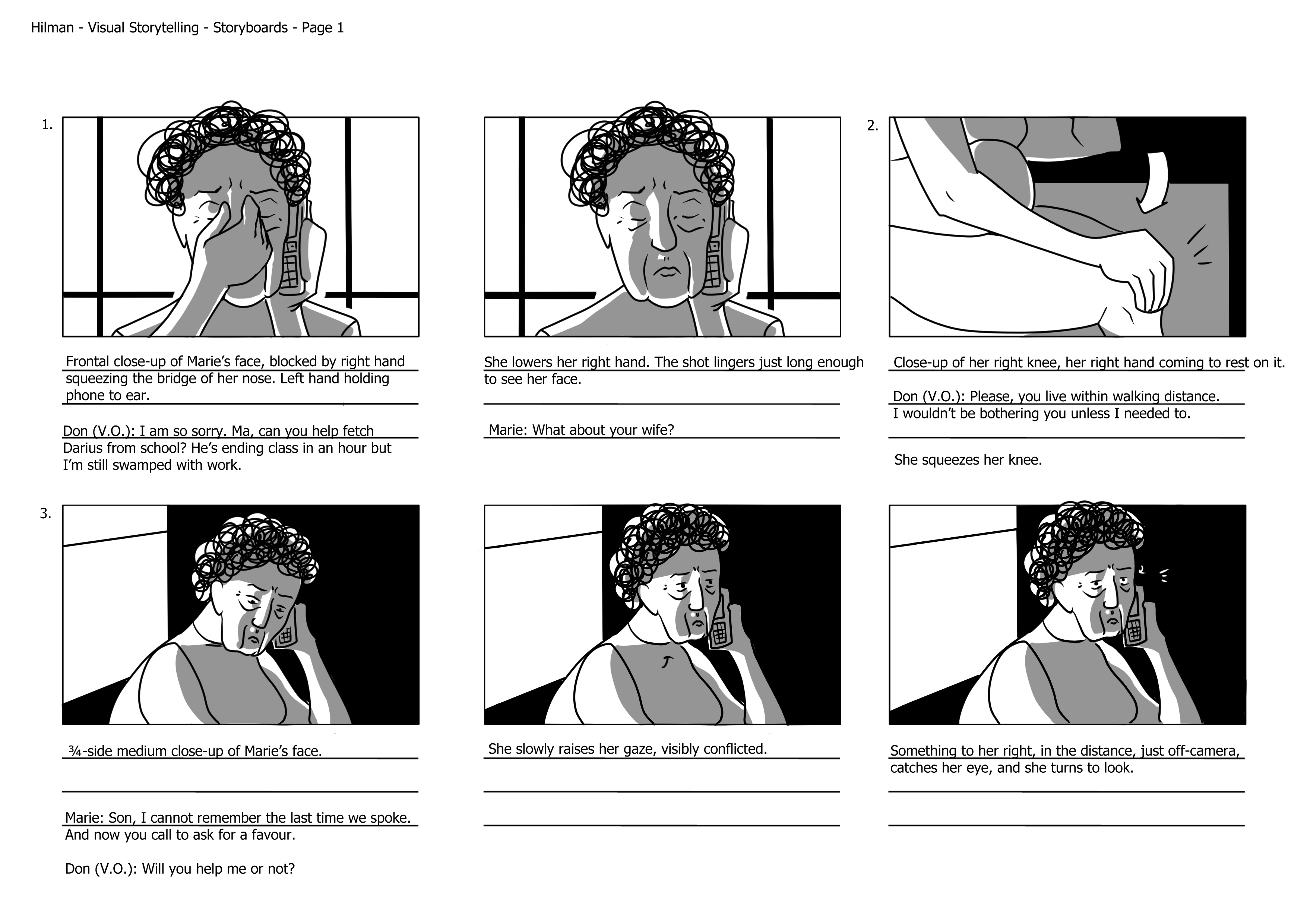
Story Synopsis: A phone call from out of the blue draws an old woman back into the life of her estranged son. Forced to deal with his messy family politics, she decides to help him avoid making the same mistakes with his son that she did with him.
The base illustrations for the animatic were repurposed from the project 3 storyboards. Where possible, I broke up each image into its constituent parts, and used the simple motion controls available in Premiere Pro to animate them.
When that wasn’t possible, I used crossfades, making sure only the parts meant to be moving had the fading effect visible – this hopefully helps maintain some illusion of motion.
Sound design became even more crucial, to cover for the lacking visual motion. I tried as best I could to have the motions accompanied by descriptive sounds, so that the viewer would have some sense of how the action was being carried out, the speed of it, even the emotion of it.
On the flipside – there’s a lot of dialogue in my animatic, and the performances are compromised because the visuals aren’t live, emoting actors, but flat drawings. I put a lot of focus into animating the facial expressions, moving eyes and eyebrows around to help emphasise the dominant emotion of each line. Software was the limiting factor here, but every little bit helps, hopefully.
One thing I should’ve considered, but didn’t while recording, was how the lines sounded without the actors’ facial expressions to accompany them – there are moments when the line reading, which seemed fine in the moment of recording, doesn’t quite match the drawn face, or sounds flat because the acting was actually coming through the actor’s face rather than voice during the recording.
I used music to further help the emotional flow of the animatic. I find there’s a fine line between music enhancing and dictating the mood of a scene. The goal for me is to enhance, rather than dictate, especially when I wasn’t involved in the making of the music – I should be doing the work. Hopefully that comes through in the animatic. There are moments as well without music – for breathing space, and contrast.
Finally: colours. My storyboards were rendered in greyscale, and frankly speaking I don’t have the technical expertise to render full-colour satisfactorily. Given the relatively simple style of the drawings, I also didn’t think the colours needed further complication – they wouldn’t fit. Instead I used overlays of colour, harking back to the days of black-and-white film when filmmakers would tint the film itself. Each space gets its own colour – the bedroom a cold, lonely blue, the car a queasy green (where plot complications are revealed), the streets almost neutral at first, as contrast for the sunset orange at the end. Sunset or sunrise orange – for these characters, the end is just a beginning.
Probably if I could I would’ve redone all the illustrations from the ground-up. The pacing of the animatic as well, I’m not too pleased with. Part of it might be that I’m not used to thinking about pacing for animation. The long takes for example don’t have quite the same impact as they would in live-action, because they’re just still images here. Another part of it is definitely time – just having the time to really finesse the cuts.
Overall though it’s been interesting just trying to wrap my head around this mode of communication. Glad to be here.
The assignment was to create a 30-seconds motion graphics video-piece that would serve as a self-portrait. This being the final assignment, I figured I could use it as a retrospective, of sorts, of the various ideas I’d explored in the past two semesters of my first year. If you are what you do, then I should be able to find myself in my work.
Looking at everything, it seemed to me that loneliness was a concept I kept returning to. Undesired isolation, and the resulting tension. The search for genuine feeling, for something real. These coalesced into a single moving image in my head.
Here’s the video.
There’s a bit going on.
The space is cold and industrial, a clearly man-made space. But there’s no people around – you’re alone.
The thing about loneliness, I think, is a desire to communicate. So there’s all these tools that we use to communicate strewn around the space – various kinds of phones, and pens and paper. But the pens are floating away, and the voices coming from the phones are robotic, and lifeless, and fake.
The image of trees – nature – comes to represent genuineness. The irony of it is that the image is being displayed through a laptop screen, a man-made object becoming the window to nature. In a way it reflects the process of making art – you’re trying to reach something real and true, through artifice and trickery. A hand reaches out towards the window, gingerly grasping for something real – and the video ends there, because that’s where I am now.
Making the video was a completely new experience for me. I did all the visuals in Adobe After Effects, and I’d never used the software before this. The space I created in 3D within After Effects, using pictures I took of the various elements and textures I wanted. The image below shows the 3D space from another angle.
I wanted the image of the trees on the laptop screen to look as though it were a window, or portal, to that space, and so I figured the most direct way of achieving that look would be to actually make the screen a window, as seen above.
I shot a clip of my grandfather’s hand reaching out, and then luma-keyed it in After Effects.
As for sound: I used the IBM Virtual Voice Creator (https://ivva-tts.sl.haifa.il.ibm.com/design) to get the various robotic voices heard in the video. It has a lot of customization options but never quite leaves the uncanny valley, and I wanted that sense of unnaturalness.
In the background there is the sound of gentle construction, to underscore the man-made nature of the space, and it slowly crossfades to the sound of nature. Both I’d previously recorded.
It feels weird revisiting this now, because the mood of it is so different from how the film actually turned out. This moodboard mixtape I put together back when we first had to deliver our pitches for our final films. At that point I hadn’t quite decided what exactly I wanted to do yet, but I had a general idea of what I wanted to explore, and a rough sense of how I wanted it to feel like – like the clip above, basically. Visual moodboards do very little for me, but music I can feel. Your mileage may vary.
In response to the theme of “home”: the idea I latched on to fairly quickly was that home is where you aren’t alone. “Loneliness” became the operative word, the feeling to reach for. At the same time more practical considerations came up. I wanted a structure for the story that would allow for a more relaxed shooting schedule, so that I’d have the time and wiggle-room to finesse things. Actors were another constraint – who among friends and family could I bother, and what roles could I write for them?
Here’s the script (if you can call it that) I wrote for my pitch.
A lot of things changed as I wrote the screenplay. I wanted the three separate people to meet at the end, to unknowingly share the same physical space, but I couldn’t figure out a way of having it happen without it feeling contrived, or in a satisfactory way given my limited means. So I decided to go in the opposite direction – the three people would be a family. That way I could play up the generational aspect of it as well, so that it wouldn’t just be “3 stages of life”, but successive moments. The weight of history comes in.
The writing process was really difficult. I was having trouble getting the three moments to cohere, to feel like they were working towards some core message or idea. Probably this central idea started to coalesce once I started to think about perspective – whose point of view should these stories be told from? I found that my sympathies lay with those pushed away. I realised the film could reflect a strain of toxic masculinity, one that pushes men to keep their emotions bottled up to themselves, and the way that affects the people around them.
Here is the treatment I eventually submitted, with the screenplay and really crude storyboards attached behind. I think it paints a fairly clear picture of where my head was at with the film going into production, so I won’t belabour those points here.
Three things I possibly didn’t quite cover in as much detail as I should have:
In the three scenarios presented I wanted to keep the audience’s perspective in line with the women’s. They each begin with some expectation of eventually understanding their partner, but don’t get to, and the audience’s perspective mirrors that experience.
I wanted very much to distill these moments down to the bare minimum – any lines of dialogue or actions that the scene didn’t need to make sense, I tried to take out. I wanted everything every little beat to feel purposeful, so that the whole mood of the film is extremely heightened.
I didn’t want to name things. I wanted to talk about things without actually talking about them, if that makes any sense. So even the few lines of dialogue in the film don’t directly address the issues at hand, and they remain these nebulous clouds looming over everything.
In the time between the submission of the treatment and the start of filming I had another think about the way the characters interacted with the spaces they were in. I decided to have the mother character (“Kartini”) step out of the house into the corridor during her scene with “Latiff”, instead of remaining inside as detailed in the storyboards, to better reflect her inner turmoil – even as she cuts him off with harsh words, she still wants to reach out to him.
I also had a think about the attires of the various characters, and how they fit into the spaces they were in. The bedroom had a very particular greenish/yellow colour scheme to it that basically determined my colour choices for everything else. I wanted the grandmother character (“Hasnah”) to fit with the space, and for her husband to stand out a little – she’s wearing green and yellow, and he’s in something red. Hopefully it’s noticeable but not too obvious. Following from that, “Kartini” wears a greenish-blue top, and Shu’s blue, while “Latiff” is wearing red again – again, the idea was to have some sense to the colours without making it too overt.
Production went pretty smoothly, and at a very relaxed pace. Filming of the various scenes was split up across six days over the weeks, and to my memory, five hours was the longest amount of time we spent in a single day – mostly we only spent about two hours per day. I really wanted to get the performances right, and I also wanted to keep things chill and comfortable on set. I was mostly working with family, and particularly with my grandparents, they needed to feel like they were in a safe space to try things out with me. I don’t know how successful it all was, but I’m glad I tried.
Alvin and JC’s help were invaluable for the filming of the corridor scenes. There was no way I could’ve pulled off the camera movements in those on my own, and I probably would’ve had to shoot those scenes very differently without their technical expertise, which meant I would’ve had to rethink my approach to the entire film. I’m grateful.
The edit was where things got messy. Tiny little niggles I hadn’t quite resolved or paid attention to during production turned into major headaches. I didn’t have a strong opening, or a strong ending, and the overall pacing was really off. In retrospect possibly the fundamental issue was how I approached each shot – I treated every single one like it was *the* crucial shot of the film, so every shot felt self-contained, whereas someone more skilled would’ve maybe sacrificed the weight of some shots to build towards a more impactful one later.
Everything’s interconnected. Using J- and L- cuts helped the pacing in the middle, but the front and end were still lacking. What I’d hoped to be a moment of catharsis, or at least a break in the rhythm to set up the ending, instead felt like more of the same, so the tone of the ending felt off, because there were tensions yet unresolved. The scene with the daughter didn’t have quite the push or release it needed, and Yue Han suggested finding another.
In re-evaluating the film, I realised the women were absent in their own ways, too. Looking at the film as a series of reactions to cruelty, the central question of the film then became whether cruelty should beget cruelty, and whether such a vicious cycle could be justified. If you keep cutting yourself off from things you’re also closing the door on yourself – and that became the final shot of the film, a pent up frustration physically expressed with the closing of the door. I could then use the shot at the beginning, as well, as a lead-in to the slower moments – by the end you understand its significance.
Sound-wise, I mostly kept things diegetic (with the obvious exception of the dikir barat) and naturalistic. I really wanted to make use of silence as a way of creating a sense of intimacy, and to build anticipation. Every sound becomes significant in disquiet. The slightly noisier scene with the daughter character would then stand out, just a little.
The idea of using dikir barat came during the edit. I needed a sound that could represent the underlying turmoil of the characters. One of the weekends there just so happened to be a Malay wedding in the park near my house and I ran there with my H5. Removed from its context it’s very loud and harsh, providing a nice contrast to the visuals and to the sound of the rest of the film. I also liked the idea of subverting the sound – it plays as “Latiff” walks towards the dissolution of his marriage. At the end it comes back again as a reminder of the unresolved tension.
It’s hard for me to be objective about the film at this point, because all I see are the mistakes and missed opportunities. Possibly my previous effort with “Split” was more successful in terms of affect and cohesiveness, but I think I was aiming much higher with this film in terms of trying to actually say something (and without actually saying it, no less). (The shots were also much more complicated this time around.)
One’s reach should always exceed one’s grasp. I feel like I learned a lot from this whole experience, not just about filmmaking, but also about myself.
Did the storyboard / story turn out as you hoped?
Yes, mostly – I more or less knew this was about the best that I could hope to do given my current drawing skills and the time available.
What would you do to improve it?
More detail in the backgrounds. The shots maybe feel a bit flat, at times – there might be ways of presenting the same general shot in a more dynamic fashion, with a greater sense of depth.
What skills do you need to improve?
Maintaining consistency from image to image. Drawing backgrounds, and putting characters in perspective, within spaces. Drawing faster.
What are the most significant things you have learned so far?
One of the things I hadn’t quite grasped before this was how storyboarding is, among other things, one way of checking if the shot you have in your head is even possible to do – sometimes there are limitations to the space that you aren’t aware of until you attempt to properly visualise it.
The assignment was to make a short film on the theme of “Dreams”, and as I understood it, we could take the theme however we wanted. In class, Prof Erwin showed us clips from some of Salvador Dali’s video works, and that was the initial impetus for me to go in a more experimental direction.
Here is my short film:
The main inspiration for my short film was a song by The Velvet Underground, linked to below this paragraph – “The Murder Mystery”. As frontman Lou Reed explained it: “The idea was simple – have two lyrics running at the same time so you get hit with one monologue in one ear and the other monologue in the other ear, like two guitar parts. Just as two guitar parts are supposed to interweave, so are these two poems. But it didn’t work because you couldn’t hear either one well enough to hear what was being said. It was supposed to be fun with words, fun with rhymes and sounds.”
I’m a fan of the band, and (though I agree with Reed’s assessment of the song) I’ve always wanted to try something similar in a film – but instead of two separate verbal experiences, one for each ear, it would be one verbal experience and one pictorial experience, the two seemingly unrelated but working together to create new meaning, the whole more than the sum of its parts. A multi-modal exercise in semiotics, in a manner of speaking.
Since I was already looking at that era, I turned to movies from the 60’s for more inspiration, particularly those of the New Wave, that were unconventional and experimental in their approach to filmmaking.
One movie that particularly affected me, of the Japanese New Wave, is Toshio Matsumoto’s Funeral Parade of Roses (1969). Among many other things, the movie plays with the distinction between fiction and reality within the fictional reality of the film itself. To attempt to explain the movie would require more words than this paragraph can contain, but for just one example: there is a film within the film. A character in the movie makes an experimental short film, and the short film plays out in the movie as though it is part of the movie itself, until the short film ends, and the characters in the movie appear to clarify what just happened. The “short film” segment can be viewed below (the silhouette at the end is of someone walking in front of the projector to turn on the lights).
I’d no desire to make anything as oblique as the clip above, but it, and the surrounding movie, showed me different ways to think about approaching my own short film. Repetition is clearly a very powerful way of building the significance of imagery being shown. The juxtaposition of different images in consecutive order almost forces associations to be made among them. Rhythm – the relative time spent on each image before moving on – can, depending on how its used, create a sense of order and purpose, or disorder and unpredictability.
The movie also frequently cuts away to text onscreen, of sentences or phrases that aren’t explicitly related to what came before nor to come, but help in a roundabout way of setting the context for them, and emphasising certain aspects of them. I figured this was something I could try in my own short film.
Other filmmakers had done this prior to Roses, one of them being Jean-Luc Godard, a pioneer of the French New Wave, who had a rather distinctive style to his typography that I wanted to homage in my own short film. (The source of the font that I used in my video is linked to at the bottom of this post.)
As I explored more works I began to feel more and more as though I needed the sound for my short film to be really cohesive – the throughline of the film, that would help to guide what might otherwise feel like rather jarring and random images. The imagery couldn’t feel too orderly, but they couldn’t feel too random, either, and the sound seemed like a way to find that balance.
Returning to the theme of “Dreams”, I figured I could imply in some manner that the experience depicted in my short film was a dream of some sort, and I could have it tumble along following dream logic, in a loose manner, using the technique of free association – my random flowing thoughts would guide the direction in which my short film unspooled. I recorded myself saying whatever that came to my mind, then did a bit of rearranging of the lines so that there was a bit of a narrative flow to them.
I knew rhythm, and repetition, would be key factors in building the experience and its significance, and so I looked for simple drum beat samples online that I could set my words to, to enhance that aspect of the audio experience. (The list of sounds that I used can be found at the bottom of this post.)
In terms of line delivery I was rather inspired by some of the music I’d been listening to lately.
With the audio more or less done I then had to come up with visuals to go with the words. The lines in the final video are:
“Sometimes I worry that I live too much of my life inside my own head.”
“When a cat likes you, it’s something special.”
“I don’t think I could get on a scooter with someone else like that, their life pressed to mine.”
“We are living on borrowed time. Hard to get bank loan.”
The “bank loan” line gave me the idea that the “dream” of the film could be kicked off by the failure to get a bank loan – an old man looking back on life, after facing his latest setback.
The “inside my own head” line would be the old man drifting into his daydream. I pictured him sitting on the ground, eyes up to the ceiling, falling into a trance as the ceiling fan whirls on.
There is overlap among the various imagery used – the shower head because I repeat the word “head” a number of times, but it also provides the running water that is seen flowing down the hands, meant to be a visual metaphor for time slipping by. Towards the end we cut from relatively younger hands, wet, to relatively older hands, dry – I liked the idea that the old man’s image of himself in his head is younger.
The line about a cat, taken with the visual of a girl, then becomes a statement about romantic love, and the next line about the scooter takes on additional significance in that context – I decided I would go blatantly Freudian and use the imagery of a banana being crushed (“pressed to mine”).
There were a number of ways that I tried to give the visuals a sense of continuity from one shot to another: shape, movement, and colour. I used the similar circular shape of the fan and the shower head to ease the cut from one to the other. The movement of the hand before it cuts to the banana, moving in the same direction, and in the same general position the hand was in before. When I’m doing quick cuts consistency of the colours in the images hopefully help to build momentum – and changes in colour palette then take on particular significance.
Below are the storyboards I did for the video. The shots in the video don’t match perfectly with the storyboards, nor did I try to – I followed them when they worked and tried other stuff when they didn’t.
Here are my final beat boards. Since the previous post, I’ve added an additional beat, splitting what was previously the final beat into two beats. I feel it’s important that the grandson finds and approaches her of his own volition. I also attempted the use of simple tones to create visual focus and contrast for the relevant elements in each image.
This is the movie poster I came up with, around which I’ve designed an advertising campaign. You can read about my process coming up with the poster here.
My campaign has a three-pronged approach: online ads, physical ads placed at strategic locations in the downtown area, and roving ads.
Online ads would be placed on social media sites such as Twitter, or Instagram. Almost everybody uses these sites, and on a daily basis at that. The algorithms that these sites use to determine who sees what ads are so frighteningly accurate these days, and it would be remiss not to take advantage of them.
twitter adinstagram ad
That said, a physical presence is still important. The “where” is a bit harder to answer, though. I figure the best places for these ads to be placed are high-traffic areas, which would mean the downtown area.
(In an actual ad campaign for an indie-style movie such as this one, it seems unlikely that there would be enough money to buy ad space on the video screens as depicted below, but since this is only fantasy, I hope you can indulge me.)
In locations where more than one poster can be placed, I figure it would be more eye-catching if posters of different colour schemes (explored in my process post) were used side-by-side, evoking the pop art stylings of Andy Warhol.
Robinsons The HeerenSuntec CityCity Hall MRT
To round it off, roving ads would also be used, such as the sides of buses. I think these are particularly effective because they aren’t limited to a single set location, and so they can reach a much wider group of people.