Ang Sang Soo:
The “godfather of Korean typography”. He uses Hangul, the Korean alphabet, to create very interesting designs. Much more than a typographer and graphic designer, he is a multi-faceted cultural producer who translates his philosophy through various mediums from visual design to poetry, photography, and installation. With 40 years of innovative contributions under his pen, Ang Sang Soo has reinvented and championed the field of linguistic illustration.
The Hangul is written with many geometric shapes, giving him a lot of room to be playful with his typography designs. It is founded on five basic elements: vertical, horizontal, and diagonal strokes, the dot, and the circle.
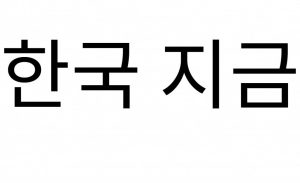
He was the first to “step out of the box,” so to speak, exploiting the graphic flexibility of Hangul and removing it from its incommodious square-framed structure.
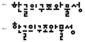
Generally understood as the simplest writing system in the world, Hangul, so linguists say, can be learned within just a few hours. Comprising 14 consonants and 10 vowels, this practical linguistic system is founded on five basic elements: vertical, horizontal, and diagonal strokes, the dot, and the circle. Established by order of King Sejong in the mid-15th Century in a progressive effort to create an alphabet unique to the spoken idiom and, in doing so, break away from its foundation in Chinese ideograph, Hangul symbolically realizes Korea’s cultural independence.
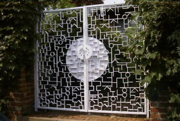
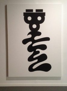
Some of his other works:
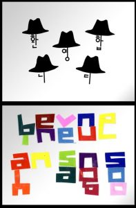
Hangul is a very interesting writing system, and it is one of the easiest writing systems to learn. I really like the way he deconstructs the Korean alphabet into shapes, to create expressive forms for his works!
You must be logged in to post a comment.