Recent Posts
Assignment 1: Finalized Piece

Before the piece was finalized, I received feedback that the typography across the top was not well-integrated in the piece, which I agreed with. Below are a few of the previous renditions of the title:
I had to make sure the face remained the focal point, and that the text didn’t look like it was just laid on top . Read more →
Categories: Assignment 1 – Gallery
0 comments.
Reply
Assignment 1: Self portrait, final rendition

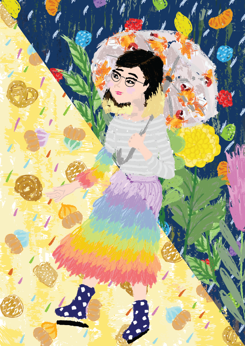
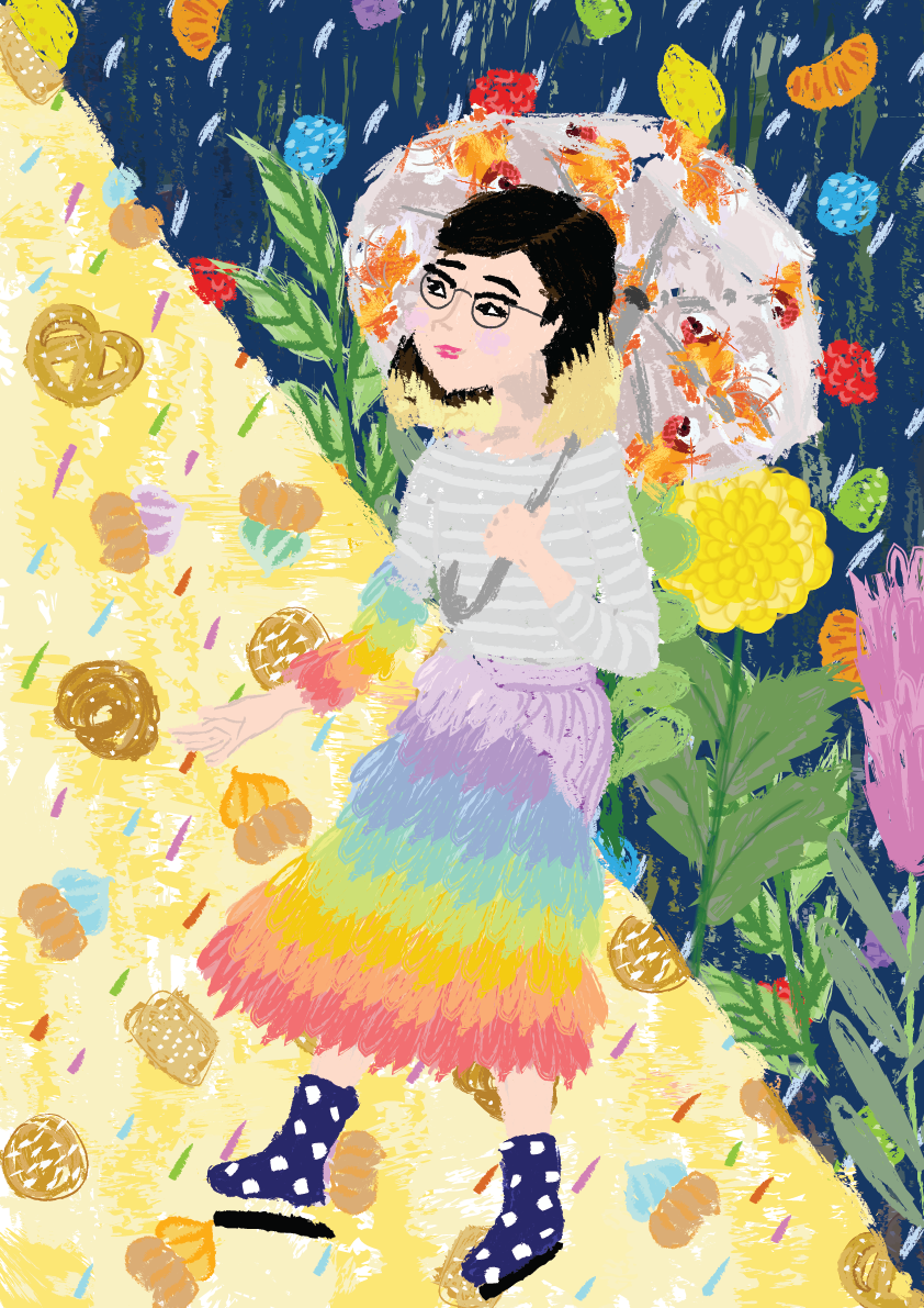
Explored different strokes to break up the harsh division line, decided to go with the second one. The strokes are more subtle and blended compared to the third piece.
Categories: Assignment 1 – Gallery | Assignment 1 – Research & Process
Assignment 1 - Self portrait Final

Version I
Version II
Version III
Categories: Assignment 1 – Gallery
0 comments.