This research has allowed us to understand and notice the small differences
amongst the various grotesk font. The derivation of each font does not appear
out of blue, but there is a constant influence from its predecessors. Fonts are
influenced by the culture of its time and do not just appear as they were
designed to be – there is a constant modification of existing fonts to suit the
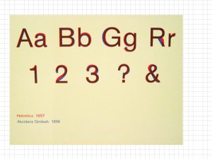
intent of the message. Therefore, we all came to a conclusion that all fonts ultimately have their own pros and cons, have their appropriate applications and connotations to them. As such, we believe that there are no “bad” fonts or “good” fonts and how fonts should not try to outcompete one another (for example the case of Helvetica and Akzidenz Grotesk), but used effectively to bring across the intended message clearly and more powerfully with the right typeface.
