CONCEPTUALISATION + FORMAT
My ideas for this topic went through many different (and drastic) changes, but I’m happy with the direction it ended up going in.
I was initially drawn to woodcuts and block printing because I was attracted to the aesthetics, and how it was a bridge between making a three dimensional object and translating it into a final two dimensional piece of work. However, this was impractical because I didn’t have the skills, materials or experience (and time!!) needed to execute this.
The first consultation resulted in the idea of creating a catalog of tattoos catered to each individual – for instance, a breast cancer survivor might be interested in getting a certain tattoo design because of it’s symbolism and connotations. However, I didn’t like the thought of stereotyping tattoo designs and wanted to take a more intimate approach – I felt that would do the subject more justice.
Going back to the idea of what a tattoo meant to the person who has it, I thought an interview approach would be more appropriate to convey the subjectivity and personal nature of each tattoo. The original catalog idea would be a concise and effective way of presenting each composition.
INSPIRATION + REFERENCE
As mentioned earlier, I’ve always been interested in tattooing and the works of tattoo artists across the globe. Many of these artists create tattoo flash sheets, or sets, which are predesigned images often with a theme in mind and in the distinct style of the artist. Flash sets are traditionally used as inspiration for walk-in customers but recently have been recognised and collected as works of art (rightfully so in my opinion hahaha).
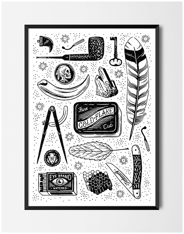
I wanted to create a personalised flash sheet for each of my interviewees based on their stories, experiences and preferences, so that the project is even further tailored to fit each person and their use of tattoos and can be viewed as a literal point of view from each individual.
I wanted to emulate the interview style of the popular blog Humans of New York, where a photo of the person or a feature of theirs is accompanied by a short but revealing quote/description. I like this method because it’s direct but powerful, and provides a form of visual accompaniment that helps the reader to give context to the words. I also wanted the publication to be ultimately visual and consciously kept the text as a secondary, supporting source.
CHALLENGES
1. the interview
The first part of the process was to track down and persuade/coerce/bribe some of my tattooed friends to let me photograph and interview them about their body art. This part of the process was the most interesting and enjoyable, but produced some unexpected challenges. I wanted to present a diversity of functions/styles of tattoos, and had to in a sense ‘curate’ the people I spoke to. I also consciously decided to not include faces and features (such as the clothes they wore) whenever possible because I wanted to keep their identities private because some topics we spoke about were really personal, and because I didn’t want to detract from or influence the perception of the tattoo.
I also had to be prepared for rejection for personal and practical reasons – some were uncomfortable talking about their work, and some just didn’t have the time. Another complication was the process of photographing: we met in public places, which made it difficult or awkward to snap photos (especially more so if the tattoo was normally covered by clothing). Because of the lack of uniformity and privacy in the environment, I felt like the photos didn’t turn out as I had envisioned them and were kind of haphazard 🙁
2. creating the flash sheet
The main challenge I faced while creating the flash sheet had to do with coming up with images or designs that reflected each person’s character. This went beyond just the cultural or accepted ‘generic’ meanings of each image and took into account what each individual felt, and the styles they preferred. These sometimes weren’t the styles that I am attracted to or have experience with, which meant I had to do additional research. It was especially challenging when I had to recreate this look in my drawings because some were simply beyond my (very amateur) ability.
3. digitalising the images


A technical difficulty I faced was the need to digitalise the images and layout. Because I’m not proficient with drawing directly in Photoshop or Illustratior, I did the initial sketches on paper and refined them with tracing paper and a Micron pen. I would then photograph the images and further clean them up and colour them with Photoshop.
I borrowed a Wacom drawing tablet from a friend, which definitely helped a lot with the composing and editing of the flash sheets but also took some time getting used to. I struggled with the use of Photoshop because I rarely use software for my work, but the flash sheet ended up a bit small for the A5 page and had ugly white borders when put into Indesign, so I’ll definitely keep this in mind for the next project.
4. the layout


To get a sense of what the layout would look like, I printed out images to create a physical mock up. I knew that I wanted the flash sheet and interview image to be on the same spread, but had to go through a few trials before I decided on the final layout. Instead of including two photographs, I decided to cut it down to one and keep the page minimal so that it wouldn’t become the focus of the spread. This was also the first time I used Indesign, so I binge watched many Youtube tutorials and bug others for help with the magazine layout.
You must be logged in to post a comment.