
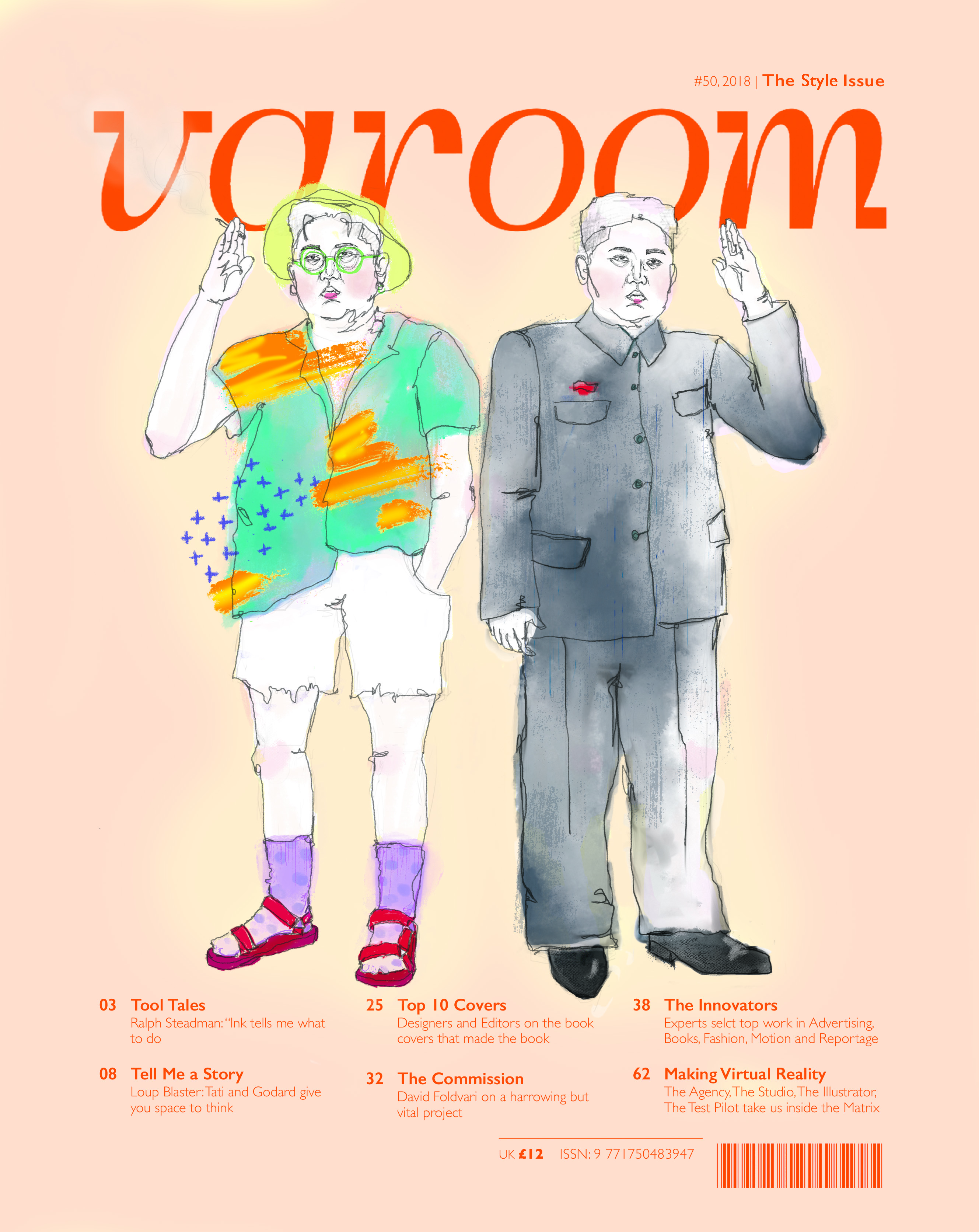
After some discussion in class, I decided to pick the orange masthead because it adds to the whimsicality of the piece. Also I think it would vibe better with the tastes of my user persona 🙂
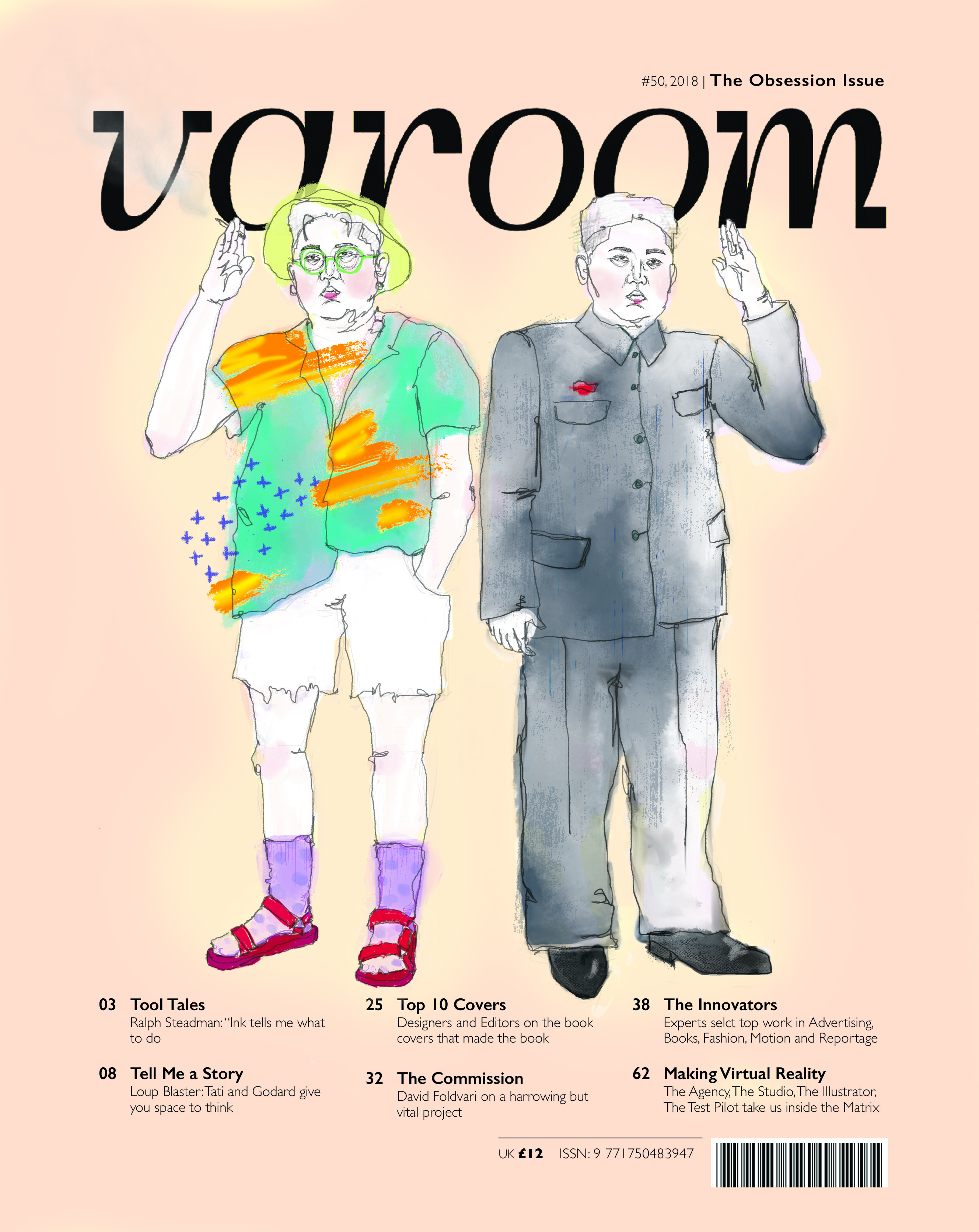
here’s the black masthead for consideration:

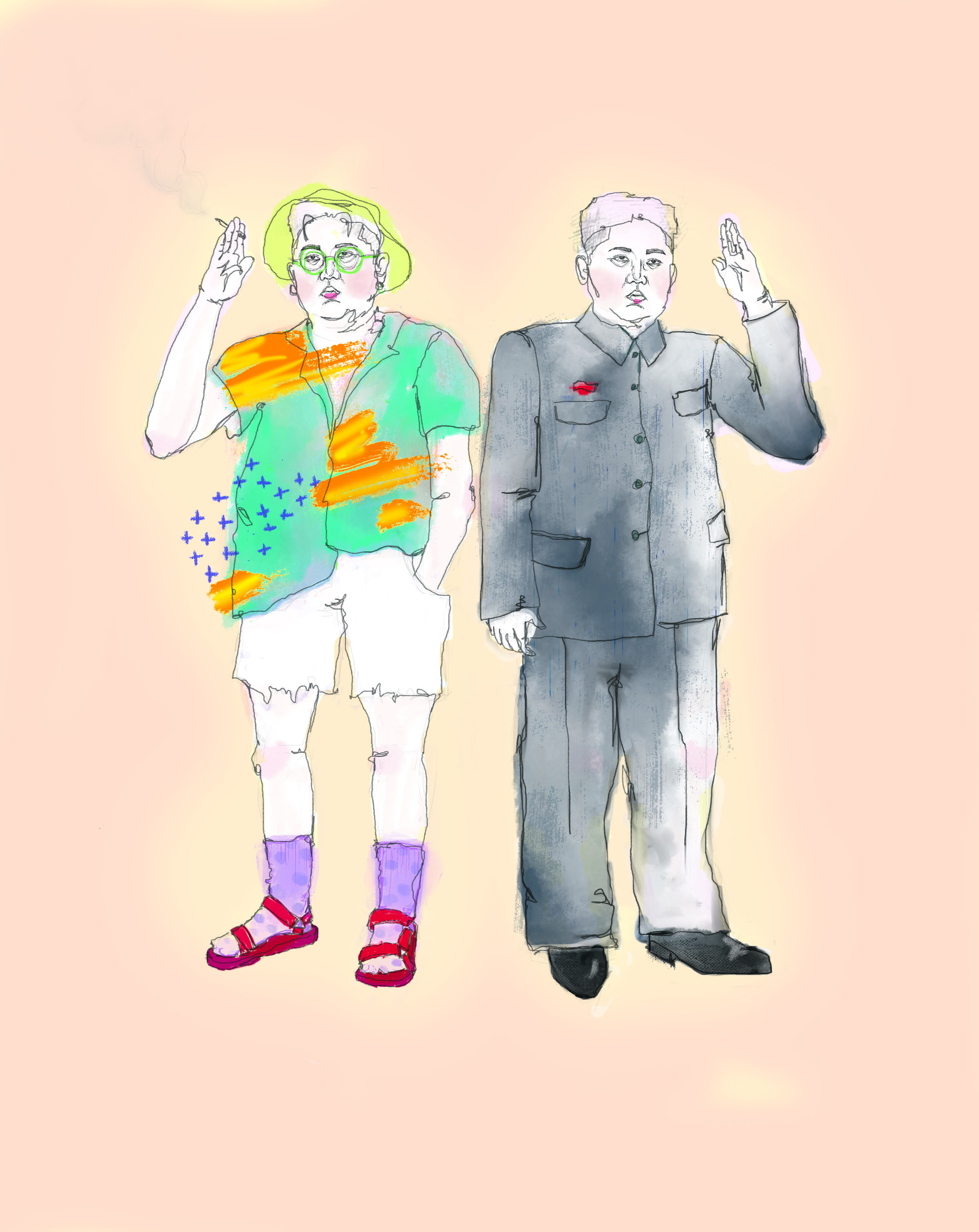
Final artwork without the template!
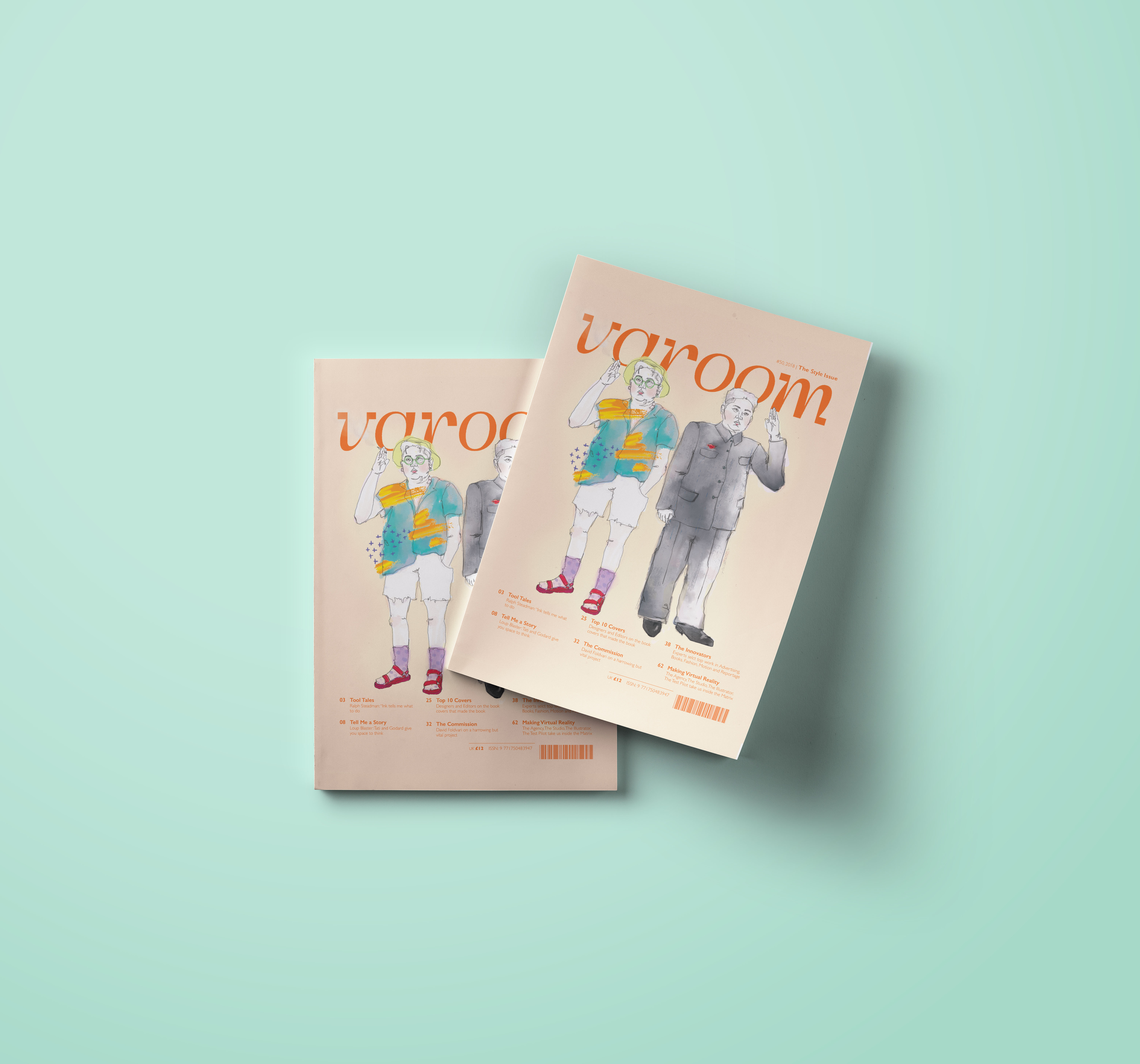
Photoshop mockup from pixeden
Wow! The Design works so well on the Mockup with the Orange/ Peach Varoom Logo, totally fits your User-Persona 🙂