Hi everyone!
As some of you may know, I’m drawn to vintage typography, especially hand-drawn letterings. Having identified a style that I’m passionate about allowed me to easily visualise ideas of what I could possibly illustrate for this project. Adding on, I mentioned that I have plans to work for a company called Stranger and Stranger, a bespoke design firm specialised in packaging for beers, spirits and alcoholic beverages.
Joy reminded me that I should always have them in consideration whilst working on my projects here in ADM. Since Stranger and Stranger are a company based in USA and UK, their products are mostly targeted to Americans and Europeans. She suggested that I could do a variety of Singaporean/ Asian type art with a European influence, a bridge between a “local S&S” and the existing company.
ATTRIBUTES
I have settled on several attributes OR just one (I’ll make the final decision after brainstorming for more ideas)
- 4 Attributes: I’m a breakfast foodie, I love travelling, I am a believer of karma, I’m a type artist in training
- Focusing on 1 attribute: I’m a type artist in training
Will be posting sketches in the next OSS post!
STYLE
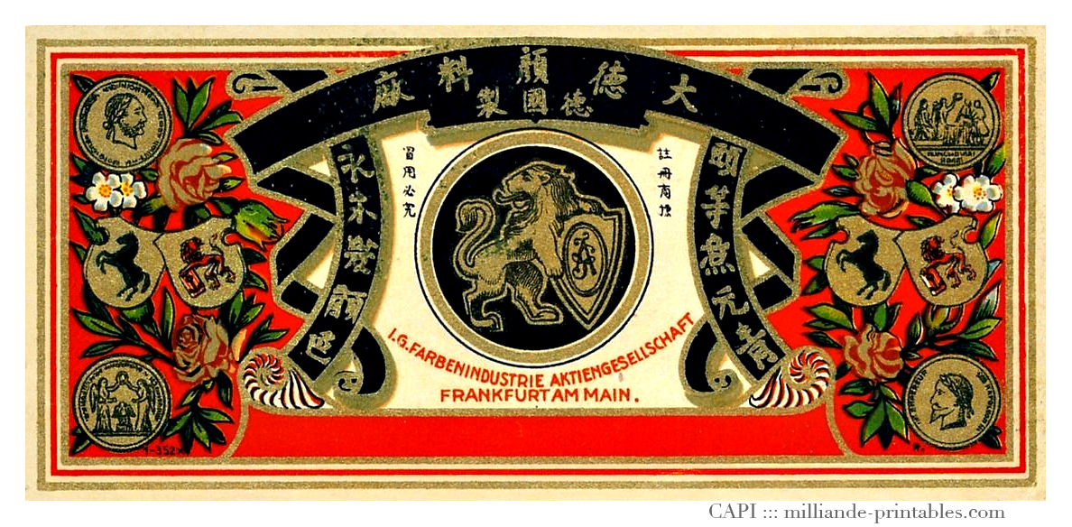
I decided to hand-draw all four cards and also to keep everything black and white to let the imagery speak for itself, without the distraction of colours. Moreover, pencil is my all-time favourite medium to use and it will give the illustrations a “raw” feel. I’ll explain further during the presentation! Adding on, I felt that the group discussion was a great way to share ideas and help each other improve. My group members gave me some fantastic suggestions to how I could incorporate the “Asian” theme into Stranger & Stranger influenced graphics; one great example was to use different languages, colours, and symbols.
Over the past two weeks, I’ve been researching on artist references to learn more about vintage type. Here’s what I’ve concluded about vintage type…
- Use of intricate borders and detailed, stylized decorative graphics to accentuate type
- Use of shapes to highlight/ define certain areas
- Symmetrical layouts – Balance
- Relevant imagery to beautify type Illustrations (done in an “etching style”) – Found a tutorial on how to create the etching effect!
- Each typeface has a character of it’s own, usually “mismatched”
- Colours used are usually monotone/ duo-tone or colours that are muted and rustic
I also spent some time scanning really useful books, will create a separate post for that 🙂 In the meantime, here are some inspiring typography I found online.


You must be logged in to post a comment.