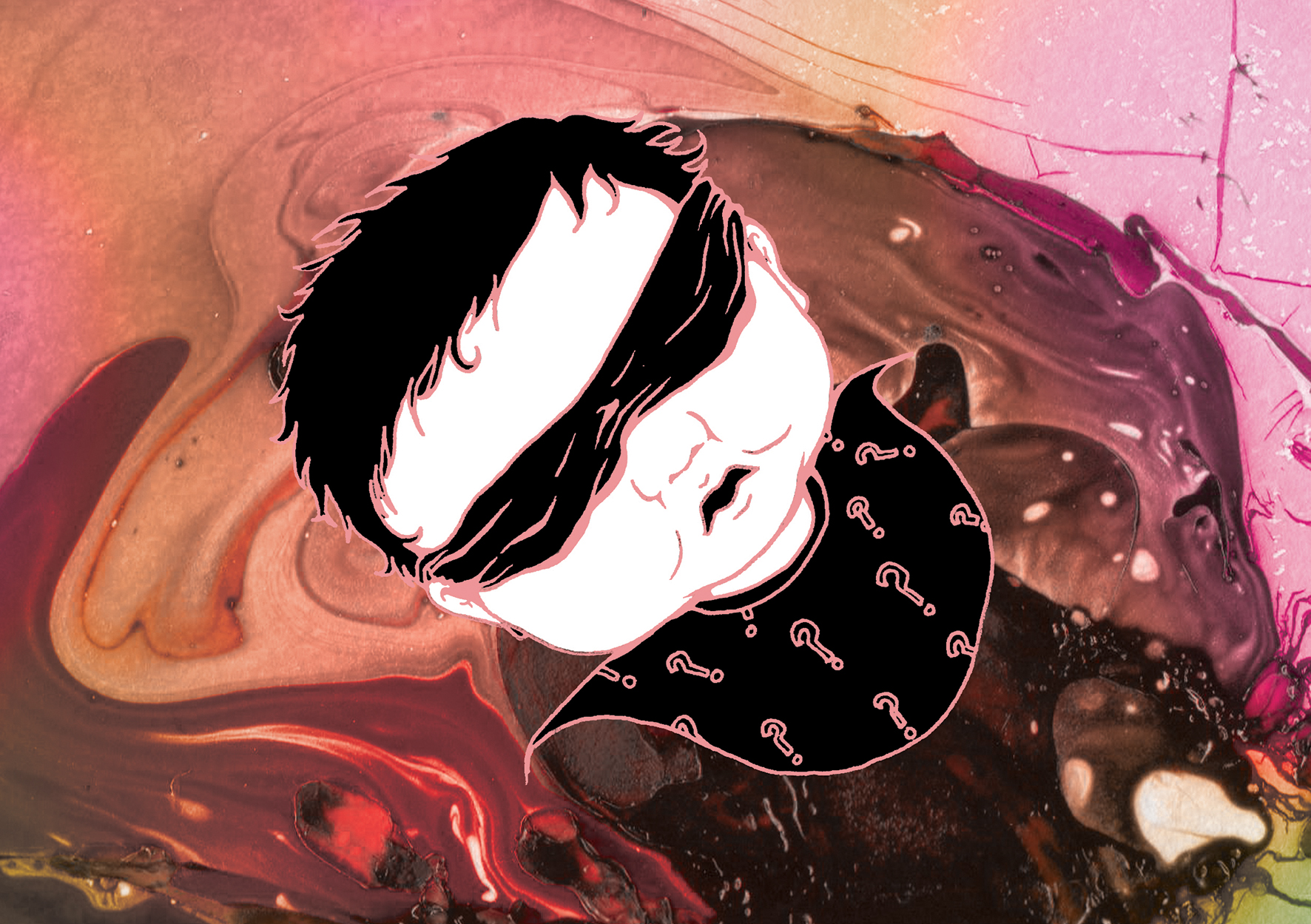
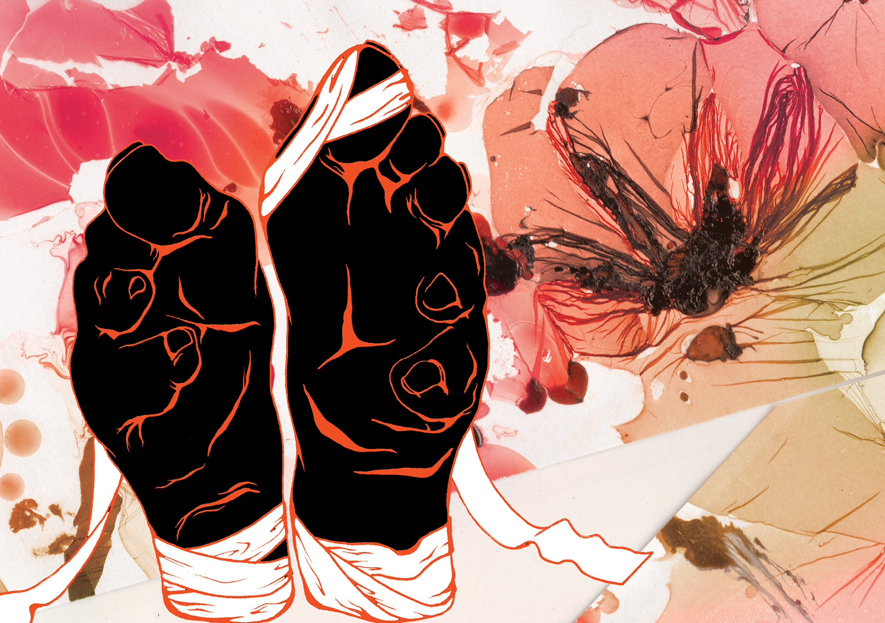
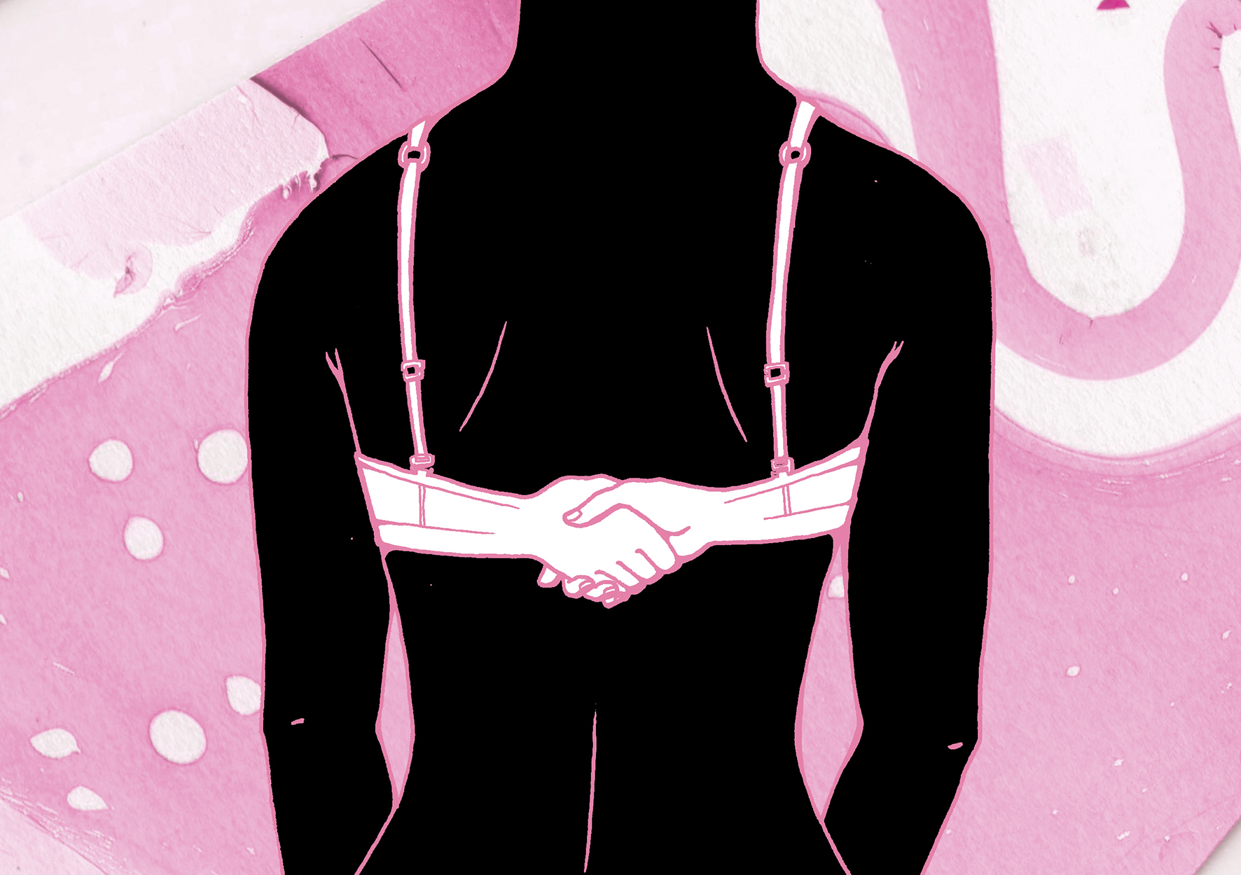
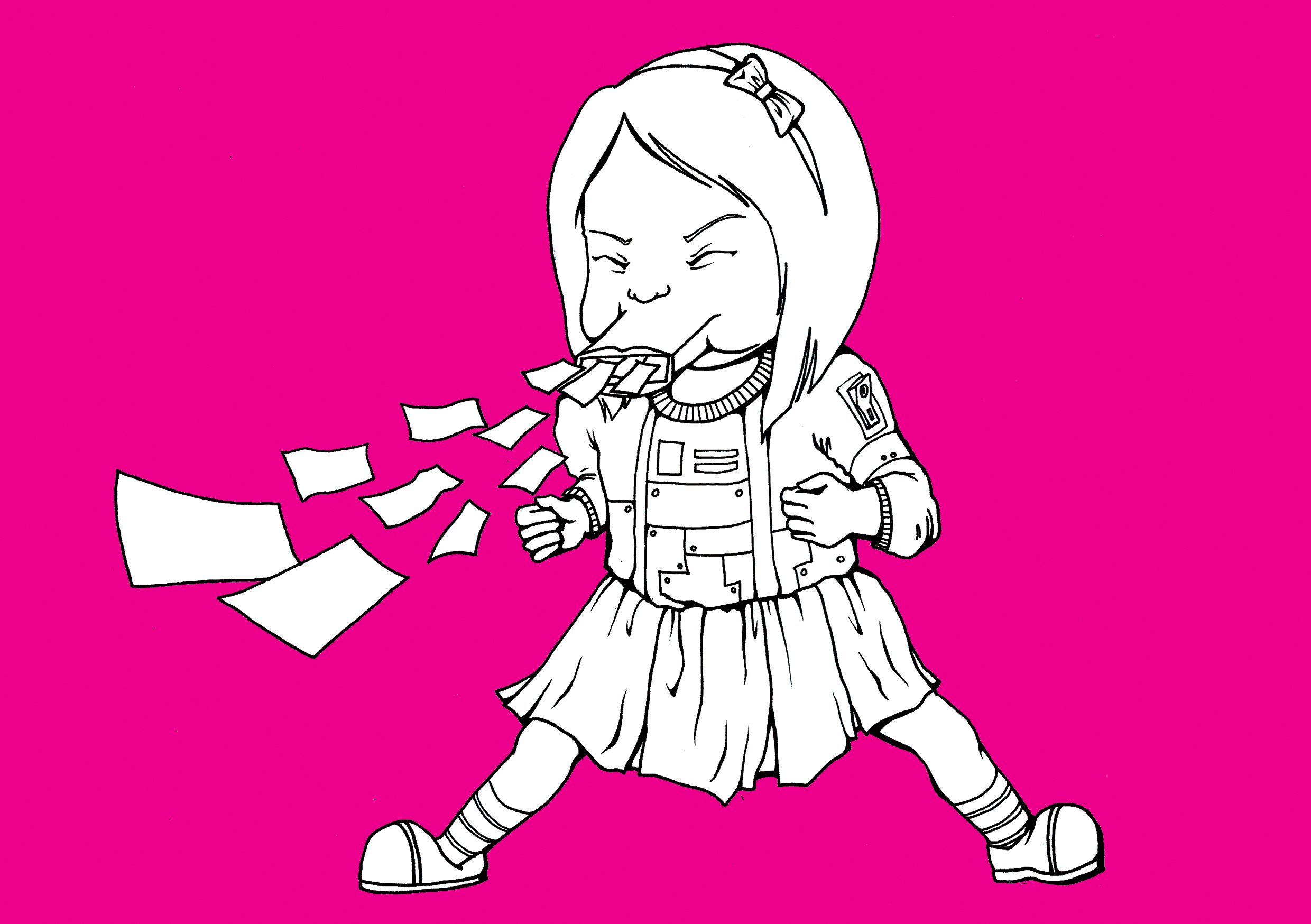
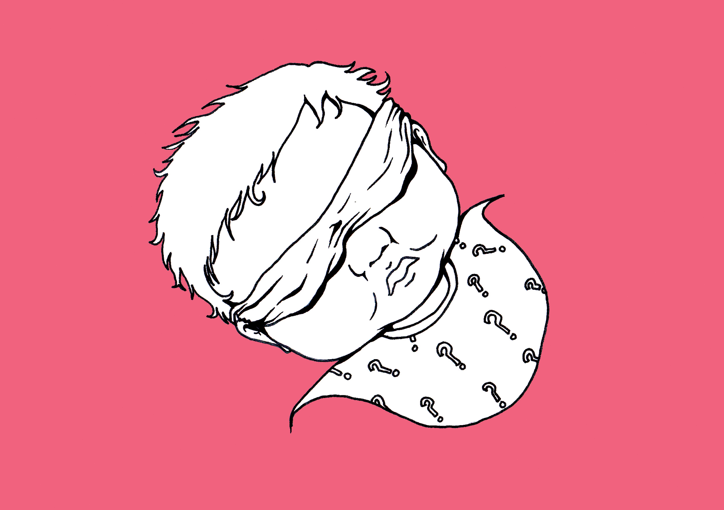
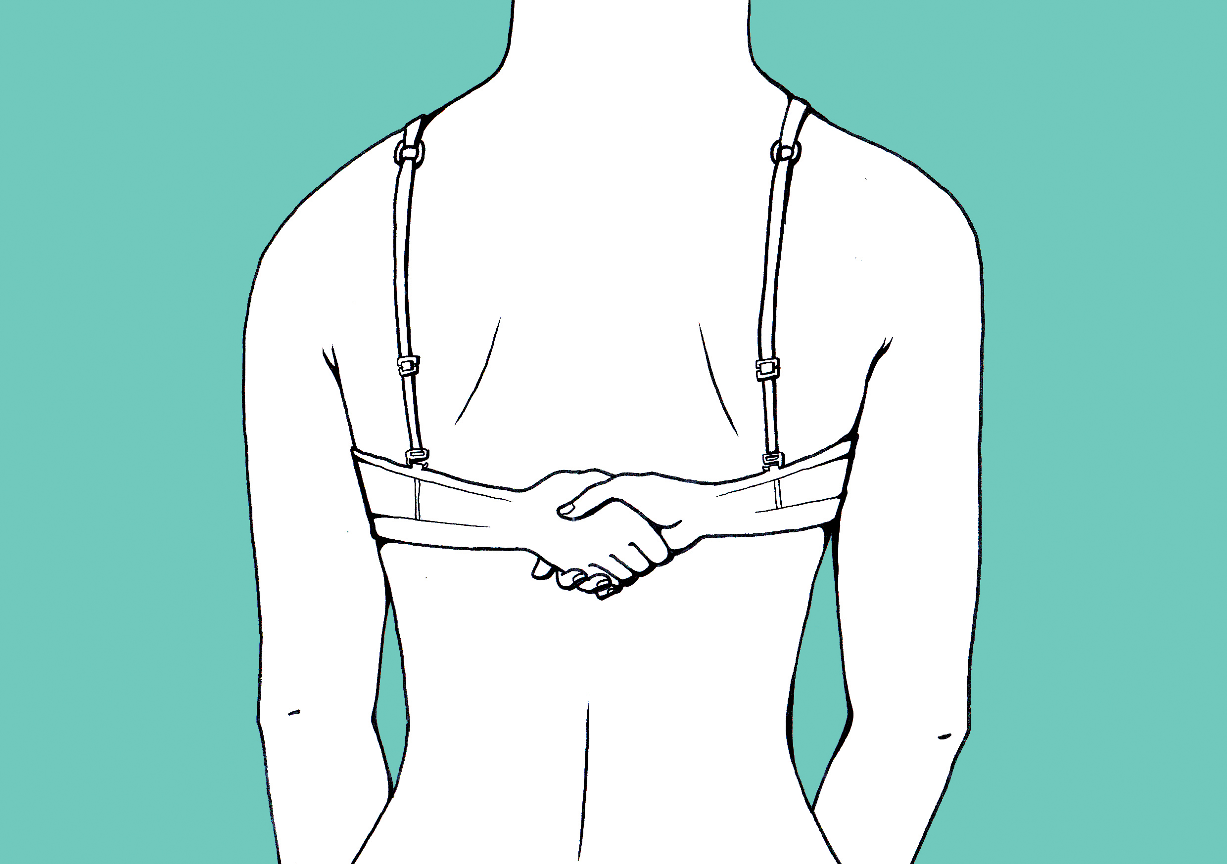
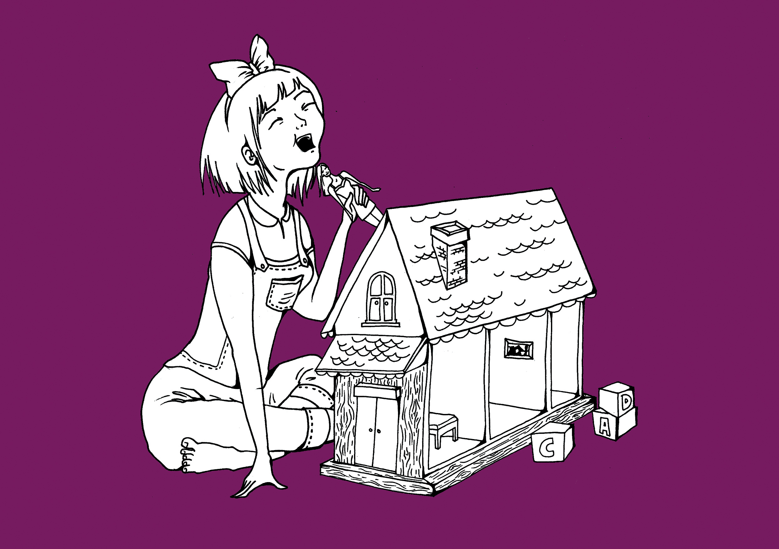
These are the final artworks I selected for presentation. I also decided to have colored linework matching the subject matter such as fleshy pink for the baby, pink for the feminine bra, an auspicious red-yellow-orange color scheme for the superstitious ancient China, cold machinelike blue for the vacuum cleaner-like moneysucking creature, and purple – the color of widows in my culture- for the ‘adult’ child.
The black and white also gives a nice contrast as well as a certain macabre quality that conveys the rather pessimistic or perhaps cynical point of views.


Having said that, I was intrigued when I tried out a colour-block technique. I was so fascinated that I decided to have a second, alternate version for fun. The look makes it seem very manga-like, somewhat Japanese in its aesthetics.
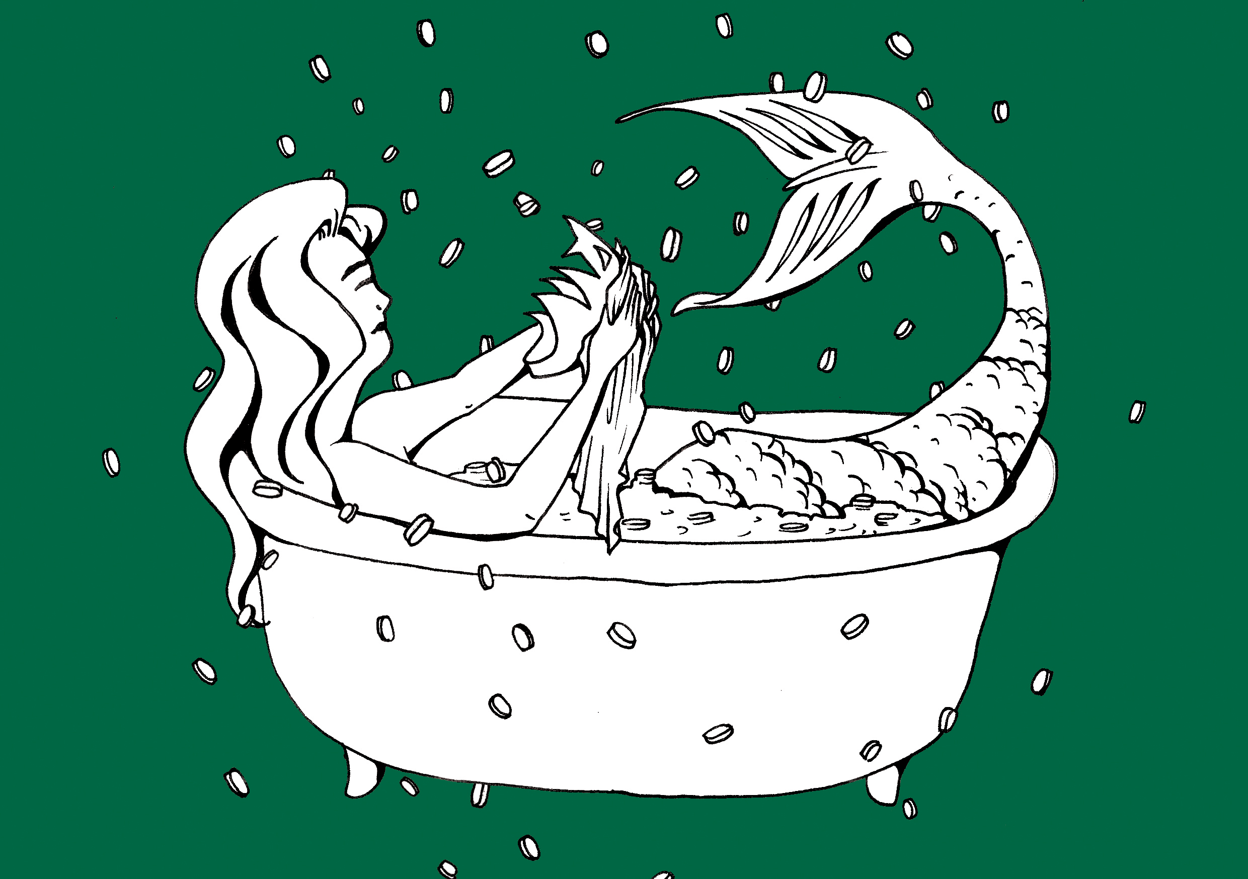
Starbucks green as seen in the ever-ubiquitous logo.
And that’s it with the compositions. I had a lot of fun trying out color schemes and compositions, as well as illustrating for these. I wouldn’t mind doing another set on the same subject with a different POV. I might even do it as a holiday project.
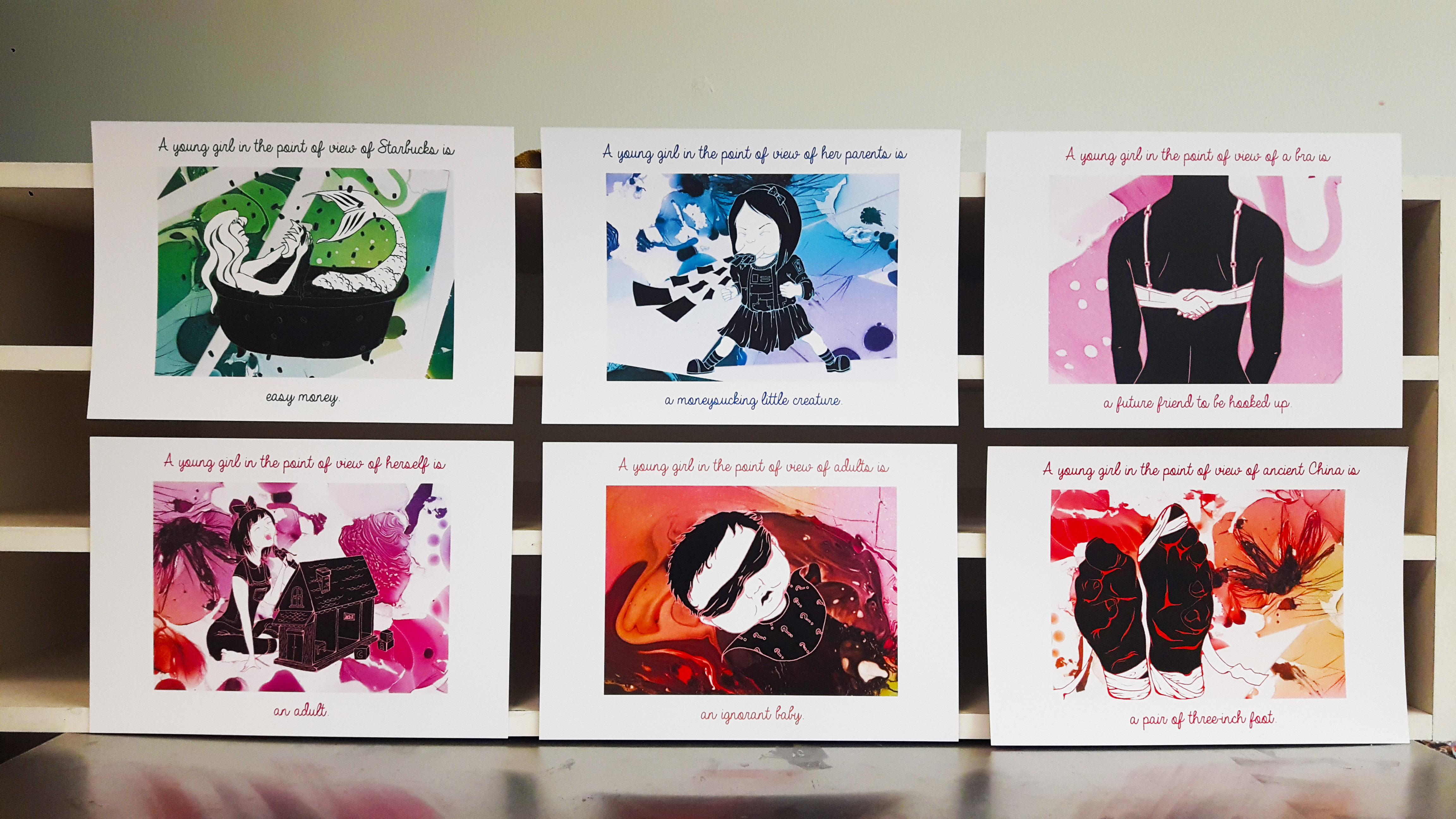
The more formal arrangement.

I might send this to my friends as postcards.
You must be logged in to post a comment.