Okay so be prepared to look at my messy sketchbook ideas…that’s just my way of planning and stuff so yeah its kinda messy…and I changed my ideas pretty drastically so this series of images of my sketchbook ideas should help to guide through my thought process (hopefully).
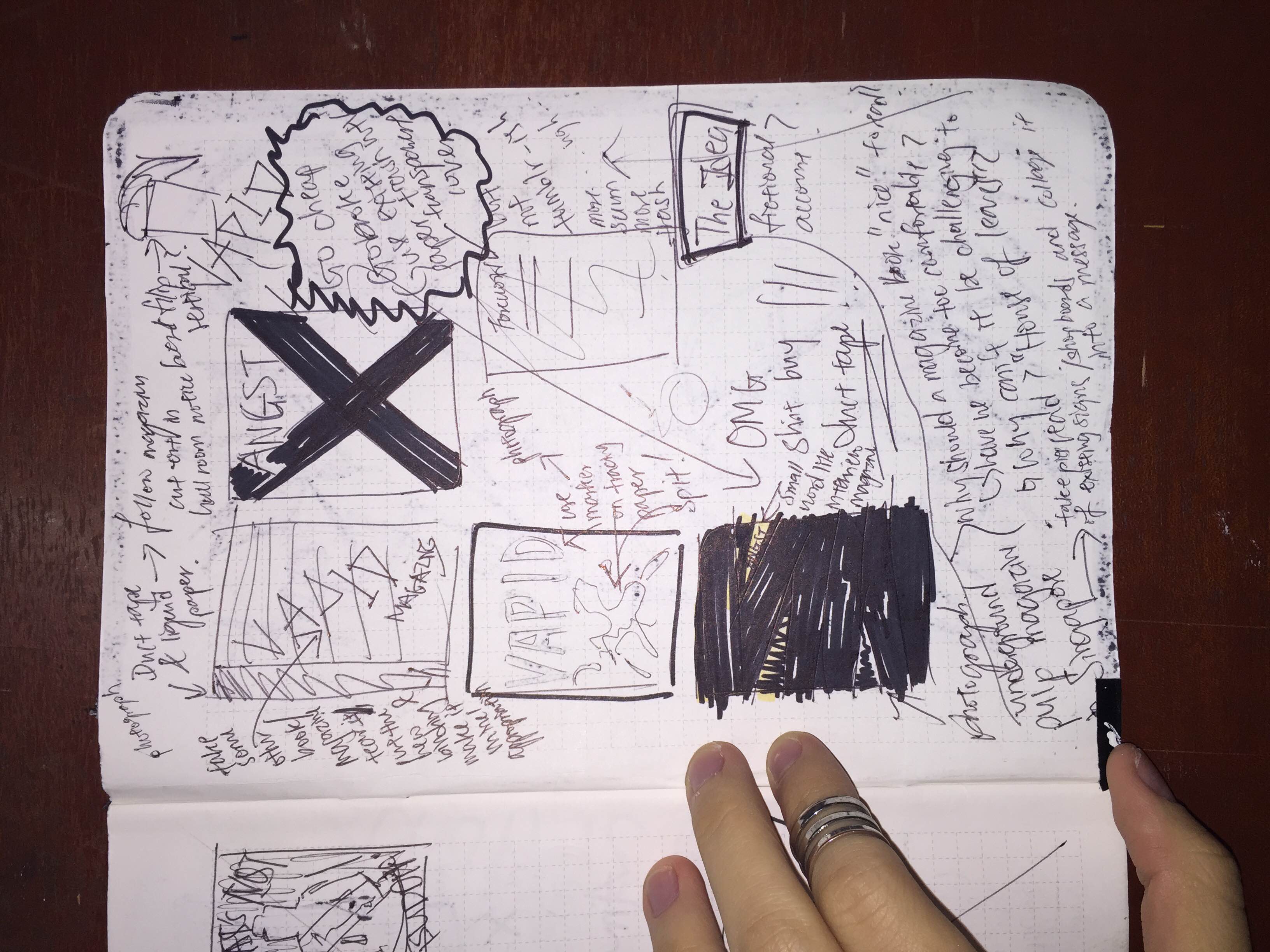
Initially, I had a few ideas for my zine that differed very much from the final product. If you are familiar with my style, I less a fan of the clean minimalist style present in most magazines and prefer the messy, raw style of cheaply made zines (which was what zines originally were). I was into the idea of making a zine inspired by old pulp magazines and a magazine that was just really messy or ratchet if that what you guys like to call it lol (refer to image below for examples of pulp zines).

I thought of creating a zine on Angst or Vapid stuff so that explains the titles and yeah as usual, working with lots of duct tape.

I tried some covers like taking an old picture I created from my typographic portrait days and editing the words “Vapid” on it. I like how plain cardboard and some random lotion squirted on it (idk I thought lotion was cool) that looks like spit creates this very trashy and plain image yet at the same time has a very interesting quality to it. I wanted that to be the point behind my Vapid zine but it didn’t make it to the final so I’ll probably work on it after sem ends? haha I actually have a collection of images that I already planned to include. It’s like badly flash photographed (or maybe not) of random things and some stuff from my typographic portrait that seem very banal but still very interesting at the same time. (or more like stuff I did when I was bored while walking back to hall lateeeee at night)


I also experimented with some of my daily notebooks which is basically just doodling and vandalising my duct tape with liquid paper and the usual childish doodles on pinup kinda thing cuz I b0reD N LAmE <33.

Marilyn Monroe has never been sexier. Btw, these notebooks sell cheapppp in Taiwan so get one now!!
I also found this notebook of mind in which I pasted a simple sticker stating “Angst” in capital letters to be quite interesting as a cover but sadly it didn’t make it into the finals (maybe next time?).

If you think about it, life is full of angst & bullsh*t…so my planner is literally my life.
Some of the questions I asked myself while thinking:
- Why should a zine be “nice” to read?
- Have we become too comfortable?
- Why can’t it be challenging to read? (not in terms of content but visually)
Below is the Pinterest of ideas I was interested in exploring for my zine that I came up with much earlier on.

I was also interested in using existing material that we see around us as it contained a lot of information that we often take for granted because we have become so used to it.


I was also interested in playing with raw textures so I thought of creating a horror shopping list zine. Basically, it follows the format of a shopping list and photos that look like they came from the supermarket or market but edited in a way to look very raw and horrifying cause maybe I’m just bored of looking at a normal shopping list lolwhut. But below are some of the ideas hehe

Pls ignore “For the Love of God” I did not meant that and I do not know why I wrote it but yea it happened
Below is a quick rough look of how the cover would look. I would have preferred a dark green basket with yellow handles and the words “basket” to be inside but ah well no time to find the perfect basket and people at Prime supermarket were judging me…ohh and I chose “Basket” as my title cause well, we say it a lot in Singapore too under certain circumstances haha

Original plan was to place some raw rotten meat inside but people at Prime supermarket were already judging me for bending down to take a pic of an empty basket so…hmmm…


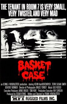
The basket zine was inspired by some images I took of food and texture it created as well as one of the CD covers from my Ego project where I edited an image of a chicken and papayas respectively to look really raw and almost gross like flesh forms. I also thought that focusing on the textures of foods like char kuay tiao and chilli crab would also remind us of our local food and all cause whats not to love when it comes to local food haha and I wanted my zine to still be very Singaporean in a way even if its inspired by western horror zines. Ohh, I was also inspired by the horror film Basket Case (1982), so yeah I was heading towards the old underground horror zine kinda look complete with scratches and tears…ahhh I really wish I did this for my zine project but oh well…shall work on it after Sem 2 ends!

erm…above are rough sketches on how I come up with compositions for the cover…

more idea planning above…

The above would be a continuation of the pulp horror zine idea that I had and struggled to decide whether to continue or not. I initially plan to create one simply because Singapore does not have a culture of underground pulp magazines so I thought it would be nice to have one. To make it more interesting, rather than let it be fiction, I wanted it to be a sensationalisation of prolific crime cases in Singapore from years ago.

Screenshot of an article on Huang Na
I thought the Huang Na murder case would be good to work on as its been quite some time (she would be 20 yrs old now if she was still alive, the same as me) since the case happened but it was a very prolific case in a time when even Facebook was not really established yet so it did not rely on becoming viral to be known around Singapore.
“he stored her body in nine layers of plastic bags stuffed into a sealed cardboard box”
I thought doing a retrospective on the case in a pulp horror zine format would be interesting, especially exploring how the case would go viral in today’s super connected world. So its like a pseudo sensationalisation of the case in today’s context through a pulp horror zine which is usually known have exaggerated stories. I already planned to have the cover be cardboard to relate back to the case itself based on the above phrase that describes how they found her and include some plastic inside too. I like it when materials relate strongly back to the content. okay that was a lot for a dropped idea. I’m done here…for now.

oh and just one more idea that got dumped but I just want to document it here! The above image is the rough cover (haven edited the text properly to blend in) but this was an image from my Typographic portrait (I somehow have accumulated a ton of unused stuff from that project hmmm) Anyway, I wanted to create a commercial magazine look for this zine idea and use it to explore the different female narratives I initially created for my prostitute idea in my Typographic portrait. The look would be fun, trashy but carry a serious message (at least I hope it does) but ah well, I didn’t have enough material to make it complete so I dumped it…still, I like the cover, I thought it looked pretty rad imo
RE:LOAD

This brings me to my “Re:load” idea which I finally settled on. It started with the idea of why the need for a physical zine and how the feeling of a page loading would feel like when we are reading a physical thing. I wanted to make a statement on why physical copies still matter and I thought maybe this would show it. I initially worked with the loading symbol. I decided to increase the size to make it look less familiar and more like a minimalist pattern on its own. This is further reinforced by the printing of a black pattern on vanilla paper that gives it a more traditional feel that contrast with its roots as a digital loading sign.


I wanted to create the impression of a minimalist pattern book from the first page. However, I also wanted to make a statement on how physical copies differ in the sense that you do not have to wait for the page to load as you can simply flip the page, thus I included this portion.

This was how I reflected that idea in my first prototype. While the full black page does signal a drastic shift in the tone of the book from a simple wordless pattern book to the main idea behind it, it still felt quite incomplete. I mean yeah I just did a freaking zine on simple oval vector shapes and one liners in black and white…the amount of effort ha…ha…ha…I mean some people like KJ said it had a cool concept so its enough but then there were also people like Andrew that said that it can be pushed further and so I did cause it does kinda feel lacking…

Another important idea behind reading online and offline would be the presence of online click-baits. While waiting for the online article to load, many websites contain these little advertisement or click-baits to another article that distracts us from the main thing that we are reading.
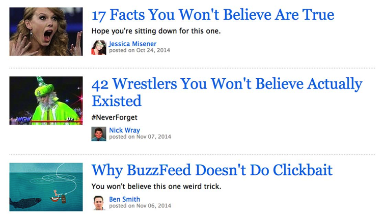
You’ll Be Outraged at How Easy It Was to Get You to Click on This Headline (Click to see article on clickbaits which is kinda a clickbait itself lol)

I tested out the idea using post its on my first print prototype. I wanted it to be like a bombardment and a distraction from the main message of being able to flip to the next page to load the content, thus effectively working like a clickbait.

I deliberately choose to have the word “behind” rather than “next” like online clickbaits since I wanted it to suit the format of the zine more (look behind the page).

More ideas and planning before settling on a small colorful cuts outs with an impact front to distract the reader from the more plain fonts of the book.


The reader ends up flipping through 3 pages of clickbait before realising that the page is “still loading” to show how clickbaits waste your time most of the time and distract you from the message at the bottom that says “TURN TO PAGE 10 TO SKIP ADS”.

Upon reaching pg 10, the reader realises that the patterns are actually an enlarged loading sign (or maybe they realised it earlier) and so they expect the content to have fully loaded. The next page “connecting” also serves to build up some expectation or hype to the actual content on the next page.

However, I left the page blank to show how all this leads to no content and then “the connection has timed out” which leaves the reader disappointed and feeling cheated (so much for ruining people’s lives since 1996) since it ruins their expectations of actual content to appear after loading for so long. This shows how the loading process can actually be a waste of time since honestly we just keep staring at it while waiting for our page to load…

The phrase “The Zine is currently unavailable. Learn more” is appropriated from the error message we see when a Youtube video is unable to load. In this case, however, since the phrase “Learn more” is printed, in which it becomes useless since we cannot ‘click’ on it like we do digitally, reinforcing how pointless my zine is. or Perhaps, suggesting that we should look elsewhere to “learn more” like actually ask people and inquire on our own…hmmm….

and that explains the cover page which I kept as simple as possible to not reveal too much. I initially planned to have a small mouse symbol placed near the reload symbol but I thought that gave away too much so I removed it eventually.

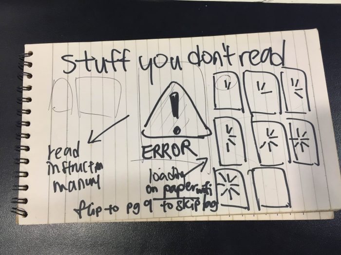
Instruction Manuals 101

Initially, what I had in mind was a combination of the instruction manuals with the reload idea since it all kinda boiled down to the main idea of exploring how we read in the 21st century (as grandiose as it sounds its actually quite direct la). However, after discussing with some people including 4D Prof Robert Zhao (!!) haha, I realised both ideas didn’t really fit well together so I decided to separate them.

So what I did was gather all the instruction manuals and brought them to school…those featured here are just a small portion of what I brought to school (I’m not even kidding) like this only shows 1/10 of my hoard. Then, I dissected them and tried finding those that were especially wordy and some which were particularly interesting when separated from the rest.

I proceeded to lay them out and see whether or not I could connect individual pages from different manuals together since instruction manuals have a certain consistent format to them (e.g. warning pages, steps…) The initial plan for my zine was to just compile some of the pages together and bind it but I decided against it in the end not because it was too rough (I mean Zines were suppose to be cheaply made in the first place) but because it did not reflect the idea strongly enough. I was stuck deciding whether or not I wanted people to read my zine or not. If I went with this idea, would people actually read the instruction manuals simply cause I binded them nicely and gave it a pleasant cover? Well, NO. Sadly. It would make a point that people picked it up for the cover but I thought that the idea wasn’t exactly complete yet.

Excerpt taken from “Lesser Designs” by King-chung Siu
I went to the library as usual and found this book called “Lesser Designs” by King-chung Siu. The book analyses designs found in the most unlikely or rather often overlooked areas like signboards and informative designs, basically in existing designs around us that we take for granted. (I might purchase this book since it kinda covers what I’m interested in!!) They had this portion on instruction manuals which helped to justify my thoughts on this idea that instruction manuals are poorly designed without the user in mind which is ironic since it has an important purpose that is to instruct the reader. Thus, I thought of making a comment on design itself through bad design which sounds kinda pretentious since I’m still new to this graphic design thing but I thought through it and here’s what I got:
maybe instruction manuals were not meant to be poorly designed, I mean back in the past when people first designed it, I’m pretty sure people actually read them if not why bother printing them in the first place. Maybe the issue lies more with our reading habits? With the internet, we can just google any question and get answers instantly which sounds a lot more convenient than scanning through a lengthy passage in a plain booklet.
This lead to the idea of exploring how we process information in the 21st Century and how instruction manuals serve as an example of design not catching up with time. I was further driven to explore this after observing my surroundings and realising that lots of informative graphic designs fail to keep up with my short attention span (might be generalising a lot here but I did ask others around me for opinions on certain posters I felt that way towards). Certainly, graphic design visual styles have changed over time but the essence of how a message is conveyed through design still seems to have remained the same despite the fact that the way the audience (us) process information has drastically changed over time due to new technologies and information bombardment. (okay wow that was long but idk how else to convey this….and uhhh I know it sounds pretentious af but I honestly mean all of this…ahhh)


Step 1: Scan individual pages of instruction manuals

Step 2: Adjust brightness, contrast, levels to clean all the shit up and erase any accidental print marks to make them look brand new again!


The initial idea that did not work out cause I realised that it was funny to me but others I asked did not get it…hmmm

Rather than just have instruction manuals, I decided to have a preface with the reasons for why we don’t read instruction manuals that I took from http://www.abcsignup.com/blog/why-people-dont-read-instructions but deliberately left the last one out so it doesn’t reveal the full picture behind why I edited these images on the manuals and I guess the “we” also serves as triggers for people to read?? and er, the auntie at the printing shop binded my zine wrongly so that explains why its in the middle…but it still works…I guess…

To show how instruction manuals or other kinds of informative design are not designed with the 21st century audience in mind, I decided to have this mock dedication and dedicate the zine to myself. I deliberately made it slanted to have it look like it was badly printed but decided to adjust it straight in my final since the rest of my zine looks well printed so it looks quite out of place (actually maybe I should have just gone with it…)


After cleaning up the instruction manuals so they look like I have the soft copy version itself when its just scanned images, I proceeded to edit visuals in to show how we process things with more visually these days due to the bombardment of information around us from signboards to mass media.


I added in a few images relating to a single phrase such that when people read these edited manuals, they learn new things from one single phrase too such as how “toasted bread” can be associated to the word “toasted” itself which carries another meaning or how “utensil” can relate to the recent invention of the edible spoon. Thus, while everything may seem like a pointless mess of images, one can actually learn new things from all these associations.
THE “DESIGN” PROCESS:
- Did not apply any of the main graphic design principles I was taught except for maybe composition but minimally still
- Word association. Literally connected a word/phrase to a visual by putting the visual next to the word/phrase. (e.g. “end of cycle” to menstrual cycle diagram, “see figure 8” to Ellie Goulding’s Figure8 mv)
- That’s just how information overload works I guess??
BUTTTTTTTT
maybe that’s where I might have failed. I might have gone a bit too far left with this experimentation of doing graphic design based on text association rather than existing graphic design principles and also due to time constraints. If I had more time, I would have tried to improve the overall visuals by arranging and choosing images according to color and composition rather than simply just dumped them based on word association.


This particular one was where I started to go a bit wild…but I guess that’s how information overload works…Problem B> “Problem” by Ariana Grande> Starbucks Grande


Okay, so I decided to use the rubrics too cause technically the rubrics are a form of instruction manual. However, in this case, most people read them?? haha even though its lengthy and all. (I don’t really read them cause mine just just gets put aside most of the time unless I need to use directly for my work lol) but its funny how people read this when Prof Ina has pretty much mentioned in class all the basics that we need to know for the assignment. Not that the rubrics are bad but they can be a bit of a constraint when you read too much into it. However, I decided to work with it too and added more images than usual such that the rubrics have become almost unrecognisable but full of images associated to it. I believe that should be how rubrics work, to inspire ideas aside from just giving instructions. or maybe I’m wrong but still good experiments…good experiments…hmmm


For the cover, I simply replaced the fan graphic with a selfie of Kim Kardashian and I like how the selfie fits nicely with the frame but looks odd with the rest of the cover page. I was kinda going for that weird almost absurd zine look. I also slanted my name to fit with the bad printing.

For the last page, I reveal the last reason as to why we do not read instruction manuals. “We blame the instruction manuals for being poorly designed.” which links back to the entire concept of these manuals not being designed with us in mind, not catching up with the way the audience processes information in the 21st century and maybe even a pinch at how my own edits are just “poor designs”. (okay I should stop)
STILL
This Zine project may not have been the best for me, I felt like I could have done so much more but I was glad that we had this project cause now I feel more driven to create zines on my own and learnt to use the basics of Indesign:)
You must be logged in to post a comment.