Cochin Typeface
Cochin is a serif typeface produced by the French Type Designer, Georges Peignot in 1912 for the G. Peignot & Fils foundry for which he was the manager. The design of the typeface was based off the engravings of 18th century artist, Charles-Nicolas Cochin, from which the typeface was named.

Decoration for a Masked Ball at Versailles, on the Occasion of the Marriage of Louis, Dauphin of France, and Maria Theresa, Infanta of Spain, ca. 1860 reprint of 1764 plate by Charles-Nicolas Cochin. Image from here.
Some key characteristics of the Cochin typeface include its low x-height and long ascenders.


Images from here.
A prominent use of the Cochin typeface in pop culture media would be the Bloomsbury Publishing edition’s covers of the Harry Potter series. The cover art saw illustrator Thomas Taylor’s watercolour and pencil drawings paired with the title in the Cochin Bold font.

Image from here.
 Image from here.
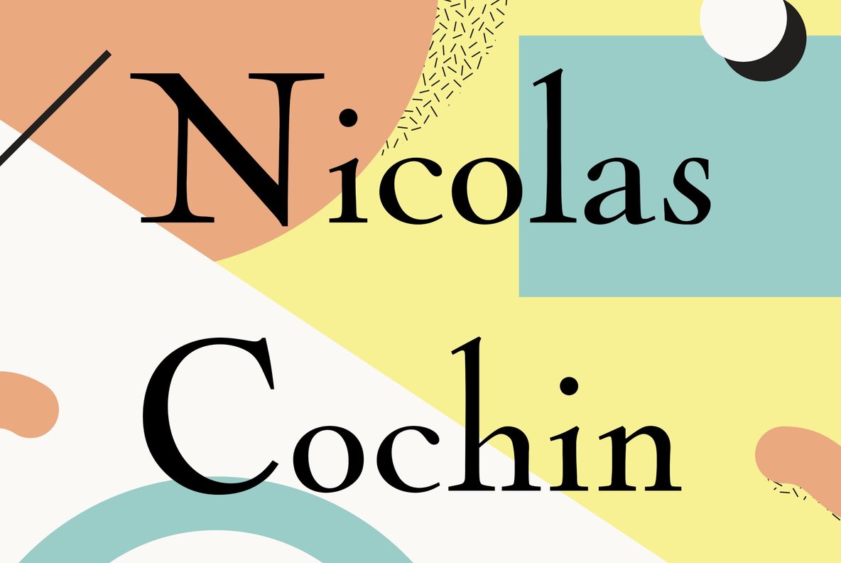
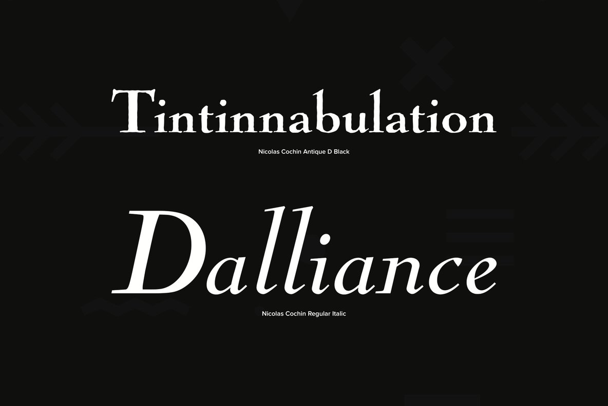
Nicolas-Cochin Typeface
Georges Peignot also created the transitional serif typeface, ‘Nicolas-Cochin’ in 1912, as a looser variation in the same style. 
Image from here.


Images from here.
The most prominent use of the Nicolas-Cochin typeface would be for the logo of luxury brand Christian Dior.
As stated in this article,
“The Dior wordmark personifies elegance alongside the rich and dynamic full screen images which work well with the fonts to create a sense of style, class and sophistication. The supporting typeface is Century Gothic, with the captions set in all caps and the body copy in upper and lowercase. The use of Century Gothic Light makes the text appear grey which knocks it back. The website also uses system font Arial.”

Image from here.

Table from here.
Below I’ve also included a beautiful application of the Nicolas-Cochin typeface by Seaborn Press for a suite of wedding invitations.


Images from here.

You must be logged in to post a comment.