Concept:
For the poster, I wanted to work on the existing graphic marks I created for the previous assignment, while adding a new layer to the project as a whole. As I was researching my Quantum Vocabulary — Gravitational waves, I noted down sound wave as a key word. Additionally, when looking at my final few marks with their various effects and textures, I noted a dynamic quality to them, some vibrating or buzzing, others ebbing and flowing. I couldn’t help associating the two elements in my mind map and final graphic marks. It was here that I decided on doing this assignment on Synesthesia. Although I am not so lucky to possess this neurological condition, my partner does. In their case, they associate letters, shapes, numbers, and even days of the week with colours. On top of that, they also experience music as a spatial display of colours, lights and shapes. Therefore, in my project, I would like to try to use my poster to depict, in my own limited ways, how a certain song would look to them with my ready-made graphic marks.
Here’s a gif I created that I feel could be an example of how I would like to execute my posters, with implied depth, various textures, shapes and patterns to convey some sort of movement or emotion.
Below are some videos I found informational when trying to learn about Synesthesia.
In this second video, the speaker also experiences a similar colour-auditory Synesthesia, which she was able to create a light display, paired with a live performance to convey how she experiences music.
Possible nouns:
Synesthesia: Meaning joint perception — syn (together) and aisthesis (perception)
Synesthete: Person with Synesthesia
Color-graphemic Synesthesia: Most common form of Synesthesia, in which letters, numbers, or geometric shapes are linked to colours or patterns
Color-auditory Synesthesia: Type of Synesthesia in which various sounds immediately recall specific colors, shapes, or textures
Sensorium: The sensory apparatus or faculties considered as a whole
Quantum Weirdness: Where classical physics fail to account for the phenomenons in the quantum realm
Intersections of Synesthesia and Quantum Physics:
I found a really interesting article, link here, that described the ways in which the human sensorium could experience/detect lights, sounds, smells, tastes and tactile sensations at a quantum, molecular and/or vibrational level.
One of the key experiments pointed out in the article showed the capacity of the human eye to see not only photons, but also quantum properties that we discussed in class, such as entanglement, polarisation and superposition.
The article also mentioned that some of the observers in the experiment have been trained via observational meditation to enhance their sensory-perceptual capabilities, which proved to be extremely crucial in their visualisation of the quantum properties. It is here where the article puts forward a new direction in which the researchers would be moving in — the consideration of how Synesthetes/Synesthesia could assist in the probing of quantum phenomena.
I think it is particularly interesting given the ways in which Synesthetes experience different sensory stimuli through an integrated, simultaneous kaleidoscope of sensory experiences, and I think their inclusion to this research would definitely be groundbreaking.
Poster Inspiration board:

Poster Exploration:
Variation 1

This first variation was simply me overlaying a graphic mark in different directions and opacities with the aim of overwhelming the eye. It did create a very trippy visual, but ultimately was not what I was looking for in my poster.
Variation 2
Image from here
Inspired by this poster I found, I tried to recreate it to see how it could fit with my concept.


I really loved the colours in this poster. However, the overall layout was too central and static for my liking and to really align with the concept I had chosen.
Variation 3

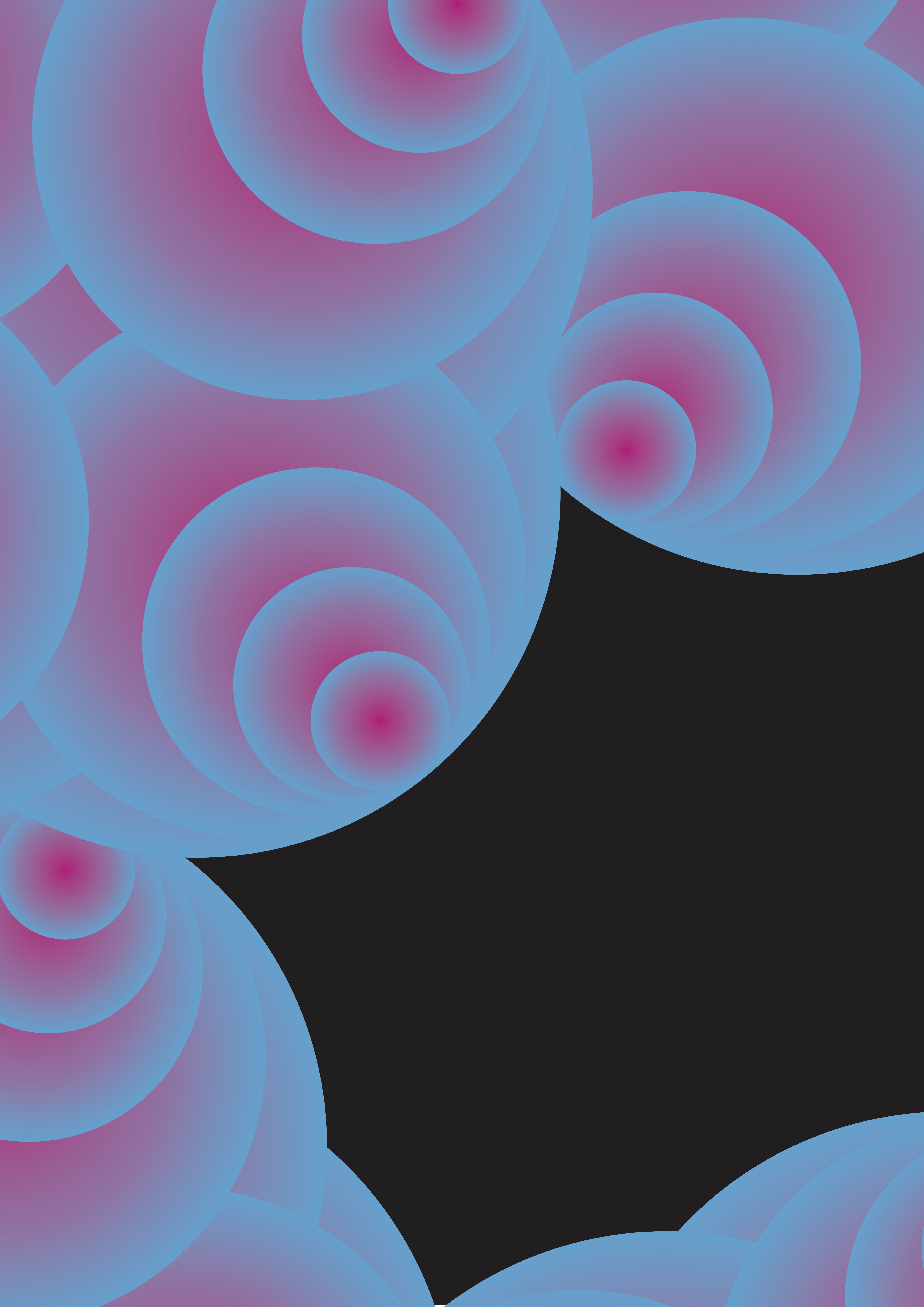
Working with a graphic mark made in the previous project, I sought to see how the concentric outlines could possibly create depth in a black void to bring out the feeling of movement and flow.


Although there were elements that I liked about this poster variation, I felt that the excitement and overwhelming feeling was lacking.
Variation 4

Working with the graphic mark I chose for the previous project, I set out to deconstruct the existing shapes to explore the different possibilities of its form in order to create depth and other various visual effects.
This composition’s colour scheme and visual elements were meant to be an exploration of the song linked above. The rhythm/beats, instrumental elements are all represented in the composition through a visual hierarchy of the visual elements.

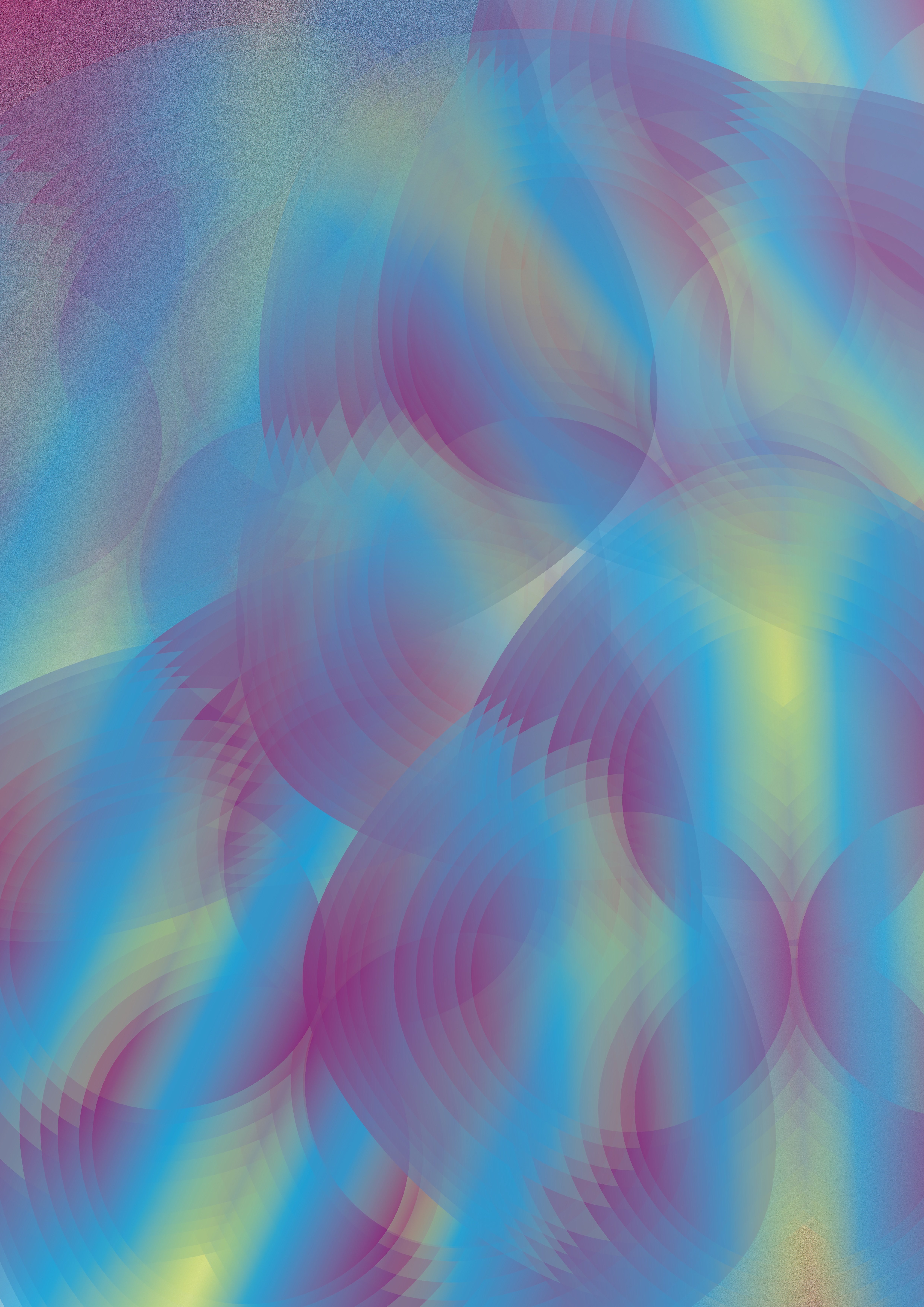
 In this first attempt, I removed the fill colours and used the gradient shades on the dotted outlines of the graphic marks and centralised them to see what kind of resulting feelings/emotions I would uncover. It was a rather pretty image, but to me, it lacked the dynamism I was looking for in the visual portrayal of Synesthesia.
The second attempt was created by overlaying the solid shape on one end, and overlaying the outlines on the other end. however, the balance of this composition was too ‘off’ for my liking and also did not create the flow of movement I wanted.


The third composition was an improvement of the second, however the elements were to large and too messy, even though I wanted to portray the sense of being overwhelmed.
The fourth one was a more curated and arranged version of the previous, but still lacked the flow and movement I desired.

As with the fourth, the fifth was not much of a difference, only with a slight rearrangement of the elements.
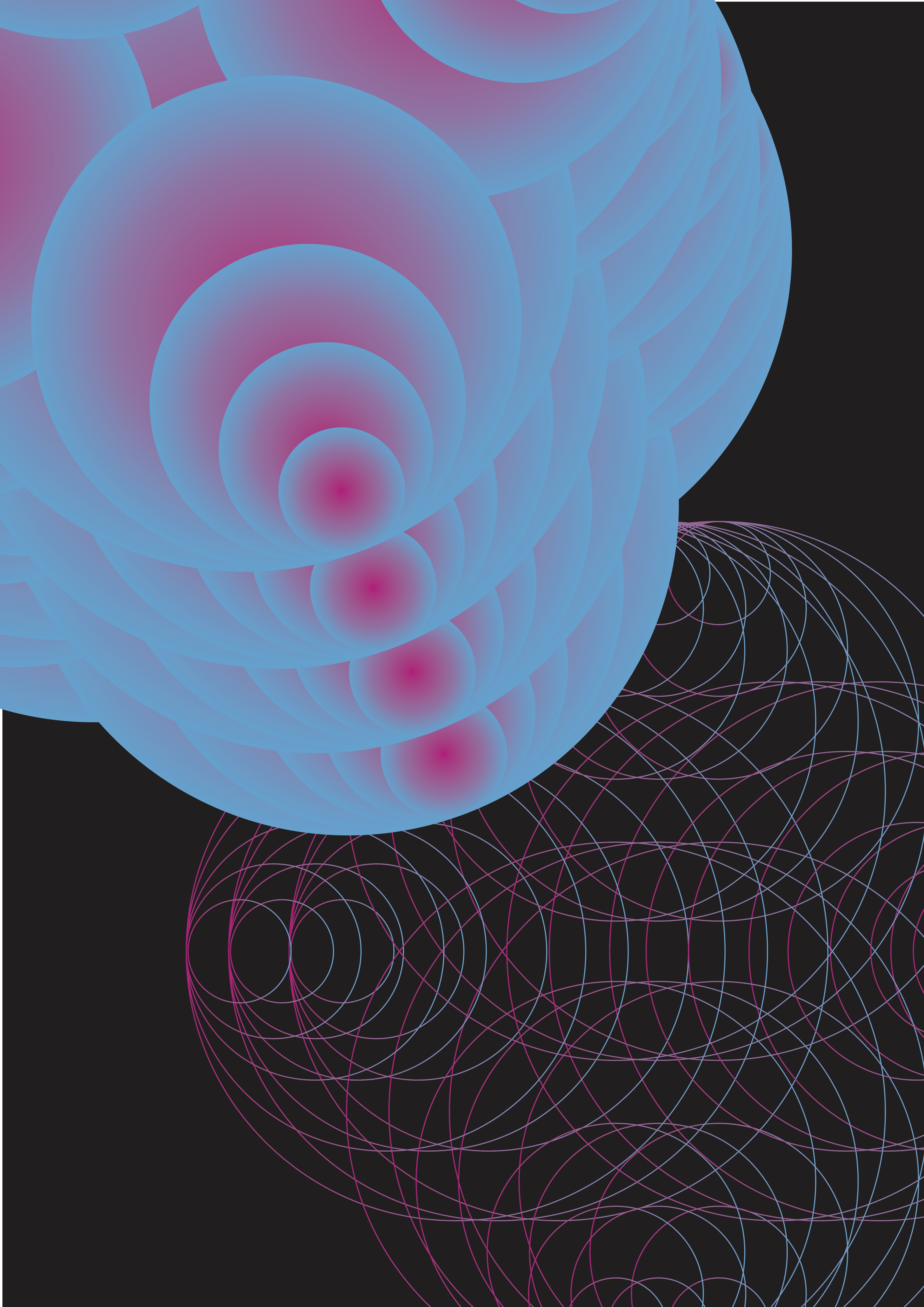
Finally, I reached an arrangement of the filled in shapes that I liked, with the overlaying of each singular graphic mark creating a sense of depth on a black ‘void’, cascading down from the top right into a circular flow that ended on the bottom right.


It is after settling on the placement of the graphic marks that I introduced the less heavy, outline versions of the same graphic mark to create more movement and depth on a smaller scale, to act as a supporting visual for the key graphic marks.
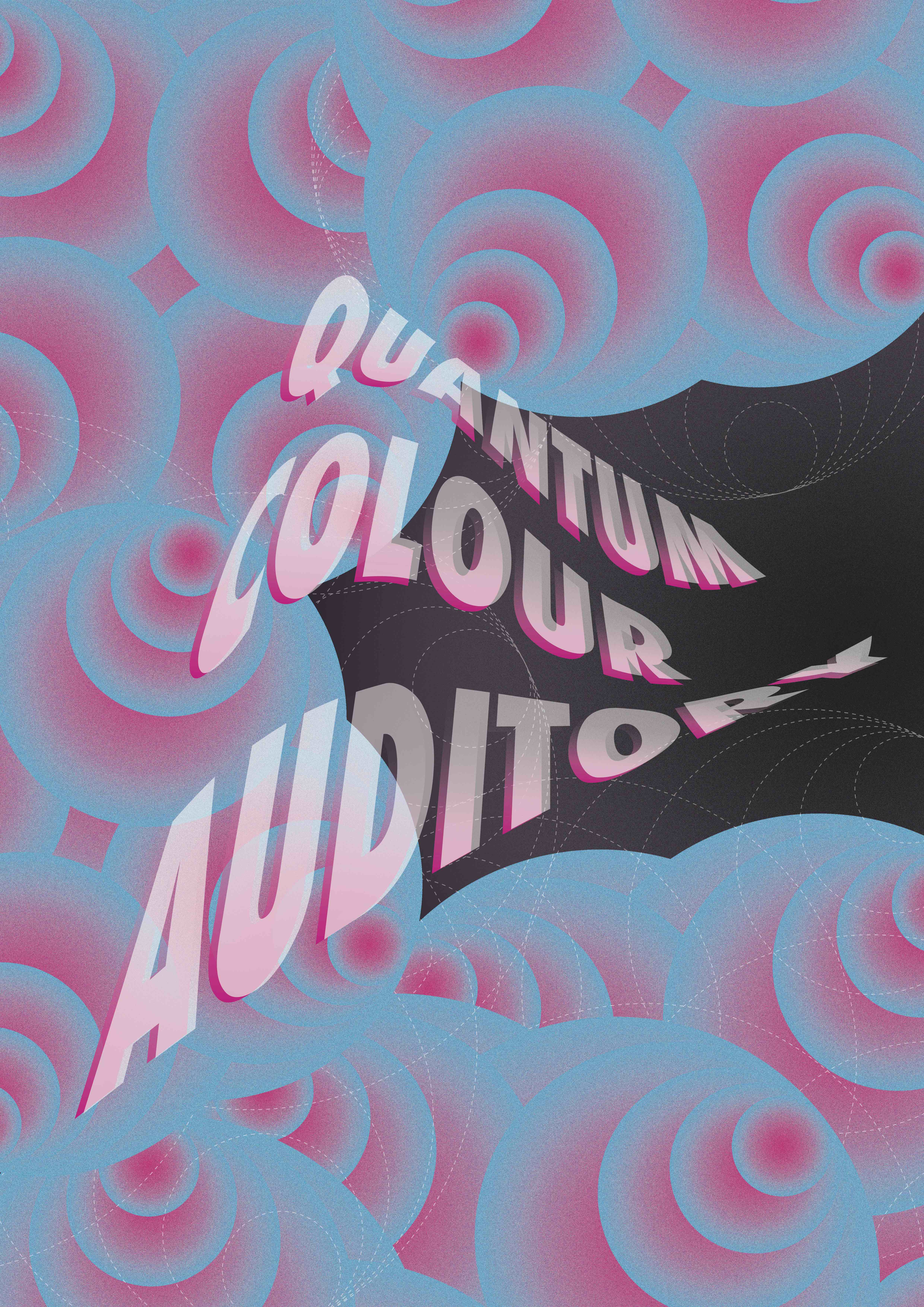
On the eight composition, I added an grain effect on the graphic marks, as well as toggled the various levels of opacity to create more depth, movement and a sense of ‘vibration’


Here, I edited the outline elements into a dotted version so as to create a better visual harmony, with the dotted outline serving to enhance the foreground images instead of distracting the viewer. I also added my chosen noun, warping the form of the text to look as though it is either emerging, or being sucked into the void. This to me added more dimensionality and dynamism into the composition.
The tenth composition was simply a variation of the ninth, with the black background adjusted into a gradient instead. I did not enjoy the colour pairing in this as much as I felt the gradient stole the attention and emphasis away from the foreground.


The eleventh and twelfth compositions were just results of me toggling with the gradient levels of the background.


Finally I decided on the colour of the text here, choosing a white translucent overlaid text on a gradient pink counterpart to complement the pink used on the graphic marks. On the fourteenth composition, I decided on the final background colour, a slight gradient of dark purple to black so it doesn’t look completely like an empty void, yet still maintains a neutral backdrop to the foreground imagery.

In these compositions, I toggled the opacity of the dotted outlines, as well as their layering on top of, in between, and below the various copies of the graphic mark, to create a sense of the objects interweaving between or through each other. I felt that this created a sort of rhythm and flow within the world of the composition, creating a harmony and balance between the elements so that they were not disconnected.


On the seventeenth composition, I finalised the placements of all the objects, before adding in more elements on the eighteenth composition to create more visual interest, more depth and also the small flairs that represented various musical elements. I was extremely satisfied with the overall effect as I felt that the composition was exciting, had the desired dynamism, flow and created this visual narrative that I could identify with the chosen song.


In these two compositions, I attempted to include some lining text to tie the composition back to the chosen song. However, I felt that the text interrupted the depth created by the visuals and did not serve to complement the poster. So I decided to go without.


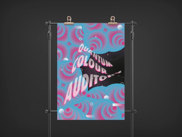
Here is the finalised poster, in RGB and CMYK mode. I initially enjoyed the RGB mode due to its overwhelming colours that created this psychedelic effect and dizzying visual quality. However, the laid back vibe of the chosen song was more aligned with the CMYK version, and was still visually pleasing, therefore I decided to settle with the CMYK version as my final chosen poster.
Final PosterI would say I’m rather satisfied with the poster as all the elements were put in place for a specific reason that spoke to the song I chose and was according to my partner, quite a close representation of the song’s Synesthetic quality.
The blues and pinks of the main graphic mark creates a calming reinterpretation of the chill soundscape, while the repetitive concentric circles creates a visual illusion of swirling and movement, much like one would experience Synesthetically. These were meant to represent the underlying beat of the song, as a dominant, recurring motif. The concentric circles also were reminiscent of the echo-y sound effects towards the end of the song.
The dotted outlines interwove with the main graphic mark, serving to represent the lyrical/piano melody, working in harmony with the beat to create a moving, flowing, symbiotic reinterpretation of the song.
The small circles and dashes represented the quirky elements in the song, such as the sound effects towards the middle and end of the song, heightening the visual and audio experience and creating a truly unique soundscape.
The noun here is represented with a warped form and with a radial blur effect to allude to movement through this soundscape.
The overall composition overwhelms the viewer with bombardment of multiple elements, much like a Synesthete would experience music.
Some of Ellen Lupton’s poster design techniques I attempted in this project would include:
1. Activating the Diagonal — I feel like the entire description of this design technique were very much in line with my concept to begin with, so things like bringing energy – which is rather tied to music, taking the eye on a journey – in line with creating a visual/synesthetic version of the song, adding dynamism, emotion, and illusion of a 3D space were all taken into consideration while trying to execute my concept.
2. Focusing/Overwhelming the Eye — I would say that in my poster, I did have the intention of overwhelming the eye, with the various elements that call for attention. However, through the placements of the elements, I still attempted to create some sort of visual flow/hierarchy.
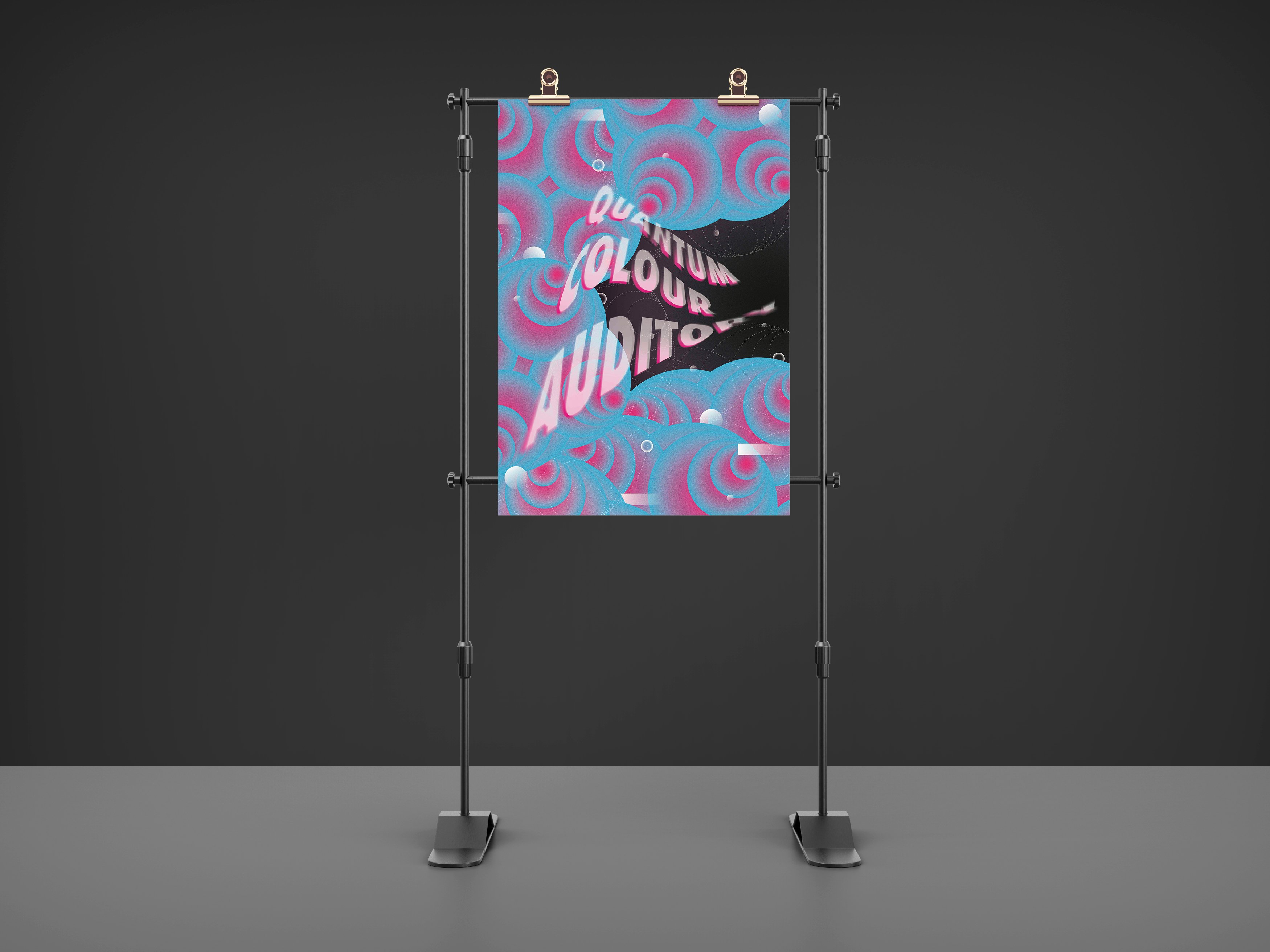
Poster Mock Ups
You must be logged in to post a comment.