Final Revision

Alright so now I have to come up with my own patterns!

And I’m only left with less than a week to do so!! Ahhh!!!

I still really like the yellow flower pattern that I found on Pattern Jam though. So what I did was to take that motif and tried to replicate an exceedingly similar pattern :p After which, I also combined it with another flower motif I drew myself and added some dots to create another pattern. Hence, my final piece was created using only two patterns. However, I played with scale and colours so that it would still have visual interest.

capture5

capture6

Ta-da!

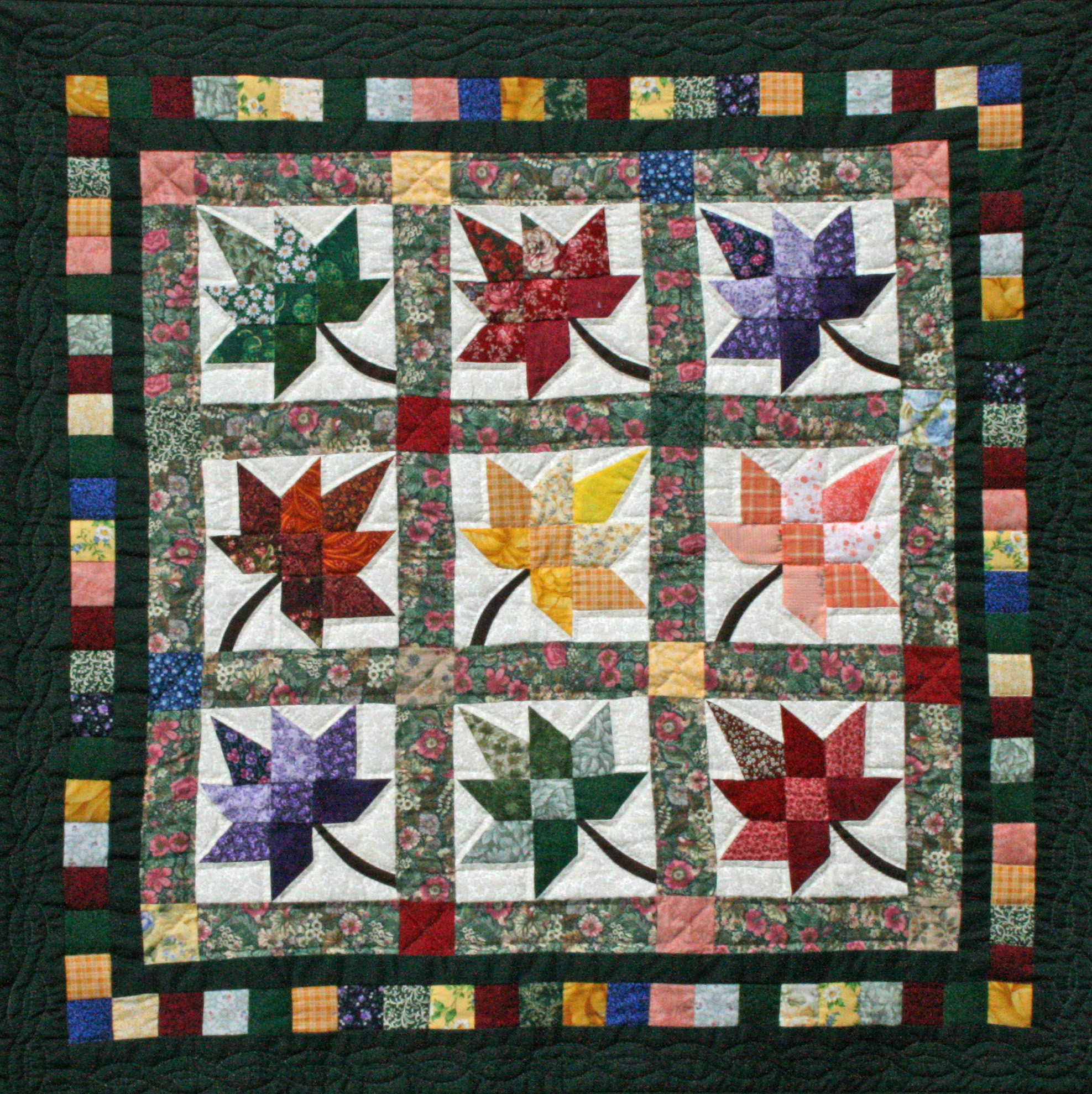
I decided to leave the square plain and only made it look like a patch for I was afraid that the patterns were already too much on the eye and more designs on the center would confuse the viewers instead. Also because my references tells me that patchwork quilt fabric squares usually looks similiar:

Problems

For all my previous mock-ups, I found that alignment was a huge issue. I had not thought that working with triangles would be so difficult before this project. It really took me till the last revision to finally straighten out my triangles and made sure that they were aligned properly digitally.

The next problem was printing alignment. I realized that even if the double-sided printing came out just a teeny bit off, it would affect my entire card because my designs were strictly triangular and there was no room for any bleeds or errors!

The worst thing was that my previous test prints were all on 80gsm paper which was already the easiest to fold. That had me worrying sick that a higher grammage would be too difficult to fold. One word: STRESS!

Printing

Okay so finally the day for printing has come. I geared up with cutting mat and penknife and 30-cm ruler and headed to Sunshine Plaza. Tried out a 170gsm paper first and it gave me this:

photo-7-11-16-5-43-09-pm

The paper was too thick so the card did not fold well even after scoring. I then tried a 140gsm paper. This grammage folds well and the card sat really nicely. But :

photo-7-11-16-5-42-40-pm

So I headed to the other print shop highly recommended by all my friends for their awesome double-sided prints. It was really expensive (double the price), but considering the wonderful finish, I would say, it’s a small price to pay 🙂

photo-7-11-16-5-42-19-pm

photo-7-11-16-5-42-28-pm

photo-7-11-16-5-42-03-pm

Improvements

Right after the uncle sent my design to the printer, I realized I could have tried printing on fancier paper such as those with cloth/fabric textures. But it was too late and I didn’t want to spend more money :p But it would definitely have been fun to explore the other paper choices.

If given more time I would also like to work a little more on my patterns because I feel like pattern design is a huge thing even on its own and it would be great to come up with motifs and designs which are uniquely mine.

Takeaway

1. It is hard to digitally draw perfect triangles
2. Alignment is affected by EVERYTHING – calculations, paperweight, printing quality
3. Good double-sided printing is expensive but so worth it
4. Scoring requires some thought and folding, some patience

Close your eyes and picture this:

A symphony of rustling leaves and silent creaking bamboo stalks surrounds you. A gentle breeze caresses your face as you take a deep breath which smells of damp forest and moss. The rays of the morning sun filter brightly through the softly swaying stalks, casting ever-changing shadows on the lush undergrowth. Coolness is deep within the bamboo grove.

Calmness, tranquility, zen-ness, serenity and peacefulness – these are the feelings associated with being in a bamboo grove, which is the therapeutic element I want to bring to the hospital.

I chose to depict the bamboo forest in a relatively abstract manner because:

1. I believe that the window art should set an immersive mood

– There are already enough distractions along the J-Walk
– Users are just buzzing through; seldom will they take the time to admire the art pieces

2. I thought that I could play with light

– Production of varying shades of green shadows which will mimic a forest undergrowth

As such, I came up with a few drafts using the traditional collaging method. And after some digital modifications, I shortlisted four of the designs but couldn’t decide on which to choose.

Untitled-1-01

So I sent them for test-prints to study the effect of light on each of them. I first printed on tracing paper (substitute for translucent decal) because I wanted to block out, as much as possible, the shadows of the rows of bars outside the windows. However, I found that it restricts too much light.

Photo 28-8-16, 12 51 29 PM

I then tried it out on transparency. After which, I realized that there weren’t significant differences among the casted shadows and that is when I decided on submitting the last piece because unlike the others, it gives the most sense of depth.

Untitled-1-02

Bamboo is flexible – bending with the wind but never breaking, capable of adapting to any circumstance. It suggests resilience, that we have the ability to bounce back even from the most difficult times.

001 square path 5

As such, I feel that the spirit of a bamboo is a very apt for the hospital setting.

References

Description
Japanese Court Poetry by Robert H. Brower and Earl Roy Miner, Page 366

I think I found a solution to all my previous concerns and it is none other than… *drum rolls*

…bamboo!

The ‘AHA!’ Moment

I’ve finally decided on the bamboo grove as my therapeutic element for this project, and I’m gonna execute it using the abstract method originally planned for SUNSHINE. My idea is to bring the tranquility of the bamboo grove to the hospital by printing the abstract design onto translucent decal, such that sunlight can still pass through to cast the varying shades of green onto the hospital floor. I imagine the coloured shadows mimicking the scene of a forest ground too, where one could experience a sense of coolness and restfulness.

The Grass Towers

the perfect gentleman

the perfect gentleman

Click here for a list of reasons why the bamboo is such an awesome plant. Its zen quality also makes it suitable for bringing a state of calm or serenity to the stressful hospital setting.

Moving On

Yay, so I’m out of the rut. Here’s what I did next:

Step One: Paint a bunch of stuff

it doesn't have to look nice (yet)

it doesn’t have to look nice (yet)

Step two: Slice them up

Photo 22-8-16, 11 24 32 PM

Step three: Arrange and rearrange

xiantian told me pasting it straight was too neat

xiantian told me pasting it straight was too neat

so i tried criss-crossing

so i tried criss-crossing

and more criss-crossing

and more criss-crossing

and even weaving (but gave up cause hello? bamboo grove!)

and even weaving! but gave up cause hello? bamboo grove!

so i went back to my first love, the vertical strips

so i went back to my first love, the vertical strips

Step four: Stick them on and scan them in

1

2

Step five: Manipulate digitally

The possibilities are endless, which is what I love about collaging 😀

I’m stuck in a pit and this post explains why 🙁

Xiantian and I took a second trip to Ng Teng Fong Hospital. This time from 6pm to 8pm.

A Second Look

– Horizontal bars (!!!!!!!!!!)
– Dark and gloomy
– Mostly staff, patients’ families, and random passers-by, who are either in a rush or on their phones
– Distraction galore – exhibition, tv, clock, etc.

Time to Say Goodbye…

…to my initial idea. The bars are just too distracting and restrictive. Besides, since there are already enough information taking up the J-walk users’ attention, I figured that my artwork shouldn’t add to the distraction. Rather, I should take an immersive approach to set the mood of the pathway.

Therapeutic Elements

I felt that the gloomy walkway seriously needed a huge dose of vibrant colours (primarily yellow, with maybe a hint of orange) to brighten it up. Only by doing this can the spirits of those passing through be lifted, even if just momentarily.

Sunshine

sunshine, daisies, butter, mellow

sunshine, daisies, butter, mellow

The first thing that came to mind when I thought of bright cheerful sun colours is sunshine. Other than being our primary source of energy, light has always been closely associated with the idea of hope and warmth.

I’m walking on sunshine

I believe that the best way to represent light is in its abstract form – to let the colours of the aureate rays speak for itself. Hence, I felt that a collage is an appropriate method of execution for this idea. If the design is to be printed on translucent decals, light would pass through and cast different shades of yellows on the floor which would give the illusion of “walking on sunshine”.

However, I am concerned with the jarring bars that line the outside of the window – to make the decals translucent means that they would become part of my design. And I can’t think of a way to make it work because horizontal lines would only serve to break up the light rays.

Walking into the light

From last week, my classmates brought up the point that hospitals tend to steer away from abstract art because there’s a high tendency of them being taken negatively. Hence apart from the horrid grills, I am also concerned about the notion of light being interpreted as death or the afterlife in a highly stressful environment such as the hospital.

Sunflowers

Taking both the above considerations into account, I felt that light might not be such a good therapeutic element to work on after all. So I came up with another therapeutic element which combines the sun and a more explicit form of nature – sunflower fields.

reminder of the source of life and all that is good

reminder of the source of life and all that is good

However, I am stumped as to how to bring a field of sunflowers into the hospital graphically.

And here is where I’m stuck. *pulls hair*

Presentation & Feedback

Seeing my classmates’ works today, I am well aware that I am lagging one week behind everyone else and it’s pretty stressful, haha. After speaking to Michael, he mentioned at the end that the forest shadow art which I presented last week seem to have potential.

Now I think I kinda have an “aha!” moment but… to be continued.

Whaddup new semester, new modules, new classmates and new mentors!

What’s more exciting than a field trip on the first day of school?

Here are some observations I made during the visit to Ng Teng Fong Hospital:

Ka-ching

The linkway connects the Admissions/Billing Office to Outpatient Clinics. Hospital stays are depressing cause other than the cost of it, admission simply means you’re not getting better. Visits to outpatient clinics are also not cool because waiting time can be super long and that sucks.

Question: How to go about cheering up people who’ve lost (are losing) money, health and time?

Tick-tock, tick-tock, we must eat

The linkway appears to me as some sort of a retail attraction, with most outlets being F&B related. There are also a gift store and a flower shop.

Let there be light

There are a total of 16 of the large windows spanning both sides of the linkway (eight on each) which oversee buildings surrounding the hospital (i.e. IMM, JCube). Light pours in from those glass panes, so there’ll be back light if artwork were to be displayed on them. This means that our designs would have to make use of the light that’s coming through in order to succeed.

Took the road less travelled

The travellators are bordered by two narrow strips of passageway on their right, on which (normal) people wouldn’t walk. I found that interesting because they are actually wide enough for walking (I tried!), but just because they are narrow, it is simply assumed that they are not to be walked upon. Not sure if this is even a useful observation but… oh well, we’ll see.

Mind Mapping / Associating Words

Mindmap

I have a few therapeutic themes in mind and they include:

Food! Oh, glorious food!

Every time I’m feeling under the weather, nothing would comfort me more than a bowl of piping hot soup or a meal. And because of all the F&B outlets at the ends of the linkway, I thought it would be a pretty apt theme. However when I spoke to my cousin about this idea, she insisted that images of delicious food would make the patients even sadder, because being sick, they wouldn’t be able to enjoy those delicacies. I thought she had a point.

MOTHER Nature

Mummies are nurturing figures. Surely, nothing can be more therapeutic than having her around? There are so many forms ranging from flora to fauna, beaches to dunes. I can’t decide on what to choose!

Laughter – the best medicine

I thought that injecting humor or the notion of fun and play to a clinical setting could lift the spirits of the people using the linkway.

Music

Classical music can be calming because of their soothing rhythm. I might just explore the different moods that various instruments produce and then think of how to best translate them into graphic form?

Below are some of the possible ways to “Eggsecute” the various themes/graphics:

Illustrations on Photography // Paper Cuts

I thought it would be a waste to block out the original view outside the window and that it would be interesting to incorporate them into my design. This could work for FOOD, NATURE and HUMOR.

Stained Glass, Transparencies and Shadow Art

These are ways in which we can make use of the light passing through the windows. I felt that intricate paper cuts or varying opacity of decals could alter the amounts of light passing into the hospital and cast shadows which could mimic the feeling of being under a forest shade (NATURE), which is something I find therapeutic.

However, I’m afraid that it might restrict too much light from entering and in turn, make the place dark and gloomy instead. Furthermore, the shadow designs wouldn’t work at certain times of the day (i.e. night) and if there is an inadequate amount of sunlight shining through.

Check out the rest of my moodboard images here.

Presentation & Feedback

I gained much insights after the sharing session with the class today.

Firstly, I totally forgotten about the horrendous rows of bars lining the outside of the window (why?!?!) even though I took a video of the place, lol.

Secondly, Vimal pointed out that the illustration on photography idea would only work from certain angles. This is a problem I’ve briefly considered but didn’t really give much thought to. Joy then suggested the idea of marking out the viewing points (or placing footpads) of the angles from which people can view the art work from. I felt that it was a playful thing to do. However, I’ve neglected to take into consideration that the users of the linkway were mostly in a hurry (as pointed out by some of my classmates today) and wouldn’t give two hoots about interacting with the windows or artwork. So… I might need to reconsider this interactive approach.

Lastly, Michael noted that I didn’t have a strong and/or specific enough therapeutic theme. Sigh, indecisive human is indecisive. This is something I need to work on asap.

Action Plans

A second trip to the hospital is in order for me to check the bars out. I’ll also need to take note of the potential audiences’ behaviours and evaluate whether the fixated approach might work. If yes, where and how to make it work with the bars and stuff. If no, I’ll have to decide on a specific element and work on its general approach.

References

Click on the pictures for individual image source and links to more of the artists’ works