Poster Assignment – Final

Hello world,

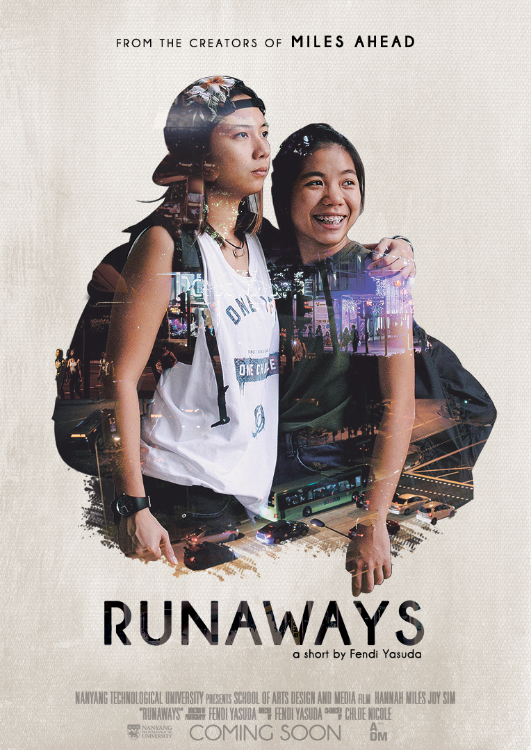
Runaways tells the story of two runaway siblings who explore old places to create their new sense of home. Miles (left) is a protective older sibling while Joy (right) is a starry-eyed younger sibling.

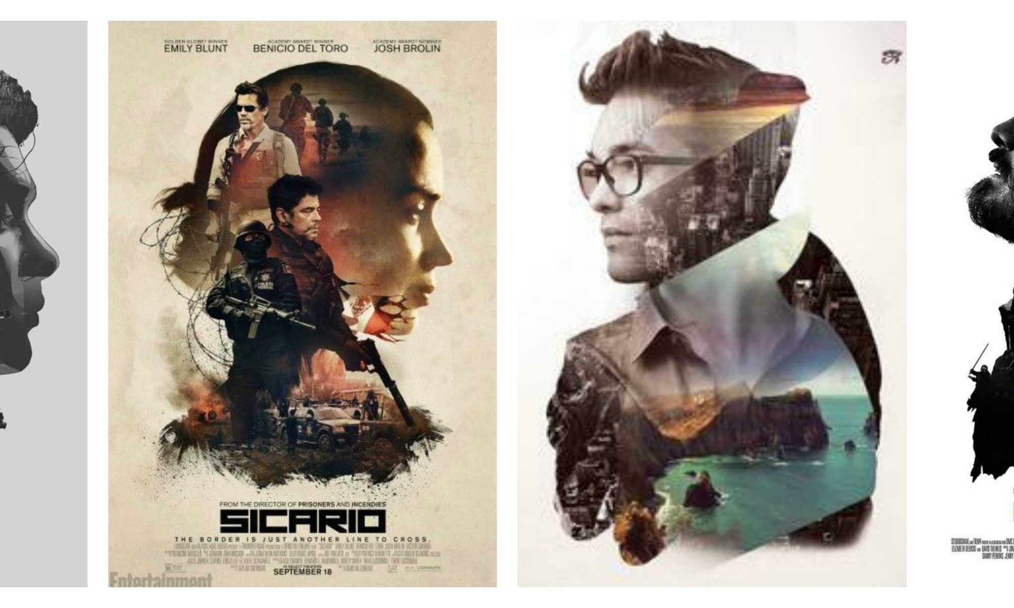
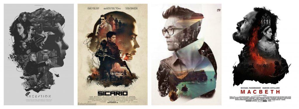
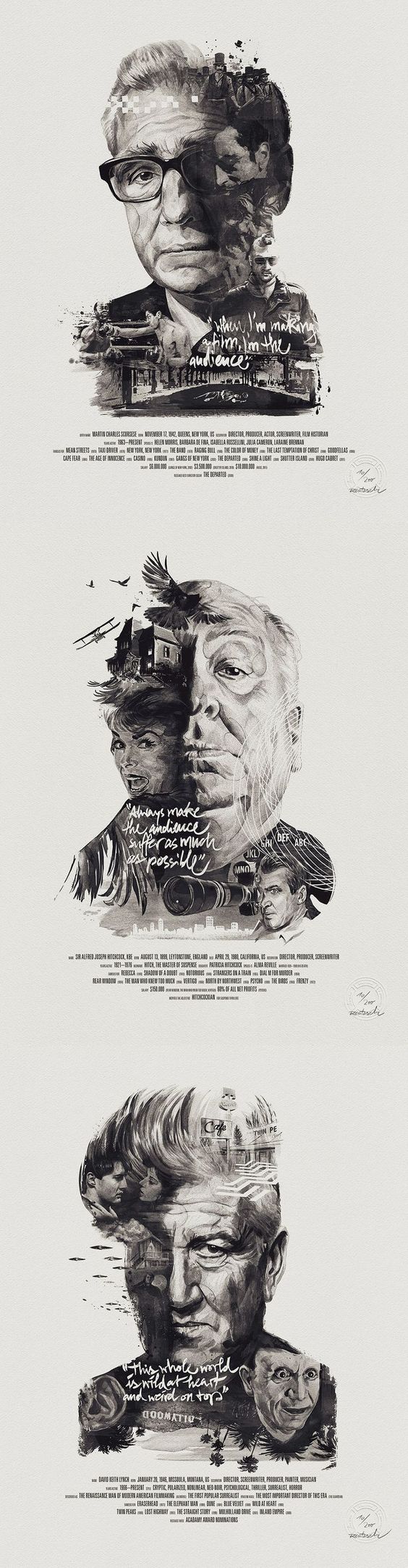
The whole reason i chose to work with double exposure is firstly, i wanted to explore the digital technique of double exposure, and secondly it conveys the metaphorical meaning of home throughout the film’s moral. In the film, I explored “how home is a place but a feeling”, a feeling that they realize they find within each other at the end (oops spoiler).

I chose to keep the background a simple and neutral white so that the double exposure becomes more prominent. I layered the text with an image to give texture to the words and allow it to feel more “alive” in the neutral background.

I realized that with a neutral background, textured, dynamic and layered images are more “alive”, and realized this is highlighted when contrasted. So i worked hard to keep it simple and dynamic.

Overall, I liked how simple the poster looks yet upon closer inspection is filled with graphics and visuals.

Touch Points

I picked these three locations as they are areas of high traffic and allows the most number of appropriate audiences to view them.

Bus Stop – With people having nothing to do while waiting for the bus, allows them to look into the film in their free time and perhaps even catch a review or two about the film.

Outside the Cinema – Having it broadcasted to “Coming Soon” allows viewers to anticipate watching a film of similar tone and mood to those being premiering at the current moment.

MRT Board – High traffic (no pun intended) of people, it is also a common place for movie posters to be put. Having it in city hall allows people to view it in a nearby mall at Suntec City.

Banner – Explores other composition styles and a place of high human traffic. Allows people to watch it in cinemas if they are interested, too.

to see my process click here
visual references click here

okay bye.

Poster Assignment – Process

Conceptualization

Conceptualization began with me sketching out some rough ideas of how the posters will look like – I looked into some research materials of what are some examples of double exposure posters.

I thought about the theme, story and genre of the movie.

Theme: Home
Story: Two runaways revisit old places to create their new home.
Genre: 
Drama, Coming-Of-Age

From there I did some sketches of my favorite layouts that I came across while looking at the web.

Notebook sketches of concepts

Visual References for posters

I looked into examples of creative double exposure movie posters and Singaporean film posters (rather than blockbuster Hollywood posters).

I realized there’s a sort of poignant, quaintness, calmness to a local film as compared to something compared to Transformers or Avengers. I noted this observation to allow my film to evoke less explosive tones.

Mood Board

I looked into one of my favorite cinematographers styles and color tones of my favorite movies for inspiration. It was interesting to note how I was very attracted to a certain look and vibe of a shot – such as that from Millennium Mambo, Chungking Express and In the Mood for Love. 

I realized that the vibes, mood and tone of the film was rather dull, cold and muted, so I chose the movies that reflected as such. Cold colors, desaturated and earthy tones of sorts.

I knew as compared to digital painting, photography was a little more restricted in terms of playing around with colors. So I asked my casts to be in earthy, neutral and dull tones, but I knew my source images were going to have purple, green and blue tones.

Post Production

Bonus points if you can see all four photos in the collage.

I played around with some color concepts as well. I consulted my design friends about the colors and they somehow agreed that it was either a dark gray or a neutral white suits the mood and tone of the film best.

Some colors looked too odd against the already complicated portrait of my characters, others drowned my design with matching tones, and the rest just did not match the tone of the film. Some were just plain painful to look at.

I opted for a much simpler neutral white, but my design friend suggested exploring with textures to keep the background interesting. So I went to dig out my canvas and snapped a picture of it.

Some tweaking and feedback from my friends later, I had my final piece!

Poster Assignment – Visual References

For this assignment, I’m exploring double-exposure photography. I was intrigued by this method when it was first introduced to me for it’s ability to show the inner thoughts of a character visually.

I looked up posters and examples of double exposure photography and studied how they composed the various elements into a character.

I then did a quick youtube search on how to double exposure, oh goodness – there are thousands of them too!