Final Artwork


(click for enlarged view)
For this project, I chose to focus on obsolete jobs to help create a central theme that would unite all 4 pieces. Each piece features a distinct illustration style, inspired by the design of the era during which the occupation was prominent.
I wanted to highlight how these jobs required people to carry out these tasks manually through the use of the hand as a recurring motif in all four pieces. With the advancement of technology, this hands-on aspect has now been made redundant. While it is much more convenient, we have in turn lost the more tactile aspect of these jobs, with much of it taken over by machines that we may never even get to see.
Ideation & Process
1. Herb Strewer

I was really fascinated by this job as I had never heard of something so excessive! Herb strewers were employed by the Royal Family in the United Kingdom in the 17th century. As the title suggests, they scattered herbs around the grounds of the Royal palaces to neutralise the odours from the Thames River, which was polluted and unhygienic at the time.
For inspiration, I decided to look up some old Royal documents to study their style of typography and illustration. I came across these royal charters, which were formal grants issued by the Royal family:

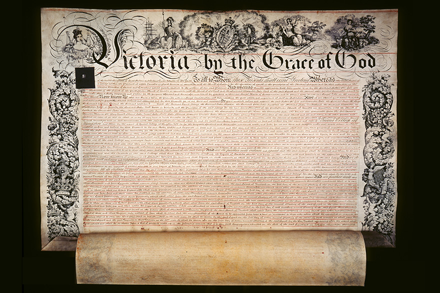
I thought that the Gothic style of type was at once both very English and traditional, which could be a way to show the idea of obsoletion in a visual way.


Since the job concerns herbs, I thought I could incorporate the style of botanical illustrations. These renderings would also complement the Gothic type since they look quite dated too. I studied especially these illustrations done by Dr. Fr. Losch. As seen from the above examples, the veins of the leaves are clearly defined with the high contrast between light and shadow.
This is my first draft:

After a consultation with Joy, I realised that the hands-on quality of these jobs was something that I really wanted to focus on, and the visual lacked that currently. Also, the background was a light grey, which differed from the more naturally brown and textured paper in the botanical illustrations.
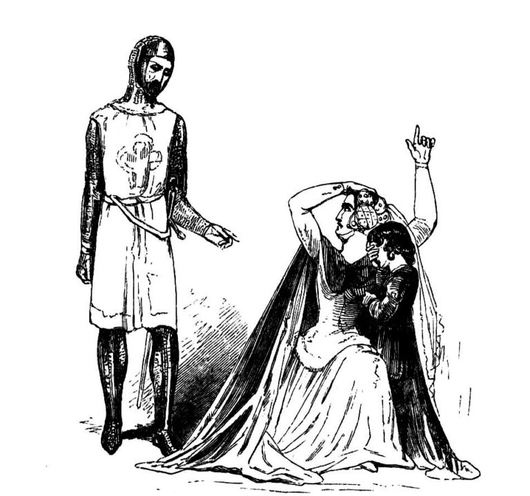
For the drawing of the hand, I referred to these illustrations from the Victorian Illustrated Shakespeare Archive. The lines were clean and simple, and shadow was depicted using hatching.

For my second draft, I included a hand drawn in the Victorian style. I also removed some of the herbs from the letter such that it wasn’t covered completely, to suggest that the hand is scattering the herbs, which fall to form the letter.
However, with this composition, the focus was unclear, since the hand and the ‘G’ were of similar scale. Joy also pointed out that the hands felt quite alienated from the letter itself and that there needed to be more leaves to really suggest the motion of the falling.

For my final composition, I added another hand and more leaves of different sizes to create an arc of movement. In addition, I integrated the hands as part of the letterform. As for the tagline, I used a Gothic font to keep the overall look of the piece consistent.
2. Lamplighter
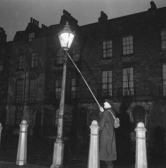
My second piece was based on the lamplighter. In the past, the lamps on the street were candle lamps, and required to be lit up manually by a lamplighter. They were employed heavily in the 19th century, before the invention of electric lamps.
When I first started out, I didn’t have a very clear idea of how this piece would look like visually. I first thought of creating something inspired by the fire of the light – to bring out the idea of a lamp that was lit with a candle rather than an electrical light.
I experimented with painting oil in the shape of a letter and then burning it, but the oil spread beyond the surface I originally painted it on, which meant that it lost the shape of the letter. So then I thought perhaps I could draw inspiration from the texture and appearance of the burnt paper and create an illustration based on that.


This was my first idea for this particular piece, to let the ‘w’ take on the form of the fire with burnt marks at the back. Although, I felt that this was too ambiguous as it could relate to any job that had to deal with fire – it just wasn’t specific enough to the lamplighter’s job.

My second idea was to create an isometric drawing of the lamp and have the ‘w’ take on the form of the candle. While this was clearer in terms of portraying the job of the lamplighter, I felt that visually there was nothing to relate it back to the idea of obsoletion.

To get visual inspiration, I decided to look to the graphic design of the 19th century. These Victorian style book covers really caught my eye. I thought the symmetry of the design would work well with the ‘W’ which was also symmetrical.


I created the following draft design inspired by the strong sense of balance in the previous artworks. The illustrations in these works featured strong line work, and created tone and shadow through line hatching. I adopted the same method in depicting the lamp and the hands.


In addition to the main ‘W’ in the lamp, I also incorporated it more subtly into the background and the frame of the design to help include more texture to the design, to add to its weathered aesthetic.


After a consultation with Joy, I realised that the way the ‘W’ was incorporated into the lamp made it quite replaceable – it would still look cohesive even if a ‘U’ was used, for example.
I revised it to merge the lamplighting stick and hand as part of the letterform, which also brought greater focus to the hands as a key element of the entire piece. For the font, I chose a tall, skinny serif that was reminiscent of the script used in that era.

3. Switchboard Operator

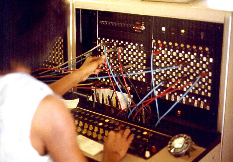
For my third piece, I decided to feature the job of a switchboard operator. The first thing that really caught my eye was the wires of the board. I tried to explore the texture by making letterforms out of cables. While this was interesting, I wasn’t sure how to incorporate the hands.


I looked to design of the 1960s for inspiration, which was when this job started to gain prominence. At first, I was intrigued by the curvy and wavy lines that were highly featured in the design of that era. For the first draft of my design (on the right), I experimented with curving hands to form the letterform ‘e’.


Although, I felt that this was not really manipulating the forms of the elements within the design. I wanted to use the different objects in the design to create a more subtle indication of the letterform.


Inspired by these posters, I was drawn to the repetition of elements, and the bright colours.


I further refined my previous design, keeping the switchboard at the back, but repeating the arm to form the three arms of the ‘E’, and the wires for its spine. This could help to draw attention to the hands, but also to the wires that cut across much of the piece. I also added the cloud motifs and arcs of colour seen in the posters above. Though, the design still looked quite vectorised and clean.


For the final design, I added a very translucent layer of white texture, as well as white specs to create a more washed out look. After adjusting the colours and adding an outline, I included the tagline in Cooper Black, which was quite reflective of the thick, chunky script often used in that era.
4. Cartographer

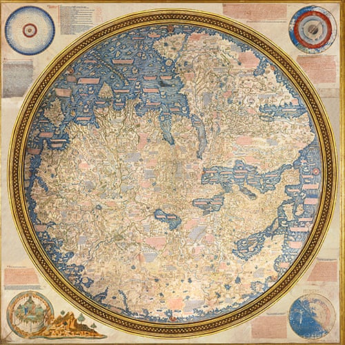
I chose to depict a cartographer for my final piece. At first, I wanted to explore using the forms on the map – the islands – to create the letterform. To keep to the classical look, I took reference from older maps, which had a circular layout rather than a linear one.


But as with the lamplighter design, I wanted to add in the motif of the hand to make the piece feel more cohesive with the others, and put emphasis on the fact that these jobs were all done by hand. In addition, I also referenced the following maps, by Fra Mauro (1448-53). Certain details that I picked up on were the various forms (e.g. shape of island, linework of waves) and other details such as inscriptions.

Here are some process shots of the final piece. I added an arm drawing to make up one of the lines of the ‘N’, to make the hand a more prominent part of the letterform. Besides adding a drop shadow to the island (which mimics the rendering style seen in the previous examples), I also included texture to evoke the weathered quality of the paper.


I corrected the colour of the piece to turn it into a more warm-toned piece, as I thought the sepia tone would work well with the more weathered look of the piece. In addition, I illustrated two scrolls for the tagline, which is done in Copperplate script.

