Hi everyone, this is Jo! 🙂
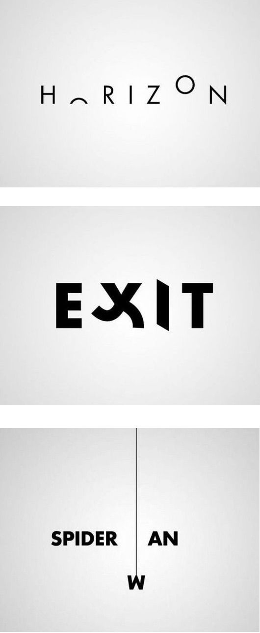
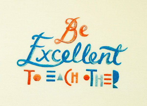
I’ve always been interested in typography, but have never properly explored it. After doing a quick search on google and pinterest, I found a few that I liked:


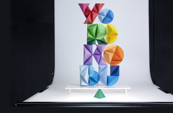
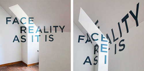
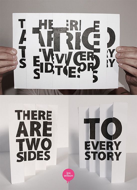
Although 3D mediums sometimes make the type hard to decipher, I find myself leaning towards 3D and handmade typography because it comes across as thoughtful and interesting.
 (delicious)


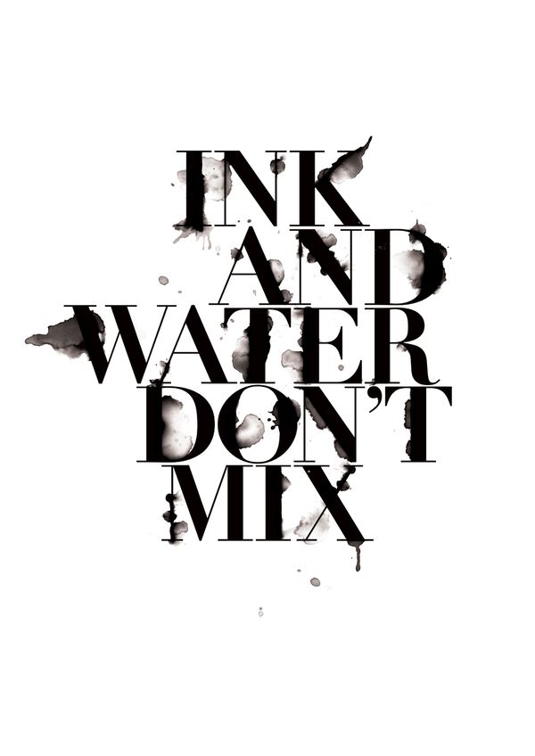
I also came across images where the surface on which the type was placed on played a key role in the overall typography. I loved how the respective artists played around and experimented with the medium/surface and used it in a way that very effectively enhanced their message.


All in all, I realised there are endless possibilities when it comes to typography. Besides the actual design of the words itself, there are a lot of additional factors such as the placement, juxtaposition, medium and surface that plays an important role in creating the overall typography as well.
You must be logged in to post a comment.