Zine

It was really exciting to work on this project as I am very keen to produce a little magazine (or rather a booklet) of my own since I was a child. It was fascinating from young to see how pages are arranged in a booklet—before it is  printed the sequence doesn’t make any sense.

My previous experience of photographing for a local magazine has given me more insights on magazine production as I will often go over to the designer’s side and take a peek at what they are doing. Currently, I am also photographing for one of the school’s publication, the Nanyang Chronicle and has also given me valuable insights into the editorial world.

Hence, it makes perfect sense to create a zine that is editorial based and creating one based on my recently founded photography business makes even more sense.

The original idea was to create little photography guides that teaches the basics to photography—ISO, Aperture and Shutter Speed. After working on the initial drafts, I realised that it was too technical to put them on paper and would require many page counts to achieve the desired outcome. An instructional video for this purpose will be more appropriate.

Therefore, I realigned my focus to work on promoting myself instead with different features—one on my status of being an Adobe Certified Expert in Photoshop CC, another on my love for photography and another fun article on my special coffee order.

Colour Scheme

colourpalette

The colour scheme is generated by an online app by manually entering my selected colours—a certain shade of blue and orange. Blue and orange is selected as they are complimentary colours and each have different feel attached to them. Blue is a cool colour and gives serenity, stablity and friendliness while orange is a warm colour that reflects liveliness and zest. Both colours work together to give a refreshing feeling that is dependable.

The images (Logo, Designs, Photographs) in each feature are made or taken by myself to give authenticity to the entire product.

Cover Page

JamesNgJunhao_U1530410J_G3_2DIIP3ZINE

The cover page is designed to look like a commercial magazine in mind. The title of the magazine, Focus, made use of my commercial icon—the yellow circle with a camera vector—to replace it with the letter O. The main subject, a LEGO minifigure that I photographed, is extracted individually and overlay-ed on top of the magazine title. The main subject is placed on the extreme left, to avoid symmetry and is placed according to the rule of thirds. The text are flushed to the right to give balance.

Similar with the rest of the layout you will see later on, hierarchy of elements are carefully thought of, through the use of different sizes to show importance as well as the placement.

The font chosen is also in accordance with the corporate font that I have chosen—Myriad Pro and hierarchy is also put in place through the use of different font styles (Bold, Condensed, etc.) and sizes.

Feature

JamesNgJunhao_U1530410J_G3_2DIIP3ZINE2

This is the first page created and it is important because it will set the general look for the editorial style for the rest of the pages. This is also the time where I thought of coming up with an information box seen on the bottom right. I made use of the ‘Expert PS’ logo supplied by Adobe and arranged my layout based on that. Due to the size of the actual zine—A5, I have to keep in mind that the text must not be too small if not it will be illegible. I dug out some of my earlier Photoshop works and included here to give context of my history. In this layout, there is no spillover for images to cross over spreads—elements are contained within their respective pages.

People

JamesNgJunhao_U1530410J_G3_2DIIP3ZINE3

In this layout, I decided to go for a change—a change that is subtle yet noticeably different from the previous spread. The main image here is spilled to the next page while the rest of the elements are within their own page. To give distinction between the pages, the first page is covered in solid blue while the second remains as white.

Special

JamesNgJunhao_U1530410J_G3_2DIIP3ZINE4

For this feature, I decided to go for a more different change—opting for a full photo spread across both pages. A sidebar is added with a lower opacity to still allow visibility through the main image here. Article title, standfirst and byline is embedded into the main picture and flushed to the right. The information box is also slightly modified to fit into the sidebar.

It was also at this stage that I decided to add in custom page numbering design at the bottom of the pages. Orange on the bottom left and blue on the bottom right. The text is also customised with the magazine title and edition. On the top left is also the Article classification—Feature. People and Special.

Back Page

JamesNgJunhao_U1530410J_G3_2DIIP3ZINE5

On the back page, I decided to include an advertisement for my recently announced graduation photography promotion. The original design is in landscape and I’ve redesigned it in portrait format, kept the original style and have some new elements introduced. The main photograph here is changed as well. There is also some set extension that I did in Photoshop to allow space for the text elements. At the bottom is a gradual fade to allow the brand logo and contact details to be seen more legibly.

Conclusion

Through this Zine project, it is really something enjoyable that sums up the entire Foundation 2D module for the entire year. It puts what we have learnt as well as our previous experience into a form that can be easily enjoyed by all.

Points of View

It was extremely interesting to work on this project as I did not ever thought that one object will have so many different point of views  from different subjects. The object that I’ve chosen—light builb—is an everyday life object that is all around us, but never did I once thought about it in a deeper manner. This project allows me to focus intimately into things that we do not usually take a closer look at.

Conceptualisation and Brainstorming

brainstorm2diiii

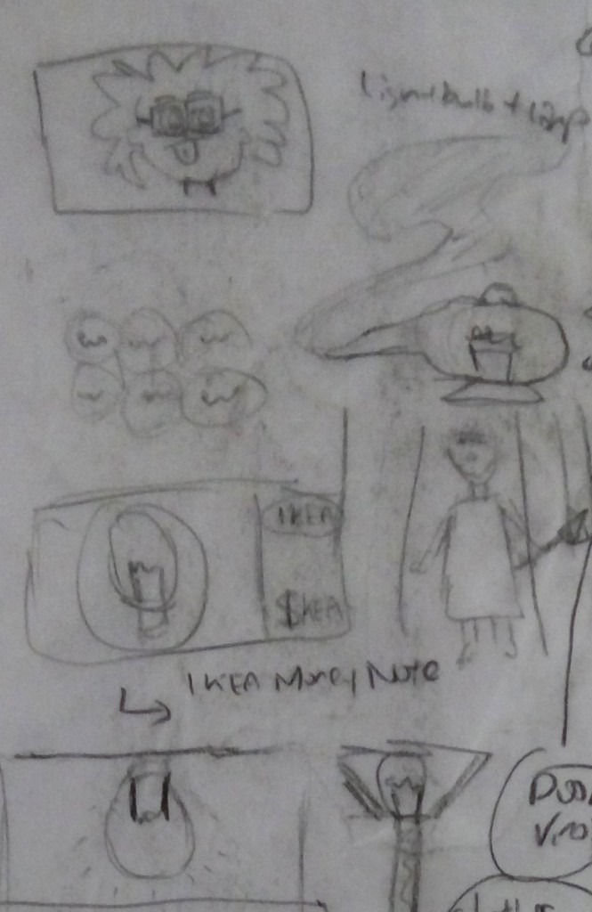
I brainstormed on several potential subject matters such as darkness, streets, angel and primary school students. After consultation and discussion, I eventually shortlisted 6 to work on—Thomas Edison, IKEA, a genie, a blindman, a caveman and a couple.

2dossiiii4

2dossiiiii

2dossiiii3 2dossiiii5

Movie Poster

To make this project even more special, I decided to use the form of a movie poster to present my artwork. To me, I feel that it is a refreshing way that is not commonly used and its also more relevant to my future major where I might have to design my own movie posters.

industrystandard

Using industry standard layout and fonts gave the posters an added level of realism.

customised

Each text and descriptions are individually customised as well, to pay attention to the small details that plays a pivotal role in supporting the main picture.

2D Vector Illustrations

I want to make this project a unique and meaningful one by deviating from my usual style of graphic design from a photography heavy medium to a style that is more of 2D vector illustrations. Each graphical element is hand traced using the Pen tool in Illustrator. I initially used the Pen tool in Photoshop as I was more used to it, but it was proved later that Illustrator was more intuitive.

I decided to use the same light bulb as the common recurring object to reinforce its importance and apply them to different base designs.

gfxarray

Pantone Colour of the Year Inspired Backgrounds

pantonecoy

All six subjects have their own coloured background that is based on the different Pantone Colour of the Year with customised tweaks. Due to my colour appreciation deficiency condition, I am very dependent on digital tools to help me overcome my shortcomings. I decided to choose the Pantone colours too as they were really vivacious and were widely accepted in the design world when it was chosen.

Custom Vignette

customvig

My photography background made me a huge fan of vignettes and I enjoy the aesthetics of it and also the fact that it adds depth to the background and allows viewers to focus in the brighter centre area.

Thomas Edison

comboartboxclean2-01

Thomas Edison is the inventor of modern light bulbs and this image is to pay homage to him. Using his signature hairstyle and black bowtie, I replaced his face with a light bulb to represent him.

IKEA

comboartboxclean2-02

IKEA is in the home furnishing business and light bulbs is of of the many homely items that the sell. It forms part of their business and it is represented through the placement of monetary notes. A local feel was injected to make them resemble the Singapore Dollar.
A Genie

comboartboxclean2-03

The inspiration for this piece comes from Aladdin and the Magic Lamp. The genie comes out from the lamp, though the lamp is not exactly one that lights up but I played with the word pun anyway.

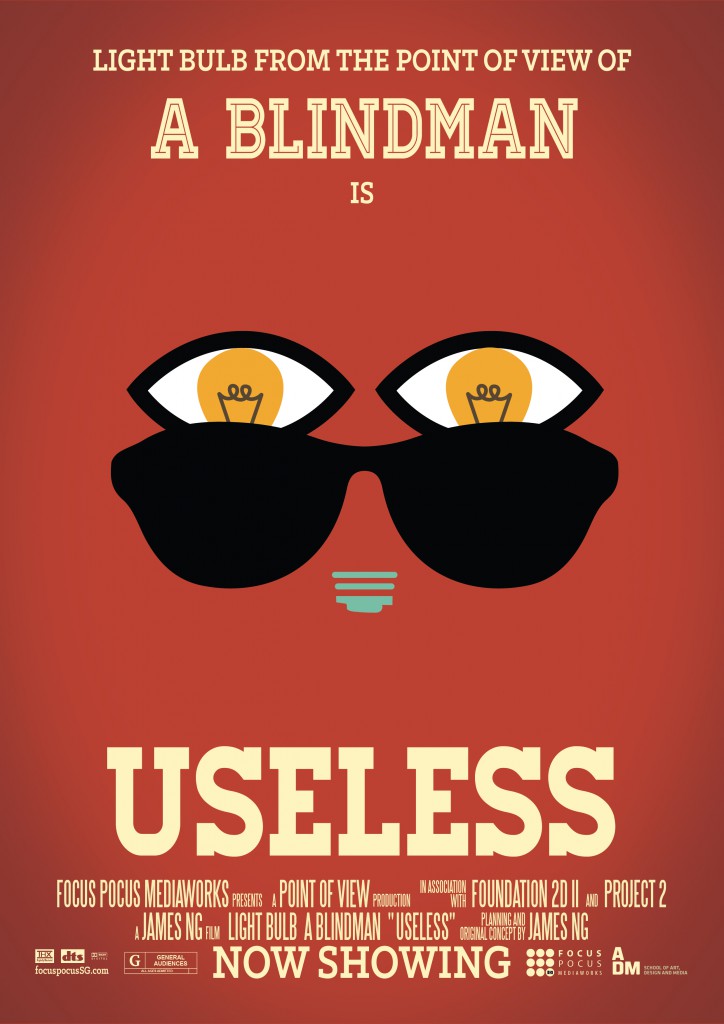
A Blindman

comboartboxclean2-04

This design is more playful in nature, in the sense that a blindman is unable to enjoy the benefits of light, thus rendering any light/light bulb as useless to him. The blind man is represented by the stereotypical dark shades while his eyes are ‘blinded’ by the light bulb.

Induction Cooker

comboartboxclean2-05

Think of a primitive caveman cooking with fire, but now it is replaced with ‘modern technology’, using heating lamps to cook their food. 😛

A Couple

comboartboxclean2-06

There’s a local saying of someone being a ‘light bulb’ when he or she is in between a couple and makes them awkward. That is where the central inspiration comes from. To show the awkwardness, the couple looks at the light bulb in the form of a hot air balloon as it rises up and flies away.

Final Layout

Capture3

Chapter 2: Secrets

Just as Alice and Kild were about to leave the shack, they hear a faint beeping sound coming from the corner of the room.

“Wait. Did you hear that Kild?”, said Alice.

“Yes, there’s no mistake about it.”, replied Kild.

The duo planned to leave this godforsaken place but curiosity got the better of them. Cautiously, they approached the origins of the beeping sound. The beep got louder as they go closer until they finally came face to face with it.

A secret trapdoor.

With some hesitation, Alice and Kild opened the trapdoor.

My name is James

In the beginning…

When I first got the assignment brief, I was unsure of how to use graphical associations to tell my name. I felt it was challenging to use certain graphical element to convey a particular meaning.

I first conjured up certain qualities I see myself possessing or some of my personal interests. Such as – Photographer, Foodie, Sleeper, Beer Lover, Bag Fanatic, Coffee Drinker.

First Trial

Initially, I tried to come up with a character for each trait.

character

For example, linking a Photographer with a Memory Keeper; a Coffee Drinker with a Caffeinator; a Sleeper with a Slumber Tree; a Beer Lover with a Beer Bear. I then proceeded to come up with some initial sketches of how I envision them.

beerbear

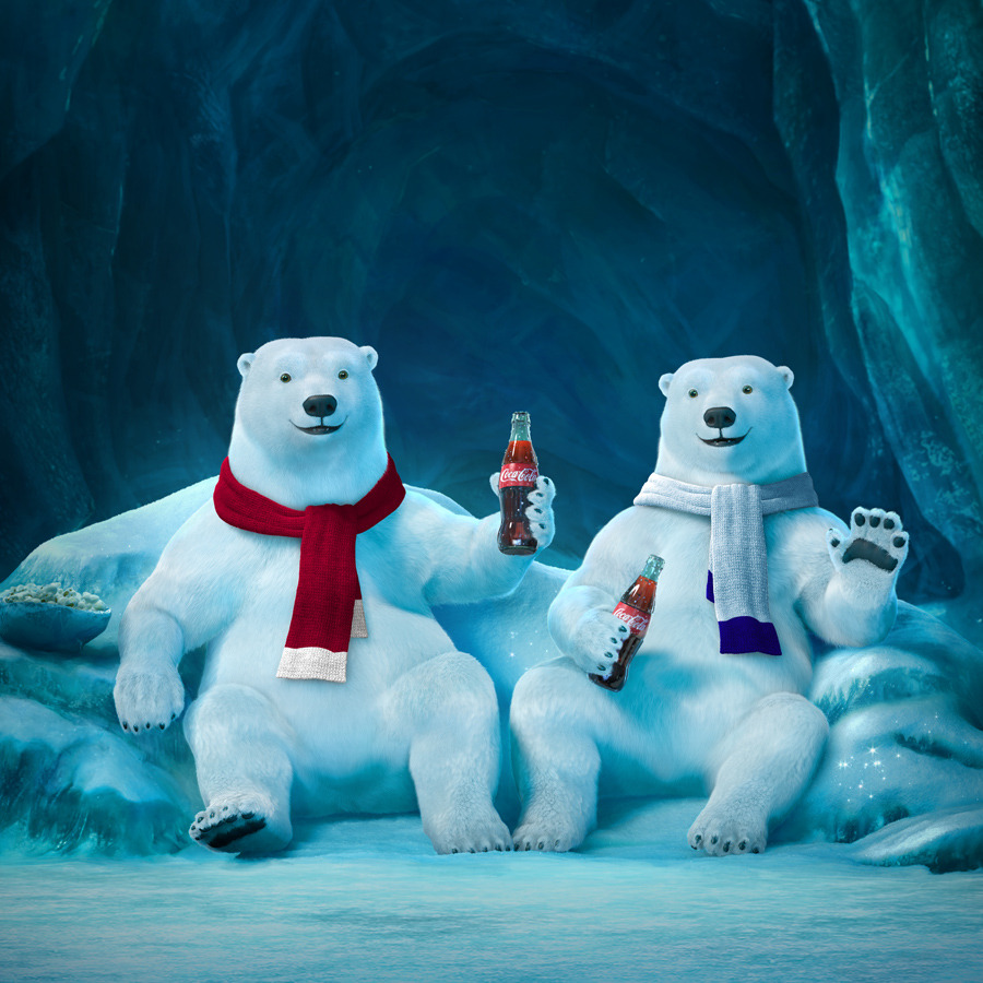
The above picture contains initial sketches for the concept Bear Beer. I tried to arrange graphical elements of a bear with beer. I had  some reference to the Coca Cola Polar Bear advertisement I’ve seen when I was younger.

tree1

Another example of a concept with Slumber Tree, I had some reference to a game character of a tree which looks sleepy.

I associated someone who likes to sleep with a tree as trees can live for very long and they seem to be in a state of constant slumber.

tree2

I then added some pillows and stars to a second draft to associate them with sleep – relating to the bedroom and night, the place and time where most people sleep.

However, this idea did not work as it was too complicated to tell a trait through a character and it is not visibly known to others. For example, there was no link between a bear and someone who loves beer. There is also no known link between a tree and sleep.

Second Trial

I then decided to work on putting things more literal. For example, in the case showing that I am a photographer, I used several elements that link to photography, such as tripod, camera, lens, flashlight and softbox.

photog

I tried various methods such as using each individual elements to form my name and even tried integrating it into a single object such as a camera lens pictured at the bottom.

I also experimented with showing that I am a foodie, using various elements of local food – prawn noodles, bak chang, chilli crab, chicken rice and BBQ chicken wing.

foodie

To represent beer lover, I tried to break down beer into its constituents such as Barley, Hops, Malt and Water. I then infused the individual elements to an alphabet.

beerguy

However, the feedback was these forms were too literal and they are very similar in terms of ideas to the last assignment last semester.

I was then challenged by my tutor to let loose on creativity and come up with a theme related to Chinese New Year since it was round the corner. I gladly took that challenge and came up with something refreshing and unique.

On the theme of CNY

I first identified the various Chinese New Year elements to represent me — Bak Kwa, Pineapple Tart, Love Letter, Prawn Roll, Ang Bao and Mandarin Orange.

brainstorm

I experimented with various ways of showing each of the CNY elements. I wanted to make it humourous, lame yet impactful.

Ideation

Ang Bao

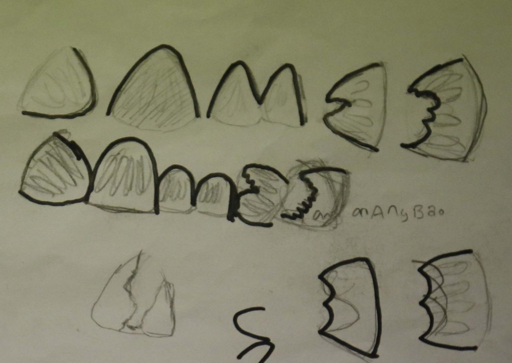
In the case of Ang Bao, I decided to go for two elements: Red (Ang) and Chinese Bun (Bao).

angbao2

For Ang Bao, I tried to picture a bao, using the way it is being eaten to form an alphabet. I find it a little too plain and decided to add in a 5 cent coin graphic to represent money and its link with red packets (giving money).

angbao

Bak Kwa

For Bak Kwa, I immediately thought of charcoal used to cook the meat as well as the paper wrapper used to wrap the meat. Other associations include the metal grill and dried meat.

bakkwa

Prawn Roll

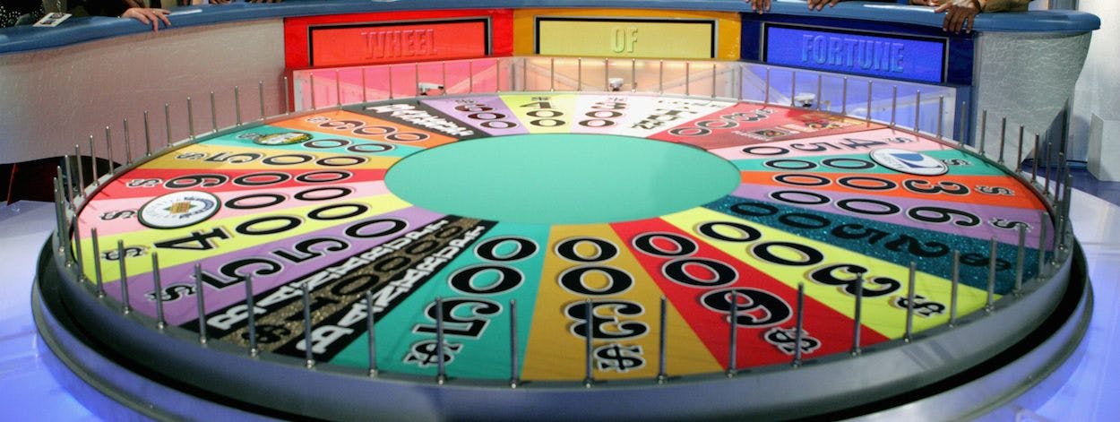
For Prawn Roll, I thought of prawns literally rolling and thought of the wheel from wheel of fortune.

I’m imagining a wheel with prawns attached and they could be turned in a circle.

prawnroll

Pineapple Tart

For Pineapple Tart, I was reminded of the Chinese word of Pineapple, Huang Li, which translates literally to .Yellow Leaving’. I thus thought of using difference between the pineapple outer skin and inner fruit to form the alphabets of my name, and the action of a piece of pineapple ‘leaving’ it.

pineappletart

Love Letter

For love letter, it was rather straightforward for me. I wanted to use letters and a heart shape icon to literally show the idea of love letters.

loveletter

It was easy to use letters, but extremely challenging to arrange them to form desired alphabets as the size and outline of each individual letter has to match and be of the right size in relation to each other. After several iterations, I finally came up with something more refined.

Mandarin Orange

Just as I was about to start on this, I was told that we only had to submit 4 designs instead of the original 6. I then shortlisted from the 5 designs that I have conceived and decided to drop the idea of Ang Bao.

Digital Renders

Check out the GIF breakdowns specially created for this documentation to understand the work process more! 🙂

Bak Kwa

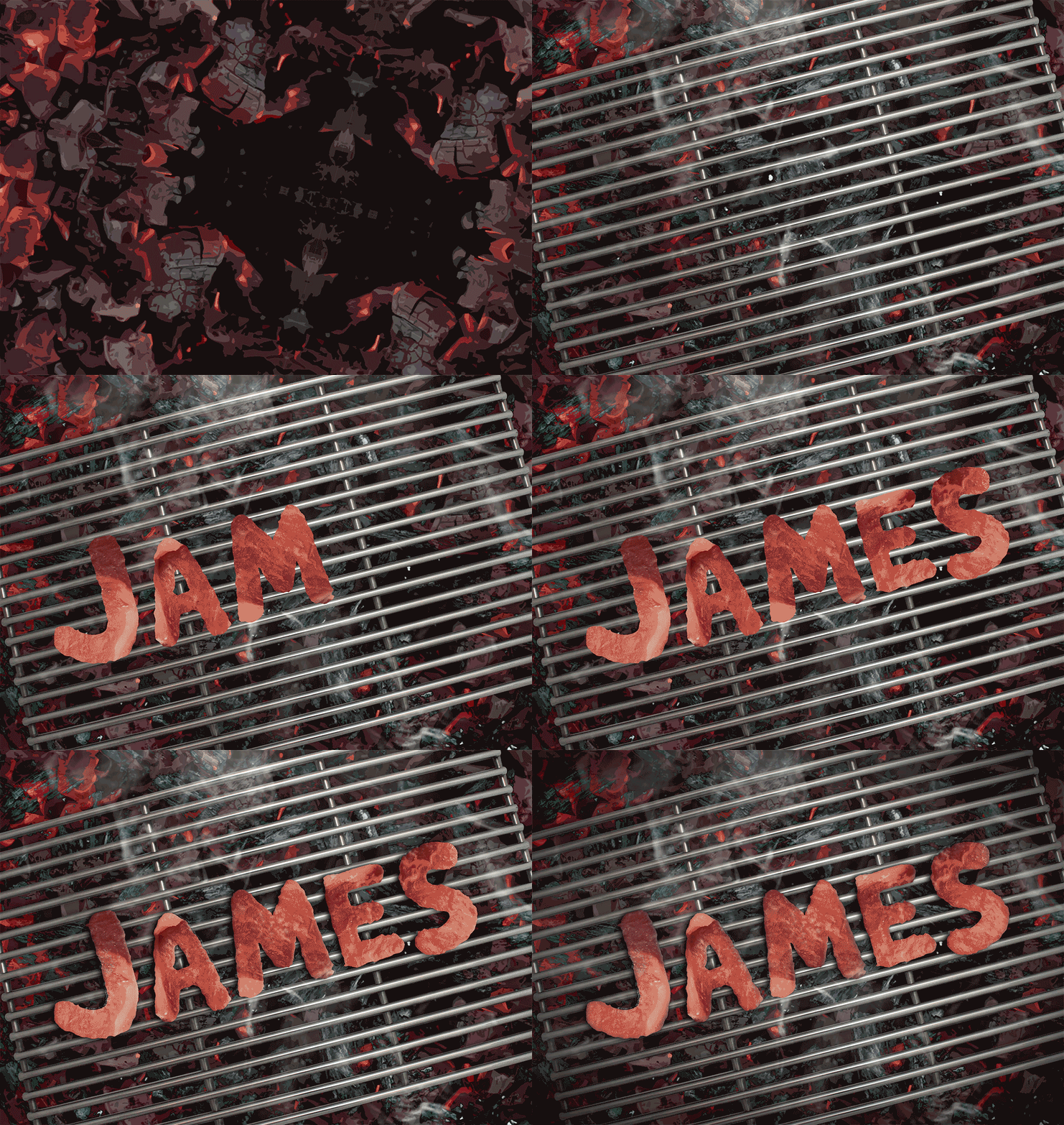
While working on the bak kwa, I decided to make some tweaks based on the sketches done for it. I decided to take out the paper wrapper and use meat to form the alphabets instead of using charcoal. The final composite is made possible using a combination of blending techniques as well as the addition of shadow and highlights to add realism.

Note that the angle for this is top down.

bk

bk

Prawn Roll

Using the idea of a prawn rolling, I adapted my idea to the final one shown below, making them seem like they are rolling off a hill. The prawns are in their native shape, but covered with a layer of fried wanton skin coating to link it to the actual prawn roll. A prawn head is added to the first prawn to further solidify the idea that it is a prawn. Only one prawn head is used as too many prawn head repetition disrupts the visual harmony of the image.

Note that the angle for this is straight on.

pr

pr

Pineapple Tart

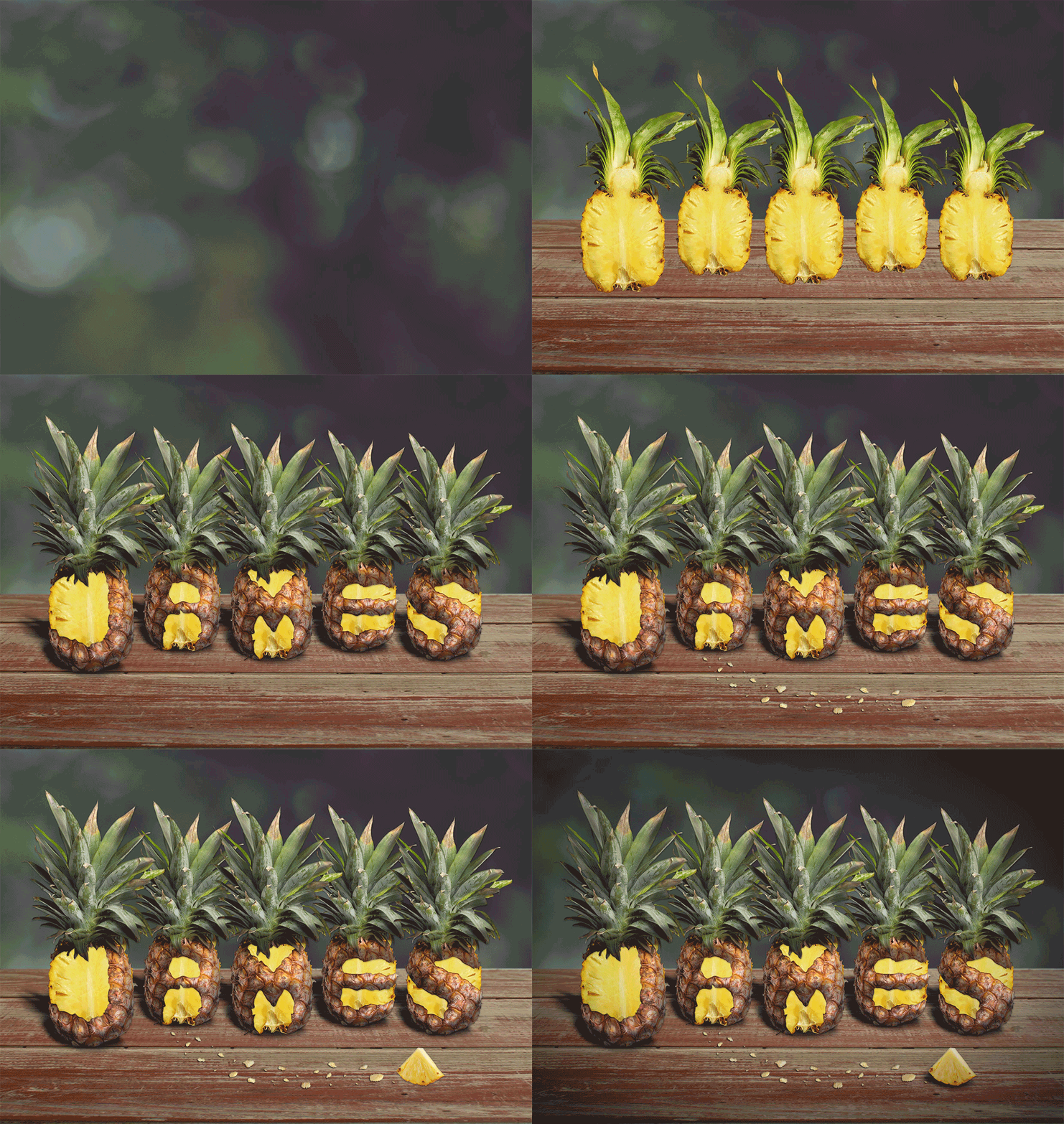
The concept for pineapple tart is very similar from the first one that is drawn up. This image heavily made use of added shadows and highlights to give realism. Liquify was used to morph the pineapple outer skin to my desired alphabet with a combination of lasso techniques.

Note that the angle for this is straight on.

pt

pt

Love Letter

The concept for love letter is also much unchanged, except that the initial idea of using a love icon is changed with a kiss lipstick mark to add naughtiness to the image. An image of a lipstick is also added to give visual cue. A series of different envelopes were used in addition of burn techniques to form the alphabet.

Note that the angle for this is top down.

LL

ll

A total of 2 different angles was used — 2 top down and 2 straight on. They were used in pairs so that they can complement each other alternatively  in the final physical treatment when printed out.

Physical Treatment

For the final treatment, I decided to make it even more unique by using actual red packets as the background to tie in with the CNY theme. The red packets are the ones that I collected for CNY and they represent blessings and good wishes.

The red packet is cut into half (front and rear), then are strategically placed so that the end result is a harmonious one. For example, the red packets that are of similar colour tone is not placed adjacent to one another.Red packets of fancy designs are also avoided since they take away the attention from the main picture.

A layer of transparency film is then placed over the mounted red packets to give an overall glossy feeling before the main image is added in. The main image is printed in matte paper with a deliberate white border to allow viewers to focus on the image.

For each of the four main pictures, my name ‘James’ is additionally printed in glossy paper, cut precisely and placed into the main image printed in matte paper. This is to give contrast and also perceived depth in a flat 2D image. The result is a subtle one and requires viewers to scrutinise and take a closer look at the image to realise the attention paid into it.

indadded

Lastly, the labels are also specially designed with the old Chinese signboard type of design with black wood and gold painted characters. Chinese characters is added on top of the English characters to tie in more with the CNY theme and the Chinese cultural roots.

chinesesign

Final Presentation

Bak Kwa

bkf

Prawn Roll

prf

Pineapple Tart

ptf

Love Letter

llf

Lore: Diver Suit

The infected cannot be exposed to sunlight for a cumulative total of 24 hours or they will die from the toxins released by an internal process of photosynthesis. A group of infected scientist led by Doctor Fujiwara from the Defence Science Agency in Singapore quickly developed a suit in their Underwater Research Facility that can shield the infected from sunlight.

This suit is known as the Diver suit as it was reassembled from diving suits retrieved from their Underwater Research Facility. The suit binds permanently to the wearer to stop the cells from photosynthesizing. Although this process is irreversible, it is able to keep the infected alive and shielded from sunlight.

There is a hatch opening in the front of the helmet to allow the wearer to eat and drink. However, this opening can only be opened at night without the presence of sunlight. As a result, the infected are only able to eat or drink only in the night.

The suit  is equipped with a special light source that emits from the wearer’s helmet. This light is designed to help the wearer navigate in the dark. This light is permanently illuminated unless the wearer has no more vital signs.

Chapter 1: Beginnings

In a state of disorientation, you awaken in a slumber. You find your hands tied behind your back as you are immobile and strapped to a chair. Trying to piece together what has happened, you look around your surroundings and realise you are in captivity inside an abandoned shack all alone.

As you wondered about what happened to your buddy, you can hear distant footsteps coming from outside the door. Through the gaps in the door, you can see rotating beacons of light shining through. You have no idea what is heading your way but you know it is definitely up to no good.

You quickly tried to unbind yourself from the chair as the footsteps get louder and louder.

Will you be successful?

Roll the dice to find out. Input your results in the comments below.

Lore: Buildings

In the Year 2029, tall housings populated the entire world in favour of urbanisation and buildings were infused with smart technologies.

They run fully on natural renewable forms of energy such as sunlight, heat and wind and are infused with artificial intelligence for a variety of functions such as door security, switching on and off of electronic appliances and automatic preparation of food. Holographic projections is a norm and buildings were equipped with high speed elevators.

Lore: Origins

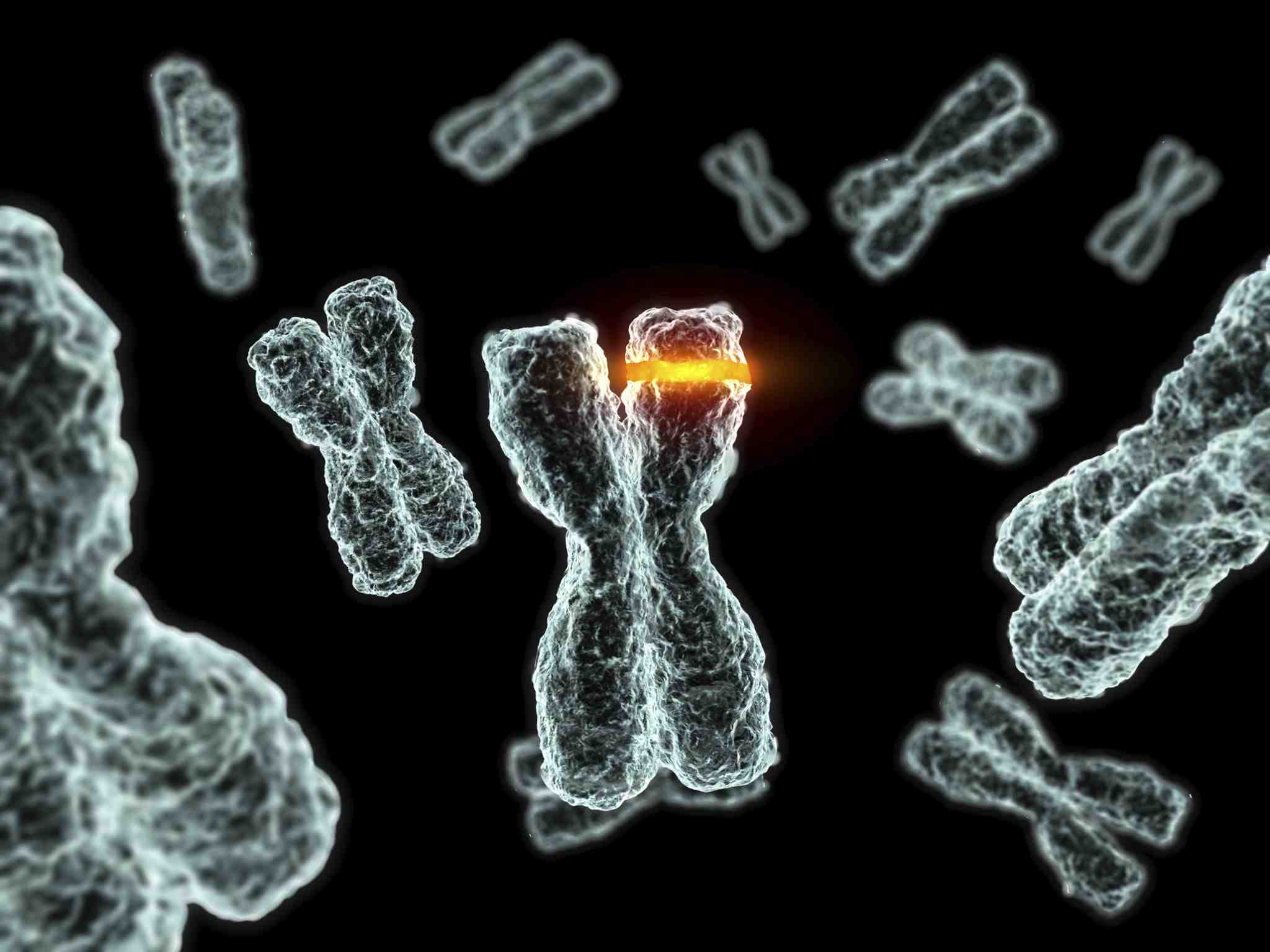
In the Year 2030,  North Korea successfully devised a genetic agent, H-9323, that causes the cells of humans to turn photosynthetic and release toxins to their bodies upon contact with ultraviolet light.

After failed negotiations with the United Nations, the rouge nation launched multiple missiles containing these agents to every corner of the world as an act of defiance.

It is later found that humans in contact with the agent will be intolerable to sunlight unless he or she has a natural genetic resistance which is only found in 30% of the global population. Many have died initially due to sunlight exposure but a group of mutated scientists successfully built a suit that shields them off from all ultraviolet light.

Although the North Korean leadership has been executed for their atrocities committed, the aftermath of this genetic disaster effectively split the world into two opposing camps between the unaffected and mutated.

By the Year 2035, medical research has rendered this genetic mutation irreversible and permanent. Out of fear of it being contagious and a lack of comprehension of this mutation, the mutated were treated with indignity and were often ostracised by society.  Finally in Year 2036, governments across the world required all citizens to undergo a mandatory checkup and those found to be mutated will be sent into exile. The exile camps were in very poor living conditions with little food and the mutated were close to being abandoned and forsaken.

Tired of the oppression, a major war broke out between the unaffected and the mutated in the Year 2036 across the world and changed the course of humanity forever…

Ego


Meme

I see myself best described as a photographer and a foodie as I really enjoy taking pictures and enjoying food.

Photographer

1

A camera is a photographer’s primary tool and I used it as an icon here to represent me as a photographer. The front view of the camera body is presented as the main subject while the side view is radiated outwards in three colours – Red, Green and Blue as a representation of my association with the digital world (RGB Monitors, Colours).

Foodie

2

I enjoy food and really embrace the local Singaporean food culture. I can still vividly remember the times I felt so nostalgic about Singaporean food whenever I am abroad and the feeling kicks in just a few days away from home. Using a popular food dish in Singapore, the Prawn Noodles, I juxtaposed noodles in the shape of the prawn body and attached it to the tail of the prawn. To show that I really enjoy and embrace food, I presented it in a fine dining way and added garnishes (black/red caviar and scallions) to make it look more appetising.

Me

3

Finally, me would be best represented crossing photography and food. Here the Noodled Prawns are presented in a way that they are swimming in a carefree manner in the azure blue seas while the camera is capturing this delicate moment and freezing it in time.

A Better Me

abetterme

A better me would be someone who embraces my vision problems, with the hope that some of them will not affect me as much.

Degenerative Vision

4

All of us probably have this phenomenon where we see floating particles swimming around in our vision. These elements are called floaters and I am seeing more than the average person due to my degenerative vision. These floaters are incorporated into this design to show my degenerative vision. I was born with myopia of 200 degrees and it grew every year till its over 1000 degrees now. Without corrective glasses, my vision is all blur and this is represented by the unclear image seen in this picture.

Colour Appreciation Deficiency

5

Probably most of us can see the numbers ‘6’ and ’42’ in this picture but they are all just coloured dots to me due to my Colour Appreciation Deficiency. It is a common misconception in the layman description of this condition as ‘Colour Blind’ as being colour blind is completely blind to colours which is not in my case. People with my condition still see colours but have some troubles seeing colours in similar shades (dark brown vs dark red; grey vs turquoise; pink vs purple) especially so under lousy lighting. This picture depicts my condition as I placed the Ishihara test circles as the lens of my glasses with me in a determined look, signifying that I will conquer this condition of mine and do as well (or even better) than ever before.

A Better Me

6

My colour appreciation deficiency belongs to the Red-Green type and probably part of the reason why I prefer to use blue in my works. I also really like the colour blue as it is a cool colour and I feel calmed and relaxed looking at it.

Using light trails, it represents the challenges in life with the notion that life is full of grooves and curves. I overlay an image of myself looking determined into the composition to show that I am ready for the challenges ahead of me and I am ready to embrace a better me.

An Ideal Me

anidealme

An ideal me is someone with more time and knowledge with a vision for the future.

More Time and Knowledge

7

Sometimes I do feel that 24 hours in a day is really too short and it will be great to have more time to do the things I want to do – school, work, family, friends, leisure, sports.

I also feel that having more knowledge is a very desirable thing as it expands my horizons to the world, people and things around me.

Using a clock to represent time and a book to represent knowledge, I hope to bring out the idea of having more time and knowledge. A radial blur effect is added to the clock to make it look more dynamic and show movement. The image of an open book is chosen over a closed one to also show movement.

Vision for the Future

8

I feel that to be a successful person, one must have the vision to see the future, to anticipate future events and have further insights.

Using astronomical constellations, I hope to bring the concept that the sky is the limit and vision for the future is to see things faraway and anticipate the challenges ahead. A series of composited constellation elements are added that are visual representation of some the things that are associated with me (camera, food and glasses).

An Ideal Me

9

If I have more time and knowledge on hand coupled with a vision for the future, it would be extremely ideal for me as I will have the right resources and conditions to pursue an ideal me. The final image is a composite of the elements from the first two images.

Me in Five Years

mein5years

I see myself settling down and forming a family with my significant half in five years time. A family is something where both parties work hand in hand and a common theme (household chores – cooking, cleaning, ironing) is used for the part ‘Me’ and ‘My Significant Half’ in a complementary manner to show rapport and cooperation.

10

My personality is represented by this colour scheme to show that I am a more quirky and jovial person. These colours work in harmony to radiate a ‘feel-good’ feeling and it best represents me and what I hope to bring to others. I occupy the top left corner in the form of a vacuum cleaner (in blue to represent Male) and the wooden spatula in orange radiates outwards to form lines that leads to the next picture.

My Significant Half

11

My significant half is a more down to earth person and this colour scheme best represents her as it gives a feeling of ‘stability’ and ‘being-focused’. She occupies the bottom right corner in the form of an iron (in red to represent Female) and a different wooden spatula in grey/green radiates outwards to form lines that leads back to the previous picture.

Me in Five Years

12

I see myself settling down with my significant half in five years and the first priority will be getting a place of our own. Using the silhouette of a couple holding hands and tapering a HDB public housing block to each of them, I hope to convey the idea that we are working hand in hand to get a place of our own together. As with traditional gender colour conventions (and also linked to the previous two pictures), I am represented in blue while she is represented in red.

With a new house comes the key to it and the keys are elongated to show the challenges ahead that we will face together. But in the face of challenges, we stand strong and ready for whatever that may come in our way.

Conclusion

On the final note, this assignment is an interesting one as it allows us to use any medium of our choice and we are finally able to use colours to convey our emotions. I feel that it really sums up of what we have learnt since day one – with the first assignment on lines/emotions and the second one on imagery placement and juxtaposition. Overall, I enjoyed working on them and it is also interesting to see how each of us have very interpretations of our lives through the styles rendered in our works.

Impossibilities of Being

Concept

The concept behind this sequence is the struggle between light and darkness inside us and it is presented through me having a dream that transcends into different spaces. At the first glance, I am uncertain if the light emanating from the alarm clock is good or evil as circumstances forced me to doubt its identity. The shadowy figure that I encounter is a representation of our inner demons and it is launching offensive attacks on me to bring me down. When I was brought down, light appears in the form of a camera hotshoe flash and granted me the power to fight against darkness and defeat it. After conquering my inner demons, I am transported back to reality and revelation dawned upon me that the light from the beginning is actually a beacon that guides me out of danger and helps me to confront my inner demons to become a better person.

For most of the shots, I am shot inside a green screen and I am individually keyed and composited into background plates taken specifically for this project. There is colour matching and colour grading before adding lens flare and particle effects.

Influence

I enjoy making impossible things happen through the use of visual effects and I am fascinated by the visual effects seen in Hollywood and Hong Kong films. Hong Kong films by comedian Stephen Chow is highly comical and his films forms part of the influence for this project. Hollywood directors such as JJ Abrams and Michael Bay are famous for using lens flares in their films to create the sci-fi and mysterious element and they form part of my influence for this project as well.

Reflections

This is a truly enjoyable project as it allowed me to creatively express myself by creating visuals that are entertaining and its impossible in reality. Although there was a huge difficulty in colour matching especially matching visuals shot in neutral light to night, and much time was taken to composite the visuals and add effects to it, the final result was worth it as I am extremely satisfied with the outcome and I am also glad it brought laughter to my audiences.