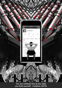
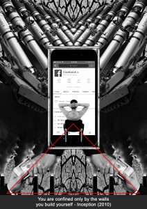
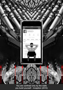
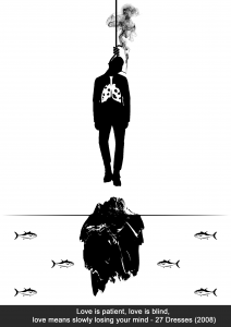
After completing the 2 previous projects which were dealing with only black and white, project 3 touched on another very important aspect of 2 dimensional design, colour theory. As a photographer I knew of basic colour harmony however I’ve never really paid much attention or understood the importance of how it would affect my images.
The purpose of this project was to explore how I would portray myself in a set of equations through the use of colour and different settings/scenarios. The timeline we were given for this project was a little tight where we had to complete a row of three designs every week as compared to one design per week for our previous projects. In the following post I will be running through my research, though process and my final designs for the 4 lines I’ve designed for EGO.
Reference Artists and Research
I get a lot of my inspiration for my works from Instagram. For this project, given the full creative freedom of medium and designs I decided to do most of my EGO lines with photo manipulation. Some of the reference artists are as follows:
@Demasrusli
@Dchantie
@Peteyulatan
I wanted to explore the “inception” effect and create a surreal space within my designs to portray my thoughts and imaginations.
As for my research on colour theory I looked online for examples on the different types of colour harmonies and tried experimenting with them in my designs.
Line 1
Optimistic + Obstacle = Conquerer
In the beginning of this project I wanted to stick to something simple and easy for me to switch colours like vectors. The inspiration for this equation is life as a student in university for me.
Optimistic
I used complementary colours for this design and chose orange as the background to portray zest and enthusiasm. The Blue colour of the water strikes out against the background and makes it easy for the viewer to understand the focus of this image.
Design wise i chose to go with the saying: “a pessimist sees a cup as half empty, an optimist sees the cup as half full” and designed the water on the top of the all too familiar takeaway plastic bag in Singapore in order to give the design a quirky local twist. Upon consultation I decided to add a hand carrying the bag to act as a leading line and also to balance the design.
Obstacle
To create a dreaded look I chose to go with blue as the main colour for this design. Complementary colours would add too much contrast to the design thus i decided to go with split complementary colours using orange as the main focus and blue and purple to complement.
The blue mountain represents the dreaded and tough journey I will need to overcome in order to reach the top of the mountain to get my degree and graduate. Continuing from the previous optimistic design I used orange to portray me as an optimistic person in the image carrying books up the mountain. The pieces of paper flying off the stack of books are to create a sense of struggle. The purple clouds help to reduce the tension between the orange and blue to pull together the design making in look cohesive.
Conquerer
For the last image of the first equation I used an analogous colour scheme. The analogous colour scheme helps to create a serene and stable design which I wanted to emphasise in this image. Going with red and orange I wanted to show energy in this image. The red rock on which the graduate is standing on is darker than its surrounding colours which draws the viewer’s attention.
Taking from the previous image of mountains i incorporated the same element into this composition however this time the colours have changed to a more vibrant orange similar to the previous two designs relating to optimism and enthusiasm. For the main design I placed the graduate, me overlooking the mountains showing how I’ve conquered climbing to the top of the mountain.
Line 2
Imaginative + Bedtime Stories = Dreams
After completing my first line I decided to stick to a medium that I was more familiar with even though it was going to be more difficult to convey colour harmony through a combination of found images and pictures that I’ve took before. I faced some difficulties trying to push some colours to stand out and finding images that fit into the colour harmony that I was going for was also an issue however with the help of photoshop and lightroom i was able to better exaggerate the colours of my images.
In this line I wanted to show a little bit of my creative side. I have the wildest of dreams sometimes and a lot of them are due to the “bedtime stories” that I have before I go to sleep. Before going to sleep I like to check my social media and I follow a lot of really creative people on Instagram that push the limits of editing and distorting reality which i tried to replicate in this equation.
Imaginative
To show a creative aspect of myself I used maroon and purple hues with a gradient background of blue. The colour scheme i used for this design can fit into the triadic colour scheme of yellow, blue and red however the yellow was not really apparent in this design thus I decided to stick with analogous colours instead even though the colours are spanned out quite far.
I used a double exposure of my self portrait and a galaxy to represent what is going on in my head. I wanted to use the galaxy to show the vastness of my imagination. Having the reds and purples in the double exposure I used a subtle blue for the background to create a contrast between the head and the background. The gradient from dark to light was used to make the image look more interesting and at the same time subtly create movement.
Bedtime Stories
This was a photo that I shot personally. To portray the serenity and comfort of going to bed I used blue lights to fill up the background of the bedroom. To make the scene more interesting I used a complementary colour scheme and added some orange fairy lights. Shot at a low aperture the fairy lights became round balls of light (bokeh). In post i exaggerated the effect and photoshopped more bokeh balls to fill the frame to create a more dream-like environment.
Dreams
To continue the series of using blue as a supporting colour in the compositions I used an old photo of mine when i shot in Hong Kong and colour graded the landscape to have blue as a background colour. The lights from the buildings helped to fit into a complementary colour scheme similar to the previous image.
Being inspired by the movie “Inception” I went ahead to try and imitate the multiple realities effect and stacked two images diagonally to create a sense of distortion and added a person falling in the center to represent me falling in my crazy dreams.
Line 3
Nature Lover + Concrete Jungle = Caught in Between
The inspiration I got from my artist reference is most apparent in this equation. It is also my favourite equation out of all the other ones I created for this project. Manipulating a combination of found images and images of my own I tried to create a consistent theme throughout the equation where the landscape is warped around a subject and there is an object in the center of the image to give context to the design.
As a cityscape photographer a lot of people might think that I only love shooting photos in an urban setting however I started photography because I was inspired by nature photographers. To sort of show the struggle I have whenever I want to travel I designed this equation to give some insight into my photography life.
Nature Lover
To show my love for nature i chose to go with a triadic colour scheme for this design. Creating a balanced harmony between red, blue and yellow I chose a found image of an ocean view with a orange sunset, thereafter shifting the hue of the orange and made it closer to red. To draw attention to the center of the frame I used a yellow tree to metaphorically represent nature.
I added a human in the sea to add interest to the composition and also to create an implied line of the person looking into the ocean directing the viewer to the main focus of this image, the yellow tree.
Concrete Jungle
Initially to show the dullness and monotonous of the city I wanted to stick to an analogous or monochromatic colour scheme however it was a little too boring so I added a person wearing a blue jacket to draw the viewer’s attention toward the figure. Again the composition of this image is similar to that of the first with the landscape warped around an object and the implied line of the person staring into the open.
The clock in the middle was to represent how in a city everything is focused on time and that time is always viewed as money. Everyone is always in a hurry trying to get to their destination and complete whatever they have for the day. I think i successfully achieved the look I was trying to go for in this image.
Caught In Between
Finally in the last image using the complementary colour scheme of red and green to create contrast and show the struggle I face when I take photos. Breaking from the previous two compositions of creating a solid landscape frame around the image I used a cityscape and nature landscape photo on each side of the composition to show the stark difference. Apart from its look I saturated the trees to exaggerate the green colour and placed a red mask over the city photo.
I found an image of a person falling on google and decided to duplicate it and made one on each side of the image, then I added a motion blur mask on top of the layers and duplicated them again to create an illusion of the two subjects in constant motion. The colours of the female’s dresses also follow the complementary colour scheme of the image.
Line 4
Real Me + Expectations = Limitless
My childhood inspired me to create this line. As a kid my father would force me to do math revision papers every night and I hated it. I always felt suffocated when I had to do something I didn’t like. Naturally as children we like to do art, however whenever my brothers and I did painting or drawings when we were young my father would get really upset and told us that he never wants us to grow up to become artists. To create a consistent theme around this equation I decided to use a frame throughout all the images and each frame represents something different.
Real Me
Using dark blue as a basis of this composition I added accents of orange through the lanterns to create tension and also focus in the image. The orange frame complements the composition and balances out the contrast of the blue.
In this design the frame represents what I view myself to be. It is a frame much like a photo frame representing me as who I am. The hoodie creates a mysterious vibe almost as if I was guilty of something. The lanterns represent my wishes and dreams of being creative however I am being restricted by father.
Expectations
Using a split complementary colour scheme I chose orange as the dominant colour accented by blue and purple. The orange here again represents me as a creative, full of passion and zest. The blue abyss is accompanied by purple numbers floating around to create a sense of dread and despair.
The frame in this image represents my father’s expectations of me. The person barely hanging off the frame represents me trying to hold on as hard as I can before i fall into eternal abyss of numbers and revision papers that i dread doing.
Limitless
Sticking to the use of orange, the last image of the 4th equation makes use of a complementary colour scheme. This time however I used a darker and less saturated orange to show stability accompanied by the blue of the sky to create harmony and show the outcome of struggling through the years.
Its ironic how my dad has always wanted me to become an engineer or a businessman but I ended up in arts school. I completed my diploma in Chemical Engineering while i was in polytechnic though so I guess that is enough to convince my father to pay for my university school fees  . After struggling through the years and being rebellious I come out limitless as portrayed by the dangling legs in the sky. The cameras with wings are carefully situated to create implied lines toward the focus of the image which is the camera in the center. Photography is my escape from all the anxiety my father has forced onto me as a kid and finally I am free to practice what I want.
Conclusion
In conclusion it has been a well spent 4 weeks designing and researching for EGO. Through the research of colour theory I feel that I have better understood how colours work together to portray different emotions which can be very useful to me in the future as a photographer.


