Category Archives: Process

Concepts of Digital Imaging Assignment 4 – Dystopian Reality

Password: Stevenmeisel
Artist Statement
dystopia
dɪsˈtəʊpɪə
noun
  1. an imagined place or state in which everything is unpleasant or bad, typically a totalitarian or environmentally degraded one.

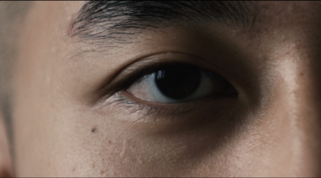
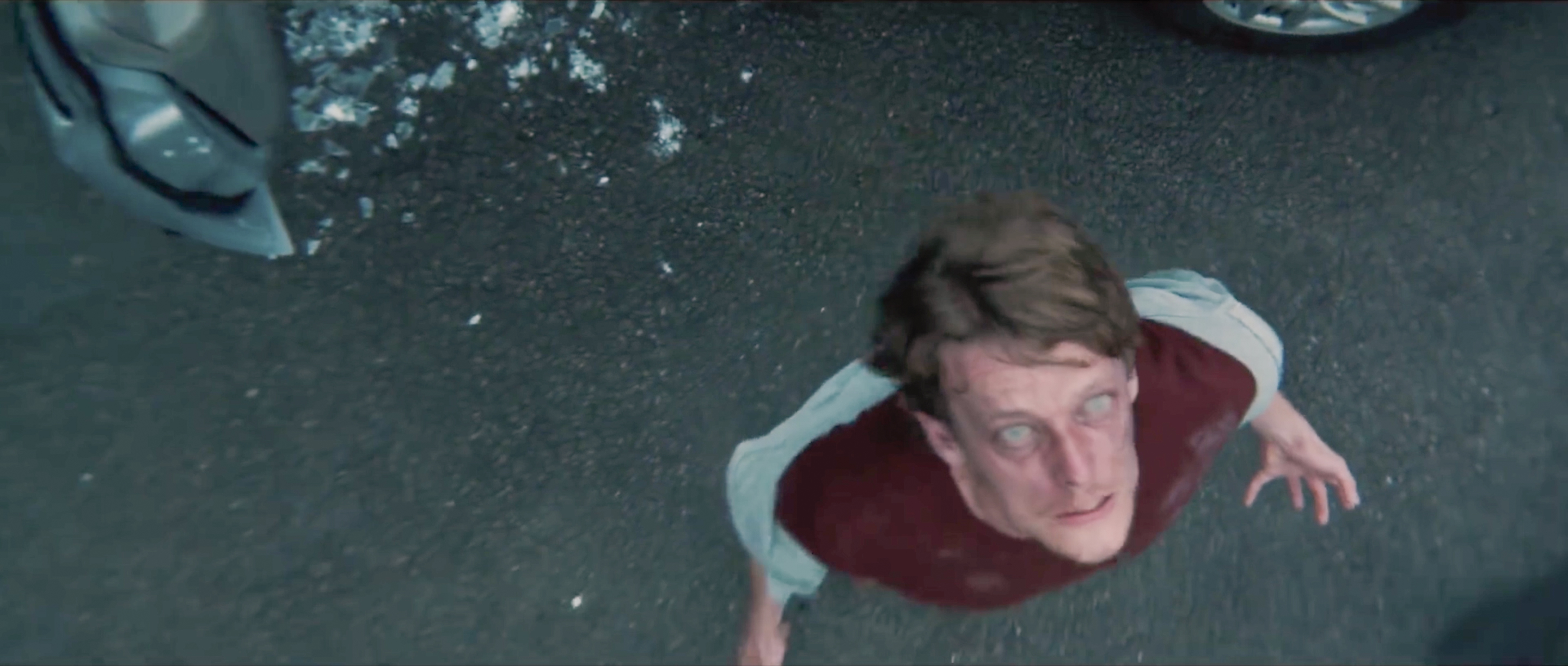
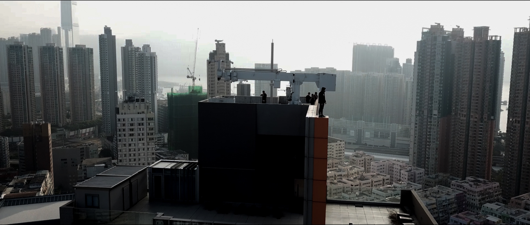
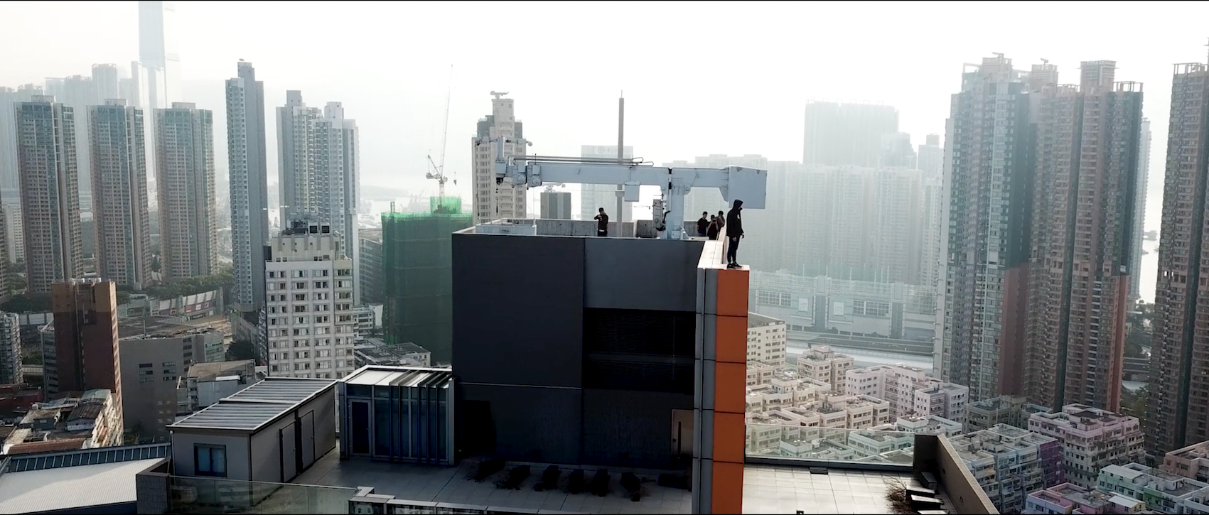
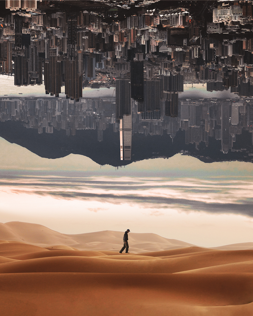
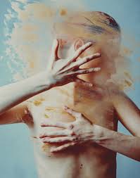
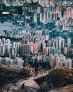
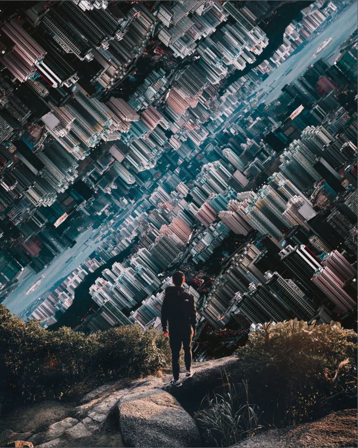
In this project I wanted to revisit my self portrait assignment “Oblivion” 2 assignments ago. Taking the same concept of a dystopian environment, I wanted to use animation and visual effects to further enhance the message I was trying to tell as an artist. To me the world is not as beautiful and naive as it seems. A lot of what we see on the internet and the media feeding us is just a curtain shielding us from the ugly truths of the world. As a result, our vision of what we think is real is blurred and only time and experience will be able to lift this curtain revealing the dystopian society that we live in.

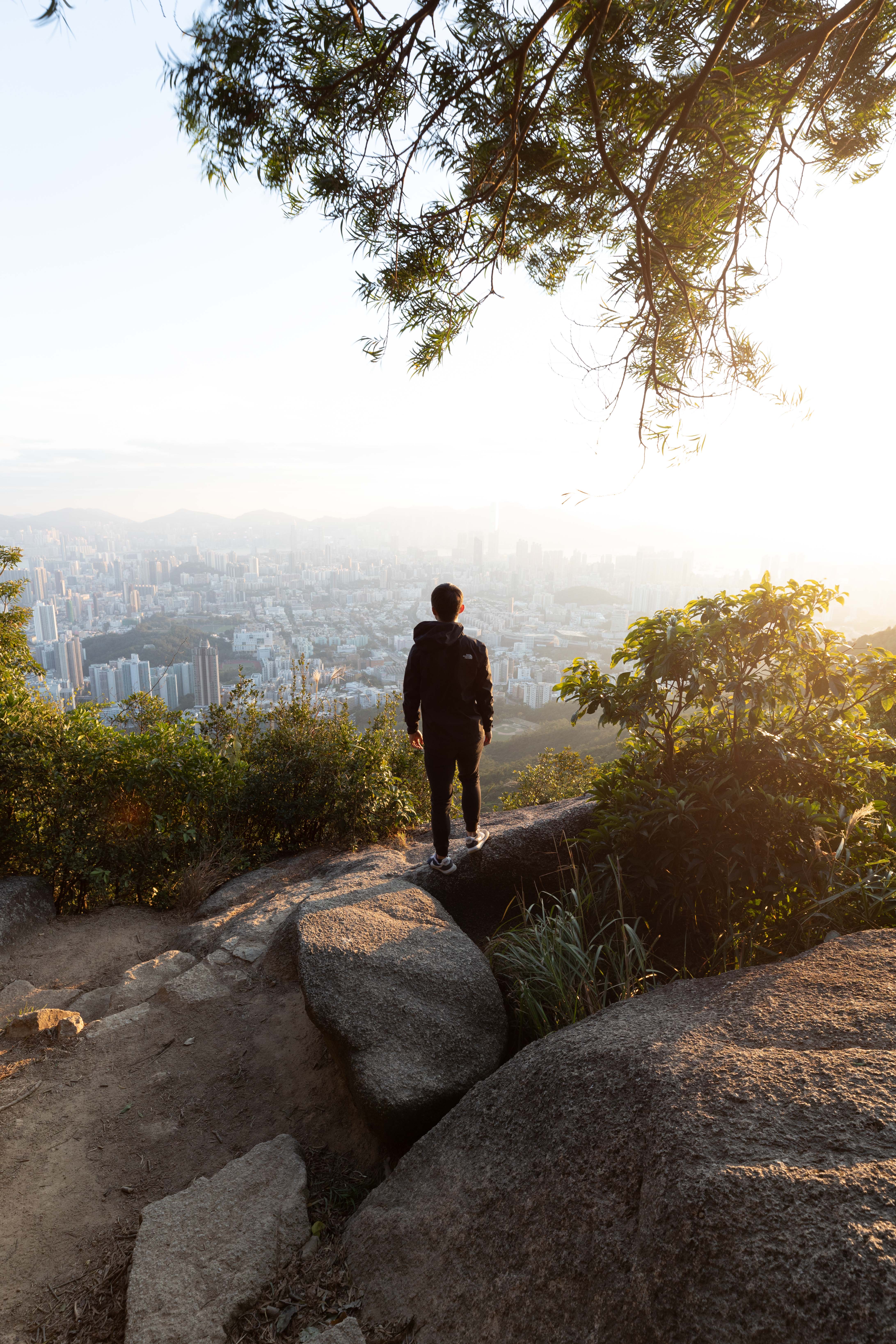
As a step up from Oblivion, the colours in this project are more distinct. The separation between the subjects in the photo are more apparent with the different colours. The city in the background is mainly made out of muted dark blue and cyan hues representing the state of depression. The foreground has brighter highlights of orange and yellow portraying a sense of hope. Using complementary colours to create contrast in this composition made my message as an artist more apparent.

Technical Decisions

The animation can be separated into 3 components. The background of the city, the foreground of the rocks/bushes, and the human subject.

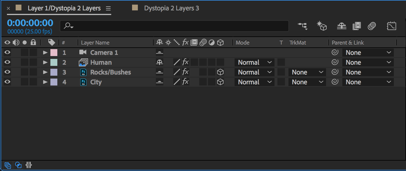
The effect I was trying to achieve is known as the vertigo effect in film. The effect is achieved by either moving the camera toward the subject on a dolly while zooming out or vice versa.


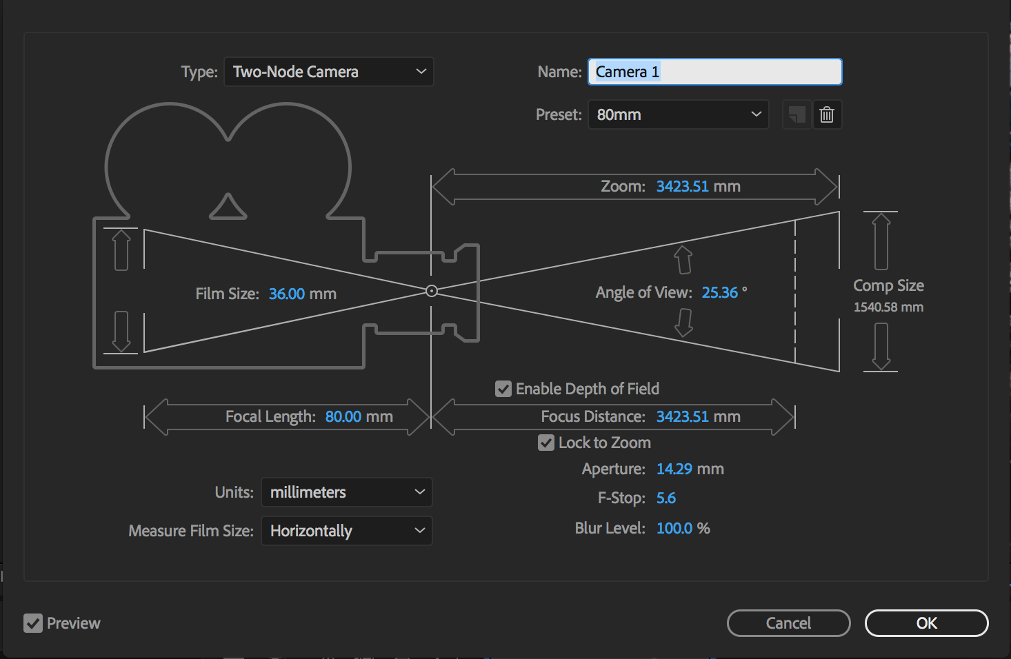
To imitate the real life motion of achieving this effect, I converted the layers into 3D objects and used a camera layer to keyframe the zooming in of the composition. To achieve the zooming out effect that would cause the background to push further into the distance, I keyframed  the city layer’s scale with an initial value of 200% and decreased it to 100% at the end of 5 seconds. To disorientate and further emphasise the idea of dystopia, I rotated the city layer by 45 degrees and keyframed the orientation back to 0 degrees creating a swirling motion throughout the animation. Furthermore, A camera lens blur effect was added to enhance the message that I wanted to tell with this animation, that as we unveil the curtains behind the ugliness of the world, our vision starts to become clearer. Thus, the effect of the city starting from a blurred image becoming sharper and clearer is achieved by using keyframes on the blur radius of the camera lens blur effect.

This effect was repeated on the foreground layers, namely the human subject layer and the rocks/bushes layer. The keyframes however, were reversed with the lens blur effect starting at full sharpness slowly increasing the blur throughout the 5 seconds of the animation. This was to imitate a real  camera’s change in focus from the foreground to the background, which helps the viewers understand the elements of the image throughout the animation. Apart from the focus change, the foreground elements were keyframed to retain its position throughout when the camera is zooming in.

In order to create depth, i separated the human from the foreground layer and changed the gradient of which the foreground increases in size. Starting with a value of 80% on the scale keyframe I gradually increased the human subject’s scale to 120%. The difference in speed of the camera zooming in and the human subject increasing in size helps to add depth to the animation and prevent it from looking too 2 dimensional.

Before & After

Before carrying out the animation in after effects, i composited the layers in photoshop and colour graded the RAW images accordingly to set the tone of the animation.

Before Colour Grading


After Colour Grading

The focus of the city colours were to make it look super depressing and somewhat having a consistency throughout the landscape. Cooling down the white balance and darkening the shadows helped to create a mysterious looking city with minimal highlights, portraying the landscape to be dull and dead.

Before Colour Grading


After Colour Grading


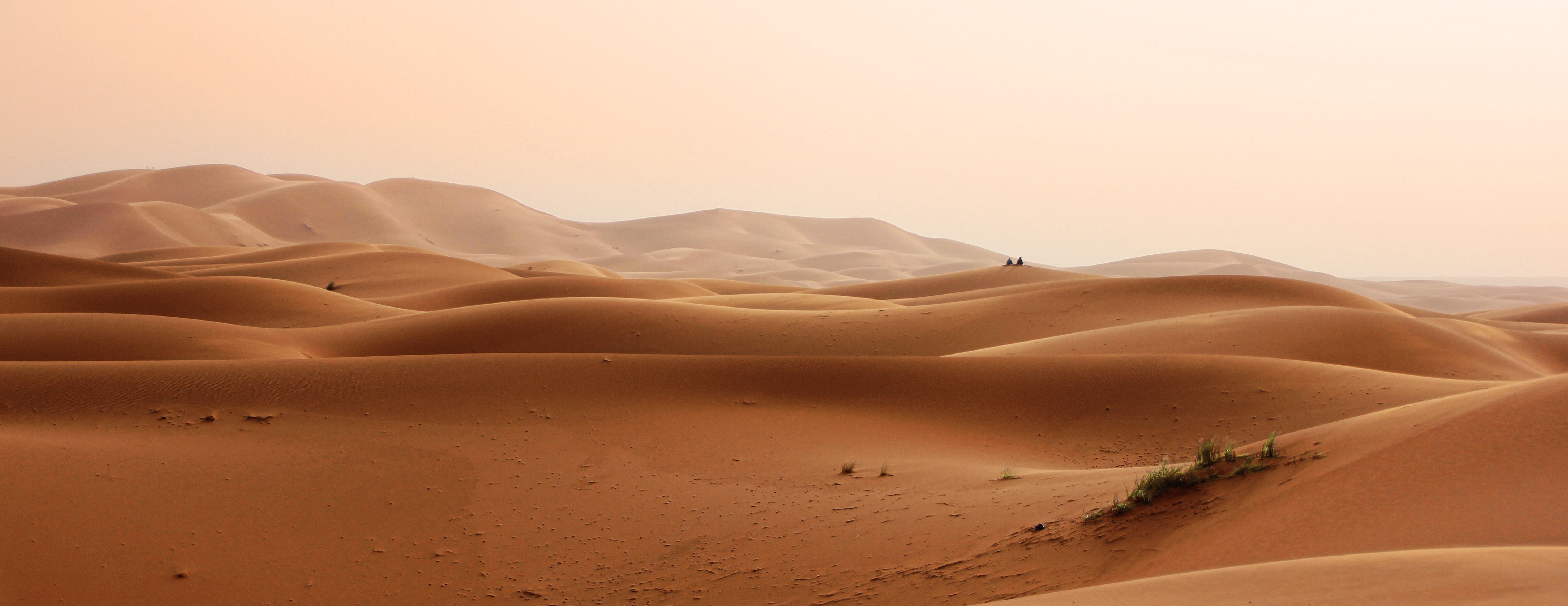
The vibrance of the initial image shot on the mountain was too saturated. Desaturating some of the unnecessary colours and concentrating on a few helped make the image more consistent in the mood i was trying to achieve.

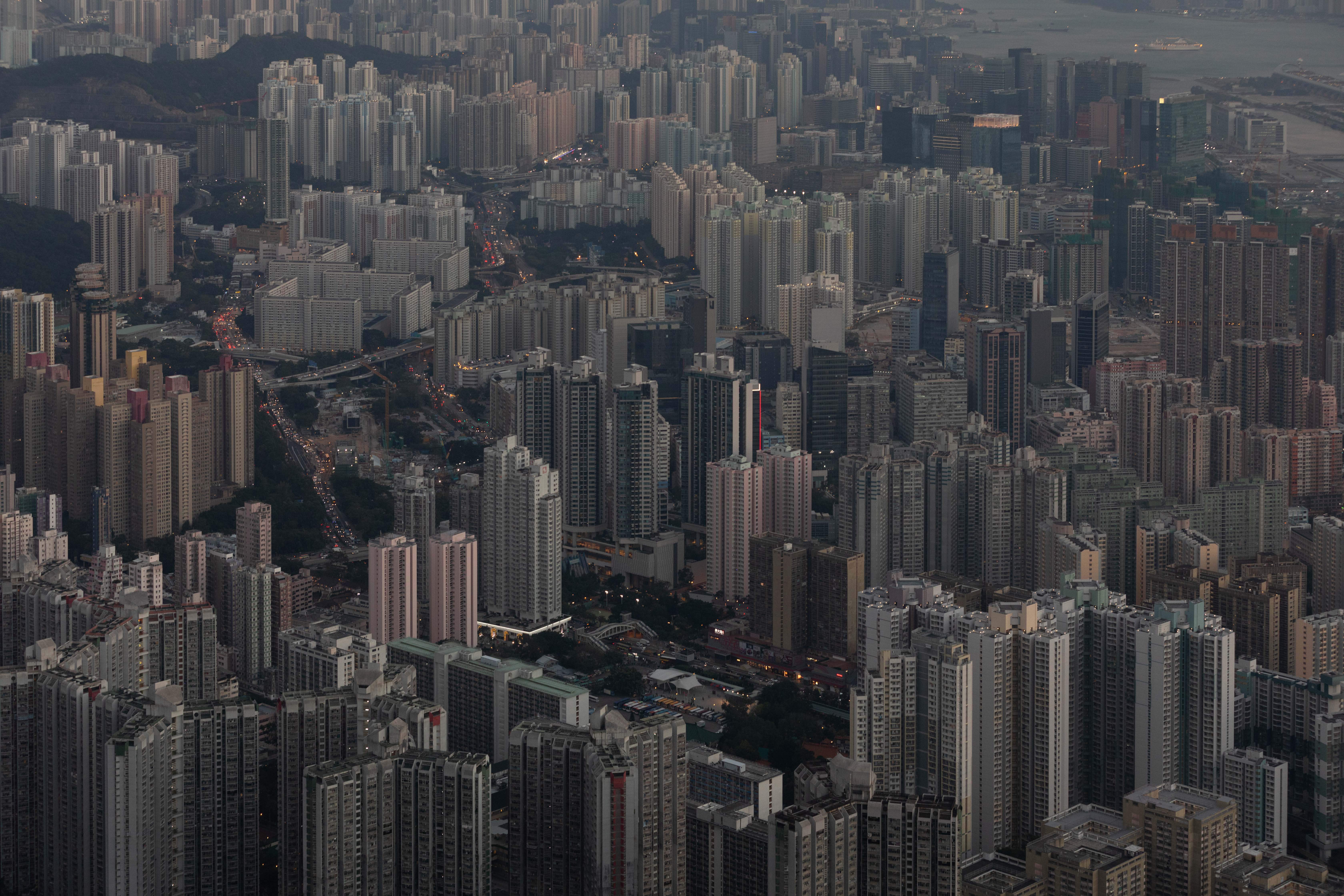
To create a dystopian look, I duplicated the city image and stacked them up on each other. Rotating the combined image 45 degrees helped to add onto the theme of a twisted reality.

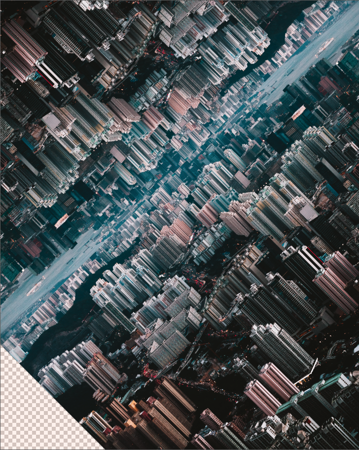
Next i had to mask out the unnecessary background from the mountain image. It was not an easy task to mask the bushes as the intricate details required close attention in order to make it look as real as possible.

Several adjustment layers had to be made in order to seamlessly combine the 2 drastically different images together.

A basic curves adjustment layer was added for the background the increase the highlights and darken the shadows in order to match the foreground image. On top of that a colour balance layer was added to add some magenta into the image and to match the warmer tones of the foreground image an orange colour fill was added with a low opacity %.

The human layer consisted of a curves adjustment layer to darken the shadows to match the dark tone of the cityscape. A blue colour fill layer was added to cool down the image creating a consistency throughout the composition. On top of that a dodge and burn layer was added to clean up some areas and create extra contrast to make the image pop.

The final composition thus looks like a seamless image.


Artist/Film References
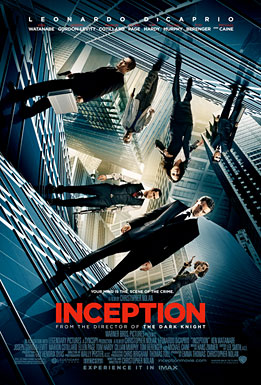
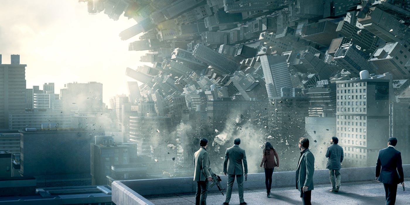
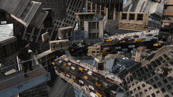
Inception

A major influence to this concept like much of my other works is Christopher Nolan’s Inception. The idea of stacking cities on top of each other has baffled me and made me interested in exploring photo manipulation. As an experimental cityscape photographer, Inception has opened up new horizons to my imagination and paved the way to some of my latest works.
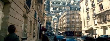
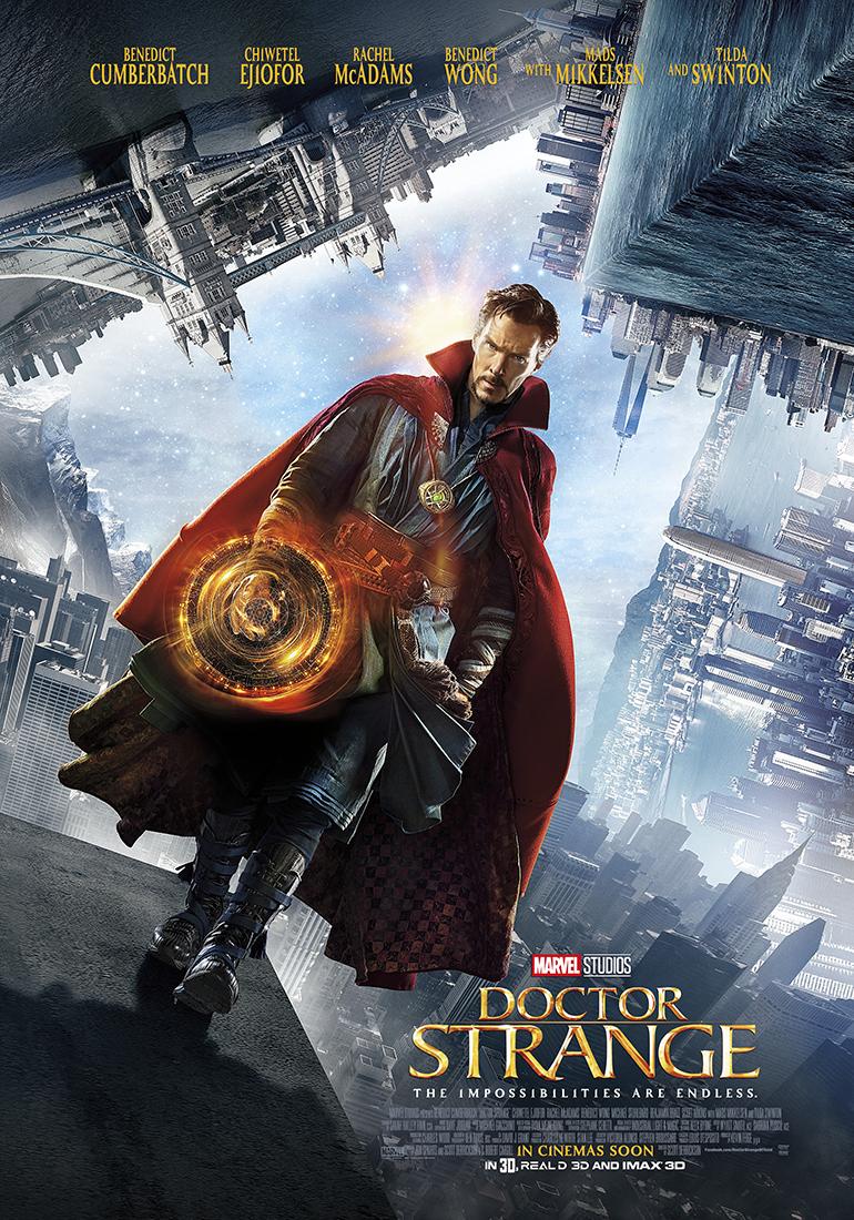
 

Doctor Strange

Doctor Strange is another movie that plays with perception and alternate realities inspiring the concept behind my project. Doctor Strange being a more recent movie, contained better visual effects than Inception. The process of how complex buildings folded and behaved fluidly amazed me.  Scott Derrickson and his team has heavily influenced this project and helped me conceptualise “Dystopian Reality”.


Jaws (1975)

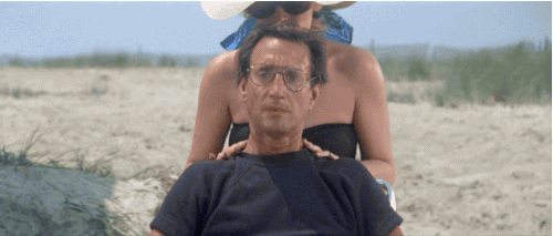
The animation part of the project was hugely inspired by movies that incorporated the vertigo effect in their scenes. One example that inspired me is Jaws from 1975. The effect created a sense of uneasiness and surrealism that cannot be achieved with our eyes. Incorporating that into this project has hugely pushed the idea forth of creating a world that had distorting realities.

Conclusion

With this as the final assignment for this module, I have learnt a lot from starting how to mask an image in photoshop to rendering an animation on after effects. The creative process for each assignment has been unique and dear to me. Each assignment has helped me express a side of me that I will not have been able to do so in words or actions. With “Dystopian Reality” I wanted to end of on a high note and create one of my proudest works to date.

Concepts of Digital Imaging Assignment 3 – LIFE

Artist Statement

In today’s society a lot of us are going through motion and living life “safely” afraid of what makes us feel insecure. With LIFE, I wanted to show my take of what it means to live life to the fullest with combinations of sound effects, thrilling video clips and intense transitions.

The footage used in LIFE  are specifically chosen to convey what my voiceover is portraying. I used a combination of my personal footage and footage that I’ve found online to create something totally new. Throughout the video there are many symbols used to further enhance the storytelling. One such example is a crowded crossroad of people walking past each other almost as if there was a higher being controlling them like puppets to convey compliance.

I wanted to tell a story with the visuals that I used, accompanying it with sound effects to further aid the delivery.

The second half of the video focuses on risk taking, which inspired me to use clips like skydiving, rooftopping and other adrenalin rushing activities to help viewers get a better sense of what I am trying to say.

1 Minute Cut

Password: stevenmeisel

30s Cut

Transcript of Voiceover

In a world filled with conformists
A lot of us are comfortable with our lives
But through that comfort comes a lot of anxiety
A lot of worry
A lot of stress
Why? because we are still living the same old routine
Most people go though life following that routine
Going through life playing it safe is like a breathing corpse
The only way that you can grow, is you gotta risk
You gotta challenge yourself
You gotta take some chances
You gotta live out of your comfort zone
They say if you’re not living on the edge you’re taking up too much space
I choose to live by my own rules
How about you?
Short Descriptive Text Premise
With society complying to whatever that makes them feel safe, sitting through countless exams growing up and living life through motion, they become lifeless zombies being manipulated.
Only through breaking free and doing things out of our comfort zone can we fully live our lives and realise our fullest potential.

Technical Decisions

I used a lot of zooming and whip pan effects to transition my clips to create a fast paced, adrenalin rushing feel.

The beginning few clips were normal jump cuts to set the pace for the video introducing how mundane life is.

After that I incorporated layers of sound design like people chattering and a train passing by to create a sense of messiness. The whip pan transitions used in this segment of the video helped to create a sense of irritation and anxiousness.

Following that to emphasise how society is living life monotonously I used a clip from “Shaun of The Dead” where a series of zoom in transitions and quick cuts were used to show how the protagonist went through his morning routine.

Approaching the end of the video I used more zooming in effects to emphasise the rush I’m trying to compare to the mundane boring life of compliance.

For the last scene I used a zoom out transition to show my eyes closed and at the very last second I open my eyes almost provoking the viewer to question how he/she is living life.

Colour Editing Process

As for colour grading I did some basic adjustments to the existing colour graded footage such as desaturating the beginning clips to show lifelessness.

Before

After

The part where the VO was describing routine was colour graded to make the footage cooler to again show how mundane it is to always go through motion everyday. The zombie footage was also cooled extensively and darkened to create a scary feel.

Before

After

Before

After

Toward the end of the video I used normal saturation for the footage  and increased the saturation of some of the clips to create a drastic change in mood.

Before

After

Artist Reference

I was inspired by Edgar Wright’s “Shaun of the Dead”. Throughout the movie there are multiple scenes that are quick cuts to show a sense of urgency. For example, there is one scene where the protagonist goes through his morning routine using  quick cuts accompanied with zoom in transitions. Even though the effect was manually done during the shoot for the movie, I had to do it in post as I was using online clips. This transition technique allowed me to emphasise adrenalin throughout the later part of the video and came in very handy when the scenes were not related visually.


Outside of movies, Sam Kolder is a travel filmmaker that really inspired me to create the voiceover for this assignment. Apart from the story behind my video, Sam Kolder’s colour grading was a huge inspiration to me when I was editing the RAW footage that I shot on my own.  Focusing on contrast and saturated colours I took that and included it into the video to enhance the visual experience of living life on the edge.

For my final artist reference, I looked to Darren Aronofsky’s “Requiem for a Dream”.  Throughout the movie there are a lot of quick cuts used. Even though the quick cuts do not exactly show what is happening during the time period of the scene itself, it helps to tell a better story of what is actually happening in real time. Like the scene where the drug dealer was selling drugs, instead of showing how he sold the drugs and what they were used for, the director used a lot of quick cuts and closeup shots to show snippets of money, cocaince smothered, pupils dilated to give viewers the idea of what is going on in the scene.

Credits

30 Days In Japan by Itchban

Why? by MOE Singapore

Aerial shooting: Wave Pool (China) by HUMAN the movie

Massive wave hits ship by GlobalLeaks

Man almost gets hit by a train! Really Close! by Luciano Jesus

Shaun of the Dead Official Trailer #1 – Simon Pegg Movie (2004) HD by Movieclips Trailer Vault

Dream Jump – Dubai 4K by XDubai

Indecent Proposal (1/8) Movie CLIP – Kiss the Dice (1993) HD by Movieclips

Scary Parkour Compilation 2016 !! by Ardit Gola Films


Concepts of Digital Imaging Assignment 2 – OBLIVION

Materialism is the only form of distraction from true bliss – Douglas Horton

Artist Statement

In a society where your credibility is deemed by ink on a certificate, it is tough not to be a guilty of materialism. Like zombies going through motion we are numbed and can only feel joy through possession of material items. What most of us fail to realise is that everything will eventually fade away and turn to dust.

In this image I wanted to portray how I am a victim of materialism and that I am lost in this never ending sea of always chasing happiness through the possession of physical items, be it the latest clothing trends, or the coolest tech gear in the market.

Hong Kong being one of the busiest and densest Asian city in our region seemed fit for this assignment. Hong Kong is known for being similar to Singapore in many ways. On my trip there I realised that life in Hong Kong was extremely fast paced and often times employees have to work overtime and are not even getting reimbursed for their extra efforts. The people in Hong Kong remind me of myself which inspired me to create this composite, that I am always constantly working and chasing happiness through material things such as money.

Art Direction

The idea of an hourglass is the focus of my project. I wanted to show that it is only a matter of time before everything in the world will fade away. Thus metaphorically using the sand to represent time and the inverted city to show that material items are just idealised sand ticking away.

The human subject portrays my view on how in today’s society even human beings are perceived as tools and will one day eventually be disposed when we become of no more use to anyone.

Before & After


Technical Decisions

The original background layer of this image is the city landscape of Hong Kong.

Shot from the famous Lion’s Rock Peak in Hong Kong it used a 70-200 lens to capture the amazing cityscape below me. Using a focal length of 85mm I was able to get a tight crop onto the busy city making my focus of the image the tallest building in Hong Kong; The International Commerce Centre.

When i shot this photo it was approaching blue hour and i was running out of light thus i had to use an aperture of f5.6 to maintain a consistent clarity throughout the image and not sacrifice anything to be out of focus. As it was super windy and cold up in the mountains i tried my best to shoot as slow as i could while maintaining sharpness in the image. Fortunately my lens has in built image stabilisation thus i was able to get away with shooting at 1/100 with a combination of ISO 640 and still maintain sharpness in throughout the photo.

The other two images that make up the composite of the final image were taken from google. Some of the challenges i faced while making this composite was trying to blend everything together to make it seem like one seamless photo even though it was obviously photoshopped.

First i blended the skies of the city and the desert together by using a soft brush and fortunately enough the original photo of the city was also a little orange thus the skies blended seamlessly. Next I added an overall orange colour fill to maintain a consistent hue throughout the image with the addition of playing with the curves.

Adding the human in was the tough part. Finding a subject that was standing/walking in a position that expressed restlessness was not easy. Fortunately i found one image with a subject walking in the desert. I masked out the entire background of the image with the human in it and played around with curves, highlights and shadows to blend the subject into the desert background.

Artist References

Erik Johansson

Erik Johansson’s photos inspired me to create something that plays around with landscape photo manipulation. He conveys his message through the extensive manipulations of the environment and successfully conveys his message through unfamiliar perspectives of a familiar landscape.

Ricarddo Bognali

Ricarddo Bognali’s images are always centred around human subjects placed in contrasting backgrounds. A lot of these subjects don’t naturally belong in their environment that is portrayed in his works. This gave me inspiration to also include a human subject to further show the contrast of the environment that is set in the composite.

Conclusion

This assignment has allowed me to explore and put to use what i have learnt through the past weeks of digital imaging. The creative process was really fun even though i struggled to find images that fit together in the idea that i wanted to carry out. Overall it was a good learning experience and I will definitely apply these skills in my future week be it professionally or for fun.


Concepts of Digital Imaging Project 1 – THRIST

Whatever you can imagine is real – Pablo Picasso

Artist Statement

With this piece I wanted to tell a story and evoke a certain feeling portraying a fantasy reflecting myself as a womaniser. The power of staged photography has helped combine the real and surreal together capturing a fragment in time where fantasy meets reality.

Upon receiving this brief I decided to create images based on my fantasies. Portraying myself in a different perspective that might not exactly be true allows me to live in that brief moment when the image is being captured what it is like to feel as a womaniser.

Image Description

The image portrays me as a high class womaniser. In this fantasy i see myself as someone that only dates women of status. To support this fantasy I had my female models to put on jewelry and have their hands all over my face to show that I am desired by them. The pearls and coloured nails on the female hands is to depict that the women desiring me are wealthy and exquisite. The expression on my face is to present that I am subtlety enjoying the attention from these women. To further support this fantasy, wearing a suit has helped to represent sophistication, masculinity and also arrogance. Unbuttoning the inner shirt and revealing some skin leads the viewer to understand that there is some form of lust and sexual desire involved.

The background and cropping of the image is also deliberate. The tight crop of this portrait is to portray a sense of intimacy. Having the hands emerging from the black backdrop hints that whatever that is going on in the image is happening in secret.

Camera Decisions & Technical Aspect

Camera: Canon 5D Mark IV

Lens: Canon 24-70mm F4L

ISO: 1000

Aperture: F4

Shutter Speed: 1/125

Focal Length: 41mm

Shooting on the 24-70 lens has enabled me to have the flexibility to zoom in and out of the setting. The lack of professional lighting has definitely made the surroundings darker than expected thus pushing the ISO to 1000 and shooting at F4 was necessary. Having he focal length at 41mm allowed me to have enough space to work with in post if I wanted to crop the image further.

Before & After


Before                                                                                                                   After

Straight of the camera, the image is very flat as it was shot in RAW.

Firstly creating masks for the highlights and shadows helped me separate and add contrast to the image. Thereafter masking the hands and myself i used a tone curve to darken out the background and whatever that was unnecessary in the image. Using the dodge and burn technique i have also deliberately darken and brighten the image in places that would enhance the lighting of the face and suit.

Touching up the skin i used frequency separation and retained the high frequency texture of the skin while gaussian blurring the blemishes to give my skin an overall consistency. Adding to that using the spot healing brush and clone stamp tool i got rid of all the odd speckles and imperfections in my face to make it look flawless.

The nails of my female model’s hands were not painted initially. To show the viewer that they are indeed female hands I went ahead to paint their nails in photoshop which helped the image look more realistic to support that the women were of status.

During the shoot pearls were added onto one of the model’s hands however due to the many reshoots and overlapping of hands some of the pearls eventually transferred over to another model’s hands. I went ahead to clone stamp the pearls instead of removing them to add more interest into the hands.

On top of everything I changed the white balance and made the image colder and also added fade on a overall tone curve adjustment layer creating a dreamy fantasy look.

Artist Reference

Sean Lee’s Two People

Flora Borsi’s Iréel

Some artists that inspired me to create this image are Flora Borsi and local talent Sean Lee. Both series are focused on the human body and how hands are used as a semiotic. Sean Lee’s images inspired me to create a very contrasty feel which gives a more exaggerated overall look. Flora Borsi’s series helped with the art direction of THIRST. I liked the pastel palette of her series however I think the colours would not fit in the context of my image.

Conclusion

This assignment has helped me look deeper into how i can use staged photography and digital image post processing techniques, to further enhance my images and my voice as an artist.