It has been a very fun and frustrating few weeks of experimentation trying to describe emotions through visuals. Taking ordinary household items and making them into mark making tools to express my emotions has certainly changed how I will view these items in the future.
As an urban landscape photographer, I am inspired by modern architecture and how shapes can portray certain emotions/feelings. Bewildered by this phenomenon I decided to research on this topic and revolve my emo lines based on geometric and organic shapes.
Irritation
As a start, I decided to find objects lying around at home that gave me a sense of irritation. My sister has always been annoying and irritating however I couldn’t figure a way to make her into a mark making tool so I settled for a cleaning brush instead. The bristles when brushed upon my skin caused an uneasy bothersome feeling that I thought was perfect for expressing irritation.
First I dipped the brush in ink and used only parallel strokes in one direction, after which I repeated the process in a perpendicular motion to the original strokes.
The result of the process created brush strokes that intersected each other to form sharp edges at the ends of each stroke. The sharp edges represent aggression which is often the by-product of being irritated. The converging lines make the pattern more complicated and messy which amplifies the effect of being irritated. I decided to use the bottom most corners of the paper making use of negative space that gives definition to the pattern.
Guilt
Researching about interesting techniques of design and perception, I chanced upon a technique that many designers use in their works, The Gestalt Principles. The gestalt principles are very useful in playing tricks on the mind. Some famous logos that make use of these principles are, the Fedex logo and the panda in the WWF logo. Using the Gestalt principle of closure I created rounded curved shapes without borders and within these shapes were concentric patterns with varying thickness.
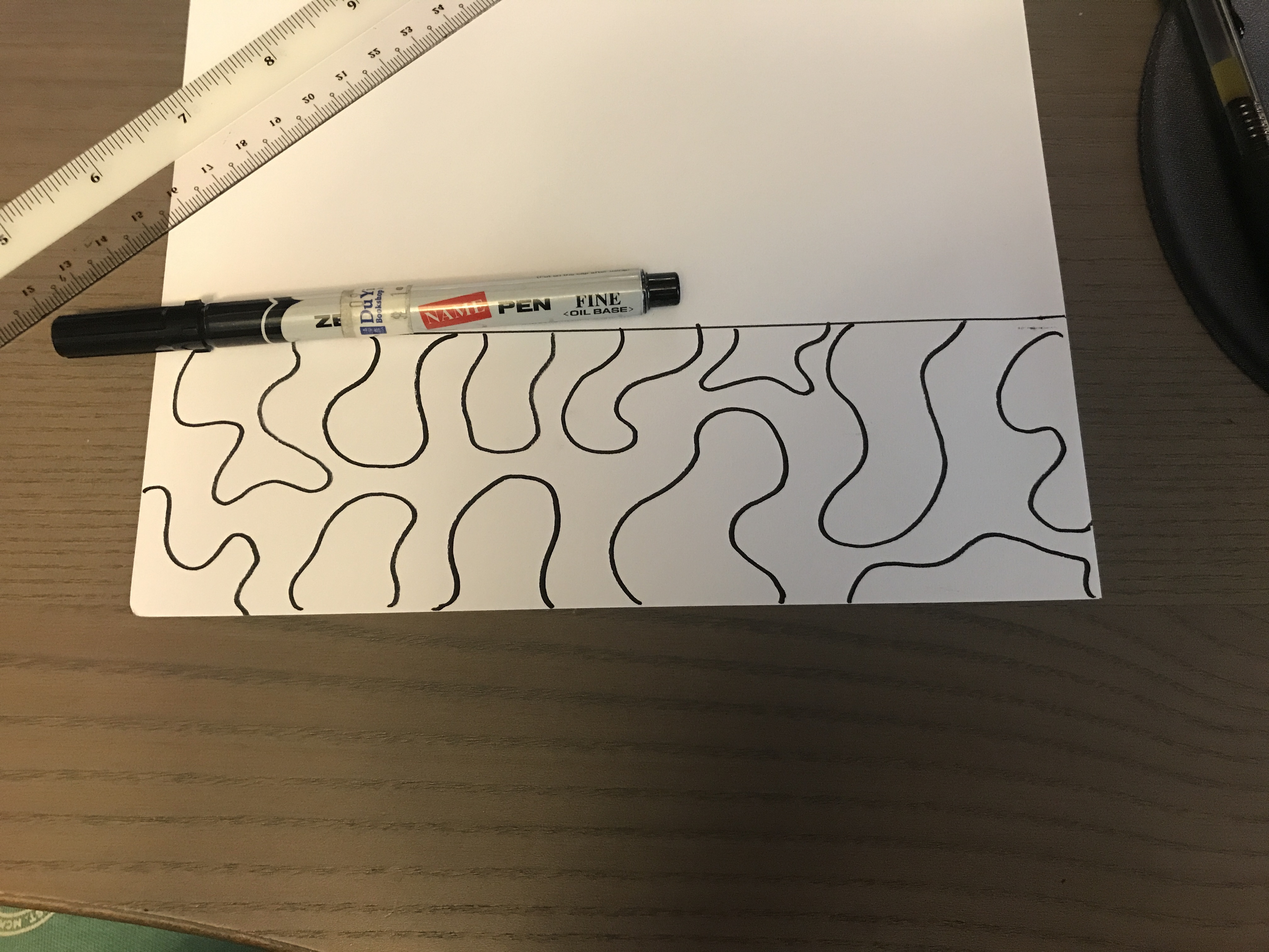
Firstly I experimented with drawing curvy organic shapes extending from the borders of the line.
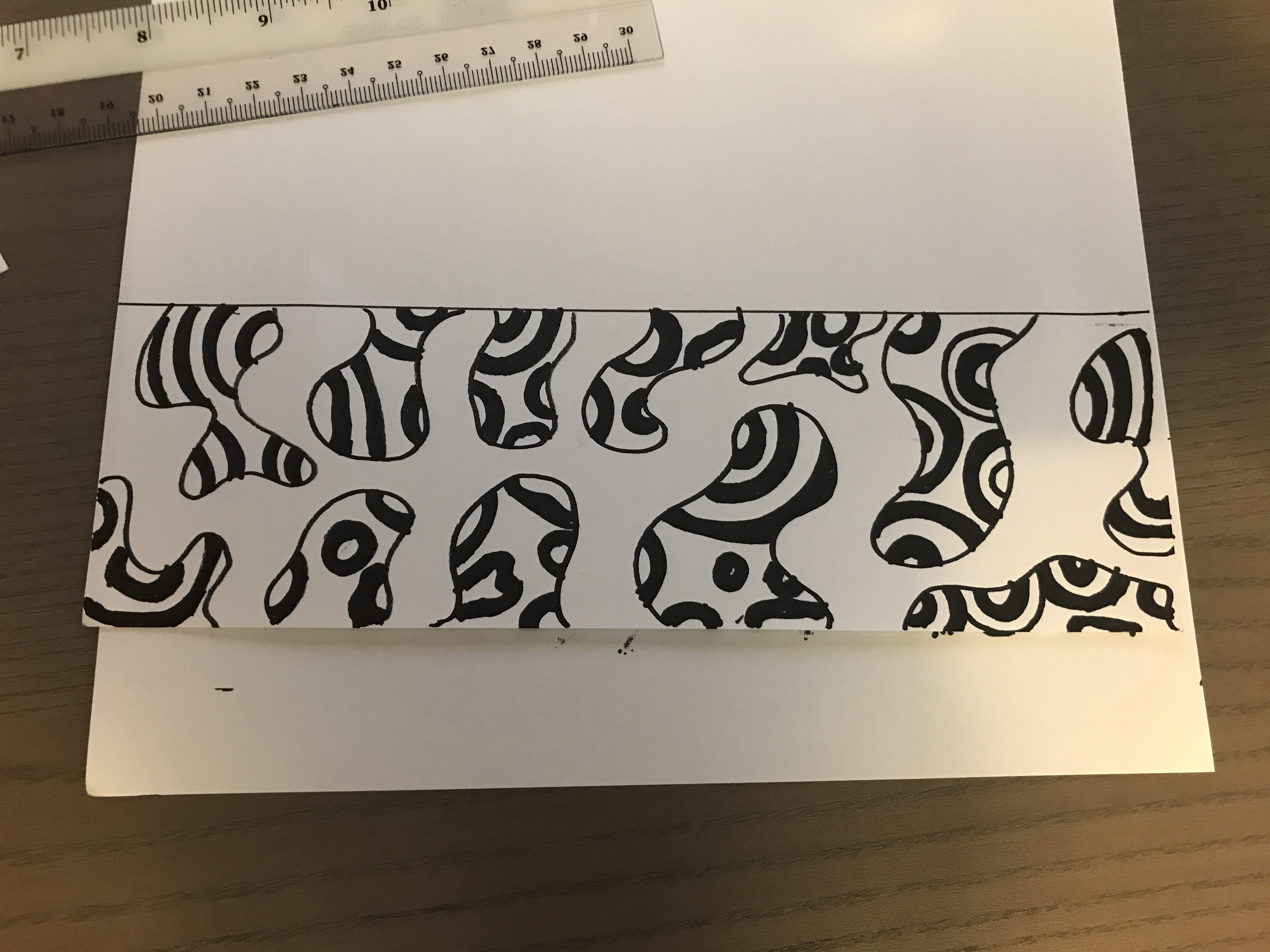
I then inserted some rounded concentric patterns to create a sense of emptiness and incompletion.
I tried adding lines to further complicate the pattern however it looked too messy and busy to express guilt.
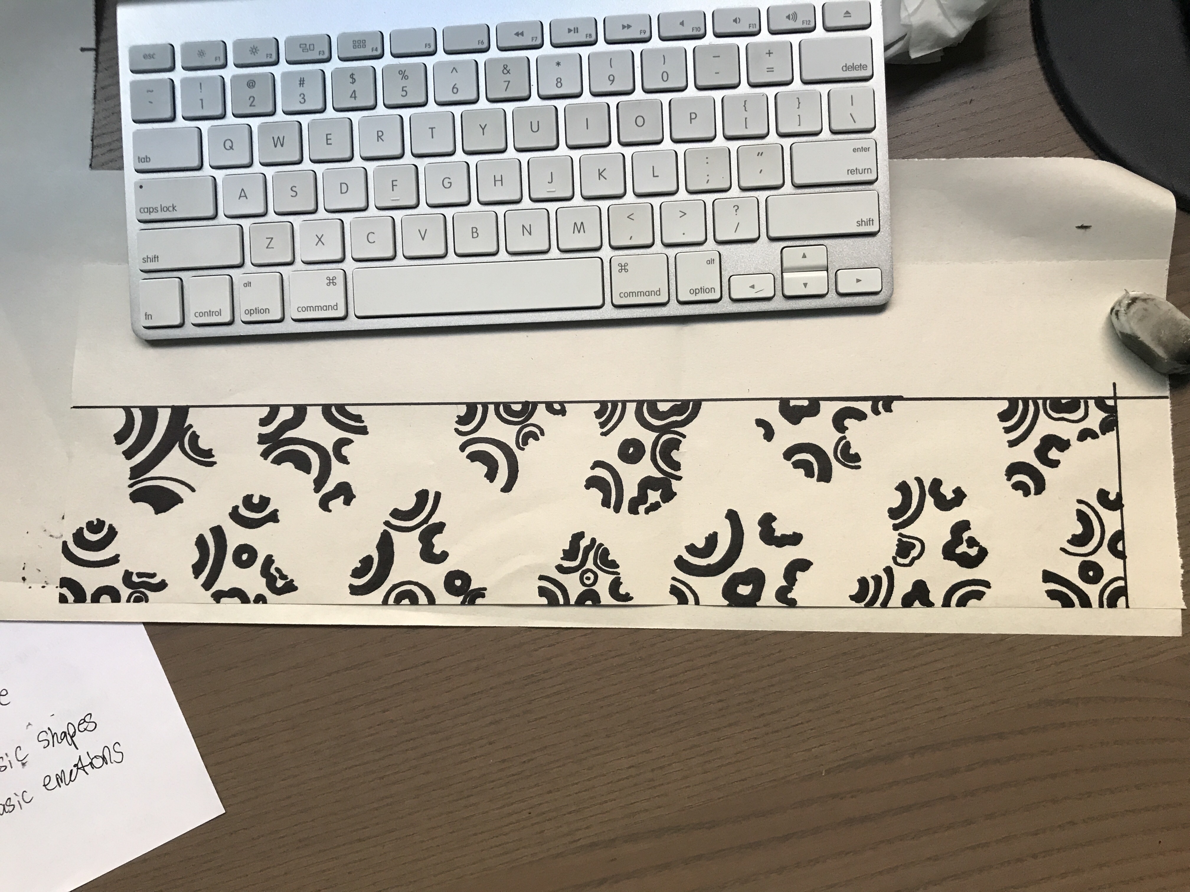
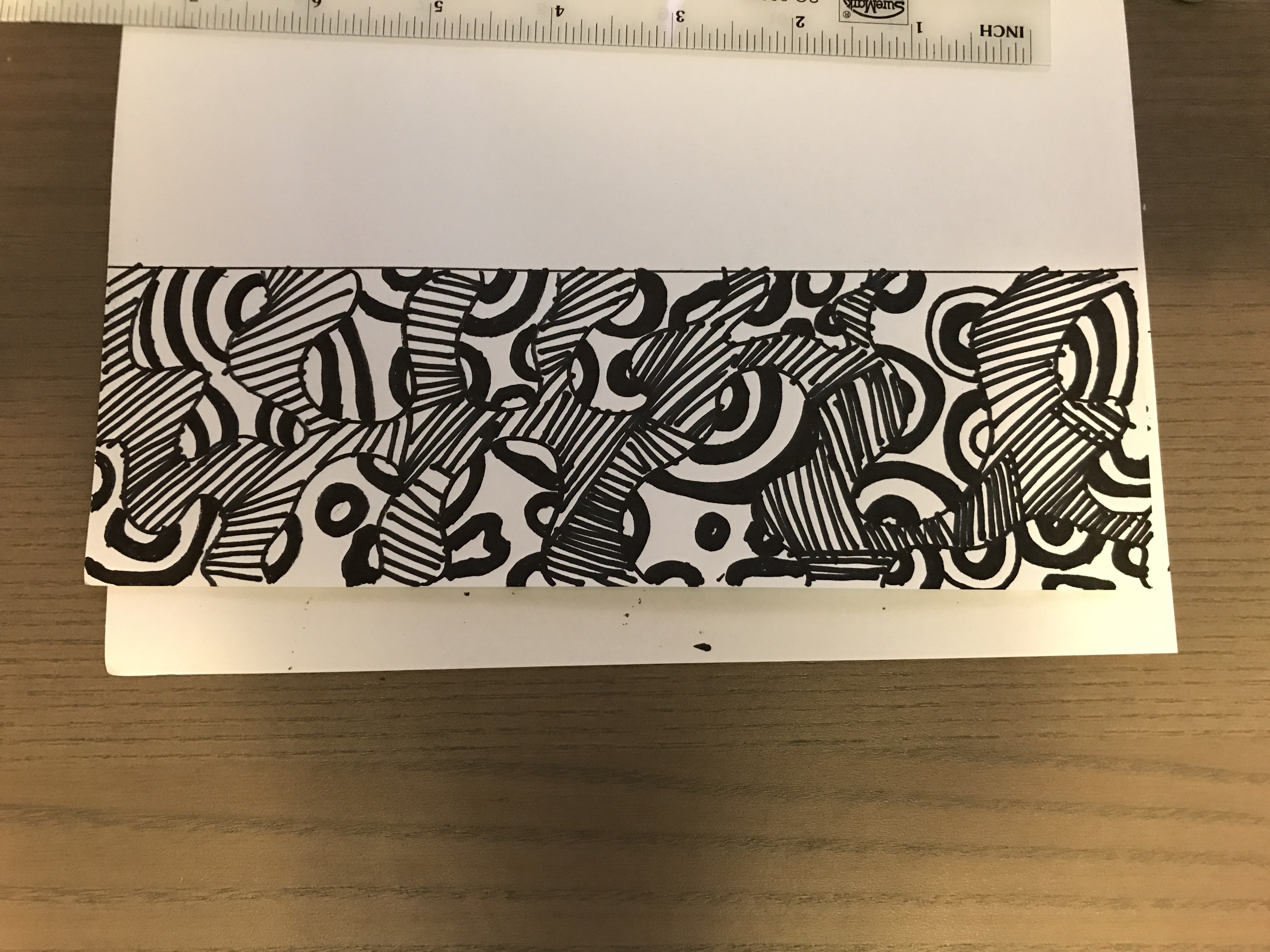
The previous iterations of my line were not exemplifying guilt enough thus I decided to draw the curved shapes with pencil and erase the borders after including the concentric patterns in them. This boosts the visual effect of guilt even more. Even though the curved shapes are incomplete, enough is present for the viewer to complete the shape. The mind portrays a shape however the eye does not see any borders, much like guilt there is an ongoing conflict based on conscience of distinguishing right from wrong. I also exaggerated the difference in thickness of the concentric shapes to express a feeling of uncertainty and doubt.
Ecstasy
After researching on the effects of the drug ecstasy, I decided to create a visual representation of what it feels like to be under the influence of the “love pill”. After surfing around the internet on techniques that create interesting patterns I chanced upon one that gives the impression that the shapes are being warped and definitely embodies some similarities to the effects of ecstasy.
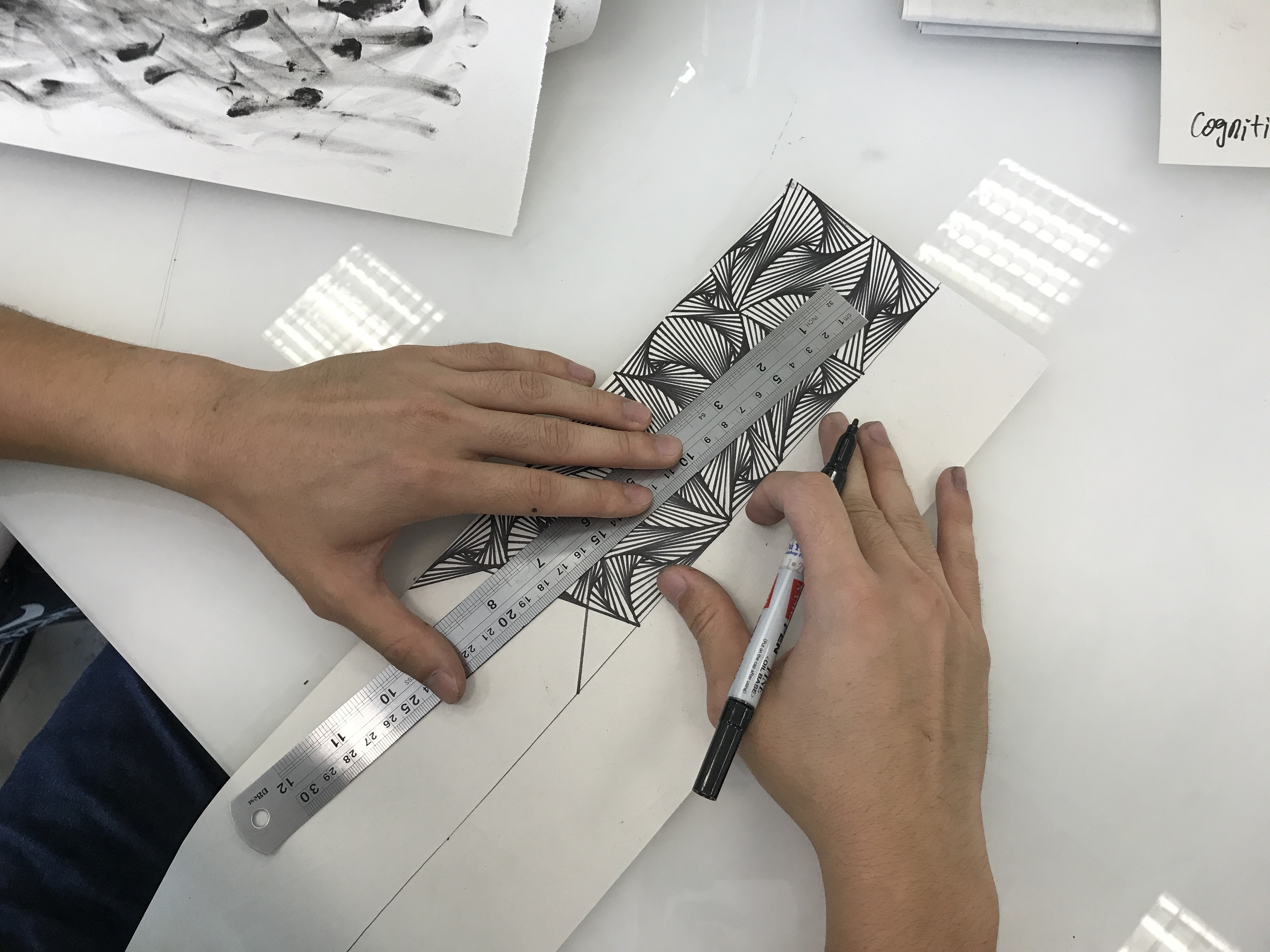
Making use of a ruler and marker, I created lines to impose an illusion of heightened perception and hallucination as the shapes seem like they are winding. The gradual change in spacing between each line as they converge at a single point creates a deception that the shapes are intertwining.
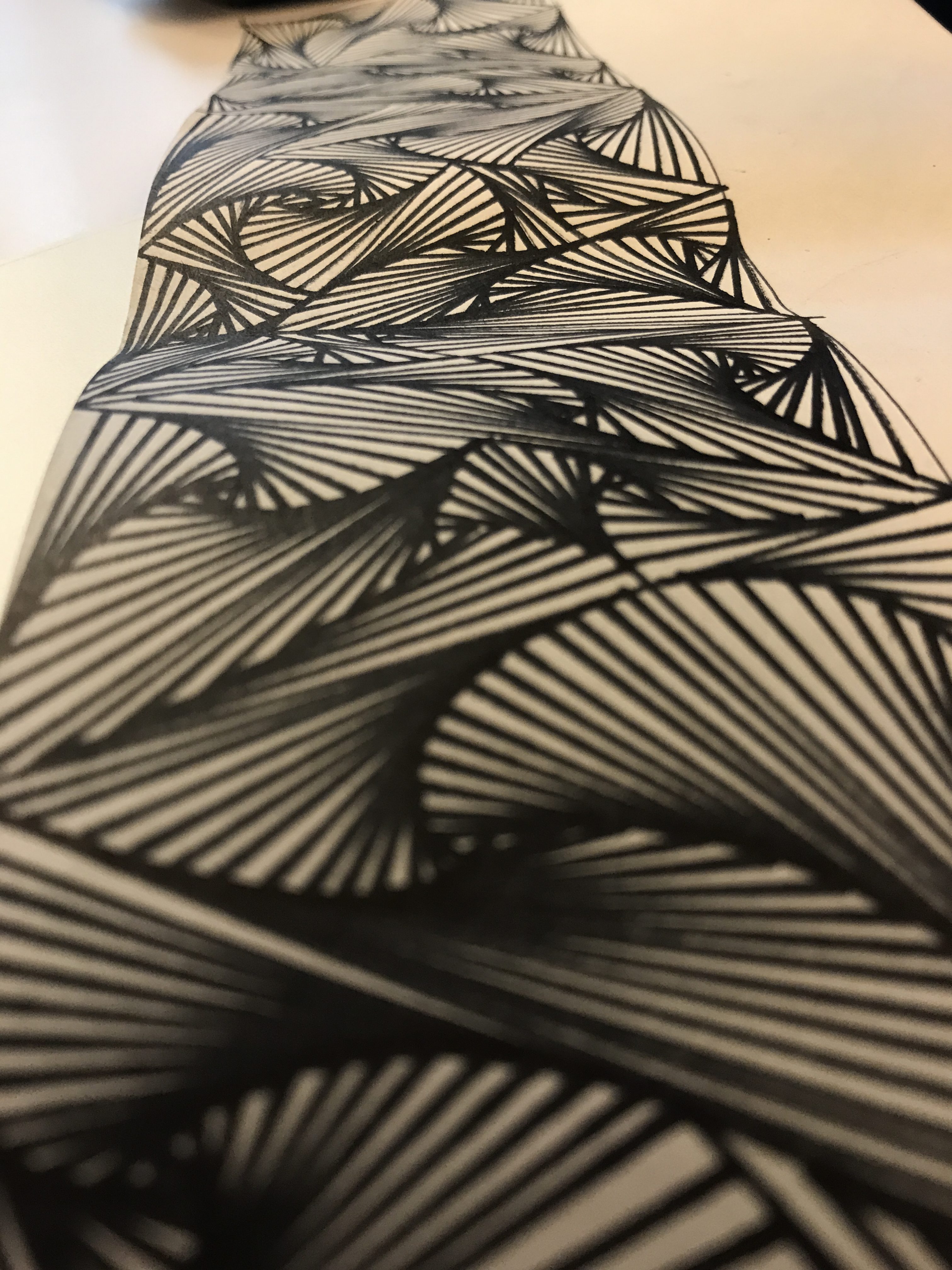
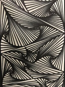
When looked upon as a whole, the patterns suck the viewer in with its complexity and much like the drug, you get hooked on the pleasures of looking at the lines as they intrigue the mind.
Love
Sticking to the theme of creating patterns using geometric shapes, I wanted to express love in a very unfamiliar way. A lot of times love may be expressed as this overflowing burst of emotions with fluidity however, I took a different approach and portrayed my view of love as being fragile.
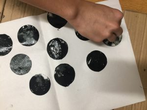
First I used a circle makeup sponge and dipped it with black ink to create some clean circles which represent love. The circles’ completeness suggests unity and harmony, often times also associated with sensuality and love.
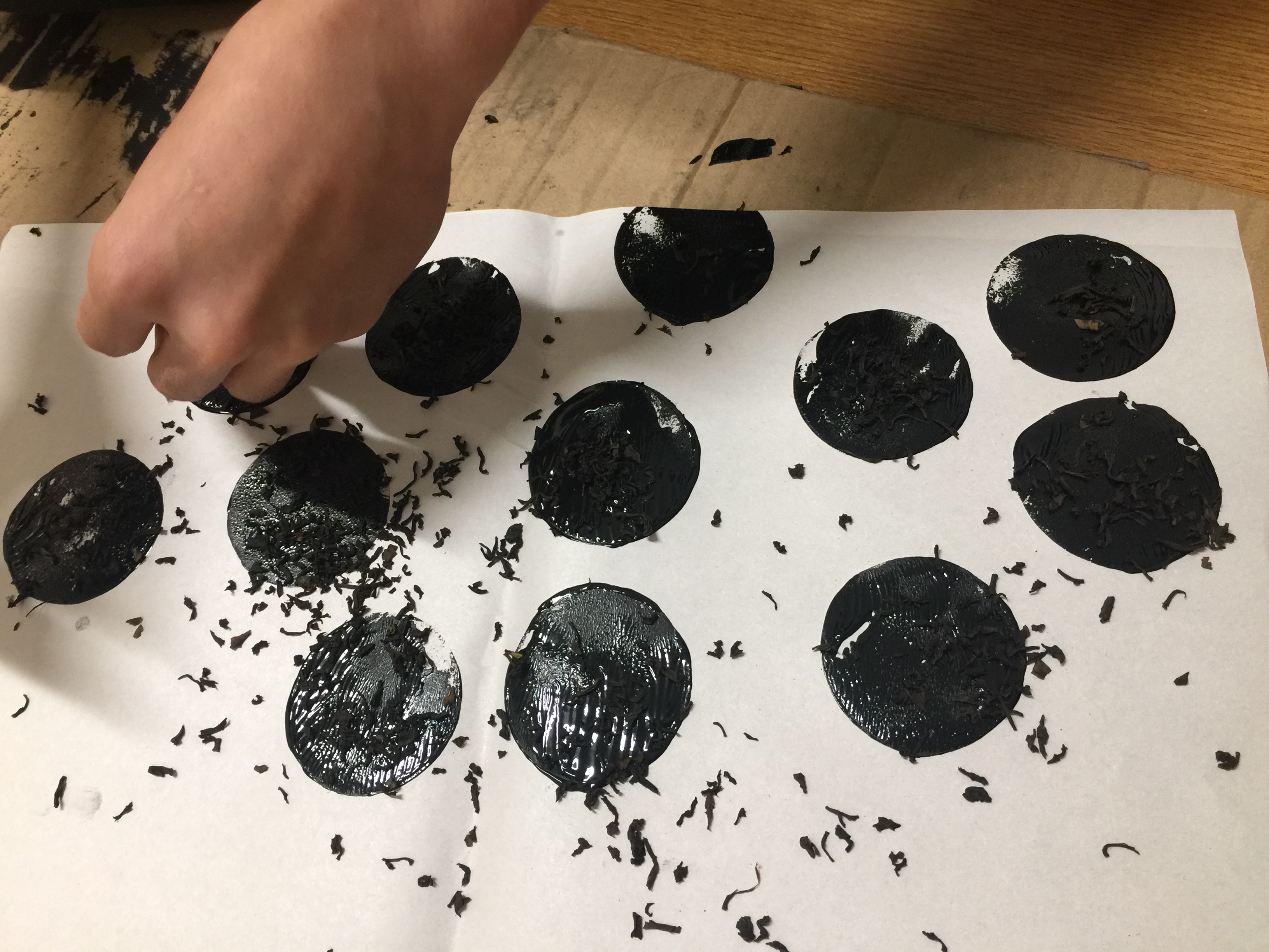
Next I added some tea leaves on top of the drying ink to represent thorns. Although love is seemed to be perfect in its entirety however it can also hurt thus using the tea leaves as they resemble the thorns of a rose.
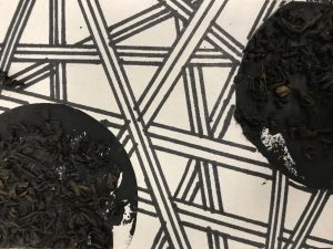
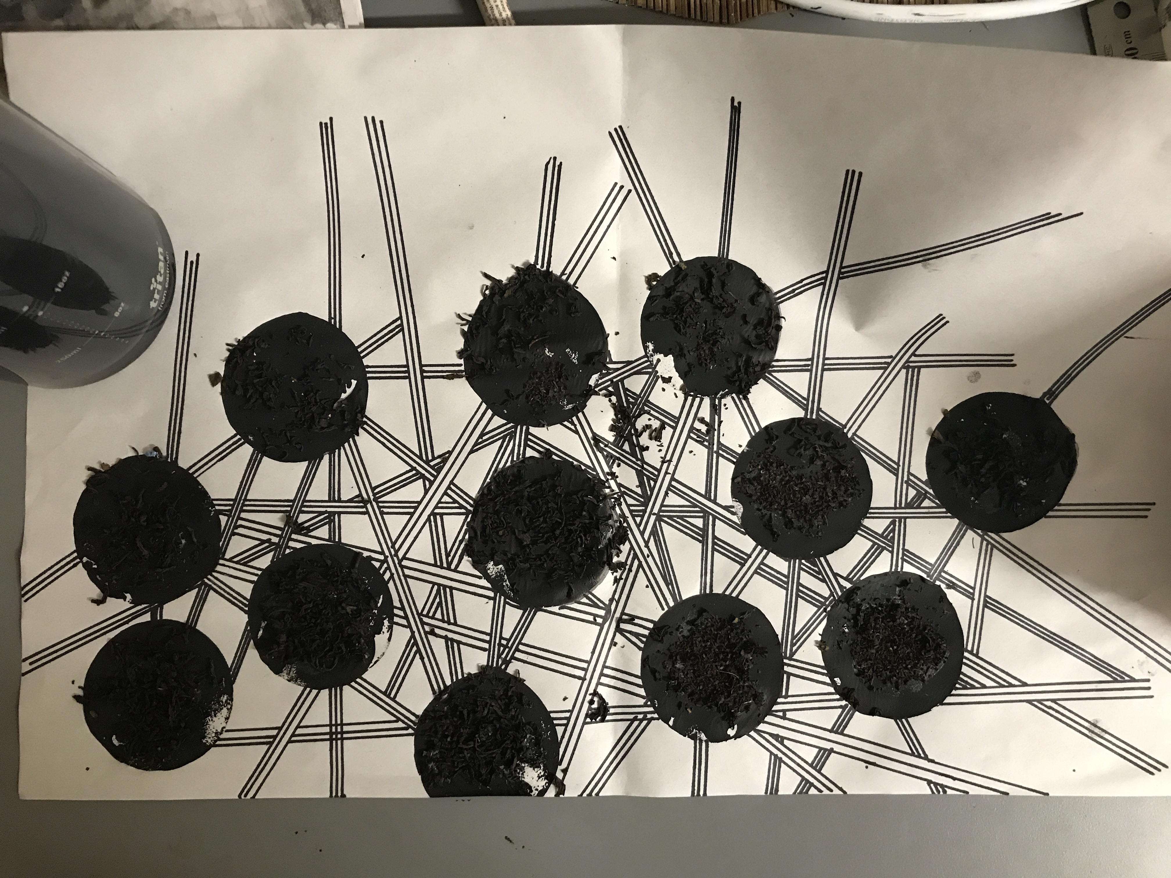
Finally to show the fragility and complication of love, I drew some thin lines across each circle. The lines overlap each other and represent the sophisticated network of emotions that are associated with love.
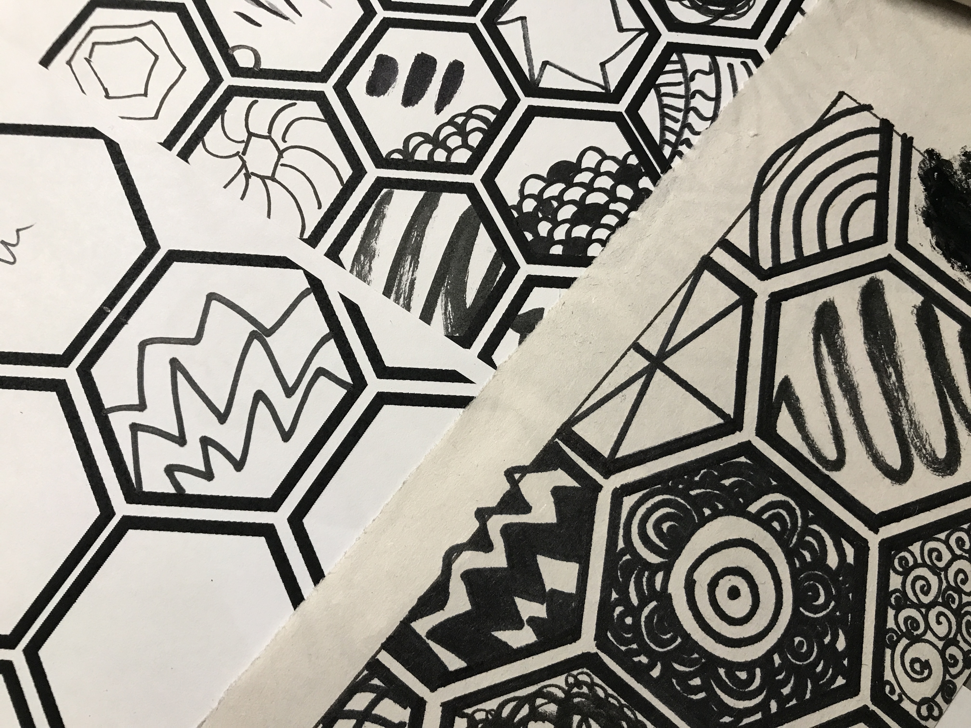
Surprise
Hexagons are one of the strongest geometric shapes as they have 6 sides and present reliability and dependability. The honeycombs in bee hives inspired me to create a systematic formation of hexagons to represent human beings.
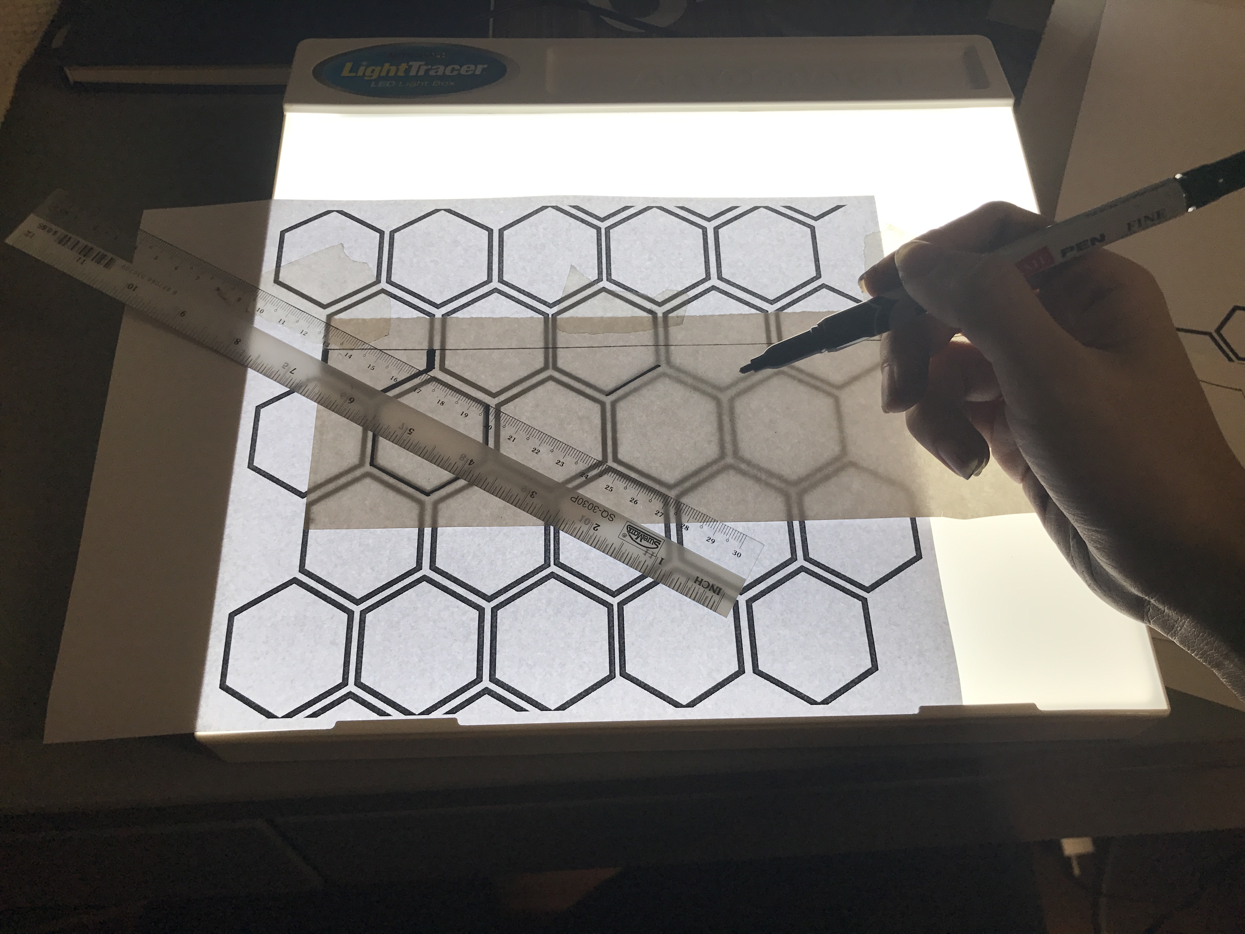
Using a light box I traced over a pattern which I photoshopped together onto the newsprint paper to ensure perfect distribution and size of each hexagon.

After which I went ahead to draw different patterns in each hexagon to represent the experiences of different people. We are all products of our own experiences and everyone is special in their own way. I wanted to portray that everyone has an element of surprise within them however we are always trying to put up a strong front which is represented by the hexagon surrounding the patterns within.
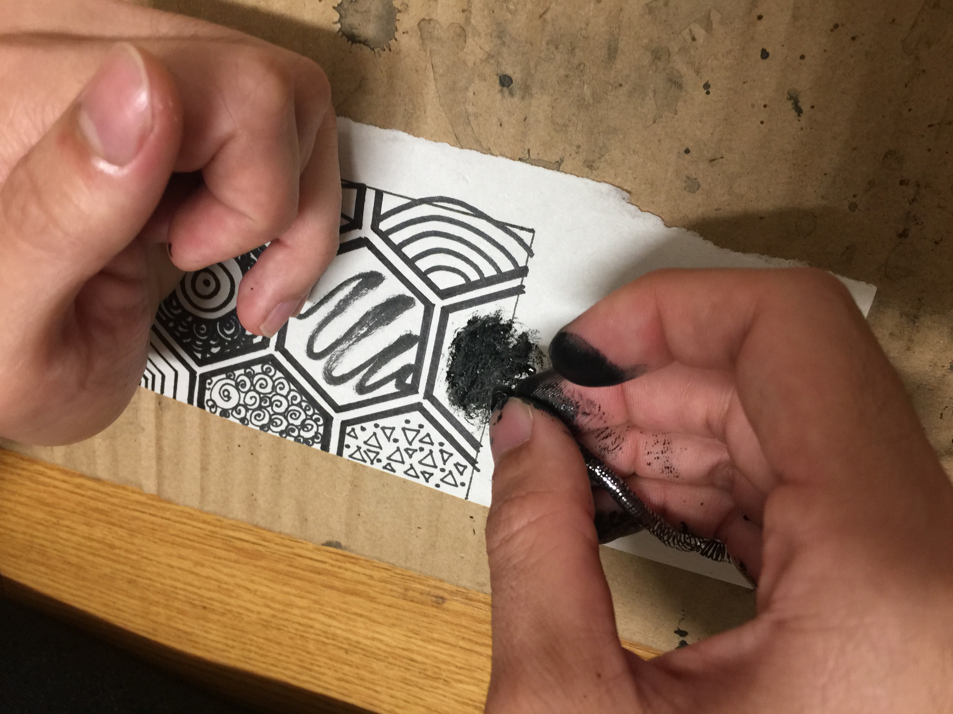
To make the line more interesting I also used different elements to create marks like a scothbrite and my thumbprint!
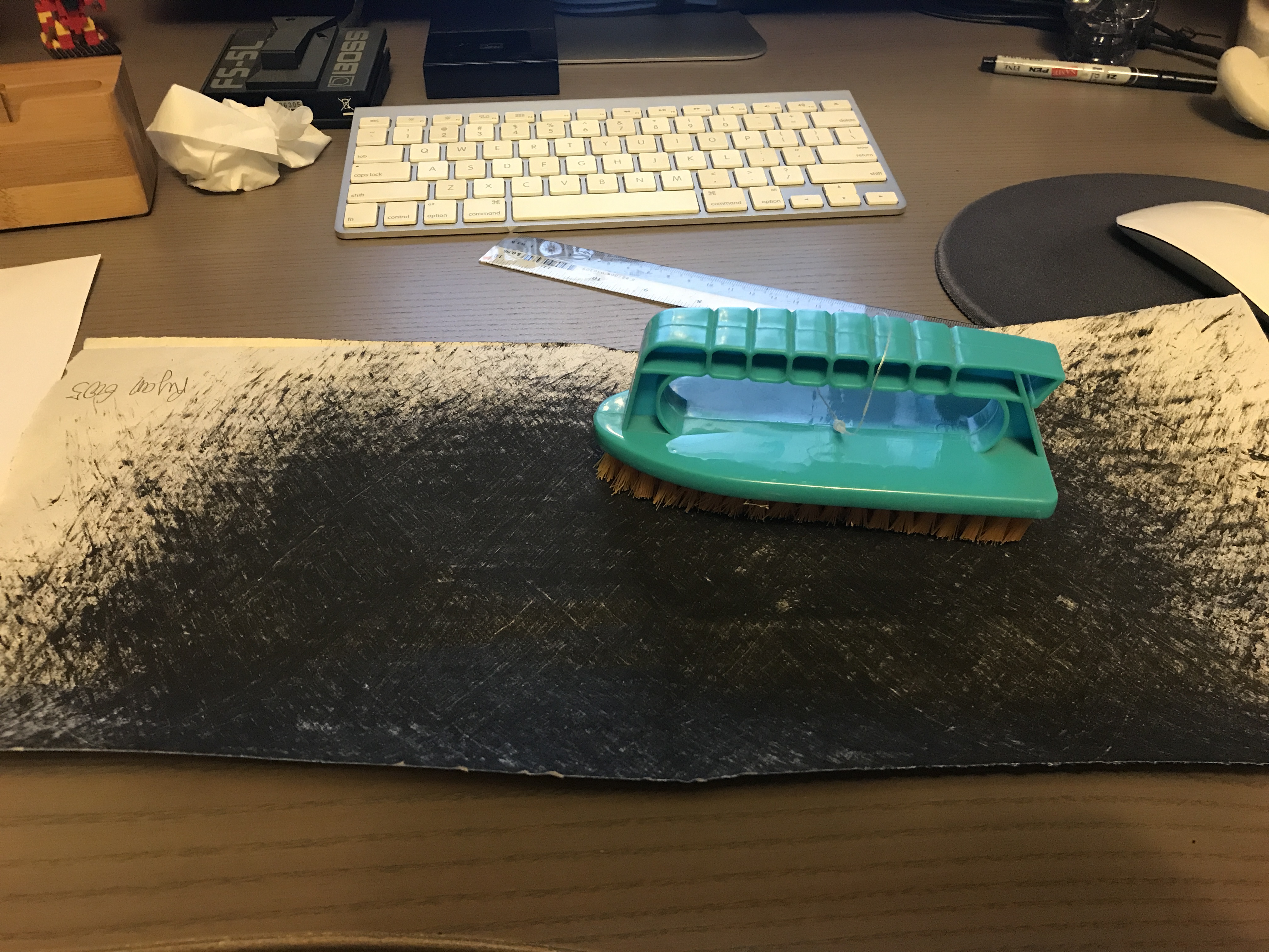
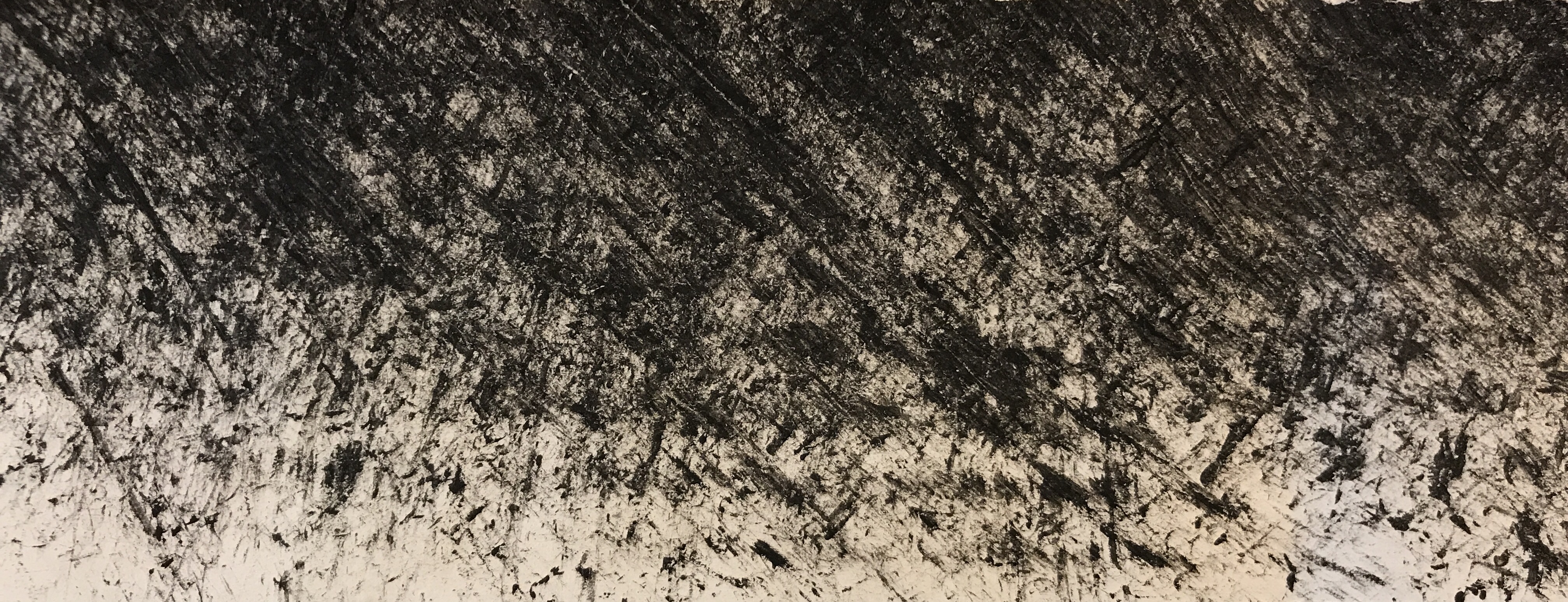
Fear
I’m sure most of us have witnessed a scene in a movie where a murderer gruesomely kills someone. Blood is splattered all around and to get rid of the body the murderer would drag it away leaving a trail of blood. I wanted to recreate that with a brush and focused on messy strokes while still retaining the visibility of how it was created.
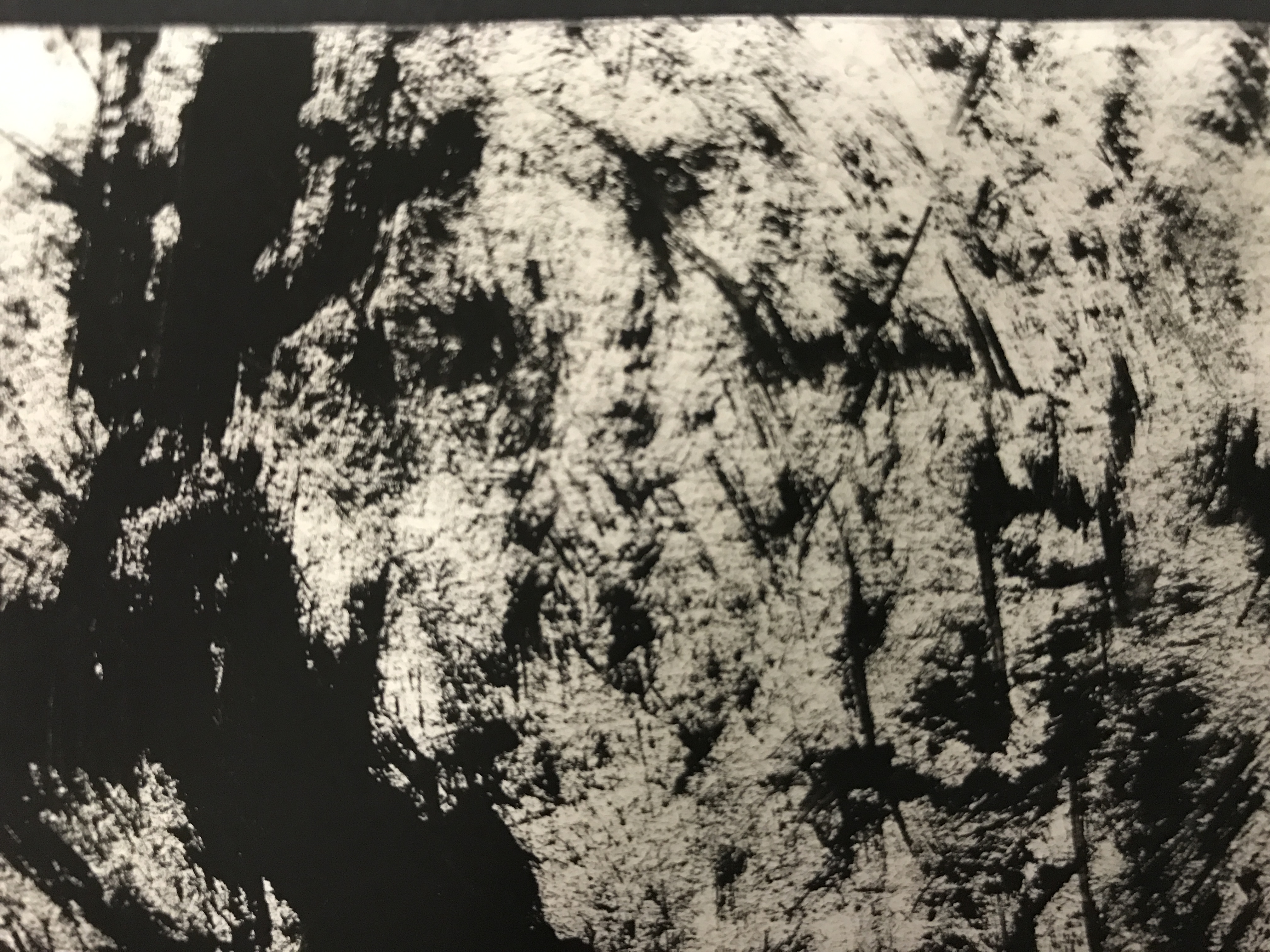
The messy strokes show randomness and there are blotches of ink splattered everywhere which shows instability therefore invoking fear. The black ink resembles blood which is often times viewed as threat.
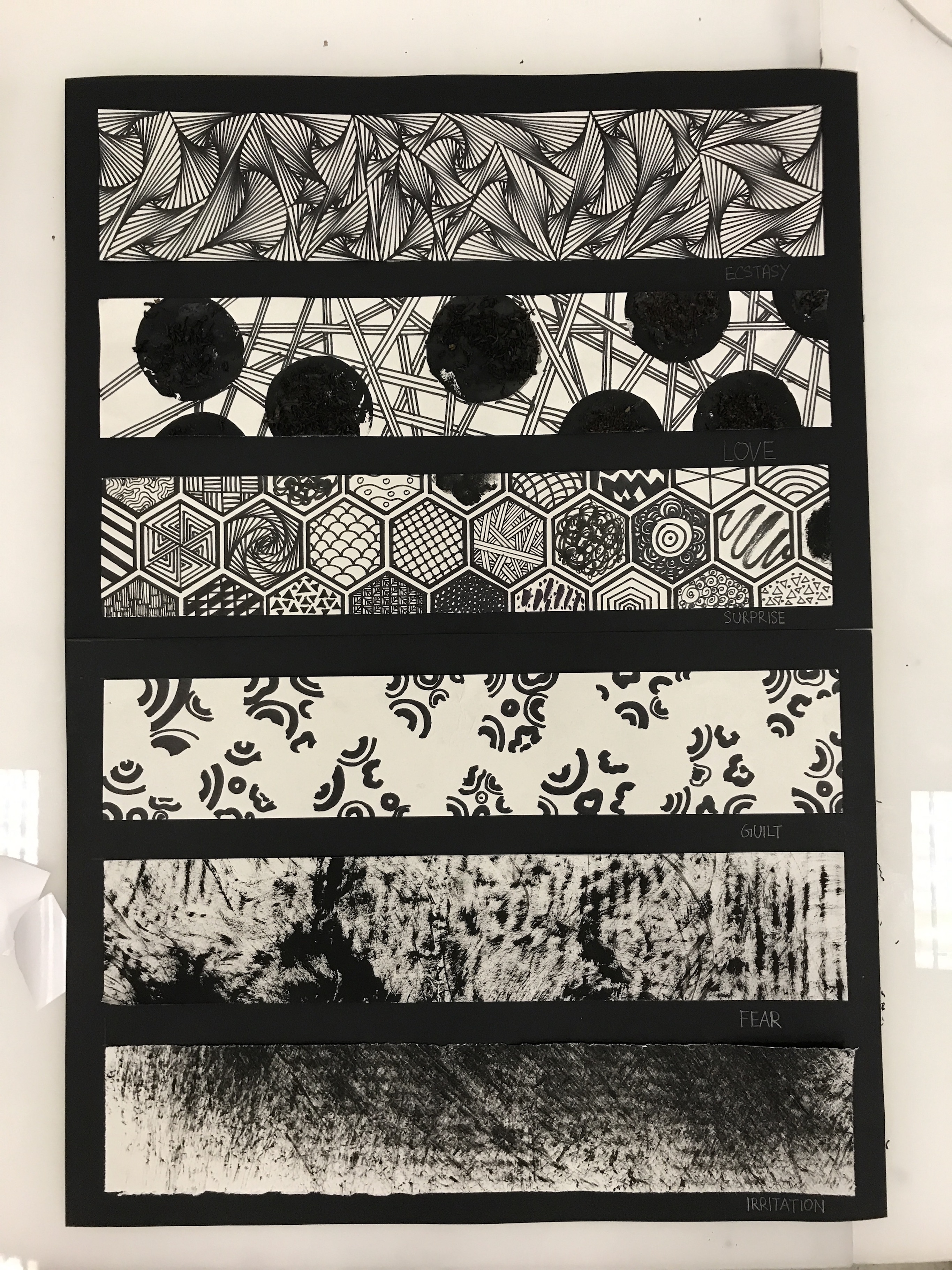
Some of the challenges that I faced during this assignment was trying to form a theme for my lines. After which another challenge was trying use the mark making tools to depict my theme of using geometric shapes to portray emotions. I ended up using only geometric shapes for some of my lines and stuck to good old fashion mark making tools for the more expressive emotions like fear and irritation.
Overall my understanding of how shapes, form, lines and contrast can be used in expressing emotions abstractly has been greatly enhanced through this exercise. I really enjoyed cracking my brain to come up with creative ideas and I am very happy with the results of my creations!