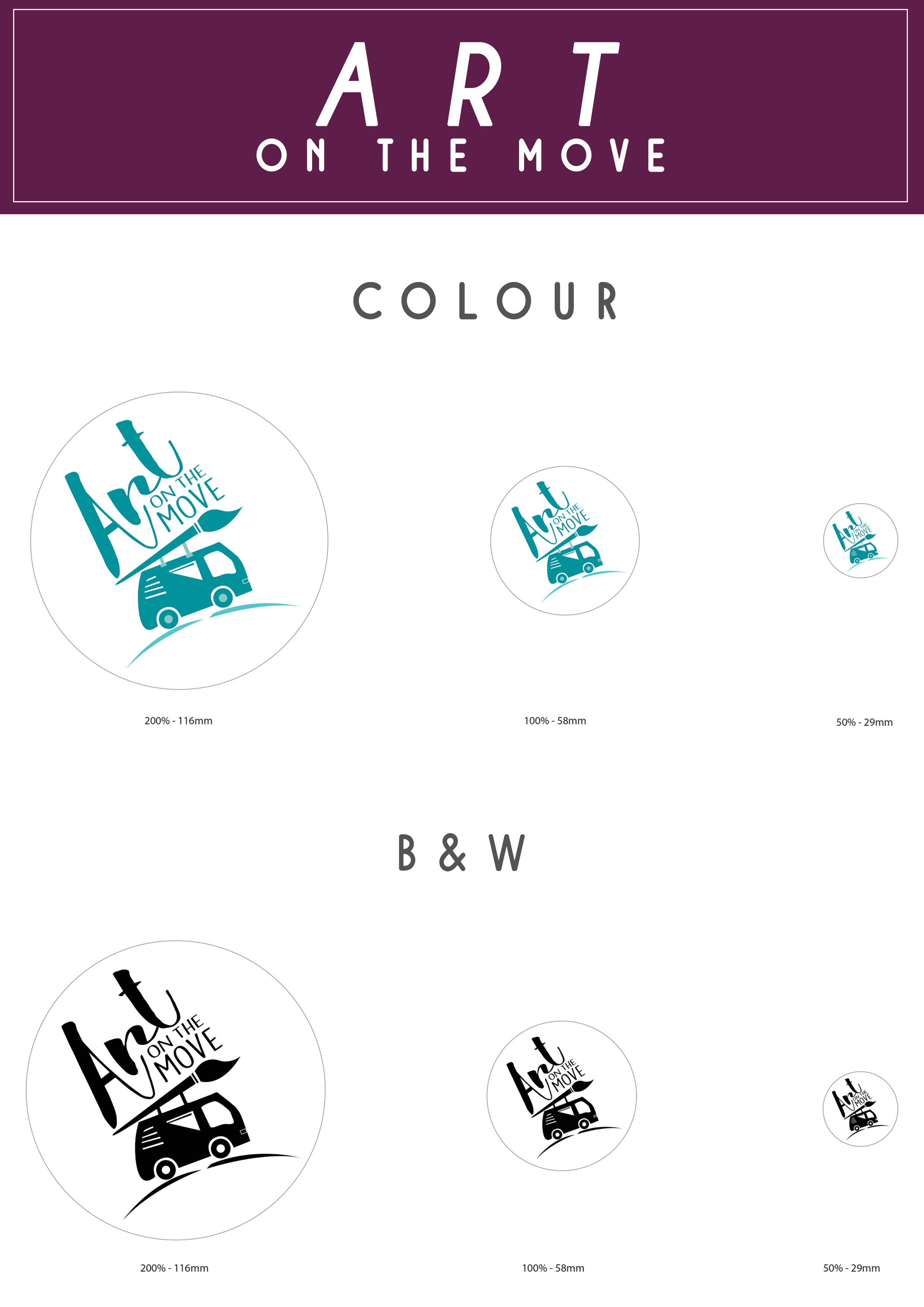

CONCEPT:
To really emphasize on art being on the move, I was mainly inspired by a hippie bus as hippies are always on the move. I feel that such a design would be very memorable and cute. Despite being a simple design, each components reflects greatly on the programme in different aspects.
It also reflects movement as by seeing this icon you can feel as if the bus is jumping or moving.
The brush on top of the bus conveys acknowledgement. Just like how artworks of patients are displayed for the public to see in a ‘gallery’ form, the paint brush is set atop the bus as a showcase. It helps deliver a sense of achievement to the work.
The bus has a welcoming presence with its rounded design (which is why it was also used as an icon with peace and freedom movements) Thus, it was used to represent welcome as well as freedom for the patients. It shows that anyone who is willing to learn is welcomed to pick up new skills.
The windows of the bus represents the versatility of the programme. Despite using normal windows, the different type of windows used on the bus shows that the programme is vastly diverse. In terms of the types of art works done(batik, painting).
The two strokes below the wheels represents a hill in which the bus in on helps to convey journey in which this program does: it is to take them to greater heights – thus the uphill motion that can be sensed by the way the van is orientated. It also represents taking a step forward which is why the line between the bus is cut into two instead of one.
Lastly, my design is meant to be more of a literal take as the badge is meant to be seen by general public as well as patients that might have troubles getting the connection if it were to be too abstract. This design is also a simple design making it easy to remember! Just imagine, bus and brush are the two elements needed to remember my design!